#and then i get to be naho and i love love loooooove her but i have never in my LIFE seen a corpse party cosplayer at a con
Explore tagged Tumblr posts
Text
More pics of my dear pixel children. Gonna be a long post, so hiding it under a read more o7
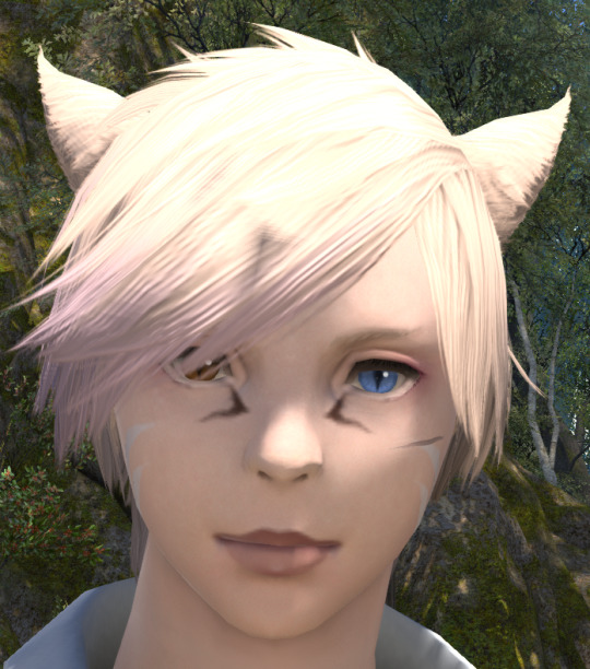
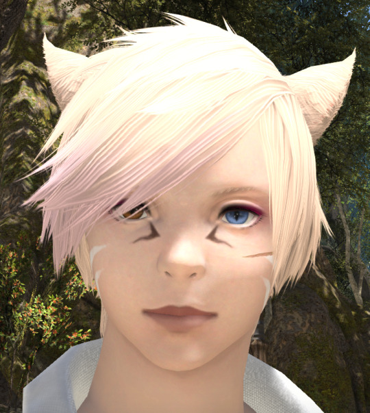
N'jinh actually looks pretty okay on benchmark, but he's already getting his entire face redone since I want him to use different base than Hawu'li. But he has that lazy, kinda dead eyed look too :/ Like the cheeck paintings showing up better tho!
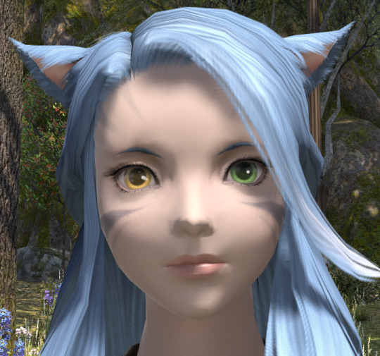
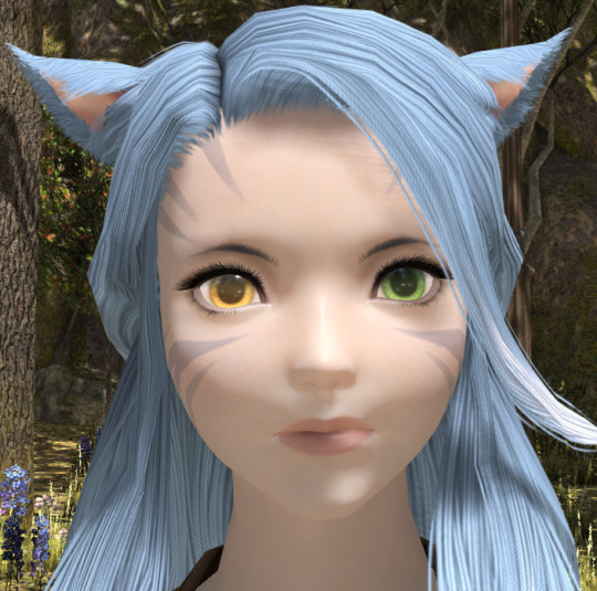
Naho is mostly better, but I don't like the kinda wet glow on her nose + will have to do some adjusting to her skintone.


Good god Yulan looks so dead behind those eyes D: Like horrifyingly empty... Benchmark also seems to make everyone into some weird yellowish hue.
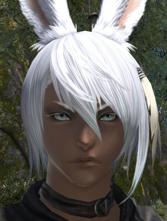

Firn..... weird lighter eyebags aside (I think it's one of the face paints so it should be easy to fix at least), they stole his pretty, thick white eyelashes?? And why is his nose so dark, everyone else I've seen complains benchmark made their's too light??? (There's also some really weird graphical bug of his hair clipping really fast through that metal part of his feather hairpiece lol).
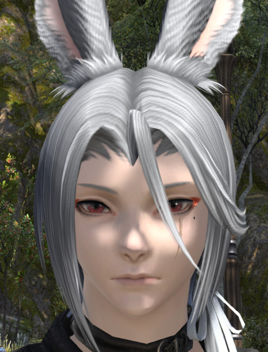

Einn is otherwise fine, but some weird graphical error eats his eye dot (it's just a tiny " / " line instead) and I have this weird feeling they made his eyes wider? Like they used to be very narrow, and now they are bigger around the middle. Also not a fan of his new lip color :/
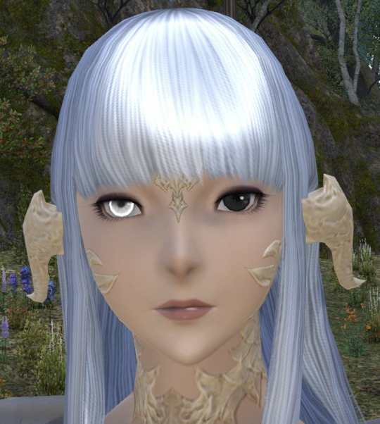
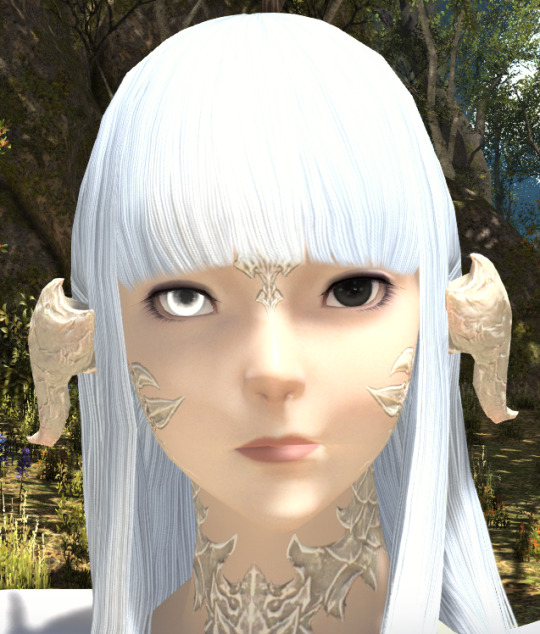
Momo honestly rocks the new look! My only complaint is that their nose looks very different, but it honestly fits them better. Very much a fan of the more rounded chin too, but I could see some people disliking it on their characters. Also very positively surprised by the new limbal ring, it fits in better and gives their white eye a nice glow.
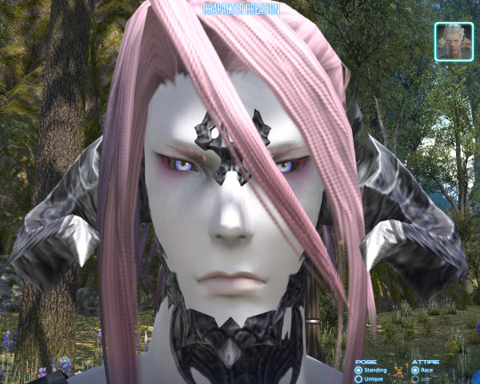
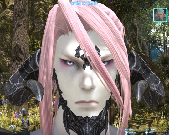
Meanwhile Chili looks a bit off? I loooooove the horn and scale textures, but his skin has a very weird green tinge I absolutely hate, as well as the new metal tips on horns (why same color as horns?? what's the point if I can't even see them?). His limbal rings are a bit funny with his eyecolor, so definitely have to tweak those little.

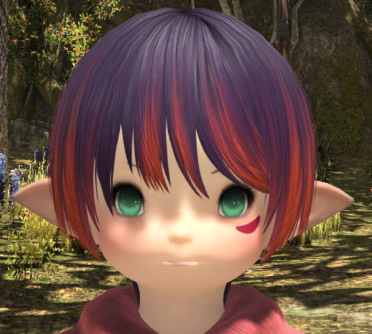
Gee, Fish, who does your mom let you have eyeshine? Honestly she's looking very nice too, can't really find anything to complain about. Extra points for finally making her mouth look better.
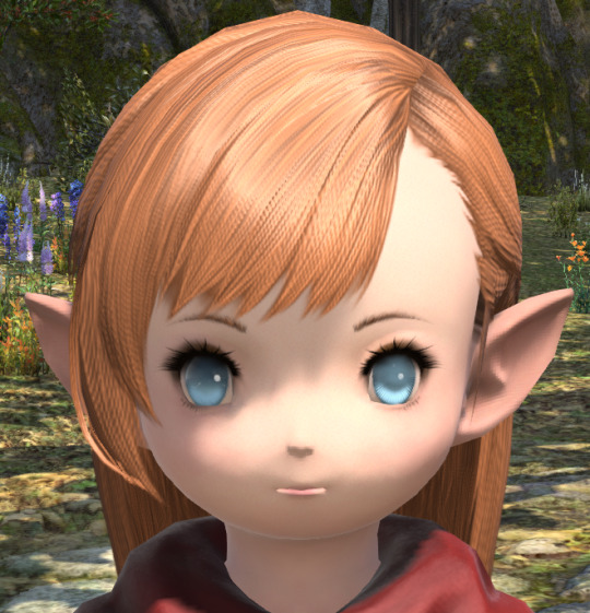

Ryne looks very good too, lalas are clearly the true winners here. Even her new eyecolor is closer to Ryne's. Interesting how her eyeshape seems to have changed too, but unlike Hawu'li hers actually fits her.
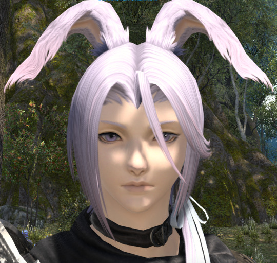

Hyth..... love, what on earth happened? Why is you face so round? Where did your eyebrows go? Why is you nose wider? What happened to your lips? Hydaelyn help me.... I'd almost say it's worse than Hawu'li's face changes :/
Super secret bonus: unnamed elezen base I played around with in character creation last week


Uhhhh there are some nice points, like the shade of his new lips, but I do not like how bumpy the new shadows make his face :/
#neri.txt#all 10 current characters (not counting hawu'li) + 1 extra#maito and yusui are not included bc they do not currently exist ingame#ayway next up is probably trying to tweak each benchmark one more into something i like?#since i only like less than half of them#especially n'jinh might be fun to tweak since i'm redoing his face entirely
3 notes
·
View notes
Text
guess whos excited for ncv
#this time im NOT gonna fuckin drink cause that was just awful#like it wasnt fun i was jus miserable the whole time and afterwards i tried to do some really bad bad things to myself#and i was just feeling terrible the entire time yeah no that was awful#but this year!!#im gonna cosplay some characters im very excited about!!!#first off i get to be one of my first ever best girls (seriously shes amazing)#and the nekopara cosplayers ive seen are so so cute!!!!!!!!!#and the character designs in that game are incredible#so im hoping a lot of people or at least a few will wanna take pics of me!!!#also im super nervous about cosplaying characters that dont have the same body shape as but she and i look exactly alike so like yeehaw#like body-wise i mean#we have the same body type almost exactly hgjkfhsfjghs#so im happy about that!!!!!#and then i get to be naho and i love love loooooove her but i have never in my LIFE seen a corpse party cosplayer at a con#so god knows if ill even get recognized at all but im excited about that too#and then i get to be FRISK#with a SANS HOODIE#and a SCARF#its gonna be FUCKING AWESOME#eee#alcohol mention#self harm mention#alcohol tw#ask to tag#im gonna play nekopara now YEEhaw
1 note
·
View note