#and then I'm thinking a full bookcloth case
Explore tagged Tumblr posts
Text
I don't think I will be able to sleep tonight if I do not figure out what to do for Mabel cover.
#no this isn't indicitive of other problems i might be having SHUSH#i have been trying to come up with ideas all day but i have NOTHING#i have accepted that it will need to be rounded. we will see about backing.#so rounded spine. are we envisioning.#and then I'm thinking a full bookcloth case#maybe red? or black?#with some kind of embellishments#either some kind of embossing or embroidery. but i don't know what!!!#i usually don't struggle this much#but i cannot move on with this project if i don't have a solid plan!!#AND i need to come up with a cover for the second volume too. because i want them to match.#HELP ME#mabel binding#mabel podcast
2 notes
·
View notes
Text
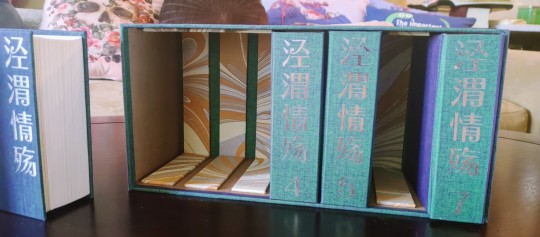
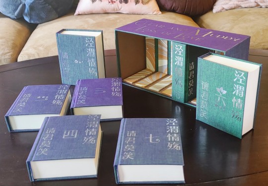
Here we go! I have some smaller books to share as well, but I've been absolutely VIBRATING with excitement to share a BIG one, and I'm going to indulge myself and post that today, then figure out words for the rest. Because I bound a new cnovel. Check it out, guys, I bound jwqs/clear and muddy loss of love :D
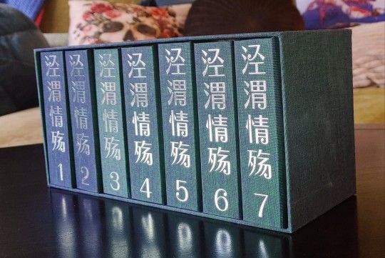
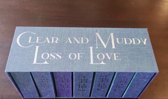
Let me indulge myself and backtrack a little! First, these are quarto books, so they're short. But I think these average a little under 500 pages each, and jwqs is a LONG book (my beloved), and this adds up to a total eleven inches of lesbians. More like twelve once they're in their cases. It's over a million characters in Chinese and I think the English translation comes in somewhere around 890k, it's HUGE
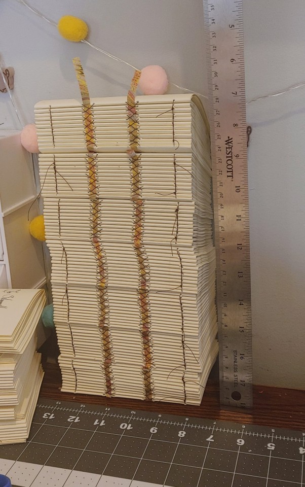
Making these books was SO FUN, I hadn't read jwqs and still haven't, and will probably read on my phone when I do. I don't have any exciting photos of the typesetting, but I knew this was an imperial succession story, and that made me nervous, those stories don't always click for me. Well, the process of typesetting and adding footnotes for this beast definitely confirmed that I'm going to have a good time with this thing when I have the time to read it, but there was also so much going on that only the vaguest of spoilers sank in. I went into an absolute FRENZY of typesetting, and after I printed, cut and folded it, well. That was one afternoon of sewing. You're looking at the reason I'm scrambling to make up a few hours of missed work, hahaha
After that, I needed cases. At the very beginning of march, I received a shipment of some FASCINATING bookcloth. It's called Duo, and it's made by layering a thin gauzy fabric of one color over paper of a different color. Depending on the combos, you get a really cool range of color-shifting effects. And they've gone out of production! But I was part of a group order to get some of the goods, and hadn't yet finished a new project. Reader, I went for it.
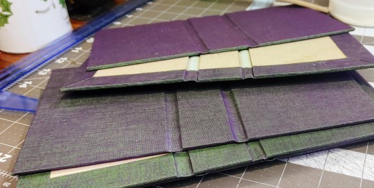
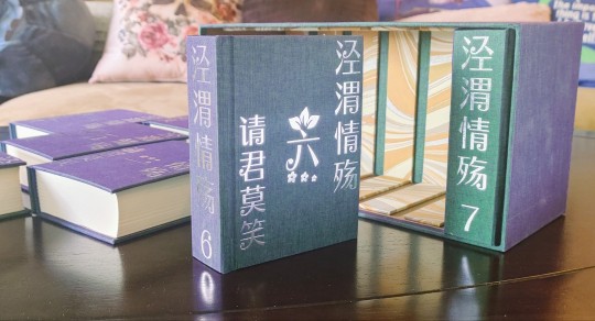
That purple and green is bananas!!!! It's so hard to photograph, this midnight picture of a few cases is one of my most successful attempts to capture the full range up close. Originally I'd been thinking of trying to evoke imperial gold, but I figured this was still the kind of drama and luxury suited the book, and also something something the hidden colors suited Qi Yan's character. I tied it back a little to the imperial gold with the endpapers, then titled them in silver foil, since the endpapers had silver in them.
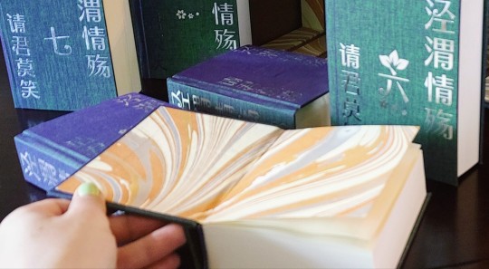
But once the books were made, I felt like it wanted something... more. Something like a BOX!
And me, I chase novelty. A set this large would be tricky for anything clamshell, but a slipcase for all seven would leave books tipping all over if it was wide open, but putting walls between slots would be demanding in terms of precision and would risk similarly-sized books getting stuck in the wrong slots. Then I remembered learning about slipcases where you could put in a little insert to support the weight of the text block, and the concept SNAPPED into place.
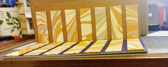
Colors aren't going to photograph well at midnight, but I made the supports using the scraps and off-cuts from my endpapers, to tie it back into the bindings. The back of the case is lined in more of the duo, and the walls are lined with a faux leather bookcloth I like a lot, it feels buttery smooth and seemed like a good neutral material to tie the papers and bookcloth together. I listened to some of the DEEPEST layers from the nine-hour conspiracy theory iceberg video while I was working on this, haha, it was a TRIP.
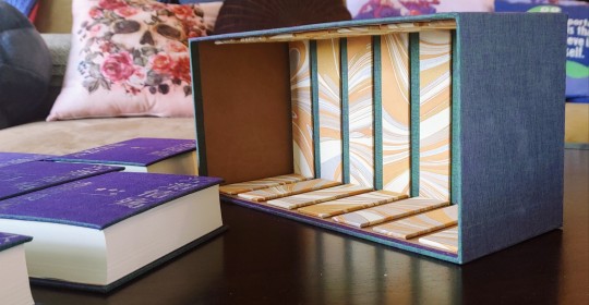
And in the end, each of the supports is sized to comfortably sit in the smallest of the volumes, and evenly spaced, so I believe it will take the books in any order with no problems. It's easy to grab the books without having to cut notches into the walls to grab them from. And even though weight is less of an issue for quarto sizing, the books in here have their weight supported no matter what angle the box is at! I'm so, so pleased with how this concept worked out and definitely plan to do more with it in the future.
So there we are! Jing Wei Qing Shang! I had such a fabulous time with this project, and I'm so excited to get to share it with all of you. The story was fun to work with, the bindings and box were fun to make, and everything here came together just as well as I could possibly have hoped. I'm so proud of this, and incredibly, incredibly excited to show it to you!
#crafts#bookbinding#box making#oh boy what is this story tagged#jwqs#jing wei qing shang#clear and muddy loss of love#I'll pick one to stick with later 😂#long post/#so proud of this one!
1K notes
·
View notes
Text
Bound: Heart Full of Gasoline by @sdwolfpup


Yes. I did a photoshoot in the car.
This was a fun bind! Considering I follow neither GoT nor Formula 1, I was a little nervous going in, like I was going to make “wrong” choices or something, but I think it works. I leant more heavily on the Formula 1 theme than GoT with the exception of some font choices, which I seem to have neglected to photograph. But here are some screenshots!


I agonized over the end papers and cover designs for a long time before I landed on this. (I was going to do faux Penguin Clothbound Classics design, but Illustrator was being a real jerk, so I had to pivot.) I always wanted to do the traffic light colors for the three binds, but I'm thinking if I make this again for the author, I would like to put it into two volumes. Anyway, the red bookcloth gave me real shit so I had to remake that cover, but fortunately it was before I cased in. So all in all, no major hiccups.
Details:
Body font: Arno Pro Chapter headers: Titillium Web (also used on covers) Drop caps: Mason Sans OT
104 notes
·
View notes
Text





World Champions | Artwork for World Champions by TheDefenestrator by TheDefenestrator, art by Blurb_brain
Fandom: The King's Avatar | 全职高手
Rating: Teen And Up Audiences
Category: Gen
Words: 71 944
At the end of season 4 of the Glory Pro Alliance, the government finally receives the information it has been waiting for: The other players have caught up. Or, In which Glory has been a government recruitment ploy for remote-piloted mecha operators all along.
About the Book
FONTS: Mundo Serif, Azonix [dafont], Segoe UI Symbol
IMAGES: Illustration by Blurb_brain [AO3]; cover image by NASA ID: 440611 [Rawpixel]; Planet Earth background ID: 6331593 [Rawpixel]; Circuit lines background ID: 3117935 [Rawpixel]; endpapers' image by Eric Eastman [Unsplash]; Swoksaar, Desert Dust, Lord Grim, Vaccaria, and Cloud Piercer [The King's Avatar Wikia]
MATERIALS: regular printer paper (8.5"x11", 96 bright, 20lb), 80pt bookboard, Iris Bookcloth (colour: Black Pearl), Neenah cardstock (8.5"x11", bright white, 65lb), waxed linen thread (white, 30/3 size), embroidery floss (shades 3750, 350, 3845, 370), leather cording (1.9mm diameter), Reeves’ acrylic paint (Mars Black, Phthalo Blue, Titanum White), Americana acrylic paint (glow in the dark), ph neutral pva glue (Books by Hand)
PROGRAMS USED: Typeset in Affinity Publisher, cover/title page/endpapers designed in Affinity Designer/Photo, QR codes generated with LibreOffice Writer, PDF arranged for printing with Bookbinder-JS
BINDING STYLE: quarto, case bound (slightly rounded, with oxford hollow, forgot to use tapes)
.
Fenes' "Glory's tech isn't handwaved" AU. This was great! Funny and creative, and I'm both amazed and full of admiration for Fenes' ability to juggle so many characters.
I was feeling excited and ambitious with this one. Tried some new fun things (double core endbands, painted edges) and used some new equipment (a lying press).
The Text
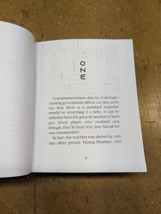
TITLE/HEADINGS FONT: Azonix says 'SciFi' to me, it's a bold, non-serif, sleek font.
BODY FONT: Mundo Serif, it's a decent serif body font I haven't used before. Felt like it worked with Azonix.
SCENE BREAKS: a special character in Segoe UI Symbol of a black & white icon of Earth, the globe showing Asia.
TYPESETTING: Finished typesetting the fic, left document open on my laptop, laptop's battery failed, file now crashes immediately upon reopening, issue persists with copied versions of file (; ̄Д ̄) . Thankfully I had a backup file for the typeset with the barebones of the text, so I didn't have to restart from scratch...
Title Page
My thinking: it takes place in space, the world's at stake, and it's the dawn of a new horizon for Earth. Glory and the titular champions are represented by Swoksaar, Desert Dust, Lord Grim, Vaccaria, and Cloud Piercer – the captains of what I'd call the 'big 5' teams. A circuitry board background element hints at the tech/mecha nature of the story's competition. It may not match Blurb's art, but I hope I was able to convey some of what the story is about.
The circuitry image is used as decoration throughout the book. I only used the avatars of the top five teams' captains because too many silhouettes would lessen their impact and readability. (Removing the backgrounds was tedious, but worth it.)
Here's what it should have looked like. The test prints for this and the BB art were fine, but I think my inkjet started running out of ink just when I printed the final copies and I didn't reprint them. (Too impatient, really wanted to finish up and read the book)
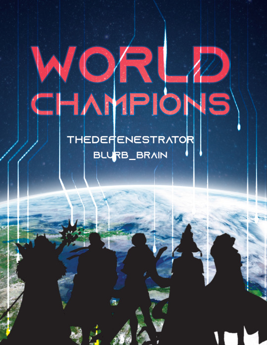
The Cover
World Champions is another Big Bang fic, and once again I based some of my design choices off of the accompanying artwork. The dominant colours of Blurb_brain's illustration are red and blue-green.
COVER PAPER: For the decorative cover material I used NASA's ASTER image of Poyang Lake. NASA has some really interesting photography some of which remind me of marbled paper, thought it could be interesting. I chose this image of Poyang Lake because 1) it's in China, 2) the colours were similar to Blurb's awesome illustration (fate strikes again, dropping matching images and artwork into my lap!), and 3) NASA is tangentially relevant to the fic, which takes place in space.
BOOKCLOTH: Verona bookcloth in the shade Black Pearl, a lovely dark navy blue colour. Thought it suited the cover paper and title page. (Bought it for this fic specifically, but the colour goes well with almost all of my decorative papers so it should see a lot of use in the future!)
Endpapers
The final decision that held this project at a standstill for two months. In the end I drew inspiration from the matchups against the final opponent in the story. The image I used is a little chaotic and a little too unrelated to identify why I picked it without an explanation, but this book is for me and I know why, so there. (Note that I played around with the colours and cropped the photo.)
Endpaper inspiration: the maps for the matches against the Infilhites
"a long bridge through an enormous tube-like hall, where light seem to come from every side through stained glass windows. It was visually confusing, limited lateral motion" "a warehouse, crates stacked on and beside metal racks that went all the way to the ceiling." "a house of mirrors, fully enclosed to be sure the Infhillte couldn’t fly out of it." "like a volcano, rivers of lava moving sluggishly down a slope, occasional vents of overheated air nearby." "a series of overlapping bridges between halls and stairways, level after level layered over an open abyss."
Trimming & Painting the Edges
Going all out, a 2-for1 deal: the opportunity to use my lying press for the first time and learn a new technique!
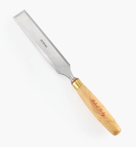
TRIMMING: Used a paring chisel and lying press.
CHISEL: The 1.25" wide paring chisel I used was form a modern manufacturer. (Vintage paring chisels are very thin, enough so that you can bend/flex the blade. But don't do that.) It's long and wide blade made it easier to register against the surface of the press for consistent cuts. Looks like this one below from Lee Valley.
LYING PRESS: My dad's project. Solid black walnut, hand carved screws and internal threads — he even made the tools to make the threads too! The jaws of the press are each 3 7/8" wide. It's big and heavy (though much smaller than full-sized professional ones omg), but there's enough of a flat surface to register the chisel against. A thicc boi, much like this one below from Bookbinding Supplies.

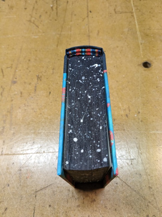
PAINTED EDGES: The idea was to have dark navy edges, speckled with white stars. I used acrylic from a tube to paint the edges — tutorials recommended it over liquid bottled acrylic, and I had an old set hanging around. Had to water it down because otherwise the paint just flaked off.
My test of trimming and painting went well. Then the trimmed book itself came out slightly crooked, the paint required significantly more watering-down than before, and the white paint did not want to be both opaque and speckle-able. Unfortunate, but still book-shaped! And now I have an idea of what to do differently next time.
Also, did not like the glow-in-the-dark paint. Looked too translucent in the light when compared to the white acrylic, and needed a thicker coat to be visible in the dark. (The thickness combined with the translucence and base colour kinda reminded me of boogers... Ended up scrapping most of it off, so there's not much left to glow.)
Endbands
Still in the mood to have fun and go all-out, I attempted double-core endbands for the first time.
TUTORIAL: YouTube @ BookbindersChronicle: Bookbinding 101 Sewing Headbands Session 2. Also watched @ DAS Bookbinding's Double-Core Endband // Adventures in Bookbinding, but I personally found Chronicle's closeup video easier to follow.
I used embroidery floss from a 100pk of assorted colours off Amazon, wrapped around a core of 1.9mm leather cording from Michaels. I drew from Blurb_brain's art for the general colours, choosing a dark base, with red, blue-green, and gold. The specific shades were picked to go with the cover.
#World Champions#TheDefenestrator#Blurb_brain#qzgs#tka#the king's avatar#fanfiction#bookbinding#fanbinding
104 notes
·
View notes
Text
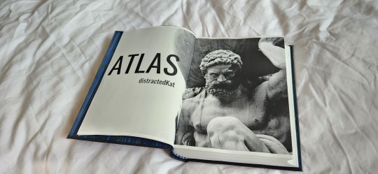
Atlas by @distractedkat
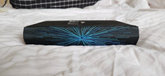
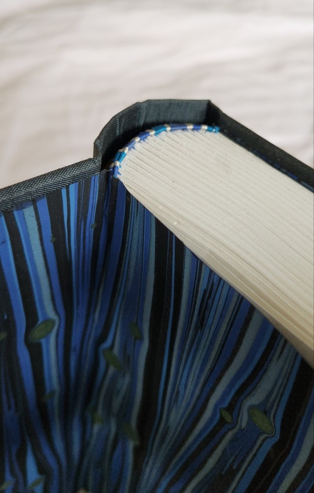
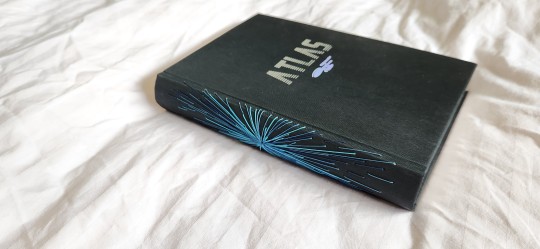
So I've used the warp design before for my design for @pleasantboatpress's copy of For Gladness of You, and I wanted to see if i could replicate it again. I do think if I ever re-attempt this design i'd like to use a little purple in there.
Design inspired by queercore's lovely modified long-stitch bindings, which i've bastardized into purely decorative spine designs (i am the jackass of decorative faux long stitch and i'm not even sorry). Blue endbands are also inspired by nim from morningstarbindery on instagram's beautiful copy of Away Childish Things. It's ridiculously gorgeous and i'm always pushed to do better and more beautiful things by my friends in Renegade.
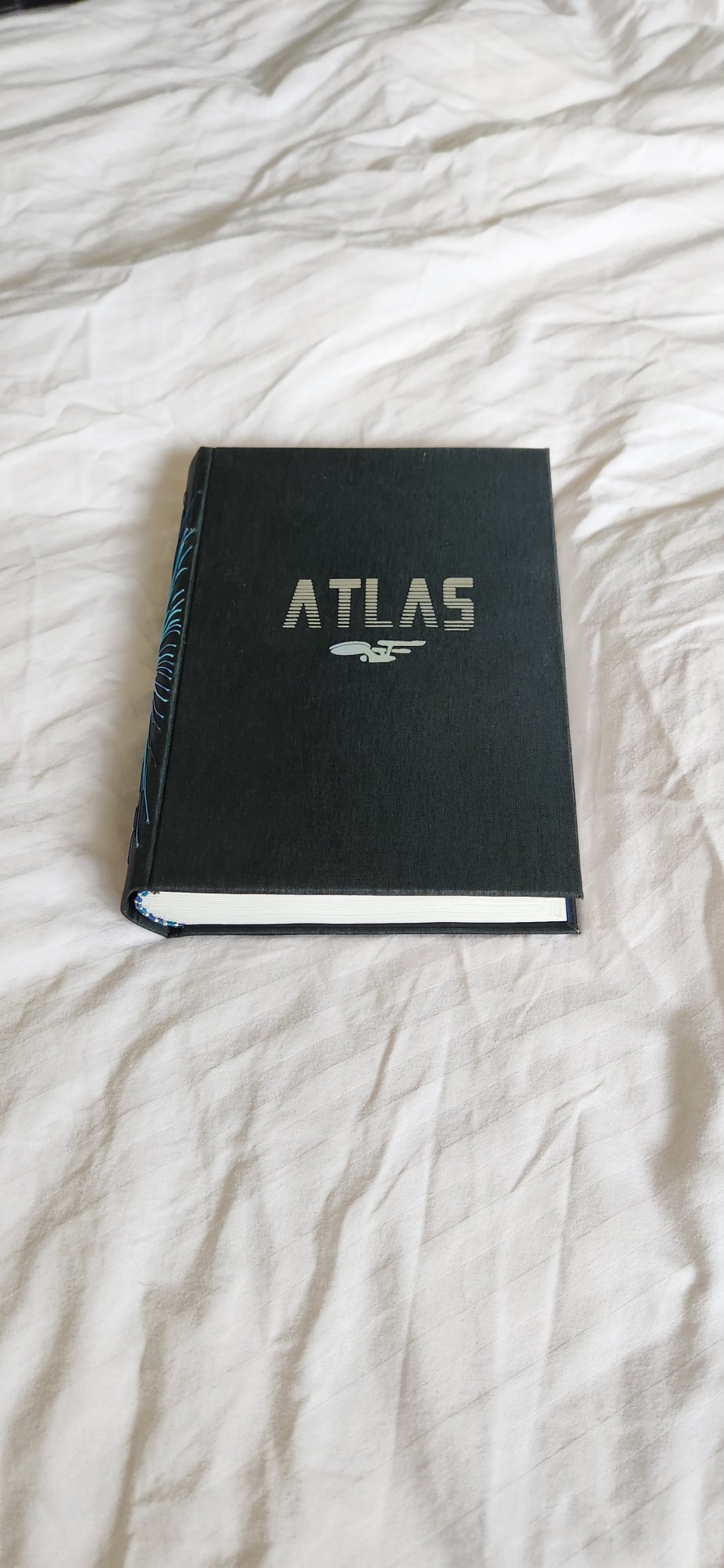
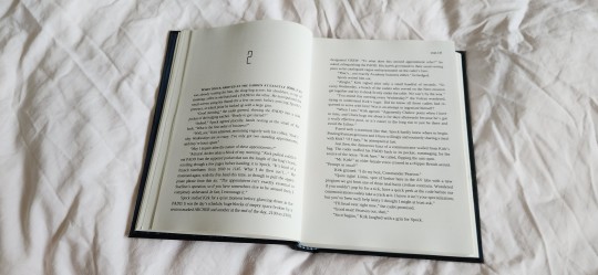
Some stats for you - as per usual:
135,529 words || 426 pages
Cover Titling font: Mandalore Gradient
Body Text: Liberation Serif, 10.5 point
Accents: Alien League II
Can you tell how much I freaking love this fic? I actually received a RIDICULOUSLY STUNNING and beautiful copy of this fic from queercore from the exchange but I had already started typesetting and prepping this amazing story and MORE PHYSICAL COPIES OF THIS FIC SHOULD BE IN EXISTENCE.
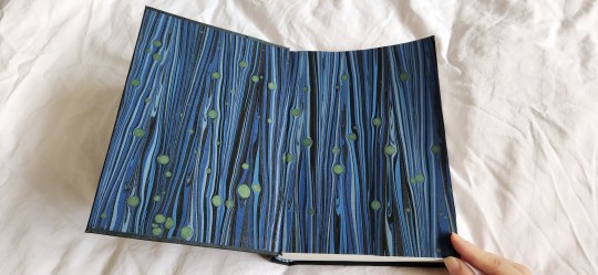
This is probably the first long star trek fic I ever read. It is that old, so it holds a lot of special memories in my heart. I used colibri graphite for bookcloth (colibri my beloved, of which i tragically scuffed the back cover, hence no photos). Endpapers are renato crepaldi (can you tell i have some loves), and the spine design is done with lightly waxed linen thread in 4 different shades of blue. I once again forgot to factor in the bulk of the thread at the spine, could possibly have added 0.1cm to the length of the cover boards but what's done is done. had a near catastrophic fuck up with endpapers on casing in because of the bulk of the thread, but luckily remedied fast enough before the PVA dried. the squares are not perfect, particularly on the back cover, but i can live with it.
I couldn't really decide what to do with the cover so as I always I kept it simple with some silver and subtle holographic HTV.
I have also discovered my binds bookshelf is absolutely fucking full and i have a problem. The solution is evidently to buy another bookcase.
next on my list are the author copies for FFWAD - they've been started and i hope to finish two of them in the next 2-3 weeks.
As always, @distractedkat, if you'd like an author copy please don't hesitate to let me know, I love making author copies :)
#bookbinding#fanbinding#renegade bindery#atlas#star trek#star trek aos#spirk#kirk/spock#distractedKat#my books#final frontier publishing#THIS IS THE FANDOM THAT OBVIOUSLY INSPIRED MY BINDERY NAME CAN YOU TELL
226 notes
·
View notes
Text
Dirigibleplumbing Anthology


Meet Again • No Surprises • The Culling of the Stars • I Am With You • Into Words (& their full AO3 page)
(Also sorry friends, I’m going to have like four binding posts in a row!)
Got super sick this summer & spent the days deliriously reading Stony fic. @dirigibleplumbing's work really spoke to because: I love mess! Where it’s so hard for two characters to understand each other & to get over their past, but when they do, when they truly see each other, it’s so cathartic. I see that in Drarry & I guess that’s what drew me to Stony/CapIM? Dirigible Plumbing writes that mess so well. In basically all of her fics, Steve and Tony have to reckon with everything in their pasts.
She also writes the best Tony—sarcastic, insecure, so loving but unsure how to show it, selfish, how he really notices what is important to other people and takes care of people (acts of service as his true love language). I love when fic features friendship prominently - another thing she does so well. Tony & Rhodey! Steve & Natasha, Steve & Peggy! Also mentorship: Tony & Peter, Tony & Harley, ugh! Also incredible epistolary elements - so hard to do. I LOVE a good texting fic & she writes real-life texting so well. Just a laundry list of lovely things about her writing.
Binding notes:
This was my second bind ever, and I’m very proud of it. I really wanted to do a longstitch binding inspired by @queercore-curriculum, with a catching, graphic color scheme. This typeset fought me the whole way through. I had a really good idea of how I wanted the case & title page to look, but NO idea about the body text. It went through some very ugly iterations, but I ended up super happy with the end look, which I think fits a more sci-fi, modern feel!


I also am super happy with the epigraph. It quotes Walt Whitman’s Crossing Brooklyn Ferry, which features heavily in I Am With You. The whole poem is so wistful, beautiful, and eminently quotable, but I settled with:
What is it then between us?
What is the count of the scores or hundreds of years between us?
about how fandom can bring us together 🥺 I'm so happy I was able to send you this book, Naomi & thank you so much for your writing!

And because I always want to know what materials other binders use, here’s a list of mine :)
Materials:
Bookcloth: Duo in Berry (a gorgeous two-toned red & purple and sadly no longer available)
Thread: UberArts (Etsy) bundle in Citrus
Body font: Baskerville
Chapter title & drop cap font: Industry Inc
Title page: based on an unattributed Reddit post :(
105 notes
·
View notes
Note
Hi! I’m curious if you’re able to share any resources for book-binding? I saw your post of the Ed/Stede fic you recently binded and thought it looked amazing !!
Hi Anon! Yes, absolutely! (also, here is the link to the post with the Ed/Stede fic because everybody should read it)
A good place to start is DAS bookbinding on youtube, I have watched many of the videos there and there are some I refer back to frequently. here's the link: https://www.youtube.com/c/DASBookbinding
my main resource is the @renegadepublishing discord server, though. we all have varying levels of experience and access to tools and materials so there's a lot of DIY and brainstorming and helping each other out in there, and if you run into an issue there's always somebody willing to help. we do also share resources and quite a few members have written up tutorials. I think if you go to the Renegade tumblr there are links to public ones. And if you want to join the server the instructions are on the tumblr as well.
When I decided to get started on bookbinding instead of scavenging bits and bobs from all over or buying what I needed piecemeal I looked around for starter kits and since I'm in the UK I eventually bought the bookbinder's starter pack from Ratchford (link) which came with tools, some paper, some greyboard, and some cut-offs of bookcloth. I still use all of those tools (I have had to sharpen the knife a few times but otherwise everything is still exactly the same) and I still have loads of bookcloth leftover, they gave me SO MUCH bookcloth I could've easily covered at least 30 bookcases, and it was all really lovely colours too. there was only one colour I kinda disliked but I found a use for it anyway. I've re-stocked on greyboard, tapes and sewing thread since I received this kit, but I still have loads of mull and the tub of PVA that came with this kit is still half full. (I bought a tub of paste from Shepherd's in London, which is a slower-drying glue good for casing in, and that tub is also still half full. I also buy most of my fancy paper from there.)
As for other things like nipping presses/finishing presses/etc. I don't have any of those. I bought two cheap bamboo chopping boards from ikea and a box of 4 G clamps (F clamps would also work) from amazon, and that's my nipping press. I use the same chopping boards and clamp to DIY a finishing press when I need one. I don't have a sewing frame or a punching cradle and I'm doing fine without so probably won't bother getting either of those. Eventually I will buy (or make) proper presses (I have seen people use the same kind of chopping boards I have for their nipping presses, only they drilled holes in theirs to put in screws and bolts etc. but I don't have a drill so I just clamp). I also don't even have a worktop, I do all my bookbinding on my bed, using those same chopping boards as a working surface.
My point is, you don't need Every Tool Ever and a Whole Damn Studio etc. to bind books. You can use what you have. If all you have is a printer and some cheap embroidery thread, that's enough to get you started.
85 notes
·
View notes
Text
@marzipanilla. You have have opened the floodgates. :P
If I were a different and more patient person I might have started out practicing with elmers glue and cardboard, honestly. But I jumped right in instead, and here's the stuff I use:
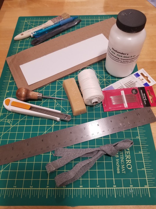
Here you've got my regular sewing, gluing, and paper-cutting supplies. (Not pictured: bookcloth, fancy marbled cover paper, cardstock, an extremely scuzzy old ball peen hammer (heehee) I rummaged out of the machine-shop of random tools in various states of dubious usability we inherited from the previous owner of the house.)
Sewing a textblock uses linen thread & beeswax (for the thread), darner or chenille needles, an awl, something to punch into (cardboard), a marked paper to mark your signatures with (the white paper with notches), and a bone folder for creasing folded pages (black thing at the back). Thicker books also require (sort of a strong word, but most people seem to do it) some sort of fabric tape; I have grey twill tape that I got from Joann's.
Gluing uses flour paste for some things and a sturdier PVA glue for others. I do have a brush, but I often just use my fingers tbh.
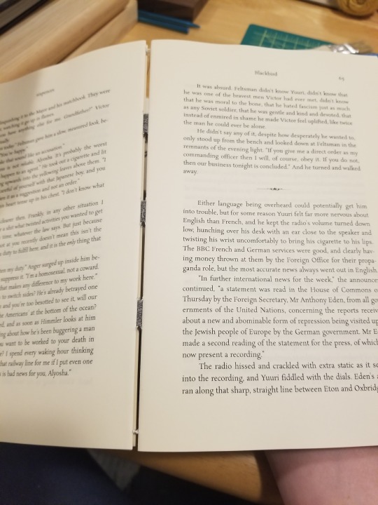
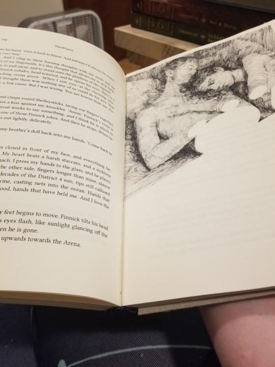
Before you glue it you can see the tapes when you flip between signatures -- once it's glued the pages are all nice and flush. :) The unglued one on the left is Blackbird by sixpences and the glued one on the right (and the one in most of these pictures) is Weather With You by @thewuzzy, who has kindly allowed me to flail occasionally in their direction while putting together a couple copies of their fic, lol.
I format in Word and print booklet-style from adobe pdf reader with 8.5x11 inch six-page signatures, which works out to be twenty-four 5.5x8.5 inch book-pages in a signature. This means a 360 page book only uses 90 actual full-sized pages, which is good, because I have the paper custom-cut so the grain runs in the right direction. Shipping paper isn't cheap, it turns out.
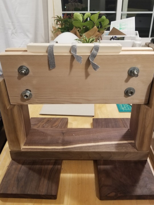
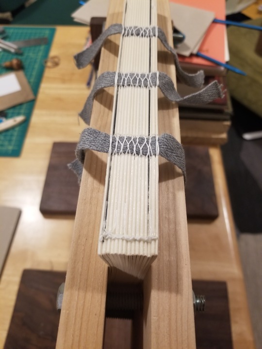
My family is all aware of my new hobby and they think it's really neat, so they helped me build a press, which is how I glue and round the spine. Above on the right you can see the twill tapes and how I sew the signatures together; this book is about 350 pages or 100k.
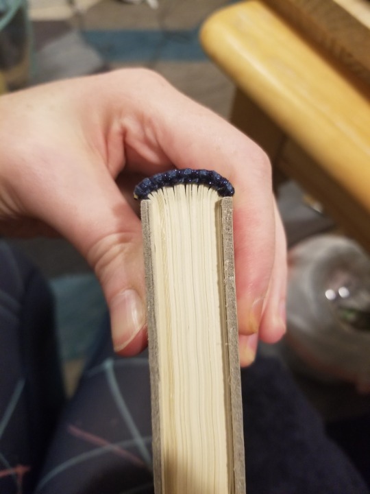
Today I was working on rounding the spine and giving it shoulders (that mushroom shape) and sewing on headbands for WWY. This copy has a dark grey-blue thread alternating with blue metallic sewn directly into the top and bottom of the spine.
Those grey boards on the sides are what the case will be made of -- but they're too short. :( There's something I could try, but I'm probably just going to end up buying new boards because I'm kind of terrified of fucking it up, lmao.
The copy with headbands is ready for covering the spine with cloth and paper. Then I need to figure out my board dilemma so I can build the case and put it in there and slap in endpapers and cry when it's a bit crooked.
So anyway. Hours and hours and hours and hours of work, and honestly it's one of the most fun things I've done in months. There's a discord I'm in and everyone is cranking out amazing stuff every day and it's just really fucking neat to see this much love for fanfiction, which is what most of us bind.
(You should bind some star wars stuff! :P lots of people in the server do star wars things.)
#bookbinding#adventures in bookbinding#realized i almost uploaded a picture where you could see my half-clothed reflection in the window lmao#just chillin in bathrobe problems#listen this isn't a cheap hobby but that's probably because i have snobbish tendencies#you can really get away with very little and make very neat stuff#my activities tracker informs me i have worked on bookbinding almost every day for like fifty days now#i'm trying not to buy more stuff than i will use on maybe ten books because it's hard to say if this is a ten-book hyperfixation or#an off-on lifelong hyperfixation like drawing and writing are. we'll see!#long post#edited because motherfucker i can't do math lol
20 notes
·
View notes