#and then I modified and drew over and coloured etc
Explore tagged Tumblr posts
Visit Tumblr Blog
Explore Tumblr blogs with no restrictions, modern design and the best experience.
Last Seen Tumblr Blogs


Fun Fact
In 2020, 44% of users from Denmark used Tumblr daily.
Text

May 2034, Jamie Tartt's farewell to football and A.F.C. Richmond
"So, you know, I hope I've given half as much as I got. And we can never really know what the future will bring, can we, but there's one thing I know for certain..."
A breath in, a breath out into the trembling air, as the stadium waited in silence that felt too close to reverence. Jamie bent his head slightly, and lifted his shirt to meet his lips.
"I'm Richmond till I die."
And he kissed the badge.
#ted lasso#jamie tartt#i couldn't stop thinking about jamie playing for richmond his entire (great and legendary) career and about his farewell#getting to say goodbye properly and on his terms#and I had to manifest it into something or else#i wanted to have a banner with the same feeling as “speravo de mori prima” (i had hoped to die before this) from totti's farewell to rome#but that's impossible to replicate i fear#so i've gone with a play on the hope that kills you so it's still sort of a callback#n.b. the basic outlines of the stadium and the player figure are based on stock photos#and then I modified and drew over and coloured etc#just for disclosure#also I spent so long on the crowd background that i thought it was going to be the end of me#only to realise at the end that it didnt really make sense for the background to be so clear and sharp#whatever ig it's the vibe that counts#afc richmond#obviously in this you cant see them but roy keeley rebecca ted georgie beard nate the himbos etc etc are all on the sidelines#having a cry#ted lasso series#ted lasso post canon#ted lasso show
20 notes
·
View notes
Text
Wed 6th March, PS image selection and masks
Today we explored the process of selecting images and creating masks. Honestly, I struggled a lot with this process today and I felt like I kept falling behind during the instructions. I found today very difficult.
We began by trying and using the brush tools in PS and adding multiple layers:
Here are some annotated notes about masks:
IMG1: Layer Mask tool
IMG2: How to tell if you have successfully made a layer mask


IMG1,2: Practicing drawing with the Brush tool and exploring different types of brushes: roundness/hardness etc.
IMG3: Brush tool icon (B)
We practiced using the marquee tool and drawing and removing shapes.


IMG: Drawn circle and removing circle with marquee tool (M)


IMG: Marquee tool icon and menu
(Select option drag removes) (Opt+V+drag: copies on same layer)
We then moved along to selecting an image with the marquee and duplicating it (Opt+V+drag: copies on same layer) and then using Command J to duplicate it on a new layer.


IMG: Duplicated boat after selection with marquee tool
Then using the brush tool set on black on the separate layer, I created a mask and removed the edges of the image to blend it into the background.
Brush tool on black: removes
Brush tool on white: adds back

IMG: resized duplicated boat
I used Command T to use the gizmo and resize the new boat.
My mask now looked like this:


IMG: Mask after using brush tool to edit
Next we recoloured an orange:
We used the polygonal selection tool and the ellipse selection tool to select the orange, then changed the colour balance of the selected path. I used the elliptical tool to remove part of the selection by holding option and creating the selection, then used the tool to remove parts that were not supposed to be in the orange selection.
I then edited the details of the selection further using the lasso/polygonal tool to draw lines for a more accurate selection.
Shift: Adds to the selection
Option: Deletes from selection
IMG1: Lasso Selection tool Icon
IMG2: Orange selection


IMG1,2,3: Recolouring the orange using hue/saturation and colour balances to make it green
We did the same on this image, which required using bezier curves to draw the shape:
Using the pen tool (P) I drew over the area of the leaves I wanted to recolour later. I also used the direct selection tool to make this selection more accurate. I opened the paths tools:
Windows: Paths
Command + Click on image icon to create new path out of selection
Then using the colour balance and hue and saturation tools I recoloured these leaves on the NEW selection of the layer mask


IMG1: Pen tool drawing over the leaves
IMG2: Finished edit
We then traced around a hummingbird:

The wings were blurred so we had to refine that shape. I first used the object selection tool and selected the bird and added it onto a new layer. I added a new layer of a green fill to help me see the edges of the wings better:
I also made this selection a layer mask:


IMG1,2: Green background added
I then drew around the wing using bezier curves, brush tool with adjusted softness and opacity to create an accurate selection then blurred the edges to align seamlessly with the new background:

IMG: Edited bird wing
I added the bird onto the background:


IMG1: Bird added to background
IMG2: Adjusting curves on bird
I then used the curves tool to modify the light shining on the bird:


IMG1,2: Further curve adjustments
Finally I blurred the edges of the bird to help it blend more into the backdrop:
IMG: Final

Honestly, I didn't feel very comfortable with my skills today. I was not pleased with how slow I felt compared to others when creating image selections, layers and masks and felt quite agitated wit myself. However, I will go and rewatch the lecture and practice in my free time to get better at this.
1 note
·
View note
Text
Taiyuu Prequel: A mess of a day
The train to Taiyuu was a long one. The speed the train was going at accentuated and exaggerated the little shakes of the carts.
The carts were full of potential candidates, a boy who radiated heat like a small furnace, two people with stars glowing through their hair, a boy made out of slime, there was one boy at the back who was playing with a couple batteries. And then there was Andrew Meda, the boy made of pure energy, beside him sat his friend Nento Attoteki.
Andrews doesn’t see the way normal people do, so Nento had to describe herself when they first met. Nento described herself as ‘just sort of someone. My hair’s a faded blue mess and I have way too much acne. I wear these ugly glasses, as you can obviously tell and, I don’t know, I’m just a regular turbo-nerd.”
Andrew didn’t know why Nento put herself down so much, from his point of view she looked fine. Andrew doesn’t even know what acne is. Or the colour blue.
“It looks like there are a lot of people here Andrew.” Nento said, her voice quivered.
“And now they’re all looking this way.” Nento continued. Nento shrank away from the attention Andrew naturally (An)drew.
“Ish fine. TH-er aw-ll here tuh-bee heroes, ever-one seemsh cool.” Andrews words all slurred together, his energy body had no mouth or vocal-chords so talking required some extra concentration.
“There are some types that want to be heroes, not all of them want to be good. Like that guy with the grey skin, I am getting some bad vibes from him.” Nento, quickly drew judgement about a boy Andrew couldn’t recognise.
“Can’ t see gRey Nen.” Andrew gave Nento a quick reminder.
“Wai, no, stop juh-jing people so k - kwi-” Andrew threw up his hands in frustration at not being able to pronounce the word.
The floaty stumps that tipped each one of Andrews arms formed full hands with full fingers. He thrust them out in a compressed thumbs-up shape.
‘Quickly’ Andrew signed.
After Andrew signed the appropriate word his hands and fingers dissolved back into their floaty stump shape.
“I know, you’re right. Wouldn’t want to be on his bad side though.” Nento kept going.
The two continued in idle chatter on the train, Andrew chastised Nento whenever she quietly badmouthed someone.
Andrew had come to Taiyuu today to take the entrance exam, ever since he was a kid he’d always wanted to be a hero. Nento came to just get away from the house, she was going to catch the next train back to the mainland and meet up with Andrew after he was done.
The next train back to the mainland was in about 20 minutes so Nento and Andrew had some more time together.
“It says here, that you all take the written test. It should be modified for you. Then it is the practical exam, that should be a breeze for you.” Nento read from the papers that were sent to Andrews house.
“Alrigh’, I’ll see you after yeah?” Andrew asked his friend.
“Yeah. Send me something when you’re done and I’ll meet you at the train station.” Nento responded, her posture was nervous but she rarely went anywhere without a plan.
“Sounds good. Anyfing comes up don’ be afrai-d to shoo’ a message my way.” Andrew said.
“Of course. I’ll see you later Andrew.” Nento said before walking off.
Andrew continued with the flow of people, he got the occasional double take and hushed whisper about his unique body. He didn’t mind, he liked the attention, it made him feel special. The crowd funnelled into the Orientation Zone, Andrew forgot the building name.
The Principal, Laccadaisy, pointed out all the major landmarks of Taiyuu, the dorms, the track, the classroom buildings, the multitude of gyms, the etc. She explained how the day would work, first came the written exam and then the practical exam, once you’ve finished everything you can go home. The details for the practical exam came later.
Just as the written exam was going to start Andrew was pulled into a different room by someone who introduced themselves as Aurora. Aurora was going to read Andrew the multiple choice questions and options and Andrew would tell her which one he wanted to fill out.
The questions were mainly about the laws regarding heroism and quirk usage. When it's okay to step in and when isn’t and how to prioritise civilians in dangerous situations.
After everyone had finished the written exam they were explained the details of how the physical exam would work. There were 8 trials total, each student was randomly assigned 3. Sounds easy enough. Andrews sheet was written in japanese and braille, he got assigned trials 1: Shaky Shimmy - located at the track, 3: Dogcatcher - located in the forest, and 5: rope climber - located near the coast of Taiyuu.
The Shaky Shimmy Trial would be happening at the track very soon. Aurora pointed Andrew in the direction of the track field and he took off.
It didn’t take too long for him to catch up to the silhouettes of the other people doing the Shaky Shimmy Trial. One was radiating heat off them like crazy, one had the night sky in their hair, and there were two more unexciting people.
They were all standing around awkwardly with the silhouette standing at the front, Probably Laccadaisy, impatiently looking at her wrist.
“Wait up! Hold on!” Another boring silhouette came running from behind the group. They already looked out of breath.
“Now that we’ve got all 5 of you we can start.” Probably Laccadaisy said.
“Start the Sh-” The Furnace Person said. “The Shaky Shimmy trial, yes. Your goal is to get to where those orange cones are.” Probably Laccadaisy answered.
The two cones were about 10 meters in front of the group framing some the track lines of the field.
“Oh, well that’s not that bad.” One of the boring silhouettes said.
“3 times. Just two laps of the track and you’ll be good.” Laccadaisy responded with a bit too much excitement.
Andrew couldn’t see where the track lines were, but he assumed it’s the hard stuff without grass. It made a large oval shape about 400 meters in length.
“Alright, line up, get ready.” Laccadaisy said, she stood to the side of the track and raised her arms.
The students all picked a lane, the ones with meat started doing stretches to limber themselves up. Andrew could tell the one radiating heat was getting hotter, more around the shoulderblades than anywhere else.
“3. 2. 1. GO!” Laccadaisy shouted. One of the boring silhouettes started skating forward; the rules of friction didn’t seem to apply to her now. The hot ones back exploded in fiery wings and he shot forward, like a high speed jet or a particularly angry Phoenix. Andrew, not wanting to be outdone flew after the flaming phoenix as fast as he could.
Once Andrew and The Phoenix reached a curve in the track the ground started shifting across the whole field. The Phoenix tried to turn to make the curve but lost height in the process, they crashed hard into the ground. Andrew gave them a mock salute as he overtook them.
Andrew continued pushing forward, it wasn’t too far until he would finish his first lap when he heard a voice behind him say.
“I’m not losing like that!” It was the Phoenix, quickly back in the air after eating dirt. The second bend wasn’t too far away now, Andrew could control his flight easily enough that he decided to do an air drift over the second bend.
The Phoenix, predictibley, hit the shifting ground again.
“FUCK!” They called out.
Andrew raced past the orange cones, starting his second lap. Ahead he spotted the two boring silhouettes, one was really struggling against the shifting landscape as they hadn’t made it past the first bend, the other had already skated past the first bend. The silhouette with the Night Sky in their hair was about halfway between the other two, they were skating too but not as well as the boring silhouette in front.
Andrew flew over the first boring silhouette who was still struggling to gain his footing. The Phoenix was back in the air and hot on Andrew’s heels.
Andrew took the bend narrow, hugging the inside of the track. The Phoenix ended up taking the bend wide and started to lose altitude when WHAM they slammed right into the silhouette with the Night Sky in their hair. Andrew winced at the sudden impact between the two. Instead of tumbling straight into the ground The Night Sky stayed upright, The Phoenix used the Night Sky to keep himself balanced and in control of his flight. The Night Sky got a free speed boost, The Night Sky’s shoes sliding perfectly across the shifting and tumbling ground.
Andrew kept pushing forward, past the second boring silhouette that was skating. The Phoenix hadn’t stumbled across the bend and was catching up. The skating silhouette joined the train of the Phoenix, adding even more to the stability and control the Phoenix originally lacked.
The second and final bend of Andrews lap two was coming up soon and the Phoenix Train was catching up. The boring silhouette placed her hand on The Phoenix’s face and the Trains speed was increased by a little bit more as the Phoenix Train all of a sudden had less drag.
The three were gaining speed and catching up to Andrew when finally the bend came. Andrew took the bend narrow again, keeping as close to the inside as possible. The Phoenix Train took the bend a bit wider. The Night Sky and the boring silhouette kept The Phoenix from crashing into the ground. The Orange cones were close, so was the Phoenix Train. The two groups were pushing further and further until… There, The Phoenix Train pulled in front at the last second.
“Don’t stop now! We still have one more lap to do!” The Night Sky said.
Andrew pulled off to the side having finished his two laps. He caught his nonexistent breath while the other three finished their two laps. The Phoenix Train pulled up after not too long, the last boring silhouette had to keep huffing along.
“Woooahhhh! That was so cool, I mean hot! Whatever!” The Phoenix said.
“I’m Nerva Rekka - Burning Soul.” The Phoenix, no, Rekka said. Name, then Quirk, as was custom nowadays.
“Meda Andrew- Energy Physiology.” Andrew responded.
“Naishin-Sunomu Isejin - Sandman.” The Night Sky, Isejin said.
“Kouka Fuitchi - Path of Least Resistance.” The boring silhouette, Fuitchi said.
“Dude you were so fast, it was like zoom and whoosh and PHWAAAA.” Rekka said, with equally extreme hand motions to emphasise the sound effects.
“No meat, no drag.” Andrew said. He liked simple and short words, they were easier to say.
“You look so, sparkly, almost see-through.” Isejin commented.
“Rekka what as with that reckless flying! It was so cool, you could have gotten hurt.” Kouka said excitedly.
“It’s no biggie really, just ate it a few times.” Rekka said, brushing the dirt on his face and torso off.
As Andrew was thinking of something to say the fifth participant of Trial 1 finished up.
“Huff, huff. What the fuck,, was that.” The new boring silhouette doubled over gasping for breath.
“You good?” Isejin asked.
“Fuckin, barely, I swear to god the next test I’m in better have a robot or some shit.” The new one said.
“You are?” Kouka asked.
“Zeke Funkee - Electrokinesis” The basic silhouette, Zeke, said.
“I think the next Trial’s starting now.” Rekka said.
“Fuck.” Zeke said, or was it Kouka.
“That’s me.” Kouka said, probably, the two look so similar.
“Anyone else?” Zeke asked the group.
“Nope. I’ve got a bit of a break.” Rekka said.
“No, I’m the one afta.” Andrew managed to stumble out.
“I’m the same as Meda.” Isejin said.
“Alright, off we go then. Um, I never got your name.” Zeke said to Kouka
“It’s Kouka, lets go Funkee.” Kouka said, slightly dragging Zeke with her.
“So are we watching Trial 2 or what?” Isejin asked the other two.
“Yeah, that's at the forest, isn't it?” Rekka said.
“Souns goo” Andrew said.
The three made their way over to the forest area where the 2nd Trial was happening. They sat a distance away from the trial happening.
“I like to play a game with my dads where we try to guess other people's Quirks, you lot wanna give it a try?” Rekka asked the group after they sat down.
“Sure.” Andrew said. “I’ll give it a try.” Said Isejin
The trial started and some wolf shapes started lunging at the student shapes. One student threw something that grew out of their hand.
“Uhhhh, that one’s really good at throwing things!” Rekka interjected.
The thrown thing exploded into huge gobules of cotton candy, it stuck a couple wolves together making it easier to dodge them.
“I think it’s a cotton candy bomb.” Isejin said.
“Tha’s a safe bet” Andrew said with some effort.
A wolf lunged towards another student, but they were pulled back by their jacked in the nick of time.
“What’s that, a cloth manipulation one?” Rekka said.
“Yeah, I think so. They’re moving as if they’re being dragged by their clothes.” Isejin agreed.
Andrew saw something the other two didn’t, his energy sense finally came in useful, the clothes on their body were colder than everything else. Super cold, like starting to freeze temperatures.
“No, ish bit more. Cold.” Andrew said.
“Huh, cold quirks suck. Garbage. I hate ‘em. YUCK.” Rekka said.
One student simply stood still, sometimes a wolf would approach them but after they did a small maneuver the wolves lost interest.
“What about her?” Isejin asked.
“I don fink hers is suited for this trial.” Andrew said.
“She’s totally Quirkless. That’s super impressive!” Rekka said.
The trio's eyes and similar sensory organs shifted towards a girl who launched into the air, propelled by a platform underneath her.
“Woah. That one’s flashy.” Isejin said.
“Yeah, is that… asphalt or concrete or something like that?” Rekka said.
Andrew’s energy sense came in handy once again. The pillar was warm, not boiling hot but not room temperature.
“It looksh like freshly laid asphal” Andrew said.
“I mean, I guess so. Sorta.” Isejin said.
The group moved focus again.
“What about her? She’s not doing anything flashy.” Rekka asked the group
It was the girl that was standing still again.
“We alread-ee talked abou’ her.” Andrew said.
“Really? What was the verdict?” Isejin asked
“That she was Quirkless but it was cool.” Andrew responded.
“Ooooh yeah! I remember now.” Rekka said.
The group faced towards the next person, this one has almost comically long hair.
“Woooahhhh. That’s so cool!” Isejin said.
“Yeah, that looks like it could come in useful for like, stealth missions and that.” Rekka said.
“What are you talking abou? I can’ shee anyfing.” Andrew asked.
“Seriously dude. It’s so obvious. They’re hair’s changing colour!” Rekka exclaimed.
“Oh, okay.” Andrew said.
There was another student who was dodging wolves only based on his own athleticism. Rolls and tucks and short sprints all over the place.
“Seems like a strength quirk, or maybe they’re just in shape.” Isejin said.
“Yeah, I dunno. There’s nothin superhuman about it. What do you think Andrew, you seem to see some stuff we don’t.” Rekka said.
Nothing out of the ordinary revealed itself to Andrew’s unique sense.
“Dunno, just seems like a regular dude.” Andrew responded.
“What about her.” Rekka pointed at someone.
It was the girl standing still again.
“She’s just standing still, maybe some sort of stealth Quirk.” Isejin said. “Guysh, we already talked about her. Twice.” Andrew said.
“Wha. Oh yeahhh, now I remember. Silly me.” Rekka said.
“Hmmm, that is a bit odd.” Isejin said.
The trio spotted Zeke and Kouka again. Kouka was being super slippery with her movements, the wolves couldn’t get a hold of her. Zeke was already pinned to the ground.
It wasn’t too long before the trial ended. In a couple minutes the third Trial would be up and running.
“Welp this is my trial. See you both later.” Isejin said.
“I’m doin this one too.” Andrew said.
“Alright, I’m gonna grab a snack. I’ll catch y’all later.” Rekka said.
Andrew and Isejin were already in the right time and place for Trial 3: Puppy Catching. It took a little bit for the other silhouettes Andrew assumed were students to funnel in and out. After a quick headcount from the silhouette in charge, probably Laccadaisy, she squared up and announced.
“BEGIN!”
There were flashes of kinetic energy everywhere as people took off running. Andrew took off into the sky and kept his “eyes” open for the distinct silhouette of a wolf. His vision didn’t blur or decay over distance like a normal human does, it sometimes gets a little overwhelming but it comes in as an advantage today.
He scanned around from his vantage point. His full 360 field of view was an advantage for scouting.
‘Wolf shape, wolf shape, THERE!’ Andrew spotted a gaggle of the plant puppies breaking off from the crowd. He took off chasing the breakoff group, the best he could do is round up 4 of the Good Boys at once.
Andrew was tailing the gaggle of Plant Dogs but he couldn’t quite catch up to them. The group was always just out of his reach. This wasn’t a problem for Andrew, he reached out with both hands and his arms extended far beyond human proportions.
His long noodle arms wrapped around two Plant Puppies and pulled them close to his chest. Andrew did a quick aerial maneuver so that his chest faced the sky and his legs were at his front. Andrews' legs then stretched out and wrapped around another two Wolves and pulled them close.
Andrew looked like a chandelier of a jacket and wolves as he raced back to the starting area to claim his Good Boy points. When he reached the starting area the person in charge called out to him.
“Good job Meda, that's four points to you.”
“Fan-s Lacca-d-d-day-see” Andrew assumed it was the principal running this exercise.
“I’m not...” The silhouette began but Andrew was already gone taking off into the forest again.
Andrew was searching for another set of dogs when he spotted the Person with the Night Sky in Their Hair sitting and surrounded by sleeping dogs. He flew past them as more and more dogs went to approach them.
He flew past as Isejin gathered something that acted like sand or dust and launched it at the new dogs. Isejin waved up at Andrew.
“H-Hey.” Andrew managed to stutter out.
WHACK! In his light daze Andrew wasn’t watching where he was going and slammed right into a tree and its branches at high speed.
“Aww my jahck-eh iz rew-inned." Andrew managed to stumble out. A branch had managed to go right through his energy body and poked a huge hole in the back of his jacket.
“Woah, are you okay?” A new silhouette said from next to Andrew. Which is weird because he’s far off the ground. Andrew managed to maneuver his jacket free of the branch, his energy body could easily shrug off a branch through his chest.
“Yeah. Jush tings a lihl.” Andrew responded.
“Just be careful when you’re in the air, aight?” Andrew got the chance to take a better look at this new silhouette now that he wasn’t impaled. The silhouette didn’t have any distinct energies or silhouettes. Just a regular person floating next to Andrew.
“I’ll try harda.” Andrew emphasised with a quick laugh at the end.
“The exercise is over!” The person running the exercise, Laccadaisy probably, called out.
Waiting/Exploring - Not recognising people
After the end of the exercise the students piled together in one place, one student ran off to attend the next trial but the main student body just stuck together. Andrew spotted the Night Sky of Isejin through the whole crowd of silhouettes. He flew closer before he was asked by one of the silhouettes.
“I haven’t seen anything like you before? Such a unique physique.” said this new silhouette
“Uhm, yeah. Mah Quirk is Energy Physiology.” Andrew responded.
“Your whole body is made of plasma? Fascinating. I’m Naishin-Sunomu Seisho - Bioelectricity Manipulation.” The silhouette said. Naishin-Sunomu, wasn’t that the same as Isejin?
“Not plas-” Andrew started but was cut off by another silhouette.
“Nice to see you back in one piece. I’m Sainoch Yurei - Phantasm.” The silhouette said. “Yeah, i’ was jush a scrach. Mah jahk-ehs coul’ use a rep-air though.” Andrew struggled out.
“You really helped me out there Seisho, thanks.” Another un-unique, an ique silhouette approached the small group.
All the other students talking amongst themselves, their unrecognisable voices blended together, the movement of all the students made it hard to keep track of who was where and with who.
“Yeah, how’d you find the trial Andrew?” A silhouette said.
“It wash preddy easy I fink. I got four poin’s, wha abou’ you Seisho?” Andrew said.
“I’m not Seisho, I’m Kayaki.” Kayaki? When did Kayaki get here? Who’s Kayaki?
“Yeah, m bad.” Andrew said apologetically.
“I’m shree, I’fe gotta go. I fink my next Trial is up soon.” Andrew said to the small group that had gathered.
Andrew flew off from the group. His next trial was the Rope Climb, located near the coast of Taiyuu. He spent his time looking around the cliffs and beaches of Taiyuu. Along the way he spotted a short silhouette with a large hat. He floated close to the small silhouette assuming this was where the next trial would be.
“Can I help you?” The silhouette said when Andrew got close.
“Is this where tha rop-ah climin trial is?” Andrew said.
“Not quite kid, follow this cliff face round till ya hit the ocean, then head up, go North-by-North-East by 62 paces and ya should be right there.” The silhouette said.
“Okay, fanks.” Andrew said.
‘Those were some confusing directions’ Andrew thought to himself.
He followed the cliff face around for another while until he finally hit the ocean. He then flew straight up the cliff face.
‘Which way is North-North-East?’ Andrew thought. Compass directions are wild and weird and whacky. Andrew kept flying up to gain a vantage point to see if he could spot any groups of people.
He was scanning the environment around him, “eyes” darting around the place searching, searching. THERE. Andrew found a cluster of people standing in front of a small thin line of stuff, probably rope.
Andrew rushed towards the group, hoping he wasn’t too late. He was close by when the silhouette in charge spotted him. Andrew landed near the back of the students, his energy “feet” never touched the ground.
“Well it looks like we have a volunteer. Late start. Step forward.” The silhouette in charge said.
Andrew imitated a step forward as he maintained his floaty nature.
“Just slap the rubber ball up top and you’ll be done.”
Andrew nodded with his whole body and flew up to the top of the rope.
‘Rubber ball, rubber ball.’ Andrews lack of traditional sight has betrayed him once again. The silhouettes of the rope all blended together and looked the same. Andrew was a little confused and just smacked the highest point of the rope.
“Nope, that’s stone.” Called the silhouette in charge.
“Oh, shree.” Andrew apologized. He aimed a fair bit lower and smacked there.
“That’s rope.” Came from the silhouette again.
“Uhhh.” Andrew aimed a bit higher and smacked. If he had blood it’ll all be at his face.
“That’s the one. You’re all good.” The silhouette called.
“Fanks.” Andrew responded quietly. He slowly floated down back to the ground. It was the other students' turns but Andrew didn’t really care at this point, it’s been a long day. He just floated back to the train station on Taiyuu Island.
Train ride home/ Meet up with Nento
While Andrew was on board the train he pulled his phone out of his pocket. His other hand formed a full finger to unlock his phone. After some struggling he got his messages app open.
‘Alright, deep breaths Andrew, take your time.’ Andrew hyped himself up for this bit.
“Ne-n-t-oh” He managed to struggle out.
‘Sending message to Nento’ The phone responded.
“I’m do-ne wif my physical tri-als. M-e-e-e-et y-ou at the lib-rar-ee?” Andrew slugged through, talking so much was like rolling a metal ball through his nonexistent mouth. Andrews' phone wrote down what he said and with a voice command it sent.
After a minute a blip came from Andrew's phone.
‘Message from Nento.’ The phone's text-to-speech said. Andrew fumbled around with his phone again until he could get it unlocked.
‘Sounds good. I’ll meet you there.’ The phone said aloud.
Andrew enjoyed his time on the train. It was a break from the bright and unending technicolour barrage from the sun. All the energy coming off of it was so intense and focused, it gave Andrew a headache. The night sky is far better, Andrew could see all the energies of such far off places with vivid detail. The sky was beautiful at night.
Andrew nodded off a little for the rest of the train ride, when he woke up again he was only 5 minutes from the mainland station. Andrew navigated his way through the familiar streets of the city until he found the library.
Andrew got his messages app on his phone again and prepared himself for the high-concentration speaking action that tired him out so much.
“I-m outsi-de Nen--to.” Andrew said. The phone bleeped and blooped and sent the message. Andrew was stuck outside the library, he didn’t want to disturb the peaceful goes inside. After a little bit someone exited the library. This person's hand signed the letters for “A” and “N”.
“Hey Ne-nt-o.” Andrew said to his friend.
“Hey Andrew.” Nento said back.
The two made their way back to the Train Station to head back home. The two walked most of the way in silence, perfectly comfortable with the other.
“Hey Andrew.” Nento piped up. “Wassup.” Andrew slurred out.
“Do you think Nick would mind if I stayed over?” Nento asked. “Nah, not at all.” Andrew said.
#andrew meda#rekka nerva#Naishin-Sunomu Isejin#naishin-sunomu seisho#sainochi yurei#fuitchi kouka#zeke funkee#taiyuu#taiyuu-oct#bnha fic#mha fic
6 notes
·
View notes
Text
In-Depth – History of the Rolex Submariner – Part 2, The 55XX References and 1680 Date
Welcome to Part 2 of our four-part, in-depth series on the Rolex Submariner. In Part 1 we covered the origins of the Submariner, the context in which it came to market and the first generation 6XXX references. You can find all the details here. Now, we turn our attention to what can broadly be considered the second generation of the Rolex Submariner: the 55XX references. We’ll also cover a watershed moment in the model’s development – the seemingly innocuous decision to add a date window. Not exactly a bold move I’m sure you’ll agree, yet it’s one that has come to redefine the Submariner and still divides opinion to this day.
As we saw in Part 1, in the early years of the Submariner, Rolex was busy reworking and evolving the model in that ‘oh so subtle way’ that only Rolex can pull off. Over a roughly five-year period, five different references were released, with a number of variations (or ‘Machs’, as the collectors like to call them) within these. By the time we get to the 55XX references though, things start to settle down a bit. Indeed, after some further experimenting Rolex lands on the key design characteristics for its Submariner that it will adopt for the next three decades (with many variations along the way, of course, most of which we will not cover here). Before that though, there were the two inaugural models in the Ref. 55XX series, which can be seen very much as the bridge between the first and second-generation of the Submariner.
Ref. 5510 & Ref. 5508 – 1958 – 1962
Although the reference number of both these models begins with ‘55’, they resemble the earlier 66XX references much more closely than the later 55XX references. That’s largely due to the fact that they were in production at the same time. In fact, the Ref. 5510 – the last of the ‘Big Crown’ Rolex Submariners – is virtually identical to the two-line Ref. 6538 we covered in Part 1. The key difference being that the Ref. 5510 was the first Submariner to use the newer 1530 calibre. The watch itself was only in production for a year and shares all the same traits of the Ref. 6538, including Mercedes hands, 200m water-resistance, etc.
Ref. 5510, the last of the “Big Crown” Rolex Submariner watches
At the same time, Rolex also released the Ref. 5508, which is much more similar to the Ref. 6536/1 we also covered in Part 1. This model features a smaller crown and thinner case, meaning water-resistance of 100m only, instead of 200m. We can start to see subtle dial evolutions here too, in terms of layout and text. Most notably, the upside-down triangle on the bezel transitions from a distinctive red to a more understated silver; a design trait that has carried through to the modern Submariners.
The small crown Ref. 5508, here with a silver-coloured triangle.
The 5508 is also the first reference of the Submariner to start using tritium paint to illuminate the dial, as opposed to radium. Until this point, the latter had been the material of choice for most watch manufacturers, until the health risks of using a radioactive material became apparent.
Perhaps most importantly for collectors though, is the fact that the Ref. 5508, which ceased production around 1962, is the last Submariner ever produced without crown guards.
Ref. 5512 – 1959 – 1980
Although the 55XX references technically started with the two models discussed above, it’s fair to say that the second generation of the Rolex Submariner actually begins with the Ref. 5512. I would even go as far as to say that when most collectors collectively refer to “vintage” Submariners, it’s likely this is the model they’re thinking of. This is the blueprint for the modern Rolex Submariner.
An early execution of the Rolex Submariner Ref. 5512, with gilt dial and two lines of text
The round case is approximately 40mm in diameter and the crown – now 7mm – is protected for the first time by crown guards. The shape and style of which Rolex would change numerous times over the coming years, but never go so far as to remove. Early examples of the Ref. 5512 feature gilt dials and four lines of text: “Rolex/Oyster Perpetual” below 12 o’clock and “200m/660ft/Submariner” above 6 o’clock. Just under a decade into production, the gilt dials became matte black dials. Around the periphery is the now-familiar rotating hashed bezel, first with an upside-down red triangle and then later a silver one. Both with a luminous dot in the middle of them.
An intermediate version of the Rolex Submariner ref. 5512 with “meters first” matte dial
Rolex would, of course, continue to make tweaks and changes to Ref. 5512 over the years, most notably to the dial. We’re not going to go into all the minor variations here, but perhaps one of most significant is the introduction of an additional two lines of text above 6 o’clock; “Superlative Chronometer / Officially Certified”. This marks the point (early 1960s) where Rolex shifted from using the non-chronometer calibre 1530 to the certified calibre 1560. This would later be updated again to the calibre 1570, which itself would be updated with a hacking mechanism in the early 1970s.
A late version of the Rolex Submariner ref. 5512 with “feet first” matte dial
These two extra lines of text also serve to distinguish the Ref. 5512 from the almost identical Ref. 5513, which we will look at in more detail now.
Ref. 5513 – 1962 – 1989
The Ref. 5513 came to market in 1962, around three years after the Ref. 5512. In a nutshell, the two watches are exactly the same, except one got a chronometer movement and the other didn’t. Of course, this being Rolex, things are a bit more nuanced than that. Regardless, this was a clever marketing move by Rolex as it allowed them to position the Ref. 5512 as the more premium option of the two. This then opened the market up to those who wanted a Rolex Submariner but didn’t necessarily want to pay extra for a chronometer movement. And in fact, the Ref. 5513 used the same calibre as was found in the first Ref. 5512s – calibre 1530.
One of the reasons collectors get so excited about the Ref. 5513 though, is that this is the Submariner Rolex tended to use for its more liberal experimentation. For example, there’s the sought-after ‘Explorer’ dial Ref. 5513, produced between 1962 and 1965. As the name suggests, this Submariner has an Explorer-style dial (with Arabic numerals at 3, 6, and 9 o’clock), much like the Ref. 6200 we covered in Part 1. (Although the dials themselves look very different between the two references.) This was the last of the ‘Explorer’-dial Submariners, making them very sought-after.
One of the rarest Rolex watches, the Rolex Submariner 5513 “Explorer Dial”
Another famed Ref. 5513, is the ‘Milsub’, a Rolex Submariner made specifically for the British Ministry of Defence during the first part of the 1970s. The Ref. 5517, a special reference used exclusively for the British Armed Forces, later superseded this in the second half of the decade (and it’s also possible to find double referenced 5513/5517 models too). It’s hard to imagine today, but Rolex actually modified these watches at the factory to satisfy MoD’s specific requirements. These included fixed bar lugs instead of the usual spring bar variety. The dials also needed to be easily readable, and therefore featured larger “sword” hands and showed the international symbol for Tritium, the encircled letter “T” that can be seen just above 6 o’clock. Another unique feature is the rotating bezel with sixty-minute hashing (versus the standard bezel which only has the first 15 minutes).
There are also a number of other Ref. 5513 dial variations, to which wily watch dealers have given names such as ‘underline’, ‘double Swiss underline’ and my favourite, the ‘Bart Simpson’ dial. And let’s not forget the important debate of feet first versus metres first. In case you haven’t realised yet, we are not going to go into painstaking detail about the subtle differences in the way dials were printed (primarily for practical purposes at the time), and which have subsequently been ascribed huge premiums based on questionable logic. Sure, it makes the hobby fun, but as much as possible we like to try and stick to the facts here at MONOCHROME.
A late generation Rolex Submariner ref. 5513. Note the glossy dial with applied old indexes, a transition to the upcoming 5-digit versions.
As production drew to a close on the Ref. 5513 in the late 1980s, it was already possible to see the modern Rolex Submariner emerging. The dial was now the glossy black we are familiar with today, and the tritium hour markers encircled by white gold. As you will soon see, these traits would carry across to the next generation of 5-digit Submariners.
Ref. 1680 – 1969 – 1979
Ten years after the Ref. 5512 came to market, and 16 years after the Submariner made its debut, Rolex decided to produce a version with the date. The answer to the question, “why now?” is anyone’s guess. It most likely had something to do with the fact that the company had introduced the Sea-Dweller two years earlier. That watch – which featured a date window, albeit without a cyclops – was markedly thicker than the Submariner due to its increased depth-rating. It’s highly possible that as a result Rolex was inundated with requests that the more wearable Submariner get a date window. Never one to miss an opportunity, the brand complied.
The Rolex Submariner ref. 1680 started its life with a red “Submariner’ inscription (from 1969 to 1975)
Timing aside, the introduction of a date window would prove to be a watershed moment for the Rolex Submariner. The model with the date would eventually supersede the popularity of the original, non-date version, by a substantial margin. So much so, that people now commonly incorrectly refer to the two models as the Submariner and the “no-date” Submariner (whereas in reality the former is actually called “Submariner Date”). Regardless, the addition of a date aperture – magnified by Rolex’s famous cyclops – split the market in two.
The first version is commonly referred to as the “Red Sub” due to the Submariner name appearing on the four-line gilt dial in red lettering. Rolex made several dial variations (or Machs) over the Red Sub’s six-year production life, and again collector’s like to quibble on the details of each. Inside was the self-winding calibre 1575, already at work in the Datejust and GMT-Master. This movement was later upgraded with hacking seconds, so you could set the time more accurately.
The second generation of the steel 1680 (1976-1979) with white “Submariner” inscription.
In the same year, Rolex also made the bold (albeit, in hindsight, not entirely unexpected) move of rolling out the first-ever solid yellow gold Submariner. As the least ‘tool’ watch variant of the two, the Submariner Date was the obvious choice for this new iteration. For many purists, this marks the point at which the Submariner crossed over from functional tool watch to mass consumption luxury watch. (Although I’m told the terms “mass-consumption” and “luxury” are incompatible.) Regardless, the solid, 18k gold Submariner Date was a hit, right down its questionably named “nipple” dial. First appearing in black, it was later followed by a blue dial variation with matching blue bezel.
The Midas Touch, the first full gold Rolex Submariner.
The other variation of the Ref. 1680 worth mentioning is, of course, the “COMEX” Submariner Date. Rolex had already worked with engineering and deep diving operation specialist COMEX (short for Compagnie maritime d’expertises) a few years earlier to develop the helium escape valve for the Sea-Dweller. Subsequently, the brand produced Ref. 1680 Submariners exclusively for the use of the company, for free. In return, Rolex got feedback on how its watches performed in these underwater environments and some fantastic PR. These models – with the name “COMEX” emblazoned across the bottom half of the dial – were never sold directly to the public. The Ref. 1680 versions weren’t fitted with helium escape valves though, so they mostly served as desk divers for COMEX office staff. Rolex also produced Ref. 5513 and Ref. 5514 Submariners for COMEX too, and these were the ones fitted with HEVs.
That closes out our discussion on the second generation of the Rolex Submariner. In Part 3, we will focus on the 5-digit Submariners, and the important changes introduced in this third generation of the collection.
Photos: Antiquorum, Christie’s, Bulang & Sons, AnalogShift, Rolex Passion Market, Lunar Oyster, Hodinkee.
The post In-Depth – History of the Rolex Submariner – Part 2, The 55XX References and 1680 Date appeared first on Wristwatch Journal.
from WordPress https://ift.tt/3aIFv4N via IFTTT
1 note
·
View note
Text
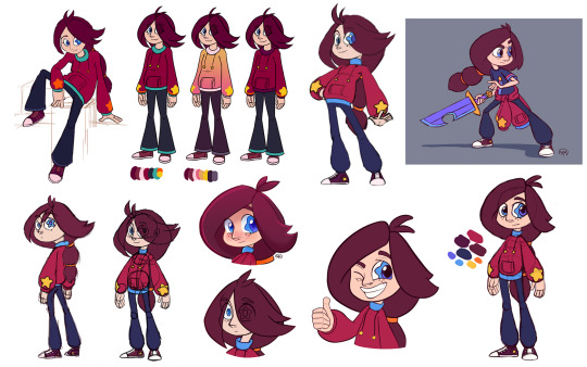
SGZ Anniversary - Cassie and the Comic
The big one, the origin story!!!! And honestly one of my favourite memories to look back on. :’D I’ll be talking about both the idea itself and the evolution of Cassie’s character in what is a BEHEMOTH of a text post, so here we go!
While July 19th, 2015 is the official origin day of SGZ, it started a bit prior to that. I have this story already somewhat explained on the blog’s FAQ page, but I might as well reiterate it here:
SGZ started as an idea in the summer of 2015 after my buddy Laura showed me two webcomics: Paranatural by Zack Morrison, and Vibe by Dan Ciurczak (two comics I highly recommend, please go read them!). I loved how vibrant and beautiful their artwork was despite how different their stories were, and how wonderful the writing and humour was. My two biggest creative passions have always been visual art and writing, but ironically this was what really flicked the switch in my head to actually try comics, the literal combination of the two. Why I didn’t start sooner will forever be a mystery to me, but I suppose a lack of exposure to comics as a kid had something to do with it. Better late than never, right?
The specific launch day of July 19th is an homage to not only the creation of the idea but of the main protagonist, Cassie. After thinking “hey, I could do this!” I started wondering what I should make a comic about. While working at my retail job (on the slowest day in existence), I began to make a list of things that I liked or wanted to write a story about, and stars / astrology was one of them. I had always loved that aspect of mythology, and my affection for stars is a mystery to no one.
I worked at what was effectively a Blockbuster clone in my hometown (RIP Cherry Hill Video) and we had scrap pieces of paper that we made from old movie facings, so the first ever notes and doodles for this series exist on these scraps. I’ve still got quite a few of them, but they got a bit scattered when I moved for college. I’m hoping the rest are at my house somewhere.
I got the idea of a girl with a star in her eye, and called it the Starglass. And, well, the idea went from there! I started researching all of the zodiac signs and symbols, and drew the first (digital) drawing of Cassie when I got back home that day. Which, looked like this:
Seeing this again is not only weird and oddly nostalgic but it’s a testament to where my artistic sensibilities were prior to going to animation school. The idea for SGZ happened mere months before I was thrown into that 3-year fray of insanity so the evolution is pretty odd in places, especially how my knowledge of shape language, anatomy, etc. evolved and how my style adapted to that. I had almost NEVER drawn humans prior to going to college, so a lot of the art for this series deals with my inability to do so at the start. ^^’ The awkward phase, if you will. And as such, it is the first story idea I had that primarily focused on humans.
Looking back on it, Cassie’s character in terms of personality was pretty different than what it is now, but from a visual standpoint there’s (surprisingly) a lot that stayed. The basic idea of her hair stayed, right down to the double ponytail and orange clasps. Her freckles, eye colour and general face shape too, even if that ended up modified after solidifying her character later.
Her main colour was always red, in fact after making the headshot I remember having NO IDEA what to do for the rest of her body, so it just ended up being RED. Then I added the blue for the contrast, but I still wasn’t happy with it at the time (a perhaps subconscious origin for her blue pants though, lol). I also find amusement in the fact that my current concept for her mother Nora has her wearing blue flats much like these.
Based on the notes I have and what I remember, Cassie was older at this point (like 15 or 16 probably) and seemed to be a lot more sarcastic (this is a norm for a lot of my characters, trust me). xD Some of the first character interactions I ever wrote largely involved Cassie being sassy to one of the signs, back when a few of them were being over dramatic (looking at you SCORPIO). I cackled reading those interactions again now that my characters have changed so much. They’re not well written at all but they still let me look back to that time with fondness. :’D
What is also interesting is the progression of her name, or the fact that she didn’t have one right at the start. My earliest notes have simply Starglass or SG whenever I wrote dialogue. I started trying to think of a name, and contrary to popular belief, settling on Cassie actually had nothing to do with Cassiopeia. Though I do really enjoy the irony of that. xD It started with Cass, which could be short for either Cassandra or Cassidy, and I ended up going with Cassidy. I then changed it to Cassie, as I find the -ie suffix makes it a lot cuter. I am biased though, my name ends with it too, aha. There is a note that spells it as Cassi and for the life of me I cannot determine if that was a typo or not, but when I write fast I miss letters sometimes. The nickname of “Star” was one the table for a while too, and now that Star VS exists it’s even funnier. I specifically recall my mother telling me that she was going to suggest Star on the Facebook post I had made for the art at the time, but thought maybe it was too obvious. She was right, though this idea lives on in the nicknames that the signs end up giving Cassie later on, my favourite being “Little Star”.
While development for the story and characters started right away, it got a much welcomed jumpstart at the beginning of my second year at animation school. We were given a character design project that would span the entire year, and would require a story concept to complete all of the assignments. We were told this fact in first year to give us time to prepare over the summer, and I had just pulled an all-nighter to finish an assignment that day, but upon hearing this news I was not tired at all. Character design was already my favourite class, but this put it over the top. That beautiful feeling of inspiration that hits you is the BEST and in that moment nothing else mattered. Not even my fatigue, which I promptly dealt with the next day.
I used this as an opportunity to spend time developing the designs and story progression of all the characters, while getting marks for it at the same time! This is largely the reason I was able to launch the comic a few months after completing that year of school, as it ended up giving me full-sized references, colour schemes, and a much better idea of the story as a whole. Based on when my school years took place, I can actually track the progression of the characters pretty well through the artistic skill upgrade I was getting too.
The progression is pretty wild honestly, especially between 2015 and 2016:
(oh god these are so old help me)
(these aren’t all of them either but I did my best jdhkfhsjkfhskjf)
From 2016 onwards I had the basic idea of her, so her colours stayed more or less the same once I actually added them. Cassie’s hair was one of the things that required a lot more iterations. I had her general idea down for a while, but when it came to making the character pack of her for my character design class, I remember having to sit down and actually figure out how her hair would work, structurally and otherwise, for that High Quality Refinement™ that was required of the project. Her older drawings had the part in her hair be in the middle, and that posed the problem of covering her eyes too much. If she was a more reserved character in any way this could have worked, but nah. I knew from the beginning she was going to be an outwardly eccentric child, one I wish I could have been when I was growing up.
Now for anyone that knows me as both a huge nerd and an artist, when it comes to fantasy stuff I LOVE armour. Absolutely love it. You see it everywhere in the things I make both inside and outside of SGZ, and I adore making themed costumes based on that (see my Feather Knights series for the most extreme example of this ever, ahahaha). So, it stands to reason that I would do the same for Cassie at some point, and I did!
There was a particular focus on a helmet for a while too, whole plot points in fact! This helmet was, story wise, a long-standing plot point that proved difficult to change once the focus shifted. The initial idea was that the helmet belonged to Cassie’s science teacher (who is still a minor character in this as of now) and he gave it to her knowing its significance to the Starglass, thus establishing a sort of connection between Cassie’s normal life on Earth and the supernatural shenanigans that happen on the Astral Plane. The night she brings it home, she discovers that this little friend laid dormant inside:
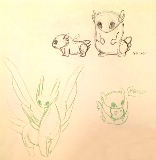
This is Flicker. A character I’ve actually never revealed to anyone prior to now but hey, why not? The idea of Cassie having a spirit companion certainly didn’t come out of left field for me, but I wasn’t entirely sure how this character would appear, or what dynamic they would have with Cassie. I didn’t have pets bigger than a hamster growing up, so the idea of Cassie having a potential dog or cat companion would be new territory based on my own experiences.
Flicker, as they are right now, acts as a sort of sensor for spirits that are roaming loose on Earth, and alerts Cassie to them... even if she’s not always up for a spirit hunt. They do have a backstory associated with how they appear and what their purpose is in the overall context of the world, but that isn’t revealed until much later in the story. For now Flicker is a cute little friend that cannot say much, but is devoted to protecting things, especially the Starglass. Luckily they still made the cut when it came to the helmet idea, and you should be meeting them officially pretty soon in the comic! :D
While the initial problem was getting any sort of cohesive look to the helmet or any other armour in terms of concept, I found as the story developed along with Cassie’s design, both her hair and her star sweater ended up being her two most “iconic” qualities aside from her eye, and using armour would have covered that up.
On top of that, Cassie didn’t really end up being the type of character that would use armour, as one might expect from a character that has to fight and defend things a lot. She’s one to do things a little differently, and both her and the signs discover that, well, different works! It wasn’t a matter of her physical strength for the majority of the problems she faces, but rather strength of heart, and that’s a very personal note for me to touch on with this character. As such, nothing about an armour concept ever came out of the sketch phase:
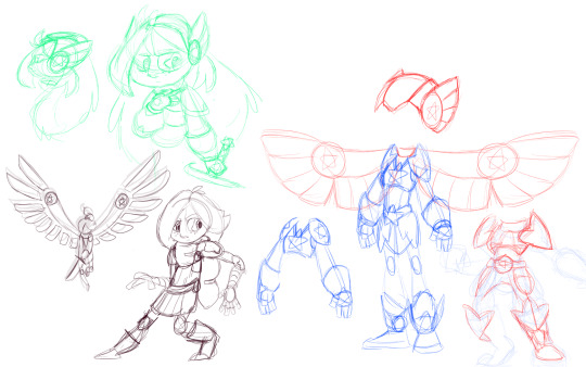
It still makes for really interesting ideas though, so I’m sure I can work these into something else I’m working on. :’D Knowing myself, I’ll find a way. (The wings are VERY Cardcaptors though lol)
What did stay, however, were her swords:
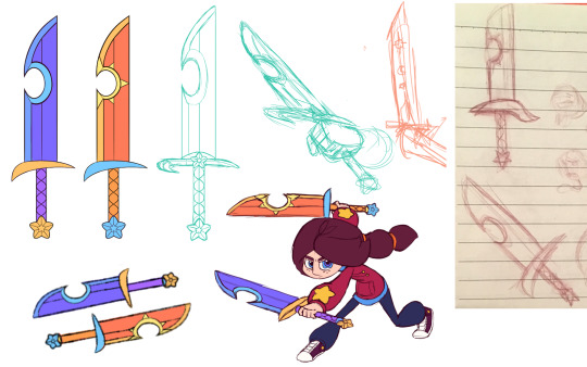
She had at least one sword at the very beginning of this concept, but it eventually evolved into two. I find it interesting that sun, moon and star symbols were always present, regardless of what iteration these swords went through. Their official names are the Sun Star and Moon Star Swords respectively. Aside from the few doodles here and there for the zodiac weapons, this was the first appearance of any kind of fantasy weapon in SGZ. I can confirm that Cassie and the signs were going to have weapons from the get-go though, this IS something I made after all. xD
I think I also need to mention the main influences for this series, as the love for those things is very evident in my work, from the visuals to the storytelling and everything in between. Aside from my general interest in fantasy topics such as mythology and astrology, here’s a list including (but not limited to) the series that inspired the making of SGZ:
Kirby, Steven Universe, Harry Potter, Avatar: The Last Airbender & The Legend of Korra, Cardcaptor Sakura / Cardcaptors, Kim Possible, Danny Phantom, and pretty much any other show I’ve watched about surviving school while going on crazy adventures. That stuff may be cliche now but I’ll be damned if I don’t love it still.
I grew up with some of these and the rest are new, but they’re all near and dear to my heart for many reasons. I’m happy that I can put that love into something I’ve made, and share that story with the world.
I know I’ve got a lot more ranting about this story to do in general and the comic is still going, but I want to say some special thanks to some of SGZ’s biggest supporters:
Laura, Eleanor, and my classmates and teachers at Seneca College. This comic wouldn’t exist without you. <3
I’ll be honest, working on this series got me through some of the toughest years of my life so far, and this was one of the first times where something I made actually came to fruition in some way, and had a genuine development period that I can look back on. I’ve grown a lot as both a person and an artist since then, and doing this look back in time really solidified that for me. I have a cast of characters that I love, and now I get to tell their story. So if you’ve stayed till the end in this gigantic post, thank you. I don’t know where this story will lead me, but with any luck it’ll be somewhere in the stars. Thanks for reading, friends. <3
#Starglass Zodiac#SGZ#SGZ Anniversary#origin story#Cassie#development#character development#story development
9 notes
·
View notes
Note
How you draw such a good genos? Love steamy toaster child
Wahh, thank you Anon!! <3I don’t usually save WIPs of my artwork but for this particular drawing I actually did so you’re in luck, lol!
For anyone curious, the process behind that particular drawing…
Originally I was actually just planning on doing a sketch to test the camera filter, and I made this:

It’s a tricky pose, so I relied pretty heavily on this reference photo. I did some changes though, like modifying the angle of the arms, the body is thinner and shorter to fit Genos’ proportions better etc. The biggest difference is making more of the face visible though, I knew from the start I wanted one glowing eye to be visible.
After I had finished the sketch I decided that I… liked the drawing, and wanted to continue with it. I inked it properly and ended up with this:

Then I was like urghhhh colourssss how do those work again?! I decided I’d try to keep it as simple as possible and work with only a few colours. As part of that, I decided to do all the shading via the lineart and so added a bunch to it:

I do most of my work in Paint Tool SAI usually but for this drawing I wanted to experiment with gradients so I kicked it over to Photoshop Elements so I could do that since SAI doesn’t have that particular tool.I picked the background colour first to set the mood, then played around with gradients until I found something that I thought would work for Genos. I wanted the drawing to be fairly dark using warm colours, to give the impression of heat.
The glow to his eyes and vents was added in SAI (Airbrush with layer mode set to Lumi & Shade - place the layer above the lineart layer).
The steam is also added in Elements using special brushes, I use this set. I add a bit of Gaussian blur to that layer to make the smoke less “realistic” so it fits in better with the rest of the drawing.
Last back to SAI to flatten everything (make a back up copy that is not flattened in case you want to do more edits later!!) and add a texture to the layer. I work with these textures, my favourites are Dirt 3 and Noise 1 (which is what I used here).
….And that’s how I drew a steamy toaster, I hope that helped XD
#seriously I had a lot of fun making that drawing#a bit different from what I usually do#might have one slightly in the same vein coming up pft#it's one I've meant to do since I found the ref but other stuff keeps coming in between!
18 notes
·
View notes
Text
2nd October 2019, Summerhall Edinburgh Field Trip, The Summerhall Tour
On Monday 30th September 2019, the two classes from Inverness and Perth UHI went to Edinburgh for a tour of Summerhall and to listen to a couple working artists talk about their own practices.
The following post is a direct reflection on my reactions in the moment as well as after the fact of the tour of Summerhall. The disjointed jumpiness of text is how I received the information.
At the beginning of the tour, we were seated in a Victorian lecture hall, where an employee of Summerhall spoke to us about the history of the building and what exhibitions we were to see on the tour. This employee mumbled a lot when he spoke making it difficult to catch what he was saying including his own name, thus him being referred to as employee throughout this post. Within the first two minutes of his talk the employee complained about how he was underpaid which was fun banter, to begin with yet soon he kept bringing it up which for me drew the line into unprofessionalism. I am not your HR team don’t complain to me about these things. Due to his mumbling, it appeared that he kept jumping from one story to the next making it very hard to follow and understand what he is saying. The employee also spoke ill of other artists saying “90% of artists you’ll work with will be absolute c words other 10% will be alright.” this to me seemed uncalled for as again it wasn’t anything to do with the tour.
Finally, the employee started talking about Summerhall.
The building of Summerhall has been around for hundreds of years, in the 1600s this area of Edinburgh was quite seedy and rough, in the 1700s a brewery was built and is the property of McGlenans Summerhall still has a brewery/distillery to honour this heritage. The gin distillery does tours also.
Summerhall has a cafe that is mainly occupied by mums with small children or people with laptops working away.
Summerhall Mission Statement is to be a multi-arts centre complex and over the past few years has become one of the best locations of the Edinburgh Fringe Festival.
Summerhall was a veterinary nurse school for hundreds of years many rooms in Summerhall have changed very little from these times. They try to incorporate the history of the building and make them a part of the exhibitions.
Summerhall has theatrical programs, as well as comic and musical programmes they run. They also do wine festivals and other events.
They have hardly modified the rooms other than modern health and safety standards and heating.
However, there are some exceptions they do transform some spaces for certain exhibitions temporarily but when they’re done the room goes back to how it was.
there is a war memorial library in the veterinary school.
they have a waiting list for use of studio spaces but it is very expensive.
Summerhall has a visual arts programme, sociated programme, and curative programme. the Sociated Programme is to have Summerhall make money you pay for a lot of the spaces etc. the Curative Programme is where they go out and look for artists and bring them in.
Summerhall has five shows at the moment of which it is my understanding we were seeing some of these on the tour.
Photography exhibition by the New York Times on climate change
Painter from Edinburgh painting exhibition deals with the exploration of sexuality, gays etc. Abstract painting.
Jane Frairs exhibition mural is highly political, Brexit, immigration, refugees. The employee describes it as a “beautiful exhibition”. The exhibition consists of murals and three short animated films. Sor politics has been talked about an awful lot in the beginning talk of the tour and it is getting irksome.
Alan Smith exhibitions life exhibition of him right up to his death artworks and a couple films where he speaks his mind about his life as an artist and illness.
In the basement, a mental health exhibition is being prepped so cannot visit today. Opening on 10th October 2019 non-alcohol opening the employee expressed how he didn’t like this and how openings with alcohol available are better.
The exhibition is about art therapy the employee stated “surprisingly they show real talent without and formal training” his tone and body langue tell that he is a believer you need formal training before even considering submitting your work to an institution.
Richard D’maro is an artist in 60s, 70s, and 80s patron and collector of the arts in Scotland and South-East Europe he has an admirable archive library which recently has been opened to the public.
The employee expressed his views that an artist (because of the mumbling didn’t catch their name) was involved in Nazi practices because they grew up during the third riech the employee said “make that as you will” all though his body language and attitude said he believed they did based on one technicality no other evidence.
Finally, the tour began. We were herded into a room full of photography no context as to what the art means or who the artist was, we were barely in there and taken a couple photos before being shuttled off somewhere else.
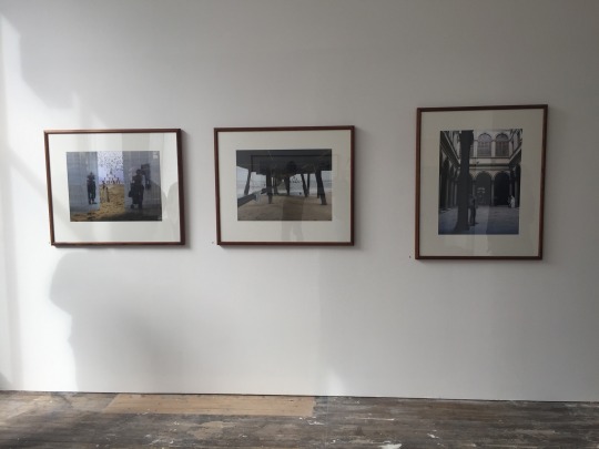
Although the images have been displayed in a very professional manner I cannot give further thoughts on this exhibition as there wasn’t enough communication as to the context.
Next, we were taken to a room with art based around the themes of Brexit and immigration by artist Jane Frere. As personally I do not like mixing art and any form of politics my brain had instinctively switched off.
However, this being said one element of the exhibition 9 enjoyed and was very interested in. It was the placement of a Japanese shadow puppet box on a black plinth.
I have used plinths to display my artworks before and like here the plinth and wall colour was the same so it gives the impression of a floating artwork. Yet this is where the similarities end. Where I use the plinth as an extension of the artwork Frere uses the plinth purely for display purposes seen as the distribution of the artwork is printed directly onto the plinth branding it as a mere stand.
Sadly this all I can say on this room and exhibition as once again after a few short moments we were escorted away to a room which I was only able to have a glimpse at the reasoning for showing this space I am unsure.
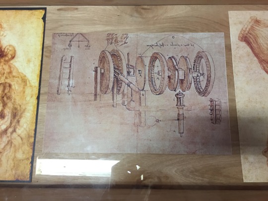
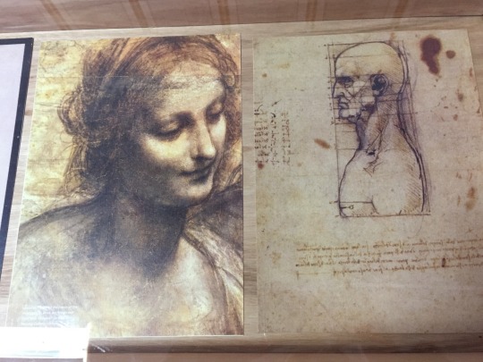
The next room greatly interested me as it holds prints of works from Leonardo Da Vinci as being known as one of the artistic greats seeing these is an experience not to be forgotten. There were also works by David Boyes.
At the end of this room there is an interesting contraption. The employee informed us that it was used to separate bone from tissue, back when the building was a vetinary school. This to me was the current highlight of the tour as these vintage machines and ways of various surgery’s are an interest of mine.
In the climate change exhibition the photographs are very uniform, each shown in the same thin black frame, the same dimensions, and same high quality resolution. Again because of the messaging I didn’t pay enough attention, but I could still appreciate the art for what they are. High quality photographs.
At this point the employee asked me what my favourite exhibition was. To which I explained that the I don’t agree with the mixing of politics and art, I don’t want to see it everywhere when I know the world is going to pot. He wasn’t pleased with this answer looking me up and down like filth before abruptly turning away to talk to other students. Over the course of the tour I had be getting more and more annoyed with the employees unprofessionalism from his complaining about being underpaid to his mumbling, this pushed me over the edge. Do not ask for an opinion if you are not willing to hear any type of response.
The tour was still not over.
The employee showed us th drool where they hold staff parties. It was a room where the vetinary school would hold dissection classes, the students stand in the balcony while the lecturer directed various animals. On the side of the room there is the original lift where they’d transport the large animals such as elephants, horses, and cows to be dissected.
After this we were lead out into the courtyard where the tour ended and we made our way back into the building to listen to Anthony Shraug talk about his practices as a working artist.
0 notes
Text
Week 9 - Rendering presentation and photoshop process
Intro: This week we completed our Project 2 assessment by doing a presentation on the rendering we had poured blood, coffee and tears into. p.s (as this week9 post consists of more than one post and is rather lengthy, I’ll be splitting it up and structuring it like this: -intro -reflection and critical evaluation on presentation -photoshop process -research board process - 2 separate posts with all the images, documentation of rendering, and work process
Reflection and critical evaluation on presentation:
-Was I adequately prepared? I think I was prepared enough to give a simple presentation, but as I wasn’t sure what type of presentation we would be expected to give; thus i retained a few basic ideas on presenting which could be applicable to what we were doing. Looking back, I think if I had written a few notes, memorised them and practiced speaking in front of a mirror, it would have assisted me better on the day.
-Did I speak clearly and articulately? Unfortunately, while I think my attempt to speak was passable in a way, I don’t think I spoke that clearly or articulately. I’ve always had trouble speaking in front of people while doing a presentation, and I have difficulty transferring what is in my mind, into a worded explanation. (tbh a small part of the reason I transferred from my previous course was to avoid public speaking and presentations… I obviously dug a bigger grave when I chose industrial design). This is something I’ll have to practice I guess, as I realise presenting is a big part of this course, and if you’re able to convey in an articulate and aesthetic way the concept you have, it’ll be extremely useful in the future.
-Was the pace of my delivery appropriate? It was decent but not great. Instead of pacing the content out in even segments, I accidentally spoke a little too long on some and hurried on others due to nervousness. If I made a small structure such as: -introduce process/name, describe, background info, tie into next topic] for each thing I talked about, it would’ve helped pace my delivery more appropriately.
-How did I feel before / after the presentation? Before: Nervous reck. After: relief.
-Was my support material effective / helpful Yes, I found my support material to be very helpful and effective in conveying my idea and process across to the audience. My research board/support material helped to guide me as I had organised it in a step by step process of what I had done. So if I ever got lost during the presentation, I just had to refer back to the board and continue. It was also quite easy to point to each quadrant of the board when presenting, as it referred the audience with a square of visual images to the idea/process I was talking about.
What did I do well and what would I do differently next time? -I’ve pretty much summed up all the pros and cons in each question above, but something which I think I did normally was the support material and the simple but effective concept behind It. For next time, I hope to practice different small aspects of public speaking such as overcoming stage fright and learning to articulate words clearly so that I can be more equipped to present something in upcoming assessments.
Photoshop Process: This unfortunately reminded me a lot of our course in fundamentals where each project takes around 20+hrs, and if you haven’t considered once taking the easy way out before the census date or through an accidental topple over a cliff, you’re either extremely gifted or not doing it right. The product I chose to render was an Ultrasone Edition 8 EX headphone, and looking back, I reckon I should’ve chose something easier. As this was my second time ever using photoshop, the darn headphones took around 20-25hrs to render, not including the research board, printing process, indesign and illustrator programs.
I’m really bad at computers in general, so opening photoshop gave me nightmares. I started off by: -drawing and pencilling an outline of the headphones and then scanned it in and opened the file on photoshop. Next, I -constructed layers Using the basic Colourfill ayer + Light layer + Dark layer which the hairdryer tutorial introduced to us, I created a set of layers for each segmented part as well as ordering them into groups and files. Next I -created paths for the individual segments which made up the headphones. After fiddling a bit with illustrator, its apparently easier to draw paths and then import them to photoshop instead of drawing with the pen tool. Once all the paths were complete, I assigned them as -masks to each respective layer with its corresponding part. I then -coloured each layer and discovered that if you’re working with a black/silver coloured object with lots of reflections, shiny aspects/facets, it’s better to colour everything in shades of grey and then use the brush tool to whiten or darken the grey to achieve the desired look. This way you can achieve both a black and a white from a base grey colour, as well as create differences between light and dark to replicate a mirror finish. Once each segment was coloured, I painted -aesthetic replication of mirror finishes, shine etc over the segments which were shiny/reflective on the original product. Using the brush tool, and modifying the opacity, brush size (all the way from 1-2ppx – 300 – 400), hardness and colour, I painted over the parts with my mouse cursor resembling a real life brush stroke. This part took me hours as I had to research light reflection and mirror finishes as well as creating even brush strokes with a mouse and the varying degrees of light and dark around each painted stroke to create the desired surface aesthetics of the matte ceramic, chrome/aluminium and polished pvd (physical vapour deposition). I came to a realisation that no matter how the object looks or feels in real life, the only tools you can recreate it with photoshop is an aesthetic manipulation of light, colour and texture to deceive the perception that it is actually like the real object. Thus I then moved on to -textures By finding an image of the texture on google and then cutting and shaping to fit over the required segment. The grill/net pattern over the flat part of the inner earpad of the headphone was relatively easy to construct as I only had to shade it whiter in the middle and darker on the edge of the circle, but the real complexity came from recreating the pleather (synthetic leather) look on the earpads and headband. I drew tiny white and black lines across a black surface, then layered the texture on top and then used a satin layer and a few other changes to create that soft rippling effect of tense stretched pleather. I then applied -logos and text For the logo and grouped text, I copied it from the product/website and photoshopped it to fit onto the headphones, as the tutors advised us against just typing a company’s logo, and to make it more realistic and appropriate if we just transferred the original logo across. Finally, I moved to the -background Where I created a gradient fill of black to white to accentuate the products shine and black and white tonal qualities.
This concludes a brief summary on the photoshop process that I completed to construct the headphones
Research Board Process:
For the research board, I used InDesign to construct the layout and appearance. I allocated my board into 6 quadrants, with each quadrant being able to hold 4 images. From left to right, each box showed a step of my processes. 1st box –Inspiration, 2nd box – pinterest, 3rd –research, 4th –form/materials, 5th – documentation of photoshop progress, 6th – surface/materials finishing. Thus I was able to show a glimpse of each of my steps, while retaining the ordered and aesthetic construct within one board.
4 notes
·
View notes
Text
Evaluation
We began the ‘Exploring meaning through narrative’ module, with a visit to the Birmingham Museum and Art Gallery, where the ‘I Want, I Want’ exhibition was taking place. We were tasked to explore the exhibition appreciating the various pieces of art and eventually had to decide upon a singular piece that would be the inspiration for our new project, which involved having to produce a flipbook. I was immediately skeptical at the design/technology aspect of the exhibition, however after looking at the variety of works I was beginning to gather ideas. I chose to pick out my favourite pieces, those being: ‘Esika Na Ngayi (My Place)’ by Eddy Kamuanga Ilugna- I was immediately drawn into this piece; the large size and strong use of colour enticed my eye. I thought the piece was beautiful, with great painting skill and ‘House Rules’ by Rose Finn-Kelcey- I was attracted to this piece because despite it being so small against a vast space on the wall, the red flashing light catches the eye and immediately captivates you. I decided that I would firstly research into both of these pieces and the meanings behind them before focusing upon one.
I found the work of Eddy Kamuanga Ilugna to be the most interesting, as it reminded me of sociology which was one of my favourite subjects that I studied at school. There was a lot of context behind this piece which was really eye opening. The synopsis of the painting describes how Congo is very present within his work; he explores the threat imposed by modernisation and commercialisation to the traditional warrior culture of Congo’s inhabitants. The patterns he paints onto his black figures reference computer chips and mobile phones that contain a coltan component, which is a metallic ore that is mined in the Democratic Republic of Congo. This particular mining industry has been associated with human rights violations. I liked the message behind the painting, with Ilunga exploring the damaging effects of technology rather than praising it. I find his work is very effective in providing a message and enticing the spectator, especially with his use of bold bright colours and patterns against the black figures. After researching into the ideas behind his work, I decided to use this piece as the inspiration for my flipbook.
I also looked at a variety of artists that work with flipbooks, to see how people work in that particular medium. I distinctly liked the work of artist, The Flippist who creates custom hand-drawn animated flipbooks inspired by one that his father showed him when he was a young boy. He takes commissions, turning people’s stories, lives etc. into personal flipbooks. He has a very distinctive style to his work and I like his comic, cartoon and handmade vibe. I also found Scott Blake’s work interesting; he creates original and distinctive flipbooks by hole punching small circles into the paper to produce whirling animations. His flipbooks are constructed from 110 pound paper and bound with heavy duty staples. I found it to be a very unique style and way of producing a flipbook that I had not come across before.
I gathered a lot of context inspired by initial ideas. Since I was so inspired by the ideas behind Ilunga’s work I originally thought that a good starting point would be to research into ways that modern society’s importance over technology has affected traditional cultures and specifically LEDC’s. With my knowledge of sociology I know that modernisation and consumerism has been both damaging and negative for LEDC’s. In order to transfer these thoughts into a flipbook I decided I would research into or make up my own case study that shows how technology affects people within these cultures. It would form a narrative by flipping through the changes. With this in mind it was suggested that my flipbook would be directed to an older, mature audience. However, after doing further research I decided that I would relate the flipbook to my own culture and show the negative effects that technology has had in terms of cyber bullying, as this is something that I am passionate about and is increasingly damaging to society. With these ideas in mind and the help of an empathy mapping exercise, I decided that an audience of secondary school children would be best suited as they are most likely to relate to the situations and ideas provoked.
I began to sketch ideas and produce a storyboard that followed a narrative of a victim being bullied at school, waiting for home time only to be followed by the bullies with technology being their source. However, after a work-check I came to realise that the story was far too long to be transferred into a flipbook. Instead I decided to cut it short to one of the scenes, which showed a victim sat at a desk and being hit by crumpled paper. To incorporate my ideas of technology being the new source of bullying, I would continue the scene with phones and laptops being thrown at their head showing the transformation. I chose a limited colour palette and decided to keep the victims skin a solid colour as Ilunga does with his black figures. I decided that I would produce the flipbook on lined notecards and use a bulldog clip to bind it, to relate to my target audience of secondary school children, as they are stationary essentials. The medium that I chose of promarkers and a simple comic style, was inspired by The Flippist as I was really inspired by his authentic, handmade and comic style. I individually drew each card by hand rather than printing from a digital version, as I wanted it to imitate the way that The Flippist creates his pieces and also found that it gave a particular atmosphere which fit for my target audience and storyline. For my digital version I simply photographed each card and compiled them into a gif.
In reflection, I am overall satisfied with the project and the final outcome. I really enjoyed researching into the work of Eddy Kamuanga Ilugna and was very inspired by his ideas. I think my flipbook represents the ideas that I wanted to provoke about how technology can be negative in our culture and responds to the brief. After looking back at the flipbook, the computer doesn’t have as much effect and so the ending isn’t as impactful as I would have hoped. If I could modify anything I would maybe add another piece of technology and ensure that they make an impact on the victim to show how damaging technology can be, whilst still being appropriate for my target audience. My work doesn’t imitate that of Ilugna as such in aesthetic terms, which could have been altered by using the same medium as his work (acrylic) or covering the victims person with a technology pattern of some sort. I did toy with the idea of adding a pattern/ insults to the victims body but it has been done so often that I didn’t think it would be very effective and so instead opted for a solid skin colour and use of red which is prominent in his piece ‘Esika Na Ngayi (My Place)’. I am pleased with my flipbook and am hopeful that my ideas are prominent and understood by my target audience.
0 notes