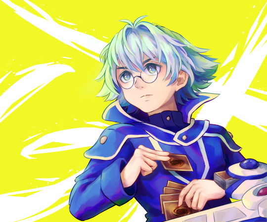
#and the lil spots of blue and yellow in his eyes are top tier
Explore tagged Tumblr posts
Text
Unstoppable, unshutuppable, jk you can block me. But Tumblr the site is Powerless.
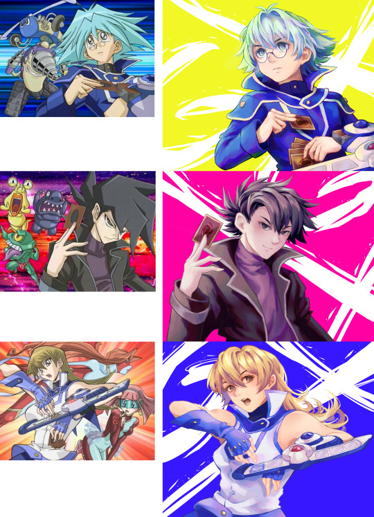
I like how the grey on her shirt still has that faint cyan edge to it to add vibrancy + how well the blue and pink shadows go with her hair. Colour theory or something. Also, again, this'll sound weird but I especially like the shading on the hair at her neck and how warm and saturated it is. But I also super love how watercoloury the shading on her white shirt feels. Its so soft. She feels so pastel its beautiful. Finally, her blue background contrasts with the white/blond so well, while the shading of white/pink/blue on the blue part of her clothing also desaturates the blue so it doesn't blend in. Oh and of course her face is great too. Do you headcanon her as using makeup? Because she has some really luscious eyes and lips compared to the boys. it's pretty.
Anyway, the thing I like a lot about these is how they show off the diffs/strengths of Yugioh's style vs Yours. You still translated it really well, ofc, and I honestly think yours is better (even if too high effort for a weekly show.) Anyway, yugioh's anatomy is kinda cartoony and some of the shapes can get a lil out there. Plus, the hair is like knives. Your anatomy is more realistic and detailed (like how you translated Syo's weird little eyes and made them not weird). Also impressed by how you made Asukas nightmare of a pose work, too. The most amazing bit imo though is the hair. Yugioh hair doesn't really have strands or roots (unless ur a yuboy) so its really interesting to see how you rebuild it with recogniseable strands, crowns, roots and inclines. It not only makes it much softer and cuter, but means that you can shade with a lot less straight lines (which really nails the feeling of shading a fiber/thread/hair). Plus, the swirl of asukas hair (which isnt really possible in ygo's style) looks Incredible here!
Hnngh I love ur shading so much. Anyway. Amazing pics. Made my day.


redraws of their stills from Precious Time, Glory Days

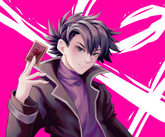
#great use of colour with the backgrounds#the yellow on Syo is not just a reference to his time in Obelisk Yellow#but it also contrasts so well with his blue hair and clothes!#it makes him pop super well!#then#since yellow is a naturally light and bright colour#it lets you use the yellow to shade his blue hair and clothes really evocatively#it makes the piece all come together#the dashes of purple and dark blue are stunning#too#its gonna sound really weird to focus on this#but I really like the purple at his shoulder that borders the highlights and shadows#to me it like spiritually encapsulates what that technique should feel like#anyway the coloured line art is on point#his expression looks wonderfully determined#and the lil spots of blue and yellow in his eyes are top tier#the hands look so good too#moving onto Manjome who has pink#(because hes a sap (look at that blush man))#but also because it goes super well with the purple black of his clothes and hair#the faint purples shadows on his face also empinken the skin rly nicely to add that vibe#I love his clothing#the folds are drawn and shaded so well#I can feel the thickness and leathery/plastic whatever its made of#in the way you shaded the sleeve and belt sleeves#the lil dash of lighting at the top to provide a thick rim is chefs kiss#then ofc that lovely purple is back#and his smug look is top tier#finally we have Asuka#with the absolutely lovely pink and blue shading
520 notes
·
View notes