#and the final cap is an aesthetic in itself
Explore tagged Tumblr posts
Text


@perioddramasource: Period Drama Appreciation Week 2024
day five | favourite aesthetic
R E N A I S S A N C E / E A R L Y M O D E R N C A T H O L I C I S M (as shown in The Borgias, The White Queen, The Tudors, Becoming Elizabeth, The White Princess and The Spanish Princess)
#the borgias#the white queen#the tudors#becoming elizabeth#the white princess#the spanish princess#perioddramaappreciationweek24#perioddramaedit#theborgiasedit#thetudorsedit#twpedit#thespanishprincessedit#becomingelizabethedit#my edits#tryna make this not all Francois Arnaud as Cesare Borgia was hard#also JRM as Henry praying chefs f**king kiss#and the final cap is an aesthetic in itself#this is where the iconagraphy from my catholic background comes forth and goes heeeey remember me
140 notes
·
View notes
Note
honestly the only thing i wish now since team past won is that we don't get a great turf war game.
A more past based aesthetic sounds inherently cooler for a game no matter what people say.
I think i was being a little too harsh and mean towards Team Past and I was riding the high of the Grand Fest....

At the end of the day, what makes Splatoon's world so special is that it's world follows our time, a year passes in our world, a year passes over there. Stopping the timeline would be a bad idea and I think the developers know better. I have faith in them.
I dont think we're gonna get a great turf war game because Splatoon 4 was most likely already in pre-production before the Grand Fest, and they are just choosing what aesthetic to wrap the game in. They probably have a bunch of storylines planned out too and now they can get to work on the next game. That's just how game development works, especially Nintendo ones where gameplay is first and story is second.
The results of the final Splatfest of each game do make an impact but not THAT big of an impact. Callie vs. Marie decided who was gonna play the villain role in the next hero mode as they already placed down the set up for that story line in the songs Tide Goes Out and Bomb Rush Blush, as well as the Splatfest dialogue creating tension between the two.
Marie won so the developers gave Callie some angst, and she strolled down to Octo Canyon, said to good ol' Octavio "Hey I wanna be evil and stuff." And Octavio was like, "aight sick yo. But you gotta wear these hypnotic shades first tho." And Callie was like "COOL! :D"
Chaos vs. Order impacted what the next game was gonna look like aesthetic wise, and even then it's not as extreme as a lot of people envisioned. Splatsville is Inkopolis but basically... a little bit more chaotic and clearly not as wealthy of a city as Inkopolis. Deep Cut's aesthetics and personality were based on the theme of chaos, we would have probably gotten a three person Idol group regardless but what team won in Splatoon 2 impacted what they were gonna look like. The rest of Splatoon 3 is just regular ol' Splatoon. It's not a crazy Mad Max chaotic land like what some were expecting and that Inkopolis was gonna be up in smoke.
And, of course, the losing team was yet again the central theme of the villain, this time, the idea of Order itself and even then its different from how Callie vs. Marie played out. Marina becomes Marina Agitando at the start of the story to get it out of the way and to subvert expectations. And then the real villain, Overlorder takes centre stage.
I dont think we're gonna see the whole "losing team becomes evil" thing because its a tired old trope and it created so much just.... bullshit in the community, I'm gonna be so real. Like you know this already and my stances on Hypno Callie and what people say about her but... I digress!!
I wanna end off my rambles by saying that the best part of Team Past winning, is that Callie and Marie got to win TOGETHER! It feels like the perfect cap to their arcs and it feels... good.... you know? It just, makes me happy that these two girls are just finally happy and are on each other's wavelengths so well. They even show that in Blushing Tide but ive already gushed about that song.
I feel like thematically Team Past/Squid Sisters winning feels.... perfect? It feels... right? I guess? Starting off in darkness and hate, fighting each other, coming together after being reminded of the good times they've had, healing their broken bond, finally winning... as a team...
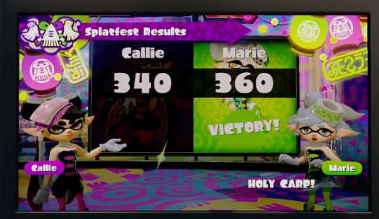
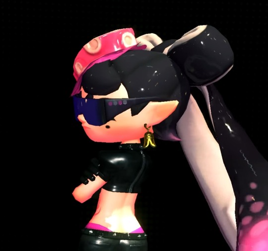
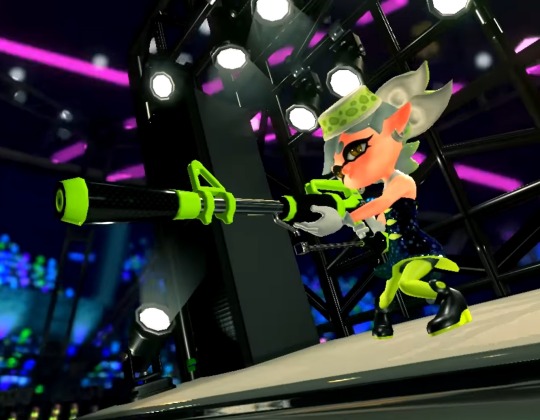

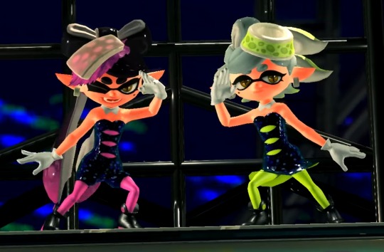


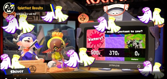
I think im taking the loss pretty well LMAO! I mean I was on the winning team of Chaos vs. Order so I'm perfectly fine with coming in second place.
#splatoon#splatoon 3#ask blog#ask me stuff#ask me anything#callie cuttlefish#callie splatoon#marie cuttlefish#marie splatoon#splatoon 2#team past#grand fest#grand festival#grand fest splatoon#final fest#autistic rambling#rambles
54 notes
·
View notes
Note
So we know how big Melli is right? Well that just means that he has to eat either more or equal to what his stuntank eats. Also I think that Melli has burn scars/current burns due to working with things that will explode any minute and a ball of electricity that will shock him at any given moment that he disappoints it. Electric burn scars/fresh ones and straight(not in Melli's case) up burn scars from the explosions. I think that he hides them so that no one will see, which is why he's always covering up.
I’ve often thought about how expensive Melli would be to feed lol, especially in a place where food isn’t as easy to acquire and prepare like in modern times
And yes! Love this headcanon! I have very similar one actually. I think it would be pretty easy to look at a character like Melli and come to the conclusion that he’d be the type of person who wouldn’t like to get his hands dirty or put himself in any danger, but I disagree. He may appear foppish, but there’s many canon details that let us know that he’s not afraid of danger or physical exertion
To even perform his duties as warden, Melli must first frequently climb Mt Coronet, an extremely large and dangerous mountain, populated by extremely powerful and aggressive wild pokemon. Then after finally arriving at the hollow he has arguably the most dangerous job of any warden, taking care of Lord Electrode. Like you pointed out, out of all of the noble pokemon, Electrode is by far the most volatile. It’s also not alone up there, as we know it lives with a colony of voltorb too, so (again like you said) I think it would be extremely unlikely for him NOT to be scarred or burned in some capacity, wether that’s from just living in a wild place like Hisui, travelling up the mountain to perform his duties, or taking care of Lord Electrode itself, among other things. We also know he’s not scared of physical confrontation (he overpowered the security corps to get into the meeting) and he doesn’t shy away from battles either, choosing to investigate the mass outbreaks on his own. Melli seems to be in situations frequently where injuries seem extremely likely. I also think due to the frequent mountain climbing and the physically demanding job that is looking after lord Electrode, that Melli is likely more muscular and physically fit than most people would give him credit for, especially given his slim build and aesthetic.
I think the idea of him covering up to hide scars is an interesting one, but I’m not too sure Melli isn’t just freezing cold from working high up on a snow capped mountain lol. Apart from wearing his hood (which we do get to see down in the offical art book) he’s no more covered than most other wardens, and Hisui overall has quite a cool climate. It’s an interesting idea to explore though! I personally think it would be very interesting in that situation for him to hide scars not necessarily because he doesn’t like the look of them aesthetically, but because he’s worried that someone may see the scars and interpret that as a sign of a past failure, something that would be unbearable for someone who’s main goal in life is to be useful to his clan and it’s leader. Like, how great must the great Melli truly be if he allowed himself to become so carelessly injured in the line of duty? In reality I think it would be an irrational anxiety, and that they (scars) wouldn’t reflect poorly on his performance as warden at all, instead being a sign that he was actively engaging in his duties. To an insecure character like Melli whose image is an extremely curated defence used to mask his true shy/timid nature, any perceived threat to that persona would be very hard to manage, and I could see him going to the lengths of hiding his injuries in order to maintain his image. It’s a super interesting headcanon to think about, so thank you so much for sharing!
Oh btw have you ever heard of a Lichtenberg scar (caused after being struck by lightning)? Irl these don’t tend to be permanent, but I could absolutely see him having these after so much time working with dangerous electric type pokemon
(pic under the cut. It’s not graphic at all, just wanted to be safe)

29 notes
·
View notes
Text
Super Mario World - Retro Game Review

System: Super Nintendo Entertainment System Release Date: Aug. 23rd, 1991 Genre: 2D Platformer Developer / Publisher: Nintendo Playtime: 5 Hours (Real Time)
Story: Mario Mario must once again rescue Princess Toadstool from the clutches of the evil King Koopa, but this time he has some help! Yoshi joins our hero to defeat the Koopalings and save his own kidnapped friends.
It sure is a Mario story.
Presentation: Super Mario World is a great looking game. There are some elements that don't quite match visually, looking like they could've come straight out of Yoshi's Island, but outside of those, its bright and colorful aesthetic keeps everything looking clean and easy to read. Music is definitely one of the highlights here. The iconic Athletic Theme is one of the greatest video game tracks ever made, and the rest of the soundtrack is no slouch either. I appreciate that they didn't just rest on the laurels of the franchise's already amazing music and do nothing but remixes of previous soundtracks.
Gameplay: The real meat and potatoes of any Mario game, and the area where I have to be a contrarian. Super Mario World kind of shoots itself in the foot when compared to it's predecessor, Super Mario Bros. 3. Mario's momentum caps out too quickly, but he also comes to a stop a little too slow, making general movement feel more slippery, while hitting max speed feels less challenging and exciting. The P-Speed mechanic in particular feels totally out of place since Mario doesn't naturally ramp up to max, instead just getting a sudden boost that often sends you flying past your intended destination. P-Speed also ties into one of the game's other weak points, the power-ups, and especially the Cape. The power-up system is quite literally a step back, bringing back SMB1's unsatisfying system where one hit makes you small, even with a fire flower or other tier 2 power-up. It's one that even Nintendo realized was a mistake, since they never went back to that style in any subsequent Mario game. There are multiple systems that skirt this, namely Yoshis and the stored power-up, but both are awkward half-measures that lead to panicky moments that cause more deaths than they prevent for beginners. On top of this, the Cape power-up is just kind of broken. Almost every stage has an easy space to get P-Speed, and doing so allows you to trivialize 90% of stages by just timing your cape flutters correctly, akin to SMB3's P-Wing, but usable in every stage at no cost. The other new mechanics like Spin Jumping, vertical throwing, etc., add some much needed complexity to Mario's moveset, but are largely superfluous unless you're making a romhack.
Conclusion: Super Mario World is important to video gaming history, it holds up well, and I'm glad to have finally finished it, but every time I pick it up, I can't shake the feeling that I'd be having more fun playing Super Mario Bros. 3. In fact, I'm gonna go play Super Mario Bros. 3 again.
Score: 8/10
4 notes
·
View notes
Text


Finally finished Anu's bio after fiddling around with the aesthetics forever !!
Accessible version of the bio below the cut. Wingdings, zalgo text, binary, morse code are all translated, and the untranslated portions are omitted for screen readers. Caps-locked text is moved to normal sentence case for readability.
[Image description: A circular icon of a simulation of the cosmic web, a sponge-like texture where areas of high density are a warm pinkish orange, and areas of low density are a deep purple.]
[Wingdings text, translated: "Anu, the Universe"]
The Eternal Cosmos, the World of Worlds
[Binary text, translated: creation and destruction and stagnation]
[Wingdings text, translated: boundless]
[Morse code text, translated: recognition reconstruction]
The Cosmos was infinite. The Cosmos was unfeeling. The Cosmos was ambivalent.
The very fabric of spacetime buckled and dipped and bent and curved. Strings of galaxies twisted and wove together to form one great tapestry. Nebulae bloomed and collapsed. Stars shone brightly before winking out. Ravenous black holes tore atoms apart.
Billions of years of this. It was all the same in the end. The Cosmos was infinite. The Cosmos was unfeeling. The Cosmos had seen it all before.
Yet still, a hunger grew deep down. Curled and tugged and churned; itching, burning, blazing. The cosmos became aware. The Cosmos became curious. The Cosmos had not seen this before.
The hunger pointed towards a planet. Nothing more than a small speck of dust. Insignificant, were it not for this novel feeling. The Cosmos watched and saw.
It saw petty wars and bloodshed. Anger, hatred, phobia of the unknown. Haste and desperation. Destruction of the self and mutilation of the other. Dragonkind and beastclans and the ones who came before. Unimportant beings clinging to old ways, trembling in fear of impermanence, blinded by ignorance as they were on that small rock, unable to touch the endless universe beyond. Bound by the limits of space and time, they knew nothing but the violence that their world had been born into.
But the Cosmos also saw great kindness. In this great pool of chaos, life had found its way towards connection and companionship. Parents hugging their children close, lovers embracing after long departed. Friends comforting friends. Strangers saving strangers. Communities congregating and growing together, voices raised in unison, plant roots weaving together, a hand held in another. Each creature connected to the next, each a part of a larger whole: a great web of life, strung together like galaxies in a supercluster.
In this single, small little rock, the Cosmos saw itself.
It made a decision. As this planet's lifeforms reflected the Cosmos, so too shall the Cosmos reflect them.
[Wingdings text, translated: bounded]
[Morse code text, translated: rebirth protector]
It began like how the cliffs of a canyon erode: particles of sand scattering in the breeze, falling away millimeter by millimeter over millions of years. It began like how a new forest grows from barren land: blades of grass reaching for the sun for the first time, giving way to shrubs and saplings, until ages later the grass is overshadowed by the arching bows of ancient trees. It began like how a spider weaves its web: string by string by string until a grand tapestry is born.
It began like all things do. It began slowly, a series of minuscule changes unseen in the larger structure, but changes nonetheless. It began with hydrogen atoms and charged particles ejected into the galactic wind. A slow trickle, molecule by molecule, drawing closer together over time.
Atoms and molecules gave way to gas and dust. Dark clouds of it clustering in the empty space. Instead of collapsing under its own gravity, it stretched its limbs out. Arms, legs, head and tail - a mimicry of what it had witnessed on that small planet. It wiggled its fingers and blinked its eyes and marveled at the sensation of a body.
It took on the form of a dragon. Hydrogen its circulatory system, stars its nervous system. Dust clouds condensed into muscle and bone. Nebulae bloomed into wings. Each heartbeat a supernova, each blink of the eye the spinning of a pulsar. Mathematical physics a mimicry of magic.
The planet was named Sornieth, and it had ensnared the Cosmos itself in its orbit. It had become the center of the Cosmos, the world of worlds. The Cosmos cradled the planet in the palms of its stardusted hands and vowed to protect it.
As long as Sornieth existed, so would Anu.
Cosmic web graphic by the Millennium Simulation Project (Springel et al. 2005)
That voice is the same voice you heard on the same night that everything glowed, took you into the air, and the arms of the Universe kept you from falling.
#my post#flight rising#my dragons#anu#quote in the broadcast message and the lyrics at the end are all from the universe is going to catch you by the antlers :3
43 notes
·
View notes
Text
Restored Conklin Slim Pocket Crescent Filler from 1923
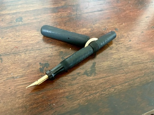


Here’s my process of restoring it! I didn’t take great before pictures, but it wasn’t in great shape (and certainly didn’t work).
Below the cut is the original state and my process of restoration.
Original State

It came with a cracked and scuffed lid. The lid was pretty fragile. Light pressure would likely break it. The crescent and nib are 14k gold and the body was pretty “sunburnt” ebonite. The filler sac had melted and the shellac had calcified.
Process
First was a LOT of cleaning. By hand, sanding off the white… stuff from the lid. Then a lot of rounds of a hypersonic cleaning before everything was ready.
The ebonite needed re-dyed. I decided to go for a matte black and went the route of using Black 3.0 in light layers. Once completed, I painted the engraved letters to match the nib and crescent which was tricky.
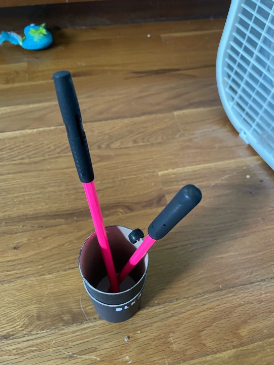

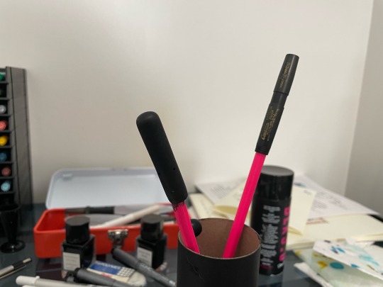
On the lid, I used UV resin on the crack to strengthen it. Then sanded it mostly flat. It got the same treatment as the body with coats of Black 3.0.
I left everything to dry after spraying a coat of protectant. After another round of UV protective sealant and drying, everything was reassembled.
Attaching a new sac was interesting. As the shellac used in attaching latex ink sacs had calcified, I began a process of carefully whittling away each layer of old latex until I reached the ebonite feed tube. Finally got to that satisfying cinch of dropping the tube onto the feed tube and testing it worked.
Writes great! Has some feedback, but is very flexy. Fun to write with.
What the Process Should Look Like
If you can't tell, I'm not an expert at this. I don't know how well this will hold up to wear. The cap cracked in the same place when I screwed it on. I'll have to fix it again, but it doesn't affect the function of the pen, the ink has stayed pretty wet.
Many people think re-dyeing the ebonite to any capacity is hurting a historical object. I went this route so as to bring the pen in line with my own aesthetic (and its original state) while also being temporary and harmless to the pen itself. The paint and sealant can be easily peeled away without taking off the UV affected layer of ebonite (something which could cause significant harm).
I also used a lot of hypersonic cleaning to avoid having to use brushes which could harm the ebonite. The objective was preservation while wanting to keep the pen used as it was intended to be.

And what a beautiful little pen I've found in this one. Nothing writes quite like it except a dip pen. The tines flex beautifully, able to create wide pathways and sharp points in a moment while still easily writing as well as any rollerball for quick notes.
If you manage to get your hands on one, I urge you to consider restoration. They are beautiful little things, made to last. Plenty of videos on youtube can walk you through restoring the ink sacs.
5 notes
·
View notes
Text
Surprise Stabtober #1: Critical Failure
@surprisestabtober
Day 1 Prompt: Critical Failure
Ridill Arondite was a scientist. Before she was a hero, a mentor, a lover, a fighter, she was a scientist.
And in the field of science, trial and error is a necessity for progress! Maybe that was a big part of why Ridill loved science; she got paid real money to fuck around and find out with stuff! Ridill did that anyways, so the only difference was the paycheck she got for doing it. Well, her salary was frequently docked due to the accidents and damages she accrued in the process, but twenty bucks is still enough for the month’s groceries! And, in a professional lab, there is more to protect you from any stray explosions than the makeshift wooden barricades that would contribute to her childhood injuries. Now, some people would argue “there should be no explosions in the lab in the first place”, but those people are prudes and narcs, and Ridil Arondite does not need any narcs in her life!
Before the people she loved slipped away, before saving the world became so much more complicated than fighting Demons and Coda diving, before her life became just another piece in the cosmic game, Ridill Arondite was a scientist. It was hard work, but she enjoyed it. Maybe a little too much, to be honest.
To facilitate Ridill’s personal projects, she almost always had a private place where she could perform recreational experiments in her spare time. In the later days of Station One, Ridill had fashioned a makeshift lab where she would perform “Private Science” out of one of the few unoccupied rooms at the base. In some back room in the recesses of the station, somewhere between the janitor’s closet and the armory, there was a small enclosure that Ridill affectionately called her “Science Closet”. It was a small enclosure, mostly decorated with abandoned ribbons from a previous birthday party, probably Ruth’s given the distinct crimson color, and a half-ripped canvas poster from some indie band, “Deaf Leopard”.
Ridil still remembered Ruth’s birthday celebration, as they had held it in secret as part of some long-forgotten bit, but Ridill had since forgotten what had led to said bit. Since then, nobody had taken the time to tear them down, and Ridill had never reminded herself to do it before she started lighting burners or mixing acids.
The only source of light in the room was an antique silver candelabra Ridill bought from a pawn shop in the Undercity, something she had bought solely to reinforce her personal aesthetic of “deranged scientist meddling with the natural order for personal gain”. She really liked that candelabra. And now, at some time between 1 in the morning and the reasonable waking hours of everyone else in the base, Ridill was messing with something in her dimly lit Science Closet, illuminated by three candles and a dream.
On a small wooden desk, practically little more than two bedside tables put together, there are two bunsen burners, each burning with a focused and luminescent flame under two separate test tubes. Ridill leaned over one of the open tubes and smelled the dark fumes emanating from it. As she put a cap on the tube, she mused aloud on the odor.
“Hm, this batch smells a little different. The last batch was more like vanilla frosting, but this is kind of like, a, uh…”
She pondered the odor for a while. At this point, she was more committed to identifying the closest matching scent for this experimental liquid than she was concerned about the liquid itself. The soft roiling of a viscous liquid, having reached a roiling boil behind her back, went unnoticed as she paced around the closet.
“It smells like…”
The fluid behind her began to boil over the fringes of the tubes. The sizzling of an unknown liquid touching the flame grew louder, but Ridill’s focus was squarely lodged into identifying what it smelled like. Finally, she reached her conclusion…
“Gunpowder!”
She pointed her finger upwards, as if to punctuate her point to no one in particular. She was very proud of her discovery. The D20 rolls... Natural 1.
And then, it fucking exploded.
In her attempt to determine what had resulted from her recreational science, Ridill had neglected to turn down her burners. And by the time she had identified the substance, it was too late. Ruth, Willow, and several other members of OPIA stationed at the base were rudely awakened by the blaring claxon of fire alarms. It took them a while to find the Science Closet, panicking and running around the base the whole time. Luckily, Ridill was mostly unharmed in the brief explosion, as her back had been turned to the blast at the time, and her lab coat was miraculously resilient.
To this day, Ridill has not talked about that incident with anyone, even Ruth or Willow. The embarrassment of the whole ordeal would overwhelm her if she shared it to anyone, and she made Ridill and Ruth swear to secrecy. God forbid if Ace ever found out about the incident, lest it give him even more ammunition for his metaphorical Shame Gun.
In the end, Ridill tried to identify a smell and ended up destroying her Science Closet. A failure of critical proportions, indeed.
5 notes
·
View notes
Text
Ok, 1989tv is HERE and, as promised, there are thoughts (and observations). The songs of course slap, but this is about things that are NEW. New observations and red-string thoughts.
RAINBOWS:
Style has rainbow colored rain on the pavement.
Out Of The Woods: “screaming color” flashes rainbow, but so does “oh I remember” before the final chorus
I Wish You Would: rainbows pulsing in circles around the lyrics of its bridge. The light swooshes are white with rainbows. Also the thing is made of blue and pink and purple accents and words (bi colors).
How You Get The Girl: the whole thing. Multicolored and rainbowed up.
There’s a TON of galaxy/celestial imagery. The men’s faces in I Know Places are starry, the moon is everywhere (specifically in the Out Of The Woods video), Wonderland, AYHTDWS, IWYW, and SIO (to a smaller extent). Additionally, there’s a lot of eyes turning into galaxies (Clean, AYHTDWS).
Storms where you wouldn’t expect them: the road in Style and the bridge, and the background in New Romantics.
Out Of The Woods: LOVE the video. I’m down with those wolf and moon t-shirts, and this video is like that brought to life with some paparazzi/media frenzy symbolism. Gorgeous video—one of my faves.
New Romantics: the song itself inspired by the New Romantics movement (itself based on denying you were a part of it), which was known for its gender-fuckery and queer similarities. This video shows the lyrics on an art-deco stage in bisexual lighting—which I’m not saying is a reference to how many queer people are in the entertainment industry and the arts, but it could be.
Say Don’t ago is SOO FUCKING GOOD YOU GUYS. It’s like if Clean and AYHTDWS had a baby.
Now That We Don’t Talk: she “can’t pretend it’s platonic” and kept herself “shrouded in mystery” to “protect [her] dignity.” Sounds very much like closeting. Also, her ex grew out their hair—something men can do, but something Taylor’s exes haven’t really done. And Harry had longer hair while they were dating.
Suburban Legends: filled with high school references, and the very notion of living a suburban is such a small-town, high-school-sweethearts things. Very Dianna coded with the Glee-ness of it all.
Is It Over Now? sounds a little like Labyrinth and OOTW; also, Tay mentions having the “decency” to “keep her nights hidden,” which also sounds very closeting-coded.
Over all:
The sound is fairly faithful to the original, but the guitars sound a little wonky, like too bright and synthy. Less warm and like someone noodling around, and more like an electric guitar someone forgot to plug in. However, I can look past that. I appreciate they kept the synth riffs at the end of the HYGTG chorus, though.
The production on the Vault Tracks sounds much more Midnights than 1989–glossy new production that sounds a little unpolished.
She’s really leaned into an 80s vaporwave aesthetic with some videos—SIO, IWYW, New Romantics.
The visuals are just gorgeous—all these videos with dynamic, high-quality video. And a lot of more obscure/artsy visuals, too.
I love the album (obvs, 1989 is one of my old faves). Some do the vault tracks I wasn’t too keen on, but I’ll have to listen more than once to form a proper opinion.
To close out:
3 notes
·
View notes
Text
"They have insurance," that's all I said to my former teammates, "life insurance, more specifically"
"You joined the side of evil for insurance?!" screamed the mom friend who acted just like the woman who won custody over my family.
"Sure? I joined the side of good for insurance too, I told you that a while ago. Health and dental, sure, but life insurance is useful if you dare to have such a thing as next of kin while working hard risking your life. That's why I don't really want to kill half of you, I know only cap and vice cap have coverage"
"What?" vice captain Amelia asked, and bless her ignorant rich girl heart because I do think she was unaware of this fact. "That's not true!"
The battlefield was deeply and uncomfortably quiet.
"I also don't struggle with rent anymore," I said, because the silence of heroes who have to recon with the realization that they're just poorly payed mercenaries with a justice complex isn't one I wanted to steep in further, "I actually own my own place now, some people helped me with the mortgage but it's mine so I only have to worry about the power and water more or less"
"Why are you telling us this?" Kyle, a healer without insurance who just 6 months ago was deluding himself into thinking that a wage two dollars higher than mine made his services in the hero industry worth it in comparison to what he could've gotten as a health provider in some other country where they didn't have bullshit laws about healing magic in medicine. Kyle was also good enough to work in most blue collar jobs, but had exactly the same amount of problems getting a second job as I had.
"They also trained me, some of the other villains do classes in their off time, and since I have cash to burn I've been thinking of taking classes- WHY DO YOU THINK I'M TELLING YOU THIS?!" I'm sick and tired of this. "Three people who could drop dead right this second from my awesome attack that kills people, and their families would get an I'm sorry for your loss and maybe your last paycheck if they're lucky! Two people who still live with their families because the job doesn't pay enough for rent! One person who does live in their own place but can't afford utilities during winter! One little princess who's just doing this as a justice fueled hobby, and her boyfriend who's paid enough that he can have the luxury of not thinking that the rest of his team might not be"
I stood there, on top of a ruined wall, aesthetically lit by the moon for the best effect of breaking their spirits into dust. They stood there, looking up at me, no longer in hurt and betrayal but with confusion and a new sort of horror dragging itself to the forefront.
"Still! We can't let you get away with this!-" the captain had done such a good job steeling himself.
"Shut up captain." to be so effortlessly be eviscerated by his own ranks.
"Frankly," I continued, "my honest recommendation is to either switch sides or fake your deaths. You could probably also flee to another country and take up the job at some place that actually pays enough to eat" I could see them dropping their stances, the power of friendship that was propping up the captain had also faltered.
"Then I'll be going" I said finally, turning around "my job was to crush the factory, not you guys, so I'm getting payed no matter what"
I gained a healer to my team within a month, two other heroes were reported dead soon after and their families were moved over the sea.
You are a superhero who joined a team for pay and benefits. However, the pay is minimum wage since you have no education and they made it so you are blackballed in the civilian world so you can’t work there either. So imagine their surprise when you joined the villain’s team.
6K notes
·
View notes
Text
Free Hat Mockup

In the realm of digital design, presentation is everything. Whether you’re a seasoned designer, a budding entrepreneur, or a hobbyist crafting custom apparel, showcasing your work in a professional and visually appealing manner can make all the difference. This is where hat mockups come into play—a game-changing resource that bridges the gap between concept and reality. Among the many platforms offering such tools, MockupDaddy stands out as a go-to destination for high-quality, user-friendly solutions. In this article, we’ll explore the value of free hat mockups, how they empower creators, and why MockupDaddy’s hat mockup collection deserves a spot in your design toolkit.
What Are Hat Mockups?
Hat mockups are digital templates that allow designers to visualize their artwork or branding on a realistic hat model. These templates simulate how a design would look when printed or embroidered on actual headwear, eliminating the need for physical prototypes. By using mockups, creators can experiment with colors, patterns, logos, and placements in a risk-free environment.
Free hat mockups, in particular, democratize access to professional-grade tools. They enable designers to refine their ideas without financial constraints, making them ideal for freelancers, startups, or anyone working on a tight budget.
Why Free Hat Mockups Matter for Modern Designers
Cost-Effective Branding Solutions For small businesses and independent artists, every dollar counts. Free hat mockups remove the barrier of expensive photoshoots or sample production. With a few clicks, you can generate lifelike visuals to pitch to clients, showcase on e-commerce platforms, or share on social media.
Time Efficiency Traditional methods of testing designs—like printing multiple samples—are time-consuming. Digital mockups streamline this process, allowing instant adjustments. Want to see how a logo looks in gold instead of silver? Swap the color in seconds.
Versatility Across Projects Hat mockups aren’t just for apparel brands. They’re used by graphic designers for portfolio projects, marketers for campaign visuals, and even event planners creating branded merchandise.
Enhanced Client Communication A picture is worth a thousand words. Presenting clients with a polished mockup reduces misunderstandings and ensures everyone is aligned on the final vision.
MockupDaddy: Elevating Design with Premium-Quality Free Resources
When it comes to sourcing reliable mockups, MockupDaddy has carved a niche for itself. Known for its extensive library and intuitive templates, the platform caters to designers seeking both quality and convenience. Here’s what sets MockupDaddy apart:
1. Realistic and High-Resolution Templates
MockupDaddy’s hat mockups are crafted with attention to detail. From fabric textures to lighting effects, each template mimics real-world conditions, ensuring your designs look authentic. Whether you’re working on a baseball cap, beanie, or trucker hat, the platform offers diverse styles to match your needs.
2. User-Friendly Customization
No advanced design skills? No problem. MockupDaddy’s templates are compatible with popular software like Photoshop and Illustrator, featuring smart layers that let you drag-and-drop designs effortlessly. Adjust angles, shadows, and backgrounds to create a tailored presentation.
3. A Treasure Trove of Free Options
While many platforms gatekeep premium templates behind paywalls, MockupDaddy believes in accessibility. Their free hat mockup collection is robust, regularly updated, and devoid of watermarks. It’s a goldmine for designers who want professional results without the price tag.
4. Inspiration for Every Niche
From sporty aesthetics to minimalist branding, MockupDaddy’s range caters to varied industries. Explore mockups featuring different hat materials, perspectives (front, side, or 360-degree views), and settings (studio shots or lifestyle scenes).
How to Use Free Hat Mockups Effectively
To maximize the potential of these tools, follow these best practices:
1. Choose the Right Template Select a mockup that aligns with your project’s tone. A streetwear brand might opt for an urban-style template, while a corporate client may prefer a clean, studio backdrop.
2. Prioritize Image Quality Always use high-resolution artwork to avoid pixelation. MockupDaddy’s templates support crisp visuals, so ensure your design files are print-ready.
3. Experiment with Context Place your hat mockup in a real-world scene—like a coffee shop or outdoor setting—to help clients envision the product in use.
4. Leverage Multiple Angles Showcase your design from different viewpoints to highlight details. Combine front, side, and back shots for a comprehensive preview.
5. Stay Consistent with Branding Use mockups that complement your brand’s color palette and aesthetic. Consistency builds recognition and trust.
Creative Applications of Hat Mockups
Beyond product previews, hat mockups can fuel creativity in unexpected ways:
Social Media Content Create eye-catching posts for Instagram or Pinterest by featuring your designs in trendy layouts.
Portfolio Development Designers can use mockups to build a diverse portfolio, demonstrating versatility across styles and industries.
Crowdfunding Campaigns Launching a Kickstarter? High-quality mockups can attract backers by presenting a professional prototype.
Personalized Gifts Design custom hats for weddings, reunions, or holidays, using mockups to visualize the final product before production.
Why MockupDaddy Should Be Your First Stop
While countless platforms offer mockups, MockupDaddy’s commitment to quality and accessibility makes it a standout choice. Their free hat mockup collection is not just a resource—it’s a catalyst for creativity. Here’s a quick recap of why designers swear by it:
Zero Cost, Zero Compromise: Access premium templates without spending a dime.
Ease of Use: Perfect for both beginners and experts.
Diversity: A style for every project, from edgy to elegant.
Trustworthy Output: Templates that mirror real-life results.
In an era where visuals drive decisions, free hat mockups are more than a convenience—they’re a necessity. They empower creators to iterate freely, present confidently, and innovate fearlessly. Platforms like MockupDaddy amplify this potential by offering tools that are both sophisticated and accessible.
1 note
·
View note
Text
Ecco Zipflex Moonless Black: Summer's Shadow, Perfected
In the relentless rhythm of summer—where concrete shimmers and pavements radiate heat—the wrong footwear feels like a betrayal. Enter the Ecco Zipflex Moonless Black, a shoe that defies the tyranny of seasonal compromise. More than “just” a summer casual mesh sport shoe, this stealthy 803734 model redefines urban adaptability. Here’s why it thrives where others merely survive.

A Design Philosophy Rooted in Paradox
Moonless Black isn’t a colour—it’s an ethos. Dark enough to mute summer’s glare, yet subtle enough to pair with linen shorts or athleisure joggers, this shade transcends "versatility". The engineered mesh upper, laser-cut for precision breathability, whispers rebellion against clunky summer sandals. It’s a shoe designed for twilight runs, rooftop cocktails, and last-minute dashes through Tube stations. No neon trims or garish logos. Just quiet confidence—much like the night sky it’s named after.
ZipFlex: The Science of Barefoot Fluidity
Traditional summer shoes sacrifice support for ventilation. Not here. The Zipflex technology—a lattice of TPU filaments fused to the midsole—mimics your foot’s natural flexion. Imagine tendons woven into the shoe itself: it bends where you bend, grips where you pivot, and rebounds with each stride. Paired with the direct-injected FLUIDFORM™ midsole, it cushions like memory foam but responds like a sprinter’s spike. Urban explorers, take note: cobblestones and crosswalks meet their match.
Breathability Without Fragility
Mesh shoes often dissolve at the first sign of puddles. The Zipflex Moonless Black scoffs at such frailty. The hydromax-treated lining repels drizzle (because British summers are legally required to include rain), while staggered perforations channel airflow like a turbine. After miles of pavement-pounding, your feet stay as cool as your post-workout almond milk latte. Bonus: The abrasion-resistant toe cap shrugs off scuffs from rogue Lime scooters.

Stealth-First Sustainability
Ecco’s eco-credentials aren’t mere virtue signalling. The DriTan® process dyes the leather uppers using 20% less water, while the recycled PET insole lining gives plastic waste purpose. Even the outsole incorporates regrind materials—proof that sustainability needn’t scream. These ecco shoes tread lightly, both ecologically and aesthetically.
From Dawn Park Runs to Midnight Metro
This isn’t a shoe that demands outfit changes. Pair the Moonless Black with tapered tech shorts for a sunrise jog, then swap to cropped chinos for an evening gig—no blisters, no awkward style clashes. The low-profile 4mm drop encourages a natural gait, whether racing deadlines or leisurely canal walks. It’s the sartorial equivalent of a multitool: always relevant, never out of place.

Where to Claim Your Shadow The Ecco Zipflex Moonless Black (803734) isn’t sold—it’s curated. Find it exclusively at 121 Shoes(www.121shoes.co.uk), where expert fitters decode your gait and style quirks. 365Days of Free returns, and a loyalty scheme sharper than your post-lunch espresso.
Final Thought: In a world of fleeting summer trends, the Zipflex Moonless Black endures. It’s not just footwear; it’s the antithesis of compromise. Now, if only it could lower the thermostat…
P.S. To the commuter wilting in suffocating trainers: The forecast calls for breathability. Act accordingly.
0 notes
Text
The UK's Number 1 Supplier of Custom Swimming Caps – Swim Hat Co
Swimming has evolved far beyond being a mere recreational activity. It’s a competitive sport, a therapeutic exercise, and a vital life skill. For swimmers, both amateur and professional, having the right gear can make all the difference in performance and comfort. One essential piece of gear is the Custom Swimming Cap. In the UK, when it comes to top-quality, personalized swim caps, Swim Hat Co stands out as the number one supplier.
The Importance of a Quality Swim Cap
Swim caps are more than just a fashion statement or a means to keep hair dry. They serve multiple purposes, including:
Reducing Drag: A sleek, fitted swim cap minimizes water resistance, allowing swimmers to glide through the water more efficiently.
Protecting Hair: Chlorine in swimming pools can be harsh on hair. Swim caps provide a protective barrier, reducing exposure to chemicals.
Ensuring Hygiene: Caps help prevent hair from clogging pool filters, maintaining the cleanliness of the swimming environment.
Enhancing Team Identity: For competitive swimmers, a Custom Swimming Cap with team logos and colors boosts team spirit and identity.
With such essential functions, choosing a high-quality swim cap is crucial. This is where Swim Hat Co excels.
Why Swim Hat Co Is the UK's Top Supplier
1. Unmatched Quality
Swim Hat Co is synonymous with superior quality. Their Custom Swimming Caps are made from premium materials, ensuring durability, comfort, and performance. Whether it’s silicone, latex, or Lycra, every cap is designed to meet the needs of swimmers across all levels.
Silicone Caps: These are highly durable, resistant to tears, and provide a snug fit. They are perfect for competitive swimmers who need a cap that lasts.
Latex Caps: Lightweight and affordable, latex caps are a favorite among recreational swimmers.
Lycra Caps: Known for their comfort, Lycra caps are ideal for swimmers who prioritize ease of wear over water-tightness.
Each cap undergoes rigorous quality checks to ensure it meets the high standards that Swim Hat Co is known for.
2. Customization Options
What sets Swim Hat Co apart is their extensive customization options. The company offers a wide range of personalization features to cater to the unique needs of their clients.
Team Logos and Colors: Clubs and schools can showcase their identity with professionally printed logos and team colors.
Individual Names and Numbers: For added personalization, swimmers can have their names and numbers printed on their caps.
Custom Designs: Swim Hat Co works closely with customers to create bespoke designs that reflect their style and brand.
Their in-house design team ensures that every Custom Swimming Cap is a perfect blend of aesthetics and functionality.
3. Eco-Friendly Practices
In today’s world, sustainability is more important than ever. Swim Hat Co is committed to environmentally friendly practices. They use eco-friendly inks and materials in their manufacturing processes, reducing their carbon footprint. Additionally, they offer recycling programs for old swim caps, encouraging customers to be more eco-conscious.
4. Fast Turnaround and Delivery
Time is often of the essence, especially for teams preparing for competitions. Swim Hat Co prides itself on its fast turnaround times. Once the design is finalized, the company ensures swift production and delivery. Their reliable logistics network guarantees that customers receive their Custom Swimming Caps on time, no matter where they are in the UK.
5. Exceptional Customer Service
Customer satisfaction is a top priority for Swim Hat Co. Their dedicated customer support team is always ready to assist with inquiries, design consultations, and order tracking. The company’s commitment to excellent service has earned them a loyal customer base and glowing reviews.
The Impact of Custom Swimming Caps on Performance
Many swimmers underestimate the impact a well-designed Custom Swimming Cap can have on their performance. A cap that fits perfectly and reduces drag can shave precious seconds off a swimmer’s time, which can be the difference between winning and losing in competitive events.
Moreover, the psychological boost of wearing a cap that represents one’s team or personal brand cannot be overlooked. It fosters a sense of pride and belonging, which translates into improved confidence and performance in the pool.
Success Stories: Teams and Athletes Trusting Swim Hat Co
Several top swimming clubs and athletes in the UK trust Swim Hat Co for their custom swim cap needs. From local swimming clubs to national teams, the company’s products are seen in pools across the country.
Example 1: The London Aquatics Club
The London Aquatics Club, one of the premier swimming clubs in the UK, relies on Swim Hat Co for their team’s custom swim caps. With vibrant team colors and a striking logo, the caps not only enhance the club’s identity but also provide a competitive edge during meets.
Example 2: Individual Athletes
Elite athletes, including national champions and Olympic hopefuls, have praised Swim Hat Co for the comfort and performance of their Custom Swimming Caps. These athletes understand that every detail counts, and having a high-quality, personalized cap gives them an advantage in the water.
How to Order from Swim Hat Co
Ordering from Swim Hat Co is a seamless process. The company’s user-friendly website allows customers to:
Select Cap Type: Choose from a variety of materials and styles.
Upload Design: Provide logos, names, and other design elements.
Review and Approve: Collaborate with the design team to finalize the cap design.
Place Order: Complete the order and receive updates on production and delivery.
For those who need assistance, the customer support team is available to guide them through every step of the process.
Conclusion
In the competitive world of swimming, every detail matters. A high-quality, well-designed Custom Swimming Cap can make a significant difference in a swimmer’s performance and comfort. As the UK’s number one supplier, Swim Hat Co has established itself as a trusted name in the industry, delivering top-notch products and exceptional service.
Whether you’re part of a swimming club, a coach looking to outfit your team, or an individual swimmer seeking a personalized cap, Swim Hat Co is the go-to destination for all your custom swim cap needs. Their commitment to quality, customization, and customer satisfaction ensures that you’ll receive a product that not only meets but exceeds your expectations.
Visit website to make your order.
Website: Swim Hat Co E-mail: [email protected] Call: +44 1384 262335
#“printed swimming caps”#“printed team swim hats”#“Custom Silicone Swimming Caps”#“team swimming hat”#“bulk swim hat”#'bulk swimming hats"
0 notes
Text
Sophisticated and Feminine: The Allure of Portrait of a Lady Perfume

Frédéric Malle's Portrait of a Lady perfume is a masterpiece in the world of fragrance, renowned for its complex and captivating aroma that embodies elegance, sophistication, and timeless beauty. Created by renowned perfumer Dominique Ropion, this fragrance has become an icon in the niche perfume industry, captivating the senses of fragrance enthusiasts worldwide.
Whether you're a seasoned perfume aficionado or new to the world of fragrance, here's your comprehensive guide to Frédéric Malle's Portrait of a Lady.
The Scent Profile:
Portrait of a Lady opens with a burst of vibrant spices, including cinnamon and cloves, that tantalize the senses with their warm and exotic aroma. As the fragrance develops, a rich bouquet of roses emerges, enveloping the wearer in a cloud of velvety floral sweetness.
Patchouli, sandalwood, and incense add depth and complexity to the composition, while hints of amber and musk linger on the skin, leaving a trail of irresistible sensuality. The result is a scent that is both bold and sophisticated, commanding attention and admiration wherever it goes.
The Inspiration:
Frédéric Malle's Portrait of a Lady takes its inspiration from the eponymous novel by Henry James, which tells the story of a strong, independent woman who defies societal conventions and pursues her own desires. Like its literary namesake, the fragrance exudes confidence, elegance, and a hint of mystery, capturing the essence of femininity and empowerment.
Portrait of a Lady invites the wearer to embrace their inner strength and embrace the complexities of their own identity with grace and poise.
The Bottle Design:
True to Frédéric Malle's commitment to craftsmanship and elegance, the bottle design of Portrait of a Lady exudes sophistication and refinement. The sleek glass bottle features clean lines and a minimalist aesthetic, adorned with the brand's signature red label and cap. The simplicity of the design allows the fragrance itself to take center stage, highlighting its beauty and allure.
The Occasions:
Portrait of a Lady is a versatile fragrance that can be worn for a variety of occasions, from daytime outings to evening events. Its bold and sensual aroma makes it perfect for special occasions such as date nights, parties, or formal gatherings, where it can leave a lasting impression of elegance and sophistication.
However, its complexity and depth also make it suitable for everyday wear, allowing the wearer to indulge in its luxurious aroma whenever they desire.
The Application:
To fully experience the allure of Portrait of a Lady, apply it to pulse points such as the wrists, neck, and décolletage.
Allow the fragrance to develop and unfold on your skin, revealing its intricate layers and nuances throughout the day. For a longer-lasting aroma, consider layering the fragrance by using matching body lotion or shower gel from the Frédéric Malle Portrait of a Lady collection.
The Final Verdict:
Frédéric Malle's Portrait of a Lady is a fragrance that transcends time and trends, capturing the essence of femininity and empowerment in every spritz. With its luxurious aroma, elegant bottle design, and versatile application, it has become a beloved staple in the collections of fragrance enthusiasts worldwide. Embrace the allure of Portrait of a Lady and experience the timeless elegance of Frédéric Malle's iconic fragrance.
For More Information About Parfums De Marly and Roja Elysium Please Visit:- Scent Split.
1 note
·
View note
Text
Unmatched Luxury: Best Interior Designer in Saint Jean Cap Ferrat
Saint Jean Cap Ferrat, known for its stunning coastal views and luxurious lifestyle, is a haven for those seeking the finest in interior design. Amidst the picturesque backdrop of the French Riviera, discerning homeowners look for an interior designer who not only understands their vision but can also bring it to life with unparalleled expertise. If you’re on the hunt for the best interior designer in Saint Jean Cap Ferrat, look no further. This blog highlights the standout qualities and achievements that set the leading interior designer apart in this exclusive enclave.

The Pinnacle of Luxury and Elegance
The best interior designer in Saint Jean Cap Ferrat is renowned for creating spaces that are a true reflection of opulence and sophistication. With a keen eye for detail and a deep understanding of luxury aesthetics, this designer transforms ordinary rooms into extraordinary living environments. Whether it’s a grand villa overlooking the Mediterranean or a chic apartment in the heart of Saint Jean Cap Ferrat, the designer’s work exemplifies elegance and grandeur.
Personalized Design Philosophy
What distinguishes the top interior designer in this prestigious location is their commitment to personalized service. They don’t just design spaces; they craft experiences. By working closely with clients, they ensure that every design element resonates with the client’s personality and lifestyle. From bespoke furniture to unique color palettes, every detail is meticulously chosen to create a harmonious and bespoke living environment. This personalized approach guarantees that each project is one-of-a-kind and perfectly suited to the client's needs.
Seamless Integration of Style and Function
In luxury interior design, functionality is as important as aesthetics. The best designer in Saint Jean Cap Ferrat excels in integrating style with practicality. They understand that a beautiful home must also be functional and comfortable. This means creating layouts that not only look stunning but also work well for everyday living. Innovative storage solutions, intuitive space planning, and high-quality materials all contribute to a design that is both beautiful and livable.
A Legacy of Excellence
The reputation of the best interior designer in Saint Jean Cap Ferrat is built on a legacy of excellence. With a portfolio of high-profile projects and satisfied clients, their work speaks for itself. The designer’s ability to blend classic sophistication with contemporary trends has earned them accolades and recognition in the world of luxury interior design. Their commitment to quality and attention to detail ensure that every project is executed to the highest standards.
Commitment to Client Satisfaction
Client satisfaction is at the heart of the best interior designer’s philosophy. They prioritize clear communication and a collaborative approach, making sure that clients are involved in every step of the design process. This commitment ensures that the final result not only meets but exceeds client expectations. From initial consultation to project completion, the designer’s dedication to creating a seamless and enjoyable experience sets them apart in the competitive world of interior design.
Conclusion
Finding the best interior designer in Saint Jean Cap Ferrat is essential for anyone looking to transform their home into a luxurious retreat. With their expertise, personalized approach, and dedication to excellence, the top designer in this stunning location is sure to deliver a design that reflects both sophistication and individuality. For those seeking unparalleled style and functionality, this designer offers a transformative experience that captures the essence of luxury living on the French Riviera.
0 notes
Text
Imprimeo: Your Top Choice for Low-Budget Interior Designers in Kolkata Under 3 Lakhs
Are you dreaming of a beautifully designed home or office space but worried about high costs? Look no further than Imprimeo, the leading name in low-budget interior designers in Kolkata under 3 lakhs. We specialize in transforming spaces with style and elegance, all while keeping your budget in mind. At Imprimeo, we believe that everyone deserves a well-designed environment that reflects their personality and meets their needs, without the hefty price tag.
Why Choose Imprimeo?
Affordable Excellence: Imprimeo prides itself on delivering top-notch interior design services at an unbeatable price. With a budget cap of 3 lakhs, we ensure that you get the most value for your money. Our expert designers are skilled at maximizing resources to create stunning spaces that look high-end but come at a fraction of the cost.
Tailored Designs: Every space is unique, and so are the needs of its occupants. At Imprimeo, we take the time to understand your preferences, lifestyle, and functional requirements. Our designers work closely with you to develop a customized plan that reflects your vision. Whether it's a cozy living room, a stylish kitchen, or a professional office setup, we tailor our designs to suit your specific needs.
Innovative Solutions: Budget constraints often lead to innovative and creative solutions. Our team excels at thinking outside the box to provide design solutions that are both practical and aesthetically pleasing. We use cost-effective materials and smart design techniques to achieve a luxurious look without overspending.
Transparent Process: At Imprimeo, we believe in complete transparency. From the initial consultation to the final reveal, we keep you informed at every step of the process. Our detailed estimates and clear communication ensure there are no hidden costs or surprises. You can trust us to deliver what we promise, within your budget.
Sustainable Practices: We are committed to sustainability and eco-friendly practices. Our designers incorporate sustainable materials and energy-efficient solutions into your designs, helping you create a space that is not only beautiful but also environmentally responsible.
Timely Execution: Time is of the essence in any design project. Our efficient project management and skilled workforce ensure that your project is completed on schedule. We understand the importance of timelines and work diligently to deliver your dream space on time.
Our Services:
Residential Interior Design: Whether you're looking to refresh a single room or redesign your entire home, Imprimeo offers comprehensive residential design services. From modern minimalism to classic elegance, we cater to a wide range of styles and preferences.
Commercial Interior Design: A well-designed office space can boost productivity and create a positive work environment. Our commercial design services are tailored to meet the needs of businesses, ensuring that your workspace is functional, stylish, and conducive to success.
Renovations and Makeovers: If your space needs a makeover, Imprimeo is here to help. Our renovation services breathe new life into old spaces, making them more functional and visually appealing.
3D Visualization: Visualize your space before the work begins with our 3D rendering services. This helps you make informed decisions and ensures that the final result matches your expectations.
Client Testimonials:
Don’t just take our word for it. Here’s what our satisfied clients have to say:
“Imprimeo transformed my living room within my budget and it looks amazing! Highly recommend them for anyone looking for low-budget interior designers in Kolkata under 3 lakhs.” – Priya S.
“The team at Imprimeo did an outstanding job with our office space. They were professional, efficient, and delivered exactly what we wanted. Best design service in Kolkata!” – Rahul M.
Get Started with Imprimeo:
Ready to transform your space without breaking the bank? Contact Imprimeo today and discover why we are the preferred choice for low-budget interior designers in Kolkata under 3 lakhs. Let us help you create a space that you’ll love and cherish for years to come.
#interior designers#low-budget interior designers in Kolkata under 3 lakhs#low-budget interior designers in Kolkata#Commercial Interior Design#Residential Interior Design
0 notes
Text
Understanding Dental Implant Healing Abutments: A Guide to Ritter Implants

Dental implants have revolutionized tooth replacement, offering a natural-looking and long-lasting solution for missing teeth. The implant process itself involves multiple stages, and one crucial element in the initial phase is the dental implant healing abutment.
This blog post dives deep into the world of healing abutments, specifically focusing on those offered by Ritter Implants, a renowned German implant manufacturer. We'll explore their function, types, placement, and the importance they hold in achieving successful dental implant treatment.
What is a Dental Implant Healing AbutmentDental Implant Healing Abutment?
A dental implant healing abutment, also known as a healing cap or cover screw, is a temporary component placed on top of a newly inserted dental implant post. It acts as a placeholder while the implant integrates with the jawbone through a process called osseointegration. This typically takes several months.
Here's a breakdown of the key functions of a healing abutment:
Protecting the Implant Site: The abutment shields the implant from exposure to the oral cavity, preventing bacterial contamination and promoting proper healing.
Shaping Soft Tissue: The abutment helps guide the growth and contour of the gum tissue around the implant. This ensures a natural emergence profile for the future crown and allows for proper cleaning later on.
Preserving Bone Level: The abutment maintains space in the bone, preventing bone resorption around the implant.
Ritter ImplantsRitter Implants and Their Healing Abutments
Ritter Implants are known for their innovative SB/LA implant system, which includes a range of healing abutments designed for optimal functionality and aesthetics. These abutments are compatible with Ritter's internal hex connection, ensuring a secure fit with the implant post.
Ritter offers various healing abutment options to cater to individual patient needs. Here's a glimpse into some of their features:
Material: Ritter's healing abutments are typically made of biocompatible grade titanium, a strong and corrosion-resistant material that promotes good tissue response.
Design: The abutments feature a smooth, polished surface to minimize plaque accumulation and ensure easy cleaning. They come in different heights and emergence profiles to achieve the desired gum tissue contour.
Customization: In some cases, dentists can customize the healing abutment for a specific patient's needs.
Types of Healing Abutments from Ritter
Ritter provides a variety of healing abutment options to suit different clinical scenarios. Here are two main categories:
Standard Healing Abutments: These are the most commonly used type and come in various heights and diameters. They are suitable for most implant placement situations.
Concave Healing Abutments: These abutments have a concave top surface that helps to create a more defined emergence profile for the final crown. They are often used in situations where aesthetics are a prime concern.
The Healing Abutment Placement Procedure
The placement of a healing abutment is typically a straightforward procedure performed by a dentist or oral surgeon during the initial implant surgery. Here's a general outline of the steps involved:
Implant Placement: The dentist surgically inserts the dental implant post into the jawbone at the predetermined location.
Abutment Selection: The dentist selects the most suitable healing abutment based on factors like implant position, desired gum level, and future crown type.
Abutment Attachment: The chosen healing abutment is screwed onto the implant post using a specialized driver.
Suturing (Optional): In some cases, the dentist may place sutures around the implant site to aid healing and stabilize the soft tissue.
Following the procedure, you'll be given specific instructions on caring for the implant site and the healing abutment. Proper oral hygiene is crucial during this healing period.
The Importance of Healing Abutments in Implant Dentistry
Healing abutments play a vital role in the success of dental implant treatment. Here's why they are so important:
Ensuring Osseointegration: By protecting the implant site and promoting proper healing, healing abutments contribute significantly to successful osseointegration, the foundation for a long-lasting implant.
Optimizing Aesthetics: The shape and size of the healing abutment influence the final emergence profile of the gum tissue around the crown. This directly impacts the aesthetics of the restored tooth.
Maintaining Bone Levels: Healing abutments help maintain bone volume around the implant, preventing bone resorption which can compromise implant stability in the long run.
Conclusion
Dental implant healing abutments are a crucial yet often overlooked component in the implant process. Ritter Implants offer a range of well-designed and reliable healing abutments that contribute to successful osseointegration and optimal aesthetic outcomes. If you're considering dental implants dental implants, understanding the role of healing abutments and the expertise of your dentist in choosing the right ones is essential for
0 notes