#and not a canvas full of a bunch of drawings maybe
Explore tagged Tumblr posts
Text
Tjis took so long for no reason I think I’m gonna pass out
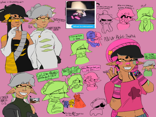
#splatoon#callie splatoon#callie cuttlefish#marie splatoon#marie cuttlefish#marie kensaki#wait do I tag Acht in this#they’re like#barely there#.#nahhhhhh this can be Acht erasure#goober art#this is literally just a thing full of tiny drawings why did it take me like 3 days to finish#(artstyle tweaks)#(thats the answer but I’m pretending it’s not my fault 🤭🤭)#I should probably go back to making normal drawings I think#and not a canvas full of a bunch of drawings maybe#perhaps#perchance#(it will be of Marina and Acht I can already see it yesss yesssssss)#OkImGonnaShutUpNow#listen to Miss World by Hole#do ur daily click#annndddddd#have a good#੧(⸍⸓⸌੧)
83 notes
·
View notes
Text
Random Suiren fact:
She looks weirdly good with white hair
#look idk I’m bored and felt like drawing smth or just messing around on a canvas#and some times ago while I was in full Kuviren Fantasy Mode kuvira watched suiren practicing her waterbending in the moonlight#and thought she looked as ethereal as the moon spirit#so I started wondering what Suiren would look like if she too was born sick and was saved by the moon spirit like yue was#so I took a recent drawing of little suiren and recoloured her hair#it takes some getting used to bc it really stands out. but honestly she looks good with it#I also can’t remember the last time I drew anyone with light hair lmao#probably when I drew a bunch of pvl characters over the summer. either fem!yekaterinburg or tver#point is. I’m not used to it and really don’t know how to shade it#but I’m willing to learn. kinda wanna take some other pieces and change her hair colour there too. just to see#I’m not gonna make it a full on au bc not many things change. just hair colour and some bits of her childhood#but I do certainly have some thoughts about it so who knows. maybe#the sheer irony of me coming up with this after kat and I just discussed the people of gaoling calling her a swamp spirit…#sotrl suiren
0 notes
Text


mob warriors au redesigns and such, some i barely changed and others i pretty much started from scratch lol
full canvas and explanations under the cut, theres a bunch of other characters and stuff i didnt manage to fit or didnt have the energy to draw that ill probably get around to in the coming future

so by virtue of mob psycho kind of acting as a parody of a shonen in a lot of its characters and usage of tropes i felt like it was fitting that a warriors au sort of act as a parody of warriors.
basically, pretty much every major character is either a house cat of some sort, but they all see clan cats as these sort of cool aspirational things so they give themselves warrior names and know of general clan concepts (though, since the nearby clan left a long time ago due to twoleg construction on their territory, these concepts have sort of become distorted over time. istg i came up with this before warriorclan me and erin hunter just have some odd psychic link)
saltsplash (reigen) is a declawed kittypet who loves the taste of freshkill, so he has taken on the persona of a former medicine cat who came from far away on some sort of spiritual quest to help the cats in this area (in reality his owners just moved here) in order to get cats to catch prey for him in exchange for advice. flockpaw (mob) comes to him for advice, since he can see spirits and keeps getting dreams from starclan, and saltsplash agrees to take him as an apprentice
there is a pretty significant ghost problem in the area, the destruction of the moonstone equivalent (this isnt the setting of og warriors because i find switching what region/biome theyre in to be kind of part of the fun to making warriors aus so this is still japan. cats can now encounter monkeys.) has left a lot of souls trapped in the physical plane and unable to pass on. dimple (still going back and forth on his name) is one of these cats, he was a clan cat but so long ago that he's forgotten his original life and only remembers the goal of "bring back the clans with yourself as leader", which he initially tries to posses random cats to do before meeting flockpaw and settling on him as a good potential clan leader
the actual clans, meanwhile, have gone way downhill since they moved away. their numbers were dwindling pretty badly when hawkstar (toichiro) took over his clan, renamed it clawclan, conquered the other clans in the area and marked all his dissenters with scars, and has forged forward with the goal of reconquering their old territory in the twolegplace in the hopes that it will bring the clans back to their glory days. a lot of the more sensible cats, including his mate, have left the clan, so he's resorted to recruiting outsiders as well as kidnapping young cats with warrior potential in order to fill out their numbers
other stuff i dont want to write entire paragraphs for
-teru was someones outdoor cat but his owners moved :( he named himself starpaw and everyone who knows shit about the clans tries to tell him hes not allowed to do that but are too scared to argue further with him about it because he gets really pissed when you point it out
-the telepathy clubs goal is to meet lions, which everyone thinks arent real
-the awakening lab is mitsuura (curlystar maybe?)'s attempt to start his own clan
-the student council is a gang of young kittypets who have tasked themselves with enforcing "the warrior code" among the delinquents (rivals gangs of young alley cats). all the older cats see this as a game theyre playing and dont take it seriously
-flashpaw (mezato) was part of dimple's initial play to brainwash a bunch of cats into reforming a clan and worshiping "starclan" (him) and those group of cats have shifted to seeing flockpaw as starclans prophet, so she's trying to convince HIM to start a new clan
-rainshade (serizawa) was initially a kittypet who always hid in his cat carrier out of his fear of his starclan given powers, hawkstar found him on one of his recruiting missions because his mother was worried for him and was asking around for someone with experience with starclan
-mogami (crowflight maybe? maggotsomething?) was an actual former warrior who went to twolegplace to get help for his sick mother after starclan said there was nothing that could be done for her. kittypets offered to get her help in exchange for him helping them with spirit problems and got their owners to bring her to the cutter (vet) and when they did the vets put her down so he started killing cats about it seeing them all as selfish thugs beyond redemption before his own death and transformation into a vengeful spirit
-minori (still thinking of a name bc i dont have her design down) is someones very haughty purebred show cat who gets hella possessed.
-didnt anyone ever teach you feeding downed fledglings was bad manners?
-SunClan (the rising sun union) are a gang of random housecats, some of whom have actual StarClan connections and others are just opportunistic liars, who use extremely predatory means to help cats with their ghost problems (asking for a specific share of a cat's meals permanently rather than saltsplash's ask of like. one fresh songbird)
thats all the stuff i can think of off the top of my head but if you ask questions i can probably answer them bc ive been thinking about this since like. march 2022.
#i tried to design it in a way where the plot of mob psycho can progress basically as normal except theyre cats#mp100#mob psycho 100#mobcats#warrior cats#shigeo kageyama#reigen arataka#ritsu kageyama#teruki hanazawa#tome kurata#mezato ichi#toichiro suzuki#shou suzuki#serizawa katsuya#art
79 notes
·
View notes
Text
Like I said I would, I'm going to go through the details I hid in my recent FNAF painting. Not because anyone asked, but because I want to and I'm proud of everything put in
1. Michael's design is my own! I've pretty much had the same concept for the design since SB came out. I just really liked the idea of having part of his jaw missing for no particular reason other than it looks cool. But, I have since moved the jaw gap to the other side, as well as defining scars and wrinkles.
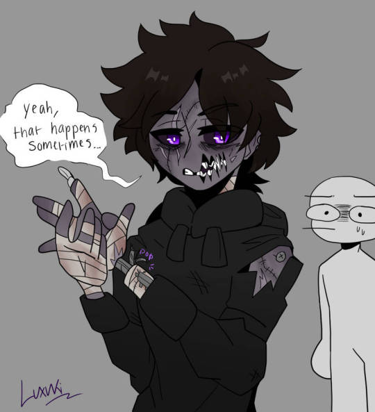
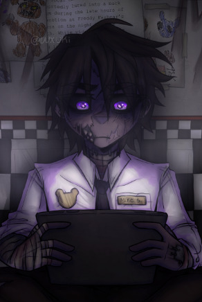
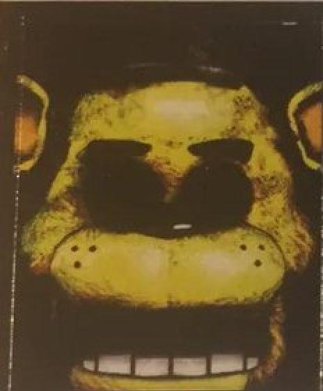
2. I've already posted Golden Freddy but here he is again. I redrew the original poster since I really didn't feel like I just should just slap the original on there. Since I had that freedom now, I decided to make references in the design to later games since it is appearing as a hallucination(?) to Michael. Obviously there are blood stains around the mouth to reference The Bite of '83 and I also added tear stains to reference Evan/CC, said victim of the bite.

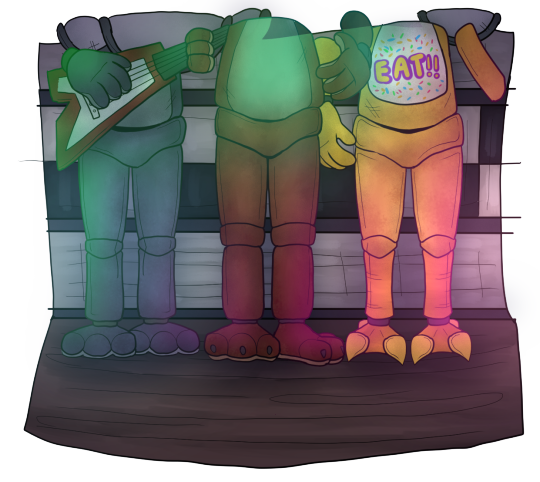
3. The classic "Celebrate!" poster. The same thing with Golden Freddy, I didn't feel like I should copy and paste the original so I drew it myself, but this time I only drew the bottom half of the crew since you'd only see that part anyway. Maybe one day I'll fully recreate the poster but for now, this is it lol (You may also notice that I gave each of them different leg shapes, to make them more distinguished from each other other than just colour)
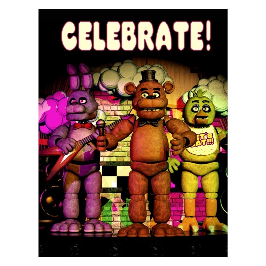
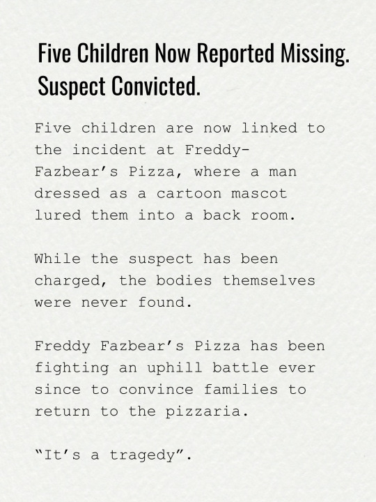
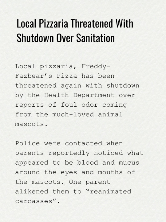
4. And again, didn't want to just copy and paste, so I re-typed all of the newspaper clippings myself in Canva. They say pretty much the same thing as the originals, but I'll still put them here anyway in case anyone wants to take a look:

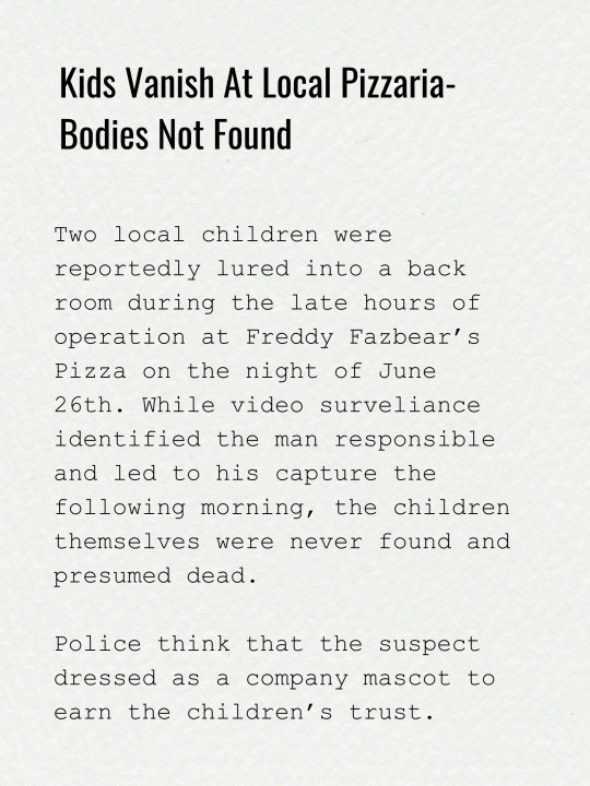
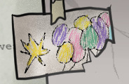
5. I also recreated the children's drawings myself. Fun fact: I actually used my NON-dominant hand to draw most the basic shapes. I figured that if I drew with my dominant hand, the lines might look too clean, showing my obvious years experience. It's silly but I really wanted it to look and feel like a child drew it
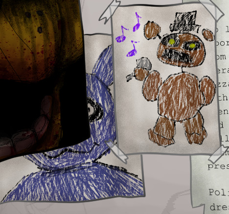
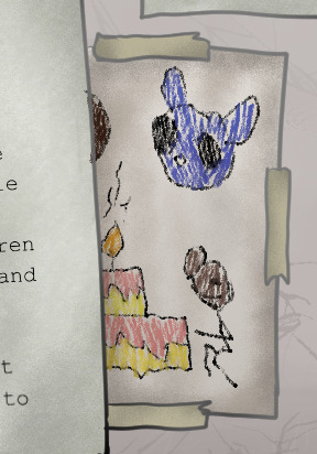
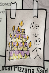
6. It ends up being pretty much invisible in the final painting, but on the floor you can see old confetti and blood stains on the tiles

7. If it wasn't obvious; cup from the Security office is here too
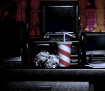
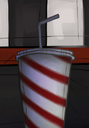
8. Now it should it obvious by now that I chose to not draw the security office. Why you ask? I'm still new to drawing more detailed backgrounds, and I really didn't feel like drawing the office in the moment lol so I opted for the hallway, and I think it still looks pretty good with what I was going for
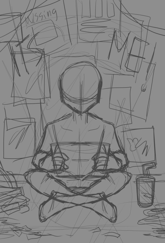
9. As a bonus, here's the original sketch I planned out. As you can see, I was originally planning to have more posters, some featuring the missing children. But in the end, I decided to scrap it and leave room for the wall to be more detailed since I thought it looked bare. Also, if you look closely, you can see a faint plan for a shadow over Mike. I was originally planning to put a shadow of Freddy there, but when I really started finishing up the shading, I realised that the extra shadow would be too much for an already dimly lit scene
And that's pretty much everything! I had so much fun doing all the little details and references, even though it did end up being more time consuming lol. I also tried out a bunch of different rendering techniques and I think they really helped pulled everything together. I'm definitely going to try my hand and making more paintings like this in the future ^^
If interested in seeing the full process, here's a link to the speed-paint:
youtube
#art#digital art#fanart#artists on tumblr#fnaf 10th anniversary#fnaf#fnaf fanart#drawing process#Youtube
69 notes
·
View notes
Note
Where do you read and find web comics?
that's a great question!
these days the scene is kinda dominated by platforms like webtoon and tapas, which heavily favour vertical-scrolling infinite canvas formats. these environments are aggressively competitive, and getting to the top of the popularity pile requires a pace of work that makes even the manga industry look downright reasonable. I wrote a little about one such comic back in 2022. the 'portal' format applies similar pressures as webnovel sites - somehow that's come down to favouring high-concept premises which can be spelled out in a title, and a fairly homogeneous art style. in general you'll see a lot of romance and isekai.
that said, traditional page-formatted webcomics are absolutely still around. usually I read them on their websites - you can use an RSS reader to keep up with updates for most comics, but I fell out of the habit of that years ago.
as far as finding them, there's not really any centralised place to find them, but often webcomics will promote other authors, and there's organisations like hiveworks which serve to cross-promote members of their network. most webcomics have a 'links' page. it's rhizomatic or some shit.
if you are coming back to webcomics, 'I used to read this comic, is it still going' can also lead to a lot of pleasant surprises - you wouldn't believe the number of webcomic authors who turn out to have transed their gender when you come back a few years later (or maybe you would). 'spend years writing a comic instead of transitioning' is a strangely common pitfall [edit: though I'm not sure 'spend years transitioning instead of making a big creative project' is like. a better strategy lmao. they're both big expressions of agency, it doesn't really matter what order you do em.]
some authors tend to stay on a single perpetual epic that will likely last until they die, but others like to write multiple projects, and usually if you enjoy one thing by a person you'll enjoy the others. for example, @bigbigtruck wrote the excellent The Less Than Epic Adventures of TJ and Amal back in the day, and is presently writing a story about stormchasers with a very similar vibe. Evan Dahm of Rice Boy went on to write some rather cool comics like Vattu.
webcomics review blogs can also be a good place to pick up recs. yes homo, now defunct, put a few things on my radar (I disagree with many of their opinions but that's part of the fun of it lol), as has thewebcomicsreview.
along similar lines, forums can be a good place to look - back in the old old days, I used to be a big fan of a D&D comic called The Order of the Stick and hang out on its forums a lot, and they had a pretty active board for talking about other webcomics (a large part of which was devoted to literally hundreds of threads for the club of posters making fun of a really mid comic called Dominic Deegan: Oracle for Hire - don't ask me to explain that...) these days I bet there are webcomics discords that function similarly, though I couldn't tell you which ones off the top of my head.
if you're willing to part with a little bit of money, events like the Shortbox Comics Fair are a good way to gather a huge stack of one-shots. I picked up a bunch in the last one of those, I should really write about them.
honestly I should really just draw up a list of comics I've liked, catch up on the ones that I fell off the update schedule on, and put that list on my website somewhere. writing full reviews is fun but time-consuming and I don't want to make promises with how incredibly ADHD I am (the 'comics comints' series lasted a mighty three posts, and of all the writing-about-stuff projects, the main ones I'm trying to get going again are the tftbn and umineko liveblogs), but it is happy-making to spread the word about good shit I've read. I used to liveblog webcomics quite a bit, you can see some of them over here. (I never got around to migrating the Homestuck sideblog.)
ultimately, word of mouth is queen here. all these suggestions are just different flavours of "find people who like the sorts of things you like and read the stuff they like" in the end!
17 notes
·
View notes
Note
Heyyyyy~ I'm just... So in love with all the work you do, they're all so precious and beautiful I'm in tears. Thank you so for what you do, can't wait to buy something you made soon :D
If it's okei, can you please tell the story of how you got into this and how did you progress from being babie artist to now growing artist and how long you've been doing this for? What's your top 3 fav works you've done? Did you eat good food today, if not please dooo. Thenks
thank you! that's very sweet x3 I'm excited to get more stuff fired and up on Etsy, hopefully before the end of June
.
choose three favourites of my work? oh, that is a difficult question.
one thing I really didn't like about my art when I was younger was that it was all very static. it was people sitting or standing, it was still life paintings. one of the things I'm really proud of in my work now is the sense of capturing a moment instead of someone posing, and/or giving a sense of movement
these two are just the opposite of static and I love them for that
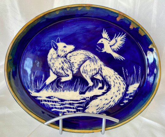
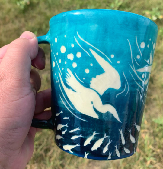
and then there's this mug. the design is great, the details are great and I had so much fun carving it. it was honestly just delightful and I wish I'd kept it. I don't say that very often.
all sold
.
I'm putting the rest of this under a cut because I'm going to ramble
I started drawing because I was making silly comics about me and my friends in grade school and through high school (I assigned them all fursonas because I was a really cool 15 year old lol)
I got a little more serious about art in high school, but I never thought it'd be something I'd make money at.
when I was... in my early twenties? maybe 19 still? ah, memory issues, I went through a nine month art program, the 'Urban Canvas' project run by SCYAP (saskatoon community youth arts programming). the program is meant to support young artists, especially those with mental health or addiction issues. and it meant I got paid to draw and paint and create weird shit for 40 hours a week, for nine months. and then some (seven? eight?) years later I got to go through the program again which... honestly I'm so grateful I got to do that. (and SCYAP still supports me, they give me a table at their craft show every year and helped me with my first solo gallery show)
these are some of the pieces I made during my time at SCYAP:

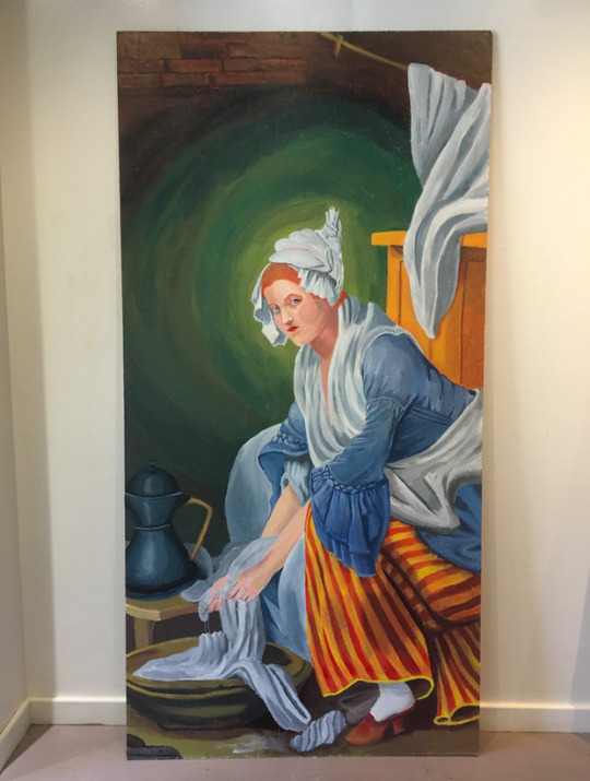


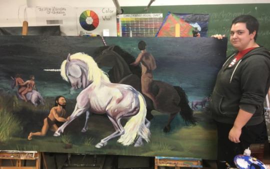
and two very rare pictures of me, posing with two of my master studies. the left from when I was 20ish, and the right when I was... 27ish? (man I'm still proud of that Gentileschi copy)
.
it was after SCYAP when I started thinking that I could actually make money as an artist. so I painted more than a dozen murals, drew a 20-some page full colour comic, painted pet portraits, and sold my own paintings. commissions were more reliable than selling my own work for a long time lol
as for how I got into pottery, my mental health uh... haha. it took a nosedive about six years ago and during some of the worst of it, I was severely agoraphobic. my mom, who has always supported my art, offered to take me to pottery classes with her, in an attempt to get me leaving the house at least once a week. it did help (along with a lot of other things) and once I started exploring the surface decoration side of pottery, things really clicked for me
.
tangent: one of the things that really drove me to progress as an artist was having something driving my work. whether it was preparing for a gallery show or making a bunch of holiday cards or making piles of fan art because I was obsessed. every time I made something, anything, I improved. so when I had a goal that made me create more, I improved faster.
my unsolicited advice: make that weird fan art. it's good for your art. (I was really into tf2 lol)

.
I've tried tons of different mediums and I think it was a great way to help my style evolve.
when you're making art with a new medium, it might take awhile before you're making your own personal work. I, at least, find that I usually have to do some studies of other peoples' art and just try some basic creations before I do anything more personal. but once I'm ready to do MY stuff, I have a new repertoire to pull from. I wouldn't be the potter I am if I didn't have the experiences I got from other mediums
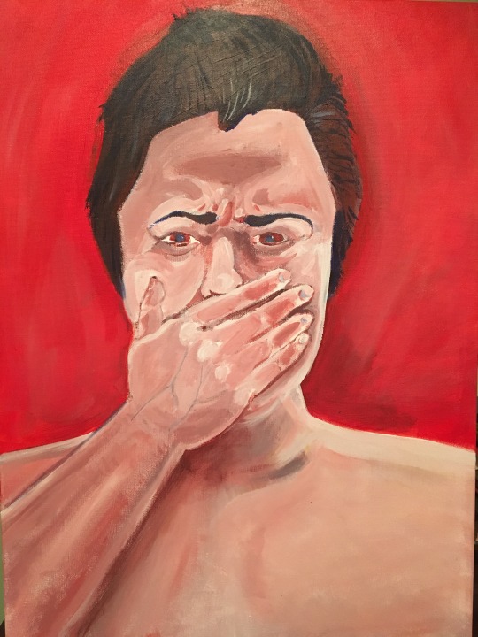
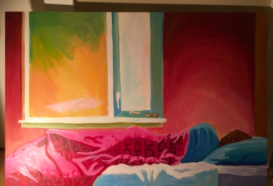
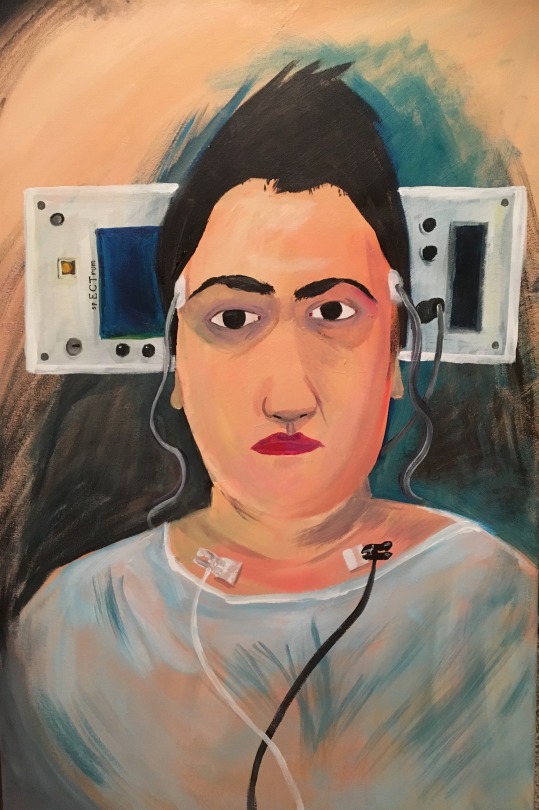
like acrylics (I did a lot of self portraits >.>)
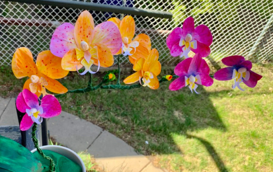
paper flower making
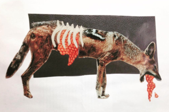
watercolour


collage

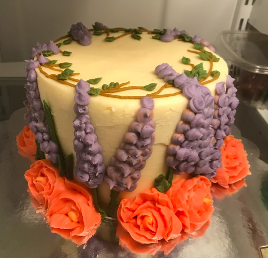
cake decorating
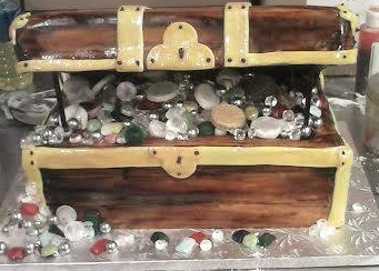

(also oil paints, pastels, 3D wire art, crochet, linocut, stone carving, sewing, set painting and quilting. also my spouse and I like to make crafts together, like cutting-construction-paper, gluing-pompoms-and-googly-eyes crafts, because it's just fun to make stuff together)
I'm sure pottery isn't the last medium I'm gonna try. I'll probably get obsessed with carving tiny wooden figurines or making wax sculptures at some point. who knows!
.
and now I'm in my mid-thirties, making art pretty much every day. I've been doing this since I was a teenager, so almost twenty years now.
I never imagined I'd be satisfied with my own art, that I could look at most of my pieces and not see how I could have done it better, but hey, here I am.
.
wow that was rambly. the ADHD really comes out when I'm writing lol. and I did eat real food today! before having some freezies
thanks so much for your ask, hopefully I satisfied your curiosity
39 notes
·
View notes
Note
HALLO i was wondering how you get out of art block?? your art is very expressive and i absolutely adore all your colour choices and designs. ive been having trouble with art block for a very long time now so i’m just trying to ask other artists how they get outta it <3 i hope u have a niceday yesyes
OUGHH HELLO!!! holy crap, art block is the WORST. everytime i encounter it, its always hard to beat it D: theres days where i feel like i WANT to draw something so badly but my brain just. cant function
i dont have a definitive solution for art block, but whenever i do, i have a few ways to cope with it. sometimes they work, sometimes they dont? but whenever the time comes and im just sitting at a brick wall, i got some survival tips
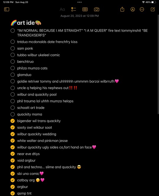
1. come up with random silly ideas,, it could be anything: random words, phrases, scenarios. they can be as nonsensical as you want them to be. during art blocks, my mind is completely dry with ideas, so i always try to compile a list of ideas from the past so i can come back to them later on. i try to come up with random duos or something as simple as “mcdonalds date”. i might not work on these now, but maybe some random lil word can spark that creativity in me
heres my art ideas list… i have some ideas that are like 8 months old in there BGAHSGA, but i save em there till i feel like working on them
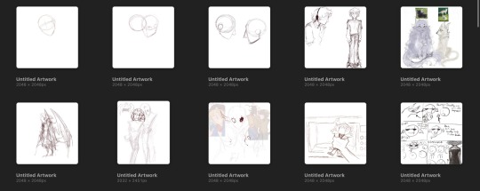
2. STRUGGLE DOODLES!! i like to make a bunch of doodles of random scenes that i think about in my head. doodle practically anything. your favorite person, favorite animal, something you see outside your window, frogs?
heres a few of mine. most of the time, i NEVER get to finishing them. however, during art blocks sometimes i like to go back to really old, incomplete guidelines and add some new, random addition to it. sometimes i forget what my sketches were exactly meant to be? and i guess thats the fun about interpreting stuff and giving things a new spin to them. during art blocks, i HATE trying to come up with new drawings from a blank canvas (since i dont even have any ideas to begin with). but working on old wips, or completely revising them? sometimes these can be super fun :]
[and bonus tip!! and this is like, a golden tip that everyone loves: going back to super old drawings and redrawing them!! its my favorite. i absolutely love seeing the improvement ive made over the years. its also pretty easy to work with since you dont have to stress about coming up with completely new ideas from a blank slate! GAHH i should do that more often.]
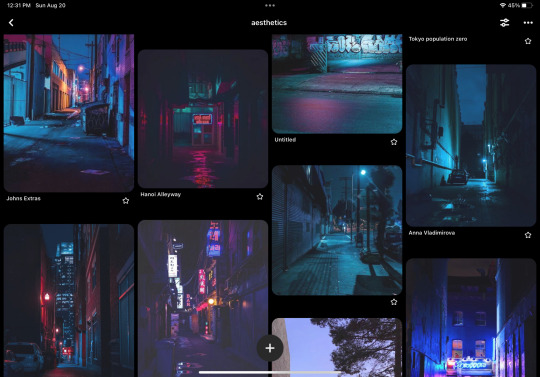
3. search up your favorite fanart, go on pinterest, anything. i love this one.
search up some really cool photos of outfits, aesthetic backgrounds?? i find myself searching up a lot of fanart of fandoms im in, any word with “aesthetic” at the end, casino aesthetic, anything! pinterest has always been my go-to platform to find ideas. i go on the app and not even a second in, im blown with all of this cool art n character designs. i have a problem saving almost everything i find into my boards, but at least i saved a chock-full of ideas i can work with. :)
a thing about me: ive never been the type to try and force my art block out. whenever im facing a block, its extremely difficult for me to come up with things on my own. sometimes i let it wait for a while, but that tends to take a REALLY long time. D: if i dont feel like drawing, or doodling, or really doing anything? i always like scrolling through really pretty photos. that tends to spark a small idea in me i can work with, and sometimes i manage to get out of art block from there. it starts out small, then over time it gets even better.
these photos especially gave me WAY more motivation than i ever had to draw wilbur during an art block moment. i started off making small random doodles of him in a neon city and over time it kinda turned into a fixation for neon cities. i LOVE imagining characters in random photos i find on pinterest.
wishing you the bestest in your art journey!! this crap’s tough but i know you can break it yo. thank you so much for the ask!
feel free to reblog and add your own ideas below :] i was only able to come up with a few, but if youd like to add on, go right ahead! /noforce
28 notes
·
View notes
Text
Sarajevo Days Of Architecture
Weltraum, a radio podcast about space on the jabbering Independent Coastal Radio NOR hosted Dunja Krvavac from Days of Architecture in Sarajevo. I had this great opportunity to talk about the city, her travels and thoughts in Mostar, where we met in May.

Dunja Krvavac | Photo © Ajla Salkić
How can a young female architect work in Sarajevo?
DK: It has its ups and downs, like everywhere in the world, you have different challenges. Maybe Sarajevo is a bit more specific in terms that is a still a very traditional and patriarchal community. World of architecture here is full of men, so many men. Going through this field of old white men sometimes can be a little bit challenging. I think that we all have to do small steps, we all have to be focused on what we want to do and how we want to achieve it. Working in Sarajevo, as I said, I love being here, I was born here, I was raised here, I've been living here for thirty years and have no desire to live anywhere else. I think this is a beautiful canvas that still has to be painted with a lot of things. Me staying here is a decision I made.

Kazani Memorial in Sarajevo (project drawings). | Photo © Dunja Krvavac
Most of the contribution that I can make into this world, I think is specifically connected to Sarajevo. Trying to be an architect here - I mean it's a cliché to say it like this that I am a girl and this is a job full of men but it happens a lot even today that you’re walking through a construction site where you have a bunch of men not taking you seriously because you are a girl. I don't want to be negative, I am very privileged as I have a wonderful job, opportunities and community of people who support me but we still have to unite in order to make this city better after all it has been through in the 1990s.
The Balkans wars from the 1990s are almost forgotten in Europe - there was a dispute in Germany that the war in Ukraine is the first war after the II WW - how did different capital intervene and defined Bosnia and Herzegovina after 1990s?
DK: n Europe people might have forgotten about the Balkan war in the 1990s but here it’s still very much present. I was born in the first year of the war, in 1992 and maybe it's a fortune that I don't remember the war. Unfortunately, due to the way that the county functions and works, we are reminded of it every day. I [as most of my generation] have this inherited trauma. This situation of us [Bosnia and Herzegovina] being in transition and the huge amount of capital flow in the late 1990s and beginning of 2000s and even now, changed the city and its architecture completely. It became a capital-focused architecture. We used to have a wonderful developing city before the war where people were eager to build the city by building schools, museum, galleries, community, culture and today everything is focused on capital and investments. There is a small amount of planning done, people just grab opportunities to earn a lot of cash when they can.
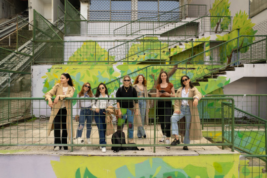
Workshop UNCONTEXT Dissecting the layers. | Photo © Sabina Hodović
Unfortunately, that's the general atmosphere now. It changed so much from socialist system transitioning to capitalism, I think we as a society still struggle to understand what is a position of an architect in this situation and context. There are a lot of people trying to be respectable towards the city and its architecture but in the end, 90% of all these efforts fail in terms that investments and politics - it's all that it matters to some people. It sounds a bit gloomy when I say all this, it sounds like there is not hope but I am an incurable optimist that things can be better. You need to make small steps and giving up is no option.
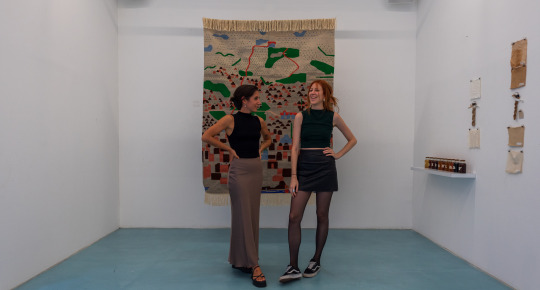
Exhibition UNCONTEXT Dissecting the layers | Photo © Sabina Hodović
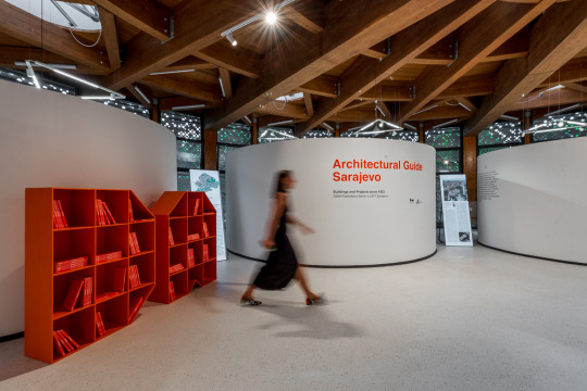
Architectural Guide Sarajevo. | Photo © Timur Babić
What did the specific capital coming from Middle East to the modernist city?
DK: This influx of Middle-Eastern capital is a very difficult topic to talk about. There is a lot foreigners coming here and they want to build, invest and sometimes to even live here. That's not an issue for me if people want to invest, I don't mind that. But what I do mind is the attitude that Bosnia and Herzegovina has taken when it comes to this or any type of investors; we have this small county attitude that we just let foreign investors do whatever they want. We are so scared that everything will fall apart if we don' let them to do everything they want.
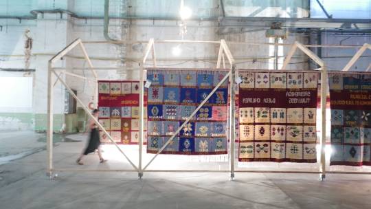
House of Memories for Memorial Center Srebrenica. | Photo © Ismet Lisica
Now we have these situations where investors are destroying most of our Olympic mountains with help of the locals. They are building huge settlements and gated neighborhoods on our mountains and the worst thing about this is that they don't really care about our traditions, customs, local experience. And we are doing nothing about it.
You are in the position of being able to travel a lot; how that influence on your work?
DK: It's a huge benefit for me that my work is connected to traveling. I discussed this with my best friend and partner in crime Irhana Šehović that we need to make our work travelabe, to meet new people in order to bring new perspectives into Sarajevo. When you are in the city for too long sometimes I have this tendency to oversee thing. You are constantly bombarded with local information that you don't filter it in a correct way. Traveling enables to connect with amazing people with new perspectives. Through LINA and other projects that we are involved in, we are making Bosnia visible again. We were visible before, we used to be an amazing county and then that horrible episode of the 1990s happened and we went some steps back. I think that everything that that we try to do here is a step forward to become better. There is no option of giving up.
What does a responsible building mean?
DK: It's a difficult question from many aspects, there is an architectural answer to that and there is a human answer to that as well. Architects are very self-centred, sometimes they [we] make buildings that are more about the architecture and the architect and less made for the community that is going to use this building.

Manifesto gallery of contemporary arts (project renderings). | Photo © Dunja Krvavac and Nikola Ostojić
I think that responsible architecture and responsible building is something where you put aside what the architecture and the architects is. That is almost not important, I always see architects as mediators. I can see space in a different way than someone else can and I can easily try to organize it. But there is an entire community that needs to use this space. It would be very narcissistic of me as an architect to say that this is an amazing building that I made and completely disregard that this building is going to be a crucial part of someone's life. If I design something it always has to be focused on the person using it. Me as an architect – I am irrelevant and not important. The only thing that is important are the people that are going to use the architecture. If you don't build for the community, if you don't interact with the community and if you don't put the community first as a part of your design process then it makes no sense.
Tell me more about the Days of Architecture and other projects that you are involved in?
DK: Days of Architecture are one of the most important projects that I am working on for almost nine years now. It's an important part of the city and regenerating the city after the war and transition.
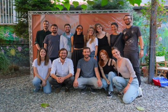
Days of architecture 2023. | Photo © Harun Čerkez
We celebrated fifteen years of Days of architecture this year. It comes down as a festival but is so much more. During the festival we gather local and international experts to discuss important topics. It a place where we can research and introduce new perspectives into our local communities as the festival is very much connected to Sarajevo. During my presentations and lectures I say “Sarajevo is our playground” to research and experiment what might Sarajevo become in the future. I am proud that we have managed to stay relevant in the city for fifteen years. We are not supported from the state so we are trying to make steps forward with the festival with the best of our capabilities. I enjoy being involved into different activist projects like the Open Air Cinema Prvi Maj in the city on which I’m working right now with an amazing interdisciplinary team.

Open Air Cinema Prvi Maj (project drawings). | Photo © Dunja Krvavac
You are good within communicating with different generations right, for example the Doršner couple which built the Olympic City of Sarajevo?
DK: It is the most precious thing in the world to bring back these people and listen to them and take in all what they have to say. I am a child of two architects and I've met a lot of architects from elderly generations at our home. People sometimes tend to put them aside and not listen to what they have to say. Especially the Doršner couple, they are like an encyclopedia of knowledge with infinity of information coming from them. Due to our [country’s] poor archiving capabilities you cannot find this knowledge in books or online. You simply have to talk to them and reach out to get all information before it’s lost.
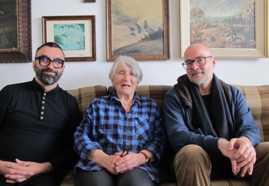
Boštjan Bugarič, Dragica Doršner and Martin Reichert during the interview in Sarajevo. | Photo © Zoran Doršner
The Doršner couple are responsible for the fact that Sarajevo had Olympic games and that we have all this amazing architectural Olympic heritage and legacy. I met them for the first time in 2021 during production of a movie which was showcased at the Venice Architecture Biennial as part of Italian pavilion.
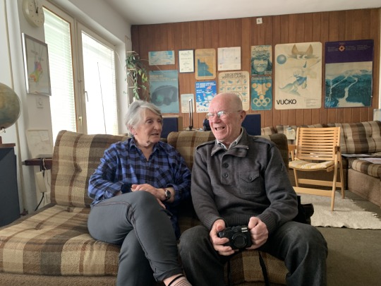
Dragica and Zoran Doršner in their home in Sarajevo. | Photo © Boštjan Bugarič
The three hour talk with the Doršner couple was some of the most amazing times of my life. This type to knowledge is very important for our generation to learn. Sharing information through different generations it is the most important way of keeping the knowledge alive.
What will architecture in the future look like?
DK: I ask myself this question all the time. There are so many things happening right now, from war in Ukraine to this horrible apartheid that is happening in Israel and Palestine. These situations make you wander what is the future of architecture, what is the future of the world? We have to change the way we think, we have to unlearn some things and question everything that we know. We need to be honest and very transparent. Architecture is the slowest changing profession in the world and we are still doing things very traditionally. Are we changing anything if we are working in box frames that we are working in? Having architecture for the sake of building - that's not the future. Focusing on communities, programs, systems - that we can change - is the most important thing at the moment. We seriously need to take stronger stands on many issues that are happening.
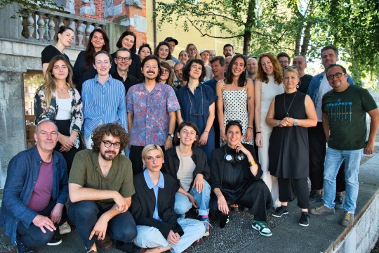
LINA Team Members. | Photo © Urban Cerjak
Dunja Krvavac enrolled at the Faculty of Architecture at University of Sarajevo in 2011 and finished her Bachelor’s degree in 2017, focusing on architectural design and constructive systems. In 2017, she started her Masters at the same faculty where she’s currently finishing her master thesis on urban planning and inclusive urbanism and design based on migrations. In 2018, as an Erasmus+ student, she spent one semester at the Norwegian University of Science and Technology in Trondheim, Norway, focusing her studies on urban planning and design. While studying, she’s been part of LIFT - spatial initiatives, a non-profit non-governmental organisation that aims to educate local communities on architecture, urbanism and design. She started as a volunteer in 2016 and moved on to become design team leader in 2019 and project coordinator of LIFT’s biggest project which is biennial festival Days of architecture Sarajevo and its complementary project Nights of architecture in 2020. As of soon, her interests expanded to fields of graphic and product design, resulting in awarded furniture designs, featured festival visuals and book illustrations. From 2020 she’s been actively freelancing and from 2022 she started working at a local architecture studio i.d.e.a Sarajevo. In 2021 she started working with Nikola Ostojić on various projects. She worked on Urban Lab Sarajevo, a collaborative project with UNDP BiH, Municipality Centar and Faculty of Sarajevo that focused on producing a digital platform for inclusive consultations several locations in Sarajevo. She continued exploring the topic of Sarajevo public spaces through joint Days of architecture and LINA European architecture platform project (UN)CONTEXT_Dissecting the layers: Sarajevo residency workshop.
Here You can listen to the WELTRAUM interview
3 notes
·
View notes
Text
She probably thought "I wanna make it shiny" and then did that.
Tbh the art explanation is that the above person is overcomplicating it in their head and making it seem wayyy more difficult than it would be.
1. This is definitely not a bas-relief. A bas-relief sculpture is, well, sculpted. She didn't sculpt anything. She used some kind of impasto medium to make a thickened/raised texture on a surface. So no, she didn't make a bas-relief and didn't really need to think about sculpting. She needed to think about rendering a 3D object in 2D like any artist does, and then gave that some texture and dimensionality by adding to a 2D image.
2. This means there aren't actually three different mediums of art happening here. The white impasto (maybe an impasto thick gesso or similar material) is being painted on, and then she's painting color. All she did was trace paint the lines of her drawing to make the outlines raised. She possibly used a palette knife to spread some of the thickness/layer, but that's still just impasto painting techniques.
3. Her coloring is done fine, but I don't think it takes anything crazy to paint a peacock feather peacock colored, yanno? Like the technical skill is fine, but I don't think it takes imagination to come up with, so much as solid color theory knowledge to mix/blend and practice to render it in a pleasing way. Basically I don't think she had to "come up with" that?
4. Mirror work doesn't seem crazy to me, but then again, I did once break a bunch of old trash CDs up and glued them to the tops of my converses in junior high so that I had shiny discoball like shoes. Literally the thought process is sometimes "but what if I make it shiny?" [See also: Klimt with gold leaf, and Louis Comfort Tiffany with glass/gems as mixed media.] It's cool, don't get me wrong, and it IS different from just straight painting (everything else being done until this point). But it's like...oh okay. It's just adding mosaic/glass cutting techniques. This is a way to make it mixed media. But I'm not as baffled by the desire to be like "okay but shiny or reflective also??" It's cool that people's brains do this when I don't always think about it, but sometimes I also have the magpie urge.
5. This makes me such a killjoy, but resin pouring over a mixed media painting is just a way to seal it. Painters varnish their paintings all the time with resins/varnish, it's just that this one is a thick poured layer of a polyresin rather than thinly brushed on. It takes work to do, but it's not particularly difficult to just dump resin on it and avoid bubbles when it sets.
Like...looking at all of this, I think it's much easier than people might think to do the same thing. Practice will improve people greatly, but also (minus the mirror cutting, and a full resin pour) i think I could teach kids how to do this pretty easily. Maybe with pre-cut mirrored pieces that aren't sharp for preteens/teens. Her lack of safety gear for the mirror cutting is stupid and alarming lol.
But elementary kids you could do deffo this with shiny plastic shiny cut out shapes, some glue, (maybe flour glue?), caulk, or plaster paste in like, pastry bags, and have them paint on a canvas or gessoed board.
Pretty simple techniques, basic subjects and colors, just rendered well with practice! But anyone could try to do something like this if they felt brave.
15K notes
·
View notes
Text
@/pyramidh3ad (crimson seal) is NO ONE going to talk abt how cho minji's just copying that one artist's works like come on.. tattoo artist my ass she's totally faking it just because she wants fame from working on the movie !!!! she was practically a ghost online until a few months ago
heyy it's leon (he/him, 21+) again with cho minji, (but don't forget jeon byeonghun too!) this intro will have information on minji, but feel free to look through her profile for extras! minji aka the velveteen rabbit who just wants to be real, ghost who wishes she could be noticed but no one can see her, melancholy mundane day to day loop who's left pieces of herself everywhere but still remains nowhere at all.. one day she will leave a mark on this world !!!! (hit her up if u want a tattoo, at least it's smth..)
let me know if you want to chat here or d!scord, but you can message me at byeonghun’s blog for plotting with either of them, or both! as always, i'm up to plotting or just throwing them together nd seeing what horrors they get up to.. leave a like and i'll come visit ur dm's!
BACKGROUND.
'94, she/her, the ILLUSTRATOR. she's recently been working as a tattoo artist at THE RABBIT HOLE, but she's had a slew of other odd jobs that you've maybe seen her at, laundromat, receptionist, coffee shop barista, hotel cleaning maid, convenience store, etc..
basically her father fell in love with her mother when they were young, but his family never approved of the match even though he ended up having two kids with her before going off to marry who his parents wanted him to, getting famous, forgetting abt them completely in the process..
totally not her mother's fault, but they had all been kind of hoping their father would leave his family behind and choose them all of these years, but kim beomsoo chooses fame, instead, and goes ahead to become a famous traditional artist, having two other kids and not even telling his other family about them, presumably.. which leaves her mother heartbroken, and she kinda checks out around when minji turns 18
so minji takes care of her younger sister by herself, and uses art as the only way she can connect with her father, since he used to teach her back when he Was around when she was younger, as well as bestowing her with one of the love kills comics, sweet velveteen
they're kinda always struggling for money? minji does her best, but she's also filled with a lot of rage towards her father for leaving them in the dust, and she kind of realizes he used to teach her a bunch of his techniques, so it's actually kinda easy for her to replicate his art? close enough to be sold as a fake
so she sells counterfeit copies of his art underneath a fake name, PHANTOM, and they start making more money then they've ever had before. even so, she only does it sparingly, because she doesn't want it to become too noticeable Or looked into
then she sees the position for the illustrator for the mask of all hearts, and her and her sister had been obsessed with love kills for ages, so. she uses a contact through PHANTOM to fake her entire background to get the position and it works
it says she went to college, did internships, worked at notable places to have enough experience to work on the movie, all with her own art, at least. she only has as high as a high school diploma, but she pretends along with the lie
she had attended the set quite often, even if she was mostly unnoticeable. stayed quiet, kept to herself, always carrying around a journal full of doodles and finding as many things to draw as she could
at the time, she was only working a job as a receptionist for a hotel, and when she began working on the art for the movie, odd things began happening in her studio in her small, cramped apartment. canvas's torn and ripped, paint splattered, waking up with her hands coated in paint and ink, all over her clothes
further into the movie, it worsened because her art began to move. it would shift on the pages, until it looked like it started coming out of the page. the first time it did, curling around her skin, made tangible shadow, was almost gentle enough for her to think she was just losing sleep, imagining things. but then it started to form into shapes and things of her own nightmares that she drew, crawling out of the pages for her, leaving odd bruises wherever it touched her
she still chalks it up to no sleep, being clumsy to her stress about money, about what she'd done to get the job and try to prove herself. when the movie's over, she even takes a break from making art, fearing the worst, but it leads her running into another money problem, and she seeks out the tattoo artist job at a shop that allows independent studios, still running on some leftover funds from PHANTOM's work
the movie's over, tattoos are permanent, they can't hurt her, right? she hasn't been drawing like she used to, but at least she's making money. until it happens again, a late night stencil of a monster for a client jumping forward and leaving scratches along her face, and then she receives the invitation for the show
not being able to draw, something she's leaned on for years, is kind of fucking her up tbh.. drawings becoming nightmares becoming drawings is a loop that has her losing sleep and her own sanity, but all she wants is answers, she wants her drawings back, still carrying them around but not daring to open the pages in case they come back to follow her all the way back 2 where it first started..
CONNECTIONS.
you saw her always glaring from whatever perch she had made for herself on set and was like.. is she staring at me or like.. what.. but she was rlly just concentrating on drawing u, in which she gave u the drawing (an odd memento u somehow still have from the movie days) and wait didn't it look like it was moving the other day..
idk u deal in some sketchy shit too and u only know her as PHANTOM, in which she always shows up w a mask/hood down/sunglasses and she never lets slip Who she is, but u build some kind of trust system between each other, esp when everyone in this business is some kind of shady.. at least u can rely on each other..
(fem only) if u are looking for some fwb's vibes.. she definitely does not stick around longer than she needs to and she is so out of touch w her emotions its kind of impressive, but. she cannot resist a pretty girl, what is she to do..
high school friends?? she was always drawing and has always had a love kills obsession, so you could've read the comics tgt, she showed you all of her horror inspired art, you watched the films tgt, and then she kinda disappeared off the face of the earth once graduation hit. wtf
tattoos before the horrors rlly got to her !! she had her own studio and took requests thru her (kinda new) insta, but let her know if u want anything horror/animated/silly she will do it..
ur like kinda suspicious abt her art?? it Does kinda look like that kim beomsoo guy's, and also like. why is there no social media of her before the movie started filming? maybe u went to the same art college but never heard of her/saw her around, start digging and find out that her records look rlly out of place.. idk u piece it together hold it over her she already has other horrors but what is One More..
she's kinda quiet and doesn't rlly hesitate to be Blunt abt things but.. u both see each other on the bus everyday, attend the same coffee shop and get the same order, live in the same shitty apartment building isn't that landlord such an asshole, she's left drawings for u but she stopped all of the sudden, she looks scared as soon as u ask her for another but like.. why is she scared of her own art..
13 notes
·
View notes
Text

My year in review, featuring many never-before-seen pieces! This year, I discovered soft shading digitally, ink, and underpainting in burnt sienna. More details on each individual piece under the cut.
January: Untitled Drawing of Alex Strike, Procreate. I had just gotten an Apple Pencil (no more drawing with my finger!) and wanted to try it out despite not being in an art mood. The full ‘comic’ was based off a post, which I reblogged with the drawing.
February: Bl. Carlo Acutis, Procreate. This was actually undated. I don’t know when I did it because I never did sign it, but I had an empty month to fill and I liked it. I enjoy drawing the saints, but iconography is a deep topic and very hard to get into.
March: Untitled Drawing of Falcus Vandacia, Procreate. I drew this in Virginia while on my spring break. It took me under a day. It’s another one of my silly four-panel ‘comics’.
April: Sketch of Dagoth Odrosa, Pencil. Another undated one, from the era before I discovered sketchbooks. I only know this is from April because I have the reference photo on my phone still. It was originally intended to be a full digital piece, but we’ll see if that happens.
May: Zenaida macroura, Acrylic on Canvas. One of my gallery pieces! I didn’t show much this year, but I went out of my way to get this one in because I loved it so much. Technically, I put it in under Plotting a Coo, because the gallery director is a bully (kidding, he’s a mensch) but in my heart it’s the species name. I pushed myself with the colors, and I think it came out the better for it.
June: Dagoth Family Tree, Procreate. The full tree plum wouldn’t fit with this format, but it’s posted on my blog. This one pushed me on my character design. Still suck at it though :D
July: Isabel Mazer, Procreate. This was probably the turning point where my art went from the harsher shading I was using before to a form similar to my traditional style. This was also done while I was working my summer job where I interacted with a lot of seagulls and a lot of Orthodox. I had them on the brain, so I smushed them together.
August: Lady Dagoth Gilvoth, Procreate. This was the piece where I discovered soft shading. I also tried to use perspective, but I think that failed. Still one of my best pieces from this year, though.
September: Nerevar, Procreate. Taken from a larger reference sheet for my Nerevarine. I’ll get around to posting it someday.
October: Louise Mallard, Procreate. Don’t much like this one. Did it for my Lit class. Not much to say.
November: Grainne Mhaol, Acrylic on Canvas. This is when I discovered underpainting in burnt sienna! Before, I was just blocking out shapes/colors, but not value, so all my pieces felt flat. I told my teacher this like it was some new discovery, and she went: “Yeah, probably should have told you about underpainting about six years ago when I realized you liked acrylics. Do you want the rest of my soda?” And I said yes because I am physically incapable of being mad at her. I also listened to Óró sé do bheatha ‘bhaile on repeat for a week for this.
December: Lili Marlene, Ink on Paper. My father voluntold me to make some art for his DnD holiday party, and I said to myself that I was at least going to have fun with it, so I drew a bunch of evil women. Most of them I didn’t care about giving up, but this little lady kind of latched onto me. I’m going to keep her design around, maybe write her a wee story. Her name comes from the song, because I had been playing my ‘40’s CDs while drawing.
1 note
·
View note
Text
Pointing out little details as I notice them:
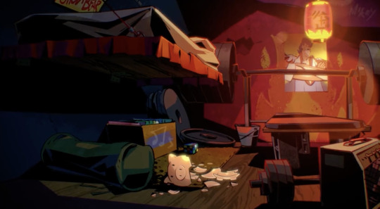
Raph’s bedroom:
Okay first of all the perspective in this shot is slightly wonky and it’s throwing me off a bit, but anyway…
His bench press is mostly held up by cinder blocks, while the part of it that holds the barbell itself (idk what it’s called) seems to be held in place by a bucket, maybe full of cement?
Raph and Leo both seem to have wooden floors while everyone else just has concrete floors?
Under Raph’s bed is a collection of weights for the bench press, a box of records, an unsolved Rubik’s cube, and a somewhat mysterious duffel bag.
Above his bed a Ghost Bear poster.
He has a random amp.
His bed seems to be just a mattress thrown on top of a concrete slab, and the slab itself is supported by those chains.
Raph has flames painted on his wall behind the bench press!
Just above and to the right of the flames it looks like Mikey graffitied his name on the wall.
I can’t tell if the poster on the wall behind the bench press is meant to be a poster of Lou Jitsu or perhaps one of Raph’s favorite musicians, I’m gonna guess Lou Jitsu on this one though.
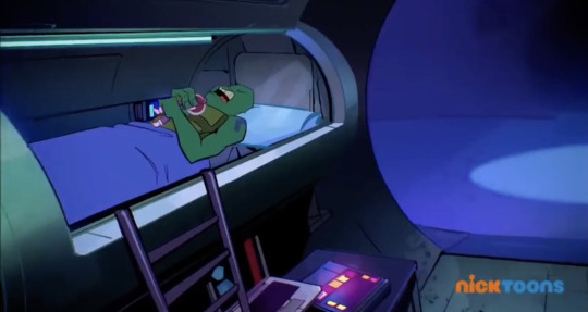
Donnie’s bedroom:
Not as much going on in this image unfortunately :(
Donnie’s bed seems to be made out of an old tanning bed, can’t see what’s holding it up to make it lofted tho.
Underneath he has a desk where he has a laptop and what looks like either a tablet or a book.
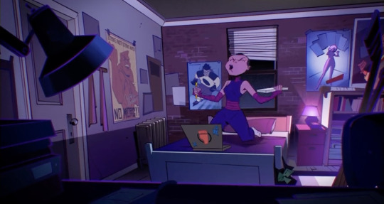
Casey’s bedroom:
It looks like she has a small stack of books on her desk that he lamp is either really close to or sitting on top of.
Leaning against her desk chair are a couple of hockey sticks.
Behind the desk chair on top of the bookshelf you can see a baseball bat.
Can’t quite make out what the posters on the wall above the bookshelf are for, but given that the other posters feature Bradford and a hockey player, they’re probably also sports posters.
It looks like she’s got either a bag with a green bow, or perhaps a bit of brownie scout paraphernalia hanging off the bedpost there.
The Bradford poster is autographed.
On her laptop is a sticker of the foot clan symbol, and also stickers of ninja stars.
Mikey’s bedroom:
On the canvas on the far right you can see that Mikey drew a cartoonified self portrait.
Next to that are a bunch of little doodles on the wall that seem to mostly be of little cartoon cats! It seems Mikey really likes drawing cartoon cats because they’re on the other side of the room as well in another collection of wall doodles. All over the floor are cans of spray paint but also buckets of paint like you get at Home Depot.
Underneath his hammock is his skateboard, a boombox, and what are either tapes for the boombox or reams of paper, given their size I’m thinking paper.
Behind the hammock he’s painting a large yellow smiley face and big bubble letters that say something I can’t quite make out.
Splinter’s bedroom:
On the top shelf in the upper left side of the room appear to be some of Lou Jitsu’s acting trophies, one of which appears to be a golden globe.
On the shelf below that seems to be just a book and a sock that’s about to fall off the shelf.
Below that there’s a knife stuck in the wall.
Over by the bed, what my really bad eye sight initially took for a suitcase full of money that he inexplicably had, is a box of sewing supplies.
On the floor is a pair of sewing scissors near a bunch of fabric that is on the floor and thrown over Splinter’s minibar.
Also on the minibar is an unfinished bowl of ramen and a box of cookies.
Splinter’s desk is just the tabletop and hutch, and is held up by cinder blocks, the pedal for his sewing machine is also on one of these blocks while he’s sewing.
Next to Splinter’s desk is a pretty tall stack of file boxes.
Behind his bed there’s a painting of a tiger.
Going by the cut outs in the fabric on the floor it seems like Splinter is in the process of sewing some pants, I wonder if the jeans on the floor are there so he could figure out the patter he would need.
The tv is pointed towards the ironing board so he can watch while he irons.
Also the cords for the tv go into the chest at the end of his bed suggesting that there’s a power source in there.
His bed is held up by wooden pallets.
Leo’s bedroom (old lair)
Leo seems to have the most collectibles/toys/action figures of all his brothers. His shelves are completely covered. (You can even see some more of them peaking through behind his head as he’s pulling the curtain back.
Leo also seems to have the most posters, though only the Jupiter Jim one is drawn in detail (it’s also the biggest one).
Leo keeps his skateboard leaning against the wall at the end of his bed.
You can’t actually see anything under Leo’s bed and actually, I think he might be the only one that just has his mattress laying right on the ground and it’s not held up by anything, so he has no under bed storage.
Just peaking behind the curtain it seems that like Splinter, Leo also has a small tv in his room.
Leo and Raph also both have the same red paper lantern hanging up in their rooms.
It could just be because his room is being filmed but Leo seems to prefer to keep his bed made.
Hamato Yoshi’s bedroom:
On the closet appears to be a painting of a woman, but the image is incomplete because the closet is open. Taped over the painting appear to be photos of Yoshi’s mother.
Also near the closet is a practice sword.
Underneath his clothes it looks like he has his own collection of records in the closet.
The posters in his room seem to be of other famous martial artists or martial arts movies.
Big Mama’s bedroom
It’s purple and covered in webs. Moving on.
Leo’s bedroom (new lair)
My boy finally got himself some under bed storage. His bed is partially held up by cinder blocks and the subway seats. Under the bed seems to mostly be random papers and what looks a bit like a USPS box?
His bed is unmade in the new lair and it’s not just his blankets, it almost looks like the fitted sheet is popping off too and you can see the tufted pattern of the mattress underneath.
Over his bed is a boombox (balanced on the back of the subway seats that serve as his “headboard”), and taped over the window is a poster for “Jupiter Jim Sails the Seven Galaxies,” a signed poster for the Prairie Dogs, and a custom “Mad Dogs” pirate flag with a skull and crossbones that uses a dog skull.
He still keeps his skateboard at the foot of his bed, and now there’s an amp next to it.
He seems to be using a cardboard box as a nightstand and that’s what he’s got his swords leaning up against.
Over on the other side where it looks like he’s turned the seats and safety bars into a shelving unit, he’s still got a small tv resting on one of the seats, under the seats are more moving boxes, on the shelf he’s got a lava lamp, some sort of skull thing, some books, and what looks like a motorcycle helmet? (But not the one he had in the series) Under the shelf it looks like he’s got a clothes line where he’s hung some things to dry.
There’s a couple of graffiti tags in the train car, ones really obvious because it’s where his shelves are, there’s some lettering on the ceiling over his bed, and there’s a star and a curved line that seems to go nowhere a little further back. None of them look like Mikey’s style though, so I’m guessing they were there when they moved in and weren’t made by Mikey.
Way in the back of the car he’s got what looks like a huge stack of comic books, more of those paper lanterns hanging from the ceiling (but now they’re blue and not red) and what seems to be a little closer area with maybe a fold out privacy screen, but tbh it’s all a little further back than I can really see with my aforementioned bad eyesight.
And that’s all I got.
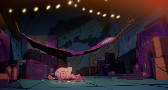
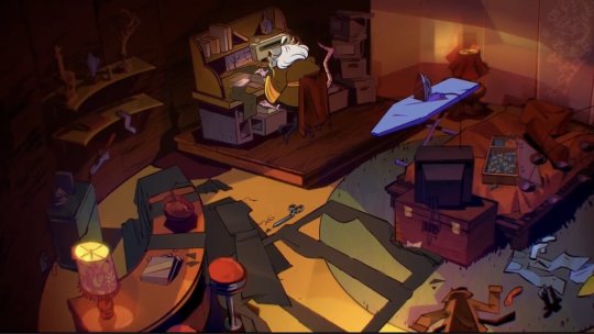
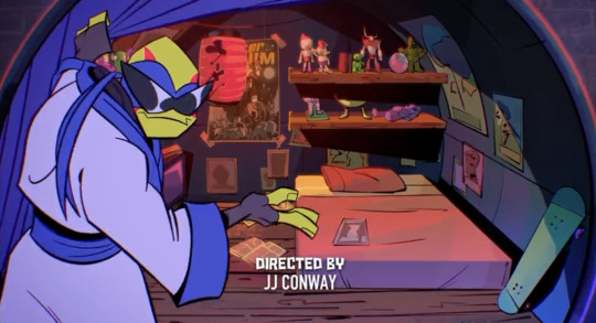
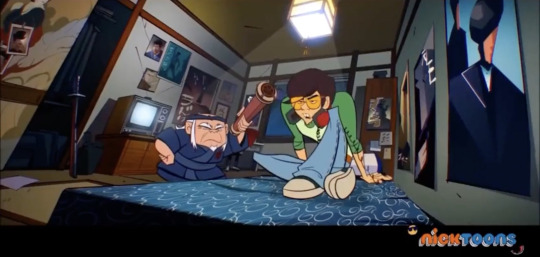
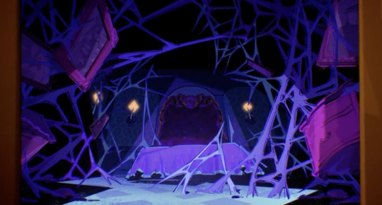
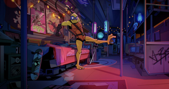
Character's Rooms (Raph, Donnie, Mikey, Leo & Splinters bedrooms in the old Lair, Casey's bedroom, young Splinter's bedroom, Big Mama's bedroom & Leo's bedroom in the new Lair)
#rottmnt#rise of the teenage mutant ninja turtles#rise of the tmnt#rottmnt backgrounds#rottmnt screenshot#rottmnt leo#rottmnt raph#rottmnt donnie#rottmnt mikey#rottmnt cassandra jones#rottmnt casey jones#rottmnt master splinter#rottmnt hamato yoshi#rottmnt big mama
3K notes
·
View notes
Text
still late , but vargastober day 3 is posted ! let's talk about it .
hello , i came back from watching code lyoko with my sister . god , the chapters where there's more than one activated tower feel LONGER THAN THEY ARE
i don't know where to start . . . i didn't write any notes for this one because i made it quite fast . first of all , i was considering skipping this prompt ! i'm already late with these and it's only day 4 . GOD . i had an incredibly specific idea for this one before . . . something like chapter 13 , that one part where edgar and scri meet before edgar goes to heaven . i like that scene where they're arguing and edgar's getting like a bunch of chains on him for some reason ? and even if he wants them to go away he just , keeps creating more . i wanted to draw something like that scene , but working without references is hard ! i'd have to get the pic out of my head , somehow . NOT AN ABILITY I HAVE RN
so i just went for something easy . wanted to draw edgar floating on a black void . . . something like a lot of blitsbyt3s' art ! i mainly took their art as a reference , so credits to them !!
i didn't know if i wanted to do something scribbly like their art or . . . well , i had another idea ! there's this trend going on in tiktok about these things called bromine brushes . or at least that's how i call them lol

if you search bromine brush on pinterest , you get a looot of results like these . i like this whole trend , makes art look SHARP
so i thought . . . maybe i can use one of these brushes to add some spice to the whole thing . the drawing would've been pretty boring if it wasn't for that . it already didn't have any real meaning to it , i don't want to make it more lame than it was already .
i always have this stage before starting to draw that's like " first i'll make a small sketch to see if i can actually achieve this in the first place . scribbled over the reference to understand it better then drew my base . man it looked SO STIFF at first , i had to move it around a lot lolz
then drew edgar's pretty face . liked how it looked so far . then , i was just about to draw his clothes . what should i draw on him ? i thought to myself . i decided to go with his canon clothes because this drawing was more about the concept than how he looked ! so i went with that .
but first-
i really like william's outfit on season four . i like the first one too , but there's something about the second one he had that scratches something in my brain . he looks so polite and handsome . aaah .

( i also really like this shot of him
well , i really REALLY wanted to draw edgar with this outfit . i don't know if it's actually something he would use in the first place , maybe too cool for him . . . idk . i don't usually draw many full body shots of him so i had to wait to draw one if i wanted to put his clothes on him .
well . this one . was a full body shot
so LOLOLOL

MAN I THINK THEY LOOK GREAT ON HIM . they'd look nice on scri too , now that i think about it . . . he's more like , old man . so mmmmaybe he wouldn't wear it . HE'S JUST SO BORING MAN , I HAVE A WHOLE CANVAS DEDICATED TO ADD SCREENSHOTS OF HIS CLOTHING AND he just has like plain shirts and turtleneck sweaters . the prettiest piece of clothing he has is that one cardigan zarla drew on him once .

I KNOW I'M TAKING THIS TOO SERIOUSLY , not that i ever draw him with any of these . i just really like to draw him with pretty and soft things .
i love that stupid man so much guys , i think of him very fondly . i want to hug him and make him feel safe . GOD what was i talking about

well , the sketch was done ! and that one fuckass william png was also there . i kept his shoes because they fit him . even though william's shoes are probably the boots from his first outfit ,
i was pleased enough with it . so i had to move it to another canvas and actually use the brush i mentioned in the start !
the main reason i haven't used those brushes before is because half of the configurations i found of it were made for ibis paint ! i just had to add some saturated colors in a white canvas and then set all of these to overlay , then play with the opacities . but , the layer modes are different on each app for some reason and it's GODDAMN ANNOYING . i had to move it around , and at first i got this one . . .
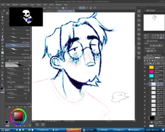
didn't look bad at all ! but it was supposed to look purple . oops
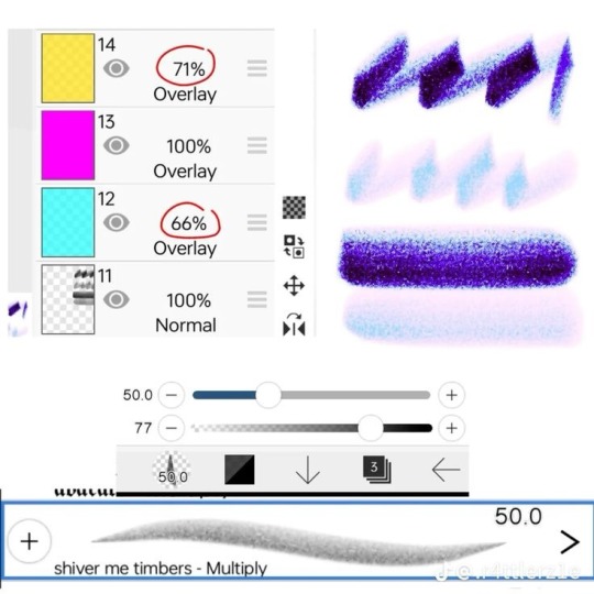
i didn't even use these exact configurations , because if i did it looked even less blue which was also annoying . ( btw , credits to .r4ttlerz1e on tiktok for this one ! ( i still kept working on it . . . another thing that was annoying is that your canvas needs to be white if you want to use these . which was a problem , because one , i was originally planning for a black void , and two , MY POOR EYES . THE PURPLE VOID IS NOT ONLY FOR IT TOO LOOK PRETTY , I NEED TO PROTECT MY EYES .
i searched for some configurations with black on them . and while i did find some , it wasn't really what i had in mind for it !
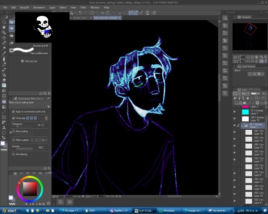
while it did look cool , was way too bright . not what i was looking for !
then , decided to add a purple overlay layer to it to see if it changed something .

it did ! looked way more accurate to the color i wanted to achieve from the start .

( this is the configuration i used for it . . . if you're curious
( ooo , also ! i added that creepy face on him ! i didn't know if i wanted to add it or not . . . so i just hid the layer for a while .
a couple of minutes more , and it was done !


+ this one where i put both of them together . I WAS SO CLOSE TO POSTING THIS ONE ! and i actually did post it on twitter . but it didn't really made any sense it just looked cool
working on this one was really fun ! took long , but not as long as yesterday's piece . i enjoyed working on this one more than the last one , too .
i'm still a day behind ! and i will probably skip today's prompt and work with tomorrow's instead . i'm going out tomorrow , so i won't be home . i'll make sure to play a lot of just dance ! :DDD i bet i'm still the best at it . X33
that's all . this one's shorter because it was easier to work with . oh , and i didn't listen to the subdigitals as much as yesterday !!! i just watched undertale theory videos and a 10 hour loop of megalo strike back . i really love that song
1 note
·
View note
Text
feeling one million ways all at once.
i want to write and sleep and stay up so late drawing until i fall asleep at the canvas i want to wake up in the morning and take my meds so that maybe i have a shot at making any attempt at earning money so that i can escape the hellish situation i am direly stuck in. i want to make food that i enjoy and feels good to eat and takes time and effort to make and HAVE THE TIME AND EFFORT TO DO SO WITHOUT IT BEING MORE DETRIMENTAL TO MY BODY THAN BENEFICIAL. i want to be taken seriously i want to love freely and openly and unabashedly and be ugly and happy and loved i want my life to be full but never crowded bustling but never overbearing i want to have the capacity to do good for myself and the people around me and if i can manage that i want to see how far that can be extended. i hate to add to the neverending onslaught of the fetishization of my potential but there’s so much i COULD do IF i had the resources, IF i could feel better in my body, IF i didnt face so many daily pains and symptoms and disorders, IF i didnt have fucking cptsd from everything that’s happened. but that isnt Real. its just as not real as most of shit people try to spew off as some sort of fact or grand ruling. like stfu your goddamn opinions do not matter more than peoples LIVES AGGGGHHH!!!!!!!! but my brain is screaming all the time the hyperactivity doesnt cease for a second so i couldnt string together two cohesive sentences if i wanted all i can do is shit out a bunch of collective points one after the next all i can do is mourn and grieve and hope and grit my teeth and realize that if i dont go to bed now i never will goodnight tumblr im going insane
0 notes
Text
I started cutting down the second strip, got bored, started cutting down the third strip, numbered my second document worth of pages. Got the entire first strip of pages saved into my Canva document. I like using Canva for making my books.
I wish I knew better ways to make this process more efficient, but I think it's about as efficient as it gets, apart from not having enough layers to number my pages. I just kinda have to make the numbers and get it over with.
It would probably be most efficient to cut down each of the strips all in a row and then turn the strips into pages, then put the pages into Canva. But that just sounds boring. Why not just do everything all at the same time?
So tomorrow, I'd like to finish cutting the second strip and get that uploaded into Sketchbook and numbered, and time permitting, maybe finish catching up the dot paper book too.
This process is so boring and repetitive, but I'm just so stupid excited about how this sketchbook is going to look in the end. It's going to be beautiful and colorful--it's going to be something that has interested me, as far as my sketchbooks go, for a while.
Spoiler alert, I'm not really positive how to handle making the four smaller sketchbooks based on dawn, day, dusk and night, so I'm leaning toward just pretending that all I have for each of those sketchbooks is the original two strips, and cutting out the transitions, like from day to dusk, and then those can be exclusive to the full collection.
Now I just have to get ahold of a bunch of watercolors and a bunch of paper and I'll be on my way to my second patterned paper sketchbook idea. I wonder what other kinds of patterned paper sketchbooks I could come up with, if only for my personal enjoyment. Those.....ah, whaddyacallums..... the arsenic wallpapers? Those could be fun to make into a sketchbook. A lot of them aren't too overpowering to draw over or write over.
0 notes
Note
mwah your art is good and nice :>
can I ask for some advice? no worries if u don't want to answer.
do you have any tips on how exactly to practice art? everytime I ask for art advice everyone always says "practice" but idk what to practice first! do you have any strategies for learning how to draw something? do you do excercises? and if so how do they work?and are there any beginner mistakes I should look out for and change specifically?
thank you so much!! have a wonderful week :>
thank you so much! im ok w answering! i dont want to speak as if i am an expert on how to draw things in general as i am learning as well and definitely am not completely learned, so i might not be the best person to ask since im not very professional w my art as I do it as a hobby (and I can only speak on mostly digital cartoon matters) but i reallly hope to try and help u out even a lil ! im really happy that you’re eager to draw :] I wish you so much luck muwah muwah
i also hated when ppl told me “just practice” and i dont wanna inflict tht on u EITHER LOL but also thats just what i ended up doing for awhile but i tried to find some things to help ^_^
tips for practice: My number one rule is that practices should be challenging but still fun, I know it can get frustrating trying to redraw a pose over and over trying to get it perfect. And over time it rlly is all about muscle memory, the longer you draw the more your eyes will pick out specific shapes in everyday life and convert them into its own vision of them! or at least its good to look at life that way, try to pin point key shapes and stress less on details in practices. after you look at key points, THEN you can go over what you have and draw in and over it to make it more “complete.” To stop practices from getting too stressful I recommend starting out drawing what you want a little more simple looking than ur desired finished product. This helps eliminate the pressure of everything not looking “perfect” and keeps your art more loose and fun. Doing this a few times is gonna get ur brain to recognize patterns in art and how things look/flow in anatomy and such. dont get stuck in ur own head abt perfecting everything to the point you either 1) give up bc ur not at a level capable of it being 100% “perfect” or 2) focus so much on making it perfect that you end up saying the work looks “wonky” or stale in dynamics, So while I do think studies help, don’t get too lost in them. I always practice with media I enjoy too, whether it’s characters or fashion I enjoy.
Strategies learning to draw something: people get mad abt this one but I think tracing reference photos is great. its been awhile but When I tried learning to draw hands better at first I would trace them then put the traced image to the side of the canvas, then try and replicate what my mind saw as its most important angles and aspects. Same for clothing folds/hair/etc! I think it’s maybe not the best idea to trace the ref and use the tracings as is, because you learn more from tracing it then trying to replicate and simplify what u learned into the style you’re working in. Find what shapes you like from them and don’t over detail it. you may have to go by eye and think “what parts of this ref photo should i simplify to fit my style” and for me, its usually adjusting the length of the torso and then the limbs by associations. i dont recommend feeling like u need a reference for every art you make though, its ok to let ur own head try out its own sometimes too while trying to learn this, see if it remembers any call bad from the past referenced sketches! over time ull remember where everything goes more, these days i rarely kick myself to use refs but im sure they still would help to use, but figure drawing simple blobby figure in a bunch of random poses was a big thing i used to do as well to get better at full body art + overall dynamics (still does this). also paying attention to silhouettes is great
Exercises and how they work: I WANNA HELP U SO BAD BUT to be honest, all the works on my blog ARE exercises! i rarely actually do finished pieces, if u scroll thru my posts ull notice most r sketches. i usually just fill up a page and call it “warm ups” then i get attached to some of them, take a few, and just line them up pleasingly on a smaller page, then color them in (or sometimes fix the lines to be more clean too). im not rlly a person who “exercises” to practice, it more so happens from just me drawing a lot for fun as a hobby! but i really should. i will tell u this has humbled me a lil i need to start practicing too 😭 LOL but a good exercise is to look at what ur inspirations do, and study it. Make a collage and write out what you like most abt their styles/what u want to gain from them. For ref Here’s a page I did awhile ago when someone asked me abt my insps:
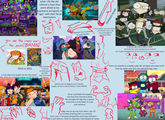
i also look at fashion magazines and as well as anime figures and take insps from that sometimes with learning cool poses and compositions to convert into my own things
Beginner mistakes to look out for: its hard for me to pin point “mistakes” beginners make, as sometimes we cant avoid all of them or even notice them, progress comes from growing out of old ways. some mistakes are even the foundation of ur future amazing cool style! but i think some things to look out for could be these, from my own old art experiences
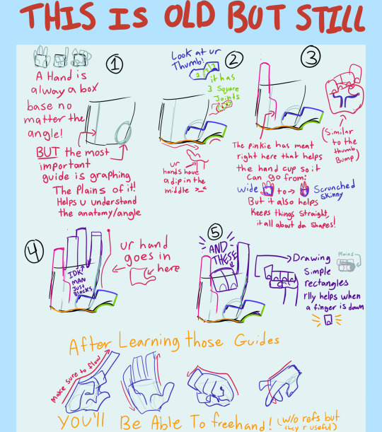
Hands were the first thing I learned bc i liked drawing them. I don’t know if that is the best way to go but I think it is smart to practice sooner than later, here is a lil guide thingggyyy wingyyy from awhle ago
i see beginners shy away from drawing signs of age in people, sometimes adding too much detail on an older person in cartoon art makes it look weird, so i try and hit the key markings on ppls faces of age.
Too thin of lines. sometimes its a stylistic choice to use thin lineart, and it can look amazing ! but sometimes it can flatten an image if ur not familiar with its flow. im not saying use thick line art, but more so to keep in mind the weight of ur strokes, adding depth with a thick thin combo of line art can do SO much for the simplest of pieces. heres a visual from a while back when i talked abt my brush + more abt lines:
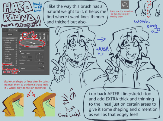
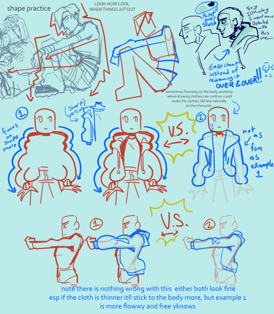
but if ur desired style is thin lineart that is cool too! tbh it was just harder for me as a beginner
sometimes artists think they need to do full lineart for everything and then hate how it looks compared to the sketch, do not fear i will introduce u to my bff: painting over a sketch, extractinging the lines, then calling it line art. i only do this sometimes but its a fun exercise-ish thing to do in a pinch. example:
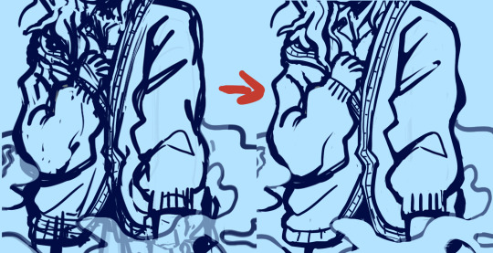
finding what shading fits ur art. sometimes ill see ppl starting out who have a style thats very simple, but they use a very detailed rendering process on it. this is not something id ever police of course, art is each persons own choice! And it CAN work. It can be so cute! but sometimes mixing two very contrasting mediums of art can throw off the “put together” look of it. i use to abuse the airbrush tool thinking it made my simple style look super cool and detailed, but looking back on it now those pieces looked a little off, having such a simple style have somewhat more realistic shading. dont get me wrong the ability i see ppl use rendering like that is so insanely talented! but i found cellshading to be a good match for cartoony art like my own. a tip i learned way too late abt that is rather than shading each layer by color picking a darker color, instead use a clipping mask over the entire art (above line art too as I color my lineart) and lasso tool the areas u want shaded + fill it w a saturated purple then set to multiply + lower opacity. also, sometimes coloring can come out chalky looking when u meant for it to be smooth and transitional, i think this comes from overshading and overlighting pieces without reason. pay attention to where the light source is, and focus on making the shaded and lighter areas nice shapes that cover the necessary areas, then u can add additional shading to the smaller details of what should have a casted shadow/light
its good to spice up ur art now rather than later, focusing making ur art pop more w backgrounds will help ur coloring skills look better too! i dont mean detailed huge backgrounds, a small lil color pallet and design rather than a blank white bg. like this will make u feel better abt it or at least it helped me *sweats* yeah:

beginners tend to draw blank faces like “:)” but I think a good thing to do is try and get silly with expressions early on. It’s okay if the mouth hangs off the face cartoonishly with joy or shock, it’s ok if the eyebrows are super high in surprise.
tracing and pasting it as is (already said this but I’ve seen ppl do it a lot with hair styles and it makes it look alienated from the rest of the style) (final fantasy fans found critically injured) n if need a ref for a pose, using a real humans anatomy as-is doesn’t look quite right on a cartoonyish drawing. Shortening torso and legs usually comes out of this for me!
flip ur canvas i promise u it’ll be less embarrassing over time!
using guidelines for perspective and foreshortening is GREAT. Do it stylistically rather than realistically to add some groove to it...yay. Having silly perspective in art can make it look like a 10 so easily opposed to a normal front facing sketch. Look at cool poses from fashion magazines! Don’t be scared to draw something you don’t feel confident in conveying perfectly, this is why progress redraws exist :)
Drawing the hairline b4 u draw the hair is great, it helps u understand where their hair flows from, where it starts and stops, AND prepares u for drawing bald ppl. Also don’t make the head too big, the skull IS bigger up top, but sometimes I see an alien head affect.
Anatomy is an interesting mistake that beginners make a lot, but it’s one they find harder to notice! When I started out, all my art would be SO wonky, but I didn’t even realize it! It still happens today too! specifically though I see beginners struggle with the arms in this department. My advice is to try and measure them out and make sure they don’t go past the knees, and are the same length as each other when Unfolded. asking for criticism is hard but it helped me realize when i would make something bigger/longer than it should have been in my art, and stuck with me being able to go “oh... i see it LOL”
clothing wrinkles- do not over do it! Too many wrinkles and shading can look unpleasant and wirey- like a plastic table cloth all bunched up which isn’t exactly what ppl wear. pay attention to gravity too
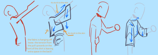
I hope this helped even a lil im sorry tht I’m not very good at explaining or didn’t have much to sayyy! If u have any troubles no guarantee I’ll have the answer, but ur always free to ask!
114 notes
·
View notes