#and i'll probably simplify the design a bit if i draw him again
Explore tagged Tumblr posts
Text
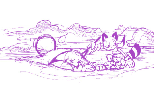
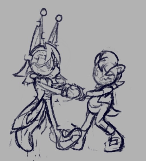
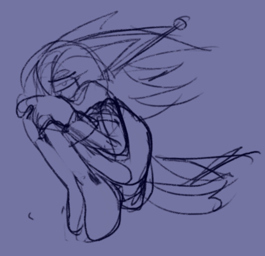
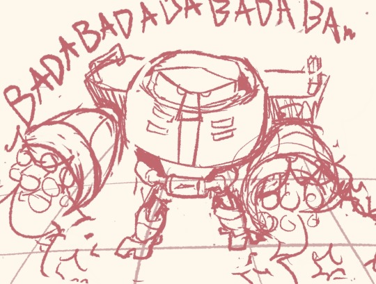
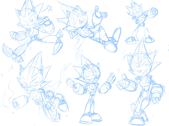
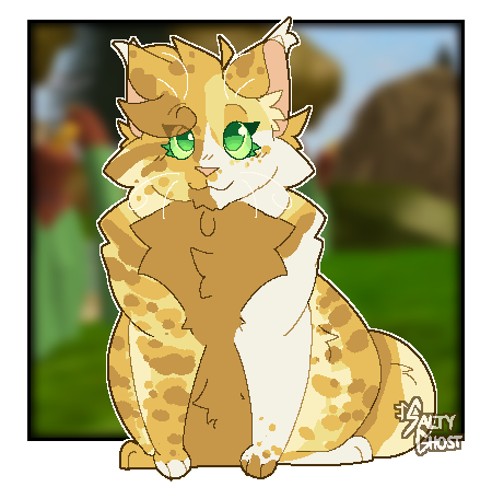
cheesefluff, a silly guy I had on the old roblox lake territory game :]
#warriors#warrior cats#warrior cat oc#wc oc#my art#my ocs#oc#oc: cheesefluff#yes the background is from said game#taken directly from one of my screenshots of him#this was a lot of fun actually#turns out making designs from those extremely limiting morphs is fun to do!#took a lot of creative liberties ofc#and i'll probably simplify the design a bit if i draw him again#anyway i think he's probably a former kittypet who joined riverclan#i think the clan either loves him or hates him without much in between#the more traditional cats probably hate him#while the less traditional cats are just like ''that's my emotional support idiot''#tbh i kinda want to open requests for this....#like. y'all send me your cats from the old roblox games#and i draw/design them#i think it'd be fun#but also i have other things i need to do first
18 notes
·
View notes
Text
Why Are Their Designs So Complicated???
Who's Here: Kaveh, Alhaitham, and Reader/Player
Contains: Self aware genshin au (not the cult au), neither Alhaitham nor Kaveh speak since they're trying to keep the fact they're self-aware hidden, Kaveh outfit slander
You thought Kaveh would be an easier character to draw. At a glance, his outfit is much simpler than a majority of the casts, so you thought he'd be a safe pick for fanart. How wrong you were.
Alhaitham watched from the sidelines, far away from where your camera was pointing, as you fawn over Kaveh. It had been a while since you came to Sumeru City for anything while you were playing, so his curiosity got the better of him. Though it was nice to hear you without needing to partake in all the labour inducing tasks you always force him to do, He could do without Kaveh looking so smug.
He suddenly hears you complain as you turn Kaveh to the right, making him finally take notice of his presence. He could see Kaveh wanted to say something, probably to gloat, but with you currently controlling him he couldn't risk anything. Kaveh still had this air of pride and arrogance surrounding him, and it was obvious he was trying to show him up. Alhaitham merely raises an eyebrow at him before quickly tuning into what you were saying.
"I should have thought this through more. Why didn't I inspect his outfit beforehand? This is painful."
Kaveh's face immediately fell before he quickly fixed his error and returned it neutral before you could notice. Though, Alhaitham could tell just looking at his eyes and the slight twitching of his fingers that Kaveh was anxious.
"Why's there a gold band on his thigh? There's no purpose for it, and I don't think that'd be comfortable to sit with. Why do so many characters just have bands on their thighs for no reason? To make drawing them take longer?"
Alhaitham continues to watch as you move Kaveh every which way, and he can see he's struggling to keep his composure.
"I-I don’t even want to draw his scarf, but he looks unfinished without it. How do I simplify this, so I don't want to die drawing more nonsensical detail."
"I just wanted to make fanart for Writing on the Wall, why do these characters have to be so complicated. His outfit looked so simple in comparison to everyone else, but now I just want to keel over."
Kaveh looked like he was about to pass out, and it's quite a shock that you haven't noticed how not normal he's currently acting. Your blindness is currently acting in their favour, though, so while you're distracted he'll try to signal to Kaveh to get a hold of himself-
"Thank God, I think I'm done sketching his outfit. Kaveh I love you so much, To the moon and back, but I'm never drawing you again. Or anyone ever… Okay that's a lie, I love you all too much, but god I wish I had the patience to not go batshit. Now I'm just exhausted and don't even want to think about colouring this right now. I'll explore Fontaine a bit, I guess. I just need my exploration team-"
Your voice fades as you switch your team and teleport away. At least that saves them from Kaveh losing his composure in front of you, but now he's sure he's having a breakdown in his house. The things he puts up with for you. At least he has new leverage to pull against him.
#genshin reader insert#x reader#sagau#self aware genshin#kaveh x reader#al haitam x reader#alhaitham x reader#Pois.Posts#pois.writes
581 notes
·
View notes
Text
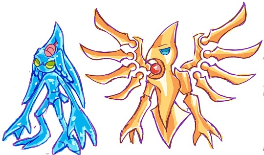
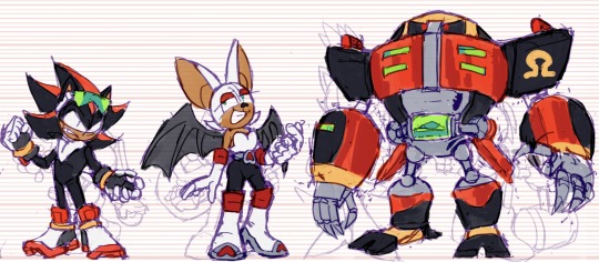
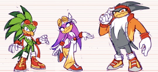
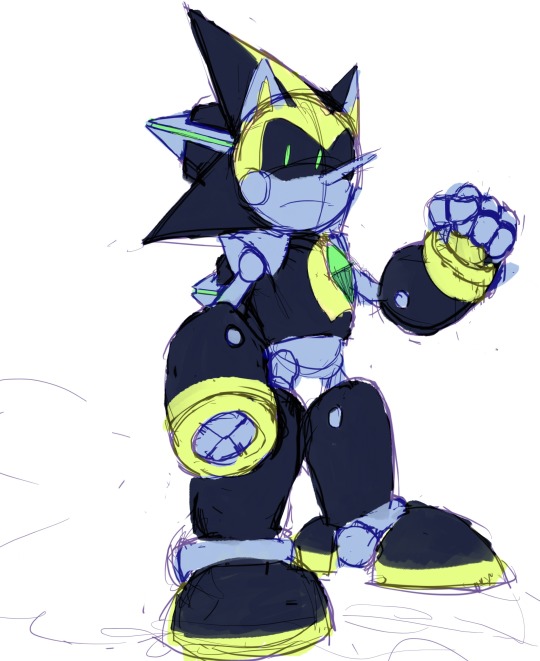
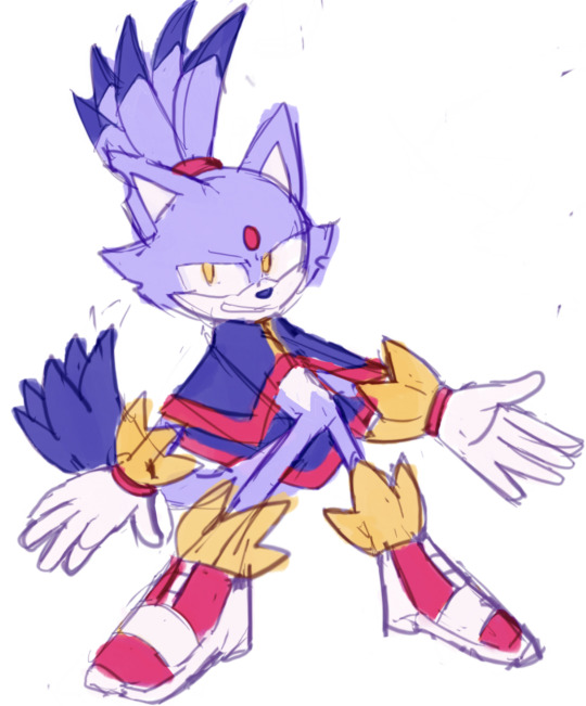
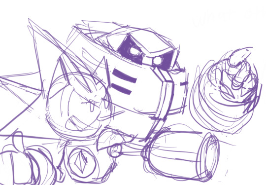
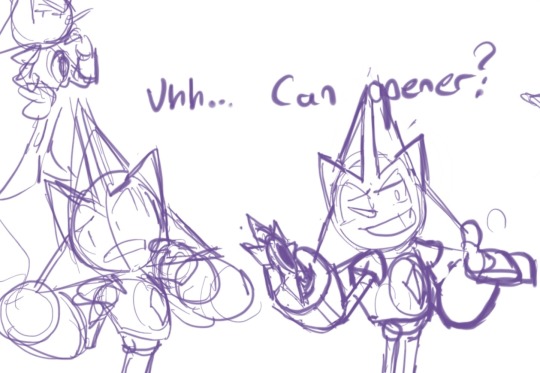
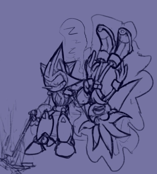
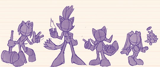
Sonic WIPs and Scribbles from 2023 (Notes Below)
Gave Chaos the Angel Chao ... "Ears" ? So that All Forms (Neutral/Dark/Hero) have some form of Representation. (The two split ... Hair? Things? In the back already resemble the Devil Chao, since the Light Chao only has one.)
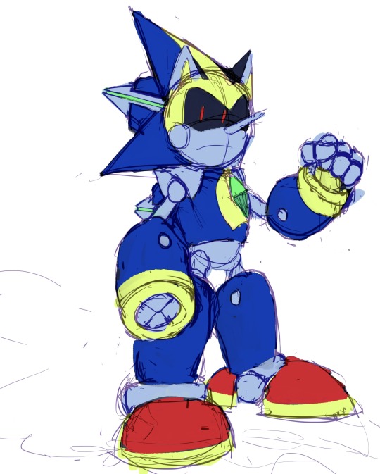
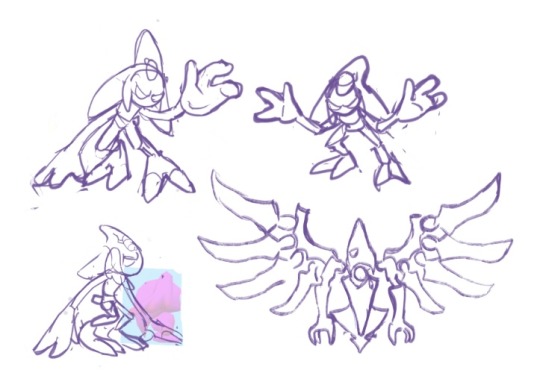
Solaris Exists! ... Crazy. I recall this redesign being bit tricky because it was just so hard to see what the fucking thing looked like Originally, but I did my best. Tried to show the Bird/Eagle Theming, and to simplify the design so People like Me could understand it. I wanted this design to look like a counterpart to Chaos -- because in this AU, Solaris is from, you'll never guess...the Sol Dimension!
Gave Team Dark a sort of... cohesive color scheme with eachother, so they really look like a Unit. Plus, Rouge wearing Red just... Makes sense, considering her name, even if I enjoy the Purple color scheme as well.
Similar color scheme thing here with the Babylon Rogues -- They all share Red/White/Yellow -- I took the darker colors out of these designs to not be so similar to Team Dark haha. The amount of points on each of their...Chest...Fluffs?? matches the amount of feathers they have on their head Respectively . Changed Storm the most -- I wanted to make his "Hair" Silhouette more Unique from Wave's, and really just wanted an excuse to give a character a Cool Jacket . The Shoes ... I phoned those in a bit, I'll probably change them Later...
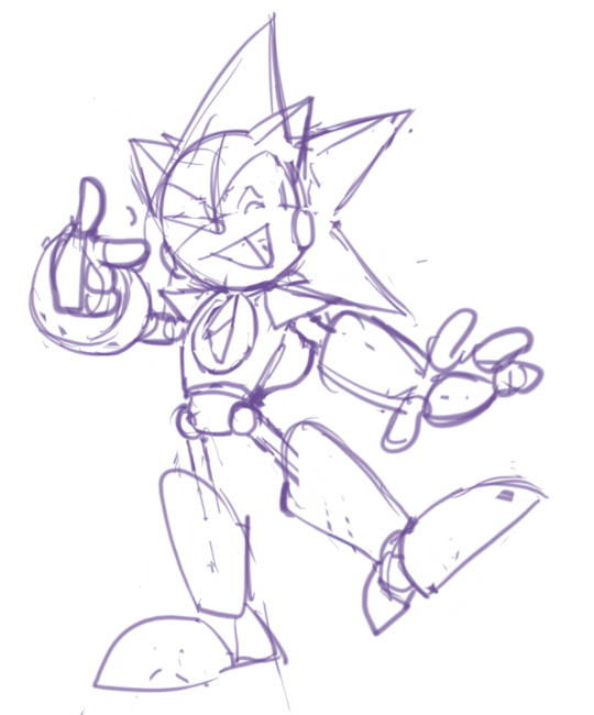
Sharddddddd. Throughout my Scribbles (including some here) You might've seen me struggle to decide what Quill Style to give him -- his OG style? Or the Metal Sonic style? Eventually, I decided I didn't need to choose -- I could do both. It's not demonstrated that well in these, but it's basically the same style the Bits have in Sonic Universe: The Silver Age -- just thinner and more Pointy .
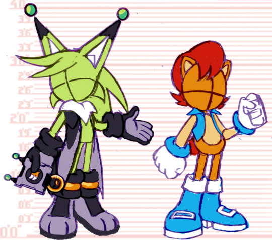
Ahhh Faceless Jumpscare! This is what they look like when I'm trying to work on Poses and Colors but don't want to Commit to a Face yet, haha . Nicole, I'm always changing her design it seems -- don't be surprised if it happens again! But I based her handheld off various devices Tails uses -- I wanted it to be compact while being more Modern than the Nokia Flip Phone. Changed her hologram form slightly to resemble her handheld -- her ears are the antenna, and the rings are on her feet like how the ring is plugged in at the bottom. Made her vest longer too! So it looks more like her Reboot Outfit . Just a little.
And that's mostly it! I've been on a quest to draw Every Character in my Sonic Au -- I've sketched about... 35 so far? Here's a Screenshot of a bit of the Madness on that canvas haha.
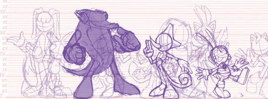
#sth#shard the metal sonic#blaze the cat#chaos 0#marine the raccoon#storm the albatross#e 123 omega#solaris#nicole the holo lynx#sally acorn#shadow the hedgehog#rouge the bat#jet the hawk#wave the swallow#amy rose#cream the rabbit#silver the hedgehog#sonic au
191 notes
·
View notes
Text
Head doodles for my tf continuity! I haven't come up with a good name yet so it's just Transformers: Crungus for now lololol!
My rants about the designs will be under the cut!
Chromia's design is comprised of straight, parallel lines to convey her straightforward and blunt personality with a "cute" periwinkle to contrast it! Overall, it's simple and to the point. Just as she'd like it :)
Bumblebee!!! OH EM GEE I LOVED MAKING HIM. Erm. Anyways! I based him off of old timey delivery boys and rubber hose mascots with a bowtie-shirt collar neck thingy! His nose wasn't intentional, that was just a result of the brush i was using but i love how it looks! Kind of like a classic cartoon nose (once *again* pushing his inspiration!) Something i realised after finishing him is that the gap in between the cap and horn looks like an antenna from the side! I think an australian honey mascot was floating around in my mind while sketching
Airachnid's probably the most similar to the design she was based off of, just simplified with delicate jewellery draped from her maleficent horns to push a vampiric theme, if that's the right word. I think I'll add a couple more bits of web jewellery to give the impression of a veil!! You might notice the line going from her mouth to her chin... well lets justr say... she has that gawk gawk 6000 ;))) Her palette is also VERY meaningful... You can put it together if you think about what colours cybertronian culture associates with death
WELL!!! I HOPED YOU LIKED THIS HEEHEE THIS WAS REALLY FUN TO WRITE AND DRAW AND I'D LOVE LOVE LOVE TO KNOW ABOUT YOUR THOUGHTS AND OPINIONS!!!
#maccadam#transformers#fan continuity#transformers au#bumblebee#chromia#airachnid#my art#tf fan continuity#transformers: crungus
58 notes
·
View notes
Text
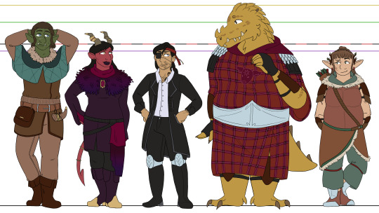
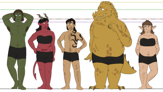
i was gonna wait until i finished the bitd and deadlands line-ups before posting these, but i'm not gonna get those done before the final season starts, so might as well bite the bullet now XD woohoo, oxventure d&d designs! i'll go into further detail below the cut for all of my thoughts on these designs and reasoning for smaller details, but for now, just know that i will never draw a cape. i simply cannot do it. hoods and weird draped fabric or nothing XD
okay i put like. waaay too many thoughts into a lot of these small details so im gonna allow myself to geek out here X3 firstly - though they're way too small to read properly, i did the little symbol eye shines i used in my first art for them! dob gets music notes, prudence gets fire, corazĂłn gets hearts, and merilwen gets flowers. i usually draw egbert's pupils pretty thin to resemble a reptile, so he just gets normal eye shines, but i probably could have given him some here... he would get suns if i thought of that
dob - muscular in a wiry and dehydrated way, lol, hence having a more defined stomach/hips despite not being as strong as prudence or egbert. he has sad/down-turned puppy dog eyes at all times because i think the big-eyed endearing look is fitting for him, though i do make them darker blue than his canonical baby blues because i just... like how dark blue eyes look, lol. i'm pretty sure he canonically has the stomach scar, and obviously his facial scar has always been there, but i gave him a couple other ones just to show that hes pretty reckless. and he gets freckles because even though they arent mentioned in the dragon dogma's video, i noticed luke added some and. i like freckles a lot
prudence - i've said this before, but i love the thought of pru getting muscular after the werebear bite <3 i just think she should be a little bit hench. as a treat. once again, the heavy stomach scarring comes from the dragon dogma's video, because i found their design choices in that really fun. i change prudence's outfit the most out of any of the characters, just because her canonical outfit confuses me. i'm really bad at understanding/drawing fantasy wear as is, but her fit... i'm lost entirely XD so i free-balled a bit. her inner sleeves that hook around her fingers are based on jane's various prudence looks, and then the looser outer sleeve is just because i love prudence with a dramatic sleeve. originally the colors were closer to her canon outfit, but it just looked messy without all the details of the original, and then i tried red like jane's prudence looks but it didn't contrast enough with her skin. so i restricted them to just deep purples and black with pops of gold and dark magenta!
corazĂłn - what can i say besides. transgender. LMAO honestly though, besides adding the top surgery scars, i just really like his canon look. i simplified the details, obviously, but i really love his big coat and his tall boots and the earrings and the black-on-black-on-black of it all. i didn't particularly feel like drawing hats when i was doing this, lol, so i stuck with a red bandana instead. the beads that are strung from it are black, red, purple, green, and yellow to match their guild's canonical color associations/the colored name plates they get in later seasons :] because corazĂłn is the sentimental sort, even when he won't say it. also he gets a little cateye for his eyeliner, i dunno if i've ever said why i do that before haha
egbert - egbert my dearly beloved. literally just his canon look except he has la vache mauve on his tunic instead of fire! and the nose spikes i give him, i guess, but i forget those aren't canon. i actually usually draw him in mike's egbert get up, with the black robes and the golden dragon sigil, but i kinda wanted to move away from that to lean more into the end of legacy of dragons, where egbert fully commits to never going back to the dragon d'or. also i just love drawing little cow heads <3 also! i like the idea that rather than typical scar tissue, dragonborns grow thicker scales over places where they've been injured. so the thicker patches of small scales on egbert's body are meant to be scars! including his kidney scar, lol. the larger scales and the ones on his face were always there though, that's just dragonborn biology baby
merilwen - if i said i based merilwen's body on cartoon bears, would you forgive me... i just think it's cute LOL tummy <3 for the final dragon dogma's video reference, that's where her freckles and tattoos come from. ellen was right, merilwen with floral tattoos fucking rules. who am i to deny it. as a hairy woman myself, i also like making merilwen a hairy woman. she's a hippie, she would NOT shave. i also really love the red earrings she wears in her canon art, so i tried to carry that through to some other small parts of my drawing for her, and landed on the bands she has on her pants as well as the odd feather for her arrows. fun archery fact, for those who may not know - in modern archery at least, you usually will have a differently colored feather (or for my arrows, rubber fins lol) that indicate how youre meant to string the arrow! so i took advantage of that to give merilwen some more red, hehe
#oxventure#dob the half orc bard#prudence the tiefling warlock#corazón de ballena#egbert the careless#merilwen the wood elf druid#I really wanted to post all the line ups at once but I have fallen ill XD#and I’m busy tomorrow. so drawing is not in the cards for a bit#I’ll try and finish those soon 👍
35 notes
·
View notes
Note
Just to any mods in general: When designing a character do you go through many design changes before settling on a final design?
I'll put it under a cut since it's kinda long.
Ellis:
not rlly tbh , tha only one's who'v rlly gone thru any sort of design changes was alien , tyrant , teen , an horror (an even then most were 4 sake of convenience/amplifying their characteristics y'kno ?)
4 example:
- while alien may hav gotten a new Frill around his neck now , he also used 2 b able 2 split his mouth all tha way down 2 his abdomen . not sure y i had that but i don't now
- horror's monster form design was a Lot different from how it was back then (never posted it publicly tho) . biggest difference was that he had eyes and a nose !!! an also chains on his wrists an ankles
- tyrant had a Lot mor scars , altho they were simplified 4 convenience sake . him being blind in one eye was ALSO not a thing originally ! ended up adding it bc ,,,, idk lol thought it looked neat
- i jus made teen look mor liek a ,,,, well a Teenager . fuckers sixteen now he can b a little edgy as a treat <3 also unrelated but fun fact he has three parents ! i forgot 2 include one of them when teen reveals who stars parents r whoops
Pearl:
Q:
For me I just kinda .. make the character design and then … keep it like that until I look at it again and go “ew”
Spinmp:
usually when i have an idea for character design i make a few sketches on paper to see what i like. ive usually talked about personality, characteristics, backstory etc beforehand so i have a vague idea of what i want it to look like!
-OWA's design changed a lot, more specifically his outfit and its colors. He used to wear a jacket until I decided that he probably wouldn't enjoy the restrictive movement that comes w it, and also drawing his scars seems cooler to me than just a normal jacket.
-Burnt Toast was going to originally be humanoid before the final design! He was going to have only one eye and a lower jaw, and he would wear a mask around people he didn't trust. After changing his story slightly, he ended up being the giant time noodle seen today :]
-Lizard RHM was actually very tricky at first. I knew I wanted him to be a lizard, but it was very difficult to decide how humanoid he would be, what his color scheme would be, what kind of lizard he would resemble, etc. Orange and spikey stuck out to me the most! im a sucker for orange. i love orangh
Sam:
i kind of just accidentally make design changes over time and go "oh i guess this is how i draw them now lol!!"
the most common thing for me to do is to make hair fluffier over time or make the character shorter by accident
Bliss:
I tend to stick fairly closely to the original design (in Alex's case, I have not changed anything about them, but that's just because I got attached to the silly), but more often change the character's personality over time (Alex went from someone barely making ends meet and working paycheck to paycheck to a popular YouTuber because of a joke AU I made).
There's an example and exception contained in one OC of mine, who went over a huge personality overhaul (went from sad to thembo) and also had a lot of his features changed as a result of him actually being given an ethnicity (he didn't have one before), after which I changed his features accordingly.
I'll also change a physical design if the old design has bad memories attached to it (I recently redesigned a character because his outfit was created by my abuser).
Milkyway:
Personally, I haven't really changed anything much design wise for my aus (except for my modsona she got a redesign recently). Triple Treat really only had this one rather dark joke I have since tossed aside I guess. However, how an au of mine did go through a bit of a change... Kid!
Initially, Kid was meant to be a rather shy and quiet child. He didn't really talk with people or other kids at his daycare, his only friends being his toys. Mama V also wasn't part of the initial concept, coming from a suggestion that one of the other mods had
As you can tell, Kid has perked up quite a bit. He's a LOT more friendly and cheerful, and a lot more... Peculiar to say the least, with some of the things he's able to so ;)
Well, I guess there's also a lot of the ideas I had for Reaper! I just, haven't really been able to implement them.
If you want an example... Well, let's just say...
Reapers... Aren't always Reapers :>
4 notes
·
View notes
Text
Jives as Grinder Turtle
Picking a Miraculous for Jives was so so simple. Not only does the Turtle Miraculous fit his colour scheme but also the character he was meant to have before he got cut out of the show
Jives was always one year above the other kids in schools and kindergarten but due to his calm, friendly and inclusive nature and there not being that many other children around he always was part of the main group. With Sportacus not having come to town in this version of events Jives filled the role of having to get the others out of trouble. Being easily the tallest one and seen as sort of a big brother he got himself the reputation of a gentle giant, never doing much but bursting with unknown energy when someone needed him
Here are the references i based his design on
Funny how Wayzz, the Turtle Kwami, seemingly always ends up with the skater boy of the group
Only way later i found out Jives actually was supposed to have blue eyes but that's really hard to change with coloured pencil so please ignore the green eyes i gave him
Design Notes:
Yellow Belly Slider Turtle - i once had a turtle like this as a pet so as soon as i had Jives and Wayzz matched up i knew for a fact i had to base his design on this pretty animal. The green and yellow combo was just too perfect
Cap and hair - I'm not too happy with the cap but Jives always wears a hat in either design so it had to stay. Also i don't like manbuns in real life but i just really think it suited him so i had to draw it
Miraculous Bracelet - in the show Miraculous Ladybug Carapace wears it on his right wrist and i think Jives is also righthanded just like Nino as they both do their heavy lifting with right but i still put the bracelet on his left wrist here because there it would be safer as he uses that hand less
Shield - i tried to make it a simplified version of the actual turtle's shell, not sure how successful that was though it looks nice enough. Also, not pictured here, he definitely uses that shield for skating/sliding
I'll be honest with you, i barely had any notes for this one because it came incredibly natural to me. I hardly had to think about it at all and before i knew it i had this design in front of me, I'm so happy with it too
Reasoning:
Like i already said, he was meant to be a protector for the other kids before they so rudely cut my boy from the canon series so what better way to highlight that injustice by bringing it back now.
Overall i have not much to say here, it just fit too well not to do it
Story:
I imagine Lazytown being a town with a lot of temporary villagers as most would leave such a secluded town once it came time to get a job or a better education for their kids, that's how such drastically different children ended up being so good friends. They always were nice and welcoming but most people didn't stick around forever. Jives always lived in Lazytown so that's how he became part of this set group. Being less lively than others his age he and Pixel quickly became very close friends.
For his character traits i stuck very closely to what i knew was planned for him if he got translated into the tv show and what was established about him in the preceeding musicals. So he keeps the role of protecting the others and his strange relationship with food. The more i played around with the few things i knew about him though the more i realized that this last bit of character wasn't really just a quirk, looking at it objectively Jives has an eating disorder. And I'm keeping it. It's an important topic and not to be made light of. Man can have eating disorders too and we need to be more aware of this. Sorry for that short rant.
So what i thought of is, Jives isn't actually a year older than the others, he just has a weird birthday and therefore got put into a higher grade. Being very tall even amongst the older kids he slowly stops eating, not wanting to be so unlike the others and always singled out. Always hearing "eat up so you grow big and strong" immensely backfired and now he just eats what he really likes or when the others have to basically force him after he once again breaks down from lack of energy.
Eventually he opens up about this problem ro a few people and with his permission they tell Sportacus and start the slow process of finding so much food he likes that he can at least sustain himself without feeling forced or guilty about eating
That was dark, let's move on
Name:
Jives is a simple guy, someone would point out his costume looks like this certain turtle species and he'd go "slider turtle? That sounds a little like skating, I'll be Grinder Turtle!" Trixie would probably laugh at him and tell people to stop picking stripper nanes for superheros but he likes it. Ziggy would then say "but how should we shorten that? Calling you Turtle is lame and I'm not calling you Grinder, it sounds... Strange" ignoring the connection it could make to both a gay dating app and smoking weed they settle on the nickname "Grind" and just don't think about it anymore because he likes it.
Thank you for reading so much! You're so cool, you get a high five from me and Jives on your way out
#Lazytown#miraculous ladybug#Lazytown au#Miraculous Lazybug#Eating disorder#Mentioned#revive the lazy#jives junkfood#maggi mjĂłi#Jives lazytown#Wayzz
22 notes
·
View notes