#and blackletter just for fun too
Explore tagged Tumblr posts
Text
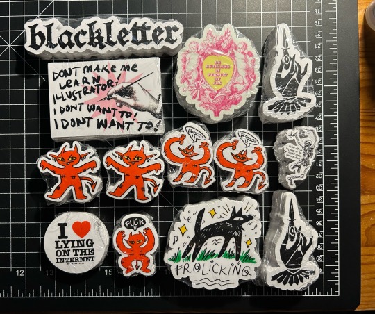
my huge sticker order came 😈 accidentally made my reorder of my little skeletons a half inch smaller than usual HAHAHAH WHOOPS! so i guess special edition mini minis coming soon
#i’m so impressed they could cut them so tiny. i didn’t even mean for you guys to do that. thanks#photo record#chatpost#i ordered the illustrator one just for fun & the different colorway cherubs bc people ask for stickers of that a lot#(the other one is magnet)#and blackletter just for fun too#tbh i went a little crazy with ordering stuff. the dagger hand is a scan of a PATCH from forever ago bc i lost the block#which i did back in 2019 or something before i started printing again for real#that’s gonna go in the sticker club queue#and the little devils also. so funny how none of the devils are the same size. could’ve tried harder to make em comparable#oh well!
33 notes
·
View notes
Text

(minus a few who were too hard to find arrival pics of) no one asked for this and yet!!!! here we are!!!
*obligatory disclaimer* these are just my opinions. this is not criticism about how the drivers look or their physical appearance. this is not to rank the drivers on anything other than their choices/outfits. plz do not take this seriously, i am just a random weird woman posting online. i have no credibility, only passion and rage.
CATEGORY #1 - SERVING (THE POSITIVES)

P1: LEWIS HAMILTON
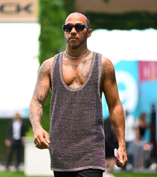
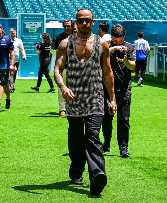
I MEAN....LIKE WE SAY IT EVERY TIME...
do i wish it wasn't an old navy tank top tunic dress? yes. but his supple breasts are out...... i cant focus on anything else.....my heart beats in my ears... dont ask me what color the anything is. I DONT KNOW I CANT SEE IT
P2: LANDO NORRIS

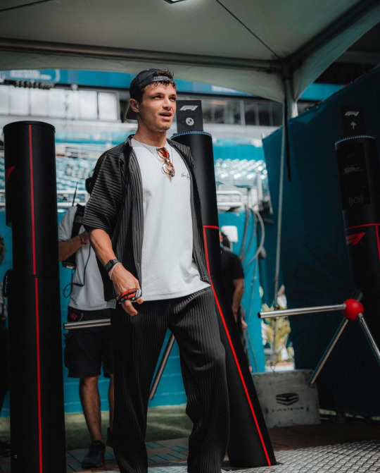
Perhaps the MOST surprising pick for me. Is Lando hot??????????? I've been asking myself this for months......he also seems to be entering his fashion girl era. (FINALLY!!!) He was pictured in an Aimé sweatshirt (A JUMPA for ur english and former english colony folk) so i have high hopes. Maybe I'm just seduced by his Dutch battle scars but he really came thru today. at first i thought he was in miyake and i was literally going to go BALD. but its not :( the brand is basically an even more expensive Zara lmao but...baby steps lol
P3: FERNANDO ALONSO
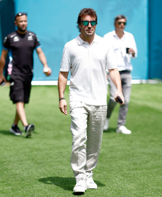
When Kevin Jz Prodigy chants 'eating the old way! serving the old way! serving the old way!', they meant that about grandpa stunting in head to toe WAG white. he's got the youthful shoes, casual polo with the dad fit, linen trousers for the swap weather. its classic. reminding all the wags who the real bad bitch is.
P4: ZHOU GUANYU
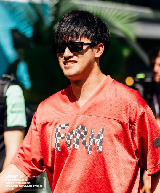
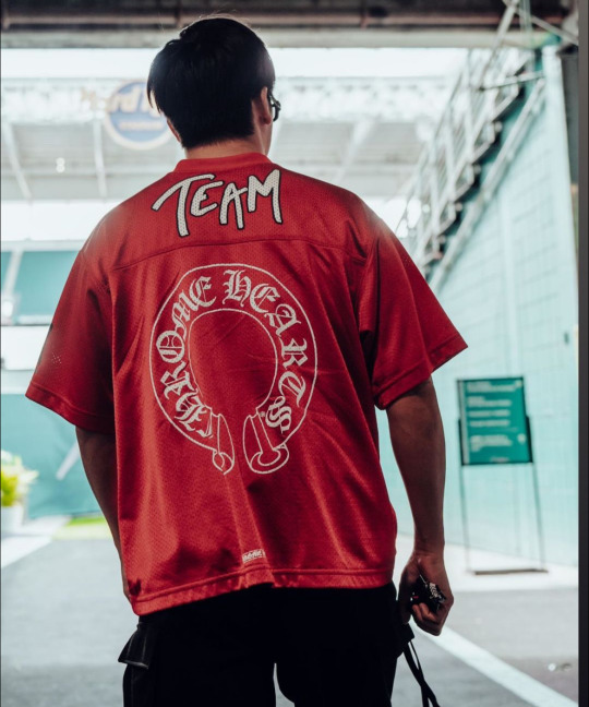
The media is doing him sooo dirty by not showing the back of his jersey!! its not my favorite look he's ever done but it's only media day. i think he looks great in red and i love the blackletter font on the back. I do wish the front was a little cuter but his pants are really cool (sorry theyre cropped out lol) and he's still giving personality and taste!
P6: OSCAR PIASTRI
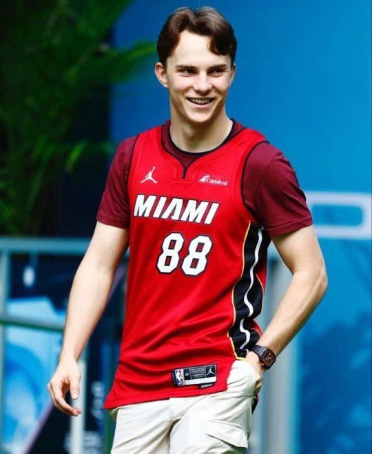
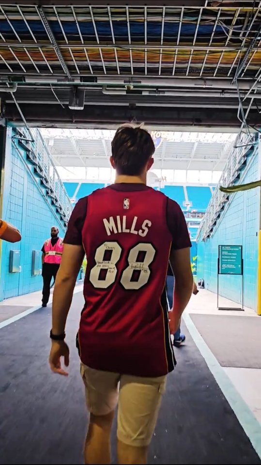
ok yes he does have the 6th grade boy who's still close with his mother fit on under the jersey but he's always stayed true to who he is. i like that he's worn jerseys to races/race locations he seems excited about like he wore one in Melbourne for his home race. AND this one is signed?! he came with a goal in mind and it was to GAG the fellow jocks at the paddock. jock4jock if you will. gotta respect it.
P7: YUKI TSUNODA
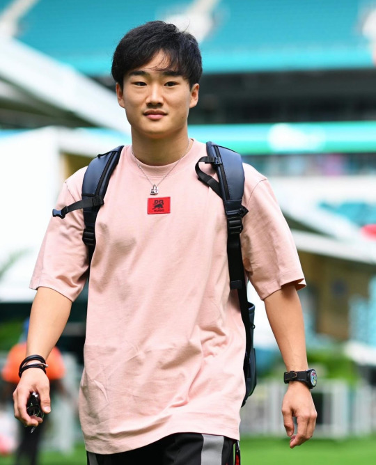

it's a basic serve but a serve nonetheless. he's comfy, he's casual and looks good. i like this color on him a lot and the contrast between the pink and red is fun. hair is looking super good too!!! this is gonna be a good weekend for him, i'm demanding it from the universe!!
P8: VALTERRI BOTTAS & LANCE STROLL
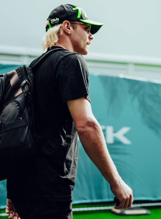
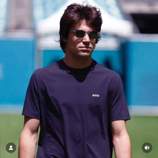
A tie because they're both just on the diva in a tee vibe. You can't blame a comfort queen for being one! The color is nice on Lance and Val is sporting that farm's tan well.
CATEGORY #2 - CHOP!!!!!!!!!!!!!!!!!!!!!! (THE BAD AND THE MEH)

P8: LOGAN SARGENT & ALEX ALBON
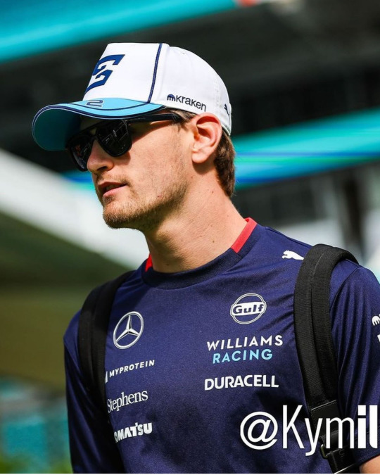
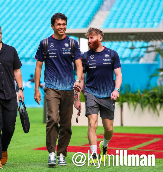
Another tie because they both just came in team livery. that's literally the only reason they were included in this category. though it pains me to rate alex anything other than handsome, wifed and successful. he does look great in them trousers and who can resist him in blue! hoping for a little creativity (arriving with lily) tomorrow!! as for logan...this is ur home race.....i better see something real special and/or Floridian tomorrow or ELSE.........CHOP!!!
P9: DANIEL RICCIARDO

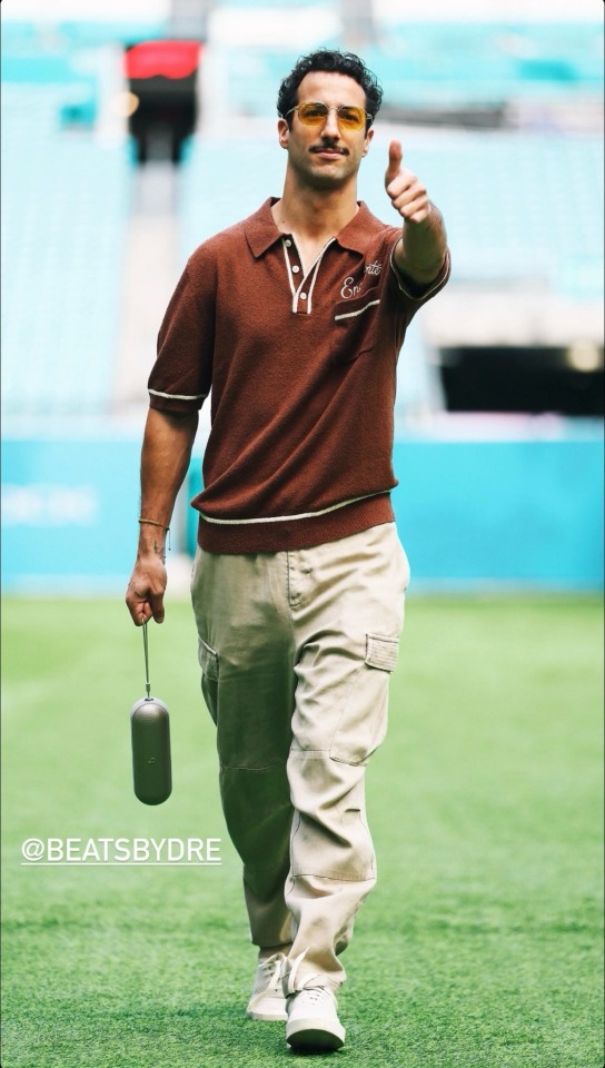
I know the girls are not gonna like this one. But i must speak my truth.....even if you won't hear it....
I don't think anyone is surprised he's wearing his own merch. It would be better for me if it was a little more interesting than his last few releases of just his brand's logo but I like the color and detailing. He's, of course, wearing the wrong size. Personally, if i were trying to promote my own brand, I would perfect tailor the shirt to fit my body so it looked like the best shirt i've ever worn. The Purse by Dre is probably the best part if only because its so stupid and useless. The cargo pants....look, as a former fan, I know that he prefers to dress in baggier clothes. I'm not knocking him for that--who doesn't love a billowing tee to hide the body tea but when you're a 35 year old millionaire...why do your pants not fit you. This is saggy crotch and diaper butt territory. From a styling perspective, sometimes wearing oversized clothes only makes you look smaller. Like you're drowning in your own clothes. That's what it always looks like to me with DR. I know he's interested in fashion and yeah maybe he is still on my shit list but for someone of his status and with the level of resources he has at his disposal...like this man went to the MET GALA with an actually good nEW YORK BASED DESIGNER. what is this...CHOPPPPP
LAST PLACE (THERES NOT THAT MANY SORRY): FUCKASS FERRARI CARLOSER SAINZ AND CHARLES LECHOP!!!!!!!!!
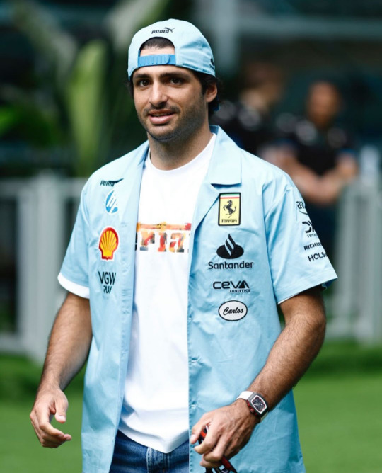
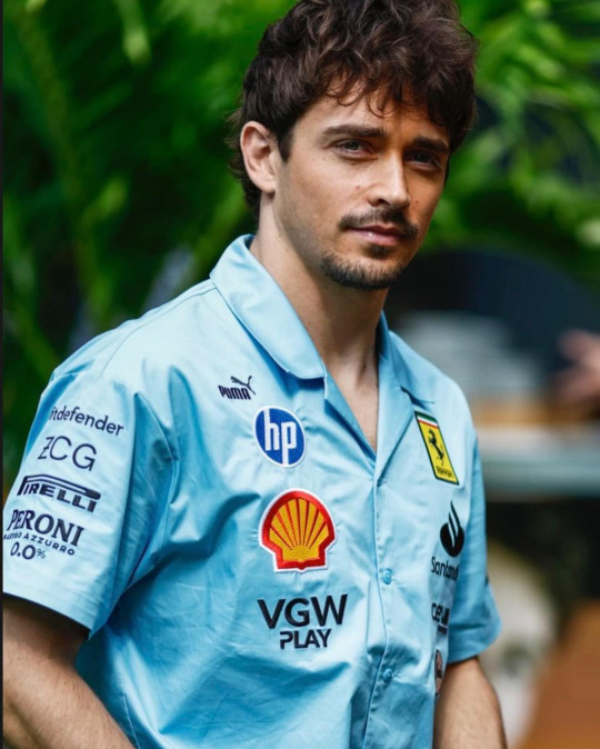
Ugh. heavy on my mind AND my spirit. Never has powdered blue made me so viscerally annoyed. Normally I love this color but not like this. If the design was actually good, I would still hate it but lucky for a hater like me, the design is SOOOOOOOOO hideous. I guess one of the top ten corporations ruining our planets wasn't enough of a steal for them, they had to add a double whammy for genocide blood money too! Puma AND Hp? It's like they thought the BDS chart was a bingo card. The mechanic style name tags are a nice touch too. Very down to earth for millionaires who's private plane usage might be able to rival THAT woman. Blue collar cosplay is kinda fun when you don't actually have to live paycheck to paycheck! Its nice that their name tages are so low too, so you remember that they've sold their souls out to corporations. It's really only a matter of time before a thirst photoshoot with laptops come out or Charles shoves his puppy into a printer. But hey! At least Charles is investing in the local community! Always nice to see million dollar homes sell when the cost of living for a normal person is 30% over the national average in a city where it's illegal to sleep on the streets🥰 CHOP!!!!!!!!!!!!!!!!!!!!!!!!!!!!!!!!!!!!!!!!!!!!!!!!!!!!!!!!!!!!!!!!!!!!!!!!!!!!!!!!!!!!!!!!!
(ok yes, i am aware these men are all millionaires and only one of them have so much as acknowledged the mass murder of Palestinians. but i'll talk my shit forever if it means there's just one person talking about the real world in the f1 space. FREE PALESTINE. BELIEVE WOMEN. FUCK COMFORTABILITY AND THESE MEN WHO PROTECT EACH OTHER. THEY NEVER WANTED US IN THIS SPORT TO BEGIN WITH, ALL THE MORE REASON TO REMIND THEM I'M HERE!!!!!!!!!)
sorry for the rant. this was originally going to be about fashion. and it still is. sorta. BYE
2 notes
·
View notes
Text
Final Reflection
Task 2 was a rollercoaster ride (it was a lot of fun, but I was also scared that I wouldn’t make it to the end). It was a big project, so I will break the reflection into parts.
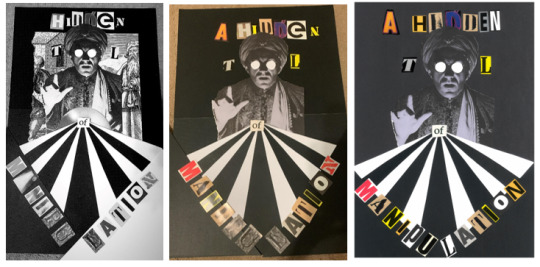
First up was the collage for which I presented Neville Brody’s quote “typography is a hidden tool of manipulation in society.” I chose this quote partly because I believe it, partly because I love how seriously designers take themselves, and mostly because it sounds cool. I cut the quote down to just 5 words “a hidden tool of manipulation” as the full quote was too long and cluttered the page. I knew I would probably lean towards Postmodernism and grunge in my collage, so when a classmate brought a collection of old art magazines to cut up, I plundered accordingly. I was picky with my letters, collecting letters with a handmade/printed look that were similar sizes and colours. Initially I wanted to make a collage like a hidden objects game so that I could use details as features on different pages of the zine. I tried many iterations of the collage but ultimately felt the images I had weren’t cohesive, so I decided to cut back to only the fortune teller since he tied in nicely with the quote. I followed Constructivist influences when creating the sunburst and positioning the words. Overall, I love the way the collage turned out, although it is off-centre which really frustrates me – in future I’ll be sure to measure things out properly before cutting them up or gluing them down.

Collage evolution (#DesignIsAnIterativeProcess)
Next up was the monogram, which was the section I struggled with most. Silly as it sounds, I don’t like my name, so I wasn’t keen on investing time into portraying it. Still, I gave it a go- I do appreciate a good monogram (and it was mandatory). I found myself drawn to older monograms; those made by creatives who used traditional making techniques like printing or engraving to sign their works. Our first monogram exercise tasked us with hand drawing 2 monograms inspired by 3 different font styles.

Dodgy attempts at hand lettering
Of the styles I experimented with I wound up really liking the blackletter designs, so I sent it to Illustrator using the Adobe Capture app, where I edited it to improve the quality of the vector and position the letters more nicely together. I kept some of the texture of the original drawing to maintain the handmade feeling, but edited enough so it felt refined. My monogram was well made, but could have been more interesting – I really struggled to find ways to weave the letters J and T without it looking like a stick. I am interested in pushing myself on this front to improve my typography and hand lettering skills.

Brainstorming alternative monograms

Process of designing final monogram
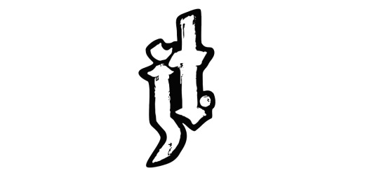
Final monogram (in a container)
Finally, all the pieces came together for the zine. I got Covid right in the middle of this project so it was a little hectic for me. Regardless, I thoroughly enjoyed the making process and felt that it was a great creative exercise. My font choices were Kiln Sans (sans-serif)- a textured font styled to look like a wood-block print; and P22 Typewriter (serif). Both of these fonts came from the Adobe Fonts library, and both emulated the handmade look that I love. I enjoyed playing with the layouts of the text and tried to develop a look that blended the geometry of Constructivism with the chaos of post-Modernism. That being said, after looking more carefully at the magazine spreads of Greiman and Carson, I could have done with a more careful use of grids in my layouts (particularly on pages 4 and 5). I enjoy learning the Adobe suite so most of the issues I faced during the creation process felt like learning opportunities – except for the problems that made me feel crazy... I'm looking at you printing set-up. It took me four tries to get all the pages printed in the right order, I had to add an extra collage in the middle to make the pages divisible by 4, then the pages printed unaligned. I cut them to size as best as I could, but realised that I definitely need some practice with using bleeds/slugs/etc to achieve the desired results.

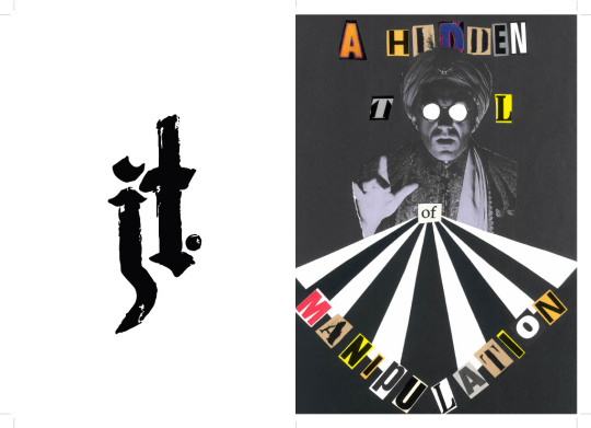
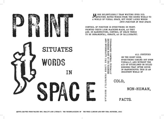
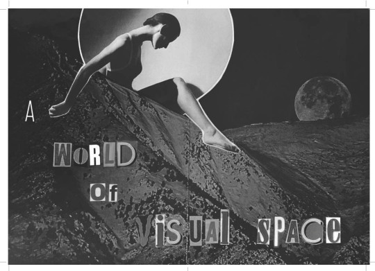
(Bonus collage/mini-poster in centerfold!)

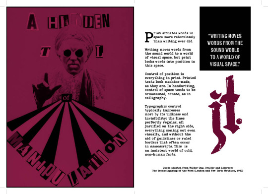

Final zine spread, cover to cover
This project (and class overall) has helped me to further develop my own art style, while encouraging me to see a project through to completion – something I really need to work on outside of uni. This process has also deepened my understanding of the history of design, giving context to and (I think) improving the overall quality of my work.
0 notes
Text
Blog Post M4.1


I chose to do my postcard series on a tattoo expo simply because I really enjoy the freedom typography gives to tattooing. After exploring and researching a few avenues, I’m leaning towards either a blackletter or victorian style font because I believe when many people think tattoos, these are the types of fonts they think of. Also because they will be the most fun to create and play around with.
I’ve also discovered some very interesting calligraphy artists, some of which also are tattoo artists also, who use a blackletter type font to create spiral, vertical or circular compositions. These really caught my eye, and although I'm not too sure how it will translate to my postcard just yet, I think a unique composition like this can give that edgy, gritty vibe that tattooing gives off while still allowing all the relevant information to be seen and absorbed.
I will need to use hierarchy to make sure this information doesn’t get confused or lost in the composition. Playing around with positive or negative space could also be fun and make my design more eye-catching. As for colour palettes, I’m leaning more towards traditional colours found in old-school flash sheets or traditional tattoos: red, blue, cream, green and black.
Creating an interesting composition which fits this theme will be a challenge, because most tattoo expos use graphics on their advertisements to grab the audiences attention, however I’m looking forward to the challenge and I’m keen to create something unique and awesome to look at!
- 6963
2 notes
·
View notes
Text
I gotta get this out of my system because my artist/graphic designer self is screaming and needs release. I WILL COMPARE THE LOKI SERIES LOGO WITH THE NEW THOR ONE BECAUSE... BECAUSE I CANNOT BELIEVE THAT MARVEL/DISNEY WOULD SPEND MONEY ON... ON THAT.
WARNING: lots of capslock.
BAD LOGO DESIGN:

‘QUICK’ POINT FORM OBSERVATIONS:
Did Loki take the whole cut out letters from a magazine as a ransom note/blackmail letter a little too far by actually using 3D letters? Did he just go around the universe stealing random letters from signs? Are some poor independent businesses missing a letter?
LOKI THE TV SERIES: WINGDINGS REVENGE
The ‘K’ is the thing that immediately draws your eye too first. The ‘K’ alone should not be the focal point of the entire logo.
HOLY HELL THE ‘O’ IS TOO DAMN DARK AND MUDDY.
THE L LOOKS LIKE PIGEONS SAT ON TOP OF IT AND TOOK MULTIPLE SHITS ALL OVER.
The L looks like someone with the skill level of Microsoft word art did that and printed it out for a mom and pop... idk, tile, stone, and granite shop? Something you’d pick out for a tile in the 80s/early 90s for a mall or office building?
The ‘I’ is all gem like and more mystical which is in tune with Loki. Is this a promo for Bejeweled the movie?
DO THE SQUINT TEST. If you squint you should still be able to read/see things fairly clearly. YES, YOU CAN STILL READ IT WHILE YOU SQUINT, BUT THE O ALMOST DISAPPEARS AND THE L JUST TURNS TO MUSH.
THE FONTS OH MY GOD THE FONTS WHY DO PEOPLE ALLOW SUFFERING. COMIC-SANS OR PAPYRUS WOULD HAVE BEEN BETTER. AT LEAST HAVE CONSISTENCY. SYMMETRY. SOME KIND OF FLOW BETWEEN THE LETTERS. I get they want to convey that this is Loki hopping around time or whatever, idk, but THERE ARE SO, SO MANY WAYS TO DO THIS BETTER. DO NOT MIX FUCKING BLACKLETTER WITH MORE MODERN SAN SERIFS. OR IF YOU DO AT LEAST MAKE THEM CONNECT SOME WAY WITH SIZE, COLOUR, SPACE, NEGATIVE SPACE, SOMETHING I DON’T KNOW. JUST NOT THIS.
The overall colour palette is dull af. The I is the only thing that pops colour wise because it has that deep emerald colour.
IT’S TOO DARK. HOW IS THAT L AND O GOING TO REALLY POP AND CATCH THE EYE? The O is just disappearing within the rest of the letters followed by the L.
The K is my favourite because it at least has a personality with the different shapes and angles to it. It’s the most fun of the bunch.
WHOEVER APPROVED THIS NEEDS TO HAVE THEIR FUCKING EYES TESTED.
While yes I am aware that the logo may tie into the show more and we could get more context this is not how it should be executed. There could be multiple different ways to tie it in.
WHY!?!?!?!
GOOD LOGO DESIGN:
Imma compare the new Thor: Love and Thunder logo because it fits within the MCU universe and also with Loki ect ect. While it may not be everyone’s cup of tea and yes it isn’t perfect, it is far superior BECAUSE:
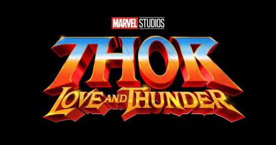
BAM! THUNDER CA- THOR: LOVE AND THUNDER IS A GO! IT KICKS YOU IN THE EYEBALLS WITH CAMPY AWESOME RETRO I-NEED-THIS-AIRBRUSHED-ON-THE-SIDE-OF-A-VAN KINDA WAY.
‘THOR’ is what grabs you right away. That alone is far superior to the Loki one because you already are presented with the character, brand, franchise in one look.
IT’S BRIGHT. IT’S ORANGE AND YELLOW AND BLUE. IT POPS MORE THAN A KARDASHIAN SPRAY TAN.
It’S FUN. Look at that fun, bright, eye-cathing retro 80′s sci-fi/fantasy vibe. All that’s missing is Thor in a tiny chain mail bikini and a fluffy white tiger.
ALL THE FONTS CONNECT. While Thor and then Love and Thunder are slightly different shape-wise they are still similar enough that they fit together and give you the same overall message of FUN, ACTION, SCI-FI, FANTASY, ELECTRIC, POWERFUL, AND POSITIVE.
NOTHING IS MUDDY AND LOST! The bright Cheeto orange, the yellow/gold that is Smaug's wet dream, the sky/mirror blue is all vibrant and breathes life into it all.
THE SQUINT TEST. You can still read the key message that is Thor very well. Even if you have trouble with Love and Thunder you will still know it is Thor.
THIS IS GOING TO BE A LOVE STORY FULL OF LESBIANS, CAMP, THUNDER, FUN, HEART, AND SOMETHING THE RUSSO’S COULD NEVER.
This logo is so fun and cheesy (literally in colour and aesthetic) that you immediately know what you're in for right away. It gives you a clear message upfront without giving anything for certain away. THIS is good logo design. While it may not be everyone’s fave, it is clear for what it stands for and represents. The Loki logo is all over, unbalanced, and isn’t cohesive like this.
LOVE AND THUNDER, MOTHERFUCKERS!!!!!!!!!
3K notes
·
View notes
Text
SERPENT & DOVE 2: ELECTRIC BOOGALOO (also blood and honey)

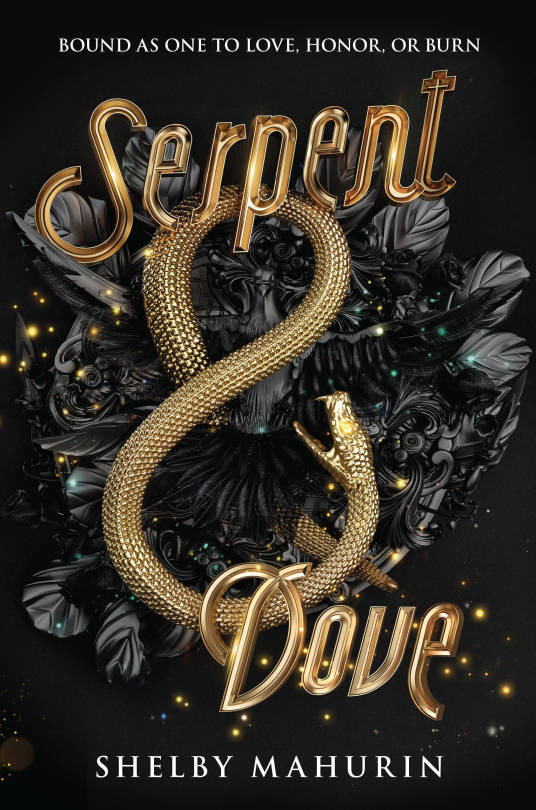
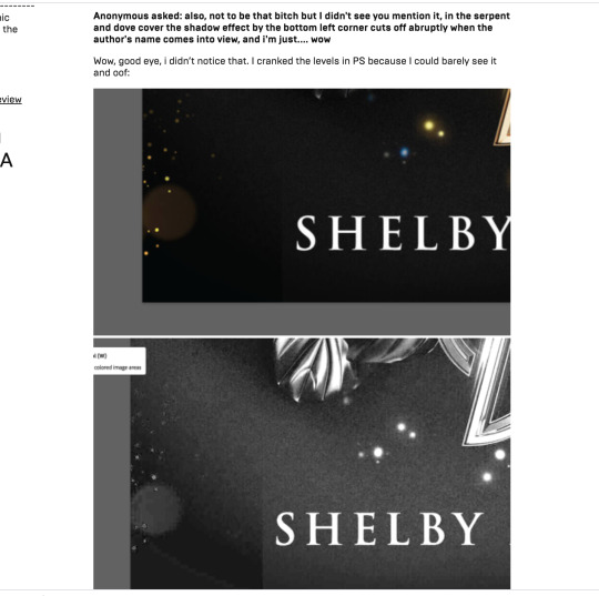
I originally covered (pun intended) SERPENT & DOVE in February 2019, and I wasn't complimentary. While the black and gold color scheme is appealing and there's a nice sense of depth and texture to the snake, beyond that, it is a hot mess. The rendering is plasticky, the imagery is mostly vague ~ AESTHETIC ~ nonsense, the whole thing has an off-center awkwardness, and what, for the love of god, is up with that midcentury typeface. An eagle-eyed blog reader even clocked weird crop mark.
Since then, I've been pointed to the online portfolio post of this cover by the designers, which has some very cool (and enlightening) process shots:
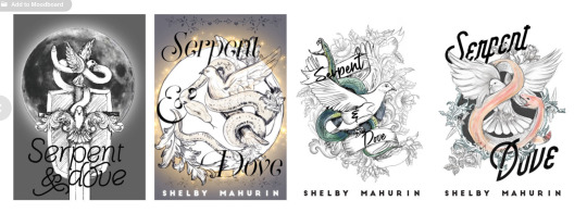
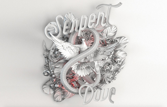
You may notice that this looks better than the actual cover! The serpent and dove figures actually share hierarchical dominance here as a single unit, and their overlap is dynamic and interesting as a focal point. So what happened? Since there's so little color in the comps, I have to assume that either it was originally intended to have a paler overall palette, or the question of color was intentionally punted down the line, but either way, this seems to have been created before the stark black and gold was decided upon. Because that's where we lose the dove completely.
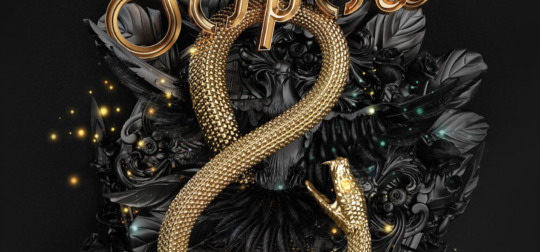
She's also been pushed fully behind the snake, losing any sense of the interaction between them and making our general sense of depth and "physical" space sort of... confused. Knowing how design processes typically work, I would think they tried the dove in gold in that original lockup and for whatever reason, it didn't work: maybe it overwhelmed the cover with too much gold or maybe it interfered with readability too badly. This explains my original discomfort with the size of the snake and weird emptiness of the design between the dramatically spaced type: originally, it was supposed to be (more) filled, and it hasn't been adjusted for the loss of that element.
Full disclosure: the first time I made a post on this cover, I didn't even realize the dove was there. My eyeballs lost it in all the nondescript foliage and flourishes so badly that the meaning-making part of my brain didn't translate those shapes into a specific object. And I spend a lot of time looking at covers when I review them! So that's embarrassing for me, yes, but this is also a failing of the cover itself. Regardless of my other issues with it, I think it's really disappointing that the (interesting! relevant! aesthetique but in a good way!) visual focal point that the entire iterative process centered around ended up completely dismantled in favor of....... ugh, I dunno, the 1950s diner type? Pinterest board trimmings of leaves and sparkles, like turkey trimmings but even less appealing?
Because I didn't know the dove was there, I was, uh, confused when I first got asked about how EXTREMELY similar BLOOD & HONEY is, a sentiment I've heard a number of times now, because BLOOD & HONEY, shall we say, overcorrects on the "bird loss" front.
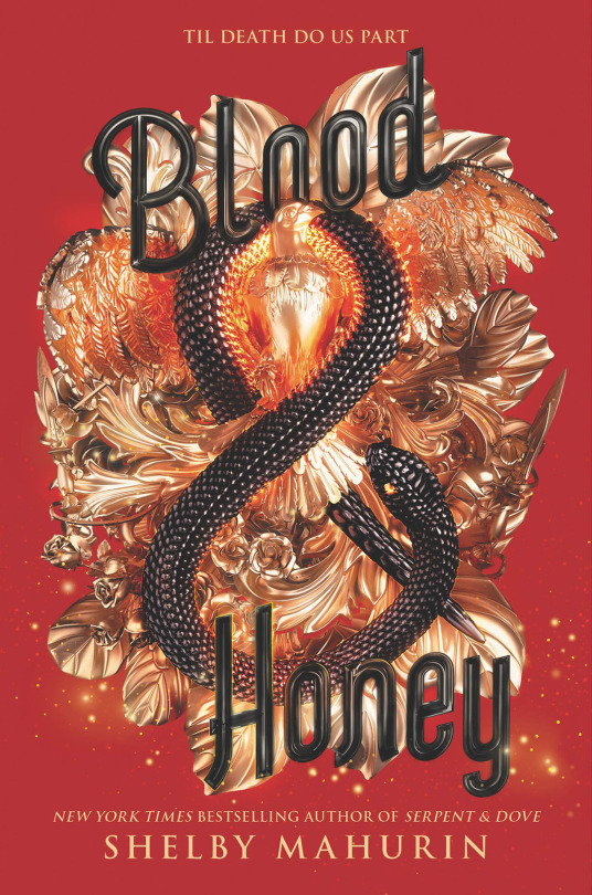
HELLO, SAM THE EAGLE. LET FREEDOM REIGN, BITCHES. MY COUNTRY TISSSSS OF THEEEEEE-
[Edit: I have been informed that this is probably still a dove, not an eagle, based on the face, but i’m not changing this joke.]
First of all, yes, the red is Bad. The black background of S&D matches the dark coloring of the objects, thereby hiding some of those Rendering Sins and lending a sort of subtlety to the mishmash of Aesthetique Things. It's all out in the open here and no less of a hot mess. The highlights are blindingly shiny and feel arbitrary as hell, like every single spear and leaf is being lit independently of anything else, and the almost pure black shadows that contrast them make my eyeballs burn-- it looks like it's a color being reflected from somewhere, rather than native shadow, because of how metallic objects reflect light, but there's nothing here but a perfectly flat, untextured field of red. I appreciate the emphasized presence of the bird (I'm ASSUMING it's an eagle, but I haven't read it, so correct me if I'm wrong) from a hierarchy and space-filling standpoint, but it is goofy as shit, and I have no idea why its chest has been so aggressively lit and filtered that it looks nearly on fire with saturation.
The primary offense of S&D's cover, that it's a tangled mess of meaningless and poorly crafted flourishes meant to be aimlessly Fancy that ends up being kind of ugly in the process, has been cranked up and the knob broken off here. An "Oooh, shiny!" from a dumb character who is about to trigger a trap manifested through a hypertrendy YA goth lens.
The text is also Still Bad. Compare the font to the one the Fairyloot book box uses for the book:
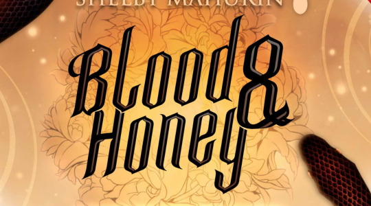
Although this isn't rendered in the metallic style, which it would have to be to match, it has a dramatic blackletter quality that matches the edgy medieval tone of the story far better than. Whatever the hell this B is doing.
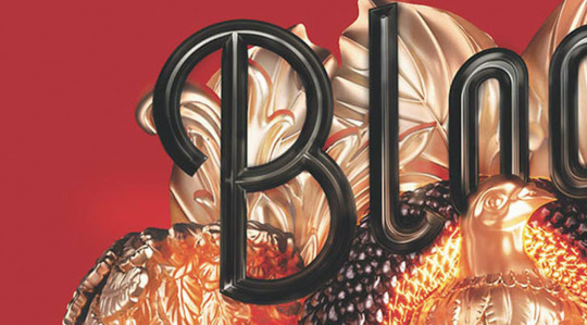
So round!!!! So friendly!!!! So Un-witch-hunt-ey!!!!
To be clear: no, B&H is not a full, exact recolor of the S&D cover-- most of the elements, though the same, are arranged differently, and that's a completely different bird and at least a nominally different snake.
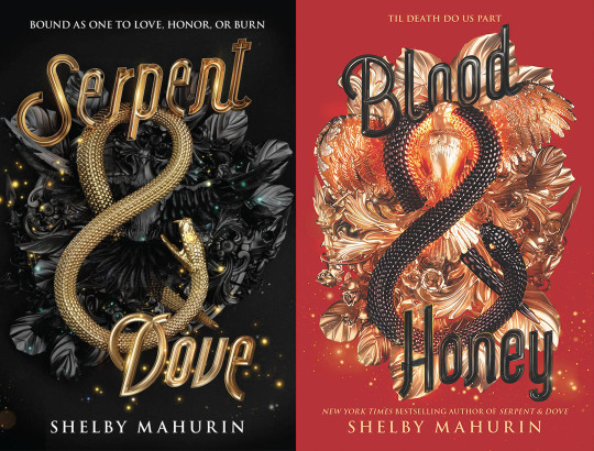
However comma I see why people think it is, because someone got lazy with the bottom left lol.
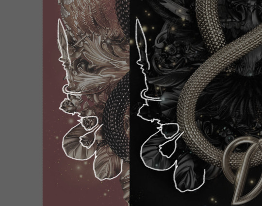
There is a Behance post for this one, too, although there's noticeably no process work, because the process was quite clearly "do it again but slightly to the left," and that doesn't involve much iterating.
Here's the thing, though; I'm not convinced any of this matters, because the truth is that hot, high-contrast messes photograph well.
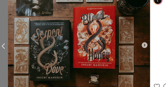
Particularly when paired with a moody setting or editing, the red that comes across as kind of a nightmare in the jpeg pops, and the Escherian snarl of detail becomes more a texture nonspecifically indicating luxury and romance than an object theoretically representing something concrete about a story. And I personally may not Love This For Us, but honestly, that's half of a book cover's job these days: look pretty and do nothing.
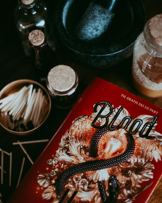
If there's something to be learned from BLOOD & HONEY's cover, it's that better or worse, instagram filters matter. (Also true of Shelby Maurin's immaculately aesthetically curated, goth-trendy personal brand, which has increasingly been mimicked by other authors since S&D listed, although the author-brand-as-book-marketing-tool has always been a thing to some degree). A book isn't just a book, it's a prop for the countless ongoing performances of book-consumption-as-identity done both for fun and for clout in this particular subculture. I'm not passing moral judgement, here-- anyone buying a new YA fantasy book, no matter what they want to do with it or what my feelings on the book itself are, is a win. But this is the industry moment we live in, and it's savvy of publishers to have it in mind in regards to marketing and design.
Like what I do? Want early access? Support bookcoversalt on Patreon
40 notes
·
View notes
Text
Typography seminar notes
Notes of everything and straightforward opinions
(notes and reflections)
Typography: how type is arranged on a layout
(how type is format for displaying on a page, product, packaging, signage or layout)
Times New Roman= early roman typestyle
gutenberg's blackletter revolution*
Typography has a long history even before the printing press, I thought this was cool and forced people to learn artistic skills in this area
monks= illuminated manuscript= blacklettering = gothic calligraphy script
adobe jenson= old style roman typefaces
focus on space saving= used italics for limited space
I find it interesting how this is the origin for the usage of italics
france didot family= in vogue and other 'classy' stuff bc of how nice it looks
the industrial revolution= typography suffered a cluttered approach, dense, chaotic, eclectic mix of styles to fit every bit of space (vintage style, circus, etc)
popular early sans serif; futura
this happens to be my favourite sans serif font so it was fun to learn how early it was invented, 10/10
gill sans= more natural curves
= humanist sans
influence of the digital age
= typography seemed out of place for a while
= fonts were rendered useless
= pixel styles more popular
= later on, overuse of really bad fonts (comic sans 😭🤚)
= typeface development can no longer be accomplished by specialists but by anyone with the right programs
DEFINITIONS
typography is the design and use of typefaces as a means of communication
typeface is the term given to a family of fonts like;
helvetic reg, helvetica oblique, helvetica bold, etc
font is the term used when someone is referring to only one weight or style within a typeface family such as helvetica bold
why is typography important?
how we show appreciation for each other
how we communicate
i was kind of aware that typography was important but this explanation really took me by surprise, and made me appreciate typography a lot more
keeps us safe (packaging, medicine, travel signs, expiry dates, times, everything) = everywhere in our daily routine
INFLUENTIAL TYPOGRAPHERS AND ILLUSTRATORS
(Notes on everyone, and how i felt about certain works with little to no explanation)
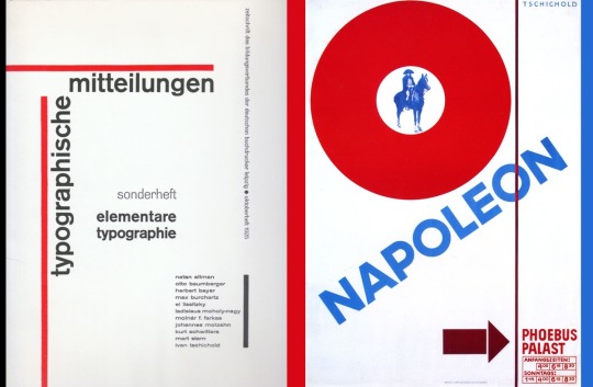
Jan tschichold=
german calligrapher, typographyer ,illustrator, book designer and educator
style of bowhouse (?), sans serif letterforms, new typography with asymmetrical layouts, integration of photography
simple and dynamic designs were applied to everyday practices
= head of typography and production in penguin
= did penguin covers
I thought he was pretty interesting, was especially interested in his asymmetrical layouts
Seymour chwast
nyc, illustration and graphic design
pushpin studios
= bottom heavy typeface style
used in pelo (magazine)
all lowercase letterforms
milton glaser
important usa graphic designer
= pushpin studios too
= 3 responses to a piece of design;
yes
no
wow (i love this response so i thought i'd write it here and use it in future notes / opinions)
= he did the 'i <3 ny' iconic logo as part of an advertising campaign (hate is a strong word but i truly do not like this logo, i don't particularly know why but it just irks me, thus i give it a no)
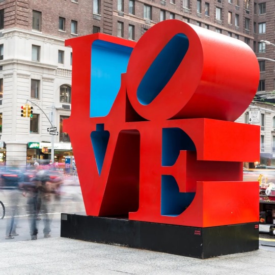
robert indiana
=brought a 2d christmas card into 3d sculpture (Yes absolutely, this was so cool)
wim crouwel
total design= his design firm
created 'new alphabet' =a type of font for machine (yes, I liked it)
alan fletcher
= eloquent work
= v&a logo
= many ways to reshape words into pictures (me personally i give it a no, though i like this concept, i did not quite understand what was so beautiful about his works. I don't think I enjoyed it as much as others did)
paula scher
contemporary usa artist and graphic designer best known for her posters logo design and album covers
= created maps with intricate lettering that indicate political and societal connections
=job of designer is to make things understandable usable and accessible
= each piece (map) she uses 50 pieces of information (roads, airline paths etc)
her public theatre campaign set a new bar for typography
=unorthodox spacing mixed fonts colours and weights and uncommon and historical typefaces is cool asf (SO COOL A WIN FOR THE GIRLS I LOVED HER)
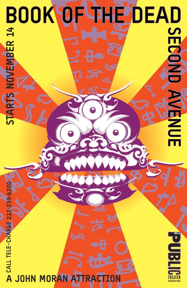
stefan sagmeister
= unique packages and designed books
most famous poster= visually convey the pain that accompanies most of the studios design projects
= got a student to carve text on his torso with an xacto knife and photograph the result (he has a lot of my respect for doing this)
=comes up with compelling concepts
drake and burgess-johnson
crafted typography + atmospheric imagery
pink neon lights, various backdrops, shot in diff location
(photography + typography=cool)
no but this made me realise I don't have as much an interest in photography as I originally thought, though the images were pretty creative 10/10
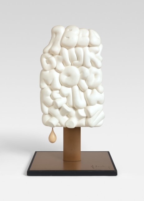
Claes Oldenberg **
= known for playfully surreal sculptures
soft alphabet 1978
41 sand filled cloth letters + resin letters
I absolutely love and adore these they are so cool and incredible and I love how soft & marshmallow-like they look an absolute 14/10 so based yes yes and ✨wow✨
matthew raw
works predominantly with clay
= new way language can communicate with form
This was really interesting to look at and gave me a new perspective of communication with form- this also made me realise I have a bigger interest in sculpture /3d than I thought i did
richard j evans
information leak= lasercut wood letters (yes am a big fan of this)
stephen powers
ny graffiti artist
= book 'a love letter to the city'
hybrid of sign writing and mural painting
taking power and using it in a good way
alan kitching
renowned for his expressive use of wood and metal letterforms in creating visuals
taxi poster = a1 piece of paper, letterpress effect gives character (yes, i really liked the affect of this one, it felt very clean but emotive(?) if thats a word, and i really enjoyed it)
max miedinger=
HELVETICA creator!!!
= neutral typeface that should give no additional meaning
(i have mixed feelings about this font, hate is a strong word but occasionally i do have mild dislike (occasionally). Also, if helvetica was a neutral typeface that 'should give no additional meaning' then how can one explain the helvetica font in the Thai language???? its so completely different from any normal font in that language and so clearly just uses the english alphabet to replace certain characters , & is BASICALLY unreadable from an inexperienced eye. I feel very strongly about this. A (soft) no from me)
saul bass
picasso of commercial artist
crafted brilliant artwork for hollywood
'vertigo' and 'the shining' movie posters (yes he is very cool i loved the posters)
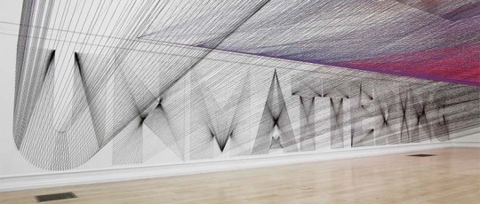
pae white
= merges art, design craft and architecture through sight specific installations
= south london gallery, mesmerising exhibition with large quantities of coloured yarn spanned and criss crossed the room to create words (the pictures of this exhibition / installation are absolutely incredible 10/10 work)
ebon heath
words are like butterflies pinned to the page
= graphic sculptures liberate letters from 2d space
= text is based off desired concept and is site specific to the location of the installation
= hand cut paper + now laser cutting technology (wow yes, i really liked this too and gave me an interest in laser cutting technology which i hope i can try out later)
cecil touchon
takes fragments of language from different sources and manipulates them into purely aesthetic sounds and arrangements (such a fun concept!)
collage and painting deconstruct shapes derived from central mexican landscapes into abstract shapes
neville brody
most famous for new wave style
art director for art magazine like face
use of bold and unconventional layouts
david carson
self taught, grid free
= made others realise that editorial layouts didnt have to stick to the rules
= unconventional and experimental style revolutionise graphic design seen in 1990s usa
'godfather of grunge typography'
(i love this man his work in the seminar was so cool to me it reminds me a lot of power lines criss crossing in the sky (if that makes sense))
mel bochner
= 'meaningless' phrases into work (very iconic of her)
nate williams
= bold & playful + tribal patterns
personally wasn't a fan of this style but I can appreciate it
adam hayes
pencil sketches in a response to project brief
= refined ink drawings + further refinement in photoshop
i'm also not a fan of this style but the amount of effort and time put into everything is incredible
jessica hische
I didn't really know what to write here as notes but I'm a fan of her book covers they're very nice
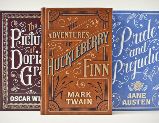
craig ward
creative director
=boundaries between illustration and type
(WOWOWOW GORGEOUS 10/10 YES, i l love love love all of his works and here are 2 of them)
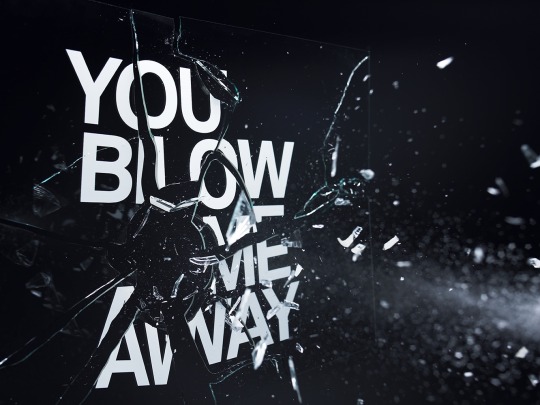
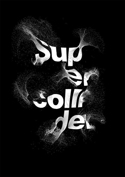
TYPE TREATMENTS
album covers
3d type /structural
collage - nice textures
simple/minimalist
relief / interactive (eg. matchsticks)
playful/ stylised (eg. toys, masking tape)
using mundane items
how nature interacts with the font= shadow of something makes out a word (eg. shop front at an urban outfitters)
patterns in environment / general patterns
kinetic type (eg. slow shutter speed with lights)
recycled materials
stitching
laser cutting
3d relief type of cardboard/ 3d printing
paper - quilling, origami, folding, cutting etc
food
1 note
·
View note
Text
Gothic fonts alphabet

#GOTHIC FONTS ALPHABET DOWNLOAD#
Bahisy Blackletter Font (OTF, TTF, WOFF)īlackletter is a style that resonates really well with a medieval aesthetic. Imagine this one on book covers or used in a newsletter headline. The ornate qualities of this font make it a memorable choice. Oracle Medieval Fairy Tale Font (OTF, TTF, WOFF) Give this font a try in your next design project. The pointed edges on the baseline make for a memorable aesthetic. This medieval font has a more gothic look. Darklands Medieval Gothic Font (OTF, TTF, WOFF) Use this one to tap into a medieval design aesthetic. Isn't this ornate font romantic? It would be a great choice for logos, headlines, and other points of interest. Rose Knight Medieval Font (OTF, TTF, WOFF) There are so many ornate, historical, and elegant display fonts to choose from. Download your favorites today, or enjoy the design inspiration.
#GOTHIC FONTS ALPHABET DOWNLOAD#
Here's a look at some of the best medieval fonts you can download right now on Envato Elements. The Best Medieval Font Designs on Envato Elements to Download Now Use it for your fantasy book, YouTube channel, and more. This medieval video intro template is also included with Envato Elements. All of this content is included for one price. Just customize it with your content, and you have a stylized opening for promo videos, YouTube, and more. Check out this medieval video opening that's also included with Envato Elements. Download stock photos, graphics, design templates, and much more. Download this beautifully designed medieval font on Envato Elements today.īut you get even more content with Envato Elements too. Choose from thousands of fonts, and download without limits. They're all licensed for commercial use too, so you can jump right in and get designing for your project. Try out all the fonts you need for your project. This is an awesome deal for creative professionals. Download from a library of thousands of fonts. Take advantage of unlimited downloads on Envato Elements. One low fee gets you unlimited access to thousands of fonts, including medieval fonts, blackletter, gothic fonts, and much more. Love medieval-style font designs? How about unlimited access to an entire library of them? That's what you get with Envato Elements. Download Unlimited Medieval Fonts on Envato Elements Download this font today on Envato Elements. Medieval calligraphy fonts often tap into an aged, handwriting look. They mimic old handwriting like you would see painted by an ancient record keeper, long, long ago. You might also see medieval calligraphy fonts as they're quite popular in this genre. This font has a magical vibe and keys into medieval font aesthetics. They are ornate and have an aged quality, rather than following modern design trends. Fonts in this genre often have elements that resemble blackletter fonts. You might want fonts like this for role-playing games, renaissance faires, fantasy novels, and more. Medieval fonts largely refer to an aesthetic: think Middle Ages font here. Use a medieval font for your fun, medieval-themed design projects. Looking for the perfect medieval font? Whether you're looking for a medieval gothic font, medieval calligraphy font, or other medieval-style font designs, there's plenty to see in this list.

0 notes
Text
Looking At Fonts
Blackletter, also known as the Old English, Gothic, or Fraktur was the first invented font in the world. The style has received recognition from many people due to its dramatic thick, and thin strokes.
https://www.toptal.com/designers/ui/typeface-history
The font you use in packaging can really impact the overall theme of your product. When you create something, you have to make sure that all elements have a link between each other.

This font I would say works pretty good in comics and kids shows. It’s big and simple and easy to read. The simple easy letter combined with a bit of three dimensional element makes it look like something you would see in Regular Show. I would not use this particular font for anything but I still think it could have many purposes.

This one is clearly meant to be horror. Horror fonts usually have traits such as, very rough and scratchy letters that are sometimes uneven to give them an unnerving vibe. Some fonts are also written in blood (or other disgusting liquids) and have drops dripping down. I think this kind of theme is very nostalgic and recognisable but I wouldn't think this type of font is still necessary in horror movies/games. It makes it look pretty corny.

This one gives me Cyberpunk vibes. I have seen a lot of companies/studios use that kind of ‘A’ especially. You can tell this is meant to be futuristic because of the way the letters have 0 curves and some of the lines (i.e. ‘E’) don’t connect with one another making it look like it was computer generated. I really like this kind of font and I would happily use it if my driver didn’t come from a fantasy old world.

Graffiti fonts are my absolute favourite. I was always inspired by graffities and I would probably use this font a lot, but it would be preferable to use it in a game/movie/product that links with street art.

Neon has to be pretty high in my list as well. It looks pretty similar to the cyberpunk one but I do think that this one has it’s own charm. The way all the lines are somehow connected in a weird way that makes them look like some kind of cables or christmas lights. I think this one works pretty well too.

In some cases, for holydays or just for fun, people invent fonts that don’t use actual words at all. Depending on the theme, the characters could look very different. If the theme is Valentine’s day, then instead of snowmen, Christmas trees and mistletoe, you would have, Cupidon, and cherubs and hearts and roses. I don’t really see this one being of any use at all but I do think it's an interesting one.
0 notes
Text
Reflection of the final piece
The first thing I had to do for the "word on the street" banner was to make context research in-depth for the theme of the Feste, which included the Plague, the Well Dressings, and the relation to Derbyshire, which was the initial inspiration for my work. Through the stage of researching, I learned a lot about the pandemic in 1665 and how it affected Britain. This gave me the idea to link the past with what is happening now, with the on-going Coronavirus and how the pandemic affects the world today. To make the link between past and present I also looked at the Cholera, the Spanish flu, and the H2N2 and gathered information and factology about each of them. This not only helped me make a clear vision of contrast and similarities between past and present but also enrich my knowledge. I realized that there is not a big difference between then and now, as the pandemics affect everyone, and is just a matter of time for them to go away, but during this time they have a massive impact on the world we live in and who we are. For the final appearance of the banner, I used a combination of the three samples I made. I took different parts from every piece made, that I like, and compound the final work. I also got inspired by several typography artists that had different blackletter typeface styles inspired by the Victorian- era and the gothic culture. I chose the Victorian-are (Gothic) style as it was traditionally used in the medieval and later on in the 18th and 19th centuries. As this style is typically associated with this ere I decided to link it to the theme I chose, to make my work more authentic and old-style. Through the working process, I had to solve several problems, one of which was the scale and proportion of the letters in ration to the 6ft long banner. I found it very difficult because I was working on a smaller scale when doing the samples. I was able to control the space and calculate the size of the phrase, whereas when I moved onto the actual work I realized that the scale is too big for me. I personally prefer to work on a smaller scale and I have full control over the space and I am able to work in detail. Though, when it comes to bigger scale pieces, I feel like I am not able to translate and enlarge my ideas properly. For this, I had to carefully calculate the letters and trace them onto the bigger paper until I find the right size. Luckily for me, this did not take too long, and I was able to carry on with making the stencils. This stage was probably the most fun for me because it was the first time for me to make my own stencils. However, I chose to work with stencils because I was able to place them where I wanted and how I wanted. In addition, the stencils really helped me create a clean edge, which I would not be able to get if I worked with freehand. Also, even though I roughly have experience with this letter style, from my past project at school, I would not be able to make the letters so clean and detailed without messing them. The third and fourth stages of my work were also very fun but challenging for me. I was very excited about making the head of the "Plague Doctor". This idea came up to my head very spontaneously, after I saw one of my old sketches, where I tried to create a shape of a hand by writing the text in a specific way. I thought it will be a great idea to recreate this idea in a different way, which made my work much more intriguing and provocative. Also, this became a significant part of my work which symbolizes this era, and it's very popular imagery that I think a lot of people would recognize. I was not having any problems through the last stage of my work. Towards the end stage of my working process, I was able to visualize my initial idea more and more clearly and see it coming together. I was not longer lost in the blank space I had at first. I think I managed to avoid the mistakes I made in the beginning. I did not want too much text going on that overwhelms the space. Instead, I tried to synthesize the found information from the pandemics' studies, so it's clearer. I think the end result is what I was hoping to achieve; I did not want it to be too tidy or too chaotic, or too basic with a lot of factology. Instead, I was hoping to make something different and extraordinary which is very out of my comfort zone, and I think I succeed.
0 notes
Text
Study Session
Downtime fic between Voski and the Book of Teeth and Nightmares.
By the time the imp’s miserable thieving silhouette had faded to a dot on Soreth’s skyline, the front of the cave was essentially uninhabitable. Kriv kept fretting about the stolen ring, which meant Amaranth kept trying to comfort him between enraged tail lashes, which meant Stelly and all the other locals they'd somehow amassed here were even more on edge than usual, even while they took turns promising each other everything was going to be okay. Things were no better outside, what with Rooster pacing about glaring at the horizon and muttering darkly to her crossbow. She seemed less interested in reassurances and more desperate for an obstacle she could actually hit back for once.
So Voski hadn't presented one. Instead, she’d found Tavra perched with her crew on some nearby rocks being aggressively nonchalant again and persuaded the kobold mage among them to cast a quick light spell. She'd asked for white. She'd gotten a sort of washed out sickly orange instead, which in fairness was less harsh refracted off the ice and stone as she slipped past the others down the tunnel towards the cave’s back chamber. Voski still scowled at it, emanating from her oboe like the world’s dullest torch.
At first the spell’s range didn't matter much in the relative confines of the tunnel. A few of the wider curves may have been more dimly lit, but the nearer surfaces glimmered off each other more than enough for Voski to make her way through in a hurry. Then the walls and ceiling vaulted out and upward into the main cavern and the sphere of visibility around her grew unavoidably finite. She pressed a hand to the cold glassy wall and ducked left, guiding herself carefully around the edge of the room.
In a way it was silly they hadn't set up their hideout back here instead. But then again it was technically a little girl’s bedchambers, even if she wasn't dragon-shaped enough to need the whole space anymore, so some deference to privacy was understandable. Voski hadn't felt inclined to wander back here again since the last time in any case. If she was going to focus, though, it was her best option now.
She found a cluster of stalagmites to nestle in and slid down, back to the wall as much as jagged rock curvature allowed. The torch became a lantern when she set the oboe down bell-first, which freed her hands while she unslung her bag and fished out the Tome of Mynskay. Somehow it had snagged a quill between two of the teeth hammered into its foredge. Voski took it begrudgingly. She opened the book and skipped directly to the blank section at the back it used for correspondence, where she wrote:
Which planes does it work on?
The book’s answer bled sleepily out of the page. Did you miss a sentence? it wrote.
Pardon me; I eschewed the formalities, Voski scrawled back. Hello, good afternoon, this is certainly some weather we're having. On which planes does the spell reliably operate?
The Prime Material certainly has the best-established track record, the book replied. It was, Voski knew, incapable of yawning, but if it could have stretched its covers languidly it probably would have. Am I to take it we are no longer there?
You and I are, Voski reassured it, unless I died under a guardhouse today and this is all a sick joke. I am more concerned about the impact of long distance casting.
So the location of the soul? The text seemed to snap a little more uniformly into line when it materialized now, as if the book had finally conceded some scholarly interest. The only requirements are "free and willing." Planar geography is...well, not immaterial. It may take longer to summon. But the spell as written assumes the soul to be on the Astral Plane.
Voski considered the imp’s trajectory as it flapped away, Erwyn’s ring in its grasp, straight to the magic golden beacon blasting out from Soreth Castle where it had first slithered its way into this whole affair. And if it’s further?
Depending on where it is instead, you may experience some problems, the book replied. Not insurmountable ones if distance is the only variable. As long as the soul is intact and hasn't been imprisoned or fallen victim to a contract, it can be summoned.
Then it added, If something happened that could affect your casting, dancing around it won't help you. Where is your friend now?
Voski rolled a single annoyed spark between her teeth before answering. We've acquired a diamond. The soul may be--(she wasn't quite depraved enough to actually write out a dramatic ellipsis, but stalled enough in her word choice that the pause was most likely still felt)--in transit. And while it's too early and information is too limited to say for sure where he's headed, I think one of the Nine Hells is a distinct possibility.
The symbols in the book swirled thoughtfully for a moment.
Well, it wrote. That is a tricky one.
Voski agreed. If it helps, he certainly wasn't handed over willingly.
It does help, the book affirmed. If he were a devil's lawful property, nothing I can teach you would be able to change that.
The cave had been echoing softly with penstroke scratches since she'd started, but Voski had more time to dwell on the distraction while she weighed her response. As I said, we can't be certain that's his destination yet. It could be someplace closer, or more amicable, or the opposite of both. But the fact remains that our single greatest advantage in performing this rite without a skilled necromancer was the soul's proximity, and that may not be reliable anymore.
She sighed.
So what else can I do to even the odds?
There was a long pause while the book considered. Are there other power sources you can tap into? it asked. If you rely on your own and it isn't enough, things could go . . . poorly. You've been practicing the music, I assume?
In my ample and undisturbed leisure time, yes! Voski looped the last words so vigorously she nearly tore the paper. Then she slumped and curled a little closer around the book. My acquaintances may have access to another source. Using it is what ended so poorly for the patient. I would have to take care in applying it here.
You will have to take care in all aspects of this ritual, the book wrote, surrounding the words with stern red ornamentation.
Or painful grisly death, yes, noted. I'll spend some more time with the gesture charts. Voski set the pen down and drummed her claws absently on the page while glancing around the cave. At the light’s edge, she could just make out the spot where she must have been standing a few days ago, oblivious and in direct dragon eyeline. She thought about a flash of white light, then green, and a bone-deep chill inexplicably receding. Erwyn had meant well. He'd failed to think the syntax through. She picked up the pen again.
But if I were to tap into external power, when would the most auspicious time for it in the ritual be?
The penultimate section is the most taxing, said the book. And also when the consequences for failure would be most catastrophic.
Voski remembered those notes. A few included diagrams, with blast radii. As if they ever aren't.
Sometimes they're merely dire.
Is it fun for you, being the way you are?
The pages rustled under her grasp. I have to take my entertainment where I can get it.
I do have one more sincere question, Voski wrote, before seizing a section of still-fluttering paper and flipping back to a part of the ritual steps. In the third section, just before the actual soul calling begins, you make it sound as though someone could successfully complete the rite and still face (she paused again, and felt like a hack) objections. So does managing to bring a soul back always end as well for the caster?
The book rustled its pages again. Voski was certain that if the tome had been capable of it, it would have been laughing. Always? Don't be absurd.
The words didn't fade right away, but rather lingered in the background while the book formed the rest of its response. You're breaking some major laws. Flouting the whims of Death and Fate. That's why you need to get some sort of higher power on your side in case the Raven Queen takes umbrage and sends one of her Inevitables to straighten out the matter.
Fairly and impartially, I suppose, Voski scribbled.
As far as she's concerned, certainly.
I have to confess, I think you're the one coming out better off in this arrangement. I paid for your lessons with some of my very best inks, and you've used them to illustrate a very narrow window for success.
Would you rather I lied to you? the book answered, decorating the words with grotesque golden flourishes. It continued in a looping cursive hand. In that case, of course everything's going to be fine. You'll get your friend back with no consequences and you'll end the spell feeling fresh and invigorated!
Point made, it reverted to its usual spiky blackletter. But if you want the truth instead of some rosy fantasy, then yes. The window for success is extremely narrow and the consequences for failure are steep. You're the one who wanted to work this ritual in the first place. If it's too challenging for you, you can always back out. But don't blame me just because raising the dead isn't all sunshine and rainbows.
Voski watched the page until it cleared itself again, taking the words wherever they went when they weren't useful anymore. Of course I don't mean to sound ungrateful, she wrote. You've stated the facts and clearly done everything in your power to prepare me, and obviously the forces at play here are beyond your control. Her wrist itched. She ignored it. But I can assure you, backing out isn't an option.
She continued in her daintiest hand. And I would hate for you to feel as though your contributions aren't valued! Which is why, in recognition of your labor, I'll be giving you a place of honor in the room when I conduct the ritual. We can find out how impressively this ends together.
Delightful, the book replied, entirely in Voski's expensive gold ink. She only slammed it a little on her way back to the spell guide.
8 notes
·
View notes
Text
100+ Best Modern Serif Fonts
It’s time to delve into a collection of the best beautiful, premium serif fonts. Serif fonts are ideal for printed literature, more detailed typography, or for creating a more formal effect. And these typefaces really stand out from the crowd.
Today, we have gathered more than 100 of the best serif fonts that you can quickly start using in your work. You’ll be amazed at what a difference they can make to your design project, compared to the more generic system fonts that get all too commonly used. There’s nothing like a distinct serif typeface to really set your layout apart, and create something beautiful.
Quas Stencil – Modern Serif Font
This is the stencil version of the popular serif font, Quas. It features the same elegance of its original design but with a creative stencil design. This font is perfect for crafting logos, titles, and poster for luxury branding designs.
Price: Envato Elements Subscription
Kenjo – Modern Serif Font
Kenjo is a collection of modern serif fonts that features a design inspired by Japanese art and decorations. It’s most suitable for making logos and other designs for fashion and apparel brands.
Price: Envato Elements Subscription
Madelin – Bold Serif Font Family
Madelin is a modern serif font featuring a thick and geometric design that makes it stand out from the crowd. The font comes in 5 different font styles, including rounded and outline font designs.
Price: Envato Elements Subscription
Style Clubs – Creative Serif Font
This creative serif font is the perfect choice for crafting fashion, apparel, and luxury brand logos and stationery designs. The font comes in 2 styles and a web font version.
Price: Envato Elements Subscription
Lara – Sophisticated Serif Typeface
The simple and elegant design of this serif font makes it an ideal choice for designing sophisticated brand logos for fashion and luxury businesses. It includes all basic characters, symbols, and punctuations.
Price: Envato Elements Subscription
Maiah – Serif Font Family Pack
Maiah is a family of serif fonts that comes with 4 different font weights ranging from light to bold. It features both uppercase and lowercase letters as well as multilingual characters and punctuations.
Price: Envato Elements Subscription
Mailtoon – Fun Serif Font
If you’re looking for a fun and quirky serif typeface, Mailtoon is the perfect font for you. It features a creative design that will allow you to easily highlight your titles and headlines, especially when making kid-friendly designs.
Price: Envato Elements Subscription
Merova – Classic Serif Font
Merova is a modern serif font that features a design inspired by classic typeface designs. It’s made specifically for crafting logos and signage for high-end products and luxury brands. The font comes in 5 different weights as well.
Price: Envato Elements Subscription
Abell – Serif Font Family Pack
Featuring 8 different font weights, Abell is a family of unique fonts that will allow you to create all kinds of business and branding designs. The font includes both uppercase and lowercase letters as well as multilingual characters.
Price: Envato Elements Subscription
The Holloway – Creative Serif Font
If you’re working on a creative greeting card design, poster, or even a social media cover, this modern serif font will help add a unique touch to your design. You can also use it to craft logos as it comes with a set of 24 premade logo templates as well.
Price: Envato Elements Subscription
Jerrick – Serif Font Family
Jerrick is a modern serif fonts family that include 6 different typefaces ranging from regular to bold and italics. The font features both uppercase and lowercase letters with multilingual characters. This is an all-rounder font you can use to design everything from greeting cards to logotypes, business cards, and more.
Price: Envato Elements Subscription
Caringin – Modern Serif Font
Caringin features a mixed modern vintage design that certainly makes it look quite uncommon. It’s an all-caps font that’s perfect for creating headers, titles, and posters. The font also includes alternate characters, ligatures, and swashes as well.
Price: Envato Elements Subscription
Little Summer – Creative Serif Font
This fun and quirky serif font is perfect for designing creating greeting cards and book covers, especially related to kids and fun activities. The font comes with all the standard characters, numbers, and punctuations.
Price: Envato Elements Subscription
Wavetone – Serif Font
Wavetone is a creative serif font that you would use to design a book cover, poster, greeting card, or a flyer. Inspired by classic ads and movie posters, this font comes with a touch of modern design that makes it one of a kind.
Price: Envato Elements Subscription
Thomas Craft – Modern Serif Typeface
Thomas Craft features a truly modern design with a clean and minimalist layout. You can use it to design logos, website headers, flyers, and much more. The font comes in 4 different weights.
Price: Envato Elements Subscription
Galvin Slab – Serif Font Family
Galvin Slab is a serif font featuring a narrow design. This makes it the perfect choice for crafting greeting cards, posters, flyers, and even T-shirt designs. The font allows you to choose from 8 different weights as well.
Price: Envato Elements Subscription
Picnic Caps – Serif Font
This is a decorative serif font you can use to create unique book covers and flyers for special events. It’s also great for crafting creative greeting cards and invitations. The font includes lots of alternates and glyphs too.
Price: Envato Elements Subscription
Quixote Obsolete – Serif Fonts
Quixote is the type of serif font you would use to design logos, website headers, and other designs related to luxury brands and corporate companies. It comes with a modern-classic design that just never goes out of style.
Price: Envato Elements Subscription
Samford – Modern Serif Font
Samford comes with a clean design making it a great choice for your minimalist website and print design works. It’s available in Solid and Outline styles.
Price: Envato Elements Subscription
Kula – Bold Serif Font
Kula comes with a bold serif design that can be used to design attractive titles in posters, website headers, and social media posts. The font is available in 4 different styles, including bold, outline, shadow, and blur.
Price: Envato Elements Subscription
Harold Modern Serif Font
Harold is a modern serif font with an elegant and a minimal design. It’s an all-caps font that also includes numbers and punctuations. It’s perfect for designing minimalist logotypes, badges, website headers, and business cards.
Price: Envato Elements Subscription
Vera Typeface
Vera is a serif font that comes with the perfect design for crafting logos, business cards, magazine covers, and posters related to luxury brands and products. The font includes multilingual characters with numbers, punctuations, and alternate characters.
Price: Envato Elements Subscription
UrbanCase
If you’re looking for a serif font with a unique urban design, this is the perfect font for you. This font is simply ideal for designing logos and branding works related to fashion and luxury products. The font is available in 2 versions.
Price: Envato Elements Subscription
Aspal Modern Serif Font
Aspal is an all-caps modern serif font that has a beautiful design for crafting elegant logos and signage. The font comes in both regular and stencil styles, which you can use with different types of design projects.
Price: Envato Elements Subscription
Whimsy
Whimsy is a handmade serif font with a whimsical and a quirky design. It’s perfect for designing book covers, posters, and greeting cards related to kids and teens. You can also use it with online designs and social media posts as well.
Price: Envato Elements Subscription
Croak Typeface
Croak is a unique serif typeface with a dry withered design. It comes in 2 different styles with a light withered effect and a rough effect. Both typefaces feature all-caps letters, punctuations, and numbers.
Price: Envato Elements Subscription
Portico Diablo
Portico is a modern vintage serif font that’s ideal for designing posters, website headers, banners, greeting cards, and book covers. The font also comes with web font version as well.
Price: Envato Elements Subscription
EXPLORER – Sailor Original Typeface
Explorer is a serif font family that features 4 different weights, light, medium, regular, and bold. The fonts have minimalist designs that makes them perfect for designing greeting cards, logotypes, posters, product labels, and much more.
Price: Envato Elements Subscription
Deadhead Classic
Deadhead is a playful serif font with a classical design. It comes with an old-school look inspired by the 1960s and includes 300 glyphs, alternate characters, and tilting characters.
Price: Envato Elements Subscription
Fenrir Gothic
Fenrir is a serif font with a gothic design. It’s ideal for designing posters and bold titles for website headers. The font includes stylish alternate letters that you can type by using the caps lock.
Price: Envato Elements Subscription
Stay High Modern Vintage Font
This font will give a unique Victorian-era look to your posters, website headers, labels, and other print designs. It features a blackletter style design with both uppercase and lowercase letters, numbers, and ligatures.
Price: Envato Elements Subscription
Jewel – Display Font
Jewel is a classic serif font that features a modern vintage design. It comes in 4 different styles, regular, bold, grunge, and grunge bold. The font is great for crafting logos, business cards, and greeting cards.
Price: Envato Elements Subscription
Farmhand Font Family
Price: Envato Elements Subscription
Farmhand is a family of fonts that include all types of typefaces from serif to sans, inline, and italics. It’s an all-caps typeface that comes with small caps letters for lowercase letters.
Morning Glory
Price: Envato Elements Subscription
Morning glory is a modern vintage font created inspired by the culture and fashion from the Victorian era. It also includes a free poster and border vector featuring the same design style as well.
Bistro Font
Price: Envato Elements Subscription
Bistro is a two-in-one serif and sans font collection that features a unique handwritten design. It comes in 3 weights, which can be customized with bi-color interior, fill, or slant. It also includes over 50 unique glyphs as well.
Minty March Condensed Serif Font
Price: Envato Elements Subscription
Minty is a condensed serif font that’s ideal for designing greeting cards, website headers, and logotypes. According to its creator, the font goes well along when combined with a script font.
Zahra Typeface
Price: Envato Elements Subscription
Zahra is the type of font that you can use to craft logos, business cards, and website headers for luxury brands and high-end products. It comes in 4 different styles, regular, regular-grunge, inline, and inline-grunge.
Marema Typeface
Price: Envato Elements Subscription
A yet another modern vintage font that features a design inspired by vintage posters and with a mix of a few modern aesthetics. It also supports OpenType features and comes with several vector graphics and ornaments.
Oatmeal Jack
Price: Envato Elements Subscription
This is a unique font that features a truly stylish hand-lettered design. It also comes in both serif and script versions as well as web font versions. As a bonus, you’ll also get 7 vintage badges as well.
Leah Gaviota
Price: Envato Elements Subscription
Leah Gaviota is a serif font with a fun and corky design, which makes it the perfect choice for blog designs, logos, badges, T-Shirt designs, and more. The font comes in 6 different versions, including decorative, outline, and script typefaces.
June Morning Font
Price: Envato Elements Subscription
June Morning is an all-caps hand-drawn display font that’s best for playful and kids-related designs, including book covers and greeting cards. It’s also great for a blog and logo designs as well.
Reidfork Typeface + Textpress
Price: Envato Elements Subscription
Reidfork is a unique serif font that features a mixed modern vintage design. The font comes to you in 3 versions, regular, hand-drawn, and hand-drawn rough. In addition, it also includes a vector pack and a tutorial on how to create a Vintage Textpress design.
Venice
Price: $19
Venice is a typeface that’s been designed with a mix of minimalism and elegance. The Vogue magazine logo design is the inspiration behind this font.
Quas Typeface
Price: $15
This font looks ideal for designing logos and signage, especially for luxury and fashion related businesses. It comes in both Bold and Regular weights.
MORVA
Price: $14
A great typeface for creating big bold headlines and banners. Morva comes in regular, italic, and ornament versions.
Isabel
Price: $25
Isabel typeface has been designed for creating all-things related to children and teenagers. However, the font design looks perfect for crafting many other types of designs as well.
The Wild Hammers
Price: $14
Give your logo, headline, and print designs an American wild west look with this stylish typeface. It comes with Opentype features, alternate upper and lowercase characters, and supports international languages.
Adelaide
Price: $12
An elegant serif typeface suitable for all modern logo, headline, web design, and print designs.
Hydrant
Price: $10
The vintage design of this font makes it a great choice for designing cards, invitations, and website headlines. The font comes in 8 different styles including, regular and grunge, inline and inline grunge, and more.
Portland Serif
Price: $12
This minimalist font is designed for creating bold headlines and logos with all-caps letters. It comes in light, regular, bold, and black weights.
Kidlit
Price: $10
A fun and a beautiful serif font for all your designs related to kids. The font pack comes in three different alphabets, including extra-tall, extra-short, and extra-swirly letters, which allows you to create your own unique designs.
Sweet Wanderlust Font
Price: $15
This calligraphy style font with quirky letters gives its letters a unique handmade look. It will play well with many types of your design needs.
FLORVA
Price: $12
Featuring a special bracketed serif shape and a beautiful swirl ornaments, this font is ideal for designing logos and headlines for fashion and luxury brands.
Sugar Cake Serif Font
Price: $12
Yet another fun and a unique typeface with a handmade look for all your exciting and enjoyable projects.
Elak Typeface
Price: $6
This typeface will probably remind you of a dark horror movie. But it looks great for headers, logos, and print designs as well.
Ravenly Hand-Written Font
Price: $6
This handmade-style font with a vintage design is perfect for designing posters, cards, logos, and more.
Jacob Riley
Price: $32
This is a premium quality and a unique font that’s been designed inspired by antique 18th-century printers’ specimens. It can be used for designing cards, invitations, and even for the pages of children’s books.
HANDY-Vintage style
Price: $3
A vintage-style typeface with a mid-eighteenth-century design for crafting stylish logos, posters, and headers.
Hamilton | Hand Drawn Uppercase Font
Price: $5
Another beautiful typeface with handwritten letters. The font is perfect for crafting graphics, posters, headers, and even quote photos for social media.
Secret Society Font + Bonus
Price: $12
This hand-drawn font is inspired by “shady dealings, nefarious henchmen and ghost stories”. According to its creator, it’s suitable for tattoos, death threat, ransom note, wanted sign, and tombstone designs.
Carrig Roman
Price: $29
Inspired by classic letterforms carved into stone, this typeface comes with a full European character set and 410 glyphs. It’s ideal for headlines, logos, branding, and many other designs.
Yellow Umbrella Thin
Price: $5
This fun and cheerful hand-drawn serif typeface will fit in perfectly with your invitation, cards, headers, and even for children’s book covers.
Flabbergast
For the better part of 2015 I spent my type design time on Flabbergast, a Didone for headlines with wide language support. After creating all of the design for my game assumptions using Didot, I felt inspired to create an even higher contrast font, for print and web. I set out only to make one weight (regular) but fell in love with even heavier verticals and added a bold weight. It was released in November of 2015 and the download includes OTF files for the regular and bold weights, as well as webfont kits for each.
Price: $25
Young Heart Typeface
Introducing Young Heart Typeface – a western style display font. OpenType features with Stylistic Alternates. To access the alternate glyphs, you need a program that supports OpenType features such as Adobe Illustrator CS and Adobe Indesign. You can use this font for various purposes such as logo, t-shirt design, posters, labels, letterheads, book covers and more.
Price: $16
Argent CF Expressive Serif Font
Dashing and expressive, with an overstated x‑height and evocative letterforms. True italics and lots of character. Featured on Typography Served, Argent is both a tribute to the past and a step into the future of typography.
Price: $19
Turquoise
Turquoise contains small caps, many discretionary ligatures, ornaments, swashes as well as several brushy nature-inspired ornaments, accessible via Opentype. Ideally suited for headlines or body text in advertising, packaging and visual identities, its delicate shapes, curves and endings give projects a harmonious elegance and stylistic feel in unique turquoise style.
Price: $59
Quincy CF font family
Quincy’s warm, flowing letterforms, tall x-height and medium contrast provide a pleasant reading experience for longer passages. Quincy also doubles as a stately display font. Five weights and true italics ensure versatility, with a compliment of Latin and Cyrillic alphabets for good measure.
Price: $19
Night Still Comes
A serif font in two styles: regular & italic, and in 2 weights. With over 550 glyphs for each font, including: A-Z, a-z, 0-9, punctuation marks, accents, small caps, ligatures, and much more.
Price: $15
Victorian Parlor
Victorian Parlor is a traditional victorian decoration typeface based on clean looks and ink textured. Containing 350 glyphs of clean looks (regular font) and 350 glyphs of ink textured (vintage font). Each letter in the font was painted manually one by one with lots of detail and consistency.
Price: $17
Endurest Font
Built to withstand the challenge of trends and time. Inspired from the graphing technique of the late Sir Raymond DaBoll but with markers, acrylics and digital touches to create balance among heights and spacing. Call it modern vintage. Changing the size and kerning were made automatic for a perfect combination. Endurest in short is perfect for your work.
Price: $12
Caston
Caston is a revival typeface based on Morris Fuller Benton’s modified litho – initially designed and issued by Inland Type Foundry back in 1907, later modified and issued by American Type Founders in 1917 after the merge. Not only the typeface is now in the hands of public domain due to the defunct of ATF decade ago & lacking of active descendants – no known digital font was found in the web, until now.
Price: $19
1805 Jaek Map
This font is mainly inspired from the engraved characters of a German Map depicting Germany’s roads and parts of surrounding lands, edited in Berlin probably in the end of 1700’s. The engraver was Carl Jaeck or Jaek (1763-1808). The Map was bought by the French napoleonic general Louis Pierre Delosme (1768-1828) probably during the Napolenic campaign against Germany, circa 1805 or at least 1806, his sole staying in Germany.
Price: $30
Naive Inline Font Pack
Naïve Inline is a serif handwritten font designed by Fanny Coulez and Julien Saurin for La Goupil Paris. The three weights of this retro-Parisian typography can be enhanced with a bicolor interior, ribbed, full or demi, to improve your designs and bring a nostalgic and unusual feeling. To do so, you can simply superimpose the 2 elements: the weight above, the interior below. We also designed a sans serif version, Naive Inline Sans.
Price: $19
Naive Font Pack
Naïve is a serif handwritten font designed by Fanny Coulez and Julien Saurin from the french foundry La Goupil Paris. The three weights of this new parisian typography can be enhanced with three weights of two alternates fancy glyphs for each letter, the “Fantaisies”, to improve your designs and bring a more poetic and unusual feeling.
Price: $19
Lettersmith Design Kit
It’s no secret that I love all things hand-lettered, but recently, I also can’t get enough of letterpress printing! And with all the gorgeous script fonts in the marketplace, I wanted to create a fun typeface to compliment them. But of course, I couldn’t stop with just a font. Nope, I went ahead and hand-sketched over 300 vector elements, added 10 cotton paper textures, and designed 50 Letterpress Styles, so that you can make anything and everything you want.
Price: $25
Metropolis – Font Family
This elegant and versatile serif typeface captures the essence of classic and modern city, the dualism between the working class and the city planners. Through the elegant lines and sinuous curves this font works perfectly for a display reading or beautifully as a headline or as body copy.
Price: $14
New York Font
A vintage style display serif font for your new projects. Great for your retro/vintage projects, the pack contains 4 font files (otf & ttf) – regular, grunge & line, and line grunge.
Price: $10
Sonten Typeface
Sonten Typeface is a modern serif-semibold for title and bodytext in a medium look. The name ‘Sonten’ originally from Sundanese word means ‘Afternoon’ that inspired from the process when I created the font every afternoon after my “business” done everyday. The design prefers to use in insignia style, so I presented the different styles including 3D, Bevel, Contour, Deboss, Outline, and Shadow. Most of them can texted in a regular way (1 color) or being combined by 2 font that have the same position like a multi-layers.
Price: $17
Alitide Typeface
Introducing western style display typeface it’s a alitide. An All-caps font with modern western style, OpenType features with stylistic alternates. To access the alternat glyphs, you need a program that supports OpenType features such as Adobe Illustrator CS and Adobe Indesign. You can use this font for various purposes such as logo design, t-shirts, posters, and much more.
Price: $12
Tigerlily
A handcrafted serif font by Jackrabbit Creative. Inspired by elegant cityscapes. Tigerlily brings a handmade feel to an otherwise “sophisticated” feeling typeface. Font comes as both .ttf and .otf font files. Includes numbers and basic punctuation.
Price: $9
Colombos Typeface
Introducing the new Colombos Typeface, another display serif font. It is a great idea to use it for logos, inspirational quotes, t-shirt graphics, typography art, apparel, labels, badges, posters, business cards, stylized wedding invitations, prints, signs, emblems, book cover designs headlines, titles, etc.
Price: $12
Alice
Alice is a fun and quirky all caps serif font. While creating this font, all I could think about was Alice in Wonderland and her adventures. Comes in 2 weights; Regular & Light and includes OTF and TTF files.
Price: $12
Bold Riley font
Introducing Bold Riley a handmade serif display typeface. To give it that human touch each glyph was hand drawn with pen and ink.
Price: $10
St. Monique Typeface
St. Monique is a display typeface inspired by medieval typography and visual motifs. Serifs and subtle details were designed to evoke the medieval feeling while keeping the typeface clean and contemporary.
Price: $12
The Wallington Pro
Wallington Pro is a decorative-serif font embodying vintage and elegant curves with functional structure. Style is adopted from Old English cultures with their descendants around mid-12th century and Art nouveau in 19th century, it was inspired by natural forms and structures and the curved lines. Crafted with love and easy-to-read letter design.
Price: $24
Black Oval
Black oval is a font with a vintage style and simple, very suitable for your brand or posters, band, shirts and others.
Price: $9
Deathcross Capital
The death cross vintage font is very similar font can help in your work with designs — especially vintage designs.
Price: $8
Nadirii Font
Nadirii Font is a handwritten, multilingual, display font, with greek/greek polytonic and latin characters.
Price: $4
Flored Typeface
Introducing Floren Typeface, a simple and beautiful font made with persistence and passion. Floren typeface has a unique character when compared with its peers — it has a unique, special bracketed serif shape.
Price: $12
Slow Pony
Just outline the stroke instead of trying to maneuver letters with tracking and kearning. Those swirls are ruthless. A beautiful font for you to use in your designs.
Price: $6
1592 GLC Garamond OTF
This family was inspired by the pure Garamond pattern set of fonts used by Egenolff and Berner, German printers in Frankfurt, at the end of the sixteenth century. All the experts said it was the best and most complete set of the time. The italic style used with it was Granjon’s, as in 1543 Humane Jenson. A few fleurons from the same printers have been added.
Price: $34
Marthas Typeface
Introducing Marthas, The time-machine between that classic wave typeface and nowadays vintage enthusiasm.
Inspired by vintage hipster enthusiasm, the needs of classic fonts are raising high for any industries that bring the trend as their red carpet to attract the market. So that’s what the Marthas was based on. It comes with a complete set of Uppercase, Lowercase, Numbers, Accents and Punctuations.
Price: $16
Corporative Cnd Family
Corporative Condensed, by Latinotype Team, is the narrowed version of Corporative Basic that offers high performance when using for headings and subheadings. The family consists of 8 weights plus companion italics.
Price: $31
Carrig Rough
This is a hand drawn, all caps display typeface inspired by classic letterforms that have been carved into stone and then weathered by time.
Price: $15
Bold Riley font
Introducing Bold Riley, a handmade serif display typeface. To give it that human touch each glyph was hand drawn with pen and ink.
Price: $10
Quiroga Serif Pro
This typography was designed for continuous text, legible at medium and small sizes, with great saving of space, optimized for 6, 8, 10 and 12 points. The morphology is a mix between tradition and innovation; it has a vertical axis, thick serifs, tall x-height, light modulation and a lot of internal space between letters: key to improve legibility at small sizes. Formally, my idea was to make a serif type that had a unique color, this is visible due to the light modulation. This is also complemented with the incorporation of not common, alternative signs. Some parts of the letters that are usually curb or diagonal where made horizontal (for example: a, q, p, etc.), this makes the eye of each character to be wide and unique.
Price: $29
Vidiz Pro Typeface
Vidiz Pro Typeface is serif font designed to help you create stunning work. Suitable for logos, posters, invitations, greeting cards, quotes — you name it.
Price: $14
Real Talk
Real Talk packs the same lip flapping smacks and pharyngeal grunts as any old nonsense. But while a baby can only babble, a grown man can mean something. Put words in perspective, located on the axes of breadth and depth, and live by them. Do what you say. Say what you know. Know what you feel.
Price: $27
Archive Garamond Bold Pro
Archive Garamond is a typeface roughly based on the designs of Claude Garamond (ca. 1480 – 1561) , a French publisher and a leading typeface designer of that period.
While the majority of contemporary digital interpretations of the “Garamond types” are cleaner and more polished versions of that genre, Archive Garamond tries to keep the rough nature which was typical in the early days of printing. Archive Garamond has a rather unique, distinctive temperament which is even more emphasised with the preserved non-uniformity, such as irregular glyph shapes or a variable baseline. Although Archive Garamond was clearly made to be used for display sizes it works surprisingly well in text.
Price: $29
NT Rudolf Gagarin
Rudolf Gagarin is part of the Gagarin Family. Made by Novo Typo. Designers from Amsterdam, The Netherlands.
Price: $26
Karl Whitefoot
Karl Whitefoot is a hand drawn font that comes in two different variations, regular and oblique. You can combine the different styles of the whole Karl family to make variations to your design.
Price: $12
Daisy Dog Hand Drawn Font Serif
It’s my hand-drawn font, Daisy Dog. Created in some of my favorite hand lettering that I always find myself including with my illustrations and surface patterns, I wanted to share it with the world.
Price: $12
AZ Vintage Tattoo
AZ Vintage Tattoo font was inspired from Early 1900’s Amateur tattoos. This font utilizes an “old look” to the line work which is designed to have a “worn feel” to it. Ideal for use as headline or sub-head text in you design.
Price: $20
Brave New Font Pack & Graphic Extras
A handmade, Brave New Font sketchy, illustrated, and hand-drawn with love. This is more than just a typeface – this is a pack, and it allows you to be even more creative than you would have been with just the font.
Price: $20
Ndogk
Opentype features ready with Stylistic Set, Contextual alternates. With Opentype features you can applied to logos, product, display, clothing, quotes and many more. You can applied to all typography with mix and match pairs of letters to fit your own designs.
Price: $17
Warrior – Hand Drawn Typeface
After many hours with my pen and sketchpad my first font has finally landed. Taken from one of my hand lettering styles which regularly features on my Instagram and Dribbble feeds, it is inspired by the love of vintage, the outdoors and a time when everything was made by hand.
Price: $16
Dacota Layered Typeface
Dacota Typeface is a layered type family, Inspired by vintage american west poster and circus poster that have a strong shapes so it will create more attention for people to look more closely. Comes with 4 font system that can be layered to create different effect (basic, rough , dropline & dropshadow).
Dacota Typeface includes a full set of capital and lowercase letters, as well as multi-lingual support, currency figures, numerals, and punctuation.
Price: $15
Carrig Refined
“Carrig Refined” is the polished version of Carrig Rough. I have taken the essence and personality of my original hand drawn typeface and refined it. Carrig’s clean, curved lines, uniform serifs and precise kerning combine to make a unique, distinctive typeface that could be the perfect solution for your next design project.
Price: $15
Champloo
Champloo is very unique typeface which combines serif features and brush stroke. Some letters have serif, but some don’t. Serif to be found on left side of stem only. It gives a quirky impression on short text. However the larger the text become, the more consistent look it gets as a whole. These two versatile weights let you play with the typeface freely and beautifully.
Price: $15
Udang Typeface
Introducing Udang Typeface classic display font. Inspired by victorian style which is combining classic and modern typography. You can applied to all typography with mix and match pairs of letters to fit your own designs.
Price: $15
Claire – Serif font & illustrations
Claire is a handwritten font created by brush and ink which gives it sharp edges and a little bit scary look. It is delivered with over one houndred thematic illustrations. So, if you’re looking for something sharp but pleasant you are on the right way.
Price: $7
The Brodze
This font is specifically designed with a variety of alternate, ideal for posters, t shirts, typography, writing etc.
Price: $11
Ana’s Rusty Typewriter
Hand-drawn font based on an old Underwood typewriter (hence the limited character set).
Price: $5
Bendy Goose
A contemporary fun font that would be ideal for funky designs and graphics.
Price: $6
Always Here
A simple, yet elegant, handwritten font. It will be ideal for minimal or typographic poster designs.
Price: $2
Horseshoes & Lemonade
Inspired by vintage fifties and sixties design elements. The lettering features exaggerated angles with the square borders popular at the time. All letters are capitals but the lowercase characters provide variations. This package includes an additional font containing only the letters without the borders. This font supports basic Latin and Western European diacritics and the download contains both TTF (True Type Font) and OTF (Open Type Font) files.
Price: $15
AZ Plug Italic
AZ Plug Italic font is inspired from a combination of original early 1900’s Edward Penfield and Franz Hazenplug poster art. This font is designed for use as a worn and antiqued headline or subheadline.
Price: $20
Teco Serif Light
Teco Serif is a simple and modest display font design. It supports a wide variety of languages — Albanian, Cyrillic, Danish, Dutch, English, Estonian, Faroese, French, German, Icelandic, Italian, Malagasy, Norwegian, and Swedish.
Price: $20
Hoods & Capers
This font was inspired by a song titled “Hoods & Capers” by Asteria.
Price: $19
Uncle Lee – Regular
Meet Uncle Lee – ahand drawn and playful serif! A upper-case-only font with upper-case-variants on the lower-case letters, and three happy versions – regular, outline & thin
Price: $13
Victoria Typeface
Introducing Victoria. Available in Regular And Bold.
Price: $15
Quiet the Thief – Thin
A modern serif font with a nice medieval outlook that will bring out the true vintage nature of your designs.
Price: $9
Aviano Wedge
Aviano Wedge comes in six different weights and is packed with OpenType features. As a complement to these characters, Aviano Wedge includes 40 discretionary ligatures for artistic typographic compositions. To see these features in action, please see the informative .pdf brochure. OpenType capable applications such as Quark or the Adobe Creative suite can take full advantage of the automatically replacing ligatures and alternates. Aviano Wedge also includes support for all Western European languages.
Price: $72
Mekicki
Mekicki is a typeface based on a poster designed in 1928 by Polish artist Rudolf Mękicki. It is part of a series inspired by the aesthetics of Poland, circa 1908 to 1939.
Price: $10
Black Heirloom Artcraft
Heirloom Artcraft is available in Thin, Thin Italic, Book, Book Italic, Demi Italic, Black, and Black Italic. It also features Metrics and Optical kerning– metrics displays characters with letterpress-traditional spacing that is pleasantly askew, or more rigid optical kerning which displays characters at identical distances for times when the importance of readability exceeds that of stylistic merit.
Price: $29
Exquise FY Italic
With its round and elegant shapes, this new didone typeface is developed in six styles, including a “poster” weight. Though inspired by classical thick and thin shapes, Exquise FY’s design is innovative with its sharp drops.
Price: $50
Hilton Serif Font
There is something special about thin fonts. On one side is the sensitive, charming and warm touch, on other side they are uncompromising, thoroughgoing. Here the contrast can’t hide the clear shapes. Hilton Serif and Hilton Sans is a pair of highly legible, subtle and elegant sans-serif and semi-serif display faces. The quality of spacing and kerning ensured by Igino Marini.
Price: $39
Skooled Serif – A Hand Drawn Web Font
Skooled Serif is a clean hand drawn font face that is perfect for creating a handmade look on your website. The text is easy to read, even at smaller sizes. The download includes all of the formats needed to embed the font in your webpage. The font features 195 glyphs including accented characters.
Price: $10
Marker Typeface
Marker is an all caps, this is my my first typeface using fontographer, i think marker its good for your headline.
Price: $10
Nexodus
This unique art font comes with new set of ornaments as well as many ligatures and Zodiac signs.
Price: $49
Marina
MARINA is typeface inspired by sea, sailing, boats and wind. Enjoy the seashore.
Price: $10
Gauthier FY Medium
nspired by Renaissance typefaces, Gauthier FY is a contemporary old-style serif typeface with big x-heights and quite small caps. Accompanied by a lovely and detailed italic, inspired by artworks from the punchcutter Granjon‚ Gauthier FY is perfect for any text design. Gauthier was co-created by Jérémie Hornus & Alisa Nowak on fontyou.com, the first collaborative type foundry.
Price: $50
Bosman
Bosman_empty is perfect font for apparel, labels posters with vintage, marine feel. Package contains also Bosman_dings.
Price: $8
Old Venexia
Unlike many of our other fonts that are strict interpretations of historical exemplars, Old Venexia is a loose interpretation of Aldus Manutius’s typefaces. Aldus was one of the greats in typography whose work influences vast amounts of typefaces to this day. This font has nearly 600 defined characters. Suitable for a wide variety of applications. This font contains regular, italic, bold, bold italic and small caps in both TTF and OTF formats. Every Proportional Lime font comes with a full character map.
Price: $30
Brush Serif – Percy
“Brush Serif” was inspired by all the classic serifs you know and love, but as an illustrator I’m not enthused with straight lines and perfect corners. Every font was styled off of one or more “classic” typefaces and completely redrawn and hand painted with a Chinese calligraphy brush and Indian Ink.
Price: $15
Brush Serif Family
The Full family. Much love, Ed.
“Brush Serif” was inspired by all the classic serifs you know and love, but as an illustrator I’m not enthused with straight lines and perfect corners. Every font was styled off of one or more “classic” typefaces and completely redrawn and hand painted with a Chinese calligraphy brush and Indian Ink.
These are as versatile as they look but are particularly striking at large sizes when all of their beautiful imperfections, dry brush edges and speckled fills are visible.
Price: $60
Dust Overhaul
A unique dusty font inspired by the American dust bowl during 1930 – 1940.
Price: $49
Australis
Australis is a hybrid roman font that won first prize in the Morisawa International Type Design Competition in 2002. After 10 years the family is finally complete and its release coincides with the reopening of the competition in 2012, in Japan.
Price: $99
Caitiff Family
Caitiff is a unique hand drawn serif. It includes about 25 ornaments to compliment your text and a couple of stylistic alternatives to your capital letters. Caitiff Slanted is an oblique version of Caitiff. Caitiff is a decorative typeface. You can use Caitiff in any setting; children’s books, beer labels, organic food packages and menu.
Price: $25
Sergio FY Bold
Sergio FY is an antique latin font family inspired by a 19th century wooden type font, found in an italian print – Gazetta Musicale di Milano, 10 Guigno 1897. This typeface is characterized by its large, sharp, and triangular serifs, which give it a very singular look. With its complete character set including small caps, oldstyle figures and discretionary ligatures (amongst others), Sergio FY comes with 3 weights and italics, as well as an amazing set of ornaments. Its large width, its short ascendants and descendants allow it to perfectly fit in small size. It will also show all its originality in big sizes for headlines or posters (absolutely fabulous in its black version). Both robust and elegant, spiky and friendly, oldschool and contemporary. Sergio FY is for sure the next celebritype.
Price: $70
Sperling FY Medium
Sperling FY is a geometric and condensed high contrast font, characterized by its long vertical serifs. Its big i-dot as well as some other deliberately naive disproportions like the W are wonderful signs to identify Sperling FY. The accompanying italic style illustrates well designed creative forms like the k or the z. Due to its good legibility in small size, you can use it for editorial texts like in magazines. You can also take great pleasure by using it in poster size.
Price: $35
Canberra FY Regular
Canberra FY is a contemporary and low-contrast serif typeface that shows legibility with personality. Its asymmetric and short serifs render a versatile look, always usable and friendly.
Price: $50
Rocking Bones Typeface
Rocking Bones is Serif Handdrawn like a Bone with handmade feel. You can use this font as creative as you want. Just imagine and touch the sky.
Price: $12
Mayonez regular
Mayonez is a typeface with rational structure and axis but softened with rounded contours and cupped serifs, getting as result a balance between seriousness and friendliness. The shapes have a soft appearance but without lacking definition.
Price: $28
Sprout Writer
I like typewriters. Heres two handwritten fonts inspired by them, regular and bold. Download includes two .TTF files compatible on both Mac & Windows.
Price: $10
Bonerica Typeface
This is Bonerica typeface is serif font made by hand. This is good for logo,greeting cards, posters, labels, t-shirt design, modern vintage, etc.
Price: $12
Boucherie Block Regular
Boucherie Block is part of the Boucherie Collection – a series of 16 distinct, yet related typefaces. With its thick wedge serifs and steeply angled crossbars and terminals, Boucherie Block cuts a bold impression. Set it large and tight for searingly effective headlines.
Price: $20
Achille II FY Black Italic
This Slab serif typeface is characterized by its curved and angular serifs which give it a special character. Not too rigid, no too round, its well balanced shapes make itself both legible in small size and powerful in big for headlines, with its robust structure.
Price: $70
Murmers Typeface
Introducing murmers typeface is a serif font . murmers typeface inspired by old films about a murder or crime . This is a great for vintage design, t-shirt, logo, labels, posters , badges and etc.
Price: $12
Brington Font
Brington font made with a mixture of ornament adds a classic and vintage. very well suited to be used for book titles, bands, movies, advertising etc.
Price: $12
Piramid Font
Piramid Font is suitable for use make design using style of racing. This font is also used a great vintage style used in your design that has a vintage concept.
Price: $9
Hansom Slab FY Bold
As its cousin Hansom FY, this font has friendly shapes and rounded terminals. Slabs reinforce its masculin and technique appearance.
With 3 weights and their accompanying italics, this modern and functional slab font family is well-suited for all kind of application. From packaging to editorial design, from screen to branding – Hansom Slab FY guarantees optimal readability.
Price: $35
DJB Holly Serif
Holly Serif is a handwritten font in the style of type with a flair of the handwritten. It contains language characters for European languages and comes in 2 styles.
Price: $7
Catalina Typewriter
Earlier this year I visited a bakery in Newport Beach, CA and fell in love with the organic design and typography of the place. Hand-drawn menus, table cards, chalkboards, and wall quotes surrounded the charming spot. It inspired me to create a new font family based on the combination of hand drawn fonts.
This typewriter inspired hand-drawn font family works great as either a display or paragraph text. It has contextual alternatives with 3 versions of each letter, and comes in both upright and custom italics versions.
Price: $45
Deputy Serif
A Gentleman Rascal of a font. Serious but fun. Responsible but quirky. He is good enough to meet your parents and your friends. He has your back in a fight and adds class to your dinner parties.
Price: $9
from Design Shack http://bit.ly/2i8M9tl
100+ Best Modern Serif Fonts See more on: Simply PSD Blog
from http://bit.ly/2DD5co1
0 notes
Text
Giving your product a soul
After a few years of designing products for clients, I began to feel fatigued. I wondered why. Turns out, I’d been chasing metric after metric. “Increase those page views!” “Help people spend more time in the app!” And it kept coming. Still, something was missing. I knew that meeting goals was part of what a designer does, but I could see how my work could easily become commoditized and less fulfilling unless something changed.
I thought of how bored I’d be if I kept on that path. I needed to build some guiding principles that would help me find my place in design. These principles would help grow and would shape my career in a way that fits me best.
What I’d like to share here is how I found my principles and regained a sense of fulfilment. I’ll also discuss one of them and hopefully convince you that it’s worth considering when we design products. Speaking of convincing, I’d also like to help you convince your boss that these things are important.
One small string that began to tie it together was watching Bret Victor’s talk “Inventing on Principle.” The first half is mostly a code demo; then, he gets philosophical and talks about how goals and principles help you. I believe that living by principles can lead you to some really interesting places — for me, they’ve helped me to find the right ways (and places) to work and the right projects to take on (like designing a typeface), and they’ve helped me to identify which areas of my life need to be nurtured so I don’t burn out.
Advocate For Design Having A Soul Link
I’ve worked on projects whose goals varied from increasing email signups by 10% to boosting ad impressions by 30%. It was honest work, to be sure. It’s important that our designs meet the needs of the product owners and our clients — this isn’t art school, and there are real constraints and requirements we need to address.
However, it’s not enough to do metrics-based design. That in itself is a bit too clinical and detached, and where’s the fun in that? We need more.
Validating and then meeting a project’s requirements should be the minimum of what we set out to do. Once we set those metrics as our baseline, we’re allowed to be more impactful and thoughtful as we get to the root of a design problem.
What we need to shoot for is to help people fall in love with our products. That means pushing to give our designs a soul.
Here’s what “emotionally connecting” means: It means you’ve created a product that stands out in someone’s heart. The product becomes what people reach for because it’s the most helpful. People might not be able to understand what you’ve done, but they’ll perceive that it’s better. This is one way to make a product that’s indescribably good.
I usually ask these two questions, which get at part of what helps people fall in love with a product:
What’s going to help someone really find this useful?
What’s going to make them care about it?
For years, we’ve focused on making our websites and products be functional, reliable and usable. These qualities are the bedrock of any good product, but it’s when we add a soul to a product that it really comes alive.
My first hint of a design having soul came back in 2005 when I logged into Flickr for the first time. Sure, Flickr has undergone many, many changes since then, but I’d like to explain how it helped me, as someone who hadn’t shared much online before. I wasn’t sure how to share something, but I noticed right away that the website greeted me with a friendly “Hello.” The website helped me breeze through the process, and the friendly tone was really assuring.
My Flickr experience was like a pal gently leading me through the process, making it easy to succeed. It was a warm experience that made me want to return. Incidentally, I can say “hello” in a lot more languages now, thanks to what Flickr taught me.
Moving forward to newer examples, we can also consider Slack, its competitors and email. All of these options help people communicate, but Slack has a personality that helps you feel more connected with it. Slackbot helps you get started by asking you questions in a conversation, much like a real human would when you meet them for the first time. The makers of Slack eschewed the standard idea of filling in a registration form in favour of something more conversational — this makes other services feel stale and unfriendly by comparison. Slack has soulful flourishes everywhere: from smooth animations to a cute little emoji that is shown when you’ve scrolled all the way to the newest message in your group.
To be fair, Slack and Flickr (which, by the way, share co-founders) weren’t the first to try for something more human — that desire has spanned centuries. Lovers of typographic history may recall that Gutenberg wanted the movable type he created to mimic the look of handwriting. He used blackletter-style letters, which were similar to the bible manuscripts that monks illuminated.
These examples makes a strong case for design having a soul. The personality that develops from having one is what wins someone’s heart and makes competitors feel like poor (or, at best, passable) copies. Consider this statement by John Medina in “Brain Rules“:
Emotionally arousing events tend to do better remembered than neutral events… Emotionally charged events persist much longer in our memories and are recalled with greater accuracy than neutral memories.
In other words, we’re wired to remember products with a soul. Let’s use that to our advantage.
Next, let’s get a little more specific and see how that can play out.
FIDDLE FACTORS
One example of a way to give a product a soul is by adding a “fiddle factor.” A fiddle factor is a playful part of a product that imparts a sense of joy or playfulness when used. I first heard this term in Jony Ive’s unofficial biography, Jony Ive: The Genius Behind Apple’s Greatest Products. Ive had a new take on, of all things, a pen. Noticing that people tend to fiddle with their pens when not writing, he added something to his pen design to give people something to play with when they were idle. Of course, Ive started by making the best possible pen, then added the fiddle factor.
According to Clive Grinyer, Ive’s once-boss:
This was a new idea back then, to put something on a pen that was purely there to fiddle with. He was really thinking differently. The pen’s design was not just about shape, but also there was an emotional side to it.
Fiddle factors invite people to idly toy with them and form a deeper connection with what you’ve made. They become that warm little blanket that wraps a product around your heart and makes you want it more.
I’ve described one already with Slack and its emoji use, but here are a few more digital fiddle factors:
That pull-to-refresh spinner with the really cool spinning animation? A fiddle factor.
That fun animation you click to like something on Twitter? Fiddle factor.
In MailChimp, when you find out that Freddy’s arm can extend almost forever when you’re testing an email’s responsive breakpoints? That’s a fiddle factor (albeit a cruel one).
ONE WAY TO ADD A LITTLE SOUL TO YOUR PROJECT
To give a project a soul is to cultivate a relationship with it. You need to know what it needs and understand its nature. In this sense, this relationship is the same as a potter with clay or an architect with wood and steel. Once you understand the nature of your materials, you will know what it can become and what its limits are. This will help you to mould a soul in the right ways. Not doing this will ultimately cause your project to feel inauthentic and fail.
Let’s say you’ve built a playful iOS app. It’s meant to send short, fun replies to friends. In the app, you’ve got an overview page showing the latest emails, and the user can go into a detail view to read a particular message. You could go the standard route of sliding in the email from the right — it’s a simple thing to do, and it’s built right into iOS.
The drawback with built-in transitions is well covered: Anyone can use them. Sure, there are definite benefits to them (namely, that they’re cheaper and faster to implement), but it’s difficult to build something that’s soulful if you only use stock components and animation.
Instead, consider an alternative kind of transition. Think about it like this: Consider the personality you think the app should have. Think about the people who will use this app. I use this chart to help me determine the tone of a project:
Back to our email app. Let’s say it’s a fun email client. In this chart, it shows most strongly in the casual, energetic and easy-going categories. If we think about the animations we’ll use here, it makes sense to be more playful.
So, let’s animate the email message to come up from the bottom of the screen with a little spring in its step. When you’re finished with it, you can swipe it away or pull it back down.
Let’s take that even further, based on the chart and animation:
Maybe the animation could be the basis for how you approach other animations in the app. Your other animations could be similarly fun (but don’t overdo it).
Maybe it will affect which typefaces you choose.
What’s important here is to avoid forcing something in where it doesn’t belong. Don’t be different just for the sake of being different, and don’t overdo it. If we saw the President of the United States deliver the State of the Union address in a Hawaiian shirt, we’d probably feel like something’s amiss and might not take him as seriously as we should. Same here — what we do has to feel natural.
OTHER IDEAS
Any interaction, be it with a button or a scroll, is a perfect place to explore adding a fiddle factor. Explore what might happen when the user scrolls to the bottom of the content. Or perhaps you could come up with something unexpected when the user hovers over a photo for a long time. Maybe you could make a neat hover or focus animation.
Adding soul isn’t limited to animation, either. It goes much deeper!
How does it sound? Each person’s voice is totally unique, and your product’s should be, too.
How does it look? We need to stand out and be ourselves; so do the things we make.
How does it act? Could your product know the user on a deeper level and anticipate their needs? That would be deeply soulful.
Convincing Your Boss And Team
It’s all well and good for designers to talk about giving their products a soul, but here’s where it gets real: You have a deadline, and a budget. Your boss might not want to go for it, and your engineers might be resistant because it would take them extra time. Let’s talk about a framework for those conversations.
The framework I use to have these discussions centres on the effort required to implement an idea and the idea’s impact on the customer and the business.
While there will inevitably be high-impact, high-effort items in a project, the sweet spot is low-effort, high-impact ideas. These types of ideas help the user in meaningful ways, without significantly affecting your timeline and budget.
This way of looking at ideas also helps me to let go of ideas that might be a little too egocentric. Those usually have low levels of impact and high levels of effort. Mapping them out in this way helps me to focus on what matters most.
I’ve found this approach effective because it enables us to differentiate our products, while making the most of our time.
Let’s go back to custom animations for a moment. If we’re talking about adding fiddle factors and animation to our email app, we can’t build something great by assembling it entirely from off-the-shelf components. If we use only basic components and built-in animations, the product wouldn’t be memorable enough to matter to people. Plus, it will make it difficult for us to fall in love with what we’re building and to give the product a soul.
One additional framework to keep in mind is the Kano model, which was developed in the 1980s by Noriaki Kano.
There is a great explanation video, but, in short, this model covers three areas:
basic needs (Does the product work?),
performance needs (How efficient is it?),
attractive needs (What makes me love it?).
The soul of a product lives in the attractive needs. The Kano model invites us to think of one or two features that set the product apart from its competition. Framing your high-impact, low-effort ideas with this model will help you make a strong case for soul.
At our core, we’re people who care about our craft. We want to build great products, and the products need to have those nice touches. Being able to fully ply our trade also helps with employee retention. We’re happier when we’re able to do our best work. If we’re able to fully stretch ourselves to make something great, we’re going to keep giving our best in future. Conversely, if we’re prevented from doing our best work, we’ll become disconnected and disinterested, motivating us to go elsewhere when the opportunity presents itself.
If your boss or company doesn’t give you this freedom and you think it’s important, it might be time to plan your next transition.
Wrapping Up
It’s not enough to simply design something and meet a goal. This is a surefire way to burnout and boring products. We’ve got to do more for ourselves, our products and our industry. Finding our principles will help us find the right place to work and to do our best work.
Giving our products a soul will make them better, more engaging products. The next time you’re designing, ask yourself what would make someone find your product useful, and what would make them care about it more than another product? Once you do that, you’ll be well on your way to cultivating a healthy relationship with your products and building things that people really love.
Also, it’s not enough for us to have these ideas; convincing our team members and bosses to come along with us is important. Once we test and articulate the value of what we do, we’ll have a much easier and more rewarding time.
By Joshua Mauldin.
This article first appeared in Smashing Magazine. | Image credit: Pixabay
The post Giving your product a soul appeared first on Akimi Technologies.
from Akimi Technologies http://ift.tt/2imgiSW
0 notes
Photo


I asked a bunch of people in my studio space to put one sticker for each letter going from A to Z. They could not repeat the process until at least 4 other people have gone ahead of them.

No one could tell each other what to do, where to place the stickers, so no one had the power to predetermine the shapes of these letters.

Then I thought about time and medium as a restriction. I cut out these circles and asked people to make imagery using all of the circles in 1 minute.

And then I went back to collaboration. Here, I asked a friend to draw a line, and then I drew a line and we went back and forth for 48 lines to make an abstract composition. For the second round, we increased line weight by 1 point each stop. Although all of these mini-experiments were fun and loosened me up, I felt that the outcomes had no meaning or message.

I’ve been thinking a lot about the current political climate and all of the protests that are happening and thinking about the connections between the process of collaboration and the power in collective voice. The power that we as individuals have in doing these protests and activisms is in the multitude of voices together.

These are some things that I was doing for Newly Formed that related to issues of identity. I decided to focus the content on issues of minority identities, whether it be gender, racial, religious, sexual orientation, etc. etc.

I began thinking about how methods and processes of design themselves communicate message. We often talk about how the message determines the medium, but I am now interested in message determining method and process and vice versa.
The process of collaboration and the process of making original imagery in themselves are a form of protest.
Collaboration shows the joining of voices together much like the power of protesting in masses.
Original Imagery is a protest against appropriation of ready-made trends.
My new plan for DP involves me discussing with individuals about their identities, asking them to share a story with me about when they felt that their identity was questioned, rejected, or dismissed in American society. Then, together, we will collaborate to make original imagery based on this story with which I will design a poster.
This is the first poster I made in collaboration with my mother. She told me about how when she first came in America, her English was not very good, limiting her mobility and stripping her of her independence. I used calligraphic strokes that are specific to Japanese Hiragana and forced it into the English alphabet and then did the same with blackletter calligraphic strokes and Japanese Katakana to make the type in the foreground, a process that reinforces mis-communication,
mismatching of languages, and a loss in translation.
For the collaborative imagery, I asked my mother to write in Katakana, a phonetic translation of the story in English while I wrote in the English alphabet, a phonetic translation of the story in Japanese. Both versions are only legible for those who understand both languages.

Collaboration with dad — similar experiences but less so.

New questions

New thesis statement.This project is a response to the current political climate of America in which those in power are constantly undermining difference and polarizing the identities of millions of Americans. Through collaboration, communication, and the designing of posters, we, the people I work with and I, collectively are rejecting the dismissal of minority identities.Every week I want to make new posters in collaboration with different people.
Week 8 — April 4, 2017:
Midterm presentation with guest critics Anne Jordan and Mitch Goldstein.
Critique: - I’m trying to do too much by including the political message. Focus on collaboration, focus on your main question: How can message be derived from process and process be derived from message?
0 notes
Text
Reflection of the “word on the street” final piece
The first thing I had to do for the "word on the street" banner was to make context research in-depth for the theme of the Feste, which included the Plague, the Well Dressings, and the relation to Derbyshire, which was the initial inspiration for my work. Through the stage of researching, I learned a lot about the pandemic in 1665 and how it affected Britain. This gave me the idea to link the past with what is happening now, with the on-going Coronavirus and how the pandemic affects the world today. To make the link between past and present I also looked at the Cholera, the Spanish flu, and the H2N2 and gathered information and factology about each of them. This not only helped me make a clear vision of contrast and similarities between past and present but also enrich my knowledge. I realized that there is not a big difference between then and now, as the pandemics affect everyone, and is just a matter of time for them to go away, but during this time they have a massive impact on the world we live in and who we are. For the final appearance of the banner, I used a combination of the three samples I made. I took different parts from every piece made, that I like, and compound the final work. I also got inspired by several typography artists that had different blackletter typeface styles inspired by the Victorian- era and the gothic culture. I chose the Victorian-are (Gothic) style as it was traditionally used in the medieval and later on in the 18th and 19th centuries. As this style is typically associated with this ere I decided to link it to the theme I chose, to make my work more authentic and old-style. Through the working process, I had to solve several problems, one of which was the scale and proportion of the letters in ration to the 6ft long banner. I found it very difficult because I was working on a smaller scale when doing the samples. I was able to control the space and calculate the size of the phrase, whereas when I moved onto the actual work I realized that the scale is too big for me. I personally prefer to work on a smaller scale and I have full control over the space and I am able to work in detail. Though, when it comes to bigger scale pieces, I feel like I am not able to translate and enlarge my ideas properly. For this, I had to carefully calculate the letters and trace them onto the bigger paper until I find the right size. Luckily for me, this did not take too long, and I was able to carry on with making the stencils. This stage was probably the most fun for me because it was the first time for me to make my own stencils. However, I chose to work with stencils because I was able to place them where I wanted and how I wanted. In addition, the stencils really helped me create a clean edge, which I would not be able to get if I worked with freehand. Also, even though I roughly have experience with this letter style, from my past project at school, I would not be able to make the letters so clean and detailed without messing them. The third and fourth stages of my work were also very fun but challenging for me. I was very excited about making the head of the "Plague Doctor". This idea came up to my head very spontaneously, after I saw one of my old sketches, where I tried to create a shape of a hand by writing the text in a specific way. I thought it will be a great idea to recreate this idea in a different way, which made my work much more intriguing and provocative. Also, this became a significant part of my work which symbolizes this era, and it's very popular imagery that I think a lot of people would recognize. I was not having any problems through the last stage of my work. Towards the end stage of my working process, I was able to visualize my initial idea more and more clearly and see it coming together. I was not longer lost in the blank space I had at first. I think I managed to avoid the mistakes I made in the beginning. I did not want too much text going on that overwhelms the space. Instead, I tried to synthesize the found information from the pandemics' studies, so it's clearer. I think the end result is what I was hoping to achieve; I did not want it to be too tidy or too chaotic, or too basic with a lot of factology. Instead, I was hoping to make something different and extraordinary which is very out of my comfort zone, and I think I succeed.
0 notes