#and Fu Hua should’ve gotten origin
Explore tagged Tumblr posts
Text
Ranking the “mostly white + 1 main color and maybe gold” designs because I’m trying to collect my thoughts and see which I want to redesign. Also, I’m only going to ranking ones that are currently in game (both because I’m taking how the gameplay interacts with the design into account and because I think lore + execution of lore should be taken into account when judging designs), so no Susannah.
Disclaimer: I’m trying my best to look at these objectively, but this is still art and my subjective biases will probably factor in. I’m not trying to convince anyone to feel the same way as me about these designs. Feel free to argue why you think something should be placed higher or lower. Also, spoilers lie ahead
S tier (excellent, wouldn’t change a thing)-
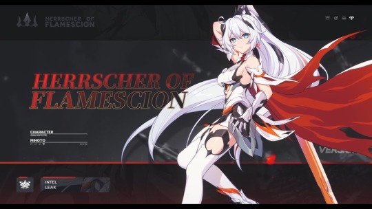
Strategic placement of black, more battle suit like parts saves all the parts from blending together
Keeps bits of the more mech-like armor seen earlier in game. Helps her look thematically consistent with the rest of Kiana’s designs
Nice range of values. The strong red cape really helps the white dress (?) stand out, while the little splashes of orange help keep it feel unified
Lovely evolution of the Void Drifter design
In actual battle, her mostly white outfit saved her from getting lost in all the glowy fire
I think having most of the colors being reflected off her is a fun application of her moon motif
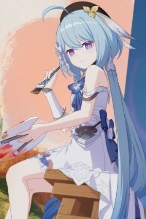
Lines up well with the lore
Free pass on just wearing a regular dress since in lore, she was never a fighter
White dress with splashes of paint on it plays into the “Griseo is like a blank canvas that takes on other people’s colors” motif nicely
The dark blues and black are eye catching and contrast nicely with her dress and hair
A tier (good design, minor changes could make it a great design)
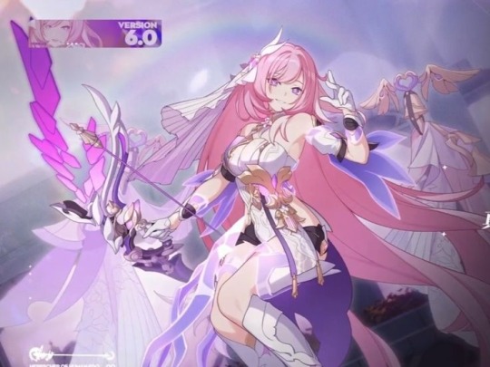
So the thing about white is though it is used as a wedding color in the west, in a lot of East Asian countries, it’s actually used as a funeral color. Idk if that was hoyo’s intention here, but the double meaning is fun none the less
The purple of the dress and pink of the hair keep the suit looking vibrant and colorful
Same thing with Flamescion where all her skills are very bright and colorful (mostly in origin form? I think that’s what it’s called?), so I think the white keeps her stand out
There is very little variation in tone between the pink and purple. One of them needs to be more saturated
I feel like it could use more variation in fabric texture
B Tier (good design, muddled lore)
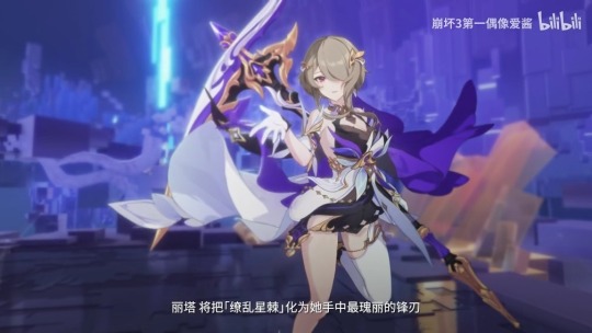
Would be ranked higher if I didn’t have to google why this battlesuit exists. Her in game intro was messy
Has the unfortunate timing of being introduced in the middle of a bunch of other lore dumps and buried underneath the more important to the plot ones. I think it’s introduction would be much more powerful if it was just Rita becoming the Herrscher of domination (I am willing to elaborate via asks)
Like, imagine if she got some sort of a string weapon instead of the sword? I think that’d be neat
So basically I was just confused by the space theme till I googled it (and based on my Reddit findings, I wasn’t the only one)
Beginning of the not looking like a battle suit era, but the inclusion of gold bits and a couple under layers keep it from being a full departure from the usual motifs, but it does lack the mech bits
I think there’s more Rita battle suits that lack the mech bits than actually have the, so I’m fine with them being missing here
Good tone variation, clear segmentation
Elegant design for an elegant lady
C tier (saved by the gameplay)-

Her knight for straight up looks like lingerie, but her guardian form looks great
Having her armor switch to black in guardian form was a good call
Unlike Rita, most of Durandal’s battlesuits look like armor, so it’s weird this one doesn’t.
I’m ok with the mostly white color palette since it contrasts nicely with the horse
Speaking of the horse- I have no idea where he came from, but it looks sick so I’m completely fine with it being here
Though for a rewrite, I think a potentially fun explanation would be “unlocking both of her stigmata allowed her to use a divine key at its full potential and said key just so happens to have a horse/armor mode” (cuz if you need weird shit to happen, Vill-V is always a valid excuse)
It’s inconsistency in comparison to Durandal’s other designs + my very mixed feelings about her being the original Kiana and that process of awakening the Kaslana stigmata are mostly why I put her bellow Rita. I don’t really have any huge problems with this design
D tier (even great gameplay can’t save this)-
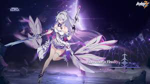
So for the design where Kiana is “no longer just reflecting others light, and instead becoming the sun itself” (or something like that), the decided to give Kiana the coolest color palette we’ve ever seen her in, take away her signature orange and Himeko’s red, and have her primary colors be Mei’s purple and Brongo’s blue… ok
Yes, I know blue stars exist and that they’re very hot. Honkai is a story set on earth though so it’d make more sense if she was becoming like our sun, not some one billions of light years away
The inclusion of HoV’s magenta accents is kinda nice though
That is a junior prom dress, not battle suit (the Fanny packs are based though). Where’d her mech parts go?
Instead of the skirt and wings by legs, I think it may of looked like a cleaner transition if the put wings it the same shape/area as HoF’s cape
After seeing how brights and glowy her abilities are, I’m ok with this design being mostly white
This designs just a whole lot of “ok, but what does that have to do with Kiana?” Why the junior prom dress? Why the flowers? Why she so urple?
F tier (the only one on this list I actively dislike)-
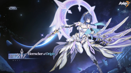
Since I’ve been pretty vocal about my dislike of Dr.MEI, I just want to start by making this clear: I like Raiden Mei. She’s cool. I don’t just have some anti-Mei bias. She’s at the bottom of this list though because she deserved so much better than this design and story (and I’ve been using her a lot in ER lately, so I’ve had a lot of time staring at her design)
Designs like these are why I have the “wait till it’s introduced in story” rule. I was sorta just “meh” on this design until I saw it in game
I hate this designs introduction. It’s just another case of the writers retconning the PE and glorifying the flame chasers/ forgetting why they existed in the first place
Mihoyo, Elysia’s been dead for 50,000 years! You can stop shooting her now!
Also another instance of Mihoyo forgetting Mei is an independent person and centering her narrative around her relationship to another character. Why’s it gotta be about becoming like Elysia and the other flame chasers instead of acknowledging their mistakes and learning from them so Mei can avoid their pitfalls and forge her own ideal future
Mei is so much fun to watch when she’s thinking for herself and forging her own path, so it’s frustrating to watch the narrative force her to walk down the path Elysia laid.
If I keep talking about this point I’m gonna go into rewrite/fanfic territory, so on to the design from a more technical standpoint:
There is next to no variation in tone (aside from her hair). Everything is just incredibly light. Her abilities in game are also incredibly pale, so she ends up getting lost in all the flashy lights
There’s so much texture throughout the outfit that there doesn’t really end up being a place for the eyes to rest
Though I understand why she’s blue, I think it’s inclusion was incredibly clunky. Including it as gems on the outfit or the underside of the skirt(?) may have helped the distribution look more even
If I went with the underside of the skirt being blue, I’d probably also say make her boots black (or just give her black tights or leggings with white ankle boots)
Orange (or at least Kiana’s shade of orange), blue, and purple are admittedly hard colors to make look good together, but there really needs some orange in there. Maybe sort of a deeper rose gold could’ve worked
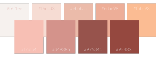
I’m thinking like edae98 or fbbc93 (two on the top right)
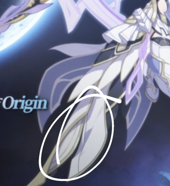
^These things just need to go. The white skirt(?) over white boots just causes the whole bottom half to bleed together. Having so much weight on the bottom of the outfit also causes her movements to look incredibly clunky. Removing these parts would help to streamline it a bit
I like the idea of Mei sorta becoming Kiana’s dragon, but the wings and tail in the skirt get lost due to all the overlapping textures, and the wing sword doesn’t do anything. Girl has 3 swords but only uses 1. Why
Rather than basing her off a western dragon, I think they should’ve made her an eastern dragon. (Turn her HoT hands into Claws instead of wings, keep the “tail” of the skirt streamlined with a little flair at the bottom, turn her HoT horns into antlers). This way, they could keep the iconic elements of HoT while reframing them into something positive (for those who don’t know: it’s a lot more nuanced and complicated than I can really explain here, but eastern dragons are generally associated with good fortune)
So, ya- that’s all I got for now. If I left anyone off the list, they’re ranked lower than HoO for being that forgettable just let me know and I’ll add them on. Again, this post is mostly just me trying to collect my thoughts
#honkai impact#honkai rambling#they did Mei so incredibly dirty#I think it was softsapphic who suggested Kiana and Mei should’ve split finality?#and Fu Hua should’ve gotten origin#anyways I really like both those ideas and will probably run with them for rewrites#kiana kaslana#raiden mei#honkai elysia#honkai griseo#honkai durandal#I’ve gotten 4 hours of sleep it’s 3am and there are plows outside and my neighbors are partying#someone please just give me a concussion so I can sleep /j
63 notes
·
View notes