#also the real reason is because the phone case i ordered is weird with wireless charging so I'm 😡
Explore tagged Tumblr posts
Text
see yes I _would_ like to go out and do yard work but what if instead I design and print a phone case. think about it. I could put in microSD storage for the arduinoHID attack thing... can't do that with yard work...
#speaking of that thing needs a USB-C and a COMPLETE case redo#is ugly...#plus i need to do software for it still#and add just normal sd card storage passthru because why not#also the real reason is because the phone case i ordered is weird with wireless charging so I'm 😡
1 note
·
View note
Text
Rockman.EXE Final Episode Review!

I ain’t afraid of no Gostler.
Finally, the last episode of the first season of the Rockman.EXE anime, the last episode before Axess changes almost everything!
You might not know this, but I am NOT a huge fan of Axess, it nearly destroys everything I’m used to and love from the first season, but I’ll talk about that some other time. Lets dive into this final adventure!

Who you’re gonna call?
The episode begins at night where Netto’s dad is carrying out an experiment. He created something called the “Dimensional core” that projects a grassy field in a parking lot, however, this is not a hologram since Dr. Hikari is able to touch a tree, claiming the experiment was a success.

He is basically God now.
The next morning we are at Netto’s house where his useless mom is humming Aki’s cheesy song while Netto is working on some kind of device he invented. The device happens to be a wireless plug that allows him to connect Rockman into a far away computer.
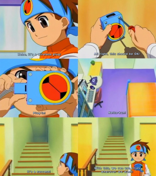
I’m not completely sure how this is suppose to work. I initially thought it was a way for Netto to plug-in to any computer withing range, but I think it just allows him to reconnect with Rockman if he is stranded in a computer, since it has been showed in the anime that he can’t send chips if he is not directly connected to the computer or server.
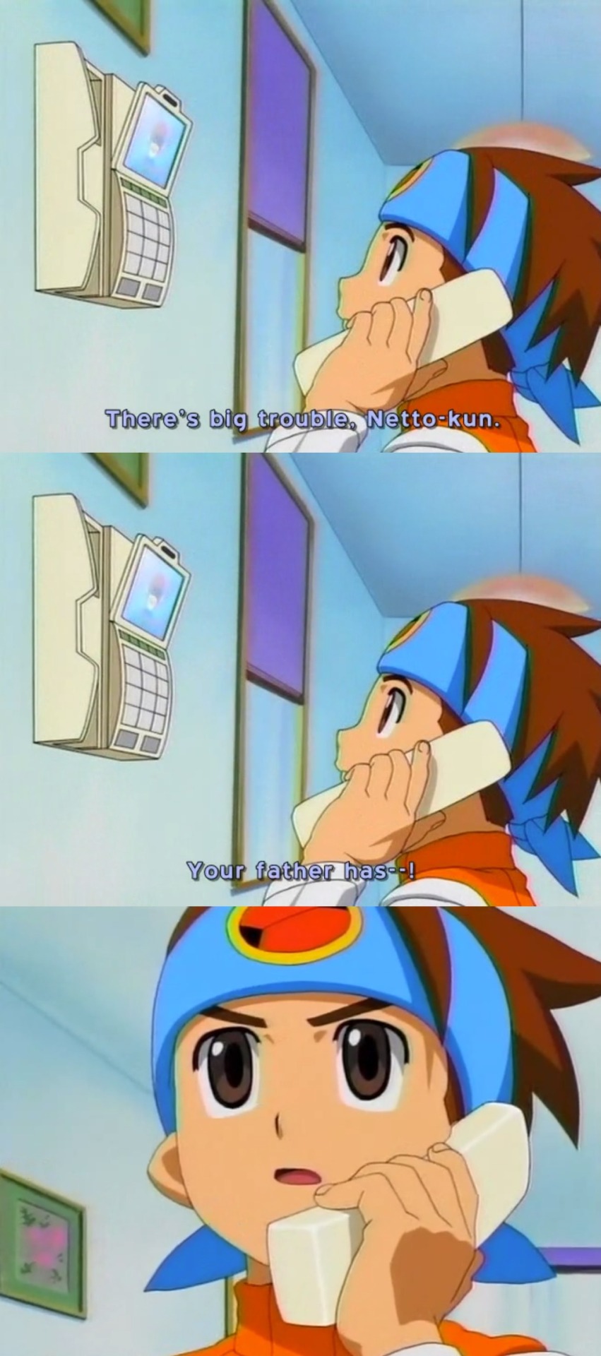
Netto gets a phone call from Commander Beef who gives him some worrying news about his father before the title card appears.
We then see Netto and his friends, along with Higure, Masa and Mariko-sensei for some reason, in a commercial plane, I guess Yaito decided to get cheap on us today.
Netto tells everyone that Commander Beef just told him that his dad had suddenly gone missing in Jawaii. He is obviously worried by this and the grown-ups try to cheer him up, with Higure saying that Commander Beef was probably lying, which angers Masa for some “unknown” reason.

Netto suddenly receives a call from Enzan who gives him more information about Dr. Hikari’s location and what he was working on.
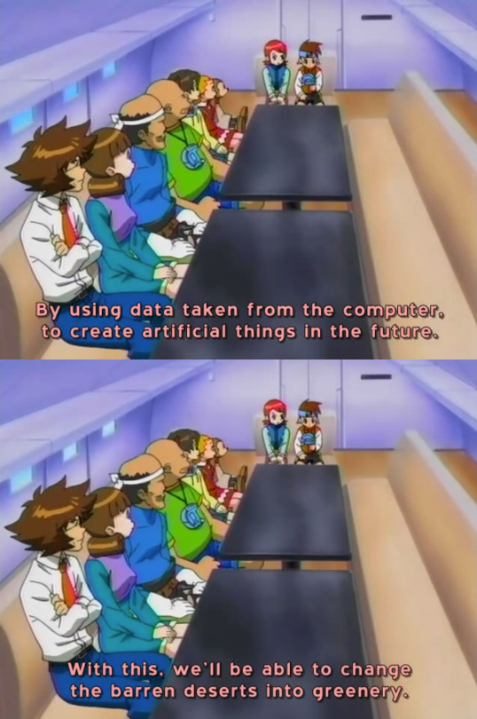
I find it interesting that this last line was skipped and given to Rockman later on in the american version.
What is Enzan’s reason to help Netto all of a sudden?
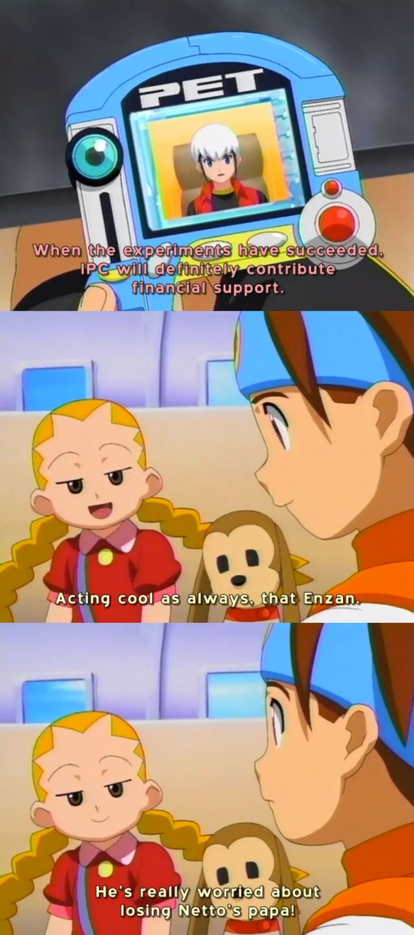
Speaking of the dub, the line they gave to Yaito here was very awkward, by revealing that she likes Chaud/Enzan which is completely out of character.
We don’t go to commercials just yet, but we get the first screen saver we haven’t seen since the first part of the season.
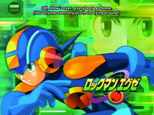
Gotta love the sub’s sense of humor.
The next scene takes us to the shopping mall that has been taken over by some big roots, with a giant tree suddenly appearing on the roof. Netto and company are now on a helicopter where they are amazed at the sight of the tree. Rockman tells them that the tree is made out of cyber matter but functions just like a real tree.
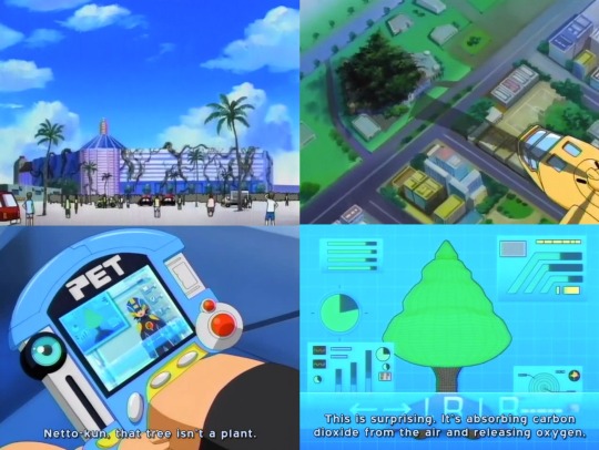
While giving us the code for shrinking the Shield program. I used to think that was a chemical equation or something. XD
So after Mariko-sensei makes a bad joke, Yaito orders the pilot... Oh no! Why is SHE the pilot?!

Did we really need that gag to return?
Meanwhile, on another part of Jawaii, we see the Ex-WWW who have opened a second restaurant called Maha Niban and it seems there is an air of contentment around them because they all look happy and fulfilled.
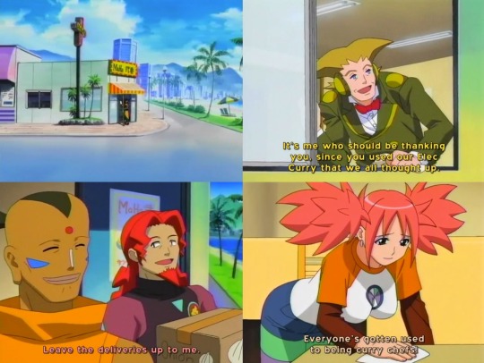
Oh boy, I can tell something bad is gonna happen to them soon and I just can’t wait!
Back to our heroes, the inside of the mall looks like that planet from the Degoba system where Yoda lived, except the camera rotates around some of the plants that look three-dimensional but they’re actually bi-dimensional.

Which raises a question. How come these plants are bi-dimensional but Dr. Hikari was able to touch a solid tree at the start of this episode?
The group suddenly hear a familiar voice, it turns out to be Aki-chan who calls for Netto from a projection near the wall.

Aki tells them about Dr. Hikari’s experiment and how it started in the parking lot of the mall with the program he created called the Dimensional Core, however, viruses have taken over the Dimensional Core making the cyberworld in the mall unstable.
After Aki’s transmission is cut off, everyone decide to go to the parking lot, but not before Yaito reminds us how clumsy Sakurako is by telling her to stay put.
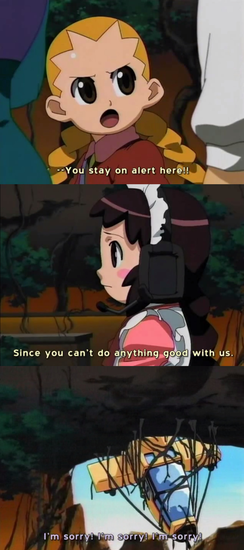
Seriously, what were you thinking, Yaito?
The group find an elevator that is still working, while they wait, Rush sees what looks like a pink female version of himself, presumably, another Mole virus. The girl virus lures him over and then... Does this.

What in the world was that?! This always confuse me. Is that how those viruses are supposed to be like? Is Rush like a tamed virus? Was it trying to eat him? Unfortunately that isn’t the case since Rush quickly hides behind Meiru who then notices that they are not alone.
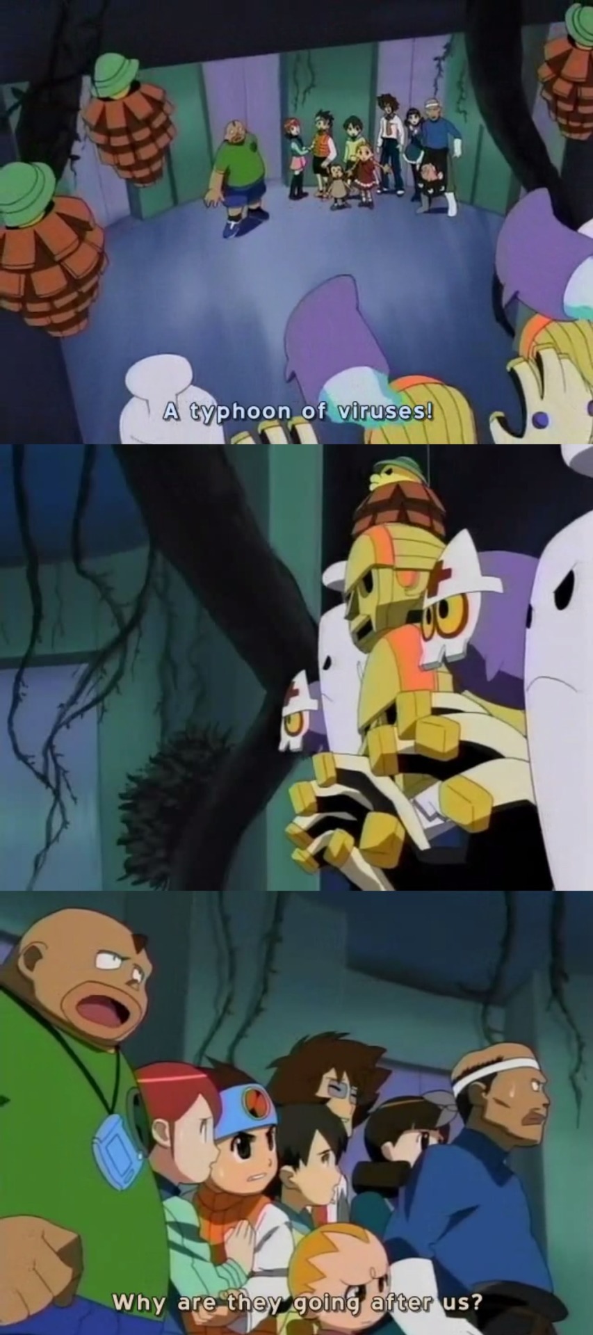
What a silly question, Dekao. They are viruses, they are programmed to destroy everything in sight, whether it moves or not.
The group manages to escape through the elevator where Tohru says that the viruses probably materialized due to Dr. Hikari’s experiment. Just then, Metools begin to destroy the elevator.
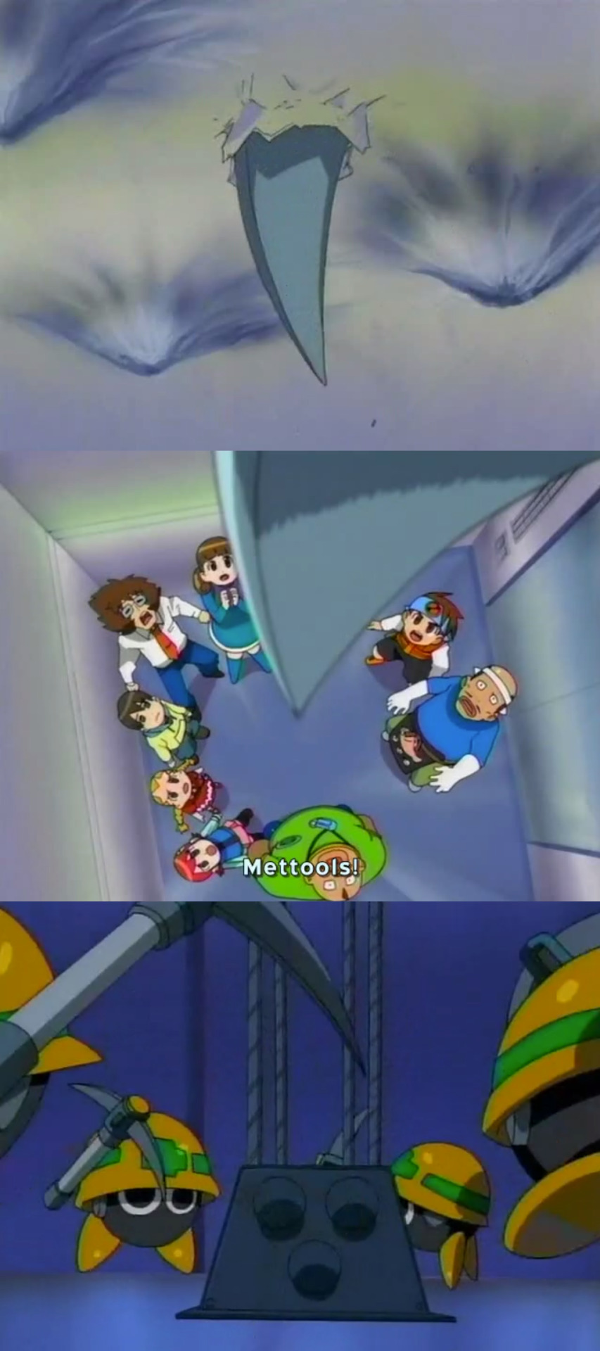
So cute, yet, so deadly.
The group is forced to get off in the second floor with the Mettools right behind them, but they are suddenly stopped by a group of Bunny viruses. With viruses on both sides, Netto and friends pull an impossible stunt to avoid getting hit by the viruses attacks.

No uncomfortable line after that, Netto? When that happened in episode 29 you were pretty happy about it.
After the vines break and Higure is chased away by a Ghostler virus, Netto and his friends decide to use their Navis to stop the experiment from the cyberworld.
I remember this part having my full attention, if viruses where able to materialized in the real world, maybe the Navis would too, we might see something different for once.
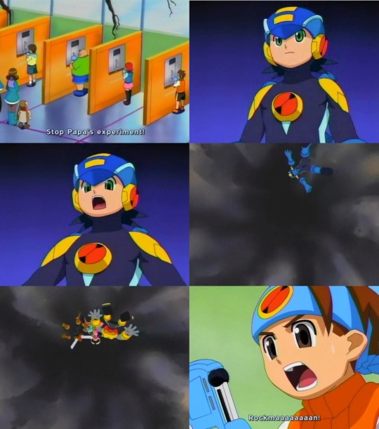
o_o Well... That’s certainly different.
Apparently the cyberworld has become so unstable due to the experiment, that the Navis had nowhere to stand on, because that’s how computers work, right?
So after this, we get the second intermission with Rush running away from a Mettool, with some confusing messages from the subs.

One, what would Pharaohman’s first appearance have to do with anything? And two, isn’t it CTRL+Alt+Del? Because either way, DON’T DO IT!
None of the PETs can find the Navis, so Netto takes out his WiFi device and says how it is connected to Rockman, and can tell Netto if there is a Bluetooh-I mean, if Rockman is within range.
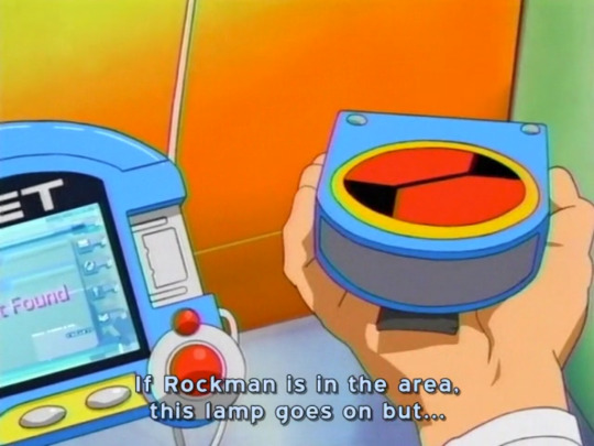
Then what was the point of building that thing?
With the Navis missing, the group have to find another solution, but before they can think of something, they are surprised by a Handi virus, and during the confusion, a Magma Dragon virus kidnaps Mariko-sensei with Masa running after it. Netto and friends are then ambushed by a Powei virus who chases them.
While trying to get away from the virus, Meiru trips (because of course she has to trip), Netto goes back for her and gets her out of the way just in time.

The virus breaks a water fountain and the splash deletes it giving Netto an idea of how to fight the viruses.
Meanwhile, we find the Navis walking around an area that looks like the inside of a tree. Since they have no idea where they are or where they’re going, they start to lose hope until Aki-chan appears before them with the compression code for Fast Gauge because we need to speed things up.
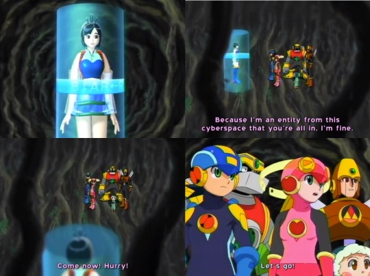
We return to Netto and friends who have found Gabgom’s department store that Yaito mentioned back on the plane, where they are all suiting up for some Live Action Virus Busting or LAVB.

So we get a Ghost Buster tribute, but instead of high tech gadgets, our heroes have water guns.
The boys cover an area of the mall shooting water at the viruses to delete them. Rush is also helping out (Even though we know he has a virus summoning ability), and we get one last scene with the weird female Rush virus before she is deleted with the water; but I still have one question in mind.


The girls cover another area where Yaito is riding a mini tank that fires water balloons.
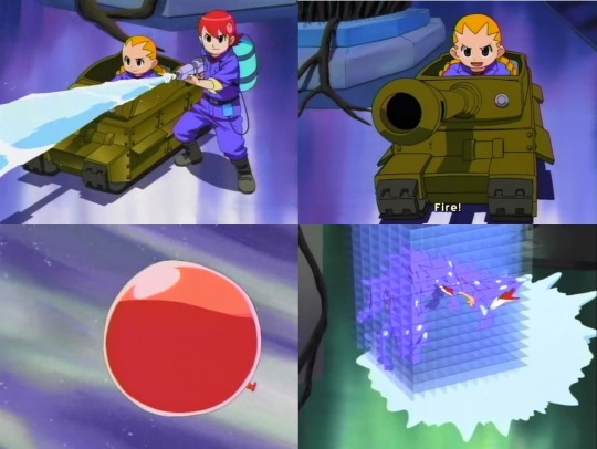
She had a bazooka in another episode so this doesn’t surprise me.
Then we get this quick scene of Masa-san changing into Commander Beef in a dressing room and attempting to save Mariko-sensei from the Magma Dragon.

As expected, it didn’t work.
After this, the Magma Dragon lands and is ready to eat Mariko-sensei or something, but the boys appear to save her. Since the Magma Dragon is big, it takes a lot of water to finally delete it. They reunite with Mariko who asks if everyone is alright.
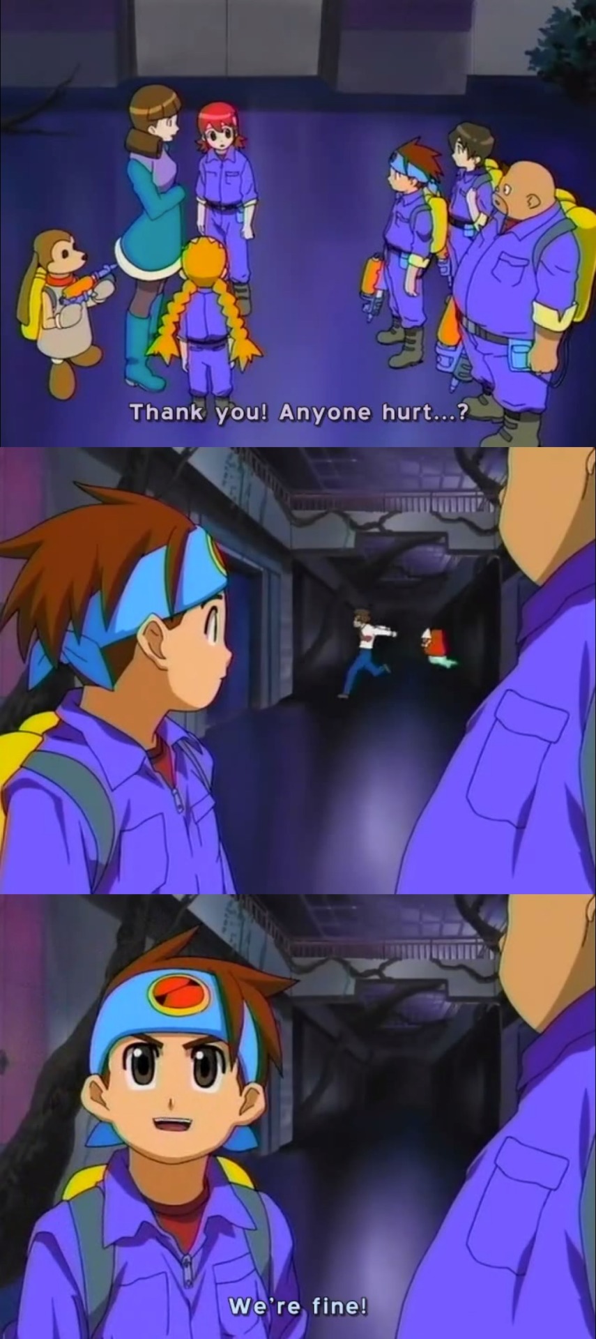
Wow, that’s cold, Netto. I know it’s just a Gostler, but a materialized virus is still pretty dangerous, except for Rush.
We then get the final commercial break that omits the second part, something the subs kindly reminds us of.

I guess it’s fair since we saw chibi Blues twice in the last episode.
We return with the Navis who finally see the exit.

“Hurry just like a Fast Gauge!”
Back in the real world, our heroes arrive in the parking lot basement where they find the Dimensional core under a gigantic tree, but before they can think of how to fix it, they are surprised by a very big cameo from the game.
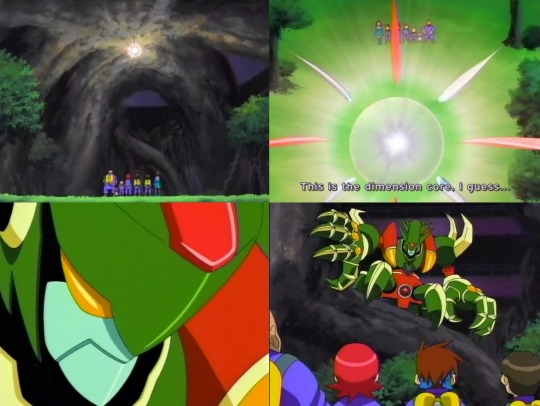
The Life Virus!
Of course the anime leaves the final boss of the first game for the final episode, and it is even more intimidating than in the game.
Turns out the powerful Life virus is the one responsible for making the program unstable. Since the boys are the only ones with water tanks for some reason now, they shoot water at the Life Virus, but because it is so humongous, their attacks are ineffective and they quickly run out of water.
With no more water, Netto and friends wait fearfully as the Life virus approaches them, but just then, Netto’s wireless device starts to react.

YEAAAAAAAAAAAAAAAAAAAAH! FINALLY!
After 55 episodes, Rockman finally appears in the real world!
The rest of the Navis appear soon after, giving Meiru and the others my exact reaction to this scene.

But I have no idea why this shot was skipped in the dub.
The Life virus attacks and the Navis fight back.

Unfortunately, their combined attacks are not enough to delete the Life virus, so Netto connects his PET to the wireless device in order to send Battle Chips to Rockman.
Now, if you’ve been taking screenshots of the episode like me, you’ll notice that there are quite a few recycled shots and animation errors, like Netto’s slot-in scenes with his regular cloths except that they were painted over to look like the outfit he’s wearing.
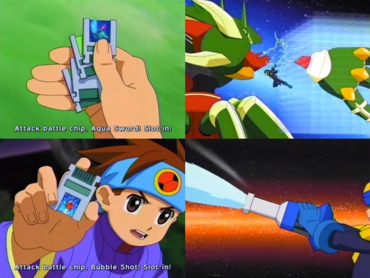
And this reused shot from episode 51, since it’s the wrong chip and the background is from the WWW lair.
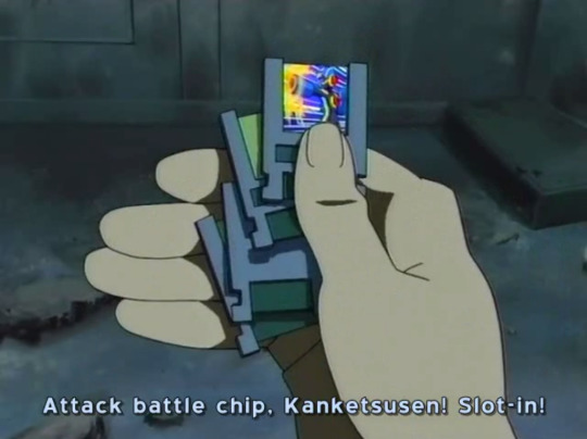
Kanketsen is Fountain, a chip that normally can only be used with an aqua element Style Change.
Speaking of said Style Change, Netto somehow activates the Aqua Custom Style without the Extra code to finish off the Life virus with the Mega Deus Ex Maquina burst!
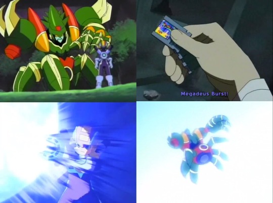
Now it’s the right chip, but still the wrong background.
Once the Life virus is deleted, the Dimensional core stabilizes and all the other plants, trees, and even the Net Navis return to the cyberworld.
With everything back to normal, the group find Netto’s dad who was sleeping the whole time, and the ending music starts to play in the background along with the credits.
Netto wakes him up by pulling his ear, and then he has this weird formal exchange with Mariko-sensei.

No questions about why your son’s school teacher is with them in the artificial park you created in a mall in Jawaii?
Now, this part might be a little infuriating since Netto’s dad had no idea that the experiment was corrupted by a Live virus, how it took over the shopping mall, and how everyone was worried about him since they didn’t hear from him in a very long time, but the upbeat ending music kinda makes you realize that this is not suppose to be taken seriously.
The worst part is that Dr. Hikari just straight up leaves Netto behind while he goes back home to Japan in his weird flying van, something I would expect from Yaito.
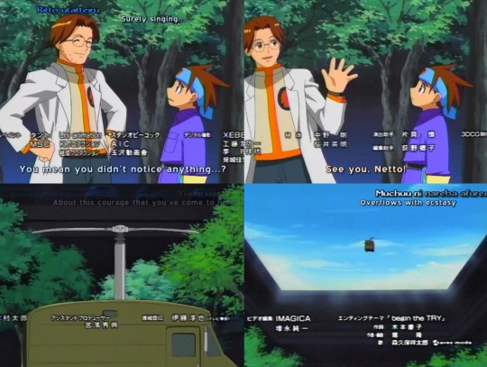
I guess it’s a good thing the dub changed his lines to avoid making him feel like a jerk. What does he say instead? Well, its kinda of spoiler for what happens next.

Rockman and the other Navis materializing in the real world, and the Ex-WWW is attacked by a giant tree... I should feel satisfied, but not really.
My final thoughts?
Wow, once again the show plays with my emotions by finally making Rockman and the other Navis appear in the real world but it doesn’t last long and it doesn’t feel as meaningful as it should be. The whole episode is treated like a filler episode rather that an important plot point for the next season. During that time, and also because Axess was never dubbed in Latin America, I never knew that they were gonna use the Dimensional Core as the basis for the Dimensional Area in the next season.
Speaking of Axess, it looked like they weren’t even planning on making another season after this, but they just had to because of the forth game that would be released for December of 2003. This episode premiered in March of 2003 while Axess started in October of the same year, that means that the producers had to hire a whole new team of writers and animators to work on Axess in the course of 7 months, because the feeling of the new season is almost completely different from the first two, and that is why the first seasons will remain in my heart while having mixed feelings towards Axess.
The idea of Netto suddenly being an inventor in this episode is a cheap way to introduce the Wireless device he gets from Meiru in BN2.
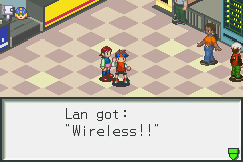
Only to have it stuck forever on the other side of a room when confronting Princess Pride who had destroy part of the floor.

Battle Network logic.
Before ending this review I have to thank WolfPack Productions and the other groups who subbed these episodes, specifically the former because they made their own credits after this episode.

And thanks to them, not only did I discover that Higure and Numberman are played by the same voice actor, but Coloredman too.
So thanks to them and everyone who follows me on Tumblr and Deviantart who liked and or commented on this reviews.
17 notes
·
View notes
Text
untitled rm9sbg93zxjz post-ep
rated: B for blobfish, R for robots, D for dreams and S for Scott.
So as I mentioned I watched the episode last night while Somewhat Drunk after a work party, and I could barely follow what was happening. It was like some crazy dream I had. I woke up this morning and it FELT like a crazy dream I had had. So I ran with that.
I'm looking forward to rewatching, but as of now I've watched it one time, while (as I mentioned) kinda drunk. So I've probably gotten a bunch of stuff wrong, which is fine because that's how a dream would be anyway. I'm sure it will all make perfect sense when I watch it again. Uh, maybe.
I wrote this in like three hours (for me, that is INSANELY fast), after drinking coffee, so adjust your expectations accordingly.
The friendly cacophony of the diner envelops them, comfortable, the two of them (as so often) alone together in a crowd. Mulder likes sitting at the counter, a habit left over from his lonelier days. You feel like you're part of the busy hum of life if you're drinking your coffee while plates pass by your head and orders are yelled out around you and someone is making pancakes three feet away.
Scully's phone chirps, and she looks down automatically. It's a push notification for something or other, telling her to drink water, or stretch, or pay her gas bill, or something. She frowns at it, and flips it over. Smartphone-era Scully, he has found, can be perfectly summed up by her habit of first programming her phone to remind her to do things all day and night, and then getting annoyed and refusing to do the things at least half the time.
Something about the exchange, however, lights something up in his brain. "Scully," he says. "I had the craziest dream last night. Whoa. I just remembered."
"Yeah?" She forks a bite of scrambled egg into her mouth. "What kind of dream?" She lifts an eyebrow at him. Gone, thankfully, are the days when they would have to flirt with each other while pretending that wasn't what they were doing, held back by a mutual terror that Crossing The Line would somehow prove disastrous. He doesn't miss those days. At all.
"Not that kind of dream, G-woman." He squints, trying to piece it all together. "I remember...a bunch of computers were after us."
"Computers were after us? Meaning what? Chasing us? Physically?"
"Well...we angered them somehow. The computers. Like...all of them, I guess."
"We ANGERED them? ...Like with that case we had at the office tower way back when?"
"Actually, yeah, kind of. God, that case was weird. I haven't thought of that in years. My subconscious must be thinking about it. Yeah, we...Well, in the first part we were at this sushi restaurant..."
"You and me?"
"Yeah, but it was empty. It was only us. And we couldn't talk for some reason, I think? I forget why. So we were eating our sushi. It came on a...one of those trays like on a conveyor belt. But they brought us the wrong thing. Remember the blobfish picture?"
She laughs. Scully had chanced to see a picture of a blobfish on the internet some months ago and he wasn't sure he had ever, in their years and years together, seen her laugh so hard. It was one of the best things that had ever happened to him, frankly, watching the outsizedly hysterical reaction of Dana Scully MD, his serious scientist partner, to a picture of a lumpy, slimy, theatrically frowning fish on the internet. He had brought it up at every opportunity for weeks, renamed the wireless network at the house Blobfish Cove, found a way to work a reference to it into a meeting with Skinner, once printed out a picture of it and left it on Scully’s pillow, and watched in utter delight as she got the helpless giggles every single time. (Even the Skinner time. He hadn't even asked, just looked wearily at some point behind their heads for a few seconds before sighing and continuing on.)
"Don't tell me the blobfish was in your dream!"
"It was!"
"You're just saying that because you want me to laugh."
"No, Scully, I swear. The restaurant served us the blobfish as part of our meal, and you thought it was hilarious." Just like now. She's giggling delicately even as he talks. "But we didn't want to eat it. You had some objection."
"Of course! I could never eat it." She cackles. "I love that thing. If ever there was something to prove that God has a sense of humor..." She shakes her head. Blobfish. Mulder sends God a mental high-five.
"So I tried to take it back to the kitchen, but I couldn't find anybody. There was literally no one in the entire restaurant but us. Like no one even working there."
"Why were we at this restaurant?"
"I don't know, we were just there. It's a dream. Oh, I think maybe it was your birthday. But then later I remember it was June, so, I don't know. Anyway, we were leaving and I tried to pay at some payment machine and the machine asked me for a tip. And I got annoyed and I wouldn't tip it, because, it's a machine. You were scolding me about that."
"Which you probably dreamed because I was scolding you just the other day for that shitty tip you gave the pizza delivery guy." It’s an annoying habit of hers, every time he's told her about a cool dream he's had (which, to be fair, is kind of often): to immediately attempt to map every aspect of it onto a real-world cause, the more mundane the better. No respect for mystery or symbolism, Scully.
"Yes. Your scolding reached my subconscious, congratulations." She nods as if accepting a great honor. "So I was hitting 'no tip' on the thing, but then I couldn't get my credit card out. It was stuck. There was this whole part -- I think we got trapped in the restaurant?"
"With the blobfish?" Her eyes are crinkling happily.
"Yes, Scully, with the blobfish. I'm sorry the blobfish doesn't play an even more substantial part in this dream than it already does."
"I can't believe you dreamed that we were going to EAT the BLOBFISH."
"We weren't going to eat it! That was the whole point. We ordered it by accident or something but we didn't want to eat it."
"So we got trapped in the restaurant, then what?"
"Well, we went home, I guess, I forget how we got out but we did somehow, and you were gonna take a taxi to your apartment." He's pleased with himself for keeping his tone neutral when he mentions her apartment. Easier these days when she's spending more nights at the house than not, but still. "But there was no driver, it was like, one of those Google cars. And you didn't want to get in and you were about to argue with me but then you got in anyway, and the car took off like, EXTREMELY fast. I'm sure you were mad about that. And I don't blame you, because it was not safe. So I went home too -- "
"Did you also have a Google car?"
"No, I just drove home."
"Why didn't I just drive my car home?"
"I don't know. It's a DREAM, Scully. It's a dream where you didn't have your car with you for some reason and we also apparently lived in some near-future dystopia where we were imprisoned in a restaurant after being served a blobfish by robots." He pauses to watch her giggle. Never fails. "And after I got home I think I was trying to call my credit card company. Maybe it was something about my card getting stuck from the other part? I just remember this whole long part where I was on hold for a really long time."
"Probably because of that erroneous charge you had to call Citibank about last month, and you kept getting that horrible voicemail system."
"Yes. I'm sure it was from that. Anyway, I was on hold forever and I also had to keep calling back -- "
"Because of how the voicemail kept kicking you back to the beginning when you were calling Citibank."
"Scully. Yes, I'm sure that's why I dreamed about it. I didn't know you were paying that close attention. Anyway, it was annoying. And while I was doing that there were a bunch of drones chasing me."
"Drones?"
"Yeah, the little ones, like in the Olympics opening ceremony. In the house. They were on the stairs."
"How did drones get in the house?"
"I have no idea, but then I got worried about you for some reason and I guess I went to your place. And Scully, I got to your place and it was insane. It was like, some crazy executive suite or something. Or a super posh hotel. All modern and, you know, like designer-y. And you were mad when I got there because I guess I had sent you a Roomba? Like I ordered it for you as a joke and you were mad because you thought I was insinuating something about your housekeeping."
"You ordered me a Roomba?"
"Yeah, but when you opened it it chased your vibrator."
She looks delightfully flabbergasted. "Mulder!"
"It was trying to vacuum up your vibrator. That little pink one." He likes that one. Because she likes that one. "But your vibrator -- "
"Mulder, PLEASE stop saying 'vibrator' in a restaurant."
"It had somehow come to life. I don't know how."
"You mean it came to life beyond the act of," she coughs lightly, "vibrating?"
"I think so. It had a malevolent intelligence. I guess. So I guess the Roomba was trying to stop it? I don't know. And, it was some kind of off-brand Roomba because I remember you saying, why didn't you just get the Roomba brand, and I had no answer. I don't know why I ordered you an off-brand Roomba."
"You were probably being cheap."
"Probably."
"So which one was malevolently intelligent? The Roomba? Or the, the other thing?"
"I don't know. The Roomba was trying to mow down the vibrator. Maybe it was a 'the enemy of my enemy' situation. Anyway, Scully, this apartment, this place was a palace. I wish in real life you could hook us up with a place like that that government employees could afford. You obviously had some secret inside real-estate source. It was insane. You had this fancy fridge."
"Full of blobfish?" She smiles around her coffee cup.
"I didn't see inside it. Oh, but you had a note on your fridge to defrost chicken because Scott was coming over. Who is Scott, Scully?"
"My sexy marine-biologist slash realtor boyfriend. I didn't tell you about him?"
He forks her gently on the nose, causing her to jerk away like a surprised cat. She swipes at her nose, then licks her finger. It's real maple syrup, so she's got nothing to complain about.
"Well, Scott the world's leading blobfish authority slash real-estate virtuoso is gonna be disappointed when he comes over for chicken because then your apartment burned down."
"WHAT?" She steals a bite of his not-quite-finished pancakes. He knew she wouldn't be able to resist that maple syrup.
"Yeah, there was a gas fire or something. I forget how it happened, but then you and I were trying to escape and we did, I guess, and you still had your vibrator but then we had to throw it away because they were tracking us."
"Tracking us via my..." she drops her voice. "My vibrator? Mulder. This is a dream only you would have. Talk about paranoid fantasies that -- "
"ANYWAY, Scully, your luxurious apartment. Burned down. And we didn't even get to christen all the rooms. So we were running and we had to throw our phones away, and the vibrator, because it was tracking us. That was your idea, because you're smarter than I am even in my own dreams. So we threw it in a dumpster." She makes a disappointed noise. Scully loves that vibrator. God bless.
"It's OK, Scully, it was only a dream. So we were running away and we ended up in this, like...robot factory? Or something like that. Maybe a warehouse? But a bunch of robots started chasing us."
"It sounds like most of this dream is robots chasing us."
"It is. I've got some deep-rooted anxieties. So we were running around the robot factory, or whatever it was, and the robots were after us. But they were robot animals, kind of. Like a robo-dog, like -- "
"Like that Boston Dynamics video we saw?"
"I don't remember that."
"You were falling asleep on the couch when I showed you."
"Well, I guess I absorbed it on some level. Maybe that part happened before we threw out our stuff. I can't remember. You know how dreams are."
The waitress leans over with her coffee pot, a silent question, and Scully obligingly pushes the cup towards her. Mulder feels a warmth deep in his belly. She has nowhere to be right now, except here, with him. He nods at the waitress and she refills his mug as well.
"Can we have more half-and-half, please?" Scully asks, and the waitress nods and takes the little pitcher to refill. She loves her half-and-half. Sensual pleasures, his Scully.
"So then what happened?"
"Well, then at some point I realized, somehow, that the reason this was all happening was that I didn't tip at the sushi restaurant."
"You disrespected the blobfish, you mean?"
"Yes. I disrespected the blobfish, or the blobfish's, I guess, robot masters, and they summoned all their connected, artificial will to come after us. And they almost succeeded. We almost DIED, Scully."
"Because you cheaped out."
"Yes. You were right all along. We almost died because I was too cheap, plus you lost your amazing apartment. Before I had a chance to defile it with you."
"I'm dying to know where this apartment was and how I afforded it."
"It was in some leafy suburb. I remember all the trees."
"Good thing I had driverless robot cars to take me to and from work, then. So did you finally cough up the tip?"
"Yeah, and once I did all the computer stuff stopped chasing us. But then you were mad that you had thrown away your vibrator for nothing. And then I woke up."
"Well, I'm glad you finally got what's been coming to you as far as your unacceptable tipping habits."
"Tipping is for exceptional service, Scully! They got my order wrong! And they were robots!"
"That's such an upper-class thing to say. You know servers don't make a living wage without tips. It's part of the cost of eating at a restaurant and if you can't pay it, you shouldn't eat there."
"ROBOTS, Scully. They don't need a living wage. They're not alive."
"Also, what does you throwing away my vibrator mean? That's got to have some kind of meaning, Profiling Wonderboy Mulder."
"You threw it away. And burned your own apartment down. Accidentally, but still." The waitress is back with the half-and-half, which Scully pours liberally into her refilled coffee.
"Why, though? What does it mean?"
"Well, I think it means that my subconscious wants you to come home. But so does the rest of me, so, I already knew that."
There's a little silence. Scully sips her coffee. Her face-down phone chimes softly again. She ignores it.
"Drones...in the house, Mulder?"
"Yeah. You know what I just realized they reminded me of? Those little green flying bugs. Do you remember? It was one of our first cases. Way back when."
"God. Of course I remember. We were in quarantine for two weeks."
"Yeah. They reminded me of those. I got the willies when I saw them on the Olympics thing and now I know why. They were purple though, not green. In my dream."
"You told me, as I recall, that it would be a nice trip to the forest."
"I probably did."
"It was NOT a nice trip to the forest, Mulder."
"I, honestly, Scully, I probably would have said anything to get you to come with me. Even then."
She shakes her head at him. They sit in companionable silence for a bit, the human noise of the diner around them.
"It would be a lot of trouble to find a new apartment, if I were to burn the current one down, due to evil sentient robots," she muses, after a time. "Probably more trouble than it would be worth."
"Probably."
"Since I don't have a Scott, in real life, to find me one."
"Shame."
"Not to mention that I could save on rent and protect you from scary drones at the same time."
His stomach flutters a bit. They have talked about this, sort of, in a roundabout way, but he hasn't wanted to ask too often, or too insistently. Scully doesn't like to be pushed. By him, by a phone that she had instructed to remind her about things, by anyone.
"Plus, no place would live up to that apartment," he says. "No place you could find in the city at least. Or anywhere, really. Unless like, maybe on a billionaire's private island or something."
"But then the commute would be hell. Even with a recklessly driving driverless car. Or boat, I guess."
"Is Scott also a billionaire, by any chance?"
"Scott can barely pay his own rent. And I think he's just with me for the free meals."
"Scott," he says, with a joking disgust that is not entirely forced. "God. Well. If that ever happens, Scully. You know the way back."
"It would be even worse if I lost my favorite vibrator at the same time." She's lowered her voice, he knows, so the entire diner won't overhear them, but he enjoys the effect anyway.
"You know I'm always willing to pinch-hit for your little pink buddy." He drops his voice to match hers. She touches her tongue to the side of her lip in that way that drives him crazy, then takes another gulp of her coffee.
"Or, you know. You don't HAVE to wait for it to burn down."
"True."
"There's room in that drawer next to the bed for Scully's little helper."
"Mulder...enough."
"I'm just saying."
She reaches over and rests her hand on his, warm from the coffee cup, lacing their fingers together, then leans her head into his shoulder. It's another reason he likes sitting at the counter. Being next to her, a very good reason.
"Got time for a walk around the park after this?" he asks. "Work off breakfast, get some extra steps in?"
"Sure," she says, giving his hand a squeeze. "There's nowhere else I need to be."
When they leave, he makes sure to tip the waitress well.
"Blobfish," he says in Scully’s ear on their way out the door, and she dissolves into giggles.
268 notes
·
View notes
Text
Microsoft Surface Duo review
In the early days, Microsoft had misgivings about calling the Surface Duo a phone. Asked to define it as such, the company has had the tendency to deflect with comments like, “Surface Duo does much more than make phone calls.” Which, to be fair, it does. And to also be fair, so do most phones. Heck, maybe the company is worried that the idea of a Microsoft Phone still leaves a bitter taste in some mouths.
The Duo is an ambitious device that is very much about Microsoft’s own ambitions with the Surface line. The company doesn’t simply want to be a hardware manufacturer — there are plenty of those in the world. It wants to be at the vanguard of how we use our devices, going forward. It’s a worthy pursuit in some respects.
After all, for all of the innovations we’ve seen in mobile in the past decade, the category feels static. Sure there’s 5G. Next-gen wireless was supposed to give the industry a temporary kick in the pants. That it hasn’t yet has more to do with external forces (the pandemic caught practically everyone off guard), but even so, it hardly represents some radical departure for mobile hardware.
What many manufacturers do seem to agree on is that the next breakthrough in mobile devices will be the ability to fit more screen real estate into one’s pocket. Mobile devices are currently brushing up against the upper threshold of hardware footprint, in terms of what we’re capable of holding in our hands and willing to carrying around in our pockets. Breakthroughs in recent years also appear to have gotten us close to a saturation point in terms of screen-to-body ratio.
Foldable screens are a compelling way forward. After years of promise, the technology finally arrived as screens appeared to be hitting an upper limit. Of course, Samsung’s Galaxy Fold stumbled out of the gate, leaving other devices like the Huawei Mate X scrambling. That product finally launched in China, but seemed to disappear from the conversation in the process. Motorola’s first foldable, meanwhile, was a flat-out dud.
Announced at a Surface event last year, the Duo takes an entirely different approach to the screen problem — one that has strengths and weaknesses when pitted against the current crop of foldables. The solution is a more robust one. The true pain point of foldables has always been the screen itself. Microsoft sidesteps this by simply connecting two screens. That introduces other problems, however, including a sizable gap and bezel combination that puts a decided damper on watching full-screen video.
Microsoft is far from the first company to take a dual-screen approach, of course. ZTE’s Axon M springs to mind. In that case — as with others — the device very much felt like two smartphones stuck together. Launched at the height of ZTE’s experimental phase, it felt like, at best, a shot in the dark. Microsoft, on the other hand, immediately sets its efforts apart with some really solid design. It’s clear that, unlike the ZTE product, the Duo was created from the ground up.
Image Credits: Brian Heater
The last time I wrote about the Duo, it was a “hands-on” that only focused on the device’s hardware. That was due, in part, to the fact that the software wasn’t quite ready at the time of writing. Microsoft was, however, excited to show off the hardware — and for good reason. This really looks and feels nice. Aesthetically, at least, this thing is terrific. It’s no wonder that this is the first device I’ve seen in a while that legitimately had the TechCrunch staff excited.
While the Surface Duo is, indeed, a phone, it’s one that represents exciting potential for the category. And equally importantly, it demonstrates that there is a way to do so without backing into the trappings of the first generation of foldables. In early briefings with the device, Surface lead Panos Panay devoted a LOT of time to breaking down the intricacies of the design decisions made here. To be fair, that’s partially because that’s pretty much his main deal, but I do honestly believe that the company had to engineer some breakthroughs here in order to get hardware that works exactly right, down to a fluid and solid hinge that maintains wired connections between the two displays.
There are, of course, trade-offs. The aforementioned gap between screens is probably the largest. This is primarily a problem when opening a single app across displays (a trick accomplished by dragging and dropping a window onto both screens in a single, fluid movement). This is likely part of the reason the company is positioning this is as far more of a productivity app than an entertainment one — in addition to all of the obvious trappings of a piece of Microsoft hardware.
Image Credits: Brian Heater
The company took great pains to ensure that two separate apps can open on each of the screens. And honestly, the gap is actually kind of a plus when multitasking with two apps open, creating a clear delineation between the two sides. And certain productivity apps make good use of the dual screens when spanning both. Take Gmail, which offers a full inbox on one side and the open selected message on the other. Ditto for using the Amazon app to read a book. Like the abandoned Courier project before it, this is really the perfect form factor for e-book reading — albeit still a bit small for more weary eyes.
There are other pragmatic considerations with the design choices here. The book design means there’s no screen on the exterior. The glass and mirror Windows logo looks lovely, but there’s no easy way to preview notifications. Keep in mind the new Galaxy Fold and Motorola Razr invested a fair amount in the front screen experience on their second-generation devices. Some will no doubt prefer to have a device that’s offline while closed, and I suppose you could always just keep the screens facing outward, if you so chose.
You’ll probably also want to keep the screens facing out if you’re someone who needs your device at the ready to snap a quick photo. Picture taking is really one of the biggest pain points here. There’s no rear camera. Instead, I’m convinced that the company sees most picture taking on the device as secondary to webcam functionality for things like teleconferencing. I do like that experience of having the device standing up and being able to speak into it handsfree (assuming your able to get it to appropriate eye level).
[gallery ids="2043528,2043525,2043529,2043522,2043527,2043523,2043530"]
But when it came to walking around, snapping shots to test the camera, I really found myself fumbling around a lot here. You always feels like you’re between three and five steps away from taking a quick shot. And the fact of the matter is the shots aren’t great. The on-board camera also isn’t really up to the standards of a $1,400 device. Honestly, the whole thing feels like an afterthought. Perhaps I’ve been spoiled after using the Note 20’s camera for the last several weeks, but hopefully Microsoft will prioritize the camera a bit more the next go-round.
Another hardware disappointment for me is the size of the bezels. Microsoft says they’re essentially the minimal viable size so as to not make people accidentally trigger the touchscreen. Which, fair enough. But while it’s not a huge deal aesthetically, it makes the promise of two-hand typing when the device is in laptop mode close to impossible.
That was honestly one of the things I was excited for here. Instead, you’re stuck thumb-typing as you would on any standard smartphone. I have to admit, the Duo was significantly smaller in person than I imagined it would be, for better and worse. Those seeking a fuller typing experience will have to wait for the Neo.
The decision not to include 5G is a curious one. This seems to have been made, in part, over concerns around thinness and form factor. And while 5G isn’t exactly mainstream at this point in 2020, it’s important to attempt to future proof a $1,400 device as much as possible. This isn’t the kind of upgrade most of us make every year or so. By the time the cycle comes back around, LTE is going to feel pretty dated.
Image Credits: Brian Heater
Battery life is pretty solid, owing to the inclusion of two separate batteries, each located beneath a screen. I was able to get about a day and a half of life — that’s also one of the advantages of not having 5G on board, I suppose. Performance also seemed solid for the most part, while working with multiple apps front and center. For whatever reason, however, the Bluetooth connection was lacking. I had all sorts of issues keeping both the Surface Buds and Pixel Buds connected, which can get extremely annoying when attempting to listen to a podcast.
These are the sorts of questions a second-generation device will seek to answer. Ditto for some of the experiential software stuff. There was some bugginess with some of the apps early on. A software update has gone a ways toward addressing much of that, but work needs to be done to offer a seamless dual-screen experience. Some apps like Spotify don’t do a great job spanning screens. Spacing gets weird, things require a bit of finessing on the part of the user. If the Duo proves a more popular form factor, third party developers will hopefully be more eager to fine tune things.
There were other issues, including the occasional blacked out screen on opening, though generally be resolved by closing and reopening the device. Also, Microsoft has opted to only allow one screen to be active at a time when they’re both positioned outward so as to avoid accidentally triggering the back of the touch screen. Switching between displays requires doubling tapping the inactive one.
But Microsoft has added a number of neat tricks like App Groups, which are a quick shortcut to fire up two apps at once. As for why Microsoft went with Android, rather than their own Windows 10, which is designed to be adaptable to a number of different form factors, the answer is refreshingly pragmatic and straightforward. Windows 10 just doesn’t have enough mobile apps. Microsoft clearly wants the Duo to serve as a proof of concept for this new form factor, though one questions whether the company will be able to sufficiently monetize the copycats.
For now, however, that means a lot more selection for the end user, including a ton of Google productivity apps. That’s an important plus given how few of us are tied exclusively to Microsoft productivity apps these days.
As with other experimental form factors, the first generation involves a fair bit of trial and error. Sure, Microsoft no doubt dogfooded the product in-house for a while, but you won’t get a really good idea of how most consumers interact with this manner of device — or precisely what they’re looking for. Six months from now, Microsoft will have a much better picture, and all of those ideas will go into refining the next generation product.
That said, the hardware does feels quite good for a first generation device — even if certain key sacrifices were made in the process. The software will almost certainly continue to be refined over the course of the next year as well. I’d wait a bit on picking it up for that reason alone. The question, ultimately becomes what the cost of early adoption is.
In the grand scheme of foldable devices, maybe $1,400 isn’t that much, perhaps. But compared to the vast majority of smartphone and tablet flagships out there, it’s a lot. Especially for something that still feels like a first generation work in progress. For now, it feels like a significant chunk of the price is invested in novelty and being an early adopter for a promising device.
from iraidajzsmmwtv https://ift.tt/33gESfx via IFTTT
0 notes
Link
In the early days, Microsoft had misgivings about calling the Surface Duo a phone. Asked to define it as such, the company has had the tendency to deflect with comments like, “Surface Duo does much more than make phone calls.” Which, to be fair, it does. And to also be fair, so do most phones. Heck, maybe the company is worried that the idea of a Microsoft Phone still leaves a bitter taste in some mouths.
The Duo is an ambitious device that is very much about Microsoft’s own ambitions with the Surface line. The company doesn’t simply want to be a hardware manufacturer — there are plenty of those in the world. It wants to be at the vanguard of how we use our devices, going forward. It’s a worthy pursuit in some respects.
After all, for all of the innovations we’ve seen in mobile in the past decade, the category feels static. Sure there’s 5G. Next-gen wireless was supposed to give the industry a temporary kick in the pants. That it hasn’t yet has more to do with external forces (the pandemic caught practically everyone off guard), but even so, it hardly represents some radical departure for mobile hardware.
What many manufacturers do seem to agree on is that the next breakthrough in mobile devices will be the ability to fit more screen real estate into one’s pocket. Mobile devices are currently brushing up against the upper threshold of hardware footprint, in terms of what we’re capable of holding in our hands and willing to carrying around in our pockets. Breakthroughs in recent years also appear to have gotten us close to a saturation point in terms of screen-to-body ratio.
Foldable screens are a compelling way forward. After years of promise, the technology finally arrived as screens appeared to be hitting an upper limit. Of course, Samsung’s Galaxy Fold stumbled out of the gate, leaving other devices like the Huawei Mate X scrambling. That product finally launched in China, but seemed to disappear from the conversation in the process. Motorola’s first foldable, meanwhile, was a flat-out dud.
Announced at a Surface event last year, the Duo takes an entirely different approach to the screen problem — one that has strengths and weaknesses when pitted against the current crop of foldables. The solution is a more robust one. The true pain point of foldables has always been the screen itself. Microsoft sidesteps this by simply connecting two screens. That introduces other problems, however, including a sizable gap and bezel combination that puts a decided damper on watching full-screen video.
Microsoft is far from the first company to take a dual-screen approach, of course. ZTE’s Axon M springs to mind. In that case — as with others — the device very much felt like two smartphones stuck together. Launched at the height of ZTE’s experimental phase, it felt like, at best, a shot in the dark. Microsoft, on the other hand, immediately sets its efforts apart with some really solid design. It’s clear that, unlike the ZTE product, the Duo was created from the ground up.
Image Credits: Brian Heater
The last time I wrote about the Duo, it was a “hands-on” that only focused on the device’s hardware. That was due, in part, to the fact that the software wasn’t quite ready at the time of writing. Microsoft was, however, excited to show off the hardware — and for good reason. This really looks and feels nice. Aesthetically, at least, this thing is terrific. It’s no wonder that this is the first device I’ve seen in a while that legitimately had the TechCrunch staff excited.
While the Surface Duo is, indeed, a phone, it’s one that represents exciting potential for the category. And equally importantly, it demonstrates that there is a way to do so without backing into the trappings of the first generation of foldables. In early briefings with the device, Surface lead Panos Panay devoted a LOT of time to breaking down the intricacies of the design decisions made here. To be fair, that’s partially because that’s pretty much his main deal, but I do honestly believe that the company had to engineer some breakthroughs here in order to get hardware that works exactly right, down to a fluid and solid hinge that maintains wired connections between the two displays.
There are, of course, trade-offs. The aforementioned gap between screens is probably the largest. This is primarily a problem when opening a single app across displays (a trick accomplished by dragging and dropping a window onto both screens in a single, fluid movement). This is likely part of the reason the company is positioning this is as far more of a productivity app than an entertainment one — in addition to all of the obvious trappings of a piece of Microsoft hardware.
Image Credits: Brian Heater
The company took great pains to ensure that two separate apps can open on each of the screens. And honestly, the gap is actually kind of a plus when multitasking with two apps open, creating a clear delineation between the two sides. And certain productivity apps make good use of the dual screens when spanning both. Take Gmail, which offers a full inbox on one side and the open selected message on the other. Ditto for using the Amazon app to read a book. Like the abandoned Courier project before it, this is really the perfect form factor for e-book reading — albeit still a bit small for more weary eyes.
There are other pragmatic considerations with the design choices here. The book design means there’s no screen on the exterior. The glass and mirror Windows logo looks lovely, but there’s no easy way to preview notifications. Keep in mind the new Galaxy Fold and Motorola Razr invested a fair amount in the front screen experience on their second-generation devices. Some will no doubt prefer to have a device that’s offline while closed, and I suppose you could always just keep the screens facing outward, if you so chose.
You’ll probably also want to keep the screens facing out if you’re someone who needs your device at the ready to snap a quick photo. Picture taking is really one of the biggest pain points here. There’s no rear camera. Instead, I’m convinced that the company sees most picture taking on the device as secondary to webcam functionality for things like teleconferencing. I do like that experience of having the device standing up and being able to speak into it handsfree (assuming your able to get it to appropriate eye level).
[gallery ids="2043528,2043525,2043529,2043522,2043527,2043523,2043530"]
But when it came to walking around, snapping shots to test the camera, I really found myself fumbling around a lot here. You always feels like you’re between three and five steps away from taking a quick shot. And the fact of the matter is the shots aren’t great. The on-board camera also isn’t really up to the standards of a $1,400 device. Honestly, the whole thing feels like an afterthought. Perhaps I’ve been spoiled after using the Note 20’s camera for the last several weeks, but hopefully Microsoft will prioritize the camera a bit more the next go-round.
Another hardware disappointment for me is the size of the bezels. Microsoft says they’re essentially the minimal viable size so as to not make people accidentally trigger the touchscreen. Which, fair enough. But while it’s not a huge deal aesthetically, it makes the promise of two-hand typing when the device is in laptop mode close to impossible.
That was honestly one of the things I was excited for here. Instead, you’re stuck thumb-typing as you would on any standard smartphone. I have to admit, the Duo was significantly smaller in person than I imagined it would be, for better and worse. Those seeking a fuller typing experience will have to wait for the Neo.
The decision not to include 5G is a curious one. This seems to have been made, in part, over concerns around thinness and form factor. And while 5G isn’t exactly mainstream at this point in 2020, it’s important to attempt to future proof a $1,400 device as much as possible. This isn’t the kind of upgrade most of us make every year or so. By the time the cycle comes back around, LTE is going to feel pretty dated.
Image Credits: Brian Heater
Battery life is pretty solid, owing to the inclusion of two separate batteries, each located beneath a screen. I was able to get about a day and a half of life — that’s also one of the advantages of not having 5G on board, I suppose. Performance also seemed solid for the most part, while working with multiple apps front and center. For whatever reason, however, the Bluetooth connection was lacking. I had all sorts of issues keeping both the Surface Buds and Pixel Buds connected, which can get extremely annoying when attempting to listen to a podcast.
These are the sorts of questions a second-generation device will seek to answer. Ditto for some of the experiential software stuff. There was some bugginess with some of the apps early on. A software update has gone a ways toward addressing much of that, but work needs to be done to offer a seamless dual-screen experience. Some apps like Spotify don’t do a great job spanning screens. Spacing gets weird, things require a bit of finessing on the part of the user. If the Duo proves a more popular form factor, third party developers will hopefully be more eager to fine tune things.
There were other issues, including the occasional blacked out screen on opening, though generally be resolved by closing and reopening the device. Also, Microsoft has opted to only allow one screen to be active at a time when they’re both positioned outward so as to avoid accidentally triggering the back of the touch screen. Switching between displays requires doubling tapping the inactive one.
But Microsoft has added a number of neat tricks like App Groups, which are a quick shortcut to fire up two apps at once. As for why Microsoft went with Android, rather than their own Windows 10, which is designed to be adaptable to a number of different form factors, the answer is refreshingly pragmatic and straightforward. Windows 10 just doesn’t have enough mobile apps. Microsoft clearly wants the Duo to serve as a proof of concept for this new form factor, though one questions whether the company will be able to sufficiently monetize the copycats.
For now, however, that means a lot more selection for the end user, including a ton of Google productivity apps. That’s an important plus given how few of us are tied exclusively to Microsoft productivity apps these days.
As with other experimental form factors, the first generation involves a fair bit of trial and error. Sure, Microsoft no doubt dogfooded the product in-house for a while, but you won’t get a really good idea of how most consumers interact with this manner of device — or precisely what they’re looking for. Six months from now, Microsoft will have a much better picture, and all of those ideas will go into refining the next generation product.
That said, the hardware does feels quite good for a first generation device — even if certain key sacrifices were made in the process. The software will almost certainly continue to be refined over the course of the next year as well. I’d wait a bit on picking it up for that reason alone. The question, ultimately becomes what the cost of early adoption is.
In the grand scheme of foldable devices, maybe $1,400 isn’t that much, perhaps. But compared to the vast majority of smartphone and tablet flagships out there, it’s a lot. Especially for something that still feels like a first generation work in progress. For now, it feels like a significant chunk of the price is invested in novelty and being an early adopter for a promising device.
from Mobile – TechCrunch https://ift.tt/33gESfx ORIGINAL CONTENT FROM: https://techcrunch.com/
0 notes
Text
In the early days, Microsoft had misgivings about calling the Surface Duo a phone. Asked to define it as such, the company has had the tendency to deflect with comments like, “Surface Duo does much more than make phone calls.” Which, to be fair, it does. And to also be fair, so do most phones. Heck, maybe the company is worried that the idea of a Microsoft Phone still leaves a bitter taste in some mouths.
The Duo is an ambitious device that is very much about Microsoft’s own ambitions with the Surface line. The company doesn’t simply want to be a hardware manufacturer — there are plenty of those in the world. It wants to be at the vanguard of how we use our devices, going forward. It’s a worthy pursuit in some respects.
After all, for all of the innovations we’ve seen in mobile in the past decade, the category feels static. Sure there’s 5G. Next-gen wireless was supposed to give the industry a temporary kick in the pants. That it hasn’t yet has more to do with external forces (the pandemic caught practically everyone off guard), but even so, it hardly represents some radical departure for mobile hardware.
What many manufacturers do seem to agree on is that the next breakthrough in mobile devices will be the ability to fit more screen real estate into one’s pocket. Mobile devices are currently brushing up against the upper threshold of hardware footprint, in terms of what we’re capable of holding in our hands and willing to carrying around in our pockets. Breakthroughs in recent years also appear to have gotten us close to a saturation point in terms of screen-to-body ratio.
Foldable screens are a compelling way forward. After years of promise, the technology finally arrived as screens appeared to be hitting an upper limit. Of course, Samsung’s Galaxy Fold stumbled out of the gate, leaving other devices like the Huawei Mate X scrambling. That product finally launched in China, but seemed to disappear from the conversation in the process. Motorola’s first foldable, meanwhile, was a flat-out dud.
Announced at a Surface event last year, the Duo takes an entirely different approach to the screen problem — one that has strengths and weaknesses when pitted against the current crop of foldables. The solution is a more robust one. The true pain point of foldables has always been the screen itself. Microsoft sidesteps this by simply connecting two screens. That introduces other problems, however, including a sizable gap and bezel combination that puts a decided damper on watching full-screen video.
Microsoft is far from the first company to take a dual-screen approach, of course. ZTE’s Axon M springs to mind. In that case — as with others — the device very much felt like two smartphones stuck together. Launched at the height of ZTE’s experimental phase, it felt like, at best, a shot in the dark. Microsoft, on the other hand, immediately sets its efforts apart with some really solid design. It’s clear that, unlike the ZTE product, the Duo was created from the ground up.
Image Credits: Brian Heater
The last time I wrote about the Duo, it was a “hands-on” that only focused on the device’s hardware. That was due, in part, to the fact that the software wasn’t quite ready at the time of writing. Microsoft was, however, excited to show off the hardware — and for good reason. This really looks and feels nice. Aesthetically, at least, this thing is terrific. It’s no wonder that this is the first device I’ve seen in a while that legitimately had the TechCrunch staff excited.
While the Surface Duo is, indeed, a phone, it’s one that represents exciting potential for the category. And equally importantly, it demonstrates that there is a way to do so without backing into the trappings of the first generation of foldables. In early briefings with the device, Surface lead Panos Panay devoted a LOT of time to breaking down the intricacies of the design decisions made here. To be fair, that’s partially because that’s pretty much his main deal, but I do honestly believe that the company had to engineer some breakthroughs here in order to get hardware that works exactly right, down to a fluid and solid hinge that maintains wired connections between the two displays.
There are, of course, trade-offs. The aforementioned gap between screens is probably the largest. This is primarily a problem when opening a single app across displays (a trick accomplished by dragging and dropping a window onto both screens in a single, fluid movement). This is likely part of the reason the company is positioning this is as far more of a productivity app than an entertainment one — in addition to all of the obvious trappings of a piece of Microsoft hardware.
Image Credits: Brian Heater
The company took great pains to ensure that two separate apps can open on each of the screens. And honestly, the gap is actually kind of a plus when multitasking with two apps open, creating a clear delineation between the two sides. And certain productivity apps make good use of the dual screens when spanning both. Take Gmail, which offers a full inbox on one side and the open selected message on the other. Ditto for using the Amazon app to read a book. Like the abandoned Courier project before it, this is really the perfect form factor for e-book reading — albeit still a bit small for more weary eyes.
There are other pragmatic considerations with the design choices here. The book design means there’s no screen on the exterior. The glass and mirror Windows logo looks lovely, but there’s no easy way to preview notifications. Keep in mind the new Galaxy Fold and Motorola Razr invested a fair amount in the front screen experience on their second-generation devices. Some will no doubt prefer to have a device that’s offline while closed, and I suppose you could always just keep the screens facing outward, if you so chose.
You’ll probably also want to keep the screens facing out if you’re someone who needs your device at the ready to snap a quick photo. Picture taking is really one of the biggest pain points here. There’s no rear camera. Instead, I’m convinced that the company sees most picture taking on the device as secondary to webcam functionality for things like teleconferencing. I do like that experience of having the device standing up and being able to speak into it handsfree (assuming your able to get it to appropriate eye level).
But when it came to walking around, snapping shots to test the camera, I really found myself fumbling around a lot here. You always feels like you’re between three and five steps away from taking a quick shot. And the fact of the matter is the shots aren’t great. The on-board camera also isn’t really up to the standards of a $1,400 device. Honestly, the whole thing feels like an afterthought. Perhaps I’ve been spoiled after using the Note 20’s camera for the last several weeks, but hopefully Microsoft will prioritize the camera a bit more the next go-round.
Another hardware disappointment for me is the size of the bezels. Microsoft says they’re essentially the minimal viable size so as to not make people accidentally trigger the touchscreen. Which, fair enough. But while it’s not a huge deal aesthetically, it makes the promise of two-hand typing when the device is in laptop mode close to impossible.
That was honestly one of the things I was excited for here. Instead, you’re stuck thumb-typing as you would on any standard smartphone. I have to admit, the Duo was significantly smaller in person than I imagined it would be, for better and worse. Those seeking a fuller typing experience will have to wait for the Neo.
The decision not to include 5G is a curious one. This seems to have been made, in part, over concerns around thinness and form factor. And while 5G isn’t exactly mainstream at this point in 2020, it’s important to attempt to future proof a $1,400 device as much as possible. This isn’t the kind of upgrade most of us make every year or so. By the time the cycle comes back around, LTE is going to feel pretty dated.
Image Credits: Brian Heater
Battery life is pretty solid, owing to the inclusion of two separate batteries, each located beneath a screen. I was able to get about a day and a half of life — that’s also one of the advantages of not having 5G on board, I suppose. Performance also seemed solid for the most part, while working with multiple apps front and center. For whatever reason, however, the Bluetooth connection was lacking. I had all sorts of issues keeping both the Surface Buds and Pixel Buds connected, which can get extremely annoying when attempting to listen to a podcast.
These are the sorts of questions a second-generation device will seek to answer. Ditto for some of the experiential software stuff. There was some bugginess with some of the apps early on. A software update has gone a ways toward addressing much of that, but work needs to be done to offer a seamless dual-screen experience. Some apps like Spotify don’t do a great job spanning screens. Spacing gets weird, things require a bit of finessing on the part of the user. If the Duo proves a more popular form factor, third party developers will hopefully be more eager to fine tune things.
There were other issues, including the occasional blacked out screen on opening, though generally be resolved by closing and reopening the device. Also, Microsoft has opted to only allow one screen to be active at a time when they’re both positioned outward so as to avoid accidentally triggering the back of the touch screen. Switching between displays requires doubling tapping the inactive one.
But Microsoft has added a number of neat tricks like App Groups, which are a quick shortcut to fire up two apps at once. As for why Microsoft went with Android, rather than their own Windows 10, which is designed to be adaptable to a number of different form factors, the answer is refreshingly pragmatic and straightforward. Windows 10 just doesn’t have enough mobile apps. Microsoft clearly wants the Duo to serve as a proof of concept for this new form factor, though one questions whether the company will be able to sufficiently monetize the copycats.
For now, however, that means a lot more selection for the end user, including a ton of Google productivity apps. That’s an important plus given how few of us are tied exclusively to Microsoft productivity apps these days.
As with other experimental form factors, the first generation involves a fair bit of trial and error. Sure, Microsoft no doubt dogfooded the product in-house for a while, but you won’t get a really good idea of how most consumers interact with this manner of device — or precisely what they’re looking for. Six months from now, Microsoft will have a much better picture, and all of those ideas will go into refining the next generation product.
That said, the hardware does feels quite good for a first generation device — even if certain key sacrifices were made in the process. The software will almost certainly continue to be refined over the course of the next year as well. I’d wait a bit on picking it up for that reason alone. The question, ultimately becomes what the cost of early adoption is.
In the grand scheme of foldable devices, maybe $1,400 isn’t that much, perhaps. But compared to the vast majority of smartphone and tablet flagships out there, it’s a lot. Especially for something that still feels like a first generation work in progress. For now, it feels like a significant chunk of the price is invested in novelty and being an early adopter for a promising device.
[ad_2] Source link
Microsoft Surface Duo review – TechCrunch In the early days, Microsoft had misgivings about calling the Surface Duo a phone. Asked to define it as such, the company has had the tendency to deflect with comments like, “Surface Duo does much more than make phone calls.” Which, to be fair, it does.
0 notes
Text
[ad_1]
In the early days, Microsoft had misgivings about calling the Surface Duo a phone. Asked to define it as such, the company has had the tendency to deflect with comments like, “Surface Duo does much more than make phone calls.” Which, to be fair, it does. And to also be fair, so do most phones. Heck, maybe the company is worried that the idea of a Microsoft Phone still leaves a bitter taste in some mouths.
The Duo is an ambitious device that is very much about Microsoft’s own ambitions with the Surface line. The company doesn’t simply want to be a hardware manufacturer — there are plenty of those in the world. It wants to be at the vanguard of how we use our devices, going forward. It’s a worthy pursuit in some respects.
After all, for all of the innovations we’ve seen in mobile in the past decade, the category feels static. Sure there’s 5G. Next-gen wireless was supposed to give the industry a temporary kick in the pants. That it hasn’t yet has more to do with external forces (the pandemic caught practically everyone off guard), but even so, it hardly represents some radical departure for mobile hardware.
What many manufacturers do seem to agree on is that the next breakthrough in mobile devices will be the ability to fit more screen real estate into one’s pocket. Mobile devices are currently brushing up against the upper threshold of hardware footprint, in terms of what we’re capable of holding in our hands and willing to carrying around in our pockets. Breakthroughs in recent years also appear to have gotten us close to a saturation point in terms of screen-to-body ratio.
Foldable screens are a compelling way forward. After years of promise, the technology finally arrived as screens appeared to be hitting an upper limit. Of course, Samsung’s Galaxy Fold stumbled out of the gate, leaving other devices like the Huawei Mate X scrambling. That product finally launched in China, but seemed to disappear from the conversation in the process. Motorola’s first foldable, meanwhile, was a flat-out dud.
Announced at a Surface event last year, the Duo takes an entirely different approach to the screen problem — one that has strengths and weaknesses when pitted against the current crop of foldables. The solution is a more robust one. The true pain point of foldables has always been the screen itself. Microsoft sidesteps this by simply connecting two screens. That introduces other problems, however, including a sizable gap and bezel combination that puts a decided damper on watching full-screen video.
Microsoft is far from the first company to take a dual-screen approach, of course. ZTE’s Axon M springs to mind. In that case — as with others — the device very much felt like two smartphones stuck together. Launched at the height of ZTE’s experimental phase, it felt like, at best, a shot in the dark. Microsoft, on the other hand, immediately sets its efforts apart with some really solid design. It’s clear that, unlike the ZTE product, the Duo was created from the ground up.
Image Credits: Brian Heater
The last time I wrote about the Duo, it was a “hands-on” that only focused on the device’s hardware. That was due, in part, to the fact that the software wasn’t quite ready at the time of writing. Microsoft was, however, excited to show off the hardware — and for good reason. This really looks and feels nice. Aesthetically, at least, this thing is terrific. It’s no wonder that this is the first device I’ve seen in a while that legitimately had the TechCrunch staff excited.
While the Surface Duo is, indeed, a phone, it’s one that represents exciting potential for the category. And equally importantly, it demonstrates that there is a way to do so without backing into the trappings of the first generation of foldables. In early briefings with the device, Surface lead Panos Panay devoted a LOT of time to breaking down the intricacies of the design decisions made here. To be fair, that’s partially because that’s pretty much his main deal, but I do honestly believe that the company had to engineer some breakthroughs here in order to get hardware that works exactly right, down to a fluid and solid hinge that maintains wired connections between the two displays.
There are, of course, trade-offs. The aforementioned gap between screens is probably the largest. This is primarily a problem when opening a single app across displays (a trick accomplished by dragging and dropping a window onto both screens in a single, fluid movement). This is likely part of the reason the company is positioning this is as far more of a productivity app than an entertainment one — in addition to all of the obvious trappings of a piece of Microsoft hardware.
Image Credits: Brian Heater
The company took great pains to ensure that two separate apps can open on each of the screens. And honestly, the gap is actually kind of a plus when multitasking with two apps open, creating a clear delineation between the two sides. And certain productivity apps make good use of the dual screens when spanning both. Take Gmail, which offers a full inbox on one side and the open selected message on the other. Ditto for using the Amazon app to read a book. Like the abandoned Courier project before it, this is really the perfect form factor for e-book reading — albeit still a bit small for more weary eyes.
There are other pragmatic considerations with the design choices here. The book design means there’s no screen on the exterior. The glass and mirror Windows logo looks lovely, but there’s no easy way to preview notifications. Keep in mind the new Galaxy Fold and Motorola Razr invested a fair amount in the front screen experience on their second-generation devices. Some will no doubt prefer to have a device that’s offline while closed, and I suppose you could always just keep the screens facing outward, if you so chose.
You’ll probably also want to keep the screens facing out if you’re someone who needs your device at the ready to snap a quick photo. Picture taking is really one of the biggest pain points here. There’s no rear camera. Instead, I’m convinced that the company sees most picture taking on the device as secondary to webcam functionality for things like teleconferencing. I do like that experience of having the device standing up and being able to speak into it handsfree (assuming your able to get it to appropriate eye level).
But when it came to walking around, snapping shots to test the camera, I really found myself fumbling around a lot here. You always feels like you’re between three and five steps away from taking a quick shot. And the fact of the matter is the shots aren’t great. The on-board camera also isn’t really up to the standards of a $1,400 device. Honestly, the whole thing feels like an afterthought. Perhaps I’ve been spoiled after using the Note 20’s camera for the last several weeks, but hopefully Microsoft will prioritize the camera a bit more the next go-round.
Another hardware disappointment for me is the size of the bezels. Microsoft says they’re essentially the minimal viable size so as to not make people accidentally trigger the touchscreen. Which, fair enough. But while it’s not a huge deal aesthetically, it makes the promise of two-hand typing when the device is in laptop mode close to impossible.
That was honestly one of the things I was excited for here. Instead, you’re stuck thumb-typing as you would on any standard smartphone. I have to admit, the Duo was significantly smaller in person than I imagined it would be, for better and worse. Those seeking a fuller typing experience will have to wait for the Neo.
The decision not to include 5G is a curious one. This seems to have been made, in part, over concerns around thinness and form factor. And while 5G isn’t exactly mainstream at this point in 2020, it’s important to attempt to future proof a $1,400 device as much as possible. This isn’t the kind of upgrade most of us make every year or so. By the time the cycle comes back around, LTE is going to feel pretty dated.
Image Credits: Brian Heater
Battery life is pretty solid, owing to the inclusion of two separate batteries, each located beneath a screen. I was able to get about a day and a half of life — that’s also one of the advantages of not having 5G on board, I suppose. Performance also seemed solid for the most part, while working with multiple apps front and center. For whatever reason, however, the Bluetooth connection was lacking. I had all sorts of issues keeping both the Surface Buds and Pixel Buds connected, which can get extremely annoying when attempting to listen to a podcast.
These are the sorts of questions a second-generation device will seek to answer. Ditto for some of the experiential software stuff. There was some bugginess with some of the apps early on. A software update has gone a ways toward addressing much of that, but work needs to be done to offer a seamless dual-screen experience. Some apps like Spotify don’t do a great job spanning screens. Spacing gets weird, things require a bit of finessing on the part of the user. If the Duo proves a more popular form factor, third party developers will hopefully be more eager to fine tune things.
There were other issues, including the occasional blacked out screen on opening, though generally be resolved by closing and reopening the device. Also, Microsoft has opted to only allow one screen to be active at a time when they’re both positioned outward so as to avoid accidentally triggering the back of the touch screen. Switching between displays requires doubling tapping the inactive one.
But Microsoft has added a number of neat tricks like App Groups, which are a quick shortcut to fire up two apps at once. As for why Microsoft went with Android, rather than their own Windows 10, which is designed to be adaptable to a number of different form factors, the answer is refreshingly pragmatic and straightforward. Windows 10 just doesn’t have enough mobile apps. Microsoft clearly wants the Duo to serve as a proof of concept for this new form factor, though one questions whether the company will be able to sufficiently monetize the copycats.
For now, however, that means a lot more selection for the end user, including a ton of Google productivity apps. That’s an important plus given how few of us are tied exclusively to Microsoft productivity apps these days.
As with other experimental form factors, the first generation involves a fair bit of trial and error. Sure, Microsoft no doubt dogfooded the product in-house for a while, but you won’t get a really good idea of how most consumers interact with this manner of device — or precisely what they’re looking for. Six months from now, Microsoft will have a much better picture, and all of those ideas will go into refining the next generation product.
That said, the hardware does feels quite good for a first generation device — even if certain key sacrifices were made in the process. The software will almost certainly continue to be refined over the course of the next year as well. I’d wait a bit on picking it up for that reason alone. The question, ultimately becomes what the cost of early adoption is.
In the grand scheme of foldable devices, maybe $1,400 isn’t that much, perhaps. But compared to the vast majority of smartphone and tablet flagships out there, it’s a lot. Especially for something that still feels like a first generation work in progress. For now, it feels like a significant chunk of the price is invested in novelty and being an early adopter for a promising device.
[ad_2]
Microsoft Surface Duo review – TechCrunch In the early days, Microsoft had misgivings about calling the Surface Duo a phone. Asked to define it as such, the company has had the tendency to deflect with comments like, “Surface Duo does much more than make phone calls.” Which, to be fair, it does.
0 notes
Text
In the early days, Microsoft had misgivings about calling the Surface Duo a phone. Asked to define it as such, the company has had the tendency to deflect with comments like, “Surface Duo does much more than make phone calls.” Which, to be fair, it does. And to also be fair, so do most phones. Heck, maybe the company is worried that the idea of a Microsoft Phone still leaves a bitter taste in some mouths.
The Duo is an ambitious device that is very much about Microsoft’s own ambitions with the Surface line. The company doesn’t simply want to be a hardware manufacturer — there are plenty of those in the world. It wants to be at the vanguard of how we use our devices, going forward. It’s a worthy pursuit in some respects.
After all, for all of the innovations we’ve seen in mobile in the past decade, the category feels static. Sure there’s 5G. Next-gen wireless was supposed to give the industry a temporary kick in the pants. That it hasn’t yet has more to do with external forces (the pandemic caught practically everyone off guard), but even so, it hardly represents some radical departure for mobile hardware.
What many manufacturers do seem to agree on is that the next breakthrough in mobile devices will be the ability to fit more screen real estate into one’s pocket. Mobile devices are currently brushing up against the upper threshold of hardware footprint, in terms of what we’re capable of holding in our hands and willing to carrying around in our pockets. Breakthroughs in recent years also appear to have gotten us close to a saturation point in terms of screen-to-body ratio.
Foldable screens are a compelling way forward. After years of promise, the technology finally arrived as screens appeared to be hitting an upper limit. Of course, Samsung’s Galaxy Fold stumbled out of the gate, leaving other devices like the Huawei Mate X scrambling. That product finally launched in China, but seemed to disappear from the conversation in the process. Motorola’s first foldable, meanwhile, was a flat-out dud.
Announced at a Surface event last year, the Duo takes an entirely different approach to the screen problem — one that has strengths and weaknesses when pitted against the current crop of foldables. The solution is a more robust one. The true pain point of foldables has always been the screen itself. Microsoft sidesteps this by simply connecting two screens. That introduces other problems, however, including a sizable gap and bezel combination that puts a decided damper on watching full-screen video.
Microsoft is far from the first company to take a dual-screen approach, of course. ZTE’s Axon M springs to mind. In that case — as with others — the device very much felt like two smartphones stuck together. Launched at the height of ZTE’s experimental phase, it felt like, at best, a shot in the dark. Microsoft, on the other hand, immediately sets its efforts apart with some really solid design. It’s clear that, unlike the ZTE product, the Duo was created from the ground up.
Image Credits: Brian Heater
The last time I wrote about the Duo, it was a “hands-on” that only focused on the device’s hardware. That was due, in part, to the fact that the software wasn’t quite ready at the time of writing. Microsoft was, however, excited to show off the hardware — and for good reason. This really looks and feels nice. Aesthetically, at least, this thing is terrific. It’s no wonder that this is the first device I’ve seen in a while that legitimately had the TechCrunch staff excited.
While the Surface Duo is, indeed, a phone, it’s one that represents exciting potential for the category. And equally importantly, it demonstrates that there is a way to do so without backing into the trappings of the first generation of foldables. In early briefings with the device, Surface lead Panos Panay devoted a LOT of time to breaking down the intricacies of the design decisions made here. To be fair, that’s partially because that’s pretty much his main deal, but I do honestly believe that the company had to engineer some breakthroughs here in order to get hardware that works exactly right, down to a fluid and solid hinge that maintains wired connections between the two displays.
There are, of course, trade-offs. The aforementioned gap between screens is probably the largest. This is primarily a problem when opening a single app across displays (a trick accomplished by dragging and dropping a window onto both screens in a single, fluid movement). This is likely part of the reason the company is positioning this is as far more of a productivity app than an entertainment one — in addition to all of the obvious trappings of a piece of Microsoft hardware.
Image Credits: Brian Heater
The company took great pains to ensure that two separate apps can open on each of the screens. And honestly, the gap is actually kind of a plus when multitasking with two apps open, creating a clear delineation between the two sides. And certain productivity apps make good use of the dual screens when spanning both. Take Gmail, which offers a full inbox on one side and the open selected message on the other. Ditto for using the Amazon app to read a book. Like the abandoned Courier project before it, this is really the perfect form factor for e-book reading — albeit still a bit small for more weary eyes.
There are other pragmatic considerations with the design choices here. The book design means there’s no screen on the exterior. The glass and mirror Windows logo looks lovely, but there’s no easy way to preview notifications. Keep in mind the new Galaxy Fold and Motorola Razr invested a fair amount in the front screen experience on their second-generation devices. Some will no doubt prefer to have a device that’s offline while closed, and I suppose you could always just keep the screens facing outward, if you so chose.
You’ll probably also want to keep the screens facing out if you’re someone who needs your device at the ready to snap a quick photo. Picture taking is really one of the biggest pain points here. There’s no rear camera. Instead, I’m convinced that the company sees most picture taking on the device as secondary to webcam functionality for things like teleconferencing. I do like that experience of having the device standing up and being able to speak into it handsfree (assuming your able to get it to appropriate eye level).
But when it came to walking around, snapping shots to test the camera, I really found myself fumbling around a lot here. You always feels like you’re between three and five steps away from taking a quick shot. And the fact of the matter is the shots aren’t great. The on-board camera also isn’t really up to the standards of a $1,400 device. Honestly, the whole thing feels like an afterthought. Perhaps I’ve been spoiled after using the Note 20’s camera for the last several weeks, but hopefully Microsoft will prioritize the camera a bit more the next go-round.
Another hardware disappointment for me is the size of the bezels. Microsoft says they’re essentially the minimal viable size so as to not make people accidentally trigger the touchscreen. Which, fair enough. But while it’s not a huge deal aesthetically, it makes the promise of two-hand typing when the device is in laptop mode close to impossible.
That was honestly one of the things I was excited for here. Instead, you’re stuck thumb-typing as you would on any standard smartphone. I have to admit, the Duo was significantly smaller in person than I imagined it would be, for better and worse. Those seeking a fuller typing experience will have to wait for the Neo.
The decision not to include 5G is a curious one. This seems to have been made, in part, over concerns around thinness and form factor. And while 5G isn’t exactly mainstream at this point in 2020, it’s important to attempt to future proof a $1,400 device as much as possible. This isn’t the kind of upgrade most of us make every year or so. By the time the cycle comes back around, LTE is going to feel pretty dated.
Image Credits: Brian Heater
Battery life is pretty solid, owing to the inclusion of two separate batteries, each located beneath a screen. I was able to get about a day and a half of life — that’s also one of the advantages of not having 5G on board, I suppose. Performance also seemed solid for the most part, while working with multiple apps front and center. For whatever reason, however, the Bluetooth connection was lacking. I had all sorts of issues keeping both the Surface Buds and Pixel Buds connected, which can get extremely annoying when attempting to listen to a podcast.
These are the sorts of questions a second-generation device will seek to answer. Ditto for some of the experiential software stuff. There was some bugginess with some of the apps early on. A software update has gone a ways toward addressing much of that, but work needs to be done to offer a seamless dual-screen experience. Some apps like Spotify don’t do a great job spanning screens. Spacing gets weird, things require a bit of finessing on the part of the user. If the Duo proves a more popular form factor, third party developers will hopefully be more eager to fine tune things.
There were other issues, including the occasional blacked out screen on opening, though generally be resolved by closing and reopening the device. Also, Microsoft has opted to only allow one screen to be active at a time when they’re both positioned outward so as to avoid accidentally triggering the back of the touch screen. Switching between displays requires doubling tapping the inactive one.
But Microsoft has added a number of neat tricks like App Groups, which are a quick shortcut to fire up two apps at once. As for why Microsoft went with Android, rather than their own Windows 10, which is designed to be adaptable to a number of different form factors, the answer is refreshingly pragmatic and straightforward. Windows 10 just doesn’t have enough mobile apps. Microsoft clearly wants the Duo to serve as a proof of concept for this new form factor, though one questions whether the company will be able to sufficiently monetize the copycats.
For now, however, that means a lot more selection for the end user, including a ton of Google productivity apps. That’s an important plus given how few of us are tied exclusively to Microsoft productivity apps these days.
As with other experimental form factors, the first generation involves a fair bit of trial and error. Sure, Microsoft no doubt dogfooded the product in-house for a while, but you won’t get a really good idea of how most consumers interact with this manner of device — or precisely what they’re looking for. Six months from now, Microsoft will have a much better picture, and all of those ideas will go into refining the next generation product.
That said, the hardware does feels quite good for a first generation device — even if certain key sacrifices were made in the process. The software will almost certainly continue to be refined over the course of the next year as well. I’d wait a bit on picking it up for that reason alone. The question, ultimately becomes what the cost of early adoption is.
In the grand scheme of foldable devices, maybe $1,400 isn’t that much, perhaps. But compared to the vast majority of smartphone and tablet flagships out there, it’s a lot. Especially for something that still feels like a first generation work in progress. For now, it feels like a significant chunk of the price is invested in novelty and being an early adopter for a promising device.
Microsoft Surface Duo review In the early days, Microsoft had misgivings about calling the Surface Duo a phone. Asked to define it as such, the company has had the tendency to deflect with comments like, “Surface Duo does much more than make phone calls.” Which, to be fair, it does.
0 notes