#also the gold paper i used inside for endpapers was a nightmare!!
Explore tagged Tumblr posts
Photo
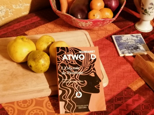
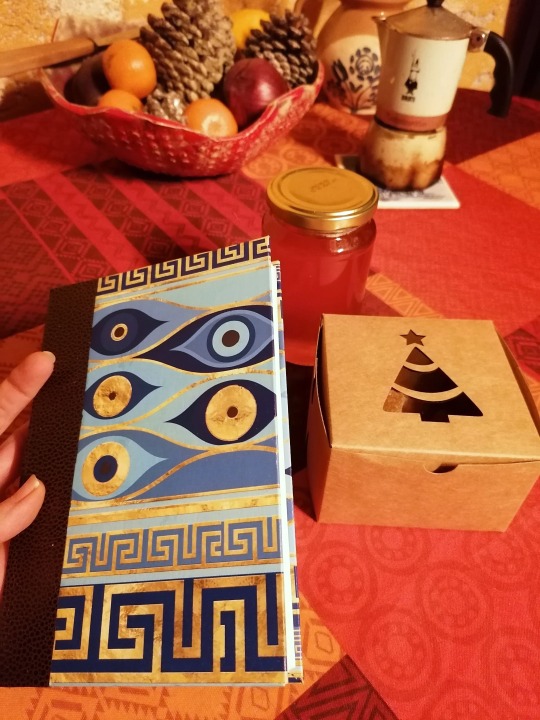

I managed to keep my resolution to give (mostly) handmade gifts this year. I was still short of a couple of gifts earlier this week, so I bought a few quinces to make them into sweets + a jar of jelly—and then I went to my library’s Christmas book fair and found a book I could re-bind (the back cover was damaged), with a theme that would go well with a Greek-patterned paper I had in my bookbinding supplies. Here’s the before-after for both!
#i liked the original front cover and initially wanted to preserve the title + eye area on the new cover but the colours didn't match#sorry cover#also the gold paper i used inside for endpapers was a nightmare!!#it wasn't bookbinding-quality paper just some gold wrapping paper. never again#''but it looks festive'' i said through gritted teeth as i tried to glue it and#shove it in the book press in 6 seconds or less so it wouldn't have time to warp
334 notes
·
View notes
Text
Books! The ongoing project I've had half-finished since March continues to thwart me, so I want to show off a project from May that turned out incredibly well. I'm extremely proud of these!
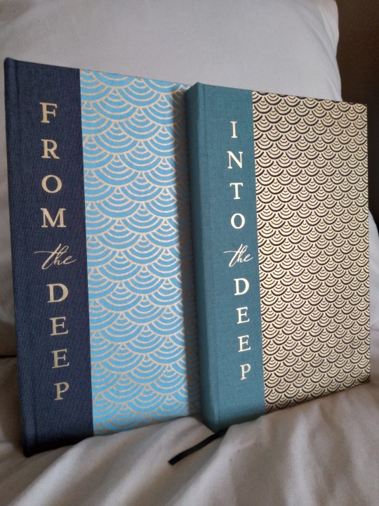
Ta-da! Look at my creations! Are they not beautiful?? This is a set of two related works, From the Deep and Into the Deep. They are by the same author, @worse0mens, and they share a lot of worldbuilding but are not a series and can be read independently. They are siren AUs with very solid characterization, both for everyone's favorite main characters (three guesses who I mean; this is a Good Omens work) and for the secondaries as well (Eve in Into the Deep is a particular favorite for me). The worldbuilding is another star; I would read non-fanwork originals in this universe and that's not something I usually say.
More photos and process talk under the cut! I had to make a lot of adjustments to the design while it was a work in progress, so this post got even longer than usual.
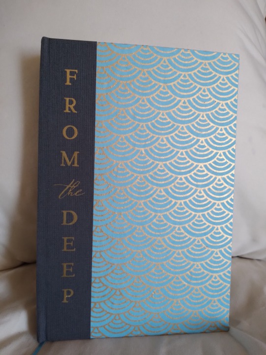
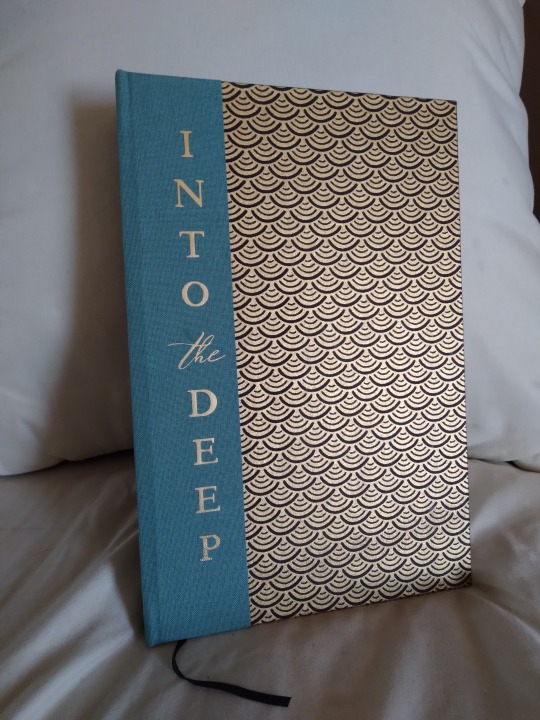

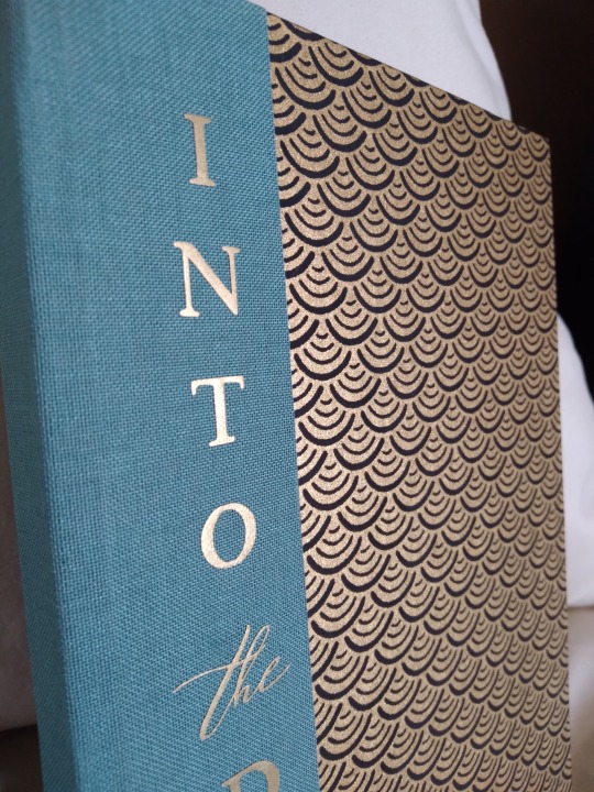
Since these are so closely related even without being a series I really wanted to make them look like a set, and I honestly think I nailed that. I found the pale blue scale-patterned paper on ChibiJay before I even started the typeset and knew it would be perfect if I could match it in black, given that those colors are so heavily associated with our two viewpoint characters. The original plan was to have one in all blue and one in all black, but that blue paper was kind of a nightmare for color-matching. It clashed horribly with the blue book cloth, so I switched that to the black book, and then it also clashed with the black cloth I had chosen. So it got charcoal in the end, and it ended up coming together quite well. The titles are HTV, first time using that on cloth, and that also did not go well. It very much did not want to stick, took more than twice as long as it should have to press, and I still ended up with some wrinkling. Further experiments are needed, I think. It was worth it in the end, though--colors and fonts are perfect, and I like the vertical orientation even more than I thought I would.

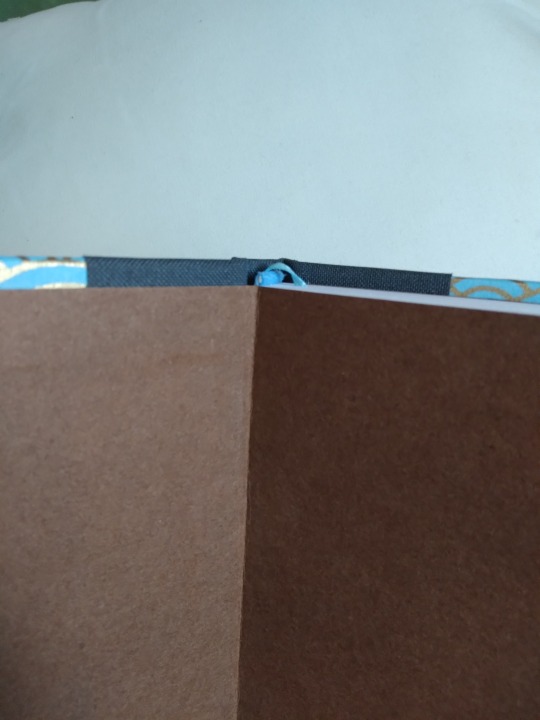
Endpapers are solid brown on both books. Another nightmare of color matching. Black is easy! Everything looks good! But that blue was really stubborn about what I could match it to, and this was the only paper that I could find that looked good with both. It's ludicrously thick and was hard to trim even with my plow. Endbands and bookmark are solid black and solid blue respectively, the only easy match in the entire project. Even then, I had originally wanted a gold bookmark on both, to match the gold lines on the covers, but I couldn't find one that was thin enough. Everything in the right colors was wider than the spines. I was very glad to find that blue ribbon, and it was an exact match for some endbands I got ages ago as part of a variety pack. Stroke of luck, there.
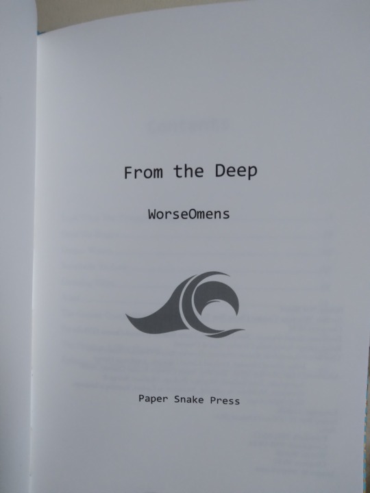
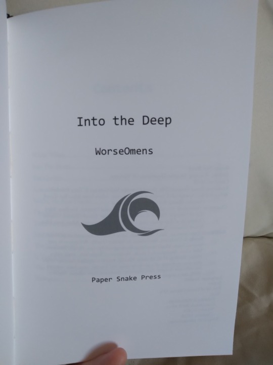
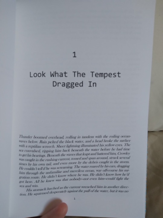
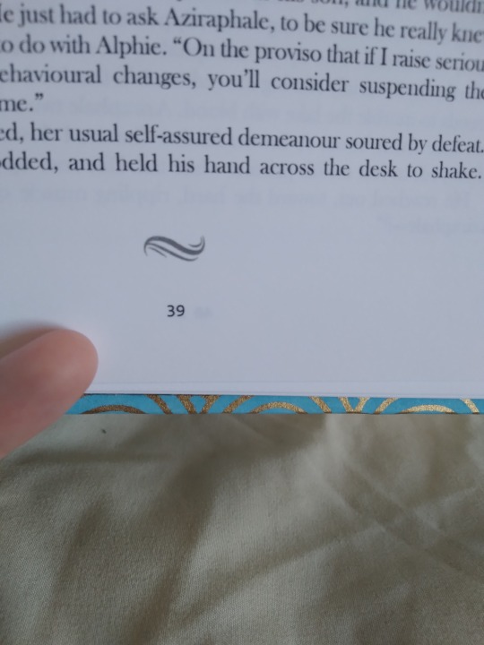
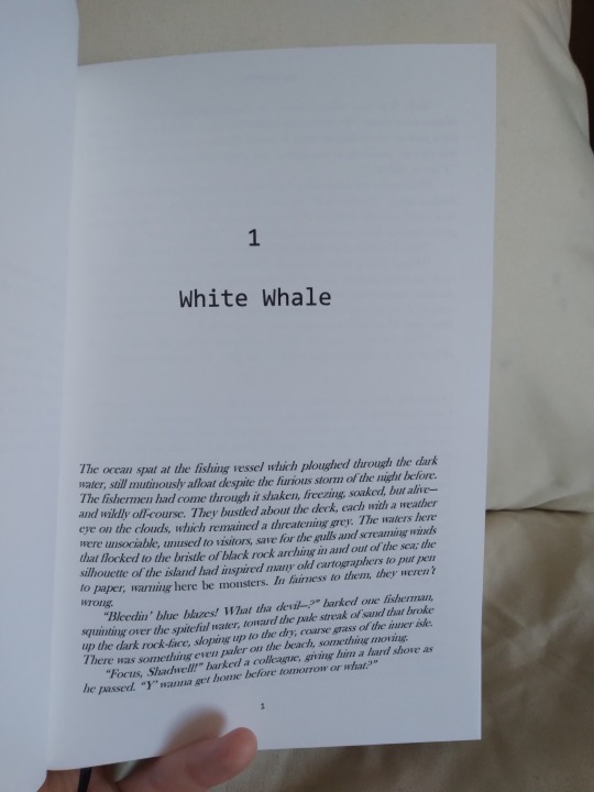
Interiors. As I said above, I wanted them to look like a set, so the same fonts, sizing, and text ornaments are used throughout both copies. All the images came from rawpixel, all I did was resize them and I think adjust the color. I was originally planning a much simpler look for these, and the typeset reflects that sort of stripped-down look; there are fewer text ornaments than I normally use, and the title fonts are less curly and ornate than my usual. The plain endpapers were also chosen with that thought in mind, but the covers turned out way more ornate than I thought when I first pictured them in my head. I don't think the insides match the outsides terribly well, but both came out so nicely that I don't mind. I could never regret those covers, they are too gorgeous for that.
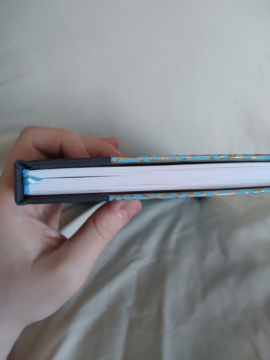
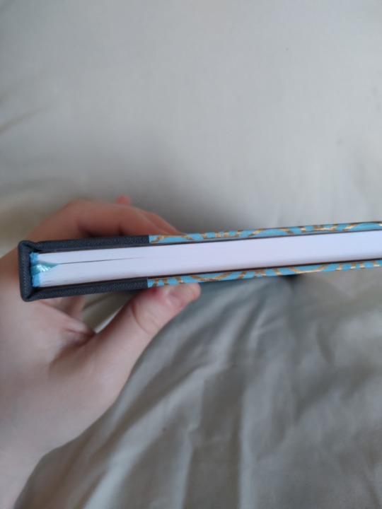
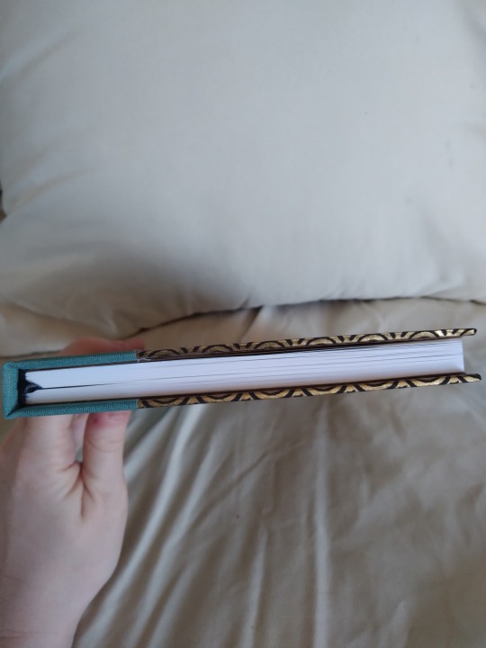
Top view on both books. I had some issues with the boards warping on this project, which you can see in the first two pictures. The one on the left is how it looks normally, and you can see that the boards curve away from the text block in the middle, leaving a gap. If you squeeze the book (middle image) this gap goes away. It's present in both books, though more visible on the blue one. I think I made an error with the grain direction, possibly in the endpapers. Or the very heavy endpapers just have more pull to them than the much lighter chiyogami on the outside, and it can't compensate. Hopefully it won't lead to any structural issues further down the line. It's just less than ideal, is all.
I've toyed with the idea of making a slipcase for these. They're already a set, but they could be a BOXED set. Very fancy. I've never done boxes before though, so I'm a bit intimidated. I may revisit them someday to do that.
#bookbinding#fanbinding#snek makes books#good omens#fic rec#i am so in love with these omg#they look like if i found them in a bookstore they would be out of my budget#but they're NOT because I MADE THEM#to one degree or another i feel that about all the books i make#it just surfaces more easily sometimes#and now is one of those times#that's a me thing though#if i bound your fic in the past i felt that way about it too#it is just not always easy to say
84 notes
·
View notes