#also reading it back i was definitely v vague in the og post
Explore tagged Tumblr posts
Note
Yo this is a dumb way to do this but my brain is fuckin toast at the moment, so let not the medium distract.
I intend to respond to you properly, but barring the ability to string enough brain cells together to do that I just want to say: I'm sorry that my response came off as rude and condescending. It's not what I intended for it, nor how I wished it to be received.
I did take it to come from the very present context of specifically not wanting to support tumblr financially because 'the site is already there', and not as the context of capitalism is the scourge of humanity. I wish I were being reductive about that reason above, but I have very literally seen that exact take a few times. That is not what you explicitly said and it's my poor form to have presumed.
So, I will respond in full, because you took the time and I'd like to return the courtesy but I wanted to make my apologies more promptly than I'm able to engage on the topic fully
aaa thank you for sending this, i really appreciate it. to be fair i definitely made some assumptions there too, i thought ur angle was more like the "nothing can ever be free, everything must cost money forever, the free market is the lifeblood of the economy and capitalism is the nature of man" type stuff cause that's been the main response ive seen to general unhappiness with the state of the internet rn. and i will say honestly if i saw someone genuinely saying since the website has already been made there can't be any costs involved in keeping it up i would probably react the same LOL
#in turn im also sorry my response wasnt very nice‚ i did try my best to keep it objective but i know some irritation#def leaked through esp in the stuff in the tags ESP considering that that makes a lot more sense now in the context#of you thinking i meant specifically tumblr kabfksbdmsbdn#also i hope its ok to reply to this publically‚ i dont thiiiiink i have followers that would like. yell at you because of that reblog#but i wanna put this up too just to be safe#i think i have messages from anyone turned on tho so i figure if u wanted it answered privately u prolly wouldve done that#also reading it back i was definitely v vague in the og post#gibberasks
3 notes
·
View notes
Text
Sitting Front Row at...(On a Budget Obvs): Lookbook no.15
Hey to anyone reading!


And welcome to my fave lookbook I’ve done in a longggg ass time! Yes, that’s partially because it involved making collages and doing the low effort work of scouring Vogue Runway for “research purposes”, but I promise, that statement wasn’t made out of COMPLETE laziness-I am super happy with it too. It’s been a good use of pre-part-lockdown-lift time in the interim between that brief period of Christmas celebrations and eateries finally fucking opening again because let’s be honest, I always knew I was gonna get distracted by oat milk vanilla lattes and veggie all day breakfasts once I could actually sit down with them at my fave local cafe. You could say I was very much operating on a self-imposed deadline.
The “what I would wear to sit front row at...[insert designer here]” TikTok/Instagram reel trend was something I wanted to get on board with ever since I first saw one and whilst the option of doing my own live action take-I really cannot bear the thought of having to edit footage of myself awkwardly attempting to sit nonchalantly in front of a camera for hours on end-was off the cards considering my complete lack of screen presence, I decided a Tumblr text post would work just as well, and if not even better in a way. Given the absence of the time limitations you face when you’re making a reel or a TikTok I thought it’d be cool to present the looks as part of a mini moodboard for each designer which adds a bit of context to each look even if you aren’t familiar with their past collections and establishes the general vibe of the brand I’m attempting to replicate. Not to sound snotty or as if I am the font of all knowledge on anything high fashion related but even with my amateur knowledge I noticed that as the video trend took off and was adopted by big name influencers, it became less about the average person putting their own personal spin on the aesthetic of the labels we can’t ordinarily afford and more about them building outfits that only vaguely resemble the general public perception of the brand around the real corresponding (and often gifted and thus inaccessible to someone who doesn’t makes thousands for a sponsored post) pieces they own SO I thought I’d take the trend back to its roots and get a bit resourceful. All that being said, in no particular order, here are the outfits I would wear to sit front row at Gucci, Vera Wang, Miu-Miu, Marc Jacobs, Dolce & Gabbana, Brock Collection, Alexander McQueen, Etro, Burberry aaaand Saint Laurent based on their past collections and guess what? They didn’t cost a shit tonne of money :-)
-disclaimer: will include an asterisk before any new purchases if from a high street store though to be honest, I don’t think there are any, we shall see! I do include where I got old purchases from in case anyone wants to search anything on Depop/Ebay-
1. Saint Laurent (formerly Yves Saint Laurent)
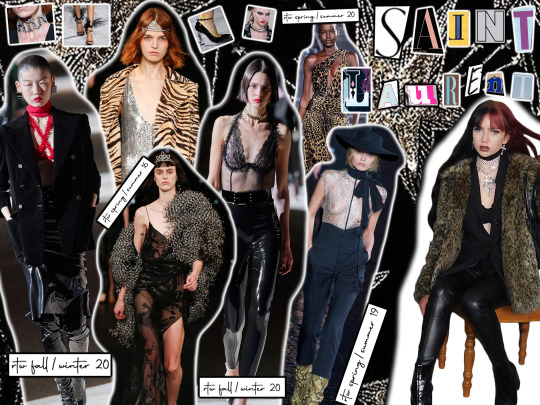
-blazer from identityparty on Depop, pleather trousers from Zara, jewellery from Dolls Kill-
I know technically abbreviating Saint Laurent to YSL doesn’t really make much sense anymore given the brand’s name change in 2012, but I’ll always think of it as that in the same way I’ll always associate it with the slightly dishevelled yet simultaneously glitzy rock n’ roll aesthetic. The thing is, whilst YSL hasn’t done anything wildly out of the box for a long time, it’s rare they put a look on the runway that I wouldn’t wear; they never end up being a fashion week standout but the Parisienne take on grunge we’ve seen Anthony Vaccarello establish as his go-to will always have a place in my heart.
2. Alexander McQueen
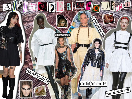
-embroidered leather jacket from Ebay (originally Topshop), harness from Amazon, dress from ASOS, boots from Koi Vegan Footwear-
Alexander McQueen is a brand that is pretty much universally liked, from the historically extravagant and groundbreaking shows the man himself put together to Sarah Burton’s more toned down but still beautiful collections. Obviously I didn’t attempt to do justice to the former, so I tried my hand at putting together a look inspired by Sarah’s blend of delicate femininity and nomadic edge, and it went...okay? Like it’s definitely not my favourite of all the looks because it does give off slightly cheap copycat vibes buuut outside of the context of this lookbook it’s cute.
3. Brock Collection
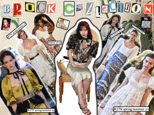
-boater hat from Ebay, midi skirt from morganogle on Depop, corset top from ownmode_, heels from amybeckett1, bag from Primark-
Brock isn’t as well known a brand as most of the others in this list but I adore everything Laura Vassar Brock does and I couldn’t pass up an opportunity to try and channel the vision of one of the OG pioneers of the cottagecore vibe through my own wardrobe. I mean fr, this woman’s work as a steady provider of meadow photoshoot worthy dresses and corsets and skirts is v slept on and I will not stand for it. I will sit in front of a camera and then write a paragraph in my blog post begging anybody who reads to give LVB (an abbreviation I acknowledge is unlikely to catch on because Lisa Vanderpump anybody?) some form of acknowledgement for her services to period romance novel inspired moodboards everywhere.
4. Marc Jacobs
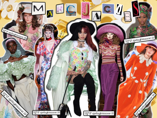
-coat from House of Sunny, white shirt from Retro World Camden, co-ord from Sugar Thrillz, bag from Poppy Lissiman-
If there’s one thing Marc Jacobs always does, it’s COMMITS. TO. HIS. THEME. I just KNOW he has a secret Pinterest with separate boards for every fashion era of the 20th century and he is putting those boards to good use providing us with collections that are as immersive as they are eclectic year in year out.
5. Miu Miu
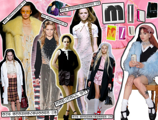
-beret from H&M, hair clips from H&M, jewellery from Primark, coat from mollyyemmaa on Depop, shirt from YesStyle, sweater vest from YesStyle, skirt from Depop, diamanté belt from Brandy Melville, shoes from Koi Vegan Footwear-
We all like to talk about Bratz dolls and Monster High dolls and Barbies as fashion inspo but can we all focus on Cabbage Patch dolls for two secs so as to acknowledge the fact that a Miu Miu collection is basically all their fits grown up? And made boujie as fuck? If I want my fix of Wes Anderson meets Scream Queens (what a combo) inspired outfits, if I want prissy and girlish but also glam, if I want to look like a bratty rich girl whose one redeeming quality is her eye for vintage clothes, I know where to look and that is the Miu Miu section of Vogue Runway.
6. Vera Wang
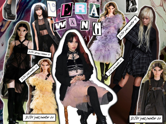
-blazer as in no.1, velvet bralet from catdegaris on Depop, harness from Amazon, skirt from Ebay, knee high socks from Ebay, lace up boots from Ebay-
Vera Wang’s RTW aesthetic, a blend of the ethereal, ultra-feminine bridal designs she’s known for and British style punk rock influences, is something I feel has only become firmly established in recent years but it is everything I ever wanted and more. I always find myself trying to balance the part of me that loves everything girly and delicate and pretty and the part of me that would love to be in a biker gang and Vera’s collections are always an inspirational reminder of just how well it can be done.
7. Burberry
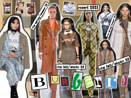
-coat from charity shop, suit from emmafisher3 on Depop, top from simranindia, shirt underneath from Zara, jewellery from ASOS-
Now I’m not gonna lie, I’m not the biggest fan of Burberry but there have been a few looks over the past few years I’ve really liked and as someone who owns numerous trench coats, high necks and way too much plaid, I thought it’d be an easy one to replicate. Plus, if you can count on Riccardo Tisci for nothing else you at least can rely on him giving you some layering inspo which is very much needed in a country where it literally just snowed in April and where my plans for today have just been cancelled because the iPhone weather app did a Karen Smith and didn’t predict rain for today right up until it started raining so thanks for that one British meteorologists. Your incompetence strikes again.
8. Etro

-corset from Urban Outfitters, vinyl trench coat from Topshop, boots from Ebay, black slip dress from kaoanaoleinik on Depop, fur trim afghan coat from louisemarcella-
Like with Brock Collection, Etro isn’t a hugely well known brand, but it is always one of my favourites-to add a spanner into the works of any attempts to cultivate a firm sense of personal style, I live for the ornate Bohemian look that Etro does so well just as much as I love both grungy and girly pieces, and so I really wanted to include a brand whose collections go down that route. It was a toss-up between this and Zimmerman, the flirtier, free spirit counterpart to the dark romance of Veronica Etro’s designs; her vision really shines through the most when it comes to the brand’s winter collections, imo, and given that I live in a country where winter or some weather state resembling it does seem to take up 70% of the year, I did decide on channelling her work rather than that of the equally talented Nicky and Simone Zimmermann this time round.
9. Dolce & Gabbana
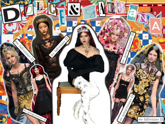
-flower crown from ASOS, tiara from Amazon, earrings from YesStyle, dress from alicealderdice1 on Depop, opera gloves from Ebay, boots from Koi Vegan Footwear-
D&G is a brand I felt really conflicted about doing-I don’t include their current collections in my fashion week reviews based on the actions of designers Stefano Gabbana and Domenico Dolce over the last few years because I don’t want to mitigate the collective effort of fashion critics to push them towards irrelevancy. Though people like to claim the brand has turned a corner since Lucio Di Rosa was brought on board as the manager of celebrity and VIP relations last year (they are as prolific a force on red carpet fashion as ever), we haven’t seen any real meaningful apologies or reparations made by Dolce and Gabbana themselves which once again leaves us in the all too familiar quandary of whether or not we can separate the art from the artist especially when it is far too much of a simplification to only credit the two men for their work given there’s a whole design team behind them. There are a LOT of shitty people working in fashion, the whole industry is a bit of a cesspit if we’re honest, but I don’t think that should stop us from at least being able to appreciate old collections if we make sure we aren’t engaging in any kind of promotion of current works whilst doing so. D&G are a brand of high highs and low lows, with looks that range from hideously ugly to showstoppingly beautiful in a single show-when the looks are good, they are GOOD-and their presence in the fashion world is most definitely felt whether we want it to be or not. It would just be shit to refuse to recognise the existence of some real iconic runway moments, the practical work that went into the ornate detail and opulence that helped cement D&Gs place in sartorial history, the styling that’s made goddesses and fairytale queens out of modern day women as they’ve glided down catwalks, the far more extravagant and, let’s be real, sexier version of our world D&G shows have transported us to in the past. Will I talk about D&G ever again? No, and if you Google the scandals their brand has faced over the past few years, there are more than enough reasons why, but just this once I did want to pay homage to some of the collections, the snippets of which I saw on my Tumblr dashboard back when I was about 13, that first got me into fashion.
10. Gucci
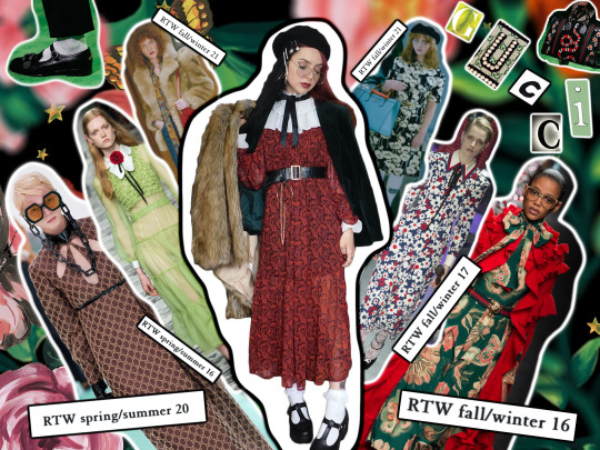
-fur coat from Topshop, clips from Zaful, glasses from Ebay, dress from gracewright246 on Depop, shirt from Boohoo, blazer from charity shop-
Now last but, if you ever read any of my fashion week reviews (the likelihood of someone actually having read one of them and reading this is incredibly, incredibly slim lol, I wouldn’t read me either) you’ll know, definitely not least, is Gucci because Alessandro Michele comes through every!! single!! time!!
The man is truly the king of quirky throwback maximalism and it hurts my heart that a lot of people seem to think of it only as a brand associated with ostentatious displays of wealth. Year after year since Michele was made creative director he has released purposeful, fully-fleshed out collections which unravel themselves to us on the runway like time capsules containing the belongings of the rich and whimsical and yes that can sometimes result in outfits which are *ahem* a bit mismatched but it doesn’t matter because through fashion he manages to take us to a vivid version of the past where people could dress as freely and lavishly as they wanted to, into the wardrobe of a person unaffected by the side-eyeing of others. You get the impression he doesn’t design so much as plays around with some kind of enchanted dress up box and takes inspiration from there and to give that impression is only a credit to his talent-to make outfits so kooky and extravagant look like they were meant to be takes a boldness and genuine love for clothes that I do tend to feel a lot of the big name designers have lost in the pursuit of profit and the necessary placating of the dying customer base that keeps that coming in. Of course I'm not for a second saying Gucci does not care about profit, but at the very least, they have on board a creative director who genuinely has fun with what they’re putting out there and wants to make a statement too and that really shows; you can rest on your laurels and sell tweed boucle jackets to rich old white women for eternity but nobody’s going to mention your brand name and the word groundbreaking in the same sentence ever again unless they’re talking about what it was a century ago, you know (mentioning no names...unless...did I hear someone say Chanel)? That feels like such a shady way to end, lol, but I’m sure said brand will survive-to be fair, they’ve been included in every other What I’d Wear to Sit Front Row At video I’ve seen so although I’m always slagging them off for doing the saaaaame thinggggg year after year, for that same reason their aesthetic is instantly recognisable and so will always be a source of imitation. There are obviously pros and cons to being a brand which constantly reinvents itself but I think it’s totally possible to do that whilst maintaining an overall mission, and Alessandro Michele’s work at Gucci demonstrates that with ease.
Anyway, if you got to here, thanks for reading! I know I’m super behind on this whole TikTok trend and I know a Tumblr post instead of a video is a bit of a cop out but all the real, physically awkward ones out there know that watching yourself back is excruciating lmao, so I hope this does the trick. After this, I’m gonna get back to the reviewing S/S21 collections post though knowing me I’ll probs take a few days to get back into that because I feel like since I left full-time education (RIP me going back in a few months) writing continuously like this for any longer than about 15 mins fries what brain cells I have left. Again, thank you for reading and if you are, sending many good vibes your way! Stay safe!
Lauren x
#front row#frontrow#fashion#fashioninpo#fashion inspo#style#style inspo#designer#gucci#vera wang#burberry#label#miu miu#runway#fashion week#mood board#ysl#saint laurent#runway trends#ss21#lookbook#vintage#outfit#marc jacobs#Alexander mcqueen#runway fashion#high fashion#haute couture#trend#collage
43 notes
·
View notes
Text
AVENGERS ENDGAME SPOILERS!!!! SPOILER ALERT!! BIG OBVIOUS SPOILER ALERT!!
So I just got home from my midnight screening of Endgame and DAMN that was a wild ride! A fitting end to a decade long saga, although definitely some things that could've been improved upon. I'm gonna break down my thoughts and comments below, so once again, DON'T READ IF YOU DON'T WANT ENDGAME SPOILERS!!
-So let's start with my (predictably) biggest reaction: Tony's death. Yes, I saw it coming, and yes, it was less angsty than I had feared, but oh my god I'm depressed now. Even typing the words "Tony's death" makes me wanna cry, I was not prepared enough for this apparently
-Tony's family: Morgan was very cute, but Pepper is still irritating af and I'm not particularly pleased by the family story they gave him, especially as he dies in the end, and also it ruined my Stony dreams even more. Bringing me on to:
-The Stony reunion: no no nO NO NO NO! Tony still hated him, then they were barely on speaking terms, then it was the final battle and the end. No big resolution, no real connection between them. I've been waiting three years for this and honestly I feel a little cheated
-Speaking of fucking up my Stony, the ending of Steve's arc: ofc he had to become old (or die), as I've said before he has to have a plausible excuse to keep him out of future fights. But I'm still not a fan of the aging thing or the Peggy thing, like it's good that he had a happy ending and all but it's not the ending I wanted
-Also, Sam becoming the next Cap: I think it should've been Bucky. He and Steve were much closer friends, and Sam already has a hero alter ego, whereas Bucky has none (he's no longer the Winter Soldier, and White Wolf didn't really seem to catch on). I think it's a bit sad that Bucky didn't finally "earn his place" with the good guys by inheriting the shield
-Speaking of the shield, Thanos destroying it was not something I expected, but DAMN I almost cried
-And also, MJOLNIR!!!! It's back and Steve can pick it up!!! Like we all called it but still, it was badass as hell, and the interactions between Steve and Thor over it were great
-The time travel: I don't pretend to understand how time travel works in this movie or how it didn't mess up the timeline with all the changes, but revisiting and adding to the old movies was GOLD, especially the A1 scenes with Loki and the OG 6, it was my favorite part of the movie
-Where the fuck was Carol for most of this? I get that it needed to centre on the OG Avengers to be a fitting goodbye, but she could've done a lot more?
-Natasha's death: fuck that was sad. The scene with her and Clint on Vormir was honestly heartbreaking
-The women uniting was one of the best moments in the movie
-Not a fan of the new Thor or Hulk personas tbh. So much work has gone into their character development, only for them to be changed really rapidly with little explanation...
-A1 Loki is bae, I miss him
-Cap v Cap was hilarious
-Wish the elevator scene had been more dramatic, but the entire theatre SCREAMED when it started
-No post-cred for the first time in TEN YEARS wtf Marvel
I'm sure there will be more ramblings to come, it was 3 hours of movie to process, so keep checking back for more vaguely coherent comments as they appear.
#avengers: endgame#avengers endgame#avengers#mcu#marvel#marvel cinematic universe#endgame spoilers#avengers endgame spoilers
14 notes
·
View notes