#also lasso-fill tool? shes fun.
Explore tagged Tumblr posts
Text

egghead !
#ft beastwife's sweet little tonta <3#cooking her lil pea brain with the residual heat from the egg.#digital art#fan art#animal art#cat#cat art#calico cat#egg#fried egg#also lasso-fill tool? shes fun.
564 notes
·
View notes
Text
[ID 1: A digital drawing of a redhaired girl in a blue shirt, looking over her shoulder, smilling and saying "lol noob". The drawing was made placing differently shaped blobs of color over each other.
2: A drawing of a girl in a side profile view. She has black hair, wears pink clothes and has bright green eyes. The drawing has very thick lines and unprecise filling inside them.
3: A landscape in tones of green, of a tree in a large field of grass with mountains on the background. Each of the elements are pretty wobly and abstract. /end ID.]
Ok so I liked the Lasso Tool Girl a lot so I gave her a some lineart

[ID: The drawing of the "lol noob" girl from above, now finished with simple lineart. /end ID.d]
It was quite fun overall! The Whatsapp and the Gallery ones were the hardest.Whatsapp's image editor has a limited set of colors, but thankfully it has a variation in brush size (I could only choose between Super Thick, Medium and Fairly Thin though). I figured the brush variety was a way more useful tool than the color picking (btw none of these two have a color pick tool) I had in the Gallery. Sure it had a preset pallete BUT there was also a color wheel I could pick lots of colors from.
It wasn't very useful though.
None of the last two had a layering system (obviously, becuse they aren't made for drawing at all) but I could contorn it by paiting blocks of color first, then details and then drawing the lineart with the medium brush in the Whatsapp one.
Anyways, I would advise you not to use ANYTHING that doesn't have multiple brush sizes, hope that helps.
Ok so I was in this way too long car ride (4 hours) and at one point I decided to draw something in my phone using random methods and now behold:

The Lasso Tool gurl

The Whatsapp gurl (I did her in the image editor of the message app I use)
And... the Gallery Image Editor Landscape
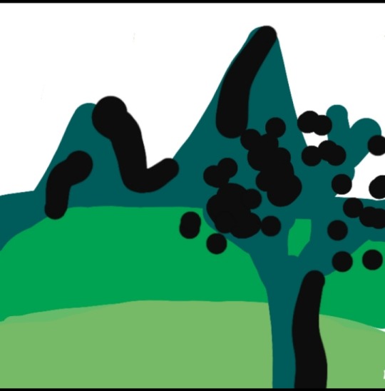
I'm not exactly proud of this one
Art Taglist
1. @for-the-love-of-angst
Let me know if you'd like to be added or removed of the taglist! 🔆
#but probably the fact that im already not great drawing landscapes influenced the final result lol#digital art#my art#lasso tool#lineart#rambles#digital work#described
7 notes
·
View notes
Note
not to be annoying but did you make your header picture of louis ?? if so could you do a tutorial for that too? i suck at photoshop lol but i wanna make stuff thank you!!
definitely not annoying!! i feel honoured that u want my advice sdfghsjgs
anyway this ones longer and i go into more info on actually cutting a figure out of an image the proper way or how i do it normally but im gonna use the pic in my icon again just bc its faster
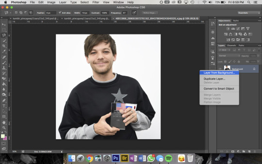
so get ur sister up and make sure shes a normal layer not the bg layer by right-clicking on it bc otherwise you’ll go through all sorts of hell
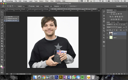
then u wanna use the magnetic lasso tool that i highlighted to remove the background
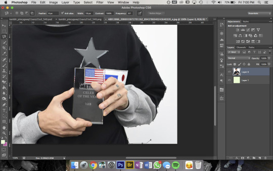
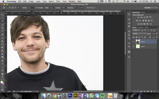
then to use this u kinda just click on the pic and trace around the area you want to select and the computer will try to automatically latch onto whatever you’re outlining. you can also click somewhere to set a point manually- its obvi based on colour values so thats why its way easier for me to do this image than the one in my actual header. im pretty sure i spent a good hour or more doing this piece by piece with that so i recommend doing it on simple backgrounds or being prepared to be one patient motherfucker

then i use the quick selection tool to add/remove any bits that the computer missed- eg. at the top of the pic you can see not all of louis’ hair is selected so i went and added that, then had to remove some bits near his jumper etc etc. this part was Very Extensive with my current header
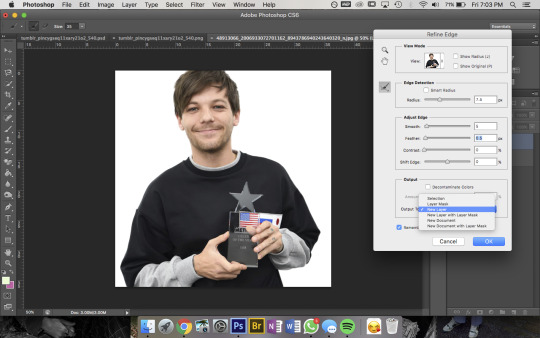
then when sis is looking all pretty u wanna right-click -> Refine Edge and that little box will pop up- thats the settings i had for this pic but it was a really large file so you’ll normally have the radius at abt 2-3px not 7. also if you’re doing a pic where the hair is Super Fluffy then you’re gonna want to focus on the feathering (third slider bar) a lot more
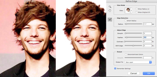
eg. these are my settings when i was doing JUST his hair in this pic. obvi mess around with it yourself to figure out what works for you but a lot of the time i do his hair seperate to the rest of the image bc otherwise its unbearable to look at
anyway make sure you set the output to a new layer itll make a new layer with the selection w/ a transparent bg and itll leave the original layer too
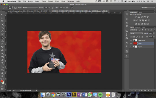
now the fun bit- i picked the colour i want the bg to be and filled it with that solid colour then using this brush pack from deviantart (just click download in the top right corner and it should automatically go into photoshop once u open the downloaded file) i used Texture Brush #2 in the preset size to colour over the top of the bg. that brush changes colour/shape slightly as you draw so thats how i got the mottled kind of effect
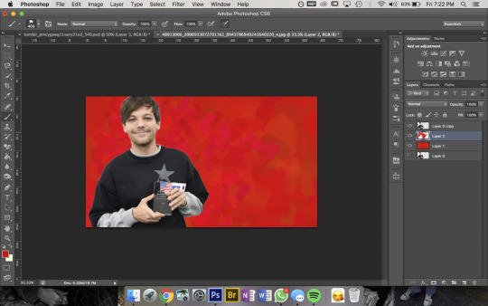
then bc im here for the aesthetic i made a new layer on top and used a slightly different shade of red & a smaller brush size to colour a bit around louis to add some ~dimension~
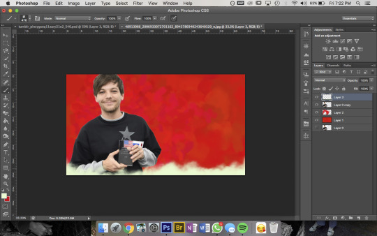
then pick a colour you want for the bottom bit and for this bit i use a mix between Cloud Brush #1 and #2 from the same brush pack. at first you wanna go over the very bottom with 100% opacity to make sure it’ll blend into your blog background
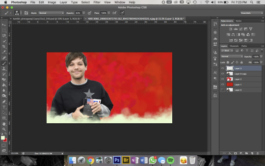
then go over again at a lower opacity to blend it up a bit and just mess around until you think it looks good and sis thats it done!!!
but because im overly thorough here are my layers for my current header file
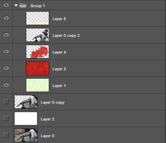
and these are for my last header- here you can see that i cut his head out seperate to his body, did a bunch of layers and experimenting for the background and also am a total layer hoarder who doesn’t know when to let go 😬
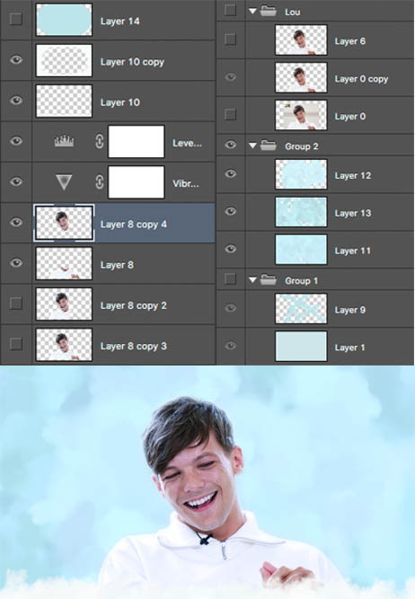
#i hope this is helpful and makes sense nonny!#and sorry if the pics dont match the text at any points ive had to fuck with it so much so tungl will let me post it all#but ur defo not annoying and if u want further clarification on anything feel free to ask#also if anyone uhhh wants an icon or header made or smthn pls hit me up im always looking for reasons to mess around on photoshop i love tha#that bitch#ask#anon
9 notes
·
View notes
Text
Double Exposure Outcome 1

I have created 3 pieces of artwork that showcase the double exposure effect using photoshop, I like this effect because it produces many possibilities which is why all 3 are quite different. In this first outcome I wanted to bring attention to black lives and their equality, therefore I combined two images that relate to Africa and black culture. Another aspect I'm pleased with is the colour scheme, the general mix of purple and yellow is really appealing. However I think the hints of red and blue is what makes it pop out, in a subtle but bold and beautiful way.
What's different about this type of double exposure art is filling the whole page, with my other two outcomes I have left negative space around the figures. The cool thing you can do with this is highlighting something in the backdrop, by exposing it through another image that can still have detail. Overall I'm really happy with my first outcome, it's pleasing to look at because it's bold and fun, but also soft and relaxing.

To begin with I saved two images from pexels.com and moved them into photoshop, with these I lowered the opacity on the top layer so I could move it to overlap the correct place. In the background image there are stairs going up in a jagged line, and I thought having this show through the woman's figure. I then cut off anything that's not overlaid and resized it, making sure the woman's face is central.

Here are the original photos that I worked with, the background is a street in Africa and the figure is a woman wearing a cultural head wrap, make-up and other accessories. The reason I used this street image is because it's got detail, gorgeous light colours and isn't modern with perfect, straight lines etc. As for the woman, I chose this specific photograph because she is smiling, which radiates positivity and happiness through the art. Her side profile is also perfect for a (partially clear) silhouette, making the shape aspect more interesting and allowing detail of her face to be seen, as it's in the light.

The next step was to cut out the background from the original image of the woman, there are many ways to do this in photoshop e.g. magic wand tool, polygonal lasso tool. However I have learnt a new and more efficient way to do this, you have to select the magic wand tool but rather than clicking on the canvas you go to 'select subject'. This will select around what photoshop thinks is what I want, and thanks to the plain background it was selected almost perfectly. The only thing I noticed hadn't been picked up was the eyelashes, so to add it to the selection I used another new technique. With the magic want tool still selected, I took this into 'select & mask' and added the eyelashes to the selection.

At the moment the eyelashes aren't well selected and there's still a lot of space around it, however it didn't matter because I could fix it with yet another new method. I started by adding a 'layer mask' which cut out my figure, but it still allowed me to go in and adjust the selection. To do this I selected the 'layer mask thumbnail' and set the foreground/background colours to pure black and white, these colours act like subtract and add so you can use the paintbrush tool and take control like that. What's good about this is you can choose the size, hardness, opacity etc, giving you full control of what's selected.
Once I way happy I selected all of the layers (including the white background), I converted them to a 'smart object' so it's all one layer but you can reopen it at any time. This example in my work isn't a very good one because it's such a small detail, but a more effective situation would be to cut around wispy hair strands. But even though there are other ways, I needed to try out the process to practice for when it's important.

With the two layers, the background photo and cut out woman, I turned down the opacity to see both images for editing. Next I went into the layer style for the woman and played around with the RGB channels, I chose to have the figure a dark blue/purple and the background in yellows.

I could have left the piece as it was, however I wanted to tweak the colours to make them more vibrant, dark, contrasted etc. To do this I created two new fill/adjustment layers, the first I added was 'colour balance' which turned the blue to a clearer purple, and the yellow more orange. I think this colour combination looks richer and even bolder, however once I incorporated a 'levels' layer I displayed more depth, contrast and vibrance.
0 notes
Photo


Spot the Difference.
In this weeks lab we worked on photo editing. We learned about colour correction, the rule of thirds and the content aware feature on photoshop. After the lab i wanted to take this new knowledge and skills and apply them to one of my own photos. Back in 2017 i visited the vatican and took this photo of a nun as she walked through one of the halls in St.Peters Basicalla. I wasnt too happy how the photo turned out it didnt really emphasize how devine the scene really was in real life. So i decide to open Photoshop to try fix this!
First thing i did was to try highlight the nun more so i selected the nun using my lasso tool & and isolated it to a seprate layer. From here i adjusted the white balance,brightness and shadow to really make the nun as angelic in the photo as she was in real life. (see photo one for results)
Another thing that ruined the photo was the machinery in the background. I used the the lasso tool to select the machinery and then used the content aware tool to fill in the gap. Photoshop was able to recognise the pattern of the pillar and fill it removing the machinery from the photo.(see photo two for results)
Also, just for fun i thought the photo would make a cool postcard so put it in black and white and used some typography for the vatican title.
But wait theres more! There is one more thing i did in this photo to just make it that much better in my opinion. Think you know what it is?
Comment on this post your answer and ill let you know if you got it right or not!
-PB
0 notes