#also helped 🏴☠️ photoshop for a friend
Explore tagged Tumblr posts
Text
spending my sunday participating in my favorite pasttime (thinking about drawing and not actually drawing)
#personal#also helped 🏴☠️ photoshop for a friend#and went to spirit halloween . just to browse#need a rip van winkle scenario to happen. im just sooo sleepy
73 notes
·
View notes
Text
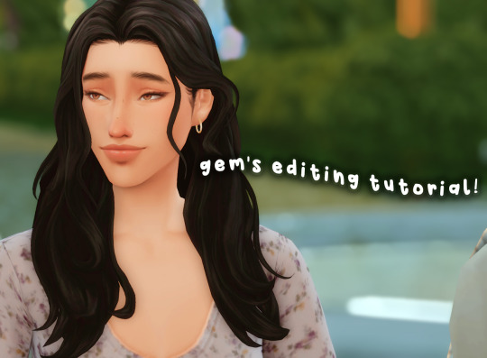
hello friends! 🌷
recently i got an ask on how i edit my instagram screenshots and here in gemville, all you have to do is ask and you shall receive my child
fun stuff under the cut!
this guide will be divided into two parts: how i take & edit my gameplay screenshots and how i edit my simstagram posts

before we get into the actual tutorial, here are a list of things that i use to help me take better screenies :)
gshade
i'm using an older version of gshade because - thanks to my procrastination - i never updated the version before everything went to shit.
2. presets!
i switch around between presets a lot lmao but for the most part, i use ellcrze's gshade preset for my family dynamics save, sunset n vinyl for my globetrotter save & sim download pictures and a modified boho dreams for my tjol legacy save (first post coming up soon!) sometimes i use lithium for cas pics too :p click here for a somewhat detailed explanation lol
3. tab mode camera mod
this camera mod is a godsend and makes taking screenshots soooooo much easier! 😌 i highly recommend getting this mod!!!

i think i mentioned this before in an ask - i edit my screenshots in photoshop before posting them on tumblr :D i don't really do much, just running a few actions and cropping my screenies. gshade does most of the work for me lol
this tutorial by @buglaur is insanelyyyy helpful omg i based my entire editing process on her tutorial, except for the colouring part because i'm lazy hehe
here's an example of my screenshots before and after editing (cropping the screenshot and running some actions)! there’s not much difference because as i said earlier, gshade will basically carry your entire editing process 💀
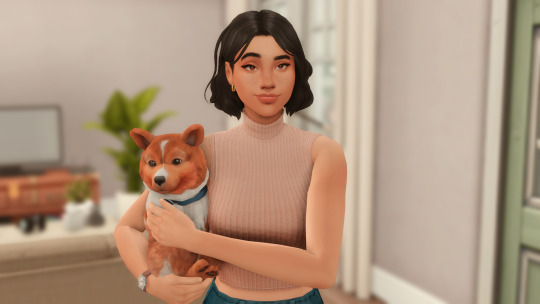
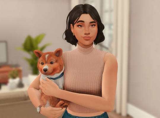
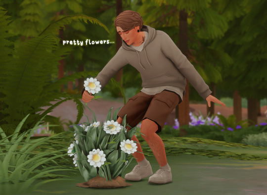
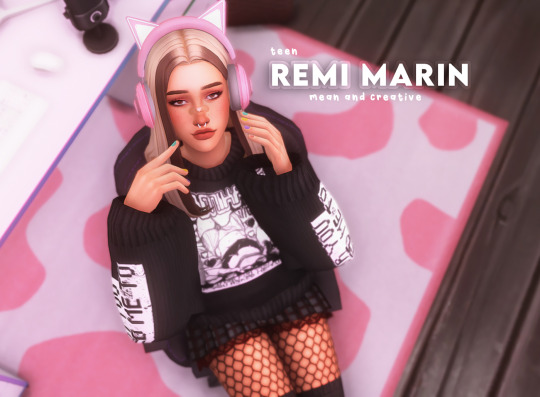
sometimes i put text in my pics like these screenies below :) i mainly use these two fonts - winkle and lemon milk :D
and that's about it for part one! now it's time for

here's what you neeeeeed
1. photoshop
i'm using a 🏴☠️ version of photoshop that i got from a somewhat sketchy website but it runs great so i'm not complaining 💀
2. instagram post template and instagram story template
a HUGEEEE thank you to @windslar for sharing the instagram story template link 😭 she is such an inspiration to me 💛
3. the actual instagram app
this is how i add text and emojis to my simstagram posts lol

disclaimer: i am NOT a photoshop expert. there's probably an easier way to do what i'm about to show you, but this works for me and i don't really mind the steps hehe
first things first, you're gonna want to open the psd files on photoshop and it'll look like this, depending on which file you opened
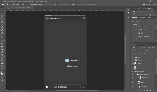
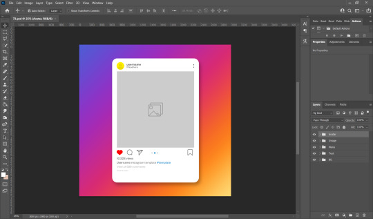
i usually just hide the layers that i don't need so in this case i'll hide the tagged users layer from the story psd and the bg layer from the post psd.
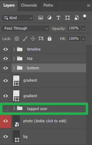

these are the layers that i hide but you can also leave them on if you want hehe totally up to you my dude. then you'll end up with something like the pics below
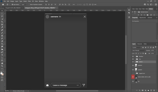

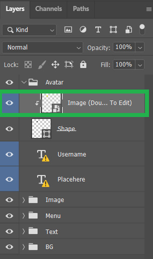
now we move on to the profile pictures! so what i do is i click these layers (shown below) and go 'file > place embedded > selected picture'

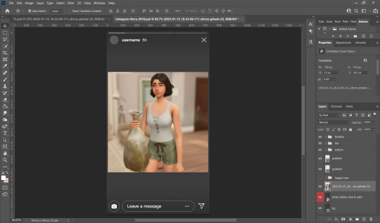
once you do that, you'll end up with something like this (below)! use 'ctrl + t' to resize your picture to fit into where the profile picture would go.


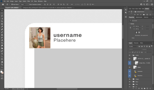
right click on the layer of your selected picture and click 'create clipping mask'. then you can hit 'ctrl + d' to adjust the picture to your liking!
now for the actual pictures for the posts. click on these layers (shown below) and go 'file > place embedded > your selected picture'


now all you have to do is 'ctrl + t' to resize your pictures, right click on the layer of the selected picture and click 'create clipping mask' then 'ctrl + t' again to adjust the pics!
after this whole process, i'll export my pics to my family dynamics folder on my desktop and queue it up on tumblr! :D sometimes my simstagram story posts have text and emojis like these ones below
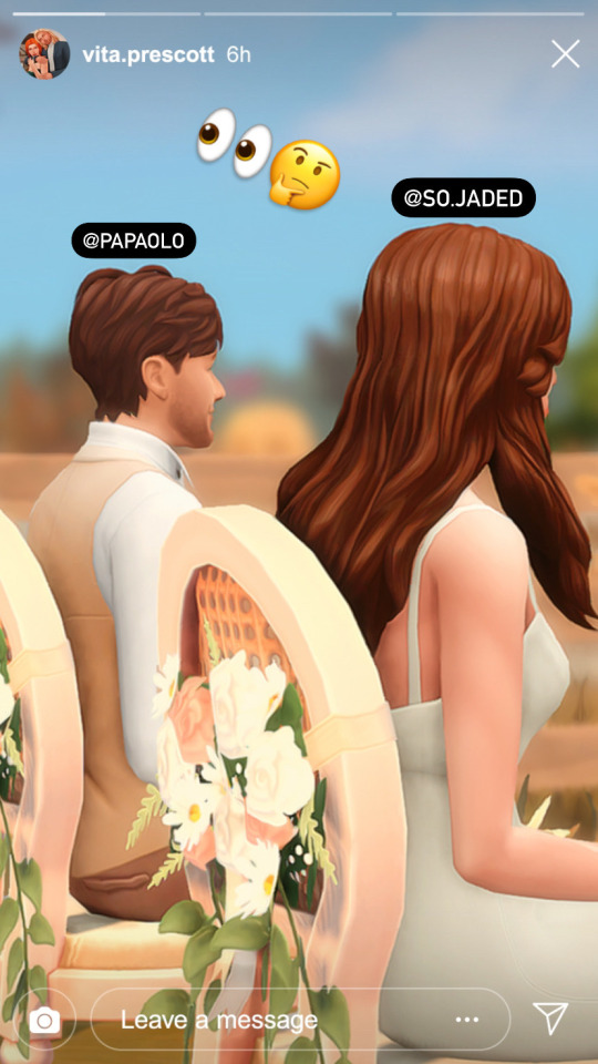
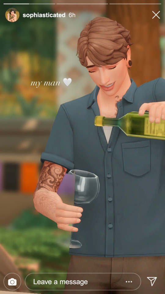
all i did was upload the pics to google drive, download it to my phone, add text/emoji on the actual instagram app then saving the story to my phone... a lot of work but i don't really mind <3

aaannnnddd that's it!!!! i can't believe i made this guide 😭 hopefully this helps :D english isn't my first language so apologies for any grammar/spelling mistakes i've made in this post 🙈 feel free to ask any questions and i'll try my best to reply to you asap!!
207 notes
·
View notes
Note
Hey Kenna😄 don't mind me, im new into your account, your writing is amazing! and I just want to know is there's any specific app or tools to make header, divider, and such with those sick fonts? I thought to make my own writing blog recently, so it wouldn't hurt to make my blog looks ✨ aesthetically✨ pleasing like yours
Anyway that's it, I hope you're having a good day :)
Hello, and thank you so much!! I'm glad you like my edits haha, even if my writing is the main focus I do work hard on them!!
I usually use photoshop, but I lost the 🏴☠️ specific 🏴☠️ link I used to download it. A good alternative is Photopea - it has most of the features Photoshop has, but it's free and and doesn't require a download! You can use it right in your browser! I don't usually use it since I do have photoshop but my friend swears by it and I have used it once or twice and it's worked just fine!
As for fonts, Dafont is your friend all the way. There's also @yourfonts which helps me find some cool fonts (or some really pretty plain ones). Also Google "font combinations" and go to the image tab to find some tasteful pairs - too much fancy is just hard to read!
A few header borders I usually use can be found here and here! Warning, I don't know what size the dash view header is but it always cuts off and looks weird - however, the headers look fine on true mobile view and i think hover view so? it should be fine?
That's about all I can think of right now...just remember the golden rules like don't use fanart, credit borders, textures and templates as the creator asks you to, make sure your fonts are free for personal use or 100% free (it tells you on dafont beneath the download button), stuff like that....and you should be good! Good luck on your blog!
#i hope this helped i'm not the best at tutorials#or well this isn't much of a tutorial but you get it#asked and answered#anon#also 100% you don't have to but i wouldn't mind sneaking a peek when you're up and running [eyes emoji]
1 note
·
View note