#also for the record 1 and 2 would both be square but i would crop 3 (Whuh Kitten) to match its contour
Text


hi, i have a few popular pieces on here making the rounds. i've been thinking about starting a little shop, so i'd like to order some stickers of these designs.
if you'd be interested and willing to purchase any of these designs for ~$2-$5 USD, please cast your vote below so i can get a sense of how many stickers to order. thanks!
#indexed post#I will probably like slap them on redbubble - the kittensworld already is on there - but i want to order nice stickers#also for the record 1 and 2 would both be square but i would crop 3 (Whuh Kitten) to match its contour#It would help me if you would reblog this after voting. thank you smiles
12 notes
·
View notes
Text

COMPREHENSIVE GIFFING TUTORIAL (vapoursynth + ps cc 2018)
+ some tips and tricks on color correction, blending and subtitles
You guys asked for it, so here we are! This is by no means the gold standard to giffing. Rather, this is simply my process and my own preferences. Take it as you will. Additionally since I use a mac some of my controls/panels may look different than what you would see for windows users.
DOWNLOADING YOUR SOURCE
This step is extremely important to the quality of your gifset. If you want high-quality gifs I would recommend giffing sources in 1080p whenever possible (especially if you’re going for larger dimensions). You may get away with 720p for smaller gifs. For kdramas, your go-to source would be dr*maday or torrents. (you can search my faq tag if you’d like to know specifics on finding and downloading torrents).
IMPORTING + PROCESSING YOUR FILES WITH VAPOURSYNTH (VS)
Please note that this tutorial does not cover basic installation and set-up of vs. If you would like to know how to download and set-up vapoursynth (it works for both mac and pc) along with some of it’s basics you can find more information at: https://hackmd.io/@nibreon/vapoursynth-book/%2F%40nibreon%2Fvapoursynth-book
Once you’ve identified what portion of your video you’d like to gif, simply drag your video file into VS. Specify the start time and duration of the clip you’d like to import. Typically you’ll be aiming for ~3-8 second clip depending on how big your gifs will be. I am very lazy when it comes to importing. The less of it I have to do, the better. Therefore, I often import clips that are 10-15 seconds long, sometimes even up to 20 seconds. I wouldn’t recommend going over 15 seconds most of the time though, because this will usually bring you over the 500 frames photoshop allows you to import at once. (when I do go over, I will sometimes import the processed VS file into PS in segments). You can also choose to import the VS output as segments if you want all your gifs on separate canvases. (I'll go into more detail on this later)
Once you’ve imported the clip into VS your screen should roughly look like this once the resizer pops up:

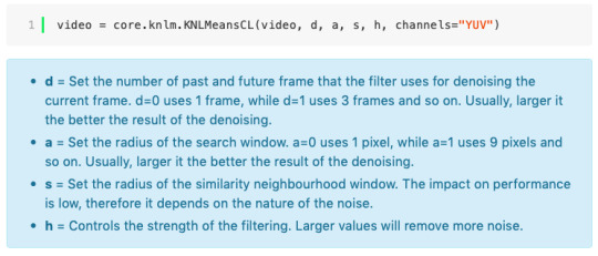
In the top left is where you will be applying your cropping, sharpening and denoising filters. Cropping: Keep in mind the Tumblr dimensions: 540px for full-width gifs and 268px for half size gifs, 177/178/177px for 3 gifs across. The height is completely up to your own preference. Usually I work in 540x300px. Once you edit those parameters you can drag/resize your video file to fit your new canvas. Sharpening + Denoising: You can choose to skip this if you would rather sharpen in ps. I personally do all my cropping, denoising and sharpening in vs. I use finesharp and KNML for sharpening and denoising respectively. Once you select those two filters from their drop down menus, be sure the select the checkbox as well. You should now notice 2 additional lines of code in the top right box. The line that reads: video = core.knlm.KNLMeansCL(video, 0, 6, 4, 1.2, channels="YUV") is where you will adjust your denoising parameters. You will only be adjusting those 4 numbers. I usually use: 0, 1, 0, 1.2. Now find the line that reads: video = hnw.FineSharp(video, sstr=0.22). These are your sharpening parameters. once again we’re only adjusting the number at the end. I typically use somewhere between 0.33-0.55. Depending on the quality of your source and preferences these parameters may change.
Here is a breakdown of the KNML parameters (source: @/nibreon HackMD):
Once you have finalized your parameters, copy all the code in that top right box and paste it into your vapoursynth editor. Note: you can ‘inactivate’ certain lines of code by adding the # symbol at the start the line. That line of code will then be greyed-out. This is what your code should now look like (the highlighted section is the part I just copy and pasted):

If you would like to preview your filters and see if you need to make any adjustments, simply navigate to the top bar and select script > preview. If you like what you see, great! If not, you can adjust the parameters directly in the editor until you see a result you’re happy with. Once you’re happy you can move onto the final step in vs: processing.
Processing: Once again, navigate to the top bar and select script > encode video. Another window should pop up. Make sure you set ‘header’ to ‘Y4M’ then click ‘start’. Patiently wait for that to finish processing. The longer your clip is and the more filters you add, the longer it will take.
IMPORTING YOUR CLIP INTO PHOTOSHOP (PS)
Now you’re done with the vapoursynth section! Not too hard, right? I use the timeline method when I gif. To import your video file into ps navigate to file > import > video frames to layers. Here you can use the sliders to further specify what range you would like to import. Make sure the ‘make frame animation’ box is checked. To optimize smoothness of your gif, avoid checking the ‘limit to every _ frames’ box. Hit ‘OK’ and wait for the frames to import. Depending on the size of your clip, ps may notify you that you are importing a large file and it may take a long time to process, simply say ‘ok’ to this. UNLESS you get a message saying it will limit to 500 frames. This means your clips contained more than 500 frames and you should select a smaller section to avoid cutting out any critical parts. (Note: you can always go back and repeat this process to select a smaller range of frames from the same video clip until you’ve imported all the frames you need).
Timing: You can adjust the timing of your gifs before converting to timeline. Select all the frames (Navigate to the icon with the 4 bars at the bottom right of you screen. Select “select all frames”). Click the drop down next to the timing of any of the frames. Select ‘other’ and input a your preferred timing. I personally use ‘0.04′ but I've seen people use anywhere from 0.4-0.8ms. Also as a note: when you convert your gif to timeline it has a tendency to mess up your timing so even if you input 0.04 or 0.05 it won’t actually be that timing later. If you want the true frame rate you can set your timing right before saving. You can also adjust timing at the end. (see export/saving gif section for more info)
Now the next part can be tedious and for that reason I’ve created numerous actions to speed up this process. But for the sake of this tutorial I will walk you through the steps. At the bottom of your screen is your timeline. As you can see, it defaults to frames, but we want to convert this into a smart object so that all your coloring/edits are made to all of the layers. To do this: 1) Navigate to the icon with the 4 bars at the bottom right of you screen. Select “select all frames” 2) Now select all your layers in your layer panel. On mac you can use cmd + option + A as a shortcut. 3) Back to the icon with the 4 bars, select “convert to video timeline” 4) Right click on all layers (which should still all be selected) and find “convert to smart object”
(Aside: Actions) actions are SUPER helpful to streamlining your giffing process. you can find actions people have made available on resource blogs like itsphotoshop OR you can choose to make your own custom actions. To do this, all you need to do is locate your action panel. Then from the controls at the bottom of the panel select the one that looks like a sheet of paper to “create a new action” Once you’ve named it and hit ‘ok’ the record icon should now be red. PS will now basically ‘record’ whatever you do. To stop recording hit the square icon. Now whenever you want ps to execute the same set of steps you just did, you can locate the action you just made and ‘play’ it by selecting the triangle icon. I highly recommend making an action for the steps I just outlined above to convert your gif into a smart object timeline. It will make your process much faster and more painless.
COLORING
Now the fun part! I focus on emphasizing the colors already present in the video source or getting rid of some less-than desirable overtones when I color. It gives the gif a natural look, but makes everything pop a little more. We will be working with selective color, curves, levels, and brightness/contrast mostly. This is the original gif I will be using to demonstrate coloring:

Curves: I always start with curves. The first curve layer I use to set a desirable black point. To do this, locate the top dropper icon from the curves panel and select the darkest point of your image. This will set that section to “true black” Feel free to play around with this until you find a desirable outcome. Now add another curves layer. This one we will be using to adjust the brightness/contrast. First, I always start off with ‘auto’ and see where that takes me. If you like the outcome, great! If you don’t play around with the different curve points until you get an outcome you like.

Selective Color: This adjustment layer will be your best friend. For me, I will typically work with reds, yellows, and black. If the source has a lot of blue/cyan I will use those too. Basically look at your source and determine which base colors you’d like to emphasize/alter. For blacks I usually up the black by +1-5 depending on the source. For reds, it also depends on the source. But I will typically either decrease cyan (to make red stand out more) or increase cyan (to make the red not look so overexposed). You want to be careful here. Overexposing the red can make your skin tones look like red tomatoes! And for my content base, where most of the actors are of asian descent, we should be emphasizing the yellows and NOT the reds (see aside on color correction + skin tones for more info). After altering the reds to my liking, I do the same process for the yellows. To bring back natural skin tones and color, you will likely want to darken the yellows, expose them a bit more and maybe even up the yellow slider. A common rule of thumb: if you want to make any of the colors less exposed, increase the cyan. If you want to increase exposure on any of the colors, decrease the cyan. If you want a color to appear more strongly or prominently, increase the black. The magentas and yellows I use more to adjust hues. You can add multiple selective color layers to further emphasize your changes.

Levels: Now we will work on the lighting some more. This creates more contrast and depth to your gif, often making them look ‘crisper’ To emphasize the bright parts, move the right-hand slider to the left. The emphasize the dark parts, move the left-hand slider to the right. You may also choose to move the middle slider to adjust more neutral lighting. Do so until you find a setting to your liking.

Miscellaneous: Depending on your gif you may need to play with other adjustment layers. Some other ones I often use are the brightness/contrast and exposure to adjust lighting and add more dimension to the gif. For additional color correction I use color balance and to a lesser extent hue/saturation and vibrance.

(Aside: Color correction + skin tones): We are anti-whitewashing and anti-redwashing when it comes to asian media. Like I mentioned earlier, natural asian skin tones have yellow undertones, not red/pink. Therefore when you’re bringing in color you should be mindful of this delicate balance. Adding more red does NOT equal un-whiteashing. Be VERY careful how you balance the yellows with selective color/hues/color balance.

^^ Here is an example of what I mean by overexposing the reds. Poor seungho is looking as sunburnt as a cherry tomato. Note: if your original source is already overexposed with red, fix it! You can do this by applying the same basic principles I explained earlier. Try upping the cyan on the reds in selective color, or shifting the color balance to favor cyan over red with the color balance adjustment layer. You may also choose to favor the yellow over blue.

^^ Now this is straight-up whitewashing. This is what happens when you are not careful with your correction of yellow. I’m not saying you can’t touch the yellow slider or get rid of some yellow form the overall image (because sometimes it is very much needed), but you should be very mindful how your corrections can affect skin tones. If you decide to decrease saturation of yellows, or decrease yellow in the selective color section of the reds, do so with caution. If your reds are looking too pink, add some yellow in the red selective color, up the yellow and black of the yellow selective color.

^^ If you hit that happy medium, you can emphasize the natural skin tones without overexposure. Here the underlying tones are very much still in the yellow range.
(Aside: Blending): I will very briefly talk about how to blend two gifs together. First make sure you’ve imported both your gifs into ps and converted them into the timeline format. On one of the gifs, right click the gif layer in the layer panel > duplicate layer > select the canvas of the gif you’d like to blend the gif with. On the canvas you just copied your second gif to, you can now drag the two layers around the on the canvas to get your desired positioning. On the top gif apply a layer mask. This can be found in your layers panel at the bottom, and is indicated by the white rectangle with the circle. Next, make sure you select the mask in the layer panel (it will show up as a white rectangle on the layer you applied the mask). Grab your paintbrush tool and make sure your color is set to black. Now you can effectively ‘erase’ the part of the top gif you don’t want to show anymore. I recommend setting your brush hardness to 0% to get a smoother transition. You can also play with the opacity settings. If you want to add back in a part you erased, just switch to a white paintbrush and you will be able to undo what you had just ‘erased’ with the black. When you merge the gifs, they will play the same number of frames. This means your blended gif length is limited by the gif with the fewer number of frames. You can move around your timeline layer and shorten the included portion by dragging either end of the timeline layer in until you get both gifs to play the parts you want.

CAPTIONS/SUBTITLES
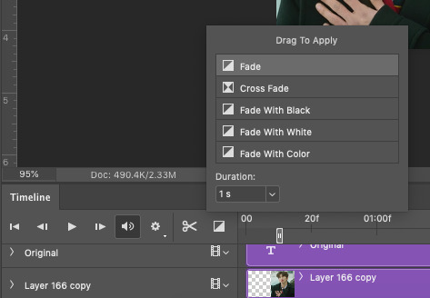
I often get asked about my subtitle font/styling settings. Personally I find the best fonts for subtitles are calibri and arial. I use calibri with the following settings: 12-14px, bold italic plus faux bold, 1px black stroke (optional: drop shadow set to ‘multiply’ at around 85% opacity), and tracking (VA) set to 75. If you would like your subtitles to fade-in or fade-out you can apply the ‘fade effect’. Locate the b/w square icon in your timeline panel. Select fade and drag it onto your text layer in your timeline. You can then right click on the wedge shape to adjust your fade duration. I usually use 0.35s. If you drag and drop the effect towards the beginning of your text you can get the fade-in effect. To get the fade-out, simply drag and drop your fade towards the end of your text layer.
SAVING/EXPORTING YOUR GIF
We’ve reached the final stretch! If you need to adjust your frame rate timing: you will need to revert your timeline to frames. To do this: 1) Navigate to the icon of 4 bars at the right of your timeline panel. Select convert frames > flatten frames into clips. 2) Navigate to the icon of 4 bars at the right of your timeline panel. Select convert frames > convert to frame animation > when promoted hit ’ok’. If at this point you see more than one frame in your timeline panel, delete the frames until only one is left. In the example below I would delete the first frame by hitting the trash icon from the timeline panel.

If there is only one frame, leave it as is. 3) Navigate to the icon of 4 bars at the right of your timeline panel. Select ‘make frames from layers’ You will most likely need to delete the first frame in your timeline panel (it won’t have your coloring). Sometimes ps adds in some ‘blank’ frames as well, delete those too. Now you can adjust your timing.
Once your timing is set: When you’re saving your gif, just keep in mind it must be under 10mb. Navigate to file > export > save for web. When it comes to your save settings I typically use either selective diffusion or adaptive diffusion. I also also occasionally use adaptive pattern (I find this is best for dark scenes without a lot of contrast). Set colors to 256, quality to bicubic and looping options to forever. If you want to preview your gif, hit the preview button in the bottom left. Otherwise, go ahead a hit ‘save’ and you’re DONE!


ADDITIONAL RESOURCES
Feel free to check out my ‘ps things’ tag for more photoshop stuff/mini tutorials. Additionally @/nibreon and the hackmd site I linked previously are your best resources for vs questions. If you would like to see my giffing process in motion feel free to check out this video. It’s sped up but you can slow down the playback. Additionally be sure to check out resource blogs like itsphotoshop for more helpful tutorials and resources.
If you reached the end of this beast, kudos to you! I hope this helps and never be afraid to reach out with any questions.
531 notes
·
View notes
Text
Hair or Lungs

A/N: I’m all for giving credit where credit is due, so big thanks to @carebearofriddles for the idea. Hope you guys like it!
And away, and away we go!
~~~
Calum made sure you and Roy were out before he finally came home from his holiday abroad. He, never being an early riser, often caught you and Roy chatting in the kitchen whenever you were over. In eavesdropping on those conversations, he had learned a lot about you. Like how your parents had a rule that you were allowed to do whatever you wanted to your body basically, provided it was temporary, and that you had shamelessly tested those boundaries by coming home with wild streaks of colors in your hair or a new piercing because “it’s temporary!”
You had since grown out of that rebellious phase, only keeping the piercings in your ears and dying your hair less frequently and more normal colors when you did. But you had loved your parents for allowing you that freedom to be you in the most you way, and it was something you planned to do for your own kids when you got to that point in your life. Because “hey, as long as it’s not addictive or harming anyone, what’s the problem?”
Well, Calum had changed up his hair. When you last saw him he was still rocking his blackish fluff of a hairstyle. The length was still the same, but the color was now a silvery blonde. And he couldn’t wait to film your reaction. So, he set up the camera, hit record, and waited.
~~~
“Roy! He’s here!” Calum heard your voice call out happily as your keys unlocked the front door. “Cal?! Cal!” you screamed before running into his arms. “I missed you!”
“I missed you, too!” he said, dragging you into the kitchen where he had his camera still waiting.
He reached down to scoop up Duke who was barking happily at him. He mumbled some cute nonsense at the dog before setting him down. Then, he ran a hand through his hair, drawing your attention to it.
“Oh, my God!” you said, clapping a hand to your mouth. “Cal! Your hair!”
“Looks good, yeah?”
“It looks great!” you said, running your hands through it. Damn, your man looked good. “Upstairs?”
“Now.”
~~~
“So, if he quits smoking before the end of the year, you 2 can’t have sex for 2 weeks,” Roy grinned over at you. Your roommate was tired of your late night sexcapades with Calum keeping him up.
You weighed the options. It was only February. Was this a bet worth taking? Yes, you decided. Calum was about to have a busy year ahead of him which meant your boyfriend would be smoking up a hell of a storm. “You’re on!” you grinned, shaking Roy’s hand.
You and Calum had been dating for close to two years, a relationship only your closest friends knew about. You both had agreed in the beginning of the relationship to keep each other off of your social media accounts and to only be intimate with each other when you were out of the public eye. It was hard, not being able to so much as hold his hand in public, but you respected Calum’s right to keep his relationship with you between just you and him. And, if you were being completely honest, you were scared for the world to know about your relationship. You had seen the type of nasty comments Crystal and Sierra received. No, it was much better to let the world think you and Calum were just friends. Because you were. He was your best friend, and you were his- “girl best friend, Ash, you’re still his guy best friend, calm down”- you just also happened to be dating him.
Calum kept himself hidden as he listened in on the conversation, smirking to himself. He had never had a reason to quit smoking. Until you. And now with this bet hanging between you and Roy, he was more determined than ever to make quitting stick this time.
~~~
The next drastic change Calum did to his hair was he cropped it super short, dying it silver in the process.
Again, he set up the camera to film your reaction.
“Jesus!” you said running your hands through it. “What are you gonna do next? Shave your head?”
Now that there was an idea! He just grinned. “Look, now you can mess it up and I don’t have to fix it before shows,” he told you, running his own hands furiously through his hair. “See? Nothing!”
You pouted. “I liked messing up your hair…”
“And I like not having to fix it,” he said, tapping a finger to your nose.
“We want the curls, Cal.”
“We?”
“We. Me. The fans. The curls. Give them back,” you said, giving a playful tug of his short hair.
“So, you can tug more of my hair? No thanks.”
“You love it, don’t lie,” you smirked, giving his hair another tug.
His eyes closed and he held back a moan. “Upstairs. Now.”
~~~
When he did eventually shave his head, he was in Korea, and you were home with Duke. Recording your reaction was going to take a little more work.
“Oh, God damn it!” you giggled when he Facetimed you. “Your beautiful hair… it’s gone…”
“It’s not all gone,” he insisted, giving his hair a rub. “Ah, that feels weird.”
“Yeah, cuz you shaved your damn head!” you laughed at him. “Oh, Cal…”
He pouted. “You don’t like it, huh?”
“I didn’t say that.”
“So?”
You sighed. “You look great, Cal. You always do. Now, hurry up, and come home so I can not mess up your hair.”
“Just got Australia left, and then I’m coming home to you.”
“You better.”
“I’ll be home before you know it, baby.”
~~~
“Cal!” you shrieked, coming home to find him home.
“Baby!” he smiled, taking you in his arms.
“Damn it! You’re gonna kill me with these hair changes!” you laughed, running your hands through his hair. The shaved head had grown out into a super short buzz cut, and your boyfriend’s hair was silver again.
“Are you saying you don’t like it?”
“I’m saying you’re gonna give me a heart attack with all these looks you keep serving. Just when I think I can breathe easy again, you drag me back to square one with a new look.”
“So, you do like it!”
“Upstairs. Now.”
He smoked his last cigarette after that.
~~~
“So, you actually quit?” Ashton asked as both men sat in salon chairs. Calum was getting his hair dyed blue, while Ashton was reverting back to his natural brown.
“Yep. Haven’t had a smoke in a week.”
“Damn, you really like her, huh?” Ashton teased.
“Fuck you, mate,” Calum laughed.
“In all seriousness though, I’m proud of you for finally quitting.”
“Me too.”
“So, are you finally going to go public with your relationship with her, too? I mean, you’ve been together like what? 2 years? You live together. You quit smoking for her. You just gonna marry her and still keep her a secret or what?”
Calum let out his breath in a huff. “I dunno, Ash. I mean, I asked her to move in after a year of dating 1.) because I love her and shit and 2.) because I felt guilty she’s stayed by my side while I act like we’re just friends in public. Like she deserved for me to show that I’m serious about her, and that was the best I was able to give her.”
“But that was then. This is now. Are you able to give her more now?”
“I quit smoking…”
“Cal…”
“Look, I’ve been making these videos of her, right? Every time I change my hair, I record her reaction. Ryan’s helping me make it into a video to give to her for our anniversary. When I give it to her, I’m also gonna tell her that I quit smoking for good. She makes me want to be a better man, mate.”
“That’s sweet Cal. I’m happy for you, really I am. Y/N’s a sweetheart. But, aren’t you ready to stop hiding behind the anti-love act and own up that you’ve actually been in love with someone this whole time? I know you guys were both scared at first. But, it doesn’t look like she’s going anywhere anytime soon.”
“Yeah, I guess you’re right.”
“I know,” Ashton smirked. Then, “She’s gonna be pissed you made her lose her bet with Roy. No sex for 2 weeks? Damn…”
“Yeah, that’s gonna suck.”
“Is that why you’re changing your hair so much? To make not smoking easier?”
“Shit, maybe… Hair or lungs I guess.”
“I’m glad you’re going with hair.”
~~~
“Calum… Thomas… HOOD!” you screamed, running to put your hands through his bright blue hair. “What the fuck are you doing?!”
“Keeping you on your toes?”
“More like slowly killing me.”
“I take it you like it?”
“Always, bubs, always.”
“Upstairs?”
“Now.”
~~~
“Oh, Cal…” you breathed, dabbing at your eyes as he showed you the video.
“Happy anniversary, baby.”
“Happy anniversary, bubs.”
“So, you like it?”
“I love it. Thank you.”
“Good, I thought you’d be mad I was filming you in secret.”
You laughed. “Is that why you were changing your hair so much? To make a video?”
“Well that and because it’s stopped me from smoking.”
“What?”
“Yeah, I quit two weeks ago.”
“Oh, Cal! That’s great!”
“I can’t take all the credit. You helped.”
“You quit for me?”
“Yeah. It was do crazy temporary things to my hair or keep damaging my lungs. And I need my lungs healthy because I plan on loving you for a long time.”
“Good, because I plan on loving you right back for just as long.”
“Now, sit, I want to show you something.”
“Show me what? Cal? What did you do now?”
He showed you how he posted the video to his social media accounts with the caption: “So, I’ve been keeping a secret. I’m in love with the amazing, beautiful, and incredibly smart @faby/n and today is our anniversary. She inspires me to be a better man, a better man who changes his hair instead of smoking. Happy 2 years, baby, and may we never stop counting the years together.”
“Oh, Cal…” you said, wiping at your eyes again. “I love you so much, bubs.”
“I’m sorry I didn’t ask first. But, I’m tired of hiding. I want the whole world to know how much I love you.”
“This is perfect.”
“And as much as I hate to break up this lovefest, you lose Y/N,” Roy said, snapping you and Calum out of your love daze.
“Damn it!” you groaned.
“Lose what?” Calum asked.
“Roy bet me that if you quit smoking this year then we couldn’t have sex for two weeks.”
“Oh, right.”
“What?”
“Yeah, I knew. I heard you guys make it.”
“You made me lose on purpose?! Calum!”
“You bet I wouldn’t quit!”
“Because I know how hard you’ve tried in the past!”
“I get to SLEEP!” Roy cheered.
You pulled a five dollar bill out of your pocket and tossed it at your roommate. “Buy some ear plugs, Roy.”
“What?! No sex! Two weeks! That was the bet!”
“Roy, lemme tell you how this is gonna go down. We all know it’s Cal keeping you up, not me. And you said no sex. There’s still plenty of other things I can do to Cal,” you told your roommate.
Calum cleared his throat as he knew exactly what you were talking about and tugged at his pants as they tightened at your words.
“That’s cheating!”
“It’s called a loophole, Roy. Now, I suggest you run, cuz I’m about to show the world how much I love me some Calum Hood.”
“Wait…? The world? Did you and Cal stop hiding?!”
“Yeah, mate,” Calum grinned at him, showing him the post that was blowing up with love for you both.
“I should’ve known Cal was whipped. Treat my brother right, Y/N. Have fun, you two,” Roy said, clapping a hand on Calum’s shoulder and leaving the house, a duffle bag slung over his shoulder.
“I’m not whipped…” Calum said, watching Roy leave you to enjoy each other in privacy.
“Cal?”
“Yeah, baby?”
“Upstairs.”
“Yes, baby.”
90 notes
·
View notes
Text
if i could date & kiss anyone it would be the Tunguska event was a large explosion that occurred near the Podkamennaya Tunguska River in Yeniseysk Governorate (now Krasnoyarsk Krai), Russia, on the morning of 30 June 1908 (NS).[1][2] The explosion over the sparsely populated Eastern Siberian Taiga flattened 2,000 square kilometres (770 square miles) of forest, and may have caused up to three human casualties.[3] The explosion is generally attributed to the air burst of a meteoroid. It is classified as an impact event, even though no impact crater has been found; the object is thought to have disintegrated at an altitude of 5 to 10 kilometres (3 to 6 miles) rather than to have hit the surface of the Earth.[4] The Tunguska event is the largest impact event on Earth in recorded history, but there have been larger impacts during prehistoric times. Studies have yielded different estimates of the meteoroid's size, on the order of 50 to 190 metres (160 to 620 feet), depending on whether the body entered with a low or high speed.[5] Since the 1908 event, there have been an estimated 1,000 scholarly papers (most in Russian) published on the Tunguska explosion. In 2013, a team of researchers published analysis results of micro-samples from a peat bog near the center of the affected area showing fragments that may be of meteoritic origin.[6][7] Early estimates of the energy of the air burst ranged from 10–15 megatons of TNT (42–63 petajoules) to 30 megatons of TNT (130 PJ),[8] depending on the exact height of burst estimated when the scaling laws from the effects of nuclear weapons are employed.[8][9] More recent calculations that include the effect of the object's momentum find that more of the energy was focused downward than would be the case from a nuclear explosion and estimate that the airburst had an energy range from 3 to 5 megatons of TNT (13 to 21 PJ).[9] A 2019 paper suggests the explosive power may have been around 20–30 megatons.[10] The 15-megaton (Mt) estimate represents an energy about 1,000 times greater than that of the atomic bomb dropped on Hiroshima, Japan—roughly equal to that of the United States' Castle Bravo (15.2 Mt) nuclear test in 1954, and about one-third that of the Soviet Union's Tsar Bomba explosion in 1961.[11] It is estimated that the Tunguska explosion knocked down 80 million trees over an area of 2,150 km2 (830 sq mi), and that the shock wave from the blast would have measured 5.0 on the Richter magnitude scale. An explosion of this magnitude would be capable of destroying a large metropolitan area.[12] Eyewitness reports indicate that at least three people may have died in the event.[13][14][15][16][3] The Tunguska event has helped to spark discussion of asteroid impact avoidance. Contents 1 Description 2 Investigations 3 Earth impactor model 4 Geophysical hypotheses 5 Similar events 6 In popular culture 7 See also 8 References 9 External links 1.1 Selected eyewitness reports 3.1 Asteroid air burst 3.2 Blast patterns 3.3 Asteroid or comet 3.4 Lake Cheko Description Trees knocked over by the Tunguska blast. Photograph from the Soviet Academy of Science 1927 expedition led by Leonid Kulik. On 30 June 1908 (cited in Russia as 17 Jun 1908, Julian Calendar, prior to implementation of the Soviet calendar in 1918), at around 07:17 local time, Evenki natives and Russian settlers in the hills north-west of Lake Baikal observed a column of bluish light, nearly as bright as the Sun, moving across the sky. About ten minutes later, there was a flash and a sound similar to artillery fire. Eyewitnesses closer to the explosion reported that the source of the sound moved from the east to the north of them. The sounds were accompanied by a shock wave that knocked people off their feet and broke windows hundreds of kilometres away. The explosion registered at seismic stations across Eurasia, and air waves from the blast were detected in Germany, Denmark, Croatia, the United Kingdom, and as far away as Batavia and Washington, D.C.[17] It is estimated that, in some places, the resulting shock wave was equivalent to an earthquake measuring 5.0 on the Richter magnitude scale.[18] Over the next few days night skies in Asia and Europe were aglow,[19] with contemporaneous reports of photographs being successfully taken at midnight in Sweden and Scotland.[17] It has been theorized that this effect was due to light passing through high-altitude ice particles that had formed at extremely low temperatures—a phenomenon that many years later was produced by space shuttles.[20][21] In the United States, a Smithsonian Astrophysical Observatory program at the Mount Wilson Observatory observed a months-long decrease in atmospheric transparency consistent with an increase in suspended dust particles.[22] Selected eyewitness reports Topi Tunguski, around the area where it fell. This photo is from the magazine Around the World, 1931. The original photo was taken between 1927 and 1930 (presumably, no later than 14 September 1930). Testimony of S. Semenov, as recorded by Leonid Kulik's expedition in 1930:[23] At breakfast time I was sitting by the house at Vanavara Trading Post [65 kilometres/40 miles south of the explosion], facing north. […] I suddenly saw that directly to the north, over Onkoul's Tunguska Road, the sky split in two and fire appeared high and wide over the forest [as Semenov showed, about 50 degrees up—expedition note]. The split in the sky grew larger, and the entire northern side was covered with fire. At that moment I became so hot that I couldn't bear it as if my shirt was on fire; from the northern side, where the fire was, came strong heat. I wanted to tear off my shirt and throw it down, but then the sky shut closed, and a strong thump sounded, and I was thrown a few metres. I lost my senses for a moment, but then my wife ran out and led me to the house. After that such noise came, as if rocks were falling or cannons were firing, the Earth shook, and when I was on the ground, I pressed my head down, fearing rocks would smash it. When the sky opened up, hot wind raced between the houses, like from cannons, which left traces in the ground like pathways, and it damaged some crops. Later we saw that many windows were shattered, and in the barn, a part of the iron lock snapped. Testimony of Chuchan of Shanyagir tribe, as recorded by I. M. Suslov in 1926:[24] We had a hut by the river with my brother Chekaren. We were sleeping. Suddenly we both woke up at the same time. Somebody shoved us. We heard whistling and felt strong wind. Chekaren said, 'Can you hear all those birds flying overhead?' We were both in the hut, couldn't see what was going on outside. Suddenly, I got shoved again, this time so hard I fell into the fire. I got scared. Chekaren got scared too. We started crying out for father, mother, brother, but no one answered. There was noise beyond the hut, we could hear trees falling down. Chekaren and I got out of our sleeping bags and wanted to run out, but then the thunder struck. This was the first thunder. The Earth began to move and rock, the wind hit our hut and knocked it over. My body was pushed down by sticks, but my head was in the clear. Then I saw a wonder: trees were falling, the branches were on fire, it became mighty bright, how can I say this, as if there was a second sun, my eyes were hurting, I even closed them. It was like what the Russians call lightning. And immediately there was a loud thunderclap. This was the second thunder. The morning was sunny, there were no clouds, our Sun was shining brightly as usual, and suddenly there came a second one! Chekaren and I had some difficulty getting out from under the remains of our hut. Then we saw that above, but in a different place, there was another flash, and loud thunder came. This was the third thunder strike. Wind came again, knocked us off our feet, struck the fallen trees. We looked at the fallen trees, watched the tree tops get snapped off, watched the fires. Suddenly Chekaren yelled "Look up" and pointed with his hand. I looked there and saw another flash, and it made another thunder. But the noise was less than before. This was the fourth strike, like normal thunder. Now I remember well there was also one more thunder strike, but it was small, and somewhere far away, where the Sun goes to sleep. Sibir newspaper, 2 July 1908:[25] On the morning of 17th of June,[26] around 9:00, we observed an unusual natural occurrence. In the north Karelinski village [200 verst (213 km (132 mi)) north of Kirensk] the peasants saw to the northwest, rather high above the horizon, some strangely bright (impossible to look at) bluish-white heavenly body, which for 10 minutes moved downwards. The body appeared as a "pipe", i.e., a cylinder. The sky was cloudless, only a small dark cloud was observed in the general direction of the bright body. It was hot and dry. As the body neared the ground (forest), the bright body seemed to smudge, and then turned into a giant billow of black smoke, and a loud knocking (not thunder) was heard as if large stones were falling, or artillery was fired. All buildings shook. At the same time the cloud began emitting flames of uncertain shapes. All villagers were stricken with panic and took to the streets, women cried, thinking it was the end of the world. The author of these lines was meantime in the forest about 6 versts [6.4 km] north of Kirensk and heard to the north east some kind of artillery barrage, that repeated in intervals of 15 minutes at least 10 times. In Kirensk in a few buildings in the walls facing north-east window glass shook. Siberian Life newspaper, 27 July 1908:[27] When the meteorite fell, strong tremors in the ground were observed, and near the Lovat village of the Kansk uezd two strong explosions were heard, as if from large-calibre artillery. Krasnoyaretz newspaper, 13 July 1908:[28] Kezhemskoe village. On the 17th an unusual atmospheric event was observed. At 7:43 the noise akin to a strong wind was heard. Immediately afterward a horrific thump sounded, followed by an earthquake that literally shook the buildings as if they were hit by a large log or a heavy rock. The first thump was followed by a second, and then a third. Then the interval between the first and the third thumps was accompanied by an unusual underground rattle, similar to a railway upon which dozens of trains are travelling at the same time. Afterward, for 5 to 6 minutes an exact likeness of artillery fire was heard: 50 to 60 salvoes in short, equal intervals, which got progressively weaker. After 1.5–2 minutes after one of the "barrages" six more thumps were heard, like cannon firing, but individual, loud and accompanied by tremors. The sky, at the first sight, appeared to be clear. There was no wind and no clouds. Upon closer inspection to the north, i.e. where most of the thumps were heard, a kind of an ashen cloud was seen near the horizon, which kept getting smaller and more transparent and possibly by around 2–3 p.m. completely disappeared. Tunguska's trajectory and the locations of five villages projected onto a plane normal to the Earth's surface and passing through the fireball's approach path. The scale is given by an adopted beginning height of 100 km. Three zenith angles ZR of the apparent radiant are assumed and the trajectories plotted by the solid, dashed, and dotted lines, respectively. The parenthesized data are the distances of the locations from the plane of projection: a plus sign indicates the location is south-south west of the plane; a minus sign, north-north east of it. The transliteration of the village names in this figure and the text is consistent with that of Paper I and differs somewhat from the transliteration in the current world atlases. InvestigationsIt was more than a decade after the event before any scientific analysis of the region took place, in part due to the isolation of the area. In 1921, the Russian mineralogist Leonid Kulik led a team to the Podkamennaya Tunguska River basin to conduct a survey for the Soviet Academy of Sciences.[29] Although they never visited the central blast area, the many local accounts of the event led Kulik to believe that the explosion had been caused by a giant meteorite impact. Upon returning, he persuaded the Soviet government to fund an expedition to the suspected impact zone, based on the prospect of salvaging meteoric iron.[30] Photograph from Kulik's 1929 expedition taken near the Hushmo River Kulik led a scientific expedition to the Tunguska blast site in 1927. He hired local Evenki hunters to guide them to the centre of the blast area, where they expected to find an impact crater. To their surprise, there was no crater to be found at ground zero. Instead they found a zone, roughly 8 kilometres (5.0 miles) across, where the trees were scorched and devoid of branches, but still standing upright.[30] The trees farther away had been partly scorched and knocked down in a direction away from the center. In the 1960s, it was established that the zone of levelled forest occupied an area of 2,150 km2 (830 sq mi), its shape resembling a gigantic spread-eagled butterfly with a "wingspan" of 70 km (43 mi) and a "body length" of 55 km (34 mi).[31] Upon closer examination, Kulik located holes that he erroneously concluded were meteorite holes; he did not have the means at that time to excavate the holes. During the next ten years there were three more expeditions to the area. Kulik found several dozens of little "pothole" bogs, each 10 to 50 metres (33 to 164 feet) in diameter, that he thought might be meteoric craters. After a laborious exercise in draining one of these bogs (the so-called "Suslov's crater", 32 m (105 ft) in diameter), he found an old stump on the bottom, ruling out the possibility that it was a meteoric crater. In 1938, Kulik arranged for an aerial photographic survey of the area[32] covering the central part of the levelled forest (250 square kilometres (97 sq mi)).[33] The negatives of these aerial photographs (1,500 negatives, each 18 by 18 centimetres (7.1 by 7.1 inches)) were burned in 1975 by order of Yevgeny Krinov, then Chairman of the Committee on Meteorites of the USSR Academy of Sciences, as part of an initiative to dispose of hazardous nitrate film.[33] Positive prints were preserved for further study in the Russian city of Tomsk.[34] Expeditions sent to the area in the 1950s and 1960s found microscopic silicate and magnetite spheres in siftings of the soil. Similar spheres were predicted to exist in the felled trees, although they could not be detected by contemporary means. Later expeditions did identify such spheres in the resin of the trees. Chemical analysis showed that the spheres contained high proportions of nickel relative to iron, which is also found in meteorites, leading to the conclusion they were of extraterrestrial origin. The concentration of the spheres in different regions of the soil was also found to be consistent with the expected distribution of debris from a meteoroid air burst.[35] Later studies of the spheres found unusual ratios of numerous other metals relative to the surrounding environment, which was taken as further evidence of their extraterrestrial origin.[36] Chemical analysis of peat bogs from the area also revealed numerous anomalies considered consistent with an impact event. The isotopic signatures of carbon, hydrogen, and nitrogen at the layer of the bogs corresponding to 1908 were found to be inconsistent with the isotopic ratios measured in the adjacent layers, and this abnormality was not found in bogs located outside the area. The region of the bogs showing these anomalous signatures also contains an unusually high proportion of iridium, similar to the iridium layer found in the Cretaceous–Paleogene boundary. These unusual proportions are believed to result from debris from the falling body that deposited in the bogs. The nitrogen is believed to have been deposited as acid rain, a suspected fallout from the explosion.[36][37][38] Researcher John Anfinogenov has suggested that a boulder found at the event site, known as John's stone, is a remnant of the meteorite,[39] but oxygen isotope analysis of the quartzite suggests that it is of hydrothermal origin, and probably related to Permian-Triassic Siberian Traps magmatism.[40] Earth impactor modelAsteroid air burst Comparison of possible sizes of Tunguska (TM mark) and Chelyabinsk meteoroids to Eiffel Tower and Empire State Building. The leading scientific explanation for the explosion is the air burst of an asteroid 6–10 km (4–6 mi) above Earth's surface. Meteoroids enter Earth's atmosphere from outer space every day, travelling at a speed of at least 11 km/s (7 mi/s). The heat generated by compression of air in front of the body (ram pressure) as it travels through the atmosphere is immense and most meteoroids burn up or explode before they reach the ground. Since the second half of the 20th century, close monitoring of Earth's atmosphere through infrasound and satellite observation has shown that asteroid air bursts with energies comparable to those of nuclear weapons routinely occur, although Tunguska-sized 5-15 megaton[41] events are much rarer. Eugene Shoemaker estimated that 20 kiloton events occur annually and that Tunguska sized events occur about once every 300 years.[8][42] More recent estimates place Tunguska-sized events at about once every thousand years, with 5 kiloton air bursts averaging about once per year.[43] Most of these air bursts are thought to be caused by asteroid impactors as opposed to mechanically weaker cometary materials based on their typical penetration depths into the Earth's atmosphere.[43] The largest asteroid air burst to be observed with modern instrumentation was the 500-kiloton Chelyabinsk meteor of 2013, which shattered windows and produced meteorites.[41] Blast patternsThe explosion's effect on the trees near the hypocentre of the explosion was similar to the effects of the conventional Operation Blowdown. These effects are caused by the blast wave produced by large airburst explosions. The trees directly below the explosion are stripped as the blast wave moves vertically downward, while trees farther away are knocked over because the blast wave is travelling closer to horizontal when it reaches them. Soviet experiments performed in the mid-1960s, with model forests (made of matches on wire stakes) and small explosive charges slid downward on wires, produced butterfly-shaped blast patterns similar to the pattern found at the Tunguska site. The experiments suggested that the object had approached at an angle of roughly 30 degrees from the ground and 115 degrees from north and had exploded in mid-air.[44] Asteroid or cometIn 1930, the British astronomer F. J. W. Whipple suggested that the Tunguska body was a small comet. A comet is composed of dust and volatiles, such as water ice and frozen gases, and could have been completely vaporised by the impact with Earth's atmosphere, leaving no obvious traces. The comet hypothesis was further supported by the glowing skies (or "skyglows" or "bright nights") observed across Europe for several evenings after the impact, possibly explained by dust and ice that had been dispersed from the comet's tail across the upper atmosphere.[8] The cometary hypothesis gained a general acceptance amongst Soviet Tunguska investigators by the 1960s.[8] In 1978, Slovak astronomer Ľubor Kresák suggested that the body was a fragment of Comet Encke. This is a periodic comet with an extremely short period of 3 years that stays entirely within the orbit of Jupiter. It is also responsible for the Beta Taurids, an annual meteor shower with a maximum activity around 28–29 June. The Tunguska event coincided with the peak activity of that shower,[45] and the approximate trajectory of the Tunguska object is consistent with what would be expected from a fragment of Comet Encke.[8] It is now known that bodies of this kind explode at frequent intervals tens to hundreds of kilometres above the ground. Military satellites have been observing these explosions for decades.[46] During 2019 astronomers searched for hypothesized asteroids ~100 metres in diameter from the Taurid swarm between 5–11 July, and 21 July – 10 August.[47] However, as of December 2019 there have been no reports of discoveries of any such objects. In 1983, astronomer Zdeněk Sekanina published a paper criticising the comet hypothesis. He pointed out that a body composed of cometary material, travelling through the atmosphere along such a shallow trajectory, ought to have disintegrated, whereas the Tunguska body apparently remained intact into the lower atmosphere. Sekanina argued that the evidence pointed to a dense, rocky object, probably of asteroidal origin. This hypothesis was further boosted in 2001, when Farinella, Foschini, et al. released a study calculating the probabilities based on orbital modelling extracted from the atmospheric trajectories of the Tunguska object. They concluded with a probability of 83% that the object moved on an asteroidal path originating from the asteroid belt, rather than on a cometary one (probability of 17%).[1] Proponents of the comet hypothesis have suggested that the object was an extinct comet with a stony mantle that allowed it to penetrate the atmosphere. The chief difficulty in the asteroid hypothesis is that a stony object should have produced a large crater where it struck the ground, but no such crater has been found. It has been hypothesised that the passage of the asteroid through the atmosphere caused pressures and temperatures to build up to a point where the asteroid abruptly disintegrated in a huge explosion. The destruction would have to have been so complete that no remnants of substantial size survived, and the material scattered into the upper atmosphere during the explosion would have caused the skyglows. Models published in 1993 suggested that the stony body would have been about 60 metres (200 ft) across, with physical properties somewhere between an ordinary chondrite and a carbonaceous chondrite.[citation needed] Typical carbonaceous chondrite substance tends to be dissolved with water rather quickly unless it is frozen.[48] Christopher Chyba and others have proposed a process whereby a stony meteorite could have exhibited the behaviour of the Tunguska impactor. Their models show that when the forces opposing a body's descent become greater than the cohesive force holding it together, it blows apart, releasing nearly all its energy at once. The result is no crater, with damage distributed over a fairly wide radius, and all of the damage resulting from the thermal energy released in the blast. Three-dimensional numerical modelling of the Tunguska impact done by Utyuzhnikov and Rudenko in 2008[49] supports the comet hypothesis. According to their results, the comet matter dispersed in the atmosphere, while the destruction of the forest was caused by the shock wave. During the 1990s, Italian researchers, coordinated by the physicist Giuseppe Longo from University of Bologna, extracted resin from the core of the trees in the area of impact to examine trapped particles that were present during the 1908 event. They found high levels of material commonly found in rocky asteroids and rarely found in comets.[50][51] Kelly et al. (2009) contend that the impact was caused by a comet because of the sightings of noctilucent clouds following the impact, a phenomenon caused by massive amounts of water vapor in the upper atmosphere. They compared the noctilucent cloud phenomenon to the exhaust plume from NASA's Endeavour space shuttle.[52][53] In 2013, analysis of fragments from the Tunguska site by a joint US-European team was consistent with an iron meteorite.[54] The February 2013 Chelyabinsk bolide event provided ample data for scientists to create new models for the Tunguska event. Researchers used data from both Tunguska and Chelyabinsk to perform a statistical study of over 50 million combinations of bolide and entry properties that could produce Tunguska-scale damage when breaking apart or exploding at similar altitudes. Some models focused on combinations of properties which created scenarios which similar effects to the tree fall pattern as well as the atmospheric and seismic pressure waves of Tunguska. Four different computer models produced similar results; they concluded that the likeliest candidate for the Tunguska impactor was a stony body between 50 and 80 m (164 and 262 ft) in diameter, entering the atmosphere at roughly 55,000 km/h (34,000 mph), exploding at 10 to 14 km (6 to 9 mi) altitude, and releasing explosive energy equivalent to between 10 and 30 megatons. This is similar to the blast energy equivalent of the 1980 Mount St. Helens eruption. The researchers also concluded impactors of this size only hit the Earth at an average interval scale of millennia.[55] Lake ChekoSee also: Lake ChekoIn June 2007, scientists from the University of Bologna identified a lake in the Tunguska region as a possible impact crater from the event. They do not dispute that the Tunguska body exploded in mid-air but believe that a ten-metre fragment survived the explosion and struck the ground. Lake Cheko is a small, bowl-shaped lake approximately 8 km (5.0 mi) north-northwest of the hypocentre.[56] The hypothesis has been disputed by other impact crater specialists.[57] A 1961 investigation had dismissed a modern origin of Lake Cheko, saying that the presence of metres-thick silt deposits at the lake's bed suggests an age of at least 5,000 years,[35] but more recent research suggests that only a metre or so of the sediment layer on the lake bed is "normal lacustrine sedimentation", a depth consistent with an age of about 100 years.[58] Acoustic-echo soundings of the lake floor provide support for the hypothesis that the lake was formed by the Tunguska event. The soundings revealed a conical shape for the lake bed, which is consistent with an impact crater.[59] Magnetic readings indicate a possible metre-sized chunk of rock below the lake's deepest point that may be a fragment of the colliding body.[59] Finally, the lake's long axis points to the hypocentre of the Tunguska explosion, about 7.0 km (4.3 mi) away.[59] Work is still being done at Lake Cheko to determine its origins.[60] The main points of the study are that Cheko, a small lake located in Siberia close to the epicentre of the 1908 Tunguska explosion, might fill a crater left by the impact of a fragment of a cosmic body. Sediment cores from the lake's bottom were studied to support or reject this hypothesis. A 175-centimetre-long (69 in) core, collected near the center of the lake, consists of an upper c. 1-metre-thick (39 in) sequence of lacustrine deposits overlaying coarser chaotic material. 210Pb and 137Cs indicate that the transition from lower to upper sequence occurred close to the time of the Tunguska event. Pollen analysis reveals that remains of aquatic plants are abundant in the top post-1908 sequence but are absent in the lower pre-1908 portion of the core. These results, including organic C, N and δ13C data, suggest that Lake Cheko formed at the time of the Tunguska event.[61] In 2017, new research by Russian scientists pointed to a rejection of the theory. They used soil research to prove that the lake is 280 years old or even much older; in any case clearly older than the Tunguska events.[62][63] Geophysical hypothesesThe scientific consensus is that the explosion was caused by the impact of a small asteroid, but there are some dissenters. Astrophysicist Wolfgang Kundt has proposed that the Tunguska event was caused by the release and subsequent explosion of 10 million tons of natural gas from within Earth's crust.[64][65][66][67][68] The basic idea is that natural gas leaked out of the crust and then rose to its equal-density height in the atmosphere; from there, it drifted downwind, in a sort of wick, which eventually found an ignition source such as lightning. Once the gas was ignited, the fire streaked along the wick, and then down to the source of the leak in the ground, whereupon there was the explosion. The similar verneshot hypothesis has also been proposed as a possible cause of the Tunguska event.[69][70][71] Other research has supported a geophysical mechanism for the event.[72][73][74] Similar eventsSee also: Fireball (meteor) and List of meteor air burstsThe Tunguska event is not the only example of a great unobserved explosion event. For example, the 1930 Curuçá River event in Brazil may have been an explosion of a superbolide that left no clear evidence of an impact crater. Modern developments in infrasound detection by the Comprehensive Nuclear-Test-Ban Treaty Organization and infrared DSP satellite technology have reduced the likelihood of undetected airbursts. A smaller air burst occurred over a populated area in Russia on 15 February 2013, at Chelyabinsk in the Ural district of Russia. The exploding meteoroid was an asteroid that measured about 17 to 20 metres across, with an estimated initial mass of 11,000 tonnes and which exploded with an energy release of approximately 500 kilotons.[55] It inflicted over 1,200 injuries, mainly from broken glass falling from windows shattered by its shock wave.[75] In popular cultureMain article: Tunguska event in popular cultureSee alsoPatomskiy crater, about 830 km (515 mi) to the east-southeast Sikhote-Alin meteorite, 1947 impact Tunguska Nature Reserve, protected area covering a portion of the site; ongoing scientific study of forest recovery Tall el-Hammam, a Middle Bronze Age site that one archaeological team has proposed was destroyed by an airburst
26 notes
·
View notes
Text
Who are You?
The Brief
Overview.
Without the use of words produce a series of connected images that visually illustrate who you are?
Create.
Exploring the work of other photographers and/or artists will help you develop a ‘visual story’ for your own work.
Give some thought to the things that are important to you. Everything you have ever done, the places you visit, the music you love, the stuff you keep, the memories and mementos carefully stored away are all part of what makes you unique. Consider how you might best illustrate who you are?
Produce.
1. Relevant research, planning and development of your work in your blog page.
2. One A3 ‘triptych’ portfolio quality print.
(The three images must include:
a. A self-portrait.
b. A place you’re connected to.
c. An object significant to you.
3. Three Individual full res 300ppi jpg files uploaded to My City.
4. An evaluation of the project in your blog page.
What is a Triptych in photography?

Modern photographic triptych
A photographic triptych is a common style used in modern commercial artwork. The photographs are usually arranged with a plain border between them. The work may consist of separate images that are variants on a theme, or may be one larger image split into three.
Source: Wikipedia https://en.wikipedia.org/wiki/Triptych
Research
Examples:

Alex Efimov “Three persons? Not sure” 2009
Source: https://www.artmajeur.com/en/e-gallery/artworks/3842743/triptych
I like this set up and treatment to portray 3 different sides of the one character.

Dimitri Mais
Source: https://www.dimitrimais.com/about-2
Could my Triptych show my self-portrait from behind and my 3 images? (including the self-portrait) as 3 images in a gallery space (which could be my special place?)
Concepts
Having researched other photographers work using Triptychs, I observe they often tell a story and when using self-portraits, use their images to convey their characters (inwardly and outwardly.) I like the concept of a single image spanning 3 panes with white between, which allows your mind to complete the picture in the unseen areas and when well executed (as in the picture used for the brief) can cover the portrait, place and object sections of the brief in a single, well composed image split into 3.
My concept is to incorporate my self-portrait into all 3 frames of the Triptych in an attempt to convey the 3 different roles I play on a daily basis The “Family Man” (centre frame with portrait shot from behind showing me looking at a photograph of my family (or objects that show I’m a father…Father’s Day gifts?), casually dressed – CENTRAL (and selfless represented by the back of my head shot focusing outwardly on my family) on to everything I do and matter most to me), “Business Man” (left hand frame in profile, looking to the right in an office/corporate environment, looking an object that typifies the business I work in - Still life of Sharpie, LX tape, open MacBook showing set visual? - dressed in business attire) and “Student” (right hand frame, in profile, looking to the left showing the College in the background, which would be the place that means a lot to me as it’s where I’m leaving the old businessman on the left frame to re-educate to be the photographer and new businessman on the right frame.
On reflection, some of the above concepts are fairly basic and possibly overly self-explanatory so I need to think of objects that more subtly hint at the message I’m trying to convey to the viewer and allow them to draw their own conclusions…
Treatment of 3 images:
I could maybe have the image on the left fade or become slightly out of focus to represent the fact that this part of my life is slipping into the past and have the image on the right-hand side coming into focus and sharpness to represent the future… How do I achieve this? Colours and tone of all 3 shots need to be sympathetic to each other, similar feel/family. Slow shutter speed on images left and right to show blurred action in the background and demonstrate fast paced action of both student and business?
Specific examples relating to the 3 stills I’m looking to shoot:
Possible type of shots for student portrait


Possible type of shots for business portrait

Possible type of shots for family portrait

Possible type of shots for family portrait


“Old School” photo album from ‘70’s

Father’s Day gifts
Today’s shoot captured the “Place” aspect of the project
This is my home studio where I spend time writing and recording music. Usually for pleasure, but occasionally for video projects or live events I’ve worked on over the years. This is my creative place that means a lot to me.
These are my favourite 2 shots...


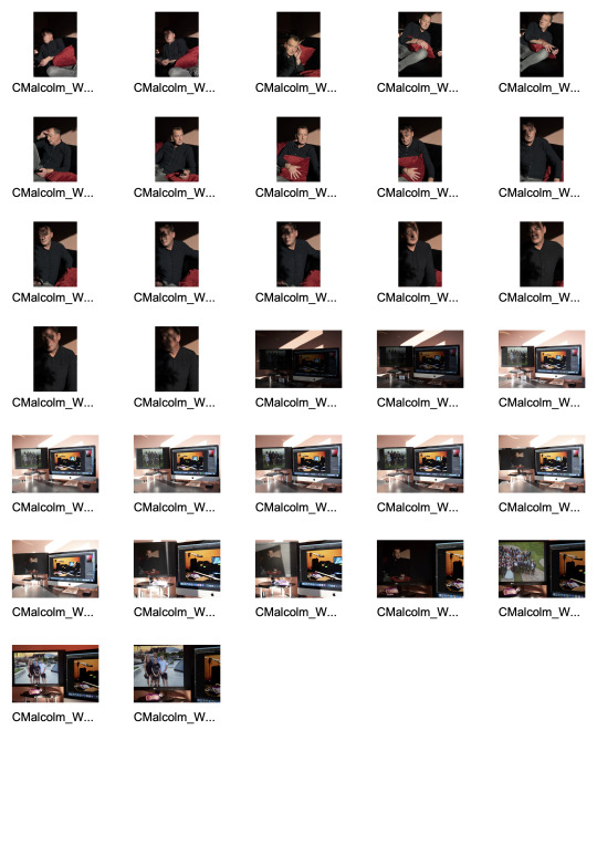
Contact sheet from this shoot:

Today I shot the “Stiil life” part of the project and the “Self portrait” shots. Below are the contact sheets from these sessions:

Individual shots chosen for first attempt:

I chose this one as I thought it would work better with the still life shot as it was sharper with the focus being on the mixing desk, rather than using the shallow depth of field shot I had previously chosen above.

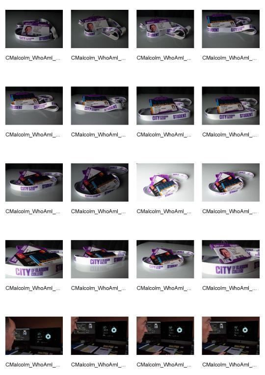
I liked this shot as it encompassed the various aspects of my life in ID cards and a business credit card, with the lanyard encompassing everything, hopefully showing it’s importance in the shot.

This, quite subtle silhouette portrait, was chosen as I wanted to show myself working in my office to demonstrate the business part of my life.
Full Colour Triptych

I thought the 3 images would work together better if I made the outside 2 square.
Black & White Triptych
I wasn’t happy that the tonality of all three images worked together well, so I converted them all to black and white in Photoshop. This helps with the tonality, however, I think it’s probably a bit of a cop out so need to look at better ways of making the 3 images work together as a triptych.

Class and lecturer Feedback
The feedback I received from my class mates was comments like “They are a working man”, “Productive lifestyle”, “Workaholic - puts a lot of energy into their work”, “Hard working person, enjoys studying and is passionate” and other very similar comments. This feedback was really useful as it showed I had conveyed part of the message of “Who am I” but also highlighted that I had not conveyed the family part of my message and should look at using the full versions of some of the original shots, which show the other aspects of my character and life. I had constructive feedback from my lecturer too, which gave me ideas on how to improve the shots and hopefully make them “hang” together better as a triptych.
Second attempt at triptych shots


My initial feeling is that while these images MAY be ok individually (although I am no longer happy with the self portrait as I feel it’s too dark), by the time they are put together as a triptych, there is just WAY too much going on in them and no real flow to them. I need to have a re-think and maybe look at shooting 3 more images that work well together, tell the story, as per the brief and I am happy with creatively. A better self portrait could be the answer, so I will re-shoot that this week.
Final shoot for triptych
Contact Sheet:
I realised today, that the best way to make sure all 3 images worked together tonally well, was to shoot them in the same place. Although I was reasonably happy with the still life, it was out of place in the triptych so I decided to drop that shot (along with the very dark and not too obvious) self portrait. The only shot I was happy with was the “place” one, so today, as the natural light coming into my studio/office was really nice and golden due to the time of year and cast interesting shadows, I decided to shoot the portrait there, in the next section of the room and the final “object” shot in the last part of the room, as the sunlight moved and illuminated the different areas in interesting ways.
For the portrait, I selected a shot I thought would work well, used in portrait format, in the centre of the triptych. I think the shot is fairly enigmatic and works quite well with the effects created by the sunlight and shadows. I would have liked better catchlights, however, I think the fact they aren’t prominent lends an air of mystique and maybe even sadness to the portrait.

For the “still life”, I decided to show my object as my iMac, as this is where I spend a lot of time working on content for my events, studying photography and viewing pictures of my family over the years. I dropped in several shots on the monitor on the left to show family are a large part of my life, however, finding a shot that tonally worked and didn’t look really cheesy and posed was not possible so, unfortunately, I dropped that idea from my final triptych and used a shot I think still told a bit of the story but really worked much better to give the flow I was looking for (and the picture within a picture). I really like the shapes in this image and think it works quite well.

Final Triptych

Evaluation
My initial research didn’t really give me anything in particular I wanted to emulate or I thought would work particularly well, with the concept I was trying to portray. The first 3 images (apart from the “place” one), were a bit literal and “corporate” and that was the message I got from the feedback (rightly so). I am happier with my final 3 images as I think the flow together in this triptych much better than the previous 3 which I realised were not only quite detached from each other but also were WAY to busy to allow the viewers eyes to view as single images but more importantly, as one overall image that wasn’t confusing but hopefully interesting, balanced and intriguing. I think that I am so used to thinking in terms of individual images rather than how they would all work together as a series, I found this brief quite hard, however, I am happier with my final triptych and look forward to feedback.
Today I had feedback with my lecturer who suggested cropping the self portrait as a square as he thought this would work better and show more of a relationship between the centre and right images, I did this and think it helps and gives a better balance. Below is the square portrait edit and beneath that, my final revised triptych.


2 notes
·
View notes
Text
2019 Top Games of the Week: Week 3

Not much is changing at the very top of the sport, but usually that takes more than a few weeks to figure out, but everything else, man, we’ve got a season on our hands. I mean, my god, Virginia and Maryland are ranked. Week 2 was packed with big games and near-miss upsets. I hope the trend continues as the weeks go on.
The Top Ten Games of the Week
10. TCU 1-0 (0-0) at Purdue 1-1 (0-0) (Saturday 9/14)
I’m a fan of this nonconference matchup, mostly because I can’t place either of these teams just yet. TCU has only played one game against an FCS opponent which doesn’t tell us a thing. Purdue has lost to Nevada but beat Vanderbilt pretty handily, so I really can’t say I’ve made up my mind about the Boilermakers except maybe Vanderbilt is worse than I thought.
9. Kansas State 2-0 (0-0) at Mississippi State 2-0 (0-0) (Saturday 9/14)
Neither team has played much competition so far, so this game could end up telling us a lot about each squad. Both are hoping to crash their respective conference races and could use some momentum going into league play.
8. #24 USC 2-0 (1-0) at BYU 1-1 (Saturday 9/14)
Well I’m very curious what’s gonna go on here. USC seems to have found themselves a gunslinger in true freshman Kedon Slovis at QB. Meanwhile, BYU has become the latest non-P5 team to go to Knoxville and come away with a win. The Trojans have to be the favorites here but Brigham Young, despite its best efforts, almost never gets a shot at a team like Southern California in Provo. This is a huge statement game for the Cougars and they should give SC their best shot.
7. #9 Florida 2-0 (0-0) at Kentucky 2-0 (0-0) (Saturday 9/14)
Do you believe in miracles? How about twice in a row? Last year Kentucky beat Florida in Gainesville for the first time since the 70′s. Now the Wildcats are tasked with taking down the Gators in Lexington for the first time since 1986 and with winning two in a row since 1976-77. It’s a tall order, but the seal has been broken. UK has the ability to beat Florida again, let’s see if they can take advantage.
6. #2 Alabama 2-0 (0-0) at South Carolina 1-1 (0-0) (Saturday 9/14)
I don’t think I’d have put this game on the top ten if it was played later in the season, but here we are. Alabama will probably crush South Carolina, but the Gamecocks just outdid their all-time scoring record on UT Martin, so maybe they can make something happen on offense. And besides, they aren’t playing Clemson yet, it’s not like this is the hardest game on the South Carolina’s schedule.
5. #1 Clemson 2-0 (0-0) at Syracuse 1-1 (0-0) (Saturday 9/14)
This one felt a lot more interesting before last week before Syracuse got blown up by Maryland. Clemson should probably knock over the Orange with little effort, but that’s what we all thought the last time the Tigers went to the Carrier Dome, and we all remember what happened then.
4. North Carolina 2-0 (0-0) at Wake Forest 2-0 (0-0) (Friday 9/13)
How can you not be fascinated by this game? North Carolina has turned from out and out loser to serious ACC Coastal contender in two weeks. Mack Brown has somehow resuscitated the Tar Heels in just two short weeks. Meanwhile, Wake Forest keeps plowing along, punching well above their weight in the past few years and looking to further improve up the Atlantic hierarchy despite massive institutional disadvantages. These long time, in-state rivals wanted to play each other so badly that they scheduled a non-conference series against each other to take the field this Friday night. That’s right, this isn’t even an ACC game and doesn’t count in the league standings. My god, this is just wild that we’re seeing this.
3. Arizona State 2-0 (0-0) at #18 Michigan State 2-0 (0-0) (Saturday 9/14)
This part of the season is so fun because narratives about each team are just starting to crop up. Not for Arizona State though. The Sun Devils are the only team in the PAC-12 South to have absolutely no buzz around them positive or negative. So we’ll learn a lot from them this week. Michigan State, meanwhile, needs a good challenge to see if the Spartans are the real deal or not. Against Tulsa they looked moribund, against WMU Sparty looked kind of scary on offense. Imagine if MSU had an offense, just the thought sends a chill down my spine.
2. #20 Washington State 2-0 (0-0) vs Houston 1-1 (0-0) (Saturday 9/14)
Boy, the PAC-12 could actually sink lower if they lose this one. They really shouldn’t if they want any part in the national conversation. This one is being played at NRG, allegedly a neutral site, but I don’t think anybody is buying that one. Oh yeah, it’s the Cougar Bowl. That’s kind cool.
1. #19 Iowa 2-0 (1-0) at Iowa State 1-0 (0-0) (Saturday 9/14)
As the prophesy foretold, one day, the Iowa-Iowa State would grab the nation’s attention. God I’m so mad that the AP took the Cyclones out of the top 25, even if it was warranted by almost losing to Northern Iowa. This could have been a top 25 matchup! That would’ve been so cool given that this game is usually either ignored or laughed at. Oh well, you’re missing out if you don’t watch this one. Iowa is one of the two serious players in the Big Ten West race and ISU has been among the three best teams in the Big 12 the past two years.
-
Top 5 G5 Games of the Week
5. Miami OH 1-1 (0-0) at Cincinnati 1-1 (0-0) (Saturday 9/14)
I’m a sucker for longstanding rivalry games, which explains why this matchup is in the top 5 and not something like Air Force at Colorado. I remain unrepentant. The Victory Bell is one of the G5′s best (and only) non-conference trophy games and it’s fantastic that these two still play every year. Also Cincinnati could use a tune-up after getting thrashed by Ohio State.
4. Southern Miss 1-1 (0-0) at Troy 1-0 (0-0) (Saturday 9/14)
I really like this regional non-conference matchup. Southern Miss and Troy are both hoping to win their respective conferences and a victory here would help out a great deal despite not counting in the official standings.
3. Hawaii 2-0 (0-0) at #23 Washington 1-1 (0-1) (Saturday 9/14)
I think Washington is going to use this game to remind people why they’ve won the PAC-12 twice in the last two years, but Hawaii has won two games already against PAC-12 opponents. We can dream.
2. Stanford 1-1 (0-1) at #17 UCF 2-0 (0-0) (Saturday 9/14)
UCF might have another big season here. The Knights are getting to play two P5 teams in a row and should be the favorites both times. Stanford started strong but ended up getting hammered by USC last week. KJ Costello should be back as QB but the Cardinal’s issues on offense and defense probably won’t get covered up fully against an experienced team like Central Florida.
1. #21 Maryland 2-0 (0-0) at Temple 1-0 (0-0) (Saturday 9/14)
Temple’s relatively innocuous game against Maryland has suddenly gained some importance now that the Terrapins have shown themselves to be severely underrated. The Owls have the chance to knock off a high flying opponent with a lot of momentum going their way.
-
FCS Games of the Week
I didn’t include the FCS vs P5 games this week, mostly because the FCS teams are all severely overmatched by P5 opponents. I mean, I think it’d be cool if they won, but it’s not very likely.
5. #13 Illinois State 1-1 (0-0) at Eastern Illinois 0-2 (0-0) (Saturday 9/14)
The Mid-America classic is one of the FCS’s most played rivalries outside of the Ivy League. Illinois State is probably Playoff bound, but the Redbirds have to win on the road against the rebuilding Panthers.
4. #6 Weber State 1-1 (0-0) at Nevada 1-1 (0-0) (Saturday 9/14)
Let’s get the transitive wins going. Nevada beat Purdue already. We could do some real damage here. Idaho State > Ohio State?
3. #4 Eastern Washington 1-1 (0-0) at #17 Jacksonville State 1-1 (0-0) (Saturday 9/14)
Two perennial FCS powerhouses square off in this Playoff preview. Jacksonville State might need this one a bit worse, though. The Gamecocks’ loss to SELA in Week 1 really took the wind out of their sails.
2. #1 North Dakota State 2-0 (0-0) at #18 Delaware 2-0 (1-0) (Saturday 9/14)
Two perennial FCS powerhouses square off in this Playoff preview. This time without a qualifier.
1. #8 Towson 2-0 (0-0) at #6 Maine 1-0 (0-0) (Saturday 9/14)
The CAA has gifted us with a great Top Ten matchup early on in the season. The only one in D-I football this week. Might as well watch it right?
#college football#TCU Horned Frogs#Purdue Boilermakers#Kansas State Wildcats#Mississippi State Bulldogs#USC Trojans#BYU Cougars#Florida Gators#Kentucky Wildcats#Alabama Crimson Tide#South Carolina Gamecocks#Clemson Tigers#Syracuse Orange#North Carolina Tar Heels#Wake Forest Demon Deacons#Arizona State Sun Devils#Michigan State Spartans#Washington State Cougars#Houston Cougars#Iowa Hawkeyes#Iowa State Cyclones#Miami Redhawks#Cincinnati Bearcats#Southern Miss Eagles#Troy Trojans#Hawaii Rainbow Warriors#Washington Huskies#Stanford Cardinal#UCF Knights#Maryland Terrapins
1 note
·
View note
Photo


✰ BEST REASONS TO WRITE FUCKIN’ RECORD REVIEWS IN 2018 ✰
✰✰✰✰✰ 6th ANNIVERSARY ✰✰✰✰✰
Neil Morris, speaking to Alan Lomax in 1959:
“Well, when I was just a small boy, Old Uncle Milt Oldfield…Billy Oldfield, the Congressman from Arkansas for so long, it is his father. He and my father are awfully close friends. And they were discussing music. They were music teachers both of them.
“And uh, and they said, dad did and Uncle Milt sanctioned what he said, that MUSIC HAD NO END. That you could learn all the other guy [or girl] learned, and after you got that done they would then, something else would crop up. That uh, that you, that was the reason why that uh, music advanced. That’s why that you would get a better music in one generation maybe that is, uh, IT WOULD FIT THE TIMES IN WHICH THEY LIVED.”
[Lomax: “What about music on the grapevine?”]
“Welllll, they said that MUSIC GREW LIKE THE GRAPEVINE THAT IS NEVER PRUNED. That each year it’d…it’d put on a little bit more. That was what they said, now, about it. Any further questions?”’
It’s time to feast from 2018′s Grapevine That Is Never Pruned with 123 (+ 162 more) of the BEST REASONS TO WRITE FUCKIN’ RECORD REVIEWS IN 2018!
A prefatory note: The Best Reasons campaigns of our first five years endured critiques from far and wide about too many damn records listed. Well...we can no longer countenance such reproach. Every single one of these nuggets is an essential thread in the tapestry of 2018′s combustible sonic arts! We here at FRR stand for ecumenicism and as such, consider the breadth of our listening parameters: Feeding Tube Records issued 74 items in 2018 (!), Clean Feed released about 80, and Astral Spirits about 30...that’s a lot potential gold in those three labels alone. Sure, it’s too much for any one person to absorb, but still...
We all know that some combination of easy access to home studio tools, world wide web streaming, social media delirium, legacy record industry collapse, and artistic resistance to creeping authoritarianism has (somewhat paradoxically) unleashed a tidal wave of idiosyncratically great music during the past decade, so it should come as no surprise that such a list as this would contain nearly 300 essential items. Yea, it seems nearly everything gets recorded and released these days (especially the zonked improv/collagist /noise/outer limits realm), but whether or not we listen to such items as frequently as we consumed Exile On Main Street or Cosmic Tones For Mental Therapy back in the day is irrelevant...the time is now, and as far as wild sounds from the outer dimensions goes, now has unprecedented bounty...listen heartily, for tomorrow, who knows?
(...all long playing records unless otherwise noted...also, the list was made complete with links, but grrr they don’t show up, so point your browser as they used to say and happy hunting!)
✩✩✩✩✩✩✩✩✩✩✩✩✩✩✩✩✩✩✩
✰ ROSALI Trouble Anyway (Scissor Tail) ✰
✩✩✩✩✩✩✩✩✩✩✩✩✩✩✩✩✩✩✩
✰ BRIDGET HAYDEN Pure Touch Only From Now On, They Said So (Early Music, Sweden) ✰
✰ YUZO IWATA Daylight Moon (Siltbreeze) ✰
✰ L$D FUNDRAISER Witness Disco (CocoMuse, New Zealand) ✰
✰ MAXINE FUNKE Silk (Feeding Tube) + Eternity 7” (I Dischi Del Barone, Sweden) ✰
✰ LONG HOTS Monday Night Raw cassette (self-released) ✰
✰ BASIC HUMAN Cassette (Meatspin, Australia) ✰
✰ LOOSE-Y CRUNCHÉ Unruly Top cassette (Altered States, Australia) ✰
✰ ETHERS Ethers (Trouble In Mind) ✰
✰ UNHOLY TWO The Pleasure To End All Pleasures (12XU)

✰ ZAÏMPH Rhizomatic Gaze 2LP (Drawing Room) ✰
✰ ALLISON COTTON All Is Quiet At The Ancient Theatre (Feeding Tube) ✰
✰ CONSTANT MONGREL Living In Excellence (Anti Fade, Australia / LVEUM, U.K.) ✰
✰ OTHERWORLD (aka Kay Logan) Mad Wee Light cassette (Kit, UK) ✰
✰ DUSK Dusk (Don Giovanni) & “The Pain Of Loneliness (Goes On And On)” 7″ (Dirtnap) ✰
✰ WENDY EISENBERG Its Shape Is Your Touch (VDSQ) ✰
✰ THALIA ZEDEK BAND Fighting Season (Thrill Jockey) ✰
✰ EN ATTENDANT ANA Lost And Found (Trouble In Mind) ✰
✰ MARK MORGAN Department of Heraldry (Open Mouth) ✰
✰ MORE KLEMENTINES More Klementines (Twin Lakes/Feeding Tube)✰
✰ PATOIS COUNSELORS Proper Release (ever/never) ✰

✰ ANNE GUTHRIE Brass Orchids (Students Of Decay)
✰ STEFAN CHRISTENSEN City Code (Knotwilg, Belgium) & Two Live cassette (The Loki Label)
✰ BB & The BLIPS Shame Job (Thrilling Living)
✰ SAMARA LUBELSKI / BILL NACE Samara Lubelski/Bill Nice (Relative Pitch)
✰ The SEDIMENT CLUB Stucco Thieves (Wharf Cat)
✰ BEAT DETECTIVES Rhythms & Edits Volume 1 cassette (Altered States, Australia)
✰ The COWBOYS Live At Tony’s Garage 7″ ep (Feel It) & The Cowboys [3rd Album] (HoZac - 2017)
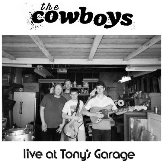
✰ SUSANA SANTOS SILVA All the Rivers – Live at Panteão Nacional cd (Clean Feed, Portugal)
✰ DIRE WOLVES Paradisiacal Mind (Feeding Tube/Cardinal Fuzz, U.K.)
✰ SPECIAL INTEREST/S Spiraling (Raw Sugar)
✰ JANUSZEWSKI & SZLAZAK Split cassette (Czaszka, U.K.)
✰ NYLEX Nylex cassette (Tenth Court, Australia)
✰ CHARALAMBIDES Tom And Christina Carter 2 LP (Drawing Room)
✰ CHRISTINA KUBISCH/ANNEA LOCKWOOD The Secret Life Of The Inaudible 2 cd (Gruenrekorder, Germany)
✰ HEAVY METAL Heavy Metal ep 7″ (Total Punk)
✰ LUJIACHI Invisible Hands cassette (Altered States, Australia)
✰ OBNOX Templo del Sonido (Astral Spirits/Monofonus Press)

✰ PINEAPPLE RNR Pineapple Rik N Roll 7″ (Lumpy)
✰ WILLIAM PARKER Voices Fall From The Sky 3 cd (AUM Fidelity)
✰ RON JONS SURF SHOP Ron Jons Surf Shop Sampler cassette (Ron Jons Surf Shop)
✰ LUCY MILLER Lion's Heart : Demos & Early Recordings cd-r (Soleils Bleus, France)
✰ BLUE CHEMISE Daughters Of Time (Students Of Decay)
✰ EKIN FIL Maps (Helen Scarsdale) & “Windblow” download (Longform Editions, Australia)

✰ COUNTER INTUITS Vietnamese Lighter 7″ (Total Punk)
✰ CHRONOPHAGE (Minneapolis) Prolog For Tomorrow (Cleta Petra)
✰ HOBBS-WHITE DUO Hobbs-White Duo at Whitechapel Gallery, 10 June 1973H download (EMC, UK)
✰ CHRONOPHAGE (Austin) Give Chance A Peace download (self-released)
✰ CIA DEBUTANTE Waves (Czaszka, U.K.)
✰ WEEPING BONG BAND Weeping Bong Band (Feeding Tube)
✰ COOLIES/The FUTURIANS Coolies/The Futurians split cassette (Uniform, New Zealand)
✰ QUIETUS Volume Four (ever/never)
✰ New Centre Of The Universe (Anti Fade, Australia)
✰ LISA CAMERON/SANDY EWEN See Creatures cassette (Astral Spirits)

✰ BRUTAL BIRTHDAY “Commotion” + 2 7” (Total Punk)
✰ DE PONTI/MORETTI Before We Were Foam We Were Unbridled Waves cassette (Dinzu Artefacts)
✰ DAVID NANCE GROUP Peaced And Slightly Pulverized (Trouble In Mind)
✰ CRAMMM Crammm cassette (Brainplan) & Live 2018 (Brainplan)
✰ NERVE BEATS Nerve Beats (Fine Concepts)
✰ WILLIE LANE Known Quantity reissue (Feeding Tube)
✰ The WAY AHEAD Bells, Ghosts And Other Saints cd (Clean Feed, Portugal)
✰ BADSKIN Where Was I (Brierfield Flood Press, Australia)

✰ The ANCIENTS Frozen Aisle (Tenth Court, Australia)
✰ METTE RASMUSSIN & CHRIS CORSANO A View Of The Moon (From The Sun) cd (Clean Feed, Portugal)
✰ SYLVIE COURVOISIER TRIO D’Agala cd (Intakt, Switzerland)
✰ MOSQUITOES Drip Water Hollow Out Stone (ever/never)
✰ CHARLOTTE HUG Son-Icon Music: Orchestra And Choral Works cd (Fundacja Słuchaj, Poland)
✰ RUSS WATERHOUSE Amaro cassette (Gertrude Tapes)
✰ RICHARD PAPIERCUTS Twisting The Night 12″ (ever/never)
✰ The COOL GREENHOUSE “London”/“The End Of The World” 7” (Market Square Recordings, Spain)
✰ SANDY EWEN & CHASE GARDNER Transfusion cd (Marginal Frequency)
✰ AMEEL BRECHT Polygraph Heartbeat (Kraak, Belgium)
✰ SUCCHIAMO Mani In Fuoco (Antinote, France)
✰ PORTRON PORTRON LOPEZ De Colère Et D'Envie (PoiL, France)
✰ TOM SMITH & MARK MORGAN Bones Sound Shipwreck cd (KSV, Germany)
✰ CIVIC New Vietnam 12″ (Anti Fade, Australia) & Those Who Know 7″ (Famous Class)

✰ CARLO GIUSTINO Non Uscire cassette (No Rent)
✰ DONALD MCPHERSON & TETUZI AKIYAMA The Kitchen Tapes, Volume 1 cassette (God In The Music, New Zealand)
✰ HORNE & HOLT Wires (Self-Sabotage)
✰ WOLKOROTS Don Treppenwitz cassette (Dinzu Artefacts)
✰SAVAK Beg Your Pardon (Ernest Jenning Record Co.)
✰ The BALKANYS The Balkanys (Toddi Records/Another Records, France)
✰ ANTELOPER Kudu cassette (International Anthem Recording Company)
✰ CLAIRE POTTER & BRIDGET HAYDEN’S I Am Come From A Place) cassette (Fort Evil Fruit, Ireland)

✰ LAURA LUNA CASTILLO Laminaires (Genot, Czech Republic)
✰ RST Spectra (\\NULL|ZØNE//)
✰ TORI KUDO ガラ刑GALAKEI 2 LP (bruit direct disques, France)
✰ SIGNE DAHLGREEN Kunki Snuk cassette (Astral Spirits)
✰ PIOUS FAULTS Old Thread (Feel It)
✰ MELFI Four Concerns cassette (Czaszka, U.K.)
✰ The EX 27 Passports (Ex Records, Netherlands)
✰ J.H. GURAJ Steadfast On Our Sand (Boring Machines, Italy)
✰ KUZU Hiljaisuus (Astral Spirits)
✰ WUSSY What Heaven Is Like (Shake It)
✰ BORZOI A Prayer For War (12XU)
✰ RAYS You Can Get There From Here (Trouble In Mind)
✰ DELPHINE DORA Eudaimon (three:four, Switzerland)
✰ LAKE MARY & M. SAGE Lupine Deluxe cassette (Patient Sounds (Intl))
✰ ART GRAY NOIZZ QUINTET “A Call To You”/”Won’t you Say It To My Face” 7″ (Robelion Music)

✰ VANILLA POPPERS I Like Your Band 7″ ep (Feel It)
✰ SOURDURE L’Espròva (Les Disques du Festival Permanent/Pagans, France)
✰ LOGARDECAY (Leslie García and Paloma López) FRGL cassette (Umor Rex, Mexico)
✰ DE KLUMB Con Pimiento cassette (U-Bac, Germany)
✰ MIDWIFE Prayer Hands cassette (Antiquated Future)
✰ SALAD BOYS This Is Glue (Trouble In Mind)
✰ RAMBLE TAMBLE Outlaw Overtones cassette (Eiderdown)
✰ ABBY LEE TEE Imaginary Friends I cassette (Czaszka, U.K.)
✰ INGRID LAUBROCK Contemporary Chaos Practices / Two Works For Orchestra With Soloists cd (Intakt, Switzerland)

✰ PATRICK SHIROISHI Sparrow's Tongue cassette (Fort Evil Fruit, Ireland)
✰ FIA FIELL All In The Same Room cassette (Nice Music, Australia)
✰ PREENING Nice Dice 7″ ep (Fine Concepts) & Greasetrap Frisbee 7″ (ever/never)
✰ SABASABA SabaSaba (Maple Death, U.K)
✰ HEADROOM/DIRE WOLVES Split (Pome Pome Tones/Centripetal Force)
✰ APOLOGIST Houston cassette (No Rent)
✰ The SITUATIONS The Day After The Night Before cassette (Melted Ice Cream, NZ)
✰ WONDERFULS Voices Like Rain cassette (Round Bale Recordings)
✰ TASHI DORJI & TYLER DAMON Leave No Trace: Live In St. Louis (Family Vineyard) & Soft Berm cassette (Magnetic South)

NAUJAWANAN BAIDAR Volume 1 cassette (Radio KHIYABAN, Netherlands)
LOUIS MINUS II Je Voudrais Juste Dormir Pour Toujours cassette (Econore, Germany)
The OPAWA 45s Silver Screen Guitar cassette (Melted Ice Cream, New Zealand)
MT ACCORD Postcards From A Dream cassette (Czaszka, U.K.)
JONÁŠ GRUSKA Žaburina (LOM, Slovakia)
CHICALOYOH Jaune Colère (213 Records, France)
MAMITRI YULITH EXPRESS YONAGUNISAN Yulith 2 LP (bruit direct disques, France)
AONGHIS MCENVOY & TRISTAN CLUTTERBUCK Duos cassette (Fractal Meat Cuts, UK)

IE Pone cassette (Moon Glyph)
MARILYN CRISPELL/TANYA KALMANOVITC/RICHARD TEITELBAUM Dream Libretto (Leo, U.K.)
E Negative World (Thrill Jockey)
Wound 2 lp (Carbon Records)
DOMINIQUE VACCARO Close Distances cassette (Dinzu Artefacts)
RIÑA Aqui No Eres Nadie 7″ ep (Thrilling Living)
GÜNTER BABY SOMMER & TILL BRÖNNER Baby’s Party cd (Intakt, Switzerland)
TRISTAN MAGNETIC Tristan Magnetique triple cassette box (Otomatik Muziek, Germany)
FAMOUS LOGS IN HISTORY Famous Logs In History cassette (Fuzzy Warbles)
LUKE STEWART’s Works For Upright Bass And Amplifier cassette (Astral Spirits)
RADIANT FUTUR Overdriven Youth download (Get Busy!, Russia)
LÄRMSCHUTZ TAFELMUSIK SEPTET Vierte Tafelmusik cassette (Katuktu Collective)

TERRESTIALS Terrestials 12″ (Heel Turn)
ALEX CRISPIN Open Submission cassette (Constellation Tatsu)
MAAVIN Sunday Drive EP download (Get Busy!, Russia)
CHARLOTTE HUG & LUCAS NIGGLI Fulguratio cd (Fundacja Słuchaj, Poland)
NAMELESS FRAMES Already Inside + 3 10″ (Super Secret Records)
GÜNTER SCHLIENZ Liederbuch cassette (Muzan Editions, Japan)
SCRAP BRAIN Scrap Brain (Thrilling Living)
WURLD SERIES Stately and Befrothed cassette (Melted Ice Cream, NZ)
ENDURANCE Celestial Governors cassette (Tymbal Tapes)
BRABRABRA Lagooona 7″ ep (Kitchen Leg, Germany)
DAN MELCHIOR ‘The Folksinger’ (Swashbuckling Hobo, Australia)
JEN KUTLER Worth cassette (Never Anything)
Field Recordings from the Sahel cassette (Sahel Sounds)
MONNONE ALONE Cut Knuckle 7” (Lost And Lonesome Recording Co., Australia)
ANDREW BARKER & DANIEL CARTER Polyhedron cassette (Astral Spirits)
YVES MALONE Aced (2014) cassette (Baked Tapes)
JOHN HOEGBERG Motion Detecting Songs cassette (Ehse)
CHAOSOPHY Who Are These People And What Do They Believe In cd (Discordian/Liquen Record, Spain)
ARIAN SHAFIEE A Scarlet Fail (VDSQ) & Beauty Tuning (Hausu Mountain)
AKIRA SAKATA & CHIKAMORACHI with MASAHIKO SATOH Proton Pump cd (Family Vineyard)

LEA BERTUCCI Metal Aether (NNA)
BIG SUPERMARKET 1800 (Hobbies Galore, Australia)
GARCIA PEOPLES Cosmic Cash (Beyond Beyond Is Beyond)
R.M.F.C. Hive cassette (Slime Street, Australia)
BIKINI COPS Three 7” (Drunken Sailor, U.K.)
MUYASSAR KURDI & NICHOLAS JOZWIAK Intersections & Variations cassette (Astral Spirts)
P WITS Blonde On Blonde double cassette (chemical imbalance., Australia)
FOLD Aegean Sea 12” (AUS, UK)
TASHI DORJI & DAVID GRUBBA Fixed Entrance Derivatives cassette (Sky Lantern)
WET PISS Wet Piss cassette (Dumpster Tapes)
TIM & THE BOYS Growing (Meatspin, Australia)
DINO SPILUTTINI Forever cassette (No Rent)
NEGATIVE NANCIES You Do You download (CocMuse, New Zealand)
MISSING PAGES “Long Way Down” 7″ (12XU)

SUNWATCHERS II & Illegal Moves 12” (both Trouble In Mind)
EYES NINETY Glaucoma Chameleon (Swashbuckling Hobo, Australia)
PATRICIA KOKETT Diabel 12” (Knekelhuis, Netherlands)
GEE TEE Gee Tee cassette (Slime Street, Australia)
C. WORTH A Farther Sea cassette (Gertrude Tapes)
OREN AMBARCHI/KONRAD SPRENGER/PHILLIP SOLLMANN Panama/Suez 12” (Ostgut Ton, Germany)
REX WONDERFUL & THE SILK SHEETS Ego Death cassette (Tenth Court, Australia)
SARAH DAVACHI Gave In Rest (Ba Da Bing) & Let Night Come On Bells End The Day (Recital)
PELVI$$ Pelvi$$ cassette (Fuzzy Warbles)
JEFF TOBIAS Completely Phantom cassette (Baked Tapes)
BILL ORCUTT & CHRIS CORSANO Brace Up! (Palilalia)
DONKEY BUGS Ancient Chinese Secrets (Lumpy)
MOUNTAIN MOVERS Pink Sky (Trouble In Mind) & New Jam 12″ (C/Site)
MAbH cinjusti cassette (Tymbal Tapes)
Bad Taste Vol. II - Another Collection Of Sounds From The NZ Underground cassette (chemical imbalance., Australia)

TERRY I’m Terry (Upset! The Rhythm, UK)
NYZ RLD GLD ET AL cassette (Fractal Meat Cuts, UK)
THEE OPEN SEX White Horses (Sophomore Lounge)
DRUNK MUMS Denim & Leather, Together Forever cassette (Slime Street, Australia)
JONES JONES [OCHS/DRESSER/TARASOV] A Jones In Time Saves Nine download (self-released)
IVAN THE TOLERABLE & FRIENDS Autodidact 10″ (Ack! Ack! Ack!, U.K.)
DANIEL CARTER / WILLIAM PARKER / MATTHEW SHIPP Seraphic Light cd (AUM Fidelity)
PURPUR SPYTT Nitpick 7″ ep (POUeT! Schallplatten, France)
BLOWDRYER Blowdryer cassette (self-released)
CHARNEL GROUND Charnel Ground (12XU)
KAJA DRAKSER / PETTER ELDH / CHRISTIAN LILLINGER Punkt.Vrt.Plastik cd (Intakt, Switzerland)
DRY CLEANING Sweet Princess cassette (self-released, U.K.)
ELKHORN Lion Fish cassette (Eiderdown)
ROMAIN BAUDOIN Bestiari (Pagans/In Situ, France)
SUNWATCHERS AND EUGENE CHADBOURNE 3 Characters 2 LP (Amish)

FRANCIS PLAGNE Moss Trumpet (Penultimate Press, U.K. )
SHITTY LIFE Switch Off Your Head (self-released, Italy)
SICK LLAMA Stage Poison double cassette (unifactor)
ROCKET 808 “Digital Billboards”/“Mystery Train” 7” (12XU)
JON COLLIN What Is Thunder cassette (Fort Evil Fruit, Ireland)
CONCRETE LAWN Demo cassette (Urge, Australia)
BLANK REALM Last Seen (Hobbies Galore, Australia)
DJ OVERDOSE DJ Overdose 12” (L.I.E.S.)
LUDWIG BERGER & VERONIKA EHRENSPERGER The Capacity Of Things To Act cassette (Dinzu Artefacts)
BRANDY Laugh Track (Monofonus Press)
PETER EVANS/ AGUSTÍ FERNÁNDEZ/BARRY GUY Free Radicals cd (Fundacja Słuchaj, Poland)
LES HALLES Zonda cassette (Not Not Fun)
SAMARA LUBELSKI Flickers At The Station (Drawing Room)
PRANA CRAFTER Bodhi Cheetah's Choice (Beyond Beyond Is Beyond)
YLAYALI Pumpkin Patch cassette (self-released)
DEAF WISH Lithium Zion (Sub Pop)
ROSE THOMAS BANNISTER Ambition cd (self-released)
MIDDEX No Home (Polytechnic Youth, UK)
SEI A Phase EP (Aus Music, U.K.)
KALI MALONE Cast Of Mind (Hollow Ground, Switzerland) & Organ Dirges 2016-2017 cassette (Ascetic House)
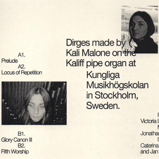
GERRIT HATCHER Parables For The Tenor cassette (Astral Spirits)
The 1902 Syntropic Seasonal 5 cd-r comp (Wist Rec, Ireland)
The LENTILS My Pillow Lava (Complete Trilogy) double cassette (unread)
SCY2E*GLOCHIDS*NURSE BETTY Weird Ear's Fantastic Voyage (Autumn East Coast Tour) comp (Weird Ear)
the SHIFTERS Have A Cunning Plan (Trouble In Mind)
CÉCILE CAPOZZO TRIO Sub Rosa cd (Ayler Records, France)
PROJET DE VIE Vol. #1 EP cassette ([Equilibre Fragile], France)
JAX DELUCA Organs In The Wind cassette (ACR, U.K.)
LUCY CLICHÉ Cliché’s Principle (Fleisch, Germany)
JANO DOE( aka KATARÍNA GATIALOVÁ) Duranzie cassette Genot Centre, Czech Republic)
KOMARE Komare cassette (Round Bale Recordings)
COLLATE Liminal Concerns (self-released)
AREK GULBENKOGLU A gift like a hollow vessel (Penultinate Press, UK)
BASIC HOUSE & WANDA GROUP No Sympathy (Opal Tapes, U.K.)
MANUEL TROLLER Vanishing Point (three: four, Switzerland)
STEPH RICHARDS/VINNY GOLIA/BERT TURETZKY Trio Music cd (pfmentum)

HEART OF SNAKE Heart Of Snake cassette (Maple Death, U.K.)
SCHWEBEN Sketches Of Plains cassette (Otomatik Muziek, Germany)
GENEVA SKEEN A Parallel Array Of Horses download (Room40, Australia)
IKUI DOKI Ikui Doki (Ayler, France)
CHARLES BARABÉ De La Fragilité cassette (Astral Spirits)
MIDNIGHT MINES Invisible Insurrection Of A Million Minds (The Loki Label) & Stations 7″ (I Dischi Del Barone, Sweden)
DELACAVE Window Has No Glass (POUeT! Schallplatten, France)
MARY LATTIMORE & MEG BAIRD Ghost Forests cd (Three Lobed Recordings)
M/M I Know You Are Thinking I've Said This All Before cassette (Czaska, U.K.)
The ATTACHMENTS II cassette (self-released)
TYSHAWN SOREY Pillars 3 cd (Firehouse 12)
JOËLLE LÉANDRE Strings Garden 3 cd (Fundacja Słuchaj, Poland)
STONE WITCHES Machine Efficient cassette (Slime Street, Australia)
CARA STACEY & CAMILO ÁNGELES Ceder (Kit, U.K)
DIRE WOLVES (JUST EXACTLY PERFECT SISTERS BAND) One For The Heads cassette (Baked Tapes) & Earthquake Country cassette (Sky Lantern) & Shootout At The Dildo Factory (Eiderdown) 142

(this is a pic of DIRE WOLVES with their eyes closed)
GEN POP II 7″ ep (Feel It)
ANGLES 3 Parede (Clean Feed, Portugal)
FRANK HURRICANE Holy Mountain Coffee tour cassette (self-released)
CARROM Prehistories cassette (self-released, Canada)
PARSNIP Feeling Small 7″ (Anti Fade, Australia)
ÁINE O’DWYER / GRAHAM LAMBKIN Green Ways 2 cd (erstwhile)
Longform Editions digital series, particularly: EKIN FIL “Windblow”, MARJA AHTI “Entering A Cloud” and STEAM VENT “Swells”
CLINTON GREEN Setting For The Iliad CD-R (Frustration Jazz, Australia)
PETER EVANS & BARRY GUY Syllogistic Moments cd (Maya Recordings, Swizterland)
ETRAN DE L’AÏR No. 1 (Sahel Sounds)

ALIEN NOSEJOB Various Fads & Technological Achievements (Anti Fade, Australia)
J.C. SATÀN Centaur Desire (Born Bad, France)
NAGUAL & STEFAN CHRISTENSEN Third 7″ (I Dischi Del Barone, Sweden)
EXEK Ahead Of Two Thoughts (W.25th) & A Casual Assembly 12″ (W.25th)
ARUÁN ORTIZ TRIO’s Live in Zurich (Intakt, Switzerland)
MIA DYBERG TRIO Ticket! (Clean Feed, Portugal)
LA DANTA Alpeis Καράκας cassette (Fort Evil Fruit, Ireland)
WEAK SIGNAL LP1 cassette (Reality Delay)
DISTANT STARS The Way Things Work cassette (Detonic, Australia)Field Recordings from the Sahel
MUDHONEY Digital Garbage (Sub Pop)
ROB NOTES & RYAN LEE CROSBY Modal Improvisations on 34 Strings cassette (Cabin Floor Esoterica)
...all those LOKI LABEL boots...
youtube
38 notes
·
View notes
Text
Exhibition review
19.09.2018
Recently my class went to go see a dual exhibition at Street Level Photoworks gallery. The two artists exhibiting were Steven Berkoff with ‘Gorbals 1966’ and Brian Griffin with ‘POP’.
“Steven Berkoff”
Steven Berkoff was born in Stepney, London in 1937 and is best known for being an actor, playwright, author, and theatre director. During his time off he would go out with his camera, photographing his surroundings.
He shot with 35mm analog in black and white and self-developed his prints. Living through the sixties and seventies his images documented everyday life around him. He was especially attracted to the run-down sort of neighborhoods because it was those areas in which he was raised. And due of that, Berkoff was able to show personal connection and reflection in his work.
Gorbals '66 was a never seen piece that depicts the period in Autumn 1966 when the council was tearing the neighborhood. They tell a story of a vital moment in history and that is why they are so important. To look at the Gorbals of today is like looking at a parallel universe. In an interview for The Herald newspaper, Berkoff says:
“I think we all have a vital interest in our past, and in our heritage,” “It’s what made us. It’s what shaped our values. It’s what developed us. And most of the time we have no idea about it because all the buildings are gone. All there is now is a lot of nightmarish utilitarian buildings. Seeing images of our past graces us with a strong memory of our home, and it’s so important to see that.”

Chatting With A Neighbour

A Little Gossip In Hell
I really enjoyed these two images. In the exhibition, they were placed separate due to their orientation but as I looked at them I saw a connection. In the first one, the subjects are staring at something out of shot but then in the second one, you see the same people and what seems to be their subject of interest. He approached the situation in a way that had each image separately say something different yet together kept the story.

Gorbals Tenement
I was also very captured by this image. Despite all of the destruction and what appears to be uninhabitable living situations, they are still there. Because they have nowhere else to go.

Hanging Around
There were many photos of children playing and it was really hard to pick just one. But compared to all of the others, this is the one I connected with most. When I looked at it, I saw myself and my sister.
“Brian Griffin”
Brian Griffin is known for being one of England’s most distinguished and influential portrait photographers. He was born in Birmingham in 1948 and worked as a freelance and music industry photographer up until the early nineties.
He shoots with many different cameras such as; a Phase One 645 AF Camera with a 30+ Phase One digital back, Hasselblad 500C, Mamiya 7, Canon 5D Mk II and an Olympus OM4, all with a variety of lenses but initially he used a 35mm Olympus OM-1 SLR that had a 3:2 format, which he would then crop into a square. He shoots in both colour and black and white and in 2004 began shooting both with film and digital.
During his earlier years he experimented quite a bit with whatever he had around him and thanks to his previous engineering education he had a good grip on the technical side of it all. Griffin’s work varies in content and location depending on the project. He has done many shoots in the studio using artificial light and even sometimes using self made contraptions and has done just as many on location using both artificial and natural light.
He is greatly influenced by fine art, especially by the Renaissance painters of the late 19th and early 20th century. He is also inspired by film and music itself. In an interview by Jo Plumridge for the Digital Photographer Review in 2011 Griffin says:
”Music also conjures up images and atmosphere, and I find it very cinematic.” “Lyrics often make me think of a band’s roots and inspirations, and where they’ve come from. The music can generate visuals.”
“POP” is a selection of the photographers favored work he initially published in a book, by the same name, in late 2017. It consists of images originally shot for album covers, posters and press for various artists in the seventies and eighties. He began working for STIFF records and quickly became the predominant photographer for New Wave, New Romantics, and Post-Punk bands and musicians.

Inner City Unit - Maximum Effect 01
I chose this image because of the dehumanization of the figure and its cinematic nature. The light and movement make it as if the subject is in the middle of a transformation into something nightmarish.

Placebo - Englands Trance
This is another favorite due to its geometrical contents and plays with the grayscale. Additionally, each element has its own distinct texture.

Howerd Jones - Cross The Line
This image caught my eye immediately. I loved the clarity of each texture and the gradual fade up of grayscale. All of the lines converge on the centered silhouetted figure and the authenticity of the subjects surprised/frightened emotions through body language.
Bibliography
Images
Griffin, B. (2018). Brian Griffin: Brian Griffin Photography. [online] Briangriffin.co.uk. Available at: http://www.briangriffin.co.uk/ [Accessed 14 Sep. 2018].
Griffin, B. (2018). Howerd Jones - Cross the line. [image] Available at: http://www.briangriffin.co.uk/images/project/ZPCLnDV3.jpg [Accessed 13 Sep. 2018].
Griffin, B. (2018). Inner city unit - Maximum effect 01. [image] Available at: http://www.briangriffin.co.uk/images/project/tbQv7y9Y.jpg [Accessed 13 Sep. 2018].
Griffin, B. (2018). Placebo - Englands Trance. [image] Available at: http://www.briangriffin.co.uk/images/project/YjjWagyg.jpg [Accessed 13 Sep. 2018].
Images by Steven Berkoff were taken by me direct from Street Level Photoworks Gallery.
Information
Cooper, N. (2018). No man's land: Steven Berkoff on his pictures of the Gorbals. The Herald. [online] Available at: https://www.heraldscotland.com/arts_ents/16349285.no-mans-land-steven-berkoff-on-his-pictures-of-the-gorbals/ [Accessed 13 Sep. 2018].
DPReview. (2018). Photographer Profile - Brian Griffin. [online] Available at: https://www.dpreview.com/articles/9720945142/photographer-profile-brian-griffin [Accessed 14 Sep. 2018].
Amateurphotographer.co.uk. (2018). Photographer Brian Griffin on creating his iconic album shots - Amateur Photographer. [online] Available at: https://www.amateurphotographer.co.uk/technique/interviews/pop-brian-griffin-113427 [Accessed 14 Sep. 2018].
1 note
·
View note
Photo

10 Women Who Should Be In The 1st Ever 30-Woman Royal Rumble Match
[January 28th, 2018]
When Stephanie McMahon announced that the Royal Rumble pay per view would not only include the traditional 30-man Royal Rumble but also the first ever 30-woman Royal Rumble, my brain started to work in overdrive. The WWE has plenty of women on the roster between Raw, SmackDown, and NXT, but how many of them would be featured in the Rumble match?
As of right now, 18 women have declared that they’ll be part of the Rumble match, which leaves 12 spots unaccounted for. Of course, there will be members of the Raw and SmackDown roster who are part of the Rumble, as well as potential members of the NXT roster, but the potential for surprises is incredible, especially following the reaction of some previously featured Raw Divas from the past. In this article, I’m gonna take a look at 10 women from the WWE’s history who I’d like to see in the first ever 30-woman Royal Rumble match.
1. Trish Stratus

She’s a former 7-time WWE Women’s Champion. Someone that I would assume most of the current crop of WWE female talents watched as teenagers, and a Hall Of Famer. Trish Stratus burst onto the WWE scene in 2000 as a manager but quickly won the fans over as one of the most hearty wrestlers in the company, holding her own in matches against the likes of Chyna, Molly Holly, Jacqueline, and her longtime rival Lita. At 41 years of age, Stratus in only a few years older than some current WWE girl wrestlers. I’d love to see Trish Stratus hit the Rumble to give Philadelphia some Stratusfaction!
2. Beth Phoenix

Affectionately known as “The Glamazon”, Beth Phoenix was relevant during a time when being a strong wrestler wasn’t the norm. While there were wrestlers such as Michelle McCool, Mickie James, Melina, Natalya, and others, having a strong focus on in-ring ability and physical dominance made her a standout wrestler. Phoenix is also one of only three women to compete in the 30-man Royal Rumble match, and holds the distinction of eliminating The Great Khali. As a former 3-time Women’s Champion and a former Divas Champion, the Hall Of Famer Phoenix would definitely be a welcome addition to something she certainly helped set the standard for. Plus, I’m pretty sure the world would go bananas to see Phoenix and Natalya in the ring one more time!
3. Bull Nakano

If you watched the WWF in the 1990s, there were two women you were terrified of: Luna Vachon and Bull Nakano. Although the former is sadly deceased, Nakano has continued to stay in great shape and has recently been a trainer, offering seminars in such companies as Rise. Nakano also competed in the Manami Toyota farewell gauntlet last November. Nakano is also a former WWF Women’s Champion, defeating Alundra Blayze and stopping what was nearly a year-long reign as champion. Once touted as the “Most Devastating” woman on the roster, it’d be interesting to see Nakano square up with some of the current crop. Imagine Nakano being face to face with Nia Jax, or even better… Asuka!
4. AJ Lee

There were Total Divas, and then there was AJ Lee. When the WWE put a focus on the E! Network reality show, Lee’s focus never drifted from being one of the most dominant wrestlers in the company, holding the WWE Divas Championship for over 400 days. Lee, in her short time with the WWE, made it a point to set records, as she’s tied with Aksana for the longest reign as the Queen Of FCW at 287 days and held the FCW Divas Championship for over 100 days. Lee sadly retired in 2015 due to an injury to her spinal cord, but could potentially make an appearance to get herself an elimination and to potentially share the ring with a future Women’s Champion.
5. Melina

I can’t say that I miss the era of women’s wrestling that Melina debuted in. At the time, the WWE Divas Search was how the company found talent, but Melina got some face time by taking a different route: competing in the Tough Enough competition. It didn’t take long for her to get addicted to the industry as she began clawing her way through the ranks at OVW until she debuted on SmackDown in April of 2005. The perfect blend of ability and beauty, Melina gained adulation by dedicating herself to her craft and becoming a two-time Divas Champion and a 3-time Women’s Champion. At the 2009 Night Of Champions event, Melina and Michelle McCool were scolded for being “too good”, to which Chris Jericho came to their defense. With that kind of endorsement, it seems that Melina is a shoo-in for the Rumble!
6. Lita

I was definitely surprised to not see the Hall Of Famer Lita on Raw during the segment when they featured former talents from the Divas division. After all, it was Lita who was in the first ever Raw main event to strictly feature women. Actually, the first two Raw main events to feature women, once against Trish Stratus and once against Stephanie McMahon. Lita was one of the first girls to hit the scene and perform hurricanranas off of the top rope and the apron, and would hit a moonsault at the drop of the hat, whether she was aiding wrestlers whose corner she was in or winning the WWE Women’s Championship, which she did four times. Lita should be a no-brainer for this match, and if AJ Lee were involved, the two having a face off would be a moment that the fans would never forget.
7. Victoria

While Trish Stratus was definitely a strong Women’s Champion, her limits had yet to be tested by someone who was willing to test her will in the ring. Enter Victoria, who in 2002, attacked Stratus and made a name for herself by making Trish fight, not just wrestle, but fight to keep the title. Their match at the 2002 Survivor Series is still one of my favorites of all-time and showed how tough Trish was by withstanding the brawling ability of Victoria. Over the next several years, Victoria proved that her place in the WWE was that of a gatekeeper, as anyone who would become anything in the WWE Divas division would have to hold their own against the “Widows Peak Freak”.
8. Molly Holly

The focus on the WWE women’s division became prominent in 2000, when it was no longer acceptable to be “just a pretty face”. Molly Holly was part of that movement, and along with Ivory, Tori, Jacqueline, and Trish Stratus, began to cultivate what would lead to the “women’s revolution” in the WWE. As a trainee of Dean Malenko and Fit Finlay, Molly’s focus was prominently on being a great wrestler and having a good match. Molly would defeat both Trish Stratus and Gail Kim to win the WWE Women’s Championship on two occasions. Holly is also one of only four women to have held the Hardcore Championship.
9. Jacqueline

If you told anyone that you were tough, Jacqueline would make you prove it. The tough Texan wrestled from 1988 until 2013, being inducted into the WWE Hall Of Fame in 2016. In 1998, when the WWF brought the Women’s Championship back, Jacqueline was the first champion to hold the new title, making Federation favorite Sable fight to gain the gold. Jacqueline would hold the title on two occasions, but would also become a Cruiserweight Champion in 2004 when she defeated Chavo Guerrero Jr. Jacqueline has proven for nearly three decades that she’s the bench mark for excellence when it comes to being a persistent fighter in the ring, and it would be great to see her celebrate 30 years in the business as part of the first ever 30-woman Royal Rumble match.
10. Alundra Blayze / Madusa

The return of the WWF Women’s Championship in 1993 was the rise of Alundra Blayze. A former AWA Women’s Champion, Blayze’s career began when she would feud with the likes of Sherri Martel and Luna Vachon before she even stepped foot in the WWF. Once she did, she became the cornerstone of the women’s division, becoming a 3-time WWF Women’s Champion. Her switch to WCW was also successful, as she became the Cruiserweight Champion when she defeated ex-boyfriend Evan Karagias as Madusa (which she’s more commonly known as). To take a look at the career of Blayze and her resurgence in the WWE where she was inducted into the Hall Of Fame in 2015, I would love to see someone who was a trailblazer for the company compete in the Rumble match.
There are several wrestlers who I wish I could have included on this list, such as Chyna, Luna Vachon, Sherri Martel, The Fabulous Moolah, and Mae Young. There are also some who I believe could be part of the Rumble who aren’t included, like Ivory, Kelly Kelly, Eve Torres, Michelle McCool, Kaitlyn, and others, but there are definitely some who I don’t want to see, and I’m pretty sure I agree with everyone on the one person none of us want to see involved. Nevertheless, there are so many women in the company’s history, including wrestlers of today, who have fought for this type of equality in the WWE and have proven that the appeal is certainly there. The 30-woman Royal Rumble match is a historic one, and with so much history behind it, there’s no doubt that there are several talents from wrestling’s past who deserve their tribute for the years of hard work.
#royal rumble#wwe#pro wrestling#wwe royal rumble#2010s#2018#30-woman royal rumble#trish stratus#beth phoenix#lita#aj lee#jacqueline#alundra blayze#molly holly#victoria#melina#bull nakano#wwf
30 notes
·
View notes
Text
Stop Motion Technical
What are the four most important rules for creating stop motions?
DON'T bump the camera.
DON'T change your camera settings.
DON'T alter your lighting.
DO shoot some test frames.
DO try to complete each scene without interruption.
DO take more shots than you think you'll need.
What equipment do you need?
You need your props (subject of the video) could be food, an ornament etc, you need a tripod to stop any uneven or any bumpy photographs, you need a table or a steady surface to place your objects on and you may also use an app on your phone to control your camera settings so you don't have to touch your camera which may cause shaking.
What are the standard resolutions for (resolution Width x Height e.g. 6000 x 4000):
• a TV at home -
480p Standard 720x480
• HD (high Definition TV) -
The most common native resolution for a high-definition TV screen is 1920 x 1080.
• UHD (Ultra High Definition TV) -
3840 x 2160 (UHD) resolutions as standard
• a Laptop you use-
MacBook Air models introduced in 2018 or later. Native resolution: 2560 x 1600 at 227 pixels per inch.
• a Desktop PC you use-
19-inch screen (standard ratio): 1280 x 1024 pixels. 20-inch screen (standard ratio): 1600 x 1200 pixels.
• a top spec iMac-
The 5K 27-inch iMac has a resolution of 5120 by 2880, while the 4K 21.5-inch iMac has a resolution of 4096 x 2304, and both models feature 500 nits brightness and wide color support for vivid, vibrant colors and impeccable picture quality.
• a smart Phone you use?
The iPhone 8 Plus has a 5.5-inch screen, which isn't especially big by today's standards. The iPhone 8 Plus' resolution is 1,920 x 1,080 with a pixel density of 401ppi.
What does the term ‘Aspect Ratio’ mean?
The ratio of the width to the height of an image or screen.
For the below screens, what are the different aspect ratio’s?
• a TV at home-
All TVs sold today have an aspect ratio of 16:9, which means that if the width is divided into 16 equal parts, the height of the TV or picture should be 9 parts
• HD (high Definition TV)-
16:9 (1.77:1) is a widescreen aspect ratio with a width of 16 units and height of 9.
• UHD (Ultra High Definition TV)
On the television side, Ultra-High Definition (UHD) was developed using the same number of horizontal lines of resolution as 4K (2160), but using the standard HDTV aspect ratio of 16:9 (or about 1.78:1). So the full resolution of a UHD display is 3840 by 2160 (or 256 pixels narrower than Cinema 4K).9 Sept 2015.
• a Laptop you use
Most current Macbook laptops other than the 11" Air use 16:10.
• a Desktop PC you use
As of 2016, most computer monitors use widescreen displays with an aspect ratio of 16:9, although some portable PCs use narrower aspect ratios like 3:2 and 16:10 while some high-end desktop monitors have adopted ultrawide displays.
• a top spec iMac
The 27" iMac display has a physical size of approximately 23.5" x 13.2" which is 16:9 aspect ratio.
• a smart Phone you use?
iPhone 8 Plus - 736 × 414 (16:9)
What is the PPI for the below devices?
• a TV at home -
13.3"
PPI
262.25
Resolution -3200 x 1800
Device - Samsung Ativ Q
• HD (high Definition TV) -
A 24 inches display that shows a Full HD image (1920×1080) has a density equal to 91,79 PPI.
• UHD (Ultra High Definition TV)-
At 100% magnification, the 3840 x 2160 pixel UHD 4K resolution can be fully utilised, but the pixel density is around 140 ppi, and the pixel pitch is about 0.18 mm
• a Laptop you use
MacBook Air 11 11.6 1366x768 (135.094)
• a Desktop PC you use-
When it comes to PC displays, most products have a pixel density of about 96 ppi to match the display density of 96 dpi (dots per inch) which has been the standard for the Windows desktop UI.
• a top spec iMac
iMac 27 27 2560x1440 (108.786)
• a smart Phone you use?
iPhone 7/8 Plus 5.5 1920x1080 (400.528)
The number of Frames Per Second (FPS) can vary, research commonly used FPS for Stop Motion / Animation / Video and consider the effect this has visually?
Most moving images you watch are shot at 24 frames per second or thirty frames per second. Which give a smoother, more steady effect when watching your film. When you're shooting stop motion, you might not have time to shoot that many, but you can get away with shooting 12 frames per second or even 7-10 frames per second if you are okay with a little bit of a jerky style.
The most common use of Stop Motion is probably in Social Media, what are the recommended aspect ratios & Resolutions & FPS for the below:
• Instagram -
Videos should be vertical (not landscape) with an aspect ratio of 9:16. Videos should have a minimum frame rate of 30 FPS (frames per second) and minimum resolution of 720 pixels. The maximum file size is 4 GB.
• Facebook
Minimum width: 120 pixels
Supported aspect ratios: 16:9 (horizontal) to 9:16 (full portrait)
Facebook recommends uploading videos in .MP4 and .MOV format with H.264 compression, square pixels, fixed frame rate, progressive scan, and stereo AAC audio compression at 128kbps+. Videos can be up to 240 minutes long, up to 4GB large, and have a maximum frame rate of 30fps.
• YouTube
Content should be encoded and uploaded in the same frame rate it was recorded. Common frame rates include 24, 25, 30, 48, 50, 60 frames per second (other frame rates are also acceptable).
The standard aspect ratio for YouTube on a computer is 16:9.
Interlaced content should be deinterlaced before uploading.
• Vimeo
Your video's resolution can vary, but most videos will fit a standard definition (SD) resolution of 640 x 480 (4:3 aspect ratio) or 640 x 360 (16:9 aspect ratio), 720p HD resolution of 1280 x 720 (16:9 aspect ratio), or a 1080p HD resolution of 1920 × 1080 (16:9 aspect ratio).
What would happen if you had too many pixels (resolution & PPI) when playing your Stop Motion on the above devices?
Instagram -
Instagram can often reduce the quality of your images during uploads for a wide number of reasons, but if you're looking to maintain quality then you should look to upload a high-quality, compressed JPEG file (max resolution: 1080 x 1350px) directly from your mobile or tablet to avoid any further compression.
Facebook -
Videos must be less than 240 minutes long. The longer your video is, the larger its file size will be. This may affect the quality of the video and the time it takes to upload. Lots of times I see people say they uploaded a 1080 video, and Facebook only lets them view it in 720.
While you can upload videos of virtually any aspect ratio, anything other than full portrait (9:16) will shrink your video and add unused space (colored gradient bars) to the top and bottom of the screen.
Youtube -
If you upload videos with a different aspect ratio, the player will “automatically frame them to ensure they are displayed correctly, without cropping or stretching, regardless of the size of the video or player.”For different aspects ratios, such as 9:16 (vertical videos on desktop browsers), YouTube will "add padding for optimal viewing. The padding is white by default, and dark gray when you use the Dark theme."
Vimeo -
If your footage exceeds 60 FPS, they will automatically reduce the frame rate.
Not all programs or websites can play back variable frame rate videos, and the audio can fall out-of-sync.
What does a TV do if it doesn’t have enough pixels & what is Photoshops equivalent?
In theory, the more pixels there are then the better the picture will be - as we will be able to see more detail.Now, you don't see each pixel at work as they are too small to see from a distance, but if you go up very close to your TV screen you will see how the image is built from this grid of small coloured dots. Any images that aren't actually in high-definition will just look slightly 'softer' and lack the sharpness you get with an HD image.The non-HD image will have always looked this way - it is just your new big-screen high-resolution TV that will highlight the low image resolution, and you will just notice it more.
Photoshop: Pixel Aspect Ratio: If you display rectangular pixels on a square-pixel monitor without alteration, images appear distorted; for example, circles distort into ovals. However, when displayed on a broadcast monitor, the images appear correctly proportioned because broadcast monitors use rectangular pixels.
When copying or importing images into a nonsquare pixel document, Photoshop automatically converts and scales the image to the pixel aspect ratio of the document. Images imported from Adobe Illustrator are also properly scaled.
How many pixels (resolution WxH e.g. 6000 x 4000) does your camera have:
Canon EOS 800D - 6000 × 4000 pixels
What is the resolution (WxH) of the recommended Stop Motion Brief?
1080 x 1920
What is the aspect ratio of the Brief submission?
Ratio 16:9
Draw a proportional sketch (or print from PhotoShop) of the difference between your camera aspect ratio and the brief submission.

How much of the image area do you need to crop out from your camera image
I had to crop about 1/3 of my full image out of the frame.
Does your camera allow you to change the aspect ratio so you can see the crop in camera when shooting?
My camera doesn't allow me to do this when shooting but when I view my images after I can use the crop tool to change the aspect ratio.
0 notes
Text
Biodiversity on our Terraces
I am excited about the diversity of the recent avian visitors to our high-rise terrace in Southbank. We live on level 5, not quite in the clouds, but overlooking a very busy and noisy intersection. We have a north-facing terrace of about 28 square metres and an east-facing one of 18 square metres, and our birds obviously love both of them.
Our northern open-air aviary has blossomed since we made a few adjustments to our garden. We are now almost enclosed, shielded from the outside with passionfruit vines all along the front and a healthy crop of leafy vegetables along the eastern side. Our full-height apartment windows form another side and a translucent glass wall finishes our almost-enclosure. Our eastern aviary is somewhat similar, walled in by dense vines, fruit trees and a host of green foliage bespeckled with flowers and vegetables.
Our front terrace is our main viewing area and we have replanted it recently with bird attracting shrubbery in mind. We planted quite a few particoloured flowering plants in the garden and have a tableful of pots with trailing leaves and flowers tumbling down almost to ground level. We have left some wilting leaves and other detritus on the ground to attract the insects and they have obviously attracted a few more birds.
Since my last post about our Currawongs, we have had repeat visits from one of them and have had several visits each day from a pair of adolescent Magpie-larks. A Little Raven has checked out our domain a few times. None of these have previously been regular visitors but our resident Sparrows, Doves and family of Mynas call in regularly every day. Our cloud of sparrows now spend more time on our smaller terrace, perhaps to avoid confrontation with the larger birds but they explore both areas when neither the Currawong nor the Raven is present. And to correct my previous record, as our Currawong has matured a little, we now believe it to be a Grey Currawong, rather than a Pied Currawong - and it certainly responds to the song of the Greys more than the Pieds’.
At any one time, we often have 4 or even 5 species present and we have delighted in their antics. We are usually only from 1 to 5 metres away from them with just a single pane of glass between us. They are well aware of our scrutiny, but obviously feel safe and confident unless we approach the open door.
The young Magpie-larks have spent a lot of time wandering around in the garden, selecting their lunch of insects from the flowers and other plants. They peck at many of our plants and appear to be eating some of the petals on the flowers as well - they certainly examine them closely and peck enthusiastically at them too. We often leave a few crumbs of toast out there and have experimented with a few other tasty morsels, greens and tiny pieces of fat or bacon rind, and the Magpie-larks have enjoyed both. I didn’t imagine they would go for the greens, but they have happily consumed our little offerings rather than destroying the foliage in out plantings.
The Raven, the Currawongs and the Mynas have also attacked the little pieces of protein with gusto, and the Doves, Sparrows, Mynas and Magpie-larks have enjoyed foraging for the tiny breadcrumbs we have left out. And we have watched the Currawong struggling with slightly larger tough crusts. He/she is very clever. He will toss the morsel around and if it is too crisp to swallow, he perches on the side of the birdbath and drops it in. He allows time for it to soak a little before retrieving it and consuming it with greater comfort.
(We usually leave a small amount of seed on our other terrace and both the Doves and Sparrows call us early each morning to provide them with a bit of brekky, but they are quite selective of which seeds they eat first from the current seed-mix we provide. The rapeseed is always left to last after everything else is consumed.)
All the birds except the Raven frequently use our little birdbath and we need to refill it several times a day when they splash vigorously and ruffle the water over the ground. We often see 2 or 3 birds in the birdbath at the same time and it is comical to see the Currawong in particular trying to bathe in the bath that is far too small for it. But we leave several different-sized water bowls around and all the birds visit several times a day to drink at, and bathe in, the bowl that most suits their respective sizes. The Sparrows often bathe in the smallest bowls if the birdbath is in use or too deep for them to use.
The Magpie-larks and Mynas in particular are very inquisitive and often approach close to the window and cock their heads while they peer inside at us. The Magpie-larks have actually poked their heads around the door jamb to check us out – perhaps we need to clean the windows more often to ensure they can see us without risking getting trapped inside. (We have had doves and sparrows inside on numerous occasions over the years and it stresses them until we can catch them or otherwise encourage to leave via the open door.) Occasionally, they give the windows a couple of desultory pecks, but without the insistence often displayed by mature male Magpie-larks (and others) who see their own reflection and imagine they are fighting off a rival.
The visits have often been quite extended, often 30 minutes or more, occasionally over an hour and all the birds have explored, and continue to explore, our plants for food – occasionally eating some of our greens, but regularly searching for bugs, beetles and other insects. They seem to see it as their secluded private playground and come and go quite freely, often exploring the same areas quite closely and making full use of the area as a food and drink source, a bathing area and simply a place to hang out with whatever birds are around when they drop in.
The fact that the area is largely enclosed probably gives them a sense of security without limiting their ability to fly in and out at any time. They seem to understand that we mean them no harm and they have certainly given us a great deal of entertainment and pleasure over the past couple of weeks in particular. There is no doubt in my mind that they believe that they have a relationship with us as just another (bigger) species - to be watchful about, but they investigate us with as much fascination as we are enthralled by them.
0 notes
Text
St. Jean Pied de Port to Estelle - 25 May – 1st June 2017
St. Jean Pied de Port to Estelle - 25 May – 1st June 2017
So having done the last section of the Camino last year from Sarria to Santiago, we wanted to sample another section of the camino and where else to start but at the beginning. Mind you there are many versions of the beginning of the Camino Francés but it is widely accepted that St Jean Pied de Port (SJPDP) in the South of France is the official starting point. We flew to Biarritz and arrived around 1pm. Very sunny, warm day. 34 degrees C. The flight had been delayed and then the baggage took ages or rather we were directed to the wrong luggage belt. I was conscious that if we didn’t get the 3pm train for SJPDP from Bayonne that we would have to wait until around 7 for the next one, leaving us late arriving. We also still had to get to Bayonne train station from the airport. I knew that there was a regular bus service to Bayonne that takes about 30 mins. We stood at the bus stop. We waited for ages. Many people left the bus stop and got taxis as the time was getting short to catch the 3pm train. Just as we were thinking of getting a taxi, the bus came along. I think it was €1 each. It seemed to take ages to get to Bayonne. We got there at about 2.50 pm but we still had to run across the road (with luggage) and queue up to buy the train tickets (€10 each). All this time we were talking to Dessie from NI who you could write a book on! I had spent 2 hours on the plane with him and he was a real character. By the time we got the tickets it was 2 mins to departure, to discover that the platform was on the other side, so down the steps with the suitcases and up the steps on the other side. We literally got on the train as it was pulling away. Phew! Got seats and left the luggage in the aisle as the train was full. It took around 1 hour to get to St Jean Pied de Port but it was great to get there.
A wee walk to the town and we found our first accommodation. I was a little worried about it as I found it very hard to get a hotel but anyway it turned out to be dead on and close to the town. The owner was very helpful with good English and told us about how warm it would be tomorrow and how difficult the hike to Roncesvalles would be! He had a strict rule that breakfast was 6.30 am to 7.30 am and you had to be out by 8am! This suited us as we knew it was going to be a long day and we wanted to leave early.
We ate in a restaurant in the town and had a few drinks at the Central Hotel sitting outside. Visited the Express Burricot offices who agreed to transport our luggage every day for the 5 days. They did a deal of around €6.50 per bag per day. It can be as high as €8. On the Sarria/Santiago stretch the fee is only €3 per day. We met Dessie again who had met a Donegal man Andy from Letterkenny. They were staying in a hostel. Dessie had managed to get a private room! We walked around the town. Lovely wee town with plenty bars and restaurants. We went to bed and had a good sleep. Little did we know what lay ahead!
St Jean Pied de Port to Roncesvalles 27 km
We got up early. Breakfast was orange juice, tea/coffee with a fresh bread roll. We left the accommodation at 7.40 am. We knew that the day ahead was going to be tough and a few hours walking before it got too warm was the plan. Everyone agrees that the walk (Napoleon’s Route) across the Pyrenees is very beautiful but quite difficult (there is an alternative route for when the weather is poor via Valcarlos but not recommended in good weather). I was delighted all the same that the sun was shining. I have seen plenty photos and videos of people doing the walk in a heavy mist, therefore missing out on the beautiful scenery.
Shorts and t-shirts. Bags with sun screen, water etc. on our backs and away we went. There is only one stop (café) on the whole 27 km and that is at Orrison after 8km. That first 8 km was hard even though it was largely on tarred roads but the scenery was beautiful. We were there around 9.40 or so. The sun was very hot, not much shelter from it and we were sweltered. Orrison is a hostel with a café, not a town! We stopped and had a ham roll and coffee. We met Andy who had shook off Dessie somewhere along the way. The views were spectacular. We could see some of the mountains in the distance that were still snow-capped. We continued on and it was mostly climbing. What was a welcome relief was that as we got further up the mountain, a cool breeze helped to cool us down. This was quite noticeable after Orrison. Eventually at 1pm we came to this white van which sold fruit, juice, hard boiled eggs etc. The sign said another 11km to go of which 1 km was up, 5km flat and 5km downhill. Lies! We seemed to climb for ages after the van but it might have been fatigue that made us think this. Mind you when you begin to descend toward Roncesvalles, it is quite tough on the legs because it is so steep, mainly through a forest. We didn’t see many people on this part, maybe some of them opted to go by the road? Anyway, we got to Roncesvalles around 4pm. Met Andy again who was showered and heading out for a wander (these fit people would sicken you!). Checked into Hotel Roncesvalles which is attached to the hostel and used to be a monastery. This hotel was a real treat! The accommodation and food there was excellent. Pilgrims menu (3 courses) including a bottle of the nicest red wine you ever tasted, all for €19 each. All the better when Peggy doesn’t drink wine! We went to mass in the chapel which is part of the same complex and met Dessie and Andy after it. After that, another wee drink at the hotel (outside of course) before bed-time.
Roncesvalles to Akeretta (29 km)
We had a good breakfast in the restaurant, left our cases as always at reception and headed on our way. I think we were not prepared physically or mentally for the day that lay ahead! In summary we had originally booked a place in Zubiri (which would have been around 22km) but friends of ours recommended strongly to proceed to Hotel Akaretta which was 6.5 km past Zubiri. So we booked into Hotel Akaretta and cancelled Zubiri. I think we were still not fully recovered from the previous day and found it hard going even though the terrain was largely flat. The sun shone again. Like the previous day where we saw a lot of horses, today we also saw large numbers of horses in fields. We got to Zubiri at about 4.30 pm in the afternoon. My advice to anyone would be to stay in Zubiri. There’s a new place opened there called Casa Txantxorena. It looks really nice. We were booked in there and how we wished we had not cancelled! We went for a snack at a busy café / bar on the corner before heading onwards towards Larrasoana / Akaretta. This went out past the outskirts of a large factory and onwards to Hotel Akaretta. It was 6.30 pm when we arrived! And we were whacked. My left foot was very sore in three places but no blisters. The bags were in the hallway and when we discovered that there was no lift in the 300 year old Hotel Akaretta, this meant that one exhausted person had to carry both 20kg bags upstairs. Thankfully we were only on the 1st floor! The hotel was old and very nice. It was where actor Martin Sheen stayed during the filming of the film “The Way”.
We showered and went to the dining room for dinner at 8pm. Another great value Pilgrim’s menu with really good wine again and the food was excellent. We had time to sit outside for a wee while before it was bed time. This past 3 days I had noticed that the area we were in was clearly Basque Country. The names of have a lot of Xs in them and they have a language of their own. I spoke to the owner a little about the Basque language etc. It was also noticeable yesterday that when we crossed from France into Spain there was no evident border. Just a large stone stating “Navarra”. They treat the entire region as one country. We noticed these fine big birds flying around and we were told they are buzzards.
Akaretta to Pamplona (16km)
I was a bit excited today because today we were heading for Pamplona. I was in Pamplona before back in the early 1980s when I just finished in college, so at least 34 years ago. For the record, I was accompanied on that occasion for the San Fermin festival by Aodh O Donnell (Stranakirka), Brian MacNamee (Kilcurry, Louth) and Declan McCarthy (Cavan) and we stayed at the home of the lovely family of a friend of ours, a Pamplona native, Ana Otaegi.
Back now in 2017, we ate a lovely breakfast. (I’m getting used to having coffee, cheese and bread for breakfast in the mornings). Because of the extra piece we walked yesterday, todays’ walk was a short distance and very pleasant. We seemed to be walking through fields of crops for the most part but it was beautiful. A beautiful sunny day. We stopped at a café/bar in a town on the outskirts of Pamplona. Very nice. People were enjoying their Sunday afternoon walking about. We reached Pamplona shortly afterwards and discovered that the hotel was near the side of the city we came into. We rested for a while and then went for a walk around the town. We had a meal in a restaurant near the Town Hall but it wasn’t great. We also did some research on buses to the next town as the feet were sore and the limbs were weary from the first three days! We discovered that there was a bus to the next village Puenta la Reina quite regularly from the bus station which was not too far from the hotel. Also the forecast for tomorrow wasn’t very good so tomorrow was officially designated as a “rest-day” and for taking in the sights of Pamplona! Best decision ever!
Pamplona to Peunta la Reina (24 km by bus!)
This day was spent mainly walking around Pamplona in the rain, eating in a well-known café in the square which Ernest Hemingway used to frequent, having a beer here and a Bacardi there and eventually heading for the bus station.
It was only 20 mins on the bus to Puenta la Reina and we got a lovely wee hotel (El Cerco) near the church (with the bell ringing every hour). We went to a local bar/restaurant and had a nice meal and a walk around. A quiet enough town with not too many restaurants or bars. In the middle of the night we thought we heard this singing outside the window, so we got up out of curiosity and there was a small group of people carrying a cross and singing and praying in the street. We hadn’t a clue what was going on. We found out the next day that it’s a custom when someone dies to do this ritual – like a procession – through the streets at 4 or 5 am.
Puenta la Reina to Estelle 22km
Nice breakfast in the morning, left the bags in reception and off we went walking towards Estelle. Great walk, the weather had turned sunny again and we passed through plenty fields and farmlands growing beans and grapes etc.
Our accommodation this time was an apartment near the centre of the town. It was a very nice 2 bedroomed apartment with living room, TV, kitchen. We didn’t need the half of it but it worked well. I needed to find out about the bus to San Sebastian tomorrow so I went toward the bus station about 10 mins walk away to see what I could find. There was a nice café at the station so I had a beer there and watched the comings and goings and got a bus timetable. Back to the apartment and then to the square where we ate outdoors and found the Spanish for “very well done” so as not to get a raw steak. There were 4 Northern Ireland bucks that we often saw, actually from the train the first day but never got chatting too much and they were in the vicinity as always. Off we went to bed looking forward to the adventure tomorrow to San Sebastian.
Estelle to San Sebastian (bus)
We found a nice café on the square where we got really nice breakfast (once they got going!). Estelle was our last town on this part of the Camino but we were relatively close to San Sebastian and decided to get a bus there and stay the night instead of staying in Biarritz. What a great decision! This city must be visited by everyone! It’s right on the beach, it has a lovely old town with nice churches, restaurants, tapas bars (they are called something else here). We got a Pension (about 15 min walk from bus station) near the beach and the old town, perfect location (Pension Pena Florida). This was a diversion from the camino but a worthwhile one. We knew (or hoped!) that the bus to Biarritz airport the next day would arrive in plenty time for the flight to Dublin. We ate in a Tapas bar and then went for a walk around the beach /promenade area, had an ice cream and took in the atmosphere.
San Sebastian to Biarritz airport (bus)
We got up early and went around the corner to a bar which was recommended by the Pension. They were only opening – a bit like yesterday – but we got another great breakfast! We then gathered our stuff from the Pension and walked to the bus station. We discovered that there were a number of providers with a bus service to the airport but we eventually got the soonest one and as always in Spain it left on time and arrived at the airport on time too. Biarritz airport is quite small so there was plenty time for hanging about. Some people went back outside to get the last rays of French sunshine before we would leave.
Another lovely week in the North of Spain (and the South of France). It was very different from last year when we went from Sarria to Santiago which was really outstanding. I think we bit off more than we could chew on the first two days this time which meant it wasn’t quite as enjoyable as last year. The highlight for both of us was San Sebastian. Anyone who is within striking distance of this city should spend at least one night there, even though it’s not quite on the Camino.
Buen Camino!
Eunan & Peggy Cunningham
June 2017
0 notes
Text
Getting the Most Out of Variable Fonts on Google Fonts
I have spent the past several years working (alongside a bunch of super talented people) on a font family called Recursive Sans & Mono, and it just launched officially on Google Fonts!
Wanna try it out super fast? Here’s the embed code to use the full Recursive variable font family from Google Fonts (but you will get a lot more flexibility & performance if you read further!)
<link href="https://fonts.googleapis.com/css2?family=Recursive:slnt,wght,CASL,CRSV,[email protected],300..1000,0..1,0..1,0..1&display=swap" rel="stylesheet">

Recursive is made for code, websites, apps, and more.

Recursive Mono has both Linear and Casual styles for different “voices” in code, along with cursive italics if you want them — plus a wider weight range for monospaced display typography.

Recursive Sans is proportional, but unlike most proportional fonts, letters maintain the same width across styles for more flexibility in UI interactions and layout.
I started Recursive as a thesis project for a type design masters program at KABK TypeMedia, and when I launched my type foundry, Arrow Type, I was subsequently commissioned by Google Fonts to finish and release Recursive as an open-source, OFL font.
You can see Recursive and learn more about it what it can do at recursive.design.
Recursive is made to be a flexible type family for both websites and code, where its main purpose is to give developers and designers some fun & useful type to play with, combining fresh aesthetics with the latest in font tech.
First, a necessary definition: variable fonts are font files that fit a range of styles inside one file, usually in a way that allows the font user to select a style from a fluid range of styles. These stylistic ranges are called variable axes, and can be parameters, like font weight, font width, optical size, font slant, or more creative things. In the case of Recursive, you can control the “Monospacedness” (from Mono to Sans) and “Casualness” (between a normal, linear style and a brushy, casual style). Each type family may have one or more of its own axes and, like many features of type, variable axes are another design consideration for font designers.
You may have seen that Google Fonts has started adding variable fonts to its vast collection. You may have read about some of the awesome things variable fonts can do. But, you may not realize that many of the variable fonts coming to Google Fonts (including Recursive) have a lot more stylistic range than you can get from the default Google Fonts front end.
Because Google Fonts has a huge range of users — many of them new to web development — it is understandable that they’re keeping things simple by only showing the “weight” axis for variable fonts. But, for fonts like Recursive, this simplification actually leaves out a bunch of options. On the Recursive page, Google Fonts shows visitors eight styles, plus one axis. However, Recursive actually has 64 preset styles (also called named instances), and a total of five variable axes you can adjust (which account for a slew of more potential custom styles).
Recursive can be divided into what I think of as one of four “subfamilies.” The part shown by Google Fonts is the simplest, proportional (sans-serif) version. The four Recursive subfamilies each have a range of weights, plus Italics, and can be categorized as:
Sans Linear: A proportional, “normal”-looking sans-serif font. This is what gets shown on the Google Fonts website.
Sans Casual: A proportional “brush casual” font
Mono Linear: A monospace “normal” font
Mono Casual: A monospace “brush casual” font
This is probably better to visualize than to describe in words. Here are two tables (one for Sans, the other for Mono) showing the 64 named instances:


But again, the main Google Fonts interface only provides access to eight of those styles, plus the Weight axis:

Recursive has 64 preset styles — and many more using when using custom axis settings — but Google Fonts only shows eight of the preset styles, and just the Weight axis of the five available variable axes.
Not many variable fonts today have more than a Weight axis, so this is an understandable UX choice in some sense. Still, I hope they add a little more flexibility in the future. As a font designer & type fan, seeing the current weight-only approach feels more like an artificial flattening than true simplification — sort of like if Google Maps were to “simplify” maps by excluding every road that wasn’t a highway.
Luckily, you can still access the full potential of variable fonts hosted by Google Fonts: meet the Google Fonts CSS API, version 2. Let’s take a look at how you can use this to get more out of Recursive.
But first, it is helpful to know a few things about how variable fonts work.
How variable fonts work, and why it matters
If you’ve ever worked with photos on the web then you know that you should never serve a 9,000-pixel JPEG file when a smaller version will do. Usually, you can shrink a photo down using compression to save bandwidth when users download it.
There are similar considerations for font files. You can often reduce the size of a font dramatically by subsetting the characters included in it (a bit like cropping pixels to just leave the area you need). You can further compress the file by converting it into a WOFF2 file (which is a bit like running a raster image file though an optimizer tool like imageOptim). Vendors that host fonts, like Google Fonts, will often do these things for you automatically.
Now, think of a video file. If you only need to show the first 10 seconds of a 60-second video, you could trim the last 50 seconds to have a much small video file.
Variable fonts are a bit like video files: they have one or more ranges of information (variable axes), and those can often either be trimmed down or “pinned” to a certain location, which helps to reduce file size.
Of course, variable fonts are nothing like video files. Fonts record each letter shape in vectors, (similar to SVGs store shape information). Variable fonts have multiple “source locations” which are like keyframes in an animation. To go between styles, the control points that make up letters are mathematically interpolated between their different source locations (also called deltas). A font may have many sets of deltas (at least one per variable axis, but sometimes more). To trim a variable font, then, you must trim out unneeded deltas.
As a specific example, the Casual axis in Recursive takes letterforms from “Linear” to “Casual” by interpolating vector control points between two extremes: basically, a normal drawing and a brushy drawing. The ampersand glyph animation below shows the mechanics in action: control points draw rounded corners at one extreme and shift to squared corners on the other end.
Generally, each added axis doubles the number of drawings that must exist to make a variable font work. Sometimes the number is more or less – Recursive’s Weight axis requires 3 locations (tripling the number of drawings), while its Cursive axis doesn’t require extra locations at all, but actually just activates different alternate glyphs that already exist at each location. But, the general math is: if you only use opt into fewer axes of a variable font, you will usually get a smaller file.
When using the Google Fonts API, you are actually opting into each axis. This way, instead of starting with a big file and whittling it down, you get to pick and choose the parts you want.
Variable axis tags
If you’re going to use the Google Fonts API, you first need to know about font axes abbreviations so you can use them yourself.
Variable font axes have abbreviations in the form of four-letter “tags.” These are lowercase for industry-standard axes and uppercase for axes invented by individual type designers (also called “custom” or “private” axes).
There are currently five standard axes a font can include:
wght – Weight, to control lightness and boldness
wdth – Width, to control overall letter width
opsz – Optical Size, to control adjustments to design for better readability at various sizes
ital – Italic, generally to switch between separate upright/italic designs
slnt – Slant, generally to control upright-to-slanted designs with intermediate values available
Custom axes can be almost anything. Recursive includes three of them — Monospace (MONO), Casual (CASL), and Cursive (CRSV) — plus two standard axes, wght and slnt.
Google Fonts API basics
When you configure a font embed from the Google Fonts interface, it gives you a bit of HTML or CSS which includes a URL, and this ultimately calls in a CSS document that includes one or more @font-face rules. This includes things like font names as well as links to font files on Google servers.
This URL is actually a way of calling the Google Fonts API, and has a lot more power than you might realize. It has a few basic parts:
The main URL, specifying the API (https://fonts.googleapis.com/css2)
Details about the fonts you are requesting in one or more family parameters
A font-display property setting in a display parameter
As an example, let’s say we want the regular weight of Recursive (in the Sans Linear subfamily). Here’s the URL we would use with our CSS @import:
@import url('https://fonts.googleapis.com/css2?family=Recursive&display=swap');
Or we can link it up in the <head> of our HTML:
<link href="https://fonts.googleapis.com/css2?family=Recursive&display=swap" rel="stylesheet">
Once that’s in place, we can start applying the font in CSS:
body { font-family: 'Recursive', sans-serif; }
There is a default value for each axis:
MONO 0 (Sans/proportional)
CASL 0 (Linear/normal)
wght 400 (Regular)
slnt 0 (upright)
CRSV 0 (Roman/non-cursive lowercase)
Choose your adventure: styles or axes
The Google Fonts API gives you two ways to request portions of variable fonts:
Listing axes and the specific non-default values you want from them
Listing axes and the ranges you want from them
Getting specific font styles
Font styles are requested by adding parameters to the Google Fonts URL. To keep the defaults on all axes but use get a Casual style, you could make the query Recursive:CASL@1 (this will serve Recursive Sans Casual Regular). To make that Recursive Mono Casual Regular, specify two axes before the @ and then their respective values (but remember, custom axes have uppercase tags):
https://fonts.googleapis.com/css2?family=Recursive:CASL,MONO@1,1&display=swap
To request both Regular and Bold, you would simply update the family call to Recursive:wght@400;700, adding the wght axis and specific values on it:
https://fonts.googleapis.com/css2?family=Recursive:wght@400;700&display=swap
A very helpful thing about Google Fonts is that you can request a bunch of individual styles from the API, and wherever possible, it will actually serve variable fonts that cover all of those requested styles, rather than separate font files for each style. This is true even when you are requesting specific locations, rather than variable axis ranges — if they can serve a smaller font file for your API request, they probably will.
As variable fonts can be trimmed more flexibility and efficiently in the future, the files served for given API requests will likely get smarter over time. So, for production sites, it may be best to request exactly the styles you need.
Where it gets interesting, however, is that you can also request variable axes. That allows you to retain a lot of design flexibility without changing your font requests every time you want to use a new style.
Getting a full variable font with the Google Fonts API
The Google Fonts API seeks to make fonts smaller by having users opt into only the styles and axes they want. But, to get the full benefits of variable fonts (more design flexibility in fewer files), you should use one or more axes. So, instead of requesting single styles with Recursive:wght@400;700, you can instead request that full range with Recursive:[email protected] (changing from the ; to .. to indicate a range), or even extending to the full Recursive weight range with Recursive:[email protected] (which adds very little file size, but a whole lot of extra design oomph).
You can add additional axes by listing them alphabetically (with lowercase standard axes first, then uppercase custom axes) before the @, then specifying their values or ranges after that in the same order. For instance, to add the MONO axis and the wght axis, you could use Recursive:wght,[email protected],0..1 as the font query.
Or, to get the full variable font, you could use the following URL:
https://fonts.googleapis.com/css2?family=Recursive:slnt,wght,CASL,CRSV,[email protected],300..1000,0..1,0..1,0..1&display=swap
Of course, you still need to put that into an HTML link, like this:
<link href="https://fonts.googleapis.com/css2?family=Recursive:slnt,wght,CASL,CRSV,[email protected],300..1000,0..1,0..1,0..1&display=swap" rel="stylesheet">
Customizing it further to balance flexibility and filesize
While it can be tempting to use every single axis of a variable font, it’s worth remembering that each additional axis adds to the overall files ize. So, if you really don’t expect to use an axis, it makes sense to leave it off. You can always add it later.
Let’s say you want Recursive’s Mono Casual styles in a range of weights,. You could use Recursive:wght,CASL,[email protected],1,1 like this:
<link href="https://fonts.googleapis.com/css2?family=Recursive:CASL,MONO,wght@1,1,300..1000&display=swap" rel="stylesheet">
You can, of course, add multiple font families to an API call with additional family parameters. Just be sure that the fonts are alphabetized by family name.
<link href="https://fonts.googleapis.com/css2?family=Inter:slnt,[email protected],100..900?family=Recursive:CASL,MONO,wght@1,1,300..1000&display=swap" rel="stylesheet">
Using variable fonts
The standard axes can all be controlled with existing CSS properties. For instance, if you have a variable font with a weight range, you can specify a specific weight with font-weight: 425;. A specific Slant can be requested with font-style: oblique 9deg;. All axes can be controlled with font-variation-settings. So, if you want a Mono Casual very-heavy style of Recursive (assuming you have called the full family as shown above), you could use the following CSS:
body { font-weight: 950; font-variation-settings: 'MONO' 1, 'CASL' 1; }
Something good to know: font-variation-settings is much nicer to use along with CSS custom properties.
Another useful thing to know is that, while you should be able to activate slant with font-style: italic; or font-style: oblique Xdeg;, browser support for this is inconsistent (at least at the time of this writing), so it is useful to utilize font-variation-settings for the Slant axis, as well.
You can read more specifics about designing with variable fonts at VariableFonts.io and in the excellent collection of CSS-Tricks articles on variable fonts.
Nerdy notes on the performance of variable fonts
If you were to using all 64 preset styles of Recursive as separate WOFF2 files (with their full, non-subset character set), it would be total of about 6.4 MB. By contrast, you could have that much stylistic range (and everything in between) at just 537 KB. Of course, that is a slightly absurd comparison — you would almost never actually use 64 styles on a single web page, especially not with their full character sets (and if you do, you should use subsets and unicode-range).
A better comparison is Recursive with one axis range versus styles within that axis range. In my testing, a Recursive WOFF2 file that’s subset to the “Google Fonts Latin Basic” character set (including only characters to cover English and western European languages), including the full 300–1000 Weight range (and all other axes “pinned” to their default values) is 60 KB. Meanwhile, a single style with the same subset is 25 KB. So, if you use just three weights of Recursive, you can save about 15 KB by using the variable font instead of individual files.
The full variable font as a subset WOFF2 clocks in at 281 KB which is kind of a lot for a font, but not so much if you compare it to the weight of a big JPEG image. So, if you assume that individual styles are about 25 KB, if you plan to use more than 11 styles, you would be better off using the variable font.
This kind of math is mostly an academic exercise for two big reasons:
Variable fonts aren’t just about file size.The much bigger advantage is that they allow you to just design, picking the exact font weights (or other styles) that you want. Is a font looking a little too light? Bump up the font-weight a bit, say from 400 to 425!
More importantly (as explained earlier), if you request variable font styles or axes from Google Fonts, they take care of the heavy lifting for you, sending whatever fonts they deem the most performant and useful based on your API request and the browsers visitors access your site from.
So, you don’t really need to go downloading fonts that the Google Fonts API returns to compare their file sizes. Still, it’s worth understanding the general tradeoffs so you can best decide when to opt into the variable axes and when to limit yourself to a couple of styles.
What’s next?
Fire up CodePen and give the API a try! For CodePen, you will probably want to use the CSS @import syntax, like this in the CSS panel:
@import url('https://fonts.googleapis.com/css2?family=Recursive:CASL,CRSV,MONO,slnt,[email protected],0..1,0..1,-15..0,300..1000&display=swap');
It is apparently better to use the HTML link syntax to avoid blocking parallel downloads of other resources. In CodePen, you’d crack open the Pen settings, select HTML, then drop the <link> in the HTML head settings.

Or, hey, you can just fork my CodePen and experiment there:
CodePen Embed Fallback
Take an API configuration shortcut
If you are want to skip the complexity of figuring out exact API calls and looking to opt into variable axes of Recursive and make semi-advanced API calls, I have put together a simple configuration tool on the Recursive minisite (click the “Get Recursive” button). This allows you to quickly select pinned styles or variable ranges that you want to use, and even gives estimates for the resulting file size. But, this only exposes some of the API’s functionality, and you can get more specific if you want. It’s my attempt to get people using the most stylistic range in the smallest files, taking into account the current limitations of variable font instancing.
Use Recursive for code
Also, Recursive is actually designed first as a font to use for code. You can use it on CodePen via your account settings. Better yet, you can download and use the latest Recursive release from GitHub and set it up in any code editor.
Explore more fonts!
The Google Fonts API doc helpfully includes a (partial) list of variable fonts along with details on their available axis ranges. Some of my favorites with axes beyond just Weight are Crimson Pro (ital, wght), Work Sans (ital, wght), Encode Sans (wdth, wght), and Inter (slnt, wght). You can also filter Google Fonts to show only variable fonts, though most of these results have only a Weight axis (still cool and useful, but don’t need custom URL configuration).
Some more amazing variable fonts are coming to Google Fonts. Some that I am especially looking forward to are:
Fraunces: “A display, “Old Style” soft-serif typeface inspired by the mannerisms of early 20th century typefaces such as Windsor, Souvenir, and the Cooper Series”
Roboto Flex: Like Roboto, but withan extensive ranges of Weight, Width, and Optical Size
Crispy: A creative, angular, super-flexible variable display font
Science Gothic: A squarish sans “based closely on Bank Gothic, a typeface from the early 1930s—but a lowercase, design axes, and language coverage have been added”
And yes, you can absolutely download and self-host these fonts if you want to use them on projects today. But stay tuned to Google Fonts for more awesomely-flexible typefaces to come!
Of course, the world of type is much bigger than open-source fonts. There are a bunch of incredible type foundries working on exciting, boundary-pushing fonts, and many of them are also exploring new & exciting territory in variable fonts. Many tend to take other approaches to licensing, but for the right project, a good typeface can be an extremely good value (I’m obviously biased, but for a simple argument, just look at how much typography strengthens brands like Apple, Stripe, Google, IBM, Figma, Slack, and so many more). If you want to feast your eyes on more possibilities and you don’t already know these names, definitely check out DJR, OHno, Grilli, XYZ, Dinamo, Typotheque, Underware, Bold Monday, and the many very-fun WIP projects on Future Fonts. (I’ve left out a bunch of other amazing foundries, but each of these has done stuff I particularly love, and this isn’t a directory of type foundries.)
Finally, some shameless plugs for myself: if you’d like to support me and my work beyond Recursive, please consider checking out my WIP versatile sans-serif Name Sans, signing up for my (very) infrequent newsletter, and giving me a follow on Instagram.
The post Getting the Most Out of Variable Fonts on Google Fonts appeared first on CSS-Tricks.
You can support CSS-Tricks by being an MVP Supporter.
Getting the Most Out of Variable Fonts on Google Fonts published first on https://deskbysnafu.tumblr.com/
0 notes
Text
Getting the Most Out of Variable Fonts on Google Fonts
I have spent the past several years working (alongside a bunch of super talented people) on a font family called Recursive Sans & Mono, and it just launched officially on Google Fonts!
Wanna try it out super fast? Here’s the embed code to use the full Recursive variable font family from Google Fonts (but you will get a lot more flexibility & performance if you read further!)
<link href="https://fonts.googleapis.com/css2?family=Recursive:slnt,wght,CASL,CRSV,[email protected],300..1000,0..1,0..1,0..1&display=swap" rel="stylesheet">

Recursive is made for code, websites, apps, and more.

Recursive Mono has both Linear and Casual styles for different “voices” in code, along with cursive italics if you want them — plus a wider weight range for monospaced display typography.

Recursive Sans is proportional, but unlike most proportional fonts, letters maintain the same width across styles for more flexibility in UI interactions and layout.
I started Recursive as a thesis project for a type design masters program at KABK TypeMedia, and when I launched my type foundry, Arrow Type, I was subsequently commissioned by Google Fonts to finish and release Recursive as an open-source, OFL font.
You can see Recursive and learn more about it what it can do at recursive.design.
Recursive is made to be a flexible type family for both websites and code, where its main purpose is to give developers and designers some fun & useful type to play with, combining fresh aesthetics with the latest in font tech.
First, a necessary definition: variable fonts are font files that fit a range of styles inside one file, usually in a way that allows the font user to select a style from a fluid range of styles. These stylistic ranges are called variable axes, and can be parameters, like font weight, font width, optical size, font slant, or more creative things. In the case of Recursive, you can control the “Monospacedness” (from Mono to Sans) and “Casualness” (between a normal, linear style and a brushy, casual style). Each type family may have one or more of its own axes and, like many features of type, variable axes are another design consideration for font designers.
You may have seen that Google Fonts has started adding variable fonts to its vast collection. You may have read about some of the awesome things variable fonts can do. But, you may not realize that many of the variable fonts coming to Google Fonts (including Recursive) have a lot more stylistic range than you can get from the default Google Fonts front end.
Because Google Fonts has a huge range of users — many of them new to web development — it is understandable that they’re keeping things simple by only showing the “weight” axis for variable fonts. But, for fonts like Recursive, this simplification actually leaves out a bunch of options. On the Recursive page, Google Fonts shows visitors eight styles, plus one axis. However, Recursive actually has 64 preset styles (also called named instances), and a total of five variable axes you can adjust (which account for a slew of more potential custom styles).
Recursive can be divided into what I think of as one of four “subfamilies.” The part shown by Google Fonts is the simplest, proportional (sans-serif) version. The four Recursive subfamilies each have a range of weights, plus Italics, and can be categorized as:
Sans Linear: A proportional, “normal”-looking sans-serif font. This is what gets shown on the Google Fonts website.
Sans Casual: A proportional “brush casual” font
Mono Linear: A monospace “normal” font
Mono Casual: A monospace “brush casual” font
This is probably better to visualize than to describe in words. Here are two tables (one for Sans, the other for Mono) showing the 64 named instances:


But again, the main Google Fonts interface only provides access to eight of those styles, plus the Weight axis:

Recursive has 64 preset styles — and many more using when using custom axis settings — but Google Fonts only shows eight of the preset styles, and just the Weight axis of the five available variable axes.
Not many variable fonts today have more than a Weight axis, so this is an understandable UX choice in some sense. Still, I hope they add a little more flexibility in the future. As a font designer & type fan, seeing the current weight-only approach feels more like an artificial flattening than true simplification — sort of like if Google Maps were to “simplify” maps by excluding every road that wasn’t a highway.
Luckily, you can still access the full potential of variable fonts hosted by Google Fonts: meet the Google Fonts CSS API, version 2. Let’s take a look at how you can use this to get more out of Recursive.
But first, it is helpful to know a few things about how variable fonts work.
How variable fonts work, and why it matters
If you’ve ever worked with photos on the web then you know that you should never serve a 9,000-pixel JPEG file when a smaller version will do. Usually, you can shrink a photo down using compression to save bandwidth when users download it.
There are similar considerations for font files. You can often reduce the size of a font dramatically by subsetting the characters included in it (a bit like cropping pixels to just leave the area you need). You can further compress the file by converting it into a WOFF2 file (which is a bit like running a raster image file though an optimizer tool like imageOptim). Vendors that host fonts, like Google Fonts, will often do these things for you automatically.
Now, think of a video file. If you only need to show the first 10 seconds of a 60-second video, you could trim the last 50 seconds to have a much small video file.
Variable fonts are a bit like video files: they have one or more ranges of information (variable axes), and those can often either be trimmed down or “pinned” to a certain location, which helps to reduce file size.
Of course, variable fonts are nothing like video files. Fonts record each letter shape in vectors, (similar to SVGs store shape information). Variable fonts have multiple “source locations” which are like keyframes in an animation. To go between styles, the control points that make up letters are mathematically interpolated between their different source locations (also called deltas). A font may have many sets of deltas (at least one per variable axis, but sometimes more). To trim a variable font, then, you must trim out unneeded deltas.
As a specific example, the Casual axis in Recursive takes letterforms from “Linear” to “Casual” by interpolating vector control points between two extremes: basically, a normal drawing and a brushy drawing. The ampersand glyph animation below shows the mechanics in action: control points draw rounded corners at one extreme and shift to squared corners on the other end.
Generally, each added axis doubles the number of drawings that must exist to make a variable font work. Sometimes the number is more or less – Recursive’s Weight axis requires 3 locations (tripling the number of drawings), while its Cursive axis doesn’t require extra locations at all, but actually just activates different alternate glyphs that already exist at each location. But, the general math is: if you only use opt into fewer axes of a variable font, you will usually get a smaller file.
When using the Google Fonts API, you are actually opting into each axis. This way, instead of starting with a big file and whittling it down, you get to pick and choose the parts you want.
Variable axis tags
If you’re going to use the Google Fonts API, you first need to know about font axes abbreviations so you can use them yourself.
Variable font axes have abbreviations in the form of four-letter “tags.” These are lowercase for industry-standard axes and uppercase for axes invented by individual type designers (also called “custom” or “private” axes).
There are currently five standard axes a font can include:
wght – Weight, to control lightness and boldness
wdth – Width, to control overall letter width
opsz – Optical Size, to control adjustments to design for better readability at various sizes
ital – Italic, generally to switch between separate upright/italic designs
slnt – Slant, generally to control upright-to-slanted designs with intermediate values available
Custom axes can be almost anything. Recursive includes three of them — Monospace (MONO), Casual (CASL), and Cursive (CRSV) — plus two standard axes, wght and slnt.
Google Fonts API basics
When you configure a font embed from the Google Fonts interface, it gives you a bit of HTML or CSS which includes a URL, and this ultimately calls in a CSS document that includes one or more @font-face rules. This includes things like font names as well as links to font files on Google servers.
This URL is actually a way of calling the Google Fonts API, and has a lot more power than you might realize. It has a few basic parts:
The main URL, specifying the API (https://fonts.googleapis.com/css2)
Details about the fonts you are requesting in one or more family parameters
A font-display property setting in a display parameter
As an example, let’s say we want the regular weight of Recursive (in the Sans Linear subfamily). Here’s the URL we would use with our CSS @import:
@import url('https://fonts.googleapis.com/css2?family=Recursive&display=swap');
Or we can link it up in the <head> of our HTML:
<link href="https://fonts.googleapis.com/css2?family=Recursive&display=swap" rel="stylesheet">
Once that’s in place, we can start applying the font in CSS:
body { font-family: 'Recursive', sans-serif; }
There is a default value for each axis:
MONO 0 (Sans/proportional)
CASL 0 (Linear/normal)
wght 400 (Regular)
slnt 0 (upright)
CRSV 0 (Roman/non-cursive lowercase)
Choose your adventure: styles or axes
The Google Fonts API gives you two ways to request portions of variable fonts:
Listing axes and the specific non-default values you want from them
listing axes and the ranges you want from them
Getting specific font styles
Font styles are requested by adding parameters to the Google Fonts URL. To keep the defaults on all axes but use get a Casual style, you could make the query Recursive:CASL@1 (this will serve Recursive Sans Casual Regular). To make that Recursive Mono Casual Regular, specify two axes before the @ and then their respective values (but remember, custom axes have uppercase tags):
https://fonts.googleapis.com/css2?family=Recursive:CASL,MONO@1,1&display=swap
To request both Regular and Bold, you would simply update the family call to Recursive:wght@400;700, adding the wght axis and specific values on it:
https://fonts.googleapis.com/css2?family=Recursive:wght@400;700&display=swap
A very helpful thing about Google Fonts is that you can request a bunch of individual styles from the API, and wherever possible, it will actually serve variable fonts that cover all of those requested styles, rather than separate font files for each style. This is true even when you are requesting specific locations, rather than variable axis ranges — if they can serve a smaller font file for your API request, they probably will.
As variable fonts can be trimmed more flexibility and efficiently in the future, the files served for given API requests will likely get smarter over time. So, for production sites, it may be best to request exactly the styles you need.
Where it gets interesting, however, is that you can also request variable axes. That allows you to retain a lot of design flexibility without changing your font requests every time you want to use a new style.
Getting a full variable font with the Google Fonts API
The Google Fonts API seeks to make fonts smaller by having users opt into only the styles and axes they want. But, to get the full benefits of variable fonts (more design flexibility in fewer files), you should use one or more axes. So, instead of requesting single styles with Recursive:wght@400;700, you can instead request that full range with Recursive:[email protected] (changing from the ; to .. to indicate a range), or even extending to the full Recursive weight range with Recursive:[email protected] (which adds very little file size, but a whole lot of extra design oomph).
You can add additional axes by listing them alphabetically (with lowercase standard axes first, then uppercase custom axes) before the @, then specifying their values or ranges after that in the same order. For instance, to add the MONO axis and the wght axis, you could use Recursive:wght,[email protected],0..1 as the font query.
Or, to get the full variable font, you could use the following URL:
https://fonts.googleapis.com/css2?family=Recursive:slnt,wght,CASL,CRSV,[email protected],300..1000,0..1,0..1,0..1&display=swap
Of course, you still need to put that into an HTML link, like this:
<link href="https://fonts.googleapis.com/css2?family=Recursive:slnt,wght,CASL,CRSV,[email protected],300..1000,0..1,0..1,0..1&display=swap" rel="stylesheet">
Customizing it further to balance flexibility and filesize
While it can be tempting to use every single axis of a variable font, it’s worth remembering that each additional axis adds to the overall files ize. So, if you really don’t expect to use an axis, it makes sense to leave it off. You can always add it later.
Let’s say you want Recursive’s Mono Casual styles in a range of weights,. You could use Recursive:wght,CASL,[email protected],1,1 like this:
<link href="https://fonts.googleapis.com/css2?family=Recursive:CASL,MONO,wght@1,1,300..1000&display=swap" rel="stylesheet">
You can, of course, add multiple font families to an API call with additional family parameters. Just be sure that the fonts are alphabetized by family name.
<link href="https://fonts.googleapis.com/css2?family=Inter:slnt,[email protected],100..900?family=Recursive:CASL,MONO,wght@1,1,300..1000&display=swap" rel="stylesheet">
Using variable fonts
The standard axes can all be controlled with existing CSS properties. For instance, if you have a variable font with a weight range, you can specify a specific weight with font-weight: 425;. A specific Slant can be requested with font-style: oblique 9deg;. All axes can be controlled with font-variation-settings. So, if you want a Mono Casual very-heavy style of Recursive (assuming you have called the full family as shown above), you could use the following CSS:
body { font-weight: 950; font-variation-settings: 'MONO' 1, 'CASL' 1; }
Something good to know: font-variation-settings is much nicer to use along with CSS custom properties.
Another useful thing to know is that, while you should be able to activate slant with font-style: italic; or font-style: oblique Xdeg;, browser support for this is inconsistent (at least at the time of this writing), so it is useful to utilize font-variation-settings for the Slant axis, as well.
You can read more specifics about designing with variable fonts at VariableFonts.io and in the excellent collection of CSS-Tricks articles on variable fonts.
Nerdy notes on the performance of variable fonts
If you were to using all 64 preset styles of Recursive as separate WOFF2 files (with their full, non-subset character set), it would be total of about 6.4 MB. By contrast, you could have that much stylistic range (and everything in between) at just 537 KB. Of course, that is a slightly absurd comparison — you would almost never actually use 64 styles on a single web page, especially not with their full character sets (and if you do, you should use subsets and unicode-range).
A better comparison is Recursive with one axis range versus styles within that axis range. In my testing, a Recursive WOFF2 file that’s subset to the “Google Fonts Latin Basic” character set (including only characters to cover English and western European languages), including the full 300–1000 Weight range (and all other axes “pinned” to their default values) is 60 KB. Meanwhile, a single style with the same subset is 25 KB. So, if you use just three weights of Recursive, you can save about 15 KB by using the variable font instead of individual files.
The full variable font as a subset WOFF2 clocks in at 281 KB which is kind of a lot for a font, but not so much if you compare it to the weight of a big JPEG image. So, if you assume that individual styles are about 25 KB, if you plan to use more than 11 styles, you would be better off using the variable font.
This kind of math is mostly an academic exercise for two big reasons:
Variable fonts aren’t just about file size.The much bigger advantage is that they allow you to just design, picking the exact font weights (or other styles) that you want. Is a font looking a little too light? Bump up the font-weight a bit, say from 400 to 425!
More importantly (as explained earlier), if you request variable font styles or axes from Google Fonts, they take care of the heavy lifting for you, sending whatever fonts they deem the most performant and useful based on your API request and the browsers visitors access your site from.
So, you don’t really need to go downloading fonts that the Google Fonts API returns to compare their file sizes. Still, it’s worth understanding the general tradeoffs so you can best decide when to opt into the variable axes and when to limit yourself to a couple of styles.
What’s next?
Fire up CodePen and give the API a try! For CodePen, you will probably want to use the CSS @import syntax, like this in the CSS panel:
@import url('https://fonts.googleapis.com/css2?family=Recursive:CASL,CRSV,MONO,slnt,[email protected],0..1,0..1,-15..0,300..1000&display=swap');
It is apparently better to use the HTML link syntax to avoid blocking parallel downloads of other resources. In CodePen, you’d crack open the Pen settings, select HTML, then drop the <link> in the HTML head settings.

Or, hey, you can just fork my CodePen and experiment there:
CodePen Embed Fallback
Take an API configuration shortcut
If you are want to skip the complexity of figuring out exact API calls and looking to opt into variable axes of Recursive and make semi-advanced API calls, I have put together a simple configuration tool on the Recursive minisite (click the “Get Recursive” button). This allows you to quickly select pinned styles or variable ranges that you want to use, and even gives estimates for the resulting file size. But, this only exposes some of the API’s functionality, and you can get more specific if you want. It’s my attempt to get people using the most stylistic range in the smallest files, taking into account the current limitations of variable font instancing.
Use Recursive for code
Also, Recursive is actually designed first as a font to use for code. You can use it on CodePen via your account settings. Better yet, you can download and use the latest Recursive release from GitHub and set it up in any code editor.
Explore more fonts!
The Google Fonts API doc helpfully includes a (partial) list of variable fonts along with details on their available axis ranges. Some of my favorites with axes beyond just Weight are Crimson Pro (ital, wght), Work Sans (ital, wght), Encode Sans (wdth, wght), and Inter (slnt, wght). You can also filter Google Fonts to show only variable fonts, though most of these results have only a Weight axis (still cool and useful, but don’t need custom URL configuration).
Some more amazing variable fonts are coming to Google Fonts. Some that I am especially looking forward to are:
Fraunces: “A display, “Old Style” soft-serif typeface inspired by the mannerisms of early 20th century typefaces such as Windsor, Souvenir, and the Cooper Series”
Roboto Flex: Like Roboto, but withan extensive ranges of Weight, Width, and Optical Size
Crispy: A creative, angular, super-flexible variable display font
Science Gothic: A squarish sans “based closely on Bank Gothic, a typeface from the early 1930s—but a lowercase, design axes, and language coverage have been added”
And yes, you can absolutely download and self-host these fonts if you want to use them on projects today. But stay tuned to Google Fonts for more awesomely-flexible typefaces to come!
Of course, the world of type is much bigger than open-source fonts. There are a bunch of incredible type foundries working on exciting, boundary-pushing fonts, and many of them are also exploring new & exciting territory in variable fonts. Many tend to take other approaches to licensing, but for the right project, a good typeface can be an extremely good value (I’m obviously biased, but for a simple argument, just look at how much typography strengthens brands like Apple, Stripe, Google, IBM, Figma, Slack, and so many more). If you want to feast your eyes on more possibilities and you don’t already know these names, definitely check out DJR, OHno, Grilli, XYZ, Dinamo, Typotheque, Underware, Bold Monday, and the many very-fun WIP projects on Future Fonts. (I’ve left out a bunch of other amazing foundries, but each of these has done stuff I particularly love, and this isn’t a directory of type foundries.)
Finally, some shameless plugs for myself: if you’d like to support me and my work beyond Recursive, please consider checking out my WIP versatile sans-serif Name Sans, signing up for my (very) infrequent newsletter, and giving me a follow on Instagram.
The post Getting the Most Out of Variable Fonts on Google Fonts appeared first on CSS-Tricks.
You can support CSS-Tricks by being an MVP Supporter.
via CSS-Tricks https://ift.tt/30djpnF
0 notes
Text
Viparspectra 600W LED Grow Light - Full 2019 Review
The Viparspectra 600 watt variant is one of the bestselling lights grow available on the market. I researched countless customers have contributed this Viparspectra grow light a review that was near perfect. Looking around the light marketplace, you do not find this thickness of admiration often with different lights.
After reading you'll be sure of whether you should decide on a Viparspectra 600 watt light grow or not.

Viparspectra is offering two variations from the 600W section. Those being PAR series and reflector series. The Viparspectra PAR series is a bit stronger but more pricey than the 600 watt reflector described below. I believe that the reflector series below is the value.
Thus, let us start with understanding this grow light and get answers to this question "Does it deserve a place in the list of best 600W Full spectrum LED Grow Lights or not?"
Viparspectra Brief Brand Overview:
Many people take comfort knowing they are doing business with a business. This is the case with Viparspectra. According to their site, they are the number 1 LED grow light reseller on Amazon. It seems to be authentic depending on the amount of testimonials on Viparspectra lights far outpacing.
Through more than 10 decades of development and research, Viparspectra has customized their increase light spectrum increase return while staying energy aware and to maximize plant growth. Viparspectra uses a three part assignment:
Increase yield per square foot,
Provide consistent premium quality crop production capability,
Decrease operating costs a pound of harvested product.
Viparspectra 600W Grow Light Design:
The Viparspectra Reflector 600W is a carefully engineered increase mild. It's a UL safety certified product, which makes it meets with safety standards including danger of casualty, fire, or electrical shock.
Viparspectra has not only kept your plants in mind, but your safety as well.
This grow light features a total of 120 LEDs at 5W each. High quality producers Epistar and Bridgelux manufactures these diodes.
The addition of this reflector design helps by ensuring all the light is reflected in the direction of the canopy, the strengthen the PPFD reading. Viparspectra claims PPFD raises up to 50% over non-reflector grow bulbs. It helps the Viparspectra 600w LED grow light to disperse light more evenly through the canopy.
If you are a gardener or growing your first harvest utilizing LED grow lights, then this Viparspectra LED grow light provides you the liberty to enlarge your grow space as soon as you get familiarized with growing.
You won't require a separate socket for a different grow panel since this includes daisy chaining feature. Daisy chaining permits you to plug the power cord from a different grow light into the back side of this light instead of putting all of your cords on precisely the socket with extension cords and surge protectors.
Viparspectra 600w Grow Light Spectrum:
That is a spectrum that is constructed LED grow light. The 12 ring spectrum was customized by Viparspectra more than 10 years for that which they think is optimal output. The spectrum includes infrared (IR) that helps your plants blossom in a timely manner. The spectrum leans a bit more toward the side that is blue, but it's a lot to successfully carry your crops from seed to harvest.
The shade of light generated by the 600W reflector of Viparspectra is purple and a sign of pink may be observed with bloom mode on.
This Viparspectra 600 watt reflector series includes switches that are different for Bloom only modes and Vegetation just. Many growers enjoy the convenience of having double mode switches included in the plan, When some manufacturers argue it is not a characteristic that is totally necessary.
Light Intensity (PPFD):
PPFD recorded by this grow panel in the elevation of 18″ is an impressive 820 uMol. Here's the image:
How can this reading pile up watt reflector grow lights we assessed? We saw PPFD readings of 520 and 660 umols in 18 inches and assessed two additional brands. People today seem to have figured out that the Viparspectra 600 watt LED grow light is better because both of the manufacturers not sold .
Coverage Area:
Having reflector design and a strong PPFD studying you will be able to find coverage .
This version will insure 3'x3′ of canopy during vegetation phase, and 2'x2′ of canopy during flowering phase. We like to say many others like to maintain their light closer and this is much more of an art than a science since some individuals are comfy hanging a bit higher.
These are the producer's claimed coverage at 22″ elevation, but most manufacturers hang 18 inches. I'd suggest hanging these but feel free to adjust based on your plants' response.
How a lot of these are required for a 4×4 develop tent?
I would recommend purchasing three of these in order to get sufficient coverage to get a 4×4 grow tent. Dependent on the PPFD readings above, you're really only getting light intensity out to two square feet. Therefore you'd want three.
With daisy chaining you'll be able to connect another grow mild, while it's another Viparspectra or even a cheap booster light to fill out a few additional inches.
Video Review:
G8LED 900 Watt LED Veg Flower Grow Light Unboxing, Review, PAR Testing
Here is a video showing what one grower managed to return from his solitary Viparspectra 600w LED grow light. An impressive grow!
youtube
Viparspectra 600w LED Grow Light -- Power Efficiency:
If you're new to develop their electricity consumption and lights, you will be delighted to know they're one of the most efficient. This 600 watt reflector show from Viparspectra is also effective. Power efficacy has been one of their main focuses and this mild brings just 260 watts from your outlet at full capacity. You use less during veg mode. This is in-line with the other brand I contrasted, although I think there room for improvement .
Viparspectra 600w LED Grow Light's Cooling Ability:
The Viparspectra 600W grow light provides a worry-free experience to you so far as cooling is concerned. There are two considerably sized lovers on the side, with ventilation slits along either side of the grow light. If you are using that HPS increase panels you may have undergone an unbelievable level of heating in your grow space, but that .
One concern that is common is fan noise level, so we researched what present owners had to say about this subject. Several made remarks saying the fans sound was negligible, not in any way, rather than louder on power that was mid than a house fan.
As far heat moves, does that the Viparspectra 600 watt LED reflector series develop light create heat, and will the fans handle it? All grow lights create some degree of warmth by character. Comparatively, LED grow lights create the warmth. A summary of heat opinions from owners of the specific Viparspectra 600 watt model are stating the light runs cool does not create much heat. Another individual with various lights said temperature fluctuation is caused by that this 600 watt model doesnt at all.
Competition -- What else is out there for the same price?
The Viparspectra is not the only light . It is a very low cost LED grow light using a fair quantity of competition. It has also existed for a little while, so some newer designs have surfaced. Below are two other LED grow lights serious thought should be given by you:
The Spider Farmer SF 1000 emits a white light spectrum gets the quantum board design, meaning it's fanless, and has light coverage and more even. In a price, you should consider this light.
The Mars Hydro TS 1000 can be a modern design with fanless design a white spectrum, and also a price that is similar to the Viparspectra 600w. Definitely make this LED grow portion of your search also.
Viparspectra Warranty - 3 years No Hassle:
Support things when you invest a hefty sum of your hard earned cash. Moreover, Viparspectra provides customer service for 3 years and reliable.
In case you are satisfied, they give a full money back guarantee if you don't feel quality or performance.
However, taking a look at the performance of this company it seems like the requirement of support is rare in their products.
Now in this Viparspectra 600W review, we'll have a quick look in itsPros and Disadvantages to receive a idea maybe not or whether it warrants a place in your grow space!
Pros And Cons Of Viparspectra 600W LED Grow Light:
Pros:
A full 12 Band spectrum including infrared
Comparatively high PPFD output
Reflector design
Great coverage ability
Perfect Replacement for 600w or 800w HPS mild
Good Power Consumption
Dual veg/bloom mode switches
Good on heating and heat dissipation
Highly Satisfied and Large Customer Base
Reliable Brand
Hassle Free Warranty
Cons:
Protection glasses, required to enter contact direct light.
No Timer, Not watertight
Viparspectra 600W - At a Glance
HPS Equivalence: 600W
Power Draw (Max): 269W±3%
Coverage (Veg): 3' x 3'
Coverage (Bloom): 2' x 2'
Input: AC100-240V
Dimensions: 15.3" X 12.8" X 3": 11.6lbs
Items in Viparspectra 600w LED Grow Light Box:
Includes several types of gear to make things simple for you.
It includes one Daisy chaining cord to extend another grow panel directly with this without worrying about socket increase light.
One hanging kit is provided to make setup of the light simple for you. Hook in four corners of this panel and then hang it on the handle of your room.
One user manual is also given in case you need to understand its functioning you'll be helped by it.
1 power cord is provided to connect this light with your power outlet.
Tips for Getting the Most Out Of Viparspectra 600W Grow Light
There are lots of tips that we'd love to share with you in this Viparspectra 600W review. We assure best possible performance out of the masterpiece to you.
Light isn't waterproof, and that is why it's advisable to keep it from draining water. It'll expand the lifeline of this grow panel.
You'll be able to control it with the timer. So if you've any spare timer that is external command that timer being used by it. In conserving energy, it'll assist you. Then it is possible to buy it, if you don't have a timer. It doesn't cost much.
Keep mild operational for the maximum of 16 hours every day and more than that as a shadow can be vital for the plants and that organic.
Don't run mild in Bloom mode unnecessarily. Keep your eye on your plant's development and wellness.
Closing Thoughts On The Viparspectra 600w:
The Viparspectra 600 watt LED grow light is a great light. Additionally it is entrance level with a modest coverage area. If you are interested in a grow light to get a larger coverage area, take a look at my review of the HLG 550 V2 Quantum Board LED grow light, or even my review of the best COB LED grow lights, that are still reasonably priced but provide better intensity and protection. No matter what you select, you'll be happy because I only allow the lights on my site.
Viparspectra 600 watt is a really user-friendly and high quality grow light which supplies of the very important bands required in a quality light for marijuana plants that are green.
Considering all its capabilities, I would suggest this increase mild for anybody with a 2.5' X 2.5' develop space searching for an affordable increase light.
0 notes
Text
Viparspectra 600W LED Grow Light -- A Complete Review for 2020
The Viparspectra 600 watt variant is among the best selling lights grow . I researched countless clients have contributed a review to this Viparspectra grow mild. Looking round the light marketplace, you do not find this thickness of admiration with a number of lights.
After studying you will be certain of if you should decide on a Viparspectra 600 watt light grow or not.
Viparspectra is currently supplying two variations from the 600W section. Those being PAR collection and reflector show. The Viparspectra PAR series is somewhat more powerful but more expensive compared to 600 watt reflector explained below. I believe that the reflector show below is the value that is greater.
Thus, let us begin with understanding this increase light and receive responses to this question"Can it deserve a spot at the listing of best 600W Fullspectrum LED Grow Lights or maybe not?"
Viparspectra 600W LED Grow Light -- Reflector Collection Review
Viparspectra Short Brand Overview:

Men and women take comfort knowing they are doing business with a business that is respectable. This is the case with Viparspectra. Based on their website, they are the number 1 LED grow light reseller on Amazon. It seems to be authentic depending on the amount of testimonials on Viparspectra lights far outpacing.
Through over 10 decades of development and research, Viparspectra has customized their light spectrum to maximize plant growth when energy aware, and increase return. Viparspectra uses a three part assignment:
Boost yield per square foot,
Supply consistent premium excellent crop production capacity,
Reduce operating costs a pound of chosen product.
Viparspectra 600W Grow Light Design:
The Viparspectra Reflector 600W is a carefully engineered increase mild. It is a UL security licensed product, which makes it meets with security standards including danger of fire casualty, or electric shock.
Viparspectra has not kept also your security too, although your crops in your mind.
This increase light includes a total of 120 LEDs in 5W each. Top quality producers Epistar and Bridgelux manufactures these diodes.
The addition of this reflector design helps the studying strengthens by ensuring all of the light is reflected from the direction of the canopy. Viparspectra asserts PPFD raises up grow bulbs. Additionally, it assists the Viparspectra 600w LED grow light to disperse light evenly.
If you are a gardener or developing your crop utilizing lights grow that Viparspectra LED grow light provides you the liberty to enlarge your space as soon as you get familiarized with growing.
You won't require another socket for a different grow panel since this includes daisy chaining attribute. Daisy chaining permits you to plug the power cord to the side of the light rather than putting of your strings on precisely the socket with surge protectors and extension cords from a different light.
Viparspectra 600w Grow Light Spectrum:

That is a spectrum that is constructed light grows. The 12 ring spectrum has been customized by Viparspectra more than 10 years for that which they think is best output. The spectrum consists of infrared (IR) that helps your plants blossom in a timely way. The range leans a bit more toward the side that is blue, but it is a lot to carry your crops from seed.
The colour of light produced by the 600W reflector of Viparspectra is purple and also a sign of pink may be observed with blossom mode on.
This Viparspectra 600 watt reflector series incorporates switches for Bloom manners and Vegetation. Many manufacturers enjoy the ease of having mode switches within the plan, When some manufacturers argue it is not a characteristic that is necessary.
Lighting Intensity (PPFD):
PPFD recorded with this increase panel in the elevation of 18″ is an impressive 820 uMol. Here is the picture.

How can this reading pile up watt reflector develop? We watched readings of 660 and 520 umols and assessed two additional brands. People today appear to have figured out that the Viparspectra 600 watt LED grow light is better since both of the manufacturers not sold .
Coverage Area:
Having reflector design and a PPFD studying you will have the ability to find coverage .
This version will insure 3'x3′ of duplex through rat stage, and two'x2′ of duplex throughout flowering phase. We love to say many others prefer to maintain their lighting and that this is much more of an art than a science since a few individuals are comfy hanging somewhat higher.
These are the producer's claimed policy at 22″ elevation, but most manufacturers hang 18 inches. I would suggest hanging but don't hesitate to adjust according to your plants' response.
How a lot of them are required for a 4×4 develop kayak?
I would advise buying three of those so as to find sufficient coverage to get a 4×4 increase tent. Dependent on the readings that are PPFD you're really getting out adequate intensity to two feet.
With daisy chaining you will have the ability to join another grow mild, while it's just another Viparspectra or even a inexpensive booster lighting to complete a couple of additional inches.
Video Review:
Here is a movie showing what one grower managed to return out of his Viparspectra 600w LED grow light. An impressive increase!
youtube
Viparspectra 600w LED Grow Light -- Power Efficiency:
If you are new to develop their electricity consumption and lights, you will be delighted to know they are one of the most effective. This 600 watt reflector show from Viparspectra is effective. Power efficacy continues to be one of the focuses and this mild brings just 260 watts from the socket at full capability. You use less during veg manner. Though I think there room for improvement , That is in-line with the other brand I contrasted.
Viparspectra 600w LED Grow Light's Cooling Ability:
The Viparspectra 600W grow light provides a worry-free experience to you so far as cooling is concerned. There are two lovers on the side, with ventilation slits along either side of the light. Then you may have undergone an unbelievable degree of heating in your area if you are using that panels increase, but that .
1 issue that is frequent is fan noise level, so we investigated what owners had to say about this subject. Many made remarks saying the fans sound was minimal, not in any way, rather than louder on power that was mid.
As far heat moves, does that the Viparspectra 600 watt LED reflector series develop light create warmth, and will the fans manage it? All grow lights create some degree of warmth. LED grow lights create the warmth that is lowest. A overview of warmth opinions from owners of the Viparspectra 600 watt model are currently stating the light runs cool doesn't create much heat. Another individual with lights that were various stated temperature fluctuation is caused by that this 600 volt version doesnt .
Competition -- What's available for the exact same cost?
The Viparspectra is not the light that is increase . It is a very low cost light grows . It has also existed for a little while, so some newer designs have surfaced. Below are just two LED grow lights serious thought should be given by you:
The Spider Farmer SF 1000 produces a light spectrum, gets the quantum plank design, meaning it is fanless, also contains more and extreme light coverage. In a price that is similar, you should consider this light.
The Mars Hydro TS 1000 is a modern design with a spectrum design, and also a cost that is similar . Surely make portion of your search grow .
Viparspectra Warranty -- 3 years No Hassle:
Earned cash. Viparspectra provides customer service for 3 decades and reliable.
In the event you are fulfilled, they give a full, 30 day money-back guarantee in case you do not feel quality or functionality.
However, taking a look at the operation of the company is infrequent in their goods.
Now we will have a glance in Disadvantages and itsPros to receive a idea maybe not or if it warrants a place on your space!
Pros And Cons Of Viparspectra 600W LED Grow Light:
Pros:
A complete 12 Band spectrum such as infrared
Comparatively Large PPFD output
Reflector layout
Great coverage capacity
Perfect Replacement for 600w or 800w HPS mild
Great Power Consumption
Double veg/bloom mode switches
Good on heating and heat dissipation
Highly Happy and Large Client Base
Reputable Brand
Hassle Free Warranty
Cons:
Protection glasses, necessary to enter contact direct light.
No hitter, Not watertight
Viparspectra 600W -- At a Glance
HPS Equivalence: 600W
Power Draw (Max): 269W±3 percent
Coverage (Veg): 3' x 3'
Coverage (Bloom): 2' x 2'
Input: AC100-240V
Dimensions: 15.3" X 12.8" X 3": 11.6pounds
Things in Viparspectra 600w LED Grow Light Box:
Incorporates a lot of sorts of gear to make matters simple for you.
It comprises one Daisy chaining cable to expand panel is grown by the following straight with this without worrying about socket, increase light.
One hanging apparel is supplied to make setup of the light simple for you. Hook in four corners of this panel and then hang it on the handle of your room.
1 user guide is given in the event you want to understand its working you'll be helped by it.
1 power cord is supplied to link this mild.
Tips for Getting the Most From Viparspectra 600W Grow Light
There are lots of tips that we'd love to talk in this Viparspectra 600W review with you. We guarantee best possible performance from the masterpiece to you.
Light isn't watertight, and that is why it's a good idea to keep it from draining water. It is going to expand the lifeline of the panel that is grow.
You'll be able to control it with the timer. Therefore, in the event that you've any timer that is outside command that timer being used by it. In conserving energy, it is going to assist you. Then it is possible to purchase it if you do not have a timer. It will not cost much.
Keep mild usable to your maximum of 16 hours every day and more than that because a shadow can be vital to the plants and that organic.
Do not run mild in Bloom mode . Keep your eye on the development and wellness of your plant.
Closing Thoughts On The Viparspectra 600w:
The Viparspectra 600 watt LED grow light is a light that is superb. It entrance level with a coverage area that is small. If you are considering a grow light to get a larger coverage area, have a look at my review of this HLG 550 V2 Quantum Board LED grow light, as well as my critique of that the very best COB LED grow lights, that can be still reasonably priced but provide far better intensity and protection. You'll be happy since I allow the lights in my website.
Viparspectra 600 watt is a higher and really user-friendly quality grow light which supplies of the bands needed in an excellent light for bud plants that are green.
Considering all its capacities, I would suggest this increase mild for anybody using a 2.5' X 2.5' develop space searching for an affordable increase light.
#viparspectra 600W review#best 600w led grow light#review of 600w led#600watt led grow light#600 watt led grow light reviews 2020
0 notes
Last Seen Blogs


halbuki
gcamkerten

kawa-what-are-u-doing
Kawa u silly

tommo-draws
I feel snazzy.

idleandwriting
Idle and Writing