#also depends on the canvas size so just play around w ur canvas size and brush size until you get the level of pixel uou want
Explore tagged Tumblr posts
Note
Hewwo! How are you? I'm so in love with how you do the lineart, that isn't funny(?) What brush do you use? It's really pretty!
thank you!!!1 really its just the most basic pen in clip studio, i just gave it a square brush tip, turned the anti-aliasing to the most pixelly setting, and turned off the settings for changing opacity and brush size!!

#i cant remeber if this is something i downloaded very long ago or if i thought of it myself#basically just a pixel pen#nothing fancy#ive tried several different brushed over the years but i always return to this ms-paint-like brush#also depends on the canvas size so just play around w ur canvas size and brush size until you get the level of pixel uou want#i think to get the brush tip you literally just make a small black box and save it as a transparent background png
43 notes
·
View notes
Text
ok heres jaunes epic cliffnotes on How Tf Do You Use Ibis Paint
oki first hit the littol plus sign to make a new drawing. set the scale to ur standards (if you make the canvas size too big it says it'll make the app lag. i always ignore this)
you can also import a picture to draw over
okay this is where it gets Complicated
toolbar
transform: tap this and it automatically selects everything on the layer youre currently on. make it bigger, make it smaller, rotate it. you can also change its perspective and mesh forms. warps it et cetera
filter: put a filter over ur drawing!! i save this til last but its very fun to look around the different filters. can also add a grid if ur getting technical with it
brush: literally just the brushes. if you watch one ad you can get all of the premium brushes for like 18 hours or smth so its very worth it. you can also save and import qr codes (i usually find them on pinterest) by hitting the three dots in the corner of the brush menu and tapping "import brush qr code." you can also make ur OWN brush and export it as a qr code for others to use. change thickness, opacity, and various other brush settings until ur happy with what you get. i think theres a setting to turn on pen pressure in a different menu but that might depend on ur hardware idk
eraser: same thing as the brushes
smudge + blur + eyedropper are self explanatory
bucket: fills in w paint/erase. if you have a circle on one layer and use the bucket on another, itll still fill in the circle unless you turn the layer off. its weird
text: ADD FUN TEXT. change style and spacing among other self explanatory things. add ur own font
frame divider: DIVIDES FRAMES 4 COMIC MAKING PURPOSES. i always do this by hand but hey it can be useful if ur in a rush/want it to look a certain way
canvas: resize, flip, trim, whatevs
other stuff
reference window: shows ur whole canvas in a little corner while ur zoomed in. i never used this either
stabilizer, drawing tools, rulers aaaand materials u can import. play around with the different tools thats how i figured it out
THE OFFICIAL WEBSITE CAN PROLLY EXPLAIN IT BETTER THAN I CAN:
I have only ever use procreate as a drawing app
(and notes app, whiteboard, magma, sketchbook, and sketch tree if those count for anything)
anyways how tf do you use ibis. I just got it
3 notes
·
View notes
Note
Nsfw alphabet (all of it) for Loki? Also, l love ur star wars ocs 💕

A = Aftercare (what they’re like after sex)
He praises you to high heaven after sex. His words come low and soft as he cleans up you telling you, in so many different way, how perfect you are. His silver tongue doesn’t stumble once.
B = Body part (their favorite body part of theirs and also their partner’s)
He loves your neck. It’s so easy to tease you with just a simple brush of his lips against that particular part of your skin. An open canvas for him bite and mark as he wishes. And it’s the perfect fit for his hand to squeeze as he fucks you.
As for himself, he likes his hands. He knows you appreciate the length and dexterity of his fingers. Not to mention it’s where most of his true power resides. They are magic hands, after all. ;)
C = Cum (anything to do with cum, basically)
He leaves such a mess when he cums. He loves cumming all over your skin; stomach, back, face, tits, it doesn’t matter. It’s his way of marking you. He’ll even take his fingers like a brush and paint it all over your body.
Even when he cums inside you, he still manages to leave his mark. He’ll spread you open, watching in fascination as a mix of your cum and his own drip down your inner thigh. He likes to take his fingers then, and spread is down your skin before licking it with his tongue. He’s a complete slut when it comes to cum.
D = Dirty secret (pretty self explanatory, a dirty secret of theirs)
He doesn’t have many to be honest. He’s very open about what he wants with you. After a thousands years or so, you learn that there’s no shame in sharing with someone you trust.
But, there have been a few instances he’s has to keep himself from moaning “mommy”. He’s not sure where it came from and that’s one kink he’s does not want to explore.
E = Experience (how experienced are they? do they know what they’re doing?)
Thor might be more bombastic, but Loki has perfected the art of whispering into an ear and making the hearer weak at the knees. So yes, he’s been around the block a few times with a variety of partners.
F = Favorite position (this goes without saying)
It really depends on his mood.
If he’s in a dominating mood then he loves taking you from behind, your back pressed against his chest and his hand clasped around your throat.
If he wants to be dominated, then please tie his wrists to the bedpost and ride his face. He wants your cum.
G = Goofy (are they more serious in the moment? are they humorous? etc.)
He runs the gambit from emotional and intense to a sexy, but fun romp in the hay. There are moments he can’t help, but make a joke or a smug comment at your expense. It keeps things unpredictable.
H = Hair (how well groomed are they? does the carpet match the drapes? etc.)
He actually keeps up a pretty close shaved down there. Not that there was much there in the first place. Perhaps the first hint he wasn’t Asgardian.
I = Intimacy (how are they during the moment? the romantic aspect)
As I said before, he runs a wide range of emotions when you’re fucking.
But, when he is in the mood or his emotions become too overwhelming, he can be extremely intimate. Sometimes it’s praises as he makes love to you, wondering how he could be so lucky. Other times it’s desperate and pleading, clinging to your body and begging you not to leave.
And then there are days he just wants to have a bit of fun.
You’re never too sure what you’re going to get on an given day.
J = Jack off (masturbation headcanon)
Not as often as you’d think. If he’s in the mood, he prides himself on being able to find a partner to satisfy him. Using his own hand feels childish and a little embarrassing. So, he won’t do it unless he’s really desperate.
K = Kink (one or more of their kinks)
God, it would be easy to lists the stuff he isn’t into.
First and foremost, he’s 110% a switch. Yes he’s got mad Big Dick Daddy Dom energy when he wants to and there are a number of fantasies he has that involve tying you up and using you as his personal fuck toy.
But if you’re telling me this same disaster theater nerd twink doesn’t also allow his partners to peg him on the reg, then you are dead wrong.
That all being said, I’d also like to add exhibitionism to the list. There are times you swear he wants to get caught when he fucks you against the bookshelves in the library, or in the gardens or even against the one of the pillars in the palace. If it weren’t for his illusions, you might have.
L = Location (favorite places to do the do)
The most common place is your bedroom. That’s where you can pull out all the stops and really take your time.
But as I said above, he does take a certain thrill out of almost being caught. If he were being honest, he’s say the library was near the top of his favorite places to fuck.
M = Motivation (what turns them on, gets them going)
Assertiveness is certainly top of the list. Knowing that you want him and no one else, combined with your confidence can lead him pleading at your feet.
Jealousy is also a motivator. If he sees another man trying to move in on you, that’s his cue to pull you into the nearest empty room and fuck you senseless. Alternatively, if he sees you getting jealous of someone hitting on him, then he’ll pull you aside and show you in every way he can that he is yours.
N = No (something they wouldn’t do, turn offs)
Infanalization, or really any age play where either of you is expected to act like a child. It’s insulting to him for one thing, since he can take some sexual humiliation, but he draws the line at not being at least considered a man.
As for you, he wants to be with an adult plain and simple. He finds it tedious and insipid otherwise.
O = Oral (preference in giving or receiving, skill, etc.)
Again, split right down the middle. There are nights that all he wants to do is tie your wrists to the bed posts as he buries himself between your legs, making you cum and cum again on his tongue until you can’t move.
Other times, he wants to pull your hair and fuck your face, making you take every inch of him before cumming down your throat.
P = Pace (are they fast and rough? slow and sensual? etc.)
Leans more towards the fast and rough, averaging at about 65% of the time. But for the other 35%, he takes his sweet time.
Q = Quickie (their opinions on quickies, how often, etc.)
Yes and please. Preferably during a ball or some other formal event where he fucks you in an empty corridor before eventually rejoining the party like nothing happened.
R = Risk (are they game to experiment? do they take risks? etc.)
All the time. He’ll trying anything once.
S = Stamina (how many rounds can they go for? how long do they last?)
He’s usually good for one to three rounds. But those rounds can last anywhere from 15 minutes a piece or a full hour depending on why you’re doing. So, stamina is never an issue.
T = Toys (do they own toys? do they use them? on a partner or themselves?)
A whole trunk full. Like I said, he’ll try anything once.
U = Unfair (how much they like to tease)
All the god damn time. If a party is particularly dull, he’ll spend the whole night teasing you. It’s a game to see how fast he can make you break.
There have been times he’s teased you right to the edge only to leave you tied to the bed and aching for hours before finishing the job.
And don’t even get me started on him trying to make you jealous of purpose. He’s such a drama queen.
V = Volume (how loud they are, what sounds they make, etc.)
He can be quiet if he really needs to be. If you’re having sex in a semi-public space he at least has the sense to keep it to himself; grunting and whispering dirty words against your skin.
When you’re in private however, all bets are off. He runs his mouth, he moans, he growls, and he curses like it’s going out of style.
W = Wild card (a random headcanon for the character)
He can talk a big game with one night stands, but his favorite kind of sex is with a consistent partner. He wants to be desired, but more than that, he wants to be chosen and chosen consistently. Having one person there every day choosing to be with him is everything.
X = X-ray (let’s see what’s going on under those clothes)
Not an overly thick or heavy cock, but certainly longer than average and it’s width proportional to his size. A nice, pretty seven inch dick.
Y = Yearning (how high is their sex drive?)
It’s strange, but when it’s just him and one night stands, his sex drive isn’t insane. He’s not going to get a head ache if he doesn’t have sex and dry spells don’t bother him as much.
But when he’s actually in a relationship, his sex drive is off the charts. I think he ultimately like the idea of someone wanting and choosing him consistently. It’s one of his biggest turn ons. So, you guys are having sex at least every other night.
Z = Zzz (how quickly they fall asleep afterwards)
It takes him a while to doze off. He likes to make sure you comfortable and clean. He’ll massage your muscles if you need it and talk the night away. He doesn’t want to miss a moment if he can help it.
212 notes
·
View notes
Photo
mobile header tutorial
hello! I’m here to share how to create a header similar to these that i’ve done in the past. here are the tools i’m using:
photoshop cc 2018 (from @birdysources)
some picture of hoseok probably from either twitter or weverse i don’t remember lol
i included pictures and tried to make it VERY beginner friendly, but please, send me an ask or dm if i’m unclear at any point. it’s 2:38 am as i’m making this tutorial and i just downed my cold brew so i’m sorry if it’s messy
1: open your picture in photoshop (here’s the picture of hobi if u wanna follow along)
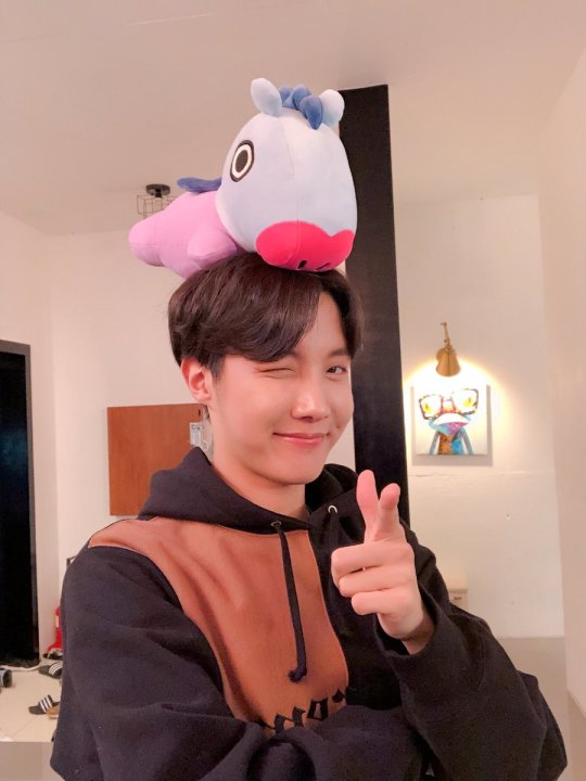
2: find the quick selection tool
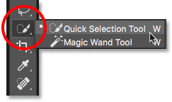
you’ll find it in the left sidebar, fourth from the top. i’ll often use this and the tool above it (polygonal lasso tool) depending on the photo. the quick selection tool is faster but more tedious, in my opinion, but hoseok was easy enough to cut out just using the quick select. use both! whatever u are comfortable with.
here are my settings for the tool:
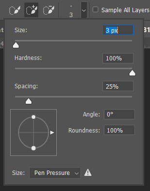
i almost always keep it at 3px. unless the image is huge, then i’ll go up to 5px, but never really above that.
3: trace over your subject(s) (aka hobi) by dragging the tool along the edges, until you’re happy with the accuracy:
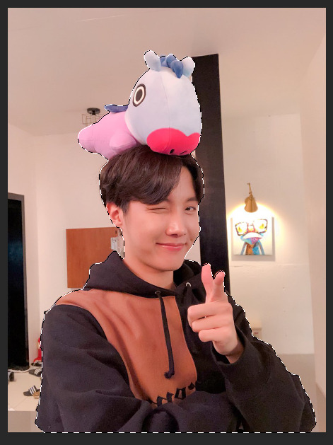
4: find Select and Mask (directly above the image):

and here are the settings i’m using:
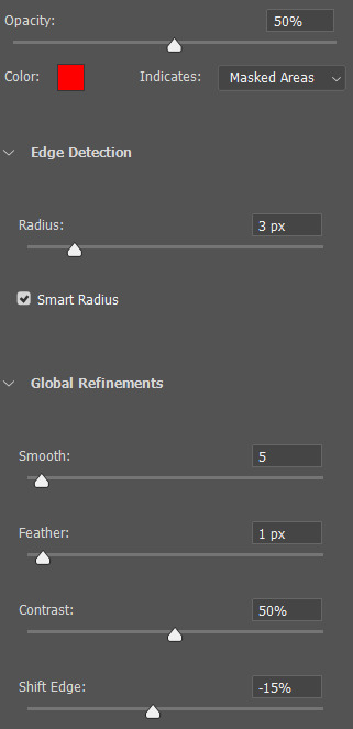
then press ‘Ok’ !
5: Select Inverse (right click inside subject)
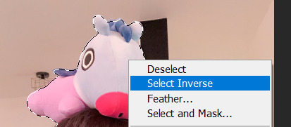
now we’re going to press ‘backspace’ on your keyboard, and the background will be gone~
make sure your file isn’t locked! it should be labeled ‘Layer 0′ and not ‘Background’ (if it’s locked, just double click it and press ‘Ok’ on the window that pops up)
after pressing backspace to delete the background, it should look like this:

then deselect it all. now is the time to look closer at your newly made render and see if there’s any cleaning up to do. i’m good to go, so i’m gonna continue on with making my header.
tip: drag the subject (hobi) with the move tool (very top tool on your left sidebar) to the center so he’s in the very middle. it should click to the center (you’ll see the pink line)

it’s not necessary for the tutorial but if you plan on saving this render as a .png and dispersing the renders you make-- it’s just cleaner looking to have them centered!
6: File > New

i always use 800 x 430 for mobile headers. for gifs, i size it down to 650 x 349.
7: resize and drag hobi into the new canvas (Image > Image Resize)

for single subjects like this i usually resize them to ~300 to ~400. whatever you think looks best tbh
now drag the file from its place up top:
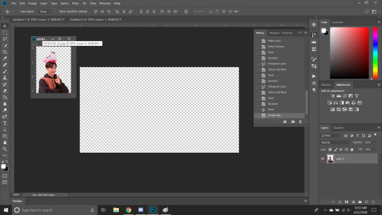
then the file from where it’s labeled ‘Layer 0′

8: now hobi is inside the canvas where the actual header is going to be made~ you can get rid of the render, or save it as a .png, whatever u plan on doing w it
i’m gonna center my hobi for the header i plan on making! from this point it’s just gonna be coloring, sharpening, etc. if you’re interested in using any textures like flowers or bring in other renders of objects, DeviantArt is a great place to search for texture packs. @beapanda on DeviantArt makes beautiful resources (kpop and non kpop related) be sure to credit them or whoever u save ur textures from!
for this header i’m not going to be using any outside resources, i just want my hobi to be the focus~
for the background, i’m gonna use a gradient from this site (this pack is 200 images. phew)
i’m using no. 200 from that pack.
9: optional- i’m gonna make some extra layers and start coloring hobi using clipping masks.
make a new layer > right click the new layer and find ‘create clippink mask’ > set the layer to either color, overlay, or multiply (whatever you think looks best and does what u are trying to achieve)
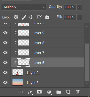
here i’ve just make layers to color things like his hair, his hoodie, and baby mang
here’s with vs without:


and when you’re done, go ahead and right click your primary layer (subject layer) and click ‘merge clipping mask’.
10: coloring~
find a psd you like or being to color the header yourself. for this header i’m gonna be using a homemade psd. i’m not gonna go into detail bc there are sooo many places to find psds on tumblr and deviantart. just like you brought hobi into the header canvas, drag your psd there, and that’s how u apply a psd.
when u are happy with the coloring, right click the bottom layer and flatten the image.
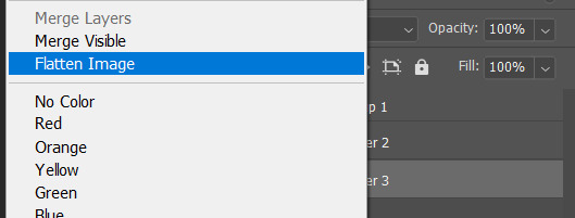
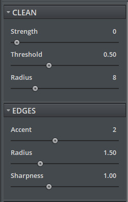
11: topaz clean + unmask sharpen
topaz clean is an addition u have to manually add to your photoshop program. u can google how to do it, but if anyone’s struggling i can show u how i did if i remember (but i’m pretty sure i do)
topaz settings:
unsharp mask settings (go to filter > sharpen > unsharp mask):
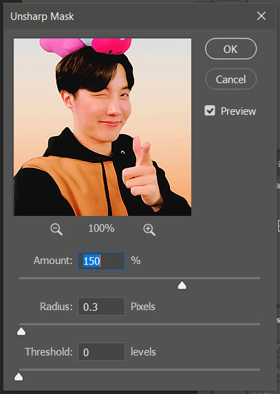
honestly, topaz is completely unnecessary, but i like the way it looks so i’m gonna go with it anyway. sharpening the header alone will still give you a great outcome
12: final step, header border time~
over on my film/tv blog @gusdapperton i’ve made a header template pack (click here if u just wanna use my premade borders) but for this tutorial i’m gonna show u how i actually made those (minus the cloud one, i was just fucking around lol) (it’s so simple)
>>> if u DO just save one of the borders i made in that pack, resize it so the width is at 800 and drag it to your header canvas. set the layer to ‘screen’ and bang there u go!
BUT with that method u can’t change the color from white. so if u want a border with any other color, keep following the tutorial >>>
go to view > rulers and select that to show the rulers (duh)
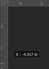
click from inside the ruler (light grey) and drag out your guides. here are where i’m placing mine:
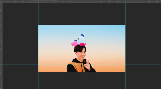
they should ‘snap’ right into place, but if they don’t, make sure u go to view > snap and that’ll fix it. u will know what i mean once u try it lol
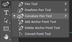
select the curvature pen tool (right click the pen tool to show more tool options):
and begin to place your dots. thanks to the guides, these dots will also snap into place
here are mine:

(i eyeballed the two in the middle, it doesn’t need to look perfect tbh)
this next step is sorta stupid but i haven’t found a better way to do it yet lol
to close the shape just make sure to closely follow the direction of the dot you last placed, then go around to make your way back to the first... it looks silly but like this:

just play around with the shape and the tool... u will get the hang of it lol
now look up ^ and press Selection

then ‘Ok’ in the next window. then boom~ there’s your selection for the border we’re about to make.
make a new layer then select the rectangular marquee tool (second from the top on the left sidebar) and either drag with your mouse or use the arrow keys to move the selection we just made. here is where i’m placing mine:
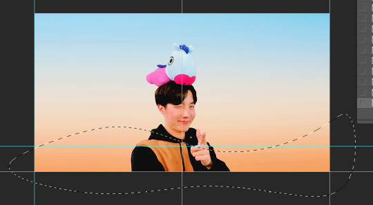
then select your paint bucket tool (if you can’t find it, right click the gradient tool and it’ll be one of the sub tools, like i showed u with the pen tool)
make a new layer, then fill it in (i’m using white)
you can stop there, but to make that line like i did in my border template pack, press the down arrow on your keyboard and go down 5-10 pixels, press backspace, go down the same amount of pixels, and re-fill that area.

now unselect. there’s the border~
now go to view > clear guides to get rid of those. u don’t need em anymore :) i’m also going to move the border we’ve just made down to the bottom of the canvas since we don’t need that big gap there.
>>> tip, don’t fill in the white directly on the layer if you wanna change the color. create a new layer on top of the border layer, right click > create clipping mask > fill the layer with the color u want for the background. example:

it saves the integrity of the shape. if you color fill right over the white, look closely and you’ll see it looks sort of pixelated and not as clean or smooth. it’s subtle but noticeable enough to me where it bothers me.
since this color i chose is kinda vibrant and clashes, i’m gonna help it out some. go back to the quick select tool and select everything inside your border layer. make a new layer, fill the layer with black (any color will do, it doesn’t matter) and set the fill to 0%. double click that new layer, and a new screen will pop up. go to drop shadow, find the settings you like, and boom. here’s what i did and what it’ll look like:
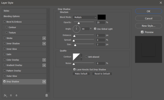
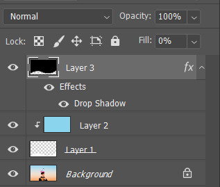
now u are finished~ i didn’t do this but u can skip sharpening the header earlier in the tutorial and reflatten the image again to sharpen it at this point instead but, yknow, i didn’t do that lol
here’s the final product (save by going to file > export > save for web)

preview of how it looks on mobile:
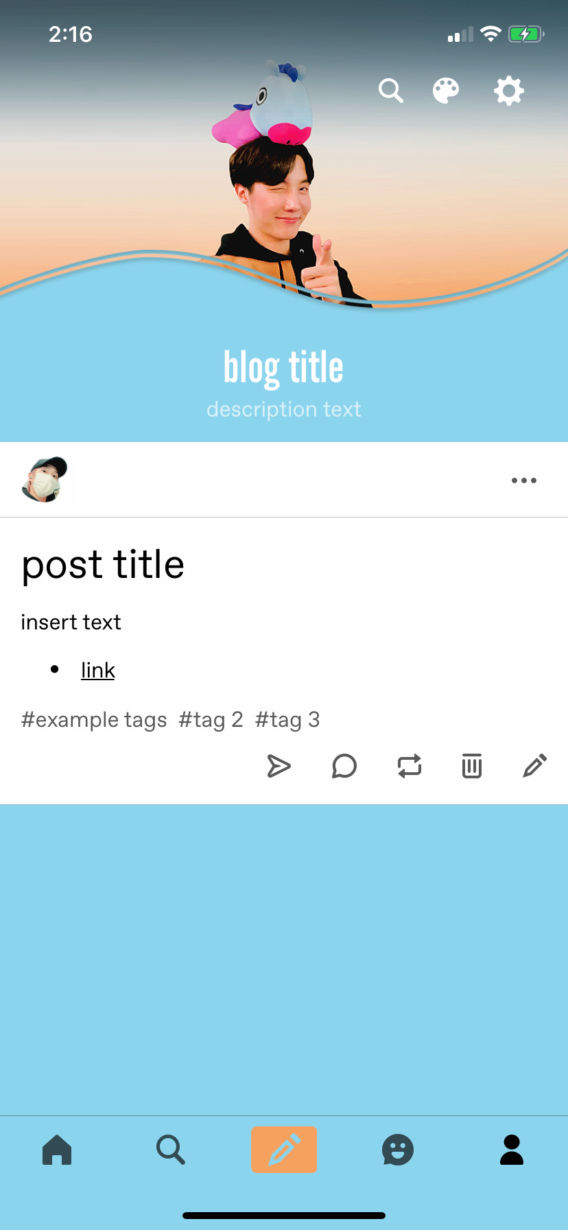
background: 8bd4ed
the end~ please send me an ask or dm if you haven any further questions, i will try my hardest to help <3
#photoshop tutorial#header tutorial#allresources#completeresources#mine:tutorial#i probably fucked up somewhere but it's bed time so i will find out in the morning hehe
149 notes
·
View notes
Note
Digital anon again, in ur experience what tablet works best?? Do u ever have problems with the whole connecting tablet to computer process, any warnings and advice for starting digital?? And (sorry for all the questions) what do u use to draw digital ??
Hey nony! I got a bit lenghty so I’m going under the cut.
I’ve only ever owned two tablets so I can’t say I know a lot-- I’ve had a Genius MousePen i608X which is fairly cheaper than a Wacom, but unnecessarily large with a tiny work space and the pen was battery powered and super fragile, so if you’re a clumsy idiot like me who drops his things on a whim, it doesn’t last. And I think they don’t even make Genius tablet anymore, so if you were to buy one it had to be via a third party site. But it’s cheap and the driver works fine, same pressure sensitivity as an intuos.
My current one is a Intuos pen small CTL480L by Wacom. It’s small but just enough for me. The cable is tiny on purpose so they make you buy the wireless kit, but I just bought an USB extensor. It comes with 3 extra nibs in a hidden compartment that no one tells you that exists, and the nib packs are ridiculously expensive and might not even ship to your country (they don’t ship to mine) but fret not, there’s tutorials online that teach you how to make DYI nibs with trimmer line and it’s super cheap and easy. The driver will sometimes randomly fail and not read the pressure (usually when you had the tablet connected for a while without using it) and you have to restart them via Services (if on windows) which is a bit annoying but it’s quick to solve. Wacom is the go-to for most artists sssso from experience and from what I always hear I’d recommend that but!
I came across this post about a tablet that’s fairly cheaper and pontentially superior than a wacom’s so it’s worht to take a look! The cheapness factor depends on where you live though bc the shipping turned out to be more expensive than a wacom tablet itself.
Now whichever you decide in the end, from my experience you probs don’t absolutely need a big ass active area and 2k pressure levels. If you get one that has that, neat!! But it’s less about the tool and more about what you do with it. I’ve never tried a more expensive tablet but I’m doing fine with the one I got now which is the simplest tier in wacom.
About the installing process, it’s chill. The same process as installing any programs in your computer. I’ve heard from other people with Genius tablets that the driver simply won’t work, but with Wacom you should be safe. The driver derps sometimes like mentioned before, but you just have to go to Services and reboot it, takes a few seconds. Once the driver is properly installed in your computer, you just plug in the tablet via USB and it starts automatically, get to drawing.
I use Paint Tool SAI for making art. It’s a paid program, but my cheap teen ass pirated it a few years ago orz others also commonly Photoshop, Manga Studio and Fire Alpaca (which is a free one). I’m set on SAI cause it’s simple enough and made specifically for making digital art. I use Manga Studio when I want to do effects like patterned backgrounds.
About tips on starting digital... Mann it’s an entire new world, I could sit and go on and on! I’ve been drawing digitally since 2014 and there’s still things I don’t know. The most basic advices I can give are (most of these applied to a SAI user):
Set your canvas to be 4000x4000px large and with a 300 ppi resolution. You don’t have to use the entire space, and you should size it down before uploading, but a larger canvas has better quality and minor mistakes are less visible.
When filling in base colors, use the magic wand to select an entire area and the select/deselect brushes to trim your selection. Saves you a lot of trouble. (ps works better if you’re doing a clean, “closed” lineart)
Try different brush settings! Sometimes what isn’t working is the kind of brush you’re using. Play around, look up what setting the artist you like use and you might find a brush that makes you comfortable when drawing (took me 12 years to realize the brush I used to sketch was making it harder for me).
SAVE. ALL. THE TIME. Set one of your express keys to be a saving button and soon enough it’ll become an almost unconscious habit.
Set a bunch of hotkeys to make your life easier! I don’t use them enough tbh, but it’s good to have some for flipping and rotating the canvas (I use tab to flip the canvas and Q+W to rotate counter-clockwise and clockwise). Always flip the canvas during the sketching process because when flipped you can notice mistakes more easily!
Try to avoid using black and white to shade and highlight your art. I mean, when choosing a darker/lighter shade for shadows/highlights, try moving the mouse sideways and changing the color a bit, rather than just choosing the same color but closer to white/black.
SAVE A FUCK TON OF TUTORIALS, EVEN IF YOU’RE NOT GOING TO USE THEM NOW, SAVE THEM SOMEWHERE AND LOOK AT THEM AND EXPERIMENT! There’s SO many things you can learn and you can only grow with digital art by experimenting. I struggle a lot actually to step out of my comfort zone and try new stuff which leads to my art style evolving faster than my digital process orz but I’m trying!!
It WILL feel awkward and you WILL feel like it doesn’t look good enough, and that is normal. You move to a whole new medium and it’s like you’re learning how to art all over again. You have expectations on how your art will look like, and you’ll be a bit upset because it doesn’t look how you wanted to yet. It’s normal. Might take months, maybe even a couple years for you to find yourself and what works for you digitally, but it’s because only YOU know what your expectations are, to everyone else it’ll be an awesome process of improvement. Look up a bunch of tutorials, watch speedpaints and see how people do their thing, try different brushes.
If you have any questions, feel free to ask again or DM me directly! I still have a lot to learn and experiment but I can share what I know! Hope this helped a little!
12 notes
·
View notes
Note
gif god Amira, how do you gif live performances??? They're so clear :0)
mMMM LMAO IM NOT A GIF GOD SINCE I STILL HAVE SO MUCH 2 LEARN BUT IM STILL SMILING A LOT GJAKDJA thats rly cute im v appreciative … :^) anyways !!! since i use a mac, i had 2 come up w my own process on how to gif live performances since avisynth ? too Slow 4 my old mac and stuff like topaz is too …. me, staring into the sun: maybe not …
buT ANYWAYS hgjsh under the cut is basically how i gif my live performances, i use
a mac
ps cc 17 (i think this will work on other versions ??? im not sure :( )
vlc player (i have version 2.2.2)
ts files of the performance (u need ts files otherwise the quality looks :/ even if it’s a 720p mp4 file,, also dont take performances from youtube u’ll end up w a walmart lookin gif when u want gucci gifs)
okay so first u need to get ts files of your performance and i get mine from _helloflora on twitter or from kpopexciting! since i … only ever gif mx i’m gonna be giffing mx again 4 this and i’ll be giffing shownu as an example from the 170507 performance of beautiful.
so first, load up ur ts file into vlc player and Basically what we’re gonna do is we’re gonna clip the video and get the part that we want !!! i would recommend starting a few seconds before the scene u actually want bc vlc is dumb like that …..
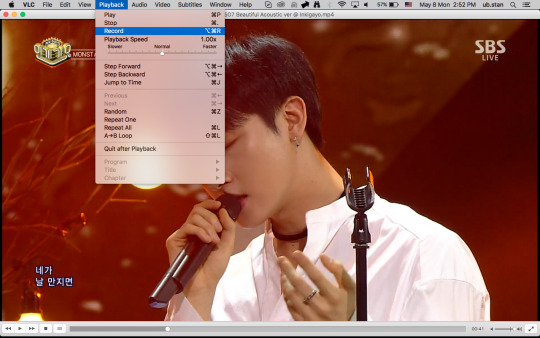
so get ur lil clip (mine is in the movies folder on my laptop bc … idk . it put it there and idk how 2 change it so i just keep it there)

make sure ur vlc is still open bc now u need to convert this little clip into an m4v file so ps can . load it … and basically what u do is u go into file > convert/stream or shift + cmd + s to open up the window. then drag ur clip into the window and on “choose profile” click customize and make sure ‘mp4/mov’ is selected. on the video codec tab, make sure u have ‘h.264′ selected then click apply and close the window and open it again just so u know it’s saved. then click ‘save as file’, save it where ever u want (i have a handy folder called ‘caps’ where i keep all my converted clips) and let it convert. the indicator that it’s converting is the play bar (streaming bar?? the bar)

^ that thing. so you let it convert (dont touch anything i learned this the hard way) and once it’s done, load it into ps!
i use the video import way so just go to file > import > video files to layers and select your converted clip, then drag the arrows to the clip you want giffed. this part is mostly trial and error to get what you want but i would recommend taking your time with finding the start of the clip and the end of it, also don’t make the space in between ur arrows too big bc then u get too many layers and that for me really slows down my mac :(
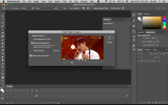
(also i literally . broke my own rule abt layers bc i messed up my recording of the clip and i was too lazy 2 do it again but CONTINUING !!!) now u have ur clip opened in ps!! i usually use around 50-60 frames so it doesn’t exceed tumblr’s 3mb limit, but also it depends on the size of your gif. the bigger the gif, the less layers you want. i’m making this test gif 268 x 270px (which is my go to sizing for gifs that i want side by side)
now what you wanna do is go to the little 3 lined bar thing on the timeline
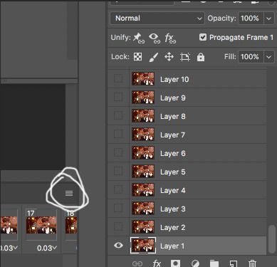
click that and select “select all frames”, then click the timing (the 0.03 numbers) and change it to 0.05! then while all your frames are still selected, click the 3 bar thing and select “flatten frames into layers”. you’ll get two sets of layers now, one titled with “layer 1″ and the other titled with “frame 1″. delete all the layers called “layers”

this is where i crop my gif !! my crop settings are at 268 x 280px, and once it’s cropped i go to image > canvas size and resize the height to 270px. then click the “convert to timeline mode” in the 3 bar menu or as the little icon next to the “forever” setting.

(my timing settings are still at 0,03 bc i was getting ahead of myself jahgkds) but ! u should have this

now so what u wanna do is select all ur layers/frames (i’m gonna call them layers so we’re not confused w the frames in the timeline) and right click and convert them to smart object! now we’re gonna sharpen them, and i used sharpening actions from @k-psds! i would recommend downloading a couple and just experimenting with which one you like best!
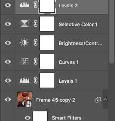
once you’ve applied your action, here comes the coloring part!! i never use psds because each gif usually needs a different way of coloring, but i do have a basic process for performance gifs. i use curves, levels, a tiny bit of brightness (either going down or up depending on the performance) and selective coloring with black, neutral and sometimes red (and depending on the performance, i’ll look into using the other colors)
this is what my layers look like
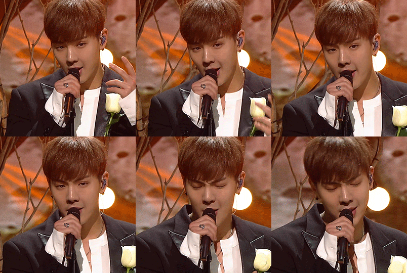
and this is the process of the gif from unsharpened + uncolored to sharpened to sharpened and colored


and that’s basically !!! how i gif performance videos !!!! it seems a little time consuming at first but the more you do it, the easier it becomes :D
SOME TIPS & TRICKS I LEARNED
when giffing performance videos, always go for close ups and clips where they’re not moving so much. it makes cropping so much easier and your gif doesn’t look as grainy
avoid flashing lights !!! it brings down the quality of the gif
use as little adjustment layers as u can! using so many makes the gif grainy (how many times have i said this) and you rly just wanna focus on making the gif bright enough 2 be pretty but not so bright u have idols looking like 2% milk
in selective coloring w the black tab, i usually bring it up to abt +15 or +10. idk why i do it tho someone told me in a tutorial and it’s been part of my process ever since.... makes the gif look nice tho so im not complaining
lastly !!! do a lot of messing around in photoshop !!! u might make a walmart looking gif but in no time ur gonna be making some nice Gucci gifs !!
if u have any questions feel free 2 send them my way and i’ll do my best 2 answer bc i know this tutorial was a Mess .... but i Tried :’)
#anonymous#gif tutorial#ps help#mine**#uH idk hagdsjhg#if u have any qs or w/e hmu !!! im always willing 2 help ghajhgd
19 notes
·
View notes