#also also (in my opinion) magenta on yellow is too low contrast for outdoor environments
Explore tagged Tumblr posts
Text

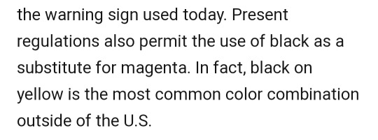
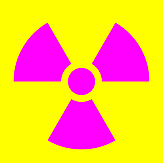
did you know that the official radiation trefoil is supposed to be magenta, by the way

it's supposed to be specifically different from any other warning symbol. the yellow and black of many modern trefoils is dangerous because it's the same set of colors as a lot of other warning symbols!
#no shade to op bc i didnot know it was originally intended to be magenta before#but its untrue to say that yellow and black are more dangerous or not how its supposed to be#the stuff in this article abt it being intended as an eyesore for maximum visibility is opinion by the author#also imo the history in the article explains pretty well why colour combos for the trefoil have changed over time#and why maximum eyesore is not necessarily the best#also also (in my opinion) magenta on yellow is too low contrast for outdoor environments#they would look mighty similar in bright light. hence why the much higher contrast yellow and black is more common#anyway no shade to op i just think the framing of this post is a teeny bit misleading. nothing they said is actually wrong tho
44K notes
·
View notes