#agcrist
Text
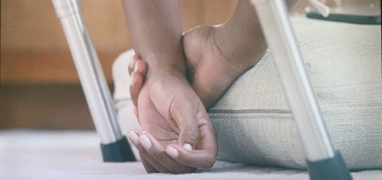


I loved this detail shot when Naomi, her boyfriend, and her sports masseuse are discussing superstition in sports as Naomi prepares to play Coco Gauff. Naomi's hands are show in motion so much that this meditative moment gives depth to her character outside of the tennis court.
The moment Naomi invites Coco to share the interview after Naomi's victory. Coco looking into the camera gives a sense of urgency to the situation and Coco's reaction, but Naomi's voice is calm and reassuring. The framing of the shot, with Naomi's back to the camera and facing Coco, shows how Naomi minimizes her own victory and wants to elevate Coco's achievements at that moment.
The angle of this shot is so interesting, showing Naomi's view out of a car window and a video of her playing in front of sports-related statues. The drastic slant of the camera shows up throughout the episode. It reinforces Naomi's tilting view of tennis, being a champion, and the dread of defending her title (which she loses after this scene).
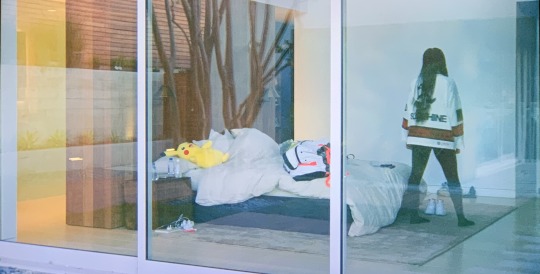
One of my favorite shots of the episode. Naomi walking around her bedroom as she explains in the interview audio that it feels like someone else's house, and that she felt afraid and out of place being there alone. It feels almost cage-like, and the stuffed Pikachu and unmade bed remind the viewer that she is still young.
2 notes
·
View notes
Text
youtube
the laundry machines, a.g. crist.
0 notes
Text


I think contact sheets are the perfect archival touch with a DIY nod for documentaries and have used it myself. It shows the building of history and the images marked as representative of that history. much like the flow of nas’ lines, it moves like water or analog film stock. contact photos give a near-filmic look at photographs and brings more gritty life to an archival element.
2. Establishing shot of the Queensboro Bridge shown while audio plays of Nas on a Manhattan-based radio station. Beautiful and matches the historical movement from the streets of Queensbridge to the larger market, the big city, and eventually the world.
3. I loved this shot of Roxanne Shanté, shown as Nas describes how she challenged him and Ill Will to spit for her and, on hearing their lack of seriousness, demands they step up their game. Her stance, symbolically passing the mic during a show by pointing it towards the audience, aligns perfectly with Nas’ story, which ends with her vowing to fuck them up if they can’t perform when she sees them next. The passing the mic gesture becomes a punch, and is perfect punctuation for a rapper who exists in the respectful invoking of the archival of this film.
4. This photograph that Nas and the kids from the block pose for is such a wonderful moment in the film. It was delightful and meaningful, given how much Nas speaks to the kernel of hope for the future, especially through children, and its power. The treatment, rather than snapping a still photo, puts the audience behind the viewfinder of the photographer themself, putting them on the street in the moment in the continuum. The lack of framing perfection—almost fitting along the golden ratio or a general grid—makes it fit perfectly in a film where the extremely charismatic Jungle is framed walking in and out of focus along those very streets.
5. Honorary mention: the smoothest and most compelling shift to credits I’ve ever seen. Sheesh!
0 notes
Text
vimeo
an eyewitness account of washing my face, by ag crist.
0 notes


Text


The first album artwork I chose is from the album The Devil and God are Raging Inside Me by Brand New, released on November 21, 2006. The album was released on my twelfth birthday, and I begged my dad to take me to Barnes & Noble to buy it that very day. We listened to it on the drive home as I scrutinized the cover, a girl eavesdropping on a conversation between masked hooded figures on the crumbling house’s stoop. I learned that my dad and I share an appreciation for post-hardcore music, and that musicians aren’t required to put their name or album title on the cover of the album itself. The color palette is earthy, tending towards somber with a subtle pop of red in the top right corner, and the textures of the cracking paint, stone, fur, hair, leaves, and a variety of fabrics balance each other. The golden section is utilized when looking at the division of the field among the human subjects.
The second album artwork is from Bon Iver’s self-titled album released in 2011, created by artist Gregory Euclide in collaboration with Justin Vernon, the musician. It reminds me of Fleet Foxes’ self-titled album from 2008, which is a painting by Pieter Bruegel the Elder, a major figure during the Dutch Renaissance. What I love about Euclide’s work is not only the texture, but how he accomplished it—juxtaposing man-made materials like paper, photo transfer, and improperly-discarded polystyrene foam with naturally-occurring materials like moss, snow, roots, and pigment from flower petals. Euclide gives dimension to the work by folding and tearing the paper, introducing topographical elements to a natural setting. The artwork activates a feeling of being out in nature, overwhelmed and surrounded by all that is not man-made, which fits this album’s sonic qualities perfectly. In an interview he gave with Art LTD. Magazine, Euclide says of his work, "When you see a human figure you identify with the form, what they are doing, and that becomes the emphasis. By showing just the land without humans I'm able to show it as it is and what they've left behind." The work follows the Z-pattern, tracking the eye across the work to take in elements that may seem simplistic at first glance.
The next album is one that was never actually made beyond the artwork: Intravenus de Milo by the fictional band Spinal Tap. This is Spinal Tap is a mockumentary that riffs on the classic styles of documentaries about bands. A running joke throughout the film is the controversy surrounding the graphic nature of their forthcoming album Smell the Glove, which is eventually released as a completely black sleeve with no identifying marks, logos, or wording at all. During an interview, the band recounts past album cover artworks from their career, as the images of the albums flash on screen. Intravenus de Milo is simple, irreverent, funny, and follows some basic design tenants. The gradient of the background gives the sense of a museum setting, highlighting the humor of the manipulation of such a classic, recognizable statue. Though I would’ve personally done the font differently, it does come off like an album from the 70s in terms of typography, color palette, and spacing. The frame is balanced, with the statue and IV bag are clearly the most important elements, and the band name as the next important, shown through scale and detail in typography.
Finally, we have the album Crazy for You by Best Coast. I love this album artwork because of how reminiscent the style is to collage and postcard styles. The color theory at work here is beautiful, and using the map as the fill for the block text of the band’s name adds a sense of dynamism that I feel is reflected in the surf rock, recorded-in-someone’s-dad’s-garage quality of the music of this album. For all the attention to detail—the shadows of the trees following the angle of the sunset, the waves, the waterline, the leaves of the trees—one of the most carefully-placed elements was a cover-up of a mistake. When commissioned for this artwork, artist David Rager was given only one instruction: “Put Snacks (the singer’s cat) on the cover.” Rager placed a thin outline of California over where Snacks’ tail would be, had it not been cut off in the original photo. It works geographically, anatomically, and stylistically.
0 notes


Text


Typography delivers the "sensibility and spirit" of the word before the word's meaning that comes from reading. This reminded me of the work of linguist Ferdinand de Saussure and the development of a theory that words consist of signs, signifiers, and signified meaning. The emotive response Scher is able to evoke in her use of typography demonstrates typography's power as a design element.
"[Clients] want proof that the design will work -- there isn't proof. It's just people and their perception." What Scher speaks to here is a sort of meta-quality we've discussed in class -- how certain aspects of design, like a shark swimming one direction on a page or another -- can "feel" right or wrong as a viewer. When the audience is "everyone who could possibly see it," you have much more to account for than personal taste.
My favorite thing that Paula Scher says in this episode is about how her best ideas come when she's "in taxicabs, in traffic, drooling" -- particularly how she elevates the importance of the "state of play" as a creative mindset. I try to operate in this mental framework to avoid waves of anxiety and self-doubt. Play is generative, inviting, engaging, and fun. To produce anything, before fine-tuning the aesthetic qualities and final touches, enjoying what you're doing in the first place is key.
0 notes


Photo


1. I love this photo of Tommie Smith and John Carlos, especially the serenity in their faces as they take up the same pose they shocked the world with on the podium at the 1968 Olympics. The expanse of the white background emphasizes the loneliness and isolation that often accompanies taking a stand for what is right, and Platon has positioned them together, leaning on each other. The shape of their bodies brings to mind the shape of a trophy or victory flame.
2. This powerful group portrait of the Little Rock Nine also stood out to me. The low angle emphasizes their strength in standing and persevering in a hostile system within a hostile world. Their organic forms stand in contrast to the looming architecture behind them, and the way the lighting highlights their upward gaze emphasizes a notion of strength and endurance.
3. Though Platon himself is in this picture, it still stands out to me as “Platon Portrait” -- the artist at work, his children posing, the contrast of the black clothing against the white background, and the black structural element that balances the frame. The unconventional family portrait here seems more powerful than a traditional facing-forward-everyone-posed-perfectly family portrait because it fits Platon’s life and personality and mindset as he approaches portraiture as a means of connection to other humans.
0 notes
Last Seen Blogs

krystakibbe
Untitled

michaelbefassy
Everything Fassy

kaylabreezy1999
Kayla

lulutb
Just another fangirl

seraphijade
I'm not gonna make it alone.