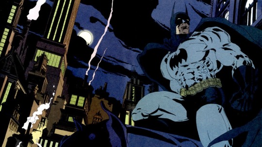
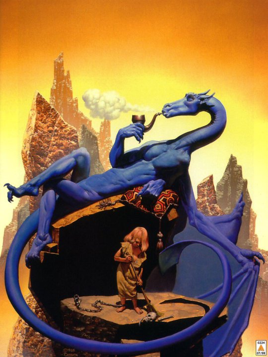
#again my preferred start is Batman Year One. Batman Long Halloween. Batman Dark Victory
Explore tagged Tumblr posts
Visit Tumblr Blog
Explore Tumblr blogs with no restrictions, modern design and the best experience.
Last Seen Tumblr Blogs


Fun Fact
Total funding amounts to $125.3M.
Note
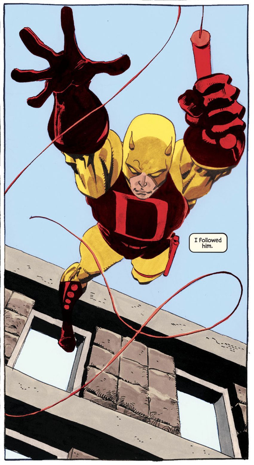
Ok! You've convinced me! If I want to be part of this community, I should explore the source material. I don't know if I'll like the artform, but if nothing else it's a cultural juggernaut I can research. My mom grew up watching Batman the Animated series, so I know that's an entry point I can try out, but I do like webcomics and manga, so I know that I might like comics better. It's an odd criteria, but is there a batman comic I can start with that's aesthetically pleasing?
Ooo aesthetically pleasing? That’s one I haven’t heard before. I’ll throw you a handful of choices of my favorite pretty comics!
Also I do 100% reccomend Batman The Animated Series which is my favorite interpretation of Batman to this day as it is for many, that and Justice League and Justice League United are WONDERFUL gateways too! (My favorite animated DC series of the time is Superman The Animated Series tied with BtAS)
I always recommend in order: Batman Year One, Batman Long Halloween, and Batman Dark Victory as it’s how I got into Batman in the first place and it’s a pretty good jumping off point. They also have movies of all 3.
mAN ok this is hard because aesthetic comics are SUCH a personal preference. Comic artists will constantly change around all the time. The current Batman/Superman Worlds Finest comic run is INCREDIBLY aesthetically pleasing and pretty as it’s drawn by Dan Mora so that could be a good go to.
- The Dark Knight Returns. It’s has a very fun gritty artstyle that I adore and it’s a comic that changed comics as we know it.
- Batman Universe is a wonderfully fun comic and his artstyle is fun so definitely check that one out.
- All Star Superman (2005-2008) has… ok artwork. But you get used to it and it’s story is one of the best written for Superman modern day.
- JLA Tower of Babel. Art is nice and the story is about Batman’s contingencies falling into the wrong hands. Good shit
Onto some Elseworld stories that aren’t canon but I LOVE the artstyles:
- Batman White Knight’s artstyle is BEAUTIFUL but isn’t a very good interpretation for your first time reading comics as it isn’t normal characterization of everyone.
- Batman Arkham Asylum: A Serious House on Serious Earth drawn by Dave McKean. It isn’t my favorite comic with it’s very edgy “hey what if batman is insane” (which yeah no shit he is insane) but the artstyle is uncanny and disturbing and beautiful.
- Kingdom Come. You have to know a bit about comics beforehand, I’d just recommend reading an article or blogpost critiquing 90s comic books, and behold the genuine beauty and glory that is this story. Painted by Alex Ross it’s one of the most beautiful comics out there.
They’re available online, your local library, or at your local comic shop! I hope you have a blast checking out the cool things comics have to offer!
#again my preferred start is Batman Year One. Batman Long Halloween. Batman Dark Victory#bones dc comic review#bones comics#dc comics#idk what to tag here honestly#if anyone else has recs feel free to reply to this!#anon if u want DM me and I can help u get said comics#bones replies#hell yeah dude I hope u have a blast reading :D#HI I REALIZED THIS WAS STUCK IN MY DRAFTS FOR FUCKING MONTHS SORRY
70 notes
·
View notes
Note
i asked you to elaborate because afaik catwoman has at least 5 different origins and i'm not even sure which one is DC going with atm
oh, okay, my apologies for misunderstanding! i thought you wanted me to elaborate on the nature of selina’s relationship with bruce via the catwoman and batman personas. but yeah, unfortunately, selina has had. . . a very rocky history whether it’s pre-crisis or post-crisis. it seems no two writers ever really agreed on a concrete origin story for her, nor on a concrete interpretation of or direction for her (and these latter points i would say are more emphasized in post-crisis, in pre-crisis her characterization was consistent if not her origins), so i think what it comes down to ultimately is which version you as a fan prefer to ascribe to. personally i liked the fresh start that batman: year one / catwoman: volume one gave her after the crisis, and i think it offered her a unique perspective on justice and crime by way of her being a sex worker. you’ll also find a lot of fans who prefer to ascribe to the origins given to her in catwoman: volume two, where selina lived with both of her parents until their suicides and maggie didn’t exist until john francis moore brought her back into continuity with the last two issues of the volume, then ed brubaker picked up on that thread in volume three. the complicated thing that happened in the early 00s is that hush brought the long halloween, dark victory, and when in rome into continuity despite the fact that these stories were published out of continuity. loeb’s backstory for her is entirely different from the ones established for her in her solo volumes so reconciling its events with her solo progressions was a bit weird and i think partially lead to large parts of her backstory being ignored after hush was introduced. overall it’s just a mess, like the novelty of selina is that there are so many angles that people approach her from and engaging with those at your leisure is fun but it also makes her pretty unstable as a character, which is unfortunate bc it’s rare to see her character pursued with a concrete, long lasting direction that can actually do anything of substance with her origins. it’s a shame and i wish she could get a dedicated writer on her again who could actually last more than a year or two
8 notes
·
View notes
Text
Research: Project Finish
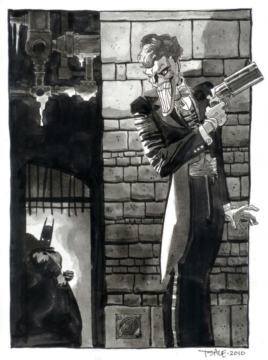
Tim Sale
Tim Sale is a famous comic book artist, who had worked in several titles along with the writer Jeff Loeb, including Batman, Spider-Man, Superman, Daredevil, and many others.
Tim Sale was born in may of 1956, in New York, where he studied visual arts, spent a good time of his life in Seattle, and today he lives in California.
For some years he drew his art privately, only to please himself. When he found himself working at a fast food in his late twenties, however, he decided to try to sell some of his work. This led to an association with Thives’ World Graphics, a fantasy anthology series, where he illustrated stories.
What most marks his work is the dramatic aspect that he manages to obtain in the characterization of his characters and in the scenarios he creates, making the stories unique and immortalizing the characters.
The union of Sale’s art with Loeb’s engaging narrative has become the perfect marriage for mysterious plots.
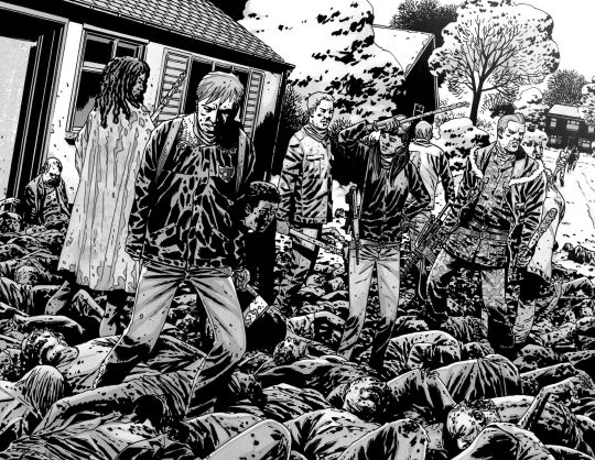
One of the most striking characters worked by Sale was Batman, which he drew “The Long Halloween”, “Dark Victory” and “Halloween”. He was able to fully transfigure the dark aura of Gotham and his Dark Knight. He also worked with Superman in the saga “ Superman for All Seasons”.
Both of The Long Halloween and For All Seasons are what is known as “Year one” comics. These works take their heroes back in time to their earliest days of crime fighters.
His main tool is watercolor, which he uses with mastery. Sale's palette of colors is something really impressive, always drawing and painting his characters very delicately, and calmly. His style is very cartoonish, although this does not diminish his art in any way, on the contrary, his style is very unique and characteristic.


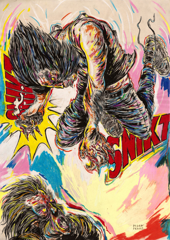
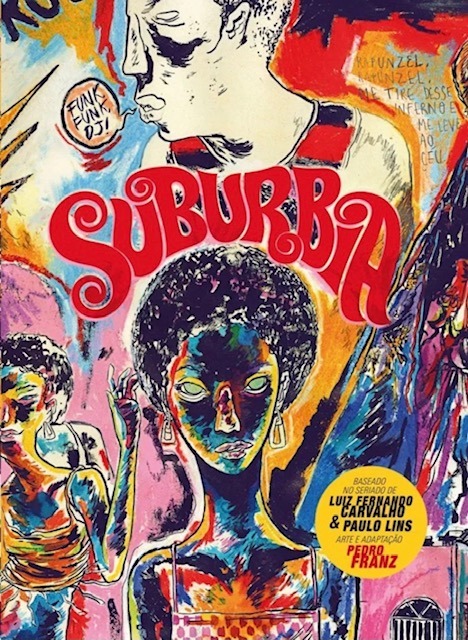
Pedro Franz
Is a Brazilian comic book artist, who was born in Santa Catarina and has a degree in design.
He has been publishing several comic books and participating in exhibitions in Brazil and abroad. As an illustrator, he has published works several magazines and books, and regularly collaborates with the Piauí magazine. As a graphic designer, he is a contributor to the Par (Ent) Esis platform. He has comics translated and published in English and Spanish, and has good international recognition, thanks to his publications.
But what is most impressive in Pedro's art, perhaps is his intensive use of colors. Mixing various shades of different colors, mixing different compositions. In addition to sometimes using characters from pop culture, with his elaborate style.
Despite liking traditional comics, he has always published and worked for national publishers, often with authorial works.
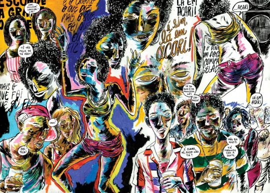
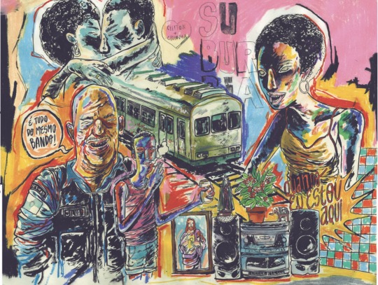
Perhaps his best known work, which was even published in the United States is the comic “Suburbia”.
Suburbia tells the story of Conceição, a girls daughter of enslaved rural workers, who flees to Rio de Janeiro in the early 1990s. In the city, Conceição begins to work as a cleaner and to get involved in the world of funk, slums and poverty.
His drawings are extremely surreal, not exactly following a traditional way of making comics, with several images spread across the page, with different shapes and sizes, with extremely strong colors, mainly valuing blue, purple, yellow and red, as his main colors.
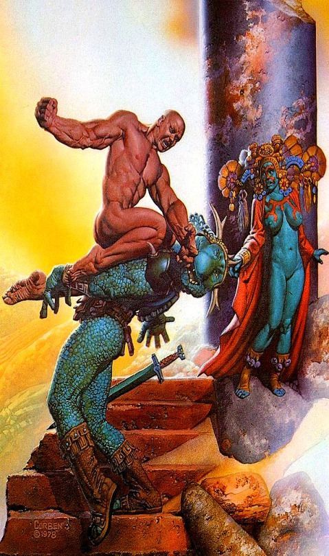
Richard Corben
Richard Corben was one of the contributors of elevating the comics to the category of Art, and of its unparalleled style of great influence among many current artists.
Richard Vance Corben was born in Missouri, United States on October 1940, in a family of farmers in the middle west ( where he started reading comics), and lived in Kansas City. There he studied Fine Arts, got married, had a girl and started working in local cinematography animation company. At the same time, he started to create and publish some underground fanzines. From the begging it was clear that he was interested in science fiction, eroticism, and total rejection of institutions ( the Army, the Church, etc), mixed with a lot of humor.
At a young age, Corben was an aficionado of bodybuilding, just like everyone who was interested in a persons aesthetics. The first character that he created, was Rowlf, a dog who took on a human form. In the beginning of the 1970s he amplified his work ( and his fame) in some underground magazines. And in 1971 he started working for the Heavy Metal publisher where he created one of his most famous characters, Den a large muscular man, who was always naked, and always after some adventure.
Corben has a very particular style, with unsettling mixture of caricatured, often satirical grotesque and intense,convincing realism. Never before had such wildly cartoonish worlds proved so convincing.
Also he can handle an exponentially higher standard because of his ability to use colour to show the effect of light on whatever he’s depicting. The way that he mixes light and colors in certain panels to differentiate those elements from each other, is something to admire.
Corben worked in a few mainstream comics, he always preferred to work with authorial works or working in specific themes like fantasy and science fiction comics and not so much on superheroes.
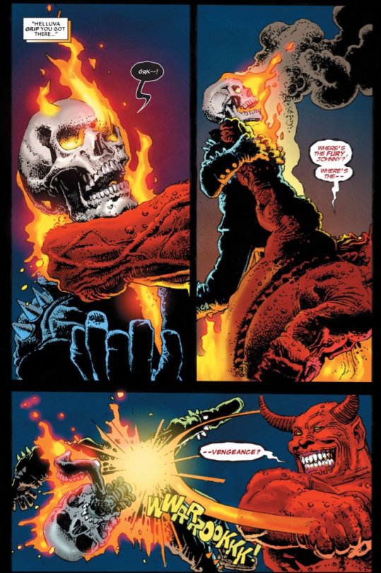
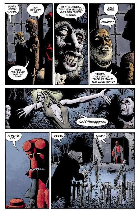
But probably the most famous mainstream comic that ever worked was the character Hellboy, along with writer Mike Mignola.
Hellboy is a series of comics that has a lot of mysticism, Norse mythology, horror and monsters. Something Corben certainly agreed to do, without thinking twice.
Richard Corben is one of my favorite artists, with a style that is perhaps not as realistic as an Alex Ross for example, but the humor and beauty that he puts in his characters is very unique.
Corben died on December 2, 2020, leaving a great legacy, for the world of comics and arts, with a very unique style and extremely stunning worlds.
Charlie Allard
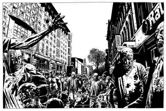
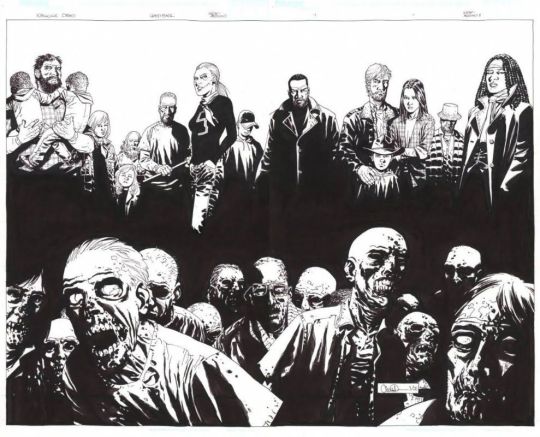
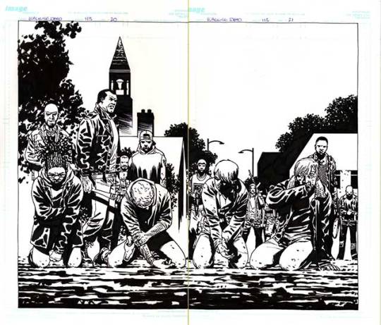
Charlie Adlard is a British comic book artist, who have worked on the comic industry for over 25 years. He spent the majority of his time since 2003 working in The Walking Dead along side with writer Robert Kirkman , until the last issue on 2019 He started reading comics when he was very young, and he said that he was very lucky to have influences of American comics and the more high art, such as Asterix and Tin Tin. He was fascinated by European comic books artists like Moebius, Alberto Uderzo and Herge. He started his career as many British artists and writers, working on 2000 AD, with characters such as Judge Dredd, Armitage and eventually Savage. In the United States he started working with the X Files, Astronauts in trouble, and of course The Walking Dead. Adlard started in The Walking Dead from issue 7, and brought a slightly different style, from the previous artist. Adlard's art is very cartoonish, but the universe of The Walking Dead still doesn't get silly because of it. Quite the opposite, the dirt and rot that Adlerd puts on his characters and the world, only sustains what a horrible world it is to live in. Many readers complain about Adlard's style, being very simple, that his characters are very similar, and sometimes it is difficult to identify them. But I believe that although his style does not vary much, when it comes time to show a horde of zombies, a devastated city, people feeling despair, and extremely disturbing scenes, Adlard manages to excel. Adlard's main tool is ink. All The Walking Dead magazines are in black and white, and he manages to give a lot of depth to the scenarios and characters using only a few ink stains. Today Adlard is doing some comics, mainly for DC, but says that he does not intend to work with Kirkman and zombies again, because he wants to explore other themes, and to innovate his drawing skills.
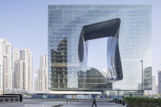
Zaha Hadid
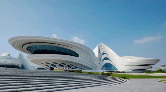
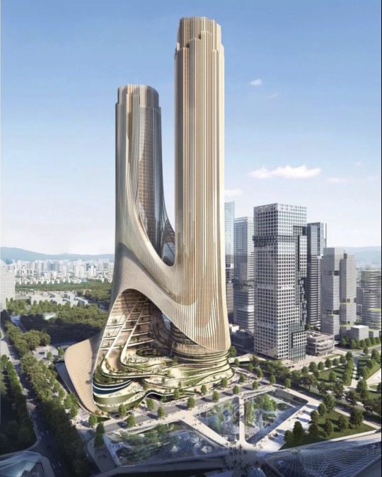
Zaha Hadid was one of the most important and well known figures in contemporary architecture and design. With a singular trajectory, marked by a versatile, bold and out of the box style, she was the first woman to receive Pritzker Prize for architecture and was also the only female representative honored by the Royal Institute of British Architects with a golden medal. Zaha Hadid was born in Iraq, more precisely in the city of Halloween, in Bagdá, in the year 1950. Her family was of high class, her father being an important politician and her mother an artist. Still young, she traveled and studied in other places of the world, like London and Switzerland, but it was in her native land the she got her first formation, when she graduated in mathematics. At the age of 22, in 1972, she enrolled in one of the most famous independent schools of architecture in London, and there she gave the starting point to her career by studying and creating an important connection with the Dutch architect Rem Koolhaas, a figure that encouraged her and opened the doors for opportunities. Later in the 1980s, Zaha Hadid decided to open her own office. This, Zaha Hadid Architects was born, which made her name and talent recognized worldwide. Known for her works with futuristic lines, clean and pure forms, as well as the fragmentation of architectural design. Her projects and discussions raise issues that put architecture and its future to the test. This is because the architect seeks in her works to interrelate design, architecture and urbanism. I knew Hadid and some of her works, but it was the recommendation of my teacher Lauren, that I should look for this architect. As my project takes place in the future, she recommended that I look at some works by Zaha Hadid to get inspiration when creating the scenario for the comic. I find it very interesting how her works have this futuristic aesthetic , because it reminds me of science fiction films like Blade Runner with those skyscrapers and buildings with different shapes and sizes that are extremely imaginative that could only exist in films. With unique works and projects, famous for their exuberance, futuristic elements, curves, non linear shapes, distortions and fragmentations, Hadid inspired and generated fascination both for her constructions around the world.

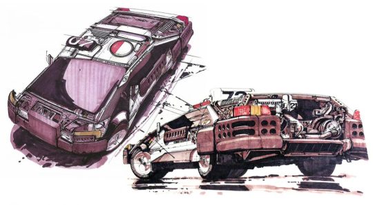
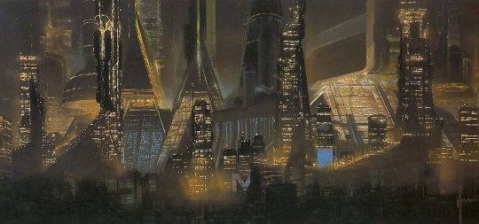
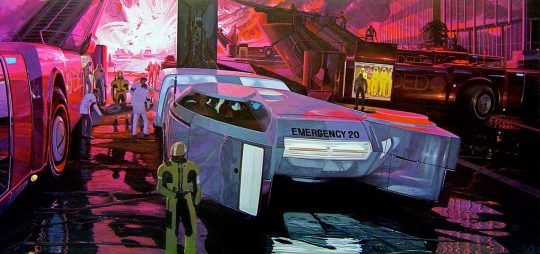
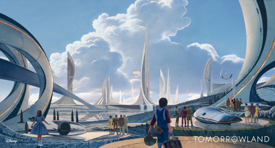
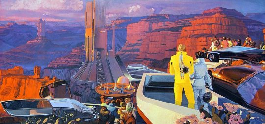
Syd Mead
Syd Mead was a designer, best known for working on films such as Aliens, Blade Runner, Tron and Star trek. Mead was born in Minnesota, United States, on July of 1933, but five years later he moved to a second house in the western of United States prior to graduating from High School in Colorado in 1951. Some years later, he did the Art Center School in Los Angeles, where he graduated with great distinction in 1959. He was immediately recruited by the Ford Motor Company. At Ford he worked in the advanced styling department, creating futuristic concept car designs. But his imagination went beyond cars and he began to imagine clothes, helmets, buildings and scenery from hyper advanced civilization. After Ford, he also worked in other big companies like Chrysler, Sony and Phillips. After that he started migrating to the concept art world of movies. Mead is really important for generation of writers of science fiction, because many of them were influenced by Mead’s colorful paintings. Mead never wrote a novel or short story. He imagined the future in his mind and turned that imagination into illustrations. In 1979 he designed the extraterrestrial spaceship for the first film “Star Trek” in the cinema. Ridley Scott called Mead to design the buildings and flying cars of the futuristic Los Angeles “Blade Runner” in 1982. In 1986 he was hired to design the space station and vehicles of the movie Aliens directed by James Cameron. Almost at the same time, the designer created the electronic world of “Tron” for Disney studios. The same ones who hired him in 2014 to design the futuristic city of “Tomorrowland”. Mead died in 2019 after three years of lymphoma, he was 86 years old. He was a great influence for many designers and science fiction writers and illustrators, due for his creative worlds and automobiles , Elon Musk quotes Mead as one of his major influences, on visions of the automotive future and design in general.
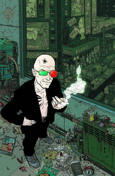
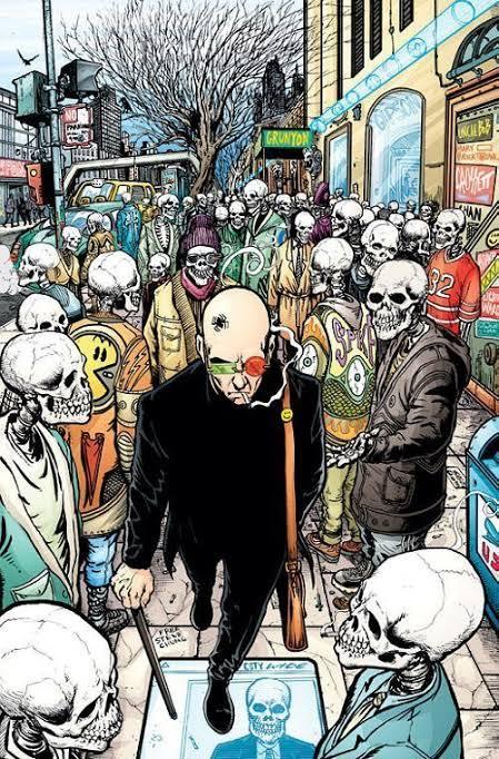
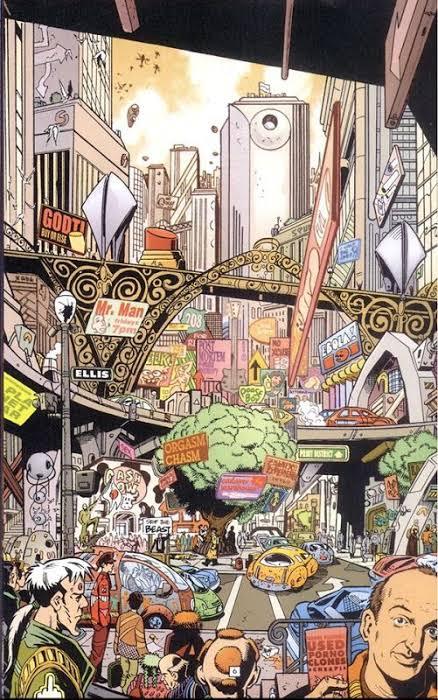
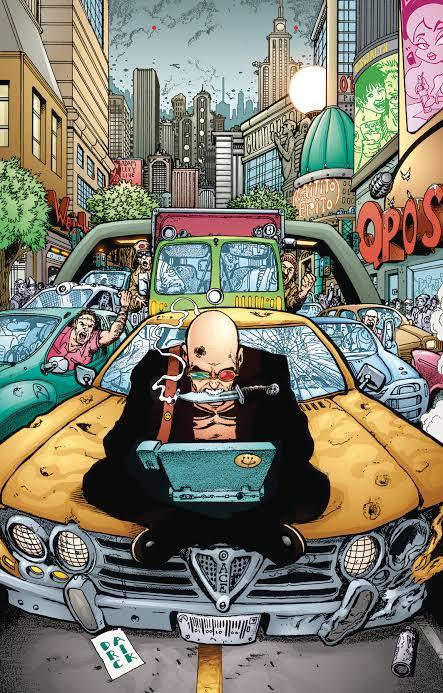
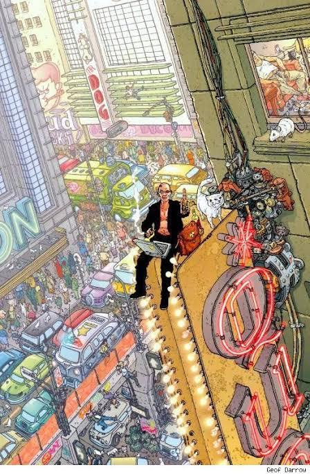
Transmetropolitan by Warren Ellis and Darick Robertson
Transmetropolitan is a comic written by the British writer Warren Ellis and the American illustrator Darick Robertson, published by the Vertigo label, and falls within the cyberpunk genre, and the problems that rampant technology will cause us.
Throughout the 60 issues of Transmetropolitan, Ellis and Robertson build a chaotic and brilliantly alive future, presenting a sci-fi society with a peculiar mix of elements of cyberpunk, political dystopias, bioengineering and transhumanism, sexuality, economics and much more.
In a dystopia, in a not so distant future, the journalist Spider Jerusalem is isolated for fiver years in a hut in the forest, but he has to return to the city to earn some money.
Throughout the comic, amid a nihilistic aura that humanity has no salvation, the author- Warren Ellis - criticizes the consumerism and futility. The illustrations, of Darick Robertson, is full of excesses as the environment should be, a brand of the style of the 1990s.
The search for the truth is the central theme of this work, and in the midst of all this we found ourselves in a investigative odyssey that involves the lowest scum of that society ( thieves, murderers and rapists) until reaches the highest of the scum ( the presidency).
This background allows the work to touch on the most profound social themes, and without fear of saying what needs to be criticized, this is where Transmetropolitan shines, and provoke deep reflections on issues such as racism, the influence of media, the power of religions, the education, and many other themes.
In short, Transmetropolitan dissects and criticizes everything, it points out the flaws, the lies and the hypocrisy of each one. It’s a study about the problems of democratic society in the 21th century.
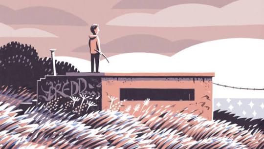
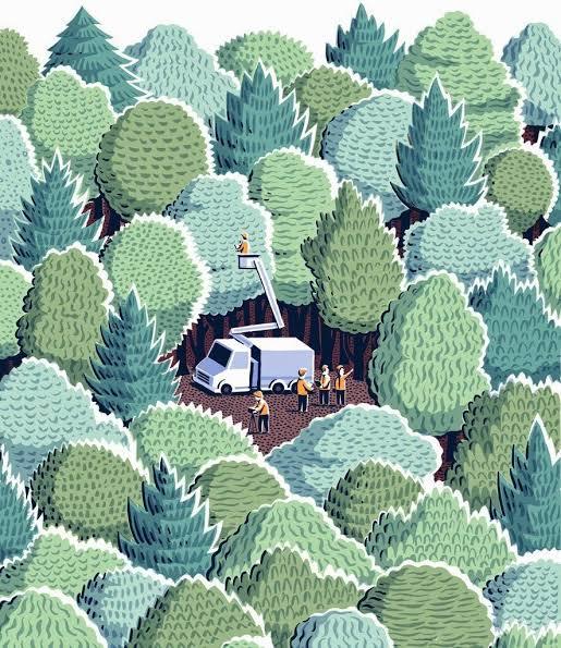
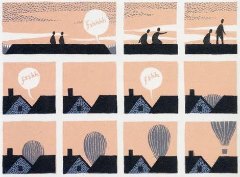
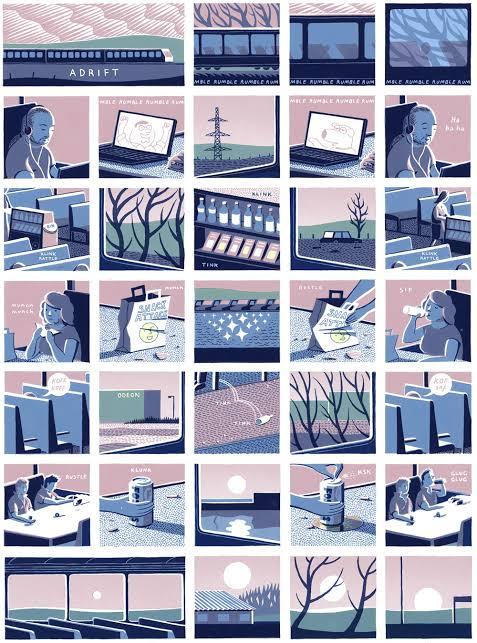
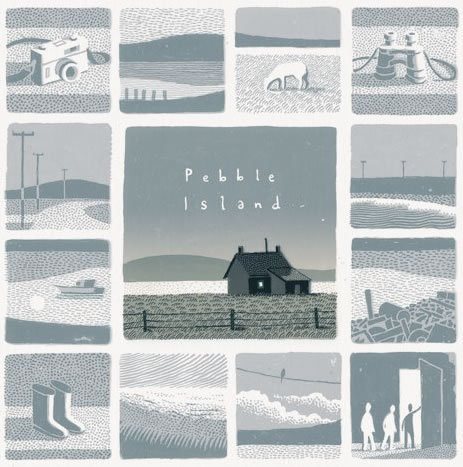
Jon Mcnaught
Jon Mcnaught was born in 1985, London, England. He work with drawing comics, and work as an illustrator, printmaker and lecturer. After spending several years on the Falkland Islands during his childhood, which will inspire his second book, Pebble island. The book pass years after the war, where he tries to recreate his childhood, with aspects of his curiosity, when he was exploring abandon bunkers, where it was just part of landscape, or somewhere where he could play. His work has essentially been landscape print-making (often situated in the city), but with quite simple intention of capturing the sense of space, light, time etc. His work is mostly about that, places that he was interested in depicting, and trying to reproduce the visual. He want the characters to feel like elements of a landscape or an environment ( he preferes to focus more on the background, than the characters itself). But usually he uses figures and postures to suggest expressions rather than close ups showing facial features. What I like about Mcnaught's work is that they are simple designs, but the colors are very vivid. The way he constructs the scenarios is very invective, because it doesn’t need to be extremely detailed, he just needs a few lines to show what he is talking about.
13 notes
·
View notes