#add (glow) layer really makes your art look much MUCH better
Explore tagged Tumblr posts
Text

Happy birthday to the specialest girl in Encanto! ✨
#encanto#mirabel madrigal#I want to be her friend so much#teawizard art#spent 5 hours doing this instead of working#yayyy#add (glow) layer really makes your art look much MUCH better
115 notes
·
View notes
Text
Tutorial: How I Render Accents
PART 2: COLORS
I usually do not recommend 'pixel hunting' aka going over your work with a fine tooth comb and picking out stray pixels to erase. However, for setting up a proper base layer for accents it is imperative to do so.
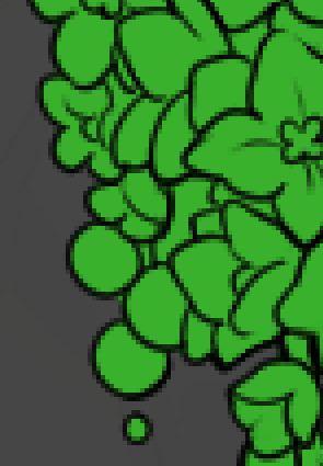
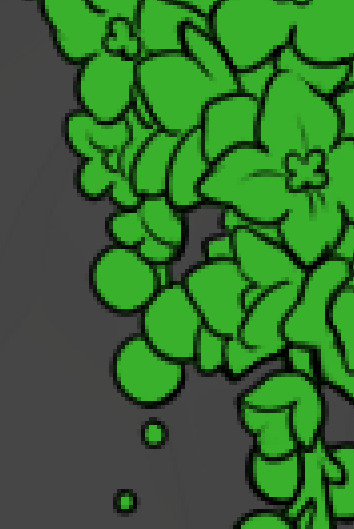
To explain my method of color blocking: I select everything outside of the lines, invert that selection, then fill in. This does a more accurate job than going into each and every section and filling them all in individually, and is also significantly faster. Only downside is small sections like above where you can see bits of the green (which I use bright green against a dark grey background to contrast the base color, lines, and background) poking out, as well as the inner section where it filled in a spot I did not want filled in. Getting all of this right in this stage will make your life easier as you go. (It's also the method I use to color block all my work, even beyond accents)
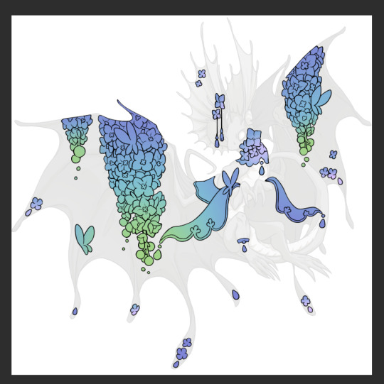
Now this where my style of rendering color may come off intimidating and, tbh it might be. I do gradients first and then I color over them with "normal" blend layers. I typically don't use multiply layers unless I'm shading something that has a lot of textures. If this scares you, it's okay I'll keep walking you through it. Here, my gradient goes from a pastel but deep periwinkle, to a soft more cyan blue, then to a lighter pastel green. Skipping steps and going from the periwinkle to green will give it a different look. There's also hints of a pinkish tone as an accent color.
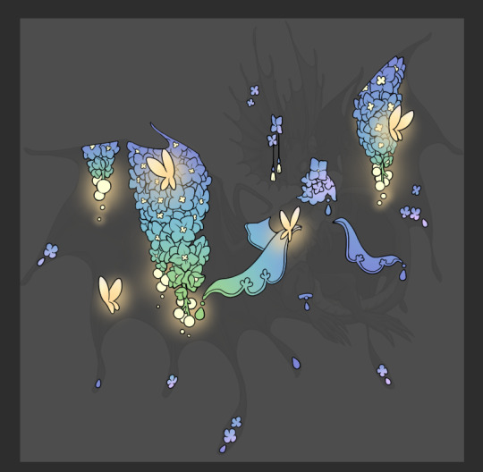
So as I said, these additional layers are done with regular "normal" blend mode layers. I've placed one in between the butterfly line art and the line art for the rest of the flowers, and then an additional layer under everything else. This allows me to create a glow effect specifically around the butterflies, and then specifically under the flowers. Going back and forth with the proper amount of opacity (by using the airbrush transparently) helps to make it glow but not be Too Loud. Also checking it against a dark background can help to check for spots where it spills past the borders, as well as really gauge how Bright it is. I've also color matched the butterflies with the flower pits and the bulbs. This adds extra cohesion and makes them all look uniform but different enough with the gradients.

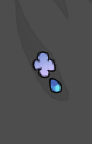

The stages of how I render gems/dew drops. Take the base color, make it a bit darker and less saturated (as well as changing the hue a bit depending on what the default color is. For yellows I go more orange/red, for blues I go more purple or even pink. It depends), add a small drop light at the bottom thats a fairly saturated version of the base color, and then a stark white/ near white highlight. That's it. Don't over complicate it, it will not matter when it gets shrunk down. Note that I do not use multiply/overlay/screen layers for these types of things as it adds too much bulk to the files and doing it manually helps to strengthen your color theory skills.
For shading and rendering, again, I create a "normal" layer and simply. Draw over what exists. Color picking and hand blending allow me to create the exact shades and effects that I want that multiply/screen/overlay layers may not be able to achieve. (which isn't to say I dont use them! i just don't use them for the main meat and potato part of my coloring) All of what is shown here is also achieved with the CSP asset SOIPEN (which can be found for free in the asset store)
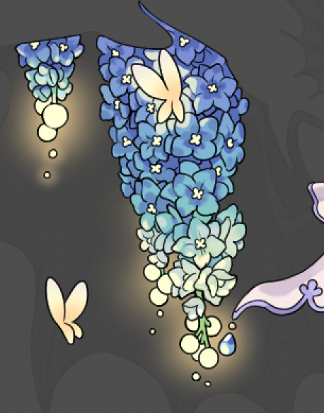

another example. The one on the right is showing how the layer looks without the gradient base layer under it. All of this is rendered by hand. I also specifically put a highlight color around where the butterfly is sitting to give a better illusion that it is properly sitting on the flowers rather than just in front of them.
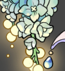
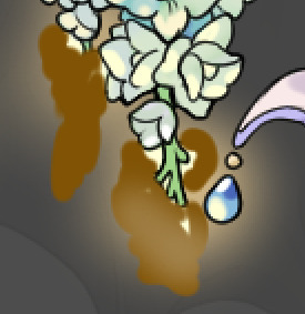
Next is changing the color of the lines, if needed. A method i'll use is I color just the sections I want (on a separate clipping layer) then lock that layer's alpha setting to them add in a gradient. It's a small and subtle effect that adds more depth without doing a lot of effort. (work smarter not harder)
Now we get to the Polish Layers!
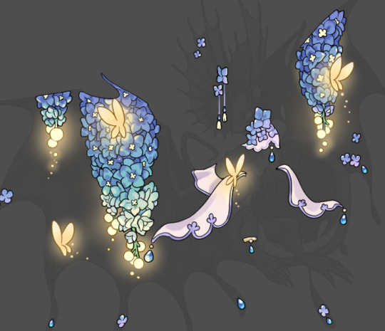
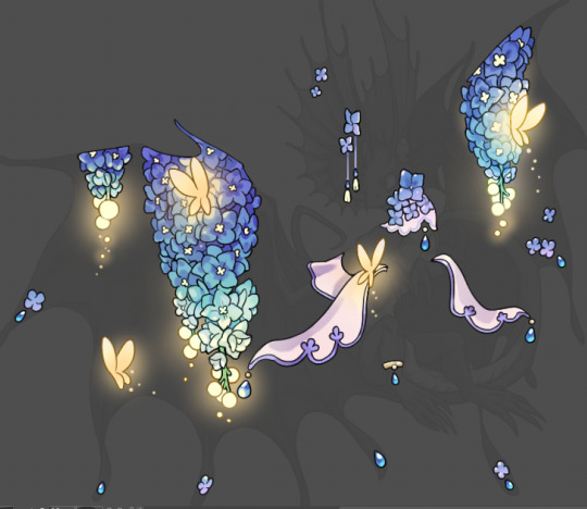
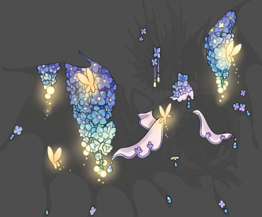
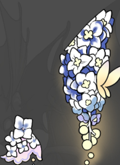
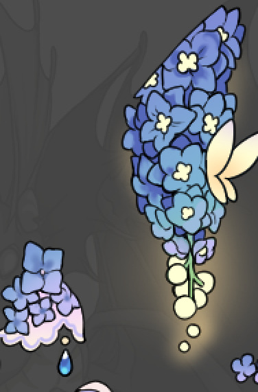
first image is how it looks as a base. second image is with an overlay layer applied. I've used some dark purples and mid tone desaturated greens to push the values a bit further (especially evident on the top left wing) Third image is with a screen layer applied, highlighting the inner most part of the flowers and adding some additional bounce light.
An important thing to note about making accents vs making full coverage skins: OPACITY AND LAYER TYPES MATTER OVER TRANSPARENT SPOTS. What I mean by this is that if you use a soft, light grey to shade with a multiply layer, don't clip it to anything, and have it go outside the lines - that will no longer appear as a 'shadow' when it comes to the final result. Instead you will have a section of soft light grey that is simply laid on top of whatever the image under it is. The same applies for overlay/screen/add layers and so on. If i use a very dark color on a screen layer (to give a soft highlight) and airbrush it over a bunch of stuff and don't clip it, it will end up with this horrible dark splotch over everything that isn't opaque. To this end, mastering normal layers is imperative to having well rendered and convincing accents.
Another thing of note: when it comes to sparkles/small details, note how 'large' the sparkles behind the butterflies are. They seem a bit chunky, yeah?
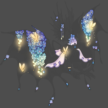
this is what they look like at proper size. If anything, I could have gone larger on the small metal beads connecting the dew drop jewels to the lace.
Another trick I also like to do is this:

a slight hint of transparency! It's just enough to let the dragon's lines underneath show through but not enough to be super noticable. I like to do this a lot when it comes to sparkly and magical effects.
Next is the worst part of all: destroying all that beautiful hard work with the shadow and line art layers! (sobbing)
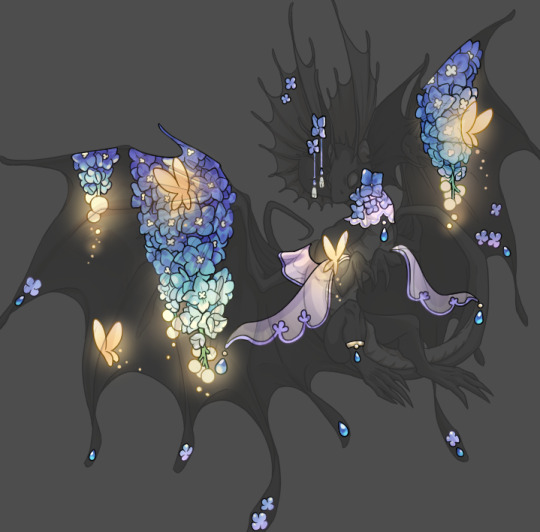
This stage always agonizes me. This is my first pass of the shadow/line layers and let's hope it's dark enough.
But yeah that's a start to finish look at how I create my accents. Unfortunately a lot it devolves into needing to know, yknow, line weight and silhouette importance, color theory and the ways that drawing applications actually apply color to a png vs how its rendered in app. All of these things impact the finesse of the accent, and are things you do have to learn gradually over time, but hopefully this has given yall some additional insight and perhaps some helpful tips.
And this should also explain why I get so mad when people go 'hey can I get this accent in another color' no! no you literally can't!
157 notes
·
View notes
Note
hi dema! i’m learning how to do digital art, would you mind sharing your coloring process? coloring (and lineart) is the hardest thing for me to do T_T… what brushes do you use for coloring and how do you not make it look muddy? i’ve been trying to follow tutorials from different artists on youtube but i find my work to look so muddy… thank u in advance >__<
Hi, and thank you for thinking about me for advice! I'm honoured to share a bit of my process, nerve-wracking as that is for my shy self, and hopefully help you out as much as I can. Forgive me if I don't express myself very clearly—I have a bit of a hard time explaining these things. Now, let's get started, shall we?
I'll be using the first panel of this artwork as an example.
My process is pretty straight-forward for most artworks. Make a sketch, draw the lineart, and follow a self-made guideline for coloring and rendering.
Sometimes I'll throw the guideline to the trash bin and start experimenting with brushes and chiaroscuro and color palettes, but that doesn't happen most of the time and, when it does, it's more a challenge than anything else, and not really what I think you're looking for.
I'll include my usual steps here, however, and like I said earlier, these steps are more like what you'd call guidelines than actual rules.
(I just realized I didn't save the sketch for this artwork. Oops)
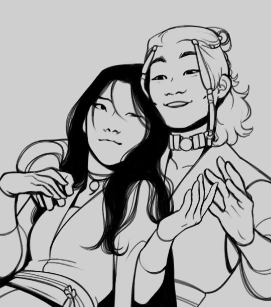
This is the lineart!
I tend to think that details bore me and are actually pretty exhausting to do, but then I go and make things as clear and detailed as I can. Because I'm a hypocrite like that.
I did try to keep things simple here, though, mostly because I had to go through three other panels and didn't want to burn out my fuel mid-process.
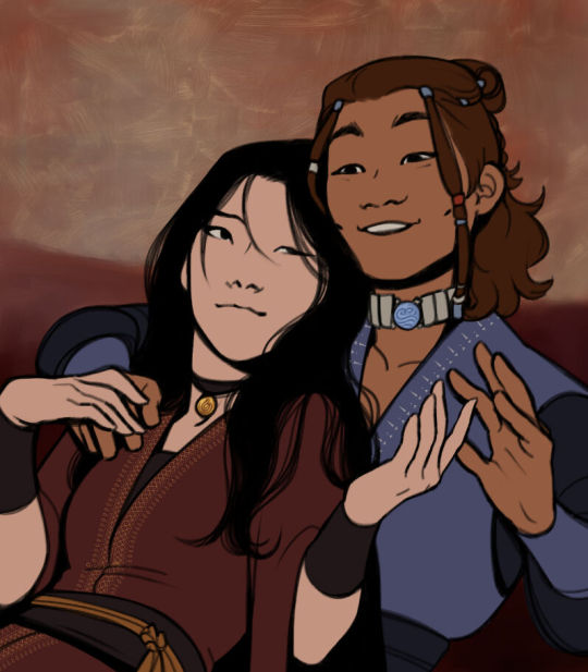
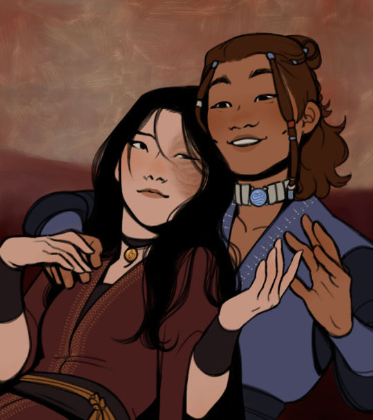
Base colors! The blush (and Zuko's scar!) I draw in a different layer in case I need adjusting the brightness or saturation later.
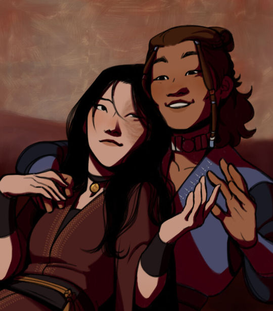
It's time for shadows!
Pick a color depending on the atmosphere you want the artwork to have. Is it a cozy, warm scene in a honey-tinted room, or is it a moment shared under the moonlight? The color choice should come as an answer to those questions—deep red for the first one and dark blue for the second.
Choose a color and make it dark and saturated. Then, play with the layer opacity! A darker shadow means harsher light, while less opacity works best for a softer look. See the difference? It's subtle, but it's there.
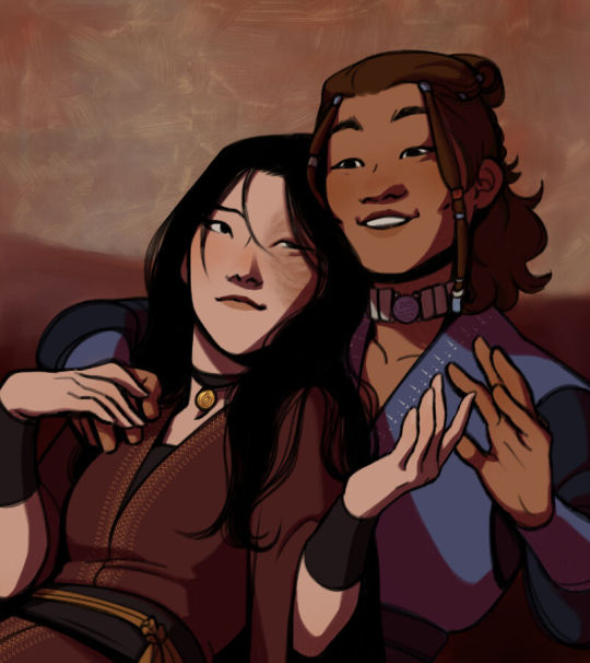
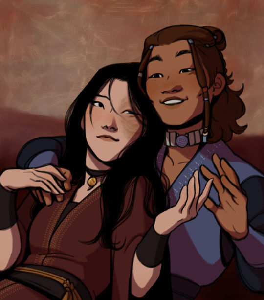
Of course, this is my personal choice. The way shadows are drawn and color is chosen depends on the artist and the artwork. I choose to play with a more simple coloring style, keeping shadows from blending into each other, but you may like a more realistic approach to shadows and colors.
My best advice? Try doing it every way you can, but in the end choose what works best for you. Whatever feels more comfortable, whatever you enjoy drawing the most. And then work to improve it. Love the little proof that you've gotten better, even if it's subtle.
And talking about subtlety...
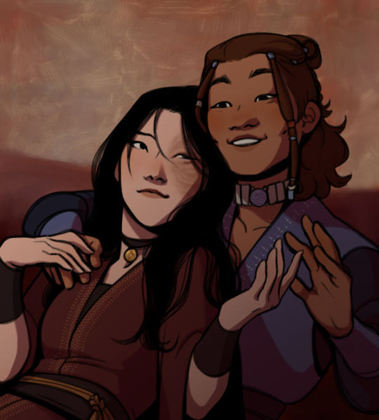
I love to play with gradients. I use them mostly to give the artwork some form of atmosphere, and make it look cohesive and whole. A light gradient in the color and direction of the shadows will help the characters blend with the background, as will another gradient in lighter colors for the light.
Get creative with gradients! Use them so the lights feel brighter and the shadows darker.

Now it's time to work with the lineart again.
The pure black lineart makes the artwork look harsher, sharper, so I tend to give it some color to soften its edges and compliment the rest of the drawing. In darker shades as the rest of the colors, growing more saturated as the light comes closer.
I love to make the characters' eyes pop and glow! It's really fun what you can do by just messing a bit with the tones of the lineart.
Finally, I play with the level correction. A high contrast will help your artwork stand out and look brighter. See the difference?
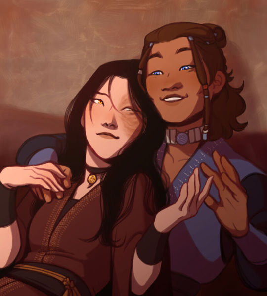
And it's done!
Sometimes I like to add other effects or details, but this is the very, very rough shape of my usual process, and thus what I thought you'd like to see.
Once again, I'd like to point out that this is what works for me, and a large part of improving as an artist is just fooling around and messing up until you find the tools and tricks you're most comfortable with.
So keep drawing those muddy shadows and colors! They're only a step of the process.
#dema answers#zutara#art advice#art process#I hope this helped you anon#Tbh I have zero idea of what I'm doing most of the time#So don't worry if you don't#Worry instead the day you feel like a drawing comes easy and poses no challenge anymore#Always strive to do better to improve to fix that lighting or find a new way to depict a scene or find other filters and effects#No artwork is ever perfect and perfection itself should never be the goal#“Don't trust a song that's flawless”#Don't give up on the strain and the frustration of struggling against your own skills#Never fall out of love with the process#That's where art is
28 notes
·
View notes
Note
what's your process for coloring like? the look of that elendira is so textured and interesting, i can't figure out how you do it
AA THANK YOUU ^__^ !! textures & brushwork are my favorite things abt my art, so im happy you find it interesting hehe . its SOO cool to look at & so much fun to draw imo
i prefer to color by building in layers , if that makes sense 🤔!! hundreds of them !! such that i'm always drawing on Top of previous layers, working from big & messy blocks of color to, eventually, small and refined blocks of color until it feels processed enough. as a result, i rarely ever erase (!!) and i rarely ever draw lineart aside from the initial sketch
a rough, patchy textured brush is key here, as it'll give you dimension and variability w/ your colors. i recommend "Brush and various sets of fountain pen style (万年筆風ブラシと色々セット)" on Clip Studio (ID: 1679706) !! :3

im terrible with explanations though, so i'm going to show a step by step of that elendira drawing if you dont mind :3
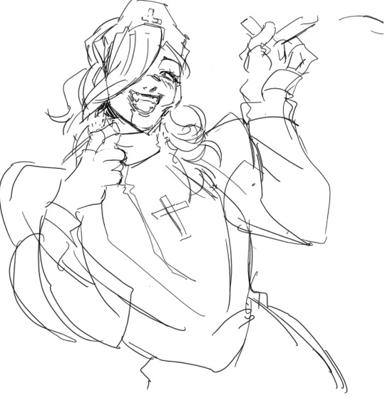
sketch layer !! because i mostly render through color alone, i try to make this as close to the finished thing as possible . ^__^ i hateee drawing the same thing over and over and like the expressivity and movement of my sketches anyways , so the more i can preserve at this step, the better. if u were to look at a side by side of my sketches and finished pieces, youd notice a lot of those og lines are present in the final drawing :3

2. flats !! pretty self explanatory, but the solid background gives me an idea of where the figure begins & ends while the colors themselves help distinguish whats what . i stick to ambient lighting @ this point because im usually not sure what i want to do with the overall palette or lighting yet . having two tones (ex, dark and light in her hair or dark and light on her skin) can also help in identifying key features early on that u wanna preserve. as you build layer by layer, sometimes these areas will remain untouched and i think it makes for a rly lovely feel at the end

3. start blocking !!! to be totally honest with you, i dont really know what i do here HAHAHA. like i just scribble the shit out of it, usually focusing on what i might want to do with lighting (ex: grey areas to accentuate folds in her costume). i think i like to start "erasing" the sketch where possible by coloring on top of it .. like if you look at her hat or her arm , you can tell i'm starting to get a sense of the shapes i like vs the ones i dont. it's at this point that the final image starts to emerge in my mind , like im gradually pulling her from a tarpit of scribbles until shes recognizable lol. chipping away at the marble until i can free her. tbh.

4. keep blockingg...when u think u are done , block some more . as you can probably see, the brushwork becomes more intentional as i add more shape, with specific focus on line weight. this is also where the patchiness of that textured brush comes in - notice how none of the colors seem totally uniform (ex: the red cross or the original sketchlines for her waist). you can see bits and pieces of the layers underneath pushing through and i really like that !! ^__^ its very fun and sketchy to me, so i try to keep them around. those areas are also great to colorpick from, because it'll give you "new" colors to work w/ that are already part of your palette.

5. GRADIENTS & GRADIENT MAPS !! TONE CURVE !! COLOR PICKER !! this is the best stage tbh. flatten your image so its all on one layer and just go crazy with all the color settings in ur program. add gradient layers and set them to darken, or overlay, or subtract, orrr. lighten or dodge glow or divide or soft/hard light.! OR!! edit the hue, saturation, luminosity and contrast.and then color pick from these edits, block even more on top of ur image, flatten, color edit again, etc. etc. until u feel satisfied.
ANYWAYSS . i hope that makes sense @__@ sry i wrote this out and deleted it like 23 times trying to make it make More sense but thats what ive got HAHA i hope its useful though :3 !
#SRY I STRUGGLED 2 EXPLAIN THIS#dude its like my brain bcomes stuffed w/ cotton anytime i try 2 write#i hope it makes sense tho..#it also probably sounds so redundant to make new layer one after the other for just a few brushstrokes#but those brushes i linked have a multiply property so if you draw on top of prev lines they'll create dark patches#and so if im working over a large area ill generally need like . 5 layers each with one brushstroke :sob: if that makes sense#this one had . 84 i think. total. layers i mean. the merylvash one had 300+ HAHAH so it rly depends#like YEAAH i could just use a normal brush but i really like the way this looks#andd sometimes the multiply function works really well or will give me the proper shadow tone im looking for#anywas.wanywaysn anyways#asktag#anonymous#long post
60 notes
·
View notes
Note
how do you like,,color schemes, or like color pallets? i have ideas for colors but when i put them down it all looks muddled or disjointed or just weird, even when i plan it out, so do you have any advice?
(ik you get a lot of asks so no pressure to answer 😭 also thank you for the advice on dynampic panels! it was rlly helpful and im getting the book you and the commenter reccomended soon.)
That's a tough one. I know a lot of artists really play around with color schemes and color theory, but I never went in for that stuff. All my color palettes were generated initially by drawing the character, coloring them in different ways until I found one I liked (lots of playing with HSB sliders) then saving those colors to the palette for future consistent use.
I think this is a fine way to handle things - some of the pallets have even shifted a little over time as I swap out individual colors for ones I like more. For instance, my pallet for Falst still has a dark brown saved in it from when my design for him had darker hair, before I decided I liked the aesthetic of the lighter, more golden hair.
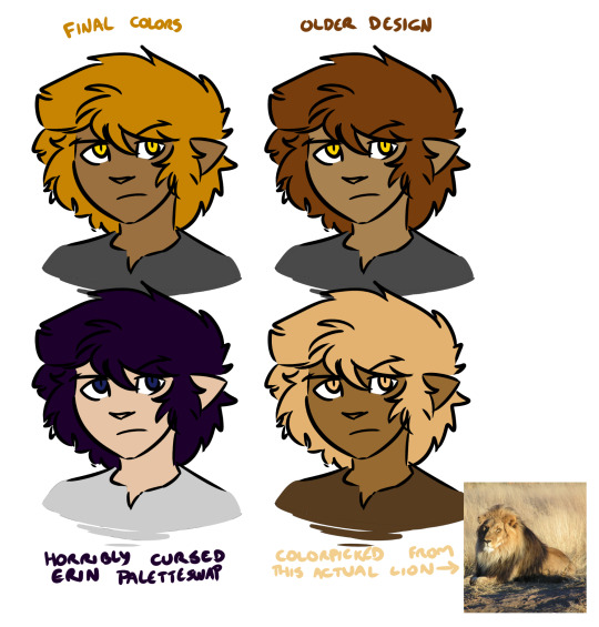
There's no right or wrong answer here (except the cursed paletteswap) and a lot of alt color schemes would look good, but the trick here is that as far as I'm concerned this matters a whole lot less than your shading and lighting.
If the colors look disjointed and weird, it's entirely possible that this is because the figures aren't matching their environment. If we were doing physical art, this would be a huge pain in the ass to fix. Fortunately, because I do digital art, I don't need to worry about all the complexities of paint mixing and underpainting and all that jazz - I can just use layer combine modes.
Suppose we want to put a character into this lovely unity asset.

If we just slap our figure on top, this isn't going to look good.

He looks like a desktop icon. We can do better. The light source in this shot is high and centralized in the frame, and it appears to be a dusty blue-white. The shadows it's casting are quite dark and stark. For now let's not worry about the color of the shadow layer - let's just draw in how we would shade this figure given this directional light. I'll use a nice light purple to start with, but we can play with this later. Benefits of digital art! Other benefit: when set on a Multiply layer, a light purple shadow immediately makes our figure look like this.
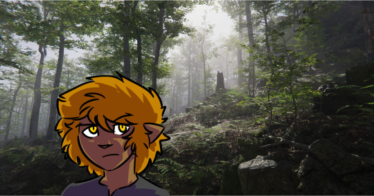
That already looks a lot better! But part of what's making this figure stand out against the environment is that the darkest points on his design are a lot darker than the background he's standing in front of, and at the same time the shadows on him are much lighter than all the shaded areas we see in the background. This is also one of the telltale visual indicators of bad VFX compositing - the light levels and black levels need to match between the different parts of the image. (there's a late episode of columbo where they use this to catch the killer!)

So, for the easiest first step, let's see what happens if we shade the figure with a dark green colorpicked from the image instead.

Immediate improvement! We've got the shadows lined up and the figure looks like he belongs in the environment. And while we could leave it as-is, I find it also helps to address the highlights as well, especially in dark environments. So I take a mid-tone gray from the light part of the image, I select the negative space of our shading layer, I fill that space on a new layer set to the Add (Glow) combine mode, I use a soft eraser to mellow out the really harsh glow that's farthest from the edges of the figure, and I blend the whole thing by 200 pixels.
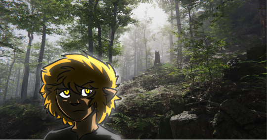
We could keep playing with this, but at this point we have a character who, regardless of underlying palette, looks like he fits in with his environment. Heck, we can even hit him with our cursed paletteswap and he still looks like he fits in the space.
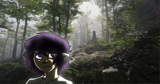
It'll work even if he's a uniform neutral gray.

So while precisely playing with color palettes is very important for certain styles of art, one huge benefit of digital art is you can just use your own freeform aesthetic sense to lock in a very basic starting palette that defines how your characters look under theoretically perfectly neutral conditions, and then you can do all the other hard work of coloring them and matching them to the space by way of shading and highlighting without ever worrying about the underlying base colors. And if you decide some part of the figure is too saturated or dim or weird or whatever, you can play with that one part until it looks good and then just update your palette with the new shade.
173 notes
·
View notes
Note
how did you make the color fade and glow for the smiley lamp on your header? if you’re willing to make a tutorial, i’d love to see your process!
I prayed at the shrine of Feral Pran & in a moment of divine generosity, he shone his unhinged light upon me (literally) 🙏

back to business 🤪 I figured out how to create this effect as I went along, but I’m really happy with how it turned out! there are probably plenty of ways to achieve it, but I liked the control this method gave me.
for context, here's the Bad Buddy lamp Nonnie's referring to before we jump into it:

first, I did a Google search for "color change GIF." I used one very similar to this:

I imported the GIF into my header PSD in Photoshop.
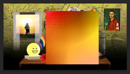
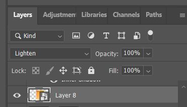
I changed the GIF's blending mode to "Lighten".
this is what my GIF looks like now. it's already looking more subtle and glowy, which is our goal!
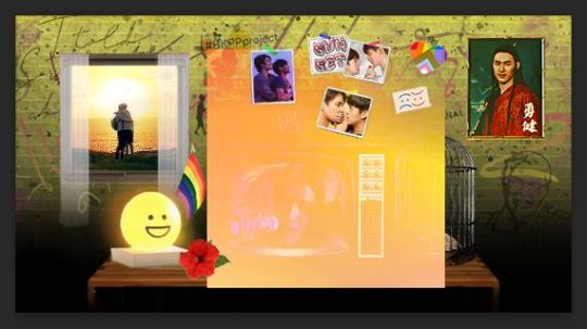
I moved the GIF over the light, then reduced the size quite a bit.
be sure to actually play the GIF through a couple of times and see if you like how the light is moving. you can always rotate the GIF, resize it, etc. to better achieve the effect you're going for.
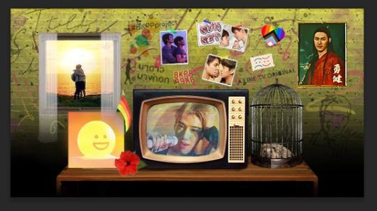
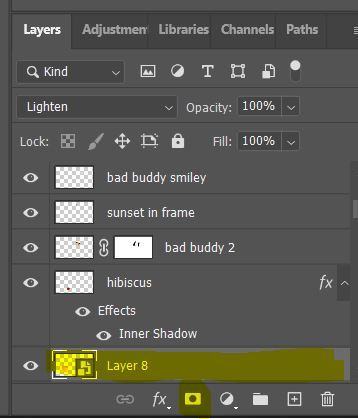
now the fun part: make a layer mask and get thee to blending!
make sure you have the GIF layer selected (see screenshot). create a layer mask by clicking on the little square and circle icon (again, screenshot).
blending is a whole other tutorial, so check out a guide on Tumblr or on YT if you're not familiar. there's an art to it- you're literally blending away the GIF/image/whatever by hand- so a lot of it comes down to the effect you're trying to achieve and personal preference.
my advice: use a brush set to 0% hardness, blend away the hard outer edges first, and play around with the opacity (I'd start no higher than 50%). you can always use the eraser tool to bring back anything you blended away too much of.
as a last step, I changed my brush size to a small enough size that I could erase the GIF completely just on the smiley face portion. we want those lines to pop and stay stationary while the rest of the GIF seems to "move" (the glowing effect).
here's what I ended up with:
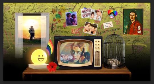
we're not done yet, though: I wanted the light to look like it was actually fading in and out, so I needed to add a fade transition to the beginning and end of the GIF.
click on the half-white square on the Timeline (see screenshot).
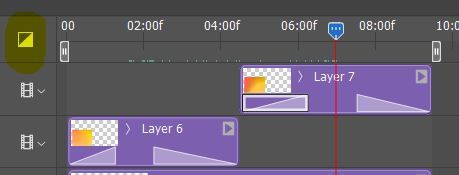
a little pop-up menu will come up- "Fade" is the first option at the top. click and drag on "Fade", releasing over the start of your GIF.
a little incline 'hill' will appear on the GIF layer. you can click and drag on the high point of the 'hill' to make the fade effect longer or shorter.
do the same thing again, but click and drag the Fade effect onto the end of the GIF.
that's pretty much it!
you might have noticed I have two color fade GIF layers on my header (layers 6 and 7, above). I wanted the lamp to have multiple fades- it's just more visually interesting- so I copy-pasted my blended GIF. now, the effect will play twice as the header loops (never said I wasn't extra).
I hope that helps!
#mor answers#anonymous#bad buddy#gif making#header tutorial#gif header tutorial#gif light effect#gif tutorial
26 notes
·
View notes
Note
I've been really self conscious about my coloring abilities in digital art, can you maybe give some tips on that because your art looks amazing
of course!
some general tips i can give you with no specific order of method is: *filters, *what are complementary colors, *color picking, *hue direction on lighting and *layer blending modes to summarize what i’m covering here.
tip #1- feel free to mess around with filters. if you have a program with filters like brightness/contrast, hue/saturation, yada yada, value those tools to help you adapt better to understanding flattering coloring. sometimes you may color a piece and it feels super saturated or bright, use the filter tools to adjust it in a way that is less straining for you to look at but also still makes sense.
tip #2- practice identifying complementary colors. what colors work with red? blue, green, etc. what level of contrast/brightness should it be to help the red pop out more? these foundations will help you decide necessary colors for your palette, but try to keep it simple. and dw multiple colors of the same hue (section of the color wheel, like blue) count to, but try to keep it simple.
tip #2.5- you can also just copy off an official color palette if you ever need to, it’s also just helpful for accuracy.
tip #3 for shading, the hue of the lighting will tend to vary both based on position and environment. i wouldn’t worry too much about it but some general tips are, lighting will get gradually cooler the further it is to the darkest area of the shadow.
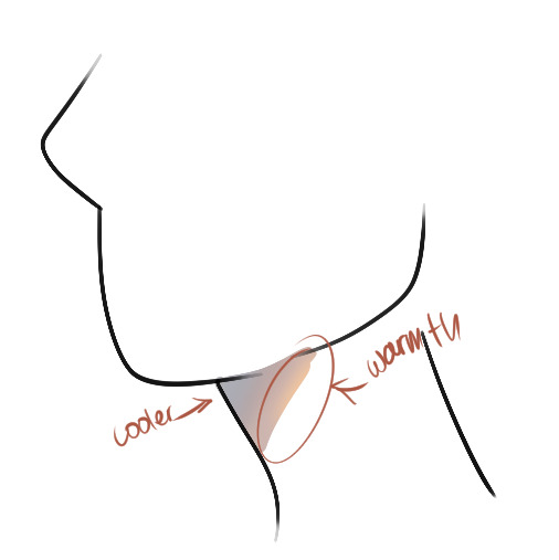
another general trick is if you don’t know what color to use for the shadow, warm tones like crimson or maybe the color of the skin are good for general lighting like day time or such. cooler tones like sky blue are good for stuff like closer to night time or a cool-lit room, etc. but again it also really depends on what looks good and benefits you.
oh yeah, for shading layers, i tend to switch between multiply and linear burn on blend layers. it just depends how intense i want the shading to be without having to directly go to the filter tool. multiply does general shadow building but linear burn helps emphasize shadows in darker colored areas, like a dark navy blue. again it depends on whatever i need. i also tend to use the add or glow dodge or linear light whatever is the brightness and most saturated blend mode on your program for highlighting certain areas. i typically use warmer colors for this unless it’s nighttime to which i’d use like a cyan.
these are really the main basics i’ve had in my coloring routine for a years that always helped me.
i hope these aren’t to confusing or broad, i would have drawn more examples but i’m kinda tired rn ^^. if you’d also like some recommendations i suggest looking into sinix design and his quick tutorial videos. marco bucci is also really good at coloring but there are really a lot of videos so i’d recommend colour harmony - 10 minutes to better painting. you don’t really need to start digitally painting but it’s just good fundamentals to learn about as it impacts cell shading as well.
17 notes
·
View notes
Note
Hello, I'm absolutely in love with your work, and most especially your use of color!
Apologizing in advance if you've answered this sort of question already, but do you have any particular methods of choosing/applying color to your pieces? I've struggled with choosing interesting colors/palettes alot personally and would love to know if you have any tips or anything about it!
Hello, thank you so much for the question!
I've been sent a similar ask before, but I also don't mind talking about art so your ask is more than welcome. Plus you touch on an interesting point! The way you apply color can be just as effective as the color itself. FUN.
The ask I linked above talks about how I choose color palettes, so check that out if you're interested~. I'll expand a little bit more down below since you got me thinking about stuff
(One note though: I primarily work digitally, and I might on purpose or accidentally frame my tips around that mindset.)
It's time for a list because I love lists so much:
If something breaks the rules of reality but looks COOLER or fits your style or theme or you just LIKE it more....maybe do it anyway. Why not? At least see what it would look like! (Make a new layer if you're working digitally, sketch it out on some scratch paper if you're going traditional) (this is especially good with color. I KNOW not many shadows are that shade of teal but it just looks good jerry, sorry!) (Light sources are good for this too)
You are not locked into anything, ESPECIALLY if you're working digitally. If you don't like how something looks, try first to figure out what WOULD make it look better and then give it a shot (I say to think about it a little bit first to try and prevent the sketch-delete-sketch-delete cycle, but....sometimes you NEED that cycle too. Even deleted art still lives in the memory of your hands and experience. It’s just trouble to get stuck there.)
When struggling with colors, look to simplify. Maybe do more pieces with JUST flat colors, see if that doesn’t help your palettes. You will find your renders more appealing if you start with a base you like, and even if you don’t like your renders…you’ll have a base you like, and that’s good enough! Flat color art is COOL. Knowing when NOT to add detail is just as masterful as knowing when and where to
When it comes to something you're struggling with, look to other artists. That's part of why I'm very happy to answer asks like this - it's good to remember you don't have to come up with every answer yourself. Even if you can't ask directly, there's a lot to learn just from...looking at art. What inspires you? What looks cool, or appealing? What solves a problem you've been struggling with?
For example, going back to color, you learn early in digital art that a purple/blue layer on multiply (or you know, other colors, but it's an example) can be a quick and easy way to do some shadows. and it is! I use it even today! But I never really liked it. So I started struggling with shadows. So I started looking to other art for inspiration. I've just always liked vibrant colors and watercolor as a medium, so...I started trying some things with that as my inspiration point.
I began applying shadows with watercolor brushes and wash brushes, I started using teal and aqua for shadows on top of a thicker magenta base. I started doing rim-lighting (boy oh boy rim-lighting). I started pushing and pulling colors, adding layers like with colored pencils. I started using more glow dodge layers, a separate layer for more opaque hard light and less opaque blooms; making pieces brighter instead of darker. I STARTED. Doing things I just LIKED more, and found out that hey…..some of it works. Some of it sticks.
There’s a lot of advice out there on how to overcome artblock; and while I know that isn’t the exact nature of this question, from my own experience I’ve usually found I hit an artblock when there is a specific THING I am struggling with (for a long time it was feet. Right now it’s shoulders, necks, and noses. For you, perhaps it’s color). Whenever I hit this point there are a few easy things I try and lately it’s been working out.
I start by stopping drawing. I go out and get inspired again. Reading, watching animation, going out and seeing nice scenery in some good lighting, looking at other artists’ work…I take my mind of my own stuff and refill it with Good Juice for Creatives
I wait. I wait until my hands itch and I just gotta draw again. I wait until I have at least ONE thing I know I want to draw or try (like a new brush or challenge or IDEA)
When I start drawing again, I take it easy. Sketching in the sketchbook, drawing fanart or oc’s, not trying to come up with too much from scratch. The break we took earlier at least gives me enough energy and want-to-draw to power through the struggle of any remaining artblock
When you’re learning…there can be a frustrating SLOWNESS to it. And with art, well. It’s tricky. You’re training your eyes, hands, and mind on something…almost completely subjective. That’s why I keep coming back to studying things you like! Not only does that make for a more enjoyable experience…well. When I was in college, my art teacher told us to “trust your gesture”.
When you are actively doing or studying art, you’re building a mental catalog. When you’re LIVING you’re doing this too! That’s where trust your gesture comes into play. You know colors you like when you see them. Trust the colors you like to be some of the colors you can use. Trust some of the things you like to be things you can learn from. A lot of art will come more naturally when you say “I know I can do it this way…but I WANT to do it this way”.
And that’s why so much of my art is Like That.
#chan says#replied#oh goodness it's long and i had too much cheesecake and also it's a monday and i'm alive so#i#rambled#sorry!! i hope this helps in....ANY way.#frankly you just asking questions like this is a good part of due diligence! to you and your art!! well done!!
25 notes
·
View notes
Note
Hi ky!! Every post you make about your OCs just makes me more excited for your story. Not even to mention your GORGEOUS portraits of your OCs. Could you maybe walk through a little bit of your editing process? Just like, in general, what you do for your portraits? Also, how long does it take you to do one of those portraits? (like the ones for your covens.) If you don't want to/don't have time to, that's a-okay!! I just thought I'd ask, since I very much admire your portrait editing!! <3 (also, do you take your pics in CAS or in-game?) Thanks so much, and I can't wait to read your story!! Love, Morri. <3
HI oh my gosh thank u so much ??!!! ur literally the sweetest please :,) i’ve been meaning to do an updated editing tut thing and i have some time tonight so here u go !
the main things i do are; repainting/fixing clipping, shading, highlights, extra highlights + touch ups, and hair usually in that order. it takes me between 1-3 hours for each one, depends on the complexity and what i have to fix. for the guild posts i took them in cas but either way i use srwe to get a cleaner image in game.
also i’ll link the brushes i use throughout the tut, i use procreate but im p sure u can use the brushes in photoshop too if im not mistaken.
okay tut below the cut cause this got longer than i thought lmao
repainting/fixing clipping: so for this i usually go in w a hard airbrush (linked at bottom) and well.. repaint or i’ll cover up any clipping with hair or accessories. i also usually do this when the clothes look really pixelated, i like using the smudge tool as well. here’s some examples. i just follow what shadows n highlights are already on the sim for this and color pick from the selected area

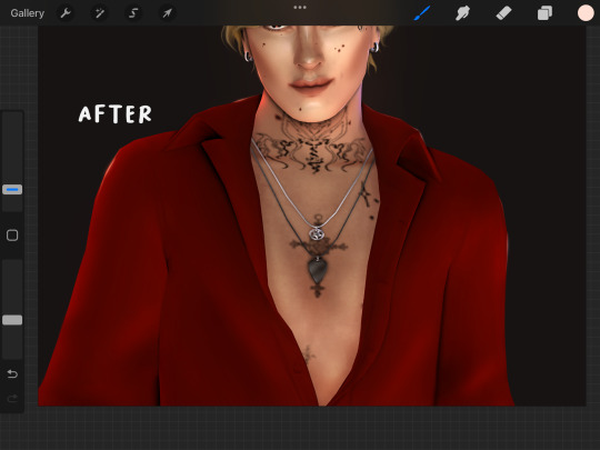
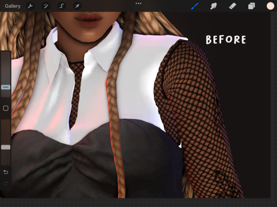
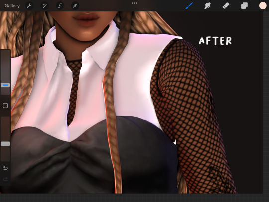
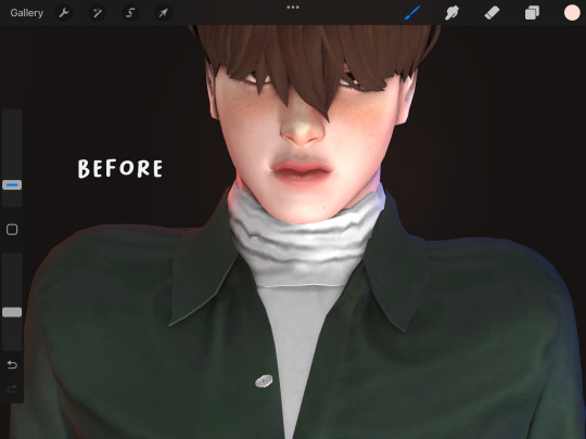

2. shading: my general shading process is the same as this post here, especially w the areas. like i said above i usually follow what shadows reshade has already laid out for me but also i’ll add my own in where i see fit.
the only things that have mostly changed from that post are; 1. i use a diff brush which i’ll link at the end, and 2. i use this color (hex code: e88d6f) on a multiply layer, gaussian blur 1-10% and layer opacity between 50-80%. just depends on what looks best to me. (oh also i shade clothes w a color pick on a multiply layer now instead of w black)
3. highlights: also pretty similar as above, i use an overlay layer, this color (hex code: ffded2) gaussian blur it, and set the opacity between 40-80%. again just depends on what looks nice. i also add a lil glow to the eyes on this layer w that color as well, makes them pop a bit.
4. extra highlights: so this one ur gonna want the highlights brush from this brush pack here (hair pack). it’s rlly snazzy, i use it on the nose, jawline, and eyes (examples below) usually using the same color as above for highlights or i’ll color pick from the sim. i set this layer to an add (linear dodge if ur in ps) layer, opacity varies, if it’s too bright i’ll just turn it down until it’s not lmao.
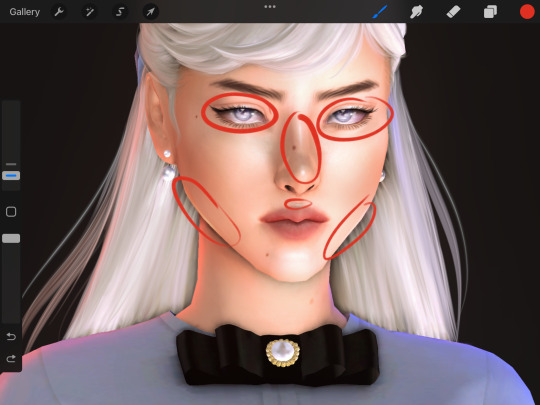

5. hair: oh boy. okay ur gonna want that brush pack from above, this thing actually saved my life w hair. i duplicate my base sim layer and alpha lock it. from there i’ll use the soft hair brush from that pack both as a regular brush and a smudge brush. my best advice here is to color pick when painting and follow the direction the hair goes. i’ll add a time-lapse below because i feel like showing is better than anything. i also use that highlights brush from the hair pack and add some lil stray strands. i can't tell u how many times i redo the hair, it can get annoying sometimes but just take ur time !!
last bonus tip is to have fun with it !! ur making art and it’s the process that makes it exciting, i like to always try something new when making an edit. i see it like painting (which it is actually now that i'm thinking about it lmao) but just go nuts !! i used to super rush my stuff and i never rlly liked it so w these i took it slow and found what worked for me.
here’s the brush i use for shading and repainting but any hard airbrush would work just fine too!
#GAH that was kinda a lot im sorry if none of that made sense LMAO#if u have anymore questions feel free to send more !!#asks#morrigan-sims#my tuts
24 notes
·
View notes
Text
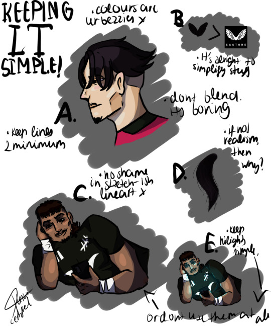
LESS = MORE art tips vol.2
I can't stress enough with this. If it's not realism, then why do people feel the need to make their jobs so detailed that it hurts to look at?
Anyways let's get onto breaking down the examples.
A.
So, avoid blending. Please. It doesn't make the colours pop in the slightest and makes everything look like a porridge, just a bad way to present a stylised artwork. Just don't blend and add normal shadows. That's the only way out of it. Also make sure to use as much colour you can to make the work look more complicated than it is. Also line art can be messy. It's even better because it gives work some personality and makes it more lively, while a single line makes it do the opposite and lose everything.
colours = ur bezzies
no blending
use your line art skills
restrain yourself from using a thin brush
B.
Logos. It's easy but at the same time not. I just recommend listing down things that make the logo stand out, like I did with Castore. It's just a pair of wings, so quite simple, just drew the wings with no text and detail in them. I did the same with Adidas as seen on examples C and E, as well as the fern logo on the both examples. As long as you know what it is, and are confident that you've portrayed it nicely, no one is going to ask questions. Plus people don't even look at it in detail!
the less detail the better
absolutely no text allowed
3-4 lines max
if it's a letter, don't even thing about recreating the same font - just draw a lazy A or B and call it a day.
C.
Again, like in example A, blending is avoided at all costs, and like in B, the logos are simplified to a level where it's recognisable if you know what you're doing. Shadows are done in a nice tone, and there's not much difference between example A and C other than the colours used and the part of the body portrayed in them. It's also visible that I've simplified the face, Rieko Ioane in this case - it might not seem like it, but if I go around saying that it's Rieko, then it is going to be Rieko and nobody can do anything about it. Just know what you're drawing, and take every short-cut you see.
just don't blend alright
know who you're drawing
simplify everything
messier line art - more personality
D.
Trust me, unless it's realism, nobody's going to chop your head off if Marcus doesn't have each of his hair strands drawn individually (actually yes they are because there's a simpler way than drawing each strand) so just don't do it, and do it like seen in example A - no blending, just a good line art that provides everyone with everything they need to know. Moral of the story - DO NOT draw hair strands, use lines, it's simpler and you won't actually die from stress.
detail = bad
nobody even cares
just use your pen/pencil brush alright
E.
If you're not a muppet you've noticed that it's literally picture C but altered. That's to show how to do SIMPLE highlights. Yes, an airbrush tool or marker tool is allowed here - but only here, and to make it more convincing, I recommend adding streaks of the same colour but with the pen slash pencil tool (depends on what programme you're using!) Like I've written down there, it's completely alright to not use the highlights - they're loads of work but if needed, no shame in doing that either.
highlights are the only case where other brushes are tolerated.
add shine or glow mode to the layer
one colour and do it lightly to not steal anything from the work
Moral of the story - just don't do anything stupid, don't go deep into detail, don't blend unless really needed, and the pen/pencil tool is the only legal one unless a certain exception. As long as it's not realism (or attempted realism)
2 notes
·
View notes
Note
hello !! i'm absolutely in LOVE with your art and i wanted to know how did you colour and choose your colour palette (especially the skin,,,) in your latest uncle obi post ? 😳👉👈
i dunno how to explain but there's that soft yet sharp?? pink glow that contrasts with the skin tone and the blueish-shadows and it's so so pretty...
plz continue to make beautiful art and take care of yourself 💖
AAAA TYSM 💖💖💖 I’m literally the worst explaining these things tho :’) I’ll try my best :’o
Also little disclaimer before starting: drawing is just my hobby so I’m not posting this as a tutorial (?) this is just to show you my process aaaa, I’m sure a professional would help you a lot more than me with this but I hope I’m able to help you in someway 💖💖💖) (also, I know someone else asked me about my drawing process a while ago, it had to do with shading, lighting and color picking, but I wasn’t sure how to respond until now aaaa, sorry about the delay 😔, I’ll answer both questions here)
Ok, so first of all, I choose my background color :0. Background colors affect how your eyes perceive all other colors so it’s very important for me to start with that (like white background makes you choose whiter (?) or less saturated colors. Red background: redder colors, etc)
When I want a white background, I tend to use another color at first and then when I’m finished, I change it back to white just because most of the time my colors are not that good when I’m painting on a white canvas.
This drawing, for example, I painted first on a yellow background and later I changed it to white :) (this also applies to complex backgrounds... I always start with painting the background)

Then I open a new layer and place base colors :). I pointed out the color I used on Obi’s skin :)...
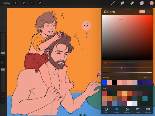
Now I open another new layer, set it to clipping mask and I paint a little bit of blush here and there on the skin with the standard round brush on approximately 40% opacity. I also use the same color for the lips :). (I covered up stuff that is not necessary with black to not confuse you lol 💖)
Now here’s where the fun begins :D... I have two things I apply to pick shadow colors and light colors
1. First I pick my “most common” colors (these would be the purpleish/blueish for shadows and kind of a yellowish tone for light, I circled them with blue on the pictures) but how did I got to these? (This might sound so stupid but it works for me lol) (look at the pictures below to understand better 😂) When I want to pick a color for shadows, I slide the color picker to the left, and if I want to pick a color for lighting, I slide it to the right :D ISKDMDKKF LOL Yes you read well aaa it doesn’t always works but 90% of the time does lol, if I’m using pretty “normal” lighting like this one on a drawing, works perfectly 😂
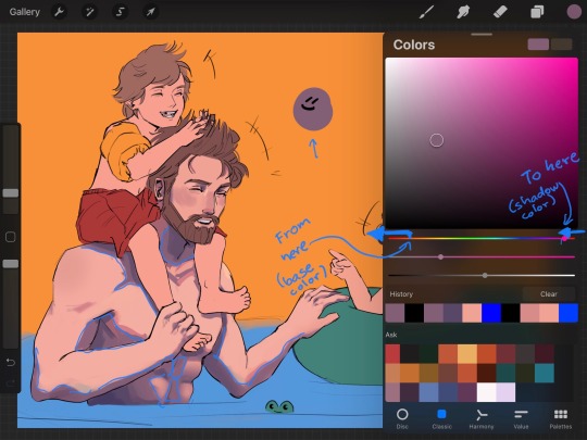
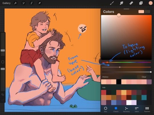
There’s no rule for me to know exactly where to “stop sliding” lol I just test how it looks and also play around with saturation a little. I must poin out, I never use the same color on all shadows (like a solid cell of color) I pick more tones of purple/ blue for shadows and more tones of yellow for lighting to put in there so it looks more natural. I use the airbrush to help me with that as well as the round brush.
2. So this is what really makes it look good. First some VERY short theory to understand why I do this and to help you apply it on other things. Light can not only come from a direct light source (like the sun, a lamp, fire, etc), light bounces, and when it bounces it kind of “brings the colors with it”
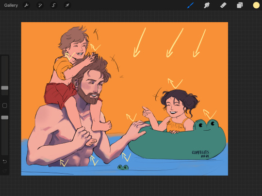
The arrows are pointing the direction of sun light. See what it does?
So when I’m coloring, I pay attention to the surroundings. In this case, light bouncing from the water, light bouncing from the green float tube, light bouncing from Luke’s red shorts, etc, all coming to Obi’s skin. Adding these, imo, makes everything look awesome
Of course, as the light bounces more and more, the colors become less saturated. Let’s take the light coming from the water for example. How do I choose the right color to paint this light on Obi’s skin?: I go to the blue tones and I just pick a very desaturated tone :), with the help of the standard round brush with approximately 40% opacity, I put a little bit of blue tones where I believe this light will hit the skin (circles with blue⬇️)
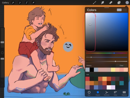
*Red circle is showing where the less saturated colors are*
This drawing was made kind of fast lol, so I didn’t really pay much attention to this here, but other drawings of mine show this better :0.
The “pink glow” you mentioned is something that I like to add to separate light from shadow :) you can see it above pointed in green⬆️ (I just like how it looks aaa)
Finally I change the background color to white.
I also add some freckles to the arms and chest
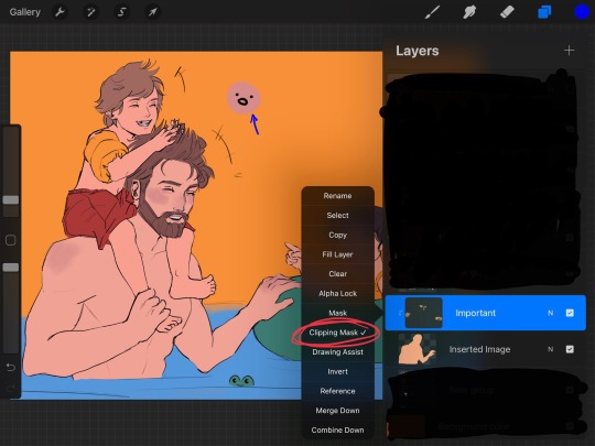
I add a multiply layer with 40%- 50% opacity and, with a blue saturated tone, I darken some places I wish to be more dark (like the abdomen, Obi Wan’s neck, some parts on the water, etc)
I open another layer set on “add” (15%-20% opacity) and, with a yellowish saturated tone, I lighten some other places like hair, arms, float tube, etc
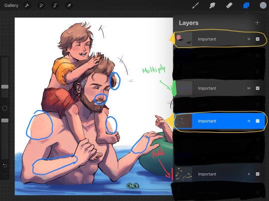
Finally I open a layer (or two) above everything (layers marked with yellow) and I start painting over the lineart where I consider needs some work (I marked those places with blue), sometimes I also add texture with other brushes in this layer too :0.
And that’s it oof lol, hope it wasn’t too long ;;; also ignore grammar mistakes aaa English is not my first language :’D
#obi wan kenobi#art process#ask#artists on tumblr#my art#coffe chats#hope it’s not super confusing :’)#coffe art
274 notes
·
View notes
Note
Its a lot harder to do with traditional art but I'd love to see progress shots of your colored pencil stuff its so neat
I wanted to wait until I had progress shots to show before answering this and I took some as soon as I was starting a new colored pencil illustration, which was the Pepto Bismol one I just posted. Gonna put a keep reading cut here bc this’ll probably be a bit of a long post lol.
I don’t have any kind of strict process I always follow, I just do whatever works best for each specific drawing, so I kind of just took a pic whenever I finished anything that felt like it could be it’s own “step.” Also keep in mind I worked on this during different days, different times of day, and different locations, so the lighting will be pretty different throughout the pics here which will affect how the colors look and the overall quality of the photos, I did the best I could with the changing lighting.
First step is the graphite sketch. Since I’m focusing on the colored pencil part of the process I didn’t document the process of sketching, just the final outcome
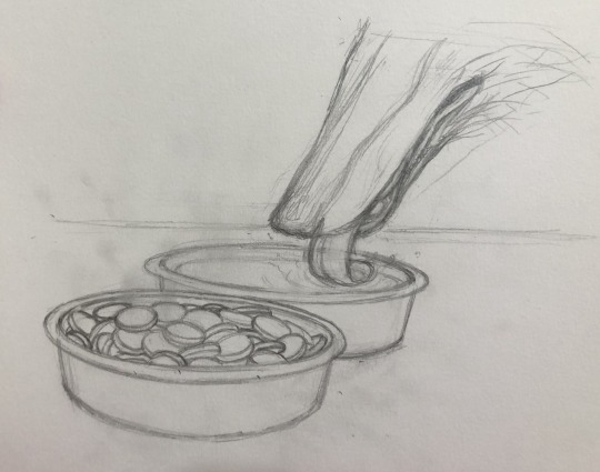
I go over the sketch with a colored pencil, I usually use a lighter color so that the lines you’ll see in the next step are lighter and not going to be noticeable when the drawing is all done, and I’ll go with a color that would be found in the illustration so that it doesn’t look unnatural wherever it may show through (I chose pink because, Pepto Bismol)
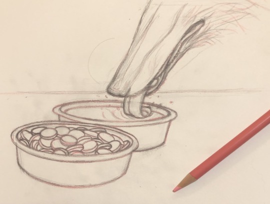
then I go over the whole thing with an eraser, only the graphite erases completely while the colored pencil stays, even though it dulls a bit. This is so I can still have a sort of outline to color in without having to worry about graphite mixing with the lighter color pencil colors and muddying everything up (it also just cleans up the sketch a lot which makes everything easier to work with)
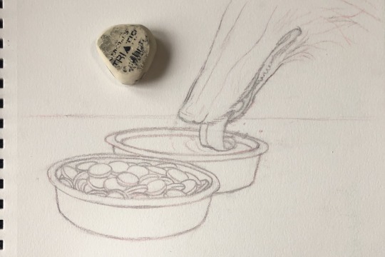
then I start putting some of the colors down while also adding some basic detail that I’ll color and shade along later. I also go over the lines again just to make sure everything is shaped correctly, but I’m using the base colors of whatever the object is because I don’t actually want things to have outlines later on
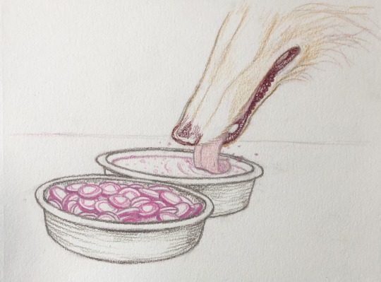
I’m kind of mapping out the colors now as well as shadows
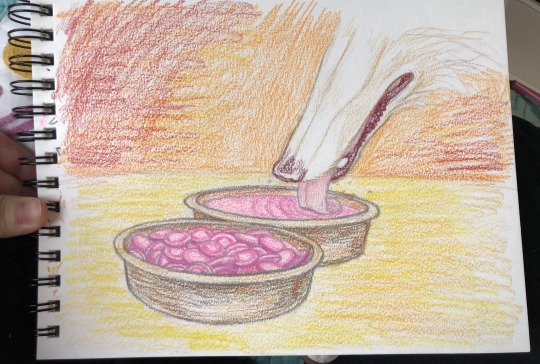
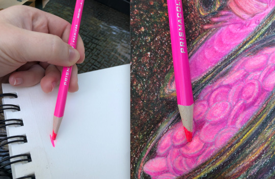
(also I finally found a use for this super bright neon pink colored pencil I have lol)
I’m basically just continuously layering on more color and detail, making sure to go light to dark. I mostly work on everything evenly rather than meticulously finishing one area after another but I was a bit more meticulous with the pepto bismol tablets just because they were the most detailed part of the illustration
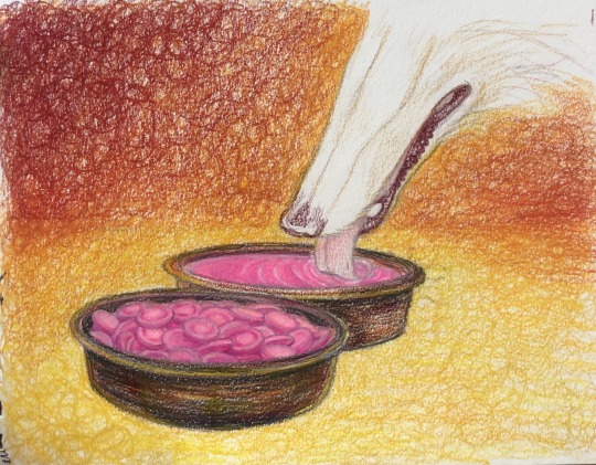
I pretty much color the borzoi last because it’s the one white thing in this image and I want it to sort of “reflect” all the colors that will be around it and you can see I’m still adding new colors to the background as I go along
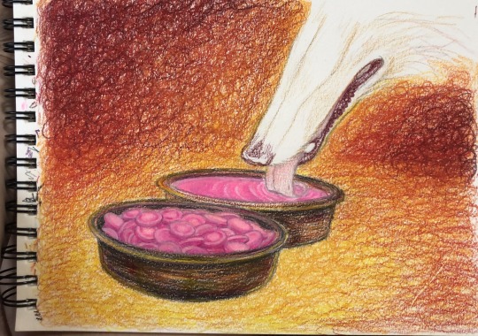
adding some green, Im basically trying to get a black without using black by layering opposing (is that the right word?) colors over each other, it makes it so that the black still looks like a natural part of the image because it’s made up of the colors in it, and it gradients toward the foreground better. I’m also doing the same for the nose and lips of the borzoi
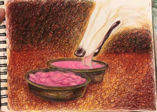
finally putting some more color down on the borzoi, both giving it a base color and making the shading more defined
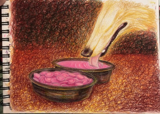
added the pepto splash before I layer any more color on the background. Also in just about every step here I’m continuously touching up the pepto bismol tablets, maybe a bit too obsessively
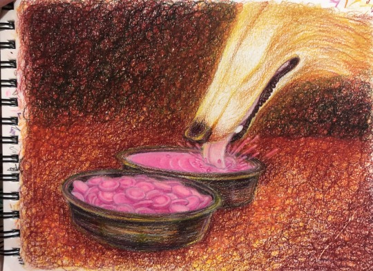
adding more colors from the background to the borzoi as well as shading it some more
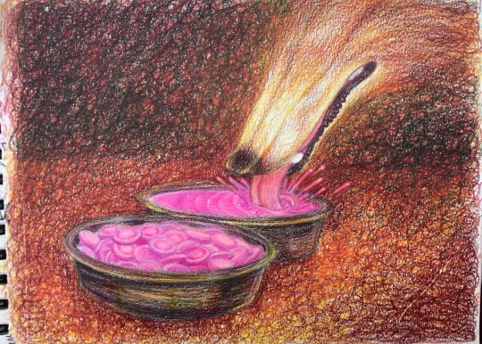
adding more green (and some dark blue) to the background and floor to darken it some more, and again to the borzoi
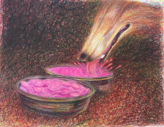
I blend some of the lighter areas with orange-yellow, dunno if this is a real technique I just like the kind of glow effect it has and I do it a lot in my drawings (basically layering light colors over dark ones and sort of pressing harder with the strokes to blend/smooth everything together while giving it an almost glowing undertone of that light color)
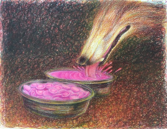
still layering colors to darken everything up
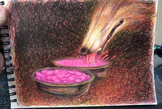
Only at the very end I use a white colored pencil, I haven’t used it at all so far. I give the borzoi it’s fur texture + its whiskers, basically using the same method as earlier when I blended the yellow into darker colors by pressing harder with the strokes, here the strokes are just fur-shaped. I also add some highlights to the metal bowls, the splash of pepto bismol, and the nose and mouth of the borzoi with white colored pencil and a tiiiiny bit of white gel pen (a really tiny bit, basically a few little dots here and there)
oh and I added the “Pepto Bismol” writing to the pepto bismol tablets (or as close to writing as I could get)
also at some point in this step a mysterious black line appeared on the drawing that I couldn’t get rid of :( but its ok I just removed it in photoshop later lol
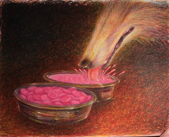
then I just take as good a pic as I can and touch it up in photoshop, this is for getting rid of flaws like that weird black line as well as to make the photo resemble what the drawing looks like irl as closely as possible, I’ll usually have the drawing next to me so I can reference it while editing the photo to make sure it looks like the real thing.
also in this step I usually crop the image both to hide the messy edges and to give it a better composition.
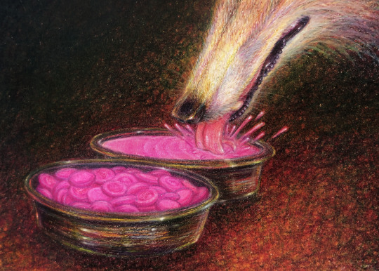
you can see how different all these pics look from each other (in terms of lighting and quality) let alone from the final piece, which is why the editing step is important lol
hope this is helpful!
514 notes
·
View notes
Text
cheek to cheek
request for taehyung from @kidcoredreamz (thanks bae!!)
listen to “cheek to cheek” by ella fitzgerald and louis armstrong and “i get along without you very well” by chet baker for maximum effect
make your own request here using these prompts!

cheek to cheek
word count: 3.1k
genre: fluff, arrangedmarriage!au
summary: it’s night like these that you wish things were different
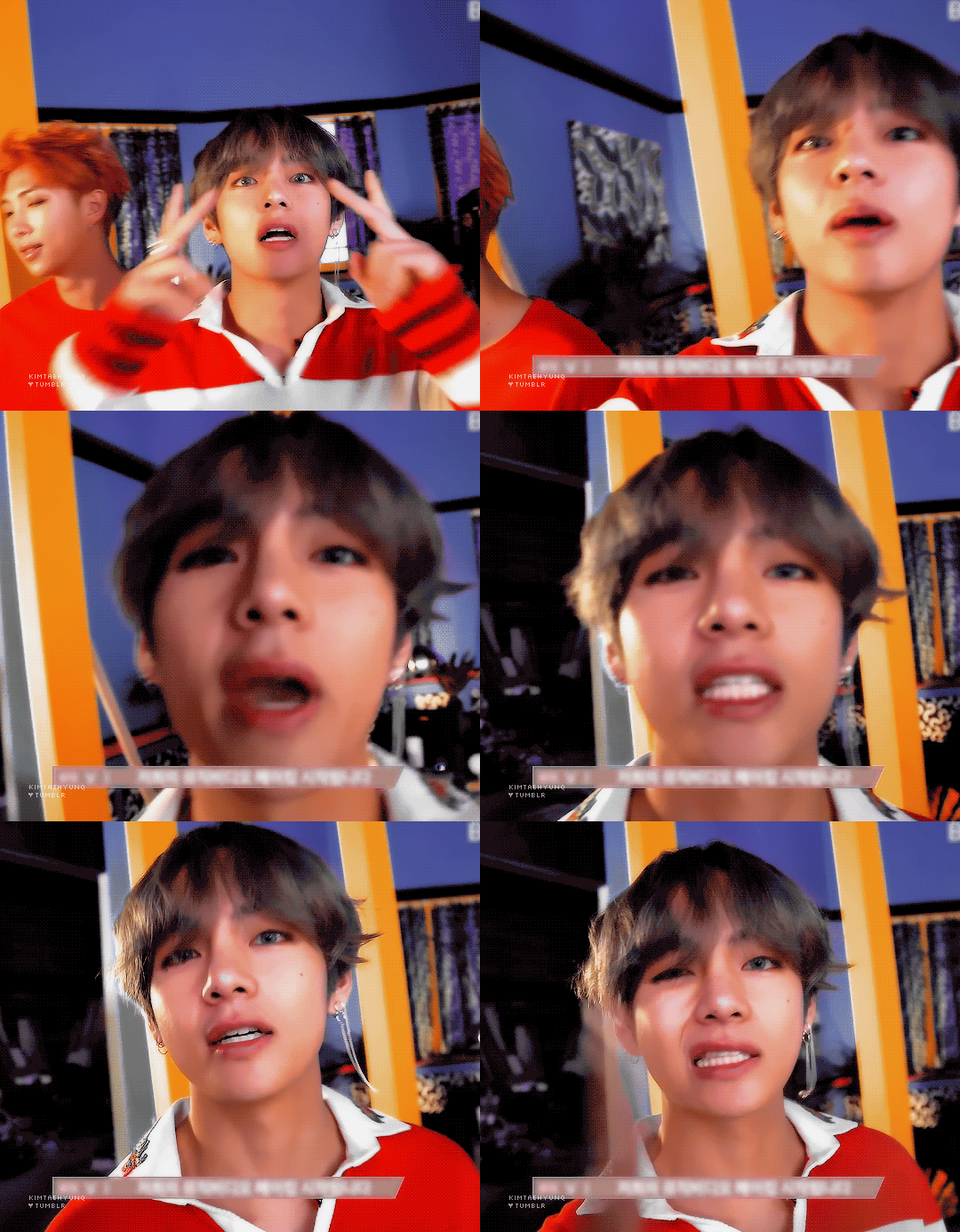
Taehyung is guaranteed, always has been.
From the minute your tiny fingers could interlock with his, you were dragging each other around the mansions and garden parties, sneaking off to corners with desserts and chocolate milk and getting sugar rushes together. Time with Taehyung comes easy and passes quickly, the hours with him condensing into minutes and the few minutes without him stretching into lonesome years.
You’ve seen him through thick and thin. Through acne flare ups and awkward conversations and never-ending games of tag. You’ve seen him pick his nose, cry over spilled milk (or, in his case, a broken remote-control race car), get caught sneaking out. You’ve comforted him while he felt broken, laughed until your sides were aching. You know his ins and outs, his rough edges and corners, his soft spots he tries to hide.
Marrying him should be a blessing.
To spend the rest of your life with the person who’s stuck by your side throughout everything is a future some can only dream about. To have someone understand you so perfectly, to understand them like no one else will. It should be a blessing.
It should be.
The digital clock reads 11:57 when he knocks on the window.
You’ve always had a weird thing about having a room on the ground floor, when possible. It’s closest to the front door, in case of an emergency. And there’s no risk of tripping downstairs when you’re sleepily moving around in the night. And, most importantly, it’s easy to sneak out when you need to.
While you’re a little startled, you’re nothing close to afraid. You know exactly what face to expect as you throw open the sheer curtains, silken pajama sleeves hanging over your fingers and eyes swollen from sleep.
The moonlight makes his silvery hair seem otherworldly, a soft glow coming off of his locks. A few months ago, you’d been more than opposed to his sudden need to dye his hair, but you really shouldn’t have been surprised. The odd color just makes him more ethereal.
“What the hell do you think you’re doing?” you hiss, opening the bay window and letting the frigid air slam you in the face. Your eyes comb over the rest of his figure, your brows furrowing at his dark hoodie and sweats, a black hoodie crumpled in one of his hands. Anyone else would have assumed he was an intruder.
“Visiting my fiancée?” he tries, flashing a lopsided grin. “Thought we could sneak out again. For old times’ sake.”
“We’re not kids anymore, Tae,” you huff.
“That doesn’t mean we have to be boring.”
You cross your arms as a chill runs down your spine from the cool breeze. “It’s midnight. I’m in my pajamas.”
“Well, then you better change.” You stare at him indignantly for a moment, wondering just how much of a doormat he thinks you are.
“Please?” he adds, batting his lashes teasingly. “I have a surprise. You’ll like it, promise.”
“But will I like it more than I’d like crawling back into bed? Can’t it wait until morning?”
“No. Let’s be a little spontaneous, like we used to be.”
You won’t lie. The soft duvet, still warm, is calling to you strongly. You know that as soon as your head hit the pillow again, you’d be out. Sleeping like a baby.
But it’s Taehyung’s half-assed pout and an unfortunately strong curiosity that compels you to slip on the nearest t-shirt and sweats for the designated “not-dirty-enough-for-the-basket-yet” chair and climb out the window with a sigh.
--
“It’s Dad’s latest passion project. It was my suggestion, but I think he’s enjoying it more than me.”
You’re enjoying yourself more than you’d like to admit, too. You aren’t sure what urged Taehyung or his wealthy, CEO father to pour their time and effort into a run down museum, but you sure are glad they did. It’s like walking through a ghost town, dust coating the walls and old exhibits. Only some of the lights work and there’s renovation supplies littering the floors. You and Taehyung stick to each other’s sides in the poorly lit areas to avoid tripping and meeting a sorry end via paint roller.
This certainly isn’t the first time you’ve been out late with Taehyung. When you were in high school and determined to rebel against your parents’ constricting ways, the two of you often found yourselves roaming the city and laughing much too loudly during a time when you should have been catching up on sleep or homework.
Being with Taehyung was never too much of a risk. His parents always fell victim to your innocent smiles and mumbled apologies, while yours believed Taehyung could do no wrong. After they yelled and scolded and nearly tore their hair out, soon they were only shaking their heads and smiling at each other knowingly. It was hard to be mad for long when things were really working even better than planned.
“What do you think it means?” Taehyung asks as the two of you stare at the large mural. It’s filled with wide strokes of color, abstract shapes littering the foreground with seemingly no pattern or reason. You really can’t even see the whole thing, when Taehyung turned on the lights for this room, only two or three managed to flicker on.
You tap your chin, deep in thought. “Well, the red is clearly...” You tilt your head. “It’s clearly having a battle with the yellow. They represent good and evil. And the purple in the back is hope.” Taehyung tilts his head in the same direction as yours, brows knit in concentration.
“You really got all that from... that?” You snort.
“Nah, I just bullshitted it. I have no idea what it means.” Taehyung giggles, shoving you in the side. You stumble, yelping dramatically and nearly crashing into a probably very expensive bust of some historical figure you wouldn’t recognize.
“I was being serious, Y/N.” You laugh at his pouty expression, resisting the urge to poke him in the side in revenge. You don’t want to start a fight you know you can’t win.
After trying to make sense of the abstract mural for a few moments, you move out of the art exhibits on to the historical section, looking at the old skeletons and fossils and relics from years and years ago.
It’s fun trying to guess the names of the different dinosaur skeletons, cackling obnoxiously at all the ridiculous things you can combine with “—asaurus.” You take turns reading the puns scattered on the colorful signs throughout the exhibit, groaning at the bad ones and acknowledging the okay ones with a tiny chuckle. You laugh the hardest when Taehyung spots the fake alligators and climbs onto the display, insisting you take his picture so he can look cool.
“Tae, you can clearly tell you’re inside!” He scoffs.
“Just take the picture!” he insists. “Don’t I look like Steve Irwin?”
The photos all come out insanely blurry, your arms shaking too much as you try to hold in your giggles.
When you were first told of the arrangement at age sixteen, you cried. You sobbed and you wailed and you screamed and you locked yourself in your room in protest for an entire day. Your parents couldn’t understand it. You loved Taehyung. More than your own family. More than anything else. They loved him too. He was the son of a close friend and a union would benefit business, certainly.
When you eventually came out of your bedroom, you refused to talk about it. You only mumbled that you were sorry and your parents knew better than to ask questions and so, that was the end of it.
“Taehyung!” you shout, grabbing his wrist and dragging him across the antiques exhibit. You’d both already tried (and failed) at using the dusty typewriter and moved on to playfully arguing about who should pose with the guillotine when your eyes locked onto an item across the room.
“What is it?” he laughed, stumbling after you, all smiles.
“It’s a phonograph,” you explain. It appears in near-perfect condition despite the circumstances, the brass horn shiny and golden like it’d been made yesterday. “You can play records on it.”
He nods in understanding. “We should try it.” The idea is tempting, but your hopes for it working are fairly low. “There’s already a record on it, just try to get it to play.”
You lean forward, fingers mentally crossed as you fiddling with the needle and try winding the crank. The gears squeak terribly inside the main compartment, making you cringe. But you keep winding it, stepping back and squeezing your eyes tight in anticipation.
When you’re met with silence instead of music, you sigh in defeat. “Well, I guess that’s alright, it’s pretty old anyway, let’s—”
Suddenly, the machine fizzles to life, record slowly turning on the turntable and a jazzy tune carries through the air. Taehyung cheers, clapping on the shoulder.
“You did it!” Your smile quickly stretches into your cheeks, exhaustion long forgotten as you relax in the nice sound, soft piano and pleasant singing filling your ears.
You begin subconsciously swaying to song, fingers drumming to the beat absentmindedly on your thighs. Taehyung seems to know the song, quietly singing a few lyrics every one and a while.
“Let’s dance,” he says suddenly. Your stomach tightens.
“Let’s not,” you reply quickly, arms hugging your sides. You stare ahead, trying to focus on the song rather than the person beside you. Out of the corner of your eye, you see him lean slightly closer, lolling his head to the side.
“Why not?”
You sigh. You don’t really have an answer.
Your hand finds his, fingers interlocking as you let Taehyung guide you out into a relatively clearly spot, tennis-shoe clad feet shuffling lightly to the music. You’ve danced with him in other settings, with many more eyes watching. You’re normally dressed perfectly, not a hair out of place and a thick layer of makeup coating your eyes and cheeks.
“Remember that time your mom made us take dance lessons when we were twelve?” Taehyung asks, a glint in his eye.
You scoff. “I remember the part where you gave me laxatives right before the first lesson, yeah.” Taehyung can barely keep his grip on you, moving his other hand to your waist in an attempt to steady himself as his shoulders shake with laughter.
“I really thought it was regular tea, I promise.”
“Sure you did.”
“I did! I thought we were being all fancy like our parents and drinking fancy tea like fancy rich people.”
“Then why didn’t you drink the laxative tea, huh?”
“I don’t like tea. I just put milk in my teacup and hoped you wouldn’t notice.” You snort, hands settled all to comfortably on his shoulders as the smooth voice croons and echoes off of the walls.
It’s intimate. There’s nowhere else to look but his eyes as he places a hand on your waist, pulling you closer with a soft smile. The room feels warmer, his breath barely skimming across your face at the close proximity.
It forces you to think about the things you’d much rather keep inside.
This should be nice. It should be normal and romantic and sweet, to be slow-dancing with your fiancée. Your smile should be light and endeared and love-struck, not forced and fake.
There’s a heavy pang in your heart as you remember. Remember how much love him. How much you care. How much you want to hold him close, press your lips on his without a single bit of hesitance.
But you can’t do those things, knowing the things you do. To Taehyung, this marriage is a convenience. It’s a way to please his parents and strengthen his business connections and do it all with his best friend. He’s always been perfectly content with the arrangement, perfectly content to marry for everything but love.
And how are you supposed to feel, wanting to marry him for the very thing he doesn’t feel for you?
He’s all you’ve ever wanted. You would have left this life a long time ago, but it would mean sacrificing him. You’re too selfish to do that. You want him all to yourself, every part that you can get.
You’ve seen every side of him, the weird and the sad and sweet. You want it all. But you’ll never have it.
You wish it were real. That this were a romantic night away, that you’d wake up in the morning all tangled in his arms. It’s this intimacy that you crave but can never enjoy, not when you know it’s all fake.
And he knows you too. Knows something is up when that little knot between your brows forms and your eyes grow just a little glassy.
“What’s wrong?” You quickly straighten your spine, blinking away any tears pricking at your eyes.
“Nothing, I’m fine.” But Taehyung knows. He leans forward slightly, dark eyes piercing through your very soul. You gulp as you feel his body heat on your own skin, releasing your hands from his shoulders in your panic.
“Do you wanna talk about it?”
“No,” you breathe. Your gaze falls as you step back, the music tapering off as the phonograph finally gives out and the moment is fully broken.
But instead of letting you slip away, his grip tightens, look growing desperate.
“Wait! Just a second.” You can see him itch to run his hand through his hair, but his arms don’t leave you. “You’ve been acting so weird lately. Is it me? Did I do something wrong?” You furiously shake your head.
“No, that’s not it. I just—” You stop yourself before too many words spill out and you say something you can’t take back.
When you don’t elaborate, Taehyung’s face falls further. “Seriously, what is it? Am I really making you that upset?”
“No, I—”
“Is it because I dragged you out so late? I’m sorry, it’d just been so long since I saw you and I missed you—”
“Just shut up!” you cry, shoving him off of you for good. A few tears wet your cheeks and your face heats with embarrassment. “It’s because you pull this kind of stupid, romantic shit that makes me love you even more than I already do but I know you don’t see us that way.”
Taehyung’s eyes go wide, but you suppose since it’s all on the table, you’ll keep going. “I know this is all just fun and games and easy to you but it fucking hurts, Taehyung. You can’t lead people on like this. You can’t do this shit and expect me not to feel something for you.”
The phonograph crackles in the corner of the room, unable to play pretty tunes or sweet songs anymore. It sounds restless and broken and unpleasant to hear.
“Maybe I wanted you to feel something for me.” You whip your head up, cheeks still hot from mortification and anger.
“What?”
“You heard me. I wanted you to love me. Because I love you.”
When you kiss him, it’s like a breath of fresh air. It’s hungry and rushed as your fingers gently tug on his hair and his palm is splayed on the small of your back, pulling you as close to him as humanly possible.
At some point, you end up pressed against the wall, euphoric as he trails pecks down your jaw and neck incessantly, like he’s trying to make up for every time he wished he’d kissed you. You whine when he parts his lips, tugging on his hair as he fastens your body against him. He tastes like the peppermint chapstick he always keeps in his pocket. The habit had ruined a pair of his dress pants before when it melted all in the pocket, but he’s always been too stubborn about chapped lips to learn his lesson and carry it elsewhere. You can smell his shampoo and the faint scent of his cologne. Everything that fills your senses is him and only him.
You feel a few tears sting at the corner of your eyes but you ignore them, gasping for breath between long kisses, a few giggles escaping you when you see you’re not the only one lightheaded.
After what feels both like hours and seconds, Taehyung pulls away, his lips swollen and pink, but stretched into that adorable grin that hasn’t changed since you were kids.
“Sorry I didn’t say something earlier,” he murmurs. “I never could find the right words to say it and I knew it’d make everything awkward if you didn’t feel the same way.” You laugh mirthlessly, cupping his face gently with your hands.
“Same here.” You sigh. “Guess we’re both idiots.”
“Guess so.”
It's a little frightening to stare at him like this. You’ve always held your guard tightly whenever you felt even close to your feelings being compromised, but that weight you’d carried for so long as suddenly detached itself from your shoulders, leaving you free floating. Yes, it’s like floating untethered through the air or being caught in the ocean with your life jacket. It’s scary and daunting and unknown. But it’s nice to know that you’ll have Taehyung’s hand tightly holding yours the whole way.
“Since I confessed first, I think you should pose for a picture with the guillotine.” Taehyung’s intent stare breaks, his face crinkling in disgust.
“But I kissed you first.”
“Only because I said I loved you.”
“If you really loved me, you’d pose with the guillotine and I could pose like I’m the executioner.” Now it’s your turn to be disgusted.
“That’s so fucking morbid, Kim Taehyung.” You smack his arm, but he keeps you against the wall, thigh between your legs as he leans in again.
“Only for you,” he murmurs, planting his lips on yours again.
The scoff about to leave your mouth is caught in your throat as you’re enveloped in his embrace, kissing each other dizzy until you’re certain the sun must be rising soon.
You wouldn’t mind too much if it did, though.
As Taehyung keeps trying to convince you to take stupid photos and explain abstract art to him, you aren’t sure how much a blessing he is. All you really know is that he’s your guarantee, your anchor in this unforgiving world. You aren’t sure where he’ll take you next, what random time he’ll decide is the best for your future adventures. You can’t know what the rest of your life holds, only that he’ll be next to you as long as he can.
And that’s enough for now.
#dulce-pjm: request#kidcoredreamz#taehyung#taehyung drabble#taehyung fluff#taehyung angst#this was uh#not supposed to be this long#nice#thank you for the request! i loved your prompt
68 notes
·
View notes
Text
Brothers Conflict || 03.
Thrust into an already established family, you struggle to find your footing while dodging the advances of seven, incredibly good looking stepbrothers.
Your father marrying, and you suddenly having to live under the same roof with seven step brothers was a royal mess or so you had thought, Because them falling in love with you was so much worse. Or was it?
◈ Genre: Romance, Fluff, Humour, Smut and maybe a little angst. (PG-18) (step brother AU) (I do NOT support incest, this work is inspired by the popular anime/manga Brothers Conflict)
◈ Pairings: OT7 x Reader (reverse harem)
◈ CHAPTER THREE
WC: 2.7k
Warnings: Language (sfw)
Masterlist

"How about this?"
"Nah, it's too sideways," you reply from where you are standing near the doorway of your bedroom.
"Right or left?" Sunmi asks, as she grips the frame and distances her torso from the wall, trying to see for herself where she should shift the frame. From the looks of it, she's failing spectacularly at it.
Suppressing a snort, you answer ‘left’ and hum when she tilts the frame and you are finally satisfied with its position on the wall. Walking back in, you marvel at the sheer grandness of your room for the umpteenth time as you take in all the space around you. Roughly four times the size of your old bedroom, it was huge.
Floor to ceiling windows on the side opposite the bedroom door, before which was your queen-sized bed. A decent size, intricately designed bedside table beside it, with the floor underneath covered with a soft, plush rosy white carpet. A walk-in closet the size of your old bedroom, a bathroom with a jacuzzi, curtains heavy enough to suffocate and kill you if they were to ever fall upon your body; your new bedroom screams rich.
It would be a lie to say that you don't feel intimidated. Raised in a middle-class, humble neighbourhood, you hadn't in your wildest dreams ever imagined living in a room like this. But here you are, soaking in the reality of the moment; and realising that it feels like something between a dream and a nightmare.
Nearly four hours since you first started unpacking, and five since you had first met your new family, most of your room was organised. All boxes untaped and emptied as you and Sunmi worked hard to make the unnecessarily large, empty room less of a hotel room and more like the bedroom of a 19-year-old girl.
Sighing, you push the last book of your novel collection into the bookshelf. Made from some sort of whitewood, much like everything else, it was designed intricately and looming large over your small shadow.
"This is it."
Slouching, you fall onto your back, eyes straying to the ceiling above and the textures carved onto it, refusing to reply to Sunmi’s statement. Agreeing would mean that you'd have to let her go and you don't think you can, the isolation and abnormality of the situation already sinking in and scaring you.
"Mmn," you reply noncommittally instead.
A long sigh, and then your best friend is curling on the floor beside you, her hand snaking around yours, fingers intertwining, as she silently lets you know that she is here for you. Repressing the tears you can already feel trying to escape your eyes, you squeeze her hand back.
The clammy, ice-cold touch of your skin against hers goes unmentioned as you both lay there in silence.

"I'll call you every day," you whisper, your voice choked as your death grip around Sunmi's waist tightens, and she lets out a strangled moan before pushing you away.
"Woman, stop being so dramatic! You'll see me back in college every freaking day once summer ends and you know I'll come to see you whenever you want me to, the hour-long ride be damned," Sunmi chides. There’s no bite in her words, and her voice wobbles despite her trying to act tough, but you don't call her out on it and only nod.
"You better, you airhead, lord knows you'll probably sob your body dry without seeing me every day."
A giggle comes out of your best friend's tall, lean body, one you are entirely too envious of, and her eyes soften, your smile softening with it.
"Take care, will ya?"
"Always," you whisper back, and with one last kiss thrown over her shoulder, she leaves. Her figure grows smaller and farther with every step she takes, and you bite your lip to prevent a call from tumbling out. Not moving an inch until you hear the distant roar of her car driving away, you finally shut the door when you no longer hear or see her car.
Suddenly you feel scarily small. Like a tiny, irrelevant existence born in a world too large and glamorous; a world where you evidently do not belong.
Meandering through the floor, you gaze at the picture frames on the wall as though you are the actress of some old seventies cinema, bemoaning the absence of a long lost lover.
Dramatic, yes, but you have always been more on the theatrical spectrum of humankind, and it isn't like there is much you can do right now anyway. Not unless you want to hole up in your room and stew in your sadness alone. And even though that might sound appealing to most (considering what your room now looks like), it wasn't something you felt like doing at the moment.
So you mindlessly gaze at the pictures, the setting sun casting a warm orange glow in the darkening hallway as you try to find some semblance of familiarity, a speck of comfort or intimacy.
"Y/n?" a soft voice calls out to you, and you twist on your heels, your eyes meeting with those of Yoongi.
"Yoongi-oppa." Voice coming out soft, your words fade at the end as your eyes track the way Yoongi's face glows when the rays of the setting sun hit his skin. Long messy dark blonde hair makes space for his glittering curvy eyes to shine through, and your breath gets caught somewhere in your chest when you look at the vision that was Min Yoongi.
"Exploring?" he asks casually, but even without knowing him for all that long, you can detect the underlying layer of concern in his voice. You don't know if he is being open with you right now, or if you can just read him well, but the concern makes your heart feel a little warmer.
"Something like that." Your answer is ambiguous, but Yoongi doesn't ask you to elaborate, so you don't add anything more, turning back and looking at the pictures again instead.
"This something you enjoy?" Yoongi asks as he moves beside you, hands stuffed deep in the pockets of his pants, and leans; making himself comfortable against the wall.
Your eyes stray to him. "Sounds like you don't."
"Not really my forte, I can appreciate it from a distance, sure, but not an enthusiast," he replies, the back of his head hitting the wall behind as he looks up at you.
Humming, you shrug. "Same, I guess, it's just fascinating to me. I wish I was smart enough to understand what half of these actually mean, but I am not, so I just appreciate the beauty and move on."
"Fair enough."
You nod and let the silence reign again, but it's a comfortable silence, the kind of quiet where you are both lost in your own thoughts but at the same time appreciate the company of the other.
Slowly the sun sets behind you, and the glassed walls shimmer one last time before the ceiling lights are switched on, bathing the entire floor in warm but bright light.
Yoongi had been silent the entire time as you explored the floor like a child in a zoo, poking and prodding the potted plants, oo-ing and aah-ing over the art around you, fascinated and occupied with the attractions around.
But when the lights switch on, he clears his throat and gets up from the couch he had taken a seat on some time ago, head tilting as he wordlessly asks you a question. You nod back and smile, making your way to him as you finally get ready to spend some time with the rest of your newly acquired family.
As you both make your way to the main hall, you don't miss how your heart is feeling much lighter now. The silent company that Yoongi had provided you with seems to have put you at ease and calmed your racing thoughts.

Walking into the kitchen alone, you try your best to make as little noise as possible. Yoongi, much to your displeasure, had promised that he'd meet you out in a few minutes only to disappear inside of his bedroom and leave you to your own devices.
The sudden bout of bravado from earlier had left your body too, in its place leaving raring, gut-twisting anxiety.
Tiptoeing to the refrigerator, you take out a bottle and pour yourself a glass. The chilled water slides down your throat, quenching your thirst, and you let out a satisfied sigh, smacking your lips in contentment after.
"That thirsty, huh?"
You jump, startled, heart racing and in your throat, as your gaze snaps to the doorway and finds Seokjin standing there. Suit coat hung over his left arm, and a button-down shirt rolled up to his elbows, he was clearly returning back home after a workday.
"Holy fuck, you scared the shit outta me!"
Your brain to mouth filter is seemingly not working after being startled. Feeling anxious was a problem enough, but being scared after was evidently enough to send your last two brain cells out the window. Your common sense and the knowledge that Kim Seokjin was now your stepbrother, eldest stepbrother, flying out the window along with them.
You hear crickets chirping in the distance as an awkward silence blankets the room, and in that moment you want to die. Spontaneously combust and float away into thin air, disappear, dissolve, vanish—die.
"I am so sorry, can we pretend I didn't say that, “you voice out meekly, your eyes avoiding Seokjin’s and instead finding purchase on the wall behind him, seemingly fascinated by the utter whiteness of it.
Hearing a chuckle ring and break the awkwardness in the air, you shift your gaze to the source of said chuckle and catch your eldest brother's gaze. "It's alright Y/n, I get that this is a big adjustment. Please don't feel like you need to rush on anybody's accord, take your time."
And then Kim Seokjin smiles—his pouty, full lips stretched into a small but ridiculously warm smile, and something in your chest clenches at the sight of it. Warning bells ring in the back of your mind, and you squash the thoughts threatening to come forward, their not-so-appropriate nature resulting in an immediate rejection from your end.
Mumbling a thank you, you let him know you'll be down soon and then dash to your bedroom, slamming the door closed once you're inside and sinking down onto the floor.
What the hell was that!?
Raking a hand through your hair, you groan in annoyance, wincing when said hand gets stuck in a tangle and pulls a few strands loose.
Looking back at your impression so far in front of Seokjin, one of your seven step brothers, it had been nothing but absolutely marvellous. So you can't imagine what could possibly go wrong when you sit down at the dinner table and are surrounded by all seven of them.
Nothing, nothing at all, nope-nada-zilch!
Frustrated, you slide a hand down your face, hoping to calm down, but the move only ends up irritating your skin under. The day has been long, and all that you pray for now is that it ends soon. Your bed, which from the looks of it was fit for royalty, was beckoning you over too.
With one last huff, you are pushing yourself up onto your feet and to the bathroom to splash some water, before you go and join the rest of your new family.

Pulling the chair in, you wring your hands nervously under the table, away from any prying eyes. One by one, the rest of your family filters in and takes a seat; Seokjin and Yoongi both pick their seats at the two heads of the table. Hoseok and Namjoon sit on either side of you, with Jimin plopping himself down opposite you, and getting flanked by Jungkook and Taehyugn on either side.
Not much conversation had taken place as they picked their seats, everyone sufficiently tired enough after a long day, but they had smiled or nodded at you when they first entered the dining room.
'Well most of them at least,' you think, eyeing the two youngest, who had both refused to give you even a cursory glance, resulting in your smile going unseen and unreciprocated. Their attitude, however, doesn't bother you too much at this point; as it was, they were virtually nothing more than strangers to you.
Conversations pick up around you, and you feel slightly out of place, as though you are a guest over for dinner rather than their new stepsister, but the feeling doesn't last long, because both Namjoon and Hoseok soon pull you into a conversation. Inquiries come forth about your day, and how your unpacking had gone.
The conversation is mostly superficial, nothing too emotionally challenging; neither of them ask how it feels being a part of their family or something like that, and you are relieved. Grateful, because you don't know if you'd be able to answer those questions anyway. The whole situation is still very odd no matter how many minutes of the day pass.
Someone clears their throat, and your eyes snap to Seokjin, who was pushing his chair back and picking up his glass, the red wine inside sloshing with the movement.
"I've done this before, and yet it never gets any less nerve-wracking," Seokjin starts, and your eyes furrow in confusion, but he continues before you can think about it any more. "Y/n," he says and tips his head in your direction, "I know this must feel a little scary—actually, scratch that, you're probably terrified right now, and that's okay.” he pauses, and takes a breath before continuing, “I'm sure it feels crazy suddenly being thrust into an already established family and being told that now you're one of them, and I just want you to know that I get it. We get it, and we are here for you. If you don’t want to accept us as family, that’s okay too; all of us would understand and support whatever decision you make. I just...” Sighing, he locks eyes with you.
“...I just hope you can let us in eventually, family or not."
Seokjin's eyes bore into yours as he says this, stressing the 'us', and you gulp, feeling the back of your throat tighten at his words. Sensing the fine thread of control that you had over your emotions loosening, you swivel your gaze to the table instead, nodding, your vision growing blurry as you try to blink back the burn in your eyes.
The room goes quiet, as the boys give you time to collect yourself—or sob, you don't know, but you appreciate the consideration nonetheless.
It was going good, it really was. You were holding on, no matter how precarious the hold was, you were holding on. Grasping onto that last string of control and restraint you had with all of your might.
But then Hoseok is wrapping his arms around your shoulders and pulling you into his side, letting you nestle your face in the crook of his neck, and the string snaps, his neck growing wet as tears streamed down your face and slid down his skin.
For a few minutes, you forget that you were now surrounded by strangers who you had to accept and call your family. For a few false, delusional minutes you forget that they don't know you, that the care they were showing was genuine and not something they were obligated to. That the one whose hands were drawing circles across your back, the one whose voice was whispering reassurances in your ear—stupid sweet-nothings that you would tell a small child to make them feel better, actually gave a shit about you.
You forget the reality and slip into a safe headspace, letting the warmth of another human encircle you, hold you, wrap you in its cocoon as you weep.

A/N: dedicating this chapter to @mel-gonzalez07, one of my oldest, most loyal readers, and more than anything else an amazing friend. ily angel 💖
Y/n is going through some shitt here. Imagine being thrust into a dynamic that has been established for years, and then having to act like you are meant to be a part of it.
The taglist for the story can be found:- here. A kind reminder that tumblr sometimes doesn’t give an alert for a tag notification, but you’ll find the notification in your notification dash. So, check it once a week as I usually update weekly.
Feedback means the world to me, so tell me what you thought. What would you do if you were in oc’s shoes?
Until next time! Take care you sweet soul and Oo! Go stream folklore 💖

Tag-list: @mel-gonzalez07 @favsssxx @imluckybitches @nomimits7 @alex4243 @calling-dips-on-j-hope @joonsinnerchild @iconicgguk @untamedfaith @kaheryn @nottodayjjk @moments-of-melancholy @gee-nee @confusemonkey @beautyyounggirl @blossoming-cherrytrees @seoul9711 @btsismybiass @toochie-too @sugakookie0698 @maboiisuga @kurohas-world @namseokiesmoonv @kerikaaria @chiidbits @girlyyzzyz @loveyoongles @btsfeelzies @knjkitten @honeyspillings @thestrugglesofateenagedirtbag @starrykook97 @xanny91 @leilalago @jiminie-08 @voguejoonie @lovelikeyouwant
#bts fanfiction#bts fanfic#bts x reader#bts fluff#bts x y/n#networkbangtan#btsghostie#ficswithluv#btsgoldnet#goldenclosetnet#bangtanhq#vantaenet#thehouseofbangtan#thebtswritersclub#bangtanidx#cypherwritersnet#bts x you#ot7 x reader#bts smut#ditttiii#ditttiii writes#jungkook fanfiction#bts ot7xreader#poly!bts#jimin fanfic#kim namjoon fanfic#jeon jungkook fanfic#jung hoseok x reader#min yoongi fanfic
595 notes
·
View notes
Text
#showyourprocess !
From planning to posting, share your process for making creative content!
To continue supporting content makers, this tag game is meant to show the entire process of making creative content: this can be for any creation.
RULES — When your work is tagged, show the process of its creation from planning to posting, then tag up to 5 people with a specific link to one of their creative works you’d like to see the process of. Use the tag #showyourprocess so we can find yours!
Thank you, @rinielle for tagging me! She chose the piece above (original post), and oh boy this one was a whole ass rollercoaster ride! Unfortunately, I hadn't turned on the timelapse feature for this but I'll try to go through each part of the process as best as I can!
The photos I'm gonna upload are gonna be a mix of screenshots and literal photos of my screen, because I'm taking some of them from my updates to friends, since a lot of the steps got lost in my painting process.
But before that, let me tag some other amazing creators!
@dragonji: this gif art!
@candicewright: this yibo painting!
@wendashanren: this gifset!
@mylastbraincql: this gif!
I haven't been able to keep track of who's been tagged so apologies if you've already done this! Also, no pressure to do it at all if you would rather not! <3
Planning
Sometimes, I get an idea first and find reference photos to go with that idea. But for this one, I sought out a reference photo first, and built an idea on top of it!
After that, I roughly sketch out the base pose. Usually, this looks very messy, but it doesn't really matter as long as I understand which part goes where!

The idea for the background didn't really come until the creation process because I don't think I really planned this to be a full piece.
Creation
Sketching
Honestly, from this point on, it's more of trial and error.
So, I redid the the initial base pose—made it cleaner and a little bit more detailed. See: the added definition in their arm muscles, the rearrangement of Wei Wuxian's legs, and Lan Wangji's hand on Wei Wuxian's back. If you look at the second photo, I also changed the pose a bit midway—I tend to edit as I go sometimes when I change my mind. (For this, I thought, given the Lan arm strength, it would be better to make Lan Wangji look more at ease carrying Wei Wuxian. This gets covered by the robes anyway though, so it didn't matter much in the end.)
I also started adding details to the base! I usually start with the face and then the hair! I usually go for the clothes next, but I dreaded the robes in this piece so I guess that's why I ended up with a basic idea of what I wanted for the background instead LOL I also figured out how I want the final crop to look like, so I blocked out all the other areas with an extra layer!
Okay, onto the part that killed me like ten times: the robes. There are a lot of interactions between their robes here given their pose, and not to mention they also have layers upon layers on each of them! So, to maintain my sanity and to keep track of which part is which, I color coded them into the most colorful sketch I've ever made.
Another reason why I filled in each layer of robe with a solid block of color, is so that all the lines underneath gets covered. Without all of the colors, the actual outline actually looks like the one on the right. What a nightmare!
I also ignored the crop again for this part, because it's always better to draw past your borders, in case you decide to rotate or tilt or whatever your piece later on. I didn't do the feet anymore though, because that I was sure wouldn't show in the final piece anymore.
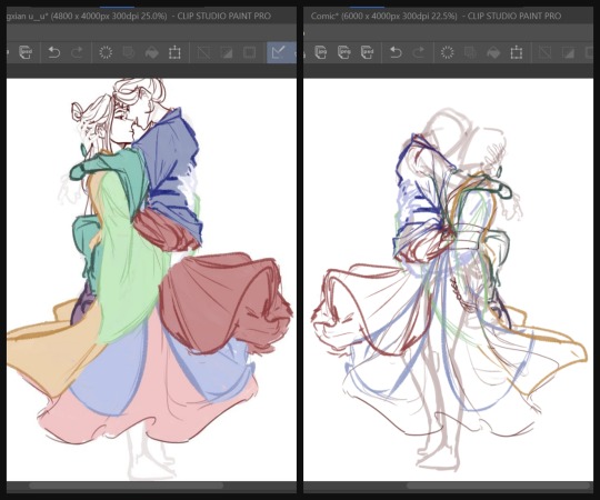
After that, I did the sketch one more time and then started adding the base colors. (I didn't have a screenshot of just the base colors, and the final CSP file is a nightmare so I copy pasted the layers into a new canvas to show you guys :') )
By the way, I drew their robes flowing this way, because I wanted it to frame the lower arch of the moon behind them for the composition. It was a little frustrating that I couldn't get Lan Wangji's robes a little higher because of Wei Wuxian's legs but I later filled in the empty space with his forehead ribbon anyway, so it all worked out in the end!
Painting
Because apparently, I was a masochist back then, I merged the base colors all into one layer and started adding shadows to the robes. (These days, I add shadows first and then, merge. It's much easier this way.)
And then, I started painting! Again, I did the face first and then the hair, before finally the robes. This was my first time painting side profiles and honestly it was quite a pain to figure out LOL but !!! I think I did a good job and I'm proud of how it turned out. I again used reference photos for this one but I can't link any because they were just several random Pinterest photos that I didn't save.
Another thing to note is that I use the mesh transform tool a lot, especially on faces. That's largely why Lan Wangji's face looks so different in the latter two!
And then I went with the robes. Somewhere along the way, I realized I didn't like how I planned to do Lan Wangji's sleeves and the flowy part of Wei Wuxian's robes and I... decided, with much dread, to do them over. So I sketched on top of the painted layers and redid the robes, again.
It was at this point that I decided to take a break from this piece because it was honestly very draining! I think it took about three weeks before I decided to open the file again and continue it.
When I did, I just finished painting the rest of the robes and their hands. The blue details on Lan Wangji's outer robes were painted on a separate layer that I put on Multiply. I probably did more adjustments to the face and hair and stuff, because my painting process is honestly a mess :')
Final Adjustments
I added some correction layers on certain areas to fix some of the colors. See: Lan Wangji's sleeve becoming much brighter and paler; Wei Wuxian's legs having less contrast. And then I merged all of the layers (excluding the background) and added a bit of blur. See: Wei Wuxian's ponytail; the entire lower part; the flowing forehead ribbon. My reasoning for this is so that most of the detail (and therefore the flow of the eye) goes to their faces and expressions!
And then, I put a blue Overlay layer on low opacity to make Wangxian blend better with the background, added a bit of shadow on the inside and the lower sections and added the glowing details for the added flair. I initially wanted sparkles and/or stars but they didn't turn out as well as this did. I also upped the contrast by a little for the entire piece!
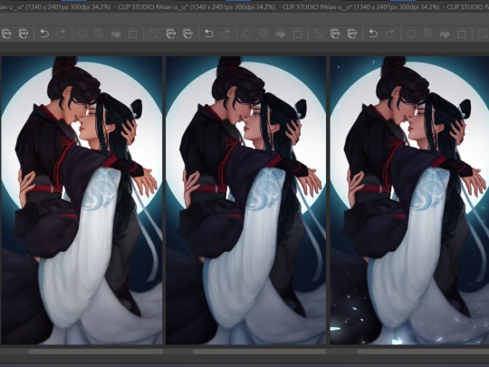
Aaaand, that's it! In truth, I did a bit more color adjustments to the whole piece, but I was a dummy who forgot to turn them back on before posting so ... oh well.
Posting
Before posting, I upload it either on my spare private Twitter account or on a drafted Tumblr post so I can check the colors on my phone. This is because the colors on different devices can look very different, and I would at the very least want all my pieces to look nice on both of my devices!
And then, once I deem it satisfactory, I just try to think of a caption and post! Some artists wait for a certain time where most of their followers are active, but I didn't have a lot of MDZS followers at this point so it didn't really matter to me.
It still doesn't really; I haven't actually been able to figure out when my MDZS followers are awake even now.
#showyourprocess#mine#whew this was so long oops#but this piece took like#maybe 1.5 weeks sans the break i had to take#so !!#LOL#tag game
46 notes
·
View notes
Note
I love your style, do you have any tips for anything, like proportions, shading, etc. for digital art?
thank u :> i have tips in the #art advice tag, and a coloring tutorial here if u haven’t seen it. i’ll try to offer more about those other aspects below the cut!
i’m a total noob too especially for digital so i do believe other people will have much better tips! here are some who make very high quality art explanations: (these are all on youtube!)
Sinix (especially his anatomy quick tips series, soo goodd)
Marco Bucci (10 minutes to better painting series)
Sycra (more in-depth stuff)
Sara Tepes (slightly more stylized)
LavenderTowne (very stylized, comic artist)
lemoncholy (art-video-design, in love with her character design)
Kim Jung Gi (The god of anatomy & perspective)
i watched a lot of these when starting out; now if i have time i love finding individual artists i just love and try to break down their art to see what i love so much about it :)
i’ll try my best to explain my own style and methods!!
💙 Stylized
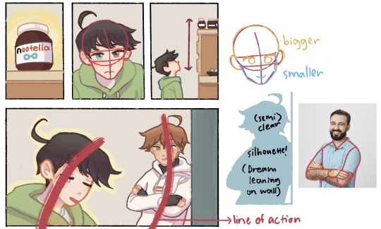
Faces: my style is very anime / chibi inspired, so that means regular proportions but cutesified, so more exaggerated childlike proportions -> big eyes, big heads, small (dot) noses. its lowkey a cheat to draw faster but still expressively hehe,,,
Bodies: mine are so basic 😅 i often use references and just simplify them into more basic shapes
i don’t do this enough but i really suggest pushing the shape language and also having clear silhouettes of who and what ur character is doing at all times
a sense of movement makes your art more dynamic and interesting and life-like. i try to keep my characters doing something in every panel, and even when staying still i think having a clear line of action is preferable (shoutout to @alkalinefrog and @li-wri for the best dynamics in their sketches imo 😌🙏)
For shading, i explain in much more depth in the coloring tutorial! I personally only cell-shade in one block the general area that i think would be covered from light on a multiply layer, and then add different colors for transitions (between shadows and light) and for secondary/reflected light (within shadows)
💚 Realism
for the most part, i agree that u prolly wanna learn to draw realistically in tandem with stylistically if u wanna develop ur art
to study proportion, i personally think there’s no way around referencing real people. i highly suggest quick figure drawings, gesture drawings and also breaking down figures into shapes!
shading is also something u learn through practice and develop intuition for, BUT i think if u look up tutorials on shading basic shapes like spheres and blocks, u can quickly apply it to more complicated shapes. u just need to know several concepts such as these:
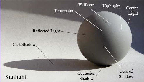
i did this while trying to figure out a george design lol (i’m still getting there, that’s why he looks like a shapeshifter in my comics T_T)
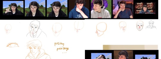
and when drawing real people’s face proportions, it tends to have to be pretty exact, so i often use grids!!
i also saved some digital-specific art tips for someone who migrated from tradi:
know u feel hella rich with literally any color now at ur disposal, but limit ur color scheme!! not as in the amount of colors, but more so be more purposeful about the color set u choose (personally i find it good to mix both saturated and desaturated colors :>)
take the time to learn about the functions of the magic buttons for the program you’re using, i swear it will save time in the future
editing colors and proportions after you’re already done is a thing now and its amazing
there’s gLOW ✨✨✨✨ (play around with blending modes!!)
that’s all i got for now, i hope any of this was useful!! good luck, we’ll be learning and improving together for sure!!
#art advice#i should be studying but i keep making these so long lmfao#thanku for asking <3#love u spadeswasfound
50 notes
·
View notes