#WCAG 2.2
Explore tagged Tumblr posts
Visit Tumblr Blog
Explore Tumblr blogs with no restrictions, modern design and the best experience.
Last Seen Tumblr Blogs


Fun Fact
Mobile Tumblr US users spend an average of 4.04 minutes per session on the app.
Text
This is a little late, but for those who are really interested in digital accessibility: WCAG 2.2 is live as of October 5, 2023!
Intopia has a nice overview of these new standards, which includes a wonderful WCAG 2.2 Map that helps conceptualize the various criteria. The latter is 100% screen reader accessible, by the way, they don't just talk the talk.
If you'd like a slightly more in-depth discussion, The Web Accessibility Initiative's What's New in WCAG 2.2 article is what you want (this one has the benefit of having easily accessible links to details on specific criteria too).
30 notes
·
View notes
Text
#Web accessibility#WCAG#Disabilities#WCAG 2.2#Section 508#WCAG 2.2 Guide#Screen Readers#Color Contrast#Accessibility Audit#Mobile Apps#Keyboard Accessible#Low vision#Biometric Verification#Cognitive Impairments#Accessibility Services#WCAG 3.0#Content Accessible#Accessible Authentication#Web Content#web accessibility Audit#Accessibility Design#Accessibility Standards#AEL Data
0 notes
Text

WCAG 2.2
Explore the latest in web accessibility with a guide to WCAG 2.2. Enhance your website's inclusivity and compliance!
#https://adasitecompliance.com/wcag-2-2-decoding-latest-web-accessibility-guidelines/#wcag 2.2#web accessibility guidelines#ada compliance#web content accessibility guidelines#accessibility standards#decoding wcag 2.2#latest web accessibility guidelines#digital accessibility#inclusive design#ada website compliance#wcag compliance#accessibility best practices#web accessibility updates#accessibility testing#a11y (short for accessibility)#usability for all#assistive technology#accessibility features#ada website requirements#web accessibility checklist
0 notes
Text
What is new in WCAG 2.2
Notes from Deque Webinar 9/7
This will take years for rules and regulations to catch up. 2.2 in final comment period. 2.2 is focused on improving the experience of people with mobility and cognitive disabilities.
Overview:
Added 9 new Success Criteria.
Remove 1 Success Criteria: Parsing
Mobility improvements:
2.4.11 & 2.4.12 Focus not being obscured.
When navigating by keyboard focused element must not be covered by content. Helps people using keyboard navigation. Example a model where someone can tab to items behind it.
AA the item must be partially visible.
AAA the item must be totally visible.
2.5.7 Dragging Movement - AA
Drag and drop cannot be the only way to do something. Provide a simple pointer alternative. Keyboard alt does not meet this. Much have a touch screen/pointer alternative.
2.5.8 Target Size Minimum - AA
Touch area 24x24 CSS px. Minimum Size or control spacing. This applies to desktop and mobile. Draw circles 24 px in diameter and make sure they don't intersect.
You can provide an alternative. That is fine.
Inline exception. Links in text is fine. It's constrained by line height
User agent control. You often can't control browser controlled user elements like drop downs. If you build yourself it applies but if you use browser default it doesn't.
Essential: Maps may have overlapping, legal forms that need to look the same as the paper form.
2.4.13 Focus Appearance - AAA
Focus indicator has sufficient size and contrast from unfocused state.
2 CSS px thick parameter.
Contrast of 3:1 between same pixels in the unfocused state.
Cognitive Improvements
3.2.6 Consistent Help - A
Phone, email, FAQ link, contact info
Always in the same place. Example contact links on the footer.
3.3.7 Redundant Entry - A
Don't require people to enter info more than one. Make it easy for people to enter the info multiple times. They shouldn't have to enter same info more than once in the same session. For example shipping and billing where you can check a box to use shipping address for billing.
Alternate ways to populate info with the same data.
3.3.8 and 3.3.9 Accessible Authentication - AA and AAA
Authentication rules. Must have a way to authenticate that doesn't rely on transcribing codes, recalling something or solving puzzles.
No cognitive function test.
Double AA allows for captcha that requires recognizing items and clicking. AAA does not.
Do not block the ability of password managers and browsers to fill in password. Don't block copy/paste of passwords and username.
Applies to all possible steps including MFA, change password, recover account.
4.1.1 Parsing - A (REMOVED)
Most Parsing issues don't impact accessibility issues. They are hard to fix. Browsers can normally fix.
Issues with duplicate IDs in forms will be covered by the success criteria on accessible labels and names.
0 notes
Text
DOJ Requires WCAG 2.2 AA Website Accessibility For Private Companies
The Department of Justice (DOJ) now mandates that private companies comply with WCAG 2.2 AA website accessibility standards. This requirement aims to ensure equal access to online content for individuals with disabilities, promoting inclusivity and fairness in the digital space. Organizations must implement accessible design practices to avoid legal repercussions and enhance user experience. Stay ahead of compliance to support all users effectively!
0 notes
Text

How to: Accessibility [EN]
Part 01 - Visual design
It’s been a while since my last how to and felt like putting something together! First of all, HAPPY PRIDE MONTH! To everyone out there! Being in the queer community, i know the struggles we go through everyday and am wishing a very proud month to all of us <3
Moving on to the actual topic here: accessibility. It’s been shown here and there when discussing coding and skinning but WHAT DOES IT ACTUALLY MEAN!
Let’s go back a bit. For years people have been trying to achieve the impossible: an universal design. A design that is universal and usable for ALL people a one-size-fits-all design that will be usable and perfect for everyone. Now, there’s only one ‘little’ problem with this: people are different. I’ve always been overweight and whenever I’ve seen clothes that say ‘one size fit all’, I look at it very suspiciously. Bottom line is: every person is different, pain points and needs will also be different.
So what do we do? One different design for every person who is using our product?
Well, let’s make it equitable, let’s provide flexibility to cater for a broader audience, and let this audience choose what’s best for them. But! That’s doesn't take the responsibility from us, the designers (and coders) to make sure that we are making what we can to enable this flexibility.
------------- I've started a list which I then realised would be way bigger than expected, so decided to make each item into its own post. We'll start with VISUAL DESIGN!
Part 01 - Visual design
Colour
I’ve mentioned before about the importance of contrast and contrast ratio briefly. If you want to go into more details, you may have a look at W3 Guidelines. In short:
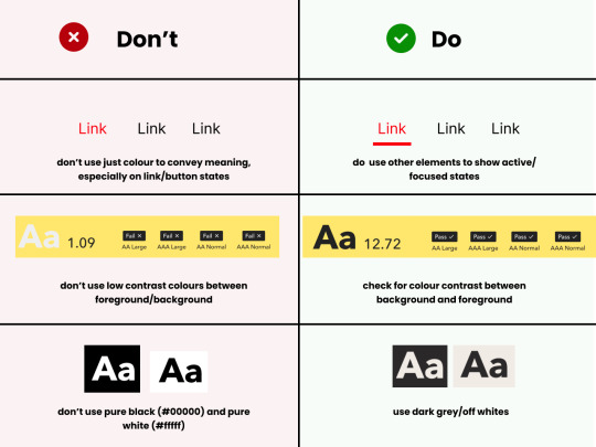
Don't rely on colour alone to convey meaning, information and actions;
Make sure there's enough contrast between foreground and background
Provide an option for light/dark mode
Light/Dark Modes
There’s a myth that dark mode is good for accessibility, because it improves text readability. (Personally, I’m a big fan of dark mode, as white/bright screens may trigger migraines). However, as everything in ux, the answer to ‘is it black or white’ is that it depends. As mentioned before, a good rule of thumb is not to generalise and provide flexibility.
When using light and dark mode, make sure the colour contrast ratio passes on both modes. Here’s a few tips for designing for dark mode (according to atmos article attached at the end of this):
Use tints (less saturated colours). Saturated colours can cause eye strain and will be hard to pass accessibility standards.
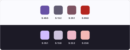
Image from Atmos website
Avoid pure black. Please. Pure black and pure white when used together might be the default instinct, but the contrast when used together is so strong it becomes hard to look at. Choose dark greys and off-whites/light grey when possible.
Be patient with your colour palette, inverting colours won’t make it necessarily good. Take your time to build a palette that will be suitable for both.
Target Sizes
First, what is this? This refers to the dimensions of interactive elements such as links, buttons, icons or touch targets. Basically, anything you can interact/click.
WCAG 2.2 established a minimum for pointer inputs to be 24x24. This is the space that should be provided for a clickable area.
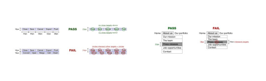
Image from W3 website
There's a number of exceptions and guidelines which I won't get into too much detail. It's important to think about the area which people are clicking into these elements. Also remember that this may be quite useful for users that are using the forum in their mobiles - so this is quite important (don't you hate when you can't click somewhere because you haven't clicked the EXACT area needed?)
In short:
Make sure target sizes are at least 24px
Make sure buttons look like buttons, anything that is clickable and interactive LOOKS like they are interactive
Make sure links are underlined (again, as an extra visual sign that they are clickable)
THAT'S IT!!
For part 01 at least. This is just the tip of the iceberg though. If you'd like to dive deeper into this, I highly recommend Stephanie Walter's content, as well as the Extra Bold book read. I'm attaching a few more articles and resources here too! If you've read all of this, you are a champ, I know this is longer than usual. Please like and share this content, let's get it out there!
Articles:
Designers Guide to Documenting Accessibility
Dark mode ui best practices
Dark mode best practices
Accessibility annotation examples
Colour accessibility tools
Inclusive components design
Accessible design in 60s
Target size minimum
Resources
Accessible colours
Accessible colour palette builder
44 notes
·
View notes
Text
Future-Proof Your Brand: Why a Holistic Digital Marketing Strategy Matters in 2025
An in-depth guide by Digitalized Era
In the post-cookie, AI-driven landscape of 2025, piecemeal tactics are no longer enough to keep a brand visible, relevant, and profitable. Whether you run a local bakery in Jacksonville or a SaaS start-up in London, you need a holistic digital marketing strategy that ties every channel—SEO, social, paid ads, content, email, and web development—into one cohesive growth machine.
1. The Shift From “Channel Thinking” to “Customer Journey Thinking”
Old model
“We need Facebook posts.”
“Let’s run a Google Ads campaign this quarter.”
New model
“Sarah discovers us on TikTok, reads a blog we rank for on Google, joins our email list, and finally converts through a retargeting ad.”
This journey mindset forces you to optimise touchpoints together rather than in silos—exactly what Digitalized Era’s 360-degree process delivers:
Site Audit & UX checks
Deep market + keyword research
On-page & technical SEO
Cross-channel content mapping
Unified paid + organic reporting
Continuous CRO (Conversion Rate Optimisation)
2. Data Privacy & First-Party Data: The 2025 Reality
By the end of 2024, Chrome will have deprecated third-party cookies. Brands that fail to build first-party data pipelines will pay up to 35 % more for the same ad results. Digitalized Era helps you:
Capture consent with value-driven lead magnets
Segment subscribers in GDPR/CCPA-compliant workflows
Deploy personalised email drips that nurture, upsell, and retain
Result: lower acquisition costs, higher lifetime value.
3. AI Is Only as Good as Your Strategy
Tools like ChatGPT, Midjourney, and Google Gemini can accelerate content production—but they can’t replace:
Brand voice & POV
Strategic keyword selection
Human-centred storytelling
Our content marketing team blends AI efficiency with senior-level editorial oversight to create assets that rank and convert. Expect:
Long-form pillar pages
Social micro-content repurposed from cornerstone blogs
Data-rich infographics coded for fast mobile load times
4. Local, National, or Global: SEO Tactics That Scale
Local SEO – GMB optimisation, NAP consistency, hyper-local schema
E-commerce SEO – faceted navigation fixes, Shopify/Woo Commerce technical audits
International SEO – hreflang mapping, currency/region-specific content
Digitalized Era’s proprietary reporting dashboard shows real-time rank shifts across markets so you can allocate budget where ROI is highest.
5. Paid Media Is No Longer “Set & Forget”
Average CPCs rose 19 % last year in the US. To stay profitable you need:
Intent-driven keyword clusters, not vanity terms
AI-augmented bid strategies with human QA
Cross-channel attribution (PPC + organic + email)
Our PPC specialists iterate weekly, pausing under-performers and reallocating spend to winning ad sets—so every rupee, dollar, or pound works harder.
6. UX-Focused Web Design: Your New Sales Rep
A 0.1-second improvement in load time can boost conversions by 8 %. Digitalized Era’s design & dev squad builds:
Mobile-first, Core Web Vitals-optimized sites
Shopify, WordPress & Wix builds that integrate seamlessly with CRM and marketing automation
Accessibility-compliant interfaces (WCAG 2.2)
Beautiful and built to rank.
7. Measuring What Matters
Vanity metrics (likes, impressions) don’t pay the bills. We align on KPIs tied directly to revenue:
Qualified leads generated
Customer acquisition cost (CAC)
Average order value (AOV)
Customer lifetime value (CLV)
Return on ad spend (ROAS)
Our live dashboards deliver clarity, not confusion.
8. Success Stories
Leather Made In Italy moved from zero top-100 keywords to page-one dominance. Prevail Clothing scaled organic traffic 3× in six months. Cozyts saw Instagram engagement jump 220 % after a visual revamp.
Your brand could be next.
9. The Digitalized Era Advantage
✔ End-to-end expertise under one roof ✔ 24/7 support via phone (+91 674 357 6892) or email ([email protected]) ✔ Transparent, package-based pricing for SMEs and start-ups ✔ Offices in the US, UK, and India for truly global coverage
Ready to Transform Your Business?
Turn every click into a customer. Schedule a free 30-minute strategy call today:
📞 +91 674 357 6892 📧 [email protected]
Digitalized Era—your gateway to digital excellence. Let’s make 2025 your breakout year.
2 notes
·
View notes
Text
You jest, but as the business analyst on a software team, this is partly what I do.
I have to stop and tell my dev team (and my boss) "we can't do that" when they start cooking up crazy ideas.
Why can't we do that?
Our software has to work on a 1366x768 laptop screen. I finally got permission to kill off 1280x720 in the year of our lord 2024 because no devices are provided by our organization with that resolution any more, although we still have some older monitors out there. (Whiners are told to contact IT for a new monitor free of charge.)
Our software has to be WCAG 2.2 compliant which means it has to be tabbable and things need to be usable entirely in a keyboard for screen readers, among other things.
Our software has to be browser and system agnostic. Currently arguing about a bug that happens in Windows that doesn't happen in Mac with my boss because he "can't reproduce it." I recorded a gif to attach to the ticket as proof. Conversely, there are bugs that happen on Macs that don't happen in Windows.
Our software has to be translatable. Not just for screen readers, but literally, we let people in other countries localize it so they don't have to use English, and we let each organization call stuff whatever words they want in the software.
It has to work on dialup.
It has to work on a laptop with an integrated GPU.
Thankfully, we don't have any developers trying to add ray tracing or visible pores since we're business software and not a video game but.... yeah.
"That guy" is called a business analyst, and you're right, if every software team had that guy (or gal, or gem) the world would be a better place.
My solution for bloatware is this: by law you should hire in every programming team someone who is Like, A Guy who has a crappy laptop with 4GB and an integrated graphics card, no scratch that, 2 GB of RAM, and a rural internet connection. And every time someone in your team proposes to add shit like NPCs with visible pores or ray tracing or all the bloatware that Windows, Adobe, etc. are doing now, they have to come back and try your project in the Guy's laptop and answer to him. He is allowed to insult you and humilliate you if it doesn't work in his laptop, and you should by law apologize and optimize it for him. If you try to put any kind of DRM or permanent internet connection, he is legally allowed to shoot you.
With about 5 or 10 years of that, we will fix the world.
#business analyst#this is what I do#I get paid to put frowny faces on screenshots when things break#its great I love my job
70K notes
·
View notes
Text
Future-Proofing Your Online Presence: Emerging Technologies in Atlanta, GA Website Design
In today’s fast-paced digital landscape, your website is often the first impression potential customers have of your business. As competition intensifies and user expectations evolve, relying on outdated designs or static websites is no longer sufficient. Businesses in Atlanta must look ahead—and that’s where Website Design Atlanta GA is heading: toward innovation, automation, and immersive experiences.
At AceOne Technologies, we’re passionate about helping businesses stay ahead of the curve. Let’s explore some of the most exciting emerging technologies shaping the future of website design right here in Atlanta, GA.
1. AI-Driven Personalization
Modern websites aren’t just digital brochures—they’re intelligent, interactive tools. AI can analyze visitor behavior to deliver a tailored experience in real time. Whether it’s personalized product recommendations, chatbots that learn user intent, or dynamically changing layouts based on preferences, Website Design Atlanta GA is leaning into AI to make each visit count.
2. Voice Search Optimization
With the rise of Alexa, Siri, and Google Assistant, optimizing for voice search is no longer optional. Future-ready sites are now built with natural language content and fast-loading structures to ensure users can find you by simply asking a question aloud.
Atlanta, GA website designers are increasingly factoring voice queries into keyword strategies and site architecture to keep businesses discoverable in this evolving search landscape.
3. Progressive Web Apps (PWAs)
PWAs combine the best of websites and mobile apps. They load fast, work offline, and offer app-like functionality—all without needing a download. Businesses in Atlanta are turning to PWAs for improved performance, better engagement, and lower development costs.
By incorporating PWAs, Website Design Atlanta, GA agencies like AceOne Technologies are building digital platforms that are mobile-friendly and future-proof from day one.
4. Advanced Motion UI and Micro-Animations
Today’s users expect visually rich experiences that tell a story. Subtle animations, hover effects, and smooth transitions create a polished, premium feel. These elements don’t just make your site prettier—they improve usability by providing cues and engagement.
At AceOne, we use motion design not as fluff, but as a function—enhancing navigation and giving users reasons to stay longer.
5. Sustainability-Focused Design
As eco-consciousness grows, even web design is going green. Cleaner code, fewer server requests, and energy-efficient design principles are part of sustainable development.
Businesses are now choosing Website Design Atlanta GA firms that align with environmental values—delivering fast, minimal, eco-friendly sites that reduce digital waste.
6. Accessibility and Inclusive Design
A future-proof website must be accessible to everyone. Emerging standards like WCAG 2.2 and advanced accessibility tools are being baked into modern design workflows. Whether through high-contrast color schemes, keyboard-friendly navigation, or screen reader compatibility, inclusive design ensures you don’t miss out on valuable customers.
At AceOne Technologies, every project is built with accessibility in mind—because your digital door should always be open.
Ready to Future-Proof Your Website?
Technology is changing faster than ever—and so are your customers. By integrating AI, voice search, progressive apps, and accessible design, you’re not just keeping up—you’re staying ahead.
If you're ready to elevate your brand with expert Website Design in Atlanta, GA, we’re here to help.
📞 Contact AceOne Technologies
💬 Email: [email protected] 📞 Phone: (855) 405-8111 🌐 Website: www.websitedesigneratlanta.com
Let’s design a future-ready website that works as hard as you do.
#WebsiteDesignAtlantaGA#AtlantaGAWebsiteDesign#WebsiteDesignAtlanta#AceOneTech#AceOneAtlanta#AtlantaSmallBusiness#WebsiteDesign#DesignServicesAtalanta#DigitalMarketing#SEO#Branding#MobileApps
0 notes
Text
Top UI/UX Design Trends Dominating the USA Market in 2025
The UI/UX design landscape continues to evolve rapidly, driven by user expectations, new technologies, and changing business models. In 2025, U.S.-based digital products are leading the way with innovative design approaches that prioritize usability, personalization, and performance. Whether you're designing a startup MVP or redesigning an enterprise platform, here are the top UI/UX trends shaping the American market this year.

1. AI-Powered Personalization
Personalization is no longer a “nice-to-have”—it's expected. U.S. companies are leveraging AI and machine learning to tailor digital experiences to individual user behavior.
E-commerce platforms suggest products in real time.
SaaS apps adjust dashboards based on usage patterns.
AI chatbots now offer UI suggestions based on previous interactions.
For UI/UX designers, this means designing flexible interfaces that adapt, not just display.
2. Voice and Gesture-Driven Interfaces
With the rise of smart devices, voice and gesture controls are making their way into mainstream digital experiences. U.S. brands are integrating voice UI (VUI) into mobile apps, smart TVs, and even enterprise tools.
Designers are now tasked with creating multimodal experiences—combining visual elements with voice or motion. Clear feedback cues and accessibility are critical in this context.
3. Neumorphism 2.0 and Soft UI
While flat design still dominates, a refined version of neumorphism—“Soft UI”—is trending again in the U.S. market. It blends realism and minimalism to create more tactile, engaging experiences.
Soft shadows, subtle gradients, and micro-interactions are being used to make interfaces feel more natural, especially in fintech, wellness, and productivity apps.
4. Dark Mode Done Right
Dark mode is no longer just an aesthetic choice—it's a functional feature tied to accessibility and battery efficiency. In 2025, U.S. companies are moving beyond simple color inversions to truly optimized dark themes:
Adjusting contrast ratios for readability.
Using motion and blur for depth in low-light UIs.
Giving users system-based toggle options.
Designers must now create fully accessible dual-mode designs by default.
5. Ethical and Inclusive Design
U.S. consumers are demanding more ethical, inclusive digital experiences. Leading UI/UX agencies are integrating:
Accessibility standards (WCAG 2.2 and ADA compliance)
Inclusive language and imagery
Data transparency and consent-first interfaces
Inclusive design is no longer niche—it’s mainstream. It also directly impacts SEO, legal compliance, and brand trust.
6. Micro-Interactions and Motion Design
Subtle animations, hover effects, and transitions are becoming key parts of UI storytelling. In 2025, U.S. brands are using micro-interactions to:
Improve onboarding
Confirm actions (like purchases or form submissions)
Guide users through complex workflows
Motion helps communicate status and intention—when done right, it improves usability without distracting.
Final Thoughts
The UI/UX design trends of 2025 in the USA show a clear shift toward smarter, more human-centered experiences. AI personalization, ethical design, and immersive interfaces are setting the new standard. If your brand wants to stay competitive, it’s time to think beyond “how it looks” and focus on how it feels and functions.
0 notes
Text
Top Wix Website Development Services in London: What to Expect in 2025
In today's era where people are using mobile phones more and more, so our website should be mobile-friendly, especially where there are thousands of competitors in the market. If the business needs to grow rapidly, then one should opt for Wix website development. There are many reasons for this, first of all its flexibility, user-friendly design tools are quite effective.
But the most important thing is that you choose a right and best web development agency. You should first understand your business goal, then select a top web company and make a better strategy with the company team.
Why is wix best for your business?
Before doing any work, we need to know about it in depth, before entering the market our first priority should be why Wix is so popular.
Drag-and-Drop Simplicity: No coding required
Customizable Templates: Over 800 designs for every industry
Built-in SEO Tools: Easily optimized for search engines
eCommerce Ready: Ideal for online stores of all sizes
Mobile Optimization: All sites are responsive by default
Wix is especially great if you’re a startup that wants to launch and grow quickly or for local businesses that want a modern site without the overhead of complex platforms.

What Makes a Great Wix Developer in London?
A top Wix website development service goes beyond dragging and dropping elements. Look for the following qualities:
1. Analog strategy
Good and knowledgeable developers understand your business goals, client requests and market demand before building anything. It is not enough to make a website just beautiful; its performance should also be good. Good developers take care of everything.
2. Advanced Customization
Wix is very beginner-friendly, making it easy for anyone to create a website. For experienced developers, it offers powerful tools to create custom features like booking systems, members-only content, and dynamic databases.
3. SEO And Performance Optimization
SEO goes far beyond just keywords. Leading Wix services in London prioritize core web vitals, fast mobile loading, and structured data to help your site rank higher.
4. Brand-First Design
The design of your website reflects your brand identity. What's more important is that people know you by your brand. That's why a good developer designs to match the tone of your business, from your colour schemes and fonts to interactive features.
5. Ongoing Support
You should look for developers that offer maintenance packages, analytics tracking, and regular updates to ensure your site grows with your business.
Wix growth trends to watch in 2025
If you want to move ahead in today's world, you must keep up with the latest trends.
The top agencies in London focus on the following:
AI-Enhanced Personalization: Websites that adapt to users in real time
Micro-Interactions: Subtle animations and feedback to boost UX
Voice Search Optimization: Preparing for a voice-first future
Accessibility Compliance (WCAG 2.2): Making sites usable for everyone
Sustainable Web Design: Lightweight designs that reduce energy consumption
Top Industries Using Wix in London
Creative Portfolios (Photographers, Designers)
Health & Wellness (Therapists, Coaches, Gyms)
Restaurants & Cafés (Menus, Online Booking)
Real Estate (Property Listings, Contact Forms)
Consultancies & Agencies (Lead Capture, Case Studies)
If you are planning to launch and invest in a reliable Wix development partner in London, choose Web Ants. We are the leader in Wix website development services in London.
Our team is expert in every technology; they can also save your time and provide you services in less budget if you have them on task.
If you need eye-catching landing pages or a complex eCommerce site, an expert can harness the full power of the Wix platform to suit your unique goals.
Ready to Build Your Wix Website?
Web Ants specialise in building high-performance Wix websites built for growth. If you are a small business, business professional looking to build in London, so
we are always here to help you turn your ideas into digital reality at a fair price. Visit our website and contact us today.
Conclusion
As 2025 progresses, the demand for visually appealing, high-performing websites will only increase. If you’re launching a new brand, refreshing your digital identity, or expanding into ecommerce, working with a skilled Wix website development service ensures your site is not only beautiful, but built for results.
Choose the right web development company and get a powerful tool to connect with your audience, enhance your brand in a competitive market.
#Wix website development services in London#Wix website development services#Wix website development London#Wix website development company#Wix website development agency
0 notes
Text
Web Content Accessibility Guidelines

WCAG 2.2: Decoding The Latest Web Accessibility Guidelines
In the ever-evolving digital landscape, accessibility has become a non-negotiable imperative for all users. The updated and latest Web Content Accessibility Guidelines (WCAG) 2.2, released in October 2023, stands as a beacon of inclusivity, providing comprehensive guidelines for making web content accessible to people with disabilities. Moreover, lawsuits against businesses with non-compliant websites have proliferated. According to ADA attorney Nolan Klein, thousands of ADA lawsuits have been filed in federal court alleging non-compliance with WCAG standards. Implementation of WCAG 2.2 standards is therefore critical not only for inclusivity but also for proper litigation risk management. As we explore WCAG 2.2 and its anticipated updates in 2023, this article aims to simplify its complexities, shedding light on the importance of web accessibility for the general public.
What is Web Accessibility?
In today’s interconnected world, the Internet has become indispensable for communication, education, employment, and social engagement. Practically everyone turns to the internet for a solution to all their queries, be they booking tickets, job opportunities, or making purchases. However, for individuals with disabilities, the web can present a daunting landscape of barriers, hindering their ability to participate in the digital sphere fully. This is where web accessibility comes into play. It is the practice of designing and developing websites and web applications so that even people with disabilities can easily and comfortably access and use them. By removing accessibility barriers and ensuring that web content is perceivable, operable, understandable, and robust, web accessibility promotes inclusivity and empowers individuals with disabilities to navigate the digital world quickly.
The Significance of Web Accessibility
The importance of a strong web accessibility initiative cannot be overstated. It is a fundamental human right enshrined in the United Nations Convention on the Rights of Persons with Disabilities (CRPD). Moreover, web accessibility makes good business sense. By catering to a broader audience, businesses can expand their customer base, enhance their brand reputation, and gain a competitive edge.
Impact on Diverse User Experiences
Web accessibility considerations extend far beyond the realm of disabilities. They encompass a broad spectrum of user experiences, including those related to age, language barriers, and situational impairments. Examples of situational impairments include watching videos with only audio in libraries or those with stubby fingers preferring larger call-to-action buttons. By designing websites that are inclusive and accessible to all, we can create a more equitable and user-friendly digital landscape.
W3C Releases: Shaping the Evolution of Accessibility
The World Wide Web Consortium (W3C) plays a pivotal role in developing and maintaining WCAG, ensuring that the guidelines remain relevant and effective in the face of evolving technologies and user needs. The WCAG 2.2 was developed through the W3C process with other individuals and worldwide organizations to provide web content accessibility guidelines that meet international governments’, organizations’, and individuals’ accessibility needs. The W3C recommends using the WCAG 2.2 as a standard for the web.And thus provides the necessary resources and training as guidance and clarity on implementing WCAG.
WCAG 2.2: A New Standard for Web Accessibility
In October 2023, the World Wide Web Consortium (W3C) released WCAG 2.2, the latest iteration of the Web Content Accessibility Guidelines. The WCAG 2.2 is built on WCAG 2.0 and 2.1, the previous versions were built on WCAG 1.0, designed to apply different present and future technologies and tested through manual and automated testing. The update incorporates new WCAG success criteria and techniques, addressing the evolving needs of users with cognitive, language, and learning disabilities and reflecting advancements in web technologies.
WCAG 2.2 and Its Relevance
The release of WCAG 2.2 marks a significant step forward in pursuing web accessibility. By adopting these guidelines, web developers, content creators, and organizations ensure their digital products and services are accessible to a wider audience, fostering a more inclusive and equitable online experience.
Multiple Layers of Guidance
The various individuals and organizations using WCAG include policymakers, web designers, teachers, and students. Thus, multiple layers of guidance meet this varied audience’s comprehensive needs. These layers include:
Overall Principles
The foundation of WCAG 2.2 rests upon four fundamental principles: perceivable, operable, understandable, and robust. These principles, each encompassing specific guidelines and measurable success criteria, form the cornerstone of accessible web content.
Perceivable: Content must be presented so that users with visual, auditory, or other sensory impairments can perceive it.
Operable: Users with diverse abilities, including motor and speech impairments, must be able to operate a user interface component and navigate content effectively.
Understandable: Content must be presented clearly and unambiguously so that users with cognitive, learning, or language disabilities can comprehend it easily.
Robust: Content must remain accessible across all various assistive technology and user environments.
General Guidelines
These come next and are the 13 guidelines providing the goals authors adhere to for making content more accessible to users with different disabilities. While they aren’t testable, they provide the basic framework for authors to understand success criteria and, thus, better implement techniques.
Testable Success Criteria
Each guideline has testable success criteria to ensure WCAG 2.2 is used wherever requirements and performance testing are required. This includes design specifications, contractual agreements, and purchasing. WCAG 2.2 defines three levels of conformance level: A, AA, and AAA, each representing a progressive level of accessibility in different groups and situations.
Level A: The minimum level of accessibility, ensuring basic functionality for all users.
Level AA: A higher level of conformance, addressing the needs of many disabled users. It is considered the recommended level for most websites.
Level AAA: The most stringent level, catering to a wider range of disabilities and user preferences. It is often considered an aspirational goal for websites.
Sufficient and Advisory Techniques
Various techniques are used for each guideline and success criterion in WCAG 2.2, divided into two categories. Sufficient techniques for meeting success criteria and advisory techniques that let authors go beyond the individual success criteria to address guidelines better. They may address accessibility problems or barriers the testable success criteria do not cover. These layers of guidance together guide web developers to make content more accessible by applying as many layers as possible. This includes including advisory techniques so that the content addresses the needs of most users.
WCAG 2.2: A Watershed Moment in Digital Accessibility
WCAG 2.2 addresses the ever-changing technological landscape and evolving user needs, thus emerging as a pivotal step forward from its predecessor, WCAG 2.1. This enhanced iteration introduces nine tool accessibility guidelines and new success criteria meticulously crafted to enhance accessibility for users with visual, physical, and cognitive disabilities. These additional success criteria encourage:
1. Improved Focus Management
WCAG 2.2 introduces three enhanced focus management success criteria catering to users with motor impairments. These success criteria enable users to navigate web content smoothly and efficiently. These success criteria are:
2.4.11 Focus Not Obscured (Minimum) (AA): According to this success criterion, there might be some degree of hiding or obscuring keyboard-focused user interface components like buttons or links in a website or app design.
2.4.12 Focus Not Obscured (Enhanced) (AAA): According to this success criterion, content web developers create, like website and app design, cannot hide any part of keyword-focused user interface components.
2.4.13 Focus Appearance (AAA): According to this success criterion, visible keyboard focus indicator parts must be a minimum of a 2 CSS pixel thick perimeter of unfocused components or sub-components. They should also have a minimal 3:1 ratio between pixels in focused and unfocused states.
2. Enhanced Touch Input Support
Recognizing the growing prevalence of touch-enabled devices, WCAG 2.2 introduces refined guidelines for touch input and page break navigation. This ensures seamless interaction for users with limited or no mouse interaction. These success criteria are:
2.5.7 Dragging Movements (AA)
According to this success criterion, a single pointer can perform dragging movements without dragging. Exceptions are when dragging is crucial to the functionality or the user agent dictates the functionality and remains unaltered by the author.
2.5.8 Target Size (Minimum) (AA)
According to this success criterion, the minimum size for pointer input targets is 24 by 24 CSS pixels, with exceptions in:
Spacing: Targets smaller than 24 by 24 CSS pixels can be positioned so that, if a 24 CSS pixel diameter circle is centered on each target’s bounding box, the circles do not intersect with other targets.
Equivalent: The same function can be accomplished through a different control on the same page, meeting the 24 by 24 CSS pixel criterion.
Inline: The target is within a sentence, or its size is constrained by the line height of non-target text.
User-agent control: The user agent determines the target size and remains unaltered by the author.
Essential: A specific presentation of the target is deemed essential or is legally required for conveying the information.
3. Clearer Color Contrast Guidance
WCAG 2.2 provides clearer and more stringent guidelines for color contrast to address the needs of low-vision users. It thus ensures text is easily distinguishable from its background. These success criteria are:
3.2.6 Consistent Help (A)
According to this success criterion, if web pages include certain help mechanisms like human contact details, human contact mechanisms, self-help options, and fully automated contact mechanisms, they should maintain a consistent order across multiple pages unless a user-initiated change occurs.
3.3.7 Redundant Entry (A)
According to this success criterion, user-provided information that must be repeatedly entered in the same process is auto-populated or made available for the user to select. Exceptions are when:
Re-entering the information is deemed essential
The information is necessary for ensuring content security
The previously entered information is no longer valid
3.3.8 Accessible Authentication (Minimum) (AA)
According to this success criterion, an authentication process does not mandate cognitive function tests like remembering a password or solving a puzzle. Exceptions are when the step offers at least one of the following:
Alternative: Another authentication method that doesn’t involve a cognitive function test.
Mechanism: A mechanism aids the user in completing the cognitive function test.
Object Recognition: The cognitive function test involves recognizing objects.
Personal Content: The cognitive function test identifies non-text content the user provides to the website.
3.3.9 Accessible Authentication (Enhanced) (AAA)
According to this success criterion, cognitive function tests, like recalling a password or solving a puzzle, are not obligatory at any stage in an authentication process unless the step offers either:
Alternative: An alternative authentication method not dependent on a cognitive function test.
Mechanism: A mechanism is accessible to aid the user in completing the cognitive function test.
The new success criteria may reference new terms that have also been added to the glossary and form part of the normative requirements of the success criteria. WCAG 2.2 also introduces new sections detailing aspects of specifications impacting privacy and security.
Was Any Success Criterion Removed from WCAG 2.2?
Yes, the success criterion 4.1.1 Parsing was removed from WCAG 2.2. It was removed as it was considered obsolete due to the advancements in web technology. Besides, new success criteria in WCAG 2.2 provide a more robust and up-to-date approach to ensuring accessible web content to disabled users. Here is why 4.1.1 Parsing was removed from WCAG 2.2:
It was primarily focused on older technologies, such as HTML 4.0 and earlier versions of XHTML, which are no longer widely used.
It was not well-defined and could be interpreted differently, leading to inconsistencies in implementation.
It was not as effective as other success criteria in ensuring that web content is parsable by user agents.
Removing 4.1.1 Parsing from WCAG 2.2 does not mean the parsing issue is no longer important. However, the new success criteria in WCAG 2.2 provide a more comprehensive and effective way to address this issue.
WCAG 2.1 vs. WCAG 2.2- The Differences
The latest Web Content Accessibility Guidelines, WCAG 2,2, builds upon its predecessor, WCAG 2.1, to further enhance web accessibility for people with disabilities. While WCAG 2.1 laid a solid foundation for accessible web development, WCAG 2.2 introduces new success criteria, refines existing guidelines, and provides clearer instructions to make accessibility more achievable and maintainable. There are thus these five major differences between the two:
1. New Success Criteria in WCAG 2.2
WCAG 2.2 introduces nine additional success criteria, addressing areas such as:
Focus appearance: Ensuring that focus indicators are sufficiently visible and distinguishable to aid navigation for users with low vision or cognitive disabilities.
Page break navigation: Providing clear and consistent mechanisms for navigating between page breaks, particularly for users who rely on screen readers or keyboard navigation.
Dragging movements: Making drag-and-drop interactions accessible to users with motor disabilities by providing adequate target sizes and clear visual feedback.
Consistent help: Providing consistent and easily accessible help or support mechanisms throughout the website or application.
Visible controls: Ensuring that all controls, including form fields and buttons, are clearly visible and distinguishable even to low-vision users.
These new success criteria reflect the evolving technological landscape and a deeper understanding of user needs, particularly those with cognitive disabilities.
2. Enhanced Mobile Accessibility
WCAG 2.2 continues to refine mobile accessibility guidelines, recognizing the growing prevalence of mobile devices and the need for websites and applications to be accessible across all platforms. This includes improvements in:
Touch target sizes: Ensuring touch targets are large enough and spaced appropriately to accommodate ease of use to users with motor disabilities or limited dexterity.
Input modalities: Providing alternative input modalities, such as voice control or keyboard navigation, to cater to users with different physical abilities.
Context-aware activation: Preventing unintentional activation of elements, such as pop-ups or overlays, that could hinder navigation for users with cognitive disabilities.
3. Improved Usability and Clarity
WCAG 2.2 aims to make the guidelines more user-friendly and actionable for developers and content creators through:
More explicit guidelines: Provide clearer and more explicit instructions for each success criterion to reduce the need for interpretation and ensure consistent implementation.
Additional examples: Offer more comprehensive and illustrative examples to demonstrate how to meet each success criterion in real-world scenarios.
Improved organization: Structuring the guidelines more logically and intuitively makes it easier for developers to find the information they need.
4. Backward Compatibility and Continuous Evolution
WCAG 2.2 maintains backward compatibility with WCAG 2.1, meaning that websites and applications conforming to WCAG 2.2 also adhere to WCAG 2.1 accessibility standards. This ensures that accessibility efforts are not lost with each new guidelines version. As technology and user needs evolve, WCAG will adapt and refine its guidelines to ensure that the web remains an inclusive and accessible space for all.
5. Removal of One Success Criterion
The success criterion 4.1.1 Parsing was removed from WCAG 2.2 as it was considered obsolete compared to web technology advancements. Besides, new additional success criteria in WCAG 2.2 ensure web content is accessible to users with disabilities.
Impact on User Experience
As always, the WCAG 2.2 offers an improved user experience, rendering digital content more user-friendly and inclusive for everyone, including users with disabilities. By adhering to the latest WCAG 2.2 guidelines, websites, and digital platforms become more accessible to all their users and visitors, regardless of their abilities. It doesn’t matter what disability the user may have or where they are, they can easily navigate, comprehend, and interact with the digital content. This is thus a win-win situation for both users and web developers. For example, visually impaired users easily navigate websites with images with alt text. In addition to improved accessibility, the alt text helps with SEO, thus improving the digital platform’s SEO rankings. Similarly, users with physical impairments and, in general, all users can easily navigate websites that are keyboard-navigable.
WCAG and Its Benefits for Businesses:
Embracing web accessibility guidelines should never be considered a waste of time or investment. It’s because web accessibility perfectly aligns with any and every business’s interests. It offers benefits like:
Broader Customer Base
Not only does WCAG 2.2 ensure everyone has equal access to the web, but the additional success criteria in WCAG 2.2 address additional disabilities to foster a broader customer base. People with disabilities form a major part of any website visitors. They will not be able to use or visit inaccessible websites. This, in turn, prevents them from accessing important information or performing important tasks like applying for jobs, booking tickets, or making purchases.
Increased Compliance
Adhering to WCAG 2.2 guidelines helps businesses and organizations comply with legal standards like accessibility laws and regulations protecting the rights of users with disabilities. Examples include the Americans with Disabilities Act (ADA), Section 508 of the Rehabilitation Act, and the European Web Directive. With businesses adhering to the latest WCAG 2.2, there are reduced chances of users filing cases for inaccessibility. Businesses thus save money by avoiding lawsuits. Besides, by ensuring equal access to users with disabilities, organizations and businesses contribute to creating a more inclusive and equitable digital environment for all.
Common Challenges in WCAG 2.2 Implementation and Useful Solutions:
Implementing WCAG 2.2 can be complex and challenging for businesses and organizations, as incorporating them into web development and maintenance processes can pose significant hurdles.
5 Common Challenges Businesses Face
The five common challenges faced by most businesses and web developers while implementing WCAG 2.2 include:
Lack of Awareness and Understanding: Many businesses and organizations lack a comprehensive understanding of WCAG 2.2 and its implications for their websites and applications. This lack of knowledge can lead to unintentional non-compliance and potential legal issues.
Resource Constraints: Implementing WCAG 2.2 often requires significant financial and human resources. Businesses may need to allocate additional funds for accessibility testing, training, and software tools while dedicating staff time to address accessibility issues.
Legacy Technology and Codebases: Websites and applications built on older technologies or with complex codebases may be more challenging to adapt to WCAG 2.2 standards. This can require extensive, time-consuming, and costly refactoring and code remediation.
Content Management Systems (CMS) and Third-party Tools: Integrating WCAG 2.2 compliance into CMS and third-party tools can be tricky, especially in tools lacking built-in accessibility features.
Ongoing Maintenance and Testing: WCAG 2.2 compliance is not a one-time project. It requires ongoing maintenance and testing to ensure new content and updates adhere to the guidelines. This can add to the ongoing costs and resource demands for maintaining an accessible website.
Practical Solutions to Overcome Challenges
The good news is that there are practical solutions that web developers can easily use to overcome these challenges. They include:
Educating and Training Staff: Regular training sessions for web developers, designers, and content creators raise awareness of WCAG 2.2 guidelines and best practices.
This helps ensure that accessibility considerations are integrated into all web development and maintenance aspects.
Prioritize Accessibility from the Start: Incorporating accessibility considerations into web development projects’ planning and design phases helps.
This proactive approach can help identify and address potential accessibility issues early on, thus preventing costly retrofits later.
Utilize Accessibility Testing Tools: Employing automated accessibility testing tools to identify and troubleshoot accessibility issues throughout the development process also helps.
These tools can provide valuable insights and help streamline the remediation process.
Choose Accessible CMS and Third-party Tools: When selecting CMS and third-party tools, prioritize those that offer built-in accessibility features and support WCAG 2.2 compliance.
This can save time and effort in the long run. Businesses may need to customize these tools or find alternative solutions that meet accessibility requirements.
Establish an Accessibility Workflow: Implementing a clear accessibility workflow that outlines roles, responsibilities, and procedures for ensuring and maintaining WCAG 2.2 compliance helps.
This will help keep accessibility at the forefront of web development and maintenance.
Clearing Common WCAG 2.2 Implementation Misconceptions
A few common misconceptions about implementing WCAG 2.2 discourage web developers from implementing them. Here are 5 common misconceptions dispelled:
Accessibility is Expensive: True
Yes, implementing WCAG 2.2 can involve upfront costs. However, the long-term benefits of an accessible website outweigh these expenses. An accessible website can increase user engagement, improve brand reputation, and reduce the risk of legal issues.
Accessibility is Only for People with Disabilities: False
Accessibility benefits everyone, not just those with disabilities. An accessible website is more user-friendly and usable for all, regardless of their abilities or limitations.
Accessibility is Too Technical: True
While some technical expertise is required to implement WCAG 2.2, accessibility is not solely a technical issue. It requires collaboration between designers, developers, content creators, and stakeholders to ensure a truly accessible user experience.
Accessibility Can Wait: False
Accessibility should not be an afterthought for website owners. It is essential to integrate accessibility considerations into all web development and maintenance phases. Addressing accessibility early on can save time and resources in the long run.
Accessibility is Binary: False
Accessibility is not a pass-fail situation but a spectrum of conformance levels. Businesses should strive to achieve the highest level of accessibility possible, as even incremental improvements can make a significant difference for users with disabilities.
Conclusion
WCAG 2.2 marks a significant milestone in pursuing digital accessibility by addressing more accessibility needs. It builds on WCAG 2.1 by adding new guidelines and success criteria and clarifying and updating existing ones. It makes the web more accessible and offers a roadmap for creating inclusive and user-friendly websites for individuals with diverse abilities. By adhering to these guidelines, web developers, content creators, and organizations play a pivotal role in bridging the digital divide, thus ensuring everyone has equal access to digital content across the internet.
Web Content Accessibility Guidelines Experts – ADA Site Compliance
Contact ADA Site Compliance today for all your ADA website compliance and website accessibility needs! Get your FREE SITE SCAN now. We are leaders in assistive technologies and making all your websites accessible.
#https://adasitecompliance.com/wcag-2-2-decoding-latest-web-accessibility-guidelines/#wcag 2.2#web accessibility guidelines#ada compliance#web content accessibility guidelines#accessibility standards#decoding wcag 2.2#latest web accessibility guidelines#digital accessibility#inclusive design#ada website compliance#wcag compliance#accessibility best practices#web accessibility updates#accessibility testing#a11y (short for accessibility)#usability for all#assistive technology#accessibility features#ada website requirements#web accessibility checklist
0 notes
Text
Inclusive Design Practices in Web Accessibility Standards
New Post has been published on https://www.justwebdevelopment.com/blog/inclusive-design-practices-in-web-accessibility-standards/
Inclusive Design Practices in Web Accessibility Standards
More than 1.3 billion people live with a disability today, according to the World Health Organization. Online, they still meet walls: missing captions, vague buttons, tiny hit areas. Laws are tightening, but the bigger motivation is simply good service.
When we weave Inclusive Design Practices in Web Accessibility Standards into each sprint, we remove friction for everyone—shoppers on shaky Wi-Fi, parents juggling toddlers, commuters with one free hand.
Over the next few minutes (about 2,500 words), you will learn:
How inclusive design differs from basic “accessibility compliance.”
The key principles that underpin all modern standards.
Updates you must know in 2025—WCAG 2.2, the European Accessibility Act, the new U.S. ADA rule, and the draft WCAG 3.
Practical, bite-sized techniques you can add to projects today.
A maintenance rhythm that keeps inclusion alive after launch.
Inclusive vs. Accessible: Clear Up the Confusion
Accessible design focuses on meeting published technical criteria—typically WCAG success criteria. It answers the question, “Can a disabled visitor complete the task?”
Inclusive design starts earlier and digs deeper. It asks, “Does the experience respect the full range of human ability, language, culture, and context?” Put differently:
Accessible designInclusive designFixes barriers after they appearAnticipates and avoids barriers upfrontMeasures pass/fail against WCAGMeasures how many people feel left outOften handled by QA at the endBaked into research, sketching, copy, and dev
Embracing inclusive thinking helps teams move from retrofits to resilient solutions.
Core Principles Behind Every Standard
Standards use different words, but four timeless ideas unite them. Remember the POUR acronym:
Perceivable – Information must arrive through at least one sense that a user can rely on.
Operable – Every function works with the tools a user has: keyboard, voice, eye-tracking, and switch device.
Understandable – Content, layout, and feedback remain predictable and plain.
Robust – Code works across browsers, assistive tech, and time.
WCAG 2.2’s nine new criteria live under these principles, and WCAG 3 (now in draft) is expected to carry them forward too.
The Latest Web Accessibility Standards
The phrase above is the anchor you can use when linking internally: The Latest Web Accessibility Standards. Here is what “latest” means right now:
WCAG 2.2 (W3C Recommendation, 12 Dec 2024)
Adds criteria such as Focus Appearance (Enhanced) and Target Size (Minimum), addressing mobile tap errors and low-vision focus loss.
WCAG 3.0 (Working Draft, 12 Dec 2024)
Promises a friendlier scoring model (Bronze, Silver, Gold) and broader coverage of emerging tech, including VR and voice UIs.
European Accessibility Act (EAA)
Applies 28 June 2025. From that date, most consumer-facing websites, e-books, banking apps, and e-commerce platforms operating in the EU must align with WCAG 2.2 AA (or equivalent) or face fines.
United States—ADA Title II Final Rule
Effective April 2026–2027 (size-based), state and local governments must meet WCAG 2.1 AA at a minimum. Private-sector rule-making is expected next, but lawsuits already cite WCAG in court.
Keep a simple tracker in your backlog: list the standard, due date, coverage scope, and a single owner inside your team.
Practical Inclusive Design Practices (Step-by-Step)
1. Structure First, Style Second
Write one, clear <h1> per page; nest headings in order.
Use <nav>, <main>, <article>, <aside>, <footer>—screen-readers leapfrog by these landmarks.
2. Color & Contrast
Minimum 4.5:1 ratio for body text (3:1 for 24 px bold).
Never rely on color alone: pair red/error with icons or text.
3. Keyboard & Focus
Every control is reachable with Tab, activatable with Enter or Space.
Provide a 2-pixel outline or comparable highlight that meets contrast rules when focused.
4. Input Slack
Targets at least 24 × 24 CSS px per WCAG 2.2.
Avoid “drag only” interactions; offer plus/minus buttons or list re-order shortcuts.
5. Alternative Text & Captions
Alt text answers: “Why is this image here?”
Live and prerecorded videos need accurate captions; add audio description if visuals carry meaning.
6. Motion & Media Queries
Respect prefers-reduced-motion. Offer a static fallback for parallax or auto-carousel features.
Support forced colors / high-contrast modes in Windows and Android.
7. Responsive & Flexible Layouts
Components grow or stack gracefully at 200 % zoom.
Use relative units (em, rem, %) rather than fixed pixels for spacing.
8. Error Prevention & Recovery
Label every form control; supply clear placeholders and visible labels.
Explain errors in plain language and describe how to fix them.
Preserve user input on validation failure.
Small, continuous checkpoints catch more than one giant audit.
Designing for Mobile, Voice, and Multimodal Contexts
Inclusive experiences must travel with the user:
Touch gestures: Offer single-tap equivalents for multi-finger or swipe actions.
Voice UIs: Provide speech-friendly labels (“Search flights”) and avoid tiny, generic IDs (“button 12”).
Offline or low-bandwidth modes: Defer huge media, show progress indicators, and cache key tasks.
Dark mode: Ensure contrast in both color schemes; test with automatic OS toggles.
Consider the “bend test”: hold the device with your non-dominant hand while carrying groceries, and try to complete checkout. If you can, many users with limited dexterity can too.
Testing and Validation Workflow
Automated scan (Lighthouse, axe-core) during CI build—catches ~30 % of issues.
Manual keyboard sweep—Tab through each template.
Screen-reader spot check—NVDA on Windows, VoiceOver on Mac/iOS.
Contrast sampling—quick checks with browser devtools eyedropper.
Real-user testing—invite people with varied abilities; pay them, use their insights.
Schedule these gates: design hand-off, QA staging, pre-release, and every quarterly release thereafter. Document findings in plain language (“link lacks focus outline”) to keep reports actionable.
Building an Inclusive Culture
Rules do not shift mindsets; stories do. Try these habits:
Open meetings with a 30-second empathy snapshot—a teammate demos a screen reader on yesterday’s build.
Add accessibility completion as a Definition-of-Done checkbox next to unit tests.
Celebrate wins: post before/after gifs of a fixed focus ring in Slack.
Budget for continuous training; bookmark W3C tutorials and run micro-workshops.
When leaders ask for ROI, share both risk (lawsuits) and upside: accessible sites load faster, reduce bounce, and rank higher.
SEO and Business Upside
Inclusive design and search optimization often walk the same path:
Inclusive techniqueSEO boostUX gainSemantic HTML & headingsBetter crawl & snippet structureClearer page outlineAlt text on imagesImage search trafficScreen-reader contextFast, media-optimized pagesCore Web Vitals scoresLower abandonmentCaptions & transcriptsKeyword-rich text for botsUsable in noisy spacesLogical link textHigher click-through in SERPsEasier navigation
Google’s crawler reads almost like a screen reader. Meet one, please both.
Road-Map: From Audit to Evergreen
PhaseWhat to deliverTime-frame1. SnapshotBaseline audit (auto + manual)Week 12. PrioritizeRank issues by impact & effortWeek 23. Fix criticalContrast, keyboard traps, and missing labelsWeeks 3–64. ValidateUser testing with assistive techWeek 75. DocumentPattern library snippets, inclusive copy guidelinesWeek 86. AutomateLint rules, CI scanners, PR checklistsOngoing7. ReviewQuarterly regression audits, update to The Latest Web Accessibility StandardsEvery 3 months
Pin this to your roadmap tool; give each step a single owner so nothing falls through the cracks.
Conclusion: Inclusion Is Continuous
Inclusive Design Practices in Web Accessibility Standards are not boxes to tick, but conversations to keep alive. The standards will evolve—WCAG 3’s bronze-to-gold model hints at future flexibility—but the people behind the numbers simply want to bank online, learn new skills, or order dinner.
Let’s build a web where nobody needs to ask for an accommodation—because the door is already wide open.
Justwebdevelopment can also help you in... WordPress Development | WordPress Theme Development | PSD To WordPress
0 notes
Text

Como fazer: Acessibilidade [PT]
(english version here)
Parte 01 – Design visual
Primeiro 'como fazer' em português! Tentando deixar as coisas mais acessíveis pra todo mundo. Em primeiro lugar, FELIZ MÊS DO ORGULHO PRA NÓS! Por fazer parte da comunidade queer, conheço as lutas que enfrentamos todos os dias e desejo um mês de muito orgulho para todos nós <3
Mas vamos la pro tópico de hoje: acessibilidade. Isso foi mostrado aqui e ali anteriormente mas O QUE QUE É ISSO?
Vamos voltar um pouco. Durante anos, as pessoas tentaram alcançar o impossível: um design universal. Um design que é universal e utilizável para TODAS as pessoas, um design de tamanho único que será utilizável e perfeito para todos. Agora, só há um “pequeno” problema nisso: as pessoas são diferentes. Sempre tive excesso de peso e sempre que vejo roupas que dizem ‘tamanho único’, olho para elas com muita desconfiança e novidade: quase nunca serve. O ponto principal é: cada pessoa é diferente, os pontos de dor e as necessidades também serão diferentes.
Então, o que fazemos? Um design diferente para cada pessoa que usa nosso produto?
Bem, a ideia é de criar designs equitativos? (espero não ter traduzido isso errado). Vamos fornecer flexibilidade para atender a um público mais amplo e deixar esse público escolher o que é melhor para si. Mas! Isso não tira de nós, os designers (e programadores), a responsabilidade de garantir que estamos fazendo o que podemos para permitir essa flexibilidade.
----------------
Comecei uma lista que percebi que seria muito maior do que o esperado, então decidi colocar cada item em sua própria postagem. Começaremos com DESIGN VISUAL!
Parte 01 - Design Visual
Sobre cores
Já mencionei brevemente a importância do contraste e da taxa de contraste. Se quiser entrar em mais detalhes, você pode dar uma olhada nas Diretrizes W3. Resumidamente:
Não confie apenas na cor para transmitir significado, informações e ações;
Certifique-se de que haja contraste suficiente entre o primeiro plano e o fundo
Forneça uma opção para o modo claro/escuro

Modos claro/escuro
Existe um mito de que o modo escuro é bom para acessibilidade, porque melhora a legibilidade do texto. (Pessoalmente, sou muito fã do modo escuro, pois telas brancas/brilhantes podem me causar enxaquecas). Porém, como tudo em ux, a resposta para ‘é preto ou branco’ é que depende. Como mencionado anteriormente, uma boa regra é não generalizar e oferecer flexibilidade.
Ao disponibilizar modo claro e escuro, certifique-se de que a taxa de contraste da cor seja válida em ambos os modos. Aqui estão algumas dicas para projetar para o modo escuro (de acordo com o artigo atmos anexado no final):
Utilize tonalidades (cores menos saturadas). Cores saturadas podem causar cansaço visual e serão difíceis de serem aprovadas nos padrões de acessibilidade.

Imagem do website Atmos
Evite preto puro. Por favor. Preto puro e branco puro quando usados juntos podem ser o instinto padrão, mas o contraste quando usados juntos é tão forte que fica difícil de olhar. Escolha cinza escuro e off-white/cinza claro quando possível.
Seja paciente com sua paleta de cores, inverter as cores não a tornará necessariamente boa. Não tenha pressa para construir uma paleta que seja adequada para ambos.
Areas de Target
Primeiro, o que é isso? Refere-se às dimensões dos elementos interativos, como links, botões, ícones ou alvos de toque. Basicamente, qualquer coisa que você possa interagir/clicar.
WCAG 2.2 estabeleceu um mínimo para entradas de ponteiros deve ser 24x24. Este é o espaço que deve ser fornecido para uma área clicável.

Imagem do website WCAG
Há uma série de exceções e diretrizes que não entrarei em muitos detalhes. É importante pensar na área clicável dos elementos. Lembre-se também de que isso pode ser bastante útil para usuários que usam o fórum em seus celulares - (você não odeia quando não consegue clicar em algum lugar porque não clicou EXATAMENTE na área necessária?)
Resumindo:
Certifique-se de que os tamanhos de destino sejam de pelo menos 24 px
Certifique-se de que os botões se pareçam com botões, qualquer coisa que seja clicável e interativa PARECE que são interativos
Certifique-se de que os links estejam sublinhados (novamente, como um sinal visual extra de que são clicáveis)
É ISSO!!
Pelo menos para a parte 01. Esta é apenas a ponta do iceberg. Se você quiser se aprofundar nisso, recomendo muuuuito o conteúdo de Stephanie Walter, bem como a leitura do livro Extra Bold. Estou anexando mais alguns artigos e recursos aqui também! Se você leu tudo isso, você é um campeão, sei que foi bem longo.
Please like and share this content, let’s get it out there!
Artigos em ingles:
Designers Guide to Documenting Accessibility
Dark mode ui best practices
Dark mode best practices
Accessibility annotation examples
Colour accessibility tools
Inclusive components design
Accessible design in 60s
Target size minimum
Artigos em portugues:
Acessibilidade em UI
Dicas de UX/UI pra acessibilidade
Importância do contraste
Recursos:
Accessible colours
Accessible colour palette builder
5 notes
·
View notes
Text
WordPress Accessibility Guide 2025: Practical Tools and Compliance Essentials
Let’s face it, WordPress accessibility guide 2025 isn’t just a checklist for developers anymore. It’s about real users having real trouble using your website if it’s not inclusive. You must plan to hire a remote WordPress developer to make sure your project defines all the benchmarks of today’s digital trends!
Millions of people browse the web with screen readers, keyboard navigation, or color-adjusted screens. If your WordPress site doesn’t support them, you’re losing traffic and trust, maybe even risking legal action.
This guide will walk you through the basics of making your WordPress site more accessible. From smart plugin picks to WordPress ADA compliance solutions, and tips on testing, we’ve packed it all in!
Starting First! Understanding WordPress Accessibility
What Is Website Accessibility?
For instance, a user relying on a screen reader must be able to navigate your blog post just as easily as someone scrolling with a mouse. In WordPress, it covers alt text for images, keyboard-friendly navigation, color contrast, readable fonts, form labels, and ARIA roles.
With over 1.3 billion people worldwide living with some form of disability (WHO), ensuring your site is inclusive is a strategic move. For e-commerce sites, blogs, or SaaS platforms built on WordPress, ignoring accessibility means excluding millions of potential users. A worthy WordPress website development company can help you achieve the mark of being highly accessible!
Key Accessibility Principles: The POUR Model
To make WordPress accessibility practical, the POUR framework serves as your foundation:
1. Perceivable
Users must be able to detect all UI elements, text, images, audio, and video. That means:
Use alt tags for every image.
Offer transcripts or captions for multimedia.
Avoid color-only indicators (e.g., don’t use red text to show errors alone).
2. Operable
Your site must work for users who:
Navigate via keyboard (tab, shift-tab, enter).
Use adaptive tools like screen readers or eye-tracking software.
Need sufficient time to complete actions like filling out forms.
3. Understandable
Structure your site with clear navigation and stick to common design conventions. Ensure error messages are easy to spot and correct. For example:
Use consistent layouts across all pages.
Label buttons with clear actions (“Submit,” not “Go”).
Avoid technical jargon or complex phrases.
4. Robust
Accessible content must remain valid as browsers and assistive technologies evolve. That means:
Valid HTML5 structure.
ARIA roles were necessary.
Regular plugin/theme updates to prevent breakages.
The Impact of Accessibility on UX, SEO, and Trust
User Experience
From font scaling to contrast adjustments, inclusive design equals a better experience for everyone. On mobile devices, these principles are even more vital.
SEO Rankings
Google’s Core Web Vitals intersect with many accessibility standards. Optimizing for accessibility often boosts SEO naturally.
Alt text = better image SEO.
Clean markup = faster indexing.
Descriptive links and headers = clearer site structure.
Brand Trust and Legal Safety
In the US alone, ADA lawsuits for inaccessible websites rose 12% in 2024. If your WordPress site isn’t accessible, you risk both revenue and legal penalties. If you’re offering WordPress development services, accessibility should be part of your pitch.
Important Accessibility Standards You Must Know (2025 Update)
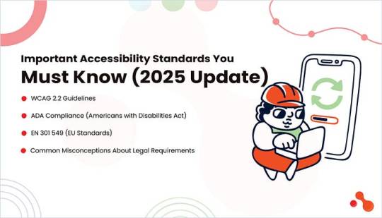
Whether you’re a developer, agency, or business owner, staying compliant with recognized accessibility standards is critical for any WordPress website. Let’s walk through the three major standards that directly impact your WordPress ADA compliance solutions and clear up the most common legal myths around them.
WCAG 2.2 Guidelines
The Web Content Accessibility Guidelines (WCAG) form the backbone of global web accessibility. The latest version, WCAG 2.2, builds on earlier guidelines and introduces refinements focused on mobile usability and cognitive impairments.
Key criteria in WCAG 2.2:
Focus appearance: Ensures users can see where they are navigating via keyboard.
Dragging movements: Replaces drag-and-drop with tap alternatives.
Consistent help: Guarantees help content is persistent on every page.
These standards categorize compliance into three levels:
A: Basic accessibility.
AA: Recommended for public-facing websites.
AAA: Advanced and often not fully achievable.
For anyone offering WordPress development services, achieving at least Level AA compliance should be non-negotiable. Most of the best WordPress accessibility plugins 2025 are designed specifically to meet these WCAG criteria.
ADA Compliance (Americans with Disabilities Act)
The ADA Title III requires that digital platforms be accessible to users with disabilities. Although the law does not explicitly name WCAG, most legal experts and courts reference WCAG 2.1 AA or 2.2 AA as the standard benchmark in litigation.
Lawsuits have surged over the last few years. Over 4,500 ADA lawsuits were filed in the U.S. in 2024 for digital inaccessibility. If you run a business website and serve U.S. customers, your site needs to meet ADA standards, especially if you offer services or sell products online.
EN 301 549 (EU Standards)
For European businesses or any site serving EU users, EN 301 549 is the standard enforced under the European Accessibility Act. It mandates accessibility for public sector websites, mobile applications, and increasingly for private entities in 2025. If you rely on WordPress ADA compliance solutions, make sure you understand the legal scope these tools claim to cover!
EN 301 549 directly references WCAG guidelines, but also includes:
Hardware and software interoperability
Assistive technology integration
Real-time text communication standards
Whether you choose to hire a WordPress plugin developer or agency, ensure they consider these regional requirements when customizing functionality:
Common Misconceptions About Legal Requirements
Many site owners and developers fall into traps due to misinformation. Let’s clear a few things up:
My site isn’t for government or healthcare, so I’m exempt.
Wrong. ADA applies to all public-facing websites in the U.S. with commercial offerings.
I installed a plugin, so I’m compliant.
Plugins help, but they don’t guarantee full compliance. Manual audits and developer input are essential.
No one will sue a small business.
Wrong again. Most lawsuits target small to mid-sized businesses because they often lack compliance knowledge or legal defense.
Accessibility is a one-time fix.
Accessibility is an ongoing process. Every theme update, plugin installation, or content change can affect it.
Top WordPress Accessibility Plugins to Use in 2025

While plugins can’t do everything, they serve as an essential layer in your WordPress ADA compliance solutions. Combining them with help from a WordPress website development company or hiring a WordPress plugin developer can help you build and maintain accessibility the right way!
Below is a curated list of the best WordPress accessibility plugins for 2025:
One Click Accessibility
Perfect for beginners, this plugin adds accessibility features like skip links, font resizing, and contrast toggles with a single install. Lightweight and fast.
Best for: Small business sites and blogs looking for quick WCAG wins.
WP Accessibility Helper (WAH)
A more advanced plugin that offers contrast adjustment, font controls, and ARIA landmarks. It includes WCAG checklists and paid options for detailed audits.
Best for: Developers and agencies managing multiple accessibility points.
UserWay Accessibility Widget
This cloud-based tool adds an accessibility widget that users can toggle. It covers contrast, font size, and screen reader adjustments.
Best for: Public-facing websites needing on-screen control options.
AccessiBe
One of the most widely used WordPress ADA compliance solutions, AccessiBe, uses AI to scan and apply accessibility fixes dynamically. It’s fully managed, but premium-only.
Best for: Businesses facing legal risk or needing full automation and audits.
WP ADA Compliance Check Basic
Audits your site and flags compliance issues. Ideal for spotting image alt text issues, missing labels, and structural HTML problems.
Best for: Developers needing fast compliance diagnostics.
Accessibility by UserWay
Similar to the UserWay Widget but with more configuration and branding controls. Integrates with screen readers and is WCAG 2.1-compliant.
Best for: Agencies and developers looking to white-label their accessibility efforts.
Let’s understand this more with this quick comparison table:
Plugin Comparison Table: Free vs Paid Features (2025)
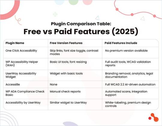
Best Practices to Build an Accessible WordPress Site

These tips align with the latest guidelines from the WordPress accessibility guide 2025 and help you deliver real accessibility value to all users.
Use Correct HTML Semantic Markup
Always structure your site using <header>, <nav>, <main>, <section>, and <footer> tags properly. Use heading levels (<h1> to <h6>) in a logical order. Screen readers rely on this hierarchy to make sense of the page.
Ensure Color Contrast Ratios
Poor contrast affects readability for users with low vision. Follow WCAG 2.2 recommendations: 4.5:1 contrast ratio for normal text and 3:1 for large text. Use tools like WebAIM Contrast Checker to evaluate your color palette.
Add Alt Text to All Images
Descriptive alt text helps screen readers convey image context. Avoid using vague descriptions like “image” or “picture.” When using decorative images, add an empty alt=”��� tag to skip unnecessary narration.
Enable Keyboard Navigation
Users with mobility impairments often rely on keyboards. Make sure all elements, menus, buttons, and forms are focusable using the Tab and Enter keys. Avoid JavaScript-only interactions that block keyboard access.
Support Screen Readers
Use ARIA roles and landmarks thoughtfully. Ensure live regions, modals, and dynamic content updates are properly announced. Test using tools like NVDA or VoiceOver to confirm your site works with real screen readers.
Avoid Auto-Playing Media
Videos or audio that play automatically can disorient users. If you must include auto-play content, provide clear pause and volume controls. This is critical for compliance under WordPress ADA compliance solutions.
Create Accessible Forms
Label every input clearly and consistently. Use <label> tags tied to their corresponding fields using the for attribute. Include helpful error messages and confirm button states that are easy to understand for users with screen readers or visual challenges.
How to Test Your WordPress Site for Accessibility?
Building an accessible site is just the beginning. You must test and audit it regularly to make sure it’s truly usable for everyone.
Here’s how you can test your WordPress site the right way!
Manual Testing Tips
Manual testing reveals issues that tools often miss. Try these steps:
Keyboard-Only Navigation: Can you navigate through all menus, forms, and links using only the Tab, Shift+Tab, and Enter keys? If not, users with mobility challenges may face barriers.
Screen Reader Simulation: Use screen readers like NVDA (Windows) or VoiceOver (macOS) to simulate how visually impaired users interact with your site. Listen for proper heading flow, button labeling, and announcements for dynamic content.
Form Accessibility Check: Test all form fields and validation states. Confirm if users receive clear error messages and can complete forms using assistive tech.
Automated Tools

Regular Audits and User Testing
Schedule monthly or quarterly audits using both tools and human testers, especially if your site updates frequently. You can involve users with disabilities in your testing cycle. Their feedback will help uncover edge cases and improve real-world usability beyond plugin coverage.
Common Accessibility Mistakes to Avoid
Even with the best plugins and tools, small mistakes can ruin the user experience. The WordPress accessibility guide 2025 points out that many site owners rely too heavily on automation or overlook mobile usability, two things that can break compliance.
Here’s what to avoid:
Relying Only on Plugins Without Manual Review
Plugins are helpful, but they aren’t perfect. They won’t catch incorrect heading structures, misleading link text, or poorly labeled form fields. For example, a plugin might not flag a CTA that says “Click Here” with no context. Always pair plugins with manual reviews and expert insight.
Ignoring Mobile Accessibility
Accessibility must extend beyond desktops. On mobile, buttons that are too small or layouts that shift can make navigation frustrating. Users who rely on screen magnifiers or touch navigation need a layout that adjusts with clarity and predictability.
Overusing Popups and Animations
Auto-triggered popups or moving elements can disorient users with cognitive disabilities. Flashing banners or background animations may also trigger seizures in sensitive users. Always offer ways to pause or disable motion.
Assuming Accessibility is a “One-Time” Project
Accessibility is a continuous process. New content, plugins, or theme updates can break previously compliant elements. Just because your site passed a test last year doesn’t mean it’s still accessible today.
Tip: Hire a WordPress plugin developer who ensures long-term compliance with each change or feature rollout!
Benefits of an Accessible WordPress Site
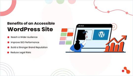
Following the WordPress accessibility guide, 2025 is a growth opportunity. An inclusive website doesn’t just help people with disabilities. It helps your brand grow faster, rank higher, and stay safer from legal trouble.
Reach a Wider Audience
More than 1.3 billion people globally live with some form of disability, which is over 15% of the population. By making your site accessible, you unlock a huge segment of users who are often excluded from digital experiences. Whether it’s visual impairments, motor limitations, or cognitive challenges, accessibility ensures every visitor can use your site.
Improve SEO Performance
Google’s algorithm rewards accessibility. Features like proper HTML structure, alt tags, ARIA roles, and keyboard navigation all improve crawlability and user experience, core factors in ranking. Many WordPress ADA compliance solutions align closely with technical SEO best practices, so improving one boosts the other naturally.
Build a Stronger Brand Reputation
In 2025, consumers value inclusivity. Accessibility sends a clear message: your brand cares about all users. It improves customer loyalty and adds weight to your ESG and DEI positioning. Startups and enterprises alike are now embedding accessibility into their development roadmap.
Reduce Legal Risks
In the U.S., the number of ADA lawsuits related to inaccessible websites has grown steadily. Internationally, laws like the European Accessibility Act are enforcing stricter standards. A non-compliant website can lead to fines, lawsuits, or even takedown orders. Staying compliant with the latest WordPress ADA compliance solutions reduces this risk and keeps your business legally safe.
Bottomline
As the WordPress accessibility guide 2025 has shown, relying solely on plugins won’t guarantee a fully accessible or legally compliant experience. Tools like WP ADA Compliance Check Basic or One Click Accessibility speed up your workflow, but the real value lies in aligning your site with WCAG 2.2, ADA guidelines, and global standards like EN 301 549.
0 notes