#VibrantPackaging
Explore tagged Tumblr posts
Text


Vibrant Narratives: Packaging That Tells a Story
This collection of packaging designs is a vivid celebration of creativity and bold expression. With a palette dominated by electric pinks, yellows, oranges, and greens, each piece comes alive with abstract illustrations and playful character designs. This imaginative approach transforms traditional packaging into captivating art pieces.
The use of organic shapes and contrasting colors draws immediate attention, making these packages irresistible on shelves. Beyond aesthetics, the designs evoke emotion and curiosity through quirky patterns and symbolic imagery, suggesting that each product has a unique story to tell. The combination of bold graphics with minimal typography ensures that while the visuals captivate, the essential information remains accessible.
This style is particularly suited for niche and artisan brands targeting younger, trend-conscious consumers who value individuality. The packaging not only protects the product but becomes a conversation starter, making it a part of the customer’s experience and identity.
Whether for cosmetics, boutique snacks, or creative stationery, this approach signals innovation and fun. By merging bold colors with storytelling elements, the designs redefine packaging as an extension of the brand’s personality, offering customers an interactive and memorable connection with the product. It’s not just packaging—it’s an artistic journey.
#VibrantPackaging#BoldDesign#CreativePackaging#StorytellingDesign#UniqueBranding#ArtisticJourney#PlayfulGraphics#ColorfulPackaging#TrendSettingDesign#PackagingWithPersonality
0 notes
Text

Fresh Packaging Ideas for Springtime Success
As winter fades, it's time to refresh your packaging with the gentle warmth of spring. Whether for business or personal gifts, spring poly mailer designs add vibrant energy to your packages.
#SpringPackaging#FreshIdeas#PackagingDesigns#SpringSuccess#VibrantPackages#GiftsInBloom#spring#packaging
0 notes
Text


Playful Hair Care Packaging Design
This collection of hair cream packaging introduces a lively and youthful aesthetic with charming, illustrated characters that embody a fun and approachable vibe. The packaging uses bright, bold colors like red, teal, and yellow, creating an eye-catching display that appeals to a younger audience or anyone drawn to a vibrant, playful design. Each character illustration features unique hairstyles, celebrating natural hair textures and individuality, fostering an inclusive and relatable brand image.
The design is both whimsical and modern, balancing minimal text with visually engaging illustrations that convey a lighthearted, joyful personality. Small decorative elements, like stars and nature-inspired accents, add a layer of detail that enhances the packaging’s charm without overwhelming the primary design. This thoughtful integration of playful graphics and simple typography makes the product visually appealing and easily recognizable.
Such packaging is ideal for positioning the hair cream line as not only a practical solution but also a product that resonates emotionally with consumers. It’s perfect for a brand that wants to stand out in the hair care market by embracing diversity and promoting self-expression, inviting users to embrace their unique beauty with products tailored to their natural hair needs.
#PlayfulPackaging#HairCareDesign#InclusiveBeauty#YouthfulAesthetic#VibrantPackaging#SelfExpression#NaturalHairTextures#FunAndFresh#WhimsicalDesign#HairCreamPackaging
0 notes
Text


Bright and Fun Packaging Design for Children's Nutrition Products
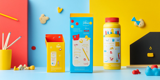
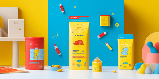
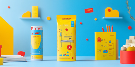
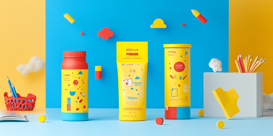
The packaging design for these children's nutritional products is lively and engaging, using bold colors like yellow, blue, and red to create a visually appealing and playful aesthetic. Each package features adorable illustrations and fun characters that capture children's attention and bring a sense of joy and excitement. The design includes whimsical icons and graphics, making it both attractive and interactive, catering perfectly to a young audience.
The choice of colors and the arrangement of elements on the packaging are not only visually stimulating but also purposeful. Important information, such as instructions and nutritional benefits, is presented in easy-to-read formats with visual guides, ensuring that parents can quickly understand the product's benefits at a glance. The playful elements also help parents build a positive association with the product, aligning with the brand's focus on healthy, enjoyable growth for children.
This thoughtful design approach transforms the product into more than just a nutritional item—it becomes a part of a fun and appealing daily routine for kids. The vibrant colors, child-friendly illustrations, and clear labeling make it an effective and attractive choice for parents seeking nutritious options for their children.
#FunPackaging#KidsNutrition#BrightDesign#HealthyGrowth#PlayfulPackaging#ChildFriendlyDesign#EngagingDesign#NutritionalProducts#VibrantPackaging#ParentApproved
0 notes
Text


Vibrant Packaging Design: A Fusion of Art and Functionality
The showcased packaging designs redefine artistic branding with a seamless blend of culture and contemporary aesthetics. Featuring stylized illustrations of cows adorned with intricate floral and ornamental patterns, these containers bring a burst of vibrancy and cultural richness to the forefront. The color palette—ranging from bold purples and teals to warm oranges and yellows—commands attention and creates a visually striking impact.
Each design tells a story, with expressive cow motifs exuding personality and charm. The delicate floral patterns surrounding the illustrations add a sense of vitality, symbolizing a connection to nature and tradition. These elements make the packaging not just a functional product but a collector’s item, reflecting artistry that resonates with diverse audiences.
The cylindrical containers are both ergonomic and visually appealing, designed to enhance the consumer experience. Their reusable nature aligns with sustainable practices, encouraging customers to repurpose the packaging while retaining its aesthetic appeal. The consistent artwork on the lids and sides ensures a cohesive look, further elevating the product’s premium feel.
This packaging design stands as a testament to how thoughtful branding can create an emotional connection with consumers. By marrying art and functionality, it sets a new standard for visually engaging and sustainable product design.
#VibrantPackaging#ArtAndFunction#CulturalRichness#SustainableDesign#BoldBranding#FloralIllustrations#CowMotifs#PackagingArt#EcoFriendlyPackaging#CreativeBranding
0 notes
Text


Art-Inspired Ice Cream Packaging: A Fusion of Culture and Creativity
This project transforms ordinary ice cream cups into vibrant works of art. Drawing inspiration from cultural motifs and traditional aesthetics, the designs feature bold and intricate illustrations of cows, floral patterns, and decorative elements. Each cup is a testament to the blending of heritage with modern packaging trends.
The color palette is a feast for the eyes, with rich blues, magentas, oranges, and yellows that reflect the joyful and celebratory essence of the designs. The artwork is meticulously detailed, making each cup feel like a collectible piece. These cups don’t just hold ice cream—they evoke stories of culture, tradition, and artistry.
Beyond aesthetics, the packaging complements the product itself. The rich, creamy scoops of ice cream in various flavors add a layer of indulgence to the visual delight. This pairing creates a multi-sensory experience for the consumer, making every purchase a memorable one.
This project successfully elevates a simple dessert into an artistic expression. It’s a celebration of identity, creativity, and the joy of indulging in something special. By merging tradition with innovation, the designs leave a lasting impression, resonating with those who appreciate art and flavor in equal measure.
#ArtInspiredPackaging#CulturalDesign#CreativeIceCream#PackagingArt#HeritageAndModernity#VibrantPackaging#IndulgentExperience#ArtisticExpression#IceCreamDesign#CulturalMotifs
0 notes
Text


Vibrant Wine Packaging: Art Meets Elegance
This wine packaging project is a bold celebration of color, art, and modern design. Each bottle is paired with a box featuring abstract illustrations inspired by nature, creating a visually stunning presentation that immediately draws attention. The vibrant color palette of deep blues, fiery oranges, and earthy greens evokes a sense of warmth and creativity, making the packaging both contemporary and inviting.
The abstract artwork on the boxes and labels incorporates organic shapes, botanical patterns, and hand-drawn elements, reflecting a connection to nature and the artisanal quality of the wine. Each design appears carefully tailored to its respective wine, ensuring a harmonious relationship between the packaging and the product inside.
What sets this project apart is its ability to merge functionality with artistic expression. The sturdy materials ensure that the packaging protects the wine while providing a luxurious unboxing experience. The bold yet elegant typography complements the designs, delivering a polished and cohesive look.
This packaging not only enhances the aesthetic appeal of the wine but also serves as a collector’s piece, ideal for gifting or display. It is a perfect example of how innovative design can elevate a product, creating a sensory experience that goes beyond taste to include visual delight.
#VibrantPackaging#ArtMeetsElegance#WineDesign#AbstractArt#LuxuryPackaging#CreativePackaging#CollectorPackaging
0 notes
Text


Vibrant Packaging Design for Modern Brands
This project captures the essence of dynamic and contemporary packaging design, blending playful aesthetics with functional structure. The vivid orange and teal color palette immediately commands attention, creating a vibrant and energetic feel that resonates with modern consumers. The designs feature an elegant interplay of abstract shapes, botanical patterns, and citrus-inspired motifs, reflecting a connection to nature and freshness.
Each packaging unit showcases versatility, whether for beverages, snacks, or gifts, proving the adaptability of the design across various product categories. The minimalistic yet artistic illustrations maintain a clean and premium appearance, catering to both youthful and sophisticated audiences. The geometric cut-outs and layered compositions add depth, making the packaging visually intriguing and tactilely engaging.
The project seamlessly merges aesthetics with sustainability. The materials and design approach emphasize eco-friendly practices, ensuring that the packaging is as kind to the environment as it is appealing to the eye. This collection exemplifies how thoughtful design can enhance a product’s identity and elevate brand storytelling, making it stand out on retail shelves.
In conclusion, this packaging design project is a celebration of creativity, function, and sustainability, redefining how brands communicate their values and aesthetics through innovative visuals.
#VibrantPackaging#ModernDesign#EcoFriendlyPackaging#ContemporaryAesthetics#BrandIdentity#SustainableDesign#CreativePackaging#BotanicalDesign#CitrusInspired#PackagingInnovation#ArtisticBranding#PremiumPackaging#EcoConsciousDesign
1 note
·
View note
Text


Bold Florals in Packaging: A Celebration of Vibrancy
This collection of packaging designs brings bold floral artistry to life, showcasing a vivid interplay of colors that immediately captivates the viewer. Set against a vibrant blue background, the detailed red and yellow floral motifs exude energy, creativity, and cultural richness. The harmonious combination of hues ensures that these designs make a lasting impression.
Each piece is a celebration of pattern and detail, blending traditional floral designs with a modern, polished execution. The bright yellow background further enhances the vibrancy, allowing the intricate artwork to stand out while adding a touch of warmth and joy.
This design approach is perfect for artisanal and culturally inspired products, where storytelling through visuals plays a critical role. The repetition of floral elements creates a sense of rhythm and movement, making the packaging feel alive and dynamic. Moreover, the designs transcend functionality, becoming collectible items that resonate with those who value art and craftsmanship.
The balance between artistry and usability ensures these packages appeal to a wide audience. They evoke a sense of celebration, tradition, and festivity, making them ideal for products with a focus on culture, beauty, or heritage. These bold floral designs prove that packaging can be more than just a container—it can be a canvas for storytelling.
0 notes
Text


Vibrant Packaging for a Modern Cookie Experience
In today’s competitive market, product packaging plays a crucial role in capturing consumer attention. The collection of cookie packaging designs showcased here reflects a bold and dynamic approach that blends functionality with aesthetics. Each box tells a story, with bright, playful colors and abstract patterns that evoke a sense of joy and indulgence.
The designs make use of high-contrast palettes, such as teal, yellow, pink, and black, creating a visually stimulating experience. The incorporation of hand-drawn elements and whimsical illustrations adds a personal, artisanal touch, suggesting that the cookies are not only delicious but crafted with care.
Beyond their aesthetic appeal, the packages are designed with practicality in mind. Cylindrical boxes and sturdy rectangular shapes ensure the cookies remain fresh and protected while offering easy stacking and storage. Transparent windows in some designs allow consumers to preview the product, building trust and excitement.
These packages cater to a wide demographic, particularly younger audiences seeking fun, vibrant products that stand out on shelves. They serve as a reminder that packaging is not just about containment but also about creating a memorable and interactive experience for consumers. This collection sets a benchmark for creative cookie branding in the modern market.
0 notes
Text


Vibrant and Playful Packaging for Skincare Products
The images display a delightful array of skincare packaging designs that are both fun and visually engaging. These packaging designs incorporate bright colors, including cheerful oranges, pinks, blues, and whites, which immediately draw attention and create a friendly, approachable aesthetic. Each product features playful shapes, dots, and whimsical illustrations that give the packaging a sense of personality and joy.
This design style is ideal for a younger audience or those who enjoy a sense of playfulness in their daily routines. The colorful patterns and animated figures on the packaging exude energy and vibrancy, making the products feel refreshing and inviting. This approach is not only appealing visually but also encourages a positive emotional connection with the brand, transforming the product experience into something enjoyable and memorable.
With such designs, the skincare products can stand out on the shelves, easily recognizable and memorable for consumers. This packaging style reflects a modern, dynamic brand identity that values creativity and aims to bring a bit of joy into the everyday lives of its customers. Perfect for brands targeting a lively, youthful demographic, these designs are both functional and full of character.
0 notes