#Unbounce setup
Explore tagged Tumblr posts
Visit Tumblr Blog
Explore Tumblr blogs with no restrictions, modern design and the best experience.
Last Seen Tumblr Blogs


Fun Fact
Tumblr has been banned in Indonesia for providing people with access to pornographic content.
Text
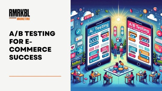
A/B Testing for E-Commerce Success
Introduction
At RMRKBL Marketing we know that making informed decisions is not ideal; it's necessary. A/B testing, often hailed as the secret weapon of digital marketers, is a great tool that can significantly impact your marketing strategy, boost conversions, and set you apart from the competition. It is incredibly valuable for both seasoned entrepreneurs and e-commerce beginners.
Today, we will delve deep into the essentials, dispel common misconceptions, and provide insights to help you elevate your A/B testing game and drive unparalleled success in the competitive online landscape.
Unpacking A/B Testing: A Strategic Overview
What is A/B Testing?
At its core, A/B testing, also known as split testing, involves the systematic comparison of two versions of a webpage, email, or digital asset to determine which performs better based on user behavior. Far more than a marketing buzzword, A/B testing is a strategic approach to refining your campaigns and gaining a deeper understanding of what resonates with your audience.
How A/B Testing Works
In the realm of marketing, A/B testing involves presenting 50% of visitors with “Version A” (the control) and 50% with “Version B” (the variant). The version with the highest conversion rate emerges victorious, guiding your future strategies. It's a continuous cycle of refinement where the winning variant becomes the new control, prompting the creation of a fresh variant later.
It's important to note that A/B test conversion rates can sometimes be an imperfect measure of success. Strategic tracking, following the value of a conversion through to the final sale, is essential for meaningful insights.
A/B/n Testing: Expanding the Horizon
Taking A/B testing to the next level, A/B/n Testing lets you test multiple variants against the control. This approach enables a more nuanced understanding of user preferences by presenting different versions to distinct segments of your audience.
The Timing Conundrum: How Long Should A/B Tests Run?
For meaningful results, run your A/B test for at least one, preferably two, full business cycles. Don't prematurely conclude the test just because of some statistical significance; meeting the predetermined sample size is key. Run tests in full-week increments to account for variations in traffic sources and day-of-week dynamics.
Understanding the rationale behind the two-business-cycle rule is critical. It allows you to see factors like contemplative buyers, diverse traffic sources, and anomalies.
Unlocking the Power of A/B Testing: Why Should You Bother?
Consider this scenario: you invest $100 in Facebook ads, sending 10 people to your site with an average order value of $25. A/B testing allows you to optimize, turning a potential loss into profit by improving conversion rates. Beyond financial gains, A/B testing reveals invaluable insights that extend beyond individual tests, informing your overall store optimization strategy.
The Maze of Choices: What Should You A/B Test?
While the beauty of A/B testing lies in its adaptability, I cannot tell what you should test. Instead, I encourage a data-informed approach. Base your tests on qualitative and quantitative analyses. Consider factors like technical performance, on-site surveys, customer interviews, analytics, user testing, and session replays.
A/B Testing Tools: Navigating the Landscape
Explore the variety of A/B testing tools to optimize your digital strategies. Here are some popular tools:
1. Google Optimize:
A versatile platform seamlessly integrated with Google Analytics, offering easy setup and in-depth insights into user behavior.
2. Optimizely:
Known for its user-friendly interface, Optimizely provides a solution for A/B testing and experimentation across various digital channels.
3. VWO (Visual Website Optimizer):
VWO offers a range of features, including split URL testing and multivariate testing, making it a robust choice for comprehensive optimization.
4. Unbounce:
Focused on landing page optimization, Unbounce simplifies the A/B testing process for marketers, enabling quick and effective experiments.
5. Crazy Egg:
With heatmap and user behavior analysis, Crazy Egg provides valuable insights to enhance your A/B testing strategy and improve overall user experience.
6. Split.io:
Perfect for feature flagging and experimentation, Split.io allows teams to implement A/B tests effortlessly and measure the impact of new features.
7. Convert:
A user-friendly platform offering A/B testing, multivariate testing, and personalization, Convert simplifies the optimization process for marketers.
As you navigate through these tools, consider your specific needs, budget, and the depth of insights needed. Choose wisely, and let your A/B testing endeavors lead to data-driven success.
Navigating the Sea of Ideas: Prioritizing A/B Test Ideas
With a plethora of A/B test ideas, prioritization is key. Consider frameworks like ICE (Impact, Confidence, Ease), PIE (Potential, Importance, Ease), or PXL (CXL's prioritization framework). These frameworks guide you in evaluating factors such as impact, confidence, ease of implementation, potential reach, and importance.
Conclusion
Mastering A/B testing is not just about following best practices but tailoring them to your business. Embrace a data-centric approach, refine your strategies, and elevate your e-commerce success through the power of A/B testing!
It's not just a tool; it's your path to unlocking the full potential of your online store.
2 notes
·
View notes
Text
Why SaaS Startups Rely on Digital Marketing Agencies for Rapid Growth
Scaling a SaaS startup is a race against time—limited runway, aggressive competition, and constantly evolving customer needs. For most early-stage software companies, the pressure to acquire users quickly while maintaining cost efficiency is immense. That’s why partnering with a Digital Marketing Agency has become a go-to growth strategy for SaaS founders looking to accelerate customer acquisition, increase brand visibility, and prove product-market fit faster.
In this article, we break down exactly how digital marketing agencies help SaaS startups grow smarter and faster through performance-driven strategies, technical expertise, and full-funnel execution.
1. Speed to Market with Ready-Made Expertise
SaaS founders often juggle multiple roles—product, sales, funding, and operations. Building an in-house marketing team from scratch takes time and money. A digital marketing agency brings plug-and-play expertise, reducing the learning curve and allowing startups to hit the ground running.
Agencies already have:
Paid media specialists
SEO strategists
Growth hackers
Copywriters and designers
Analytics and CRM experts
This gives SaaS companies instant access to a cross-functional team—without the cost and time of hiring internally.
2. Full-Funnel Strategy, Not Just Ads
Rapid growth doesn’t just depend on leads—it depends on moving those leads through the funnel to become paying users.
Agencies build end-to-end strategies covering:
Awareness (SEO, paid ads, social content)
Consideration (retargeting, webinars, product comparison pages)
Conversion (optimized landing pages, CTAs, onboarding emails)
Retention (email automation, feedback loops, in-app messages)
This cohesive funnel approach ensures higher conversion rates and better user activation.
3. Performance Marketing That’s ROI-Focused
Every rupee spent needs to show a return—fast. Digital marketing agencies focus on data-backed performance marketing to drive sign-ups and reduce CAC (Customer Acquisition Cost).
Tactics include:
Targeted PPC and LinkedIn Ads
A/B testing for ad creatives and landing pages
ROAS tracking and budget reallocation
Real-time optimization based on campaign data
This level of oversight helps SaaS startups scale without wasting budget on ineffective channels.
4. Growth Hacking for Early Traction
In the early stages, getting the first 100–1,000 users is critical. Agencies experienced with startups use growth hacking techniques such as:
Viral referral campaigns
Limited-time access and exclusivity
Influencer and community partnerships
Product Hunt and Reddit launches
They also help implement analytics tools like Mixpanel or Heap to track user behavior and uncover viral loops.
5. Content Marketing That Builds Authority
Thought leadership and helpful content are essential for SaaS products that require education. Agencies create and execute content strategies that include:
Blog articles optimized for SaaS-specific keywords
Comparison posts and how-to guides
Use case pages and case studies
Email sequences tied to content downloads
By combining SEO and content, agencies help SaaS startups drive organic traffic while building trust with potential users.
6. Conversion-Optimized Website and Landing Pages
The SaaS homepage or product landing page is often where conversions happen—or don’t. Agencies specialize in conversion rate optimization (CRO) to make sure the site is doing its job.
Improvements include:
Clear headline and value proposition
Benefit-focused copy
Social proof and testimonials
CTAs matched to user intent
Mobile optimization
Many agencies use tools like Hotjar and Unbounce to test layouts, messaging, and user flows.
7. CRM and Email Automation Setup
Retention and upselling are just as important as acquisition in SaaS. Agencies help integrate CRM tools like HubSpot, ActiveCampaign, or Customer.io to:
Segment users by lifecycle stage
Automate onboarding emails
Trigger behavior-based nudges
Improve trial-to-paid conversions
This helps startups build predictable MRR (monthly recurring revenue) over time.
Final Thoughts: Smart Growth Starts with the Right Partner
For fast-moving SaaS startups, time is the most valuable resource. A Digital Marketing Agency offers the systems, tools, and expertise to execute growth strategies at speed—without the delays and costs of building everything in-house.
From acquiring your first 100 users to scaling to 100,000, the right Digital Marketing Agency serves as both your execution partner and strategic advisor. In a space where speed and efficiency matter most, working with a results-driven agency could be the difference between growth and guesswork.
0 notes
Text
AI Website Builders: 10 Tools for Designing Your Site in 2025
Design Smarter, Faster, and More Creatively with the Latest AI Website Builders
Building a website in 2025 has never been easier—thanks to the rapid evolution of AI website builders. Whether you’re launching a startup, a personal blog, or an e-commerce store, artificial intelligence can now design, structure, and even write your content in just minutes. No more hiring expensive developers or struggling with design tools!
In this post, we’ll explore 10 of the top AI-powered website builders revolutionising the digital space in 2025, inspired by insights from Shopify’s AI Website Builder Guide
🤖 What Is an AI Website Builder?
An AI website builder uses artificial intelligence to automate website creation. These tools can:
Suggest layouts and color palettes
Generate SEO-friendly content
Customise designs based on your brand
Optimise for mobile and performance
And even connect your site to eCommerce or blog platforms
Whether you're a total beginner or an experienced web designer, AI builders help you work faster and smarter.
🛠️ 10 Best AI Website Builders to Try in 2025
1. Shopify Magic
Perfect for eCommerce stores, Shopify Magic integrates AI features like product description generation, email subject line writing, and smart theme editing. It streamlines store setup and drives conversions.
2. Wix ADI (Artificial Design Intelligence)
Wix ADI asks a few simple questions and instantly creates a site tailored to your business. With AI-generated content and layout suggestions, it’s ideal for users who want quick, beautiful results.
3. Zyro (by Hostinger)
Zyro combines affordability and simplicity with AI features like content generation, heatmaps, and logo makers. It’s a great all-in-one tool for small businesses or freelancers.
4. Durable
Built specifically for entrepreneurs, Durable claims to create a complete website in just 30 seconds. It includes AI-powered copywriting, CRM tools, and an intuitive interface for editing.
5. Framer
Framer focuses on design-first websites, and now includes AI capabilities for fast prototyping and publishing. Great for portfolios, landing pages, and creative professionals.
6. Bookmark
Using its AI assistant "AIDA," Bookmark builds tailored websites with ease. Its strength lies in the ability to learn and improve results based on user feedback.
7. Jimdo Dolphin
Jimdo’s Dolphin AI takes you through a quick Q&A process, then designs a fully functional website—great for solopreneurs who need minimal hassle.
8. 10Web AI Builder
This AI builder uses WordPress as a base and lets users clone or redesign existing websites with AI. It’s ideal for agencies that want fast results while maintaining control.
9. Unbounce Smart Builder
For marketers focused on landing pages and lead generation, Unbounce offers AI-optimized layouts, A/B testing, and high-converting page creation tools.
10. Leia
Leia offers fast website creation through a mobile-first app. Just answer a few questions, and it delivers a responsive website with editable sections and AI-generated text.
🧠 Why Use an AI Website Builder?
⚡ Speed: Launch your website in minutes, not weeks
🖌️ Customization: Tailored designs based on your input
💬 Content Support: AI helps write headlines, product descriptions, and more
📱 Mobile Optimization: Automatically adjusts for mobile users
💸 Cost-Effective: Ideal for startups or personal projects
🔚 Final Thoughts
AI website builders are no longer just “nice-to-have” tools—they’re shaping the future of web design. Whether you’re starting a business, showcasing your portfolio, or launching an online store, these platforms offer intelligent, user-friendly ways to get your site online quickly and beautifully.
As AI continues to evolve, expect even more intuitive and powerful tools in the years to come.
#web design dubai#website development#website#ai generated#artificial intelligence#website designer dubai#web design
0 notes
Text
How do I set up a PPC campaign?
In today’s digital landscape, Pay-Per-Click (PPC) advertising is one of the fastest and most measurable ways to drive targeted traffic to your website. Whether you’re a small business owner or a digital marketer, understanding how to set up a successful PPC campaign is essential to achieving your online goals.
This article will guide you through the step-by-step process of setting up a PPC campaign, including strategy, execution, and optimization—without keyword stuffing and with clarity for both beginners and experienced users.
What is a PPC Campaign?
A PPC campaign is a form of online advertising where advertisers pay a fee each time someone clicks on their ad. These ads appear on platforms like Google Ads, Bing Ads, or social media networks like Facebook, Instagram, and LinkedIn. The goal is to attract users actively searching for your product or service.
Steps to Set Up a PPC Campaign
1. Define Your Goals
Before you launch your campaign, ask yourself:
Do you want to generate leads?
Are you trying to increase website traffic?
Are you selling a product or service?
Clear goals will guide every part of your PPC setup, including keyword selection, ad copy, and budget allocation.
2. Choose the Right Platform
Select a PPC platform based on your audience and industry. Popular choices include:
Google Ads – Best for broad reach and search intent
Bing Ads – Often cheaper with less competition
Facebook & Instagram Ads – Great for visual products and audience targeting
LinkedIn Ads – Ideal for B2B campaigns
Choose one or more based on where your audience spends time.
3. Conduct Keyword Research
For search-based PPC (like Google Ads), keyword research is crucial. Use tools like:
Google Keyword Planner
Ubersuggest
SEMrush (free version)
AnswerThePublic
Look for:
High-intent keywords (e.g., "buy running shoes online")
Low-to-moderate competition terms for better ROI
Avoid broad keywords initially—they may drain your budget with unqualified clicks.
4. Set Your Budget and Bidding Strategy
Decide how much you’re willing to spend daily or monthly. Then choose your bidding strategy:
Manual CPC: You control maximum cost-per-click.
Enhanced CPC: Google adjusts bids for higher conversions.
Target CPA: Set a cost-per-acquisition goal.
Maximize Clicks: Google tries to get the most clicks within your budget.
Start small, track performance, and scale once you see results.
5. Create High-Quality Ads
Your ad copy should be:
Relevant to your keyword
Compelling with a clear call to action
Specific to the user's search intent
Include:
A headline that grabs attention
A description that solves a problem or offers a benefit
A display URL (clean and keyword-rich)
Ad extensions like callouts, sitelinks, or call buttons
6. Design a Landing Page That Converts
Don’t send clicks to your homepage. Create a dedicated landing page that:
Matches your ad’s message
Has a clear and prominent CTA (e.g., “Get a Free Quote”)
Loads quickly and works well on mobile
Includes trust elements (reviews, testimonials, certifications)
Tools like Unbounce, Instapage, or WordPress make it easy to build landing pages.
7. Launch and Monitor Your Campaign
Once everything is set:
Launch your campaign
Set tracking with Google Analytics and conversion pixels
Monitor metrics such as:
Click-through rate (CTR)
Quality score
Cost-per-click (CPC)
Conversion rate
Regularly check your search terms report to exclude irrelevant searches by adding negative keywords.
8. Optimize Continuously
A successful PPC campaign is never “set and forget.” Regularly:
A/B test ad variations
Adjust bids based on device, location, or time
Pause underperforming keywords
Update landing pages for better conversions
The goal is to maximize ROI by continuously improving your campaign elements.
Final Thoughts
Setting up a PPC campaign might seem complex at first, but breaking it down into actionable steps makes the process manageable. From setting clear goals and choosing the right keywords to optimizing ads and tracking performance, each part plays a vital role in your campaign’s success.
You don’t need a massive budget—just a thoughtful approach, consistent analysis, and a willingness to improve over time.
By following this guide, you’ll be on your way to creating a high-performing PPC campaign that delivers measurable results for your business.
0 notes
Text
5 Growth Hacking Tools for B2B Marketers
A few years ago, when I first time heard about growth hacking, I thought it's just a buzzword; a startup jargon used only in San Francisco by guys with $3,000 suits and bare feet. But I was wrong! Growth hacking has become an essential element of starting and growing a new business. Therefore, I started learning and experimenting on this process to understand what tools and tactics can provide better results. In this article I will share what I learnt from my experiments.
It's no secret that growth is the key to business success. Without growth, profits remain flat, which is why we have seen so much interest in the process of 'growth hacking' among startups of all kinds over the past few years. But when it comes down to it, growth happens through marketing, and the best marketing happens when you use the best tools.
Here are 5 of the marketing tools you'll want to take into consideration when it comes to fueling your business growth:
Unbounce:
Landing pages are extremely important when it comes to converting visitors into customers, so it shouldn't come as a surprise that it can be difficult to build and test them thoroughly. Unbounce makes this process much easier. With a drag-and-drop interface, the program makes it easy to setup pages and create forms - even if you don't know a line of HTML code. With the program's wide variety of templates and seamlessly-integrated A/B testing, Unbounce is one of the best tools out there for turning shoppers into buyers.
LeadzGen:
As digital marketing is getting obsessed with conversion rates; increasing conversions by a few additional percent can make a huge difference to the bottom line, and that's where LeadzGen provides an edge. LeadzGen is a cloud-based marketing intelligence tool that automatically tracks your website visitors, finds their company and contact information, turns those visitors into leads, and feeds your sales pipeline. Try this free tool to discover who exactly visited your website and how to contact those prospects.
Maptive:
These days, plenty of marketers talk a big game about big data, but few of them actually use the information they have to make meaningful decisions about their businesses. Maptive gives you an easy way to mine your data by allowing you to upload a spreadsheet of addresses and see them laid out on a custom map. Use this free tool to determine where your products are selling best, uncover the best spots for an upcoming marketing tour or answer any other question you have about the geography of your data.
Typeform:
Online surveys can be dull and robotic - and these dry forms certainly don't encourage interaction. Instead, Typeform helps you create surveys that are fun, interactive, and enjoyable to look at. The user experience looks and feels great, allowing you to acquire more data through your forms, as well as make the data more useful. With Typeform, you can adjust survey questions fit your brand, as well as use the integrated analysis feature to reveal patterns and trends. Over time, this will help you adapt your message and your product lines so that you continue to grow.
CrazyEgg:
Want to know how visitors are behaving on your site? CrazyEgg shows you where they click, how far they scroll, what they watch, and more. In addition, CrazyEgg's heat-mapping tools allow you to segment your traffic and determine whether certain design or content elements are resonating more with one group than another. This can give you plenty of meaningful feedback on your site, without having to run dozens of A/B tests. It's an easy to use, affordable tool that will make a big difference in your messaging and growth.
No one can manage fortnite free v bucks generator growth alone, which is why it's so important that you have the right tools in your arsenal. These 5 tools will give you a great start when it comes to growing your customer base, managing your social media presence, and improving your conversion rate - virtually guaranteeing your company's growth and success.
1 note
·
View note
Text
AI Website Builders: 10 Tools for Designing Your Site in 2025
Design Smarter, Faster, and More Creatively with the Latest AI Website Builders
Building a website in 2025 has never been easier—thanks to the rapid evolution of AI website builders. Whether you’re launching a startup, a personal blog, or an e-commerce store, artificial intelligence can now design, structure, and even write your content in just minutes. No more hiring expensive developers or struggling with design tools!

In this post, we’ll explore 10 of the top AI-powered website builders revolutionising the digital space in 2025, inspired by insights from Shopify’s AI Website Builder Guide
🤖 What Is an AI Website Builder?
An AI website builder uses artificial intelligence to automate website creation. These tools can:
Suggest layouts and color palettes
Generate SEO-friendly content
Customise designs based on your brand
Optimise for mobile and performance
And even connect your site to eCommerce or blog platforms
Whether you're a total beginner or an experienced web designer, AI builders help you work faster and smarter.
🛠️ 10 Best AI Website Builders to Try in 2025
1. Shopify Magic
Perfect for eCommerce stores, Shopify Magic integrates AI features like product description generation, email subject line writing, and smart theme editing. It streamlines store setup and drives conversions.
2. Wix ADI (Artificial Design Intelligence)
Wix ADI asks a few simple questions and instantly creates a site tailored to your business. With AI-generated content and layout suggestions, it’s ideal for users who want quick, beautiful results.
3. Zyro (by Hostinger)
Zyro combines affordability and simplicity with AI features like content generation, heatmaps, and logo makers. It’s a great all-in-one tool for small businesses or freelancers.
4. Durable
Built specifically for entrepreneurs, Durable claims to create a complete website in just 30 seconds. It includes AI-powered copywriting, CRM tools, and an intuitive interface for editing.
5. Framer
Framer focuses on design-first websites, and now includes AI capabilities for fast prototyping and publishing. Great for portfolios, landing pages, and creative professionals.
6. Bookmark
Using its AI assistant "AIDA," Bookmark builds tailored websites with ease. Its strength lies in the ability to learn and improve results based on user feedback.
7. Jimdo Dolphin
Jimdo’s Dolphin AI takes you through a quick Q&A process, then designs a fully functional website—great for solopreneurs who need minimal hassle.
8. 10Web AI Builder
This AI builder uses WordPress as a base and lets users clone or redesign existing websites with AI. It’s ideal for agencies that want fast results while maintaining control.
9. Unbounce Smart Builder
For marketers focused on landing pages and lead generation, Unbounce offers AI-optimized layouts, A/B testing, and high-converting page creation tools.
10. Leia
Leia offers fast website creation through a mobile-first app. Just answer a few questions, and it delivers a responsive website with editable sections and AI-generated text.
🧠 Why Use an AI Website Builder?
⚡ Speed: Launch your website in minutes, not weeks
🖌️ Customization: Tailored designs based on your input
💬 Content Support: AI helps write headlines, product descriptions, and more
📱 Mobile Optimization: Automatically adjusts for mobile users
💸 Cost-Effective: Ideal for startups or personal projects
🔚 Final Thoughts
AI website builders are no longer just “nice-to-have” tools—they’re shaping the future of web design. Whether you’re starting a business, showcasing your portfolio, or launching an online store, these platforms offer intelligent, user-friendly ways to get your site online quickly and beautifully.
As AI continues to evolve, expect even more intuitive and powerful tools in the years to come.
#web design dubai#website#website development#website designer dubai#web design#seo experts dubai#seo services#digital marketing#graphic design
0 notes
Text
How to Perform an SEO Audit of Your eCommerce Site
Introduction
Performing a regular SEO eCommerce site audit should be part of your online marketing strategy (if it isn’t already).
As an eCommerce business, your website is a paramount touchpoint in your customers’ journey, as well as the prime source of conversions and, ultimately, revenue. If you don’t have a physical presence, then your online store is even more important.
Optimizing it according to the best practices of your vertical and rising customer expectations is, of course, a good start. But apart from industry trends and customer insights, there is one more variable that should dictate how you define and further optimize your website: search engines.
To deliver the most relevant search results to users’ queries, search engines use algorithms that consist of multiple ranking factors. These algorithms are constantly changed and updated, but most of those updates won’t be that significant in scope to require a complete makeover of your website.
However, you will still want to optimize your eCommerce site regularly to maintain its relevancy within the ever-changing algorithms, and an SEO website audit is a good starting point in this process.
What Is an SEO Audit?
An SEO eCommerce audit involves evaluating the current performance and health of your entire eCommerce website, and accomplishes the following:
Identifies SEO issues that are currently impacting the performance of your website
Suggests optimizations for improved performance.
Contributes directly to the overall increase in website performance, visibility, and organic traffic.
In the end, an SEO eCommerce audit provides guidance for your SEO strategy by illuminating areas you need to improve and how to do so.
Additionally, if SEO is already part of your online marketing strategy, a website audit can help you compare results of your current optimization campaign to past ones. This enables you to better evaluate whether and by how much your SEO efforts are paying off.
Source
If SEO wasn’t a priority until now, the audit will be a good starting point to see where you stand, by providing a snapshot at time t=0 so you have a comparison benchmark when you evaluate results.
A typical SEO audit checklist will cover the following areas:
Technical SEO – The technical aspects of your website ensure that search engines can crawl and index it. As Moz’s “Hierarchy of SEO Needs” puts it, crawl accessibility is the foundation of any SEO strategy (and therefore technical SEO should be the starting point of your SEO audit);
On- and off-page analysis – On-page SEO is focused on the page content and HTML elements (these help search engines understand the web page’s relevancy for the search query). On the opposite pole, off-page SEO refers to external links and other signals (branded searches, brand mentions, reviews, etc.) that build on your website’s authority and trustworthiness;
Content gaps and opportunities – Although content is part of the on-page SEO, it requires a separate section in your audit. As the “Hierarchy of SEO Needs” indicates, content contributes to off-page SEO as well (as it can gain your site credible links, citations, and more). Therefore, content has a two-fold objective – to increase organic traffic and to improve authority;
User experience – Apart from relevant and qualitative content, search engines aim to provide users with the best overall experience. That’s why they will always prioritize websites that are aligned with the latest UX best practices.
Why Is an SEO Audit Important for eCommerce Sites?
Search engines are the gatekeepers to organic traffic.
Of course, there are multiple sources of traffic, but no matter what your budget, company size, and experience is, organic traffic should be part of your strategy.
As the statistics show, organic traffic generates significant opportunities for eCommerce businesses:
With shopping being among the most popular online activities, it is no surprise that eCommerce revenue is projected to reach 54 trillion US dollars by 2022. But the industry is also becoming highly competitive.
81% of people search online for products/services. In fact, individuals use search engines every day.
After referral and paid, organic traffic generates the highest conversion rates;
33% of website revenue is generated by organic traffic, recording a 21% YOY growth;
Organic traffic is long-term. While paid traffic lasts for as long as you pay, organic traffic takes more time to gain traction, but lasts much longer (and is less hard on the budget).
If you’re looking at the overall stats, you’ll see that organic traffic continues to be among the first sources of eCommerce conversions/revenues, coming close to paid traffic. So, SEO is not going anywhere, anytime soon.
In the highly competitive eCommerce industry, it is instrumental that your eCommerce site ranks high in search engine result pages (SERPs).
Now that you have a sense of why SEO is important for eCommerce, let’s dive right into the basic steps of your website audit!
eCommerce SEO Audit Checklist
Here are the main elements that you want to assess in your eCommerce website audit:
1. Technical SEO
As we outlined before, technical SEO is all about making your eCommerce website easy to be crawled, indexed, and ranked by search engine robots.
Crawlability
Search engines use robots (also known as “spiders”) to discover content. To do this, they follow links, and that’s exactly why your website discoverability is heavily influenced by both external and internal links. When accessing your website, the robots analyze its structure to determine its relevancy and ranking in SERPs.
Crawling is the very first step in the ranking process, but you know what they say, “first impressions are the last impressions.” To avoid having search engines reject your website for indexation or rank you low, you want to have a fully optimized setup.
Your SEO audit should start by crawling your eCommerce website. There are several tools that simulate a crawling process, and you can configure them to behave like the search engine you’re interested in (Google, Bing, etc.). They’ll diagnose the technical issues that require your attention.
Let’s see some of the technical aspects that are important in the crawling process:
Robots.txt
The Robots.txt file tells search engine robots what they are allowed and disallowed to crawl and index from your website. This file is usually found at:
<code> https://www.domain.com/robots.txt </code>
There will be certain parts of your eCommerce website that you don’t want crawled and indexed (for instance, test pages, thank-you pages, the shopping cart pages, etc.). However, be careful when setting up the Robots.txt file, otherwise you run the risk of preventing search engine robots from finding important areas on your site.
For example, Pipedrive disallowed search engine robots to crawl and index some of its subfolders, including the Academy and Sales Objections sections of its website. Diving even deeper, we can see that Pipedrive instructed search engines to not access the category page “Favorites” from the Sales Objection subfolder.
Meta robots
Meta robots are similar to Robots.txt file in the sense that they instruct search engines how to crawl your website. However, meta robots also allow for further directives such as whether to index the page or not, and whether to follow the links it contains.
This is recommended if you have pages that you want to be crawled but not appear in SERPs, or if you don’t want to transfer your domain’s link authority to the included links. Such pages can be those that contain duplicate content (e.g. filter pages).
XML Sitemap
An XML map is simply a listing of all the relevant pages in your website.
As we said, the crawling process consists of search bots following links and discovering new content from one link to another. If important pages from your website do not contain any internal links (we’ll talk more about them later), bots may find it hard to find and crawl them.
An XML map will give more structure to your website, preventing search bots from overlooking important parts of it and making the crawling process more efficient.
According to Google, very large websites with rich media content benefit most from an XML map. eCommerce websites tend to be particularly extensive due to having many filter pages, category pages, and product pages. They also have rich media content due to product images, videos, and more. As such, a sitemap would be even more helpful in structuring your website for search bots.
Looking at Unbounce’s XML sitemap, we can see that the main file contains 12 sitemaps. Each sitemap then consists of an extensive list of the web pages.
If you don’t already have such a map, it’s time to submit one. If you do, make sure to keep it updated.
Indexation analysis
Once the robots have crawled your website and deemed it relevant, they’ll store its latest HTML version in a large database (also known as the Search index for Google).
It’s important to know that it will take search bots some time to crawl your website again and index the new HTML, following your eCommerce site audit.
When performing SEO audits, the most common indexation issues include:
Duplicate content
Duplicate content refers to content that appears on multiple pages, whether from the same domain or across more domains.
Don’t worry, though. Google understands that certain types of duplicate content are non-malicious in nature. However, penalizations will be triggered when duplicate content is created with the sole purpose of manipulating search engines.
We hinted at this before – as an eCommerce business, your website will most likely have filter pages that create the risk of duplicate content. When users have the option to filter products based on variables like type, size, color, etc., your existing content is simply narrowed down, creating multiple instances of the same product content. The same thing can happen with category pages.
Another pitfall is related to product descriptions – simply copying the description provided by the manufacturer automatically signals search bots that they are dealing with duplicate content.
The solution: Canonical Tags
Although search engines do not penalize duplicate content that will emerge naturally (e.g. from filter pages), you still want to avoid any confusion in indexation.
You can solve duplicate content issues by specifying to search engines which URL they should index and rank. Just use the rel=canonical attribute with the original version of the URL you want to appear in SERPs.
For instance, H&M allows visitors to filter each of their clothing sections (dresses in this example) by size, color, pattern, and type.
To prevent search engines from indexing any of these filter pages, H&M indicated the main page version that should rank in SERPs:
Internal links
Apart from an XML sitemap, a good internal linking strategy can also prevent crawling issues. If you’re strategically linking to your own pages, search bots will find it easier to navigate your website and identify those important pages.
Organize your internal links so that you build a simple and clear architecture for search engines:
Source
A flatter architecture – fewer clicks from the homepage to the important pages – is preferred as it enables search bots to easily crawl your website.
Of course, a good interlinking strategy also contributes to boosting organic traffic.
But internal links can bring their fair share of indexation issues, as can be seen below.
404s
This error appears when a link leads to a non-existing page on your website. Depending on the reason they’re occurring, their impact on your SEO will vary. Overall, it’s ideal to minimize the number of such 404 errors because neither the users nor the search engines fancy them.
404 error pages can occur for a variety of reasons:
Broken internal links – these occur because you either intentionally deleted existing pages (for instance, very old pages) from your website or you linked two pages incorrectly (i.e. misspelling the URL). Broken links negatively impact user experience, as well as search bots’ ability to crawl your website.
Soft 404s – these are pages that no longer exist, but because of some server issues, they return a 200 status code. This indicates that the request of returning the page has succeeded. In terms of SEO impact, soft 404s waste search engines’ crawl budget. Instead of spending time on pages that actually exist, search bots will be crawling and indexing these soft 404s (which they do not identify as real 404s).
There’s no magic secret or tool to prevent this type of error from ever occurring within your website. You need to regularly monitor and fix 404s. The great news is that you can easily retrieve them using Google Search Console, or other tools.
If these pages were already indexed, search engines will simply remove them from the index, so they will not appear in SERPs. This is desirable for those intentionally removed pages.
Finally, to minimize the impact on user experience, you may want to create a custom 404 page.
Redirects
There are multiple ways of fixing 404 errors pages generated by broken links. One such way is using a 301 redirect to another relevant page that best serves the user intent, or your homepage.
If a 404-page had reputable backlinks and a lot of traffic, then you don’t want the link authority to be spilled – that’s exactly how a redirect helps.
30x redirects don’t lose PageRank anymore.
— Gary 鯨理/경리 Illyes (@methode) July 26, 2016
HTTPS
Another ranking signal is the HTTPS protocol which ensures a secure connection to your website.
Implementing a HTTPS via a SSL certificate will protect the customer’s data (such as login credentials and sensitive information like credit card information). The SSL certificate encrypts the data transferred from the browser to the website’s server, so it cannot be intercepted by hackers.
Make sure to check that all your website assets (such as images, video, or scripts) are also hosted on secure URLs.
2. On-page SEO
On-page SEO refers to the HTML elements and content in a web page that can be optimized. All these on-page optimizations should be based on your keyword research.
Keyword research
Keyword research will help you gain an understanding about your target audience. Discovering the keywords that they use most often will give you a starting point to design on-page content that caters to their needs.
First, create a list of relevant keywords for your eCommerce business. You surely have some keywords in mind that you would like to rank for, so start by searching those in a keywords research tool (Moz, SEMrush, Ahrefs etc). You’ll get similar, related keywords as well as search volume and difficulty to rank for.
Another thing you can do is manually type a keyword in Google and see what suggestions you get, and also check for the “Searches related to” section or “People also ask.” It’s also useful to research competition.
Second, you need to choose what keywords to target from your list, and there will be several variables you’ll want to look at – search volume, keyword difficulty, even the cost-per-click (CPC). The right figures for search volume and keyword difficulty depend very much on your industry. While striking the right balance between the search volume and competitiveness of a keyword can be challenging, long-tail keywords are key.
Finally, make sure that those targeted keywords match your users’ intent (which, for an eCommerce business will most likely be transactional).
Now that you’ve narrowed down your list, it’s time to incorporate those targeted keywords in your on-page content.
Pro tip – keyword research is not a one-time activity. When you’re doing your SEO audit, make sure to refresh your keyword research as well. In an ever-changing industry like eCommerce, your current targeted keywords may no longer be relevant or new keywords may have emerged.
Title tags
Title tags are written in the HTML code and appear when the page is displayed in SERPs, in the browser’s tab title, bookmarks, as well as when users share the link on social media.
SEO best practices advise including the page’s primary keyword in the title tag. For an eCommerce business, it’s also good to include the name of the company.
You want to have a catchy title tag that would convince users to access your web page.
Etsy provides a good example of SEO-friendly title tag. It’s clean and it comprises the brand as well.
Meta descriptions
Meta descriptions are essential in maximizing click-through rates (CTR). Although not directly considered a ranking factor, they can influence the organic traffic you get.
On one hand, the users’ searched keywords are highlighted in bold – this can prompt them to click on your web page. Make sure to include your targeted keywords in the description to fully benefit from this feature provided by search engines.
On the other hand, as an eCommerce business, you can include some incentives in the description. If you provide free shipping, discounts, or any other perk, make sure to include them and attract users’ attention.
For example, Macy’s used capital letters to emphasize their free shipping option.
Headings
Headings are not necessarily a ranking factor either, but they help search engines understand what your content is about. And the better search engines understand your content, the better the ranking you’ll get for relevant queries.
Headings will also help make your content more readable – and we know search engines consider readability as a ranking factor. Readers also like them, because it makes it easier for them to skim though the text and see if they can find what they need on that page.
Make sure you have a single H1 that includes your primary keyword (but be careful, H1 is not the same as the title tag). Then incorporate H2s to H6s to break up large chunks of text.
Alternative text
Search engine bots cannot read images, which is why including an alt attribute to them is important.
You can also include your target keyword in the alt text if it indeed adds value and describes what the image is about.
As part of your website audit, you need to ensure that all your images have relevant alt texts.
Interlinking
We discussed using internal links in the technical SEO section, but there is one more aspect to them that impacts the on-page SEO.
You should be strategic when you’re doing interlinking. Depending on how you link your pages to one another will signal to search engines which one is more important and will rank it higher. So, link your pages to important ones that you want to rank on the first page in SERP. Usually, these are the ones that target high-volume keywords, and that are of an outstanding quality (i.e. your best content).
Also, make sure your anchor text is the exact or partial match of the targeted keyword of the page you want to link to.
Page content (keyword optimization)
Finally, content is the most important part of any web page. All the previous HTML elements contributed to building a SEO-friendly page structure for your cool content.
We’ll talk more about your content later, but for now keep in mind that it’s essential to have it keyword optimized. That’s why you do a keyword research in the first place – to understand your target audience, and to come up with topics that answer their queries.
Bonus: eCommerce-specific pages
There are two types of pages that any eCommerce business will have – product and category pages.
We hinted at this before: optimizing these eCommerce pages might be more challenging than optimizing other types of websites. They have certain features – a high number of products or fluctuating inventory – which can lead to some of the issues mentioned above (crawl budget, duplicate content, or internal linking issues).
Product Pages
No matter what product you’re selling, all links in your website should lead to your product pages (because conversion are your end goal, right?).
Let’s take a look at some eCommerce SEO best practices:
Each product should have a unique and keyword-optimized meta title and description.
Products should not be listed twice and should have unique URLs.
Categories should not be included in the URLs (you want the products to be visible across multiple filters/facets). Keep the product page URLs clean and short.
Each product should be listed in at least one indexable path. As shown before, you don’t want to index all the instances where your products appear (e.g. filter pages), that’s why you’ll tell search engines not to index them. However, make sure you have each product listed in an indexable path.
Out of Stock product pages can be left indexable if temporary, but make sure to recommend related products until the stock is back. This way, you won’t lose the traffic.
If the product will remain permanently out of stock, you can use a 301 redirect to the next closest relevant page (or even to the product’s category page), to not spill the link equity collected on the initial out-of-stock product page.
Add reviews on product pages
Category Pages
Each category page should have a unique meta title and description
As already outlined, you don’t want to index filter pages (so as to avoid duplicate content and crawling budget issues). However, you need to index the main category pages that are part of your website’s main navigation.
Each category page should target a keyword. Being indexable, you want to rank with these pages.
3. Off-page SEO
Off-page SEO refers to all the external sources that can influence your eCommerce website’s ranking in SERPs. Essentially, after you have optimized your website, you need to spread the word about it.
Note that off-page SEO goes beyond backlinks. Although these are still the most important signal, authority and trustworthiness can be signaled by other sources as well (such as unlinked mentions, branded searches, reviews on dedicated websites, etc.).
However, for your eCommerce SEO audit, you want to start with the following off-page action items:
Backlinks
To this day, backlinks are still one of the most important ranking signals considered by search engines.
You know how customers tend to trust third-party reviews and word-of-mouth more than the company itself? That’s exactly how the search engines behave too.
Backlinks are external links from other websites that link to your website. They have a prominent role in ranking because they pass the link authority to your website. That’s why getting backlinks from reputable websites with high authority in your industry should be a priority. However, if these links have a “nofollow” attribute attached to them, the link equity will not be passed on to your website. Although there’s not much you can do about this, even an unlinked mention can build up to your authority. However, your focus will still be to get “dofollow” backlinks.
The process of gaining backlinks takes time, but it’s worth it. There are many proactive link-building strategies you can use, and broken link strategy, guest posting, and participating in roundups/interviews are just some of them.
At the end of the day, if you create quality content (such as original research), websites will naturally link to it.
A best practice would be to keep track of your brand mentions. In case some negative comments arise, you can join the conversation and protect your authority. In your SEO audit, having an overview of the quality of the backlinks you have is important in establishing a benchmark to compare against your results following, let’s say, a link-building effort.
Social media engagement
Social media is separate from search engines, and does not have a direct say in your ranking.
However, social media contributes tremendously to your reputation, authority, visibility, i.e. all the elements that off-page SEO is looking to improve.
4. Content Audit
Content auditing is another essential part of your website audit, if not the most important. In the end, your whole website is built around content.
A content audit helps determine if your current content efforts are working towards the established goals you set. It also provides the necessary insights so you can fine-tune your content strategy for better performance.
A content audit should help you identify your best-performing content pieces, those topics that are preferred by your audience (along with the ones that are wasting your resources). A content audit can also unveil content gaps (maybe there are some topics that your audience resonates with, but you haven’t covered yet).
Take your audit a step further by assessing your competition’s content as well. You can understand what keywords they are ranking for, which of their content performs particularly well, as well as potential gaps that you can fill.
There are some characteristics that your content should mark off the checklist:
Uniqueness – avoid duplicate content issues and thin-content (i.e. low-quality content). One way to solve this issue when you cannot simply avoid it (as in the case of filter pages) is to use the re=canonical tag, as we pointed out. However, the most effective solution to duplicate/thin content is to create unique and original When writing your product description for example, you can try to answer all the questions the users could have relative to it. Adding other pieces of content like photos/videos and reviews is also good.
Usefulness – informative and useful content is designed for your buyer personas, and based on the stage in the buyer journey that visitors find themselves in. That is, a prospect finding themselves in the interest stage needs a different type of content than a long-term client. You may also want to group your pieces around topic clusters, so users can easily find what they are looking for without having to leave the website. Your content should serve the interests of visitors, not of search engines.
Accuracy – it’s a no-brainer, but your content should be error-free, both in terms of grammar/spelling and of facts/statistics used to back-up your assertions.
Freshness – to keep your content qualitative and relevant, you’ll want to update and make supplementary additions to it every now and then.
SEO–friendly structure – this refers to making your content easily readable by both users and search engines. This is what on-page SEO is about, as we discussed above. In addition, you may want to consider optimizing your content for SERP’s features like snippets/reviews/FAQs. This can be achieved by including structured data in the HTML code.
The best of the best – there’s a saying among SEOs that content should be crafted as if there is a real chance for it to be better than the pieces that are already ranking for the targeted keyword. You want to at least start with this mindset when creating content.
Now, you’ll work with some extensive spreadsheets in your content audit. It will take some time, but it’s an essential activity in your website audit. That’s how you can keep your content relevant and qualitative, as both search engines and users want.
E-A-T
The end goal of your strategy is to have E-A-T content.
Following Google’s June 2019 update, more importance was placed on E-A-T when ranking pages.
Don’t worry, this is not another daunting task to cut off the checklist. In fact, all that we’ve discussed until now leads to this end goal. Your overall website should demonstrate:
Expertise – as a provider of a particular product, you most likely have a skilled team that possesses subject-matter expertise in your field. You certainly need to emphasize this, as Google will evaluate author’s E-A-T, not only that of the website. If you have a blog, author bios can help tremendously. Expertise also amounts to complying with the checklist we went through earlier – delivering unique, useful, accurate, and fresh content that solves your audience’s queries.
Authority – this is all about off-page SEO. All the external links you gain from industry peers, brand mentions, social shares, etc. contribute to building your authority in the field.
Trustworthiness – this is fostered in several ways. Essentially, you want to be transparent and provide a secure experience to your customers. HTTPs, privacy policies, refund and return policies, or contact details can contribute to build a trustworthy reputation. Oh, and since we’re at this point, managing your online reputation is also part of the story – you can restore trustworthiness by managing negative reviews you get on review websites.
5. User experience
Last, but not least, is user experience, because this is also a ranking factor. Google evaluates a website’s usability when ranking results.
Here are some items that you need to keep in mind for this part of your website audit:
Mobile friendliness
Since 2019, Google has mainly been using the mobile version of the website for indexing and ranking. It goes without saying that mobile-friendly websites will be prioritized in SERPs.
In addition, by 2021, it is forecast that mobile eCommerce sales will account for more than half of all eCommerce sales. Mobile commerce is on the rise.
These two arguments alone should be enough to justify why you need to go mobile.
Site and page speed
Neither users, nor search engines, like slow websites. In terms of user experience, lengthy load times can increase bounce rates and cart abandonment, and, ultimately, can lower your conversion rates. In terms of SEO, your website will certainly rank lower.
As part of your audit, make sure you learn what elements are slowing down your website and optimize them for improved speed performance.
How are users using your internal site search?
Your internal site search is a great resource, as it provides you with first-hand data about the way users interact with your website. Google Analytics allows you to track the keywords introduced by users in your search bar, and you can even use some of those in your keyword research.
You can also discover the most searched items in your store (and leverage those in campaigns), or identify topics that users are most interested in. If users continue to stay on your website after performing a search, then your content is satisfying their needs. Otherwise, you need to work on it.
All in all, a search function improves user experience because users can effortlessly navigate your website. It also provides you with valuable insights to implement and further optimize your on-page SEO.
Bounce rate, average time on page, and exit pages
Google Analytics provides useful metrics that will help you determine how users are interacting with your website.
For eCommerce websites, a lower bounce rate is ideal. eCommerce sites tend to have between 20% to 45% bounce rate. You want to keep them hooked by your site, to navigate from page to page, and finally, to convert. Improving your bounce rate is a matter of optimizations (including content and internal linking)
Average time spent on page goes hand-in-hand with the bounce rate. It’s part of keeping users hooked by your website. The longer they spend consuming your content, the higher the chance they will convert. But again, having a higher average time spent on the page depends on the content quality.
Identifying pages that have a very high exit rate is also part of the optimization process. In fact, it’s another way of identifying problematic pages, in a very timely manner. You can then check for all the aspects we’ve discussed so far. Is the page technically optimized? How are the on-page elements, particularly the content?
Best SEO Tools to Audit Your eCommerce Site
We’ve mentioned some tools that can help you tremendously in your eCommerce SEO audit.
Now, it’s time to take a quick dive into the best tools which can automate some of the previously discussed tasks for you.
SEMrush
SEMrush caters to multiple search engine marketing (SEM) needs, hence its name.
This tool is particularly helpful for on- and off-page SEO, including:
Keyword research (you can see for which keywords you are ranking, as well as discover new, related keywords)
Backlinks (to monitor them)
Competitor analysis (SEMrush is great as it allows you to retrieve all the aforementioned data for competing domains, too)
Ahrefs
Ahrefs is widely recognized for its Site Audit function, helping more on the technical side of SEO. You can configure it to crawl your website and it can return a bunch of technical issues.
Ahrefs is also widely used for backlinks. Having an impressive index, this tool allows users to easily identify what sites are linking to each other, what sites are linking to competitors but not to them, and more. This enables you to efficiently identify link opportunities.
Google Search Console
Google Search Console is a webmaster tool. It will prove particularly useful in identifying and fixing technical issues (you can use it to submit your sitemap, identify structured data issues, errors, and more).
PageSpeed Insights
Provided by Google, this tool returns information about the speed of any web page (on both mobile and desktop), as well as suggestions to improve loading time.
Screaming Frog
Screaming Frog is dedicated to technical SEO, as it can crawl your website and return all kinds of issues, including broken links, duplicate content, faulty metas, and much more.
Majestic SEO
Majestic SEO is a tool exclusively focused on link analysis. Their reports provide detailed metrics about the links on a domain, such as Trust Flow, Topical Trust, External Links, Crawled and Indexed URLs, and much more.
WooRank
WooRank provides an array of data to help in technical and on- and off-page SEO.
From crawling and indexing issues, to performance issues and keywords and content, this tool comes in handy for keeping your website optimized.
Bonus – For a complete list of SEO tools to improve your rankings, check out this article.
Conclusion
An eCommerce site audit might seem like a daunting task. Apart from the typical issues encountered in any SEO audit, eCommerce websites bring their own layer of complexity to the job, with all those product and dynamic pages we’ve talked about.
But fear not, once you systematically start to audit your website, you’ll see why this task is not that daunting. It only takes time, and with all the SEO tools at hand, even the time spent on it is minimized. Make sure you focus on the plethora of elements that you’ll audit. Keep it systematic.
As you’ve already seen, a lot of SEO optimizations come down to making your website trustworthy, not for the search engines, but for your potential customers. As an eCommerce business, having a reliable website is even more important.
And a last piece of advice – be patient. SEO results will gain traction in time.
Good luck on your SEO audit!
The post How to Perform an SEO Audit of Your eCommerce Site appeared first on The 2Checkout Blog| Articles on eCommerce, Payments, CRO and more.
How to Perform an SEO Audit of Your eCommerce Site published first on https://yousweetluxury.weebly.com/
0 notes
Text
Creating Signup Pages That Convert (With 12 Examples)
“Attention!“
You’ve heard the word before. Marketers, copywriters, and salespeople talk about attention all the time. It’s like a nervous tic, always sitting on the tip of the tongue.
It’s curious, though, because another word that marketers don’t often use is “patience.” And patience is just as important.
Sure, our first objective is to gain the attention of our prospects. But with signup pages, it’s also about making that registration process as painless and as easy as possible. In other words, it’s not enough just to get your visitors’ attention—you shouldn’t test their patience either. Not with additional questions. Not with confusing copy. Not with incongruent design. As UX expert Steve Krug once famously put it, “Don’t make me think.”
Today we’re going to cover 12 examples of signup pages that get both patience and attention right, with commentary by yours truly. But before we get our hands dirty, let’s take a closer look at what a signup page is.
What’s a Signup Page?
Simply put, a signup page is a type of landing page with a primary conversion goal to drive registrations. These can occur on the landing page itself, or the page can prime visitors before prompting them to enter an account creation flow.
Now, you may be saying to yourself, “But I’m already driving traffic to my website. Do I really need a separate signup page?”
Let’s make a comparison.
When someone lands on your website’s homepage, they could have come from one of many channels (like an organic search or by clicking a backlink in someone else’s content.) They’re checking you out, yes, but they may not be there to buy. They might not even know what you’re offering or what you do. Your visitors are curious, maybe. Intrigued? Possibly. But will they fill out a contact form? Don’t count on it.
When you run ads, though, your main goal is often to get your visitors to convert. For this reason, it makes much more sense to send them to a landing page that is specifically designed to get them to sign up instead of a generic homepage full of links and other distractions.
Photo by Austin Distel on Unsplash
When should I use a signup page?
If you’re running paid ads, you should be using a signup page. That goes for PPC ads and social media ads like Facebook, LinkedIn, and Twitter, or if you’re running email campaigns. In all cases, using dedicated landing pages to drive traffic is an easy way to boost conversions.
With SaaS, especially, remember the importance of patience. It’s crucial here because testing your target audience’s patience will cost you—a lot. No one bounces faster than a first-time SaaS user. That’s why you must ease them in. Sequenced pages can help you achieve this goal by making the experience seamless, focused, and pleasant.
Two other elements are vital to keep in mind. First, grant your users small victories, in the beginning, to give them a sense of empowerment. And, second, be sure to show them tons of value early on. Have them perceive the value of your tool, specifically for them. How do you create these little Aha! moments? By having them apply what they learned easily, and by getting them to experience the results for themselves.
Wanna learn how other SaaS marketers use landing pages to connect with customers? See how you can get a handle on your business and achieve unprecedented growth in our guide for SaaS marketers from Talia Wolf.
Create a signup page that’ll knock their socks off.
Like most landing pages, a high-converting signup page must have some essential elements, like:
A clear benefit-driven headline
A subheading that drives home the point
A fantastic (and relevant) hero image
A compelling call-to-action
“But wait.” Yes, you there with your hand raised. “Where’s the form?” Exactly!
A great signup page is one that might as well be yelling, “Look, ma. No hands!” You want to keep the f-f-f-friction to a minimum, either by keeping your form as short as possible or even hiding it until the right might moment. (Some smart examples of this tactic below.)
You do this by having them click on the call-to-action, no fields. And voilà! A form appears, seemingly out of thin air. From there, you’ve got options. Will you lead them down a multi-page sequence? Or will you collect the email and get them to log onto your platform, where they’ll be prompted to follow dopamine-triggering queues? Or will you email them and start nurturing them that way?
The best way to learn is to see these principles in action, though. Let’s dig deeper into how to create a signup page by going over some Unbounce-certified examples below.
12 Great Signup Pages Created by Unbounce Customers
As the name suggests, an excellent registration page follows all the principles of a great landing page but uses them to get people to fill out your form. Since we have a dozen examples to review, let’s focus on actionable takeaways.
1. Ruby shows incredible focus.
Image courtesy of Ruby. (Click to see the whole thing.)
Ruby is a virtual receptionist and chat company that gets the power of branding. Their gorgeous above-the-fold setup for this landing page is a perfect example of signup done right.
First of all, the headline is direct. Make more sales when people reach out to you. They promise to help you create “happy customers” while you’re at it.
The body copy is equally clear. The first sentence (“Missed calls are costing you customers”) is a swift punch to the gut. Hit ‘em where the pain point is. Then, tie that to your offer, with a bow. Well done.
And look at that image. The yellow sticks out like a broken thumb, and the caller’s gripping the phone. There’s a clear gap between the caller and the target audience, symbolizing silence. Her expression. What is she thinking? This isn’t your typical stock image.
The two buttons? I’d probably A/B test this setup against a single button, since you can easily find their phone number on the top right-hand corner. It might yield higher conversion rates.
Also, comparing this signup page with Ruby’s homepage illustrates the different approach you need to take with your landing pages:
Fair headline, right? Unlike the signup page, though, it ain’t about the target audience at all. “Meet Ruby” sounds a lot like something you’d say when introducing someone at a party. The body copy focuses on the company too. And the CTA? “Watch OUR Video.”
But the most significant difference lies in all those menu options. Buttons are popping out at you from almost every corner. That’s five buttons I get exposed to even before I start scrolling. Everything is calling for my attention, and I’m more likely to begin exploring than to convert.
This works for a homepage, of course. It’s beckoning us to browse and get to know Ruby. But Ruby’s signup page had a much tighter focus in its messaging suited to converting traffic from a paid campaign.
2. GraphicsZoo stays true with a gorgeous landing page.
Image courtesy of GraphicsZoo. (Click to see the whole thing.)
GraphicsZoo offers white-label design services for agencies. Its signup page is sizzling hot in its simplicity. As a white-label graphic design service, they get landing page design. The GIF above gives you a sneak peek of the platform. That’s all you need to know that it’s got a gorgeous, useful, and intuitive UI.
The headline explains what the app is in simple terms. (That’s fine, but it might be worth testing a benefit-oriented headline. Something like, “Scaling white-label design services just got a whole lot easier.”) Finally, there are no menu items on this registration page. Just a single call-to-action, and it only wants your email address. Keeping the ask small makes it more likely that visitors will convert.
3. Flyhomes gets their signup forms to pop up.
Image courtesy of Flyhomes. (Click to see the whole thing.)
Flyhomes makes buying and selling your homes easy, and profitable. (Their website copy is a fun read as well.)
Mm mm mm! If there’s one thing that’ll make me do a double-take, which is a super weird thing to do by yourself, it’s a remarkable form. (No, seriously.) Just look at that CTA: Start Now. There’s not a misleading word in there. (For example, it’s not, “Sign up now,” which wouldn’t be quite true.) And when you click on it, you’re prompted with, “Let’s Get Started.”
Everything fades into the background when you click. All you need to do to get started is to give Flyhomes your email and whisper the sweet words every marketer wants to hear: “Nurture me.”
4. PointsBet delivers an irresistible offer.
Image courtesy of Zeller Media.
PointsBet is an online bookmaker for sports and entertainment, based out of New Jersey. Props to Zeller Media for putting this one together. The agency did a fantastic job creating this signup page.
This example shows that you don’t need a long-form landing page to convince prospects to convert. Think about this for a moment. Not only is this registration page asking you to sign up, but it’s also straight-up telling you that you need to make a $10 commitment.
So how do you do that without scaring off your target audience? Offer them 10 times the amount back. Literally.
Veteran copywriter Roy Furr calls this the irresistible offer. Even a non-gambler can see the appeal. And for a gambler? It’s a no-brainer. Slip me an easy $10, which is peanuts, and you get $100 back. That’s a $90 profit! I’m no math scientist, but that’s a hell of a deal.
Grow your agency with landing pages. Find out how Unbounce can help you win more conversions for your clients and extend your menu of services using landing pages—no coding required.
5. Heymarket double-dips with its call-to-action.
Image courtesy of Heymarket. (Click to see the whole thing.)
Heymarket is a powerful SaaS platform that lets teams collaborate in business text messaging with customers.
I like the headline in gray (“It’s not personal, it’s business”). It takes a saying that a villain in a movie might say to someone they’ve screwed over, and turns it on its head. This is business. Then the page tells you what the product is and ties it directly to the benefit in the headline.
The body copy simply expands upon this line, before presenting the initial pricing. The image is also immediately recognizable as a SaaS design, so there’s no mistaking where you are when you land.
Though sometimes multiple CTAs spell trouble, the double-dip on the calls-to-action here is a nice touch. This landing page puts the primary CTA under the body copy and the secondary CTA on the top right, space traditionally reserved for the menu. What I love about this is that the primary CTA invites the target audience to view a demo first, while the top-right button instead prompts the target to hop right into a free trial.
What I would test though is this type of design against variants with photos of people as well as copy. SaaS is getting competitive. It’s becoming an increasingly saturated market, one where visual branding will play a greater role. Beyond a single landing page, A/B testing can provide useful insights into which direction you should be guiding your brand.
6. Zire gets account creation flow right.
Image courtesy of Zire.
Zire is an advertising platform for musicians, and it’s thoroughly impressive in its ease of use. In terms of visual style, this signup page is my favourite. The branding is spot-on, and the button leads to a magical wonderland of awesome UI:
If you’re already on a platform like Spotify, as soon as you put your name in, your name, song, or album will pop up as a suggestion. When you click on it, the page prompts you to add relevant images and upload a clip of your song. Then, once you finish clicking a few buttons here and there, you end up with a summary of your efforts:
The GIF example above is sped up, by the way. The actual flow is a lot smoother, and it’s a pleasant experience through and through. Zire did a fantastic job with every aspect of this.
Wait! (Cue the record scratch.)
Are we missing something here?
Right. They haven’t asked for my email yet. But I’m engaged with their services, and ready to convert. Now that’s slick.
7. Intouch Insight dishes out a whoppin’ 60-day free trial.
Image courtesy of Intouch Insight. (Click to see the whole thing.)
Intouch Insight is a B2B company that provides software solutions for companies aiming to scale.
This registration page is straightforward and appealing. At first glance, there’s a lot of text, and the form is long. But if you’re offering me a 60-day trial, I’m intrigued enough to want to read through the copy and find out what I’m getting into. (Still, it’d be worth testing a variant with trimmed copy or a shorter form.)
My favorite thing about this page, though, is how they’ve managed to squeeze all this essential information into an easily digestible and clean landing page. The fine print under the CTA also does a good job of addressing common objections: when they offer a 60-day free trial with no commitment, the company means business.
Free-trial pages have been around since modems used to screech at you. This signup landing page is a solid example showing that the underlying principles behind high-converting landing pages have changed little since the good ole’ days.
8. reciProfity does pattern interrupters like a boss.
Image courtesy of reciProfity. (Click to see the whole thing.)
“Food costing software”? Never heard of it, but the target audience (professional chefs) certainly has. reciProfity—their name combines the words recipe, profit, and reciprocity—is an inventory management system for executive chefs who dream of being “home before midnight.” Notice how the headline and hero immediately signal the appeal of this software to busy executive chefs, like the one pictured above, and the brief supporting copy above the fold outlines the problem.
Even more effectively, the product shot that’s cut off at the bottom encourages visitors to scroll down further, without leaving the page. (And guess what you’ll find when you do? More pattern interrupters that keep you scrolling to the bottom of the page.) Finally, while the copy on this page works to convince visitors to try reciProfity, this landing page also takes advantage of the top-right menu space to describe their software in exact terms. If the eye drifts up to their menu, they see a succinct description of the software instead. It’s a small thing, but it helps keep visitors focused.
9. Nakisa stays true to its messaging by staying organized.
Image courtesy of Nakisa. (Click to see the whole thing.)
Nakisa helps companies visualize their organizational structure so that they can make better business decisions. On this signup page, Nakisa makes the wins for its prospects easy to understand, specific, and tangible.
This type of landing page can work well for SaaS B2B, in particular, for a couple of reasons: first, a B2B visitor is ready to buy because they’re actively shopping around for a solution. But the buyer journey isn’t linear because the B2B buyer tends to be research-savvy. They jump back and forth between the interest and consideration stages, and the consideration stage is much longer.
Second, B2B buyers also more interested in technical features than emotional appeals compared to B2C. That’s because they want to know all about the performance and return on their investment.
Nakisa understands this. For this target audience, the copy is direct and appealing to B2B buyers. The landing page includes a visually compelling clip of organizational design that shows how their software works. And the 14-day free trial offer lowers the barrier to test driving the product.
10. Targetable uses a testimonial to lure prospects in.
Image courtesy of Targetable. (Click to see the whole thing.)
Targetable is an advertising platform that uses AI to help restaurants make more money with data.
Look at the quote they use as a heading on this signup page. Are there many restaurant owners who believe their restaurant is “amazing”? Sure. But this quote isn’t functioning as a testimonial, per se. Instead, the bottom subheading (in red, which helps it stand out) asks if you share this common sentiment. Then it presents a list of benefits that address this pain point, with a simple visual showcasing a platform feature.
This page is an excellent example of using creativity to vary your copy, while pushing the boundaries. (It’s also a great opportunity to A/B test the different ways you can present a pain point.)
Here, they’ve gone with a quote, but maybe something more direct would be more effective? Or perhaps a touch of humour would work? And some audiences could respond better to one headline, while others respond better to another. (A/B testing or using a tool like Smart Traffic can help you find out what copy works best for winning new signups.)
11. Marley Spoon breaks the rules of signup pages, but smartly.
Image courtesy of Marley Spoon. (Click to see the whole thing.)
Marley Spoon is a meal plan delivery service with healthy food options, but that isn’t the only thing that’s tasty around here. Nom, nom, nom. This signup page does a couple of things extremely well.
Like including a menu. (!) I know, I know. Earlier, I noted that excluding the menu is the obvious move. (It’s certainly a landing page best practice.) But this menu here works, and here’s why I think it does: since Marley Spoon is a food subscription service, they provide a chance to look at the menu before taking advantage of the coupon.
The other thing it does well? Those buttons are in different colors.
You know, even without reading the call to action, that these two buttons have two separate appeals. One’s a simple signup button, whereas the main CTA is a clear benefit-driven one: Save $80 in 4 weeks. That’s a strong 1-2 copy punch combo. Achieve X in Y amount of time.
And would you look at that beautiful account creation flow? The steps are numbered and labeled, clearly managing visitor expectations every step of the way. All the visitor is required to do is click away at the options as they reach the last leg of the race (indicated in glowing gold!). Talk about giving the visitor a sense of satisfaction.
They make getting all that food delivered right to your doorstep to look effortless. (And tasty too.) Mwah! A chef’s kiss.
12. Libris/PhotoShelter breaks out the big guns.
Image courtesy of PhotoShelter. (Click to see the whole thing.)
Libris by PhotoShelter is the final boss of digital asset management tools. If you need a way to manage your visual assets, then you just can’t say no to Libris, and this landing page shows you why.
Let’s end this list of examples with Libris’ no-brainer offer, which ticks all the boxes:
60-day trial? Check.
Body copy explaining how Libris can make life a little easier for your marketing team? Check.
Two different-colored buttons hinting at different purposes? Check.
Awesome aerial shot of a beach with very few people to line this up with the “exclusive” feel and mention in the headline? Check.
A badge showcasing a super-recent award as a Top 100 software company from G2? Amazing!
If you’ve got it, flaunt it, especially if you’ve received a significant award and recognition from an industry leader in your space. The award from G2 is a major trust booster and signals indirectly to your visitors that they’re missing out if they don’t try Libris out.
One thing I would test is the “limited time offer” message. When something’s limited, you should indicate the period or the deadline. Don’t do it, and your message can feel somewhat generic and fall flat. Do it, and make your target audience perceive and feel the scarcity. Feeling inspired yet? (If you need even more inspiration, check out these examples of evergreen SaaS landing pages.)
Signing Up for Success
All right, time to saddle up on your business horse and show your chops by creating some high-converting signup pages. If you’re looking for a shortcut to launching your next campaign, drop by our template library.
Creating Signup Pages That Convert (With 12 Examples) published first on http://nickpontemktg.blogspot.com/
0 notes
Text
Creating Signup Pages That Convert (With 12 Examples)
“Attention!“
You’ve heard the word before. Marketers, copywriters, and salespeople talk about attention all the time. It’s like a nervous tic, always sitting on the tip of the tongue.
It’s curious, though, because another word that marketers don’t often use is “patience.” And patience is just as important.
Sure, our first objective is to gain the attention of our prospects. But with signup pages, it’s also about making that registration process as painless and as easy as possible. In other words, it’s not enough just to get your visitors’ attention—you shouldn’t test their patience either. Not with additional questions. Not with confusing copy. Not with incongruent design. As UX expert Steve Krug once famously put it, “Don’t make me think.”
Today we’re going to cover 12 examples of signup pages that get both patience and attention right, with commentary by yours truly. But before we get our hands dirty, let’s take a closer look at what a signup page is.
What’s a Signup Page?
Simply put, a signup page is a type of landing page with a primary conversion goal to drive registrations. These can occur on the landing page itself, or the page can prime visitors before prompting them to enter an account creation flow.
Now, you may be saying to yourself, “But I’m already driving traffic to my website. Do I really need a separate signup page?”
Let’s make a comparison.
When someone lands on your website’s homepage, they could have come from one of many channels (like an organic search or by clicking a backlink in someone else’s content.) They’re checking you out, yes, but they may not be there to buy. They might not even know what you’re offering or what you do. Your visitors are curious, maybe. Intrigued? Possibly. But will they fill out a contact form? Don’t count on it.
When you run ads, though, your main goal is often to get your visitors to convert. For this reason, it makes much more sense to send them to a landing page that is specifically designed to get them to sign up instead of a generic homepage full of links and other distractions.
Photo by Austin Distel on Unsplash
When should I use a signup page?
If you’re running paid ads, you should be using a signup page. That goes for PPC ads and social media ads like Facebook, LinkedIn, and Twitter, or if you’re running email campaigns. In all cases, using dedicated landing pages to drive traffic is an easy way to boost conversions.
With SaaS, especially, remember the importance of patience. It’s crucial here because testing your target audience’s patience will cost you—a lot. No one bounces faster than a first-time SaaS user. That’s why you must ease them in. Sequenced pages can help you achieve this goal by making the experience seamless, focused, and pleasant.
Two other elements are vital to keep in mind. First, grant your users small victories, in the beginning, to give them a sense of empowerment. And, second, be sure to show them tons of value early on. Have them perceive the value of your tool, specifically for them. How do you create these little Aha! moments? By having them apply what they learned easily, and by getting them to experience the results for themselves.
Wanna learn how other SaaS marketers use landing pages to connect with customers? See how you can get a handle on your business and achieve unprecedented growth in our guide for SaaS marketers from Talia Wolf.
Create a signup page that’ll knock their socks off.
Like most landing pages, a high-converting signup page must have some essential elements, like:
A clear benefit-driven headline
A subheading that drives home the point
A fantastic (and relevant) hero image
A compelling call-to-action
“But wait.” Yes, you there with your hand raised. “Where’s the form?” Exactly!
A great signup page is one that might as well be yelling, “Look, ma. No hands!” You want to keep the f-f-f-friction to a minimum, either by keeping your form as short as possible or even hiding it until the right might moment. (Some smart examples of this tactic below.)
You do this by having them click on the call-to-action, no fields. And voilà! A form appears, seemingly out of thin air. From there, you’ve got options. Will you lead them down a multi-page sequence? Or will you collect the email and get them to log onto your platform, where they’ll be prompted to follow dopamine-triggering queues? Or will you email them and start nurturing them that way?
The best way to learn is to see these principles in action, though. Let’s dig deeper into how to create a signup page by going over some Unbounce-certified examples below.
12 Great Signup Pages Created by Unbounce Customers
As the name suggests, an excellent registration page follows all the principles of a great landing page but uses them to get people to fill out your form. Since we have a dozen examples to review, let’s focus on actionable takeaways.
1. Ruby shows incredible focus.
Image courtesy of Ruby. (Click to see the whole thing.)
Ruby is a virtual receptionist and chat company that gets the power of branding. Their gorgeous above-the-fold setup for this landing page is a perfect example of signup done right.
First of all, the headline is direct. Make more sales when people reach out to you. They promise to help you create “happy customers” while you’re at it.
The body copy is equally clear. The first sentence (“Missed calls are costing you customers”) is a swift punch to the gut. Hit ‘em where the pain point is. Then, tie that to your offer, with a bow. Well done.
And look at that image. The yellow sticks out like a broken thumb, and the caller’s gripping the phone. There’s a clear gap between the caller and the target audience, symbolizing silence. Her expression. What is she thinking? This isn’t your typical stock image.
The two buttons? I’d probably A/B test this setup against a single button, since you can easily find their phone number on the top right-hand corner. It might yield higher conversion rates.
Also, comparing this signup page with Ruby’s homepage illustrates the different approach you need to take with your landing pages:
Fair headline, right? Unlike the signup page, though, it ain’t about the target audience at all. “Meet Ruby” sounds a lot like something you’d say when introducing someone at a party. The body copy focuses on the company too. And the CTA? “Watch OUR Video.”
But the most significant difference lies in all those menu options. Buttons are popping out at you from almost every corner. That’s five buttons I get exposed to even before I start scrolling. Everything is calling for my attention, and I’m more likely to begin exploring than to convert.
This works for a homepage, of course. It’s beckoning us to browse and get to know Ruby. But Ruby’s signup page had a much tighter focus in its messaging suited to converting traffic from a paid campaign.
2. GraphicsZoo stays true with a gorgeous landing page.
Image courtesy of GraphicsZoo. (Click to see the whole thing.)
GraphicsZoo offers white-label design services for agencies. Its signup page is sizzling hot in its simplicity. As a white-label graphic design service, they get landing page design. The GIF above gives you a sneak peek of the platform. That’s all you need to know that it’s got a gorgeous, useful, and intuitive UI.
The headline explains what the app is in simple terms. (That’s fine, but it might be worth testing a benefit-oriented headline. Something like, “Scaling white-label design services just got a whole lot easier.”) Finally, there are no menu items on this registration page. Just a single call-to-action, and it only wants your email address. Keeping the ask small makes it more likely that visitors will convert.
3. Flyhomes gets their signup forms to pop up.
Image courtesy of Flyhomes. (Click to see the whole thing.)
Flyhomes makes buying and selling your homes easy, and profitable. (Their website copy is a fun read as well.)
Mm mm mm! If there’s one thing that’ll make me do a double-take, which is a super weird thing to do by yourself, it’s a remarkable form. (No, seriously.) Just look at that CTA: Start Now. There’s not a misleading word in there. (For example, it’s not, “Sign up now,” which wouldn’t be quite true.) And when you click on it, you’re prompted with, “Let’s Get Started.”
Everything fades into the background when you click. All you need to do to get started is to give Flyhomes your email and whisper the sweet words every marketer wants to hear: “Nurture me.”
4. PointsBet delivers an irresistible offer.
Image courtesy of Zeller Media.
PointsBet is an online bookmaker for sports and entertainment, based out of New Jersey. Props to Zeller Media for putting this one together. The agency did a fantastic job creating this signup page.
This example shows that you don’t need a long-form landing page to convince prospects to convert. Think about this for a moment. Not only is this registration page asking you to sign up, but it’s also straight-up telling you that you need to make a $10 commitment.
So how do you do that without scaring off your target audience? Offer them 10 times the amount back. Literally.
Veteran copywriter Roy Furr calls this the irresistible offer. Even a non-gambler can see the appeal. And for a gambler? It’s a no-brainer. Slip me an easy $10, which is peanuts, and you get $100 back. That’s a $90 profit! I’m no math scientist, but that’s a hell of a deal.
Grow your agency with landing pages. Find out how Unbounce can help you win more conversions for your clients and extend your menu of services using landing pages—no coding required.
5. Heymarket double-dips with its call-to-action.
Image courtesy of Heymarket. (Click to see the whole thing.)
Heymarket is a powerful SaaS platform that lets teams collaborate in business text messaging with customers.
I like the headline in gray (“It’s not personal, it’s business”). It takes a saying that a villain in a movie might say to someone they’ve screwed over, and turns it on its head. This is business. Then the page tells you what the product is and ties it directly to the benefit in the headline.
The body copy simply expands upon this line, before presenting the initial pricing. The image is also immediately recognizable as a SaaS design, so there’s no mistaking where you are when you land.
Though sometimes multiple CTAs spell trouble, the double-dip on the calls-to-action here is a nice touch. This landing page puts the primary CTA under the body copy and the secondary CTA on the top right, space traditionally reserved for the menu. What I love about this is that the primary CTA invites the target audience to view a demo first, while the top-right button instead prompts the target to hop right into a free trial.
What I would test though is this type of design against variants with photos of people as well as copy. SaaS is getting competitive. It’s becoming an increasingly saturated market, one where visual branding will play a greater role. Beyond a single landing page, A/B testing can provide useful insights into which direction you should be guiding your brand.
6. Zire gets account creation flow right.
Image courtesy of Zire.
Zire is an advertising platform for musicians, and it’s thoroughly impressive in its ease of use. In terms of visual style, this signup page is my favourite. The branding is spot-on, and the button leads to a magical wonderland of awesome UI:
If you’re already on a platform like Spotify, as soon as you put your name in, your name, song, or album will pop up as a suggestion. When you click on it, the page prompts you to add relevant images and upload a clip of your song. Then, once you finish clicking a few buttons here and there, you end up with a summary of your efforts:
The GIF example above is sped up, by the way. The actual flow is a lot smoother, and it’s a pleasant experience through and through. Zire did a fantastic job with every aspect of this.
Wait! (Cue the record scratch.)
Are we missing something here?
Right. They haven’t asked for my email yet. But I’m engaged with their services, and ready to convert. Now that’s slick.
7. Intouch Insight dishes out a whoppin’ 60-day free trial.
Image courtesy of Intouch Insight. (Click to see the whole thing.)
Intouch Insight is a B2B company that provides software solutions for companies aiming to scale.
This registration page is straightforward and appealing. At first glance, there’s a lot of text, and the form is long. But if you’re offering me a 60-day trial, I’m intrigued enough to want to read through the copy and find out what I’m getting into. (Still, it’d be worth testing a variant with trimmed copy or a shorter form.)
My favorite thing about this page, though, is how they’ve managed to squeeze all this essential information into an easily digestible and clean landing page. The fine print under the CTA also does a good job of addressing common objections: when they offer a 60-day free trial with no commitment, the company means business.
Free-trial pages have been around since modems used to screech at you. This signup landing page is a solid example showing that the underlying principles behind high-converting landing pages have changed little since the good ole’ days.
8. reciProfity does pattern interrupters like a boss.
Image courtesy of reciProfity. (Click to see the whole thing.)
“Food costing software”? Never heard of it, but the target audience (professional chefs) certainly has. reciProfity—their name combines the words recipe, profit, and reciprocity—is an inventory management system for executive chefs who dream of being “home before midnight.” Notice how the headline and hero immediately signal the appeal of this software to busy executive chefs, like the one pictured above, and the brief supporting copy above the fold outlines the problem.
Even more effectively, the product shot that’s cut off at the bottom encourages visitors to scroll down further, without leaving the page. (And guess what you’ll find when you do? More pattern interrupters that keep you scrolling to the bottom of the page.) Finally, while the copy on this page works to convince visitors to try reciProfity, this landing page also takes advantage of the top-right menu space to describe their software in exact terms. If the eye drifts up to their menu, they see a succinct description of the software instead. It’s a small thing, but it helps keep visitors focused.
9. Nakisa stays true to its messaging by staying organized.
Image courtesy of Nakisa. (Click to see the whole thing.)
Nakisa helps companies visualize their organizational structure so that they can make better business decisions. On this signup page, Nakisa makes the wins for its prospects easy to understand, specific, and tangible.
This type of landing page can work well for SaaS B2B, in particular, for a couple of reasons: first, a B2B visitor is ready to buy because they’re actively shopping around for a solution. But the buyer journey isn’t linear because the B2B buyer tends to be research-savvy. They jump back and forth between the interest and consideration stages, and the consideration stage is much longer.
Second, B2B buyers also more interested in technical features than emotional appeals compared to B2C. That’s because they want to know all about the performance and return on their investment.
Nakisa understands this. For this target audience, the copy is direct and appealing to B2B buyers. The landing page includes a visually compelling clip of organizational design that shows how their software works. And the 14-day free trial offer lowers the barrier to test driving the product.
10. Targetable uses a testimonial to lure prospects in.
Image courtesy of Targetable. (Click to see the whole thing.)
Targetable is an advertising platform that uses AI to help restaurants make more money with data.
Look at the quote they use as a heading on this signup page. Are there many restaurant owners who believe their restaurant is “amazing”? Sure. But this quote isn’t functioning as a testimonial, per se. Instead, the bottom subheading (in red, which helps it stand out) asks if you share this common sentiment. Then it presents a list of benefits that address this pain point, with a simple visual showcasing a platform feature.
This page is an excellent example of using creativity to vary your copy, while pushing the boundaries. (It’s also a great opportunity to A/B test the different ways you can present a pain point.)
Here, they’ve gone with a quote, but maybe something more direct would be more effective? Or perhaps a touch of humour would work? And some audiences could respond better to one headline, while others respond better to another. (A/B testing or using a tool like Smart Traffic can help you find out what copy works best for winning new signups.)
11. Marley Spoon breaks the rules of signup pages, but smartly.
Image courtesy of Marley Spoon. (Click to see the whole thing.)
Marley Spoon is a meal plan delivery service with healthy food options, but that isn’t the only thing that’s tasty around here. Nom, nom, nom. This signup page does a couple of things extremely well.
Like including a menu. (!) I know, I know. Earlier, I noted that excluding the menu is the obvious move. (It’s certainly a landing page best practice.) But this menu here works, and here’s why I think it does: since Marley Spoon is a food subscription service, they provide a chance to look at the menu before taking advantage of the coupon.
The other thing it does well? Those buttons are in different colors.
You know, even without reading the call to action, that these two buttons have two separate appeals. One’s a simple signup button, whereas the main CTA is a clear benefit-driven one: Save $80 in 4 weeks. That’s a strong 1-2 copy punch combo. Achieve X in Y amount of time.
And would you look at that beautiful account creation flow? The steps are numbered and labeled, clearly managing visitor expectations every step of the way. All the visitor is required to do is click away at the options as they reach the last leg of the race (indicated in glowing gold!). Talk about giving the visitor a sense of satisfaction.
They make getting all that food delivered right to your doorstep to look effortless. (And tasty too.) Mwah! A chef’s kiss.
12. Libris/PhotoShelter breaks out the big guns.
Image courtesy of PhotoShelter. (Click to see the whole thing.)
Libris by PhotoShelter is the final boss of digital asset management tools. If you need a way to manage your visual assets, then you just can’t say no to Libris, and this landing page shows you why.
Let’s end this list of examples with Libris’ no-brainer offer, which ticks all the boxes:
60-day trial? Check.
Body copy explaining how Libris can make life a little easier for your marketing team? Check.
Two different-colored buttons hinting at different purposes? Check.
Awesome aerial shot of a beach with very few people to line this up with the “exclusive” feel and mention in the headline? Check.
A badge showcasing a super-recent award as a Top 100 software company from G2? Amazing!
If you’ve got it, flaunt it, especially if you’ve received a significant award and recognition from an industry leader in your space. The award from G2 is a major trust booster and signals indirectly to your visitors that they’re missing out if they don’t try Libris out.
One thing I would test is the “limited time offer” message. When something’s limited, you should indicate the period or the deadline. Don’t do it, and your message can feel somewhat generic and fall flat. Do it, and make your target audience perceive and feel the scarcity. Feeling inspired yet? (If you need even more inspiration, check out these examples of evergreen SaaS landing pages.)
Signing Up for Success
All right, time to saddle up on your business horse and show your chops by creating some high-converting signup pages. If you’re looking for a shortcut to launching your next campaign, drop by our template library.
from Marketing https://unbounce.com/landing-page-examples/signup-pages-that-convert/ via http://www.rssmix.com/
0 notes
Text
Creating Signup Pages That Convert (With 12 Examples)
“Attention!“
You’ve heard the word before. Marketers, copywriters, and salespeople talk about attention all the time. It’s like a nervous tic, always sitting on the tip of the tongue.
It’s curious, though, because another word that marketers don’t often use is “patience.” And patience is just as important.
Sure, our first objective is to gain the attention of our prospects. But with signup pages, it’s also about making that registration process as painless and as easy as possible. In other words, it’s not enough just to get your visitors’ attention—you shouldn’t test their patience either. Not with additional questions. Not with confusing copy. Not with incongruent design. As UX expert Steve Krug once famously put it, “Don’t make me think.”
Today we’re going to cover 12 examples of signup pages that get both patience and attention right, with commentary by yours truly. But before we get our hands dirty, let’s take a closer look at what a signup page is.
What’s a Signup Page?
Simply put, a signup page is a type of landing page with a primary conversion goal to drive registrations. These can occur on the landing page itself, or the page can prime visitors before prompting them to enter an account creation flow.
Now, you may be saying to yourself, “But I’m already driving traffic to my website. Do I really need a separate signup page?”
Let’s make a comparison.
When someone lands on your website’s homepage, they could have come from one of many channels (like an organic search or by clicking a backlink in someone else’s content.) They’re checking you out, yes, but they may not be there to buy. They might not even know what you’re offering or what you do. Your visitors are curious, maybe. Intrigued? Possibly. But will they fill out a contact form? Don’t count on it.
When you run ads, though, your main goal is often to get your visitors to convert. For this reason, it makes much more sense to send them to a landing page that is specifically designed to get them to sign up instead of a generic homepage full of links and other distractions.
Photo by Austin Distel on Unsplash
When should I use a signup page?
If you’re running paid ads, you should be using a signup page. That goes for PPC ads and social media ads like Facebook, LinkedIn, and Twitter, or if you’re running email campaigns. In all cases, using dedicated landing pages to drive traffic is an easy way to boost conversions.
With SaaS, especially, remember the importance of patience. It’s crucial here because testing your target audience’s patience will cost you—a lot. No one bounces faster than a first-time SaaS user. That’s why you must ease them in. Sequenced pages can help you achieve this goal by making the experience seamless, focused, and pleasant.
Two other elements are vital to keep in mind. First, grant your users small victories, in the beginning, to give them a sense of empowerment. And, second, be sure to show them tons of value early on. Have them perceive the value of your tool, specifically for them. How do you create these little Aha! moments? By having them apply what they learned easily, and by getting them to experience the results for themselves.
Wanna learn how other SaaS marketers use landing pages to connect with customers? See how you can get a handle on your business and achieve unprecedented growth in our guide for SaaS marketers from Talia Wolf.
Create a signup page that’ll knock their socks off.
Like most landing pages, a high-converting signup page must have some essential elements, like:
A clear benefit-driven headline
A subheading that drives home the point
A fantastic (and relevant) hero image
A compelling call-to-action
“But wait.” Yes, you there with your hand raised. “Where’s the form?” Exactly!
A great signup page is one that might as well be yelling, “Look, ma. No hands!” You want to keep the f-f-f-friction to a minimum, either by keeping your form as short as possible or even hiding it until the right might moment. (Some smart examples of this tactic below.)
You do this by having them click on the call-to-action, no fields. And voilà! A form appears, seemingly out of thin air. From there, you’ve got options. Will you lead them down a multi-page sequence? Or will you collect the email and get them to log onto your platform, where they’ll be prompted to follow dopamine-triggering queues? Or will you email them and start nurturing them that way?
The best way to learn is to see these principles in action, though. Let’s dig deeper into how to create a signup page by going over some Unbounce-certified examples below.
12 Great Signup Pages Created by Unbounce Customers
As the name suggests, an excellent registration page follows all the principles of a great landing page but uses them to get people to fill out your form. Since we have a dozen examples to review, let’s focus on actionable takeaways.
1. Ruby shows incredible focus.
Image courtesy of Ruby. (Click to see the whole thing.)
Ruby is a virtual receptionist and chat company that gets the power of branding. Their gorgeous above-the-fold setup for this landing page is a perfect example of signup done right.
First of all, the headline is direct. Make more sales when people reach out to you. They promise to help you create “happy customers” while you’re at it.
The body copy is equally clear. The first sentence (“Missed calls are costing you customers”) is a swift punch to the gut. Hit ‘em where the pain point is. Then, tie that to your offer, with a bow. Well done.
And look at that image. The yellow sticks out like a broken thumb, and the caller’s gripping the phone. There’s a clear gap between the caller and the target audience, symbolizing silence. Her expression. What is she thinking? This isn’t your typical stock image.
The two buttons? I’d probably A/B test this setup against a single button, since you can easily find their phone number on the top right-hand corner. It might yield higher conversion rates.
Also, comparing this signup page with Ruby’s homepage illustrates the different approach you need to take with your landing pages:
Fair headline, right? Unlike the signup page, though, it ain’t about the target audience at all. “Meet Ruby” sounds a lot like something you’d say when introducing someone at a party. The body copy focuses on the company too. And the CTA? “Watch OUR Video.”
But the most significant difference lies in all those menu options. Buttons are popping out at you from almost every corner. That’s five buttons I get exposed to even before I start scrolling. Everything is calling for my attention, and I’m more likely to begin exploring than to convert.
This works for a homepage, of course. It’s beckoning us to browse and get to know Ruby. But Ruby’s signup page had a much tighter focus in its messaging suited to converting traffic from a paid campaign.
2. GraphicsZoo stays true with a gorgeous landing page.
Image courtesy of GraphicsZoo. (Click to see the whole thing.)
GraphicsZoo offers white-label design services for agencies. Its signup page is sizzling hot in its simplicity. As a white-label graphic design service, they get landing page design. The GIF above gives you a sneak peek of the platform. That’s all you need to know that it’s got a gorgeous, useful, and intuitive UI.
The headline explains what the app is in simple terms. (That’s fine, but it might be worth testing a benefit-oriented headline. Something like, “Scaling white-label design services just got a whole lot easier.”) Finally, there are no menu items on this registration page. Just a single call-to-action, and it only wants your email address. Keeping the ask small makes it more likely that visitors will convert.
3. Flyhomes gets their signup forms to pop up.
Image courtesy of Flyhomes. (Click to see the whole thing.)
Flyhomes makes buying and selling your homes easy, and profitable. (Their website copy is a fun read as well.)
Mm mm mm! If there’s one thing that’ll make me do a double-take, which is a super weird thing to do by yourself, it’s a remarkable form. (No, seriously.) Just look at that CTA: Start Now. There’s not a misleading word in there. (For example, it’s not, “Sign up now,” which wouldn’t be quite true.) And when you click on it, you’re prompted with, “Let’s Get Started.”
Everything fades into the background when you click. All you need to do to get started is to give Flyhomes your email and whisper the sweet words every marketer wants to hear: “Nurture me.”
4. PointsBet delivers an irresistible offer.
Image courtesy of Zeller Media.
PointsBet is an online bookmaker for sports and entertainment, based out of New Jersey. Props to Zeller Media for putting this one together. The agency did a fantastic job creating this signup page.
This example shows that you don’t need a long-form landing page to convince prospects to convert. Think about this for a moment. Not only is this registration page asking you to sign up, but it’s also straight-up telling you that you need to make a $10 commitment.
So how do you do that without scaring off your target audience? Offer them 10 times the amount back. Literally.
Veteran copywriter Roy Furr calls this the irresistible offer. Even a non-gambler can see the appeal. And for a gambler? It’s a no-brainer. Slip me an easy $10, which is peanuts, and you get $100 back. That’s a $90 profit! I’m no math scientist, but that’s a hell of a deal.
Grow your agency with landing pages. Find out how Unbounce can help you win more conversions for your clients and extend your menu of services using landing pages—no coding required.
5. Heymarket double-dips with its call-to-action.
Image courtesy of Heymarket. (Click to see the whole thing.)
Heymarket is a powerful SaaS platform that lets teams collaborate in business text messaging with customers.
I like the headline in gray (“It’s not personal, it’s business”). It takes a saying that a villain in a movie might say to someone they’ve screwed over, and turns it on its head. This is business. Then the page tells you what the product is and ties it directly to the benefit in the headline.
The body copy simply expands upon this line, before presenting the initial pricing. The image is also immediately recognizable as a SaaS design, so there’s no mistaking where you are when you land.
Though sometimes multiple CTAs spell trouble, the double-dip on the calls-to-action here is a nice touch. This landing page puts the primary CTA under the body copy and the secondary CTA on the top right, space traditionally reserved for the menu. What I love about this is that the primary CTA invites the target audience to view a demo first, while the top-right button instead prompts the target to hop right into a free trial.
What I would test though is this type of design against variants with photos of people as well as copy. SaaS is getting competitive. It’s becoming an increasingly saturated market, one where visual branding will play a greater role. Beyond a single landing page, A/B testing can provide useful insights into which direction you should be guiding your brand.
6. Zire gets account creation flow right.
Image courtesy of Zire.
Zire is an advertising platform for musicians, and it’s thoroughly impressive in its ease of use. In terms of visual style, this signup page is my favourite. The branding is spot-on, and the button leads to a magical wonderland of awesome UI:
If you’re already on a platform like Spotify, as soon as you put your name in, your name, song, or album will pop up as a suggestion. When you click on it, the page prompts you to add relevant images and upload a clip of your song. Then, once you finish clicking a few buttons here and there, you end up with a summary of your efforts:
The GIF example above is sped up, by the way. The actual flow is a lot smoother, and it’s a pleasant experience through and through. Zire did a fantastic job with every aspect of this.
Wait! (Cue the record scratch.)
Are we missing something here?
Right. They haven’t asked for my email yet. But I’m engaged with their services, and ready to convert. Now that’s slick.
7. Intouch Insight dishes out a whoppin’ 60-day free trial.
Image courtesy of Intouch Insight. (Click to see the whole thing.)
Intouch Insight is a B2B company that provides software solutions for companies aiming to scale.
This registration page is straightforward and appealing. At first glance, there’s a lot of text, and the form is long. But if you’re offering me a 60-day trial, I’m intrigued enough to want to read through the copy and find out what I’m getting into. (Still, it’d be worth testing a variant with trimmed copy or a shorter form.)
My favorite thing about this page, though, is how they’ve managed to squeeze all this essential information into an easily digestible and clean landing page. The fine print under the CTA also does a good job of addressing common objections: when they offer a 60-day free trial with no commitment, the company means business.
Free-trial pages have been around since modems used to screech at you. This signup landing page is a solid example showing that the underlying principles behind high-converting landing pages have changed little since the good ole’ days.
8. reciProfity does pattern interrupters like a boss.
Image courtesy of reciProfity. (Click to see the whole thing.)
“Food costing software”? Never heard of it, but the target audience (professional chefs) certainly has. reciProfity—their name combines the words recipe, profit, and reciprocity—is an inventory management system for executive chefs who dream of being “home before midnight.” Notice how the headline and hero immediately signal the appeal of this software to busy executive chefs, like the one pictured above, and the brief supporting copy above the fold outlines the problem.
Even more effectively, the product shot that’s cut off at the bottom encourages visitors to scroll down further, without leaving the page. (And guess what you’ll find when you do? More pattern interrupters that keep you scrolling to the bottom of the page.) Finally, while the copy on this page works to convince visitors to try reciProfity, this landing page also takes advantage of the top-right menu space to describe their software in exact terms. If the eye drifts up to their menu, they see a succinct description of the software instead. It’s a small thing, but it helps keep visitors focused.
9. Nakisa stays true to its messaging by staying organized.
Image courtesy of Nakisa. (Click to see the whole thing.)
Nakisa helps companies visualize their organizational structure so that they can make better business decisions. On this signup page, Nakisa makes the wins for its prospects easy to understand, specific, and tangible.
This type of landing page can work well for SaaS B2B, in particular, for a couple of reasons: first, a B2B visitor is ready to buy because they’re actively shopping around for a solution. But the buyer journey isn’t linear because the B2B buyer tends to be research-savvy. They jump back and forth between the interest and consideration stages, and the consideration stage is much longer.
Second, B2B buyers also more interested in technical features than emotional appeals compared to B2C. That’s because they want to know all about the performance and return on their investment.
Nakisa understands this. For this target audience, the copy is direct and appealing to B2B buyers. The landing page includes a visually compelling clip of organizational design that shows how their software works. And the 14-day free trial offer lowers the barrier to test driving the product.
10. Targetable uses a testimonial to lure prospects in.
Image courtesy of Targetable. (Click to see the whole thing.)
Targetable is an advertising platform that uses AI to help restaurants make more money with data.
Look at the quote they use as a heading on this signup page. Are there many restaurant owners who believe their restaurant is “amazing”? Sure. But this quote isn’t functioning as a testimonial, per se. Instead, the bottom subheading (in red, which helps it stand out) asks if you share this common sentiment. Then it presents a list of benefits that address this pain point, with a simple visual showcasing a platform feature.
This page is an excellent example of using creativity to vary your copy, while pushing the boundaries. (It’s also a great opportunity to A/B test the different ways you can present a pain point.)
Here, they’ve gone with a quote, but maybe something more direct would be more effective? Or perhaps a touch of humour would work? And some audiences could respond better to one headline, while others respond better to another. (A/B testing or using a tool like Smart Traffic can help you find out what copy works best for winning new signups.)
11. Marley Spoon breaks the rules of signup pages, but smartly.
Image courtesy of Marley Spoon. (Click to see the whole thing.)
Marley Spoon is a meal plan delivery service with healthy food options, but that isn’t the only thing that’s tasty around here. Nom, nom, nom. This signup page does a couple of things extremely well.
Like including a menu. (!) I know, I know. Earlier, I noted that excluding the menu is the obvious move. (It’s certainly a landing page best practice.) But this menu here works, and here’s why I think it does: since Marley Spoon is a food subscription service, they provide a chance to look at the menu before taking advantage of the coupon.
The other thing it does well? Those buttons are in different colors.
You know, even without reading the call to action, that these two buttons have two separate appeals. One’s a simple signup button, whereas the main CTA is a clear benefit-driven one: Save $80 in 4 weeks. That’s a strong 1-2 copy punch combo. Achieve X in Y amount of time.
And would you look at that beautiful account creation flow? The steps are numbered and labeled, clearly managing visitor expectations every step of the way. All the visitor is required to do is click away at the options as they reach the last leg of the race (indicated in glowing gold!). Talk about giving the visitor a sense of satisfaction.
They make getting all that food delivered right to your doorstep to look effortless. (And tasty too.) Mwah! A chef’s kiss.
12. Libris/PhotoShelter breaks out the big guns.
Image courtesy of PhotoShelter. (Click to see the whole thing.)
Libris by PhotoShelter is the final boss of digital asset management tools. If you need a way to manage your visual assets, then you just can’t say no to Libris, and this landing page shows you why.
Let’s end this list of examples with Libris’ no-brainer offer, which ticks all the boxes:
60-day trial? Check.
Body copy explaining how Libris can make life a little easier for your marketing team? Check.
Two different-colored buttons hinting at different purposes? Check.
Awesome aerial shot of a beach with very few people to line this up with the “exclusive” feel and mention in the headline? Check.
A badge showcasing a super-recent award as a Top 100 software company from G2? Amazing!
If you’ve got it, flaunt it, especially if you’ve received a significant award and recognition from an industry leader in your space. The award from G2 is a major trust booster and signals indirectly to your visitors that they’re missing out if they don’t try Libris out.
One thing I would test is the “limited time offer” message. When something’s limited, you should indicate the period or the deadline. Don’t do it, and your message can feel somewhat generic and fall flat. Do it, and make your target audience perceive and feel the scarcity. Feeling inspired yet? (If you need even more inspiration, check out these examples of evergreen SaaS landing pages.)
Signing Up for Success
All right, time to saddle up on your business horse and show your chops by creating some high-converting signup pages. If you’re looking for a shortcut to launching your next campaign, drop by our template library.
Creating Signup Pages That Convert (With 12 Examples) published first on https://nickpontemrktg.wordpress.com/
0 notes
Text
Creating Signup Pages That Convert (With 12 Examples)
“Attention!“
You’ve heard the word before. Marketers, copywriters, and salespeople talk about attention all the time. It’s like a nervous tic, always sitting on the tip of the tongue.
It’s curious, though, because another word that marketers don’t often use is “patience.” And patience is just as important.
Sure, our first objective is to gain the attention of our prospects. But with signup pages, it’s also about making that registration process as painless and as easy as possible. In other words, it’s not enough just to get your visitors’ attention—you shouldn’t test their patience either. Not with additional questions. Not with confusing copy. Not with incongruent design. As UX expert Steve Krug once famously put it, “Don’t make me think.”
Today we’re going to cover 12 examples of signup pages that get both patience and attention right, with commentary by yours truly. But before we get our hands dirty, let’s take a closer look at what a signup page is.
What’s a Signup Page?
Simply put, a signup page is a type of landing page with a primary conversion goal to drive registrations. These can occur on the landing page itself, or the page can prime visitors before prompting them to enter an account creation flow.
Now, you may be saying to yourself, “But I’m already driving traffic to my website. Do I really need a separate signup page?”
Let’s make a comparison.
When someone lands on your website’s homepage, they could have come from one of many channels (like an organic search or by clicking a backlink in someone else’s content.) They’re checking you out, yes, but they may not be there to buy. They might not even know what you’re offering or what you do. Your visitors are curious, maybe. Intrigued? Possibly. But will they fill out a contact form? Don’t count on it.
When you run ads, though, your main goal is often to get your visitors to convert. For this reason, it makes much more sense to send them to a landing page that is specifically designed to get them to sign up instead of a generic homepage full of links and other distractions.
Photo by Austin Distel on Unsplash
When should I use a signup page?
If you’re running paid ads, you should be using a signup page. That goes for PPC ads and social media ads like Facebook, LinkedIn, and Twitter, or if you’re running email campaigns. In all cases, using dedicated landing pages to drive traffic is an easy way to boost conversions.
With SaaS, especially, remember the importance of patience. It’s crucial here because testing your target audience’s patience will cost you—a lot. No one bounces faster than a first-time SaaS user. That’s why you must ease them in. Sequenced pages can help you achieve this goal by making the experience seamless, focused, and pleasant.
Two other elements are vital to keep in mind. First, grant your users small victories, in the beginning, to give them a sense of empowerment. And, second, be sure to show them tons of value early on. Have them perceive the value of your tool, specifically for them. How do you create these little Aha! moments? By having them apply what they learned easily, and by getting them to experience the results for themselves.
Wanna learn how other SaaS marketers use landing pages to connect with customers? See how you can get a handle on your business and achieve unprecedented growth in our guide for SaaS marketers from Talia Wolf.
Create a signup page that’ll knock their socks off.
Like most landing pages, a high-converting signup page must have some essential elements, like:
A clear benefit-driven headline
A subheading that drives home the point
A fantastic (and relevant) hero image
A compelling call-to-action
“But wait.” Yes, you there with your hand raised. “Where’s the form?” Exactly!
A great signup page is one that might as well be yelling, “Look, ma. No hands!” You want to keep the f-f-f-friction to a minimum, either by keeping your form as short as possible or even hiding it until the right might moment. (Some smart examples of this tactic below.)
You do this by having them click on the call-to-action, no fields. And voilà! A form appears, seemingly out of thin air. From there, you’ve got options. Will you lead them down a multi-page sequence? Or will you collect the email and get them to log onto your platform, where they’ll be prompted to follow dopamine-triggering queues? Or will you email them and start nurturing them that way?
The best way to learn is to see these principles in action, though. Let’s dig deeper into how to create a signup page by going over some Unbounce-certified examples below.
12 Great Signup Pages Created by Unbounce Customers
As the name suggests, an excellent registration page follows all the principles of a great landing page but uses them to get people to fill out your form. Since we have a dozen examples to review, let’s focus on actionable takeaways.
1. Ruby shows incredible focus.
Image courtesy of Ruby. (Click to see the whole thing.)
Ruby is a virtual receptionist and chat company that gets the power of branding. Their gorgeous above-the-fold setup for this landing page is a perfect example of signup done right.
First of all, the headline is direct. Make more sales when people reach out to you. They promise to help you create “happy customers” while you’re at it.
The body copy is equally clear. The first sentence (“Missed calls are costing you customers”) is a swift punch to the gut. Hit ‘em where the pain point is. Then, tie that to your offer, with a bow. Well done.
And look at that image. The yellow sticks out like a broken thumb, and the caller’s gripping the phone. There’s a clear gap between the caller and the target audience, symbolizing silence. Her expression. What is she thinking? This isn’t your typical stock image.
The two buttons? I’d probably A/B test this setup against a single button, since you can easily find their phone number on the top right-hand corner. It might yield higher conversion rates.
Also, comparing this signup page with Ruby’s homepage illustrates the different approach you need to take with your landing pages:
Fair headline, right? Unlike the signup page, though, it ain’t about the target audience at all. “Meet Ruby” sounds a lot like something you’d say when introducing someone at a party. The body copy focuses on the company too. And the CTA? “Watch OUR Video.”
But the most significant difference lies in all those menu options. Buttons are popping out at you from almost every corner. That’s five buttons I get exposed to even before I start scrolling. Everything is calling for my attention, and I’m more likely to begin exploring than to convert.
This works for a homepage, of course. It’s beckoning us to browse and get to know Ruby. But Ruby’s signup page had a much tighter focus in its messaging suited to converting traffic from a paid campaign.
2. GraphicsZoo stays true with a gorgeous landing page.
Image courtesy of GraphicsZoo. (Click to see the whole thing.)
GraphicsZoo offers white-label design services for agencies. Its signup page is sizzling hot in its simplicity. As a white-label graphic design service, they get landing page design. The GIF above gives you a sneak peek of the platform. That’s all you need to know that it’s got a gorgeous, useful, and intuitive UI.
The headline explains what the app is in simple terms. (That’s fine, but it might be worth testing a benefit-oriented headline. Something like, “Scaling white-label design services just got a whole lot easier.”) Finally, there are no menu items on this registration page. Just a single call-to-action, and it only wants your email address. Keeping the ask small makes it more likely that visitors will convert.
3. Flyhomes gets their signup forms to pop up.
Image courtesy of Flyhomes. (Click to see the whole thing.)
Flyhomes makes buying and selling your homes easy, and profitable. (Their website copy is a fun read as well.)
Mm mm mm! If there’s one thing that’ll make me do a double-take, which is a super weird thing to do by yourself, it’s a remarkable form. (No, seriously.) Just look at that CTA: Start Now. There’s not a misleading word in there. (For example, it’s not, “Sign up now,” which wouldn’t be quite true.) And when you click on it, you’re prompted with, “Let’s Get Started.”
Everything fades into the background when you click. All you need to do to get started is to give Flyhomes your email and whisper the sweet words every marketer wants to hear: “Nurture me.”
4. PointsBet delivers an irresistible offer.
Image courtesy of Zeller Media.
PointsBet is an online bookmaker for sports and entertainment, based out of New Jersey. Props to Zeller Media for putting this one together. The agency did a fantastic job creating this signup page.
This example shows that you don’t need a long-form landing page to convince prospects to convert. Think about this for a moment. Not only is this registration page asking you to sign up, but it’s also straight-up telling you that you need to make a $10 commitment.
So how do you do that without scaring off your target audience? Offer them 10 times the amount back. Literally.
Veteran copywriter Roy Furr calls this the irresistible offer. Even a non-gambler can see the appeal. And for a gambler? It’s a no-brainer. Slip me an easy $10, which is peanuts, and you get $100 back. That’s a $90 profit! I’m no math scientist, but that’s a hell of a deal.
Grow your agency with landing pages. Find out how Unbounce can help you win more conversions for your clients and extend your menu of services using landing pages—no coding required.
5. Heymarket double-dips with its call-to-action.
Image courtesy of Heymarket. (Click to see the whole thing.)
Heymarket is a powerful SaaS platform that lets teams collaborate in business text messaging with customers.
I like the headline in gray (“It’s not personal, it’s business”). It takes a saying that a villain in a movie might say to someone they’ve screwed over, and turns it on its head. This is business. Then the page tells you what the product is and ties it directly to the benefit in the headline.
The body copy simply expands upon this line, before presenting the initial pricing. The image is also immediately recognizable as a SaaS design, so there’s no mistaking where you are when you land.
Though sometimes multiple CTAs spell trouble, the double-dip on the calls-to-action here is a nice touch. This landing page puts the primary CTA under the body copy and the secondary CTA on the top right, space traditionally reserved for the menu. What I love about this is that the primary CTA invites the target audience to view a demo first, while the top-right button instead prompts the target to hop right into a free trial.
What I would test though is this type of design against variants with photos of people as well as copy. SaaS is getting competitive. It’s becoming an increasingly saturated market, one where visual branding will play a greater role. Beyond a single landing page, A/B testing can provide useful insights into which direction you should be guiding your brand.
6. Zire gets account creation flow right.
Image courtesy of Zire.
Zire is an advertising platform for musicians, and it’s thoroughly impressive in its ease of use. In terms of visual style, this signup page is my favourite. The branding is spot-on, and the button leads to a magical wonderland of awesome UI:
If you’re already on a platform like Spotify, as soon as you put your name in, your name, song, or album will pop up as a suggestion. When you click on it, the page prompts you to add relevant images and upload a clip of your song. Then, once you finish clicking a few buttons here and there, you end up with a summary of your efforts:
The GIF example above is sped up, by the way. The actual flow is a lot smoother, and it’s a pleasant experience through and through. Zire did a fantastic job with every aspect of this.
Wait! (Cue the record scratch.)
Are we missing something here?
Right. They haven’t asked for my email yet. But I’m engaged with their services, and ready to convert. Now that’s slick.
7. Intouch Insight dishes out a whoppin’ 60-day free trial.
Image courtesy of Intouch Insight. (Click to see the whole thing.)
Intouch Insight is a B2B company that provides software solutions for companies aiming to scale.
This registration page is straightforward and appealing. At first glance, there’s a lot of text, and the form is long. But if you’re offering me a 60-day trial, I’m intrigued enough to want to read through the copy and find out what I’m getting into. (Still, it’d be worth testing a variant with trimmed copy or a shorter form.)
My favorite thing about this page, though, is how they’ve managed to squeeze all this essential information into an easily digestible and clean landing page. The fine print under the CTA also does a good job of addressing common objections: when they offer a 60-day free trial with no commitment, the company means business.
Free-trial pages have been around since modems used to screech at you. This signup landing page is a solid example showing that the underlying principles behind high-converting landing pages have changed little since the good ole’ days.
8. reciProfity does pattern interrupters like a boss.
Image courtesy of reciProfity. (Click to see the whole thing.)
“Food costing software”? Never heard of it, but the target audience (professional chefs) certainly has. reciProfity—their name combines the words recipe, profit, and reciprocity—is an inventory management system for executive chefs who dream of being “home before midnight.” Notice how the headline and hero immediately signal the appeal of this software to busy executive chefs, like the one pictured above, and the brief supporting copy above the fold outlines the problem.
Even more effectively, the product shot that’s cut off at the bottom encourages visitors to scroll down further, without leaving the page. (And guess what you’ll find when you do? More pattern interrupters that keep you scrolling to the bottom of the page.) Finally, while the copy on this page works to convince visitors to try reciProfity, this landing page also takes advantage of the top-right menu space to describe their software in exact terms. If the eye drifts up to their menu, they see a succinct description of the software instead. It’s a small thing, but it helps keep visitors focused.
9. Nakisa stays true to its messaging by staying organized.
Image courtesy of Nakisa. (Click to see the whole thing.)
Nakisa helps companies visualize their organizational structure so that they can make better business decisions. On this signup page, Nakisa makes the wins for its prospects easy to understand, specific, and tangible.
This type of landing page can work well for SaaS B2B, in particular, for a couple of reasons: first, a B2B visitor is ready to buy because they’re actively shopping around for a solution. But the buyer journey isn’t linear because the B2B buyer tends to be research-savvy. They jump back and forth between the interest and consideration stages, and the consideration stage is much longer.
Second, B2B buyers also more interested in technical features than emotional appeals compared to B2C. That’s because they want to know all about the performance and return on their investment.
Nakisa understands this. For this target audience, the copy is direct and appealing to B2B buyers. The landing page includes a visually compelling clip of organizational design that shows how their software works. And the 14-day free trial offer lowers the barrier to test driving the product.
10. Targetable uses a testimonial to lure prospects in.
Image courtesy of Targetable. (Click to see the whole thing.)
Targetable is an advertising platform that uses AI to help restaurants make more money with data.
Look at the quote they use as a heading on this signup page. Are there many restaurant owners who believe their restaurant is “amazing”? Sure. But this quote isn’t functioning as a testimonial, per se. Instead, the bottom subheading (in red, which helps it stand out) asks if you share this common sentiment. Then it presents a list of benefits that address this pain point, with a simple visual showcasing a platform feature.
This page is an excellent example of using creativity to vary your copy, while pushing the boundaries. (It’s also a great opportunity to A/B test the different ways you can present a pain point.)
Here, they’ve gone with a quote, but maybe something more direct would be more effective? Or perhaps a touch of humour would work? And some audiences could respond better to one headline, while others respond better to another. (A/B testing or using a tool like Smart Traffic can help you find out what copy works best for winning new signups.)
11. Marley Spoon breaks the rules of signup pages, but smartly.
Image courtesy of Marley Spoon. (Click to see the whole thing.)
Marley Spoon is a meal plan delivery service with healthy food options, but that isn’t the only thing that’s tasty around here. Nom, nom, nom. This signup page does a couple of things extremely well.
Like including a menu. (!) I know, I know. Earlier, I noted that excluding the menu is the obvious move. (It’s certainly a landing page best practice.) But this menu here works, and here’s why I think it does: since Marley Spoon is a food subscription service, they provide a chance to look at the menu before taking advantage of the coupon.
The other thing it does well? Those buttons are in different colors.
You know, even without reading the call to action, that these two buttons have two separate appeals. One’s a simple signup button, whereas the main CTA is a clear benefit-driven one: Save $80 in 4 weeks. That’s a strong 1-2 copy punch combo. Achieve X in Y amount of time.
And would you look at that beautiful account creation flow? The steps are numbered and labeled, clearly managing visitor expectations every step of the way. All the visitor is required to do is click away at the options as they reach the last leg of the race (indicated in glowing gold!). Talk about giving the visitor a sense of satisfaction.
They make getting all that food delivered right to your doorstep to look effortless. (And tasty too.) Mwah! A chef’s kiss.
12. Libris/PhotoShelter breaks out the big guns.
Image courtesy of PhotoShelter. (Click to see the whole thing.)
Libris by PhotoShelter is the final boss of digital asset management tools. If you need a way to manage your visual assets, then you just can’t say no to Libris, and this landing page shows you why.
Let’s end this list of examples with Libris’ no-brainer offer, which ticks all the boxes:
60-day trial? Check.
Body copy explaining how Libris can make life a little easier for your marketing team? Check.
Two different-colored buttons hinting at different purposes? Check.
Awesome aerial shot of a beach with very few people to line this up with the “exclusive” feel and mention in the headline? Check.
A badge showcasing a super-recent award as a Top 100 software company from G2? Amazing!
If you’ve got it, flaunt it, especially if you’ve received a significant award and recognition from an industry leader in your space. The award from G2 is a major trust booster and signals indirectly to your visitors that they’re missing out if they don’t try Libris out.
One thing I would test is the “limited time offer” message. When something’s limited, you should indicate the period or the deadline. Don’t do it, and your message can feel somewhat generic and fall flat. Do it, and make your target audience perceive and feel the scarcity. Feeling inspired yet? (If you need even more inspiration, check out these examples of evergreen SaaS landing pages.)
Signing Up for Success
All right, time to saddle up on your business horse and show your chops by creating some high-converting signup pages. If you’re looking for a shortcut to launching your next campaign, drop by our template library.
from Marketing https://unbounce.com/landing-page-examples/signup-pages-that-convert/ via http://www.rssmix.com/
0 notes
Text
Creating Signup Pages That Convert (With 12 Examples)
“Attention!“
You’ve heard the word before. Marketers, copywriters, and salespeople talk about attention all the time. It’s like a nervous tic, always sitting on the tip of the tongue.
It’s curious, though, because another word that marketers don’t often use is “patience.” And patience is just as important.
Sure, our first objective is to gain the attention of our prospects. But with signup pages, it’s also about making that registration process as painless and as easy as possible. In other words, it’s not enough just to get your visitors’ attention—you shouldn’t test their patience either. Not with additional questions. Not with confusing copy. Not with incongruent design. As UX expert Steve Krug once famously put it, “Don’t make me think.”
Today we’re going to cover 12 examples of signup pages that get both patience and attention right, with commentary by yours truly. But before we get our hands dirty, let’s take a closer look at what a signup page is.
What’s a Signup Page?
Simply put, a signup page is a type of landing page with a primary conversion goal to drive registrations. These can occur on the landing page itself, or the page can prime visitors before prompting them to enter an account creation flow.
Now, you may be saying to yourself, “But I’m already driving traffic to my website. Do I really need a separate signup page?”
Let’s make a comparison.
When someone lands on your website’s homepage, they could have come from one of many channels (like an organic search or by clicking a backlink in someone else’s content.) They’re checking you out, yes, but they may not be there to buy. They might not even know what you’re offering or what you do. Your visitors are curious, maybe. Intrigued? Possibly. But will they fill out a contact form? Don’t count on it.
When you run ads, though, your main goal is often to get your visitors to convert. For this reason, it makes much more sense to send them to a landing page that is specifically designed to get them to sign up instead of a generic homepage full of links and other distractions.
Photo by Austin Distel on Unsplash
When should I use a signup page?
If you’re running paid ads, you should be using a signup page. That goes for PPC ads and social media ads like Facebook, LinkedIn, and Twitter, or if you’re running email campaigns. In all cases, using dedicated landing pages to drive traffic is an easy way to boost conversions.
With SaaS, especially, remember the importance of patience. It’s crucial here because testing your target audience’s patience will cost you—a lot. No one bounces faster than a first-time SaaS user. That’s why you must ease them in. Sequenced pages can help you achieve this goal by making the experience seamless, focused, and pleasant.
Two other elements are vital to keep in mind. First, grant your users small victories, in the beginning, to give them a sense of empowerment. And, second, be sure to show them tons of value early on. Have them perceive the value of your tool, specifically for them. How do you create these little Aha! moments? By having them apply what they learned easily, and by getting them to experience the results for themselves.
Wanna learn how other SaaS marketers use landing pages to connect with customers? See how you can get a handle on your business and achieve unprecedented growth in our guide for SaaS marketers from Talia Wolf.
Create a signup page that’ll knock their socks off.
Like most landing pages, a high-converting signup page must have some essential elements, like:
A clear benefit-driven headline
A subheading that drives home the point
A fantastic (and relevant) hero image
A compelling call-to-action
“But wait.” Yes, you there with your hand raised. “Where’s the form?” Exactly!
A great signup page is one that might as well be yelling, “Look, ma. No hands!” You want to keep the f-f-f-friction to a minimum, either by keeping your form as short as possible or even hiding it until the right might moment. (Some smart examples of this tactic below.)
You do this by having them click on the call-to-action, no fields. And voilà! A form appears, seemingly out of thin air. From there, you’ve got options. Will you lead them down a multi-page sequence? Or will you collect the email and get them to log onto your platform, where they’ll be prompted to follow dopamine-triggering queues? Or will you email them and start nurturing them that way?
The best way to learn is to see these principles in action, though. Let’s dig deeper into how to create a signup page by going over some Unbounce-certified examples below.
12 Great Signup Pages Created by Unbounce Customers
As the name suggests, an excellent registration page follows all the principles of a great landing page but uses them to get people to fill out your form. Since we have a dozen examples to review, let’s focus on actionable takeaways.
1. Ruby shows incredible focus.
Image courtesy of Ruby. (Click to see the whole thing.)
Ruby is a virtual receptionist and chat company that gets the power of branding. Their gorgeous above-the-fold setup for this landing page is a perfect example of signup done right.
First of all, the headline is direct. Make more sales when people reach out to you. They promise to help you create “happy customers” while you’re at it.
The body copy is equally clear. The first sentence (“Missed calls are costing you customers”) is a swift punch to the gut. Hit ‘em where the pain point is. Then, tie that to your offer, with a bow. Well done.
And look at that image. The yellow sticks out like a broken thumb, and the caller’s gripping the phone. There’s a clear gap between the caller and the target audience, symbolizing silence. Her expression. What is she thinking? This isn’t your typical stock image.
The two buttons? I’d probably A/B test this setup against a single button, since you can easily find their phone number on the top right-hand corner. It might yield higher conversion rates.
Also, comparing this signup page with Ruby’s homepage illustrates the different approach you need to take with your landing pages:
Fair headline, right? Unlike the signup page, though, it ain’t about the target audience at all. “Meet Ruby” sounds a lot like something you’d say when introducing someone at a party. The body copy focuses on the company too. And the CTA? “Watch OUR Video.”
But the most significant difference lies in all those menu options. Buttons are popping out at you from almost every corner. That’s five buttons I get exposed to even before I start scrolling. Everything is calling for my attention, and I’m more likely to begin exploring than to convert.
This works for a homepage, of course. It’s beckoning us to browse and get to know Ruby. But Ruby’s signup page had a much tighter focus in its messaging suited to converting traffic from a paid campaign.
2. GraphicsZoo stays true with a gorgeous landing page.
Image courtesy of GraphicsZoo. (Click to see the whole thing.)
GraphicsZoo offers white-label design services for agencies. Its signup page is sizzling hot in its simplicity. As a white-label graphic design service, they get landing page design. The GIF above gives you a sneak peek of the platform. That’s all you need to know that it’s got a gorgeous, useful, and intuitive UI.
The headline explains what the app is in simple terms. (That’s fine, but it might be worth testing a benefit-oriented headline. Something like, “Scaling white-label design services just got a whole lot easier.”) Finally, there are no menu items on this registration page. Just a single call-to-action, and it only wants your email address. Keeping the ask small makes it more likely that visitors will convert.
3. Flyhomes gets their signup forms to pop up.
Image courtesy of Flyhomes. (Click to see the whole thing.)
Flyhomes makes buying and selling your homes easy, and profitable. (Their website copy is a fun read as well.)
Mm mm mm! If there’s one thing that’ll make me do a double-take, which is a super weird thing to do by yourself, it’s a remarkable form. (No, seriously.) Just look at that CTA: Start Now. There’s not a misleading word in there. (For example, it’s not, “Sign up now,” which wouldn’t be quite true.) And when you click on it, you’re prompted with, “Let’s Get Started.”
Everything fades into the background when you click. All you need to do to get started is to give Flyhomes your email and whisper the sweet words every marketer wants to hear: “Nurture me.”
4. PointsBet delivers an irresistible offer.
Image courtesy of Zeller Media.
PointsBet is an online bookmaker for sports and entertainment, based out of New Jersey. Props to Zeller Media for putting this one together. The agency did a fantastic job creating this signup page.
This example shows that you don’t need a long-form landing page to convince prospects to convert. Think about this for a moment. Not only is this registration page asking you to sign up, but it’s also straight-up telling you that you need to make a $10 commitment.
So how do you do that without scaring off your target audience? Offer them 10 times the amount back. Literally.
Veteran copywriter Roy Furr calls this the irresistible offer. Even a non-gambler can see the appeal. And for a gambler? It’s a no-brainer. Slip me an easy $10, which is peanuts, and you get $100 back. That’s a $90 profit! I’m no math scientist, but that’s a hell of a deal.
Grow your agency with landing pages. Find out how Unbounce can help you win more conversions for your clients and extend your menu of services using landing pages—no coding required.
5. Heymarket double-dips with its call-to-action.
Image courtesy of Heymarket. (Click to see the whole thing.)
Heymarket is a powerful SaaS platform that lets teams collaborate in business text messaging with customers.
I like the headline in gray (“It’s not personal, it’s business”). It takes a saying that a villain in a movie might say to someone they’ve screwed over, and turns it on its head. This is business. Then the page tells you what the product is and ties it directly to the benefit in the headline.
The body copy simply expands upon this line, before presenting the initial pricing. The image is also immediately recognizable as a SaaS design, so there’s no mistaking where you are when you land.
Though sometimes multiple CTAs spell trouble, the double-dip on the calls-to-action here is a nice touch. This landing page puts the primary CTA under the body copy and the secondary CTA on the top right, space traditionally reserved for the menu. What I love about this is that the primary CTA invites the target audience to view a demo first, while the top-right button instead prompts the target to hop right into a free trial.
What I would test though is this type of design against variants with photos of people as well as copy. SaaS is getting competitive. It’s becoming an increasingly saturated market, one where visual branding will play a greater role. Beyond a single landing page, A/B testing can provide useful insights into which direction you should be guiding your brand.
6. Zire gets account creation flow right.
Image courtesy of Zire.
Zire is an advertising platform for musicians, and it’s thoroughly impressive in its ease of use. In terms of visual style, this signup page is my favourite. The branding is spot-on, and the button leads to a magical wonderland of awesome UI:
If you’re already on a platform like Spotify, as soon as you put your name in, your name, song, or album will pop up as a suggestion. When you click on it, the page prompts you to add relevant images and upload a clip of your song. Then, once you finish clicking a few buttons here and there, you end up with a summary of your efforts:
The GIF example above is sped up, by the way. The actual flow is a lot smoother, and it’s a pleasant experience through and through. Zire did a fantastic job with every aspect of this.
Wait! (Cue the record scratch.)
Are we missing something here?
Right. They haven’t asked for my email yet. But I’m engaged with their services, and ready to convert. Now that’s slick.
7. Intouch Insight dishes out a whoppin’ 60-day free trial.
Image courtesy of Intouch Insight. (Click to see the whole thing.)
Intouch Insight is a B2B company that provides software solutions for companies aiming to scale.
This registration page is straightforward and appealing. At first glance, there’s a lot of text, and the form is long. But if you’re offering me a 60-day trial, I’m intrigued enough to want to read through the copy and find out what I’m getting into. (Still, it’d be worth testing a variant with trimmed copy or a shorter form.)
My favorite thing about this page, though, is how they’ve managed to squeeze all this essential information into an easily digestible and clean landing page. The fine print under the CTA also does a good job of addressing common objections: when they offer a 60-day free trial with no commitment, the company means business.
Free-trial pages have been around since modems used to screech at you. This signup landing page is a solid example showing that the underlying principles behind high-converting landing pages have changed little since the good ole’ days.
8. reciProfity does pattern interrupters like a boss.
Image courtesy of reciProfity. (Click to see the whole thing.)
“Food costing software”? Never heard of it, but the target audience (professional chefs) certainly has. reciProfity—their name combines the words recipe, profit, and reciprocity—is an inventory management system for executive chefs who dream of being “home before midnight.” Notice how the headline and hero immediately signal the appeal of this software to busy executive chefs, like the one pictured above, and the brief supporting copy above the fold outlines the problem.
Even more effectively, the product shot that’s cut off at the bottom encourages visitors to scroll down further, without leaving the page. (And guess what you’ll find when you do? More pattern interrupters that keep you scrolling to the bottom of the page.) Finally, while the copy on this page works to convince visitors to try reciProfity, this landing page also takes advantage of the top-right menu space to describe their software in exact terms. If the eye drifts up to their menu, they see a succinct description of the software instead. It’s a small thing, but it helps keep visitors focused.
9. Nakisa stays true to its messaging by staying organized.
Image courtesy of Nakisa. (Click to see the whole thing.)
Nakisa helps companies visualize their organizational structure so that they can make better business decisions. On this signup page, Nakisa makes the wins for its prospects easy to understand, specific, and tangible.
This type of landing page can work well for SaaS B2B, in particular, for a couple of reasons: first, a B2B visitor is ready to buy because they’re actively shopping around for a solution. But the buyer journey isn’t linear because the B2B buyer tends to be research-savvy. They jump back and forth between the interest and consideration stages, and the consideration stage is much longer.
Second, B2B buyers also more interested in technical features than emotional appeals compared to B2C. That’s because they want to know all about the performance and return on their investment.
Nakisa understands this. For this target audience, the copy is direct and appealing to B2B buyers. The landing page includes a visually compelling clip of organizational design that shows how their software works. And the 14-day free trial offer lowers the barrier to test driving the product.
10. Targetable uses a testimonial to lure prospects in.
Image courtesy of Targetable. (Click to see the whole thing.)
Targetable is an advertising platform that uses AI to help restaurants make more money with data.
Look at the quote they use as a heading on this signup page. Are there many restaurant owners who believe their restaurant is “amazing”? Sure. But this quote isn’t functioning as a testimonial, per se. Instead, the bottom subheading (in red, which helps it stand out) asks if you share this common sentiment. Then it presents a list of benefits that address this pain point, with a simple visual showcasing a platform feature.
This page is an excellent example of using creativity to vary your copy, while pushing the boundaries. (It’s also a great opportunity to A/B test the different ways you can present a pain point.)
Here, they’ve gone with a quote, but maybe something more direct would be more effective? Or perhaps a touch of humour would work? And some audiences could respond better to one headline, while others respond better to another. (A/B testing or using a tool like Smart Traffic can help you find out what copy works best for winning new signups.)
11. Marley Spoon breaks the rules of signup pages, but smartly.
Image courtesy of Marley Spoon. (Click to see the whole thing.)
Marley Spoon is a meal plan delivery service with healthy food options, but that isn’t the only thing that’s tasty around here. Nom, nom, nom. This signup page does a couple of things extremely well.
Like including a menu. (!) I know, I know. Earlier, I noted that excluding the menu is the obvious move. (It’s certainly a landing page best practice.) But this menu here works, and here’s why I think it does: since Marley Spoon is a food subscription service, they provide a chance to look at the menu before taking advantage of the coupon.
The other thing it does well? Those buttons are in different colors.
You know, even without reading the call to action, that these two buttons have two separate appeals. One’s a simple signup button, whereas the main CTA is a clear benefit-driven one: Save $80 in 4 weeks. That’s a strong 1-2 copy punch combo. Achieve X in Y amount of time.
And would you look at that beautiful account creation flow? The steps are numbered and labeled, clearly managing visitor expectations every step of the way. All the visitor is required to do is click away at the options as they reach the last leg of the race (indicated in glowing gold!). Talk about giving the visitor a sense of satisfaction.
They make getting all that food delivered right to your doorstep to look effortless. (And tasty too.) Mwah! A chef’s kiss.
12. Libris/PhotoShelter breaks out the big guns.
Image courtesy of PhotoShelter. (Click to see the whole thing.)
Libris by PhotoShelter is the final boss of digital asset management tools. If you need a way to manage your visual assets, then you just can’t say no to Libris, and this landing page shows you why.
Let’s end this list of examples with Libris’ no-brainer offer, which ticks all the boxes:
60-day trial? Check.
Body copy explaining how Libris can make life a little easier for your marketing team? Check.
Two different-colored buttons hinting at different purposes? Check.
Awesome aerial shot of a beach with very few people to line this up with the “exclusive” feel and mention in the headline? Check.
A badge showcasing a super-recent award as a Top 100 software company from G2? Amazing!
If you’ve got it, flaunt it, especially if you’ve received a significant award and recognition from an industry leader in your space. The award from G2 is a major trust booster and signals indirectly to your visitors that they’re missing out if they don’t try Libris out.
One thing I would test is the “limited time offer” message. When something’s limited, you should indicate the period or the deadline. Don’t do it, and your message can feel somewhat generic and fall flat. Do it, and make your target audience perceive and feel the scarcity. Feeling inspired yet? (If you need even more inspiration, check out these examples of evergreen SaaS landing pages.)
Signing Up for Success
All right, time to saddle up on your business horse and show your chops by creating some high-converting signup pages. If you’re looking for a shortcut to launching your next campaign, drop by our template library.
from Digital https://unbounce.com/landing-page-examples/signup-pages-that-convert/ via http://www.rssmix.com/
0 notes
Text
Creating Signup Pages That Convert (With 12 Examples)
“Attention!“
You’ve heard the word before. Marketers, copywriters, and salespeople talk about attention all the time. It’s like a nervous tic, always sitting on the tip of the tongue.
It’s curious, though, because another word that marketers don’t often use is “patience.” And patience is just as important.
Sure, our first objective is to gain the attention of our prospects. But with signup pages, it’s also about making that registration process as painless and as easy as possible. In other words, it’s not enough just to get your visitors’ attention—you shouldn’t test their patience either. Not with additional questions. Not with confusing copy. Not with incongruent design. As UX expert Steve Krug once famously put it, “Don’t make me think.”
Today we’re going to cover 12 examples of signup pages that get both patience and attention right, with commentary by yours truly. But before we get our hands dirty, let’s take a closer look at what a signup page is.
What’s a Signup Page?
Simply put, a signup page is a type of landing page with a primary conversion goal to drive registrations. These can occur on the landing page itself, or the page can prime visitors before prompting them to enter an account creation flow.
Now, you may be saying to yourself, “But I’m already driving traffic to my website. Do I really need a separate signup page?”
Let’s make a comparison.
When someone lands on your website’s homepage, they could have come from one of many channels (like an organic search or by clicking a backlink in someone else’s content.) They’re checking you out, yes, but they may not be there to buy. They might not even know what you’re offering or what you do. Your visitors are curious, maybe. Intrigued? Possibly. But will they fill out a contact form? Don’t count on it.
When you run ads, though, your main goal is often to get your visitors to convert. For this reason, it makes much more sense to send them to a landing page that is specifically designed to get them to sign up instead of a generic homepage full of links and other distractions.
Photo by Austin Distel on Unsplash
When should I use a signup page?
If you’re running paid ads, you should be using a signup page. That goes for PPC ads and social media ads like Facebook, LinkedIn, and Twitter, or if you’re running email campaigns. In all cases, using dedicated landing pages to drive traffic is an easy way to boost conversions.
With SaaS, especially, remember the importance of patience. It’s crucial here because testing your target audience’s patience will cost you—a lot. No one bounces faster than a first-time SaaS user. That’s why you must ease them in. Sequenced pages can help you achieve this goal by making the experience seamless, focused, and pleasant.
Two other elements are vital to keep in mind. First, grant your users small victories, in the beginning, to give them a sense of empowerment. And, second, be sure to show them tons of value early on. Have them perceive the value of your tool, specifically for them. How do you create these little Aha! moments? By having them apply what they learned easily, and by getting them to experience the results for themselves.
Wanna learn how other SaaS marketers use landing pages to connect with customers? See how you can get a handle on your business and achieve unprecedented growth in our guide for SaaS marketers from Talia Wolf.
Create a signup page that’ll knock their socks off.
Like most landing pages, a high-converting signup page must have some essential elements, like:
A clear benefit-driven headline
A subheading that drives home the point
A fantastic (and relevant) hero image
A compelling call-to-action
“But wait.” Yes, you there with your hand raised. “Where’s the form?” Exactly!
A great signup page is one that might as well be yelling, “Look, ma. No hands!” You want to keep the f-f-f-friction to a minimum, either by keeping your form as short as possible or even hiding it until the right might moment. (Some smart examples of this tactic below.)
You do this by having them click on the call-to-action, no fields. And voilà! A form appears, seemingly out of thin air. From there, you’ve got options. Will you lead them down a multi-page sequence? Or will you collect the email and get them to log onto your platform, where they’ll be prompted to follow dopamine-triggering queues? Or will you email them and start nurturing them that way?
The best way to learn is to see these principles in action, though. Let’s dig deeper into how to create a signup page by going over some Unbounce-certified examples below.
12 Great Signup Pages Created by Unbounce Customers
As the name suggests, an excellent registration page follows all the principles of a great landing page but uses them to get people to fill out your form. Since we have a dozen examples to review, let’s focus on actionable takeaways.
1. Ruby shows incredible focus.
Image courtesy of Ruby. (Click to see the whole thing.)
Ruby is a virtual receptionist and chat company that gets the power of branding. Their gorgeous above-the-fold setup for this landing page is a perfect example of signup done right.
First of all, the headline is direct. Make more sales when people reach out to you. They promise to help you create “happy customers” while you’re at it.
The body copy is equally clear. The first sentence (“Missed calls are costing you customers”) is a swift punch to the gut. Hit ‘em where the pain point is. Then, tie that to your offer, with a bow. Well done.
And look at that image. The yellow sticks out like a broken thumb, and the caller’s gripping the phone. There’s a clear gap between the caller and the target audience, symbolizing silence. Her expression. What is she thinking? This isn’t your typical stock image.
The two buttons? I’d probably A/B test this setup against a single button, since you can easily find their phone number on the top right-hand corner. It might yield higher conversion rates.
Also, comparing this signup page with Ruby’s homepage illustrates the different approach you need to take with your landing pages:
Fair headline, right? Unlike the signup page, though, it ain’t about the target audience at all. “Meet Ruby” sounds a lot like something you’d say when introducing someone at a party. The body copy focuses on the company too. And the CTA? “Watch OUR Video.”
But the most significant difference lies in all those menu options. Buttons are popping out at you from almost every corner. That’s five buttons I get exposed to even before I start scrolling. Everything is calling for my attention, and I’m more likely to begin exploring than to convert.
This works for a homepage, of course. It’s beckoning us to browse and get to know Ruby. But Ruby’s signup page had a much tighter focus in its messaging suited to converting traffic from a paid campaign.
2. GraphicsZoo stays true with a gorgeous landing page.
Image courtesy of GraphicsZoo. (Click to see the whole thing.)
GraphicsZoo offers white-label design services for agencies. Its signup page is sizzling hot in its simplicity. As a white-label graphic design service, they get landing page design. The GIF above gives you a sneak peek of the platform. That’s all you need to know that it’s got a gorgeous, useful, and intuitive UI.
The headline explains what the app is in simple terms. (That’s fine, but it might be worth testing a benefit-oriented headline. Something like, “Scaling white-label design services just got a whole lot easier.”) Finally, there are no menu items on this registration page. Just a single call-to-action, and it only wants your email address. Keeping the ask small makes it more likely that visitors will convert.
3. Flyhomes gets their signup forms to pop up.
Image courtesy of Flyhomes. (Click to see the whole thing.)
Flyhomes makes buying and selling your homes easy, and profitable. (Their website copy is a fun read as well.)
Mm mm mm! If there’s one thing that’ll make me do a double-take, which is a super weird thing to do by yourself, it’s a remarkable form. (No, seriously.) Just look at that CTA: Start Now. There’s not a misleading word in there. (For example, it’s not, “Sign up now,” which wouldn’t be quite true.) And when you click on it, you’re prompted with, “Let’s Get Started.”
Everything fades into the background when you click. All you need to do to get started is to give Flyhomes your email and whisper the sweet words every marketer wants to hear: “Nurture me.”
4. PointsBet delivers an irresistible offer.
Image courtesy of Zeller Media.
PointsBet is an online bookmaker for sports and entertainment, based out of New Jersey. Props to Zeller Media for putting this one together. The agency did a fantastic job creating this signup page.
This example shows that you don’t need a long-form landing page to convince prospects to convert. Think about this for a moment. Not only is this registration page asking you to sign up, but it’s also straight-up telling you that you need to make a $10 commitment.
So how do you do that without scaring off your target audience? Offer them 10 times the amount back. Literally.
Veteran copywriter Roy Furr calls this the irresistible offer. Even a non-gambler can see the appeal. And for a gambler? It’s a no-brainer. Slip me an easy $10, which is peanuts, and you get $100 back. That’s a $90 profit! I’m no math scientist, but that’s a hell of a deal.
Grow your agency with landing pages. Find out how Unbounce can help you win more conversions for your clients and extend your menu of services using landing pages—no coding required.
5. Heymarket double-dips with its call-to-action.
Image courtesy of Heymarket. (Click to see the whole thing.)
Heymarket is a powerful SaaS platform that lets teams collaborate in business text messaging with customers.
I like the headline in gray (“It’s not personal, it’s business”). It takes a saying that a villain in a movie might say to someone they’ve screwed over, and turns it on its head. This is business. Then the page tells you what the product is and ties it directly to the benefit in the headline.
The body copy simply expands upon this line, before presenting the initial pricing. The image is also immediately recognizable as a SaaS design, so there’s no mistaking where you are when you land.
Though sometimes multiple CTAs spell trouble, the double-dip on the calls-to-action here is a nice touch. This landing page puts the primary CTA under the body copy and the secondary CTA on the top right, space traditionally reserved for the menu. What I love about this is that the primary CTA invites the target audience to view a demo first, while the top-right button instead prompts the target to hop right into a free trial.
What I would test though is this type of design against variants with photos of people as well as copy. SaaS is getting competitive. It’s becoming an increasingly saturated market, one where visual branding will play a greater role. Beyond a single landing page, A/B testing can provide useful insights into which direction you should be guiding your brand.
6. Zire gets account creation flow right.
Image courtesy of Zire.
Zire is an advertising platform for musicians, and it’s thoroughly impressive in its ease of use. In terms of visual style, this signup page is my favourite. The branding is spot-on, and the button leads to a magical wonderland of awesome UI:
If you’re already on a platform like Spotify, as soon as you put your name in, your name, song, or album will pop up as a suggestion. When you click on it, the page prompts you to add relevant images and upload a clip of your song. Then, once you finish clicking a few buttons here and there, you end up with a summary of your efforts:
The GIF example above is sped up, by the way. The actual flow is a lot smoother, and it’s a pleasant experience through and through. Zire did a fantastic job with every aspect of this.
Wait! (Cue the record scratch.)
Are we missing something here?
Right. They haven’t asked for my email yet. But I’m engaged with their services, and ready to convert. Now that’s slick.
7. Intouch Insight dishes out a whoppin’ 60-day free trial.
Image courtesy of Intouch Insight. (Click to see the whole thing.)
Intouch Insight is a B2B company that provides software solutions for companies aiming to scale.
This registration page is straightforward and appealing. At first glance, there’s a lot of text, and the form is long. But if you’re offering me a 60-day trial, I’m intrigued enough to want to read through the copy and find out what I’m getting into. (Still, it’d be worth testing a variant with trimmed copy or a shorter form.)
My favorite thing about this page, though, is how they’ve managed to squeeze all this essential information into an easily digestible and clean landing page. The fine print under the CTA also does a good job of addressing common objections: when they offer a 60-day free trial with no commitment, the company means business.
Free-trial pages have been around since modems used to screech at you. This signup landing page is a solid example showing that the underlying principles behind high-converting landing pages have changed little since the good ole’ days.
8. reciProfity does pattern interrupters like a boss.
Image courtesy of reciProfity. (Click to see the whole thing.)
“Food costing software”? Never heard of it, but the target audience (professional chefs) certainly has. reciProfity—their name combines the words recipe, profit, and reciprocity—is an inventory management system for executive chefs who dream of being “home before midnight.” Notice how the headline and hero immediately signal the appeal of this software to busy executive chefs, like the one pictured above, and the brief supporting copy above the fold outlines the problem.
Even more effectively, the product shot that’s cut off at the bottom encourages visitors to scroll down further, without leaving the page. (And guess what you’ll find when you do? More pattern interrupters that keep you scrolling to the bottom of the page.) Finally, while the copy on this page works to convince visitors to try reciProfity, this landing page also takes advantage of the top-right menu space to describe their software in exact terms. If the eye drifts up to their menu, they see a succinct description of the software instead. It’s a small thing, but it helps keep visitors focused.
9. Nakisa stays true to its messaging by staying organized.
Image courtesy of Nakisa. (Click to see the whole thing.)
Nakisa helps companies visualize their organizational structure so that they can make better business decisions. On this signup page, Nakisa makes the wins for its prospects easy to understand, specific, and tangible.
This type of landing page can work well for SaaS B2B, in particular, for a couple of reasons: first, a B2B visitor is ready to buy because they’re actively shopping around for a solution. But the buyer journey isn’t linear because the B2B buyer tends to be research-savvy. They jump back and forth between the interest and consideration stages, and the consideration stage is much longer.
Second, B2B buyers also more interested in technical features than emotional appeals compared to B2C. That’s because they want to know all about the performance and return on their investment.
Nakisa understands this. For this target audience, the copy is direct and appealing to B2B buyers. The landing page includes a visually compelling clip of organizational design that shows how their software works. And the 14-day free trial offer lowers the barrier to test driving the product.
10. Targetable uses a testimonial to lure prospects in.
Image courtesy of Targetable. (Click to see the whole thing.)
Targetable is an advertising platform that uses AI to help restaurants make more money with data.
Look at the quote they use as a heading on this signup page. Are there many restaurant owners who believe their restaurant is “amazing”? Sure. But this quote isn’t functioning as a testimonial, per se. Instead, the bottom subheading (in red, which helps it stand out) asks if you share this common sentiment. Then it presents a list of benefits that address this pain point, with a simple visual showcasing a platform feature.
This page is an excellent example of using creativity to vary your copy, while pushing the boundaries. (It’s also a great opportunity to A/B test the different ways you can present a pain point.)
Here, they’ve gone with a quote, but maybe something more direct would be more effective? Or perhaps a touch of humour would work? And some audiences could respond better to one headline, while others respond better to another. (A/B testing or using a tool like Smart Traffic can help you find out what copy works best for winning new signups.)
11. Marley Spoon breaks the rules of signup pages, but smartly.
Image courtesy of Marley Spoon. (Click to see the whole thing.)
Marley Spoon is a meal plan delivery service with healthy food options, but that isn’t the only thing that’s tasty around here. Nom, nom, nom. This signup page does a couple of things extremely well.
Like including a menu. (!) I know, I know. Earlier, I noted that excluding the menu is the obvious move. (It’s certainly a landing page best practice.) But this menu here works, and here’s why I think it does: since Marley Spoon is a food subscription service, they provide a chance to look at the menu before taking advantage of the coupon.
The other thing it does well? Those buttons are in different colors.
You know, even without reading the call to action, that these two buttons have two separate appeals. One’s a simple signup button, whereas the main CTA is a clear benefit-driven one: Save $80 in 4 weeks. That’s a strong 1-2 copy punch combo. Achieve X in Y amount of time.
And would you look at that beautiful account creation flow? The steps are numbered and labeled, clearly managing visitor expectations every step of the way. All the visitor is required to do is click away at the options as they reach the last leg of the race (indicated in glowing gold!). Talk about giving the visitor a sense of satisfaction.
They make getting all that food delivered right to your doorstep to look effortless. (And tasty too.) Mwah! A chef’s kiss.
12. Libris/PhotoShelter breaks out the big guns.
Image courtesy of PhotoShelter. (Click to see the whole thing.)
Libris by PhotoShelter is the final boss of digital asset management tools. If you need a way to manage your visual assets, then you just can’t say no to Libris, and this landing page shows you why.
Let’s end this list of examples with Libris’ no-brainer offer, which ticks all the boxes:
60-day trial? Check.
Body copy explaining how Libris can make life a little easier for your marketing team? Check.
Two different-colored buttons hinting at different purposes? Check.
Awesome aerial shot of a beach with very few people to line this up with the “exclusive” feel and mention in the headline? Check.
A badge showcasing a super-recent award as a Top 100 software company from G2? Amazing!
If you’ve got it, flaunt it, especially if you’ve received a significant award and recognition from an industry leader in your space. The award from G2 is a major trust booster and signals indirectly to your visitors that they’re missing out if they don’t try Libris out.
One thing I would test is the “limited time offer” message. When something’s limited, you should indicate the period or the deadline. Don’t do it, and your message can feel somewhat generic and fall flat. Do it, and make your target audience perceive and feel the scarcity. Feeling inspired yet? (If you need even more inspiration, check out these examples of evergreen SaaS landing pages.)
Signing Up for Success
All right, time to saddle up on your business horse and show your chops by creating some high-converting signup pages. If you’re looking for a shortcut to launching your next campaign, drop by our template library.
from Marketing https://unbounce.com/landing-page-examples/signup-pages-that-convert/ via http://www.rssmix.com/
0 notes
Text
Creating Signup Pages That Convert (With 12 Examples)
“Attention!“
You’ve heard the word before. Marketers, copywriters, and salespeople talk about attention all the time. It’s like a nervous tic, always sitting on the tip of the tongue.
It’s curious, though, because another word that marketers don’t often use is “patience.” And patience is just as important.
Sure, our first objective is to gain the attention of our prospects. But with signup pages, it’s also about making that registration process as painless and as easy as possible. In other words, it’s not enough just to get your visitors’ attention—you shouldn’t test their patience either. Not with additional questions. Not with confusing copy. Not with incongruent design. As UX expert Steve Krug once famously put it, “Don’t make me think.”
Today we’re going to cover 12 examples of signup pages that get both patience and attention right, with commentary by yours truly. But before we get our hands dirty, let’s take a closer look at what a signup page is.
What’s a Signup Page?
Simply put, a signup page is a type of landing page with a primary conversion goal to drive registrations. These can occur on the landing page itself, or the page can prime visitors before prompting them to enter an account creation flow.
Now, you may be saying to yourself, “But I’m already driving traffic to my website. Do I really need a separate signup page?”
Let’s make a comparison.
When someone lands on your website’s homepage, they could have come from one of many channels (like an organic search or by clicking a backlink in someone else’s content.) They’re checking you out, yes, but they may not be there to buy. They might not even know what you’re offering or what you do. Your visitors are curious, maybe. Intrigued? Possibly. But will they fill out a contact form? Don’t count on it.
When you run ads, though, your main goal is often to get your visitors to convert. For this reason, it makes much more sense to send them to a landing page that is specifically designed to get them to sign up instead of a generic homepage full of links and other distractions.
Photo by Austin Distel on Unsplash
When should I use a signup page?
If you’re running paid ads, you should be using a signup page. That goes for PPC ads and social media ads like Facebook, LinkedIn, and Twitter, or if you’re running email campaigns. In all cases, using dedicated landing pages to drive traffic is an easy way to boost conversions.
With SaaS, especially, remember the importance of patience. It’s crucial here because testing your target audience’s patience will cost you—a lot. No one bounces faster than a first-time SaaS user. That’s why you must ease them in. Sequenced pages can help you achieve this goal by making the experience seamless, focused, and pleasant.
Two other elements are vital to keep in mind. First, grant your users small victories, in the beginning, to give them a sense of empowerment. And, second, be sure to show them tons of value early on. Have them perceive the value of your tool, specifically for them. How do you create these little Aha! moments? By having them apply what they learned easily, and by getting them to experience the results for themselves.
Wanna learn how other SaaS marketers use landing pages to connect with customers? See how you can get a handle on your business and achieve unprecedented growth in our guide for SaaS marketers from Talia Wolf.
Create a signup page that’ll knock their socks off.
Like most landing pages, a high-converting signup page must have some essential elements, like:
A clear benefit-driven headline
A subheading that drives home the point
A fantastic (and relevant) hero image
A compelling call-to-action
“But wait.” Yes, you there with your hand raised. “Where’s the form?” Exactly!
A great signup page is one that might as well be yelling, “Look, ma. No hands!” You want to keep the f-f-f-friction to a minimum, either by keeping your form as short as possible or even hiding it until the right might moment. (Some smart examples of this tactic below.)
You do this by having them click on the call-to-action, no fields. And voilà! A form appears, seemingly out of thin air. From there, you’ve got options. Will you lead them down a multi-page sequence? Or will you collect the email and get them to log onto your platform, where they’ll be prompted to follow dopamine-triggering queues? Or will you email them and start nurturing them that way?
The best way to learn is to see these principles in action, though. Let’s dig deeper into how to create a signup page by going over some Unbounce-certified examples below.
12 Great Signup Pages Created by Unbounce Customers
As the name suggests, an excellent registration page follows all the principles of a great landing page but uses them to get people to fill out your form. Since we have a dozen examples to review, let’s focus on actionable takeaways.
1. Ruby shows incredible focus.
Image courtesy of Ruby. (Click to see the whole thing.)
Ruby is a virtual receptionist and chat company that gets the power of branding. Their gorgeous above-the-fold setup for this landing page is a perfect example of signup done right.
First of all, the headline is direct. Make more sales when people reach out to you. They promise to help you create “happy customers” while you’re at it.
The body copy is equally clear. The first sentence (“Missed calls are costing you customers”) is a swift punch to the gut. Hit ‘em where the pain point is. Then, tie that to your offer, with a bow. Well done.
And look at that image. The yellow sticks out like a broken thumb, and the caller’s gripping the phone. There’s a clear gap between the caller and the target audience, symbolizing silence. Her expression. What is she thinking? This isn’t your typical stock image.
The two buttons? I’d probably A/B test this setup against a single button, since you can easily find their phone number on the top right-hand corner. It might yield higher conversion rates.
Also, comparing this signup page with Ruby’s homepage illustrates the different approach you need to take with your landing pages:
Fair headline, right? Unlike the signup page, though, it ain’t about the target audience at all. “Meet Ruby” sounds a lot like something you’d say when introducing someone at a party. The body copy focuses on the company too. And the CTA? “Watch OUR Video.”
But the most significant difference lies in all those menu options. Buttons are popping out at you from almost every corner. That’s five buttons I get exposed to even before I start scrolling. Everything is calling for my attention, and I’m more likely to begin exploring than to convert.
This works for a homepage, of course. It’s beckoning us to browse and get to know Ruby. But Ruby’s signup page had a much tighter focus in its messaging suited to converting traffic from a paid campaign.
2. GraphicsZoo stays true with a gorgeous landing page.
Image courtesy of GraphicsZoo. (Click to see the whole thing.)
GraphicsZoo offers white-label design services for agencies. Its signup page is sizzling hot in its simplicity. As a white-label graphic design service, they get landing page design. The GIF above gives you a sneak peek of the platform. That’s all you need to know that it’s got a gorgeous, useful, and intuitive UI.
The headline explains what the app is in simple terms. (That’s fine, but it might be worth testing a benefit-oriented headline. Something like, “Scaling white-label design services just got a whole lot easier.”) Finally, there are no menu items on this registration page. Just a single call-to-action, and it only wants your email address. Keeping the ask small makes it more likely that visitors will convert.
3. Flyhomes gets their signup forms to pop up.
Image courtesy of Flyhomes. (Click to see the whole thing.)
Flyhomes makes buying and selling your homes easy, and profitable. (Their website copy is a fun read as well.)
Mm mm mm! If there’s one thing that’ll make me do a double-take, which is a super weird thing to do by yourself, it’s a remarkable form. (No, seriously.) Just look at that CTA: Start Now. There’s not a misleading word in there. (For example, it’s not, “Sign up now,” which wouldn’t be quite true.) And when you click on it, you’re prompted with, “Let’s Get Started.”
Everything fades into the background when you click. All you need to do to get started is to give Flyhomes your email and whisper the sweet words every marketer wants to hear: “Nurture me.”
4. PointsBet delivers an irresistible offer.
Image courtesy of Zeller Media.
PointsBet is an online bookmaker for sports and entertainment, based out of New Jersey. Props to Zeller Media for putting this one together. The agency did a fantastic job creating this signup page.
This example shows that you don’t need a long-form landing page to convince prospects to convert. Think about this for a moment. Not only is this registration page asking you to sign up, but it’s also straight-up telling you that you need to make a $10 commitment.
So how do you do that without scaring off your target audience? Offer them 10 times the amount back. Literally.
Veteran copywriter Roy Furr calls this the irresistible offer. Even a non-gambler can see the appeal. And for a gambler? It’s a no-brainer. Slip me an easy $10, which is peanuts, and you get $100 back. That’s a $90 profit! I’m no math scientist, but that’s a hell of a deal.
Grow your agency with landing pages. Find out how Unbounce can help you win more conversions for your clients and extend your menu of services using landing pages—no coding required.
5. Heymarket double-dips with its call-to-action.
Image courtesy of Heymarket. (Click to see the whole thing.)
Heymarket is a powerful SaaS platform that lets teams collaborate in business text messaging with customers.
I like the headline in gray (“It’s not personal, it’s business”). It takes a saying that a villain in a movie might say to someone they’ve screwed over, and turns it on its head. This is business. Then the page tells you what the product is and ties it directly to the benefit in the headline.
The body copy simply expands upon this line, before presenting the initial pricing. The image is also immediately recognizable as a SaaS design, so there’s no mistaking where you are when you land.
Though sometimes multiple CTAs spell trouble, the double-dip on the calls-to-action here is a nice touch. This landing page puts the primary CTA under the body copy and the secondary CTA on the top right, space traditionally reserved for the menu. What I love about this is that the primary CTA invites the target audience to view a demo first, while the top-right button instead prompts the target to hop right into a free trial.
What I would test though is this type of design against variants with photos of people as well as copy. SaaS is getting competitive. It’s becoming an increasingly saturated market, one where visual branding will play a greater role. Beyond a single landing page, A/B testing can provide useful insights into which direction you should be guiding your brand.
6. Zire gets account creation flow right.
Image courtesy of Zire.
Zire is an advertising platform for musicians, and it’s thoroughly impressive in its ease of use. In terms of visual style, this signup page is my favourite. The branding is spot-on, and the button leads to a magical wonderland of awesome UI:
If you’re already on a platform like Spotify, as soon as you put your name in, your name, song, or album will pop up as a suggestion. When you click on it, the page prompts you to add relevant images and upload a clip of your song. Then, once you finish clicking a few buttons here and there, you end up with a summary of your efforts:
The GIF example above is sped up, by the way. The actual flow is a lot smoother, and it’s a pleasant experience through and through. Zire did a fantastic job with every aspect of this.
Wait! (Cue the record scratch.)
Are we missing something here?
Right. They haven’t asked for my email yet. But I’m engaged with their services, and ready to convert. Now that’s slick.
7. Intouch Insight dishes out a whoppin’ 60-day free trial.
Image courtesy of Intouch Insight. (Click to see the whole thing.)
Intouch Insight is a B2B company that provides software solutions for companies aiming to scale.
This registration page is straightforward and appealing. At first glance, there’s a lot of text, and the form is long. But if you’re offering me a 60-day trial, I’m intrigued enough to want to read through the copy and find out what I’m getting into. (Still, it’d be worth testing a variant with trimmed copy or a shorter form.)
My favorite thing about this page, though, is how they’ve managed to squeeze all this essential information into an easily digestible and clean landing page. The fine print under the CTA also does a good job of addressing common objections: when they offer a 60-day free trial with no commitment, the company means business.
Free-trial pages have been around since modems used to screech at you. This signup landing page is a solid example showing that the underlying principles behind high-converting landing pages have changed little since the good ole’ days.
8. reciProfity does pattern interrupters like a boss.
Image courtesy of reciProfity. (Click to see the whole thing.)
“Food costing software”? Never heard of it, but the target audience (professional chefs) certainly has. reciProfity—their name combines the words recipe, profit, and reciprocity—is an inventory management system for executive chefs who dream of being “home before midnight.” Notice how the headline and hero immediately signal the appeal of this software to busy executive chefs, like the one pictured above, and the brief supporting copy above the fold outlines the problem.
Even more effectively, the product shot that’s cut off at the bottom encourages visitors to scroll down further, without leaving the page. (And guess what you’ll find when you do? More pattern interrupters that keep you scrolling to the bottom of the page.) Finally, while the copy on this page works to convince visitors to try reciProfity, this landing page also takes advantage of the top-right menu space to describe their software in exact terms. If the eye drifts up to their menu, they see a succinct description of the software instead. It’s a small thing, but it helps keep visitors focused.
9. Nakisa stays true to its messaging by staying organized.
Image courtesy of Nakisa. (Click to see the whole thing.)
Nakisa helps companies visualize their organizational structure so that they can make better business decisions. On this signup page, Nakisa makes the wins for its prospects easy to understand, specific, and tangible.
This type of landing page can work well for SaaS B2B, in particular, for a couple of reasons: first, a B2B visitor is ready to buy because they’re actively shopping around for a solution. But the buyer journey isn’t linear because the B2B buyer tends to be research-savvy. They jump back and forth between the interest and consideration stages, and the consideration stage is much longer.
Second, B2B buyers also more interested in technical features than emotional appeals compared to B2C. That’s because they want to know all about the performance and return on their investment.
Nakisa understands this. For this target audience, the copy is direct and appealing to B2B buyers. The landing page includes a visually compelling clip of organizational design that shows how their software works. And the 14-day free trial offer lowers the barrier to test driving the product.
10. Targetable uses a testimonial to lure prospects in.
Image courtesy of Targetable. (Click to see the whole thing.)
Targetable is an advertising platform that uses AI to help restaurants make more money with data.
Look at the quote they use as a heading on this signup page. Are there many restaurant owners who believe their restaurant is “amazing”? Sure. But this quote isn’t functioning as a testimonial, per se. Instead, the bottom subheading (in red, which helps it stand out) asks if you share this common sentiment. Then it presents a list of benefits that address this pain point, with a simple visual showcasing a platform feature.
This page is an excellent example of using creativity to vary your copy, while pushing the boundaries. (It’s also a great opportunity to A/B test the different ways you can present a pain point.)
Here, they’ve gone with a quote, but maybe something more direct would be more effective? Or perhaps a touch of humour would work? And some audiences could respond better to one headline, while others respond better to another. (A/B testing or using a tool like Smart Traffic can help you find out what copy works best for winning new signups.)
11. Marley Spoon breaks the rules of signup pages, but smartly.
Image courtesy of Marley Spoon. (Click to see the whole thing.)
Marley Spoon is a meal plan delivery service with healthy food options, but that isn’t the only thing that’s tasty around here. Nom, nom, nom. This signup page does a couple of things extremely well.
Like including a menu. (!) I know, I know. Earlier, I noted that excluding the menu is the obvious move. (It’s certainly a landing page best practice.) But this menu here works, and here’s why I think it does: since Marley Spoon is a food subscription service, they provide a chance to look at the menu before taking advantage of the coupon.
The other thing it does well? Those buttons are in different colors.
You know, even without reading the call to action, that these two buttons have two separate appeals. One’s a simple signup button, whereas the main CTA is a clear benefit-driven one: Save $80 in 4 weeks. That’s a strong 1-2 copy punch combo. Achieve X in Y amount of time.
And would you look at that beautiful account creation flow? The steps are numbered and labeled, clearly managing visitor expectations every step of the way. All the visitor is required to do is click away at the options as they reach the last leg of the race (indicated in glowing gold!). Talk about giving the visitor a sense of satisfaction.
They make getting all that food delivered right to your doorstep to look effortless. (And tasty too.) Mwah! A chef’s kiss.
12. Libris/PhotoShelter breaks out the big guns.
Image courtesy of PhotoShelter. (Click to see the whole thing.)
Libris by PhotoShelter is the final boss of digital asset management tools. If you need a way to manage your visual assets, then you just can’t say no to Libris, and this landing page shows you why.
Let’s end this list of examples with Libris’ no-brainer offer, which ticks all the boxes:
60-day trial? Check.
Body copy explaining how Libris can make life a little easier for your marketing team? Check.
Two different-colored buttons hinting at different purposes? Check.
Awesome aerial shot of a beach with very few people to line this up with the “exclusive” feel and mention in the headline? Check.
A badge showcasing a super-recent award as a Top 100 software company from G2? Amazing!
If you’ve got it, flaunt it, especially if you’ve received a significant award and recognition from an industry leader in your space. The award from G2 is a major trust booster and signals indirectly to your visitors that they’re missing out if they don’t try Libris out.
One thing I would test is the “limited time offer” message. When something’s limited, you should indicate the period or the deadline. Don’t do it, and your message can feel somewhat generic and fall flat. Do it, and make your target audience perceive and feel the scarcity. Feeling inspired yet? (If you need even more inspiration, check out these examples of evergreen SaaS landing pages.)
Signing Up for Success
All right, time to saddle up on your business horse and show your chops by creating some high-converting signup pages. If you’re looking for a shortcut to launching your next campaign, drop by our template library.
https://unbounce.com/landing-page-examples/signup-pages-that-convert/
0 notes
Text
How A/B and multivariate testing can skyrocket your social media conversions
30-second summary:
Less than a quarter of marketers are satisfied with the conversion rates they achieve today.
A/B and multivariate testing help to put your website’s variables to work, with various text boxes, images, and call-to-actions capable of being tested among different audiences simultaneously.
Where A/B testing can perform trials of two ideologies, multivariate testing can display a wide range of varied elements to show users exponents are preferred by audiences.
Multivariate testing can help to optimize web pages based on the traffic arriving from different social networks.
Regardless of whether you’re aiming to foster more leads, email signups or purchases, there are few more effective ways to create more custom than through rigorous testing.
Given the array of tools at the disposal of marketers, just 22% claim that they’re satisfied with the conversion rates that they amass.
Fortunately, A/B testing and multivariate testing can seamlessly combine to fully optimize the process of turning your social media traffic into conversions.
To understand the power of A/B and multivariate testing, it’s important to remember the array of variables that comprise your website. Text boxes, images, videos, call-to-actions and various multimedia plugins all combine to bring audiences an experience that aims to result in a conversion. Testing helps marketers to discover the exact combination of elements that are best placed to encourage visitors to act on the interest that encouraged them to navigate towards your site in the first place. The same practice can apply to just about any marketing approach. From social campaigns to PPC advertising.
For example, have you arranged the images on your website in an effective manner? Or will visitors feel overwhelmed by the overflow of visuals? It’s virtually impossible to anticipate which layout will be the most effective in keeping visitors on your pages for longer – but actively testing different setups can offer up tangible insights into how prospective customers interact with the various elements that comprise your pages.
It’s also possible that different layouts can lead to different effects. If your website’s tone is more informal, you might find that you’ll build more engagement with audiences, but could ultimately lack the sales you were aiming for. Whereas more formal imagery could create more purchasing intent but less of engaging customer experience.
Different businesses will require different levels of website performance, and rigorous multivariate testing helps marketers to see what online features offer varied results for users.
Adopting A/B and multivariate testing tools can help you to generate more leads, a higher volume of subscriptions, and ultimately attract more sales. But let’s take a closer look at how both A/B and multivariate testing can directly boost your social media conversions:
Learning your A/Bs
A/B testing often referred to as split testing, actively compares two versions of a web page, email or other facets of a business in a way that can actively measure their respective performance.
This can be done by rendering one version to be observed by one group and another to a different cross-section of users.
To help illustrate the key concept behind A/B testing, think of yourself as a website owner, and imagine that you have two landing page layouts that you can’t decide on.
Through tools like Unbounce and Optimizely, A/B testing allows you to test one page by showcasing it to one group while sending another to a different group and studying the results. It’s possible to study the performance of each landing page by consulting metrics pertaining to traffic, conversions or purchase intent.
Generally, these metrics will show one landing page to perform better than its competitor and you’ll gain a clear idea of which layout would be most effective online.
Tapping into multivariate testing
Source: Leadpages
While multivariate testing can certainly complement A/B testing, these two practices are not fundamentally the same.
Where A/B testing helps both website owners and marketers to see which design is more popular within different control groups, multivariate testing allows users to test various campaign elements all at the same time.
This means that various different combinations of images, multimedia, text, call-to-actions can all be displayed for different users. While some may be greeted with a large image and a sign-up prompt, others may see an introductory video when they arrive on the same website, for instance.
Given the wide range of element-based combinations that your campaign could feature, multivariate testing is regarded as one of the most efficient ways to gain insights into the impact that your marketing campaign could have once it’s correctly optimized.
Finteza can be a handy tool when it comes to analyzing the performance of A/B tests, enabling you to see which page performs better from a sales funnel point of view.
Advances in marketing technology have catapulted the capabilities of multivariate testing tools into the limelight. With the right software, it’s possible to conduct tests in real-time with the same audience – providing a true sample to draw results from. This means that various combinations of elements can be sent to audiences at different times, with analytical software on hand to interpret the results and figure out which blend of elements operate most efficiently.
The value of A/B testing on social media
Source: MeetEdgar
One of the most effective uses of A/B testing can be found on social media. Campaigns can be optimized for various audiences by sending different messages to different control groups. Where 50% of the control group is shown message A, the other 50% is shown message B. The winning version is determined by which received the highest volume of clicks or impressions. The most effective option is then broadcast to all audiences from there on in.
Social A/B testing helps to enlighten marketers as to which message is most engaging to audiences, and what type of content creates more meaningful engagements. This form of testing can also help to provide insights into what time of day a message will be most likely to hit home and which call-to-actions are best positioned to generate conversions.
A/B testing is best summarized by WIRED writer Brian Christian, who explains that A/B helps to generate high-quality focus-groups that can test new ideas in real-time, without any prior conditioning. “Without being told, a fraction of users are diverted to a slightly different version of a given web page and their behavior compared against the mass of users on the standard site. If the new version proves superior—gaining more clicks, longer visits, more purchases—it will displace the original,” Christian surmised.
The marketing landscape is ever-changing, and very few marketers can seriously claim to have the vision and anticipation required to stay ahead of trends. With this in mind, A/B testing in real-time is essential to gain insights into your target audiences.
While it can seem like a complex approach to conversion optimization, there are plenty of advanced tools that can aid A/B testing methods. Notably tools like Evergage can help to optimize headlines for linked articles on different social media platforms. Content is an essential part of the process of generating new leads, but A/B testing helps marketers to figure out how best to deliver content on different platforms – leading to greater levels of traffic and subsequent conversions.
Multivariate optimization
While A/B testing can work wonders in helping marketers to decide between two different campaign ideas using quantifiable metrics, multivariate testing can deliver more comprehensive and exponential insights.
Of course, social media is a rigid place for the testing of different messages and campaigns, but multivariate testing tools have the power to deliver fully customized website experiences for traffic arriving from various social sources. This can be a particularly effective way of catering to the different demographics of social networks – from the relative maturity of the microblogging platform, Twitter, to the more vivacious and vibrant youthfulness of Snapchat and TikTok.
Source: Online Sales Guide Tips
Given the vast array of elements that can be altered during multivariate testing, it’s important to turn to a tool that can make the whole process of tweaking landing pages and content as simple as possible.
VWO is an effective platform in undertaking not only multivariate tests but also A/B and split URL testing. With the help of visual editors, marketers and website owners alike can change elements on the pages they wish to test and deploy different landing pages for visitors arriving from different places across the web. Furthermore, the tool helps users to study metrics based on how long a visitor spends on pages, how far they scroll, their exit intent and a host of other custom triggers.
The marketing landscape is ever-developing due to the arrival of more intricate and engaging technology. While A/B testing has existed in the world of marketing for some time, multivariate approaches can bring unprecedented levels of optimization and insight into the performance of different ideas and concepts.
For better or worse, the world is in love with social media. But different platforms have evolved to be favored by different user bases. Advanced tools and testing methods can now provide brands with the agility to take on competitors on different social fronts by crafting heavily tested, personalized experiences depending on where their traffic is coming from. The World Wide Web is developing into an increasingly competitive place – advanced testing helps to give conscientious marketers a fighting chance.
Peter Jobes is the Content Marketing Manager at Solvid, a digital marketing agency that specializes in SEO, paid advertising, and website designing.
The post How A/B and multivariate testing can skyrocket your social media conversions appeared first on Search Engine Watch.
from Digital Marketing News https://www.searchenginewatch.com/2020/07/03/how-a-b-and-multivariate-testing-can-skyrocket-your-social-media-conversions/
0 notes