#UNIT32
Explore tagged Tumblr posts
Text

Enjoy Personalised Online Unit 32 Business Strategy Assignment Help At The Most Affordable Price! Order Instant Solution for BTEC HND course on WhatsApp: +44 141 628 6080!!
#Unit32 #BusinessStrategy #AssignmentHelp #Solution #UK #HNC #AssessmentHelp #OnlineTutor #AskTutor #AssessmentWritingService #SunderlandAssignmenthelp #UKAssessment #UKtopwritingservice #top10writingservice #AssessmentWriting
0 notes
Link
Evaluation
At the very beginning of this unit I was given a brief to create a 30 second ident for Digital Cinema Media (DCM) and within this ident I had to represent one or more emotions that an audience feels when they enter the magical world of movies, and I think I did this. As I think my ident successfully portrayed the true power of cinema.
I know my ident does this as it shows the purpose of identity to the DCM company. As throughout my ident I show what the company believes in. for example in my ident I use a voice over to say rhetorical questions about how films make us feel, and some of the questions I took from the DCM website. This is good as it ultimately shows the audience what type of company DCM are, and by doing that the ident is promoting the identity of the company to a larger audience.
Although my design also helps with portraying the true power of cinema, as the screen tempo was fast. This is good as the younger target audience will not get bored, and the older target audience will be able to understand what’s going on. Furthermore, I think my design is very original and interactive with the audience, as no other ident for DCM shows how film evolved, and it is interactive as the voice over talks directly to the audience. This is very good as it connects the audience to the ident, which makes a great impact on the image of the company. However, the only limitation with my ident is that it was too long, as it went over by 8 seconds. Consequently, this could be bad as I did not stick to the brief, which means that DCM might not like it or worse find another creator.
However, another element that helped do this was the onscreen graphics. Like E4 I wanted to create something that made my target audience ‘escape from reality’. For example, for the DCM logo I used bright blue graphic animation that went in and out of the logo. This is good as it draws the audience in more, and because the colours are bright it means that it holds connotations to positivity. Consequently, this makes the audience excited about film, which is what DCM want. Even though I am happy with the logo, I am not so happy with my typography, as I think I could have made it more interesting to watch.
In conclusion I believe that I have made an ident that is authentic, genuine and extraordinary, but if I could do it again I would learn how to make high quality typography and maybe cut the clips even shorter so I stay in the maxim time limit.
0 notes
Photo

UNIT 32 SHARE CAPITAL AND DEBT.
Description --> In this unit the author explains the share capital and debt, that contains subjects of capital, share capital, loan capital, security, and leverage.
What I learned --> In this unit I learned about the share capital and debt that contains vocabulary of capital, share capital, loan capital, security, and leverage.
Capital: capital, raise capital, share capital, loan capital, shareholders, company, and lenders.
Share capital: share capital, shareholders, put up money, hold shares, dividends, equity, and venture capitalist.
Loan capital: loan capital, lender borrower, borrowing, debt, indebtdness, principal, and interest.
Security: debentures, security, loan, and bonus.
Leverage: leverage, gearing, highly leveraged, and overleveraged.
0 notes
Video
youtube
This is my ident for Unit 32 and Unit 1 for Digital Cinema Media. It came out exactly as I wanted it, being both comedic and entertaining to watch. I wanted to make my ident about comedy as that is the genre I personally want to pursue in my career, so that is what I focused on. I used a voice of god type character to introduce cinema and used him for comedy, I did this by making him come across stupid and bad at his job when what he has to do is actually very obvious. It also helps to keep the viewer anticipating what is coming next as it seems as though the character himself doesn’t know.
If I were to redo my ident I would probably like to take the time to film my own shots, that way I could make it more mine rather than using an already established film. I may also take more time to find more sound effects to make the voice more believable, adding in foley to make the character seem more real and as if he were actually there. I could accomplish this by adding sound effects such as footsteps, machine sounds and possibly even the voice of the characters assistant.
In conclusion I was happy with how my ident turned out because even though it is quite simple and easy to make, it is enjoyable to watch and can bring about a good response from the audience, possibly getting them in the mood or cheering them up before a film plays, especially if it is a comedy film they are about to see.
0 notes
Text
Unit 32 & Unit 1 - Ident/Evaluation
vimeo
Evaluation
I think that I have met the brief whilst creating my ident because I feel like I managed to successfully portray the true feeling of cinema. I included a montage of varied shots that each symbolised an emotion. I also think that I managed to find a soundtrack that matched up with my footage. It made the emotions stand out more. Also, I feel like I managed to make the ident look quite creative because I used overlay and adjusted the brightness and contrast as opposed to leaving the footage as it was. It looks much more interesting. I also made the clips move with the movement on the shot, which changes the focus point for the viewer.
Whilst creating my ident, I enjoyed both the filming and editing. I enjoyed the filming because I liked creating time-lapses of the sky using my camera. I feel like it looked really interesting. I also enjoyed the editing because I was able to experiment with After Effects whilst I was editing the final shot with the DCM logo. I was also able to experiment with Premiere Pro with my shots because I could see what looked best for my ident.
I came across some hindrances whilst shooting. I found that some of my shots did not turn out how I had anticipated. I wanted to get a slow motion shot of someone lighting a match but the match did not light until at least 3 seconds later. I wanted to try to capture the sparks but this did not work. I also wanted to get a shot of a ball dropping into water but I felt like the sink, as a backdrop did not fit in with the theme of the ident. Therefore, I used an overlay, which made it look a bit better.
If I was to repeat my ident again, I would make sure beforehand that I had appropriate backdrops. This is to make sure that each shot fits in with the theme of the ident.
0 notes
Text
Health And Saftey
1. Be Careful with any wires or leads that may be on the ground, don not trip up.
2. Be aware of the tripod that will be on set , make sure it is not out when not in use but also let people know when you are using it.
3. Be Careful when working outside if it is wet try not to slip over as can cause injury.
4. Be careful when walking up stairs as you could fall and hurt yourself and also possibly break the equipment. DO NOT RUN!
5. When walking outside be careful not to slip as the ground may not be dry. Walk slow and were correct footwear.
6. When shooting outside make you have permission with others if they are in shot.
7. Do not leave equipment running and plugs left on set. If plugs are still on this could trip the electrics and also possibly set fire. Make sure to unplug and turn of when not using.
8. When moving items make sure you lift up correctly and be careful where you walk.
9. Ask if actors/actress are allergic to animals as there is a dog on set.
10. Due to the fact of shooting video next to a pond make sure your wearing the camera strap at all time in case you drop into the pond.
0 notes
Text
Unit 32: Evaluation
what went well: For this project I feel that my digital images were stronger than my darkroom. I am happy with my digital final and I am really pleased that I was able to produce a folio image. I think that I have interpreted my film well and portrayed this well in my images. Next time I need to improve on my darkroom. I need to make sure that my images are exposed properly and if not leave enough time to reshoot them. I also need to manage my time better so that I can make the best of my work. I feel I had a bit of a mad rush toward the closing date. My original intentions were to produce a digital and film images that represents the film ‘Girl Interrupted’ I am content that I managed to achieve what I set out to do at a good standard of work. Im less impressed with my film image but pleased with the way the shoots went. I think i was methodical in the way I shot in the studio and both on location. I pleased with the results of my pictograms, that was the first time I had made them before and I really like the technique. I would say that all my experimentation and research was valid and added to the success of my images. The pictograms helped me with the use of props and thinking about what my images symbolised in comparison to the film. The research and creation of mood boards allowed me to explore techniques I could use in my work to make them look more like the film. I would defiantly like to come back to pictograms and I am aiming to get more shots like my folio image. I think i could make a really nice series out of shots like that with the narrative of being trapped and different forms of abuse.
0 notes
Text
HEALTH AND SAFETY
1) Keep camera equipment away from water when filming, be careful when filming water.
2) Be cautious not to trip over any wires.
3) Make sure that there is no loose wires.
4) Keep food away from camera equipement so not to break the equipment.
5) Make sure that the equipment does not overheat
0 notes
Text
Evaluation
Final Film: Over all I was really happy with how my film image came out, printing wise and experimental. I had changed the shutter speed to not work with the flash lights. I did this in order to create an almost half image, this was done in the shooting stage, I did this as part of my experimental so that I could add to the blank side of the image. If I was to create this final image again I would definitely refine my painting technique so I can get a clean but exact look I wanted. I feel I didn't test enough with this and would of liked it neater Film experimental: I really liked doing experiments with film, I hadn't been confident in using film so was worried about adding anything more than getting the whole process right. I made a few prints in the dark room. With some I decided to put thin materials like a defuser or tissue of the dark room paper to create affects on my image, after printing all my images I took to the experimenting on them, although I loved this stage I think I should of done it a lot more before painting on my final print. I knew the style and look I wanted to go for I just didn't practise one exact image a lot I used lots of different ideas. I would like to do this again but not change the shutter speed so that I have the whole image to paint on to. Final Digital: I really loved creating and looking at my final digital image. I felt like it really captured the era and scene of my movie, late 80's early 90's American diner, I used red and blue gels in front of my camera lens to create a decide in the image and then had my still life object in one colour. The object was in the blue section of the gel as it was red. This mad both the object stand out with the red gel making it pop. I chose those colours as they are typical colours found in an American diner. I studied stills from the film when the scenes where going on in the diner to create ideas for the experimental. Digital experimental: I experimented using lots of Different coloured gels for the project, when I felt these weren't strong enough I started putting two couples together to make the image more interesting and pop more. Although I am really happy with how this turned out, if I was to do it again I would definitely try putting the gels over the lights to create a wider more defused spread of colour. I could them also add a thin material in front of the lens to creat a smoky hazy feel to the image. Overall I am really happy with how this project went. If I was to do this again I would spend a lot more time on the experimenting phase so as to create more ideas and images to work with.
0 notes
Text
Making Process

The creating of my ident wasn’t that difficult. I started off by recording the audio lines in Audacity and exporting them as .wav files. I dragged them into Premiere and placed them where about they needed to go (adjusting their placement later on based on the footage). I added in extra sound effects that I downloaed from freesound.org to make the voice sound more realistic and make more sense (light switch sounds when the voice asks for things to be turned on and page turning sounds when he is looking for the next thing to play). I added the white box to simulate a bright light, The Revenant footage for the visuals and the DCM logo to play at the end. I adjusted the audio levels of the voice lines to sound clearer and animated the opacity on the images and footage to appear at the correct times. I also animated the volume of The Revenant footage so that when the voice was talking you could still hear him over The Revenant footage.
0 notes
Text
TV Idents
An ident is a short video/visual image that television channels use to identify themselves. An ident is exactly 30 seconds long which is as long as it should ever really be. This is because no one wants to get bored by an ident when a show is about to start. On the contrary it’s supposed to make the audience excited for the next show.
Ident of the channel: in order for the specific channel to stand out from all others, in the hope of attracting more viewers.
Scheduling: Because of the increase of competition for television, it is vital for channels to gain channel loyalty within viewers, they do this through channel branding and through tight scheduling, giving a viewer a few reasons to go to another channel. The main tactic for TV schedulers is to get a maximum amount of audience.
Segmentation within scheduling: Segmentation is the division in TV channels enabling the channels to focus on one specific genre and audience.
Branding: Depending on the channels main purpose when considering what they want to air and what kind of audience they hope to attract the branding will differ. For example, BBC three, have a target audience of 16-34 year olds, this means their branding is a lot more colorful and light-hearted when looking at theirchoice of humor opposed to BBC one who have to appeal to a wide range of people with the hope to have programs which satisfy everyone, making their branding different to BBC three.
Marketing: By creating an ident, a television channel can then place these at the starts and ends of television programs, as well as during the advert breaks. This is a marketing technique that can be used by television channels, firstly, to help remind the viewer about what channel they are watching, but to also advertise the identity and branding of the channel to their current audience.
Repackaging: if there is a change in the branding, identity or even the types of programs a specific television channel shows, idents can be used to symbolize a change in such things to the audience because idents can be reasonably quickly made to represent the new identity, branding and new programs that a television channel may now be showing. Television idents therefore have an important role in packing or repackaging a channel and what they represent, by simply changing or altering the channel’s idents. Television idents are also used for packaging and repackaging the channel depending on the time of the year. A television channel may have one main ident, but they will then repackage this and create an ident similar to the original ident but just slightly different so that it suits a certain time of theme like Christmas.
Raise viewing figures: The design of the ident is also very important because it is the main way accompany will get across their message and the purpose of their ident to the audience and will be the main representation of the company’s image.
History of TV Idents:
The First ident “television symbol”, or the Bat’s Wings” (1953-1960)
The first incarnation of the globe, introduced in 1960 (1960-1964)
The “mirror globe” ident, the first ident in colour (1969-1974)
The final mirror globe using tiwn-striped BBC1 legend (1981-1985)
In 1985, the first computer generated BBC One ident was introduced, the “computer originated world” (1985-Feb 1991)
The “virtual globe”, designed by the Lambie-Nairn branding agency (February 1991-1997)
This outdoor image depicts Cley next the sea (1997-2002)
The “Capoeira” and other identsare predecessor of the current ident. “Circles”. It marked the departure of the globe that was used as BBC One’s symbol for over 39 years. (2002-2006)
The circle Idents were introduced on October 7, 2006
TV idents need to convey:
Tempo and informative/entertainment-led aspects – fast shots and edits in idents represent excitement and action whereas slow moving objects or organisms suggest tranquility and calmness, Each of these idents are unique in their approach to inform and entertain. Some entertain via visuals whilst others inform e.g. slower idents allows more time for the audience to “take in” the brand or corporation
Sound – The use of a voiceover and music work well with idents to convey a certain theme or idea
Brand loyalty – TV idents stick with a particular theme so as to encourage brand loyalty and this makes it easier for the target audience to identify that channel
Colour – The more colours that are used, the more eye-catching it is for the audience.
Setting – can infer to the viewer locations and time of day that the programmes are broadcast and who they are intended for.
Audience interaction – attempting to break the fourth wall and interact with viewers through design e.g. Channel 4 puzzle ident interacts with the audience by using their natural inquisitiveness to see the puzzle piece together.
Density and space – This relates to the amount of visuals within the allocated time slot. Some idents are very “busy” with lots of action occurring and others are the complete opposite, with simple animations and little action.
There are different types of on-screen graphics. Some of these are:
• Titles – at the beginning of shows. This often includes content from the show, to make it clear to the audience the content of the upcoming program, as well as the presenters or actors.
• Graphic transitions in shows enhance a program visual appeal and add a sense of excitement.
• Info graphics and ticker bars as seen on the news. These are used to display small amounts of information, often at the bottom of the screen, such as someone’s name and their occupation. Info-graphics dynamically convey graphics with text-based information or graphs, statistics and numbers. This maintains the audience’s interest and offers a better understanding of the stories or information for viewers. Graphic animation is often used for the idents themselves. They tend to be colorful, imaginative and visually powerful, so as to grab the viewer’s attention and maintain it.
On-screen graphic representation is used for:
• Interactive TV – red button
• Signposts e.g. Film 4 graphics showing genre of film coming up
• Teleshopping
• Sports e.g. Olympics, score of game, team colors, positioning of players on field before game
• Adverts (product branding of electrical items, for instance)
• Weather
DVD Menu – organized options for a viewer before the film: special features, scene selection, play.
Some examples:
https://www.youtube.com/watch?v=r8fAyNKJc58
https://www.youtube.com/watch?v=Muo_9sFbpdM
https://www.youtube.com/watch?v=y1BTXvWQ-gc
Opportunities:
• Creation of corporate identity
• Display of text-based information
• Branding of content
• Encouragement of brand loyalty
• Creation of tone
• Appeal to target audience
On-screen graphic representation is used to help sell a product. The information about the product is conveyed in an interesting way, such as info-graphics, along with a voiceover instead of a long-winded lecture about how great the product is. On-screen graphics also publicize a company and its values.
Creation of corporate identity
A corporate identity can be created through the use of on-screen graphics. This is an opportunity because they are able to visually communicate the aims, mission and values of a company. Corporate identities are the parent companies of their brand identities. An example of this is BBC. Its brand identities are BBC One, BBC Two, BBC Three and BBC Four.
Display of text-based information
A very clear opportunity of on-screen graphic representation is the ability to convey information and ideas visually. Some aspects of information have no other way of being conveyed apart from through the use of text. Although this may not seem like a visually appealing way to communicate information to an audience through a visual medium (television), on-screen graphics enable it to be more than a large block of boring text.
Branding of content
Branding of content is the idea that a channel is known for the programmes that it broadcasts. For example: MTV channel with a programme called “MTV’s Top Hits.” The content of that channel has been branded in its title so that it is clear to the target audience what channel it has been broadcast from.
Creation of tone
On-screen graphics set a particular tone. The correct tone is an opportunity for a corporate or brand identity to be successful and appeal to its target audience. Colour, tempo and sound make up the tone of an ident.
Appeal to target audience
Idents are typically aimed at certain demographics, such as age and gender. On-screen graphics give you the opportunity to appeal to a target audience in various ways depending which genre theme you pick.
Limitations
Typography
This is the way in which text is placed on screen. This is a limitation because it has to be legible and decipherable. In the past, there were very few devices meaning the quality and screen sizes were approximately the same, hence there was no need for an awful lot of thought into typography. Nowadays, new versions of computer software and recent models transmit different screen resolutions. This affects the quality of the typography and how it appears on different devices. It may become pixelated or too small and unreadable. If the on-screen graphics were created on a smaller screen than the one it will be broadcast on, it may pixelate.
Resolution
Resolution is the detail of an image. It is widely believed that the more pixels there are, the better quality it is. The resolution of different screen sizes, different computers and other devices varies. PCs are said to have a better quality than televisions. The resolution of the output device may also affect the impact of the graphics on the audience. If it is not high quality, it is not particularly nice to look at because of the grainy pixelated-effect.
Colour
In relation to screen size and resolution, graphic designers can never know for sure what the colours will appear like. Some may have HD flat screens, whereby the colours appear just as they should, whereas others may still have black and white or tube televisions. Obviously, the colours would not appear on the black and white television and are likely to appear not as they were created on the tube television. This may affect the design and impact the on-screen graphic has. RGB – Red, Green, Blue – is a colour model used for screens.
Screen size
There is no standardised screen format. This means that there is no control over the final output of the transmitted graphic. This is a clear limitation, as the graphic can lose quality. This leads into analogue and digital transmission systems.
Aspect ratio
The origin of on-screen graphics is graphic art. Graphic art is used to working on different mediums but is not accustomed to the strict TV aspect ratio. This is a limitation of on-screen graphics. TV has an aspect ratio of 4:3 whilst film has a ratio of 16:9. This film aspect ratio is now being used for widescreen televisions. Some graphics may appear stretched, as they had to accommodate themselves to the landscape orientation of the TV screen. Flat screen televisions are being increasingly purchased and this means graphics will need to start being created for this ratio, which is a limitation for graphic artists in terms of the larger rectangle television format that they will have to adapt the graphics to.
Definitions:
2D animation:
2D animation has existed since the late 1800s and is the most traditional method of animation. It is the method of one image followed by another image in a slightly different pose. This image is also followed by another in a slightly different pose again. This would be repeated again and again until there are 24 frames per second.
3D animation:
3D animation is when objects appear to have a three-dimensional shape. These shapes can move as if they are real objects. It is this style of animation that is used in games, virtual reality and some new films, although people may used it in presentation graphics in order to add some flair into their visuals.
Stop-motion:
Stop-motion animation is a type of animation which involves real objects and cameras. This technique involves physical manipulation of a real object in small movements between individually photographed frames. The result should be as if the objects are more on their own when the photographed frames are played in a chronological, continuous sequence.
Layering:
Layering in animation refers to the technique of have differing levels which can be placed on to of each other in order to create an image.
Analysis:
Doctor Who BBC One Christmas Ident 2009 with David Tennant
https://www.youtube.com/watch?v=_kXvs0aKSt0
In this video, people and especially fans of the show can easily identify that it is a BBC One ident straight away because of the character of the Doctor walking in the snow in his well known suit. When the Doctor begins to loop in the air on the reindeer, the trail left behind creates the well known ident circle that most BBC One viewers should recognise. This makes it clear to the viewers that they are watching the specific channel. This ident is specifically made to advertise the show, especially at Christmas because the Christmas episodes of "Doctor Who" were David Tennant's last two episodes. This signifies the importance of the show to viewers and fans. Also, the Christmas special is a big audience puller because of the general Christmas period. The Ident is exactly 30 seconds long, which is as long as an ident should ever really be as it might be boring to the audience which is waiting for the next program. Even though making the ident 30 seconds long is enough time to ensure which channel the audience are watching and to promote their channel through various means such as specially created idents.
Health & Safety
1. Make sure you dont break anything in the cinema.
2. Make sure you put the equipment away so nobody trips over it.
3. Make sure you treat equipment from college carefully.
4. If you use props like bodyspray don’t put it in direct sunlight as it could explode.
5. Be careful when brushing your teeth fast as it could damage your gum.
6. If you are on location make sure you dont forget any equipment or props.
7. If filming with a tripod, make sure that the tripod legs are secure before using it, especially on steps.
8. Make sure you dont fall down the stairs as its dark in the cinema.
9. Always be aware of other crew members behind you or beside you
10. Make sure you treat inventory in the cinema carefully.
Written Treatment
Target Audience
My target audience is young adults/adults between 10-30 years old.
My main Purpose
The main purpose of my Ident is to set the right mood for the upcoming movie in cinema or on television combined with a bit of comedy.
Brief description of product
I intend the ident to be 30 seconds long. A bored person is sitting on the couch zapping through the channels, turns the TV off. Jumps off the couch runs to brush his teeth, sprays deodorant under his armpits, puts a shirt on and then we see a walk through a cinemas corridor, screening room and then sitting happily on a cinema seat facing the screen while the DCM logo appears.
USP
The Unique Selling Point of my ident is that, people that love to go to the cinema are getting excited and motivated. Everyone experienced the feeling of sitting bored on the sofa and nothing good is on TV and then the idea of going to the cinema pops into your mind. Everyone knows what kind of exciting feeling it is to go down the long corridor of a cinema, opening the door to enter the big screening room and take your seat. And I think through a bit of comedic acting and the appropriate cutting of the footage you can reach an audience better.
My ident does not contain a slogan, as I do not believe it will be of any benefit, as it may confuse the audience, draw away attention from the more important aspects such as the logo and when my ident is used within the channel it could affect the continuity announcer or text of upcoming shows. I used a popular song which I have done a quick survey on asking if people recognize and know the song (Wolfgang Amadeus Mozart - The Marriage Of Figaro, K.492). Additionally I used a voiceover to get people ready for the main event. I shot some scenes in the Aylesbury Odeon Cinema, which I had to get permission for. To get permission to film I went to the manager and explained them what I was planning to shoot and what it’s for. The Lady was very friendly and supportive and gave me her details to contact her to arrange an appointment for the filming. I shot for about 2 hours and another 30 minutes for the other footage. The Voiceover i recorded with a Rode microphone from College.
I created a folder, imported my files and put them in order i wanted them to be in. After having a rough cut i imported my soundtrack. As i think the cut to soundtrack technique works very well to attract the audience, i decided to use that technique for my TV Ident. I had several soundtracks with different pace as a choice, so i had to make a decision on how fast or slow i cut my footage. In the end i found a soundtrack ( Wolfgang Amadeus Mozart - The Marriage Of Figaro, K.492) that starts slowly and then gets faster which worked perfectly well with my content.
Different music choices:
https://www.youtube.com/watch?v=YVDbTTrdHDw
https://www.youtube.com/watch?v=H_6beo6LLAo
https://www.youtube.com/watch?v=LbPRGDwlfqs
https://www.youtube.com/watch?v=SSR6ZzjDZ94
https://www.youtube.com/watch?v=gKuw6FPpuDM
Originally I planned to do something similiar to the Bon Jovi - It’s my Life music video with the actual soundtrack in it which i had to make alterations for in order to match my 30 seconds timeline, but it wouldnt work well with the footage so i abounded that idea.
Music Video: https://www.youtube.com/watch?v=vx2u5uUu3DE
My previous idea: https://www.youtube.com/watch?v=L9Xnczt17Ks&feature=youtu.be
As soon as everything was synced I put the DCM Logo on top of the footage, I wanted it to appear on the Screen. Unfortunately it didn't turn out as great as i thought it would because the actual screen in the cinema is a bit curved and the lighting was not good.
Evaluation:
I’m very happy with the result, it turned out exactly how i wanted it to be. I used two different cameras (DSLR & FULL HD Camcorder) to shoot the footage, which really helped me, as the DSLR allowed me to adjust the ISO and aperture regarding the difficult light condition in the cinema (very dark). I borrowed lights from college to make sure enough light goes into the lense. Unfortunately the footage still looks grainy and has noise in it. If I had to do it again i would focus more on getting the perfect picture. Despite having just two hours for filming i think I managed pretty well. I used the Full HD Camcorder for the footage i shot at home as I had my own equipment at home. I think the voiceover is the little cherry on top because it prepares you for the main event additionally. All in all I think it works perfect and people are willing to watch it several times.

Behind the scenes pictures.


testing the lights in the cinema, you can see light coming from both sides.

Email contact Odeon Aylesbury to make an appointment.

I used automatic colour correction to make the footage look better, I drag and dropped the effect on the footage.

For the zooming in effect i set up a key frame at the beginning then zoomed in and set another key frame at the end of the footage.


0 notes
Text
Unit 32 - Experimental Imagery in Photography - Harman Competition
Blog Content: Scenario, Introduction, Chosen Film Information, Investigation & Experiment, Research

Scenario:“You are a professional photographer working to develop ideas for a new personal project. To instigate ideas you will experiment and investigate photographic film and digital processes. Like all professionals you want to challenge yourself & promote your own work; you must therefore experiment using a wide variety of approaches to create two final images, one digital, one film based, that MUST be entered in the 2015 Harman Student competition.”
Research Chosen Film - Wizard of Oz - (Task B)
For this project, I have chosen the film ‘Wizard of Oz’ an American fantasy musical produced by Metro-Goldwyn-Mayer in 1939. The film is of course based on L Frank. Baum original novel ‘The Wonderful Wizard of Oz’ from 1900. The film was known for his Technicolour which was a colour motion picture process invented in 1916 and then developed and improved over decades to come. The technicolour was just one part of the interesting factors of the film, along with the unusual creative characters featured throughout the film, the beautiful musical based songs and the overall fantasy storytelling which makes the film what it is. It has been nominated for 6 Academy Award including Best Picture despite losing this to another film, however it did win Best Original Song with ‘Over the Rainbow. The film did not originally make the profit that was originally desired, it was MGM’s most expensive production at the time, however it finally started to turn profits again in theatrical re-releases in 1949.
The main actress that plays the part of Dorothy Gale is Judy Garland, who was an upcoming icon during this time in the 30’s.
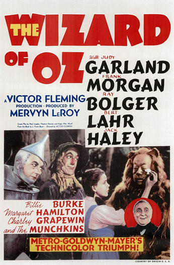
- Theatrical Release Poster for Wizard of Oz
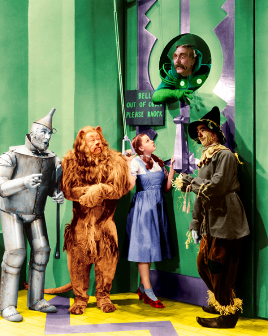
- Movie Still from Dorothy & the gang arriving at the Emerald City
Wizard of Oz Theme Moodboard

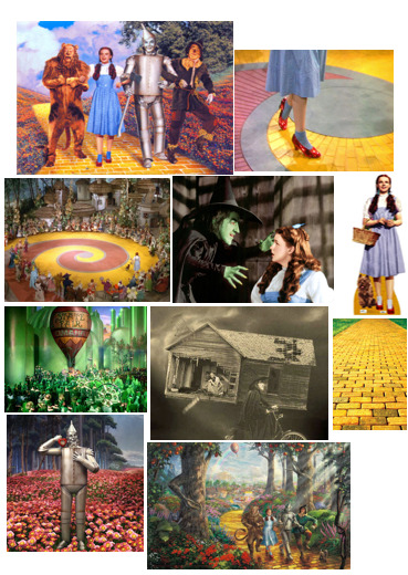
Film Still Analysis
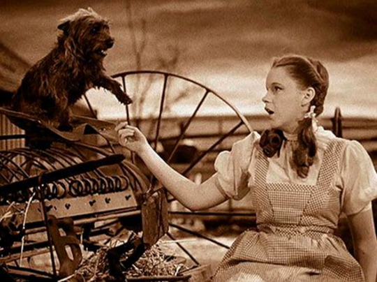
The first film still I am analysing is this one from the beginning of the movie, where Dorothy is based in Kansas on her family’s farm with her dog Toto. This part of the movie is accompanied by Dorothy singing the iconic song ‘Over the Rainbow’ which also reflects her current unhappiness with the life she leads. This part of the film is in Black and white which I feel reflects the mood of the beginning of the film with negative themes such as Dorothy not being happy, her pet dog being taken away and the cyclone her home is caught up in. Eventually she ends up in colourful Oz where the colour is first introduced to the movie which I feel is symbolically linked to Dorothy’s song ‘Over the Rainbow’ Rainbow representing the colour of beautiful colours of Oz. The costume Dorothy is wearing is iconic to this film and is very popular amongst fancy dress today,
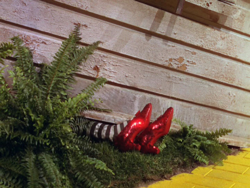
This film still is from the first half of the film, this part is where the Wicked Witch of the East is squashed my Dorothy’s house much to the Wicked Witch of the West’s dismay. This was the part where Dorothy acquired the famous Ruby Slippers which were owned by the Wicked Witch of the East. The main focus of this still is of the Props and the Yellow Brick Road, the use of colour of both of these creates emphasis of the importance of these props and the theme they represent throughout the film. They are two key features that are consistent about the film and I feel both can individually represent the Wizard of Oz film alone. At the beginning of this film, the setting is in Black and White when Dorothy is still in Kansas, it is when her house arrives in Oz, following a cyclone, when the colour was introduced to the movie, which I personally believe makes the film what is is. The use of colour throughout the film is such an important part, the shiny glittery Ruby Red slippers instantly attract your attention and help you understand why they are so wanted throughout the movie, this is the main use of the colour red throughout the film and is used in a positive light, the yellow brick road represents their journey throughout the movie and is extremely prominent, and finally I feel the colour green is used in a mixture of ways both positive and negative, the wicked witch of the west is green coloured representing evil and darkness, whilst the Emerald city is a beautiful positive place representing a close to their journey finally followed by the hologram of Oz which is both positive and negative to Dorothy and her friends as they are pleased to have met him but are left disappointed by what he has to say and the revelation of who he really is.
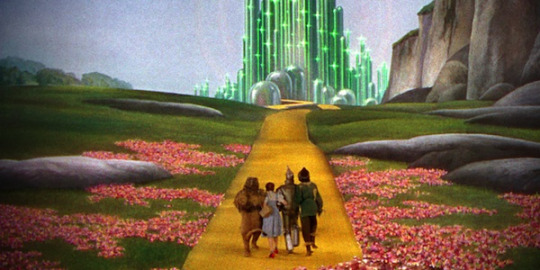
This film still is one from midway through the wizard of Oz when Dorothy, The lion, the scarecrow and the Tinman are linked arms skipping along the yellow brick road to Oz the big green building ahead of them. This is a very iconic image from the film and represents a happy moment and a breakthrough for their journey that you accompany them with throughout the movie. It is quite bright and pleasing to the eye with a mixture of colours. The films settings were mostly hand painted backdrops throughout the entire film as film effects were nowhere near as good as they are today being as the film was produced during the 1930’s, so you can really appreciate the effort that has gone into every scene as the backdrops were all drawn or hand-painted, most included the yellow brick road which was a key setting for most parts of the movie and is extremely iconic to this film today. The characters each remain in their same costumes throughout the film also, each outfit is also unique to this film. Half of this still is the painted backdrop whilst the other half is made entirely of props such as yellow brick road, poppies that were actually made from asbestos despite the health hazards being known for quite sometime before the production of the film and of course just the characters and their costumes.
Historical & Contemporary Research
Historical & Contemporary Moodboard
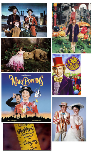

Similar works to that of the Wizard of Oz that I have come across are films such as 1971’s Willy Wonka and The Chocolate Factory and 1964’s Mary Poppins. The reason I have chosen these two movies is because they have many different similarities despite having different storylines. Wizard of Oz was of course the oldest out of three movies and was produced during a time where special effects were not easy to produce, even though both the other movies, Willy Wonka and Mary Poppins were produced before the 80’s and also contain limited special effects. All three movies are musicals so they contain fun filled, catchy songs throughout that are well known to this day so they are all very similar in terms of sound. All three movies also contain backdrops that were hand-painted and specially made unique props that were specific to the film, the films in general contain a lot of colour throughout the film and all have very surreal, fantasy, fairy-tale like storylines and features.

This film still contains a hand painted backdrop and is part of one of the songs in the musical Mary Poppins. Although the colours in this particular scene appear quite dull the rest of the movie is fairly colourful as they are scenes that are actually cartoon as well as real life. I can see the similarities with there being a few select main characters that embark on a journey together. The film is upbeat for the best part of it similar to Wizard of Oz and is a light hearted fun film to watch and listen too.
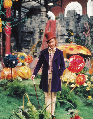
This is a shot of Gene Wilder as Willy Wonka in his colourful and edible Chocolate Factory. You can see the bright and vibrant colours that his Chocolate factory consist of and visually appealing for the best part of the movie. Its colours help to exercise your imagination as much as descriptive words do in a well written story. There are backdrops in the film that were also fake and appear as scenery which is similar to both Wizard of Oz and Mary Poppins. I think this is a good historical example of work similar to that of my chosen film, as the artists and producers clearly had similar ideas in terms of what they wanted their audience to see and experience when watching the film.

I have chosen this contemporary image produced by Annie Leibovitz as part of her Disney Homage Series. I chose this particular image that was featured in Vogue magazine and reflects the Beauty and the Beast as I feel it has similarities to the previous works I have researched (Wizard of Oz, Willy Wonka & Mary Poppins) as it has a backdrop that has been produced specifically for this shot. It is hard to tell whether or not this backdrop is painted but you can see there are props that have been included especially and a fake scenery backdrop. This is a great contemporary example of a fantasy photography shot of characters from a Disney cartoon Musical Beauty and the Beast. Other works in this series of Leibovitz had really been enhanced and manipulated digitally using Photoshop software whereas to produce the backgrounds whereas this one has been specially designed for the shot. This image unlike the others I chose to analyse is a real photograph with models and props purposely set up for photographic purposes whereas the others were film stills from the film itself.


However, these two images from Leibovitz’s Disney Series of Wizard of Oz are by far my favourite contemporary version of work relating to my chosen ideas. Similar to the Beauty and the Beast image, the sets have been specifically and uniquely designed for the shoot and are really imaginative and creative. They directly link to my film as they are actually paying homage to the film with the Actress Kiera Knightley. They are modern and colourful and in both images you can see she is wearing Red shoes that are very subtle but clearly Leibovitz felt they were important to include as an iconic feature of the character which directly inspires me within my own work. I don’t feel she need to put as much emphasis on the shoes in these particular images as they top one contains other iconic characters from the film and in the second the shot is focused as a whole on the scenery, setting, scarecrow, Dorothy and Toto. They have been set up so perfectly and are such a great idea and have always been my favourite since I first saw them feature in Vogue. Really love this as a contemporary example and they have definitely inspired me in terms of allowing me to elaborate on ideas of how I’d like to include Ruby Slippers in my shots and or backgrounds/scenery.
Experimental Portraiture (Digital & Film, Studio & Location)
Film & Location Portrait
Aims & Objectives – To produce a portrait shot on location on either digital or film. For this image, I will be shooting on a Digital camera on location.
Concept – I will be shooting a landscape image of the Ruby Slippers and black and white stripy tights placed in the style as if a house has landed on them the way it does in the movie.
Location – I will be shooting In Ashridge Woods with a small wooden hut as the main focus to represent the house squashing the witch.
Lighting – I will be using natural lighting for this image as I will be shooting outdoors.
Equipment – I will be using a Digital camera (Canon 700d) to shoot this image.
Influence -

This image is what I have been inspired by since beginning my research for the film, this has also been a key part of the film I have always remembered from a young age and is a key feature of the film and the journey of the ruby slippers and how Dorothy acquires them.
Props – In this image I will be featuring the wooden hut, the black and white stripy tights that I will fill with screwed up newspaper to form the shape of the ‘legs’ and the Ruby Slippers.
Character – The character I am depicting in my image is the Wicked Witch, as she will appear squashed underneath a house (Wooden Hut) with just her legs appearing slightly squashed they way they do in the movie.
Contact Sheet for Digital Location Image
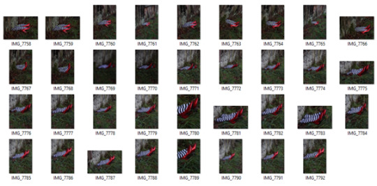
As you can see from the contact sheet I tried to shoot from various different distances away from the subject, I wanted to ensure I had a variety to play with when I came to editing my images later on. I wanted to make sure I did not lose any detail by shooting further away and also tried to shoot in both portrait and landscape. Although I shot less in landscape, I actually decided my final image was a landscape shot. It was definitely better in terms of composition and also was a similar style to the film stills I had found when researching which made me feel more comfortable about how successful it would be.
Chosen Final Digital Location Image

- F-stop - F/5.6, ISO 400, Shutter Speed 1/125, Focal Length 69mm
Digital Final Image Evaluation
I am really pleased with the final outcome of my image, It was exactly what I had in mind when imagining how I wanted to shoot my image. I wanted to ensure I had the right settings when shooting and try to make my image the best I could in camera so that it did not require too much editing. The only editing I had to do to my image was using the ‘Selective Colour’ to enhance the red tones so that the redness of the ruby slippers came out as well as enhancing the green grass. The point of using these techniques was so that it appeared vibrant in colour as I feel that the use of colour is really important and prominent throughout the movie so I wanted this to come across in my image.
Film Image
Aims & Objectives – To produce a portrait shot inside the studio on either digital or film. For this image, I will be shooting on a film camera.
Concept – I will be shooting a Silhouette type image by experimenting with shadows. The silhouette will be of the Wicked Witch as I have chosen to develop her character throughout the project rather than change to a different character. I would like to have her with her hands out appearing Witch-like and creepy.
Location – I will be shooting this image in the studio within my college at West Herts College.
Lighting – I will be using a Snoot to produce this image, I wanted to a circular amount of light that the snoot will allow me to control due to the shape of the end of the snoot. I also wanted the lighting to be hard which is exactly what the snoot produces as I would like my silhouette to appear fairly sharp and dark.
Inspiration -
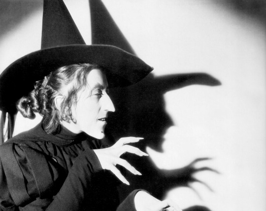
I have take direct inspiration from this image I found during my research of the film, this stood out to me massively and was not an image I had seen before and was not a still from the movie, this is a seperate image shot alongside the film. I would like to experiment with casting shadows for his shoot.
Equipment – I will be using a Canon 700D SLR to test on however my final image will be shot on a Film camera with 35mm Film.
Props – In this image I will be using classmates Hannah Wilson as my model with a Witch’s hat which includes a black veil connected to the hat that I will include in my image.
Character – The character I am depicting in my image is the Wicked Witch, I have chosen to stick with the Wicked Witch as my main character throughout the project as she has been extremely good fun to work with and has allowed me to stretch my ideas in different styles to produce different outcomes.
Digital Experimentation

Here is a small cut of the shots I tested with digitally before shooting on film. As you can see I experimented with increasing the aperture to produce a darker silhouette which also effectively darkened the white backdrop to a grey tone. I really liked the outcome of the shadowing experiment and found it appeared really effective overall. This gave me the go ahead to copy my settings over to the film camera and produce some shots on that instead. The outcome of my film after being processed was also really successful and I am pleased with the outcome of the shoot.
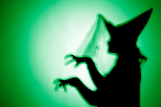
- F-stop – F/16, ISO 400, Shutter Speed – 1/125, Focal length – 27mm (Exact settings applied to Film Camera, bracketed F-stop by 1 stop under way i.e; F/8.
I also wanted to produce a little digital version of the image I will be shooting on film as another form of experimentation. I wanted to introduce a green colouring to my image so that it matched the theme of the Wicked Witch. Her face in the film is Green and is also the same colouring of the theme of the West End show ‘Wicked’ based around the Wizard of Oz Witch. I really liked this digital effect and felt it helped add the colour to the image that is an important essence of the movie throughout as it is extremely colourful throughout with its unique backdrops and props. Obviously I appreciate that I will be shooting this image on film therefore my image will be printed in black and white however I wanted to use my digital techniques to produce an outcome to demonstrate some digital experimentation as this is an important part of the project as a whole.
Film Final Image

(Quality reduced due to scanning process)
Film Final Evaluation
I have found this whole idea quite difficult at times to try and get right however when I finally found the right settings and exposure times I managed to produce a print that I felt worked well for me. The overall print isn’t brilliant in all honesty, there are some marks on the Witch silhouette which are actualy from effects made on my negatives, they are merely scratches on the neg or potentially rinse stains however these are minor and I felt ok to put this aside as I was more concerned about the ink application and colour. You can see a subtle green glow on my witch which was the exact effect I wanted to produce, I did not want the colour to be too in your face or tacky as that is not the effect I have aimed for. I wanted the colour to be subtle but effective, I carefully coloured in the silhouette with green ink and made sure to very carefully paint a real slim margin outside of the silhouette so that you could see a green glow on the outside of my witch to help her stand out against the white and create some texture to the image. I wanted to use this shade of green also as it was a deep green which I think matches the ‘witchy’ feel more especially the sort of green that is used in the West End shows for ‘Wicked’ which is based around the wicked witch from the Wizard of oz. The process was tricky but I am pleased with the outcome of the image and felt that my experimentation has been successful and effective to my final overal print and is definitely something I would like to progress practicing and experimenting with further in the future. This same process will be applied to my final showstopper image I have planned also so I am glad to have managed to practice and experiment at this point of the project.
Darkroom Experimentation for Final Film Image
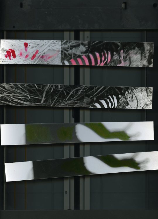
These are some test strips I produced before printing my final image. I had to experiment with exposure to test the best outcome with the ink painting experimentation I had in mind. Two of the test strips are from the film silhouette witch print and 2 are from the location film print of the ruby slippers crushed under the house. Both I used to practice ink painting on before applying this to my final print. I found with the silhouette print that it was a better outcome to produce a print that wasn’t as black in its shadows because it meant you are able to see the green ink better on the print. The bottom test print was a darker test strip I produced with an exposure of 12 seconds, I wanted the dark area of the print to be slightly lighter and a darker grey tone rather than black so I just exposed for 2 seconds less and still kept it on a contrast of 5 on the enlarger. This provided me with a dark grey area to work with which appeared better and more visible when applying my green ink.

This was my first initial full sized print of the negative I shot, I was initially inspired by an image I found during my research of the Wicked Witch casting a shadow on a white backdrop. I chose not to include the physical witch in mine and wanted to focus solely on the shadow which was an experiment in itself as I found I had to set up my lighting and position things accordingly to produce the best sharp outcome of a shadow that I possibly could. Of course this print here you can see the darker area is black, this I managed to do by turning my filter on and putting my contrast up to 5 with an exposure of 12 seconds. However, I didn’t really like that the ‘White’ areas were also actually a lighter shade of grey so it was the best option to expose for less time when producing my next print.

This was my first proper full sized test print that I needed to produce in order to get a better idea of how the overall image was going to look. You can see that from 2 seconds less exposure that the lighter areas of my print are much more whiter than previously produced and the black areas were a darker grey tone which I needed to be able to apply my green ink efficiently. I practiced with various different brushes and strokes when applying the ink, it was hard to try and get a decent outcome. I had to water down my ink so that it was more water based and easier to apply with leaving a excess ink that was going to try and leave a mark. The best option was to have 2 sets of ink ready to use, one more water down and the other more pure so that I could apply a more intense colour. I had to go around the edges of the witch with the watered down ink which essentially ‘puddled’ my print with watery ink, and then I was able to add the darker ink in the centre. I also wanted to experiment with what the colour would look like if I painted the white background as initially I actually considered submerging my entire print in a green toner however unfortunately I was unable to get my hands on some leaving me with no choice but to practice with green ink instead. I felt when applying green ink to the white background that it actually looked quite messy and I knew i would not get the even spread of green I wanted that I could have produced with toner. From this experiment, I was clear on the process I was going to use for my final print. This same method will also be applied to my film print with the red ruby slippers.
The ‘Showstopper’

The specific object I have chosen to focus my ‘Showstopper’ images around are of course the Ruby Slippers that Dorothy acquires early on in the film and keeps throughout to the end. The Ruby Slippers are truly beautiful, glittery and eye-catching and one of the main consistent themes throughout the movie, they are wanted so badly by the Wicked Witch which instantly informs of the audience of their importance. When viewing the larger subjects of the film from start to finish, you see themes such as true friendship, a journey, escape, inadequacy of adults, power, gender, roots and family. As much as the film seems to be such a fun, colourful, fantasy based movie there really are larger important themes that have an underlying impact on the overall success of the movie. The inadequacy of adults directly relates to the fact that all of the good adults within the movie appear to be powerless, Auntie Em, The Scarecrow, The lion, The Tinman and even the Wizard of Oz himself. Also I don’t believe it is a coincidence that the only characters that have any true power are all female, Glinda the Good Witch and Miss Gulch/Wicked Witch, there was a real reversal of roles in terms of power of gender during this time which in the Hollywood world always seemed to be a masculine hero of some sort. For me the real most important theme of the film is the power within ourselves, which is what the Ruby Slippers represents. There is an element of escape through the film as well as elements of embracing your roots which are clearly conflicting and opposite to each other but their journey shows a way of joining both ideas. Glinda the good witch says to Dorothy at the end that she had the power to return home all along although she didn’t know it however this truth only emerges at the end as it’s made to look throughout their journey that she is gaining the power and importance from the Slippers.
Final Showstopper Images (Digital & Film) - Task C
Digital & Studio Portraits
Aims & Objectives – To produce two Final Images as part of ‘The Showstopper’ task on this project. I have chosen to shoot this first image digitally.
Concept – I will be shooting a close up shot of the Ruby Slippers with black and white stripy tights depicting the Wicked Witch.
Location – I will be shooting in the studio at West Herts College.
Lighting – I will only be using a Snoot to light my props as I think it would be most effective to use hard lighting for a more dramatic effect.
Equipment – I will be using a Canon 700D DSLR with a 16gb SD Card, I will also be using a sync lead and Studio lighting equipment with a black backdrop.
Props – My image is going to be of the lower half of a model’s legs wearing black and white stripy tights with sequin covered Red Ruby Slippers in the style that Dorothy Gale wears in the movie Wizard of Oz.
Character – The character I am depicting in my image is the Wicked Witch, you’ll be able to tell this as my model will also be wearing the black and white stripy tights that she wears when she is squashed under the house.
Contact Sheet -


As you can see from the contact sheet, I tried to experiment with a through different ideas of how I could shoot this studio image of the shoes. I wanted to make it interesting and rather than just a bog standard shot of the shoes. I wanted to make sure the shoes appeared glitzy and eye catching so I felt the best option for this would be to use hard lighting so that the light reflected off the sequins on the shoes made them appear as if they were glowing. I tried to shoot without the tights at first however I felt these images appeared really bland and boring and didn’t exactly represent the Witch they way I wanted too, the tights added a much more Witch like feel to the image and matched the outfit of the Witch that gets squashed in the film. I wanted to experiment with some shadowing by using the lighting, however I found this really difficult to focus on both the shoes and the shadows. I found it difficult to make both techniques look really great together so I moved on and shot an image of the shoes looking eye catching and glamorous the way I wanted them to look. I decided I would wait to experiment further with some shadowing a different time when I go on to produce another image of just the witch as I have some interesting ideas for that shoot. I am pleased with the outcome of the shoot as you can see the quality of my shoot and ideas improved throughout the shoot and my images became much more interesting towards the end of the shoot. Each image I took meant that I would be able to push myself further to see what further ideas I had during shooting resulting in some great images.
Final Digital ‘Showstopper’ Image

- F-stop - f/5.6, ISO 100, Shutter Speed 1/125, Focal Length 95mm
Final Digital Studio Image Evaluation
I am extremely pleased with the outcome of my final image from my digital studio based shoot. I managed to produce an image that was beyond was I originally expected to produce. I had an idea before shooting but allowed myself to be carried away during the shoot with the instant outcomes of each image in camera. I noticed my progression throughout the shoot and was pleased that my work was improving from start to finish. I wanted to focus my sole attention on the shoes and the way the light reflected of them, I shot on a black backdrop so was particularly happy with the reflection of the sequins on the bottom of the black backdrop as I felt it added a nice glittery effect to my image which helped highlight the overall magical effect I wanted to produce with the Ruby Slippers. I did not have to edit my image much afterwards in Photoshop as I tried to ensure that my image was shot well in the first place, however I slightly burned the black areas of the tights as well as some real slighting burning of the backdrop. I did not want to over burn the backdrop black colour as I wanted the shadowing underneath the shoes to still stand out. I also used the ‘Selective Colour’ tool on Photoshop to enhance the Red in the shoes however it was not as effective as I thought it would be and also made my Ruby Slippers look worse than better, they made the whiter reflective parts of the shoes more Magenta coloured or made them appear to dark of a red so I was not satisfied. Upon reflection I realised I actually really liked the shoes as they were shot and decided to leave them alone. I wanted to experiment with the ‘Selective Colour’ tool however I found it was not as successful as I hoped. The overall image however I personally believe is really successful and matches exactly what I aimed to produce. I believe you would look at this image and instantly think of ‘The Wizard of Oz’ which is exactly what I wanted to achieve.
Film Location Image
Aims & Objectives – To produce two Final Images as part of ‘The Showstopper’ task on this project. I have chosen to shoot this first image on film.
Concept – I will be shooting a landscape image of the Ruby Slippers and black and white stripy tights placed in the style as if a house has landed on them the way it does in the movie. I have chosen to progress further on my original image I produced digitally earlier on in the experimentation part of the project, this time introducing the black and white feel which is closely linked to the beginning of the movie itself which was produced in black and white.
Experimentation – I will be using special Ink to paint on my final film print specifically on the ruby slippers with a Crimson ink. I wanted to include this experimentation to my final print as it creates emphasis on the main feature of my image which are the ruby slippers.
Location – I will be shooting again In Ashridge Woods with the same small wooden hut as the main focus to represent the house squashing the witch.
Lighting – I will be using natural lighting for this image as I will be shooting outdoors.
Influence -
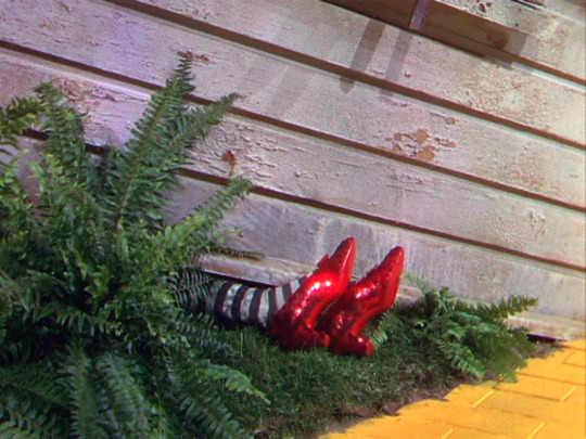
This image is what I have been inspired by since beginning my research for the film, this has also been a key part of the film I have always remembered from a young age and is a key feature of the film and the journey of the ruby slippers and how Dorothy acquires them.
Equipment – I will be using a film camera to produce this image.
Props – In this image I will be featuring the wooden hut, the black and white stripy tights that I will fill with screwed up newspaper to form the shape of the ‘legs’ and the Ruby Slippers.
Character – The character I am depicting in my image is the Wicked Witch, as she will appear squashed underneath a house (Wooden Hut) with just her legs appearing slightly squashed the way they do in the movie. I have chosen to stick with this character as I have really enjoyed working with her throughout this project and have found her really interesting from start to finish.
Final Film ‘Showstopper’ Image

Film Final Image Evaluation
I was extremely pleased with the outcome of my final film print, it was a development from the digital version I produced earlier on which was vibrant in colour and I was also really pleased with. I chose to shoot this image in film as I felt it closely matched the effect of the movie which was produced 77 years ago and began in black and white and was originally shot in black and white before the colour was introduced in later years. I chose to experiment with some coloured Ink to add to my final print after I developed it in the darkroom which I focused specifically around the Ruby Slippers which was the object I chose to focus on as part of ‘The Showstopper’ task. I developed my print along with test strips beforehand which I used to practice my ink painting on. I found that there was a particular method that had to be used for the best outcome to produce a respectable final image that I have explained earlier on. The quality of my image has been reduced after I scanned it in to be able to upload onto my blog however I am confident this is not a problem as my final print will be what is assessed. It was fairly straight forward to produce and with the correct planning I put in place in advance helped me produce this outcome efficiently. I think next time I would like to practice further with methods of painting Ink onto a final print so that I have a flawless print however I am pleased I experimented in a way that I have not done before in my photographic practice. I liked the outcome of the overall print and feel that my experimentation has been successful and effective. It highlights the object I chose to focus on in a unique way.
Project Evaluation
What went well on the project?
I personally feel that there were areas that went well with the project whilst there were others areas I certainly can improve on for the future. I enjoyed the location shoot for both digital and film outcomes for this project of the wicked witch squashed underneath the house. I used a local wooded area for this print that had a small ‘witches hut’ as I’ve always called it growing up. This was the perfect setting for the image I had in mind that I wanted to produce and certainly had fun shooting. I shot both digital and film that day and used my digital camera to help assist me with the correct settings for the film camera. I enjoyed seeing the outcome of the images also as they were exactly what I aimed to produce.
What did you find difficult?
I found getting initial inspiration for ways in which I could experiment with in both the darkroom and digitally for the project. Perhaps further research into ways of which I could have expanded on experimented with would have been beneficial to my project. After getting stuck for inspiration towards the start of the process, I found this started to take its toll on the way I was managing my time on the overall project. It began to slow me down and the typical perfectionist within my personality refused to settle for any idea that didn’t sit right with me. I tried to think of ideas of ways I have experimented with previous to this project that could have been beneficial to this project however I knew I wanted to produce something that I hadn’t before and add fresh ideas to the project. Eventually I got an idea and managed to go with it however the slowing down at the beginning of the project was extremely difficult and definitely had an effect on my workload and the way I managed to project.
Did you find the experimentation process beneficial?
I found the experimentation process vital to my project, without it I would not have been able to complete it. I previously mentioned about initial inspiration for ways in which I could experiment was slow however once I got the ball rolling with my ideas I managed to progress at a steady pace. I found the darkroom experimentation more effective and interesting in all honesty and I found that digital experimentation was confined to digital software in the case of this project which is something I am used to doing so I found it wasn’t as interesting as perhaps the darkroom experimentation was. It was fun to test with inks and I would also have liked the opportunity to have been able to practice with toners as well however there was not any green toner available to me within the college which is a shame as I think it would have been a good idea to be able to compare the two results and decide which would have been good to include in my project.
What would you do differently next time?
Next time I would definitely carry out my own research on darkroom experimentation to gain better inspiration towards my project, I think if I had done this from the start I would have been more successful with my time management which would have effected the overall flow of the project. I would also like to ensure I stick to arrangements I make in order to keep to a strict schedule and also try to shoot ahead of when I was supposed to so that if for whatever reason I am delayed I don’t actually end up falling behind as such.
Did you find the research useful?
I found the research as vital to my project as the experimentation, I think it was so important to develop what and why I am producing the images I was to keep things relevant to both the brief and my initial idea. It was actually really interesting to learn about a film I have been watching for the past 20 years and break it down in ways I hadn’t before, it allowed me to understand the larger subjects of the movie which have always just appeared has visual and audio scenes to me previously. I also found it really useful to look at the contemporary works of other artists such as Annie Leibovitz that had produced images similar to what I wanted to do in paying homage to both Wizard of oz using famous actresses such as Kiera Knightley. Her disney recreation series is something I have always been fond of since discovering it a year and a half ago. It has been useful and beneficial to research areas of the film that were going to effect my project and think I would not have been as successful with the overall outcome of my final images If I had not have researched to the extent that I did by producing mood boards and analysing key still images from the movie.
How did you manage your time on the project?
I previously mentioned when evaluating ways in which I could improve in the future and what I found difficult that I found my time management was not as good as it could have been. Initially I was slowed down because of a delay inspiration but once I got going I found it was quite a downhill sprint towards the end which was good. I could plan better in the future and stick to tighter schedules and timetables in terms of shoot days and making sure that I allocate time to study when I can find peace and time away from distractions. I found turning my phone off or putting it on silent was also a massive help, I lead a busy life and finding time to actually sit and focus on my work is something i regularly find a struggle.
Are you pleased with your final images?
Overall, I am extremely pleased with the outcomes of my final images. They are exactly what I aimed to produce and had in mind from the start. I think I probably could have improved on my darkroom practising, whilst I personally feel I succeeded in experimenting, I think I probably could have cleaned up my standard darkroom processing and developing a bit more i.e quality of the film negatives and final print. I especially love my final digital image and competition submission of just the Ruby Slippers, it was quite unique and a nice contemporary attempt.
#unit32#harmancompetition#wizardofoz#experimentalphotography#experimentalimagery#darkroom#filmphotography#digitalphotography#l frank baum#technicolour#mgm
2 notes
·
View notes

