#TypogRAPy
Explore tagged Tumblr posts
Visit Tumblr Blog
Explore Tumblr blogs with no restrictions, modern design and the best experience.
Last Seen Tumblr Blogs


Fun Fact
Tumblr.com is the 103rd most visited website in the world.
Text

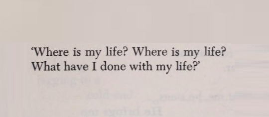
Franz Kafka, from a letter to Felice Bauer written in 1912, featured in Letters To Felice
605 notes
·
View notes
Text

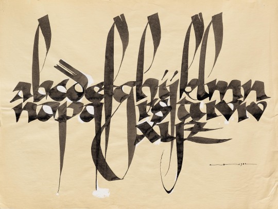
‘Schriften Vorlagen zum Praktischen Gebrauche für Maler, Steinhauer, Architecten und Zeichnen-Schulen’
14 notes
·
View notes
Photo

Valentin Goppel
5 notes
·
View notes
Photo
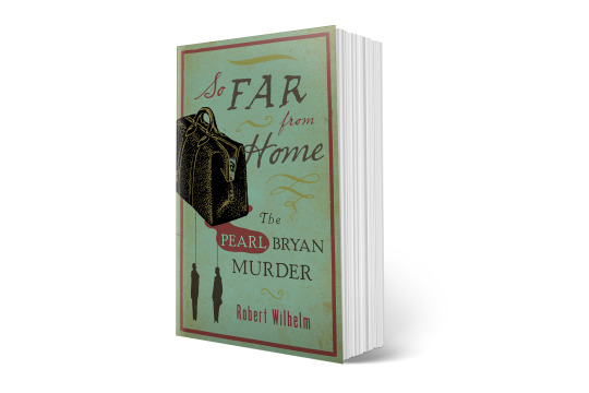
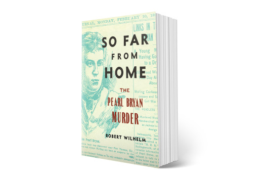
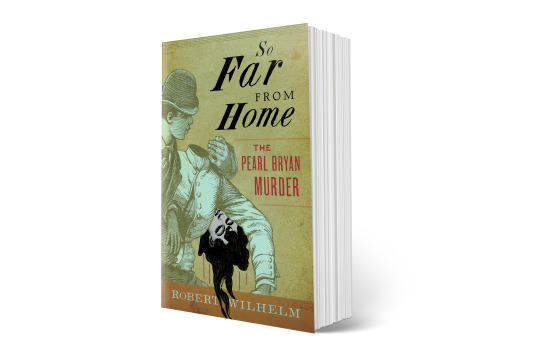

Client: Robert Wilhelm
This rather gruesome event in Kentucky history concerns the untimely murder of Pearl Bryant, a 22-year-old pregnant American woman. Beheaded and left in a field, her murder was eventually connected to a Dental student (the baby's father) and his roommate, who after the killing allegedly took the head in a bag to a local saloon before disposing of it. It's a miserable story but I'm attracted to the macabre as much as anyone and ran with it. The image with the headless body was a staged event at the time of the trial, and many mistake if for the actual crime scene.
1 note
·
View note
Text
Just read this article. To put my thoughts on this: I think there is some potential—the same as with every algorhythm—to automate repetitive tasks. Like creating a bold weight from a regular one (as stated in the article). For this kind of task you normally need to outline a few key letters (like: o, n, e, k, H, O …) and then roll those out on all the other letters. There are already scripts that help you with that to a degree. They are actually helpful to set a basis. But! You need to go through them afterwards anyway, and since you didn’t do all the steps from the get-go it can be sometimes confusing what values for stem widths or bowls were chosen. So, I often end up, re-doing it all anyway.
I’m not an design bot enthusiast at all, and I find that most of the future scenarios created by such enthusiasts lack evidence. They always say: “They will be able to do this and that in the future—trust me.” And I basically don’t trust those predictions. Also about the speech-promt-created fonts, I don’t think they hold much merit. If they should ever develop into something half-useable it ‘might’ be a tool for sketching an idea. But I think the author’s blindspot is that he is mainly focus on display fonts. Those can be expressive and don’t need to be as accurate to work. For a typeface with a wider applicability you need to do so much detail work, that is simply not feasible with automation of any kind.
And I think the strongest argument—for me at least—against the argument of “adapt or get left behind” is that designing typefaces is a creative expression of one-self. In essence most body text fonts can be boiled down to about five form principles. Just decide on one of those and pick one of the thousands of variations. No reason to create another sub-par version of the same principle through a program. If, on the other hand, you love a certain form principle and want to add your own interpretation to it, that is something completely different. Even if the result may be close to the original, I belive that every designer has their own handwriting that always shines through. So that bit of personality will shine through. What personality will a robot’s variation bring? A human might give it meaning, but it doesn’t bring any inherently.
Well, anyway. Those are my quick thoughts on this. There might be a wave of glitchy fonts—and for a time designers might find that interesting due to its novelty. But, typing a promt will never be able to replace the joy of creating something on your own.
1 note
·
View note
Photo


@lgbtqcreators creator challenge | typograpy
(insp.)
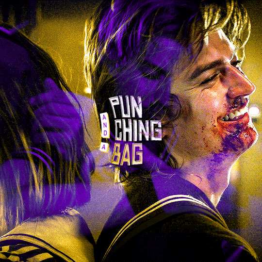
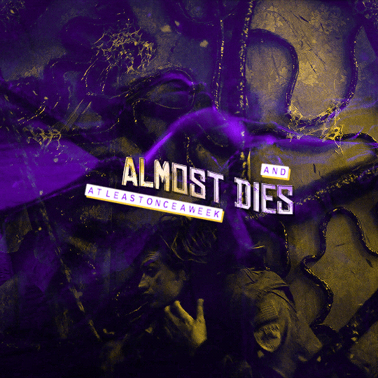
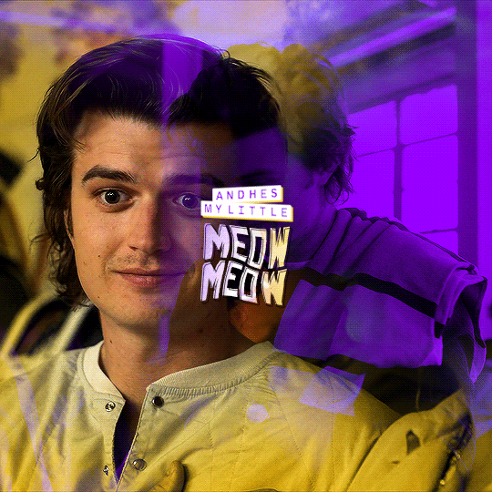
#*#stranger things#strangerthingsedit#tvedit#usergif#userchibi#useralison#usercim#userhallie#usermorgan#tuserheidi#userrobin#tuservaleria#tuserlana#userkarolina#userchristie#obligatorytag#usershreyu#userbarrow#userzesty#userfaiths
265 notes
·
View notes
Text


Office Magazine redesign (2021) (Format, typograpy and layout) with Will Canning and Jamie Parkhurst
7 notes
·
View notes
Text

im always sooooo excited to make gifs with typography until i start and remember i hate typograpy
8 notes
·
View notes
Text
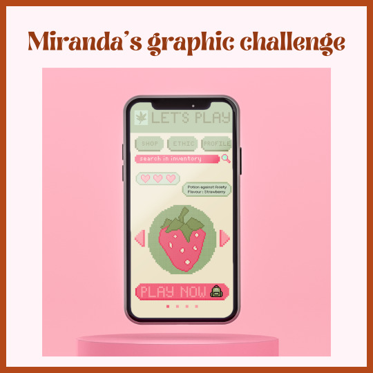
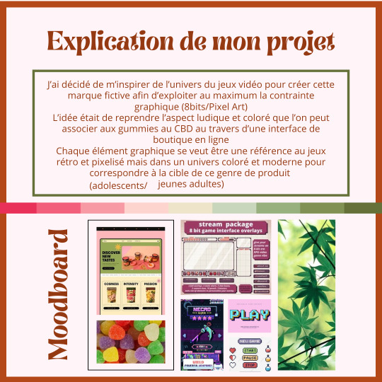
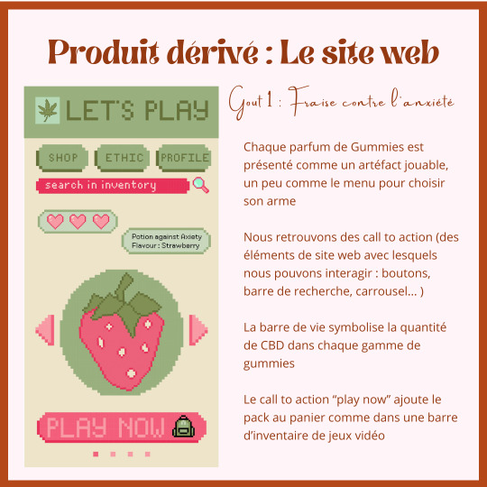
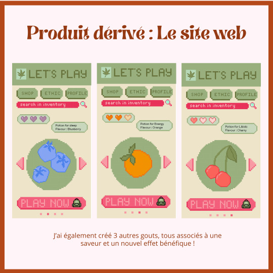
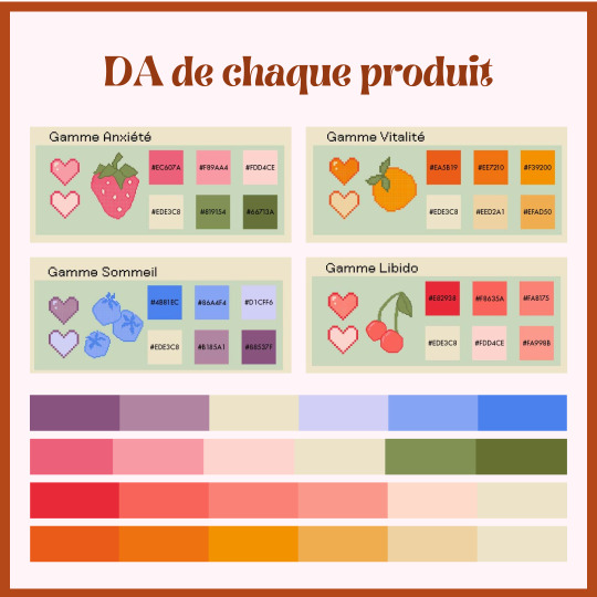
During a class project, I drew three elements for the project; A type of product, an aesthetic and the target audience.
What I had to create at the end was a logo, some derivation of it, merch and a corporate identity.
I decided to use the video game aesthetic for this fictional brand to use to its full potential the graphic demand (8bits/Pixel Art).
The general idea was to convey the fun and colourful aspect sometimes seen with CBD gummies with an online marketplace. Each and every graphic element is meant to bring back the retro aspect of video games, while keeping a modern and colourful design to appeal to the target audience (teenagers/young adults).
Each flavour is depicted with a fruit, which can be equipped like a sort of weapon. You can find call to action such as buttons, search bar, etc. The health bar shows the amount of CBD in each type of gummy and the call to action “Play Now” puts the pack in the shopping cart, like an inventory bar.
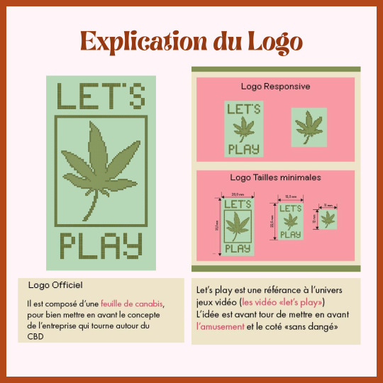
Logo Explanation: Depicting a canabis leaf, showing the core of the concept, a brand using CBD | Let's play is referencing video games, enhancing the concept of fun and "without danger" of CBD gummies
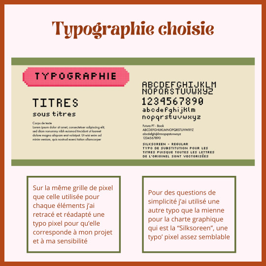
Typograpy : Made out of pixels to stay in the graphic aesthetic
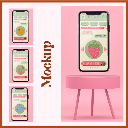
Merch: Website
0 notes
Text
A beatiful concert poster

The poster demonstrates author's sophisticated skill and imagination in typography and color design.
The typograpy is well adopted by form of instrument with transformation of text, combining with light yellow color with analogous color ,black and symbolic background, indicating the mood of the concert.
The detail information well design in the box of big text formed with good hierarchy and contrust design.
0 notes
Text
Denise Levertov, from O Taste and See: New Poems; "The Old Adam,"
543 notes
·
View notes
Photo
about #opentypoatelier sinds some weeks i’m back into reading books and theories ; history of bookbinding, theorie of collors and the transformation from callography (handwriting) to typograpy (machinal writing). the more and more i feel that this is my desission - to collect, connect and transmit the knowledge. my sneaky dream is to create a place where we create work, with a knowhow and materials from the past. i kind of a labyrinth that makes connections between art, theory, history and a good portion of « savoir-faire » . a place that reflect the passion for ink and paper! . www.astridfieuws.com rue pletinckxstraat 27, 1000 brussels (open by apointeent or by chance). . ik parle ook #nederlands et du #francais. i’m a #dislectic #graphicdesigner and #typographer with a #passionforpaper and #printtechniques. i grow up in a #printingfamily and i’ve been playing with #paperleftovers all my life. this is my inspiration en red line in my #unique #papetery work. I make #notebooks with #recovered paper + #postcards with #upcycled illustrations from old books + #cards printed wijth the old #typo letters of my grandfather ; i created a small galery with artworks from (un)known artists - exposed in #handmade frames ; ... #nowaste is important, so i do work in small quantities and i compose all the dyes myself by using only #biodegradable products! so... i’m #astridfieuws a #handmadeinbelgium #craftwomen who wounds to share the #artisanalknowledge of #printing by organising #workshops in a #opentypoatelier in #brussels (bij astridfieuws) https://www.instagram.com/p/CqQpNJVNtkE/?igshid=NGJjMDIxMWI=
#opentypoatelier#nederlands#francais#dislectic#graphicdesigner#typographer#passionforpaper#printtechniques#printingfamily#paperleftovers#unique#papetery#notebooks#recovered#postcards#upcycled#cards#typo#handmade#nowaste#biodegradable#astridfieuws#handmadeinbelgium#craftwomen#artisanalknowledge#printing#workshops#brussels
1 note
·
View note
Text
Berlin - Typography
U-Bahn Typograpy
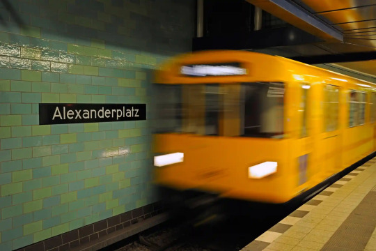
From the ‘authentically German’ typography used by the Nazis, to the ‘boogying Octopuss’ lettering of the late 70s, the fonts of Berlin’s transport system articulate the chequered past of Germany’s capital
VEB Typoart
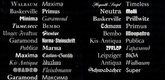
This image from the jacket of Kapr and Schäfer, Fotosatzschriften, 1989 shows all the font families Typoart created for photo-typesetting
VEB typoart is the state-issued type foundry in East Germany owned by the GDR. I find it interesting that even the type used in the city was controlled by the government and the results are interesting and tell the unique story of East Berlin.
Maybe my project could be a revival project of some of these typefaces or something similar
0 notes
Text
My Audience
Typographers and designers would be Typographika’s audience.
As designers, they aren’t laymen. they expect:
- the subject as the main feature in posters. ie: typograpy - solid and well designed posters - lack of technical errors for them to needle for the irony of bad design at a design con
What would suit:
- inside references to typographers and designers - visually unique
0 notes
Text
Nenad Bacanovic
39 notes
·
View notes