#TextShadow
Text
youtube
piZap's Quick Photo Editing Tutorial: piZap's Text Shadow
Make your messages more expressive with text shadow. It's super easy with PiZap Photo Editor. You can have your texts to have a colorful shadow.
Express yourself through your texts!
Go PRO!
www.pizap.com
#pizaptutorials#pizap#photoeditor#photography#photoediting#collage#stickers#filters#borders#textshadow#Youtube
1 note
·
View note
Video
How to make shadow of text in Adobe illustrator. For complete YouTube video tutorial, you can find the link given in bio. . . . . . #adobeillustrator #illustratorTutorials #graphic #graphicsDesigning #freelancing #illustratorvideo #typographyart #typography #shadowtext #textshadow #timelapsevideo #speedart #graphicdesign https://www.instagram.com/p/CDZHa1UDwMK/?igshid=55yxt09ig8f1
#adobeillustrator#illustratortutorials#graphic#graphicsdesigning#freelancing#illustratorvideo#typographyart#typography#shadowtext#textshadow#timelapsevideo#speedart#graphicdesign
1 note
·
View note
Text
Creating Playful Effects With CSS Text Shadows
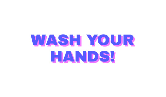
Let’s have a look at how we can use the CSS text-shadow property to create truly 3D-looking text. You might think of text-shadow as being able to apply blurred, gradient-looking color behind text, and you would be right! But just like box-shadow, you can control how blurred the shadow is, including taking it all the way down to no blur at all. That, combined with comma-separating shadows and stacking them, is the CSS trickery we’ll be doing here.
By the end, we’ll have something that looks like this:

Quick refresher on text-shadow
The syntax is like this:
.el { text-shadow: [x-offset] [y-offset] [blur] [color]; }
x-offset: Position on the x-axis. A positive value moves the shadow to the right, a negative value moves the shadow to the left. (required)
y-offset: Position on the y-axis. A positive value moves the shadow to the bottom, a negative value moves the shadow to the top. (required)
blur: How much blur the shadow should have. The higher the value, the softer the shadow. The default value is 0px (no blur). (optional)
color: The color of the shadow. (required)
CodePen Embed Fallback
The first shadow
Let’s start creating our effect by adding just one shadow. The shadow will be pushed 6px to the right and 6px to the bottom:
:root { --text: #5362F6; /* Blue */ --shadow: #E485F8; /* Pink */ }
.playful { color: var(--text); text-shadow: 6px 6px var(--shadow); }

Creating depth with more shadows
All we have is a flat shadow at this point — there’s not much 3D to it yet. We can create the depth and connect the shadow to the actual text by adding more text-shadow instances to the same element. All it takes is comma-separating them. Let’s start with adding one more in the middle:
.playful { color: var(--text); text-shadow: 6px 6px var(--shadow), 3px 3px var(--shadow); }

This is already getting somewhere, but we’ll need to add a few more shadows for it to look good. The more steps we add, the more detailed the the end result will be. In this example, we’ll start from 6px 6px and gradually build down in 0.25px increments until we’ve reached 0.
.playful { color: var(--text); text-shadow: 6px 6px var(--shadow), 5.75px 5.75px var(--shadow), 5.5px 5.5px var(--shadow), 5.25px 5.25px var(--shadow), 5px 5px var(--shadow), 4.75px 4.75px var(--shadow), 4.5px 4.5px var(--shadow), 4.25px 4.25px var(--shadow), 4px 4px var(--shadow), 3.75px 3.75px var(--shadow), 3.5px 3.5px var(--shadow), 3.25px 3.25px var(--shadow), 3px 3px var(--shadow), 2.75px 2.75px var(--shadow), 2.5px 2.5px var(--shadow), 2.25px 2.25px var(--shadow), 2px 2px var(--shadow), 1.75px 1.75px var(--shadow), 1.5px 1.5px var(--shadow), 1.25px 1.25px var(--shadow), 1px 1px var(--shadow), 0.75px 0.75px var(--shadow), 0.5px 0.5px var(--shadow), 0.25px 0.25px var(--shadow); }
CodePen Embed Fallback
Simplifying the code with Sass
The result may look good, but the code right now is quite hard to read and edit. If we want to make the shadow larger, we’d have to do a lot of copying and pasting to achieve it. For example, increasing the shadow size to 10px would mean adding 16 more shadows manually.
And that’s where SCSS comes in the picture. We can use functions to automate generating all of the shadows.
@function textShadow($precision, $size, $color){ $value: null; $offset: 0; $length: $size * (1 / $precision) - 1;
@for $i from 0 through $length { $offset: $offset + $precision; $shadow: $offset + px $offset + px $color; $value: append($value, $shadow, comma); }
@return $value; }
.playful { color: #5362F6; text-shadow: textShadow(0.25, 6, #E485F8); }
The function textShadow takes three different arguments: the precision, size and color of the shadow. It then creates a loop where the offset gets increased by $precision (in this case, it’s 0.25px) until it reaches the total size (in this case 6px) of the shadow.
CodePen Embed Fallback
This way we can easily increase the size or precision of the shadow. For example, to create a shadow that’s 10px large and increases with 0.1px, we would only have to change this in our code:
text-shadow: textShadow(0.1, 10, #E485F8);
Alternating colors
We want to spice things up a bit by going for alternating colors. We will split up the text in individual letters wrapped in spans (this can be done manually, or automated with React or JavaScript). The output will look like this:
<p class="playful" aria-label="Wash your hands!"> <span aria-hidden="true">W</span><span aria-hidden="true">a</span><span aria-hidden="true">s</span><span aria-hidden="true">h</span> ... </p>
Then we can use the :nth-child() selector on the spans to change the color of their text and shadow.
.playful span:nth-child(2n) { color: #ED625C; text-shadow: textShadow(0.25, 6, #F2A063); }
CodePen Embed Fallback
If we had done this in vanilla CSS, then here’s what we’d end up with:
.playful span { color: var(--text); text-shadow: 6px 6px var(--shadow), 5.75px 5.75px var(--shadow), 5.5px 5.5px var(--shadow), 5.25px 5.25px var(--shadow), 5px 5px var(--shadow), 4.75px 4.75px var(--shadow), 4.5px 4.5px var(--shadow), 4.25px 4.25px var(--shadow), 4px 4px var(--shadow), 3.75px 3.75px var(--shadow), 3.5px 3.5px var(--shadow), 3.25px 3.25px var(--shadow), 3px 3px var(--shadow),' 2.75px 2.75px var(--shadow), 2.5px 2.5px var(--shadow), 2.25px 2.25px var(--shadow), 2px 2px var(--shadow), 1.75px 1.75px var(--shadow), 1.5px 1.5px var(--shadow), 1.25px 1.25px var(--shadow), 1px 1px var(--shadow), 0.75px 0.75px var(--shadow), 0.5px 0.5px var(--shadow), 0.25px 0.25px var(--shadow); }
.playful span:nth-child(2n) { --text: #ED625C; --shadow: #F2A063; }
We can repeat the same a couple of times with other colors and indexes until we achieve a pattern we like:
CodePen Embed Fallback
Bonus points: Adding animation
Using the same principles, we can bring the text to life even more by adding animations. First, we’ll add a repeating animation that makes each span move up and down:
.playful span { color: #5362F6; text-shadow: textShadow(0.25, 6, #E485F8); position: relative; animation: scatter 1.75s infinite; }
We can optimize this a little further by using the prefers-reduced-motion media query. That way, folks who don’t want the animation won’t get it.
.playful span { color: #5362F6; text-shadow: textShadow(0.25, 6, #E485F8); position: relative; animation: scatter 1.75s infinite; } @media screen and (prefers-reduced-motion: reduce) { animation: none; }
Then, in each nth-child(n) we’ll add a different animation delay.
.playful span:nth-child(2n) { color: #ED625C; text-shadow: textShadow(0.25, 6, #F2A063); animation-delay: 0.3s; }
CodePen Embed Fallback
The post Creating Playful Effects With CSS Text Shadows appeared first on CSS-Tricks.
Creating Playful Effects With CSS Text Shadows published first on https://deskbysnafu.tumblr.com/
0 notes
Text
Creating Playful Effects With CSS Text Shadows
Let’s have a look at how we can use the CSS text-shadow property to create truly 3D-looking text. You might think of text-shadow as being able to apply blurred, gradient-looking color behind text, and you would be right! But just like box-shadow, you can control how blurred the shadow is, including taking it all the way down to no blur at all. That, combined with comma-separating shadows and stacking them, is the CSS trickery we’ll be doing here.
By the end, we’ll have something that looks like this:

Quick refresher on text-shadow
The syntax is like this:
.el { text-shadow: [x-offset] [y-offset] [blur] [color]; }
x-offset: Position on the x-axis. A positive value moves the shadow to the right, a negative value moves the shadow to the left. (required)
y-offset: Position on the y-axis. A positive value moves the shadow to the bottom, a negative value moves the shadow to the top. (required)
blur: How much blur the shadow should have. The higher the value, the softer the shadow. The default value is 0px (no blur). (optional)
color: The color of the shadow. (required)
CodePen Embed Fallback
The first shadow
Let’s start creating our effect by adding just one shadow. The shadow will be pushed 6px to the right and 6px to the bottom:
:root { --text: #5362F6; /* Blue */ --shadow: #E485F8; /* Pink */ }
.playful { color: var(--text); text-shadow: 6px 6px var(--shadow); }
Creating depth with more shadows
All we have is a flat shadow at this point — there’s not much 3D to it yet. We can create the depth and connect the shadow to the actual text by adding more text-shadow instances to the same element. All it takes is comma-separating them. Let’s start with adding one more in the middle:
.playful { color: var(--text); text-shadow: 6px 6px var(--shadow), 3px 3px var(--shadow); }

This is already getting somewhere, but we’ll need to add a few more shadows for it to look good. The more steps we add, the more detailed the the end result will be. In this example, we’ll start from 6px 6px and gradually build down in 0.25px increments until we’ve reached 0.
.playful { color: var(--text); text-shadow: 6px 6px var(--shadow), 5.75px 5.75px var(--shadow), 5.5px 5.5px var(--shadow), 5.25px 5.25px var(--shadow), 5px 5px var(--shadow), 4.75px 4.75px var(--shadow), 4.5px 4.5px var(--shadow), 4.25px 4.25px var(--shadow), 4px 4px var(--shadow), 3.75px 3.75px var(--shadow), 3.5px 3.5px var(--shadow), 3.25px 3.25px var(--shadow), 3px 3px var(--shadow), 2.75px 2.75px var(--shadow), 2.5px 2.5px var(--shadow), 2.25px 2.25px var(--shadow), 2px 2px var(--shadow), 1.75px 1.75px var(--shadow), 1.5px 1.5px var(--shadow), 1.25px 1.25px var(--shadow), 1px 1px var(--shadow), 0.75px 0.75px var(--shadow), 0.5px 0.5px var(--shadow), 0.25px 0.25px var(--shadow); }
CodePen Embed Fallback
Simplifying the code with Sass
The result may look good, but the code right now is quite hard to read and edit. If we want to make the shadow larger, we’d have to do a lot of copying and pasting to achieve it. For example, increasing the shadow size to 10px would mean adding 16 more shadows manually.
And that’s where SCSS comes in the picture. We can use functions to automate generating all of the shadows.
@function textShadow($precision, $size, $color){ $value: null; $offset: 0; $length: $size * (1 / $precision) - 1;
@for $i from 0 through $length { $offset: $offset + $precision; $shadow: $offset + px $offset + px $color; $value: append($value, $shadow, comma); }
@return $value; }
.playful { color: #5362F6; text-shadow: textShadow(0.25, 6, #E485F8); }
The function textShadow takes three different arguments: the precision, size and color of the shadow. It then creates a loop where the offset gets increased by $precision (in this case, it’s 0.25px) until it reaches the total size (in this case 6px) of the shadow.
CodePen Embed Fallback
This way we can easily increase the size or precision of the shadow. For example, to create a shadow that’s 10px large and increases with 0.1px, we would only have to change this in our code:
text-shadow: textShadow(0.1, 10, #E485F8);
Alternating colors
We want to spice things up a bit by going for alternating colors. We will split up the text in individual letters wrapped in spans (this can be done manually, or automated with React or JavaScript). The output will look like this:
<p class="playful" aria-label="Wash your hands!"> <span aria-hidden="true">W</span><span aria-hidden="true">a</span><span aria-hidden="true">s</span><span aria-hidden="true">h</span> ... </p>
Then we can use the :nth-child() selector on the spans to change the color of their text and shadow.
.playful span:nth-child(2n) { color: #ED625C; text-shadow: textShadow(0.25, 6, #F2A063); }
CodePen Embed Fallback
If we had done this in vanilla CSS, then here’s what we’d end up with:
.playful span { color: var(--text); text-shadow: 6px 6px var(--shadow), 5.75px 5.75px var(--shadow), 5.5px 5.5px var(--shadow), 5.25px 5.25px var(--shadow), 5px 5px var(--shadow), 4.75px 4.75px var(--shadow), 4.5px 4.5px var(--shadow), 4.25px 4.25px var(--shadow), 4px 4px var(--shadow), 3.75px 3.75px var(--shadow), 3.5px 3.5px var(--shadow), 3.25px 3.25px var(--shadow), 3px 3px var(--shadow),' 2.75px 2.75px var(--shadow), 2.5px 2.5px var(--shadow), 2.25px 2.25px var(--shadow), 2px 2px var(--shadow), 1.75px 1.75px var(--shadow), 1.5px 1.5px var(--shadow), 1.25px 1.25px var(--shadow), 1px 1px var(--shadow), 0.75px 0.75px var(--shadow), 0.5px 0.5px var(--shadow), 0.25px 0.25px var(--shadow); }
.playful span:nth-child(2n) { --text: #ED625C; --shadow: #F2A063; }
We can repeat the same a couple of times with other colors and indexes until we achieve a pattern we like:
CodePen Embed Fallback
Bonus points: Adding animation
Using the same principles, we can bring the text to life even more by adding animations. First, we’ll add a repeating animation that makes each span move up and down:
.playful span { color: #5362F6; text-shadow: textShadow(0.25, 6, #E485F8); position: relative; animation: scatter 1.75s infinite; }
We can optimize this a little further by using the prefers-reduced-motion media query. That way, folks who don’t want the animation won’t get it.
.playful span { color: #5362F6; text-shadow: textShadow(0.25, 6, #E485F8); position: relative; animation: scatter 1.75s infinite; } @media screen and (prefers-reduced-motion: reduce) { animation: none; }
Then, in each nth-child(n) we’ll add a different animation delay.
.playful span:nth-child(2n) { color: #ED625C; text-shadow: textShadow(0.25, 6, #F2A063); animation-delay: 0.3s; }
CodePen Embed Fallback
The post Creating Playful Effects With CSS Text Shadows appeared first on CSS-Tricks.
source https://css-tricks.com/creating-playful-effects-with-css-text-shadows/
from WordPress https://ift.tt/2KwsnDT
via IFTTT
0 notes
Text
Adobe Muse Widget Bundle 2 (Muse Widgets)
Adobe Muse Widget Bundle 2
Adobe Muse Widget Bundle 2 is a widget Bundle for Adobe Muse CC, It contains 7 brand new essensial bundle special for you. If you are muse developer or designer you must have this Bundle.
Main Feature:
100% Responsive
100% Webpage Suitable
100% Webpage Modification
Package content:
[TA] – 3DTextonHover [Widget]
[TA] – Background Music [Widget]
[TA] – BoxShadow [Widget]
[TA] – GIFonClick [Widget]
[TA] – Scroll2Top [Widget]
[TA] – TextOutline [Widget]
[TA] – TextShadow [Widget]
Documentation
assets
index.html
[TA] – Widget Bundle.zip
3DTextonHover:
Using this you can make 3d text. Text change on the mouse move. amazing thing you must have to see this.
Background Music:
Relax with music. play inside your website thats attracts your user.
GIFonClick:
Onclick you still image start making motion like facebook. Please use in your website that attract more than your creativity.
Scroll2Top:
Its basic but mendatory. now you can put anything over scrolling box.
Installation:
Browse to the location where you downloaded the widget file.
Extract the contents of the file.
Double-click the MULIB file to import it into the Library. This will launch Muse if it’s not already open.
After extracting the files, click the Import Muse Library icon at the bottom of the Library Panel in Muse.
Browse to the location you where you extracted the widget files. Select the MULIB file.
Note: The help file is included in the main package.
from CodeCanyon new items http://ift.tt/2rakV5q
via IFTTT https://goo.gl/zxKHwc
0 notes
Link
Let’s have a look at how we can use the CSS text-shadow property to create truly 3D-looking text. You might think of text-shadow as being able to apply blurred, gradient-looking color behind text, and you would be right! But just like box-shadow, you can control how blurred the shadow is, including taking it all the way down to no blur at all. That, combined with comma-separating shadows and stacking them, is the CSS trickery we’ll be doing here.
By the end, we’ll have something that looks like this:

Quick refresher on text-shadow
The syntax is like this:
.el { text-shadow: [x-offset] [y-offset] [blur] [color]; }
x-offset: Position on the x-axis. A positive value moves the shadow to the right, a negative value moves the shadow to the left. (required)
y-offset: Position on the y-axis. A positive value moves the shadow to the bottom, a negative value moves the shadow to the top. (required)
blur: How much blur the shadow should have. The higher the value, the softer the shadow. The default value is 0px (no blur). (optional)
color: The color of the shadow. (required)
CodePen Embed Fallback
The first shadow
Let’s start creating our effect by adding just one shadow. The shadow will be pushed 6px to the right and 6px to the bottom:
:root { --text: #5362F6; /* Blue */ --shadow: #E485F8; /* Pink */ }
.playful { color: var(--text); text-shadow: 6px 6px var(--shadow); }

Creating depth with more shadows
All we have is a flat shadow at this point — there’s not much 3D to it yet. We can create the depth and connect the shadow to the actual text by adding more text-shadow instances to the same element. All it takes is comma-separating them. Let’s start with adding one more in the middle:
.playful { color: var(--text); text-shadow: 6px 6px var(--shadow), 3px 3px var(--shadow); }

This is already getting somewhere, but we’ll need to add a few more shadows for it to look good. The more steps we add, the more detailed the the end result will be. In this example, we’ll start from 6px 6px and gradually build down in 0.25px increments until we’ve reached 0.
.playful { color: var(--text); text-shadow: 6px 6px var(--shadow), 5.75px 5.75px var(--shadow), 5.5px 5.5px var(--shadow), 5.25px 5.25px var(--shadow), 5px 5px var(--shadow), 4.75px 4.75px var(--shadow), 4.5px 4.5px var(--shadow), 4.25px 4.25px var(--shadow), 4px 4px var(--shadow), 3.75px 3.75px var(--shadow), 3.5px 3.5px var(--shadow), 3.25px 3.25px var(--shadow), 3px 3px var(--shadow), 2.75px 2.75px var(--shadow), 2.5px 2.5px var(--shadow), 2.25px 2.25px var(--shadow), 2px 2px var(--shadow), 1.75px 1.75px var(--shadow), 1.5px 1.5px var(--shadow), 1.25px 1.25px var(--shadow), 1px 1px var(--shadow), 0.75px 0.75px var(--shadow), 0.5px 0.5px var(--shadow), 0.25px 0.25px var(--shadow); }
CodePen Embed Fallback
Simplifying the code with Sass
The result may look good, but the code right now is quite hard to read and edit. If we want to make the shadow larger, we’d have to do a lot of copying and pasting to achieve it. For example, increasing the shadow size to 10px would mean adding 16 more shadows manually.
And that’s where SCSS comes in the picture. We can use functions to automate generating all of the shadows.
@function textShadow($precision, $size, $color){ $value: null; $offset: 0; $length: $size * (1 / $precision) - 1;
@for $i from 0 through $length { $offset: $offset + $precision; $shadow: $offset + px $offset + px $color; $value: append($value, $shadow, comma); }
@return $value; }
.playful { color: #5362F6; text-shadow: textShadow(0.25, 6, #E485F8); }
The function textShadow takes three different arguments: the precision, size and color of the shadow. It then creates a loop where the offset gets increased by $precision (in this case, it’s 0.25px) until it reaches the total size (in this case 6px) of the shadow.
CodePen Embed Fallback
This way we can easily increase the size or precision of the shadow. For example, to create a shadow that’s 10px large and increases with 0.1px, we would only have to change this in our code:
text-shadow: textShadow(0.1, 10, #E485F8);
Alternating colors
We want to spice things up a bit by going for alternating colors. We will split up the text in individual letters wrapped in spans (this can be done manually, or automated with React or JavaScript). The output will look like this:
<p class="playful" aria-label="Wash your hands!"> <span aria-hidden="true">W</span><span aria-hidden="true">a</span><span aria-hidden="true">s</span><span aria-hidden="true">h</span> ... </p>
Then we can use the :nth-child() selector on the spans to change the color of their text and shadow.
.playful span:nth-child(2n) { color: #ED625C; text-shadow: textShadow(0.25, 6, #F2A063); }
CodePen Embed Fallback
If we had done this in vanilla CSS, then here’s what we’d end up with:
.playful span { color: var(--text); text-shadow: 6px 6px var(--shadow), 5.75px 5.75px var(--shadow), 5.5px 5.5px var(--shadow), 5.25px 5.25px var(--shadow), 5px 5px var(--shadow), 4.75px 4.75px var(--shadow), 4.5px 4.5px var(--shadow), 4.25px 4.25px var(--shadow), 4px 4px var(--shadow), 3.75px 3.75px var(--shadow), 3.5px 3.5px var(--shadow), 3.25px 3.25px var(--shadow), 3px 3px var(--shadow),' 2.75px 2.75px var(--shadow), 2.5px 2.5px var(--shadow), 2.25px 2.25px var(--shadow), 2px 2px var(--shadow), 1.75px 1.75px var(--shadow), 1.5px 1.5px var(--shadow), 1.25px 1.25px var(--shadow), 1px 1px var(--shadow), 0.75px 0.75px var(--shadow), 0.5px 0.5px var(--shadow), 0.25px 0.25px var(--shadow); }
.playful span:nth-child(2n) { --text: #ED625C; --shadow: #F2A063; }
We can repeat the same a couple of times with other colors and indexes until we achieve a pattern we like:
CodePen Embed Fallback
Bonus points: Adding animation
Using the same principles, we can bring the text to life even more by adding animations. First, we’ll add a repeating animation that makes each span move up and down:
.playful span { color: #5362F6; text-shadow: textShadow(0.25, 6, #E485F8); position: relative; animation: scatter 1.75s infinite; }
We can optimize this a little further by using the prefers-reduced-motion media query. That way, folks who don’t want the animation won’t get it.
.playful span { color: #5362F6; text-shadow: textShadow(0.25, 6, #E485F8); position: relative; animation: scatter 1.75s infinite; } @media screen and (prefers-reduced-motion: reduce) { animation: none; }
Then, in each nth-child(n) we’ll add a different animation delay.
.playful span:nth-child(2n) { color: #ED625C; text-shadow: textShadow(0.25, 6, #F2A063); animation-delay: 0.3s; }
0 notes
Text
3D Transforms & More CSS3 Goodies Arrive in GSAP JS
3D Transforms & More CSS3 Goodies Arrive in GSAP JS
GSAP’s CSSPlugin is now super-charged to handle some slick new CSS3 properties like 3D transforms, boxShadow, textShadow, borderRadius and clip. Plus you don’t need to worry about a litany of vendor prefixes. GSAP makes it easy to create next-generation effects today. [Note: the animation below is NOT a video – it’s regular DOM elements being animated with GSAP. And yes, the scrubber works!]
View On WordPress
0 notes
Text
story = {
classes: {
text3d: {
position: {z:3},
font: 30,
color: "#456",
textShadow: [0.5,0.5,2,"rgba(0,0,0,0.5)"]
}
},
item: {
itemType: "layer",
init: {
size: [120,40],
bg: "rgba(255,255,127,0.7)",
corners: true,
shadow: [0.5,0.5,2,"rgba(0,0,0,0.5)"]
},
scripts: [
{ action: {delay:1, anim:10, rot:{x:540}}},
{ action: {delay:0.5, anim:[12,"bounce"], rot:{y:540}}},
{ action: {anim:11, rot:{z:-540}}}
],
items: [{
text:"i crave death!",
init: {class:"text3d", pos:{z:4}}
},
{
text:"i crave death!",
init: {class:"text3d", pos:{z:-4}}
}]
}
};
0 notes
Text
artificial grass between concrete slabs
artificial grass between concrete slabs
[av_section min_height=” min_height_px=’500px’ padding=’default’ shadow=’shadow’ bottom_border=’no-border-styling’ bottom_border_diagonal_color=’#333333′ bottom_border_diagonal_direction=” bottom_border_style=” id=’#textshadow’ color=’main_color’ custom_bg=” src=’https://installartificial.com/wp-content/uploads/2016/10/artificial-grass.jpg’ attachment=’1025′ attachment_size=’full’ attach=’scroll’…
View On WordPress
0 notes
Text
JS/CSS navigateur déterminant Script Développeur
New Post has been published on http://www.developpeur.ovh/612/
JS/CSS navigateur déterminant
il ’ léger s ( gzippé 2KO ou 3, 8Ko minimisé) détecteur de navigateur JavaScript qui peut être utilisé dans tous vos projets web. Il ’ s créé pour vous aider à écrire du code CSS ou JavaScript pour n’importe quel navigateur spécifique, la version du navigateur ou autres joyeusetés d’une manière très facile. Détecter le moteur d’affichage, OS, prise en charge des fonctionnalités CSS et plus encore.
c’est une solution indispensable pour la construction de sites web inter-navigateur et inter-plateformes et applications web.
Comment ça marche ? Très simple. Il génère une liste des classes avec des informations détaillées sur le navigateur, appareil moteur, système d’exploitation, mise en page et puis l’attache à la balise .
Contrairement à la célèbre Modernizr, le déterminant de navigateur CSS/JS est principalement axé sur le navigateur et l’appareil lui-même, mais pas sur les fonctionnalités du navigateur. Mais elle détermine également la prise en charge des fonctionnalités courantes de CSS.
détection de navigateur avec CSS
.opera élément color : red / / toutes les versions d’Opera .ie8 élément color : red / / MSIE 8 .ie7_5 élément color : red / / MSIE 7,5 .ie8-élément color : red / / Internet Explorer 8 ou moins .chrome24-élément color : red / / Chrome 24 ou moins (version 25 est la valeur maximale disponible) .webkit élément color : red / / navigateurs tels que Chrome à base de Webkit , Safari, IOS, Android etc... gecko18 élément color : red / / navigateurs qui basé sur Gecko v18 .macos élément color : red / / Mac OS .windows seul élément color : red / / n’importe quelle version de Windows .win7 élément color : red / / Windows 7 .pc seul élément color : red / / de n’importe quel ordinateur non mobiles, y compris Mac OS .mobile élément color : red / / n’importe quel appareil mobile .desktop élément color : red / / fenêtre largeur 980px ou plus .iphone élément couleur : rouge / / iPhone. ipad.landscape élément color : red / / iPad en paysage orientation .android élément color : red / / appareil avec Android OS. android.crmo élément color : red / / Chrome Mobile sous Android OS. mobile.tablet élément color : red / / Only appareil mobile avec la largeur courante de la fenêtre de 768px pour 979px .boxsizing élément color : red / / navigateur prenant en charge le CSS3 box-sizing propriété .no-gradient élément color : red / / navigateur qui ne prend en charge CSS3 gradients .cookie élément couleur : red / / Cookies activés .no-éclair élément color : red / / Flash n’est pas installé... et tellement plus !
détection de navigateur avec JavaScript
si (browser.ie && browser.version
et beaucoup-beaucoup plus.
sélecteurs CSS tous
navigateurs- chrome safari firefox c’est à dire konqueror opéra operamobi operamini crmo inconnu
version de navigateur comme : firefox18 firefox18-firefox18_0 (mais pas firefox18_0- ou firefox18_0_1234 ou firefox18_0a1)
moteurs de présentation : webkit gecko trident presto khtml
version mise en page comme : gecko18 gecko18_0 (mais pas gecko18- ou gecko18_0_1 ou gecko18_0a1)
les appareils mobiles : iphone ipod ipad , kindle de blackberry
systèmes d’exploitation : windows win8 win7 vista xp win2003 cros unix linux ios android unknown_os
propriétés CSS3 base : opacité dégradé , borderradius borderimage animation transition transformation textshadow boxsizing boxshadow . Ou non-gradient etc. no-borderimage …
d’autres :
pc mobile (n’importe quel ordinateur ou appareil mobile)
Bureau tablette téléphone (selon la largeur de la fenêtre)
paysage portrait (orientation de la fenêtre, selon la hauteur et la largeur de la fenêtre)
rétine , écran tactile (ou non-rétine no-touchscreen)
cookie flash java (ou non-cookie sans flash no-java)
JavaScript API
browser.is_modern — retourne true si il ’ s un navigateur modern. Dépend de la question de savoir si le navigateur prend en charge la propriété de transition CSS3
browser.is_old — contraire de browser.is_modern
browser.is_mobile — retourne true si il ’ s un appareil mobile
browser.is_pc — n’importe quel ordinateur non mobiles, y compris Mac OS
browser.is_desktop — 980px de largeur de fenêtre et plus
browser.is_tablet — fenêtre largeur 768px à 979px
browser.is_phone — largeur de la fenêtre est 767px ou moins
browser.is_retina — retourne true si il ’ s écran Retina
browser.is_touchscreen — — retourne true si elle ’ appareil à écran tactile s
browser.name — le nom du navigateur
browser.NAME — comme browser.ie, browser.firefox etc.. Retourne true ou indéfini
browser.nameFull — retourne le nom complet du navigateur comme “ Firefox ”, “ Internet Explorer ” etc.
browser.version — la version du navigateur
browser.layout — le nom du moteur de présentation, comme “ webkit ”, “ gecko ”, “ trident ”, “ presto ”, “ khtml ” ou “ inconnu ”
navigateur. LAYOUT_NAME — comme browser.webkit, browser.gecko etc.. Retourne true ou indéfini
browser.layoutFull — nom du moteur de présentation, complet comme “ WebKit ”, “ Gecko ”, “ Trident ”, “ Presto ”, “ KHTML ” ou “ inconnu ”
browser.layoutVersion — comme la version du moteur de présentation, “ 533,1 ” pour WebKit/533,1, “ 18,0 ” pour Gecko/18,0, “ 18.0a1pre ” pour Gecko 18,0 Alpha 1 pré etc.
browser.os — retourne le nom abrégé de la système d’exploitation, comme “ windows ”, “ macos ”, “ CRO ”, “ unix ”, “ linux ”, “ ios ”, “ android ” ou “ inconnu ”
browser.osFull — retourne le nom complet du système d’exploitation, comme “ Windows ”, “ Mac OS X ”, “ CRO ”, “ Unix ”, “ Linux ”, “ iOS ” , “ android ” ou “ inconnu ”
browser.osVersion — retourne la chaîne de version d’OS, comme “ 7 ” pour Windows 7, “ 4.2 ” pour Android 4.2 etc.
browser.device — retourne le nom court de l’appareil mobile, comme “ iphone ”, “ ipad ”, “ ipod ”, “ blackberry ” ou “ kindle ”
browser.deviceFull — retourne le nom complet de l’appareil mobile , comme “ iPhone ”, “ iPad ”, “ iPod ”, “ BlackBerry ” ou “ Kindle ”
browser.supports.CSS_PROP — comme browser.supports.opacity, browser.supports.gradient etc.. Seules les propriétés prédéfinies sont acceptés ( “ propriétés CSS commun ” liste ). Veuillez noter que le second mot doit être capitalisé comme textShadow, borderRadius, boxSizing etc.
browser.mode — retourne “ Bureau ”, “ tablet ” ou “ téléphone ” selon la largeur courante de la fenêtre
browser.orientation — comme orientation de fenêtre de navigateur “ paysage ” ou “ portrait ”
browser.cookieEnabled — retourne true si les cookies sont activés dans le navigateur
browser.flashEnabled — retourne true si Flash Player est installé et activé dans le navigateur
browser.javaEnabled — retourne true si JAVA est installé et activé dans le navigateur
browser.width() — retourne la largeur du navigateur
browser.height() — retourne la hauteur de la [navigateur
browser.supports("css-prop") — déterminer si le navigateur prend en charge la propriété CSS.
responsive utilitaires
CSS/JS navigateur déterminant est aussi supports base utilitaires réactif plus rapide mobile de l’environnement de développement. Vous pouvez utiliser des sélecteurs CSS pour déterminer la plate-forme de bureau, tablette ou téléphone. Il peut être utile si vous avez besoin d’un appui sensible dans Internet Explorer 8 (ou moins), qui ne prend en charge CSS3 Media Queries.
Live démo et une documentation complète
de Changelog Version 2.3 | 6 février 2014
- Minor corrections
Version 2.2 | 15 décembre 2013
- fixe flash detection
- autres corrections de bugs
Version 2.1 | 15 octobre 2013
- détection fixe de Opera 15 +, IE 11
- rallumé à “ ie ” propriété de “ msie ” dans l’API JavaScript (alors maintenant il ’ s browser.ie)
Version 2.0.3 | 29 mai 2013
- l’orientation (paysage, portrait) mises à jour automatiques pour CSS
Version 2.0.2 | 24 mai 2013
- fixes de détection de périphériques mobiles
Version 2.0.1 | 11 mai 2013
- opéra se déplace à WebKit bientôt, alors maintenant nous prêts pour cela !
- Correction d’un lien vers la documentation (déplacé vers un nouveau domaine)
Version 2.0 | 23 janvier 2013
- Total almoust remaniement du sol vers le haut
- encore plus puissant. Ajout du support des nouveaux navigateurs, OS, moteurs de présentation, dispositifs et autres fonctionnalités
- nouvel algorithme de détection
- maintenant, vous pouvez détecter des démos
de la version du moteur OS et mise en page avec CSS et JavaScript
- mise à jour - nouveau outil ajouté (Voir l’aperçu en direct) de test
- nom du navigateur Firefox remplacé de ” .mozilla ” à ” .firefox ”
- remplacé “ c’est à dire ” à la propriété “ msie ” dans l’API JavaScript (alors maintenant il ’ s browser.msie)
- Mac remplacé OS de ” .mac ” à ” .macos ”
- le même 4 Ko (minimisé) !
version 1.0.5 | 1er janvier 2013
- fixes de détection de largeur de fenêtre
Version 1.0.4 | 28 décembre 2012
- ajouté OS : win8, win7, vista, xp
- rétine ajouté affiche detection
Version 1.0.3 | 27 décembre 2012
- ajout du support de détection iOS
- Correction d’un bug critique avec les navigateurs Safari
- autres modifications et corrections de bugs
Voir sur Codecanyon
JS/CSS navigateur déterminant
0 notes
Text
Quick reference: SVG CSS attributes.
It wasn’t as easy to find full reference of all the CSS attributes supported by SVG elements. Mozilla has documentation on how to use. https://developer.mozilla.org/en-US/docs/Web/Guide/CSS/Getting_started/SVG_and_CSS

But here we go.
alignContent: ""
alignItems: ""
alignSelf: ""
alignmentBaseline: ""
all: ""
animation: ""
animationDelay: ""
animationDirection: ""
animationDuration: ""
animationFillMode: ""
animationIterationCount: ""
animationName: ""
animationPlayState: ""
animationTimingFunction: ""
backfaceVisibility: ""
background: ""
backgroundAttachment: ""
backgroundBlendMode: ""
backgroundClip: ""
backgroundColor: ""
backgroundImage: ""
backgroundOrigin: ""
backgroundPosition: ""
backgroundPositionX: ""
backgroundPositionY: ""
backgroundRepeat: ""
backgroundRepeatX: ""
backgroundRepeatY: ""
backgroundSize: ""
baselineShift: ""
border: ""
borderBottom: ""
borderBottomColor: ""
borderBottomLeftRadius: ""
borderBottomRightRadius: ""
borderBottomStyle: ""
borderBottomWidth: ""
borderCollapse: ""
borderColor: ""
borderImage: ""
borderImageOutset: ""
borderImageRepeat: ""
borderImageSlice: ""
borderImageSource: ""
borderImageWidth: ""
borderLeft: ""
borderLeftColor: ""
borderLeftStyle: ""
borderLeftWidth: ""
borderRadius: ""
borderRight: ""
borderRightColor: ""
borderRightStyle: ""
borderRightWidth: ""
borderSpacing: ""
borderStyle: ""
borderTop: ""
borderTopColor: ""
borderTopLeftRadius: ""
borderTopRightRadius: ""
borderTopStyle: ""
borderTopWidth: ""
borderWidth: ""
bottom: ""
boxShadow: ""
boxSizing: ""
breakAfter: ""
breakBefore: ""
breakInside: ""
bufferedRendering: ""
captionSide: ""
clear: ""
clip: ""
clipPath: ""
clipRule: ""
color: ""
colorInterpolation: ""
colorInterpolationFilters: ""
colorRendering: ""
columnCount: ""
columnFill: ""
columnGap: ""
columnRule: ""
columnRuleColor: ""
columnRuleStyle: ""
columnRuleWidth: ""
columnSpan: ""
columnWidth: ""
columns: ""
contain: ""
content: ""
counterIncrement: ""
counterReset: ""
cssFloat: ""
cssText: ""
cursor: ""
cx: ""
cy: ""
d: ""
direction: ""
display: ""
dominantBaseline: ""
emptyCells: ""
fill: ""
fillOpacity: ""
fillRule: ""
filter: ""
flex: ""
flexBasis: ""
flexDirection: ""
flexFlow: ""
flexGrow: ""
flexShrink: ""
flexWrap: ""
float: ""
floodColor: ""
floodOpacity: ""
font: ""
fontFamily: ""
fontFeatureSettings: ""
fontKerning: ""
fontSize: ""
fontStretch: ""
fontStyle: ""
fontVariant: ""
fontVariantCaps: ""
fontVariantLigatures: ""
fontVariantNumeric: ""
fontWeight: ""
height: ""
hyphens: ""
imageRendering: ""
isolation: ""
justifyContent: ""
left: ""
length
:
0
letterSpacing: ""
lightingColor: ""
lineHeight: ""
listStyle: ""
listStyleImage: ""
listStylePosition: ""
listStyleType: ""
margin: ""
marginBottom: ""
marginLeft: ""
marginRight: ""
marginTop: ""
marker: ""
markerEnd: ""
markerMid: ""
markerStart: ""
mask: ""
maskType: ""
maxHeight: ""
maxWidth: ""
maxZoom: ""
minHeight: ""
minWidth: ""
minZoom: ""
mixBlendMode: ""
motion: ""
objectFit: ""
objectPosition: ""
offset: ""
offsetDistance: ""
offsetPath: ""
offsetRotation: ""
opacity: ""
order: ""
orientation: ""
orphans: ""
outline: ""
outlineColor: ""
outlineOffset: ""
outlineStyle: ""
outlineWidth: ""
overflow: ""
overflowWrap: ""
overflowX: ""
overflowY: ""
padding: ""
paddingBottom: ""
paddingLeft: ""
paddingRight: ""
paddingTop: ""
page: ""
pageBreakAfter: ""
pageBreakBefore: ""
pageBreakInside: ""
paintOrder: ""
parentRule
:
null
perspective: ""
perspectiveOrigin: ""
pointerEvents: ""
position: ""
quotes: ""
r: ""
resize: ""
right: ""
rx: ""
ry: ""
shapeImageThreshold: ""
shapeMargin: ""
shapeOutside: ""
shapeRendering: ""
size: ""
speak: ""
src: ""
stopColor: ""
stopOpacity: ""
stroke: ""
strokeDasharray: ""
strokeDashoffset: ""
strokeLinecap: ""
strokeLinejoin: ""
strokeMiterlimit: ""
strokeOpacity: ""
strokeWidth: ""
tabSize: ""
tableLayout: ""
textAlign: ""
textAlignLast: ""
textAnchor: ""
textCombineUpright: ""
textDecoration: ""
textIndent: ""
textOrientation: ""
textOverflow: ""
textRendering: ""
textShadow: ""
textSizeAdjust: ""
textTransform: ""
top: ""
touchAction: ""
transform: ""
transformOrigin: ""
transformStyle: ""
transition: ""
transitionDelay: ""
transitionDuration: ""
transitionProperty: ""
transitionTimingFunction: ""
unicodeBidi: ""
unicodeRange: ""
userSelect: ""
userZoom: ""
vectorEffect: ""
verticalAlign: ""
visibility: ""
0 notes
Link
In CSS3 text-shadow property applies the effect to the text only
0 notes
Text
Text Shadow (IE included)
p {
text-shadow: #000000 0 0 1px;
zoom:1;
filter: progid:DXImageTransform.Microsoft.Glow(Color=#000000,Strength=1);
-ms-filter: "progid:DXImageTransform.Microsoft.dropshadow(OffX=-1, OffY=-1, Color=#000000)progid:DXImageTransform.Microsoft.dropshadow(OffX=0, OffY=-1, Color=#000000)progid:DXImageTransform.Microsoft.dropshadow(OffX=1, OffY=-1, Color=#000000)progid:DXImageTransform.Microsoft.dropshadow(OffX=1, OffY=0, Color=#000000)progid:DXImageTransform.Microsoft.dropshadow(OffX=1, OffY=1, Color=#000000)progid:DXImageTransform.Microsoft.dropshadow(OffX=0, OffY=1, Color=#000000)progid:DXImageTransform.Microsoft.dropshadow(OffX=-1, OffY=1, Color=#000000)progid:DXImageTransform.Microsoft.dropshadow(OffX=-1, OffY=0, Color=#000000)";
}
0 notes
Text
[av_section min_height=” min_height_px=’500px’ padding=’default’ shadow=’shadow’ bottom_border=’no-border-styling’ bottom_border_diagonal_color=’#333333′ bottom_border_diagonal_direction=” bottom_border_style=” id=’#textshadow’ color=’main_color’ custom_bg=” src=’https://installartificial.com/wp-content/uploads/2016/10/artificial-grass.jpg’ attachment=’1025′ attachment_size=’full’ attach=’scroll’…
View On WordPress
0 notes
Text
How much does artificial grass cost
How much does artificial grass cost
[av_section min_height=” min_height_px=’500px’ padding=’default’ shadow=’shadow’ bottom_border=’no-border-styling’ bottom_border_diagonal_color=’#333333′ bottom_border_diagonal_direction=” bottom_border_style=” id=’#textshadow’ color=’main_color’ custom_bg=” src=’https://installartificial.com/wp-content/uploads/2016/10/artificial-grass.jpg’ attachment=’1025′ attachment_size=’full’ attach=’scroll’…
View On WordPress
0 notes
Last Seen Blogs

avid-forgetmenot-enjoyer
brook

ourbrandontaylor
IGNOU PROJECTS

riyansh123
Untitled
daztoons
Daz Blog!

ask-femnorway-2p
Takk for alt