#Taku Satoh
Explore tagged Tumblr posts
Photo
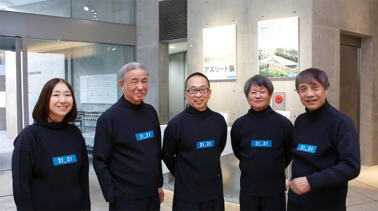
21_21 DESIGN SIGHT
3 notes
·
View notes
Text
在平面設計師的意識當中,需要同時具備中心和邊際,才能根據狀況,判斷進行中心或邊際的設計,抑或是必須介於兩者之間的設計。
0 notes
Text
Week 12 - Compulsory Question 2
My artistic vision as a student aspiring to become a Japanese-style graphic designer is to blend the elegance and simplicity of traditional Japanese art with modern design elements. I aim to create visually captivating designs that evoke a sense of harmony, balance, and minimalism while incorporating elements of nature, cultural motifs, and symbolism.
In terms of revising my vision statement, I might consider specific aspects of Japanese design that I want to focus on. My vision statement may also gain more content if I describe how I want to incorporate these components into my design process and use my work to communicate thoughts and emotions. I think my vision is well thought out overall, but there's always space for more improvement. To do that, I will approach my learning in various ways, including many parts of Japanese design, art, and culture.
Firstly, I have to gain an understanding of the techniques, aesthetics, and symbolism of traditional Japanese art forms such as sumi-e, ukiyo-e, and other classic styles. To gain a better knowledge of the context behind the art, I plan to immerse myself in Japanese literature, films, exhibitions, and art museums. I am constantly creating and experimenting with designs inspired by Japanese art, incorporating elements of nature, symbolism, and balance into my work.
Finding mentors or joining communities where I can learn from experienced Japanese-style graphic designers and receive feedback and guidance to refine my craft By combining these techniques, I want to build my own distinctive artistic voice within this alluring aesthetic and foster a comprehensive grasp of Japanese-style graphic design.

A Japanese-style minimalist poster design that resonates with me is one inspired by the works of Taku Satoh, a renowned graphic designer in Japan.
Studying his works helps me broaden my perspectives and refine my approach towards creating impactful and culturally resonant designs. His work inspires me and acts as a mentor for me as I work toward becoming a graphic designer in the Japanese style.
Here is a sample of the poster I created for my studio project:

"Pulse" by Rafael Lozano-Hemmer is an interactive project that combines technology and human connections. Participants place their fingertips on heart rate sensors as part of the exercise. The lights in a public area are then controlled by using this data to create a visual depiction of their heartbeat. The collective effect fosters a sense of shared experience and togetherness among participants by symbolizing the synchronization and interdependence of human rhythms.

I think this Connecting Practice with Society module teaches me that design is not just community-based. Its community-based nature aligns with my aspiration to create inclusive, interactive designs that foster connections and dialogue among diverse groups, promoting social cohesion and empathy in public spaces.
(Words count: 455 word)
Reference :
Satoh, taku|member|tokyo TDC (no date) Tokyo TDC. Available at: https://tokyotypedirectorsclub.org/en/member/taku_satoh/ (Accessed: 16 November 2023).
Pulse room (no date) Hemmer. Available at: https://www.lozano-hemmer.com/pulse_room.php (Accessed: 16 November 2023).
0 notes
Text
AGI Open Reflection
In week 8 I was fortunate to attend the AGI Open. The conference included many incredible designer from across the world that have greatly shaped the way I will approach new design projects.
First, Taku Satoh and his Hodo Hodo philosophy that shapes his creative process. From Satoh I learnt the value in minimal design, developing ideas that serve various functionalities but are created with the intention for longevity. While products at the time could be unexpected and exciting, after a while they are thrown away. When we stripe back and reduce the object we find greater value in the design.
Another designer that I resonated with was Liza Enebeis and her transparency with having doubt in your designs. I think as a student and being new in the industry it is only natural to have doubt in your creations and whether they measure up to expectations. However, Enebeis had a point of 'benefit from the doubt'. In saying that she taught me that when you know something isn't right or isn't quite there, the project likely requires more enquiry and diving further into your reasearch. This was a valubale lesson for me, in that sometimes if something doesnt feel right, it might mean you need to push the idea further and try a different direction.
Overall, the whole conference was a valuable experience that I learnt many many valuable lessons!
0 notes
Text
Week 11 - Creating the Collage
Objects
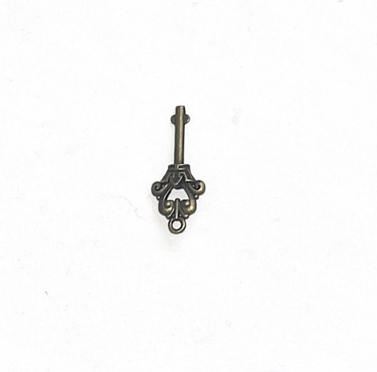
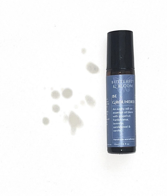
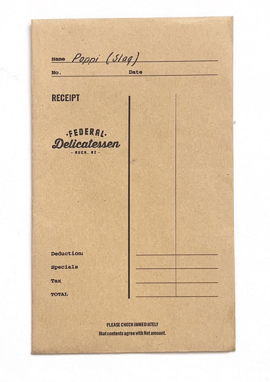
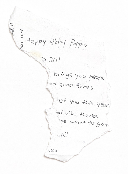

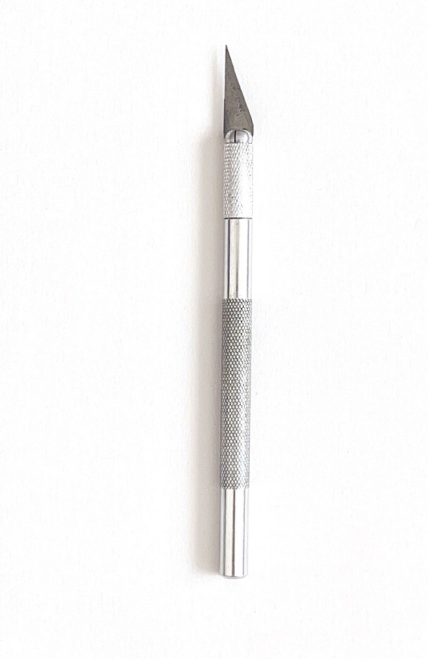

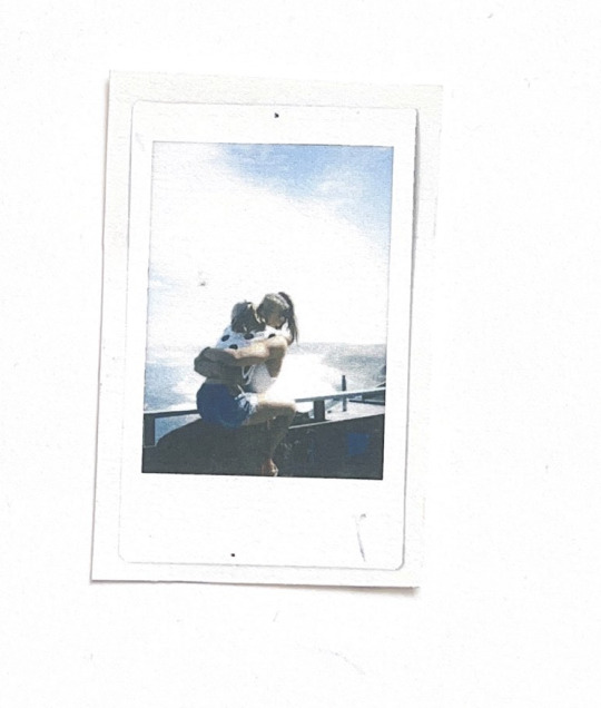


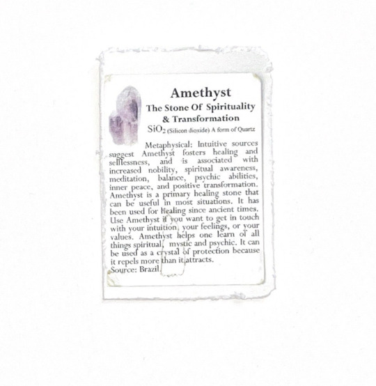
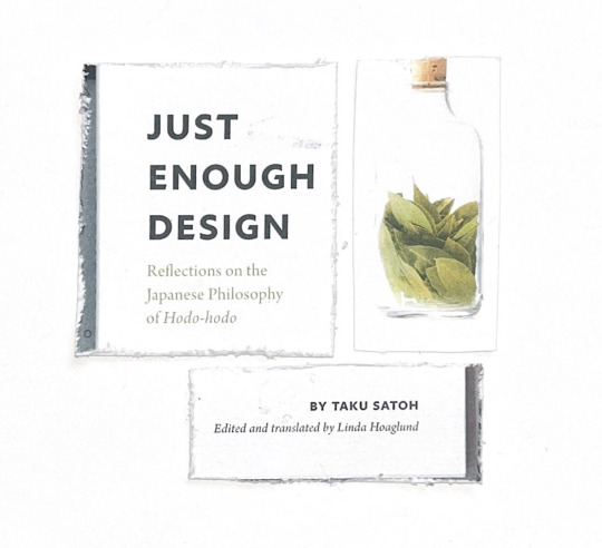
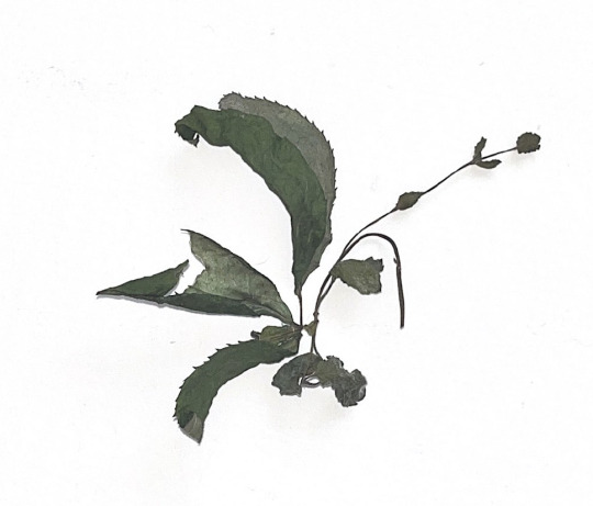
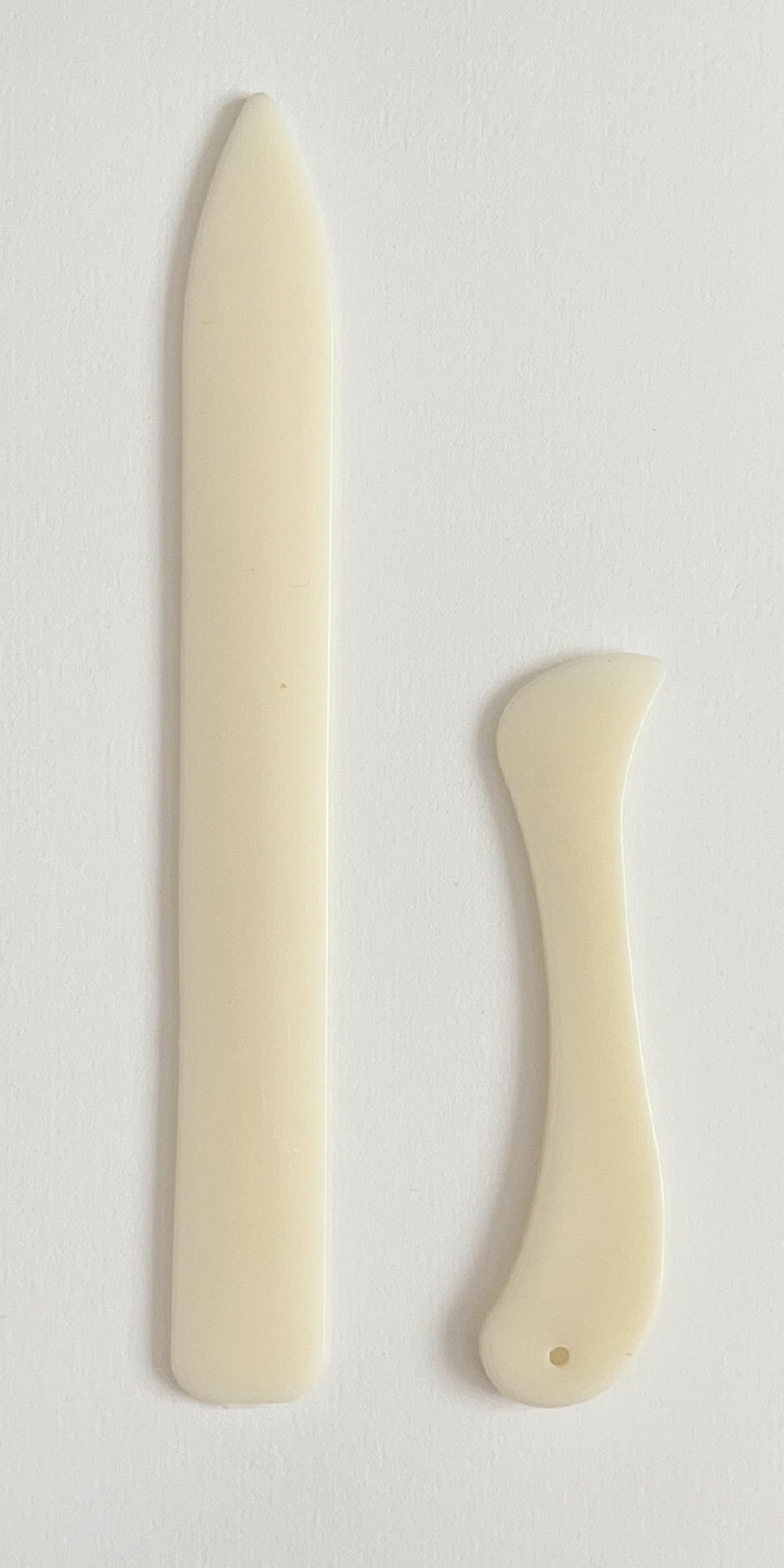



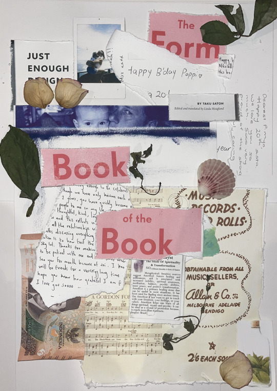
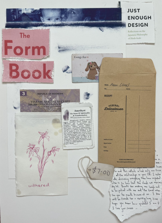
I have added over 20 elements because I am working with collage and could make a mistake or an object could not work with the composition.
Explantions for the objects I ended up using:
Thrift Tag:
Second-hand shopping is one of my favourite things to do in my spare time. The interesting thing about thrift is it provides opportunities. I buy clothing from thrift shops that I never would have bought new, even if it's at a similar price, just because of the concept of re-using.
Amethyst Card:
This card is from a wise old woman at the crystal shop in my hometown. I was always infatuated by her knee-length white hair and her extensive knowledge about the different stones. She introduced me to how I could use stones to calm my anxiety.
Just Enough Design book:
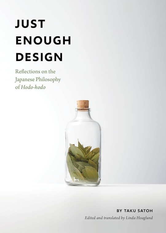
This is the first design-specific book I bought for myself. Taku Satoh’s ideology surrounding “hodo-hodo” (to not overdo) is a concept I keep in mind whenever I feel overwhelmed by the design process or outcome. The book is specific to me because I bought it the same day I listened to him speak at AGI.
Bali’s Visa On Arrival:
Travel has been a big part of my upbringing, my family took us to a different country in South-East Asia each year consecutively for 6 years. have always found an odd feeling of peace in the craziness. I have taken many
Sketch Book Extract:
I have scrapbooked and sketched since I began primary school. At age 5 I would entertain myself by cutting up different magazines and cardboard to create collages while my mum was busy with my little siblings. To this day analogue/scrapbook themes still show through in my design practices.
Gong-Cha Loyalty Card:
No deep underlying themes here. I love boba tea, I get one almost every day. Sitting in a cool space and being creative with a boba tea is my happy place.
5,000 Idonesian Rupiah
I included this note to represent my dream to live and work in Bali. The money represents my plan to set up a design studio and put Indonesian design on the map within the industry. I believe Indonesia has the creative potential to make an impact in the design world.
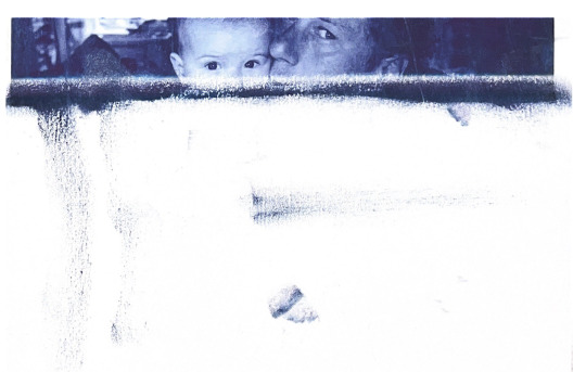
Messy Screen Printing:
This is an image of my dad holding me as a baby. I have an album of photos that only exist as physical images, meaning there is only one copy. This adds immense value and I protect these photos with my life.
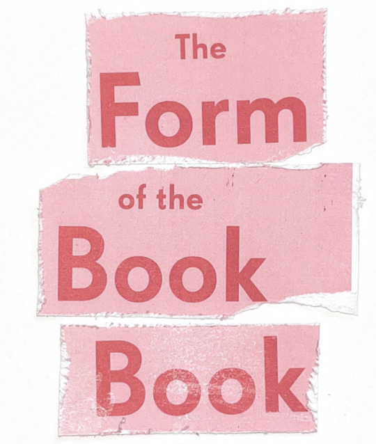
The Form of the Book Book Edited by Sara De Bondt and Fraser Muggeridge:
This is another book I bought at AGI. It explores the history of book design, how it developed and the way it is heading. I felt it important to be educated on the historical fundamentals of book design to remain informed when designing my own publications.
Birthday Notes:
I have kept every handwritten birthday card I have ever received, there is a massive box in my attic full of them. I am an emotional and sentimental person, and I cherish all the sweet words from my loved ones. I hope to make everyone proud with my design career.
The Federal Cafe Voucher Envelope:
This is my favourite old American-style diner/cafe, I love the atmosphere. This envelope holds the voucher my best friend got me. It makes me laugh because the name she calls me is written on the front. I considered scribbling it out for this poster, but I guess it's authentic.
Acrylic Paint Spots:
Painting is a medium I have loved for a long time. It started with realism oil painting classes when I was 8 and has turned more towards surrealism. My painting doesn’t tend to come into my design practice much, it is more of a hobby and something I do to wind down.
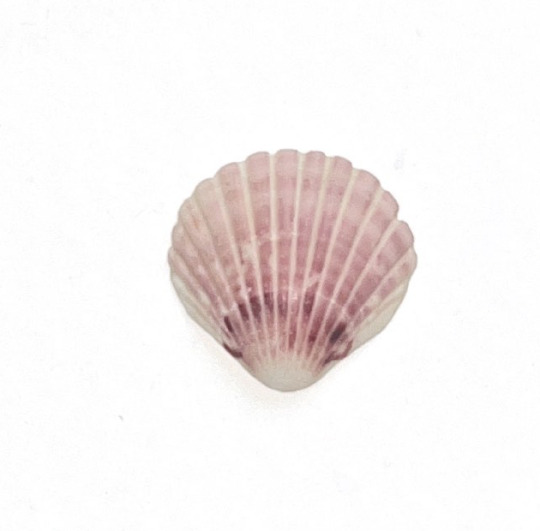
Pink Sea Shell:
I grew up in the mountains and only got to experience the beach a couple of times a year and when I did it was near impossible to get me out of the sea. My dad always called me “his water baby.”
Music Sheet:
My Nana was the first to hold me when I was born which she tells me gives us a special connection. She has a grand piano that she would play for my cousins and I growing up. She tried to teach me but I was never any good.
Polaroid Picture:
Photography is a practice I have engaged with since I was young. I have had many types of cameras; Cannon, film, and iPhone but Polaroid is my favourite because it produces a tactile picture. I like that the photos are not available digitally.
Brass Key
This key is simply for looks. My best friend/flatmate found a pile of these keys at her work, and she gave them to me knowing I would love them. I plan to make a necklace and earrings out of them.
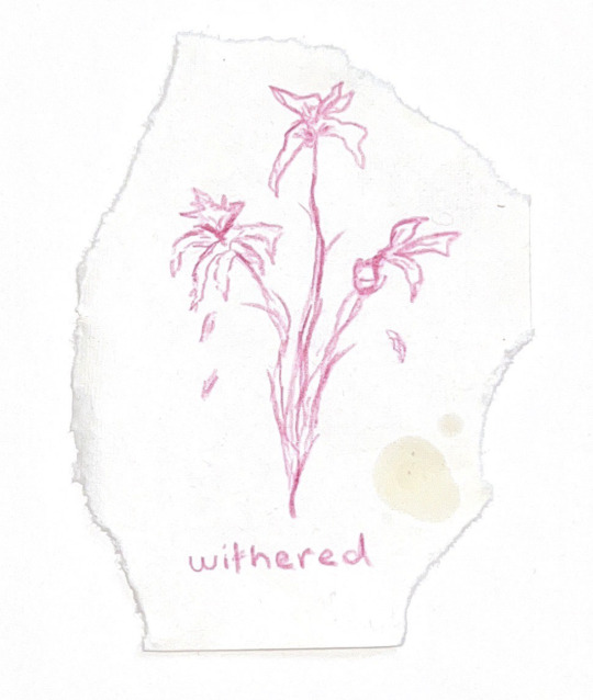
Dried Leaves
A creative practice I do often is drying out flowers. I do this for both aesthetics and sentimental value. In the same way, I collect letters written to me, I also preserve any flowers I receive by drying them out and creating arrangements.
Essential Oil
My mum was always into mindfulness and its practices. She always preferred natural remedies over pharmaceuticals. Even after moving out I still use essential oils and natural remedies to treat sicknesses.
Scalpel
This tool has been used for a wide range of projects but is most commonly used for my collages and cutouts for scrapbooking.
Silver Frame
I was given this frame the day I was born. It was my great-grandmother’s, it has been passed down two generations before it reached me. This frame is only to be used for pictures of family.
Collage Layouts:
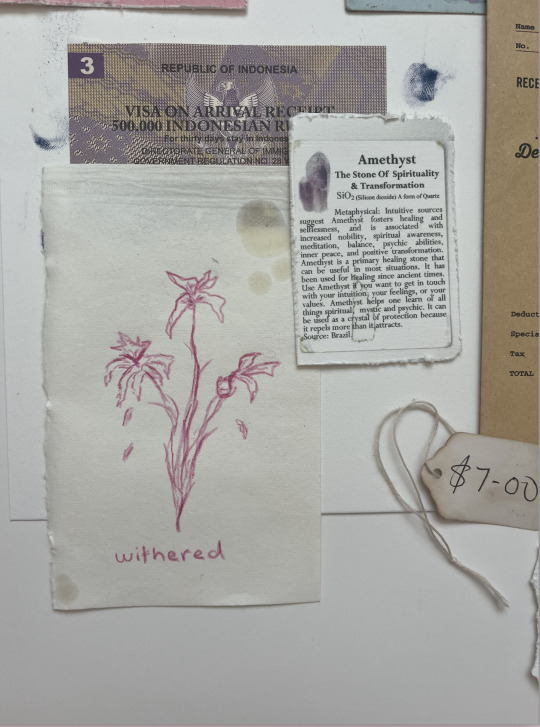
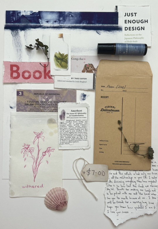
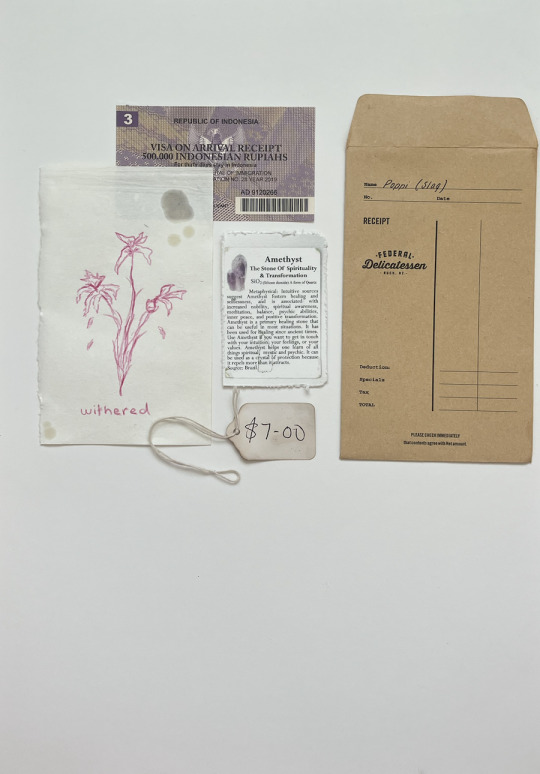
A more minimalistic approach to the collage

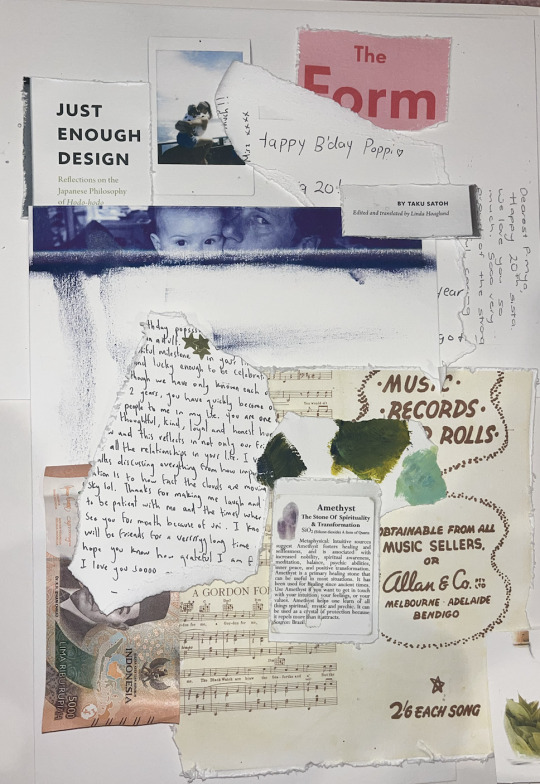
Busier layouts with more depth.

These are a middle ground between minimal and busy. They are quite linear and lined up horizontally.
0 notes
Text
Week 9: AGI Open conference
For me personally, the whole experience was amazing and it was a truly rewarding experience.
Taku Satoh One of my personal favourite speakers were Taku Satoh who spoke about "Just Enough" design - "Hodo Hodo", in Japanese. He said there is balanace and elegance when it is just right - using the chopstick analogy. The chopstick, surfboard and furoshiki share a commonality that they are just enough in its appropriateness and create elegance. He also said Hodohodoshows knowing when to stop, leaving room to resonate and encouraging other elements to shine.
Ahn Sang Soo I think this speaker was interesting in the way he approached design. He thought of design as many things, taking things out of the digital world, but really thinking it of as art. In his design institute, PaTi, is a place for students to be able to partake in Zens/yoga and finding that inner peace for design. He states "life peace symbol, connects people ad live forms, without live forms whether animal or plants we do not exist either. " I thought this speaker was very though provoking.
Kris Sowersby As I began to be interested in type early this year, I was quite excited for Kris Sowersby. He talked about the research phase in designing a Maori typeface. It was also interesting how he took a hypothesis of "what would Maori typeface look like from the beginning?", and with this hypothesis he began to research and design a typeface that consists of serif and sans serif.
0 notes
Text
AGI
a
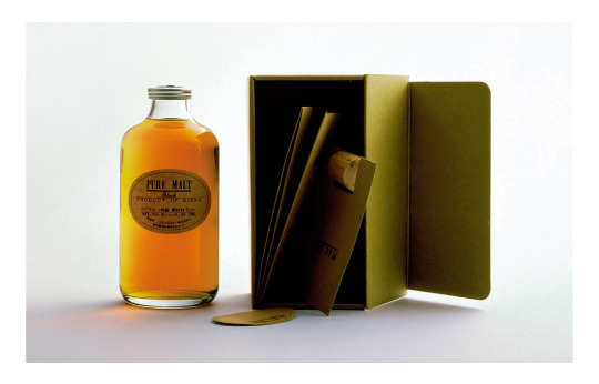
Taku Satoh's talk was one of my favourite from the AGI Open event where he talked about Hodo-Hodo, just enough design. The Malt Whiskey bottle design project that he introduced was particularly interesting to me. He quotes, "The more unique the shape, the faster it becomes trash, it's just an empty whiskey bottle." But with a stripped back simplistic yet beautiful shape, it is more likely to be reused because it is simply more reusable.
Foreign Policy Design from Singapore.
Kenya Hara is a Japanese designer famous for designing the Muji design system, a member of the Japan Design Committee along with Taku Satoh, and a lecturer.
The project, Architects' Macaroni he talked about was interesting to me and gave a good insight into his philosophy and the roots of his minimalistic designs.

a
Stefan Sagmeister:
I studied Sagmeister for the M&M paper the very first one in the first semester of my first year. I remember reading the interview on his website, particularly the section where he talks about beauty, and it felt so familiar and helped me make sense of what I felt about creation. It was bizarre hearing him talk about it in person and it reassured me of my idea of beauty.
Some quotes from the interview that were interesting for me:
"I very strongly believe that the sole pursuit of functionality often leads to work that does not function at all, the public housing projects of the 50ies and 60ies being a prime example: The goal was to house as many people as effectively as possibly resulting in projects that were not fit for human habitation, - they needed to be torn down again 20 years later."
"Beauty is a fantastic strategy when it comes to sustainability. Just look at the Pantheon in Rome, 2000 years old and it is still there, in use, because it is so incredibly gorgeous that no generation had the heart to tear it down. "
"And the wonderful romantic Theophile Gautier even postulated: "Something can only be truly beautiful when it has no function whatsoever. Everything that's truly useful is ugly. The most useful room is the house is the toilet"."
"Richard said very matter of fact: “The purpose of art is to have no purpose.” He also went on to say that a good artist creates a distinct, personal world, and that we, as an audience, are allowed to look into this world, compare it with our own and expand our view."
0 notes
Text
Week 8
AGI Conference:
For our first week back I was unable to attend class as I was at the AGI conference, this conference was very informative and inspiring and taught me a lot that not only helped me as a designer but also specifically for this class.
One of the stand presenters was the first presenter of the first day Taku Satoh. Taku Satoh is a Japanese graphic designer born in Tokyo. He graduated in 1979 from the Tokyo National University of Fine Arts and Music in the Department of Design. He completed his master's degree in 1981. In 1984 founded the Taku Satoh Design Office after working at Dentsu Inc. He talked about the concept of Hodo Hodo, which is the idea of being just enough. He speaks about this through his designs, talking about how good design doesn't always have to be complicated or over the top, it can be just enough and still be just as adequate. I thought this idea of being just enough is something I struggle with - often stuck with the idea that more is better, but it was really insightful and something I want to keep in mind when creating my poster.
Feedback:
The first week back we also received our formative grades on Canvas and the written feedback from the lecturer. Below is a screenshot of mine.

Having had peer feedback already from my actual formative I was able to start working and improving on some of the feedback I was given, so for now I need to work on solidifying a theme and how I can portray that visually while still staying true to myself.
0 notes
Text
AGI
I got the privilege to go to AGI. It was such an incredible event to go to, I gained a wealth of knowledge. here are some snippets of what i learned that can be applied to life and design!
Taku Satoh
"Hodo Hodo" means just enough, having simplicity and special consideration. About knowing when to stop, not overdoing it to let other elements shine. Taku was one of my favourite speakers he was concise and to the point and I loved this line above.
Astrid Stavro
keep learning by asking questions and being curious. Don't take the money but do what you love. Challenges are opportunities in disguise. Mistakes lead to unexpected places. Never stop learning. Do work that's true to your heart, embrace the uncertainty, and leap before you look. Curiosity is the engine and doubt is the catalyst.
' if you feel safe in the area your working your not working in the right area. Always go a little bit further in the water than you feel your capable of being in. Go a little bit out of your depth and when you don't feel your feet are quite touching the bottom your just about in the place to do something exciting'
Irene Pereyra
Doing things different is better than doing the same. Sell something new make it familiar, sell something familiar make it surprising. Its important to spend time on projects you love as this will continue the passion ( set aside 10% to do your fun things).
Henrik Kubel
Have a very clear brief
Paul Garbett
Create and bring something into existence, we create what we observe. Pay intention without paying attention. creativity is connecting ideas and then connecting with people.
Dean Poole
He makes meaning of every single detail and connects it with his customers. Design can just be about people and place a way to sell stories rather than sell. don't overthink design just do it.
Ahn sang Soo
Create joy in other peoples lives through design. Have a hungry spirit, thinking hands and human enhancement. Creativity stems from our heads and technology takes away. We often hold our head in high regard and despise the body but we need to respect the boy in the creative process. Play with creativity that comes from pleasure impulse.
Pauler Scher
Create seasons and series instead of individual work- create a system out of things that seem iratic. Create a design that's fast, loose, dangerous and fun! For everything you do create systems and brand manuals. Find something you like and take the opportunity and go for it.
Stefan Siegmeister FAVOURITE SPEAKER
A lot of his work comes from living in Rome and having dinners with other artists. As a communication designer, you must be aware of what's going on in the world. Look at the problems this world has of doom and gloom and do something to help. Every positive outcome will have negative side effects and we have to work on them this is just a reality. Every idea has a dozen to make a series. It doesn't matter if you are an artist or designer it matters if you speak and communicate - he gives deep reasoning behind his work and wants to connect with people. He uses random things he's passionate about such as coffee ( he has 13 cups a day). His slogan and mission statement is 'Now is better' Look back and see how far you've grown and how far we have grown as a world. With things that could be a big obstacle, he uses it to his advantage. He encourages art to be a conversation starter. For people who cannot afford art, he created a giant poster notepad and they could rip it off and take one home for free. He isn't out to get but to give back and make the world a better place. 90% of people 200 years ago lived in extreme poverty look where we are today, always look at the glass half full, and look at the long-term picture - it's about your perspective. The world can be improved. Now is better.
Lars Muller
Ensure consistency and structure in your work with grids, books are objects so consider all aspects such as size, weight, and texture. I loved this quote ' White is the colour of imagination, everything and nothing, a place to draw inspiration from and start afresh'. Think outside the box and look at other materials you wouldn't usually consider (concrete-covered book). Don't be afraid of colour.
Ya-Leng Yu
If you ditch tradition or history you can't relate but if you cling young people can't embrace it. The new encompasses the old. Use aspects of the product (roof shape) as inspiration to create a contemporary approach to relate and connect to history in a new way. Collaboration is at the heart of design.
Panel
have a cretain amount of time to do your passion projects and play (15% is good! - as a student it should be 100%). Designers don't retire. Do projects that make you look at the world different.
Kenya Hara
make things unknown and think outside of the box. Have the art of simplicity. Good design includes function and laughter. Respect the nature and land in your work.
Stanely Wong
it's not about exhibitions or achievements, it's about the journey and the relationship of pen to paper, time and existence. Ask 'who am I?' 'What is my image?'. He is a Buddhist and a lot of what he does stems from this but he is not invasive with it. He works on projects aligning with his values, culture and spirit. Every project he creates there is a key value at play. He encourages to make a poster a week and make a personal project 80/20 rule. He tries something new when he enters a new season of life. his seasons are based on what he learns. Passionately curious creativity is values and time and your past.
Ariane Spanier
Confront the unknowns head-on, and embrace it it is our job. There are known knowns, known unknowns, unknown knowns and unknown unknowns. make decisions, start with what you have or you'll run out of time. Try for impact. Quote I love ' Have the love for drawing first, it is the first language, typography is a drawing". Create the space to play and the result for people to enjoy themselves its awesome if you can make a story out of it. People love drawing and feel connected - involve people for connection. Uncertainty can open the crack in the wall which you can emerge. use the uncomfortable feeling as a compass - leave the last known behind you and find the new unknown.
0 notes
Text
AGI - highlight speaker
Taku Satoh - Japanese designer (graphic, product, moving image)
Hodo Hodo is a philosophy on not over complicating things (just enough). To put it simply it's the same as KISS (keep it simple stupid). The example that he picks are chopstick and Furoshiki (type of fabric). Chopstick is simple utensil, yet more versatile than a fork. The chopstick also follow Hodo Hodo philosophy, the end of the chopstick is tapered, which make you eat slower and mindfully. Furoshiki is one of the common fabric in Japan which seem like a normal piece of cloth, but it could be used in many ways. Most common way to use it is for wrapping, packaging or as a bag, other uncommon uses are decoration and fashion.
Culture, hobby & passion. Satoh have a hobby of surfing, he compare design principle with his hobby. "Surfing teaches you to not always be in control. Surfing teaches you to be one with."
One of his product and packaging design is a whiskey bottle and label, he choose to go with tropical shaped bottle instead of complicate and fancy one (uniqueness does not always translate to usfulness). The label in stick on the bottle with wet glue which could be wash off and reuse the bottle for other purpose.
Irene Pereyra - UX designer
You does not have to always follow the design principle, breaking convention lead to more engagement
Some that may apply to the Pattern and Motif Museum (only those would be elaborate in detail)
unfamiliar - To sell something new make it familiar, to sell something familiar make it surprise. In the museum setting most website are in black and white, which doesn't give a sense of belonging to places. She has design one of the website for Hong Kong museum, reflecting on the vibrant, neon city she pick 7 vibrant colors for the website.
Is appearance lead - From the testing that she has done the majority would pick aesthetic over usability, we are more bias to believe that attractive products are more usable. One of her design reflect on this result which is a NU:RO watch. The watch is describe as a minimalist analog watch with hourglass icon in the middle. The watch has 2 dials, the one on the top is hours and the bottom is minutes, the dial would rotate and show the current time inside the hourglass.
get in the way (interrupt) - Sometime the website should not be as smooth, it should reflect on the topic. The example would be 'timeduringcovid19.com', which is a survey but you have to scroll through the tunnel of complains.
relocates complexity
take afford to learn (learn as you go)
cant be measured
address my need (only8.org)
Brian Collins
0 notes
Text
W8 - AGI Open 2023
On Monday I had the privilege of attending the Alliance Graphique Internationale with a free ticket from AUT! This was a super exciting opportunity and I walked away from it with lots of insights and ideas (and freebies). Below are the notes I made for (most) speakers, a well as some highlights which I will expand on further:
Day 1 - 18/09/23
Taku Satoh
Hodo hodo - just enough
Balance and elegance when just right
Furoshiki
Everything in moderation
Knowing when to stop
Leave room for things to resonate
Water-based glue
Changing the rep of chewing gum so packaging design cannot look like gum
Astrid Stavro
Leap before you look
Curiosity and doubt
Eli wiesel
Interview magazine
Penguin education - type as image
Grid notepads
Fear and making mistakes
Dont work for money
Azimuth festival - saudi arabi
Keep it simple stupid
Starting over
Irene Pereyra
Anton & irene ux
To seel something new, make it familiar and to sell something familiar, make it new
M+ museum - hong kong
We judge usability by its beauty and aesthetics
Atm interface study
Aesthetic usability effect
We dont mind making the effort
Shantelle martin
Henrik Kubel
Important to have a clear brief in kahoots with client
Paul Garbett
Seeing things book
We create whatever we observe
Paredolia - seeing faces in things, seeing meaninful images in objects and patterns
Presence - paying attention with intention
The act of observation is an act of creativity
Dean Poole
Nz’s elemental nature
Raw sophistication
Humanism
Culturistic rituals
Meaning in materials
Doesnt have to be loud
Design is about making decisions
Diecut leaves
Tracing shapes in landscape photography
Southern hemisphere snowman
Good shit soda
Ahn Sang-soo
Gaphis magazine
Anthropocene
PATI - students are taught to design their own lives and let their lives be completed by design
Pur ideas should stem from our hands
Elongate design by bodily experience
Just play!
A flower flourishes, spring comes
Alejandro Paul
Roma cafe in buenos aires
Balneario
Inspiration - travel - photography
Varietta
Rigatoni - bodoni
Sudtipos design agency
Paul Boudens
Fun is fundamental
Eddie Opara
The landcape, origin, history, life around really is what egins a bespoke desing process
Rectilinnear
The Joslyn, scott Pavilliam, hawks
Each building only uses the typeface desinged for it
Also desinging glyphs for omaha-ponca - native american language of the region
Animations
Regenerative narratives
Book Showcase
James Goggin
Ubi sunt
Titus kphar ted talk
Redaction.us - free typeface
Irony of this typeface being used in the legal system - unauthorised
Book is soft-bound bc hardcover still considered contraband in prisons
Cold glue vs hot glue
Minmin Qu + Qian Jiang
Stuart Geddes
Need to take advantage of books that are thick enough to write sideways on the spine
Jumping He
Carpets from art
Designing the life cycle of a book - another reading
Arch MacDonnell
Inhouse design
Books with john reynolds - “cloud of new zealand language”
Climate change - apocalypse o’clock
I want you to panic
Nikki Gonnissen
Thonik
Phil bloom - first naked woman on int. Tv
Inspirational women
Day 2 - 19/09/23
Paula Scher
marking something recognised + understood
silk-screen theatre posters
Public Theatre
page of scribbles - type made from scribbles
'banal'
digital, moving billboards
dingbat/scribble 'library' to use in system
find something and run with it
Stefan Sagmeister
the critic with bad news is seen as smarter than the critic with good news
embedding blocks of statistics in old paintings
mosaic insects on bike path
kids' hospital tunnels - Toronto
Now is Better - book
design should have a function
Lars Müller
Super Normal - book
sensations of the normal
Thomas Widdershoven
Thonik
the power of design
social
strategic
experimental
best iconic building award for their studio
Yah-Leng Yu
how do you get people to come into your museum?
look at the city - what do people like doing?
drawing the people of Singapore like to shop, so give them something they can shop for
what makes something look childish?
Kris Sowersby
Matarongo typeface with Johnson Witehira
Tatai Kapu Toi = typography
type is so subtle
distilling the essence of a rich culture and history into type
glyphs = wh, ng in cap-cap, cap-lower, lower-lower
Jonathan-Castro Alejos
Peru -> Netherlands
Panel
nomads set free + being a tourist
taking on international clients
cultural sensitivity
global climate
global market
country's politics
country's history
balance between corporate/client projects and projects that we do for ourselves
making money vs making things that make you happy
student = authenticity, purity
graduating = getting corrupted
how to stay relevant
where would you go first upon landing in a country where you don't know anyone and you don't speak the language?
Kenya Hara
'un-know the world'
using squares + circles to make sense of the universe
Re Design - daily products of the 21st century
long-life design
becoming
visualise + awaken
rhetorical figures
fruits disguised as other fruits
make things unknown and visualise it
muji
"frugal, but not feeling inferior to luxury"
muji 'concept' applied to other things
humans + cleaning
global vs local
"architecture must be the interpreter of the richness of the land"
cream knit turtleneck with yellow edges -> like working military gloves
mango (clothing brand) book
Stanley Wong
AnotherMountainMan
MTR: 'there are some things in life you can always count on'
Asaba's Diary - posters!
self-talking
"time will tell" - Einstein
creativity x values x time
Ariane Spanier
known knowns
known unknowns
unknown knowns
the free brief
feelings mixer app - Heavy Mental
colour
Fukt magazine
having facial blindness and drawing portraits
Highlights
It was really neat to see how real designers are always using what they know and what they are good at to influence their design process, no matter if it is a commercial or personal project. It was comforting to me to see that there doesn't always have to be this immense pressure to try something that you don't know anything about, or that you aren't good at, just for the sake of going out of your comfort zone. Although this is useful and can really expand a designer's horizons, it is not always necessary to be uncomfortable at all stages of a design process. Drawing on your interests and strengths is also a good way to create a successful outcome.
The calibre of presentations were top tier - they were engaging and 'guided your eye', and embodied all the tips we go over in class, such as limiting the number of words on a slide.
I was pleased at how this international conference still allowed for freedom of the hosting country to incorporate any necessary traditions or honours that are encouraged in that country. The conference opened with a Mihi and Waiata, which communicated to me that it was important for Alt Group and AGI to create a safe Māori space.
Kris Sowersby's talk was a huge highlight of mine. He broke down a new typeface that his is collaborating on with Johnson Witehira, called Matarongo. It was fascinating to see their process (iteration on iteration on iteration), right from the deep, rich research they did through to the varied typefaces that were created. So many things were considered - lower/upper case, sans/serif, extra glyphs, etc. I found that I gained a whole new appreciation for typography through watching his talk.
0 notes
Text
AGI Open
I was lucky enough to get the opportunity to go to the AGI Open that was held in Auckland during the 18-19 of September.


Taku Satoh -Just enough in design - HODO HODO


Astrid Stavro - Some quotes that Astrid said that I found super inspiration. She was one of my favourite speakers. Constraints are a leeway to design - they can lead to surprising and unexpected results. It is the engine to put imagination - curiosity. Also really liked her work 'Interview magazine'.
Paul Boudens


Paula Scher


Stefan Sagmeister


Jonathan Castro Alejos


Kenya Hara
Extremely grateful that I was able to go and see all these worldwide famous and listen speak about their practice and being in the industry. Many had very insightful things that inspired me towards my final year project. And I took photos of ones I enjoyed the most.
0 notes
Text
我發現怪東西的真正魅力,僅是在怪店內的時間還沒法感受充分。我必須將這些怪東西擺在身邊,慢慢欣賞,慢慢感受,慢慢思考自己究竟為什麼迷上這件怪東西。
0 notes
Text
AGI OPEN @ AOTEA SQUARE NOTES
Below are the notes I took on each speaker when I had the privilege of going to the AGI event. The star beside some of the names were my favourite speakers and so I also went and found some images online of their work that I enjoy.
TAKU SATOH *
TSDO website. HODO HODO = just enough. Gerry Lopez— surf realisation is designed by him. The ecological approach to visual design. A piece of cloth by Taku Satoh. HODO HODO design / just enough design. All things in moderation. Pure malt whiskey design. The more unique the shape the more quickly it’ll become trash. Reflective design rather than assertive. 21_21 design site gallery.

ASTRID STARVO
Interview magazine inspiration. Grid notepad maker based on influencial design books. Kiss— keep is simple, stupid.
IRENE PEREYA *
UX design specialist, website + user experience. M+ museum site designer. Thonix did the brand design / design identity system. Shantel Marleen? Meditative line drawing playful website designed. ‘One shared house’ website lesbian commune house epic. Inspired by where in the world is Carmen San Diego. Their design studio is called Anton & Irene.
1. Good UX can be unfamiliar.
2. Sometimes good UX should be beautiful first. We are biased to believe a more beautiful product works better.
3. Good UX does get in the way.
4. Good UX relocates complexity.
5. Good UX should be learned.
6. Good UX cannot be measured.
7. Good UX addresses my (the designers) needs.

HENRIK KUBEL
A2-Type. Designed Rail Alphabet 2 — designed for signage for railway stations.
PAUL GARBET *
Curiosity and optimism and empathy driving design. We create whatever we observe, the act of observation is an act of creation. Seeing faces in things is called pareidolia. Author of seeing things.

MICHEALA WEBB
Inbetween posters— working with First Nation Australian artists and designers.
DEAN POOLE
Alt group. Designing for Fisher & Paykel appliances. Design has to be present and keep stories alive. Designer of good shit soda. A hole poster is really cool.
AHN SANG-SOO
Designer of the life peace symbol. Korean designer. Life peace diary with iterations very cool. Pati design school is made by him / designed as well. Pati’s motto is “just play!” + “be spellbound!”. He’s kind of awesome just working and making a school in the pursuit of harbouring happiness, making new rules, changing things up.
ALEJANDRO PAUL
Calligrapher + Typographer. Very cool decorative font like Atelier Volatire + Varietta + Rigatoni + Fixture + Tinkuy. All very very cool I’ll look into these. Key Mono Asciii Art maybe Stephen should know this. Sudtipos type design studio.
PAUL BOUDENS *
Fashion and graphic design mix work on publications and posters, red is favourite colour to use. Started at Walter studio doing design for fashion design stuff. Number A magazine designer and creator.

EDDIE OPERA
Omaha performing arts designer. Apart of pentagram. Designing The Joslyn museum brand identity system. Made a 3 new typefaces based on the three forms of the three main museum buildings, the joslyn, the Hawkes, the Scott.
BLACK GRACE
Awesome performance with graphic movement tracking. Moving Tapu cloth.
PAULA SCHER *
Pentagram designer. A brand is an amalgamation of things. Designing the brand is just working on how it’s perceived. Graphic Design New York she has work in it and it looks cool. She became a play poster designer for the Public Theatre. Designing for each season of plays. Posters and systems as a whole and not just individuals. Systems in the erratic. Custom Knockout font design where the fonts could be edited in relation to each play. Very cool!

STEFAN SAGMEISTER
We are programmed to enjoy negative news. Designed data visualisations into old paintings to show how much better things have gotten. Also clothes that represent the data very cool! and water glasses. Hospital hallway design. Very all about optimism and spreading happiness. Made a book talking about those data paintings.


LARS MULLER
He is a publisher mostly. “The book is the only printed matter that is meant to last”. Books are a 3 dimensional object. The cover is what makes the book remembered. Uses simple design but the material and details make it intricate and interesting. Uses cement as a cover once also lots of subtle embossing used. Back cover matters too because of the ability to feel the back when you hold it which is much more likely to be touched than the front cover so the back is not to be dismissed.
THOMAS WIDDERSHOVEN
Leader at Thonik. Designed museum Boijmans inspired by the font and Mexican olympics design by Lance Wyman. Designed their building also inspired by these ideas alongside an architect. Made the book “why we design”. @studiothonik.
YAH-LENG YU
Designer of house facades in Singapore under this brand ‘Figment’. National gallery in Singapore design.
KRIS SOWERSBY
Klim type foundry person. Big font and typography maker, inspiring letter forms from Māori culture. Researching older more traditional type treatments to make digital and modern. Fonts Ata and Atakau. Works with Johnson Witehira too on this.
JONATHAN CASTRO ALEJOS *
Traces and Dirty Listening. Interested in the idea of printing noise. Archiving of traces or grafitti in the city. Traces of people left behind. Designing viynl covers since it goes into the idea of sound and noise as a physical mark:


KENYA HARA
Designer at Muji. The world is organic but mankind designed everything square. RE design project where he asked designers to redesign a bunch of 21st century products. Thinking fresh and new from anything we’ve ever seen before. Global becoming important also means the importance of local also increases. High Resolution Tour. Takeo paper show. “Make things unknown and then visualise them”. Gathering peoples attentions by emptyness.
1 note
·
View note
Text
AGI Conference
Reflection and Notes:
Firstly, a big thank you to everyone involved and those who gifted the tickets to me and my fellow students. It was my first design event and it did not disappoint at all. The lineup of speakers and panels was excellent and all amazing designers or creatives. This event introduced me to so many names, people and studios that I never heard of before, from international and local areas. They also showed such a rich and amazing collection of design works and contexts that I could never come across all in one place. The experience was one that I'll remember for a long time, and will hopefully guide me into my future design and creative endeavors.
Some overall points and tips that stuck with me and most of the speakers agreed upon was that you need to have an open mind when designing, and be able to express yourself through your work somehow. I.e. some designers had side projects that are self initiated, while others have clients that allow them to express their passion into the projects.
Stefan Seigmeister:
The speaker I was most looking forward to was probably Stefan Seigmeister because I have seen his work the most and came across him in year 1 already. He has a very clearly unique design style and collection of work which drew me to him. His talk was also very inspiring. He talked about a current project that shows statistics from the past few hundred years to the present day, and how it shows us the positive change that has already happened in the world. This does not excuse the bad things that happen in the world today, but is to appreciate what we have now, and to show that the world has changed in a positive way already. He also made a very interesting point that people are drawn to negative things. People are more likely to read a newspaper filled with bad news, compared to good positive things, "Its just more interesting". This can be directed into our design thinking and planning for projects. Do I want to use this to my advantage and design something depressing so that it is more interesting or do I want to bring a small positive moment into their life etc.. His talk got me thinking about things like this and how I can apply them into my current and future works.

Taku Satoh:
Satoh was the first speaker of the event. He was very friendly and genuine and did a great job introducing us into the conference. He made some really interesting points on product design and tips that I can directly relate to for another course and my future design works. He showed an example of one of his own works for a whiskey bottle. The thinking behind the design was that the bottle has a basic and unoriginal form so that it may be reused around the house instead of thrown out and create waste. This idea relates really well to a current project designing a membership box. I have left it the box blank and rather simple with only a cutout resembling the logo, so that it may be reused and repurposed. This idea of repurposing can and should be used more often around product design to reduce waste.

Irene Pereyra:
Irene is a UX designer but had many very interesting points that can be carried across to graphic design. Firstly, a big point that she made, which can be quite contreversial, is that beauty over function. Her reasoning behind this is that when something is beautiful, people are much more forgiving if it doesn't function as well. Ofcourse people have a limit, so it does need to function as well. but beauty should be at the forefront. This idea makes a lot of sense to me. This can be applied almost anywhere in the world, throughout many different categories or areas. Another example, if someone is beautiful, people are much more likely to give up their seat on a bus for them over someone who is considered unattractive. This concept should be considered while designing something, whether it be considered usable or not.


Honorable mention: Paula Scher once said " brand design is making something recognisable,.."
0 notes
Text
Week 12
Poster Layout
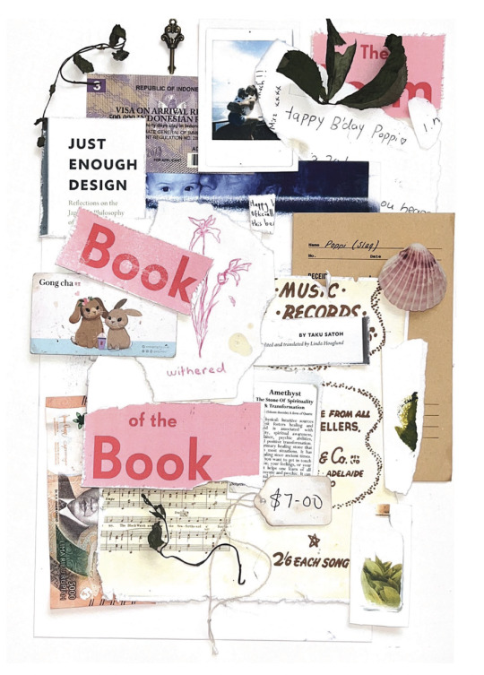
Choosen Collage Layout
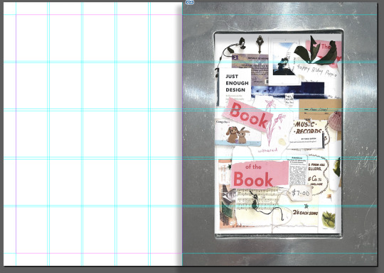
I chose this layout because it is the most balanced. I decided not to go minimal with the collage because it made it too difficult to fit all the elements in. I will have the other side of the A2 poster minimalistic to allow some space to breathe (hodo hodo Taku Satoh.)
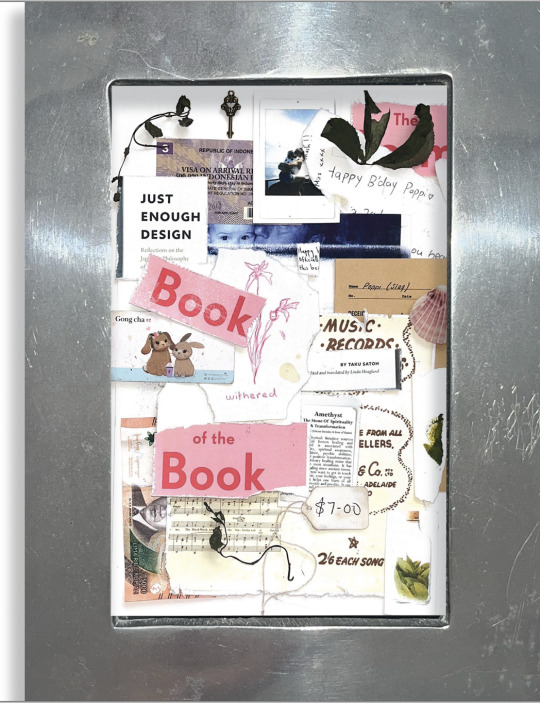
There is only 19 elements within the collage because the final element is the frame that this collage is going into.
The frame is a family heirloom passed down to me when I was born. Putting the collage within the four walls of the frame is a way of showing the strength of my connection with my family, and I remember that nothing within the frame would have any relevance if it was not for them as they are the people who brought me into this world.
Visually I also love how the tough, sharp and heavy metal frame contrasts with the softens and flexibility of a paper collage. I have talked previously about how I love to contrast two things because they bring out a different kind of beauty in each other when paired together.
I did not want the frame to sit flat so I added a drop shadow to continue the depth and concept of working analogue. I actually wanted to frame the printed A2 poster, but the brief did not allow this so this was the next best option.
Editing in Photoshop:
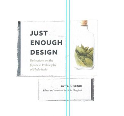
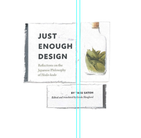
Brought down exposure slightly to bring the element off the page a bit more and stop it from being lost in the background.
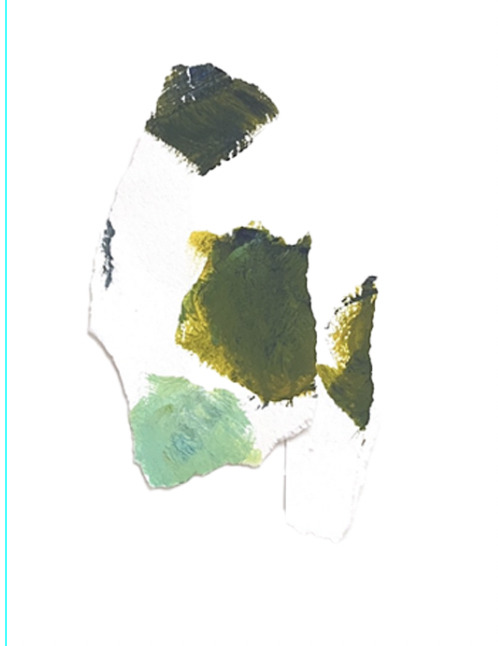
Brought down exposure slightly to bring the element off the page a bit more and stop it from being lost in the background.
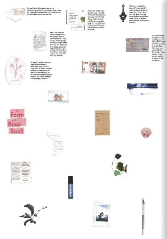
I tested using digital type to explain each element. But it just does not work with the nature of the poster. Everything is 3 dimensional and the flat digital text just looks wrong.
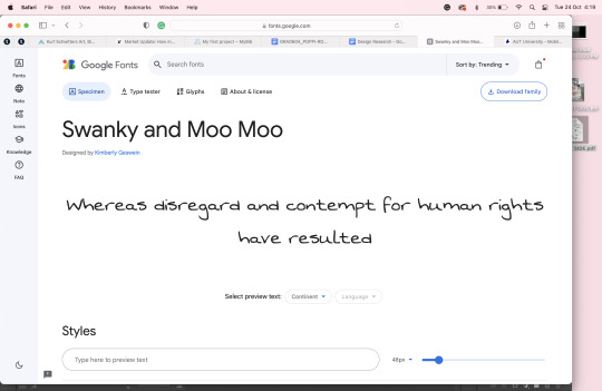
I also tried handwriting but my writing is just too messy to read. So to keep on theme but still be functional I found the typeface most like my handwriting and used that.
0 notes