#THIS WAS VERY DIFFICULT. the lineart is so thin and the lighting was tricky to replicate!!!
Explore tagged Tumblr posts
Text

oh man I loved this scene it was so lovely how they showed simon hanging out with his old friends from before he was freed of the crown. right. right <- the wishful thinker
screenshot edit!!!! ahhhhh ahhhhhhhhhhh!! save me!!! original under cut

#simon petrikov#life giving magus#magus adventure time#adventure time#fionna and cake#simon adventure time#simagus#maguskov#ancient sleeping magi of life giving#screenshot edit#I REALLY LOVED THE ORIGINAL SCENE!!!!! I just also really wanted to see simon hanging out with old friends#listen. there is enough room on that machine for two. it is fate or something I've decided#atimers#adventure time fanart#THIS WAS VERY DIFFICULT. the lineart is so thin and the lighting was tricky to replicate!!!
51 notes
·
View notes
Photo
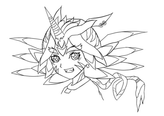
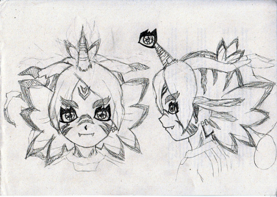
Happy birthday to me. /o/ And that’s the first and last time I mention it in this post. I don’t care and you shouldn’t either—I just want cake.
FubuGabu is back! Not by popular demand because, well, no one has asked for it, although the feedback I got was lovely. But, hey, I had this material ready, so might as well do something with it, lame as it might be.
These are some early and not-so-early doodles of FubuGabu. The latter was pretty much the base of the final design, but the former… that’s from 2014 or something wild like that. I actually had many more doodles and concepts, but I hated them all so much that I erased most of them. I’m surprised I could save that one. I might have kept it because it was a full lineart, I guess. In any case, I’m glad I could find that much.
Since it’s fitting to do, let’s talk about FubuGabu’s design today! There’s a lot to talk about, but my memory is awful, so I’m sure I’ll forget about some things. I hope it won’t betray me too much.
Anyway, as usual, more under the cut.
Well, well, well. Ain’t this boy one little shit. Fudou gave me nightmares. Kidou is still giving me nightmares (to the point where I’m considering changing the idea I’ve had for around a year now). Someoka was awful to draw and make sense of. Max’s tail was awful to work with. But Fubuki? Fubuki is on a whole different level.
Let’s start by talking about the final design, since that’s the better one. Not even good, just better. That’s an epic victory as it is, so who cares.
FubuGabu’s design, as the reference sheet and my last post states, is not based on Gabumon, but on Gabumon’s line. What this means is that it has elements from (almost) every single one of Gabumon’s evolutions. Just for the sake of satisfying people’s curiosity, namely @IshidoShuuji’s, I’ll list the different elements here, since that’s the easiest and most straightforward way to explain it:
Tsunomon: eyes, colour of the face.
Gabumon: horn, face stripes, teeth, hair ears.
Garurumon: eyebrows, pretty much all of the hair, hair tail, forehead marks.
WereGarurumon: nose stripes, pretty much all of the hair, earrings, eye scar.
So, no, MetalGarurumon, Punimon and Omnimon/Omegamon aren’t part of the design. …Or are they?
Just kidding. They are not. ww But you shouldn’t rule them out just because of that. Well, no—rule Omnimon out. There will be no Agumon miximax, so that isn’t going to happen. I don’t want to keep people’s hopes up for nothing. I made it pretty clear from the start that I wouldn’t use a franchise twice, but I bet most people don’t know that. So, yeah.
Now that I have broken down the elements, let’s look at them from up close. This is truly a difficult design to understand, so I’ll get the explaining done as I move along.
Let me start with Tsunomon’s part. I used the colour of Tsunomon’s skin because it looks human: I didn’t want to turn Fubuki into a furry—I mean, have him all covered in hair, because it just looks weird. It was either Tsunomon’s skin or Gabumon’s, and he’s BRIGHT YELLOW. So you’re welcome.
The eyes have changed very dramatically. Tsunomon’s aren’t all that complex compared to Gabumon’s, for example, so it was easier to pull off without screwing up too much. That’s in the early concept you can see above, Fubuki has eyes based on Gabumon’s instead and it looks like he’s using about 4kg of eyeliner, hah— You’re gonna run out of money if you wear so much of it every single day, pal.
They’re not exactly Tsunomon’s eyes, although it’s a rather radical change. As I mentioned when I talked about Creature miximaxes, eyes get rather distinctive shapes when animals (or monsters) are involved. I did something that goes against my analysis, though: I added light to FubuGabu’s eyes. Just because I hate myself and because it looked kinda weird without it.
While Tsunomon’s eyes are completely round, FubuGabu’s actually follow the shape of Fubuki’s eyes, although vaguely. The irises are Fubuki’s, period. I simply extended the lines to match the new shape of the eye. The lower eyelid creates a straight line based on the hypothetical line of Fubuki’s eyes, which is visible in coloured art. The outer part of the eyes also matches that of Fubuki, not to mention that I kept the fold over the upper eyelid and the little marks below the eyes. The main difference, therefore, is the thicker contour (which is linked to the spikes) and the curve that replaces the right angles on Fubuki’s usual eyes.
Let’s move on to Gabumon. His marks were probably the toughest to place, and it doesn’t help that Fubuki’s refs are so BAD. REALLY. Many, most characters have references that match. Maybe not perfectly, but almost. But Fubuki? Fubuki ain’t need none of that crap. When you are this FABULOUS, no one cares about your face changing size and shape in every screenshot or your hair going longer and shorter every 5 seconds. Everyone is blinded by your sparks, anyway, so who will notice?
I noticed. But anyway. ww
Since Gabumon only has markings on half of his body (since the rest is all yellow), I let FubuGabu borrow those on Gabumon’s nose. Actually, if you were to strip FubuGabu (please don’t do that), you’d see that his whole body is covered with markings. I like to think that those belong to Gabu, even if they could easily belong to Garuru or Were instead. Still, that means that the marks on his neck are Gabu’s.
As for the marks on his cheeks, they were very easy to place on the front view and frustrating to figure out elsewhere. I just gave up on them at some point and thought, “meh, Inazuma has pulled off weirder stuff!” They’re supposed to end somewhere behind the jaw, though, but before reaching the neck. Hence why I actually drew the jawline ww
The horn and the teeth are pretty self-explanatory, but I’ll point something out about the latter: I only added two teeth even though Gabumon has many because I wanted some kind of parallelism with Someoka. He, too, has two teeth, but they grow on the opposite direction. True teammates who complement each other!
Now, for the hair ears, aka those things growing from the sides of his head. Those are 100% hair—they don’t really serve a purpose. As such, using Gabumon’s seemed like the best idea. After all, what makes WereGarurumon’s ears interesting are the earrings, but how do you put an earring on hair? As for Garurumon, his ears are just more boring than Gabumon’s. Gabu’s ears are kind of quirky and worn out, which is a cool little thing that I felt like adding. Also, Garuru’s ears go upwards and I didn’t dig that.
Regardless, Garurumon is probably the star of this design. Most of the bigger elements are based on him, after all. You could argue that many of them also belong to Were, but I was looking at Garuru when I designed them. I guess that’s enough of a reason. I guess.
There was an element of Garuru’s design that I really, really wanted to add to Fubuki: the feather-shaped hair growing from his back. You know, these things:

After fiddling with that idea a whole lot, I eventually realised that it was best to keep it simple and shape Fubuki’s hair to look like those… however you wanna call them. I’ll just call them feathers. It may not be a perfect resemblance (and it may not make perfect sense either lmao), but I definitely thought it looked the best. These are actually not too hard to draw:
The first feather (from the top) follows the natural curve of Fubuki’s hair, but instead of curving down again, it creates an arrow-like shape.
The second feather starts and ends in the exact same spots as Fubuki’s, but instead of curving upwards, it’s completely horizontal.
The third one is the trickiest: it’s long and doesn’t match Fubuki’s normal hair. The part that touches the second feather starts where it should, but the part that touches the fourth one doesn’t. It’s tough to explain, so here’s a picture that will hopefully make it all clear:

The last feather is shorter and isn’t as diagonal as the third one, but it does start and end at odd places, too. The “trick” to draw it is keeping in mind that the third and the fourth feathers end at pretty much the same height:

The fifth feather isn’t even a feather; it’s just a simple spike. Nothing relevant there ww
Garurumon is also responsible for the marks next to the ears and the one on the forehead, not to mention the top of the head in general. The ones on the ears weren’t too bad, but the forehead was frustrating. As I mentioned, Fubuki’s references are a mess and I draw over them for the sake of keeping the original proportions, but it backfired in this case. Since they’re all so different from each other, Fubuki’s forehead grows bigger or smaller depending on the view, so the forehead mark is radically less visible sometimes, even though it technically shouldn’t be. Still, rather than repositioning it every time, I thought it made more sense to place it correctly to settle for a specific place, so that’s what I did.
Now, the top of the head is tricky. Let’s start by saying that it’s based on Garurumon’s back. Maybe WereGarurumon’s too, but I couldn’t find a single picture of Were’s back, so who knows. As you can see in the following image, Garuru’s back has a long, thin line that goes from his head to his tail, and that’s exactly what happens to FubuGabu too. You can’t quite see the end of the line because of the hair, but it’s still there… technically.
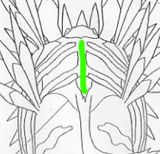
That thin line sprouts into a bunch of rugged lines, and that’s exactly what happens with FubuGabu too. The lines are rather random (and I didn’t spend much time figuring the size out, whoops), but they do follow some certain shapes. The closest line to the face might be rugged, but it goes straight down. The second one starts from way back, but it’s shaped like an arrow pointing at the face. The tips of both lines are fairly close, too. The third line is way smaller than the rest, and is also the last one you can see, but definitely not the last one in general.
Let’s talk about Fubuki’s little sprout as well. As you know, Fubuki’s sprout has two locks of hair, but FubuGabu’s has three. That’s because FubuGabu’s is also based on Garurumon: to be more specific, on this part:
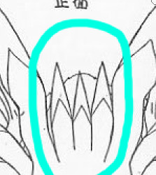
I tried adding that part just the way it is by sticking it to the forehead, but I didn’t like the result at all, so I figured it was best to do something funny with Fubuki’s sprout instead. Oh, well. Choices! And talk about choices, I added Garurumon’s tail simply so the hair would be a complete portrayal of his figure. As I mentioned in the post I linked to above, miximaxing with creatures often leads to that, so yeah.
The hair is obviously the biggest and most visible part of FubuGabu’s design, but Garuru hogs quite a few other spots. Not Gabumon, nor Tsunomon, nor WereGarurumon (nor Punimon) have eyebrows, so I was pretty much forced to use Garurumon’s. Not like I mind, because they’re pretty awesome. It’s kind of sad that they’re usually not visible, but, to be honest with you guys… they’re kind of a pain to draw because of their very specific shape. So I’m secretly glad. ww
And last, but not least, WereGarurumon. Ah, what a little shit. How come there are official linearts for MetalGarurumon, but not for WereGarurumon? Anyway. ww
Were’s contribution is pretty straightforward. Earrings, a scar and marks. There are a couple of things worth mentioning, though.
For the earrings, I noticed too late that Were has both white and red earrings. I was going to use the red earrings because they stand out more, but I noticed that the visible ear was on the side of the white ones… And it was too late to change the design completely, so I just went for the white. Too bad, but life is simply unfair. Especially when you don’t pay attention.
Now, the nose marks are funny. I struggled so much with those. As you can see on the second picture of this post, they were originally going to be shaped like triangles, but I didn’t dig that. And even after I changed the design, I couldn’t get them right, which was… frustrating.
(Also, it took me a long time to realise that the bridge of the nose would be hiding one half of the marks in every view except the front one. After I did, though, everything finally looked better. Thank goodness.)
Anyway, I think that pretty much covers the final design, but let’s also talk about the early designs real quick.
Nothing much to say about the second picture of the post. I just made sure to make some sense out of the markings and retouched the elements I mentioned above. Well, I tried to polish everything, really.
Now, the first picture of the post is easily over 2 years old. It was one of the first, if not the very first, concept of FubuGabu. And, man, what a mess.
It was like, “what does Garurumon have? Feather thingies! SO LET’S ADD THEM EVERYWHERE.” The feather thingies appear on his forehead, the locks of hair over his face, on his hair and even behind his head. I could never figure the latter out—but, man, did I spend hours trying to make those work. And all because Garurumon has feather on his face and on his back, so I felt like FubuGabu needed two layers of feathers too. Thankfully, I eventually realised many of these elements simply weren’t needed, like that second layer of feathers, the earrings on Garurumon’s ear (which, again, are made of hair, so wtf), and… the ring at the end of the tail? Where did that come from? This is Garurumon, not Gatomon! Geez, self!
Some of the early elements made it to the final design. The overall shape of his eyebrows, the markings on the head, the neck and the cheeks and even the horn, just to mention a few. The final feel to it is completely different, though.
This is probably because of how different the hair looks. FubuGabu’s original hair was full of feathers, but they didn’t fit Fubuki’s normal hair. They were randomly coming out of his head for whatever reason. Not to mention that the hair falling over his face looks like tentacles rather than anything else. It looks like a miximax with Squidward rather than with Gabumon. Ugh, I hate myself. XD
One last note: I don’t know where the forehead mark on that first design comes from. I guess it’s meant to be Gabumon’s, somehow? I forgot and I’m too tired to investigate it. It probably never made sense, anyway. XD
I think I covered everything! But, phew, that took long. Still, if anything isn’t clear or there’s something I forgot to mention, please let me know!
(Also, I’m too tired to re-read this post, so excuse the many typos that I probably made. I’ll check it out... eventually.)
25 notes
·
View notes
Text
Personal Illustration Process
04/06/18
For my final piece, I have pretty much decided that I will be having an illustration in my final piece, the illustration will be of me. There is more context and rough sketches of ideas in the 10-page sketchbook work post below which detail the ideas which I had relating to the illustration. Anyway, I’ll talk briefly about some ideas that I have for my final piece. My main idea now is to draw myself have a cityscape background behind me. The illustration will include me wearing a striped t-shirt, which will be added in Photoshop when I have finished the whole illustration - the stripes will be lines which I will distort so it looks like a striped t-shirt, but also not at the same time because it will look manipulated and unshaded - I think that this will look pretty good when it’s done. The background will be hopefully transparent so that I can export it into Photoshop, but if this doesn’t work, then I will try my best to cut around it using the tool available to me in Photoshop such as the pen tool, it will just come down to my own accuracy. The reason I’m keeping the background plain is so that I can have a cityscape background which I will create in either Photoshop or Illustrator, I say Photoshop as I recently created a scene for an animation there, and found that as long as I don’t use complex shapes such as shapes that involve the line tool to create, then creating a cityscape scene shouldn’t be too tricky - the whole reason for using Photoshop for this at all is because of the effects it offers as opposed to Illustrator.
So I started by sketching out some line art, which I think looks okay, but the face needs some working on. I decided to kind of exaggerate the eyebrows because I think it resembles me more that way. I think the hair looks relatively similar to my own, though probably a bit straighter-looking, but I tried to get the curl on the right hand side, and the hair which you can see at the back of my neck. The glasses may look a bit too big, but the neck and clothes look fairly good in my opinion. For this line art I used a very thin black watercolour brush with brush sensitivity on, as I’m using a Wacom drawing tablet - not really expensive one with a screen, but it does the job.

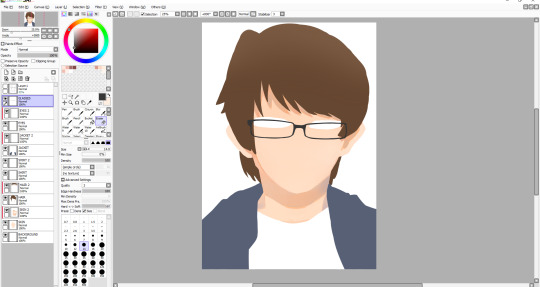
I started adding some basic colour to the segments which need to be coloured in, in this case being the hair, the visible skin and the jacket - I also thought that I would colour the shirt in white, so that when I export it when it’s finished, it’s not transparent because it wasn’t coloured in. The colours aren’t flashy or anything, but I think that it will still look good when it’s all finished. When colouring, there’s a specific way that I do it. I colour the different parts on their respective layers, and then add another layer above it, and enable something called ‘clipping layer’ or I think that’s what it’s called - basically, it means that whatever I do on this layer, will only happen on whatever I did on the layer below it, so it’s extremely useful for shading different parts of a drawing. This will take effect on the part below.

I began to start shading in places I thought would fit, like on the neck, where a shadow is cast from the head. I also shaded under the hair above my glasses, as the hair would be casting a shadow there too. For the shade I used mixes of orange and grey. Because of the blue jacket thing that I’m wearing here, I tried to reflect the colour from it slightly onto the neck shade, on the right. This was also the point at which I drew the glasses, which took a really long time to get right as I did it freehand with no shape tool or anything. I think that they turned out alright.
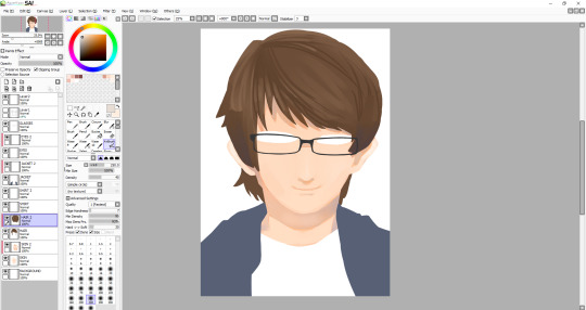
Next I shaded the face slightly, so that it didn’t look so flat. I also added a shade on the face to give the impression that there’s a nose - I also added a subtle highlight on the nose too. I drew a facial expression and also a little detail under the mouth to show that the chin is there. After this I decided to start working on the hair. I started by adding shade and lines where I thought my hair kind of parts, and then I added some highlights mainly near the left hand side. I didn’t have any particular idea for a light source in this illustration, though judging from the shadows on the face and neck, I would assume that it’s coming from the front. I also added a small shade under the middle of the glasses - I haven’t yet decided whether I want to have a shadow being cast from the glasses themselves, because it would be frustrating to draw them all over again except this time I’ll need to be even more accurate. I might be able to duplicate the layer and change the colour to the skin shade and have them underneath the glasses.
I worked on the hair for a while to try and get it to look kind of smooth, which I think I’ve pulled off for the most part, although I might work on it some more when I’ve done everything else. The hair contains a range of shades. I even used a desaturated purple, as well as some saturated browns and some greys. For the highlights, I tried to smooth them out and they’re just regular browns, with a bit of desaturation to them. After doing the hair, I decided I was unhappy with the eyes once I tried adding pupils, so I changed the shape of them a bit. I also added a more noticeable highlight on the nose as well as add one below the nose. I’m not very good at caricature, so facial features don’t tend to look a whole lot like how they should, so I have to rely on getting the hair right to some degree for now. I added a kind of gradient thing to my jacket, though I may remove it - I still plan on shading the jacket, I just thought it might be a cool touch.
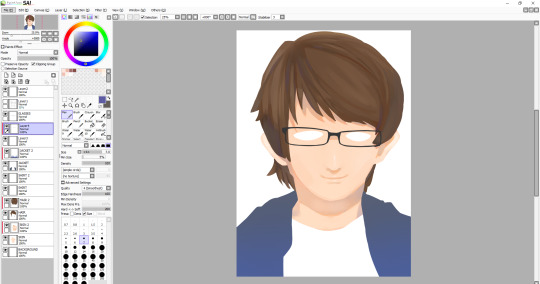
I decided to work on the hair some more, and added some more highlights, most notably on the left side of the hair. One of the more prominent things which I added here is the eyes. I think that they look alright, maybe it bit sad-looking, which wasn’t my intention - maybe I’ll work on them later. The face still needs things adding such as the eyebrows, which I think will be the thing to make it look more like me. The whole illustration still needs line-art around it, so I will add that when all of the colouring is done - though if line art doesn’t work then I’ll leave it as it is now. A problem that has been raised by my tutor, and that is that since my composition is going to be landscape eventually, with the illustration looking like this, the sides of my arms are cut off. I don’t know how I didn’t think of this, but I’m glad that it was pointed out much sooner than later. I suppose I’ll have to draw the arms on, which in theory might actually be quite difficult, since I’m working with quite a few layers, and also I’m not even sure if I’m able to expand the canvas, I’ll have to research this soon, as the deadline is creeping up on me, and I can’t spend too much more time on this illustration.
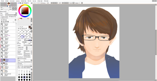
Luckily, I was able to expand the canvas as much as I wanted so I could draw on the sides of the arms. I decided not to sketch them first, so they may look a bit off, or that could be because I really need to improve on drawing anything from the head down. Alongside this, I drew on details around the eyes, most notably the eyebrows, which I think turned out well. I also changed the eyes slightly, though I still look sad. Also - I made the hair a bit rounder near the top, as I thought that it just looked a bit off before.
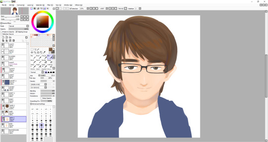
I am almost finished - except not, because now I have to work on the jacket, which was the part I was least looking forward to, so if the drawing doesn’t look as good now, I’ll be blaming it on the jacket. Anyway, to start, I very loosely stuck to my original lineart, though there are some differences between them. I stuck with one of the watercolour brushes that I’d been using throughout this whole illustration, though maybe I should’ve used something else because the texture just doesn’t really look like clothing. I suppose just a different type of brush may have done the trick, though it still comes down to how I handle the shading and where to put it. I usually like to draw things like hair and clothing in segments, like with hair, there’s different parts to, and with clothing, there’s folds, which I need to vastly improve it seems. After I finished with the dark tones, I decided to add highlights I deemed necessary, that or I just added them because it looked empty - though perhaps I shouldn’t have added highlights, and just worked on the darker shades because I’m not particularly pleased with how it turned out. Anyway, that was the end of the illustration, I thought I would add a kind of inner glow in the illustration, as I plan to have this illustration in front of a city. To do this all I had to do was go on each layer and use a large white airbrush. Also, I’m leaving the shirt blank as I still plan on adding some black lines in Photoshop which I will manipulate to look wavy.
Final Illustration

Overall, I think that this illustration turned out well, in particular the head and neck. As I mentioned, I’m not very happy with the jacket, but I think that no matter how many times I redo it right now, I won’t be able to make it look good - it just comes down to me needing much more practice drawing and shading clothes. Looking back at this, I noticed the head looks a bit too big for the body, which wasn’t what I had intended, but I guess after all, the whole thing is just an exaggerated drawing of me.
0 notes