#Stone Serif type
Explore tagged Tumblr posts
Photo

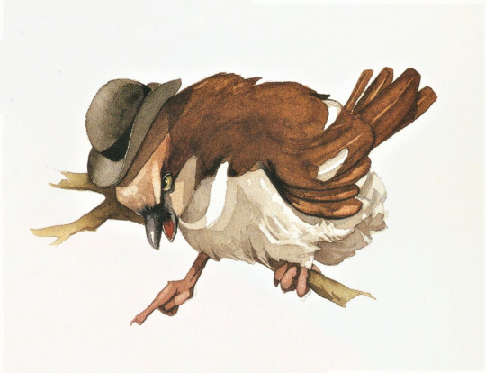
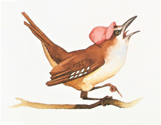
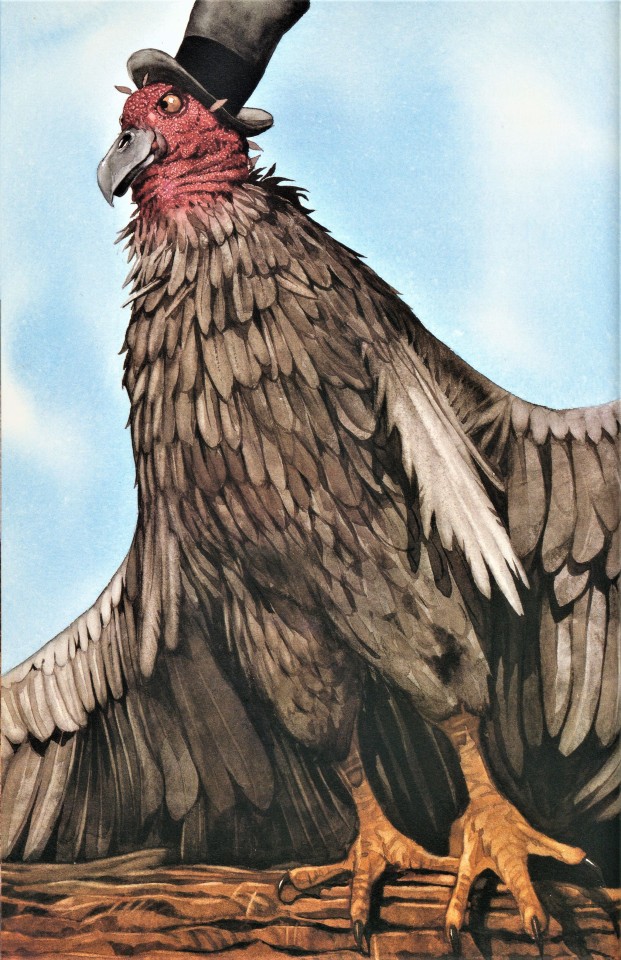
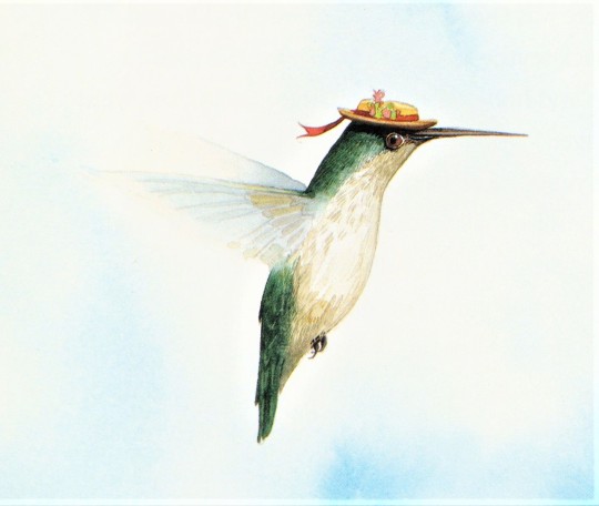
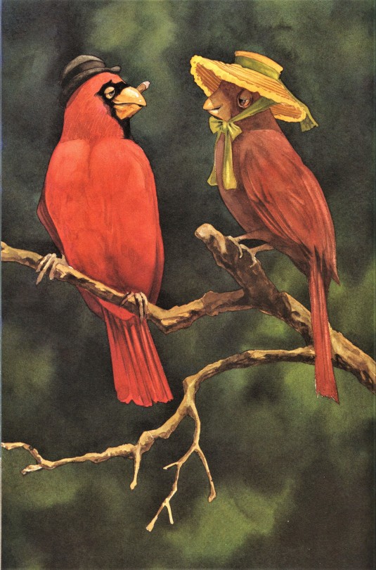
A Well-Chapeaued Feathursday
Birds in Hats!
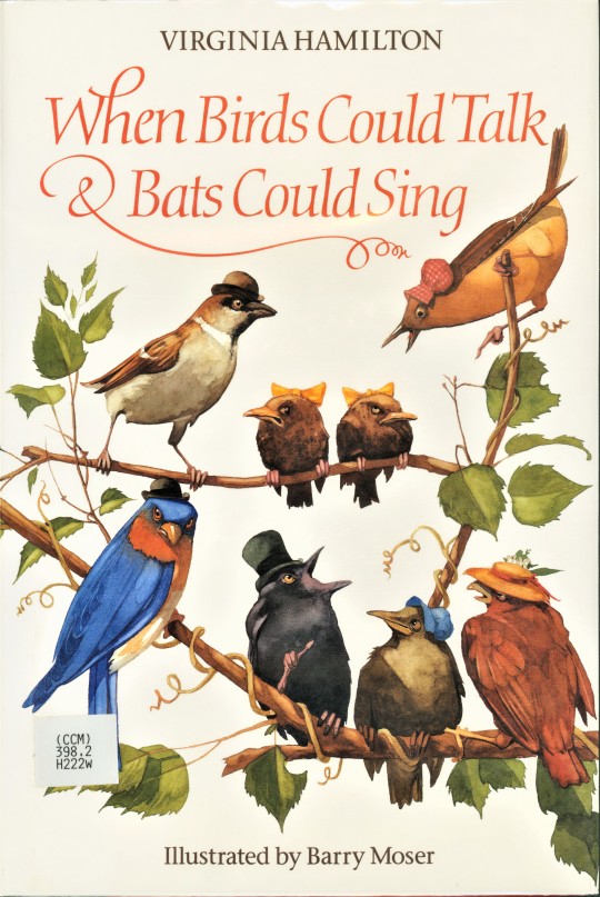
Our graduate intern Olivia is currently preparing a major exhibition on the work of wood engraver, illustrator, designer, letterpress printer, and fine press publisher Barry Moser. He is well known, at least in fine press and book enthusiast circles, for his distinctive engravings and exquisitely-designed limited editions from his Pennyroyal Press. The rest of the world, however, mainly knows him for his illustrations for children’s books, which are usually executed in watercolors. We hold many of Moser’s fine press publications, but only a few examples of his children’s books. The Curriculum Collection in our general library, however, holds quite a number of his children’s books, and we are borrowing a few to include in the exhibition.
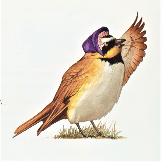
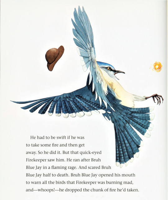
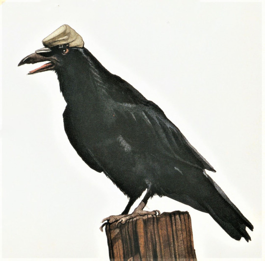
We are especially tickled by Moser’s humorous paintings of anthropomorphized birds in hats for Virginia Hamilton’s collection of African American folktales, When Birds Could Talk & Bats Could Sing, published in 1996 by The Blue Sky Press, an imprint of Scholastic, Inc. The illustrations are a perfect accompaniment to this set of lively and entertaining jewels of American folklore.
Since the book was mostly designed by Moser, it bears an extensive colophon, usually reserved for fine press publications. This is why we know that the paintings were executed in transparent watercolor on handmade Barcham Green paper, the types are Sumner Stone’s Stone Serif Medium (1987) and Gudrun Zapf von Hesse’s Diotima Italic (1953), the color separations were made by Bright Lights, Ltd in Singapore, and the edition was printed and bound by Tien Wah Press in Singapore. Probably more information than any child would need to know, but we sure appreciate it.
View more posts on work by Barry Moser.
View more Feathursday posts.
#Feathursday#Barry Moser#Virginia Hamilton#When Birds Could Talk & Bats Could Sing#children's books#The Blue Sky Press#Scholastic Inc#Stone Serif type#Diotima typeface#Bright Lights Ltd#Tien Wah Press#children's book illustration#watercolor#watercolor illustrations#Curriculum Collection#Pioneer Valley School#folktales#African American folktales#birds#birbs!#birds in hats
180 notes
·
View notes
Text
[Yōkai AU] Fiend & Menace
Made by Cat, aka Researcher Serif/AW
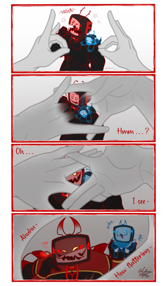
"I know I'm quite the catch but for you to look at me like that, you trying to tell me something, Master~? You don't need to look from so far, you're free see my true self as close and as often as you please~. Just know you aren't escaping me that easily~."
(The Kitsune no Mado, or "Fox Window", is a Japanese hand technique believed to reveal hidden Yōkai through your fingers as with above.
It's comparable to the Celtic hag-stone or adder stone, a stone found in riverbeds with a naturally formed hole which can reveal witches or faeries through it.)
─────────────────────
Sometimes, I really hate colors. I spent so long agonizing his color palette it ain't funny, I swear. At least I think I did better on colors this time. Not by much but decent enough... (lighting's hard)
Either wae, here's @cosmica-galaxy's Fiend and Menace! They're apart of my Yōkai AU, very much based/inspired on @twstedforyou's own original Yōkai Twisted Wonderland AU.
Below is some lore if you wanna know! I recommend reading up this post for further AU lore if you wish.
Do hope you enjoy either wae!
─────────────────────
For those who don't know what Yōkai are, "Yōkai are a class of supernatural entities and spirits in Japanese folklore."
They can range from your classic demon, in this case Oni, to objects gained spirit and sentience such as Kasa-Obake, a friendly and playful one eyed, one legged sentient umbrella.
So now that that's outta the way...
[Yōkai AU Lore]:
꧁ღ⊱ | Oni!Fiend |
Fiend is an Oni, a kind of yōkai, demon, orc, ogre, or troll in Japanese folklore. They're known to be big, terrifying and having great strength. They're also known for their violent and short temperaments with a hunger for humans and alcohol.
In this AU, since people are pretty much wiped out, skibidi's are the suitable replacement. While not as fun as human prey at times, there's something a bit more satisfying playing with them. (The answer is abundance and the fact no one cares about them. He can be as sadistic and cruel as long as he wants with his food, something he couldn't with humans to avoid getting caught with his pants down so to speak.)
Fiend is a young Oni, reflecting his canon self being a Gen 0 mimic born after the fall of humanity, but he's still quite older than a century at least.
Due to his experience and the fact that the Yōkai District is quite traditional, he's a bit different. A tad wiser and more eloquent in his words for one. Not that he chooses to be, preferring to be a bastard most times. He's still the tsundere little shit who gets turned on when you make the battlefield red with the blood of your enemies.
Due to his heritage, he's quite the alcoholic. Because of that, he's also quite a bit more aggressive with skibidis because there's just some types of alcohol exclusive to the human realm that isn't made or sold in his District.
In this AU, Yōkai can shift forms to disguise themselves as the most dominant species in the human realm via shapeshifting or illusions. For some more humanoid Yōkai like Yuuki-Onna, it shows in their true forms. The believability of a Yōkai's disguise vary between Yōkai and those with skills more inclined to disguise like Tanuki and Kitsune are better at it than most. Fiend has an unusual competence in the art for Oni, Yōkai known to be quite dog shit at their disguises, especially for one as young as him.
With his surprising competence in illusions and Menace being too young to create his own disguise, Fiend extends his own over Menace until he can learn for himself. It also means when his transformation goes, so does the tuggle's.
Before the War, Yōkai had the option of either human or mimic guises but considering mimics themselves mimicked humans, it was mostly human disguises. Now though, the option is either Alliance members or mimics who mimicked them. Fiend in particular chose the mimic option because it gave him more freedoms so to speak. Disguising himself as an Alliance member would've burden him with the role of acting like one which, as apart of a military operation, is a heavy one to play.
Fiend spent most of his time in the human realm. When the fall of humanity came, he was mostly wandering and hunting alone and only rarely going back into his District when bored. Despite the solitude of the empty cities, not even he knew why he stayed in the wasteland as a TV mimic as he did. At least, not until he met you.
In this AU, his meeting with you was much like his canon self. He decided you were interesting at first and pretty much stalked you. Though, he was much more… open, so to say, with his less than mortal nature. He didn't necessarily show off he was of an Other nature but he didn't necessarily bother with blending in too much. Humans are pretty much dead and gone and he only kept a thin veneer up for the Alliance to not get up all over his ass after all.
Let's just say it was quite a surprise when he confronted you for the first time and found out you were his beloved Master all along. (He did not let go for the next week, still closely shadowing you for the rest of the month after. Your presence— no, your existence is simply too much— too intoxicating— for him to simply ignore and leave be.)
Bonus! He'd never admit it but sometimes, he'd head over to his District and find baubles for you that he makes seem like they're old belongings he'd never touched and left to dust. He's always terribly smug when you like it and gloats it over the others with a smirk.
꧁ღ⊱ | Oni!Menace |
Menace is also an Oni, a very young one
He's pretty much canon Menace but more of a little shit with a nasty temper when really angry
Though, instead of the whole 'parents dying leaving bby orphaned', its more he was orphaned at birth
Unless a hybrid of sorts, Oni are traditionally born from the death of a horrible human's spirit which is why Oni, at their base nature, are cruel and violent. By using the dead spirit of a horrible human to bring them into existence, they're bound to take bits of the violent and cruel parts that make up said spirit. Luckily for Fiend and you, it's something that could be taught to be managed but anger is always something present that'll have to be managed for the rest of his life.
Despite being essentially a toddler, he still has the absurd strength Oni are known to have. He can easily carry you with no problem which is a bit troubling considering he likes get mischievous. Often with Byte at that...
He's also a a bit of a nipper considering human flesh is apart of the natural diet of Oni. He knows better than to harm, Spirits forbid consider you prey and eat you. Adopted Papa Fiend is hovering over his back with a critical eye after all.
Bonus! Menace, underestimating his own strength and your human constitution, had accidentally thrown you once. Luckily, it was at Fiend. Unluckily, it was at Fiend. Possessive shit extraordinaire. (Yōkai won't let any slight against their Master stand, kid or not. Someone boutta get their little ass cooked.)
─────────────────────
Check out my main blog: @researcher-serif
Here's my NSFW blog if that tickles your fancy: @grandfather-of-sin
─────────────────────
[Read under cut for those that can't see the image text or colored text]
Fiend: "Hmm...?"
Fiend: "Oh..."
Fiend: "I see~"
Fiend: "Ahuhu~"
Fiend: "How flattering~"
#do not repost#without permission at least#no art thieves allowed#mine art#reader insert#skibidi tag#skibidi mimic#skibidi toilet mimic#skibidi toilet x reader#yokai au
71 notes
·
View notes
Note
7, 17, and 27 for the tag game!
7: Preferred writing font
I’m not terribly bothered about fonts in general, so I tend to default to Arial bc I write in google docs, mostly. (I prefer sans-serif fonts for fiction writing, because serif fonts are Essay Fonts to me.) So long as it’s legible, though, I don’t feel too strongly!
17: My writing and editing process
I have two kinds of writing, determined by my feelings on any given day about any given fic. Type one is very deliberate: I roll an idea around in my head like a river stone until it is polished to a mirror shine, then set it out on the page, tinkering as I go to make sure the phrases feel right in my mental voice. Type two is when the characters in a scene bodily possess me and I am merely a conduit for What Must Be. Both versions still require going back over my work for pacing and general editing! I’ve been lucky enough to have friends (especially the wonderful and brilliant @larkral ) to help with this stage.
27: My favorite part of the writing process
Definitely when I get the “type two” mood from my previous answer. It’s a wonderful feeling to be so full of certainty about what’s going to happen next, like I’m just some stenographer copying down events rather than painstakingly inventing them. It tells me I’ve reached an understanding of the characters and how they fit in my version of their world, and I feel like the words are just fighting to escape through my fingertips— like I can only hope to type fast enough to pluck them all out of the air and pin them to the page for all to see. It’s a rush!
4 notes
·
View notes
Text
The Transforming Power of Typography on Graphic Design.
Typography, that is, the craft or discipline of organizing the type to visualize the language and make it readable, holds a prime place among all the design elements in the complex fabric of graphic design. It oversteps the boundaries of being a combination of letters and words, and in the end it becomes a power that creates the visual environment, passes the ideas, makes the emotions arise and sets up the brands. Visual communication's fabric weaves typography into a vessel for both the transmission and the catalyst of meaning as it builds bridges of understanding between creators and their audience. On this comprehensive investigation, we embark on a mission to identify the various functions of typography in graphic design.
Understanding Typography:
The Historical Lens
Understanding the typographic consideration in the graphic design can be performed by understanding the background of typography. The beginning of typography can be traced back to the turn of ancient civilizations when scribes laboriously carved symbols onto clay tablets, papyrus rolls, and stone slabs which eventually evolved into the earliest forms of written language. With the invention of the movable type in the 15th century by Johannes Gutenberg, typography undergoes a significant transformation providing massive opportunities for the dissemination of knowledge as well as the spread of ideas since the Renaissance era. The evolution of typography ran in parallel with the improvement of the printing technologies; this resulted in the development of individual typefaces, printing styles, and graphic movements. Starting from the ornate serif typefaces of the Baroque and continuing through the minimalist sans-serif fonts of the Bauhaus movement, typography has not only mirrored but also has left a very deep mark on historical graphic design, graphically referring to changing tastes, ideas and culture.
for more please read article
1 note
·
View note
Text
Serif week 3
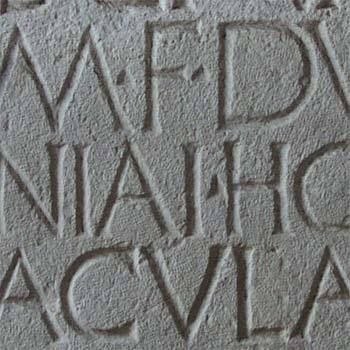
When were serifs originally created? While the creation of serifs is quite obscure many believe that serifs were used to neaten the ends of lines when chiseling stone. The creation of serifs is almost as recent as the type style. PrintWiki defines typestyle as “the distinguishing characteristic of a typeface, which can refer to Roman, italic, bold, condensed, expanded, etc.” Overall, we know that serifs were probably created during the creation of the typestyle.
0 notes
Text
Notes on books I read:
there's lots of technical terms to describe letter forms
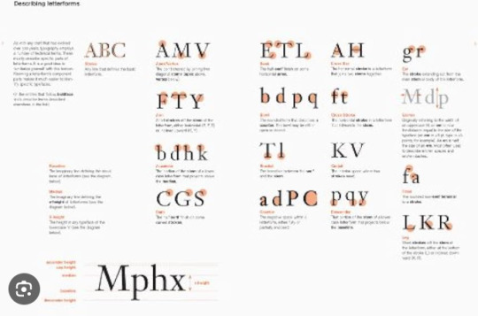
the bulk text of a book is designed as text type usually between 6pt and 12pt (usually has more readability )
Headlines or call-outs are called display type. Display typefaces are used to be seen and not read.
quick history
Words were originally written by scratching into wet clay - hence the used more straight lines rather than curved ones
Greeks changed the writing from right to left to how we read today (left to right) and also changed the orientation of the letters
roman square capitals has serifs on their words as stone carvers followed brush marks that were left (serifs usually used to make font look " authoritative, professional, and suggest the weight of history or experience")
4th century Romans used cursive for their day to day transactions simplified for speed ( cursive used to "add a touch of character and charm, it can also humanize the sentiment you're trying to convey")
unicals (Uncial is a majuscule script commonly used from the 4th to 8th centuries AD by Latin and Greek scribes) incorporated aspects of roman cursive. "Unica" meaning a twelfth of anything, unical referring to the height of the font being 1/12th of a foot (1 inch).
Blackletter (T1450) - strongly vertical letterform used for typecasting/printing. carved ink block of wood used for printing. Later they used an adjustable mold system for "casting" movable. re-usable type from molten lead.
oldstyle (1475) - based on lowercase forms used by Italian scholars for book copying
Italic (1500)- made to be close-set which allowed more words per page
Script (1550)- replicate engraved calligraphic forms. not appropriate for lengthy texts. Forms now range from formal and traditional to casual and contemporary.
Transitional (1750)- refinement of old-style due to refinement of printing methods. Thick-to-thin relationships were exaggerated and brackets were lightened
Modern (1775)- further rationalization of old-style. serifs were unbracketed and contract between thick and thin were extreme.
Square serif (1825)- heavy bracketed serifs little variation between thick and thin strokes. newly developed for advertising heavy type in printing. no brackets. also known as slab serif.
Counter form- spaces between the letters aka negative space. How well you handle the counters determines how easily we can read whats been set.
fonts can be used to reinforce meaning. sizes of words, where the word is on the page (setting) missing letters. playing with the dots in i and j. repetition. combining scale and structure. colour. kerning (spaces between the words). margins
~ a type primer by john kane
After reading a few of the books I looked at many different fonts and many different ways to use type to convey your message and a lot of history behind typefaces.
0 notes
Text
Project 1: Music Festival Design System
Week 2 - Typographic Design: Form and Communication by Rob Carter
Chapter 2: The Evolution of Typography
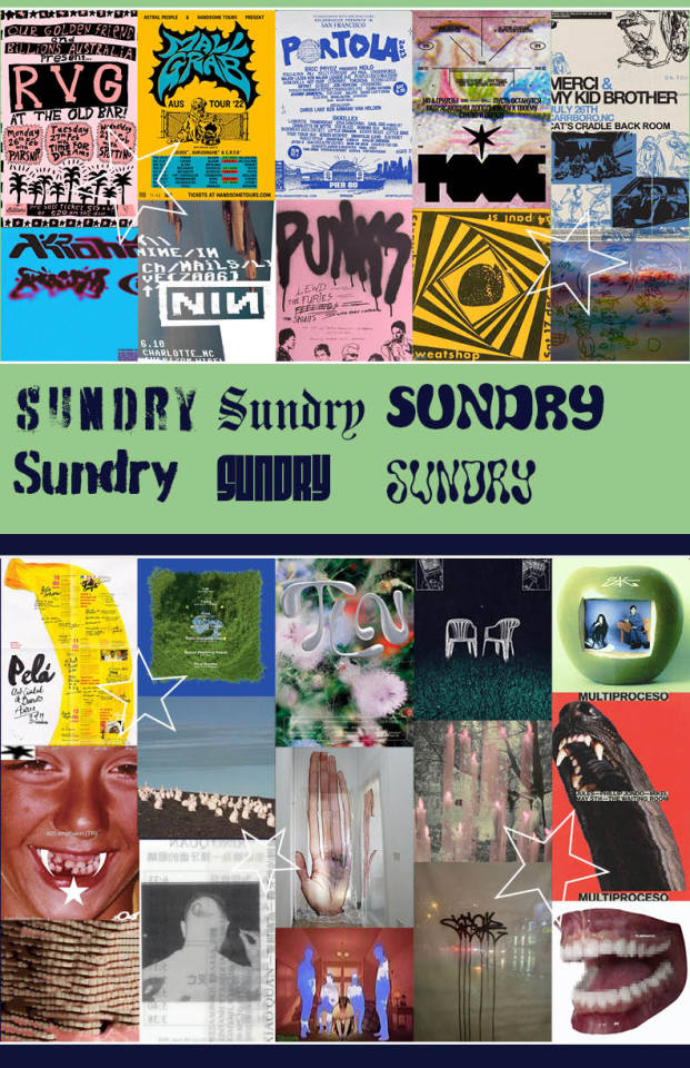
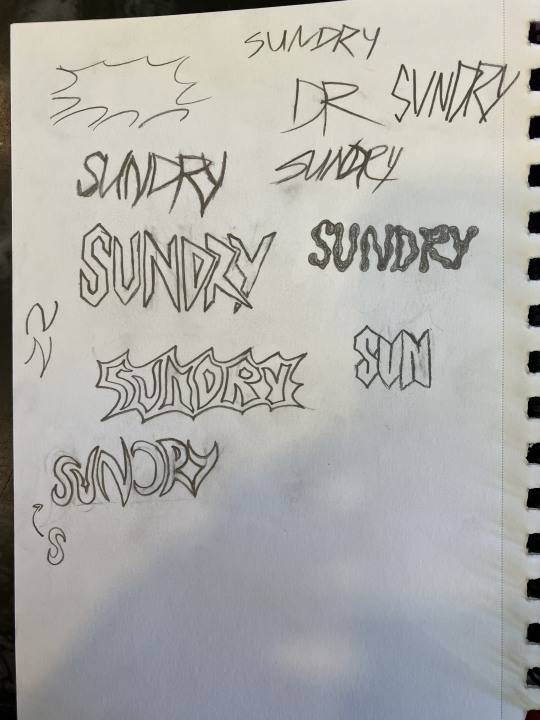
Typography has been around since words were first written, even if it was not recognized or had a term for it. It has developed from purely physical, handwritten words to a digital medium. Words were transformed from a simple means of communication, to an art style that communicates visually as well.
Typography began as impressions made into stone/clay before shifting to papyrus and parchment. Greek and Roman writing became the large and uniform serif letters we are familiar with. Church monasteries would have scribes that would copy text by hand to create books. In later centuries, there would be demand for a uniform writing style by Charlemagne. This new style would be termed as Gothic. It started as Early Gothic (which was focused on bigger letters) to Gothic (a condensed version). Woodblocks and the Gutenberg press made printing uniform type easier, and much quicker. New styles of type were created, but all still featured serifs. By the 1800s there was a huge revolution in typography. Type was no longer being designed with such emphasis on perfecting the standard typeface, but focused on decorative fonts. This time also gave way to the first sans serif. Type then shifted from printing presses to typewriters. The 1900s was when typography was really being pushed out of its original form. Sans serifs became more popular, and new art styles influenced the designers of typefaces. In the 1980s Apple's Macintosh computer made it possible to use and make fonts digitally.
This history is important to remember when designing. The Music Festival Poster design is supposed to feature typography in an interesting and striking way. It needs to be the main feature and focus. With so much of design being focused on digital mediums, it can be hard to remember how effective, helpful, and unique designing from hand can be. I typically stray away from hand-made work, but I want to push myself to create new types rather than tweaking typefaces made by others. I struggle to come up with ideas for different styles, but experimenting has led me to come up with ideas that I never would have considered had I not just got my ideas onto paper messily.
0 notes
Text


“I sit here in the familiar. A fizz at my heart burdens my sinuses, My life propped up by - absent - capital. All life is swathed in currency, though why should it be different? Was it? The protection of affection is no more.”
(DISQUIETUDE)
[DIGITAL ARTWORK, 2022]
'Bespoke prose typeset adjacent to esoteric beam iconography.’ In the top left corner sits the number of the piece in the collection (A usage of David Rudnick’s approach to cropping type, for ‘Terrain’ merely hinting at the letterforms through their upper baseline forms).
PROSE: Harry Vincent.
IMAGE SOURCES: Artwork: ‘Adam and Eve’, byTitian (Tiziano Vecellio), 1550. Stone: Head of concrete slab.
TYPEFACE: ‘Kern’ by Pizza Typefaces.
IMAGE DESCRIPTION: A portrait poster that has a Red background showing Adam and Eve from the Christian Bible. On top, Black text and graphics with esoteric rays from the centre and a quote in a sans-serif typeface reads “I sit here in the familiar. A fizz at my heart burdens my sinuses, My life propped up by - absent - capital. All life is swathed in currency, though why should it be different? Was it? The protection of affection is no more.” All on a Black background.
0 notes
Text
Not a linguist but I think there’s a fairly good reason for why Aurebesh letters are the way they are. Everyone uses datapads, and paper, and therefore handwriting, is pretty rare. If everyone is typing, there’s really no need to conserve space, since like in a word doc you’re not limited by space like you are on paper, leaves, tree bark, stone etc. I think this is also the reason why the Aurebesh letters aren’t actually very nice to write, (like there’s no reasonable stroke order that isn’t just super awkward for some of them). Basically, almost no one is hand writing them, except maybe artists, and adding text to art is really more drawing the letters than writing them anyway.
I haven’t looked to see if there is any cannon info on the origins of basic, but I’m pretty sure data pads and such have been around for a long time in the Star Wars universe, and basic was chosen and/or constructed for the most amount of species to be able to speak, its corresponding alphabet was probably also chosen/constructed with the medium most people were using in mind. If it’s a totally constructed alphabet, then it doesn’t have the history with physical writing mediums which real life written languages do.
Or, even if it does come from an alphabet with that history, there’s a fabulous real life example of writing getting more angular with Chinese characters as they’ve changed over thousands of years
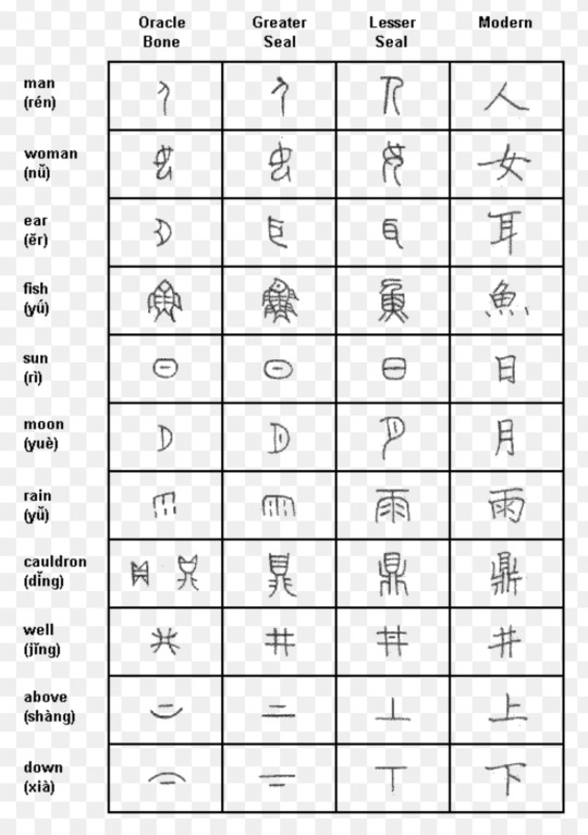
And these are hand writing! Some fonts are far more boxy. Now admittedly Chinese is one of probably the most efficient space to meaning conveyed ratios in a language, so the point about that stands…
But also French exists to prove that people will both tolerate and actively preserve fairly inefficient space to meaning ratios in language.
(Eg. l’huile de noix de coco = coconut oil)
I don’t know too much about this but there was apparently a kind of a crisis about whether the character writing system was going to survive when things were just starting to go digital because while you can get most alphabets down in just a few pixels, characters require a lot more detail—then better screens and typing systems like the pin-yin keyboard were invented and it wasn’t an issue anymore. The point of this tangent is that part of the reason the characters might be so boxy and simple is some remnant of the influence of a period of technology where screens weren’t good enough to use more than a few pixels for each letter. Maybe the standardization of basic was done in that period and due to maybe repeated standardisation (which a massive galactic government would absolutely rely on to function on the scale of the Republic—much like several periods of most large empires have involved standard fixing writing, measurements, roads, vehicles, currency etc.) it hasn’t been allowed to change much since that period, and so has remained pretty blocky and not very space efficient.
All this being said, the combined letters look really cool and I like them a lot. Maybe something like that is used when people do hand write Aurebesh? Maybe there are weird school administrator fights about which letters to combine and how and what fonts are right, just like there are fights about whether to teach cursive or printing, and serif vs. sans-serif fonts.
Maybe almost everything official in the Republic is done in basic and typed and for anything handwritten people don’t really ever use Aurebesh, they use other alphabets like Huttese or their native language alphabets? Maybe handwritten Aurebesh is like a core words thing which everyone else thinks is pretentious as hell? Maybe there’s a cursive Aurebesh script that everyone uses and you’d almost never print it (I’ve heard at least once that this is what mostly happens in Cyrillic languages)?
Anyway I’ve gone on about five tangents whilst being neither a historian nor a linguist. Languages are cool. I think ops actually already mentioned half the things I mentioned, and the combined letters are cool I didn’t know that before, aside from in Korean. Please correct my history/language facts if I’m wrong.
the Aurebesh isn't very great from a conscripting perspective. not only because it's a fucking cipher (a mere font to write in English, with English nonsensical spelling rules) but also because all letters are blocky squares.
Which us fine because this isn't the focus of Star Wars, it's purpose isn't to work well linguistically or practically, it is to set an atmosphere and pretend it's not English
Chinese, Japanese and other syllabic scripts work that way because each symbol stands for a while syllable, not an individual sound. and English has syllables with massive consonant clusters like scratch
an alphabet needs many tall, thin letters like l i r q r t p d f h j k l b
if all letters are fat and wide like ლ then any text occupies far too much space and is overly long. and larger chunks of text consume exponentially more space, paper, ink, digital pages, stablishment titles, etc, not to mention being annoying to read
the simplest solution is to create thinner versions of each letter, making them thinner and thinner until it's a totally different alphabet
a different solution that preserves the blocky feel is to combine letters together into ligatures, like in Hindi, specially for common words and consonant combinations, so, fusing E and R into a single ER letter, for example.
to illustrate, this is "Republic" in canon Aurebesh:

and this is "Republic" after combining some letters:
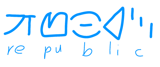
we could go more aggressive and combine more than two letters, but speakers would have to know all ligatures, but that's fine, Hindi speakers learn hundreds or millions of letter combinations and they're not random, they are intuitive
now with Skywalker:


of course, i'd still prefer to make an alphabet which actually makes sense

real life example: Korean
if we wrote English with the Hangul, Republic would be 러풉맄
[ㄹ=r][ㅓ=e][ㅍ=p][ㅜ=u][ㅂ=b][ㄹ=l][ㅣ=i][ㅋ=k]
ㄹ+ㅓ=러
ㅍ+ㅜ+ㅂ=풉
ㄹ+ㅣ+ㅋ=맄
canon Aurebesh would spell it ㄹㅓㅍㅜㅂㄹㅣㅋ
Hindi:
र=e रे=re फ=p फु=pu
ब=b ल=l ब्ल=bl ब्लि=bli ख=c
रेफुब्लिख = Republic
canon Aurebesh would spell it रएफउबल��ख
52 notes
·
View notes
Text
Rationale
Arpona is a small wedge serif with nine different weights ranging from thin to black plus, Including italics.
Aspects of the typeface relate to my place as it supports languages from Western, Eastern and Central Europe. This relates because The Store Stone was supposed to be the Church Missionary Society trading post which is an organization that was founded in England. Not to mention the type is also made for commercial purposes.
This typeface was inspired by the Roman-Germanic Museum in Cologne which contains many artifices of Roman inscriptions. This is shown by the many elements of stone etching embedded in the font. Another reason why I’ve chosen Arpona to be my font is that it reminds me of the similarities in the shape and texture of the exterior of The Stone Store with the structure of the sharp edges of the font. Arpona was designed to be a font for art, fashion, food, beverage and lifestyle. This couldn’t be a more perfect representation of The Stone Store today as they sell everything listed above.
Through many of the classes, I’ve learnt the usefulness of columns. It provided structure and helps guides you on where to place things.
Not only that, it creates unity throughout your work. The great thing I learnt about Columns and grids is that not everything has to be in a certain way. The gird and columns still allow flexibility in your layouts and endless ways of using one type and column or gridding format. Such as modular, column, equal and bilateral, just to name a few. They can range from complex to simple formats, Providing structure without you being restricted. Which is why I ending up using ( a four-column format) though it might not be as simple as the single-column grid. My Favorite part of the four-column system is that I could fill three columns out of my four-column setup and still be able to see that it’s four columns.
1 note
·
View note
Text
Choosing Utopia: The Ideal Typeface for My Assignment
Introduction
Typography plays a pivotal role in setting the tone, creating an atmosphere, and enhancing the readability of a piece of writing. Among the myriad of typefaces available, I've decided to use Utopia, an Adobe Original designed by Robert Slimbach, for my upcoming assignment. My decision is not just based on aesthetics or functionality, but also on the emotional resonance that the typeface holds for me. As someone who considers New Zealand to be my personal Utopia, the clean style and classical design of this typeface perfectly encapsulate my feelings towards this beautiful country. Here's why I've chosen Utopia:
A Testament to Exemplary Design
Utopia, a transitional serif typeface, was released by Adobe Systems in 1989. It was part of the Adobe Originals program, an in-house type foundry at Adobe, started to create original typefaces of exemplary design quality, technical fidelity, and aesthetic longevity. The typefaces released as Adobe Originals are the result of years of work and study and are regarded as industry standards for their ambition and quality of development.
A Harmonious Blend of Historical and Contemporary Design
Utopia is influenced by the 18th- and early-19th-century ideals of classical design. It combines the vertical stress and pronounced stroke contrast of eighteenth-century Transitional types like Baskerville and Walbaum with contemporary innovations in character shapes and stroke details. Adobe's Sumner Stone has also compared it to Hermann Zapf's Melior, highlighting its distinctive blend of historical and modern aesthetics. This unique combination of the old and the new is one of the reasons why I'm drawn to this typeface for my assignment as New Zealand has a long history and yet is also a very young and new country even queen street is filled with building old and new.
Versatile, Professional & Feature-Rich
Utopia is available in four optical variants for display, headline, regular, and caption text sizes, each in regular, semibold, and bold weights. There's also a black (extra-bold) weight available in the headline size. Released in the OpenType format, Utopia comes with advanced typographic features like ligatures and small capitals, further enhancing its usability and appearance. However, it is important to note that Adobe does not guarantee identical character metrics. This means that documents developed using one font file should not be switched to using another, at risk of lines breaking in different places.
Embodying the Open Source Spirit
In an unprecedented move for Adobe's professional typefaces, a basic set of Utopia's styles has been open-sourced, allowing it to be used for free. This includes regular, italic, bold, and bold italic styles of the regular size. This spirit of open-source accessibility not only broadens Utopia's reach but also allows it to be a part of a larger creative community, contributing to its ongoing evolution.
Conclusion
Choosing Utopia for my assignment is a decision that resonates with my personal style and my vision of New Zealand as my Utopia. This typeface, with its timeless design, professional versatility, and the spirit of open-source sharing, perfectly encapsulates my thoughts and emotions. I am confident that Utopia will not only articulate my ideas clearly and elegantly, but also embody the feelings and aspirations that I associate with my personal Utopia.
0 notes
Text
W9: 1970's Brands Research (23/03/23)
I look at some brands and logos of the 1970's and took some notes on their designs.
HBO was the first satellite TV channel
The hole in the "O" represents the button on a TV remote
Polaroid was founded in 1972 and ruled over the camera market by the end of the decade
The type is tightly packed and the colour palette represents the camera's ability to create coloured images
Atari was a video game company that branched out from Nintendo
I really like font that they've used here "SF Atarian System"
Kodak is another camera company
The bright colours in muted tones stand out here and make the logo memorable
Nintendo have changed their logo so many times and this is what they used in 1970. It's also the design that they have stuck the closest too since.
The design was intended to be modern and appeal to both American and Japanese markets at the time
Woodstock festival was founded in the 70's
The logo was meant to go against the psychedelic designs of the time which were very detail oriented
The Chupa Chups logo uses the same colours as the Kodak logo
The fonts are far more serif heavy than the former
The logo was designed by Salvador Dali
Biba was a UK Shopping company that was popular in the 70's
The best way to reach customers at the time was through printed media and this logo suited print
Space Invaders was an arcade game that was very popular in the late 70's
The drop shadow helps the logo stand out
This logo is yet another example of the red/yellow colour combo
The logo that Apple used for their first consumer product was far more psychedelic than the one they use now
This was in the late 70's and the colourful apple represents the time that it came from
The first Star Wars logo is another example of yellow type
The bold and angled text are what stand out for me
Probably the most memorable logo that I could find is the Rolling Stones logo
It was made in the early 70's and demonstrates another use of the colour red
Some Patterns I noticed:
Red and Yellow colour combo, especially in muted tones: Chupa Chups and Kodak
Drop Shadow, Space Invaders
Angled Type, Star Wars / Space Invaders
Very Playful Fonts, Atari, Kodak, Nintendo and Star Wars
0 notes
Text
Typeface finals -
Changing type - for simplicity I don’t want a serif font, as well as when you scale it down it makes it too noisy with the feet. San serif is cleaner and has more space between characters. Need to prioritise legibility on my work. - font matching.
In experimentation, compared to ‘Mramor,’ the Skia font is spaced extremely well and offers the entire family as well as condensed and extended, it is obvious and easily digestible while having a slightly different look/ more interesting, to be featured on a typographers brochure. - differently shaped characters. I will be using it for headers and poster type.
‘Skia is a sans-serif typeface designed by Matthew Carter for Apple Computer in 1994.[1] Skia is Greek for "shadow", and the letterforms take inspiration from stone-carved 1st-century BC Greek writing. The typeface was the first QuickDraw GX font, and has been pre-installed in Mac operating systems since System 7.5 (1994), and is in the current Mac OS. Skia includes "GX variations" technology that – if an application offers the UI – allows its weight to be adjusted smoothly between thin and bold, and its width between narrow and extended.’'


With researching for body copy, I decided to use keywords such as typographers/designers suggested body copy type, sans serif. What came up were suggestions such as Roboto and Lato, Noto Sans and Montserrat. I played around with some options and ultimately landed on ‘raleway’ from google fonts - after seeing it work with Skia and look good space-wise and legibility-wise on my indesign brochure file even when scaled down, I was happy with the pairing together and individual practical look.
‘Raleway is an elegant sans-serif typeface family. Initially designed by Matt McInerney as a single thin weight, it was expanded into a 9 weight family by Pablo Impallari and Rodrigo Fuenzalida in 2012 and iKerned by Igino Marini. A thorough review and italic was added in 2016.’

Sources - wikipedia.
FINAL TYPEFACES FOR BROCHURE:
headings/large text: Skia
body copy: raleway
0 notes
Text


//Design skills poster workshop//
In this workshop, we had to use typography and hierarchy to design posters for a V&A museum exhibition in London. The brief was based around a set of stone statue images to choose from that I turned into a poster using photoshop and indesign. I explored how the hierarchy and typeface choices in a poster can communicate the most important information first and stand out to the viewer. I made two posters that could be seen as a pair in a series of posters, choosing a leading typeface that represents the sturdiness of the stone and also has historical connotations with serifs. As ‘Secrets in Stone’ is the most important part of the poster I wanted this to have the most elaborate type and the other information is written in simpler, easy to read sans-serif type. Having only two type faces in the posters means that attention is not detracted too much from the main title. If I were to improve these posters, I would consider making the tube logo smaller so it’s not so dominant and making sure that the text is readable over the statue in the second poster as it is slightly difficult to read from a distance.
0 notes
Text
Well, okay then!

From left to right:
Yvonne Valene Rose- the main character of Tick Tock. Sweet girl, pretty laid back and go with the flow type.
Darling Venus- the reader insert turned Oc of my unpublished fic; Requiem. She's blind and was "raised" in Underlust. (Not really. She fell into the underground with amnesia and learned their culture) There's a bit more going on with her, but that'd be spoilers. She's also the owner of that bracelet I posted a while ago and let you guys figure out which charm went with which skeleton!
Rosetta Scarlet Stone- the reader insert turned Oc from Goodbye To Spring (and she's in a lot more unpublished fics too now). A sweet little girl who was severely abused and neglected by her birth parents, but it's okay because she has a bunch of dads now that love her very very much.
Ashley Morgan- the best friend of the Mc of my abandoned story; Cheating Death. A very headstrong and reliable, and loyal, woman who would've caused problems for the mob boys after a while.
Megaera "Kitty" Lovania- actually the first Undertale Oc I made, I think. She was for a story that is long gone now, but did help me get into Undertale and it's many AUs. I think I have some little snippets from what was the story she was in, but it’s super old. She was Frisk's older sister! (Or Chara's in the Swap AUs.)
Marina "Momma" Roselle- what I guess is my monstersona. Who I imagine as Momma from Babybones.
And finally, there's Korinna and Bell Serif- Dust and Mc's kids from Dust Coated. Sweet girls, very much both of their parents' children though. And poor Kori. Baby girl has it rough. T.T
Do you guys want to hear about them??
#im sure you guys know most of these girls#you might just see ashley make an appearance in gbts#ive connected her and rosetta to a certain degree#in other fandoms at least#rosey's ocs
13 notes
·
View notes
Photo
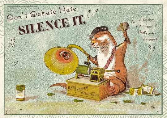
A landscape format poster inspired by the style and printing techniques of the 1870s-1880s, with bold strokes, pointillism and false flaws. The image is as if printed on a paper whose grain can be seen.
It depicts an otter sitting behind a cylinder phonograph screaming hateful messages. The whole in a decoration with blue, brown, yellow and green tints.
The device rests on a rather large wooden base on which one can read the text "Hate Speech Manufactoring". Its mechanism is made of brass and is particularly visible. One can notice a dial with settings on "conspiracy, hatred, violence". The device reads a green cylinder on which one guesses the term "transphobia". The horn of the phonograph has a vociferous mouth instead of the usual hole.
The otter behind the device has a light brown and white coat. It wears a black cap and a bandolier, both with anti-fascist and anti-racist badges. She holds a hammer made of wood, stone, and creeper above her head to strike the phonograph. With her right hand, she twists the bell of the device.
There are no set elements around this scene, we can just notice the shape of the shadow cast by the otter as well as boxes and pieces of wax cylinders (green). These have labels that recall sexism and bigrotry, racism and white supremacism, anti-Semitism, hate speech and validism (antivax). By their condition, we understand that they have been destroyed by the otter.
At the top left of the image, a text written at an angle and in large irregular characters says "Don't Debate Hate". Just below in text written in very large, sharp serif type answers "Silence it".
The text reads "Don't debate hate, Silence it."
Text to the right of the otter and his hammer reads in sans serif type "Giving fascist a platform? That's otter nonsense!"
A few vegetal flourishes embellish the image, which is entirely surrounded by a wide band with geometric or wave-shaped friezes.
97 notes
·
View notes