#Rossiya
Explore tagged Tumblr posts
Text
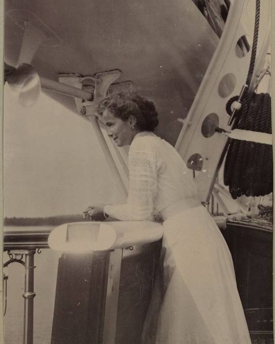
Grand Duchess Olga Nikolaevna of Russia on the Imperial yacht Standart, 1912.
#olga nikolaevna#grand duchess olga#romanovs#house of romanov#romanov dynasty#standart#the imperial yacht#imperial yacht standart#russian imperial family#russian royalty#imperial russia#russian empire#rossiya#russia#1910s#1912#grand duchesses#she's 🥰😍
99 notes
·
View notes
Text
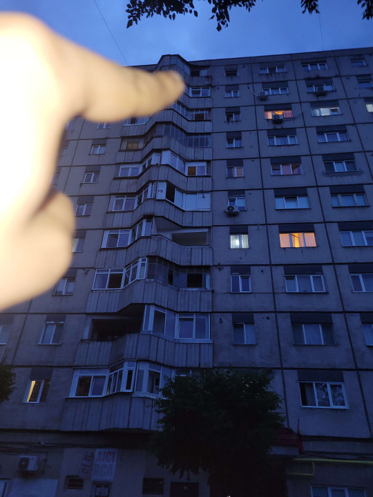
acolo traieste
#russiacore#dark#winter#eastern europe#liminal#liminalcore#desolate#gloomcore#gloomy#ussr#soviet#rossiya#Россия#sovietcore#nostalgiacore
40 notes
·
View notes
Text
No. 31 - Croatia Airlines (and other shapes)


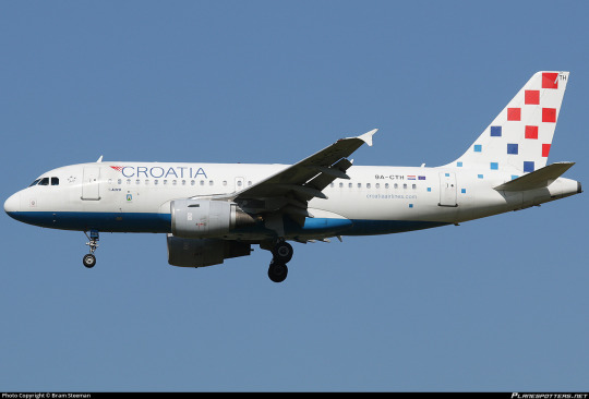
I'll be honest, anon - I'm with you. I like the squares. I don't love the entire package, but I love the squares. I feel like that's just not a shape you see often when it comes to liveries. You see a lot of lines and rectangles but it's so rare you even see a rhombus or something. The world of parallelograms is so much wider! (Or in this case equilateral.) Croatia Airlines is working with something pretty nice here, and I just wish they'd lean even further into it.
I think it's very nice that they didn't stop at the tail, either. They recognized that this pattern of staggered squares can and should extend off the tail to the main body, and I appreciate that. I just wish they'd committed to the bit a little more, which is sort of the running theme - they are working with a fantastic base idea that could really stand out if they just pushed it a little farther.

Now, in their most recent deliveries (this plane, 9A-CTN "Osijek", was delivered 2020 and is their second newest plane with the actual newest being in a [clenches fist] Star Alliance livery) they've stopped painting the belly blue and in a slightly uncharacteristic moment I actually prefer this. I like the sleekness of the white engines and I like that the squares get more room to spread out and breathe.
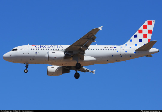
Plus, now there are more squares visible from below! Honestly, I think my main criticism is that this needs more squares! Bigger squares and more of them! It creates this lovely unusual dithering effect and making it cover more of the fuselage, adding some to the nacelles...I think you'd have a solid livery!
I'm going to contrast two liveries I think are kind of conceptually similar but ultimately succeed and fail in different places. Rossiya's 2016 livery, Brussels Airlines' 2021 livery, and Croatia Airlines are sort of a shape trifecta. Croatia is of course squares.
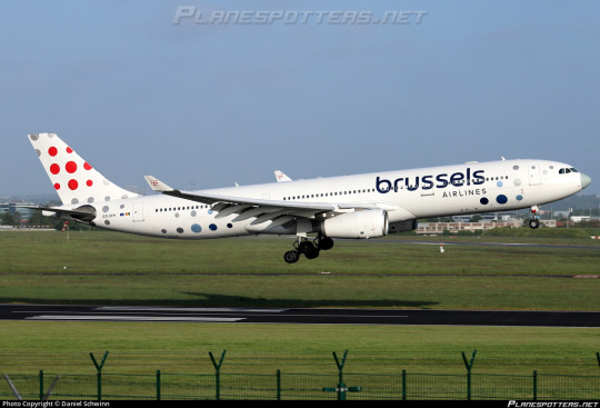
Brussels gets off easy, because they use circles, and polka-dots are a relatively easy shape to work with. Though admittedly they contrast with angular airframes, the color-blocking Brussels uses is pretty intuitive to pull off while creating a nice bit of excitement. Any airline which uses circles ends up looking a bit pop-art (and I will say I like the Brussels Airlines wordmark in this sense as well) but this is where the white body really hinders this livery and prevents it from quite hitting home. Just look at it next to Flair Airlines, which also uses circles - the difference is extremely clear. Plus, the red being limited to the tail does make the airframe look asymmetrical despite there being a fairly equal distribution of Stuff. This is mitigated on stubbier airframes, but I don't really factor that in for this or other liveries - you have to alter your design for other airframes, otherwise you're judged for your weakest links.
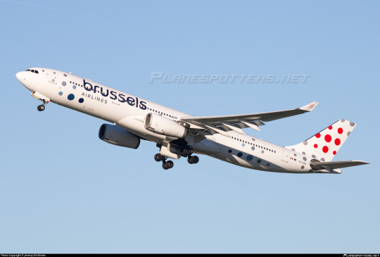
So Brussels gets a C. It is completely adequate.
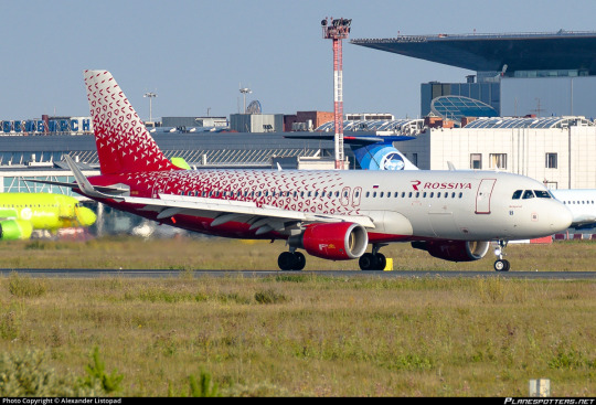
Rossiya (a very strangely named airline) is triangles. I really like the approach here, where everything clusters in and then spreads out, and I like the amount of the fuselage it covers. Unfortunately, I feel like the way they've chosen to handle the spreading-out is just worse than how Croatia Airlines does it. The dismantling of the triangles leads to a sort of pockmarked appearance and I think just making them smaller and smaller, like Croatia's squares, could be far more elegant. Liveries that only use white and one other color, even if it's this super vivid shade of red, also tend to look a little flat to me - both Brussels and Croatia use a combination of secondary blues and reds and that suits them both very nicely. It's, I don't know...it's flat and crowded at the same time. It's bizarre.

Look, even a tiny bit of blue and white really adds a nice pop! Imagine what could happen if it was used for, say, shading. After all, Russian carriers are working with the same flag colors as Croatia is.
(I just want to put out there that this plane - the as-of-yet-undelivered-and-probably-won't-be-for-a-while Irkut MC-21 launch airframe - is named Дед Мороз, which could be considered the Russian equivalent to something like Saint Nicholas.)
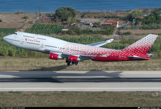
This looks a lot better on the 747 due to the extra space balancing it a little. A lot of liveries do. I feel like this blog makes me seem like a massive humphead (new term for 747 fans) when I actually am not a huge 747 fan, but the extra vertical space and inherent balance against the height of the tailfin just makes a lot of liveries sit nicer on them.
I do like the wordmark, though R is probably the easiest letter to work with for logos (and I do think it's strange that the Latin R is used in place of the Cyrillic Р given that this airline is...Russian. I mean, its name is literally 'Russia', in Russian. Also, Riyadh Air does it better).
Rossiya gets a C, though a far more conflicted one than Brussels.
I like the concept way more, but there are a few major stumbles in implementation which make me unable to fully like it. They probably have time to design a better livery before they actually get their MC-21, though.
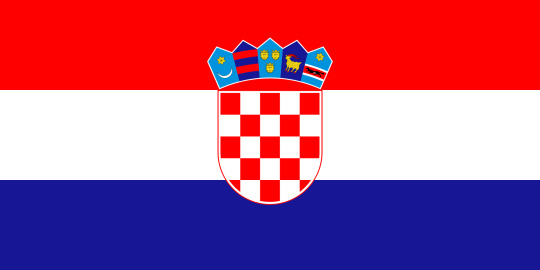
Now back to our actual subject, Croatia. I don't even mind the shiny white the way I do most of the time because it gives the squares room to play and matches the flag of Croatia. As do, as it were, the squares.
To be honest, though, I think the current iteration of the livery is saved by the fact that Croatia Airlines operates a relatively small fleet of 13 aircraft, with the jet portion exclusively comprised of lovely stubby A319s (and one Star Alliance A320). The limited coverage of the squares would be...a lot more apparent on a longer plane (see: Brussels Airlines).

A super long-looking turboprop like the Q400, for example.
Now, props (heh) to them: the blue underbelly really saves this on a plane where the square pattern, when projected exactly as on an A319, doesn't even reach the main fuselage underside. I think the squares look better on a triangular tail for contrast too, and the t-tail does it no favors. (This is why you should adjust your livery for different models of airplane! Barely any modern carriers do it and it's a real shame, because square-on-triangle can create such a nice staccato effect, especially on an already-stubby airframe!) On the other hand, the shorter airframe makes the drop-off in square size a little less dramatic, which I like.

Not a fan of just the website on the nacelles, either. You're a flag carrier! Take yourself a little more seriously!

I like what Croatia Airlines is starting with. They're sitting on something really admittedly neat that could really be a showstopper if they leaned into it more. I think Croatia, if they tried harder, could easily get a B+ at least from me, just for how cool and unique the squares are. They're a hard shape to work with, but they're already off to a good start here - if they follow this path onwards they could make something really special.
Like I mentioned earlier, Croatia Airlines has a very small fleet. It began with very questionable economic prospects given its emergence from the turbulent mire that was late Yugoslav SFR, and it's basically never turned a profit given it's a government-owned full-service airline that only flies small planes (and, from what I've heard, provides pretty solid service on par with other European flag carriers). That said, it's been able to grow pretty consistently, and this has included new airplanes, with the most recent development being plans to acquire several (between 6 and 15) A220 models. I think the small A220 will suit the squares well, and they'll certainly have time to refine the design while they rework their fleet.
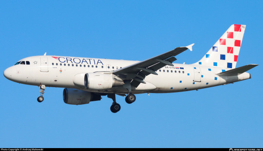
Croatia Airlines...gets a C.
That said, I think this is the best of the Shapes Trifecta and I think it has a lot of room to grow. Unlike Rossiya and Brussels, which feel like they need to rethink their implementation, Croatia just needs to do more with it - they've made the back half of a good livery and just need to add the front half. But I think, if they take my advice (and I do know the government of Croatia reads my blog), they could make a really fantastic livery that punches above their fleet's weight class. As is, I'm already very endeared to their planes, and they just need to do what they're already doing but commit to it even more, because they've got something really nice going.
I'm excited to see their A220s arrive!

#tarmac fashion week#grade: c#era: 2010s#era: 2020s#croatia airlines#rossiya#brussels airlines#region: europe#region: southeast europe#region: eastern europe#region: west/central europe#region: croatia#region: russia#region: belgium#flag carriers#compilations#requests
19 notes
·
View notes
Photo

Explorer inside Orda Cave, the biggest underwater gypsum cave in the world, Russia
2 notes
·
View notes
Photo

Summer in the Far East, Kamchatka Peninsula / Russia
3 notes
·
View notes
Photo

Spring in Chara Valley, Eastern Siberia, Russia.
4 notes
·
View notes
Text
Domes of the Church On The Spilled Blood in St. Petersburg, Russia

4 notes
·
View notes
Text
Nous sommes des Russes - Dieu est avec nous !
Une procession de milliers de personnes a lieu à Saint-Pétersbourg.
Les Russes en avant !
0 notes
Text
“Ruskeala gap caves, Karelia / Russia .â€

0 notes
Text
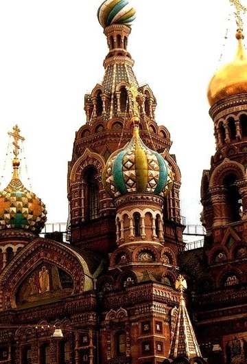
Domes of the Church On The Spilled Blood in St. Petersburg, Russia
1 note
·
View note
Text
The Raphael Loggias at the Hermitage Museum in Saint Petersburg, Russia

0 notes
Photo

"Meglio di Trump": la strana rivelazione di Putin su Biden
0 notes
Text
Seagull in front of a wooden church, Chukotka Peninsula, Russia

0 notes
Photo

The Raphael Loggias at the Hermitage Museum in Saint Petersburg, Russia
0 notes
Text
Domes of the Church On The Spilled Blood in St. Petersburg, Russia

0 notes