#Richard Vander Wende
Explore tagged Tumblr posts
Text
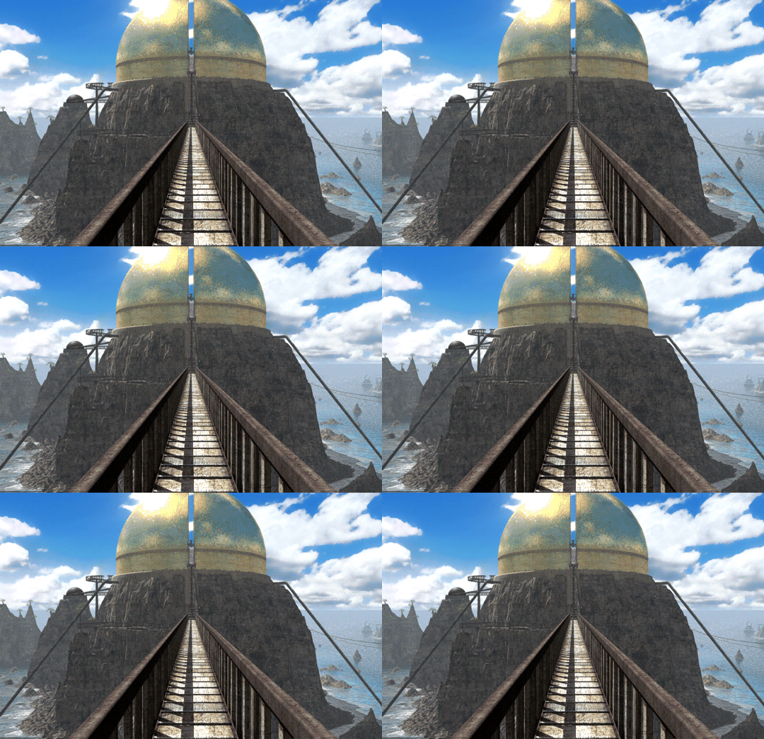

From old to new.
#myst#d'ni#riven#temple island#golden dome#I will forever refer to this as#The Starry Expanse Project#excited for#Richard Vander Wende#involvement
119 notes
·
View notes
Text
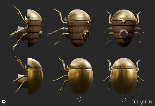


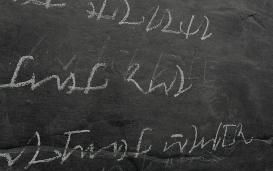


...Aaaaand some of my prop designs & models for Riven (2024).
So much of my own sensibility as a concept artist was inspired by Richard Vander Wende's work on the original Riven, so getting to work alongside him to re-create some of these objects (and design some new ones) was completely surreal. Meet your heroes!! Sometimes it works out because your brains work in the exact same way. 😎👍🏼
(Credits to my collaborators: Grave marker models by Lance VerMeer, rebel viewer handle design by Richard Vander Wende)
1K notes
·
View notes
Text
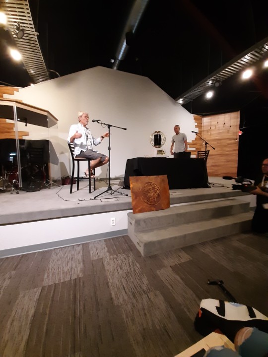
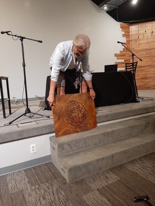
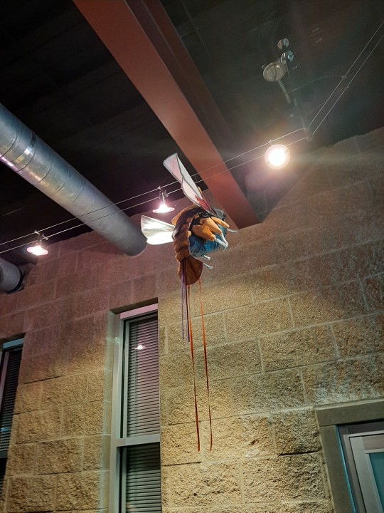
Mysterium 2023: Rand and Richard Vander Wende (!) reveal Gahrohevtee.
More pics below:

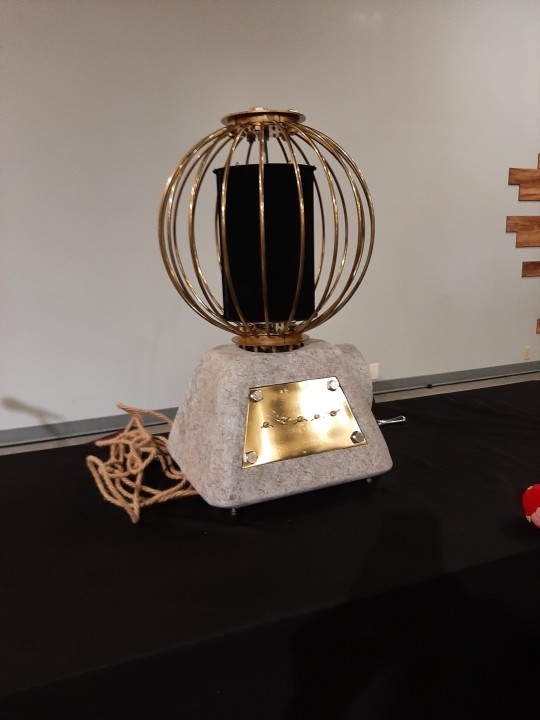
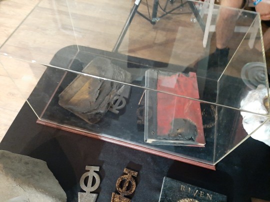
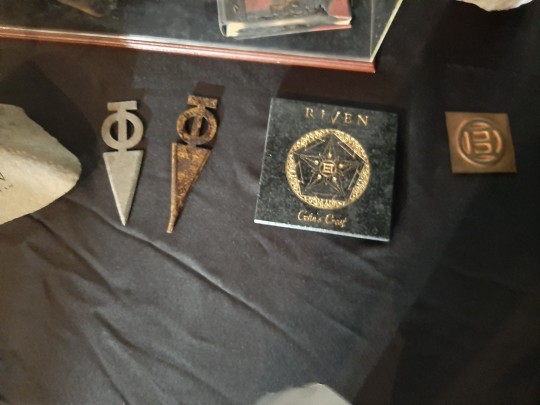


18 notes
·
View notes
Text
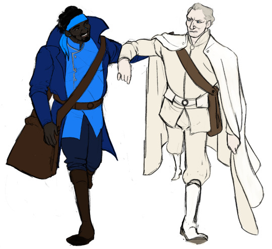

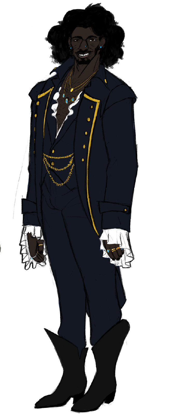

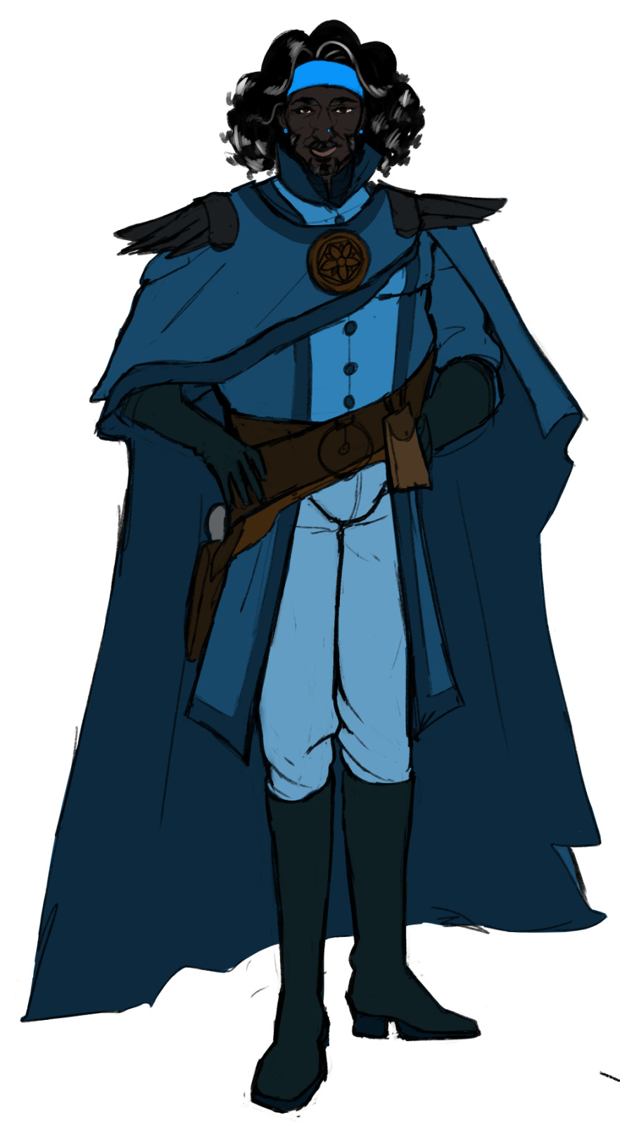
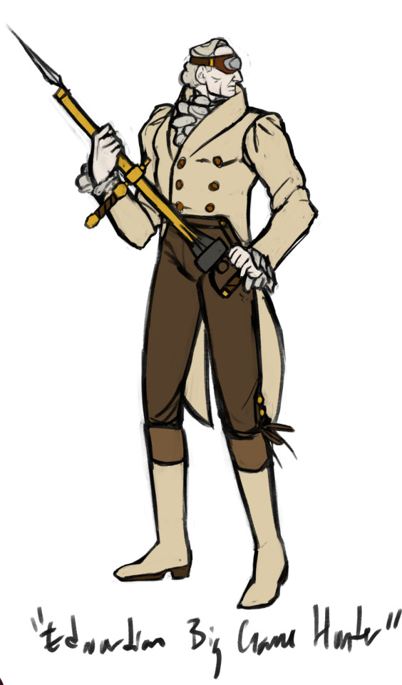
i love finding handsome little outfits to put them in 💖 like evil little paper dolls
the last one btw is my take on something Richard Vander Wende said in a video i saw at Mysterium this year--he was talking about reference material for Gehn in Riven, and he described his general vibe as an "Edwardian Big Game Hunter" and that stuck in my head ever since then, so i looked up some references and made it a reality for myself :) i do adore his canon outfit so so much, it's just always nice to think of alternative looks!
6 notes
·
View notes
Text

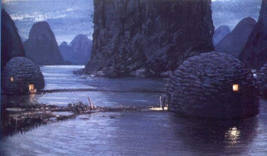


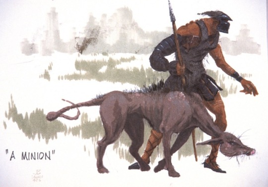


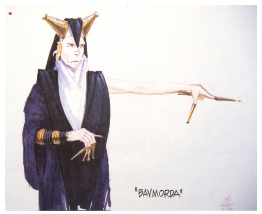


Concept art for WILLOW (1988) by Richard Vander Wende, John Bell, and Dave Carson.
#art#concept art#willow#fantasy#movies#films#1980s#80s#john bell#dave carson#richard vander wende#production art#paintings#design#character design
943 notes
·
View notes
Photo
Makes me think of this:

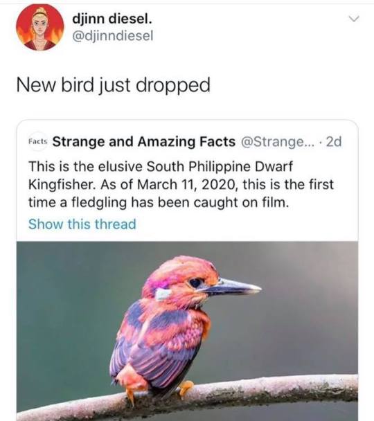
SO COLORFUL
it fascinates me that theres (probably) billions of species left undiscovered
217K notes
·
View notes
Text
Man I hope the Myst TV series is good.
0 notes
Photo
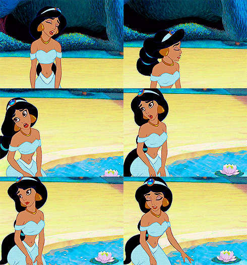


aladdin trivia: 5/12 “production designer richard vander wende devised a simple color scheme for the film, inspired by its desert setting. blue (water) stands for good, red (heat) for evil, and yellow (sand) is neutral. for example, the villainous jafar is clad in blacks and reds, while the virtuous jasmine wears blue. another example is in the cave of wonders, where the lamp’s chamber is blue, and the ruby that tempts abu is bright red.”
#aladdinedit#disneyedit#tianasweets#mickeyandcompany#animationsdaily#animationedit#disney#aladdin#atrivia*#aladdin trivia#trivia#mine#i like this so simple but so significant#1k
1K notes
·
View notes
Text
DWR #4.2
I have finished preparing the content for the presentation, what is left is to make a pdf file.
Here is the second part - What to do and to present:
Describe the key factors you have found so far in your research which are crucial to understanding/explaining your topic.
As the questions accompanying the thesis statement indicated, the paper will focus on the 2 main categories: 1, psychological depiction of the characters and 2, environmental background set-ups. The former will depict how the characters’s traits are being reflected in the color-coding. The latter will focus on the happenings in the background, that is how the use of colors affects the underlying atmosphere of the scenery.
Give a brief description of how you plan on defending/proving the current thesis statement/question.
The defense of my statement will mainly be presented through thorough analyzation of the case studies, which were carefully selected from the Disney’s collection. The case studies consist of 2 classical and 2 more contemporary films. By carefully inspecting the role of the used colors of each case study, the thesis statement will be fully assisted.
Give a brief description of the main research resources you have identified to date and describe any specific kind of special research which you plan on doing.
As mentioning previously, the case studies will be the focus point. My plan is to break down each case study thoroughly.
A brief analyzation of the characters in Alladin 1992
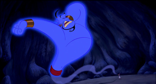
Genie, the lovable blueish character of the Disney house, is so distinctive for his color that we as viewers wonder about the choice of color of this character. According to Smithsonian, the reason for that is both symbolic and stylistic. The film’s color palette was picked intentionally, as certain colors were used to convey the traits of the characters. Eric Goldberg, who oversaw the Genie’s animation for the original Aladdin, told Smithsonian, “The reds and the darks are the bad peoples’ colors. The blues and the turquoises and the aquas are the good peoples’ colors.”
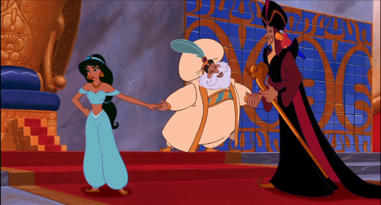
For this representation, Jafar, the main antagonists with his parrot, are painted in red and black, whereas Aladdin and Jasmine are dressed in cooler shades of blue, purple, and white and Genie is very much blue. According to Richard Vander Wende, the production designer who developed the movie’s color script, said the blue hue has even deeper symbolism attached to it. “Certain blues in Persian miniatures and tiled mosques stand out brilliantly in the context of the sun-bleached desert, their suggestion of water and sky connoting life, freedom, and hope in such a harsh environment," he said.
Additionally, series of research regarding articles in magazines, websites or ebooks will be conducted as complementary materials.
note: I have found an ebook on Disney animation that I plan to go through it in order to fully understand the essence of Disney animation therefore enhance the quality of the paper.
0 notes
Photo

Richard Vander Wende Workplace
11 notes
·
View notes
Audio
Originally Released 2005 / Cover Art by Richard Vander Wende
#Robyn Miller
#music#robyn miller#keith moore#ambo#richard vander wende#paintings#box art#audio#op#itsnotfunnyitsnotfun#non myst
4 notes
·
View notes
Photo


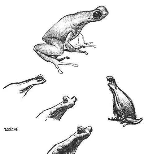
Richard Vander Wende production design sketches for Cyan’s Riven
203 notes
·
View notes
Text
These look insane..I'm so glad Richard Vander Wende is back. You can really tell.
Screenshots from Riven
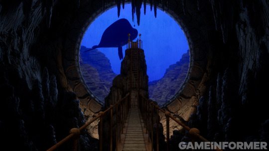


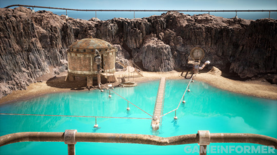
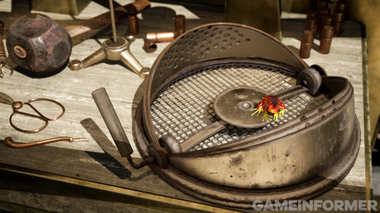
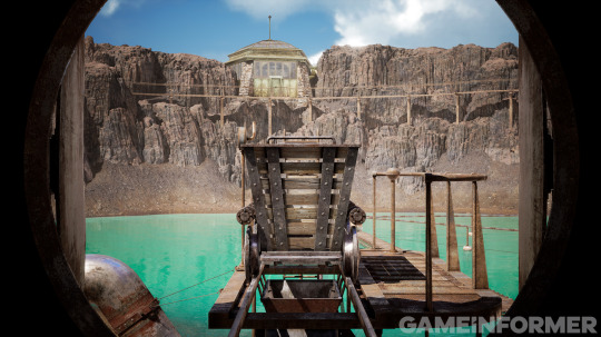


Riven (2023 in game shots)
77 notes
·
View notes
Text
Richard Vander Wende and Kentaro Miura. Two favorite artists.
1 note
·
View note
Photo
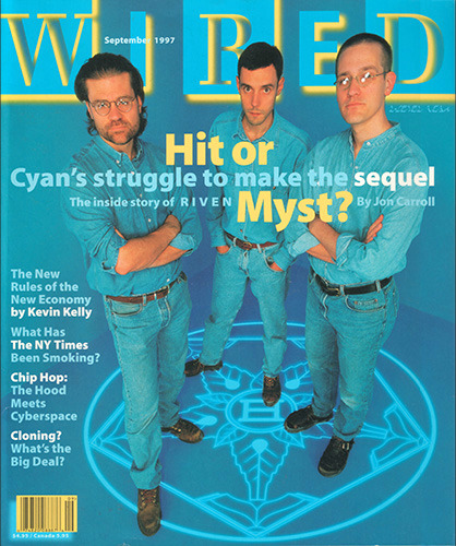
Rand, Richard, and Robyn on the cover of Wired, September 1997.
This glowing, cyan magazine, and the promisingly optimistic article within its pages, gave me hope for years to come in regards to Cyan's future. At the time, it seemed impossible that they would ever fall from grace after having risen so high.
51 notes
·
View notes