#ResponsiveGrid
Text
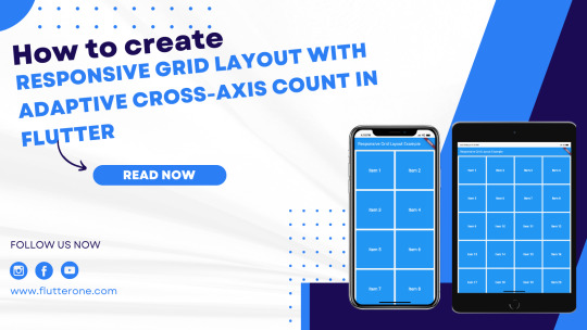
How to create a responsive grid layout with adaptive cross-axis count in Flutter?
Introduction:
A responsive grid layout with an adaptive cross-axis count is a powerful technique in Flutter for creating dynamic and flexible grids that adjust based on the screen size. This allows your app to provide an optimal user experience on various devices, accommodating different screen sizes and orientations. In this step-by-step guide, you will learn how to create a responsive grid layout with adaptive cross-axis count in a Flutter app. By following this tutorial, you will be able to build a grid that automatically adapts its column count based on the available screen space, ensuring a visually appealing and user-friendly layout.
Content:
1. Set up a new Flutter project:
Ensure that you have Flutter installed and set up on your machine. Create a new Flutter project using the following command in your terminal:
2. Implement a responsive grid layout:
In the Dart file where you want to implement the responsive grid layout, import the necessary packages:
Define a stateful widget for your grid layout:
In the GridView.builder widget, use SliverGridDelegateWithFixedCrossAxisCount as the gridDelegate to define the initial cross-axis count.
3. Determine the adaptive cross-axis count:
To make the grid layout responsive, you need to determine the adaptive cross-axis count based on the available screen space. You can achieve this by utilizing the MediaQuery class.
Add the following code inside the _ResponsiveGridState class:
Modify the crossAxisCount property in the SliverGridDelegateWithFixedCrossAxisCount widget to use the adaptive count:
4. Customize the grid items:
Inside the itemBuilder function of GridView.builder, build your grid items based on the index. You can use widgets like Container, Card, or any other desired widget to represent each grid item. Customize the appearance and content of each grid item based on your app's requirements.
5. Use the responsive grid layout:
In the Dart file where you want to use the responsive grid layout, import the necessary packages and add the ResponsiveGrid widget to your widget tree.
6. Test the responsive grid layout:
Save your changes and run the app using the following command in your terminal:
7. Observe the responsive grid layout in action:
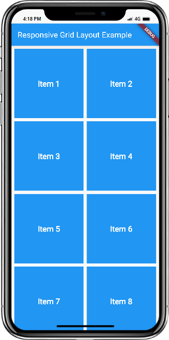
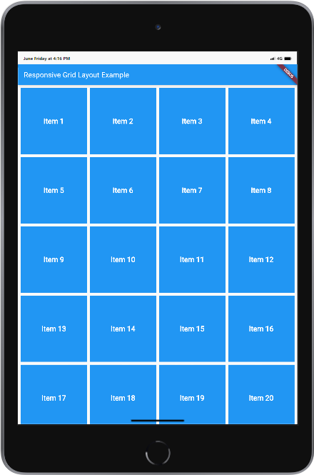
Upon running the app, you will see the responsive grid layout with the adaptive cross-axis count. The grid will automatically adjust its column count based on the available screen space, providing a visually appealing and user-friendly layout.
Sample Code:
Output:
Mobile and Tab view
Conclusion:
Congratulations! You have successfully implemented a responsive grid layout with an adaptive cross-axis count in your Flutter app. By following this step-by-step guide, you have learned how to build a dynamic and flexible grid that adjusts based on screen size, ensuring an optimal user experience on various devices. Utilize this technique in your Flutter app to create visually appealing and user-friendly layouts that adapt to different screen sizes and orientations.
Read the full article
0 notes
Text
How To Create Your Own Unique Portfolio Layouts With Media Grid?

How To Create Your Own Unique Portfolio Layouts With Media Grid?
It's easy and simple only with Media Grid!. Really, I am talking the truth. But How will you do that? I am going to describe to you all the steps through this long writing. Please don't bore, Read carefully...
Tell me, who does not want to show one's creativity?
Everyone...Right?Media Grid will allow showing your creativity. It will allow you to create your own unique portfolio layouts very easily. Firstly, let's introduce you to Media Grid.
What Is Media Grid?
Responsive portfolios with exceptional formats
Media Grid is an exceptional apparatus to make boundless responsive, filterable, paginated portfolios effortlessly. Utilizing progressed CSS and javascript procedures enables you to make your very own designs and adjust them to any holder.
Exceptional methods not repeatable by any device: disregard fixed columns or plans, here your inventiveness can be completely abused.
Stressed over the portrayal of your setup on little screens? There's a brilliant framework swapping consequently to an easier and portable streamlined mode: lighter pictures, contact confirmation sizes and dynamic control on overlay components. Everything will be constantly shown flawlessly.
At last, module coordinates everything with the most well known interpersonal organizations (Facebook, Twitter, Pinterest, and Google+) giving a superior sharing framework, concentrated on genuine thing substance!

Visual framework developer
Everything floats around visual framework's developer: the genuine module's center where you can make your astonishing formats.
Pick among a wide sizes assortment to take care of business your portfolios: it demonstrates your adjustments progressively, speaking to a genuine preferred position in anticipating stage!
MANUAL MODE: the traditional way turned out to be celebrated in these years. Complete opportunity and command over components forming the lattice and its design.
DYNAMIC MODE: even the greatest framework just requires minutes. Make the base-format, select which components need to fill squares and after that tune how Media Grid handles them: rehashed structures, pagination, rearranged things. Barely any snaps to have bewildering results.
Full media support
Media Grid is very flexible and highlights 14 distinctive thing types to create your portfolio:
1.Basic static picture without a lightbox.
2.The great single picture
3.Completely responsive pictures slider with subtitles and video support.
4. Inline slider, flawlessly incorporated in matrix estimating framework.
5.Sound player supporting a single melody or tracklist + SoundCloud.
6. Inline Audio player, having similar highlights.
7.Youtube/Vimeo/Dailymotion or additionally self-facilitated video.
8. Inline video, getting same highlights the matrix setting.
9. Connected tile, diverting clients with cutting edge controls.
10.Custom substance, a clear space prepared to be loaded up with your substance
11. Post substance, dynamically bringing substance from a post type.
Also, obviously the "spacer" thing to help you make amazing formats.
Every one having its custom choices to appear as you need. For instance the Ken Burns impact in the framework or in the lightbox, or additionally the picture zoom for a single picture.
Utilize your posts!
Do you as of now have a great deal of substance and would prefer not to lose time making things?
You can form matrices likewise with them!
Media Grid underpins any open post type (eg. posts or WooCommerce items) prepared to be incorporated from visual network developer. They will be displayed as "single picture" things, with related lightbox, or additionally as immediate connect to their unique page.
In addition, each post can be tuned through a few choices, as you do with Media Grid things. Can be additionally related to matrix classifications to be separated!
CSS3 Lightbox and SEO deep linking framework
A lot of things are covered up under Media Grid lightbox: it isn't just totally overseen by lightweight CSS code yet additionally streamlined to let web crawlers discover substance easily.
The most ideal approach to keep everything quick and clean is to utilize AJAX calls, however regularly it is against best SEO rehearses. Media Grid goes past this, utilizing HTML5 capacities to make genuine URLs for every component: lightbox, channels, pagination and even thing looks. Everything naturally, with no extra module!
Attempt these two connections identified with the matrix on the base of this page: "Exhibitions" channel "Bike display" thing
However, there's additional: Media network offers likewise an exceptional XML document to be utilized in explicit SEO frameworks, for example, Google Webmaster Tools. Containing thing joins and related highlighted pictures to push substance ordering as quick as could be expected under the circumstances!
Boundless properties
One of the most significant things in a portfolio is to show unmistakably things attributes. They could just allude to the creator of a photograph or show the track's collection or discharge date.
With Media Grid you can make boundless thing traits, with related symbols, for everything type. Sort them and utilize just the ones required!
1 Click quick setup
Is it accurate to say that you are inexperienced with web sizes, edges or hues? Try not to have room schedule-wise to deal with each module setting?
Forget about it, the module is prepared to be utilized out of the container and has got 10 preset styles you can empower just with a single tick!
Simply pick what you like the most from the wizard and let Media Grid wrap up.
When set, the style can be tweaked to any perspective: most extreme effortlessness and adaptability!
Website design enhancement pagination framework
Corroded crown
SoundCloud track
Different Tracks
Bike exhibition
Media Grid offers 6 diverse pagination arrangements: from straightforward bolts to numbered catches to boundless parchment! Be that as it may, for what reason is a "Website design enhancement well disposed" pagination?
Thing subtleties are altogether stacked in the page, however, just web crawlers will almost certainly totally file your magnificent things. Pagination is likewise followed by the deeplinking framework, so you can share a particular matrix page.
This implies no effect on page's stacking speed and in the meantime an incredible preferred position on the web!
Check all pagination types!
WooCommerce mix
Flawlessly incorporated, Media Grid is an ideal arrangement additionally to make WooCommerce items features.
No unpredictable procedures: everything will be overseen as a local thing, supporting both single/multi-picture items. As local things, they can be altered and blended to other thing types with no change at all to the WooCommerce center.
Additionally, item traits and appraisals are gotten and flawlessly incorporated in module frameworks.
At long last, Media Grid lightbox highlights a keen "add-to-truck" catch: ajax-driven underpins amount and variable items!
Shortcode wizard
A static picture with an overlay!
When you've made matrices, utilizing them in your site is basically as utilize the convenient shortcode wizard, situated over any WordPress editorial manager.
Pick the matrix, the pagination framework, regardless of whether to show channels, their position and pick whether to utilize things seek framework.
You can even choose to conceal the "All" channel or to choose a default channel that will be connected on a matrix's stacking.
Move thing writings under an included picture in two modes: connected or disconnected from the thing.
At long last, you can supersede worldwide framework styling: setting custom edges, outskirts and fringe span on the fly!
Remarks joining
Draw in guests and comprehend what they think about your items!
Media Grid, on account of its deep linking motor, incorporates with Disqus and Facebook Comments: presumably, the best social instruments to get and oversee remarks flawlessly.
Clearly, this element is absolutely discretionary, you can likewise handicap remarks for explicit things.
Things seek framework
You can undoubtedly discover things with the incorporated looking framework: it depends on things title and works continuously, without deferrals!
Are titles too limited? Utilize the inquiry aide, in things editorial manager, to include recorded words and add a semantic touch to seeks!
"guitar play show occasion" words have been utilized for "SoundCloud track" thing, in the principle demo: give an attempt!
Alternatively, quests and channels are likewise performed through pages.
WP manufacturers coordination
Quit pondering what holes up behind complex shortcodes and begin utilizing constant reviews! They are the cutting edge of present-day WordPress page building, accelerating advancement.
The module locally incorporates with Elementor, Visual Composer and Cornerstone, to give you the best client experience accessible today on WordPress.
100% Multilanguage
Media Grid is additionally totally translatable on both front and back finishes.
You will almost certainly limit it making your .po document, utilizing WPML or Polylang.
Indeed, it has additionally the WPML multilingual affirmation and has been tried to work consistently with it!
Customization
According to LCweb's theory, the module's solid point is adaptability. Each part of framework things and lightbox can be changed to coordinate the look and feel you need!
Boundless hues, edges, paddings, outskirts, sharing symbols styles, channels position and hues. Four thing's route styles, six lightbox route styles, five lightbox content formats, three lightbox entrance/sliding impacts, 16 CSS3 loaders, full typography control: are just a touch of what you can oversee. Everything effectively, with few ticks.
You are just one step away to create your own portfolio layouts. I think you have learned all steps carefully. So, why wasting time? Show your creativity with this amazing responsive Wordpress portfolio layouts plugin.
Read the full article
#audio#comments#essentialgrid#gallery#grid#image#pagination#photo#responsivegrid#search#showcase#slider#video#visualbuilder#woocommerce#wordpressgridplugin#wordpressportfolio
0 notes
Text
Blokco 2.0 - Cryptocurrency WordPress Theme
Blokco 2.0 – Cryptocurrency WordPress Theme
Features
BootstrapVisual Composer Page Builder(Worth $46)Revolution Slider(Worth $26)Eventer Plugin(Worth $33)Retina Ready & Fully ResponsiveGrid / List / Carousel viewsContact Form 7, WPML plugin compatibleIsotope Galleries (Worth $25)Font Awesome Web-Font Icons150 Line Icons Web-Font includedMultiple SlidersGoogle Fonts SupportSEO OptimisedGoogle MapsTouch/Swipe Support for SlidersRetina Ready…

View On WordPress
0 notes
Photo

CSS Grid Tutorial: Responsive Card Design http://ehelpdesk.tk/wp-content/uploads/2020/02/logo-header.png [ad_1] In-depth, step-by-step web desig... #androiddevelopment #angular #c #css #csscards #cssgrid #cssgridlayout #cssgridresponsive #cssgridtutorial #cssgrids #cssresponsivegrid #csstutorial #dataanalysis #datascience #deeplearning #development #docker #flexgrid #gridcss #htmlandcss #htmlcssresponsivedesign #iosdevelopment #java #javascript #machinelearning #node.js #python #react #responsivegrid #responsivewebdesign #responsivewebdesigntutorial #responsivewebdesigntutorial2019 #responsivewebdesigntutorialstepbystep #unity #webdesign #webdevelopment
0 notes
Last Seen Blogs

akverum
akverum 🖤

kdblism
she's a waterfall.

kctaylor-blog
KcTaylor

uaenax
Heartist♡

kcnncdyadams
this girl is on fire.