#RachelDataChallenge
Explore tagged Tumblr posts
Visit Tumblr Blog
Explore Tumblr blogs with no restrictions, modern design and the best experience.
Last Seen Tumblr Blogs


Fun Fact
12.7% of mobile users access Tumblr.
Text
Project #1: Data journalism project website
I've finished the first project in my Overly Ambitious Data Journalism Project Challenge: the website where I'll be posting projects.

(The desktop version)
It's a really basic and flat site, but I think it will work well enough for this purpose. I have a renewed appreciation for web designers, because doing something this simple was still challenging.
I'm happy with this because it's the first website I've built without using any pre-existing CSS framework (like Bootstrap). It's also responsive!

(Mobile version!)
Astute readers will notice that the menu items on the nav display in reverse order on mobile. I had some trouble with getting the items to float right on the desktop site and maintain appropriate spacing without breaking onto a second line. The only way I was able to make it work was by reversing the order of the elements in the HTML, so that's what I did (I know, it's a terrible hack).
I'm trying hard not to hold myself to perfectionist standards with these projects, and instead operate by what's good enough for now. For a first website ever, I'm calling this adequate, and hopefully I'll get better at solving these kinds of problems in more optimal ways.
As always, feedback is welcome, and you can follow along at rachelwalexander.com
1 note
·
View note
Text
Rachel's data journalism project challenge
It's time for my overly ambitious data journalism project!
The goal? To get myself out of the rut of taking online classes and tutorials on code without ever actually building anything.
The method? Based on this project list, I'm going to aim for building one thing per week starting roughly in mid-July. Projects will be focused on one or more of the following: open data, data scraping, mapping, data visualization, and basic web design.

(Basically, I want a portfolio of cool things instead of just this one.)
I've been inspired by Jennifer Dewalt’s 180 Websites in 180 Days project, though my focus will be somewhat different than hers.
Once I get going, I think some of these ideas will firm up or change. But to start off (and in no particular order), here's what I'm hoping to build (EDIT: Will be updated as project progresses with live links):
Make a homepage to list projects and link to them.
Make an image gallery page to showcase work with a lightbox feature when a thumbnail image is clicked.
Build an interactive resume which expands/collapses different sections.
Design a basic article page → something not quite as minimalist as Medium, realistic for a daily with ads, but with some white space/breathing room.
Make a map with leaflet.js. Possibly of marijuana retail or grow operations with WCLB licenses, but could be of anything interesting.
Use scraperwiki Walla Walla tweets search to make a page showing something interesting about WW’s use of Twitter.
Make some charts with D3 (more here) (maybe using Census demographics?)
Make something using the Wikipedia API
Finish cleaning Oregon recall election data and post table online using tabletop.js on dataforradicals tutorial.
Make a TileMill map of anything.
Use CensusReporter data combined with an open source GIS program to map something demographic about our coverage area.
Use Kimono to create an API pulling feeds from location pages on the UB website, and use those feeds to complete a map showing latest stories for different cities in the area.
Make some charts with infogr.am.
Pull some data into Google Spreadsheets via “scraping” (notes here) and make an infographic, table, etc. from it
Make an interactive about city or county salaries over time, either a table listing them, or graphs showing trends, or something like that.
Make an interactive Buzzfeed-style quiz about some aspect of Walla Walla life.
Use this API tool to do something fun.
Make an interactive showing city council vote breakdowns on the most contentious issues of the year (aviary closure, etc.)
Build something illustrating something about local windfarms → could be an interactive map showing sites, but something bigger telling a story about tax exemptions or something would be cooler.
Make an infographic showing population trends over the past 100 years in the towns/areas I cover.
Suggestions and project ideas are more than welcome. I'm excited to get started, and will be spending the next few weeks doing some basic file cleaning and organization so I can hit the ground running.
Projects will be posted to rachelwalexander.com and I'm planning to blog about the process here. Any related posts will be tagged with #RachelDataChallenge so you can follow or blacklist as desired.
1 note
·
View note
Photo
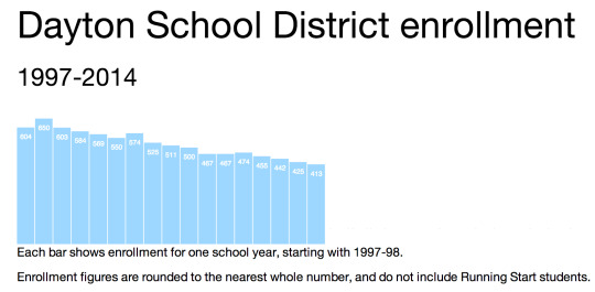
Data Project #3: A graph of Dayton School District enrollment using D3 (a JavaScript library for manipulating stuff using data).
It's taken me a while, but I finally put together a simple, clean graph of enrollment for the Dayton School District, which is one of several small rural school districts I cover.
You might look at this and think, "How did this take you 3 weeks?" And my answer would be, "Clearly, you have never tried to learn D3 during your spare time."
I relied almost entirely on this wonderful tutorial by Scott Murray, which involved a lot of hand-holding with the code, so I'm not as confident as I'd like to be that I could build something from scratch with D3. But I think I'd be better prepared to try, and I'd like to do that at some point down the road during this project.
As with the TileMill project from a few weeks ago, I feel like I've been exposed to an amazing, powerful set of tools for visualizing data and have barely scratched the surface.
Reflections on the data
I wanted to do so much more with this graph, and probably will down the line. It's related to a story I've been working on for several months about students who transfer out of the district.
Last year, a total of 89 students living within Dayton's boundaries were open-enrolled in other school districts or online programs, which cost them about $600,000 in state funding (versus $3.5 million total funding). It's a huge issue for them, and it's also created a chicken-and-egg situation where some of the things that might keep students in the district cost money they don't have because so many people have left. I spent this week drafting a story we're planning to run in a few weeks looking at why this is happening and what might be done about it.
Enrollment decline is related to the out-transfer issue, but it's also its own thing. I really wanted to plot enrollment on a line graph against county population (relatively stable from 1997-present) and county population ages 5-19 (declining over the same period, but I'm not sure by how much relative to enrollment). But my D3 skills are not quite there yet.
Reflections/self-eval
I really wanted to get year labels on the data, but wasn't sure how to do that using the tutorial we were doing. I did successfully make a separate set of text elements inside an SVG element to function as year labels, but I wasn't able to get them styled or visible or placed where I wanted, and I figured I'd spend long enough messing around with the graph.
While the utility without year labels is questionable, I like the overall look of the graph quite a bit: it's clean, simple and easy to spot the trend in enrollment.
SVGs are both awesome and confusing. I struggled with making them responsive: I was able to do it by making each individual rectangle its own SVG (instead of a "rect" element inside an SVG) and styling those SVGs in the CSS, but then a lot of the code later in the tutorial didn't work. There's probably a simple solution here, but I need to read more documentation about SVGs, clearly.
0 notes
Text
Guiltblogging the data project
My data project went on hold last week (as in, I didn't make anything new) and I've been feeling guilty ever since, which is making it hard to get back on track.
We did our election coverage last week, so I had to track down eight candidates for two county commissioner races, interview all of them and then write those profiles up. Also, we're in the process of switching to a new paywall, so I've gotten to do quite a bit of exciting FAQ-writing for that. Combined, that meant less time than usual to experiment with code things at work.
I did have a data thing ready to go last week - some charts I made on Infogram for a story I'm working on - but I wanted to make myself do something involving Javascript/jQuery, so I held off on posting that. My perfectionist side also took over and wanted to wait until I had a series of charts to tell the whole story, not just a few that show I've learned how to use Infogram and select complementary color schemes for graphs.
Part of me thinks I should just post what I have and save the more technical stuff for later. But sooner or later, I'll be out of relatively easy projects, and then I worry about getting buried with another week like last week.
I did do some messing around with D3 this morning and started reading this set of tutorials, which has got me all excited (except for the part where things didn't work as expected on my end). I'm hoping that will yield a rudimentary graph by the end of the week, but if not, I'm going to post the Infogram stuff and call it good.
Also, I really need an accountabilibuddy here.
0 notes