#PP_HNCGD1
Explore tagged Tumblr posts
Photo

Passion Project | Poster Final Touches & Mock ups
Here I have added in the finishing touches to the designs for each poster to include further copy, festival logo, website etc for promotional event purposes.

I created the info design/alignment purposefully to evoke the shape of a film slate as I felt that tied into the theme.
The mock ups I have used help to create a sense of scale and environment as I envisioned these posters to be used on billboard and outdoor settings to advertise the event, they are paired with a small selection of merchandise mockups ie postcards, tickets and totes.
Casablanca
Final advertisement poster and Ticket and Merchandise Mock ups


Dirty Harry
Final advertisement poster and Ticket and Merchandise Mock ups


Star Wars
Final advertisement poster and Ticket and Merchandise Mock ups


Jaws
Final advertisement poster and Ticket and Merchandise Mock ups


#PP_HNCGD1#mandela effect#graphic design#passion project#poster design#typography#film festival#student project
18 notes
·
View notes
Text
WINDOW POSTER
For my window poster I wanted to choose one of my logos to take forward to include in my window poster design. The poster is intended to be used in the stores windows to promote the brand collaboration. The poster can also be used in store in light boxes as part of the store design concept. The goal is for this poster to clearly show the new brand logo and the date and location of the city that it is launching in.
RESEARCH
The idea of ‘window shopping’ is even more relevant at the moment, where smaller shops have to limit the number of customers in their store at any one time. Now, if there is a queue outside your shop, a potential customer may think twice before spending time waiting their turn. This means that an eye-catching window display is more important than ever.
What do we appreciate the most when window-shopping. It may be the layout of the items, the different colours and decorations used to complement the products. Perhaps it could be the recreation of real life situations or even touching and heartfelt messages used to advertise. All shop owners know the importance of using their shop fronts to encourage patrons to enter. Yet this wasn’t the case for British retail in the 1800s before the store display revolution. Shop windows were originally just an extra storage area for stock and not much thought was given to their appearance.
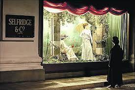
In the television program Mr Selfridge you may have been surprised to learn that the evolution of the window display was part of a radical change in the way we shop. Interactions between sellers and customers were very straightforward and transactional. In the show, when Mr Selfridge goes shopping for a pair of gloves for his wife, he is frustrated by the need to request to see each individual pair of gloves and requests that they are all emptied out on the counter for him to look at and feel. This sparks the idea for how he wishes his brand new department store to look and work for his customers. was credited with injecting life and creativity into the shopper experience. He introduced the art of shop window displays to the UK in 1909. He was one of the first to create window dressing displays to attract customers. The American millionaire’s aim was to “make an art of window display and upgrade window dressing”.
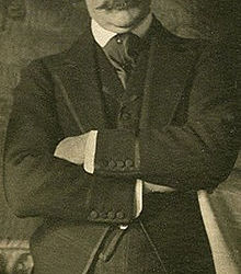
SALVADOR DALI
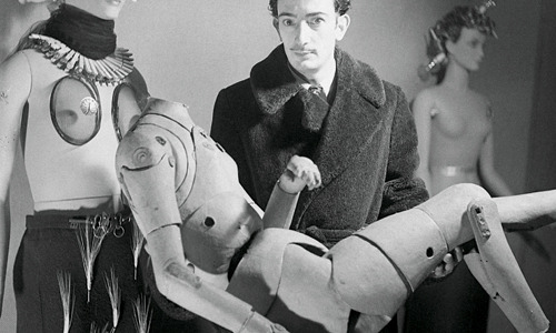
In New York around the winter holidays families, fashionistas, and ordinary passers by would flock to the impressively decorated department store windows on New York’s Fifth Avenue. Lush fabrics and mechanised displays delight viewers, and lure them inside to shop. From 1929 to 1980 Bonwit Teller was one of those dazzling wintertime stops, a high style ladies’ retailer on Fifth Avenue. But Bonwit Teller’s window displays were much more than glitter and women’s wear. In 1929 the store hired their first artist as window display designer: the eccentric Salvador Dalí. And a fascinating history of creative collaborations was born.
ANDY WORHOL
Warhol had been a commercial artists for many years. An illustrator specifically. In 1951 Bonwit Teller display director Gene Moore hired Warhol to provide artwork for the shop’s windows, as an extension of his work as a commercial artist. As an avant-garde Pop artist Warhol’s work was not being taken seriously in New York at the time. But 1961 brought his big break. The artist hung five paintings behind department store models and announced the significance of his own artwork – lowbrow subjects with a cheeky take on consumerism. The paintings were based on comic book strips and newspaper advertisements, and the stylishly dressed mannequins in front played directly with the idea of art as advertising.
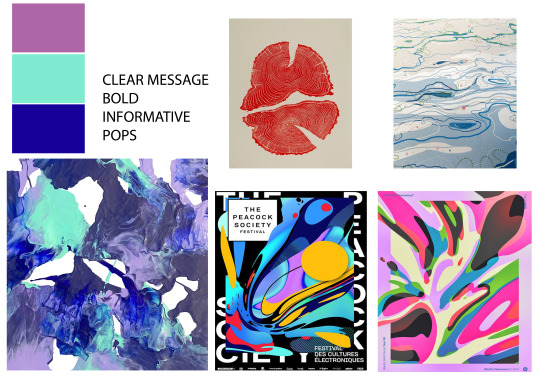
RESEARCH BOARD
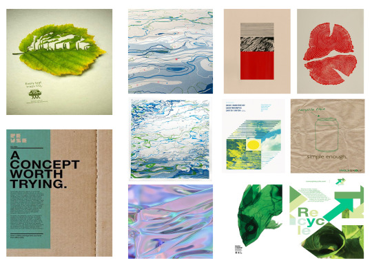
I was really drawn to bright vibrant colours and patterns. Looking back at my previous making I was keen to continue the theme through brand, concept and design. I wanted to really bring through the colours and patterns I had created. Ultimately this concept was to highlight sustainably fashion.

Below I pulled some images together that inspired me. These images where very natural based and I wanted to concentrate on the element of global foot print and sustainability. The use of printing, ink bleeding and using reusable backgrounds really inspired me.
CONCEPT BOARD
DEVELOPMENT
Before jumping straight into the design stage I draw up a few of my ideas and some layouts. If I don't start at this stage would struggle to really start anyway other that looking at the blank page hoping something happen.
A lot of my ideas where based around with incorporating my making from the previous post. I wanted the typography to be simple yet bold, to convey the message. Also for each poster to be made personal to each store that it is in also
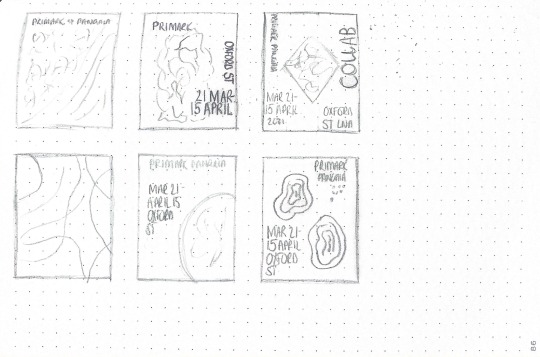
For my first design I incorporated some of my making. As you can see this also has my logo before I developed it further. Like the logo at this stage the poster and logo looked pretty unoriginal. With restricted by me trying to somehow keep with the current identity of the brands and not make its own. Thee is defiantly lots of areas I can improve on. Mainly creating a better identity and more cohesive.
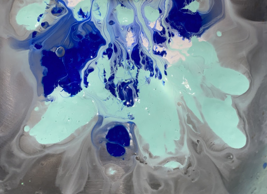
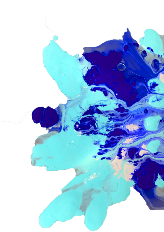
I then wanted to try include my making I had done as part of my branding and swing tags for this poster. Below is my previous making.
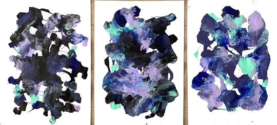
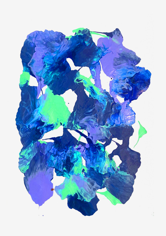
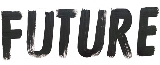
During my time developing my brand logo I looked to free handing some hand painted lettering. This was something that I also wanted to include in my design aspect of this window poster. As in my branding I didn't want all of the lettering to be hand painted just an element of the context in the message.
MESSAGE
In my poster I had to have a think about what I wanted to include in it. What was the message ? Doing back to the start of my research on both brands the reason for choosing them was the message they both pushed as brands. This was to improve the carbon foot print and work towards a more sustainable way of fashion. Some of the below there lines I looked at using.
“Working Together”
“A Better Further”
“Making Changes”
“ Together We Can Change”
After further developing my logo and branding I wanted to push forward on my window poster. Using my making that had became a huge part of my brand identity I wanted to work round this. Taking inspiration for some of my previous research I then started to play around with typography styles and placement. I could see it was starting to take shape. After some feedback from my tutor I had a better understanding in what direction I needed to go down. Perhaps I needed to look at painting some of my typography out similar to my branding just so that there was a connection. I also hadn't added in the brand logo so it didn't really has meaning as of yet. Time to go back and develop this further.

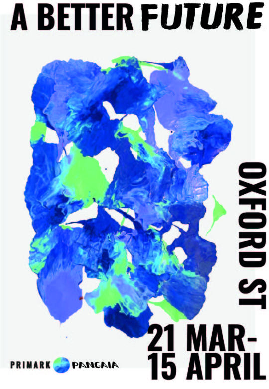
My final design I tired to create a strong message for the customer. This poster I the first thing they will see before they enter the store. I wanted it to have a clear message about the location the brand and the launch dates. Overall I am happy with the outcome if I had to make any changes I would develop the layout more.
2 notes
·
View notes
Text
All Hands on Decks: Research


REFERENCE www.jimphillips.com. (n.d.). JIM PHILLIPS homepage. [online] Available at: http://www.jimphillips.com [Accessed 29 Jul. 2021].
Phillips, J. (2007). Jim Phillips : the skateboard art of Jim Phillips.Atglen, Pa: Schiffer Pub.
Adventuresportsjournal.com. (2021). [online] Available at: https://adventuresportsjournal.com/wp-content/uploads/2013/10/cdot-web.jpg [Accessed 5 Aug. 2021].
Many images from Forcopssake’s Instagram at https://www.instagram.com/forcopssake/
#PP_HNCGD1#allhandsondecks#jimphillips#skateboardart#skateboard#GraphicDesign#santacruz#forcopssake#Spiderverse#steal like an artist
7 notes
·
View notes
Text
PASSION PROJECT: Symbols
Not too much energy left today to go into too much detail but I have crafted a whole bunch of symbols for my wayfinding system and possibly for use on maps. One to go but I’ve popped in a wee reminder and I��ll get round to it tomorrow. Good night!

7 notes
·
View notes
Text
Passion Project
REFINING IDEAS
Further development of the brand mark for BREWMAID Beer Co:

#PP_HNCGD1#BEERLABELDESIGN#PASSIONPROJECT#BRANDING#LOGODESIGN#GRAPHICDESIGN#EXPERIMENT#REFLECT#DESIGNSTUDENT
4 notes
·
View notes
Text
Passion Project: Adaptations
Firstly, I apologise for the quality of the screenshots - but this post is about layout, so really nobody's looking at the details.
Having pieced the brochure together, I took a break. Didn't look at it for about ten days or so. Coming back with fresh eyes (and fresh resources for my textures) meant I quickly spotted things that didn't work and things I wanted to improve.

Above is the layout I had at the end of my last session. A front cover, five double-page spreads, and a final photograph. I'll wait until I print out a copy before I decide what I think of the front and back pages, and I'm beyond chuffed with the 4th spread, but the others required a little editing.
And I know I tend to waffle on sometimes, and seeing as one of my aims with this brochure is to minimise text, I've given myself only a small space in each comparison to explain my process.


My next step will be to print this out. Having enjoyed the old skate magazines so much, my first plan is to see how they look on yellow, aged-looking paper. Wish me luck, fans.
3 notes
·
View notes
Text
Passion Project: Branding Alternatives


This branding is very cool - am I allowed to say that? I love the smooth style of it, I love the way it all flows, I love the fact that it has a skatepark feel to it through the bumps and slopes. However, when applying it to decks and t-shirts it became clear that it's not really obvious enough. So, I spent time creating various thicknesses that felt more in tune with the idea of a skate brand, yet I still wanted to allow the logo to carry the Minimal concept.

A lot of this logo carries the meaning of the brand well, but I think in the situation where I'm trying to create a bold brand in a popular market, it may not have the impact that I want it to.
2 notes
·
View notes
Text
Passion Project | Concept Experimentation
Star Wars: The Empire Strikes Back
I really wanted to attempt the other movies I had listed, so I decided to apply the same method to the Star Wars poster as I had for the other designs. I began again by printing out and playing around with cutting and pasting the words to re-arrange and create texture for the poster.
I first toyed with beaming a light into the word NO. The intention for this was to make the word ‘No’ the highlight, make it look large and in your face. It was looking quite cool, but also proved tricky to get just right and I wasn’t sure at first how this would translate once brought into computer (plus my camera phone ain’t great)


Imagery wise I considered light sabers but in the end settled on the Darth Vader mask as it creates a little ominous energy to the poster. The image is by Inkredo Designer on unplash, I considered buying a mask to create the image but I liked how this image looked and wasn’t sure I would achieve any better with a crappy toy mask and dodgy phone camera. I scored out Luke’s name and made the score look a little like the glow of a lightsaber
I quite enjoy this outcome, but unsure if I like it with the red ‘father’ or without?
I wanted to try another method and fell back on coloured acetate to add some shapes to the design.
I wanted to make sure that colour (specifically red) was a focal point for this design, to create a feeling of alert, evil, danger and also to correlate to Darth Vader’s lightsaber. So in my final design I made this clear and contrasted the red by having ‘Luke’ appears in green to mimic his good side and his light saber. (which I was unsure if was green or blue, turns out he had both colours but acquires the green after losing his orginal in his battle with Darth Vader)

left: original scan, right: final design
Now I just need to decide on which version I like best. I’m drawn to the right purely based on the bold red, it draws the eye well.

6 notes
·
View notes
Text
Passion Project | Branding the Festival
It’s time to think about the Film Festival itself before experimenting with the poster concepts.
Naming the Festival, and creating a quick brand (this is not the full focus of my brief, so I kept it simple)
So I wanted to create a name that would play to the theme of the Film Festival. After creating a mind-map I was able to hone in on several ideas. I liked the idea of using the words REVEALING, CUT, REEL and/or BUFF. ‘Reel’ could be used in place of ‘real’ as it directly relates to cinema as well as the concept of showing the ‘real’ movie line. I also enjoyed the words ‘Film Buff’ and envisioned the word ‘buff’ in a more literal term of buffing out something that is there in error or needs to removed. I wanted to also make sure that I was able to show the theme of the Mandela Effect within the title and feel of the Festival itself (although I’m not sure how I can achieve this) and this could be explored further throughout the physical promotional materials and visuals.

So after some help from my partner, who is much better at coming up with clever titles than me, I settled on the following list of ideas:
Title
The Reel Film Buff Festival or
Moonsing Film Festival (play on Sundance)
Tag-lines, some need re-thought and played with to be more marketed towards cinema and the Mandela effect. I think it should allow the audience to question something, I just need to get the wording right, incorporate thing such as MEMORY, REVEAL, REEL, MOVIE LINES/QUOTE etc.
Movies as they were meant to be remembered
So you think you know your onions?
For the Reel Film Buffs
Warning, could be reel-y revealing!
It’s ‘reely’ revealing
That’s a Cut!
Lights, Camera, Reveal!
Re-visiting the classics
Do you know the reel line?
Don’t Cut Away
There is a lot to uncover
Do you need to go over your lines? (something to do with movie lines)
I have know I have decided to settle on the title:
The Reel Film Buff Festival
Creating a logo design for the Festival
I needed to create a quick identity for the overall branding of the festival to use across the promotional material for the posters, tickets, merchandise etc. This will give me a base for my posters.
Inspiration
youtube
I have fond memories of going to the Showcase cinema in Linwood and singing along to the Pearl & Dean intro, a highlight of cinema trips...
...as well as the super 80′s/90′s National Amusements neon clean up your shit, shut the hell up and turn off her god damn phone advert (I joke) but, no joke, re-watching these almost made me tear up a little, and I don’t know if thats just nostalgia for you or the fact I haven’t been to the cinema in a year and a half, and for me I am usually there every week. But anyway, tangent on nostalgia over, watching these sparked that feeling of how much going to the cinema can mean, its not just a movie, its an experience and an escape from reality, something I didn’t realise how badly I missed. People love film and this festival is supposed to be a celebration for those big film buffs.
youtube
The Pearl and Dean advert uses film reel imagery within the branding and this is something I was thinking of incorporating into the logo of the Festival. I enjoy the feeling of movement it creates and its use of chrome colours (not sure if thats correct term) evokes an almost retro camera film feel.
I was also finding myself inspired by other logo designs such as Film4, which uses a red colour and bold angular shape to create the number 4 within its branding. I liked its modern, crisp and memorable imagery.

So with these in my head and a little research and mood boarding of other film festival branding, I began digitally sketching out and playing around with concepts. I’m not one for sketching loads of ideas on paper, I find going straight into illustrator gives me more freedom for experimenting with ideas in my head.

Above: Film Festival logo & branding, noted they mostly rely on black and white colours, are simple and bold. I enjoy the pop of colour in the Glasgow Film Festival and its super simple branding using a outlined rectangle to represent a screen, I’d like to echo this in my idea by keeping it minimal in its design.

Above: Initial concept play and font/typeface selection

Above: another idea I had that i didn’t bring into the computer, but I feel there was definetly something there, I think this one the ‘reel’ would need to be omitted as it wouldn’t work for the concept.

Above: Another concept using circle film reel Imagery. Although I note in the above that it evokes a feeling of aliens, I’m not sure if that is bad or good as aliens can be associated with conspiracies.

Above: Another explorative concept for logo using eye imagery. The eye idea works well with the conspiracy theme, as it can imply ‘open your eyes and look again, you’ve remembered it wrong!’ and I’m a little torn between this concept and the final one below.

Above : I think my final concept selection (bottom right)
Throughout these concepts I wanted to somehow play with with the placement of the text to echo the idea of words, quotes and phrases being removed, placed wrongly, added in etc. and so tried out a few variations of alignment.
After asking around, I think the final selected one on the bottom right reads the most clearly from the variants.
For the final concept I settled on using a film reel imagery to create a simple logo mark because that idea is used within the title of the festival. I thought this image/logo mark can be ‘unrolled’ and expanded upon throughout the promotional material and branding of the project, ie. I can ‘unravel’ it or use its shape in different forms to highlight or separate different information, words, phrases and imagery as well as uses it to physically frame and contain element, just like a movie screen or camera lens.
Now to start exploring, experimenting with and researching festival/event posters and what they look to achieve?
Initial thoughts on what a film festival poster looks to achieve:
Excite, anticipate, convey information at a glance (date and subject), create a feeling and capture the emotion of the event, fun, engaging, different, stand out, build awareness, attract correct demographic
For this project I also began picking up books for reference beginning with, Saul Bass: A Life in Film & Design and Selling the Movie: The Art of the Film Poster

Above : inspirational photos snaps I saved from Saul Bass: A Life in Film & Design. I enjoy his concepts for his movie titles, and he plays a lot with interesting concepts to reveal information slowly, ie, tearing the paper, lifting sticky notes in an animation sequence, burning the poster, punching holes etc. And all have connotations to the theme of the film. These concepts have given me ideas to try out with my own posters.
On his opening titles for Bunny Lake is Missing Saul states “the opening reflects this psychotic state of mind. It consists of series of hands entering the screen and tearing various shaped pieces out of the screen revealing the different credits...with the final action creating the symbol for the film-the shape of a child torn out of paper” the peeling away of layers of paper is a metaphor for the peeling away of layers of mystery in the film about a child who disappears.
Interestingly, from my initial toe dip into poster research, the use of the film reel imagery to convey a Film Festival seems to be used very frequently. In Saul Bass’s designs he almost exclusively uses this to represent the event, so its fitting that I have used it in the branding of the festival.
I adore Saul Bass work, his use of colour, objects and suggestive/metaphorical imagery to convey a film was ground breaking and I admire the simplistic feel to his posters.
Below : Selection of Saul Bass’ Film Festival Poster Designs

8 notes
·
View notes
Text
Passion Project: Inspiration
I don’t think I’m starting at the beginning with this post. Keep your eyes peeled for later posts that explain what I’m doing and why.
After a month of thinking about, sketching and painting designs, I have finally done something. Essentially, recently watching two films has pushed me into action, and a part of me is ashamed to admit it. There isn’t a word count or any typesetting to curtail my thoughts here, so strap in.
When I created this brief I figured I’d draw a million wee skateboards, colour a few of them in, then fling my favourites into Adobe illustrator and make them look good. From there I would take the 5 best up to the skatepark and ask some of the patrons there which designs stood out to them. Next, I would adapt the three front-runners and create sweet PhotoShop mockups that would show what my designs would look like as skateboards. If I had the time, inclination or money by the end of the project, I would have the design laid onto a real skateboard (I’ve been looking to buy a new one for some time) and then be proud of myself.
So I’ve drawn some wee skateboards. Then I started upscaling the designs onto the floorboards of my loft:
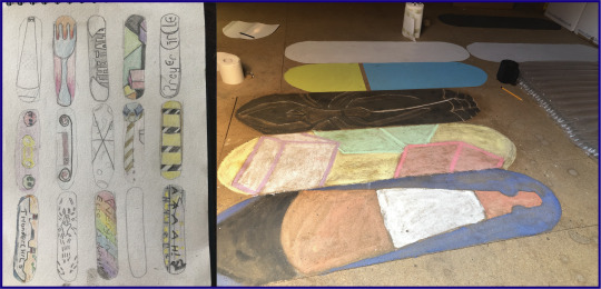
This was an exercise to let me see how small things need to be adapted to be blown up. Skateboards can have any level of detail that you like on them, I hadn’t considered this until I was trying to draw a semi-perfect triangle for the traffic cone, or until I was using chalk to recreate four cubes. It’s also been fun to work with different media on chipboard - I have learned that most kinds of pencil, paint, chalk and charcoal do not like being used on chipboard. Decorating paint, however, has no such issues. Thanks, Dulux!
And so, with a few of these under my belt, I decided to try some digital designs. So I jumped into Illustrator and totally ignored my sketchbook, coming up with three designs that were all inspired by the day I had just had. The top design, I’ll focus on last, for reasons that will become apparent (unless you follow me on Instagram, where you’ll already know that it’s an absolute hit, with over 19 likes already!). I was told by a guy at the skatepark that he likes decks with very basic designs, just a colour or two, nothing overly detailed. Another skater told me that he often likes the basic wood background with one small emblem or sticker just beside the wheels.
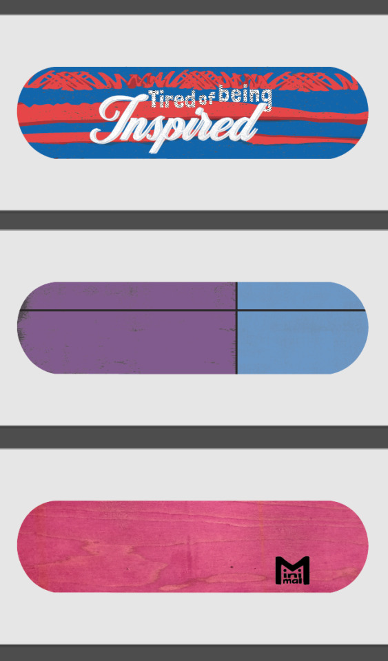
The duo-tone design felt nice, I’m usually one for over-complicating things. I definitely have an attitude of “If there’s more in it, there’s a greater chance someone will find something they like”. The first colour choice put my girlfriend in the mind of a hand-bag she had seen photographed in the arms of Carrie Fisher - it was designed to look like a Prozac pill. So I changed the colours up, and added the separating black lines and textures to give it some subtle character. I then went full meta with the Minimal design. And, if I’m being honest, I’m incredibly happy with how it looks like a wee character. Expect to see that making a comeback in the very near future. But the top design is what really got me going.
I’ve recently been watching...
...Spider-Man: Into the Spider-Verse, and have been loving Miles Morales’ multiple hobbies of graffiti, mixing beats and saving his neighbourhood from a variety of dangers.

I then went to the cinema to see In The Heights, telling the tale of the Latin community during a blackout in North Manhattan. I found myself wrapped up in the romance, tribulations and music of the cast, and was felt oddly proud of Lin Manuel Miranda - who wrote this as a stage-musical while he was in college, had a modicum of success with it, then went on to create Hamilton, one of the most important musicals of our time. With the success of that particular show taking the entire world by storm, he was given the opportunity to make his old, relatively only semi-popular play into a blockbuster film. You can’t help but be inspired by someone like that.
I often find towards the end of a film I’m inspired by the characters’ journeys: be that from zero to hero, from lonely to loved or from rags to riches. Then I walk out and carry on with my normal life doing normal things. And as the hero of the story’s dreams all came true in the closing minutes (sorry for the spoiler, but it’s a musical, they rarely end in despair), a thought floated across my mind:
I’m utterly sick of being inspired
Now, to my credit, I did figure out in the car home that ‘tired’ would be a far more fitting and rhythmic word to use in this sentence, but this was a mentality that I found resonated really strongly with me. I’m very good at being inspired, I think most people are. We hear stories of people starting their own business, achieving some sporting brilliance or overcoming a personal hurdle and we say “Wow, isn’t that inspiring?” or
“It really inspires you to go out and make a difference!” or
“They are such an inspirational speaker!”
Then we go off about our day, not acting on the inspiration, and, for the most part, remaining uninspired. So I decided to act.
I did some very quick research (/acquiring of images of graffiti) in order to get the right shapes and textures to create a spray paint effect in Illustrator. I did some very quick research (/confirming the colours) of South American flags, taking the blue and red used in flags of the home nations of Miles Morales from Spider-Man and Usnavi from In The Heights. And I created the top design.
YES! I had been inspired and I had drawn a wee picture to show that - I had acted on my inspirations!
Then I looked to my left and spotted three, blank skate decks that I had bought on a whim from Re:Ply (a wonderful wee company who do a great deal of charity work supplying boards to people who need them, selling boards to people who can afford them, and for a very reasonable fee, providing unusable decks to people who want to use them for artistic purposes). I realised I hadn’t acted on my inspiration, I had just drawn a few pictures of skateboards with the eventual aim of PhotoShopping them onto other pictures of skateboards.
So I took myself...
... into the city centre with a shoddily prepared speech: “I’m looking for some cheap, small cans of spray paint. I’ve no idea what I’m doing, or if I’ll be good at it, so don’t want to invest too much into this.” Hiding behind this self-deprecating shield I barged into multiple art-, pound- and model-shops and pleaded with the staff to help a young idiot out. Amazingly, a very kind shop assistant pointed me in the direction of Fat Buddha, a clothes shop I’d always ignored as it seemed a bit to “...” for me. I don’t know what it seemed, but I knew it wasn't my kind of shop. Happy to prove me wrong, the guys in there were super helpful and they helped me buy my first cans of spray paint.
Now I’d spent money...
... and as a skinflint, that meant I had to get use out of my purchases. I had tricked myself into being inspired. Inspiration led me to the drawing, inspiration had led me to buy decks and the paint, now inspiration had to make me spray paint.
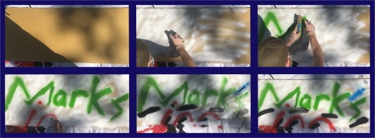
I’ll stop yammering on now. Essentially, I had planned on creating some analogue designs then digitising them (I’m guessing I should do a post on my brief, yeah? Might just upload the PDF to save me talking more), but then I found that I was doing the complete opposite. Genuinely accidentally. I had played with a few typefaces from various websites to get fonts that represented the ideas I wanted. The top one was semi-stolen (I can’t use the word ‘inspired’ any more in this post) from the end credits of In The Heights. The larger font is something of a nod to inspirational quotes you see on Facebook or on glittery frames in B&M.
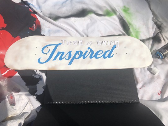
I printed those out and cut them into stencils (very impressed that my digital boards have been drawn to a workable scale, thanks Maths). And after putting down a tack-layer (GRAFFITI JARGON (I think)) I sprayed the whole lot in blue.
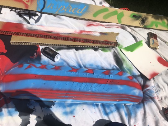
Next, I tried to get a little fancy. Using cardboard blockers to create straight lines I added stars* (borrowed from the Puerto Rican flag) and made the bottom stripes vaguely reminiscent of America’s Old Glory.
I peeled the lettering off, and I’d done it. I may have to explain the overtly-negative inspirational quote to people, but to me it’s a clear sign that there’s no point in just being inspired, and that’s all I wanted.
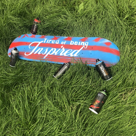
A weight I didn’t know I was carrying was lifted from my shoulders. The plan was to possibly end up with a self-designed skateboard. And now I have one.
*Yes, I know they’re crosses.
4 notes
·
View notes
Text


This week I got some pictures printed out and started collaging. It was a good practice to see how photos could work together to make something new. What’s frustrating about this method is that I can’t resize items, like I could directly on photoshop. I think I’ll need to rely on digital and analog methods.
3 notes
·
View notes
Text
All Hands On Decks: Brochure
With my design work complete, five skate decks painted/ printed and varnished and umpteen others digitally mocked-up, it was time to put all the work together. I had initially planned on presenting a poster with my processes and final pieces displayed on them, but with the amount of work I had done a brochure seemed more fitting. This was the biggest task I’d undertaken on InDesign, which required multiple files from Illustrator and PhotoShop to link across the 12 page document. Once it was all together, I printed the file out to get an idea of how it would look.


The next day was spent reading through it and “critiquing” my work. Essentially, annotating every part of the brochure that didn’t work, from typesetting to image placement, backgrounds to font choices.

Thankfully, this led to some pretty big improvements, but it’s amazing how something that looks perfectly acceptable on screen can be so different when printed out.
2 notes
·
View notes
Text
Passion Project | Concept Experimentation
Jaws
For Jaws, I wanted to look at some rather gruesome tearing, sinking and bite mark effect to change the quote. The goal is to make this poster design fill the viewer with dread and feel a little uneasy, but I would like to leave out the Shark imagery where possible as I think this echoes the movie perfectly, in that you do not see the shark until the very end.


Above, I decided to break out the paints for this quote (using the same typeface as the other designs to keep that coherent feel across the posters) and get shredding some paper. The goal is to erase the word ‘we’re’ and replace it with ‘you’re. I’m constantly worried during this process that the legibility will cause issues, but I think so far I am happy with the outcomes.
I preferred the far bottom left scan, so I brought this into Photoshop to toy around with further, adding some water imagery stills from the film within the text, but for the most part not much editing was required, just some colour and level adjustments to help push the effect.

The original experiment on paper translated very well into this design and I am enjoying the water leaked lettering. The slashed word ‘we’re’ feels as if it has movement and is submerged in water. I feel the word also weirdly looks like it has been bitten, so I guess I succeeded there, although that is purely my opinion. It would be nice to show these to someone and see if they directly know the movie at first glance.
3 notes
·
View notes


