#Nina Manandhar
Explore tagged Tumblr posts
Text
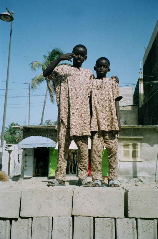
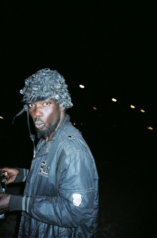

1, 2 by nina manandhar & 3 by wä dé
#photography#documentary#style#editorial#motorcycle#beauty#street photography#life#afrofuturism#styling#outfits#fashion#model
0 notes
Video
vimeo
'The Pause of Power' | On Running from Jess Kohl on Vimeo.
On Running AW21 Apparel “The Power Of Pause”
Featuring Chloe Abbott, Stephen Adjaidoo & Josh Amberger
Director: Jess Kohl Production Company: PRETTYBIRD UK Executive Producer: Juliette Larthe Producer: Benji Landman
Creative Lead: David Kauder Art Director: Davy Renaud Studio Producer: Anna White
Editor: Gaia Borretti Edit House: The Assembly Rooms Edit Producer: Josh Gochez Edit Assistant: Andre Rodrigues
Colourist: Tim Smith Post House: Cheat Post Producer: Nicki Coombes
London Crew Production Manager: Yazzmin Anderson-Moore Production Assistant / Covid Supervisor: Stephen Carruthers Production Assistant: Enrique Da Silva 1st Assistant Director: Clara Paris 2nd Assistant Director: Ato Yankey Director of Photography: Joel Honeywell Runner: Josh Haselden 1st AC: Hopi Dematio 2nd AC: Kairo Jones Steadicam Op: Junior Agyeman Gaffer: Chris Dowling Electrician: Lex Tully Sound Recordist: John Thorpe Wardrobe: Emmanouela Megkistou Wardrobe Van Driver: Dayo Olufemi Art Department: Kat Docherty Photographer: Nina Manandhar Photographer Assistant: Arthur Comely DIT: Chris Nunn Video Playback: Ben McConnel Medic: Chris Arnall Camera Van Driver: Paris Tume Minibus Driver: Mark Righelato Minibus Driver: Lee Righelato Camera supplied by: Panavision Lighting Supplied by Chris Dowling Radios: Lift & Shoot
Kentucky Crew Service Production Company: Frame 144 Executive Producer: Scott Irick Executive Producer: Kristina Dahl Director of Photography: Allison Anderson Stills Photographer: Ben Rayner 1st AC: Kim Meffert 2nd AC: Mike Reyes VTR: Marc Wellington Gaffer: Mike Dickman Best Boy Electric: JR McCleney Key Grip: Daniel Williamson Best Boy Grip: Jamie Pate Art Director: James Wise Sound Mixer: Brad Cassetto Stylist and Makeup: Lesa Miller Stylist Assistant: Sophia Hytken PA: Craig Mullins PA: Aaron Wiggen Camera: SKM Ventures Grip and Electric: Louisville Lighting & Grip VTR: CMG WALKIES: KY Bluegrass Prod
Brisbane Crew Production Company: Scoundrel Executive Producer: Adrian Shapiro Producer: Holly Winter Production Manager: Sarah MacKinnon 1st AD: Nick Embery Director’s Assistant: Susan Jackson Runner: James Bacskay DOP: Andrew Commis 1st AC: Bretty Tracey 2nd AC: Mark Desiatov VTR Operator: Eric Downer Sound Recordist: Paul Jones Gaffer: Dan Michaud Best Boy: Richard Boniface Grip: Logan Collier Ronin Tech: Mick Smith Buyer / Dresser: Bea Berry Wardrobe Asst: Sophie Borra Location Manager: Dugald McMaster Safety Supervisor: John Walton Stills Photographer: Chris Gurney
0 notes
Photo

Poster 28
Photo of human rights activist Loujain Alhathloul by Nina Manandhar
#lujain alhathloul#poster#graphic design#arabic typography#Typography#square kufic#feminism#Loujain Alhathloul#Nina Manandhar
22 notes
·
View notes
Photo


JOYRIDE
To joyride is to drive around in a stolen car with no particular goal other than the pleasure or thrill of doing so.
Joyriding was a major problem in the United Kingdom during the 1980s and accelerated in the 1990s, but has eased off since the year 2000 largely due to improved security standards on newer cars and the number of old cars with more basic security diminishing. Many surviving older cars have had modern security features fitted in order to reduce the risk of theft
In Northern Ireland, joyriding is a common crime and many people have campaigned against it. Since the 1980s a number of youth gangs have been in existence, particularly in nationalist areas of Belfast, dedicated to joyriding and other criminal activities. During The Troubles, paramilitaries such as the IRA administered to suspected joyriders extralegal punishment usually consisting of breaking their fingers or kneecaps in order to temporarily or permanently incapacitate them from operating most motor vehicles.
Collage references:
Turbo Vanish by NastyNasty
Mopped Guys by Phil Knott
Folk Archive by Jeremy Deller
Gradient Scooter by Patrick Tuttofuoco
Money on my Oyster by Nina Manandhar
Kent by Frayser V.BLOCC
Extras:
You, Me and Marley by Richard Spence
#joyride#you me marley#patrick tuttofuoco#nina manandhar#phil knott#jeremy deller#v.blocc#daniele torcellini#gabber eleganza
54 notes
·
View notes
Photo

Nina Manandhar
0 notes
Photo

By Nina Manandhar
1 note
·
View note
Photo

Mexico press.
4 notes
·
View notes
Photo

MARGARET HOWELL IN HER LONDON STUDIO, PHOTOGRAPHED BY NINA MANANDHAR, MAY 2019.
188 notes
·
View notes
Photo


Personal post no.21 - A book by Nina Manandhar exploring British fashion through the ages, one particular page caught my eye as it reminded me of a new smiley face bag I’ve bought.
0 notes
Text
Exhibition Plan
Previous Semester
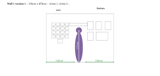
Although this has been explored in my post in the ‘inspiration’ section of the blog. I wanted to get started with my exhibition plan by talking about my previous experience where I used In Design to design my space for the exhibition using the correct dimensions and the requirements of the gallery space.
It was a quite a process in selecting work that worked well together to create a strong narrative for the project. I used a grid of small A5 prints of suitable selection of images that worked well through a consistent aesthetic. The use of small size worked well. I also used a participatory element (postcards) adds a fun and engaging spin as the question about one's favourite holiday destination is at odds with the presented images of Hatfield. I also placed my photograph on a plinth to add further interest in the project. This wasn’t just done over night, through various research and edits (see post in the ‘inspiration’ section of the blog) to get the final look of the project ready for the exhibition.
Key Elements for an Exhibition
In this section, I want to talk about the key elements for an effective show. You should have a body of work with a consistent theme rather than being a collection of random images that don't fit together. I have a project with a theme ready, although the project has black and white images as well as polaroids and various other aesthetics images, they all have a running theme that ties the work together.
Curating the images
It’s very important how much you space you have to exhibit, then you can plan your work around the dimensions. Now, it’s the challenging part, selecting images.
For the project above, I had a collection of 100+ images, I had 1.4m of space to work. I didn’t want to clutter the work as I thought it would detract the work hence I opted for a grid layout which informs the viewer the standard and the uniformal sense of the project which it self is a deadpan view. I exhibited 16 images of 100+ images. I had the A5 size in mind which helped to design for the show.
Promoting it online and offline
Although as a class we promoted our online (our social media) and offline (fliers / zine). Looking back, I don’t think it was enough. The exhibition was at a quiet place despite being in London. We spent a lot of time in planning for the exhibition that we didn’t take the time to promote and market the exhibition as effectively we should have which would’ve helped with the turnout. We didn’t use the local shops / community centre to promote, neither did we look for options online.
We also didn’t enter any competitions or open calls, we missed out in this key opportunity as there are plenty of organisations that help promote University student’s work. I didn’t do this previously hence I missed out on getting exposure to my work. However, in this semester, I have made this my goal.
Previous Ideas
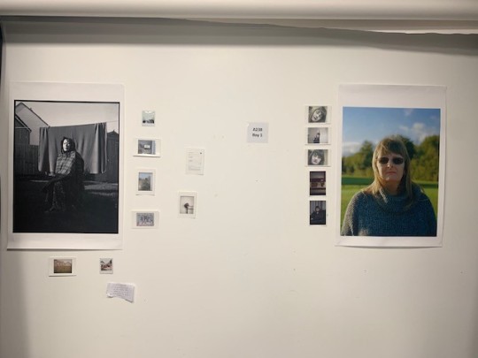
Through out the previous semester, I had a theme running in terms of exhibiting my work.
-’Random’ placements of images on the wall= Mimicking the appearance of a workspace or a personal wall, the scarcity of the images suggests variety of themes and subject matter
-Varied in size and scale of the prints= This gives importance to various subject matter in images.
The idea was to have my images disperse on the wall which hints at my identity which is so scarce itself with no clear beginning or ending. “I’m a queer mixture of east and the west, out of place everywhere, at home nowhere.”
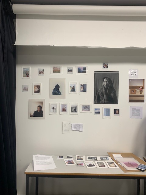
For the print options, I always had this idea of having various prints from darkroom, inkjet, C-type, polaroids as well as texts. It’s this rough look that still entices me as that’s what the project is about. This raw, introspective exploration of identity and scarcity of it.
Influence
Wolfgang Tillmans has an influential figure to me in terms of exhibiting work. His method of using prints without usage of frames or any other materials that ‘inform’ you that it’s a special image. He simply uses his images using minimal technique, whilst he experiments with scale as well texture of the prints.
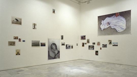
Tillmans's images in exhibitions are casual seeming in both their subject matter and their dispensation around the walls: some small, some large, some close together in linear runs, some mounted high up, low down and, occasionally, printed large and given solitary prominence.
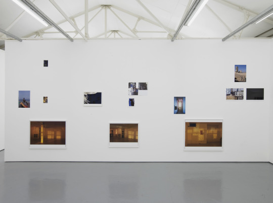
It’s compatible to that of magazine layouts; some people made reference to teenage bedroom walls, which, in the seemingly ad hoc positioning, the shifts between genres and the inclusion of portraits of friends and the occasional music or fashion celebrity, also seemed pertinent.
The spatial relationship is key in his work as he uses negative space to surround his large / small images, sometimes they are cluttered, others are not suggesting the relationship. The method replicates our working space where each print stand out against the spacious white wall. The subject matter is also dispersed amongst the wall as Tillmans makes connection between the detail of his lives to give them an aesthetic and often emotional presence which is something Tillmans intends to share.
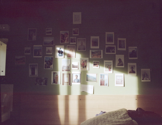
My room
I have experimented with a more tighter approach than a spacious take. Although it appears and feels ‘ amateurish’, I think it adds to the narrative to the project, it seems unfinished and still under working process which is exactly what my identity is, it’s a working process. The ‘raw’ images on the wall becomes something else, it’s almost journal like, maybe more perhaps a working sketchbook.
Inspiration II
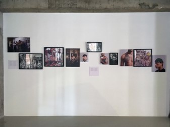
Nina Manandhar has been a big influence in my project which I explored in the previous semester. The exhibition show depicts an editorial like photo story where it conveys a narrative about the Nepalese identity. The dispersed images on the wall with a row of images work well as a documentary editorial project where the layout is informative and cohesive. The work highlights themes of kinship, fraternity, belonging, collective cultural expression and masculinity. With Manandhar being Nepalese as her father is from Nepal, she uses her camera not only as a tool to explore her environment but also to develop projects which depict dual heritage identity as informed by her own. The resulting body work, functions as part anthropological enquiry and part personal story from her point of view of a mixed-race British Nepali women who has grown up as an insider/outsider to the Nepali community in the UK. Her particular interest in the young males nods to the imagined setting of her father in the UK- a hint at his life as a young man and his journey settling in London, but also her own identity as British Nepali.
Experimentation
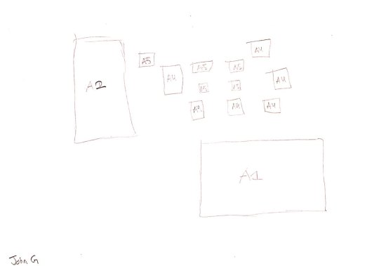
Prior to Covid 19, the above was a rough plan for the exhibition. The layout is a result of lots of experiments in the past. I wanted to have two huge prints instead of one to highlight certain subject matter in the layout as I thought having just one huge print will have lots of influence on the other small prints. By having two huge prints, I can base the small, supplementary images to the project. It has a playful appeal to it, which works well to place importance on each print. I wanted to experiment with the spatial relationship between the prints as they have various subject matter from landscapes, still life to portraits. With care and thought behind it, it can mix well together to create a sense of cohesiveness to the project.
Core Idea
Similar to the photo book idea, I want the exhibition to have a feel of “family photo” type of images but with a fine art approach, where the layout or having “rough” prints suggest otherwise with experiments on the scale and the spatial relationship between the prints. I think having this "look” work for the project as it seems to take in lots of ideas and explores them lightly. As a result, the work appears to pull in to the work but with distance, and with distance, instil a connection.
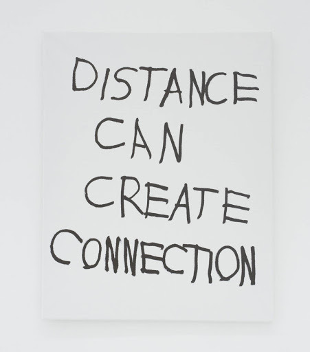
Jim Joe
As a result, the photographs looks at the present world with distance, and with this distance, instil a sense of amazement. The camera is an eye and is utilised as an instrument of perception which examines the self and the external world and in doing so, provides visual expression to concepts of reality. The landscapes, still life and portraits become a container for this memory. Creating this work, interacting and reflecting upon my identity is a reminder that at some point I was in that moment, it now acts as a portal.
At the core of it, it’s much about me and my life, what has been and what is. I think the viewers can somewhat understand the themes of the project and hopefully understand where I’m coming from. The work informs and shares the perspective of someone who’s unknown and the identity is also somewhat underrepresented in society. Although the work is filtered through own experiences of growing up in Nepal and Nepal. These photographs express my personal nostalgia for a long past period of my life and the places of my childhood. I believe that they also inspire feelings of nostalgia in many of the people who view them who might have grown up in a similar way. Perhaps it may stimulate embodied memories of some who might have shared some experiences of place and people that I have experienced in this project.
Essentially, the prints takes photography literally. “We are all frightened by time and the way it moves on, and the way things disappear. That’s why we are photographers. We are preservationists by nature. We take pictures to stop time, to commit moments to eternity. Human nature made tangible.”
Reference
Jobey, L. (2010). Wolfgang Tillmans: the lightness of being. The Guardian. [online] 25 Jun. Available at: https://www.theguardian.com/artanddesign/2010/jun/26/wolfgang-tillmans-serpentine-photographs-exhibition [Accessed 21 Apr. 2020]
artnet News. (2020). “Record-Keeping Is Never Neutral”: Wolfgang Tillmans on How Photography Can Be Used as a Potent Political Tool for Change. [online] Available at: https://news.artnet.com/art-world/wolfgang-tillmans-interview-brussels-1798353 [Accessed 21 Apr. 2020].
0 notes
Photo


“THESE DAYS I WAKE UP, AND I’M GENUINELY SO GASSED TO BE ALIVE.”
#GENF: FROM THE SUBURBS OF LONDON TO THE CHORUS OF TYLER, THE CREATORS’S LATEST TRACK, MEET 19-YEAR-OLD INDIE SAVANT REX ORANGE COUNTY.
PHOTOGRAPHY BY NINA MANANDHAR
219 notes
·
View notes
Photo

Boy Town, by Nina Manandhar #inspired
48 notes
·
View notes


