#NOTE:
Explore tagged Tumblr posts
Text
Alt Text: Not Always Needed
New Post has been published on https://thedigitalinsider.com/alt-text-not-always-needed/
Alt Text: Not Always Needed
Alt text is one of those things in my muscle memory that pops up anytime I’m working with an image element. The attribute almost writes itself.
<img src="image.jpg" alt="">
Or if you use Emmet, that’s autocompleted for you. Don’t forget the alt text! Use it even if there’s no need for it, as an empty string is simply skipped by screen readers. That’s called “nulling” the alternative text and many screen readers simply announce the image file name. Just be sure it’s truly an empty string because even a space gets picked up by some assistive tech, which causes a screen reader to completely skip the image:
<!-- Not empty --> <img src="image.jpg" alt=" ">
But wait… are there situations where an image doesn’t need alt text? I tend to agree with Eric that the vast majority of images are more than decorative and need to be described. Your images are probably not decorative and ought to be described with alt text.
Probably is doing a lot of lifting there because not all images are equal when it comes to content and context. Emma Cionca and Tanner Kohler have a fresh study on those situations where you probably don’t need alt. It’s a well-written and researched piece and I’m rounding up some nuggets from it.
What Users Need from Alt Text
It’s the same as what anyone else would need from an image: an easy path to accomplish basic tasks. A product image is a good example of that. Providing a visual smooths the path to purchasing because it’s context about what the item looks like and what to expect when you get it. Not providing an image almost adds friction to the experience if you have to stop and ask customer support basic questions about the size and color of that shirt you want.
So, yes. Describe that image in alt! But maybe “describe” isn’t the best wording because the article moves on to make the next point…
Quit Describing What Images Look Like
The article gets into a common trap that I’m all too guilty of, which is describing an image in a way that I find helpful. Or, as the article says, it’s a lot like I’m telling myself, “I’ll describe it in the alt text so screen-reader users can imagine what they aren’t seeing.”
That’s the wrong way of going about it. Getting back to the example of a product image, the article outlines how a screen reader might approach it:
For example, here’s how a screen-reader user might approach a product page:
Jump between the page headers to get a sense of the page structure.
Explore the details of a specific section with the heading label Product Description.
Encounter an image and wonder “What information that I might have missed elsewhere does this image communicate about the product?”
Interesting! Where I might encounter an image and evaluate it based on the text around it, a screen reader is already questioning what content has been missed around it. This passage is one I need to reflect on (emphasis mine):
Most of the time, screen-reader users don’t wonder what images look like. Instead, they want to know their purpose. (Exceptions to this rule might include websites presenting images, such as artwork, purely for visual enjoyment, or users who could previously see and have lost their sight.)
OK, so how in the heck do we know when an image needs describing? It feels so awkward making what’s ultimately a subjective decision. Even so, the article presents three questions to pose to ourselves to determine the best route.
Is the image repetitive? Is the task-related information in the image also found elsewhere on the page?
Is the image referential? Does the page copy directly reference the image?
Is the image efficient? Could alt text help users more efficiently complete a task?
This is the meat of the article, so I’m gonna break those out.
Is the image repetitive?
Repetitive in the sense that the content around it is already doing a bang-up job painting a picture. If the image is already aptly “described” by content, then perhaps it’s possible to get away with nulling the alt attribute.
This is the figure the article uses to make the point (and, yes, I’m alt-ing it):
The caption for this image describes exactly what the image communicates. Therefore, any alt text for the image will be redundant and a waste of time for screen-reader users. In this case, the actual alt text was the same as the caption. Coming across the same information twice in a row feels even more confusing and unnecessary.
The happy path:
<img src="image.jpg" alt="">
But check this out this image about informal/semi-formal table setting showing how it is not described by the text around it (and, no, I’m not alt-ing it):
If I was to describe this image, I might get carried away describing the diagram and all the points outlined in the legend. If I can read all of that, then a screen reader should, too, right? Not exactly. I really appreciate the slew of examples provided in the article. A sampling:
Bread plate and butter knife, located in the top left corner.
Dessert fork, placed horizontally at the top center.
Dessert spoon, placed horizontally at the top center, below the dessert fork.
That’s way less verbose than I would have gone. Talking about how long (or short) alt ought to be is another topic altogether.
Is the image referential?
The second image I dropped in that last section is a good example of a referential image because I directly referenced it in the content preceding it. I nulled the alt attribute because of that. But what I messed up is not making the image recognizable to screen readers. If the alt attribute is null, then the screen reader skips it. But the screen reader should still know it’s there even if it’s aptly described.
The happy path:
<img src="image.jpg" alt="">
Remember that a screen reader may announce the image’s file name. So maybe use that as an opportunity to both call out the image and briefly describe it. Again, we want the screen reader to announce the image if we make mention of it in the content around it. Simply skipping it may cause more confusion than clarity.
Is the image efficient?
My mind always goes to performance when I see the word efficient pop up in reference to images. But in this context the article means whether or not the image can help visitors efficiently complete a task.
If the image helps complete a task, say purchasing a product, then yes, the image needs alt text. But if the content surrounding it already does the job then we can leave it null (alt="") or skip it (alt=" ") if there’s no mention of it.
Wrapping up
I put a little demo together with some testing results from a few different screen readers to see how all of that shakes out.
#Accessibility#alt text#approach#Article#bread#Color#content#CSS#css-tricks#details#easy#emphasis#fork#friction#headers#how#images#it#LESS#meat#memory#mind#muscle#notes#One#performance#Picked#picture#Read#screen readers
0 notes
Photo
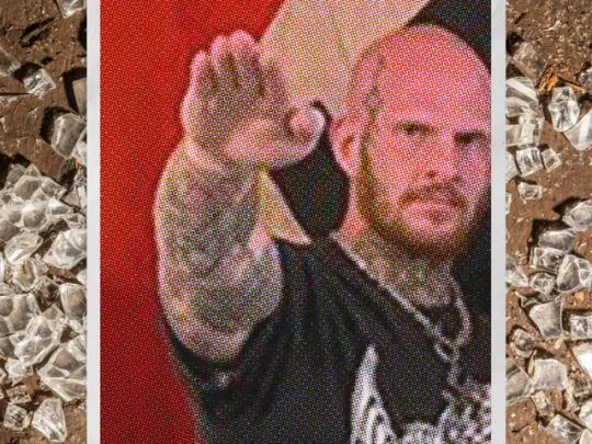
How Concerned Citizens Drove a Neo-Nazi Out of Rural Maine
Christopher Pohlhaus planned to build a fascist training compound in the woods of rural Maine. The local journalists, veterans, lumberjacks, and policymakers weren't having it.
Pohlhaus, 37, is a former U.S. marine, an itinerant tattoo artist, and a hardcore white-supremacist influencer. He is loud and hostile, and proud to be both. His voice is pitched surprisingly high, and he has a slight Southern drawl. He has a large body and small bald head; a blue-black tattoo crawls up the right side of his face, from his chin to his forehead. Over the years, Pohlhaus has collected thousands of social media followers, who know him by his nickname: Hammer.
Hammer had been living in Texas for a few years when, in March 2022, he bought the land in Maine. He told his followers that he was going to use it to build a haven, operational center, and training ground for white supremacists.
Check out our excerpt of The Atavist’s latest blockbuster story.
1K notes
·
View notes
Photo

PORTO ROCHA
865 notes
·
View notes
Photo
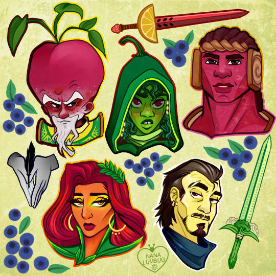
🧀🥪🌶️🥭 The Ravening War portraits 🧀🥪🌶️🥭
patreon * twitch * shop
[ID: a series of digitally illustrated portraits showing - top left to bottom right - Bishop Raphaniel Charlock (an old radish man with a big red head and large white eyebrows & a scraggly beard. he wears green and gold robes with symbols of the bulb and he smirks at the viewer) Karna Solara (a skinny young chili pepper woman with wavy green hair, freckled light green skin with red blooms on her cheeks. she wears a chili pepper hood lined with small pepper seeds and stares cagily ahead) Thane Delissandro Katzon (a muscular young beef man with bright pinkish skin with small skin variations to resemble pastrami and dark burgundy hair. he wears a bread headress with a swirl of rye covering his ears and he looks ahead, optimistic and determined) Queen Amangeaux Epicée du Peche (a bright mango woman with orange skin, big red hair adorned with a green laurel, and sparkling green/gold makeup. she wears large gold hoop earrings and a high leafy collar) and Colin Provolone (a scraggly cheese man with waxy yellow skin and dark slicked back hair and patchy dark facial hair. he wears a muted, ratty blue bandana around his neck and raises a scarred brow at the viewer with a smirk) End ID.)
#trw#the ravening war#dimension 20#acoc#trw fanart#ttrpg#dnd#bishop raphaniel charlock#karna solara#thane delissandro katzon#queen amangeaux epicee du peche#colin provolone
2K notes
·
View notes
Photo

One of my favorites by Paul Lehr, used as a 1971 cover to "Earth Abides," by George R. Stewart. It's also in my upcoming art book!
1K notes
·
View notes
Quote
もともとは10年ほど前にTumblrにすごくハマっていて。いろんな人をフォローしたらかっこいい写真や色が洪水のように出てきて、もう自分で絵を描かなくて良いじゃん、ってなったんです。それで何年も画像を集めていって、そこで集まった色のイメージやモチーフ、レンズの距離感など画面構成を抽象化して、いまの感覚にアウトプットしています。画像の持つ情報量というものが作品の影響になっていますね。
映画『きみの色』山田尚子監督×はくいきしろい対談。嫉妬し合うふたりが語る、色と光の表現|Tokyo Art Beat
147 notes
·
View notes
Photo

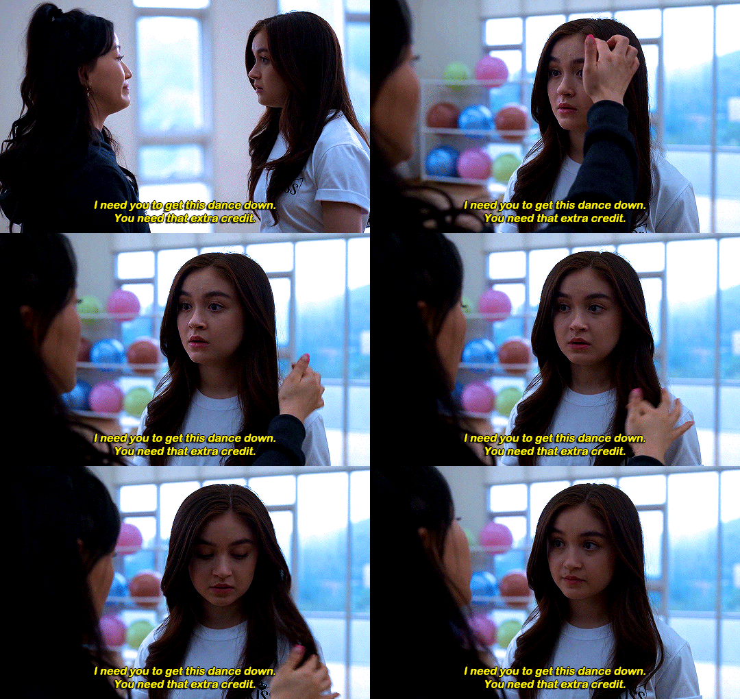








#thistension
XO, KITTY — 1.09 “SNAFU”
#xokittyedit#tatbilbedit#kdramaedit#netflixedit#wlwedit#xokittydaily#asiancentral#cinemapix#cinematv#filmtvcentral#pocfiction#smallscreensource#teendramaedit#wlwgif#kitty song covey#yuri han#xo kitty#anna cathcart#gia kim#~#inspiration: romantic.#dynamic: ff.
1K notes
·
View notes
Photo
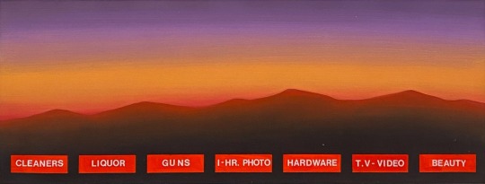

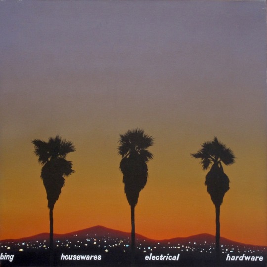
No one wants to be here and no one wants to leave, Dave Smith (because)
102 notes
·
View notes
Photo
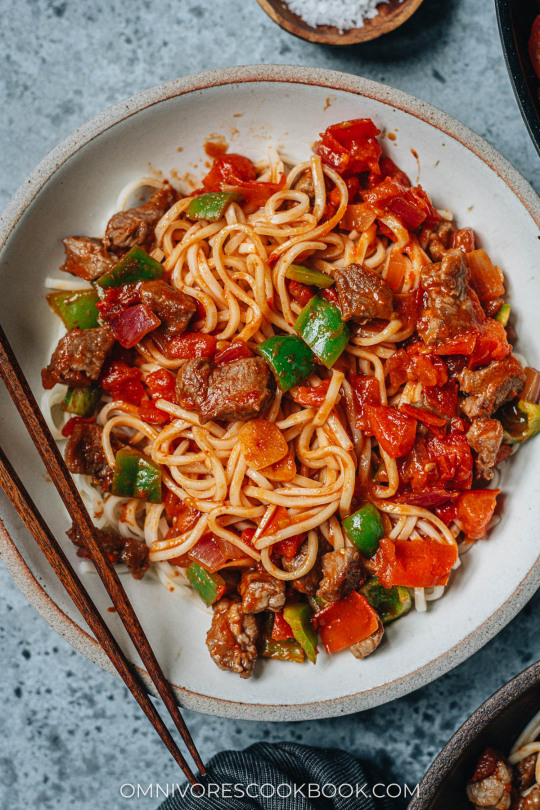
Noodles with Lamb Sauce (Laghman, 新疆拌面) Xinjiang laghman features chewy noodles served with a bold and rich lamb and tomato sauce that is bursting with flavor.
Recipe: https://omnivorescookbook.com/recipes/uyghur-style-noodles-with-lamb-sauce
121 notes
·
View notes
Photo


CJ from Hello World (MSPFA) by phasedsun?
112 notes
·
View notes
Photo

PORTO ROCHA
522 notes
·
View notes
Photo

HRH The Princess of Wales in Southport today, on her first engagement since completing chemotherapy. It’s so good to see her!❤️ --
#catherine elizabeth#princess catherine#princess of wales#princess catherine of wales#catherine the princess of wales#william arthur philip louis#prince william#prince of wales#prince william of wales#william the prince of wales#prince and princess of wales#william and catherine#kensington palace
111 notes
·
View notes
Quote
よく「発明は1人でできる。製品化には10人かかる。量産化には100人かかる」とも言われますが、実際に、私はネオジム磁石を1人で発明しました。製品化、量産化については住友特殊金属の仲間たちと一緒に、短期間のうちに成功させました。82年に発明し、83年から生産が始まったのですから、非常に早いです。そしてネオジム磁石は、ハードディスクのVCM(ボイスコイルモーター)の部品などの電子機器を主な用途として大歓迎を受け、生産量も年々倍増して、2000年には世界で1万トンを超えました。
世界最強「ネオジム磁石はこうして見つけた」(佐川眞人 氏 / インターメタリックス株式会社 代表取締役社長) | Science Portal - 科学技術の最新情報サイト「サイエンスポータル」
80 notes
·
View notes
Photo


AGUST D : DAECHWITA (大吹打) & HAEGEUM (解禁) ⤷ movie posters | ig ; twt (click for hi-res)
#i'm back and ready to create again :'))#bts#bangtan#yoongi#agust d#suga#userbangtan#usersky#bangtanarmynet#hyunglinenetwork#dailybts#*latest#*posters#*gfx#btsgfx#idk if i wanna do an amygdala one#that one seems too personal to edit for me#so these will do for now
700 notes
·
View notes
Photo
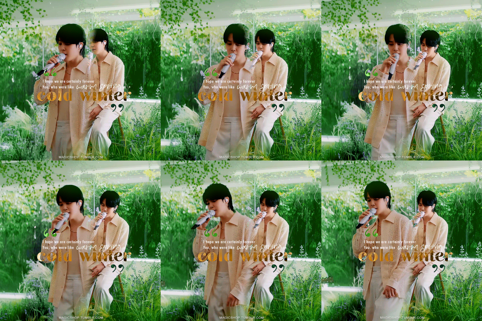


You, who gave me their hand when I fell, now I'll hold it for you.
#jimin#park jimin#bangtan#bts#btsgif#btsedit#userbangtan#mine#mine:gifs#mine:pjm#i've been sick and this has been on repeat for comfort so i thought i'd do a little something#photoshop kept glitching so idk how i feel about it but i might as well post it#<3#tumblr isn't letting me link the trans so: https://www.learnkoreanwithsel.com/letter
601 notes
·
View notes