#Monotype Bulmer
Explore tagged Tumblr posts
Photo
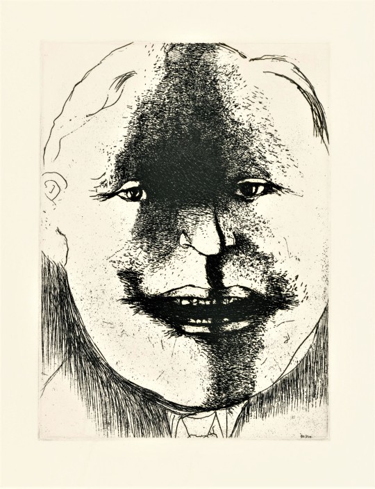

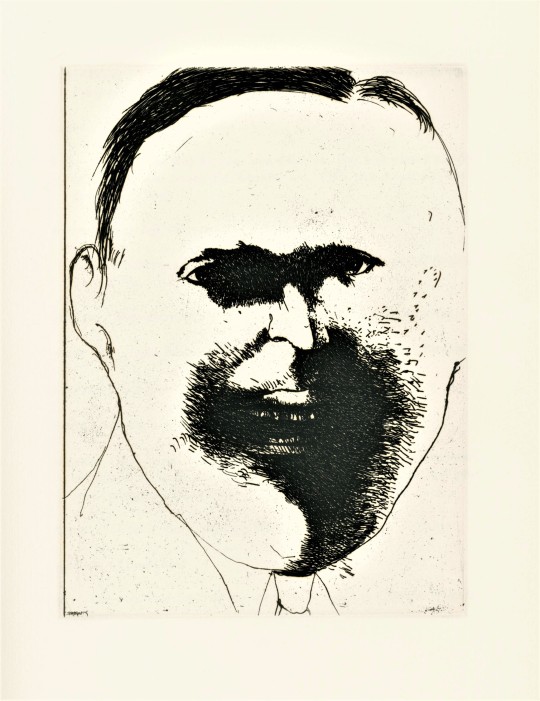
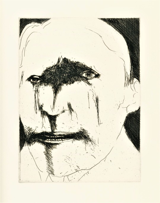
It’s Fine Press Friday!
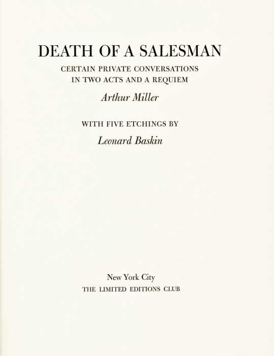
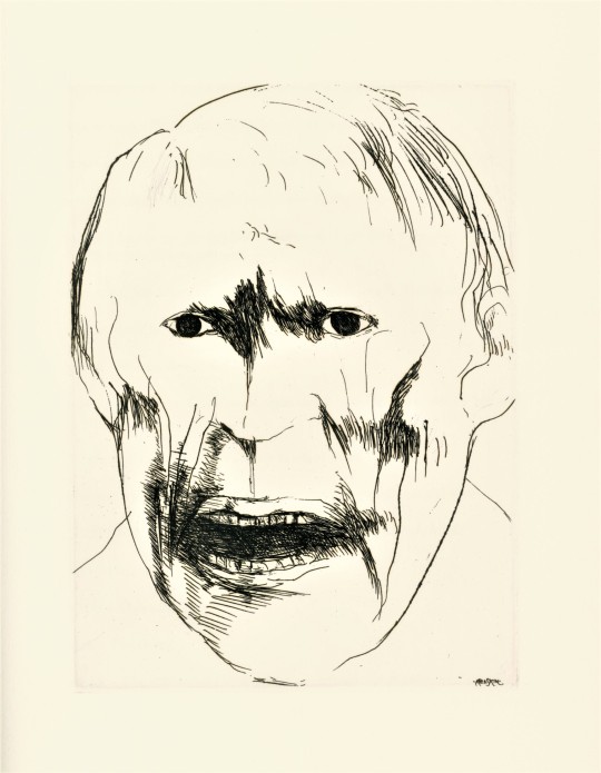
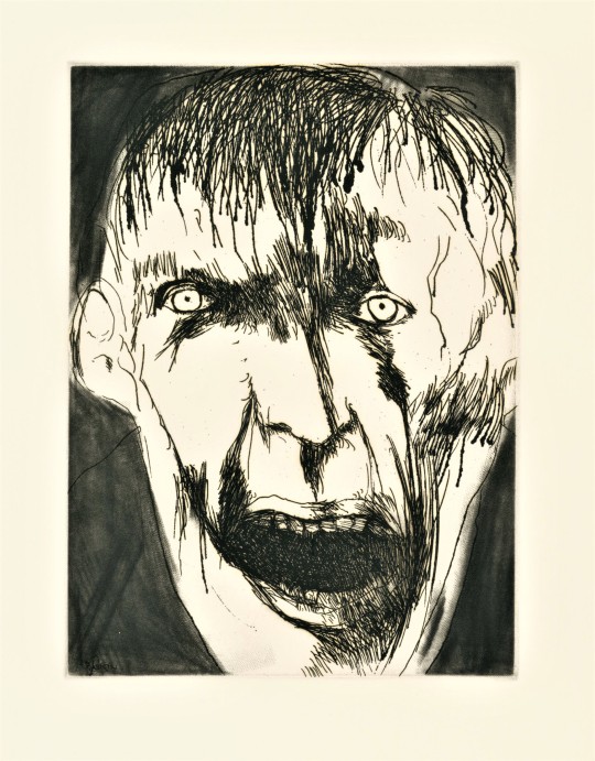
Death of a Salesman: Certain Private Conversations in two Acts and a Requiem, a tragedy by American playwright, screenwriter, and essayist Arthur Miller (1915-2005) is here published, with five etchings by American graphic artist, Leonard Baskin (1922-2000), by the Limited Editions Club (LEC) in a limited edition of 1500 copies signed by the playwright and the artist in 1984.
The play, Death of a Salesman, first opened on February 10, 1949. It was incredibly popular, and is considered by some critics to be one of the best American plays. It has since been revived on Broadway five times and adapted to film ten times, and has won numerous awards. Salesman is a fine example of one of Arthur Miller’s dominant themes,the importance of the father-son relationship. It is somewhat inspired by Miller's short time working for his father. His biographer wrote:
Arthur particularly loathed the vulgarity and aggressiveness of the buyers, who treated his father and the salesmen with arrogant contempt, and he became acutely aware of the meaning of self-respect when he saw how cruelly it was abused.
The play is about the unrealistic expectations we have for ourselves and others, expectations that cause us to lose sight of what really matters even to the point of falling out of touch with reality. In this case it is the expectations a father has for his children.
This edition marks Leonard Baskin’s third time illustrating for the Limited Editions Club. Other tiles he has worked on include, Eugene O'Neill’s The Iceman Cometh, 1982 and Aristotle’s Poetics & Politics, 1964, both of which we may feature at a later date.. The striking etched portraits are very characteristic of Baskin’s work. Baskin often works in themes of death. His etchings richly portray the mental degradation that the main character, Willy Loman, suffers from.
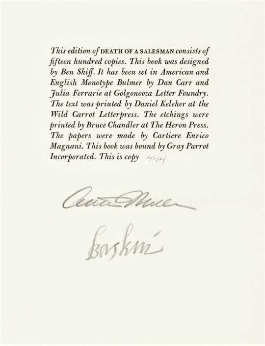
This book was designed by book designer Benjamin Shiff, son of LEC owner Sydney Shiff. He selected American and English Monotype Bulmer fonts, which were set in type by Dan Carr and Julia Ferrarie at Golgonooza Letter Foundry. The text was printed at the Wild Carrot Letterpress by Daniel Keleher and the etchings were printed at The Heron Press by Bruce Chandler. The paper was made by Cartiere Enrico Magnani and the book was bound by Gray Parrot Incorporated. Our copy was a gift from our friend Jerry Buff.
View more Limited Edition Club posts.
View more Fine Press Friday posts.
– Teddy, Special Collections Graduate Intern
#Fine Press Friday#Leonard Baskin#Limited Editions Club#LEC#Arthur Miller#Death of a Salesman#Ben Shiff#Benjamin Schiff#Wild Carrot Letterpress#The Heron Press#Catiere enrico Magnani#Gray Parrot Incorporated#Julia Ferrarie#Golgonooza Letter Foundry#Dan Carr#Monotype Bulmer#Teddy#Etching#Book Design#Fine Press Books#Printmaking#Fine Press Fridays#Pioneer Valley School
46 notes
·
View notes
Photo

Casting at the C.C. Stern Type Foundry today began with a thorough cleaning of the Monotype matrix (insider tip: use a denture brush). Chris Chen demonstrates each step of the process from keyboarding on paper tape, then using the tape for casting. (The keyboard makes an endearing sad goose sound with every strike of "s.") The result: lovely centered 10 point Bulmer Italic. To be continued next month! #typecasting #letterpress #ccsterntypefoundry (at Portland, Oregon)
1 note
·
View note
Text
Books On Books Collection - Wilber Schilling
Books On Books Collection – Wilber Schilling
Bartleby the Scrivener: A Story of Wall Street (1995)

Herman Melville, Bartleby the Scrivener: A Tale of Wall Street, 1853. Indulgence Press, 1995. Type composed in 12 point Bulmer on the Monotype System and printed by Wilber Schilling on Arches MBM mould made paper at Janus Press. Calligraphy by Suzanne Moore. Ochre-coloured endpapers handmade by MacGregor & Vinzani. Wilber Schilling created…
View On WordPress
0 notes
Text
Tipos Modernos
La redonda del francés Firmin Didot, de 1784 se considera el primer tipo en el estilo Moderno. Tres años después le siguió un tipo similar, aunque superior, del maestro impresor y diseñador tipográfico italiano Giambattista Bodoni. Los tipos modernos permanecieron inalterados como tipo estándar para textos hasta los últimos años del siglo XIX.
El tipo moderno también se conoce como Didone.
Tipos Modernos
Debido a las consiguientes mejoras en los procesos de impresión y en papeles y tintas, los grabadores del periodo Moderno fueron capaces de tallar letras en las que no se hubiera podido ni pensar en una época anterior.

Principales características:
Tenían un espaciado más estrecho
Sus contrastes eran abruptos o elevados
Trazos terminales horizontales delgados y usualmente encuadrados, aunque no siempre.
Estructura muy alejada de los tipos antiguos y humanistas.

Tipografías: Didot, Bodoni, Bell, Caledonia
Didot
Diseñada por Firmin Didot en 1784
El tipo de Didot de 1784 estableció todas las características del estilo moderno, un abrupto contraste de los trazos gruesos y finos, una modulación vertical y trazos terminales horizontales y filiformes.


Bodoni
Giambattista Bodoni (1787)
La redonda Bodoni, que se talló poco después, era superior en muchos aspectos, en particular sus trazos terminales filiformes eran lazados y cóncavos, cuando los de Didot habían sido planos y sin enlazar.
La Bodoni no era ideal para una lectura continua debido a que las letras están demasiado condensadas y su fuerte modulación vertical les interrumpe el flujo horizontal del ojo al recorrer la línea.
El diseño grande y sorprendente de Bodoni es más adecuado para la rotulación o aplicaciones limitadas en textos.
Ha sido revivida por Baesir, Linotype y Monotype.


Bell
John Bell (1788)
En Inglaterra, Bulmer y Bell aparecieron en la misma época que Didot y Bodoni, con un híbrido de transición-moderno que era más estrecho, presentaba rasgos terminales agudos y un contraste acusado aunque no abrupto.
Se han realizado varias copias a lo largo del tiempo y las redondas del siglo XX están mayormente inspiradas en estas tipografías, como la Berthold (Alemania), la Rendition (Monotype), la Basilia Haas, Torino.


0 notes