#MR_HNCGD1
Explore tagged Tumblr posts
Visit Tumblr Blog
Explore Tumblr blogs with no restrictions, modern design and the best experience.
Last Seen Tumblr Blogs


Fun Fact
Mobile Tumblr US users spend an average of 4.04 minutes per session on the app.
Text
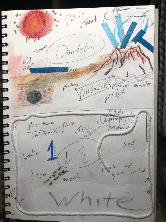
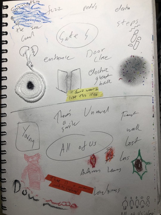
All Of Us: Wool


10 notes
·
View notes
Text
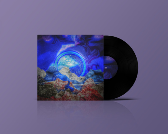
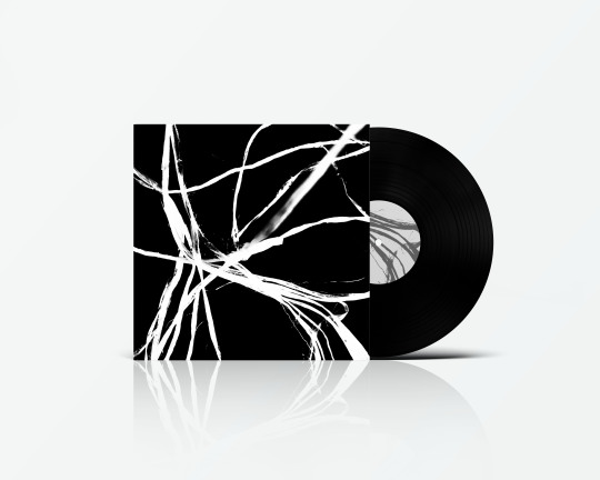
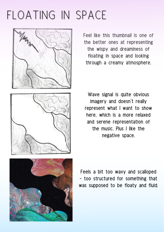
ALBUM COVER//CONCEPT DEVELOPMENT AND REFINEMENT
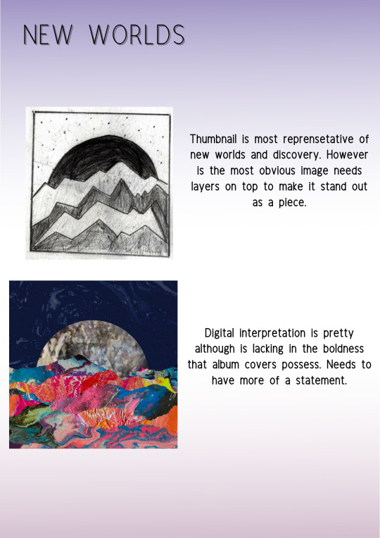
For this concept I did originally think I should stay away from these images but I felt like this was the best representation of the song that I wanted to show.
I messed around with different paper cutting and lights and found that using ink was a really successful way to get the effect I wanted.


Overall, I think I managed to capture the dreamy essence of a new world, and really compliment the song.
7 notes
·
View notes
Text
Brief//Music Response
Final Image Grid & Album Art

This is my chosen final design for the album art for All Things by The Cinematic Orchestra. I found it really hard to choose between my design as I think they all represented the main themes I was trying to communicate.
Ultimately I felt this design really encapsulated the essence of the track and my initial thoughts about it. When I first listened to All Things, I felt the song was a little sinister to begin with - it made me uncomfortable but as the track progressed there was a transformation - I felt like it went from dark to light. I think each of my covers represents that transformation.
6 notes
·
View notes
Text
Music Response:Album Cover
Concept 2 Final Design
First initial sketches
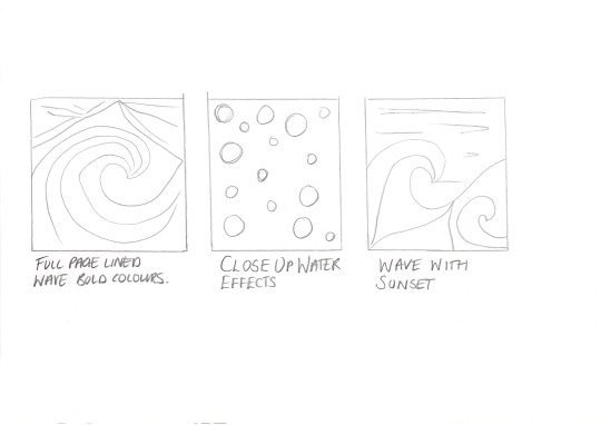
For my second concept I selected one of my previous images of line work I done. Although I really loved this as a final image I wanted to try and push this further and capture a more wave like effect. On my initially mind map the song itself made my think of waves. I went back to my mood board and wanted to try and recreate The Great wave off Kanagwa. Using the same line work effect I created a wave onto a background of pastel work.
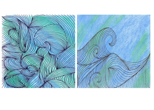
I was really please with out this turned out. I think this works so much better than the line work being on the full pages and the wave itself has a lot more impact.
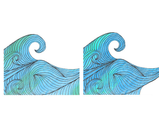
After taking my wave into photoshop and then getting a little feedback from some of the students in my class I cut some of the line work out. I actually really like how simple it looks in the white background however I decided to explore options just to see what woks best.
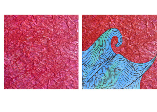
From the my previous experimentation used my ink paper and inserted it onto the background. Although I like out it turned out I wasn't sure if in fact it was just so much and over worked.
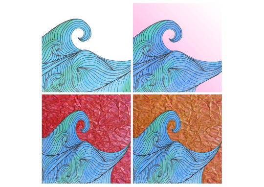
My final 4 Album covers. I played around with some of the colour in the backgrounds. Still keeping in the simplicity of the with and my ink drawings and also tried to create something in-between.
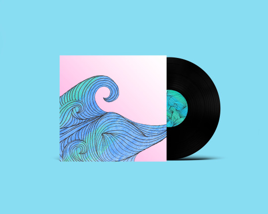
I was really happy with my final outcome. I decided in the end to go with the pink. I think it brings a softness to the line work in the wave yet still an element of the sky in the background.
6 notes
·
View notes
Text
Moodboards:
I’ve really thrown myself into research and experimenting with our #MR_HNCGD1 brief. Time to fine tune it all into some sort of direction.
MOODBOARD 1:

MOODBOARD 2:

MOODBOARD 3:

MOODBOARD 4:

6 notes
·
View notes
Photo
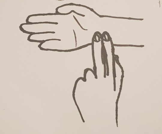
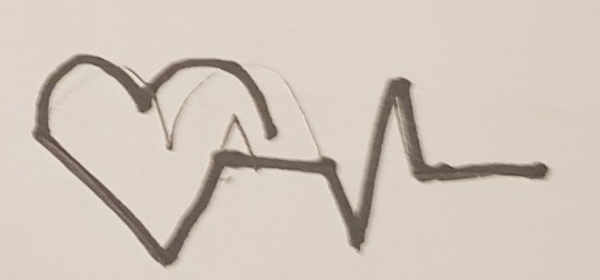
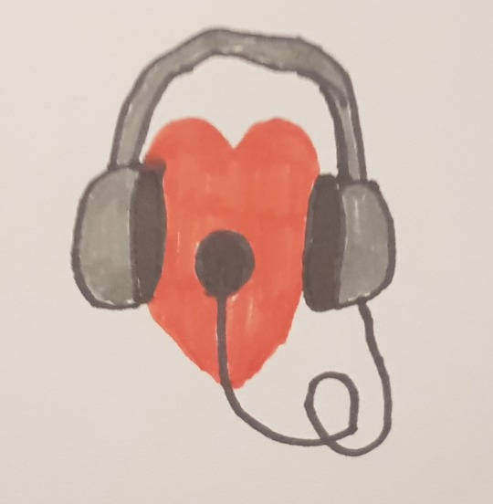
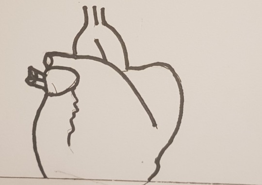
a few ideas i was playing around with to go with the heartbeat theme
5 notes
·
View notes
Text
ALBUM COVER//RESEARCH// 1

Leif Podhajský
The stunning visuals created by Leif Podhajský could not go amiss when I was looking for inspiration for this brief. I came across his work and was instantly mesmerised by the colours, shapes and patterns that were so prominent in his images. So much of his work has a bold fluidity that results in these psychedelic images.

Podhajský has mentioned being inspired by nature, technology and spirituality. This is evident from work, that demonstrates abstract imagery, geometrics designs and vast landscapes (Tenor, 2020).

References:
Williams., N. 2017. Meet Leif Podhajský, Today's Coolest Album Art Designer. Billboard. Accessed 20 October 2020. Available at: https://www.billboard.com/articles/news/lifestyle/7825818/album-art-designer-leif-podhajsky-interview
Tenor., M. 2020. MEETING LEIF PODHAJSKÝ, Foot District. Accessed 20 October 2020. Available at: https://footdistrict.com/en/blog/meeting-leif-podhajsky/
Famous Graphic Designers. 2020. Leif Podhajsky. Accessed 20 October 2020. Available at: https://www.famousgraphicdesigners.org/leif-podhajsky
Dean., H. 2018. Under The Covers: Leif Podhajsky. LNYW. Accessed 20 October 2020. Available at: https://lnwy.co/read/under-the-covers-leif-podhajsky/
Album Art Featured
From top to bottom:
Young Magic - ‘Melt’ (2012) - Carpark Records
Tame Impala - ‘Elephant’ (2012) - Modular Recordings
Nick Mulvey - ‘Wake Up Now’ (2017) - Fiction, Universal
Tame Impala - ‘Innerspeak’ (2009) - Modular Recordings
Mount Kimbie - ‘Cold Spring Fault Less Youth’ (2013) - Warp
8 notes
·
View notes
Text
Brief//Music Response
Concept 3: Final Design
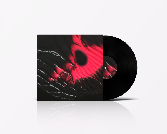
For Concept 3, I was keen to go back to an experiment I did previously with Mica Powder. I was initially disappointed with how this turned out and wanted to try again.
The first time I experimented with the process, the colours of the powder didn't come through as vibrant as I had hoped. I decided to try again using the powder on a black background and it worked a lot better. I think the dark background made a difference to how the powders photographed.
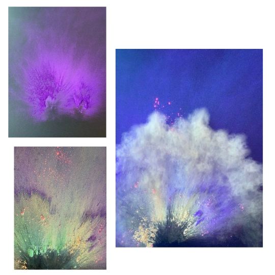
Another important theme that came through from the track was the idea of movement/motion - as I listened I thought about vibrations and soundwaves. After researching motion through art, I came across work by Yee Wong and this inspired me to try and create motion through the powders.
I decided to use bright colours to link to the colours of a butterflies wings again linking back to my initial theme of transformation.
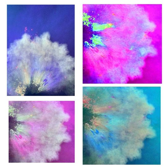
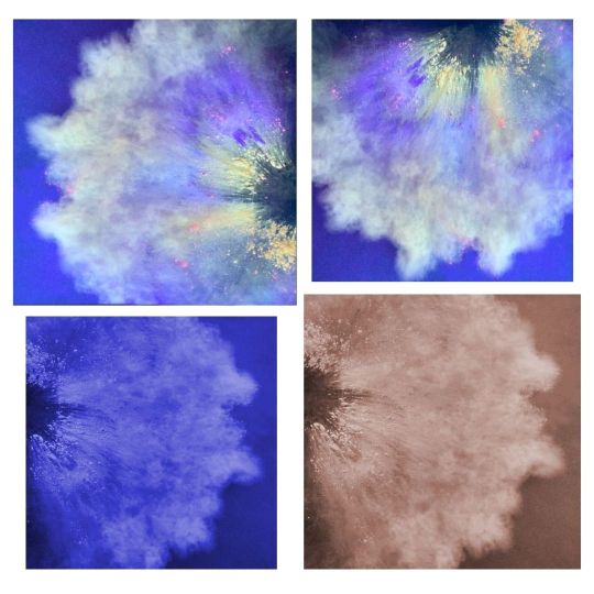
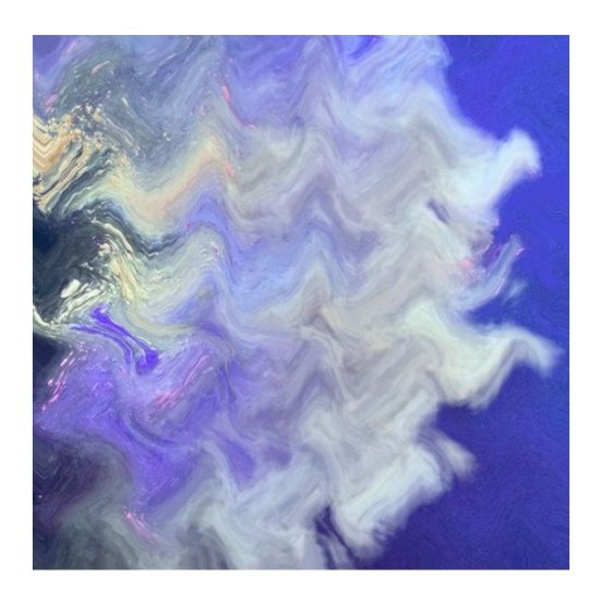
Again I took this into Photoshop and played around with colour and different compositions. I also tried a wave filter - I think this looks like acrylic paint and although it retains motion, visually I wanted the powder to be present.
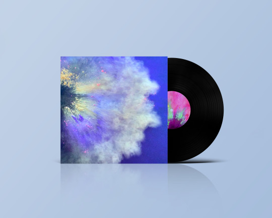
I really like how this turned out as a final cover and I think the powder has worked really well to represent the motion I felt from the track. I used Photoshop to enhance and highlight the colour within my original image without making it look too digitized.
6 notes
·
View notes
Photo

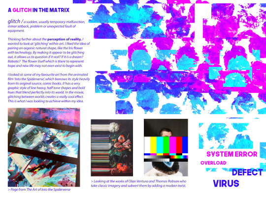
>Above; trying to re-create that glitch effect seen in the works of Olan Ventura, I found the shear tool on Photoshop which dragged the pixels.
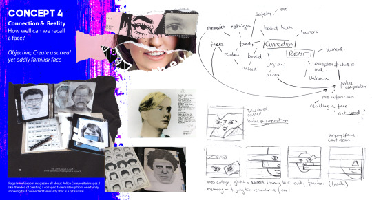
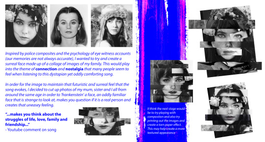
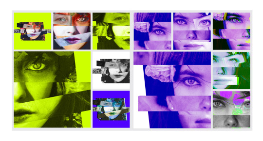
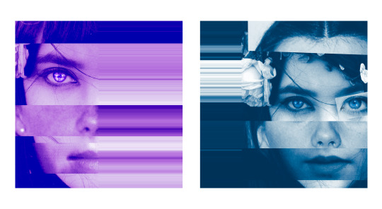
Concept 4 / Connection & Reality - recalling a face
connection // a relationship in which a person or thing is linked or associated with something else.
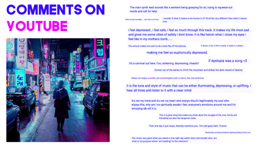
One youtube comment on the song says “...makes you think about the struggles of life, love, family and friendship...”


6 notes
·
View notes
Text
All Of Us - Almost All Of My Thoughts

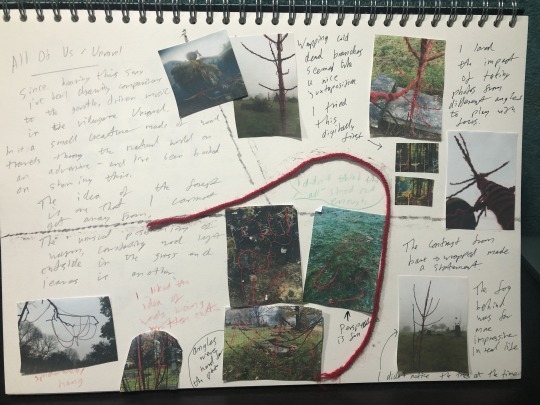
Thanks to Lucas Film (through Disney), Unravel (through EA) and Adobe Stock for images.
6 notes
·
View notes
Photo
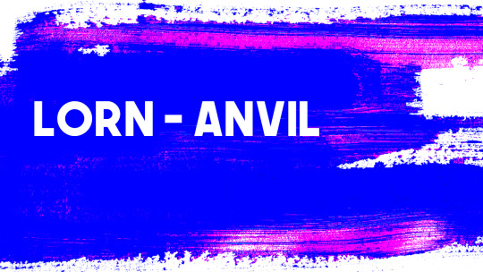
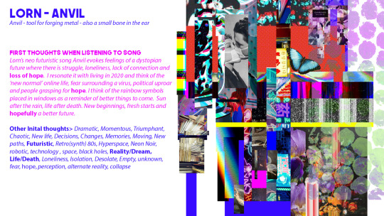
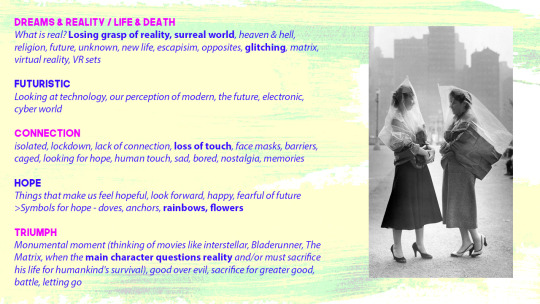
MUSIC RESPONSE /The Mind Mapping Stage LORN // ANVIL
Sometimes my brain feels all over the place and gathering all my thoughts and ideas into one can be difficult. Ultimately I decided to stick with the song that I kept going back to, and threw all my initial thoughts and ideas into some mind mapping boards in order for me to visualise several different creative directions.
My first direction seems to centre around the theme of HOPE, its symbols and the perception of REALITY, I am looking forward to experimenting with these.
youtube
7 notes
·
View notes
Text
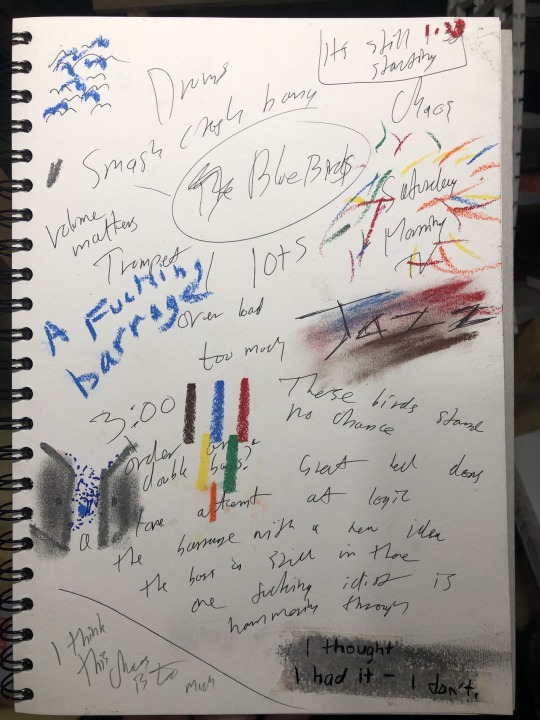
9 Songs. 7 Minutes.
After shortlisting nine songs to be considered for the album brief, I had to start seeing where I could go with them visually. Taking inspiration from some fellow students (cheers team) I gave myself seven minutes with each song to really listen, create a mind-map and draw whatever came to mind.
Leaving the best until last, I had BlueBirds. A forceful jazz track by The Cinematic Orchestra. Since creating my shortlist I was set on BlueBirds - so much so that I “accidentally” gave it a full page, where the others had only been given half. I was picturing a Hitchcockian flock streaming through long off-set rectangles, reminiscent of the jazz albums of the 60s. Listening to it on repeat, it was chaotic, brash, and, too much. I thoroughly enjoyed the experience of putting my thoughts onto paper and playing with a variety of new materials - but the realisation that BlueBirds wasn’t for me was nothing short of disappointing.
I don’t know where I’m going next - back to the playlist? Or into one of the eight tracks I have left?
Oh, well.
REFERENCE
Dan: making marks while listening
Hayley: visualising a short-list
7 notes
·
View notes
Text
Brief//Music Response
Concept 2: Final Design
For Concept 2, I took inspiration from the chrysalis research I had done previously. To take this further I looked at my initial mood board and thumbnails, looking particularly at the X-ray images of the chrysalis.
During my development process I decided to use string to represent the fibres of the chrysalis.
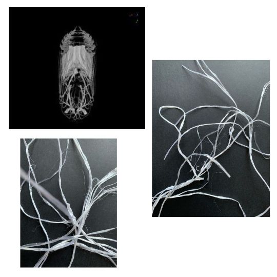
I took these images into Snapseed to play around with colour and different filters. I wanted to make the images appear more graphic and I think Snapseed was useful in achieving this.
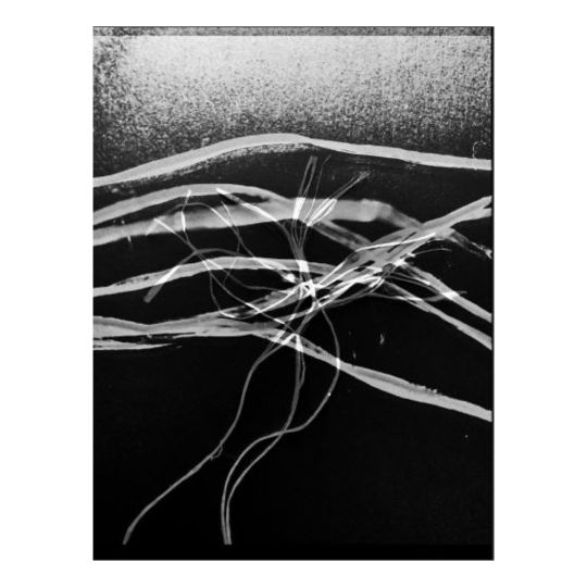
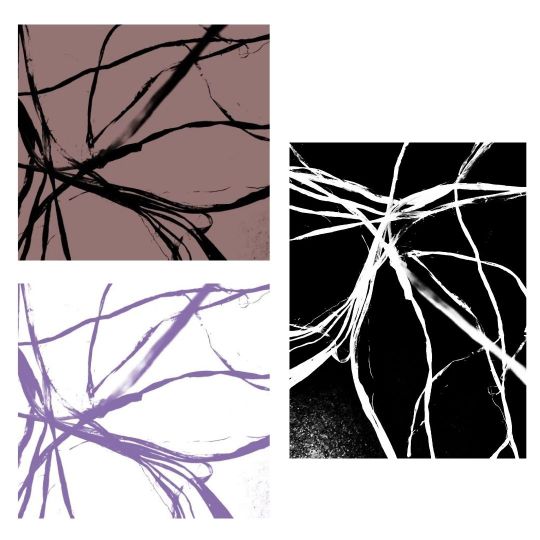
From Snapseed I took my images into Photoshop where I decided to try and create some colour versions. For this concept I didn't want the colours to be bright so I deliberately chose more muted earthy tones. The main reason for this was to reflect the early chrysalis process and mimic the lack of colour in this.
For my final cover, I decided to use the black and white image. I think looking at this, it looks very graphic and you don't quite know exactly what it is. It reflects the feeling of weirdness and other wordly thoughts that sprang to mind whilst listening to All Things. I don't think this would look out of place alongside other album covers by The Cinematic Orchestra.
5 notes
·
View notes
Text
Brief//Music Response
Concept 4: Final Design
Refine & Reflect
For Concept 4 I decided to develop another theme taken from my initial mood board which was the butterfly. I was keen to include this as one of my final album covers as it represented part of the chrysalis cycle.
The first experiment I tried was Riso printing and this transformed my original black and white image. (Image 1 pink & blue).
I felt this was a little too pretty and wasn't representing my track in the way I wanted it to. I then took this into photoshop to play around with colour and composition.
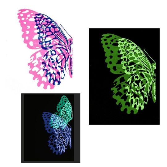
I changed the colour of the background to black and used the colour & saturation tool to transform the butterfly. I think the colour change has given my image more impact and the darker colours are more representative of my chosen track. I also duplicated the main butterfly image to create two butterflies, I think this creates a sense of movement.
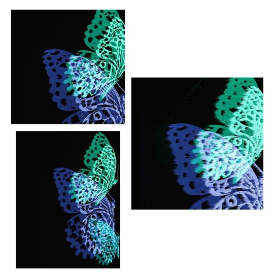
Initially I mocked up a version of the album art shown in the the top image with the two butterflies, I also added a filter but I wasn't completely happy with the end result. I went back to the drawing board and decided to duplicate and add another butterfly. Again I played around with the colour and i think the three butterflies compliment each other tonally.
As a final album cover, I think this represents the process and development of my theme, however, I was keen to use one of my earlier butterfly prints. Although I really like this album cover, I don't feel like it represented the delicacy of the chrysalis process in the way I had hoped.
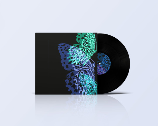
I decided to mockup another few versions of my album cover using the acrylic paint prints I created:


I really loved the quality of the butterfly version above and decided to reduce the size slightly. The below image is my final mocked up album cover.

5 notes
·
View notes
Text
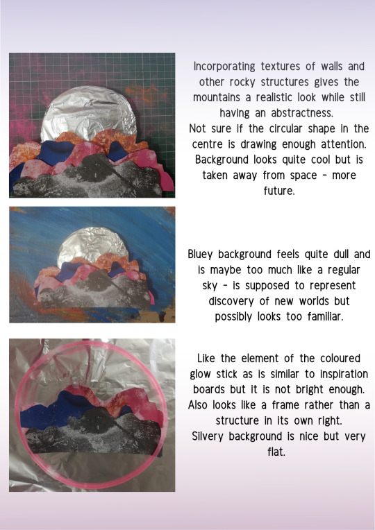
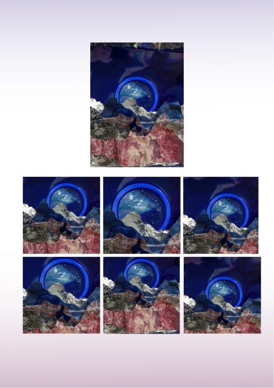
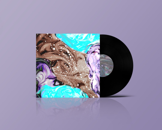
ALBUM COVER//CONEPT DEVELOPMENT AND REFINEMENT
Refining my concept began with choosing the thumbnail I most wanted to emulate. I like this one was it really was at the forefront of my mind when I listened to the music.
I then decided to try and create the image physically. I worked with felt and shaving foam to try and get the textures I wanted to get some depth in the image.
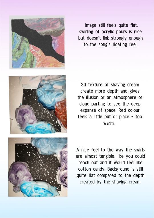
I was happy with what I had created but felt the backdrop was quite flat and dull compared to the sides, it wasn’t one whole complete picture. I tried to digitally add on some texture from previous experiments.

After than I played with colour and composition, I kept it quite wide and open to keep that empty and felt that purpley blue tones worked really well.
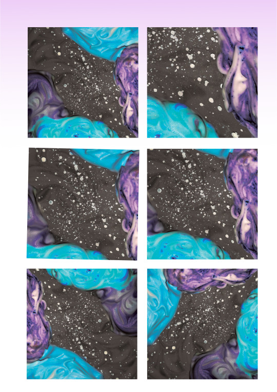

And voila!
5 notes
·
View notes
Text
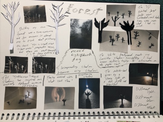
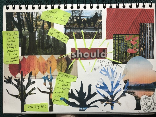
Comfort Zone? What Comfort Zone?
I’m pretty sure I’ve settled on a song choice. The process of mind mapping All Of Us by Slowdive has left visions of forests in my head for the past two weeks, so I took myself down to some woods and was decidedly annoyed when it didn’t look exactly like the woods I had been picturing. Instead of strolling through an inspirational forest with the exact kind of trees I wanted, placed exactly where I wanted them, I had to walk off a concrete path and take a photo that hid the lamp posts lining the pavement.
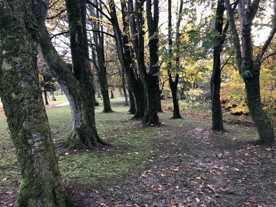
I quite liked taking the photographs, it was something normal, something I’m used to doing. Something comfortable.
Now it was time for something new - mood boards. I’ve heard about them for years, I’ve seen quite a few in my life, and recently we’ve been talking a lot about how useful they are. All I had to do was make one. To keep myself a little bit within my comfort zone, I went for a digital version first. Finding images online, sitting legible scribbles carefully over the cropped photos, colouring the background to split the sections up - this was all very do-able. Although I still felt “mood boarding wasn’t for me”.

While this brought new ideas to me, and allowed me to explore one of the photos I’d taken an expand upon an idea - it didn’t feel quite right. So I tried again, this time in the physical world as opposed to the digital.
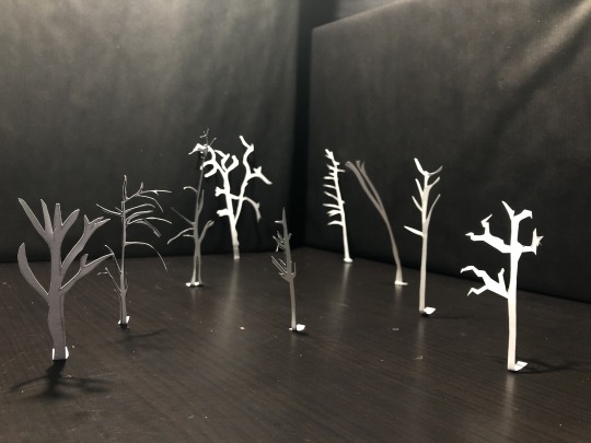
After a long evening of trimming tree shapes, the using the templates to cut around printed images, I decided I’d leave some jobs to Adobe in future - but I was onto something. I could make my own trees, and thus my own forest.
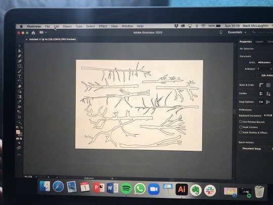
For my own sanity, digital drawings made this much easier, plus it meant repeatable patterns in case anything went wrong.
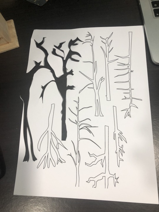
Where trimming trees for the mood board had felt quite arduous, knowing I had a solid end goal here made this job significantly more enjoyable (no offence to mood-boarding). The next obstacle I had to get around was how and where to build my forest. Thanks for a recent workshop on photography, I knew that I wanted to eliminate shadow so I could focus on the objects, so I had to build a black surrounding for my starkly white trees. Then I had to photograph them the way I wanted. Pushed for space, and wanting to try a technique I’d recently discussed with a friend, I managed to set up my phone as a camera and link it to my laptop, so even if I couldn’t see phone screen, I’d be able to build my forest without constantly lifting the phone and checking my positioning.
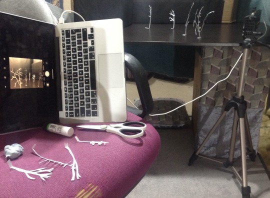
Mildly shambolic but immeasurably useful. I then stood gluing small paper trees to a home-made black landscape.
It’s certainly not the best thing I’ve ever done - but before I started I didn’t know what to do. And now I have an idea of what to do. And after a weekend of new experiences and a distinct lack of comfort, I’m beginning to think my idea might just work.
I also may have to change my idea.
6 notes
·
View notes