#Klaverweide
Text
President Santokhi: “We moeten investeringen en handel naar een hoger niveau tillen”

President Chandrikapersad Santokhi heeft tijdens zijn werkbezoek in buurland Guyana de lancering van de Suriname-Guyana Chamber of Commerce (SGCC) bijgewoond.
Het staatshoofd heeft in zijn toespraak aangegeven dat Suriname en Guyana investeringen en handel naar een hoger niveau moeten tillen. “Er zijn grote kansen voor een intensieve en verhoogde samenwerking tussen het bedrijfsleven van beide landen”, sprak de president.
De launch heeft plaatsgevonden op zaterdag 24 februari 2024 in het Pegasus Hotel. Naast de ministers Albert Ramdin van Buitenlandse Zaken, International Business en Internationale Samenwerking (BIBIS) en Stanley Raghoebarsingh van Financiën en Planning, waren ook leden van de SGCC, corps diplomatique en ondernemers uit Guyana en Suriname aanwezig.
Santokhi was ingenomen met de lancering van de Chamber. Hij ging in zijn toespraak in op de vele voordelen voor beide landen. De relatie zal groeien als beide regeringen bereid zijn om het zakendoen tussen de twee landen te vergemakkelijken op het gebied van douaneprocedures, investeringsfaciliteiten, vergunningen; migratievereisten, certificeringen enz. “Het wegnemen van barrières is in CARICOM is één doel, maar het wegnemen van handels- en investeringsbelemmeringen tussen buurlanden is een must”, aldus de president.
Het staatshoofd gaf verder aan dat het bouwen van de brug over de Corantijnrivier de export, de economische activiteiten, de handel en het toerisme veder zullen bevorderen. Hij noemde ook de strategische discussies over samenwerking op het gebied van olie en gas, verbindingen binnen de regio. Met Noord-Brazilië zullen nieuwe markten en investeringsmogelijkheden open gaan en de samenwerking met Caribische landen, zoals Trinidad en Tobago zal ook inkomsten genereren. “Het bedrijfsleven in onze samenleving speelt ongetwijfeld een essentiële rol bij het opbouwen van transparante, veerkrachtige en duurzame economieën”, benadrukte president Santokhi.
Toch gaf de voorzitter van de SGCC, Vishnu Doerga, aan dat beide landen moeten samenwerken om de handel verder te ontwikkelen. Verder gaf hij aan dat de SGCC continu zal blijven werken aan het versterken van de economische banden tussen Suriname en Guyana, om zo de welvaart en ontwikkeling van beide landen te bevorderen. Derrick Klaverweide, ondervoorzitter Suriname -Guyana Chamber of Commerce en Commercieel directeur Optiek Ninon, vindt ook dat door samen te werken ondernemers aan beide kanten veel voordelen te behalen zijn. Hij riep de ondernemers op om te investeren.
Read the full article
1 note
·
View note
Text
Capelle aan den IJssel - Van maandag 9 oktober tot en met zaterdag 14 oktober staat duurzaamheid weer extra in de schijnwerpers in Capelle. Er is een programma vol ‘duurzame’ activiteiten voor jong en oud. Dit jaar is het overkoepelend thema ‘Tijd voor nieuwe energie’.
Week van de Duurzaamheid
Nieuwe energie in de vorm van het gebruiken en opwekken van duurzame energie. Maar ook het enthousiasmeren van Capellenaren om aan de slag te gaan met nieuwe energie. Capellenaren kunnen dit jaar weer deelnemen aan verschillende bijeenkomsten en activiteiten over energie besparen in huis met aantrekkelijke inkoopacties.
Tijd voor nieuwe energie
Capellenaren kunnen in de Week van de Duurzaamheid in diverse wijken van Capelle speeddaten met een energiecoach van wie zij energiebesparende tips krijgen. Bewoners die een oude gloeilamp inleveren, krijgen er een gratis ledlamp voor terug. Daarnaast zijn veel Capelse partners aangesloten met frisse energie. Zo zijn er rondleidingen bij de afvalwaterzuiveringsinstallatie, de milieustraat, op de wijngaard van Sjatoo010 en kunnen inwoners onder andere een lezing bijwonen over klimaatbestendige tuinen.
Van ondernemer tot de jonge Capellenaar
Aan alle Capellenaren is gedacht. De Week van de Duurzaamheid wordt maandag afgetrapt met een ware safari voor Capelse ondernemers door Green Businessclub Fascinatio. De jonge Capellenaren kunnen woensdag 11 oktober bijenhotels en zaadbommetjes maken bij Kinderboerderij Klaverweide. Samen met (klein)zoon en -dochter op pad? Dan is de Natuurbelevingswandeling in het Schollebos op donderdag 12 oktober een leuke activiteit.
Wethouder Sjoerd Geissler over de Week van de Duurzaamheid: “Ik ben heel blij met de extra aandacht voor duurzaamheid. Het is een onderwerp waar we allemaal ontzettend veel energie in moeten stoppen om te zorgen dat Capelle in 2050 en later nog steeds een stad is waar het goed wonen, werken en recreëren is. ‘Tijd voor nieuwe energie’ spreekt me dan ook ontzettend aan. Ik hoop dat veel Capellenaren met enthousiasme en (nieuwe) energie meedoen aan de activiteiten!”
Meer weten over het volledige programma en aanmelden? Kijk op www.duurzaamcapelle.nl/agenda.
0 notes
Text

Why not travel in style to your next destination? With 1000+ colors and textures of choice we can always make a passport holder to match your travel outfit! Contact us for more info.
#klaverweide#fashion#travel#design#passport#traveltheworld#traveler#love#metal#python#passport holder
2 notes
·
View notes
Link
Dennis Klaverweide CEO and Fashion Designer for Klaverweide Luxury Fashion Brand exclusive interview https://couleurz.com/lifestyle-magazine/dennis-klaverweide-ceo-and-fashion-designer-for-klaverweide-luxury-fashion-brand-exclusive-interview/
0 notes
Photo

Burgernet: Vermist meisje (13) Enkhuizen ENKH-klaverweid-vermist 13 jr blank meisje blond, achterkant haar weggeschoren, lichte jeans, slippers met sokken,samen met blond meisjeTips? Bel nu 0800-0011
0 notes
Note
Hi Janice! Your art is wonderful, I love how your designs and paintings are creative and unique in your on way, congratulation for the amazing work! I'd like to ask you how you became an UI artist and if you have any suggestions on how to learn it because I really want to study UI and create awesome designs like you do. Thank you very much! :D

Aww thank you Daniel :)
Haha that’s a good question. I feel like I kinda just “fell” into UI art. I enjoy doing graphic design and I learned a bit of during my time at art school. My prof was a tough one. We painted letters in gouache and it always had to be perfect. He had some cool lessons on composition which I think was super helpful. Anyways ffwd to internship times:During my internship at Digital Extremes, Warframe was just starting off and they needed someone to help out with ability power icons. So I volunteered because I enjoyed the challenge at the time. Fast forward to getting hired at Digital Extremes I did a few concept tasks and they kept assigning me UI icons because at the time no one was there to help out with the icons except for the concept artists. So I guess being the junior, I got all the UI icon stuff but I didn’t mind ( sometimes I did because I wanted to concentrate on concept stuff but eh :P ) And then I guess that’s where my UI experience really began and I kept doing icons on the side for fun like Destiny related styled icons. I also learned a ton from the UI lead at Digital Extremes (Dorian Stewart) He taught me how to use Illustrator which is VERY important if you want to be a UI artist - everything has to be vectored. If it’s not, you’re doing it wrong :P He was super picky when I was vectorizing icons, frustrating at the time, but it really paid off after. You need hawk eyes for that. Every pixel counts when you are doing a UI icon or a menu screen.
I’ve always enjoyed graphic design (all kinds, from package design, advertising, infographics, logos, etc) so it was cool to find out that it could be incorporated into games. To me, icons is like a challenge of taking something complicated to simplifying it to its most simplified form.
When it comes to UX though, I’m horrible lol…I’m still learning that. My main forte for a UI artist is doing the art side. It’s good to know UX but usually I think most video game companies will have a UX person (UX is where things are placed in a menu/ its functionality/ flow)
As for wanting to learn UI art, you can always take your favourite game and try to replicate your own set of icons/ menu screens and how you would try and make it “better” Like I mentioned before, I love Destiny’s look for their UI so I wanted to replicate some badges, banners etc for fun and see what that would be like. Another good game to study UI art is Tomb Raider - they have nice graphic simplified icons. I always look on pinterest for HUD/ UI art inspiration to study from.
Some cool sites:
https://www.hudsandguis.com/
https://standardsmanual.com/

A good friend gave me this book and I love it. It’s filled with a ton of beautifully designed logos.
Elliot Gray (Bungie) https://dribbble.com/aftercompletion
Ryan Klaverweide: https://www.behance.net/Alrightok
But yeah, I hope that helps :)
36 notes
·
View notes
Text
The Many Faces Of UI and UX Design
One of our first design goals for Failure: NeuroSlicers was to create a User Interface (UI) that was streamlined, clean and gave the player just the information that they’d need at a given moment without cluttering or overwhelming them.
Looking To The Past
Other RTS games often, at least in the past, had UI’s that would take up 1/3rd of the screen with unnecessary elements or over the top art that, in our opinion, added little to the immersion and took away the player’s ability to see the bigger picture. This is also why we allow full camera movement rather than fixed angle and zoom.
Very little has changed in terms of UI design for RTS games over the past 20 years; we still see the mini-map, info panel, areas for Resources, Tooltip box and a number of other elements as seen in below screens from 3 of the most popular RTS games from the past few years:


As you can see from the above examples the designs are almost identical and all have 1 very annoying problem; their size and the amount of information being displayed means that only 2/3rds of the screen are viewable to the player and this restricted view means the player will have to move the camera around more in order to keep focused on the action. This is compounded by the limited camera zoom, rotation and tilt that players have access to.
With Failure, we have made it our mission to remove or at least reduce this screen clutter while still giving as much information to the player.
First Iterations At Minimal UI Design
UI design is endlessly complex; there’s an incredible number of things to think about when it comes to the thing that you’re going to be interacting with throughout your time with a game; element positions, fonts and sizes, what happens when you press a button, how shortcut keys are linked to elements, sequences of actions, animations of elements, input methods (i.e. touch, mouse/keyboard, controller, motion, eyes, voice, etc.). The list is almost endless and it’s been the biggest discussion point over the past couple of months. Before I go into details about our plans for Failure’s UI, I’d like to show you how it’s changed over the past couple of years:

The above version of the UI was one of the earliest iterations and boy was it ugly!
Here we used the top left section to show the available Scripts and their costs. When you had enough Data to play one it would light up. Below this was the data resource pool… no idea what we were thinking with that design. And finally, in the center of the screen was a radial menu design. This appeared when you selected a cell and you would slide you mouse over to the script you wanted to use.
Several issues were evident quite early with this design. Firstly, you needed to memorize the icons for each Script and what they did (and some we didn’t even have icons for!), the Data Pool section looked really out of place and the overuse of colour really didn’t help things. Also, as we continued to develop the game the layout didn’t fit with the new mechanics that we designed.

This circular menu never actually made it into the game, it was just a mock-up to see how we could integrate the elements from the top left section from the previous iteration into the placement UI. What was quite nice about this UI was that we could see when a Script might be ready; as you gained more data the segments of each script would fill up, though one issue was that you'd only see this menu when clicking on a cell, and once you'd clicked on a cell the UI would occlude your view of the level, so not ideal.
Experiments In UI Overlays

Here's another mock-up UI that never made the cut. Though this time it's an overlay. We felt we wanted to integrate a chat system and mini-map and make the Data Resource a bit more prominent, though through play-testing we very quickly realized that there was little need for a minimap due to Failure having small arena based maps and no fog of war. It was space that could be better used. The other issue we found was that due to the Data Resource Positioning some players never looked in the top left corner.

This was a second mockup that we actually integrated and tested in game, though once again we realised it wasn't the best use of space. It also still relied on the cell selection based menu for Script placement, meaning you had no idea whether you had enough Data to play your Scripts until you selected a cell. Not ideal.
Going Clean with UI
This in-game UI was the first version designed by Ryan Klaverweide (UI Artist from Bungie) when we brought him on board.
Here we have the Data in the center, Function scripts to the right and building Scripts on the right. All scripts displayed their cost in the top right and over on the Building side you can see the units that were associated with each building.

Several things changed here from the previous iterations. We realised how important it was to be able to see each of your scripts at all times along with their associated costs; one thing you can't see in the above is that scripts were given a dark overlay when you didn't have enough data to play them and then became lit when you did. With this layout, we also allowed shortcut keys to be used to trigger each of the Scripts, bound to the numerical keys 1 - 6 (though they could be bound to any keys you want).
With this design, we still had a few issues. Firstly, players still needed to learn the icons in order to decipher each script. We also couldn't find a good way to display the upgrade menus for each script.

At this point, several key design changes happened. First, we decided to separate units from buildings, in effect making them their own Scripts. Previous to this you would build a building and then units would spawn automatically from them at certain intervals; we wanted players to have more control over units, at least in terms of placement, so the change was necessary.
The second major change came from the load-out/deck building - we moved away from the 6 Script Deck onto a 9 Script Deck. The idea being; you would build a deck of 9 scripts in the deck builder before a match and then, using a new resource called Tech, unlock up to 6 during a match.
This allowed for more strategies during a match, allowing you to build a Deck that could work for a number of scenarios and also helped with match pacing.
You'll see the Tech resource here to the left of the Data UI Element. You can earn up to 3 Tech and Script / Upgrades cost between 1 - 3 Tech each.
NOTE: Tech is earned through secondary objectives and over time, its used for both unlocking and upgrading your scripts during a match. Data is then used to then play your Scripts.
We were really liking this layout but we soon realized that we had failed to resolve one major issue - understandability and learning for new players. You see, although an icon-centric interface might look super nice and clean it still has a very steep learning curve requiring players to learn each and every icon before being able to easily understand what each refer to. In addition, we found that more hardcore players wanted more information from each of their Scripts before playing them. Things such as health, attack power, territory gain, movement speed and the core abilities needed to be displayed in order for players to truly understand how a script played, what they were good and not so good for. Some scripts even have multiple behaviors or complex abilities that just weren't easily placed on an icon based UI system.
We had to find a better solution.
Re-Purposing Card Based UI Design
So the idea was to take a CCG approach, using cards with additional elements to display each of our Scripts. It seemed like a natural progression from the icon-based approach and allowed for considerably more information to be displayed while still keeping the UI minimal... well in theory.

Above was our first mock-up of how the new Card based system could work. This screen showed your Scripts in a Mini Card format at the bottom. A larger card format with additional stats would be displayed on mouse-over or right-click which would also show the Script Upgrade menu. For Slots that didn't have a Script installed yet you would click (or use the corresponding shortcut key) to open the purchase menu where you could install one of your 9 available scripts. In addition we saw a redesign of the Resource UI elements on the left.

With this first version of the Large (Above) and Small (Below) versions of the cards we were suddenly able to add a tonne of additional information. On the large card we had Attack Power, Attack Range, Health and Armour on the left. At the top left was an icon to say what kind of card it was (Unit, Building or Function power), the name, Data Cost, a box for additional details and context sensitive info when hovering your mouse over one of the three ability slots at the bottom. Then we had a large area at the bottom to explain the Script’s specialty and finally a button on the far right to open the upgrade menu for that card. The mini card version was just a compact version of the larger card with slightly less information.

The issue we then had was trying to determine exactly what information players would want at any given moment while also attempting to simplify the way we give the player information in order to reduce the learning curve and time players need to be looking at their cards - Failure is pretty fast paced with matches lasting around 5 - 10 minutes each; you don’t want to be spending half that time looking at the UI, you want to be actually spending that time trying to defeat your opponent so it’s crucial that the information on the cards is presented in such a way that you can understand at a glance and make informed choices without having to spend too much time reading through a bunch of stats.
Here’s how we started to prioritize information based on Script Type:

As you can see, not all Script types need the same information on them and with this in mind we had to try to determine how to present each in a clever way.
Here are some other iterations we went through - pretty much everyone on the team had a try at different layouts and feels for the cards as well as information/stat layouts:


This last one is how our Scripts look in-game right now but over the coming weeks we’re going to be taking much of our findings and research and creating something much cleaner that will hopefully meet our design goal of minimal UI that conveys just the information a player needs at a given moment without overwhelming them while also offering the details that hardcore players want from an RTS.

We are still finding ideas to compress information in a smarter way, and the Card-based UI system isn’t the only UI element we’re trying to be innovative with.
We imagine that throughout the development process we will be tackling a number of design challenges in regards to information and readability, we’ve really thrown ourselves into the deep end with the development of an RTS game, but this process is really showing what the team are capable of and we cant wait to conduct some proper player research with the new UI systems to see how things have improved.
Justin French - Creative Director
1 note
·
View note
Text
Leerkracht Groep 1/2 (Daltonschool Klaverweide) – Stichting Openbaar Basisonderwijs Duin- en Bollenstreek – Noordwijk
Vacature http://dlvr.it/RgDwz0 vacaturekinderopvang
0 notes
Text
Eerste bestuursverkiezingen voor Suriname-Guyana Chamber of Commerce
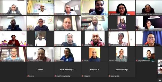
De eerste Algemene Leden Vergadering van de Suriname-Guyana Chamber of Commerce (SGCC) heeft op 30 januari 2024 plaatsgevonden. Tijdens deze virtuele vergadering kwamen de bestuursverkiezingen aan de orde. 11 bestuursleden zijn op democratische wijze gekozen.
De oprichting van de SGCC is een initiatief is geweest van ambassadeur Blankendal, ambassadeur van Suriname in Guyana en Vishnu Doerga van ActionInvest Caribbean Inc. Het streven van de SGCC is erop gericht om de samenwerking te vergemakkelijken, investeringsmogelijkheden te bevorderen en krachtige partnerschappen te smeden om economische groei te stimuleren.
Daarnaast is het streven ook om de investeringsbanden te versterken en de welvaart tussen Suriname en Guyana te vergroten. De SGCC is op 21 september 2023 opgericht en bestaat momenteel uit 27 leden uit Suriname, Guyana en internationale bedrijven.
De voorzitter en vicevoorzitter van de SGCC zijn respectievelijk Vishnu Doerga van ActionInvest Caribbean Inc en Derrick Klaverweide van Optiek Ninon Guyana. Ambassadeur Blankendal werd als erelid benoemd net als Virjanand Depoo, ambassadeur van Guyana in Suriname.
De voorzitter gaf aan dat de gekozen leden bij de bestuursverkiezingen een breed scala aan vaardigheden, expertise en een gedeelde inzet hebben om de economische belangen van wederzijdse landen te bevorderen. Daarnaast hebben de ereleden een belangrijke rol te vervullen zoals het versterken van de diplomatieke banden en het bevorderen van de economische samenwerking tussen beide landen. De voorzitter gaf verder aan dat hun benoeming de waardering weerspiegelt van de SGCC voor hun uitmuntende bijdrage aan de bevordering van de grensoverschrijdende samenwerking.
De SGCC heeft ook haar dank uitgesproken aan alle leden die hebben deelgenomen aan de alv en zij die hebben bijgedragen aan het succes van deze historische gebeurtenis.
Read the full article
0 notes
Text
Keurmerk Veilig Ondernemen voor bedrijventerrein Klaverweide Oud Gastel
Keurmerk Veilig Ondernemen voor bedrijventerrein Klaverweide Oud Gastel
Oud Gastel – Bedrijventerrein Klaverweide in Oud Gastel heeft 13 oktober 2021, als eerste bedrijventerrein in Halderberge, het certificaat Keurmerk Veilig Ondernemen (KVO) ontvangen. Er zijn afspraken gemaakt over de samenwerking tussen de eigenaar, ondernemers, gemeente, politie en brandweer. Gezamenlijk is een plan van aanpak voor de komende drie jaar gemaakt om het bedrijventerrein schoon,…

View On WordPress
1 note
·
View note
Text

Silvia Saveschi from Bravo, ai stil for Klaverweide. Wearing our Custom made red suit with genuine python Lapel and our Leather Chained Edition Weekend Duffle Bag.
Send us a message for more info
https://wa.me/31640712515
#royal#garments#fashion#exclusive#womens fashion#womenswear#womens clothing#ceo#suit up#suit#klaverweide#designer#design#python#leather#bags#chain
0 notes
Text

When was the last time you experienced something for the first time? First impressions are everything! Give your Baby a Fair, Warm and Luxurious first experience with the new Klaverweide Baby collection. Discover the first pieces of the collection on
Www.Klaverweide-Design.com
0 notes
Text
Bushokjes in Woerden voorzien van groen dak
Bushokjes in Woerden voorzien van groen dak
Woerden – Op 12 en 13 augustus zijn drie bushokjes in Woerden voorzien van een groen dak. In samenwerking met de JCDecaux hebben de bushokjes bij de haltes Jozef Israelslaan, Station en Klaverweide een groen dak gekregen. Hiermee wil de gemeente aandacht vragen voor meer groene daken in de gemeente.
Groene bushokjes
Een groen dak heeft vele functies en is goed voor het milieu. Zo geeft het…
View On WordPress
0 notes
Last Seen Blogs

nolanrose
Hoover Rug Cleaners

gadislitmatch
awek/milf dari litmatch 🤤

mai-monnie
Tiny ghost town 🌧

amansagaripd
Aman IPD Project

fuutaka
Art Is An Explosion