#KierSpronk
Explore tagged Tumblr posts
Text
Why is the exhibition exhibited the way it is?
Het Nieuwe Instituut - Speculatief Design Archief
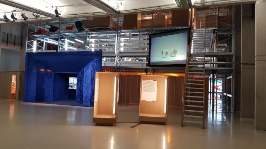
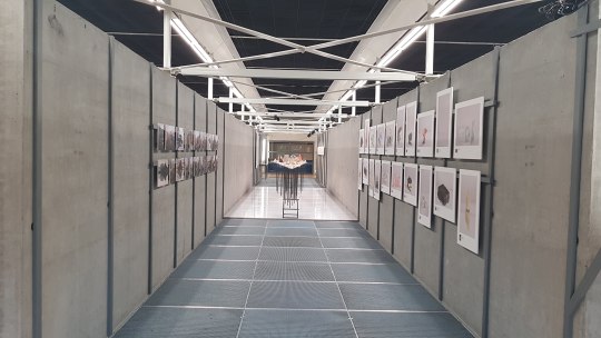
Archived ideas are in a lot of cases being forgotten, which is a pity. The exhibition “Speculatief Design Archief” gives these “forgotten’ prototypes, sketches, material- and colour tryouts and other workpieces that have been important for the development of dutch designers, a new place to be shown. In this way the pieces can still be looked trough, even though the designers themselves don’t have place to show these pieces.
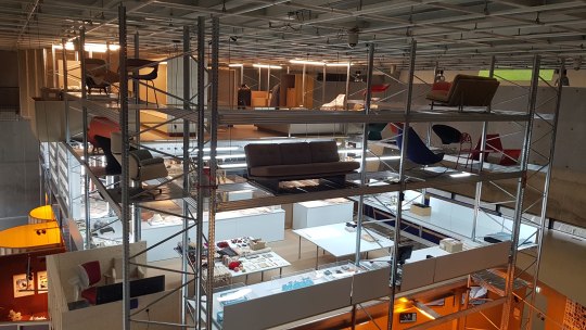
I think the reason why the Nieuwe Instituut chose exhibiting this way was the fact that they wanted to have multiple stories where they could show their pieces. The building belonging to the Nieuwe Instituut is built in a way that there’s a big open area in the middle of the first floor. This area has been designed the way it is to facilitate big installations that have been shown here before. Speculatief Design Archief however doesn’t contain any big pieces and exhibiting small objects in the big open space wouldn’t look nice; that’s also a reason why they chose to make a big installation where they can show small pieces in the way they did I think. The installation in the middle of this open area then functions as a room divider and it gave an opportunity to store everything in a clear, accessible way.
I like the concept of the exhibition where you can do your own research and touch everything, but the actual doing it makes me feel awkward. That’s why I prefer going to an exhibition where everything is shown. This creates a better overview of all the pieces and doesn't give you the feeling that you’re doing something that your not allowed to (even though you are). The awkward feeling is due to the fact that exhibiting in a non-touchy way is norm, and I personally think many people will have the same feeling once visiting this exhibition.
by Kier Spronk


0 notes