#IzabellaOrlowska
Explore tagged Tumblr posts
Text
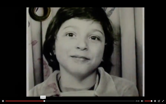
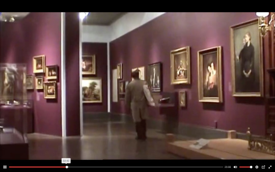
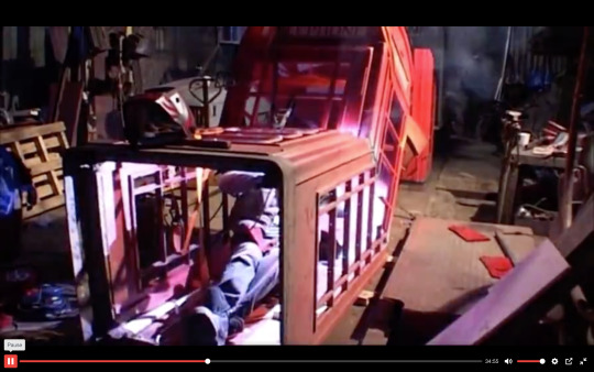
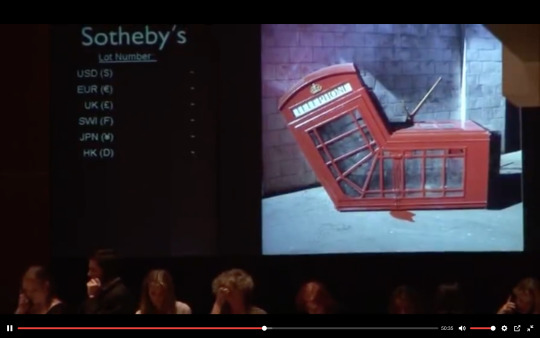
I thought it was really informative and crucial to learn about the circumstance of Thierry's mother death and how it shaped his life.
Really loved the way he went about sneaking up to hang the painting.
I really liked the humor of the British phone booth.
Great story arch of how street art went from this 'contraband' act to being highly appraised and sought after collectors' pieces .
0 notes
Text

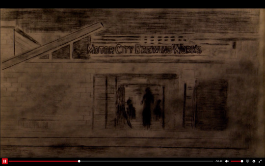
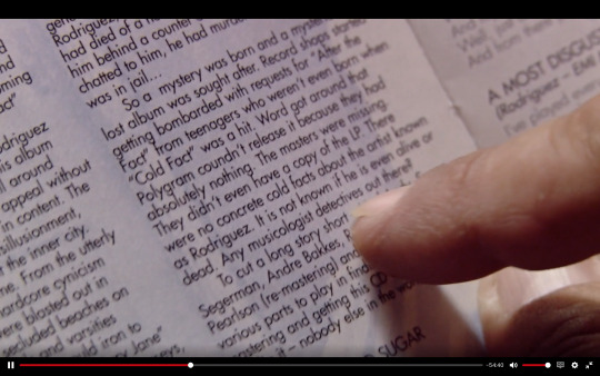
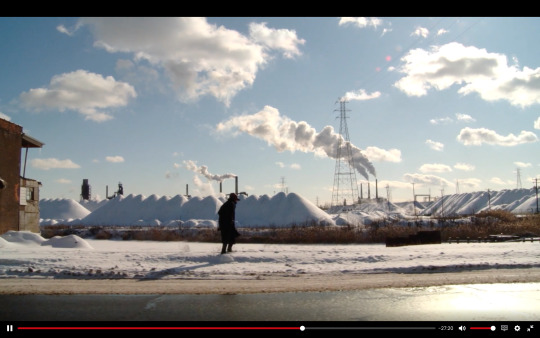
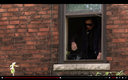
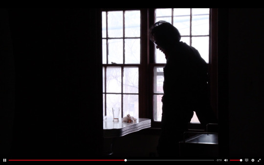
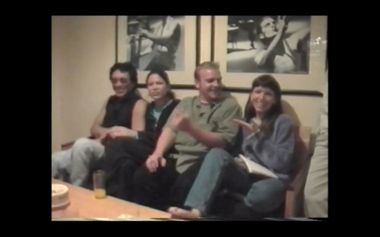
This documentary blew me away. It is the best (and now officially my favorite) documentary that I have ever seen. I was moved to tears on a few occasions while watching it. There are many inspiring points and moments that I will remember for my own work. And I am super happy to have discovered it thanks to this class.
I found the cinematography stunning. Full of texture.
Really liked the addition of drawings and animation. I felt it brought so many other dimensions of medium and content, making it a richer audience experience.
I really liked the way the story structure was crafted. "Any musicologist detectives out there?" is a line that marked a turning point in the story. It also is placed at the end of Act 1, if one was to break down the structure of this documentary in terms of traditional script writing format.
There were so many stunning images and moments where Rodriguez is walking, that gave me a feeling of music videos. And brought a sense of rhythm and movement that I really appreciated. It gave me as the audience member room to breathe, process the narrative, and to just be with this profound and touching story.
and 6. followed each other and cut on action. I really liked this choice of Rodriguez seen looking out through the window, and then in the next sequence, seen in silhouette against the backdrop of a window. I liked this choice a lot both as an aesthetic and continuity decision.
I really liked how archival footage and photos were incorporated into the structure and plot. The trip to South Africa of the entire family proved to be a life changing event for not just Rodriguez but others as well, in a positive way.
0 notes
Text
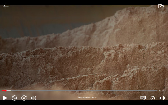
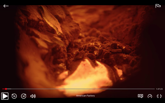
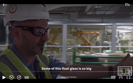

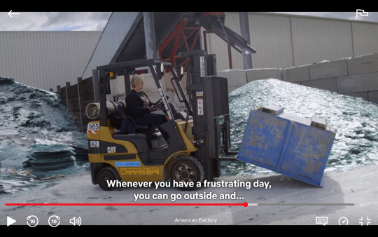
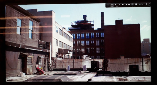
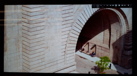
1 & 2 For me, these pictures showed what this documentary had the potential to be in terms of visual storytelling rich in texture.
And in my opinion it failed to deliver.
I found the story very compelling. Except the way it was carried out in terms of cinematography and editing choices fell short.
For a two-hour documentary there was an overwhelming amount of medium shots and lots of people 'talking' about things that could have been shown in an organic and behavioral way through action and image.
I would have much preferred in 3 to see the float glass rather than see a person driving a vehicle and talking about it.
Or in 4, why am I looking at a group of workers going about an ordinary day at work for a good few minutes, while the story in the VO is about the significant fire safety hazards resulting from architectural issues? Then I would rather see what about the building, exits and entrances poses this risk.
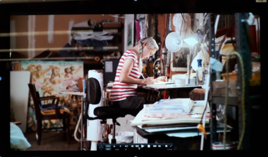
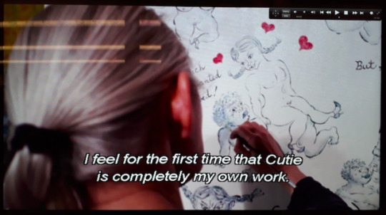
5 is an example of moments that really worked for me. It captured a person engaging in an activity that is part of the story = show don't tell principle.
0 notes
Text

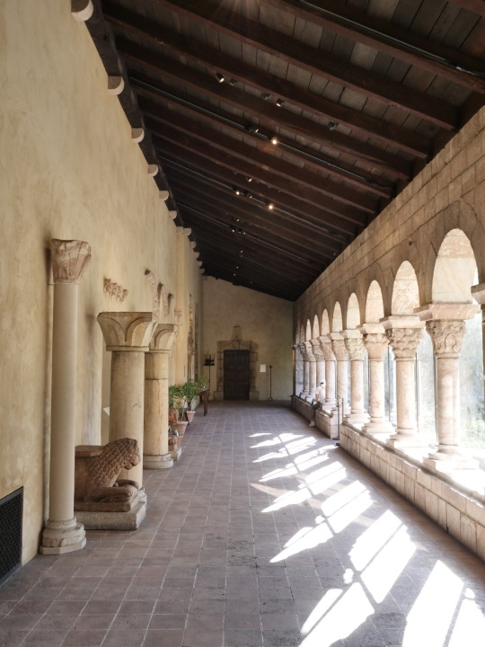
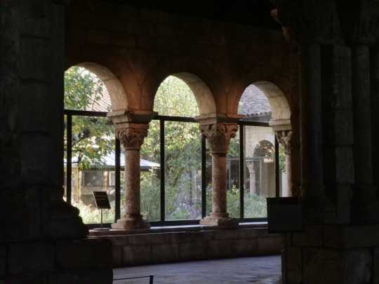
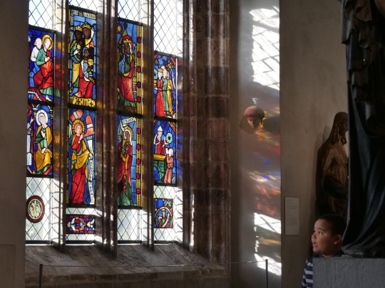
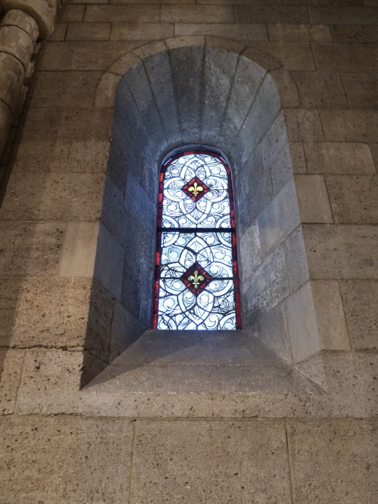

Viewpoint
Perspective
Rule of Thirds
Golden Rule
& 6. Symmetry
0 notes
Text


I really like the selection of types of frames.
In this part about Naomi winning, there is a great juxtaposition created by the wide frame followed by the close up, which capture well the opposition between what the world sees and what is the inner experience that Naomi is having.
The desire to win is great and it is really important to the story to reveal what is driving Naomi's need for victory, winning, and success in tennis. It comes from her family. Since Naomi's mom might not want to speak about hardships and working hard to support the family, it makes for an effective storytelling tool to have archival footage of family from the time Naomi describes, with Naomi's voiceover giving it context and meaning to her.
I really liked the way this episode has a composition that incorporates lots of planes. Also, it uses many moments of over the shoulder frames, like here, which I find very effective and engaging.
0 notes
Text


I really appreciated how this sequence portrayed the dynamic between Grace and her father through a context of an activity. Also, it is a close up of them being engaged in an activity together. I found it quite symbolic and moving. Despite their difference about changes in the work place, they still manage to find their connection and enjoy leisure time spent together.
I found this sequence really captured well through the images the future-looking changes implemented by Grace. Making a website is represented by an image of Grace looking out into the world through a square opening, almost like that of a screen.
This frame of new storefronts and its lighting and color scheme really works well for me.
I loved how this establishing set up become like an anchoring image that is interwoven at least three times throughout the episode. It becomes like a grounding image of the story.
0 notes
Text


I found this episode to be a magnificent feast for the eyes!
1. I really loved this sequence where we are established a location, while we also see both Dona Suzana and her husband Antonio in it. We see his main activity of being a fisherman and catching the fish that later get made into the famous dishes. And we also see the relationship between the two in the form of an affectionate kiss blown by Suzanna to Antonio across the waters. This frame captures so much of the story.
2. This frame captures the height of Suzana's emotional intensity of excitement and joy about the possibility of being a professional cook.
3. There are so many amazing images that capture the nature. I wonder how they were filmed?
4. I love the vibrant colors, rich textures, and depth of this image.
0 notes
Text


Graphic design that gives me a huge sense of movement. I thought of dance when looking at this photo.
Compression and expansion are also fundamental to movement and dance composition. I experience many of Platon's photos as dance forms.
I really learned a lot through this section where Platon speaks of the practice of stillness as a way of awakening observation skills. Platon shares how when sitting and being still, even a small activity such as a person walking by becomes a "massive event".
Icon = head + shoulders + probably a halo = Platon picture
The iconic design makes for a striking composition that works over time with many different sitters. I thought that it is also emblematic of how Platon approaches his sitters. Looking at them as heroes, his curiosity and desire to learn from them imbued with a quality resembling reverence.
0 notes
Text


I found it mind-blowing how a design threw an election.
High Line = H + railroad tracks
One of the themes of the episode about Paula Scher is how she chooses to navigate working with clients in a strategic way. Paula describes that one of the issues she encounters in her work with clients is that they want proof that it is going to work. However, there is no way to prove it because it’s a question of how do people “see and perceive and accept things”. Making a decision is a creative act of courage. There will always be those who like and dislike it, understand or not, approve and disapprove. It’s about making a decision and being willing to stand by it. It’s as much about art as it is about a financial calculation.
This brings me to an insight I had about the process of logo decision making. When asked to merge the Travelers and Citibank logos into one, the task was framed as finding a way of bringing the red umbrella to Citibank. I realize that it was not up to Paula to question this approach. Yet, I do feel the representatives of both companies would have optimized the process of logo re-design if they had opened up to the possibility of defining a new joint identity, instead of clinging to and merging the two pre-existing ones. In my impression, the red semicircle does not communicate an umbrella. Nor does it invite to associate the company with travel or insurance. However, Citibank in its prior logo did have a symbol that arguably resembles a compass - the perfect travel companion. Hence, I would have made a case for adding red into the compass to signify true north and maybe changed the font of Citi. My conclusion is that sometimes the egos of company executives and their attachment to their previous logos/brand/identity can stifle speedy development.
“You have to be in a state of play to design.” Those are Paula's words and photo that capture her approach and practice of doodling as a way of engaging in a playful state of mind.
I was fascinated when Paula started to explore her work in designing environmental graphics. It speaks to my need and appreciation for texture, movement and exploration of design as a form existing within time-space. Suddenly, the design is not just an image to be seen, it is also a form that has a body, weight, depth, texture of material and sound. I find this aspect of her work both fascinating and captivating because it opens up to me the chance of having an experience.
0 notes
Text


End sequence that I felt really captured the role of music in shaping Nasir's life.
Jungle speaking about the lives of all the people they grew up with and how their lives ended up not turning out well. I found this a great visual set up to the part that is edited together with it in which Nasir is sitting in the studio.
Nasir in the studio following the part where his brother talks about how horribly the lives of others they grew up with turned out, really heightens the set of stakes and sense of drama of what might have happened to them also.
I really appreciated the part by Marley Marl talking about how he would watch people outside his window while making music. If they didn't do a two-step, he would make a new beat.
0 notes
