#It is the exact colours but my backdrop makes them lighter
Explore tagged Tumblr posts
Photo


With me having all 6 heirs for this legacy, I thought I’d do something I did in the past, but I wish I did it with the colours of the legacy. So I asked the server I’m part of which do they prefer, the heirs on their colours, or the heirs on their spouse’s, using Daisy as the example.
The overwhelming response was option b, so spouse colours it was. Hickory was the ponder, as he won’t have a spouse, so I choose to loop around and make his background that of his great-great-great grandmother.
I will admit, I love everyone’s are quite calm and gentle, and then, we get to Zephyr, who is a bright berry, and his background is a bam.
#my sims#Daisy Snow#Twilight Snow#Tea Rose Snow#Zephyr Snow#Celadon Snow#Hickory Snow#Sims 3#the sims 3#ts3#Berry Sweet Sims#Back to the void I go#It is the exact colours but my backdrop makes them lighter#so what can you do#Family: Snow V1
26 notes
·
View notes
Text
Final Crit
My Critique
Our film recreation was of La La Land, we decided to do the argument scene. our angle was it was fairly simple with the over the shoulder back and forth of the convo, but we thought the tricky but would be the lighting, we were right. It took us many hours to set up the lighting for the peice. Peer and Orla from my group had to go in early and start to look at the place in which we were filming, luckily we had a faulty blank place in which we could put the lighting backdrops up on. I personally was the DOP and the editor, this meant i was able to try and control the lighting and colour when filming but also when colour grading I could match the exact colour to try and get the correct colour. After going into our crit I think we did quite well, i’m our crit we only had a few lighting trouble, one of which was artificially inserted by me to try and get Emma’s face lighter. It was a mask for the colour grading, it took many hours to just to try and get that correct. this was because we did her first as she had to leave early and did gregour after, but by then we had figured out how to properly light their faces, but it was to late for emma. So i had to work with what i had. This was my first time trying to colour grade and I think I did ok but certainly not great, I'm very excited to learn how to do it properly and understand the waves in which to make a scene really pop. Other than Gregours accent dropping a few time i would say the acting was done very well and i’m very happy with it. The actors were both old friends of mine who did Drama with me at school so I knew they would be reliable for acting, but our director still needed proof and so they had to send in short little snippets of the scene so they could be approved.
We had many take for the audio, the problem with this was they argue over each other. But we need clear audio from both of them, which was fine but they had to get the argument exactly the same when they did it individually. luckily we got that sort of correct, i think it was effective enough when i edited it together as no one picked up on it being separate tracks.
Overall i was extremely happy with the feedback, it wasn’t like we did bad but there were a few things for next time. Which meant we did something right.


0 notes
Text
Wk 7, 8 & 9: Turnaround sheets
For the first part of the lesson, we were given a visual reference. This was to help us create a character. We were allowed to research these visual references so I researched mine which was a Zombie and Zips and Buttons.
I just loaded up Zips and Buttons into google images and looked at the appearance of them, figuring out a way I could put them on a zombie. That’s when I got the idea of a stuffed toy zombie. I got a textile theme going for my character. He had stitches on his body and also he was torn by his ear with stuffing hanging out. He had a zip for his mouth and a button for his eye, the other eye was stitched up. I kind of got the idea for button eyes from the movie Coroline.
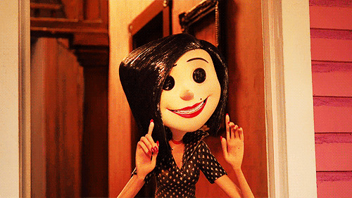
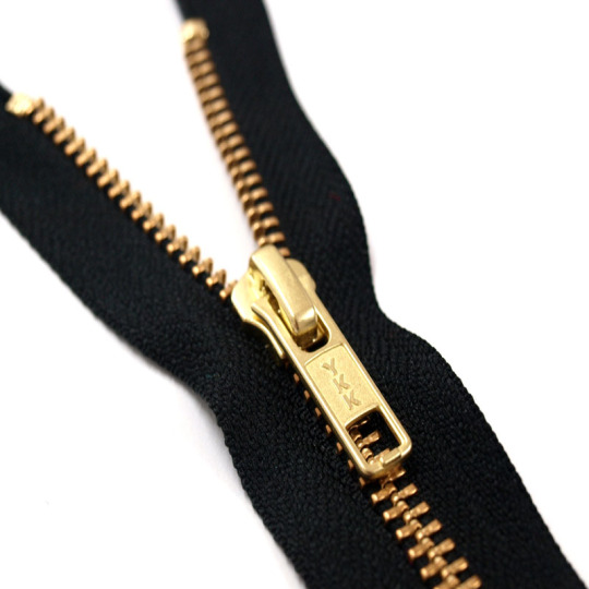
Image Source
I was worried I wouldn’t have a plan of what to sketch so I created a mindmap in my sketchbook with a few small sketches to help me.
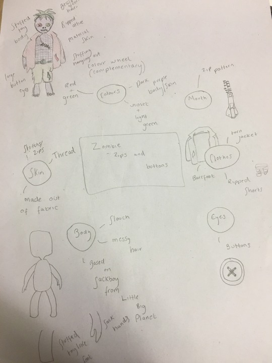
I actually found this first task quite difficult to complete. I think I overthought my character design and aimed to make it complicated and as crazy as can be which is why it took me so long to come up with this idea. I had to keep in mind that whatever my plan was, I had to be sure that I could draw it so I couldn’t think of an idea out of my level of skill. That being said however, the turnaround sheet definitely brought me out of my comfort zone. I stuck to my initial plan thoroughly. The idea I had in mind is exactly how it came out in my sketches. Next time I receive a task similar to this, I’ll build my idea slowly and not immediately think of something crazy and not achievable in the time given. I believe that I focused too much on what my peers were doing rather than my own ideas and work.
Scanned Turnaround Sheet:
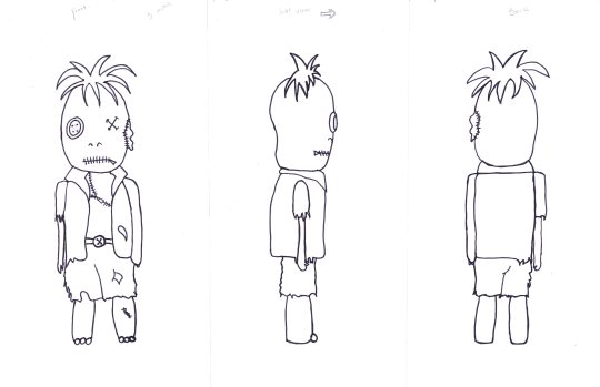
After creating a final sketch of my character, we started our own turnaround sheets which consisted of front view, side view and rear view. We drew guidelines all the way across the page so that each body part were to be the exact same height and size as the original and first drawing. We had to keep in mind the way we turned our characters. For example, if mine was turned to face the left, I had to be sure to remember that the torn sleeve wouldn’t be seen. We had to bare important factors like this in mind. I found that it was harder to keep the same width for the front and back view of my character as my ruler lines were a bit wonky. I also struggled drawing my character’s colour as I didn’t entirely figure out how it would appear in side and rear view. That being said, I am very happy with how my turnaround sheet came out to say it’s my first time creating one. Even though some parts were uneven and not as accurate as they could be, it still looks neat enough to be a turnaround sheet. Next time, I should work on improving the accuracy of my guidelines and also to pay attention to the width of my character.
Render Process:
After we sketched our characters, we scanned them into the computers for digitisation (colouring).
To hide some of the sketch marks and also the mucky looking background, we did the technique shift + ctrl + alt + 2 which selects all of the white then we made sure our marquee tool was selected before right clicking and selecting inverse. After, we clicked the mask tool. Adding a new layer, we fill it in white. Doing this method before anything else ensures we have a clean cut background but with the lines bold and in tact to work with.
I decided to colour my character in first using flat colours and add details in later. I prefer the method of building layers up from the back to front, adding details last.
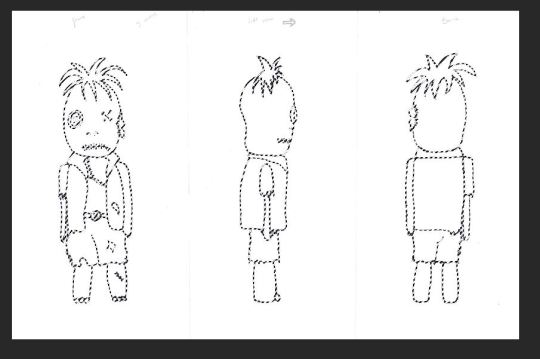
I selected the jacket on all figurines of my character using the magic wand tool then created a new layer labelled ‘jacket’. I picked a crimson red and using the brush tool, I started colouring in the jacket.

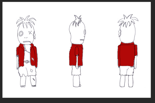
I decided to colour all the turnarounds at once, fully, before adding detailed shadows and highlights. I used the same method as above to complete my character’s attire and body parts.
The shorts:
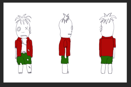
The head:
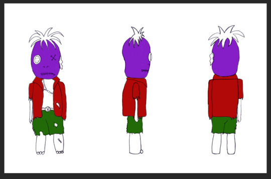
The rest of the body:
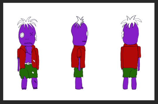
The hair:
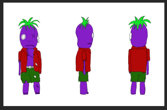
Smaller details (eyes, belt etc):
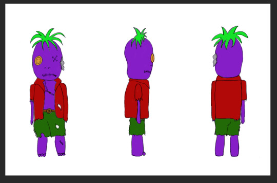
I also added a subtle backdrop for my character, I used the gradient tool and opted for a gentle blue to contrast well with my ‘funky’, punk colours.
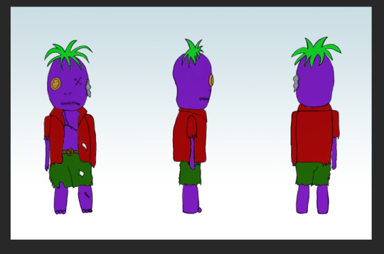
After, I added some more subtle tones. I started with adding shadows, particularly under his hair and clothes before adding a highlight to his button eye. I determined the light source was from above.
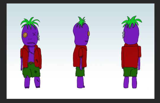
Because my character is based off a stuffed toy, I wanted to add a handmade knitted effect. I have knowledge in adding overlays and transparency so I had an idea of how to achieve this. Firstly I obtained a simple image of knitted material. The lighter the better, so I opted for this one:
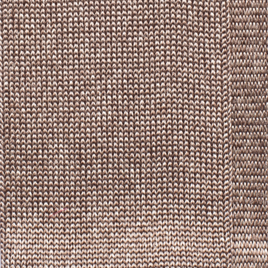
In a new document I pasted this image and all I did was turn the entire saturation down low so it appeared a whiteish grey colour. This enables the image to blend better with my neon purple colour.
After copying the edited image onto a new layer, I used the warp tool to make the wool appear more rounded and scrunched together as this is what the material would initially look like for the head of my character as its an egg shape almost. I selected my head layer and used select inverse and the masking tool to add the material to the entire shape of my character’s head. This is an easier method than just adding a square over and erasing around the edges.
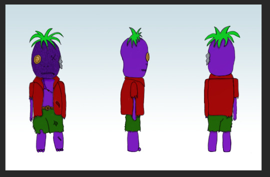
I did the same method for the rest of his body. Before masking:

After masking:
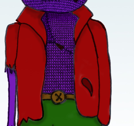
I repeated this on every turnaround of my character as you can see below:
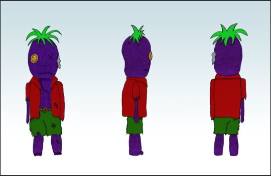
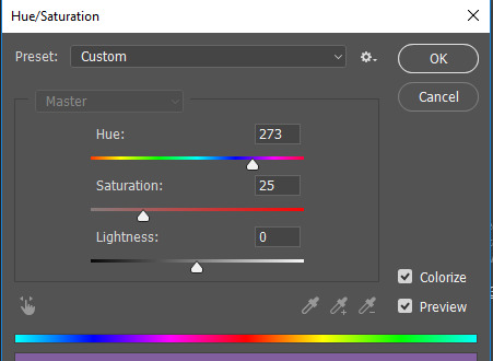
To make it blend in better with my character’s purple skin, I used Hue/Saturation to change the colour of the knitting overlay. Clicking Colourize and moving the Hue dial edits the colour of the overlay. I chose a purple colour so it blends in with my character’s skin.
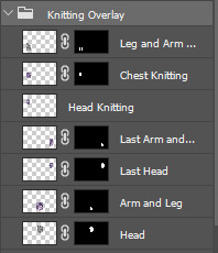
All the layers that I used to mask the material to my character are inside a folder I created called Knitting Overlay.
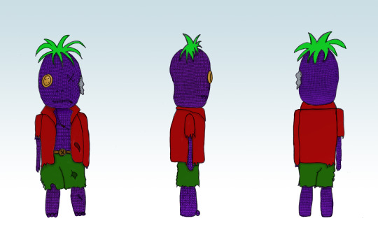
I found the basic colouring in of my character easy as I have experience with doing something very similar last year. I am proud of my overall final look. I kept to my original plan and had no trouble with rendering. I’d like to improve on my shading and highlighting. I feel as though the shadows aren’t really seen that well and I find it quite difficult to add tone to a drawing either way. I’d like to brush up on these skills.
1 note
·
View note
Text
Painting Strategies For three Shades Of Color On One Wall
I've heard when painting walls a darker colour you need to paint the ceiling a lighter shade of the identical colour. Some providers could require primer in order that it retains the shade of the paint that you selected, particularly on darker walls. Updated on Might 6, 2012 Elsie Nelson moreContact Author Source Painting your partitions is one in all the most cost effective and easiest methods to improve the look of your private home. On ceilings, stairwells and excessive partitions, single strokes may be not possible. Once you've got properly prepped your partitions, the actual painting is straightforward. It also is very clean, covers very properly, so you do not have to use a couple of coat (except you have got very porous partitions, as with new construction). If you have painted the brand new construction, or when you have partitions that have been painted over a number of times, the smartest thing to do is to make use of a tinted primer as a base coat. Don't attempt to blend over a finished portion, as the paint, having set, will elevate clean off, or upon drying will depart a shiny spot which can mar the finish. Properly, painting your ceiling a darkish purple additionally, will make the area look larger. And when spray painting molerski krecenje i drugi radovi Beograd always persist with Rustoleum or Krylon (industrial only), depending on the coloration and protection wanted.
Jupiterimages/Pictures.com/Getty Photos Step 4Choose another base shade if desired. It may also help energize any room with colour and texture. Now, I've by no means had paint soak via my drop cloth, but you can buy plastic-lined canvas drop cloths that provide better soak-by protection. The large one, if in case you have children, they see them as an enormous clean canvas and begin their first attempts at artwork class one zero one. I am certain most of us have been there, proper! All it's a must to do is select the correct paint for the job and get the surface into pretty much as good a condition as possible. Danny Lipford: In case you have a small hole in your wall, like this, from where an image was hanging it’s fairly simple to repair utilizing a lightweight spackling or joint compound. However, what do you do with something like this, a hanging gentle fixture? Accentuate the texture to give your walls depth and curiosity, making them seem like sun-washed plaster or weathered stucco. You should use your imagination to attempt painting your walls with completely different material like crumpled plastic bags, spatulas, twine dipped in numerous colored paint o even bottle caps.
When you are painting an entire room, the ceiling is one of the best place to begin. This text is a brief summary of greatest practices for wall painting focusing on slicing-in and normal brush utilization. Not to mention, manufacturers consider one hundred% acrylics to be their best merchandise. The materials and choices out there in the marketplace ca give life to your imagination and creativity. Now we have heaps ofstencil ideas to inspire your creativity. If that's the case, read up on some simple decorating tips together with some ideas not commonly taken advantages of. Begin by filling the bucket about halfway with paint, then dangle the grid in the bucket. Purple paint, nonetheless, is a complete other world. When I’m painting furniture with latex paint, I typically don't use the dearer manufacturers of paint since I don’t want a whole gallon. The approach you choose to make the most of should depend on your confidence in your own painting and drawing skills, the look you’re going for, the materials it's a must to work with and your finances size.
Allen Lyle: Prime-down. You’re not attempting to do a again and forth movement on this. Earlier than replacing the light-switch covers and electrical-outlet covers in a newly painted room, I write the important data (model title, paint colour, paint number) onto a bit of masking tape and stick it to the again of a swap plate. Paint every coloration on a chunk of poster board and tape them up using painter's tape. Paint the top portion of the room one colour and the bottom portion one other coloration. Its the color I chose and painted them. In the event you take a look at a paint card, most firms have already found out what you are looking for. Go to home depot, and go to the paint section, and purchase a spray can referred to as ''Killz''. Subsequently, the home improvement retailer will mark it all the way down to about 25% of the original sale price. This final quantity will provide you with the exact area of wall space you'll paint. Why not brighten their day and gipsani radovi beograd (www.palermo-decor.rs) personalize it with an excellent wall mural? The decision to paint your basis wall is a permanent one.
Some decorators encourage folks to look at this sort of wall art to create the illusion of an extra play-house for youngsters who can use it as a backdrop. When making use of paint with a brush it can be arduous to get a straight line, however there are just a few tips to help you alongside the way. Make the interior yourself mirror on the partitions by depicting it all with a fine stroke of the paint brush! They make a room look unfinished. Some services similar to concrete require an additional product to make the walls obtain paint more simply. Ensure that each the transfer paper and picture are mendacity flat against the wall, somewhat taught and clean. Discover or design a picture on paper. It’s the Handy Paint Cup. Milk and chalk paint are additionally about 30 days. There are 4 approaches you can take to creating murals, each with its personal pros and cons.
0 notes