#It helps keep things consistent and then I can add a new layer overtop to change the lighting/atmosphere
Explore tagged Tumblr posts
Text
Why did I pick a pose/reference photo that has his hands prominently featured??? Everything else is basically done already but the hands are bothering me so I’ve been losing my mind - redoing them until I think they look good
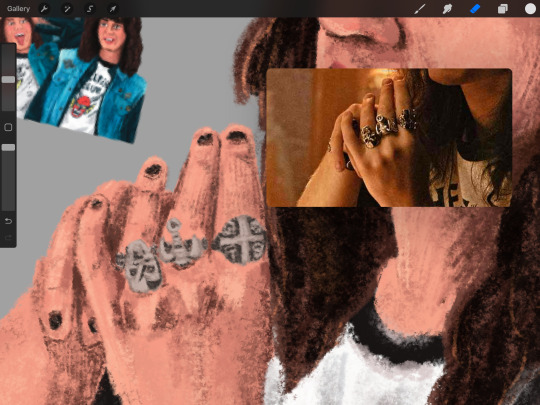
They definitely look better than before, but they still look off to me
#I want to move on to making the rainbow version of this but I know I shouldn’t until I finish the regular drawing first#If you’re wondering about the Eddie’s in the corner. I like to use previous drawings of mine as color references#It helps keep things consistent and then I can add a new layer overtop to change the lighting/atmosphere#But I like having a base color palette to work off of. So I colorpick from the older works when I first start coloring#don’t mind me. I’m just talking to myself#my art#mine#art wip#wip#wip wednesday#eddie munson#stranger things#text post
3 notes
·
View notes
Text
Digital Character Illustration - Class One
For the first part of this class, we pretty much just went over the basics of drawing on Photoshop with a drawing tablet. We learnt/relearnt many commands and learnt new techniques to better our drawing and colouring.
Commands include: B = Brush E = Eraser CMD + Z = Undo Shift + CMD + Z = Redo OPT + Delete = Fill selection with foreground colour Number Keys (1 - 0) = Opacity CMD + A = Select All
There are even more helpful commands, but these are the ones we used the most.


First we did some page setup, distinguishing between layers and background. The layers are created by clicking the plus icon in the lower right of the layers menu. The background is the only layer present when a new file is made, and has a solid white background, unlike layers created afterward which are transparent.
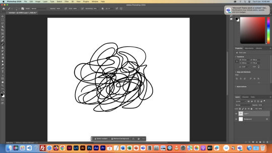

We then tested lots of brush and eraser types. For example, there are hard and soft brushes, which refer to the rigidness of the lines edge when drawn. There are many other types of brushes, but we just used these for the example. We also played with the sizes of the brushes and erasers, as shown.


Next we tried changing the opacity of the brushes and eraser. I found this very interesting, especially the eraser, as it led to some cool gradients by just making very simple strokes. I think I'll keep this technique in mind when designing my characters.

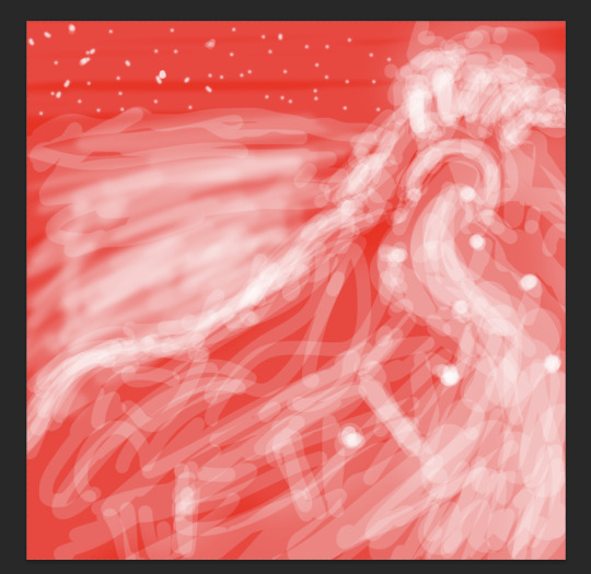
After that, we messed with the colour wheel, and did some more of everything else over again, just to see how everything meshed together.
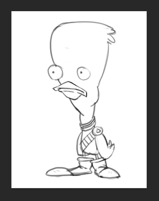
After we had finished getting used to Photoshop, we got our first character template to practice drawing over.

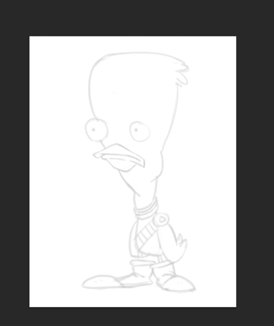
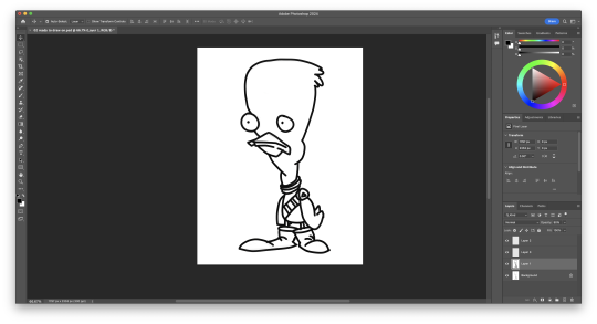
We then setup our layers, so we could draw overtop on a white layer whilst still being able to see our template. We did this by creating a second layer that was filled in with white, and dropping its opacity a little bit, so we could see the template. I drew my first outline, was happy with it. I think I'll be able to get used to the drawing tablet pretty soon.

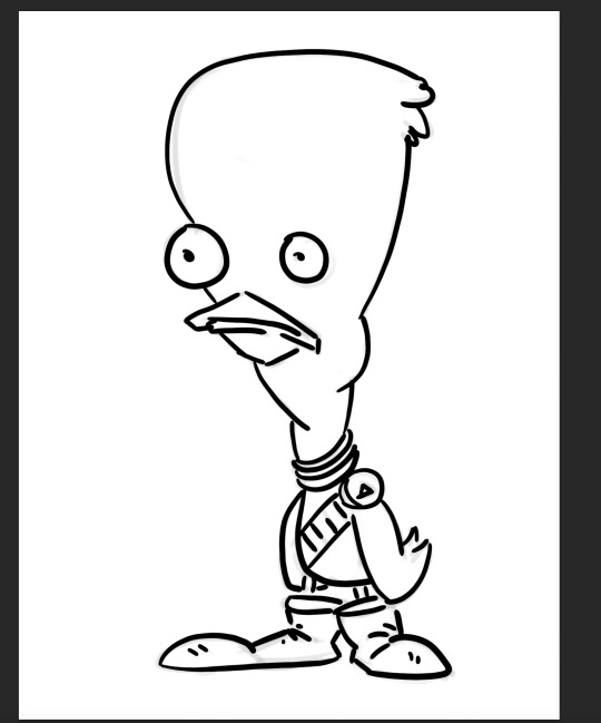
Next, we started using the pressure brushes, which change thickness depending on how much pressure you put on the drawing tablet with your pen when drawing. I like this brush type a lot, it looks more like a manual drawing, which I think is really cool.
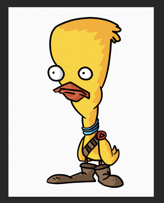
I also coloured it in for fun.
We then learnt a process for designing characters and colouring them, the process was made by Tom Garden, or at least that's what the slideshow said.
It pretty much consisted of choosing a design, drawing line art over your sketch, filling that line art with a base colour in grayscale, then making a new layer for each section of the design that needs a different colour, and adding a different grey to it depending how light/dark you want it, then adding colour to each section, and then adding shadows and highlights on individual layers as well.
Here's my attempt below

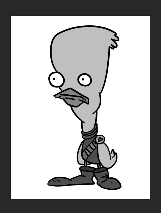
Here is my greyscale of the duck character. Each different type of grey was on it's own individual layer, so I could colour each section individually.
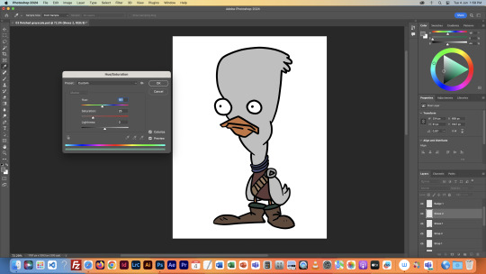
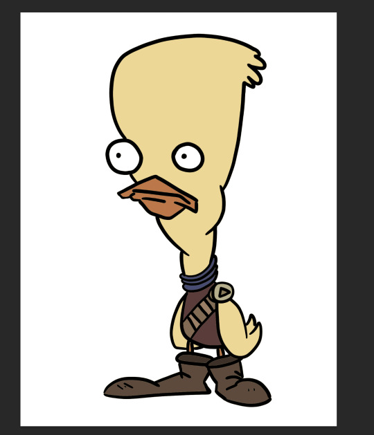
I then used the hue menu (CMD + U) to colorise each section of the design.
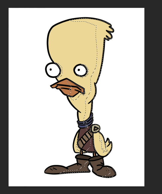
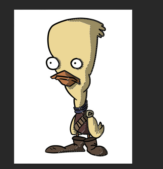
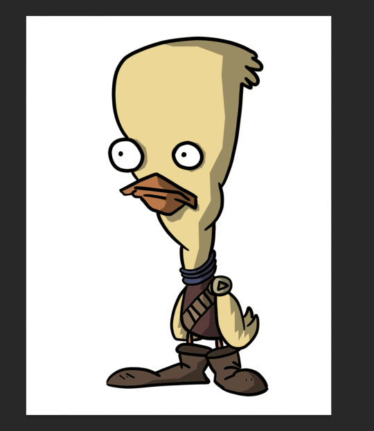
Next I used the polygonal lasso tool to select areas I wanted to add shadow to, on an individual layer, I filled the final selection with black, and made the opacity of the layer 35%, as it said in the instructions.
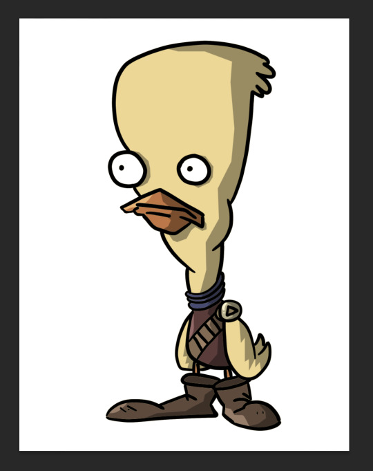
Finally, I added a couple highlights to the design, such as on the badge, shirt, shoes and beak. This added a little extra tone which I thought was nice. Overall I'm way happier with this one than the original one I coloured, so I'll definitely be using this process in the future.
I did this process again for another template we got:
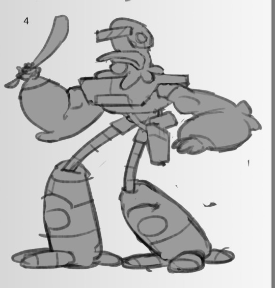
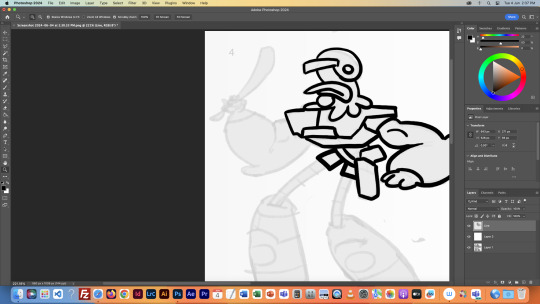
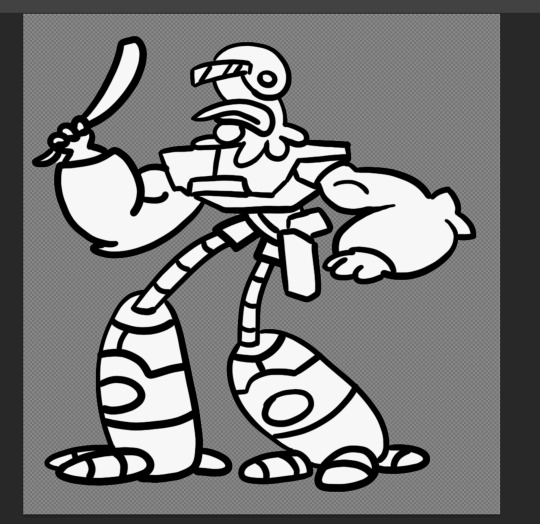
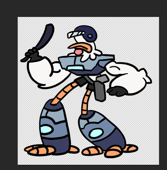
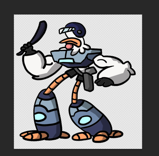
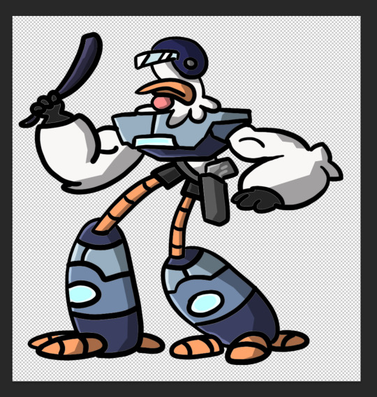
This was a little more intricate of a design than the duck was, so it was a nice step up to see how I would do. I think it turned out pretty good, since I''m doing pretty much all of this for the first time.
Overall this first class was very helpful, I learnt a whole bunch of new things and I can already see the improvement in my digital art compared to my previous stuff.
1 note
·
View note