#IconGridSystem
Explore tagged Tumblr posts
Text
How to design using a special grid system?

How to create amazing designs using a special grid system!
Creating amazing designs using a special grid system can be a challenging but fun process. By following a few simple tips, you can create layouts that are both innovative and visually appealing. First, it's important to consider the purpose of your design. Do you want to create a simple document or poster? Or do you want to create something more complex, such as a photo collage? Once you know the goal, you can begin creating your grid. Designing layouts with grids is a common technique for creating an organized and visually pleasing design. In the last article, we already discuss the different types of grids, and where to use them. If you miss it, please refer back to this article "How do the grid and layout help your design?". And now let's get start it.
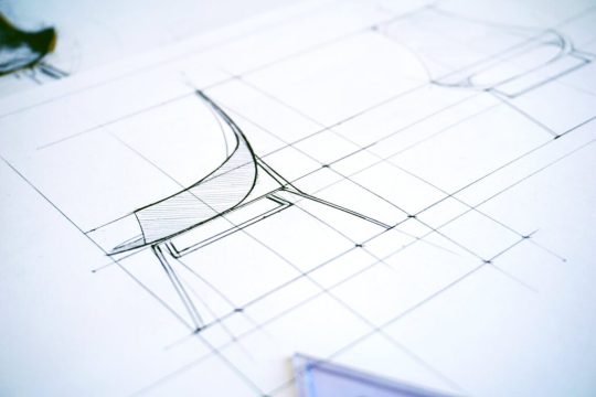
Photo by Karol D on Pexels.com
Composite Grids Using Modular and Column Grids
Develop your layout before pictures or text is placed by using grid lines. This is called Blocking. This gives you a procedure for conflict resolution and a rationale for each element's placement. It also allows you to determine what elements are more important while ignoring other elements, where you can place photos or final text, and at what point you may need to start searching for a photograph. Column grids are used to create a symmetrical layout, while modular grids allow for more flexibility in design. When used correctly, both of these grid types can help you to create pages that are easy to navigate and visually pleasing.
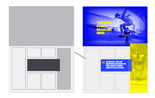
Image By Lindsay Marsh Design
Isometric Grids
An isometric grid system is a type of grid that is used in creating three-dimensional drawings. It is made up of evenly spaced horizontal and vertical lines that intersect at right angles. This type of grid can be helpful when creating designs that need to be viewed from different angles, as it gives a more accurate representation of the object's shape. Axonometric projections, also called isometric grids, are tools that are used to represent 3D objects on 2D surfaces. They can be used effectively by engineers who want to create maps, blueprints, and drawings, and enable them to see planes or levels similarly. They're also suitable for displaying information. Isometric grids have become popular in design for design purposes as well as for illustration and product mockups. How Isometric Grids are constructed Isometric grids are easy to make. They consist of equal-spaced vertical lines. You can use copy these same lines and then rotate them by 60 degrees so that the first intersecting series of lines is formed. Lastly, duplicate the first 60 degrees line set and rotate it 60 degrees in the same direction to form the third set of intersecting lines. All of these 3 lines make up the isometric grid you see image background below. I also provide a brief description of the highlight & shadow, Isometric direction, color choice, and depth & height.
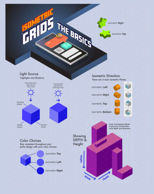
Image By Lindsay Marsh Design
Icon Grid System
Almost any interface can be improved with the judicious use of icons. Icons make an interface more intuitive by providing visual cues to the user about what actions are possible. They also help to keep the interface consistent by using shared symbols throughout the application. We're going to take a look at some common icon grids and how you can use them in your own designs. A grid has been created that helps an icon be properly aligned and balanced. Using the grid available in the icon set can help you create the icons that are intended to look coherently arranged. The spacing between circles and lines is relative to the Golden Ratio.
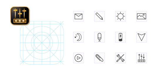
Image By Lindsay Marsh Design
Diagonal Grids
A diagonal grid is a great way to add interest and movement to your quilt blocks. This type of grid can also help you to create more complex blocks with ease. It's very easy to make a diagonal grid for your quilt blocks.

Image By Lindsay Marsh Design
Using Grids for Social Media
This grid is a modular structure where the margins are arranged. I am utilizing the grid not just to determine the elements of where to insert them but to frame parts of the elements, like in the focal point of the logo or the facial area of an individual. We already know that finding the right balance is critical to everything that we do. It's equally important to have equally weighted sides to the face and popsicles, as they're often in close proximity to one another and tend to work in concert to achieve a single focus.

Image By Lindsay Marsh Design
Grid System in Logo Design
Grids are simple, geometric shapes that can be used to create orderly designs. They can be used to create a sense of balance and symmetry in a logo and can make it more visually appealing. Grids are also versatile and can be used in a variety of different ways. Spacing is important between components of the logo as well as the spacing recommended for the space outside of that logo.
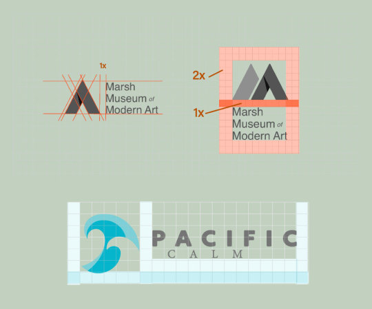
Image By Lindsay Marsh Design
Grids for Web and Desktop Layout
Grids are an important tool for creating web layouts. They help to create a unified design and make it easy to align content. In addition, grids can be used to create fluid or fixed layouts. A classic 12-column grid layout with a left gutter appears near the top of the following image. This is seen in nearly all desktop and website designs.
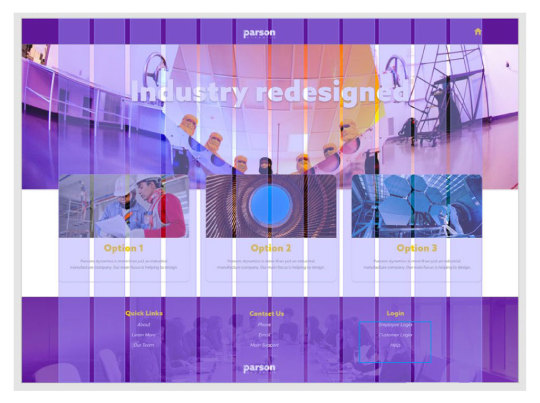
Image By Lindsay Marsh Design
Grids for Mobile Layout
A common grid system of 4 columns guides the design of mobile user interfaces. These columns may therefore help guide the placement of buttons, photos, and other design elements. They often help you understand elements with various columns like the example here. The ends of the buttons line up with the info above the right hand.
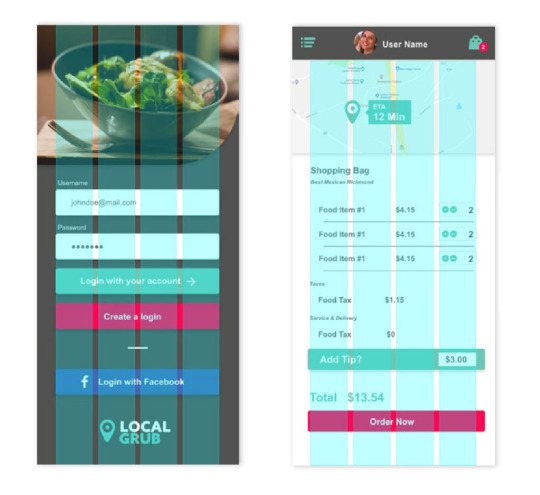
Image By Lindsay Marsh Design
Grids in Editorial Layout
The Grid system is a valuable tool for setting up the overall look and feel of an editorial layout. They provide a structure for arranging type and images, as well as guiding the reader's eye around the page. Grids can be simple or complex, depending on the design needs of the project. It's very efficient when creating editorial layouts and distributing information because they keep both sides of a spread in balance and provide an even distance between the gutters. In recent years, grids have become less rigid, with more flexible column widths and modular layouts. This allows for greater creativity and flexibility in page design.
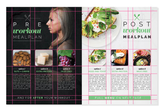
Image By Lindsay Marsh Design
Conclusion
In conclusion, by using a grid system, you can create amazing designs that are both visually appealing and organized. This grid system is easy to use and can be applied to a variety of projects. So why not give it a try? You may be surprised at how simple and effective it can be! Read the full article
#CompositeGrids#desktoplayout#DiagonalGrids#EditorialLayout#graphicdesign#gridandlayout#gridsystem#gridssystem#IconGridSystem#IsometricGrids#layouts#MobileLayout#specialgridsystem#UsingGrids
0 notes