#I. write urls manually I hope that’s spelled correctly
Explore tagged Tumblr posts
Visit Tumblr Blog
Explore Tumblr blogs with no restrictions, modern design and the best experience.
Last Seen Tumblr Blogs


Fun Fact
69% of Tumblr users are millennials.
Note
hi. rolls up wearing a "Terra Fan #1" t-shirt. FOR the character ask game, 1, 2, 12, 14, 18, 21 (or 22, optionally), and 25, all for Terra!!! feel free to skip some if that's a bit Too Many At Once i'm simply the world's nosiest little beast :3
squints and carefully puts “Terra fan #2” shirt away (I can’t compete with my irl who loves Terra more than me it’d be foolish)
He’s BIG hes TEDDY BEAR and he has SO SO MANY PROBLEMS and he was three people and a terrifying armor ghost for years I love Lingering Will I think lingering will is the coolest thing ever. Wayfinders are my favorites when they’re vengeful ghosts
coughs. Lingering will. But actually I love that he’s a very polite boy I think a lesser medium would have made him edgier. He’s very polite and asks for things nicely and says please. good boy. 12. oh no I’m in a list wait
12. I think he’s very bad at cooking. I think he’s just downright bad at it it’s not that he doesn’t want to he is just bad. After kh3 he tries to get into it because aqua likes to bake as stress relief but he is not good at it however he CAN!!! make a KILLER kebab. because he just piles everything he likes to bbq on a stick
14. I. Honestly his normal aesthetic is so good for him. Samurai fantasy tech warrior is so good. And I don’t think athletic wear quite fits him? Put that boy in climbing gear maybe. Plenty of carabiners
18. Ummmmnnnnnhhhh UHHH ACTUALLY YOU KNOW WHAT i don’t quite know about this one bc all of his relationships are either sad or very brief I think he should interact with sora more though. I think they would get along well. I hope he chats with riku more too….. it’s so cute… maybe that’s the answer to the actual question. Wiku
21/22. Can you believe I’ve written him like once? Unbelievable. He’s just hard to do for me I think. I like it when ppl make Terra the lets go lesbians let’s go guy I love it when he’s just a woodworker he’s in a trade of some kind and lesbians just love the guy. It’s a trope I’ve seen like three times and every time it’s so funny to me. Who would have guessed. the big gentle himbo. But I also don’t like it when fics make him Too Mean?? You know? This is a problem with both Terra and Aqua I think people assume they’re older and therefore stricter and more entrenched in master eraqus’ teachings and completely unwilling to go near the idea of accepting darkness and while I don’t think that interpretation is wrong or not easily supported, it just feels… too harsh… like they didn’t also go through a big darkness revelation and have to deal with it all by themselves and maybe they wouldn’t find Riku to be comforting, if not a major relief. idk. You can make them as complex as you want (personally I have thoughts about how unintentionally bad they are at emotions and communication ALL THE TIME) but i get sad if they’re one dimensionally mean :( I get it you want a bad guy in your vanitas redemption. But cmon :(
25. I (thinking) I basically watched kh backwards. Sort of. So my first impression was actually,, Terra giving his friends a big hug and crying!! So I always knew he was a sweet boy. Now he is a complex sweet boy who made bad decisions and his whole arc can be taken with different readings beyond even the effects of manipulation into cycles of power and relapse or su(i am dragged offstage by a comically long cane) HEY
#suolainensilakka#I. write urls manually I hope that’s spelled correctly#ask game#ask#AND!!!!! I think Terra has more fat on his body than his model. I love him. He’s STRONG strong; not model strong
25 notes
·
View notes
Text
Why you shouldn’t let media agencies design your creative
The obsession with adtech has yielded some baffling design choices. Buying the space has somehow become more important than designing for the space. This process does not help anyone in the chain, least of all consumers, who are ultimately the people that will hopefully pay for your product.
In this post focusing on the UAE, I look at a series of paid ads on social networks and publishers, using my mobile as the primary browsing device. I look at design, copy and user journey issues which can lead to massive sales funnel leaks. Plenty has already been written about mobile being used more and more, which is why mobile optimized design is so crucial to ensure best use of marketing budget, and more importantly, prioritize the customer.
Part 1. The case of Social Media ads
Social Media remains the most abused channel for marketing in the region because marketers look at it as a cheaper channel, rather than a channel to invest in, engage in actual conversation and drive conversions. This is the digital front line after all. We have now passed the valley of despair, where the design asset doesn’t match the required spec size, and have moved on to the mountain of mediocrity as far as best practice goes.
Is this because marketers no longer want to pay for creative? Is it because they don’t know any better? Who knows. Let’s look at some examples:
TWITTER
The largest Twitter advertisers currently in terms of volume appear to be automotive ones. Here’s a selection of the top 4:
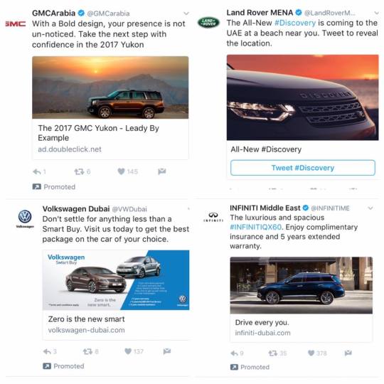
Most of them have reasonable images, but the Volkswagen one stood out for “cram as much text as possible onto a Twitter ad”. The banner text is completely unreadable on mobile. Considering that’s where most of your social engagement will be, this seems like a waste of copy.
The GMC one has a non brand URL which will not inspire confidence in prospects, but let’s look closer at some of the wonderful copy text:
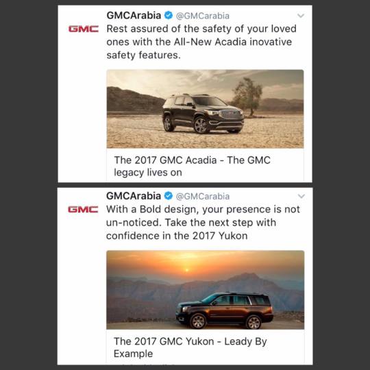
“Rest assured of” and “inovative” are basic grammar and spelling mistakes (change to ‘rest assured that’ and ‘innovative’ with a double n).
With the GMC, a double negative leads to utter confusion along with the chance to “Leady By Example”. Who’s writing this stuff? A 5 year old?
I did message them on twitter and they responded that they amended it.
Things get even better when one actually engages and is taken to a landing page of sorts, where the prospect is supposed to register for a test drive:
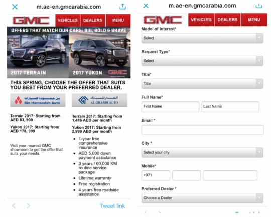
On the left, we see the first landing page, after your selection you are taken to the never ending form on the right.
For mobile users, less is more. Having one car fill up the width of the mobile browser and allowing a thumb scroll interaction would be better than presenting both options at once.
The inconsistent use of font size, emboldening and poor distributor logos all detract from what ostensibly is a premium vehicle.
Moving onto the form itself, it’s a textbook case of designing for inputs to the brand CRM / ERP system, not for the user. If you’re interrupting people on a dynamic social network, (and even if not), best practice for forms dictates 3 fields or 4 at the maximum.
Next up on Twitter ads, the Property sector:

Once again, the “leave no white space unfilled” theory is in full effect. You didn’t actually want to enjoy a full width view of the promoted apartment did you? I’ll just leave that there.
Now let’s see how Lulu tackles Twitter with a new approach, one I like to call, “SuspenseTech”
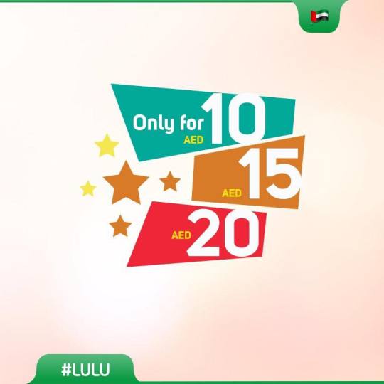
What are these magical products for these low low prices? You’ve got my attention, but for all the wrong reasons. TELL MEEEEEEE
The body copy of the tweet did include a url so I duly clicked and…..
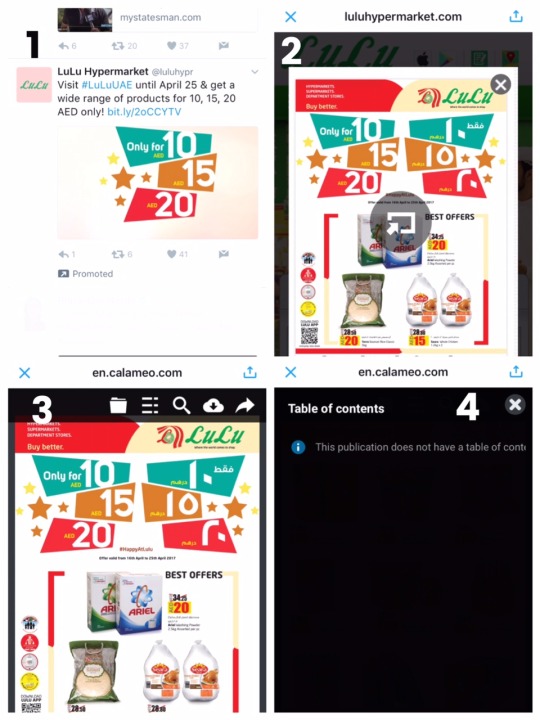
Yes, you’re seeing it correctly. It’s an online brochure. One un-clickable image. With the requirement to click something in the middle or, the X in the corner first.
But wait, something in the main menu looks like it might have more info, unfortunately, the table of contents did not have… a table of contents.
So I’ll be forced to schlep down to the store, wherever that is….
Calameo by the way is just like Issuu. For people who want to replicate the page turning experience online.
Like so
Did you spot the 1st edition of #NationTowers @myconciergeUAE magazine yet? A must for all luxury products & unique experiences #inabudhabi! pic.twitter.com/66a2Gp6M3v
I haven’t found a Twitch channel yet which gives me access to live page turning but i’m sure the good folks at Lulu can oblige.
In some cases, promoted tweets did not resolve to a landing page at all.
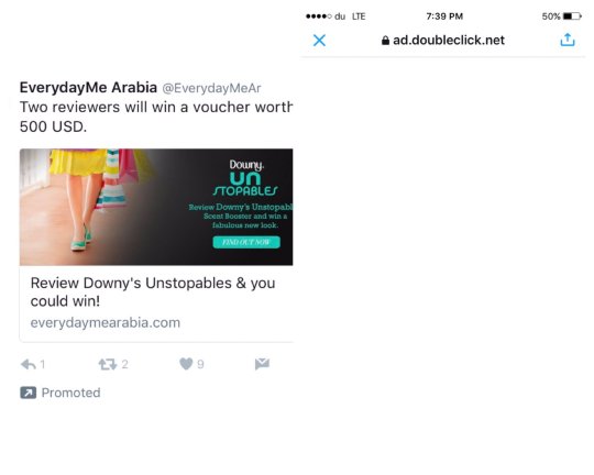
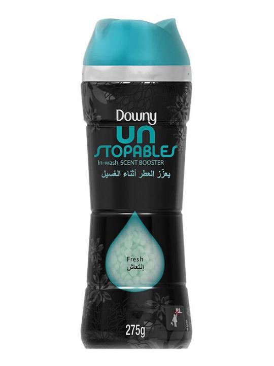
I was also about to go bananas at yet another spelling error (shouldn’t it be “Unstoppables”?) but it turns out it is actually the name of the product. Forget fake news, P&G are promoting fake spelling:
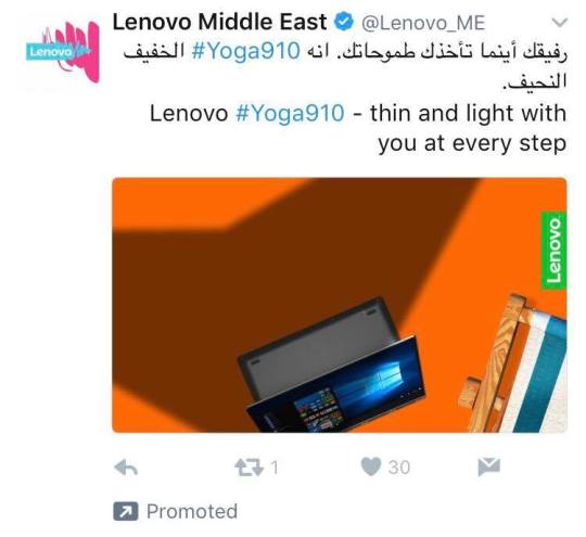
Finally, the Lenovo pad, whose english copy text makes it sound like…..a pad
INSTAGRAM
On Instagram, things aren’t much better, with the main errors being too much copy text which renders the design unreadable, or, for those ‘grams that link out to a browser, the user is led to a non mobile optimized final destination.
For the purposes of brevity, I’ll just show one example, that of twofour54:
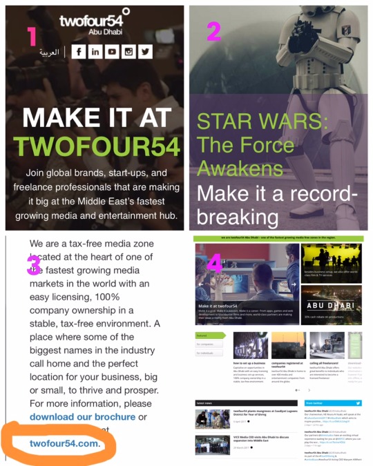
Whilst you do have to wade through rather a lot of content before you get the information that you require, at least it is optimized for mobile viewing. Obviously I’m not going to be downloading a brochure on my phone so I click the url to take me to the money page, where I will hopefully get detailed answers as per my buyer persona, and twofour can get me to hand over my details for their database.
It was all going so well, until I clicked out, and then everything just made my eyes hurt. Additionally, not taking me to an inside page meant I had to start the journey all over again and with that tiny font, I didn’t know where to start.
FACEBOOK
Hopping over to Facebook, Panasonic has clearly spent all its money on the hardware with none left over for decent graphic designers, or web designers for that matter. Take a look:
Husband comes home to find wife behind alien force field. Armed only with his briefcase, how will he reach her?
Alien force field secretly permeates dining room whilst you’re out at work all day.
And the most terrifying of all:
Alien spores trap family in unending spiral of doom.
(also its “breathe” not “breath” - sadly aliens can’t be defeated by poor spelling)
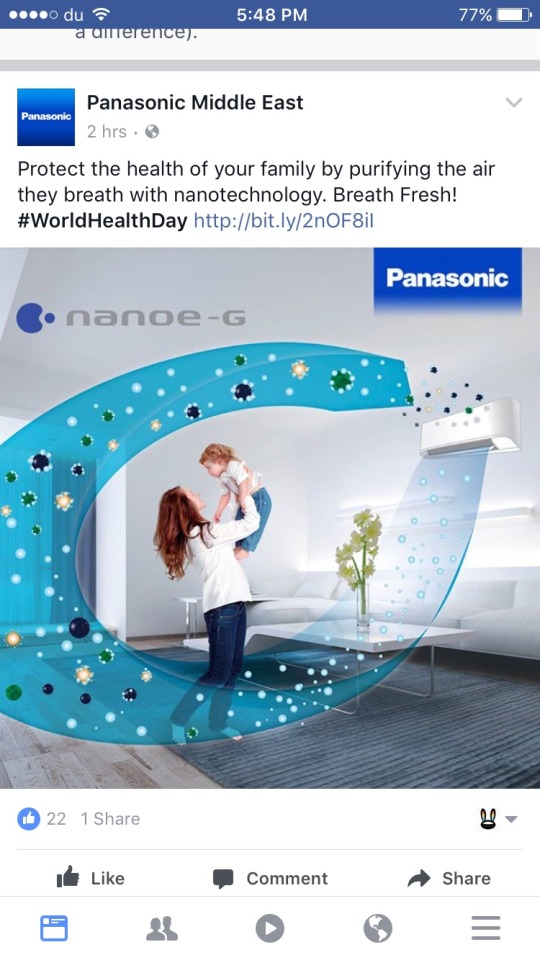
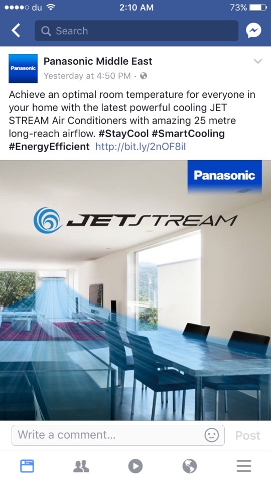
Haunted by the big blue blanket, I click on the required URL to see what else Panasonic has up their sleeve.
The CS-C24TKF could be Klingon for ‘commence countdown’. Looks like a jet engine in the background.
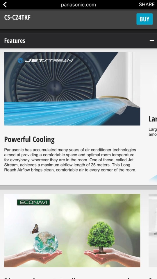
Notice that bit of text peeking out on the right? That’s how it appears in the mobile screen. You can actually scroll on the horizontal plane as well as the vertical plane. This is way too confusing and the user experience suffers as a result.
So far, I understand nothing.
Scrolling further, and the copy text is about as engaging as a plumbing manual. Also, this text-in-banner image simply doesn’t work on mobile. Everything is still way too small. If these are the most important marketable features of the product, why aren’t they more visible?
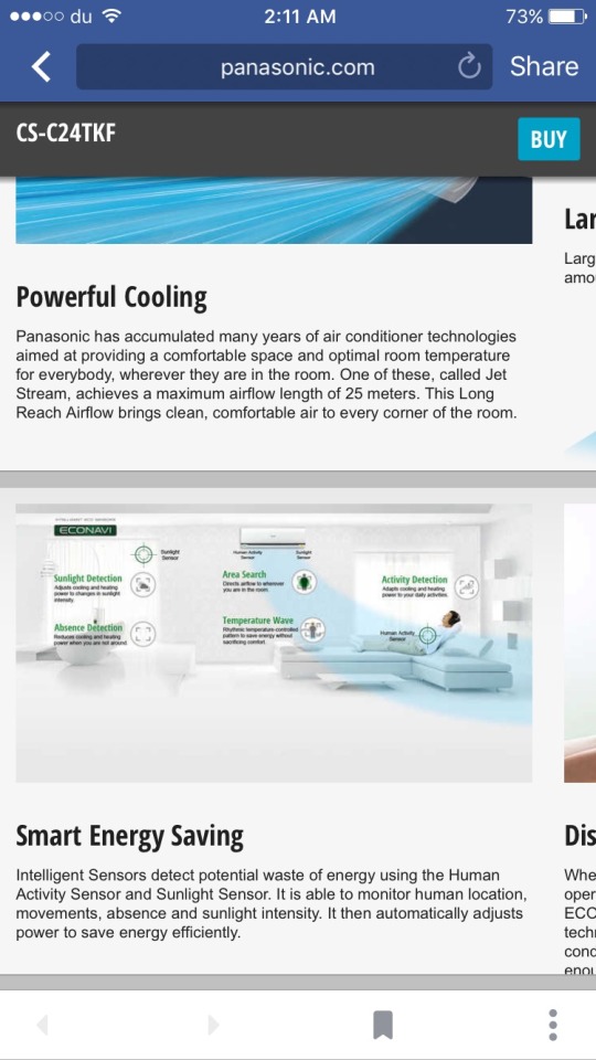
WAIT A SECOND! The blasted blue blanket of bewilderment is back and now it has green friends which are clearly preventing the woman from getting off the couch......
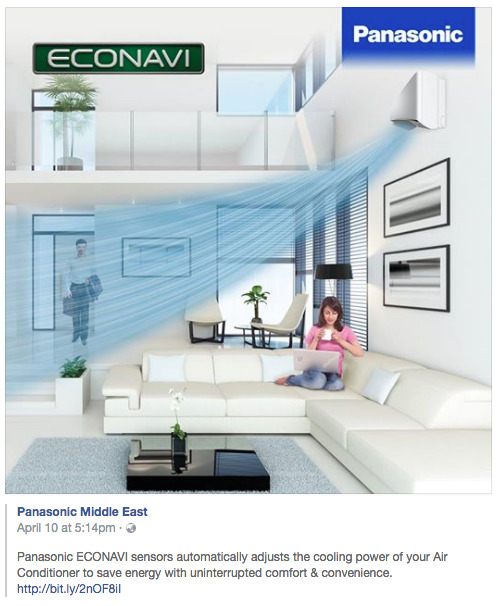
No review of regional creative would be complete without the old; “stick the product next to a sand dune, and the Middle Easterners will know its for them”.
Take note of the dual colors. Not sure if this means it’s blowing out 55 degree air or it counters it. Help!
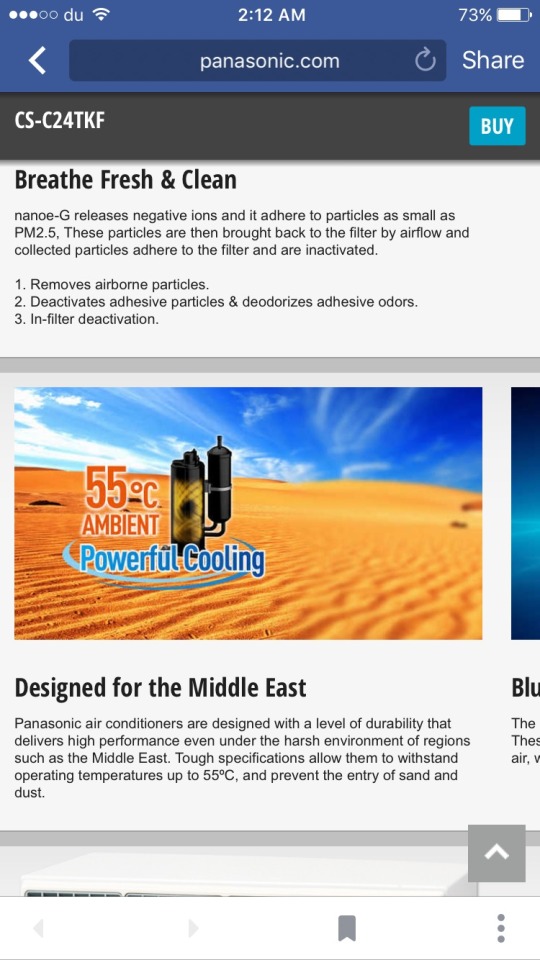
This image tells me nothing. It could be a water flask for my desert hiking trips for all I know. Why is it so hard just to get some decent images and write copy that converts. One minute alien forces are coming out my ac, next i’m stranded in the desert with this weird contraption.
Nevertheless I persist and try to navigate to buying (although I know full well this isn’t an ecommerce site).
First, if i’m online, why not default to “online showrooms”?
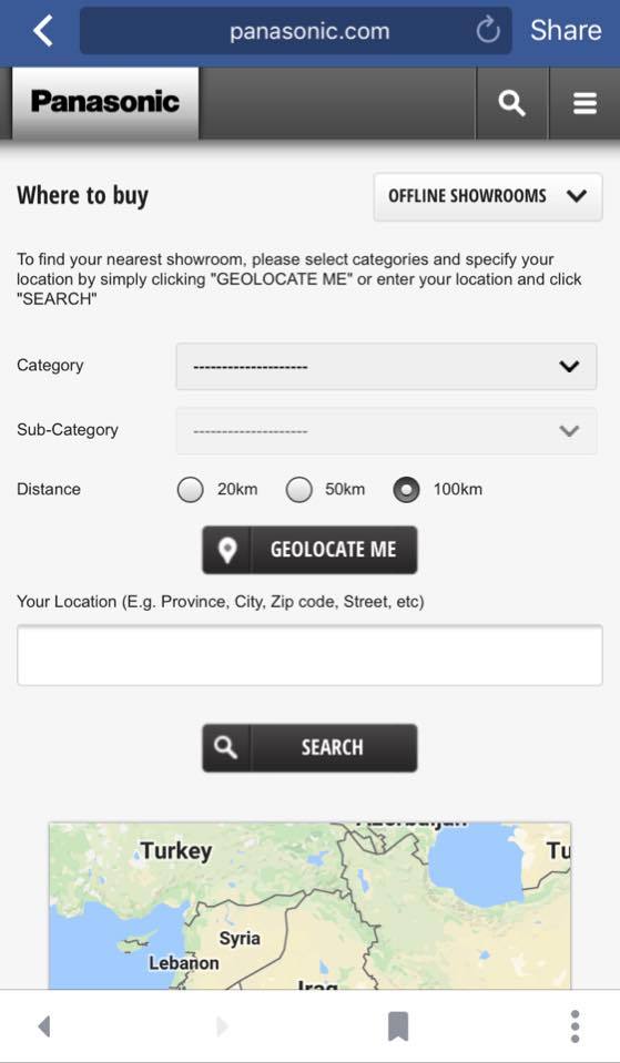
Second, just no. Its WAY too complicated to go through all the instructions. I do not want your product that badly that I need a PHD in form filling to get round your awful geolocation.
How do I know what category? What’s a sub category? What happened to our CS-C24TKF? Why didn’t you tell me what category it was in?
This is another case of repurposing content with no regard for the medium or the user. This looks like a trade marketing brochure. It certainly isn’t as engaging and easy to interact with as most B2C brands. The stock imagery gives it an outdated feel. There is no consideration to a purchase funnel here. The user is left alone to try and navigate a horizontal and vertical scrolling site, with multiple “brand names” (Jet stream, Econavi, Panasonic) and has no idea where to go or what to do.
The best Panasonic can hope for in the absence of investing in their digital channels is the dreaded “post a comment to win” type of social interaction. Which will inevitably be followed with the ubiquitous “interested please review my profile” comment, by the carefully uncurated audience, cultivated as a result of not investing in great web design and copy that converts.
B2B audiences fare no better, with Thomson Reuters dipping its toe in the SME arena. This is a data capture exercise which is most likely being used to add to the excellent and comprehensive Zawya Company Profiles database (Reuters acquired Zawya earlier), however, the on-boarding suffers from poor mobile optimization.
First I followed the journey from the Facebook ad:
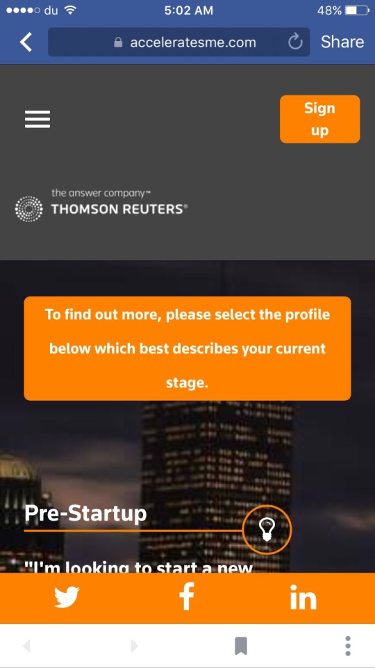
I was taken to the landing page, within the Facebook container:

Nice large CTA at the top, but the rest of the space is taken up by waffle. On mobile and particularly as a result of a paid ad, users need a bold statement, a problem that they need a solution to. This will stimulate them to continue the journey.
In addition, use of an animated header similar to Bloomberg or Backchannel would have drawn the user in

(image by Zack Grosser from Aaron Zamost post on Backchannel)
Here’s how a Bloomberg page with animation opens on mobile (video in portrait as most people will be reading this on mobile)
vimeo
bloomberg movie from alex t on Vimeo
Now obviously I’m not suggesting that Reuters throw animated lipsticks all over the landing page, but the point is that a B2B audience deserves some nice front end and it would stand out amongst competitors.
Scrolling down…
All of a sudden the header appears to have doubled in size, taking up almost half the screen. Why? And, i’m now forced to go through the rigmarole of a signup, which experience tells me will likely be painful, without any reassurance on what I will get if I do so.
I carry on browsing and...

We have entered “lasagna design” territory - piling everything on top of each other. Not a great UX.
I also saw the same ad on Instagram so I followed from there and was taken to the same site but directly in the browser. Much of the same ensued.
Below is part of the form where you register your company:
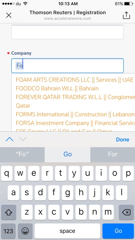
Pre-populating a form field can be super useful for users, but unless it deploys quickly and is optimized for the mobile screen (above you can see how part of the company name doesn’t fit in the window) it’s frustrating for users and often easier for them to type it in themselves.
The leaders in search tools are Algolia. Using their design and technology, users can get faster access to the information they need.
(As at the time of writing, the acceleratesme.com site is down for maintenance so it’s possible they are working on these issues)
Part 2. Publishers and Display ad journeys
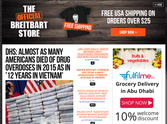
Much has been made in international marketing circles about brand ads appearing next to offensive content on social networks and youtube. Sleeping Giants has been doing a great job of actively trying to pressure brands to pull ads from hateful news sites including Breitbart.com
This is how users report the brands that advertise to the Sleeping Giants account:
@Hertz I'm a loyal Platinum customer. So disappointed to find you advertising on Breitbart, not the best brand fit. @slpng_giants pic.twitter.com/aVW9eJyOyz
Thanks to the joy of programmatic (I assume) we managed to see a few homegrown brands appear on this particular publisher:

The brands are:
Dubai Shopping Festival
Dalma Mall
Rasasi
The Galleria
Rite Bite
Friends Provident International Middle East
I tweeted at them at the time when these appeared, but none of them responded.
As of today, Fulfilme.com, an online grocery store backed by NMC is advertising (desktop site)
Regional publishers more often than not, have not optimized for mobile. This is especially worrisome as the majority of titles are franchised from the mature markets and the parent title has obviously followed best practice. Why doesn’t the franchisee follow suit?
Below, 2 titles from the Motivate Publisher, Campaign Middle East, Cyclist Middle East:
Campaign UK (left) and Campaign Middle East (right):
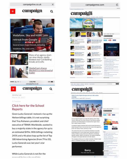
Here is the comparison of Cyclist UK (left) and Cyclist Middle East (right)

There’s a reason I picked this publisher. Campaign Middle East is a B2B magazine for the advertising and communication industry. It frequently reports on digital topics, with contributors noting on many occasions the proliferation of content consumption on mobile. It is therefore absurd that a publisher that talks to companies in this domain doesn’t have a mobile optimized site.
Leaving Thousands of Ad Revenue dollars on the table
This also leaves thousands of potential ad dollars on the table. Much of the growth in Campaign website traffic has been driven by referrals from social channels. As we already know, social is largely consumed on mobile. If Campaign Middle East were to develop a strong mobile presence, and associated ad space, hundreds more clients from the suppliers in digital technology, design and marketing would populate the space with their ads.
Using a CPC model, and potentially combined with an affiliate model, Campaign could grow its sales revenue efficiently whilst clients clearly get value for money.
Some publishers make no secret of their business model. ElleArabia.com has an excessive amount of ads placed next to a tiny amount of content:
Publisher: We need ads to support our content
Brand: Or is it the other way around….?
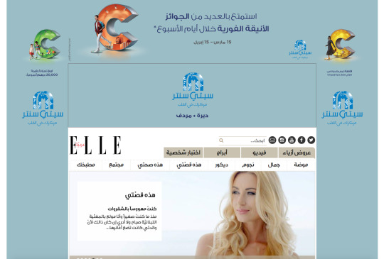
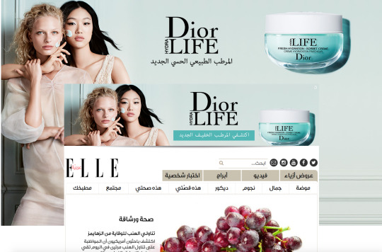
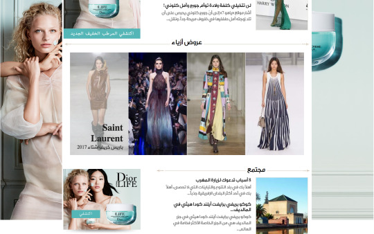
These Dior ads which appear to be on every female focused lifestyle digital property at the moment, resolve to the international site, dior.com. Ideally you’d send your local traffic to a local landing page. More on that in a later post.
More display horror from the property sector again, this time from Damac:
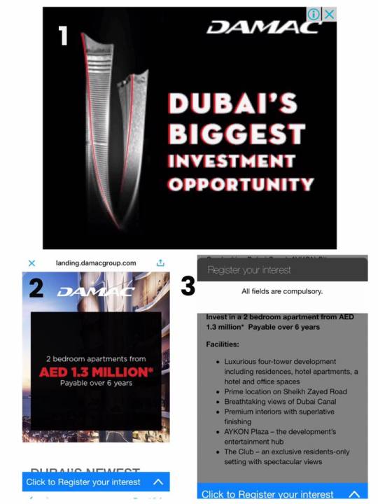
Shadows on the font for an online ad? Headache inducing.
The landing page is ok, although cutting off the sentence near the bottom of the frame makes me nervous that the rest of the mobile experience will be weak.
Unlike others in the space who utilize excessively long form fields, when I clicked to register my interest, there was no form at all.
Money is being left on the table. Again.
Part 3: Emailers
I’ll use the experience of my bank. Financial services firms are notorious for terrible design, even those who push mobile banking in their promotional campaigns appear to forget that their BTL comms needs to be mobile optimized as well.
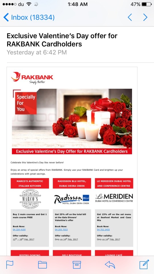
As you can see, this email is being read in my mobile device. The readable parts are the subject line thanks to Apple. You can now compare the unreadability of the rest of the text. There appear to be great offers in here but I can’t read them without zooming.
With a tri-column design, this should be collapsed in the mobile view, for a single column approach. With this tiny font, my fat thumb may misclick.
It turns out there is an entire table of offers in the email. So I scroll and zoom:
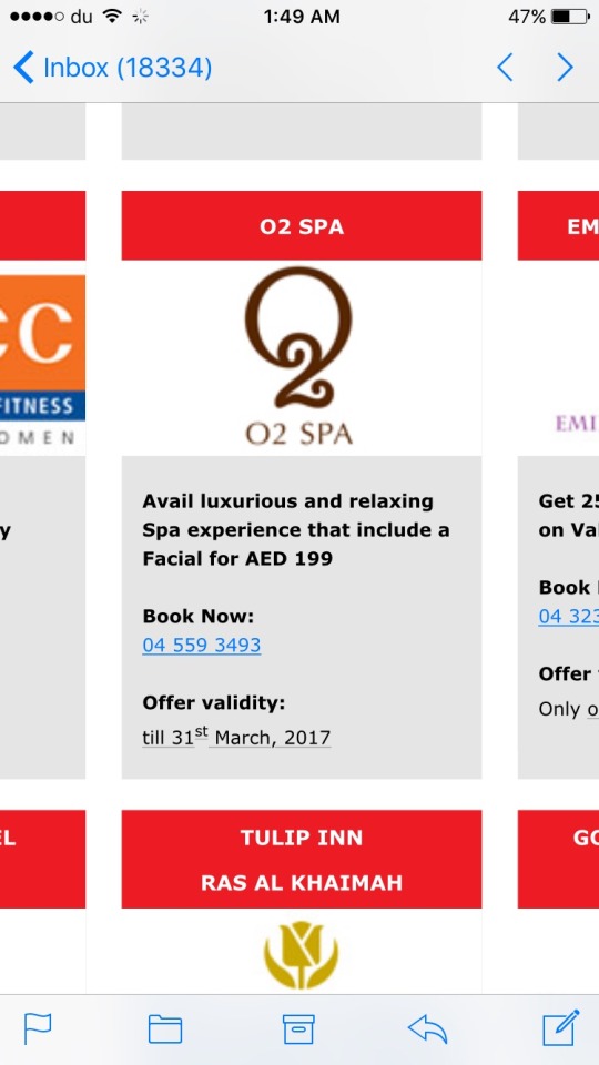
The minute I see the word “avail” i’m already put off (see analysis section for more on this).
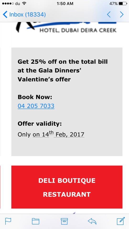
Have you noticed there is no clear CTA in each of the offers? I’m not sure what part I should click and if it will take me to the specific offer. Or how to redeem this offer. So much information packed into this mail, except what I, as the user should do.
Clicking on an offer takes me to…..
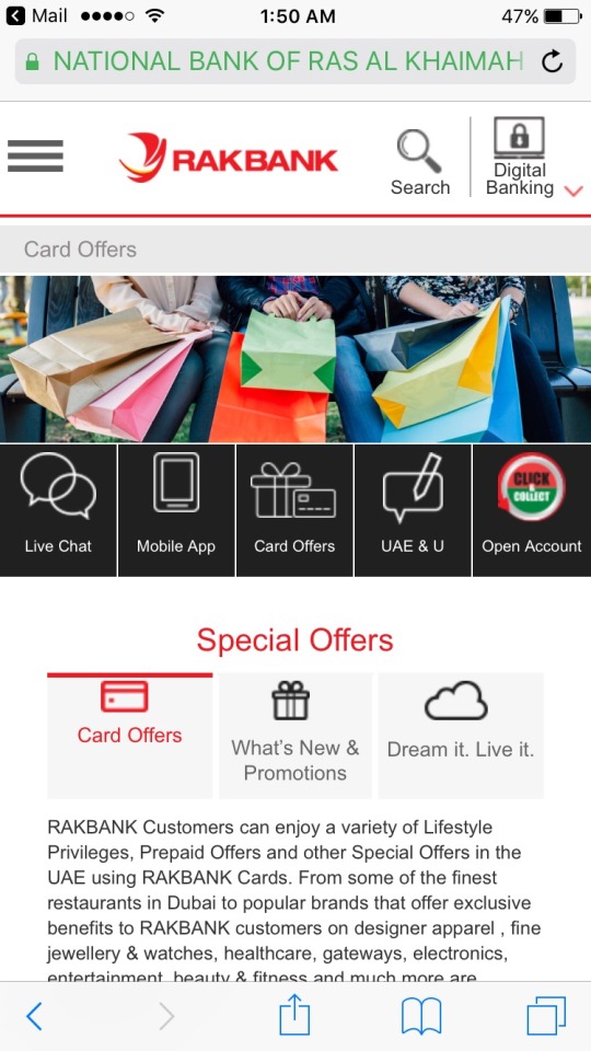
Oh great, i’m at another non mobile optimized screen and I didn’t land on the specific offer I clicked. Why? Why do i have to go through the entire journey again? How can I easily find the offer I wanted?
And what about that menu? My fat finger cannot distinctly click on one of those black options.
Co-marketing with banks and offer redemption is a great way to reach a targeted user base, but instead of optimizing for customer journeys, banks leave us to wander in the wilderness, most likely dropping out of the entire funnel. Which means poor redemption rates.
Banks make money when I use my card, so it’s really in their interest to design a journey so I will buy buy buy. I can’t do anything with this.
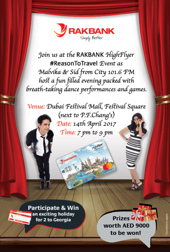
Here’s another emailer I received. In 2017:
I’ll conclude the design part of this post by two of the most baffling online ads I’ve seen this year:
Mashreq: we don’t like pronouns

And this: Secret Yoghurt hiding in Crisp Packet:
Analysis
All advertisers seek to engage users. Engagement comes from design and, on digital channels, by usability. Of course it can be argued that many brands seek only awareness, rather than to complete the entire journey from awareness to purchase. However, since digital is the only channel that offers the chance to do this, there is no reason why more brands cannot drive to checkout. This offers immediate ROI on your marketing spend.
Nevertheless, if the call to action on social channels is to “Learn More” or click on a link, you need to make sure that
a) the content is there
b) it is designed for mobile and
c) you don’t waste users time.
By shifting the focus back to creative agencies, you ensure that the quality of your brand does not suffer. Creative agencies have user delight at their core, media agencies are more concerned with reach and margins. Brands that do pay more attention to design can easily win here.
Let’s look at a one hypothetical example of a brand that seeks to drive awareness through paid ads on social channels:
Get the users attention in a busy timeline
Getting the users attention in a busy timeline is priority number one. This can be done by great graphics, well produced videos and perfect copytext. But don’t repeat the same creative. Users will become immune. Media agencies who do not frequency cap ads are the bane of consumers lives. Make sure you have a varied portfolio
Have a great reason to pull them out of the social environment
The next step. If you are asking users to link away from a social channel where they want to be spending most of their time, there has to be something riveting for them to do. Riveting for consumers does not usually involve filling out forms. With a varied portfolio of ads, it will be easy to measure which ones consumers are most interested in. Users will click on something to find out more information, here they are in the consideration stage. If there isn’t a huge amount more info to give them - then default to delighting them with design. Everyone will spend time with beautifully crafted design and text. If you don’t have access to great front end designers, use excellent witty copywriters.
Stick to the funnel and try to move to email
If you have managed to successfully complete this step, and you need to continue conversing with the customer to eventually shepherd them to a purchase offline (and on their own terms), then retarget them (with a different creative) on other channels, this time offering them something of value in order for them to leave you their contact details. Emails are the channel that actually result in the best ROI. But you only want to be emailing those that are far enough down the purchase funnel in order to keep conversion rates high and your database relatively clean. Again, make sure your emails are mobile optimized and use the latest design techniques.
Double check its actually mobile optimized
When designing for mobile, about 70% of brands believe that having the content fit in a mobile screen is equal to it being mobile optimized. If your senior executives cannot read all of the content or somebody has to pinch and zoom, then it’s not mobile optimized.
The ROI of Great Design
Essentially you get what you pay for with design. If you choose to spend as little as possible on creative, you will get the corresponding low quality user base. This is acutely true in emerging markets. If you’re a brand reading this you’ll most likely be suffering from a deluge of job related requests on your social channels rather than those that are high quality users, engaged in a conversation and likely to purchase. Because you spent all your money on buying the ad space and nothing on the creative to fill it.
Once again, it can reasonably be argued that the overall quality of audience in this region is low compared to other territories, why spend more when you can spend less. However, we have a wildly heterogeneous audience in the UAE (compared to other GCC markets). Higher quality users are attracted by proper copy using the right syntax and spelling, and excellent design.
By not catering to these users you are leaving money on the table. These users respond to better quality design and tend to be those that will have a higher LTV and higher retention rates.
Obviously this reduces your cost for acquiring customers, which means more money in the bank for you.
Finally, and I cannot stress this enough, investing in great design and UX at the beginning, massively reduces the amount you will spend on support afterwards. A known expenditure for design is much more preferable than an unknown expenditure on community management and engagement and call centres who you may be paying for by the hour.
Advertising online is largely a self serve method. You no longer have to go through an intermediary (ie a media agency) to get access to the space. It is cheaper to either hire or train media buying staff in house than it is to outsource to a media buying agency. If you keep media buying in house you are already saving 10 - 15% of your media buy costs (this percentage would be charged by the agency).
In addition, you get greater transparency on where your media is being spent. By spending less on media and investing more in design and creative, the results will allow a quicker ROI and the time spent to recoup that investment will be shorter. And, great design is the cornerstone of competitive advertising strategies.
When outsourcing digital design you’ll need to look for the following roles:
Graphic Design
Front End Design
UX and UI Design
Copywriters (ideally not bilingual, get one for each language you operate in)
Email Design
Mobile Design
Focus on delighting users, wowing them with creativity and usability and making it as easy as possible for them to accomplish whatever task is required.
0 notes