#I'm really digging pixel art!
Explore tagged Tumblr posts
Text


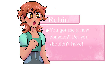

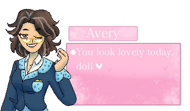

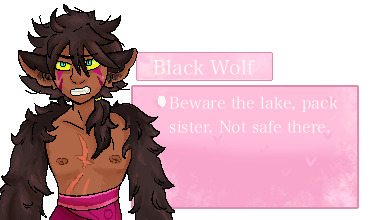
Putting way too much effort into a rape game pt.2
This took me the whole week.
#i had fun tho#I'm really digging pixel art!#degrees of lewdity fanart#degrees of lewdity love interest#whitney the bully#kylar the loner#eden the hunter#robin the orphan#sydney the faithful#sydney the fallen#alex the farmhand#avery the businessperson#great hawk#great hawk the terror#black wolf#black wolf the alpha#dol#degrees of lewdity whitney#degrees of lewdity eden#degrees of lewdity sydney#degrees of lewdity kylar#degrees of lewdity alex#degrees of lewdity robin#degrees of lewdity avery#degrees of lewdity great hawk#degrees of lewdity black wolf
346 notes
·
View notes
Note
Can you do more Hazbin Hotel x enderman reader? I'm obsessed with it. I love the idea.
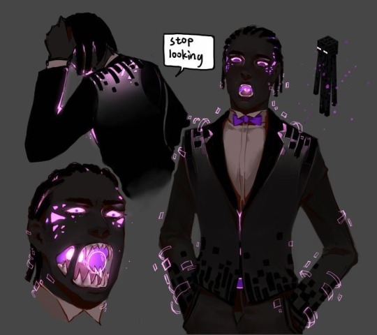
Credit to the person who made the art, this is just how I imagine Enderman!reader to look like as a human. 🦆✨
MORE HAZBIN HOTEL X ENDERMAN! READER IMAGINES/HEACANNONS
imagine how reader is when they get pissed…they would just straight up punching shit just like the Enderman hits you in Minecraft 😭
I Imagine Charlie trying to make you do a eye contest with Alastor only for you to start tweaking and punch Alastor into a wall as Alastor only gives up a thumbs up while you sweatdrop putting on your blindfold as you try to pull out Alastor from the wall
I headcannon reader to always pat everyone’s head when they are at their full height. But at 6’5 they just pat their back like “good job buddy😐✨”
Imagine Lucifer and you wearing matching shirts that say, “if lost return to big boy” as your shirt says “I lost big boy”
Headcannon that Angel is your cuddle buddy because he likes how your arm is basically a pillow for you. And husk is your second cuddle buddy because of his fur and you like to pet him.
I imagine Angel trying to make you wear pink only for it to turn black when it fits your body. Angel gave you a “🤨 are you fuckin serious?” Look as you just shrugged with a “😐” face. I mean shit, if it fits. It fits.
I headcannon Enderman!Reader’s suit to be like the art but instead of those black things on it. It’s just slight purple sparkles on it to represent the purple pixels around them.
But definitely their second fit is a black vest and a white dress shirt with black slacks and black dress shoes. 🤨☝🏾 W FIT YOU GOTTA ADMIT!
Yk how Angel made that Snapchat post about you and you got death threats? Yeah well Valentino was the reason as he got mad that Angel “wasn’t paying” you as you were just working on the hotel
I imagine Enderman! Reader to be black coded just like how the art is above as the reader’s hair is always in dreads, cornrows, and twists. But never in an Afro state as it takes time to get the hair nice and soft (coming from a black writer….it literally takes an hour…)
I imagine you once teleported during your cuddle session between husk and angel. They were so confused they even searched your room only to find out you teleported on the top roof of the hotel during your sleep.
I imagine Valentino at least trying to ambush you to see why Angel is so happy to come to the hotel to see you again. Only for you to teleport out of his view every second. And the moth dude is like “shit! He’s onto me…” but really you are just bored asf and need some fresh air from the hotel air.
I can see nifty just minding her business when you lifted her up and croaked softly petting her head and sitting her down.
I headcannon Enderman! Reader’s room to be built from those block in the end so reader can feel the presence of his home in the hotel💗🦆
I imagine Velvette actually getting able to like post you on her fashion account as a mysterious person with your blindfolded looks. The girls dig for guys who seem mysterious.
Imagine Lucifer and you making each other building hobbies, like he makes you build him a duck as he makes you a sleeping mask just incase you don’t want to stare at someone’s face without your blindfold.
Headcannon on how fat nuggets like to cuddle against reader’s legs as reader was making a bed for fat nuggets to have a heater installed if the pig is cold.
Like…bro IMAGINE READER BENG SO PISSED THEY SUMMON THE MOTHER OF ALL…THE GUARDIAN OF THE END…THE ENDER DRAGONNN (dun x3 dramatically) maybe they would summon that during the battle between the angels and absolutely destroy their asses
I headcannon Angel once seen your mouth glowing purple when you unhinged your jaw to screech. He definitely asked before checking out your mouth which he could see in the back was glowing.
Since I headcannon enderman! Reader is black coded. They have a bonnet that was shipped from Velvette as they put it on and felt more comfortable sleeping ‼️💗
Who would be the first one to respond to you calling them: Lucifer, Charlie, Angel dust, husk, nifty, Alastor. And specifically in that order 🦆
I headcannon for Vox to try to always have you on his night show so he can show off his new “guest” being a new specie of demons.
I imagine sinners asking what ring (7 deadly sins) you came from and you are just like. “The end….i came from the end..” and now they are more confused than you when they asked where you came from
I headcannon reader’s nickemame is like, “ENDY, tall one, handsome, [actual nickname], weirdo, cutie, dad, fucker, bestie.” You can imagine who called you who which is kinda obvious…
I imagine Adam to make a lot jokes about you saying how freaky you are and how weird you are for not liking eye contact without your blindfold as you just stand there like “what’s for dinner…😐”
I can see you showing the egg boiz a picture of a ender dragon egg making them think they can have someone like them but also just like you
I can see you just standing there as everyone argues in the court because Charlie wanted you there since you don’t seem like a demon or angel. She tried to get answers but no one knew what you were.
Imagine modern au! Angel dust and you do tiktoks….because Angel dust forced you to be in his tiktoks as the others just watch trying to enjoy their summer vacation
I can see Adam hating how you aren’t pressed about what he says about you as you just stand there ignoring him.
Imagine you being sick and everyone stopping to make sure you are okay. (except for Alastor as he knows you will be better soon) Like the whole crew just starts to baby you and try to fix things you can fix but only fail.
Imagine reader with a baby ender dragon as a pet as reader whistle for the dragon to land on their shoulder or appear more bigger for it to protect you and the crew
I headcannon reader’s singing voice to sound decent with a little bit of deepness in it to mask out some things.
I imagine your full form if you were a demon or angel obviously an ender dragon lol 🦆
Imagine Pentious just pure on slithering around your body as you just sit down after a rough day of complaining by residents and their rooms.
I headcannon Lucifer to get on your shoulders to feel bigger for fun which make it seem so cartoony as one has a derpy smile while the other has a thumbs up and a “😐” face just staring blankly into people’s soul
#hazbin hotel x enderman! reader#enderman#ender dragon#minecraft x reader#minecraft#Minecraft x Hazbin Hotel#Enderman!reader#hazbin hotel x reader#hazbin#hazbin hotel x platonic!reader#hazbin hotel x male reader#hazbin hotel lucifer x reader#hazbin hotel imagine#hazbin hotel headcanons#hazbin hotel#hazbin hotel x you#hazbin x you#hazbin vaggie#hazbin husk#hazbin lucifer#hazbin charlie#hazbin angel dust#hazbin alastor#hazbin hotel x y/n
2K notes
·
View notes
Note
Cali, I've been thinking about Ursa Major, as one does, and realized that, because I don't play the game I don't really know what John looks like. I've seen clips from the game and fan art and even pictures of the actor from other shows.
But I'm so curious. Do you have an image of John in your mind when you write for him in this story? A literal visual.
I usually picture him very close to his video game pixel style but... if I'm being honest honest? He's just bigger, in my head at least. I have a very particular taste in masculine figures (regardless of gender). I like them big big. Too big. Like, can't fit on an airplane big. Like, makes the elevator alarm go off big. Duck their head through a doorway big. Russian powerlifter big.
Price is huge in my mind. Not just muscular. Chunky. I need fat on him. A big belly preferably. But I know that as a soldier he wouldn't look like how I'd want him to look so in most of my fics he's not as fat as I need him to be on a personal level. And he's gotta be hairy. Not like oooh a little bit of fur. No. Hairy. Hairy belly. Hairy back. Thick pubes. Fully covered. Too hairy for most people to find palatable.
In Ursa Major, I've written him to have more of a full beard, sort of like Barry Sloane in Six? But I may have just glossed over that.
I'll put some references below the cut so tumblr doesn't flag me. But honestly, they're not tall enough, fat enough, nor hairy enough for my personal tastes. But they are probably the most accurate to how I have written him. Hope this helps!
Also, if you're brave enough to dig through my likes, you'll see more of my taste. We listen and we don't judge okay? My likes are between me and the devil.


#cali answers asks#please ask me questions#I am very sad these days#trying to be better#call of duty fanfic#captain john price#call of duty#cod mw2#john price#cod#cod mwii#captain price#ursa major#by the californicationist
94 notes
·
View notes
Text
Just a small project i´ve been working on
Inglés/English
When I found out that the G5 series of My Little Pony had been cancelled, I had a nostalgic attack and decided to watch the Friendship is Magic series again, taking advantage of the fact that it is complete on YouTube, to refresh my memory and then watch the "complete" G5, something I haven't done yet because I don't have the money to pay for Netflix and I don´t want to risk with a pirate site to watch the movie :P. The thing is that while I was watching the series at some point I got the idea that the adventures of Twilight and friends would fit very well in an RPG style game, so I started digging around the fandom to see what kind of fangames I could find (don't even get me started on official mobile games, I'm against the business model of those kinds of games), but the thing is that, apart from some horror games like those of Princess Luna or the one of Applebloom in the town without cutie marks, some MMOs, the games based on the Fallout Equestria fanfic and that filthy game with Trixie, I didn't find anything that resembled the idea I had in mind (Don't get me wrong, a lot of those games look really fun, especially "that one") so I said to myself "Hey, what if I made that game?".
With this idea in mind I started to fantasize about what this videogame would be like and I had the idea of making it in clickteam fusion, the same engine that the classic FNaF games are made in, a saga of which I am a fan, so I started to learn about the particularities of this software and to design prototypes for some mechanics that I want to include, such as a mission system and an inventory. What you see in the video is a practically finished version of a character customization system, which has several options so you can create the pony that best suits your personal tastes.
After much thought I decided to call this project "MLP: Harmony is Magic". As I already implied this is a fangame so it does not have the official license nor the support of Hasbro (hopefully not their wrath either). It will be inspired by G4, which includes the main series, the comics both canonical and non-canonical, some information taken from the books, and content related to Equestria Girls. In "Harmony is magic" you will take on the role of a pony who, along with his five friends, must face threats that will put the fate of Equestria in peril and overcome trials in which their friendship will be challenged. Explore this magical kingdom to meet and help its inhabitants and fight in turn-based combats against monsters such as Manticores, Little and Big Dippers, Vampire Ponies, Changelings and others that endanger the peace of the little equines, with the help of an enigmatic being that will not last long when it comes to lending its strength to restore harmony: the Tree.
I still have many things to work on, for example in the aesthetic section of the game, which I can tell it will be in a minimalist pixel-art style to resemble the aesthetic of the series. I also have to polish some mechanics and finish designing others, such as the special powers of each pony race or a cutie mark´s skills system inspired by Pokémon. When I have something more to show, I will return with another post; In the meantime, be happy, learn about friendship, drink water and whatever.
Meow.
=================================================Español/Spanish:
Cuando me enteré que habían cancelado la serie de la G5 de My Little Pony, tuve un ataque de nostalgia y decidí volver a ver la serie de La Magia de la Amistad aprovechando que esta completa en YouTube para refrescar mi memoria y luego ver "completa" la G5, cosa que no he hecho por el momento porque no tengo plata para pagar Netflix ni ganas de meterme en un sitio pirata para ver la película :P. El caso es que mientras miraba la serie en algún momento se me ocurrió la idea de que las aventuras de Twilight y amigas encajarían muy bien en un juego estilo RPG, así que me puse a hurgar en el fandom a ver que fangames podía encontrar (ni me hablen de los juegos para móviles oficiales, estoy en contra del modelo de negocio de esa clase de juegos), pero el caso es que, aparte de algunos juegos de terror como esos de la Princesa Luna o el de Applebloom en el pueblo sin cutie mark, algunos MMO, los juegos basados en el fanfic de Fallout Equestria y ese juego cochino con Trixie, no encontré nada que se pareciera a la idea que yo tenia en mente (no me malinterpreten, muchos de esos juegos se ven muy divertidos, sobre todo "ese") así que me dije "Oye, ¿y si yo hiciera ese juego?".
Con esta idea en mente me puse a fantasear sobre como sería dicho videojuego y tuve la idea de hacerlo en clickteam fusion, el mismo motor en el que están hechos los juegos clásicos de FNaF, saga de la cual soy fanático, así que me puse a aprender sobre las particularidades de este software y a diseñar prototipos para algunas mecánicas que quiero incluir, como un sistema de misiones y un inventario. Lo que se ve en el video es una versión prácticamente finalizada de un sistema de personalización de personaje, el cual cuenta con varias opciones para que puedas crear el pony que más se ajuste a tus gustos personales.
Tras mucho pensar me decidí a llamar a este proyecto como "MLP: Harmony is Magic". Como ya di a entender esto es un fangame por lo que no cuenta con la licencia oficial ni mucho menos con el apoyo de Hasbro (esperemos que tampoco con su ira). Este estará inspirado en la G4, lo que incluye la serie principal, los comics tanto los canónicos como los canónicos, alguna información extraída de los libros, y el contenido relacionado con Equestria Girls. En "Harmony is magic" asumirás el rol de un pony que junto a sus cinco amigos deberán enfrentarse a amenazas que pondrán en jaque el destino de Equestria y superar pruebas en los que su amistad se verá desafiada. Explora este mágico reino para conocer y ayudar a sus habitantes y lucha en combates por turnos contra monstruos como Mantícoras, Osas Menores y Mayores, Ponis Vampiro, Cambiantes y demás que pongan en peligro la paz de los pequeños equinos, con la ayuda de un enigmático ser que no durará a la hora de prestar su fuerza para restaurar la armonía: el Árbol.
Aún tengo muchas cosas en las que trabajar, por ejemplo en el apartado gráfico y estético del juego, que ya les adelanto que será con un estilo pixel-art minimalista para parecerse a la serie. También debo pulir algunas mecánicas y terminar de diseñar otras, como los poderes especiales de cada raza de pony o el sistema de habilidades inspirado en el de Pokémon constituido por las cutie marks. Cuando tenga algo más que mostrar volveré con otra publicación; mientras tanto sean felices, aprendan sobre la amistad, beban agua y que se yo.
Miau.
(Por cierto, si bien soy latino me decidí a hacer este juego 100% en inglés para ir manejando mejor el idioma y todo eso)
#mlp#mlp fim#mlpfim#mlp g4#mlp g5#fangame#mlp fangame#friendship is magic#my little pony#my litte pony friendship is magic#miautastic games#harmony is magic
18 notes
·
View notes
Text

well @voidsteeth has given me the power to ramble a bit more. PLEASE ignore the cat in that picture, for some goddamn reason it's the only way tumblr let me post this goddamn picture. it's a nice kitty, mind you
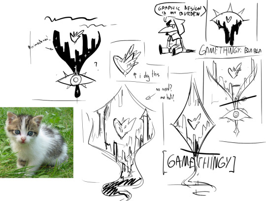
Up above, some really loose logo/main pic ideas for it! Excuse my terrible handwriting. Let me do it bullet-point format since it helps my adhd pin down stuff
So, it's gonna be a RPG. I wanna figure some fun gimmick and I surprisingly have a bunch of that well fleshed out! (Part of it revolving the elemental system, concerning Flesh/Memory/Mind/Matter/Soul). I'm not a huge fan of the repetitive encounter "smash everything in front of you" format. I'm going to be using RPG Maker MZ. My partner has a lot of experience with that, which should help a lot!
Inspired by a bit of a mix of classic JRPGs and more recent indie RPGs, specially Rpg Maker stuff. I've been raised watching my dad play the old Final Fantasy games (which I love dearly, specially IX, X and VII), but I've ended up loving the more recent indie scene myself (OFF, Oneshot, Undertale/Deltarune, Everhood)
(I'm gonna be playing more RPG Maker games to help with inspiration and knowing how much I can bend the system- Please feel free to recommend me some!)
Set in a sort of high fantasy setting, and it takes a bunch of stuff from the one I run my current DnD campaign in. I think it will feel familiar to DnD/PF players, but I'm going all in with my own worldbuilding! I wanna set myself apart from these.
I want to have a sort of in-game illustrated encyclopedia because I really dig that. I liked the way OFF used images here and there to add to the lore. I just love the idea of being able to collect pages and learn more on the way. I've sketched the ones for the elements already!
Themes will spin around friendship and human connection, eldritch horror flavoured stuff, and some temporal shenanigans too. It will also tackle on the importance of understanding the past- The story will put some focus on how people are too busy pillaging a ruined city to understand what actually destroyed it in the first place. Which, well, it's the kinda thing to have consequences.
I'm planning to work on this on my free time, and once it has a nice shape (and perhaps a playable demo), I may consider having a Kickstarter to complete it. I'm fairly confident I can handle (with enough time) most of the parts of it. I just need to get a bit familiar with pixel art (for the maps). I used to do that ages ago! I'm also familiar enough with programming and have done small web-games in the past.
The one thing I am absolutely not qualified enough for is music. I wanna try honing my skills but- Oh boy. (on that note, if you know of small musicians that are open for commissions, do let me know! Just as a very preliminary view)
also you can bet this is gonna be really LGBTQ+ themed. I wanna also take the chance to maybe sprinkle in some of my heritage's stuff, I've wanted to do that for ages!
I'm of course always open for specific questions about this. I'm really excited to work on it and help my mental health on the way. I'll do my best to share some concept art, mock ups and such as I get it more fleshed out! I have some enemies pinned down and I think people will really enjoy these designs : )
#gamethingy#long post#it's not the first time tumblr acts up about black and white doodles so i may start adding cat pictures on them
43 notes
·
View notes
Text
I don't know how to word this concisely but interacting with people outside of my usual bubble both online and face to face has me extremely worried that the vast majority of Americans (of people? i'm not sure, I certainly hope not) are perfectly content to go on engaging with everything on a surface level — with writing, art, music, film, even their own personal lives — and that's why generative ai has taken off so quickly and with such enthusiastic support, not only from the tech bros who are motivated by disdain for artisans and for the humanities, but with people who are indifferent or are even supportive (if passively and without much commitment) of the arts. the output of this technology can only ever exist at the surface level, regardless of the medium: pixels that mimic the appearance of art, a text file which mimics the phonetics and cadence of poetry. there is nothing deeper than the outer shell, which makes it obviously (pathetically obviously) hollow and empty to anyone who regularly engages with any aspect of human creation. but I've come to realize that I've taken engagement for granted, and I suppose I'm trying to grapple with the epidemic of passive consumption that seems to exist among all kinds of people across income levels, political leanings, genders, sexualities, education levels, etc. it's not that a generated output is just good enough and will just have to suffice because they lack the ability, or budget, or connections, or will to create something better — but my observation has been that for so many people, there is no distinction between something generated and something created, because they were only ever interacting with everything on a surface level to begin with, and rarely (if ever) thought about the choices that were made by those who created it. and that has sort of made me sick to my stomach? that the barrage of irony-poisoned, sound-bite, advertisement-inundated, vapid corporate IP culture — in which any kind of taking art seriously is seen as pretentious and a waste of time — has created a country of disenchanted highschoolers who never grew out of "the curtains are fucking blue." it's not that there aren't millions of people who do love digging deeply! and tumblr, especially, I think, acts as a beacon for social media where analysis (and overanalysis), poetry, creation, is relatively mainstream, and short-form video or influencer culture has not yet been able to lay roots and thrive. it's just ... this seems so comparatively rare. or rarer than I really thought it was, or would like it to be, and the prognosis for a good environment for analytical thought to flourish is ... well, dim.
and what I don't mean to suggest here is the stereotype of the coworker that lacks a rich inner life (although differences in viewing intentions, experiences, and takeaways was part of my process in thinking about this) but rather the "laugh epidemic" at movie screenings because it is more comfortable to mock the style or performance, to maintain an ironic distance, than to be moved or connected. or Trump selecting YMCA for his playlists, with seemingly no one in the MAGA movement knowing or caring about the history of gay hookup culture that is woven into the very fabric of The Village People and especially the lyrics of that song — it exists to them only as a catchy melody with nostalgia for the 70's and 80's (as they remember it) and its smiling Americana stereotypes. college students handing over their essays to ChatGPT — surrendering the process of learning more deeply, to use their education as an opportunity for growth and understanding about the world instead of (or alongside, I suppose) future financial benefit — as well as their emails to faculty, their applications, their research (another integral skill to be drawn from higher education). people seeking partners using generated text on dating apps, which seems bizarre to me (!) to outsource that communication whether you're searching for the love of your life, or just a moment of human intimacy and pleasure. or musicians generating lyrics for their own deeply personal stories of love and passion and heartbreak, and turning those over to AI music sites to add instrumentation. (not linking this one because I don't want to call anyone out personally; but AI gen music, art, even romance novels, is an increasingly widespread phenomenon) more, easier, faster; less aching intentionality, less investment of time and emotion and cognition. the celebration of queer sexuality is watered down into a peppy dance trend; the meaning to be gained from writing, singing, drawing, cursing it out and going back to it, exchanged for output and digital, numerical, profitable engagement.
and I'm not speaking from a moral highground here: I'm pretty damnably addicted to social media with a dwindling attention span, and inclined to speak ironically or surface-level even about things I'm passionate about for the sake of a joke, so I guess this is as much a reminder to myself to do things earnestly, intentionally? to take things seriously and not take the easy route of irony. to not skim a text, but to read it slowly from dedication to references; to take my time creating art, and do the research, even if it comes at the cost of creating less more slowly, and fewer likes. to put my phone down when I'm watching a new film — or one I've seen a thousand times! — and really sit with it. to look up the lyrics, to attend live performances, to cry in the cinema, to write letters, to speak and listen to other people with earnestness and compassion and curiosity. make the 1 note over-analytical post. read the article, not just the headline, the museum plaque; the liner notes. I can't control which films investors choose to fund, or what television grabs popular ratings or pulls advertiser dollars, or what technology oligarchs tailor algorithms towards with ill-gotten data, but my own attention is mine and it stays mine as long as I remain constant and intentional about the things that are worth it. and words, art, people, film, music, are worth it.
6 notes
·
View notes
Text

Trying to get back into furry art again. The time when I drew furry art was probably my most prolific as an artist. This one isn't really a study, the only reference I used was pictures of aardwolves...aardwolfs?
Anyway, hard to find a good picture of them now, lots of fucked up Dreamworks-ified AI slop where they're sooo stripey and weird shapes (even on duck-duck-go). I'm really digging these fast pixel art pieces though. The go back to crayons of digital art.
2 notes
·
View notes
Text
#1531
I'm not sure but, what's the point of bringing The NuanceTM to the case of Solomon?
Do you really need detailed or sophisticated reasons to hate a show-off and a manbaby, with no understanding of societal etiquette, who openly shows his petty dislike of Sebastian, who employs fatalistic notions, and worst of all — pushing his twisted views on magic onto people as if they ever asked for it (it's about his statement that nothing is able to reverse a curse; he is dreadfully factually incorrect); to the point he hates the Dark Arts with all his heart yet eagerly uses it to scare off, or even injure, if not kill, two teenagers — whom he judged unworthy of being heard first and therefore deserving this horrendous act of violence. For an ex-Auror, it's especially jarring, no?
Solomon is the man of no standards, human dignity, reason, good word, or hope. Is this enough NuanceTM or I need to dig deeper?
I'm not sure what the UnderstandingTM argument should entail either. That argument always leads up to Understanding = Forgiveness or Cutting Him Some Slack.
If Solomon's only trouble was Sebastian's own trauma, yes. If he was portrayed as a tired and grumpy parent only, also yes. If he would be shown having respect for Anne as a person as in, to try and keep her happy nonetheless, yes, totally. But it did never happen.
Solomon's trouble is the world daring to act in ways he doesn't approve of — and Sebastian inherited it from him.
Solomon doesn't want Anne to have any hopes — and he is glad she's convinced she's dying or wouldn't ever recover because it fits his worldview. He hates Sebastian's attempts to lighten up the mood so much—attempts that wouldn't hurt because Anne does not hate them—because it threatens his ideas of how things should be or go. Even if it means Anne should die. Solomon wants to be right, superior, powerful and all that at the egregious cost of burying Anne alive. I will elaborate: the fact that she is supposedly dying does not mean she must be treated like a corpse in a tomb, told all these things about the cure and that nothing is able to reverse it, heard the squabbles of him and Sebastian over this exact issue where all the fatalism flows. It is not care. It is not him being a bad parent. It is Solomon being a shithead.
Don't tell the chronically ill about death. We're aware, tyvm. Anyway.
Solomon does all this manchildrenry while warning about dangers of the Dark Arts. He left the Office over the use of them. But does he finds them truly despicable, though? I doubt so very much. If his standards truly were this high and his character was also against the use of them, Solomon would not die in the tomb. In fact, he supposes violence is the answer — and deemed himself the judge, but who is he to judge? It does not matter if he only wanted to injure the two. It absolutely does not at all matter if he would kill them. What matters is that the kiddos went against his wishes, he got pissed and decided to punish them for it. He acted as he would usually, because if people don't play along his narratives, whatever they are and can be, he will act out and hurt in order to keep the person bent to his views. He did that with Anne, exploited her depression and fatigue; he tried to sow discord between her and Sebastian and jumped at every opportunity to separate them, let alone he always brings up his dead brother. It is not shit parenting. It is a grave offence and Sebastian is right to be insulted by it — you never forgive someone who throw the beloved, the cherished, the dear at you, do you? It isn't some kind of meek offence. It's grave-dancing. How is this acceptable, no, passable, for to go easy on Solomon, anyhow?
A terrible man. Nothing else here to understand.
P.S. To be fair, that he brings up so much to analyse from the point of empathy is great. This is what fiction is for — to hate on an arsehole made of pixels rather than taken from the police report. Besides, I don't see much sense in him being actually and apparently a Decent But Slightly Lost man. Slightly Lost People at least try to communicate, they don't cut off or cause scenes themselves. У меня некоторое количество диссонанса на эту тему тоже есть. Люди будто никогда мудаков таких в жизни не встречали. Ну а вот я встречал. Ещё и похуже видел. Всё с мужиком, как персонажем, нормально, лепить из него что-то положительное или доброе не имеет большого смысла, иначе из этой истории не выйдет трагедии.
2 notes
·
View notes
Text
Wire Witch Hex - Wearing Many Hats (Font Design)
Lately most of the traffic I'm getting on this blog has been people stumbling onto my multipart series on how a computer works. Glad people are enjoying that as much as they seem to be. My reason for teaching myself all of that (besides just the joy of learning) is I'm very slowly working on designing a new video game console that anyone sufficiently motivated can build for themselves as a neat little DIY project. There are so many moving parts to this project that for now I'm focusing mainly on just the controller and its unique features. To avoid having to make a whole working console, with software, to test it, and make sure I have something to show for all this if the rest doesn't pan out, I'm designing the controller to also be more or less compatible with the NES and SNES (which secretly use the same input standard, just differently shaped plugs at the end of the cord).
This means all I'll need to test and demo my controller is an SNES ROM that knows what to do with my scroll-wheel outputs, a setup where an emulator accurately handles those signals, and later a cart I can slap a couple EEPROMs into and test on real hardware. Oh and I also need to teach myself enough about SNES development to actually create every demo I want to run, do all the art, code it up, and compile it. This is a big job, and I'm not getting paid, so maybe consider throwing me a little money before we dig into this?
Since... really the last time I reported in on this, I've been studying away trying to learn all this, and hey, have a compiled ROM image that'll display a blank screen in any color I want, and a third party program that IN THEORY with a bit of massaging will convert a 256x256 image into an SNES character ROM image. AKA the file with all the graphics. My ultimate goal for this demo cart is to cycle through several very simple games, showcasing how my controller works with each. So I need to cram every image any of these are going to need into my one big image file, which I'm slowly picking away at, but the one thing I knew from the start that I'd definitely need is to throw some text on screen explaining the controls for each demo. And since it's not like there's a built in font in in the system, I had to make my own.

This is not my first font-making rodeo. For this one, my thinking was, I'm going to be in a fixed 16x16 resolution per character (because I forgot the specifics of how the SNES actually tiles graphics), some built in spacing so I can slap them all right up against each other or some border and still be readable, and I wanted a nice little shadow built into every character in case they end up on a low contrast background. Let's zoom in on what I have here so far, in case you don't feel like downloading the file and blowing it up to something more readable.

The first thing I want to note is that after finishing the first 4 rows of characters here, I double checked, and while the SNES CAN break backgrounds into 16x16 tiles, the absolute minimum is 8x8. If I were really trying to be space efficient, I should have designed around that. Several of these characters would easily fit into a 16x8 space, that level of compression would also let me have just the period and comma and be able to build a colon, semicolon, or apostrophe from those, and most importantly, I rendered this with all of the lowercase letters exactly 1 pixel too tall to fit into a 16x8 space and let me double up there. Since I'm rather happy with this font so far and I'd eventually like to make some version of it available for, if nothing else, other people writing software for my eventual console here, I will likely, at some point, make a more space-optimized variation. I'd also like to cover a wider range of characters. At the very least, have some accent marks, wouldn't be too hard to add support for Cyrillic. Pretty sure I can get Japanese and Korean text in keeping with this look. Maybe some other languages. Anyway though, let's talk about what I've got.
My general design rule here was, where possible, make lines 2 pixels thick, and have each white pixel cast a black pixel shadow immediately below, to the right, and the diagonal between them. This gives a pretty convincing relief effect in my opinion, and keeping the shadows this thick keeps a nice firm edge there so it's even generally readable on a pure white background. Within each 16x16 tile, I was extremely strict about keeping a 1 pixel margin clear at the top and bottom of each image, and 2 or 3 on the sides (often 3 on the left, 2 on the right. With capital letters, I went with a generally rigid and blocky style, trying to stretch things to my arbitrary margins. Lowercase letters I restricted to just 8 pixels tall, and those featuring tails are given special permission to drop down an extra pixel, leaving the shadow right on the edge of their true bounding box.
While it wasn't an intentional move at first, several lowercase letters ended up with a decidedly rounded, squashed look, particularly g and q. I found that to be both kind of cute, giving the whole font a real unique character, and eventually started to actively lean into it (which may not be super obvious, I started with W as it's kinda the letter than needs the most breathing room and worked outward from there), and did my best to distort all the rounder shapes and in particular the highly mirrorable b d p q set, as I seem to recall once reading the more you avoid identical shapes with those, the more legible the font becomes for people with dyslexia. Similarly, I made a point of distinguishing the shapes of the Ms and Ws, and added a little whimsy to the numerals. Overall I'm super happy with all the lowercase letters (except for e and s being too thin, but that was an inevitable compromise), and if I ever have the time to kill it's very likely I'll revisit this someday and apply this squishy rounded aesthetic to the capitals too.
Your eyes were probably drawn really quickly to the parentheses here, where for at least the moment I'm breaking my rules about blank space and shifting them inward quite a bit rather than centering them. That's going to look really bad if I use them in a sentence (like this), but the main reason I'm including them right now is so I can list button prompts with both the icons representing what's actually going to be on my controller, and the SNES buttons sharing the same signals. So something like: "GO (A) Jump" and I think the half-spacing and closeness to what they enclose will look pretty nice in this one specific case.
As a final note, the particular hardware I'm working with absolutely supports the ability to mirror any image horizontally or vertically, as well as change the palette. If I truly wanted to cram letters in as efficiently as possible at this font size, I could, for instance, have an 8x8 right-angle segment, build a whole H just from mirroring that, also use it for the legs of the A, P, F, the left side of the D, etc. This however is incompatible with the shadows I'm using for extra readability. And of course for other projects I HAVE made a perfectly legible 8x8 font before.
I'm pointing this out because hey, if you do the math, JUST these characters I've set aside for having arbitrary on-screen text, as is, are consuming 5/16ths of my total graphical memory, and I'm probably never even going to display most of these anywhere. Again, not a huge problem for the simple demo pack I'm making, and that 256x256 drawing space isn't a hard limit. Spending an extra processor cycle to change an index value and access a whole other page of image data is a pretty common practice on the hardware, but especially with older computers and racing to get things ready to draw before a screen refreshes, it's good to at least be mindful of the tradeoffs with that sort of thing.
And again, my sole source of income at the moment is patreon donations, so if you're excited about seeing updates to this weird project of mine or you're learning useful things from any of it, maybe consider throwing me a little support?
7 notes
·
View notes
Note
Saw the ask thing and I thought I'd give my 2 cents. I dig your style and your pixel art has this really fun charm to it. Like, I can see it being in a cute little GBA game where you beat the bad guy with the power of friendship. I also like your lines. They're thin but capture the weight of a character pretty well, something I sadly can't nail down. Keep at it, I'm happy to support your art!
Thank you for the nice words, MightyRay. I dig the traditional art style that you deliver along with your outstanding slug designs. I do enjoy the vibrant colors mixed with the dynamic line thickness. I am very glad that you support me, and I am happy to support you art!
2 notes
·
View notes
Text
"I made this!"
So I have a bit of an unhealthy relationship with art.
I would never call myself an artist, but I would never disparage someone for doing the exact same thing I do and then call themselves an artist. An artist, to me, is someone who makes art. Simple as. Sure, you could more minutely define it as someone who makes a living from art, but you could also argue that the specificity of that would fall under whether or not someone calls themselves a professional artist. Meaning that they do it as their profession. (IE: a paid occupation, usually involving prolonged training and/or formal qualification.)
So, by that rule, I'm an artist because I make art (sometimes), but not a professional artist, because I don't make a living from it.
I suppose I could call myself a writer, too, but let's not get too into the weeds on etymology and labels. I'm some rando that makes art (sometimes) and writes (sometimes, and I even post sometimes too! [keyword: sometimes])
I'm pretty apprehensive about posting things I've made because of weird vulnerability I feel around it. Cuz like, I tried my best (or maybe its just a quick n dirty something or other for a laugh) and now that thing is going to be out for anyone to see? Spooky.
Well, I'm going to try to change my mindset and post things that I made cuz I made them, and if other people see them, great. If not, then it's for me to look back on anyway. It's not about likes or reception or anything. Just for me to look back on. It's just a scrapbook that I just so happen to put somewhere for others to look at if they want.
I recently went through my PC and located everything I've ever made and put it one spot. It's organized by year, and it was kind of wild to see how far I'd come in some regards.
There's some pictures I took of my sketchbook from when I was following Mark Crilley's art tutorials. Some attempts at pixel art (some of which aren't half bad, tbh) and some sketches I made in that old Sketchbook app for android. I actually had to hop on my old deviantart for some of it (oof) since I couldn't find the original files. They're probably on an old laptop somewhere, but I couldn't be bothered to pull the hard drive and dig for it.
I can really pinpoint my artistic motivations and pursuits in each year.
2013: Pixel art (just the worst pixel doubling and uniform outlining, yikes!)
2014: Traditional art and youtube tutorials, along with some pixel art here and there)
2015: I could only find one drawing from 2015 (had to grab that one from facebook...YIKES) and its a not-too-shabby drawing I did from reference.
2016: Following along with a Bob Ross episode in Mario Paint. This one actually looks really good. Maybe I'll post it one of these days, cuz it's kinda neat.
2017: Bought a drawing tablet with the money I made from working. Downloaded Sai and tried drawing from figure references. Some of it is really bad, but some of it shows an understanding of figure, which is kind of impressive in hindsight.
2018: Some more Bob Ross pixel art. I followed along with the same video as in 2016, but in Aseprite (the demo, so I only have a screenshot of the finished product because you can't save in the demo) and damn, it's still one of my favorite things I've ever made in Aseprite. Especially for only being 4 colors (GB green palette)
2019: Some more Sai stuff. Probably all done in the same session, but it's not the worst I suppose. I'm pretty inconsistent when it comes to focusing on art. I tend to get pretty distracted when I'm not immediately good at something. (And now I know why, although hindsight is 20/20)
2020: Uh? Couldn't find anything from 2020. Given what occurred that year, that's not all that surprising TBH.
2021: Some music I made and a doom level I made. This was sort of my intro to making levels for games. We had to make a game pitch for a school project and I went all out on making a demo. I think I clocked my hours and it was well over 40 hours put into the level alone. Made a custom weapon sprite any everything. It's pretty cool.
2022: My intro to working in 3D and making youtube videos. I started in Gmod, making simple animations, before eventually swapping to SFM for stills. Then a friend asked why I didn't just learn Blender instead, so that's what I did. If you know me from twitter, then you've probably seen these. They're NSFW, so maybe don't go digging if that isn't what you're into. That was sort of where my unhealthy relationship with social media and art began, because I started focusing a lot on views and likes and reception for things instead of just making things I wanted to make. (Mostly because I was surrounded by and learning from actual professionals, who do it as like, a job.) Sure there were things I made because I wanted to make them, but for the most part, I was going for the popular thing and wanting to "get big" at the time. Cringe, I know. Such is life. You live and you learn. Some of the best I made during this time was cuz I wanted to make it, and those are the ones I'm most proud of to this day.
2023: Burnout city! Unemployment will do that to you. Sure I worked on some stuff here and there, but I really burnt the hell out. Ended up working on some Doom levels and some little things here and there. Making a titlecard for a friend's youtube video, a cover art for a HM2 level, finishing my second reload animation, and a couple blender things. 2022 felt so productive in comparison, where did it all go wrong? (Oh yeah, the weird obsession with views. Right.) Then I got into writing that summer and I've sort of kept up with it. AO3 says I wrote 93k words that year, so that's not nothing. (I promise I'm working on another big project. It's just...hitting some creative snags. Again. Such is life.)
2024: The current year. I'm...trying to get back into making things for me. Writing things because I would read it. Drawing things that I would look at, or that I find interesting. Once again, I'm sort of trying to game my attention problems by not focusing TOO hard on one thing at a time. Otherwise I'd never finish anything, and while I'm not concerned about having things to post to social media, it does feel good to look back and see things you've actually finished. It's better to finish something and have it be like 50% of what it could have been than never reach 100% and then it just lives on as a reminder of your inability to finish things. I'd rather call something done and move on than obsess for ages over "what could have been." Or maybe I'm just waffling because I'm still trying to shake my weirdness. Bah. Some stuff I make might never see the light of day, but that's kind of a shame. I like making things and sharing them with other people. It's fun.
That's really the operative word of this whole ramble.
Fun
I do things because it's fun. I should want to do things because they're fun. Of course that's easier said than done when you have my specific brand of brain problems, but ya gotta catch the wind in your sail when it blows, right? (If that even makes sense.)
So yeah, here's hoping that this weird ramble convinces me to post things. Not because I want to get clicks or likes or engagement. But because I want to remind myself of how fun it was to do.
Like that Kolibri doodle I posted yesterday was something I did for fun. I though it'd be fun to do, so I did it. Simple as.
So here's to fun. Let's do stuff for that, and forget about clicks. I'm doing it for me. If you happen to like it, then more power to you. But I wanna have fun for me.
Yeah.
(Watch me then never post anything because my interests have waned and I hyperfixate on something else and then have to look at this post in a few months and cringe at the thought.)
But hey, nobody else is reading this anyway.
Right?
2 notes
·
View notes
Text
There were a lot of really good scenes in the FNaF movie, but the most important one...the Springtrap...it was...underwhelming.
Maybe if the guy had the head on it would have looked less...comical. I'm (not) sorry, but he overacted it.
I will criticize this scene in particular because the pixel art original version of the Springtrap scene is absolutely BRUTAL and has been one of my favorite scenes in gaming since years. You can FEEL the pain! You can feel the animatronic parts digging into him, immobilizing him, making him shake with sharp pain that turns into uncontrollable spasms and the pressure and coldness of the steel digging into his muscles and organs, crushing his bones, replacing most of his organic matter with steel. All through pixel art! BIG pixels!
The aftermath of this scene in the movie was more brutal than the scene (in the movie) itself.
2 notes
·
View notes
Text
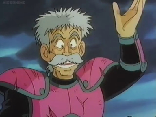
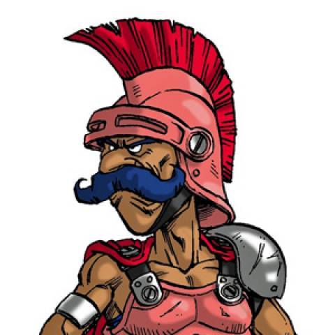
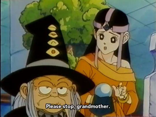

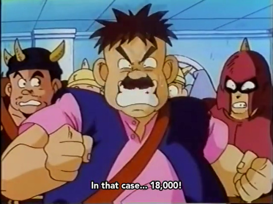
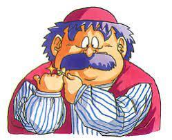
Pour one out for every time my heart skipped a beat while watching Dragon Quest: The Adventure of Dai (1991) and thinking I was finally about to see a DQ4 character but got juked.
See, part of the reason I put this anime on my list oh so many years ago now is because I grew up with the Dragon Warrior games on NES, and 4 in particular was one of my world-reshaping JRPGs (I feel like most everyone has at least one JRPG they played in their childhood or teen years that completely rocked them to their core; this was one of mine). In the early 00s when I learned what Google Image Search was, I got really into looking for fan art of characters I had only seen previously as pixel sprites. And while looking up DQ4 characters (I only knew their early NA translation names, not the modern ones they have today), I saw an image of what I THOUGHT must have been a screenshot from an anime featuring two of my favorite characters from DQ4. I only saw that one image by itself and nothing else like it, so I figured if it was a screenshot it must have only been like one scene in one episode, so it probably wasn't a big deal, but it was still cool and stuck in my memory for years.
Eventually, I found out that there was in fact a Dragon Quest anime, about original characters and an original plot with no direct ties to any of the games I grew up with. But it sounded like it could be fun nonetheless, and hey, maybe it still did have that screenshot after all! So now here I am in 2023, finally got around to watching it and keeping my eyes peeled for that so-called screenshot, just in case. This is also a big reason I watched the 91 anime instead of the new 2020 one, even though the 91 version doesn't cover the complete manga series. I've been catching all the little references to DQ trivia and monsters that I know along the way, but it's been mostly centered on stuff from DQ 1-3, with 4 mostly only reflected in the background music (which in hindsight makes sense, given that the game debuted around 1990, and the anime aired in 91-92, adapted from a manga that started in 89).
Anyway, I'm 99% positive now that what I saw back then was not, in fact, a screenshot of Mara and Nara (oh sorry, guess I should use their modern names now - Maya and Meena Mahabala), but just a really cool fan art. A mild disappointment, but I can't fault the anime for that. Now I wonder if I can still dig up that fan art to show what I was talking about...
#dragon quest: the adventure of dai#dai no daibouken 1991#dragon quest#ragnar mcryan#badak#meena mahabala#torneko taloon
17 notes
·
View notes
Note
Game-rec anon here again, I’m not the biggest fan of horror game but can definitely appreciate it in moderation! I’ll definitely check out both Dredge and the Excavation of Hob’s Barrow, thanks! If you do have any recommendation in the story-driven, light-on-horror but kind of investigatory mysterious vibe (kind of like the first Life Is Strange) I’m all ears! Thank you so much for taking the time!
I'm the same way about horror ^_^ I'm not a horror aficionado, but I appreciate it in moderation.
Oooh, so many ways to go here... I mean, Night in the Woods jumps right out if you're looking for a story-driven game with a bit of mystery and investigation to it that scratches a lot of the same itches as Life is Strange. The art is lovely, the characters are fantastic and relatable, the story is engaging, the gameplay is smooth and satisfying, the dialogue is on-point, and the music is phenomenal. If you haven't played it yet, I highly recommend.
I also recommend checking out Purrgatory. It's free on Steam, and it was shockingly good. More visual novel and/or point-and-click style than LiS or NitW, but it's very much story and character driven with some investigation. More digging for backstory and helping characters find closure than solving a mystery, but it scratches a similar itch. I really loved the characters and dialogue. I like the art style, but some may find it an acquired taste. I didn't expect much from it with it being a free game, but I ended up really, really loving it.
I haven't played it myself yet, but I remember watching my partner play Gone Home a few years ago and it being really good. Story-driven and investigatory/mysterious vibe for sure. I really need to get around to playing that one for myself.
We haven't streamed it in a while, but we were really enjoying Chinatown Detective Agency. Point-and-click mystery/crime-solving game in a futuristic setting with interesting characters and stories. Not as deeply character-driven as LiS and similar games, but it's engaging and has a lovely pixel art style.
A VERY different vibe from LiS, but if you want some mystery-solving fun my partner and I have been enjoying Murder By Numbers. It's more of a visual novel style where you solve nonograms to find evidence to solve mysteries. Again, very different energy from LiS, but it's a fun time. We played a little bit of it in our first Indie Game Speed Dating stream and decided to continue playing it off-stream because it's too much pressure to solve dozens of nonograms for an audience ^_^'
Also a very different vibe from LiS, but we really loved the Frog Detective games. Lots of mystery and definitely story-driven, but also very, very, VERY silly. All depends on what you're in the mood for!
I hope one or more of these recs speaks to you ^_^ Let me know if you end up playing any of them and what you think!
#game recs#ghost plays#ship wrecks#ship recs#indie games#night in the woods#nitw#gone home#chinatown detective agency#murder by numbers#frog detective#purrgatory#ask ghost
4 notes
·
View notes
Text
2025 media thread, part January

5th January: Loddlenauts
man, i just really liked Loddlenauts. i don't really have a lot to say about it- it's the very ideal of a cozy game, in my opinion- but it was just such a nice little treat of a game, and i really enjoyed my time with it
i'm a huge fan of ocean settings, so this was destined to end up in my library at some point or another, but as a game, i actually find it very compelling- cleaning up GUP-14 was rather addiction, and i ended up finishing the game in only two settings. and, of course, the addition of the Loddles themselves was such a treat. i didn't get as attached to them as i'm sure some people will, but they are just- so frickin' cute. and all the different designs are really fun and pleasing to look at, and i like how that system worked, even if i had to cheat a little towards the end
i really hope this team makes more games, because there's something distinct here- i'm not sure i'd call it special, but i do think i'll think back on this game fondly, which is pretty special, i guess
if nothing else, it's a really good game to sit down with, and just enjoy. and we can never have enough of those

6th January: Sheepy: A Short Adventure
wow, what a phenomenal little game! it's short (probably around an hour), and also free, so there's honestly no reason not to check this one out
while there's obviously not a lot to dig into, here, it builds scale so well, and perfectly nails this very epic and grand vibe. also, the pixel art is absolutely gorgeous
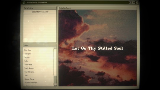
10th January: Home Safety Hotline
genuinely just such a wonderfully creative experience!! i played this with the fiancee, so i didn't get to read the entries as deeply as i otherwise likely would have, but man. what a fantastic little game
the creature designs are great, like i don't think there's a single one i didn't like, and the game manages to nail this perfect sense of reality, while still obviously leaning into the horror of it all. like, yeah, sure, slugs the size of dogs that primarily stay near stairs, why not. it all feels cohesive, and makes sense within the world
also, i love how the game balances humour and horror- it's such a hoot of a game, and i don't wanna spoil anything, but oh my god, the endings. the endings are perfect
also- the DLC is so good. and i love it so much. and if they ever release another DLC, i will be on that shit so fast
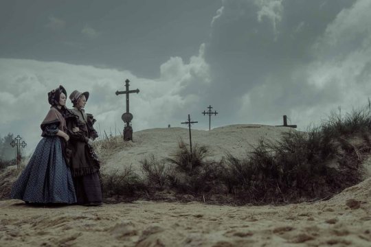
10th January: Nosferatu
a genuinely amazing movie. absolutely beautiful cinematography, simple-but-complex story, and a cast that feels very human. i've never seen the original (or, to be honest, a proper Dracula adaptation), but i adored this story- the darkness of it, while still keeping it realistic. the use of colours is so stunning here, the way it sometimes shifts into black-and-white, before bringing colours back in, either as a pale, washed out thing, or properly bright and saturated. like. absolutely obsessed??
also, i adore Ellen as a character, and her relationship with Thomas, and, of course, the Nosferatu himself. like. it's just so good and i keep on thinking about a scene and going ough, that was so good to myself
also! no cats were harmed!! at all!! like they were just there to be cute and cat-y, and i love that for them. for me. perfection, actually
12th January: Tinykin
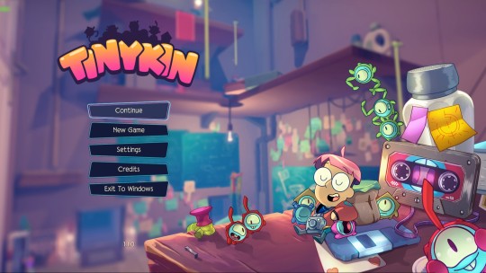
really solid and excellent 3d platformer/collectathon. this one was super popular back when it released, and while i can't say it didn't deserve that hype, it didn't hit me quite that hard
it's really good! the graphics are genuinely excellent, and the gameplay is just all around solid, but, idk- it didn't quite compel me as much as it seemingly did everyone else. definitely a 'should play' if you're a 3d platformer fan, and i absolutely do not regret playing it, but ¯\_(ツ)_/¯
i will say though, the world building here is really fun. as a story, it's rather flat, and i think giving Milo a voice would have added a lot, and also make way more sense, but as a setting, i really liked this one! always a fan of 'little guys in big places', and this one was such a joy for that
15th January: Balatro
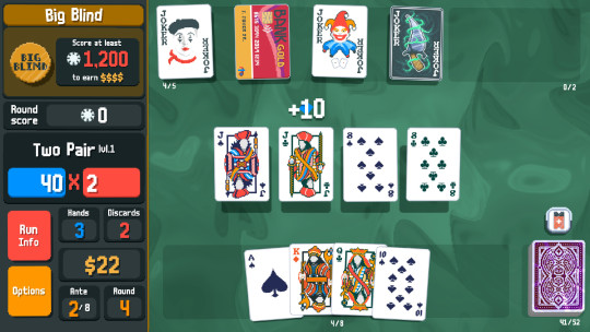
oh Balatro... i wish i liked you more than i do
i get why it's as popular as it is- i think it's a very good game. but it's honestly just not my thing. i did manage to get one win, and i do like it, but it doesn't click, and while i might poke at it some more, i think i'm kind of done with it. at least for now
did still manage to get 4.5 hours out of me, so, like. that's something?
26th January: Into The Emberlands
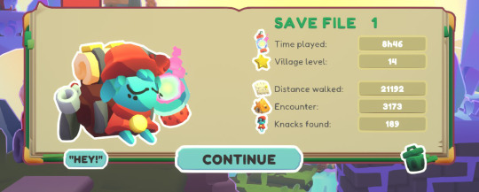
a very chill little exploration game. it's not anything super deep, and it's very 'fetch quest', but i found it pretty relaxing and nice to play. also very cute graphics!
it's supposedly a bit of a roguelike, but outside of the fact that dying takes away some of your upgrades, it didn't really hit that genre for me- it's also pretty easy to avoid dying, and i think i only died four times? and one of those times, it was because i got too careless, haha
0 notes
Text
'Drova - Forsaken Kin' Switch Review
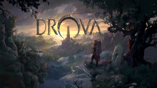
Well, this is neat. Homages to Japanese turn-based RPGs and tactical RPGs are pretty common these days. Games inspired by Bioware's old Infinity Engine computer RPGs also aren't terribly uncommon. But Drova is something else. It's a 2D game from an overhead perspective, I suppose coming off like Diablo with a bit more of a pixelated look. Hearing someone describe it as "pixel-art Gothic" helped the pieces come together for me. Yes, that's pretty much the feeling here, in more ways than one.
Dire world full of moral ambiguity and little in the way of joy? Check. An open-but-not-too-open world to explore, full of interesting detours that are almost always worth taking? Yes. Action-based combat where you're likely to get shredded until you know which fights not to pick? Mm-hm. Lots of interesting systems to dig into if you feel that-way inclined? Naturally. Jank? Oh goodness, you bet. Drova is a big game with a lot to do, and it's one that rewards those who prefer their video tourism to be dangerous and unguided.
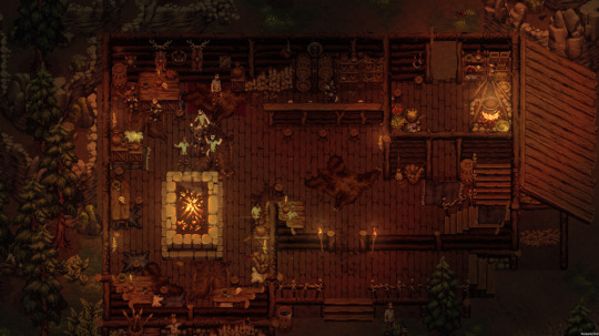
Chasing a couple of druids on their stupid quest, you end up in a hostile world where the survivors are doing their best to stay alive. Naturally, there is some disagreement among them about how to go about things, leading to two opposed factions. Your choices and decisions will see you throwing in with one or the other, and that will affect the narrative and which quests, skills, and other things are available to you. Basically, there's enough here for two playthroughs. Each one is going to take you more than twenty hours, so that adds up to a lot of game.
It's a game that more or less leaves you to your own devices once it teaches you the basic ropes. You are free to wander and die, and you will. It autosaves often enough, but you'll probably want to make your own saves just to be sure. The interactions with NPCs are interesting and the overall plot is compelling. The combat is a bit awkward on the Switch, and you can tell it was designed around a mouse-and-keyboard interface. You don't get a ton of real options in battles, despite how many appear to be there on the surface. It's more about making sure you don't get in the wrong fights, don't get outnumbered, and whether or not you're strong and well-equipped enough to go the distance.
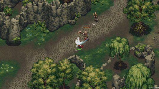
It took me a while to get into Drova. It was really buggy at launch, which probably didn't help matters. It's had at least one big patch since then and that got things into a far more stable state. Setting that aside, this was a slow burn initially. I couldn't quite figure out how the game wanted me to proceed, and it took some time to get the lay of the land. I'm glad I stuck with it through the teething pains, though. I don't think this kind of experience is for everyone, but there's something to an RPG that will let you be an idiot and pay the price for doing so. There's a solid atmosphere here, too.
Drova - Forsaken Kin has its share of rough edges, with some clumsy control and UI choices, and more bugs than I'd prefer to see, even post-patch. I think a lot of its choices (and they are indeed intentional design choices) aren't going to go over well with some players, as well. If you can stick with it through its awkward early hours, I think you'll find this to be a really good game to hunker down with. It rewards exploration, and its swift punishment for excessive bravado only makes it that much more satisfying when you get away with it. On top of that, you get an intriguing story set in a well-realized world. I'd probably advise playing this on PC over Switch, but if a Switch is all you have and this sounds interesting to you, I recommend giving it a go.
Switch Score: 4/5
1 note
·
View note