#I'm formatting this similar to my old posts on instagram
Explore tagged Tumblr posts
Text
Just domestic cat-kin things
.·͙*̩̩͙˚̩̥̩̥*̩̩̥͙ ✩ *̩̩̥͙˚̩̥̩̥*̩̩͙‧͙ .

✧ Sunny spots are a must ✧ Is someone in the vicinity knitting? (You will be playing with the yarn ✧ Wow look, a piece of kibble, sure hope nothing... happens to it ✧ Zoomies ✧ Someone calls your name so you respond... eventually ✧ "Of course this spot on the couch is reserved for me, isn't it obvious?" ✧ Meow meow meow meow *purr* ✧ Sleeping in the weirdest positions imaginable ✧ Keyboard in use? The ideal place to sit, obviously.

#therian#catkin#cat therian#domestic cat therian#small cat therian#feline kin#feline therian#feline theriotype#I'm formatting this similar to my old posts on instagram#(Just in case anyone notices lol)#Feel free to request a kintype!
14 notes
·
View notes
Text
🌟
anime north 2023 con report
finally posting this - thank you to everyone for a wonderful anime north!! \o/ this con prep season was the longest ive ever prepped for a con, and i think it was the busiest con for me ever. it makes me so happy to see people taking my art home!! 😭
so thank you for coming by anime north and chatting and supporting me! and thank you esp to the people who came by gifting their own merch?!??? - either fanart or ocs?! and im honored to see your beautiful ocs?!?? what the hell you guys are the GOAT thank you all 🥹🥹
it was so busy that i wish i had time to walk around & talk to other artists! i really wanted to get dango and onigiri at the delta too.. didnt really get time to eat so im sorry if you saw me shove 10 timbits in my mouth at the end of the con. yes i really did that .
throughout the con i kept saying "he just like me.. HE JUST LIKE ME FR!!!!!!!" every 5 seconds like an NPC. im sorry if you had to hear that more than once.
---
i wasn't able to post my con catalogue for AN on tumblr and instagram... i was so busy.. dying... maybe if i do other cons this summer ill post something similar. i had a lot of new stuff this year so formatting it was rough haha. here it is! more thoughts under the cut (bc this report really is more for me, but maybe someone can find something useful)
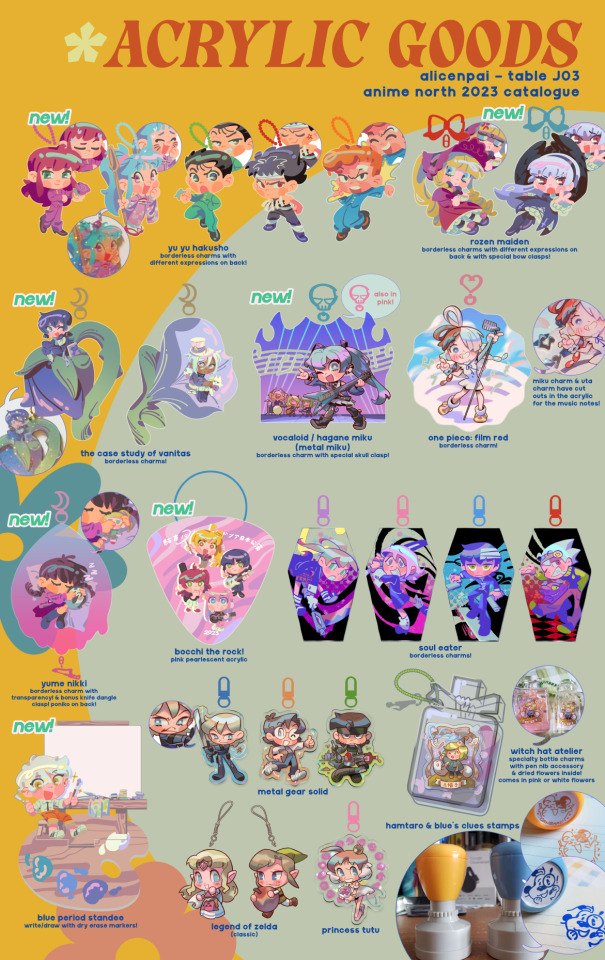
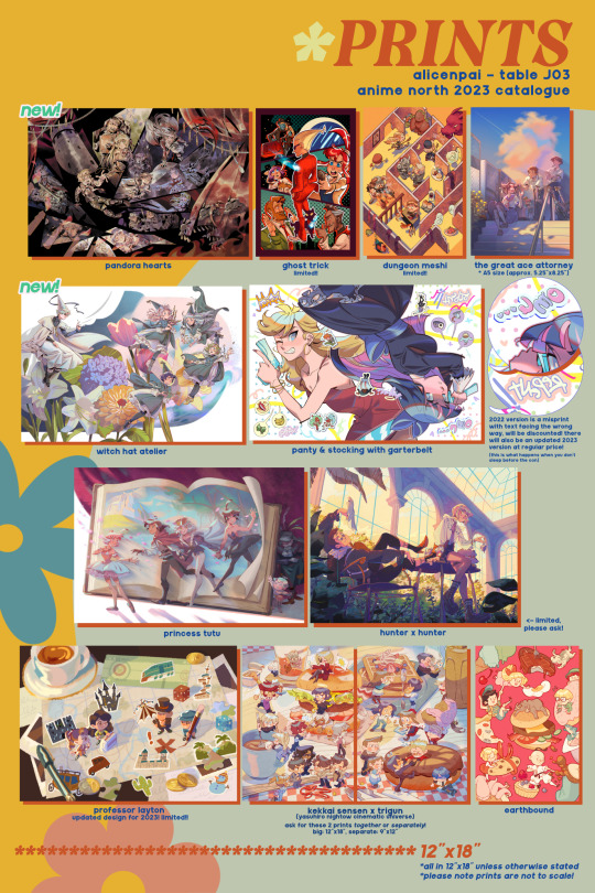

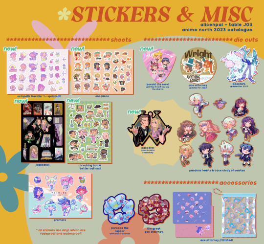

---
this is more for me honestly, so it will be really long. but i'm sharing it in case it may be helpful for others. i find that i'm always looking back at my old con reports, so typing out all of my thoughts are really useful to me. overall a great con, fellow artists and customers alike really inspire me to do better in my art.
comparisons to last year: (since i didn't end up making a con report last year!!!!!)
location: the artist alley layout was huge, and im really happy there are a lot more newcomers to the con scene. i know how much my first con experience meant to me, so i want others to join in on the fun! i don't know how the artist alley staff managed to fit so many artists in the building now! we got placed in a corner where there was a lot of breathing room, and a lot of traffic. i got lost a few times (didn't actually have time to walk around, but you know, it was to get in and out of the con centre and to the washroom/water station) because the amount of tables was overwhelming however, and the layout was super confusing. however i didn't feel as if there were any significant bottlenecks in traffic when i was taking some walk breaks.
commissions: last year it was still busy, but i still had some time to draw a handful of commissions. this year was a non stop barrage of customers! i think i may retire on the spot commissions at cons, just because ive always found it too stressful to draw right at the con, even if the traffic is slow. (and im lazy)
fandoms: last year i felt that it was... never so difficult to sell niche and old fandoms...? most people bought primarily 3 things from me at AN 2022, and not much else was touched. it was a struggle, and i even wondered if my art plateaued, if it wasn't good, if i should stop doing conventions altogether, at least for a little while. this year was so surprising with how much love there was for old and niche fandoms. two people from quebec came by and noticed the old fandoms and mentioned that if i was able to come to otakuthon, i should, people in mtl love nostalgia.. i'm gonna be honest otakuthon was pretty bad expenses-wise for me, but i heard it picked up since cons came back in 2022. it is a really beautiful city so mayhaps.. i will come for miss montreal.................
---
and a separate section on the new merch i made:
the new sticker sheets i printed (one piece, baccano, breaking bad/better call saul) did so well! nts to add luffys scar bc apparently i forgot... ive seen this dumbass's face for hundreds of eps and yet i still forgot .

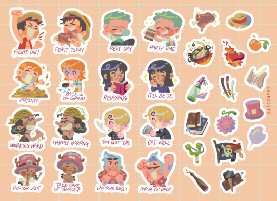
these are a far cry to the sticker sheets i designed in previous years. many sticker places restrict you on how many stickers you can place on a sheet due to spacing requirements... the more stickers you have + the closer they are, the higher the margin of error, which i understand is why many professional sticker printers have these restrictions in place.
the artists i worked with for my AN stickers are so genuinely nice and accommodating with my requests. I just went wild haha. the sheets with the most stickers are brba/bcs at 27 stickers and one piece at 32 stickers.

2021 (top) vs 2023 (bottom), the chara stickers on the new sheet are larger & 2x as many item stickers! the new design makes greater use of the space. my octopath 1 stickers are meant for planners but you could use it for anything!
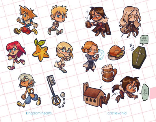

in 2017 i could only realistically fit 6 ish stickers on a sheet (for vinyl, not cricut home printing) due to printing restrictions. these costed about $3.30 CAD per sheet from s/ticker/mule (not worth it for the price point AT ALL... but i wanted to try sheets for the first time)... and yes it's a tiny 4x7 as well. it was a hard sell for $7 in 2017. but im glad artists have been pricing them a bit higher + sheets have become much more customizable.
now on to charms:
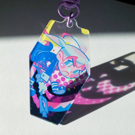
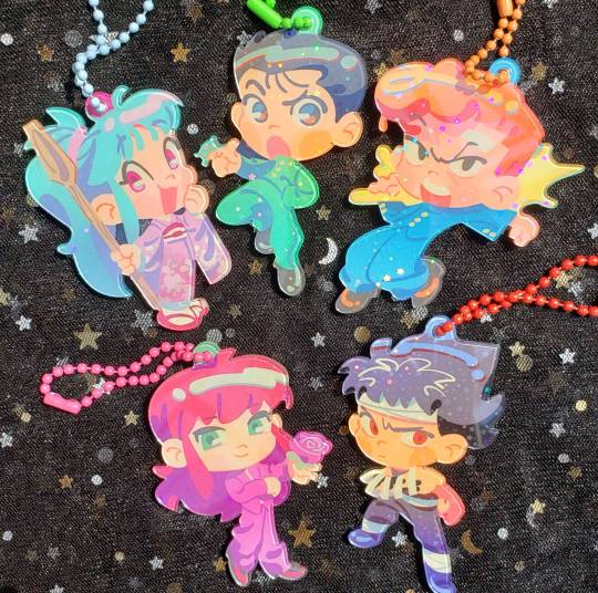
i am so obsessed with this borderless charm look on the new charms... they look like candy... thank you guys for loving my new charms!! i tried out a new technique with designing charms. and im so happy with how they turned out. the charm manu was super accommodating and they are so much better than vograce who fucked up my order so bad in 2022 🤡👍
the soul eater charms from last year were kind of a precursor to this. last year i tried something a bit different than my usual with the transparent bgs, which require full bleed in the file setup, and that was already pretty new for me. i find that charm sales are usually pretty mid for me, so during the pandemic i took a soft break from making them, and i wanted to do research based on others' designs and really tried to improve my design sense. to me i want to design charms that aren't just a flat piece of artwork that gets printed, but something that utilizes the capabilities of the acrylic material it gets printed on 🤔


---
fandoms/merch types i want to try next time i table:
more soul eater? it's one of my favourite animes and im very happy for the soul eater love this year. my partner kept selling out of her soul eater prints even though it was her first time tabling!
fma! ive been rereading AND rewatching it lately. it's one of my top 5 anime of all time so me drawing anything for it is a struggle, the bar is set so high. i never end up having the time or ideas to draw anything for it (and the aesthetics are very different from my usual taste)
shadows house has been one of my favorites recently!
dungeon meshi, the print i made was back in 2018 and i think it's time to retire it! it sold out at AN, thank you! with the way the story has developed in the last 5 years, i really want to draw something new for it if i can.
blue period needs more love!
golden kamuy.....
and many more.....
i also want to try mini prints maybe...
---
administrative stuff:
next time before the con, i definitely need an organized chart i print out before the con so im not.. literally writing down each transaction... 🧍♀️
clamps...?
possibly new display? grids even with plastic panels are heavy... and they can be a pain to put up. this AN we had our neighbors and good friends @nappotuna & @stripeyworm helping us put the grids up, they did an absolute speedy banger job! but it might have taken way longer without 4 hands on the grid work.
if we had used tape to hold our prints up as well who knows how long it would have taken. we used magnets, apparently a lot of people were using them at TCAF. they were so easy to put up and adjustable. *jesse pinkman voice* MAGNETS, BITCH!!!!!!!
---
merch i may shelve/do less of:
i really appreciate when artists talk about these kind of things behind the scenes... when products do well, when others dont, products w surprising responses, the factors that we think affect sales... the hard truth is that not everything sells, just bc the art is good =/= good sales, etc etc.
lately ive found it so fun to design sticker sheets over individual die cut stickers!! i understand now why some people only specialize in stickers!! it's also such a pain to stock individual characters and have greatly varying levels, bc of customer interest, and bc of how printing stickers works, you often get extras of random characters due to overflow 😭.. like at some point I had 7 jeannes and like only 1 of the other vnc charas bc the printer had so many extras and she's arguably less popular HDHFJSJHDJS anyways, i think i'll probably do less die cut individual stickers for my next con...
anything old that i only have 1 or a few copies left (meaning i won't reprint) i may not have for display anymore bc of space concerns... before my next con ill just post them on social media to have people claim them!
i may want to do less 3" charms in the future...? theyre a hard sell online prob bc i cant really do deals (i could but id have to be checking the stock every few hours which is not ideal), but they do a lot better in person due to deals.
it's been fun to try specialty products (I've tried scrunchies, stamps, pouches, microfiber cloths, coasters, enamel pins), but i... find they dont sell well for me... maybe my art doesnt have that wide mainstream nostalgic merch type appeal idk... maybe im just not good at designing or advertising them wahahaha. (specialty charms are still charms and i wouldn't necessary consider them a part of this)
my jojo buttons were really popular at anime north 2019 and fan expo 2019, but when the part 5 anime concluded, i noticed that interest for the interest completely moved on 😭 (or it's possible that everyone who was interested bought the buttons already?). part 6 anime didn't rejuvenate the same level of interest. it was a struggle to sell even more than a handful of these at each AN 2022 and 2023. right now they're taking up a lot of space in my con luggage that i'd prefer for newer, better art. i still love the art i did, but unfortunately, i think ill give them a go if i get into otakuthon (and maybe fanexpo too), then it'll be time to retire the jojo buttons. sometimes fandoms come and go so fast, and it's difficult to keep old merch around when they don't have any more interest and when they're occupying a lot of space.
my banana fish lollipop charms do not sell well, and i only sold 5 of them in a 3 year period, across cons and my shop. i created a bargain bin at AN, and it really helped me get rid of old things! unfortunately even in the bargain bin i could not sell a single one of the banana fish charms. maybe it's the art that's not appealing, the characters aren't recognizable, the price point for a lollipop charm was too high, i wasn't hitting the right audience, the market was slow around the time, even when it was included in my promo post... etc. these lollipops were my first time making specialty charms. unfortunately i think that's the last time making lollipop charms, and about time to recycle these charms, so that i have space for fresher and better art!
other thoughts moving on:
maybe go back to simplifying my art a lot more... if i keep making drawings like my great ace attorney tarot + zine, witch hat atelier print, and pandora hearts print, then id not only take 1 month per illustration, id also be destroying my arm 😭 i stopped stylizing my art in 2021 bc i found that my art was getting sloppy in 2020 + i was really struggling in life drawing in school. i needed to buckle down and be more conscientious when drawing poses, learning anatomy and structure... and bc getting back into anime in 2021 really helped me cope with the isolation of the lockdown, so that had a huge influence on my style. but bc of that i think it just took longer and longer to make illustrations and that's something i no longer really wish for.
i really like the period of my art in 2017 with a lot of my persona 4/5 art bc it still has structure even though it's simplified... and the style in my zelda icon... mayhaps experiment a bit more this summer if i can...
36 notes
·
View notes
Note
How well can each villian draw? I'm especially curious about Maxie and Cyrus's skills. I've probably said this a lot but I love your art! I don't have an account on Tublr so I search up your blog every day! The first thing that comes up on my recently searched is always DBAMC! XD
Oooh OK! I have in fact some drawings of how each villain draws... Some drawings are from the “meet the villains” post and some are from a future project that I’m not going to talk about for now... XD I didn’t have drawings of all characters, but... I made some for the occasion too!
Anyways, here they are:
Giovanni:

Although Gio has a good visual-spacial intelligence, it’s more about a good sense of direction and capacity to understand visual information than about his artistic abilities. He is good at understanding visual input, but not good at translating the visual info on his head to an actual paper. Besides, he doesn’t make an effort. He just “decided” that he is bad at it and so he doesn’t try to do anything other than simple stick figures.
Archie:

Archie likes drawing with crayons and thick pencils, usually. He is a fan of “children media” like child games and cartoons, so his style is influenced by that. He doesn’t have a great knowledge of anatomy, but that is not important for him, since his style is simplified and cute. In terms of colors, Archie is not super consistent with his color choices. He uses the colors available at the moment and that’s good enough for him.
Maxie:

Being a perfectionist, Maxie really cares about the proportions in his drawings. He draws a structural skeleton before drawing people, so that he can have an idea of the proportions and positions involved. He has a very delicate hand so his drawings tend to be light and have thin lines. He likes coloring with watercolor and tries to keep it as close to reality as possible. He has a strong aesthetic sense and to him it’s important that the drawing looks pretty in the end. He doesn’t add lost of shading, to him, color is more important than the shadows, making his drawings a bit 2d-looking.
Cyrus:

Cyrus is also very delicate in terms of physical touch, so his drawings also tend to have light lines. However, differently from Maxie, he is not very much concerned about the final product’s aesthetic appeal. He wants it to be recognizeable and similar to reality in terms of basic shapes and shadows. Usually prefers pencils. Colors don’t matter much to him, as he considers the interactions between light and dark more important than them. However, if Cyrus is drawing just to illustrate an action, not to create a portrait, he will definitely simplify his drawings a lot, like the first example here. In that case, he will use the first pen or pencil he finds.
Ghetsis:

Ghetsis is not only very talented for arts in general, but also knowledgeable in the history of art and techniques involved. He is not a fan of cartoony styles, and prefers to use paint other than pencils or pens. Ghetsis works with masses of colors and lighting other than contours, lines and bidimensional shapes. He is also very fond of realism, and will keep working on one same piece for days, even months... That, of course, when he has the patience and will to actually make art. When he is out of patience, well... You have the first example.
N:

Similarly to Giovanni, N is not very talented for drawing. The difference is that N is acutally trying his best. He tries to put all the shapes he can perceive in his body into paper, but doesn’t have any idea of how these shapes interact when put in a certain angle and from a certain perspective. You can notice how the hand is inverted, for example. Here, he used ballpoint pens of different colors.
Colress:

Colress also likes the cartoon-like proportions, just like Archie, but his style is not that much inspired by children’s media. He doesn’t care much about consistent propotions, as long as you can see that it’s the same person on both drawings, for example. He tends to draw all faces the same, because facial features are not that easy for him, so everyone has those same black eyes, nostrils and mouth. He will change the expressions depending on what he wants to show, though. He likes pixelated edges on his art, and usually works on the computer.
Lysandre:

Lysandre loves to experiment with different styles, usually on the computer, but sometimes by hand too. He is very fond of warm tones adn curved lines. He usually likes to make definite contours, strong and visible outlines that make the drawing pop out from the backgrount. He will sometimes break that rule too, since he loves to try different things all the time! Most of Lysandre’s drawing depict himself with all sorts of emotions. In his opinion, art doesn’t have to be true to reality, what matters most is the aesthetic result of an artwork.
Lusamine:

Lusamine will work with wathever materials she finds. On her old drawing of “herself” (Nihilego), she used thick whiteboard pens, but on her newest drawing, she used thin pens on paper. Her style is slightly inspired by Dr. Seuss in terms of propotions, but with many differences in terms of execution: instead of several lines composing the outline of her drawing, Lusamine draws with one long stroke for each shape. Her aesthetics usually include lots of curves and curls.
Guzma:

Most of the time, Guzma uses thick markers for his drawings. He is careless when drawing outlines, but his style is somewhat consistent. On “meet the villains”, Guzma traced a generic anime-style man to make his own portrait. For that, he used a thin felt-tip pen, to try to make it look more “professional”. Guzma cares more about the big picture and much less about the details.
Piers:

Piers has his own style, just like nearly everything about him. He developped a technique to make his lines look like barbed wire, and loves to use pointy shapes and spikes all over his art. The keywords for his style are “sharp edges”. Although Piers loves colorful stuff, he thinks he is “bad at colouring”, and so he prefers to keep his own art black and white. He says it’s better to have something black and white than badly painted.
Rose:

Rose’s style was inspired by comics and cartoons, specially short strip comics that work on a “gag-a-day” format. Resemblance to reality is not vital for him, so people won’t have different shapes of head or eyes in his art. He works with a kind of “formula” where every human follows the same basic structure and differences are added later on. He thinks the facial expressions are very important on his drawings, so his characters have big eyes and mouths most of the time.
Anyways...
I usually don't like to talk about drawing "well" or not when it comes to art, because it's actually pretty relative... Although, yes, sometimes there are people who can't really draw much. Giovanni is one of them, for example, and N is also not great. That aside, we have some with more skills like Ghetsis and Maxie, and some with average skills... Each one has their own style! Here are the examples of their art! ^^
Also! I'm really glad to hear that you like my art that much! I wanted to take this content other places than Tumblr, but Instagram and Twitter didn't really have the same charm, specially because of how photo albums work there. I'm still thinking about what to do, then maybe you'll be able to see the comics on another media! ^^
29 notes
·
View notes