#I’ve redrawn this particular drawing three times now
Explore tagged Tumblr posts
Text
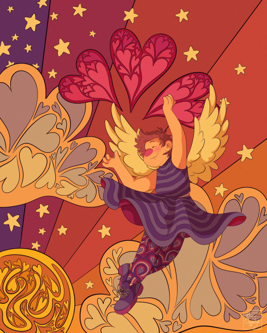
Wings of Love [x]
#artblr#original art#artists on tumblr#digital art#wiggleart#redraw project#I’ve redrawn this particular drawing three times now#the link in the caption goes to the other images#she was the second ever picture ie posted to my original DA account in 2008#so whenever I go oh I wanna pick my redraw project back up! I start with her#hence all the redraws lol#suffice it to say this one is my favorite one#having a digital tablet makes a hell of a difference#the redraw from 2018 was digital too but either I was using my Wacom tablet and my laptop so not drawing directly on the screen#or I had used my finger and my phone with procreate pocket#either way it wasn’t as detailed as I wanted#so yeah!#I know this isn’t fanart and I’m sorry y’all#I’m trying really hard to get some stuff done for a portfolio
94 notes
·
View notes
Photo

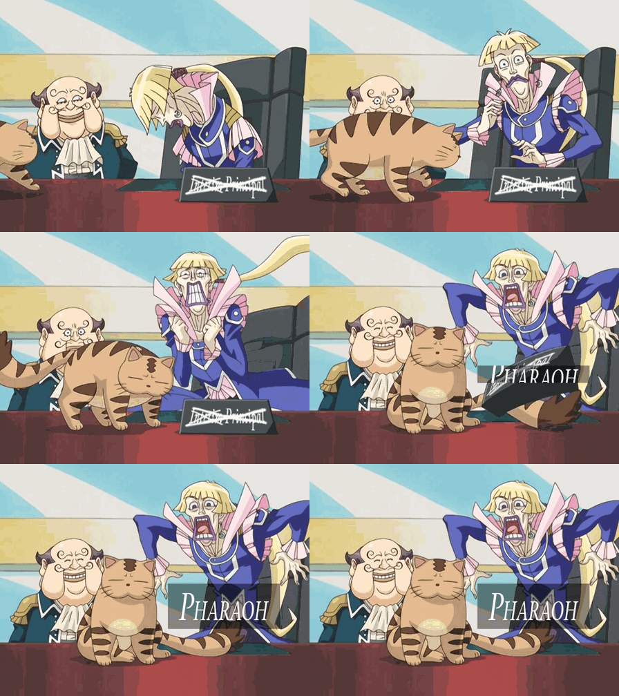

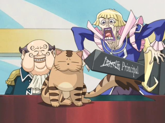


99% - GX Season 2 Opening: “I Fits I Sits” (WIP)
this scene is still adorable ngl
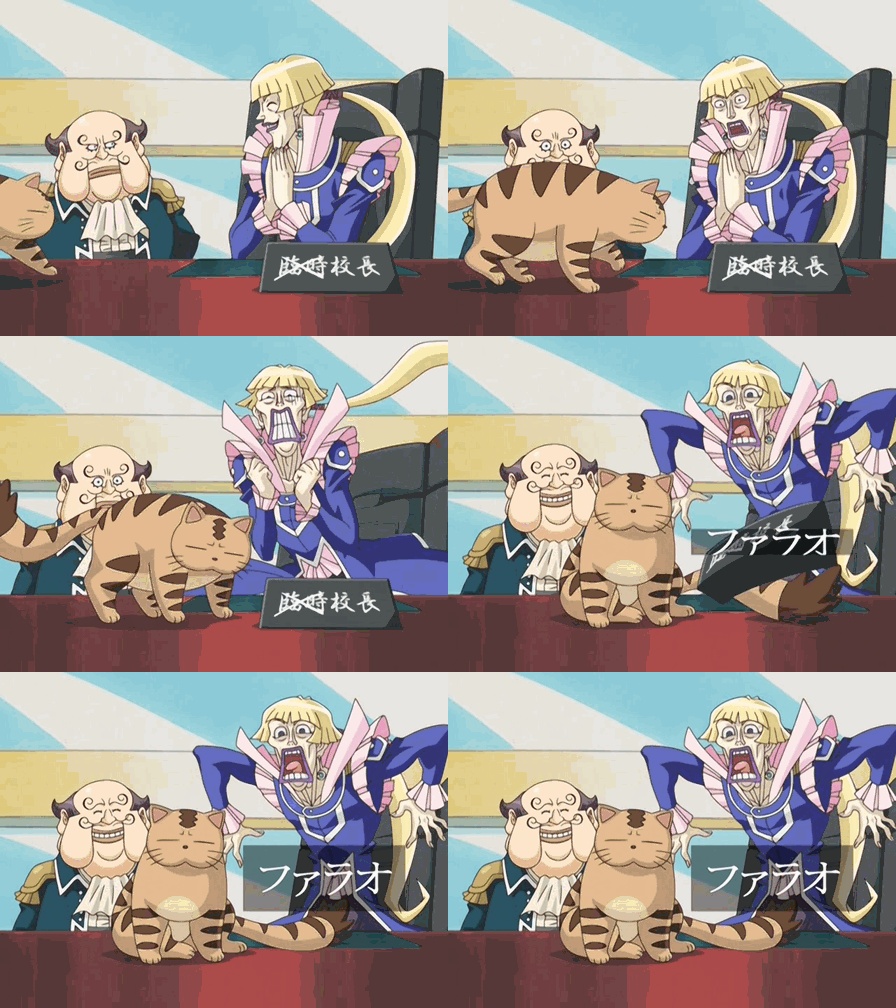
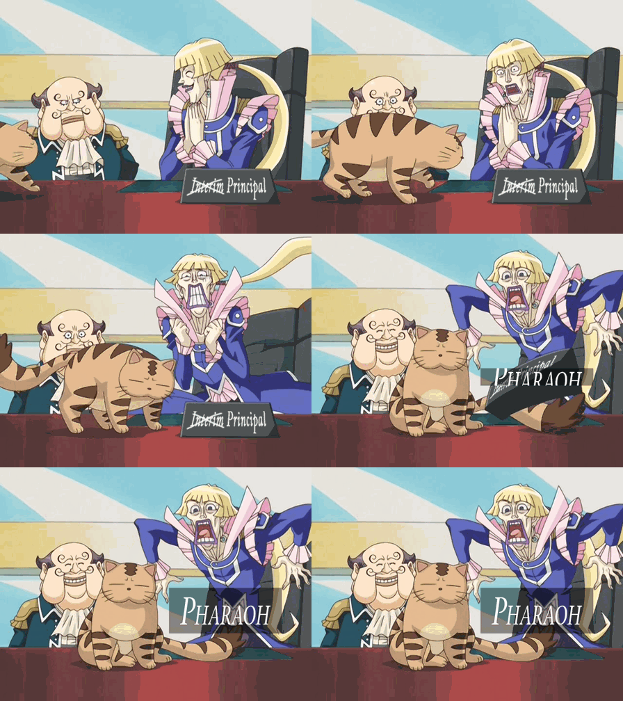
So, I’ve been at work the past three weeks since finishing my 5D’s Dub-Uncut Ep. 24 getting ready to finalize my Season 2 subs, which means it’s time to revisit 99%’s Season 2 opening video for translating! In my first go-around, while I did use the textless video to fully translate the credits and lyrics, I opted to use subtitles on Chronos’s placard here and the names that pop up for each character since I wasn’t all that versed in Photoshop and was limited with Sony Vegas. Now, about (...however long ago I first subbed episode 53 how has it been that long) and quite a few animation fixes later, I thought my particular set of skills has expanded quite a bit--enough so to try and realize what I’d wanted to do back then but couldn’t by fully translating the OP, names included!
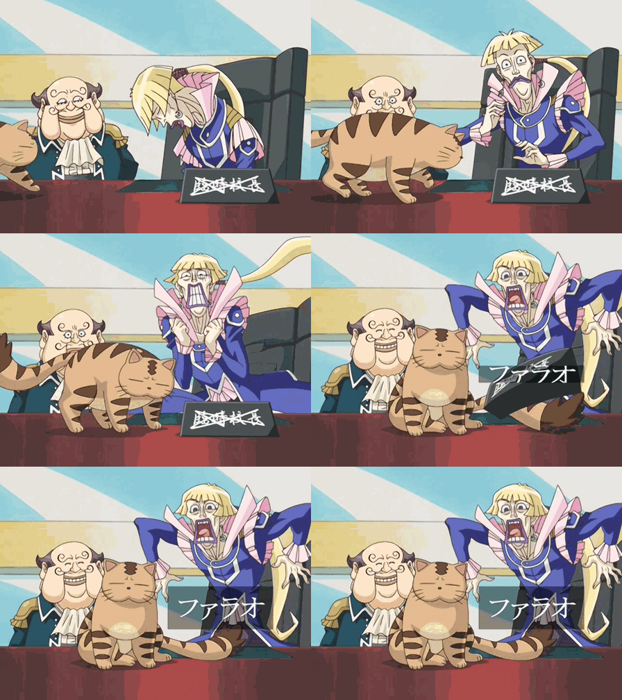
Here, you see some of that in action--after I took time to recreate the name boxes throughout the opening (text and a transparent box on a transparent background to overlay), I took each frame involving placard (after a still) or Chronos movement and Pharaoh’s name sliding in and edited it to both translate Chronos’s placard (which involved getting more familiar with Vanishing Point lol) and digitize out Pharaoh’s name box, which meant also redrawing Chronos’s uniform/hair/pants ruffles and Pharaoh’s tail accordingly on top of it. I also used the frame as Chronos jumps in which he disappears for a second as backup to consistently edit the chair behind him in each frame. Admittedly daunting since it was about 14 frames to edit, but as you see above, I think it came out really well! Gif #1 is the original while Gif #2 is my translation; as a bonus, Gif #3 is the translation with Pharaoh’s name covered up, since I thought it’d be neat to include. Had 4Kids thought to use this in their OP, it might be how it’d look, lol.
And, being in Rome and all, once I wrapped up the V1 of this scene (used in 53-84, the one with gloating Chronos and annoyed Napoleon), I figured like a madman that I may as well take care of the V2 for later (used in 85-104, the one with dejected Chronos and a gloating Napoleon after Samejima comes back). Having done most of the scene already, it just involved me taking the first few frames of dejected Chronos moving from the in-episode opening (since it wasn’t released textless; once Chronos starts to jump up, both versions use the same footage) and, because the in-episode opening is zoomed in a bit compared to the textless version I’m using, resizing them in Photoshop for easy matching with my previous edits, as I then put a bigger crossout on his placard, redrew Chronos’s hair to wipe out the credits, and copied Napoleon’s right eyebrow with some slight tweaks to cover up the credit on his left one (thanks for being so symmetrical). I also took the frames from the IEOP with Pharaoh’s name sliding in/the extra-crossed-out placard flying and resized them to fit into the textless frames; that lets me get a textless version of this V2 OP ready to release for folks. Gif #4 is how that looks, while Gif #5 shows my translation with an extra layer of marker crossout.😂 (poor Chronos)
Once the frames were edited, I just plopped everything into Sony Vegas to get everything moving; I touched up a few spots here/there, but overall, once I put in the frames, it looked pretty solid!
I added photos 6-9 to show an example of the coverup I did while the placard was in mid-air; in this frame, Pharaoh’s tail and Chronos’s hair were redrawn to cover up Pharaoh’s name, while the placard was blanked so I could put my translation on, then match the crossouts. For the V2 crossout, I mostly matched the placement on the Japanese one, just tweaked a little for consistency with how I’d made it go just past the L on top and on the bottom. For the frames after where Chronos is in view fully standing, I did redraw his ruffles and think I did a good enough job there; luckily, the name will be blocking much of the view of any drawing slipups I made, lol.
But yeah, so there’s this; I think this might’ve been the toughest one to do, but I’m going to work on the one with Chronos and his deck next. That’ll be interesting, since it’ll involve perspective Vanishing Point work with the placard, and then in V2 dealing with Chronos as he moves and pouts, haha. Stay tuned!
Also, BONUS:

#GX#yugioh gx#yugioh#ygo#ygo gx#Chronos de Medici#Pharaoh#VP Napoleon#longest-runtime ygo opening checking in#i think this V2 edit for Chronos's head is much smoother than my last go-around#then again#given that was me manipulating his head in later frames in Sony Vegas#i think that's a given lol#also Tumblr's new gif limit coming in clutch!#remember that time i made gifs as i posted my new subbed episodes lolol#...i just realized I won't have a still of Chronos's deck to work with like I will with the others#...crapbaskets#i guess i'll make some proxies to cover up his name box lol#subbing rambling#my gifs
18 notes
·
View notes
Text
Adapting the Impossible: Translating the Overhaul Arc into Animation

Hello all, and welcome back to Why It Works. Over the past few weeks, My Hero Academia’s initially slow-burning fourth season has exploded into dramatic action, as the assault on the Hassaikai yakuza compound has resulted in episode after episode of brutal, all-encompassing fight scenes. Red Riot’s first two battles, Suneater versus three Hassaikai lieutenants, Lemillion’s desperate attempts to save Emi - My Hero Academia has been firing on all cylinders recently, and beyond the immediate thrill of its recent fights, I’ve also been enjoying seeing the production as a whole navigate the inherent difficulties of translating this particular manga’s fight scenes into animation. Today let’s dig a little more deeply into that process, as we examine the challenges of translating Horikoshi’s thrilling fights into motion!
First off, it should go without saying that different mediums have different strengths, and thus great adaptations tend to embrace a rule that some might consider sacrilege: do not attempt to faithfully translate all of the elements of the source material, but instead capture its spirit in a way that best takes advantage of the strengths of its new medium.
A movie that attempts to contain all the internal monologue of the book it’s based on will likely be a worse movie for it; books are just naturally suited to extended internal monologue, whereas visual mediums are unsurprisingly better at conveying their drama visually. And though manga and anime are a bit closer in terms of their strengths, My Hero Academia’s recent arcs have clearly demonstrated Horikoshi embracing the unique strengths of manga in a way that’s actually made it harder to adapt his work.
So what are those unique strengths? For manga, the relationship between panels is actually crucial to their momentum and tension. Manga normally drives our attention forward quickly through stacking panels, with extended panels tending to prompt a brief mental pause, as we scan across the panel in order to take in the whole. This is how you manage “pacing” in a medium like comics - the relationships between panels dictate the speed at which they are consumed, with many small panels implying frantic movement, and larger ones implying stillness or impact.
Following that logic, manga’s most impressive (or at least attention-drawing) panels tend to be dramatic two-page spreads, the most impactful tool in a mangaka’s toolkit. They force the reader to sit back and take stock of the image as a whole, and are generally framed as the key turning points of any given battle. Two-page spreads embody manga’s potential for outright awe in single, overwhelming images, and My Hero Academia’s recent arcs have been making increasingly prominent use of these shots for its big action setpieces. Unfortunately, while these impressive visual setpieces naturally embody the strengths of manga, their appeal is almost untranslatable into anime.
There are a variety of reasons for this. As I said, the size and distribution of panels is one of the main ways comics manage pacing - but in anime, no single panel is generally “larger” than any other. All sequences that are adapted tend to consume the same amount of screen real estate, resulting in a “flattening” of dramatic emphasis. Jokes that might have only occupied a tiny side panel are now forced to carry the whole screen, while two-page spreads that would have naturally drawn attention to themselves in comic form can be afforded no more attention than any other image. Often, if you think some sequence felt funnier or cooler or whatnot in the manga than in the anime, this can be a subtle byproduct of this flattening of dramatic intent between panels.
But there are reasons beyond the general difficulty of adaptation that make My Hero Academia such a tricky adaptation. Horikoshi’s big panels tend to be less about conveying a dramatic still moment than about capturing one moment within a larger transformation. As his creativity and ambition when it comes to Quirk designs has increased, so has the complexity of these shots, and so has the inherent difficulty of parsing his battles. For a character like Sun Eater, the number of moving on-screen parts is bountiful and strangely articulated, with characters actively morphing as they fight, and it can be hard to tell what’s going on even when given the guiding hand of panel-by-panel storytelling.
This issue was clear to see even back in the Hero License arc, when the anime was forced to contend with adapting the introductory fights of characters like Inasa Yoarashi. As impressive as single panels like this are, they present an impossible challenge for adaptation, as all those beautiful still objects represent a nightmare to bring to life. And this challenge has reached new heights in the Overhaul arc, through the absurd difficulty of conveying transformational powers like Sun Eater, as well as the issues presented by the Hassaikai’s own powers.
One of the foundational rules of animation is that adjusting the camera’s own perspective is prohibitively difficult. Animating characters in motion is difficult enough, but when you move the camera, your perspective relative to all other objects shifts, and thus everything in the frame must be redrawn. Well then, how do you animate a sequence when the backgrounds themselves are constantly shifting, like, say, due to a Quirk that manipulates static objects, or one that constantly destroys and rebuilds matter on the fly?
The answers will unfortunately have to wait until next week, as I've already run out of time. Sorry to jerk your chains like that, but I'll be back soon, and I hope you've enjoyed this dive into the details of adaptation!

--------------
Nick Creamer has been writing about cartoons for too many years now, and is always ready to cry about Madoka. You can find more of his work at his blog Wrong Every Time, or follow him on Twitter.
Do you love writing? Do you love anime? If you have an idea for a features story, pitch it to Crunchyroll Features!
0 notes