#I wanted to put more effort into the final panel for comedic effect but I got lazy
Explore tagged Tumblr posts
Text
Mikaila Orchard sucks at Paneling
I debated making this a video or not. But, I decided against it. If you guys are interested in me making videos about this sort of thing, let me know and perhaps it's something I could cover in the future.
So Mikaila Turkleson aka Mikaila Orchard has always made... questionable art. To me it seems like a weird amalgamation of Equestria Girls and Sophie Labelle's art. Anatomy bad character design bad etc etc. I don't however see a lot of people talk about her paneling.
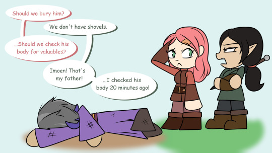
Recently, Mikaila and presumably her partner, Lily Orchard started a new art endeavour. I assume to turn over a new leaf and bury the now-infamous Pokemadhouse. You can find it over at bhaalspawnfunnies. It appears as if the blog will focus around the player character of Baldur's Gate 1, Gorion's Ward, and their half sister, Imoen. This is the first entry.
Source
youtube
Where to start? My first impression is that this is very poorly drawn, and low effort even by Mikaila's standards. The speech bubbles are low contrast against the background. The ground/floor blurry blob looks extremely bad. As a fellow artist I get the distinct impression that Mikaila did not want to draw this piece.
Moreover, there's a huge issue with the panelling and pacing. Comics are really cool in that you can kind of use panelling and negative space to "time" jokes, leading the eye where you want it to go and using framing and other art tricks to make a punchline land a little better.
This "comic" has none of that. There is no pacing, there is no comedic timing. It's all bland and presented as a block. I took it upon myself to re-panel this piece, and I've made two versions: One, with Mikaila's art style and visuals, but with the panelling slightly adjusted to be more punchy and effective, the other I completely redrew, using the same joke.

Excuse the sloppiness. I'm not going to expend too much energy polishing and gilding this turd.
That being said, this is already a huge improvement. Even if Mikaila isn't at the technical level of a professional artist, this is very attainable with only a few more minutes of effort. The timing is punchier, the speech bubbles draw your eyes down the page, and even without colour coding, it's clear which of the characters is talking. This isn't exactly a hot take but in my opinion you shouldn't need colour coding on a comic page to denote who is speaking. It should be very obvious! Moreover, speech bubbles should be included in the composition, not added as an after thought.
I'm guessing the original comic took her less than an hour to make. I think I'm being generous here, honestly if this took her more than twenty minutes I would be concerned. Being generous though I gave myself one hour to make a version completely redrawn.

This was again, very quickly put together and of course is in no way perfect, but its to demonstrate what a little bit of thought can do to improve a comic page. I decided to change the pose of Gorion because making family guy references should be a a cardinal sin for artists, as well as make the characters a little more recognizable. "Aryana" is, notably, Lily's OC and bears little resemblance to the canon character of Gorion's Ward, but considering Baldurs Gate does allow character customization and dialogue choices, I decided to make their gender a little more ambiguous so players of any gender could see their version of Gorion's Ward in the comic, but kept the elf with long dark hair appearance from Mikaila's original. I also looked over the pic after I was all done and ready to upload and noticed some small flaws I could easily fix, and went back and did those things. You should always go over your pieces when you're finished them with fresh eyes before you submit them as a final piece.
Again, this certainly isn't perfect and I'd probably put more effort into a piece with characters I care about and a joke I actually find funny, but I hope this demonstrates that pacing and expression really are everything in comics.
150 notes
·
View notes
Text
Higurashi: Massacre Chapter 23
Again, this whole thing makes the Wild Dogs seem utterly incompetent. Not only were they spotted by a bunch of children, but they never noticed they were being tracked by said children.
And then Rika and her friends get into a 6-vs-6 brawl and manage to pretty effortlessly beat the Wild Dogs. And you have to consider how Rika has pretty much no fighting ability at all while Satoko was a pure support in that brawl.
Keiichi even brings up how surprising it was to beat them. Rena chalks it up to how Mion's club creating a "Do whatever it takes" mindset. I'd argue part of the reason is the Wild Dogs also have to operate more covertly. Their goal is capture rather than defeat or kill.
The plan is to charge through the Wild Dogs, steal their van, and get to the Sonozaki underground Saiguden.
I'd like to know how the van driving would have turned out. I bet Mion has no idea how to drive but she has a go-gettem attitude.
I guess those jokes of Rena displaying super strength when she sees something cute weren't just for comedic effect.

Now that I think of it, that hatchet she always wielded would be heavy but she can swing it without any effort.
Almost every shot of Shion's face during that fight makes her look eager to fight and having fun the whole time. Recall that this is the person who was smiling as she intended to escalate immediately to homicide when Teppei appeared.


Hanyu's timing is far too exact. She stopped time the literal second before Keiichi is going to die. And if we combine this with how she knew this was the day Rika dies, it tells me that Hanyu's power over time lets her know the when of events even if she doesn't know the how or why.
Throughout this arc, Keiichi's been refusing to admit defeat or succumb to destiny. And even though he accepts his own death, he still refuses to accept defeat or destiny. His final words are to tell Takano to not think she's won.
I'm desperately trying to find a reason for why Hanyu decided to stop time at this moment and point out Keiichi's approaching death. My speculation is based solely on this one panel where Hanyu's indifferent visage nearly broke.

I want to argue that she actually tried to help. She's stopped time so everyone can take a moment to figure out how to save Keiichi. But all she managed to do was make everything worse. Not only is Keiichi doomed to die, but now everyone has to see it about to happen and despair that there is nothing they can do.
I think Hanyu took a chance to see if she could stop destiny, but she wasn't able to do anything, reinforcing her belief that destiny is unchangeable.
The end of this chapter feels very different if you skip over every page that took place in the frozen time. If you did that, we'd go from Rika triumphantly declaring how she'll tear down destiny as she and her friends run at the van straight to Keiichi being shot and the rest of them being captured.
I'm not entirely sure how to put it, but not including the scene in frozen time makes the ending feel anticlimactic. Our protagonists have rallied together to push toward their final goal only for Keiichi to get shot and everyone else be immediately captured.
But with the scene, we can see and process when everything falls apart and we also see everyone try and fail to overcome. It gives us a moment to see the group stand in defiance even knowing they will not win.
The last few pages really show the chaotic nature of what happened. Too many things happened at once and Rika's friends cannot process it all in any meaningful way. There's no order to the series of events because everything is kind of happening at the same time.

The only order we have in the moment is that in one instance, Keiichi was shot and in another everyone was captured.
Things only calm down once everything is over and everyone realizes they've lost.
back
5 notes
·
View notes
Text


I think about what Garrus went through between ME1 and ME2 a lot.
#Mass Effect#ME2#ME1#commander shepard#garrus vakarian#I wanted to put more effort into the final panel for comedic effect but I got lazy#This comic is because I couldn't get the line ''Father being a cop is cringe'' out of my head#Posting this like 5 minutes before the power goes off for the night lol
541 notes
·
View notes
Photo
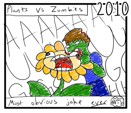
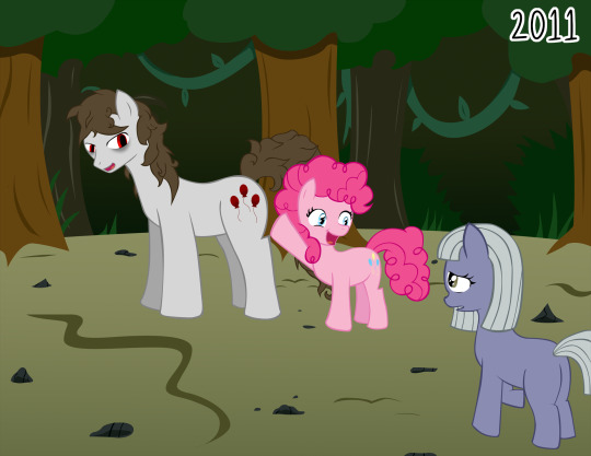
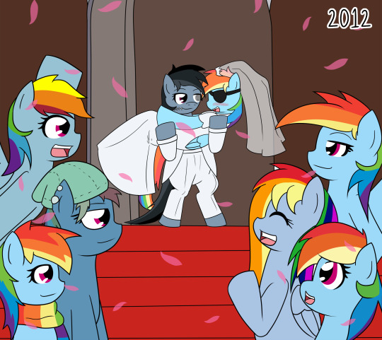


Looking back at my art from the 2010s. I went through and picked 1 piece I drew/wrote from each year that I felt either showed off my best art, my most iconic art, my best improvement, or was simply a personal favorite of mine.
There were a lot of possible choices and it was kind of difficult to narrow it down to 1 per year, since each piece tends to encapsulate so much more than just a single moment per year. Especially with stuff like Motherly Scootaloo or Aria’s Archives encapsulating so much history in a single picture. But under the Read More are my choices at the end of the decade:
1.) My Old Drawn Blog # 53
Man, the years before MLP existed were really weird for me. I knew I liked drawing and telling stories, but I had no consistent direction on what I wanted to do with my art. I was still jumping between different comics and ideas, and in 2010 I was going through some of the worst depression I’d ever felt in my entire life. I hadn’t even had the experience of being kicked out of the first place I tried to move out of home to yet. It was wild.
As for the ‘joke’ that seems ‘so obvious’ in this post, I had a running gag back then of the face the Flower makes, known as the ‘screaming window’ face. I drew it whenever I needed to draw something screaming in pain or fear for maximum comedic effect. Maybe I’ll bring it back some day lol
2.) Silent Ponyville
I couldn’t NOT put Silent Ponyville on this list. I was gonna have both 1 and 2 as different spots, but I wrote them both in the same year. That seems insane to me now?? Like WOW, I just WROTE those fics and then they became fandom-wide phenomenons. To the point where even in 2019 I’m still getting people drawing fanart of it, or people telling me “Yeah, I got into Fanfiction because I read Silent Ponyville”.
I don’t know if I’ll ever make a creative piece as universally known in a fandom as Silent Ponyville again, but I sure would love to make an original piece of art that is as beloved as Silent Ponyville one day, if not more so. It’s a testament to the fact that if I put my mind to it, I can create a really amazing horror experience, and I know I do plan to do so again some day.
3.) Pirate Dash x Dead Rainbow Dash
Who doesn’t love shipping wars that get large numbers of people involved? This is probably the second most involved in the ‘community’ I got, though it was certainly the better experience of the two. And it was all just for silly fun at the end of the day.
And funnily enough I never ACTUALLY shipped these two, I just thought the reactions from the creators seeing them be shipped was hilarious, so it just kind of grew from there. It was all fun and games at the end of the day, and made for a good memory, and a pretty dang ambitiously drawn pic for the time!
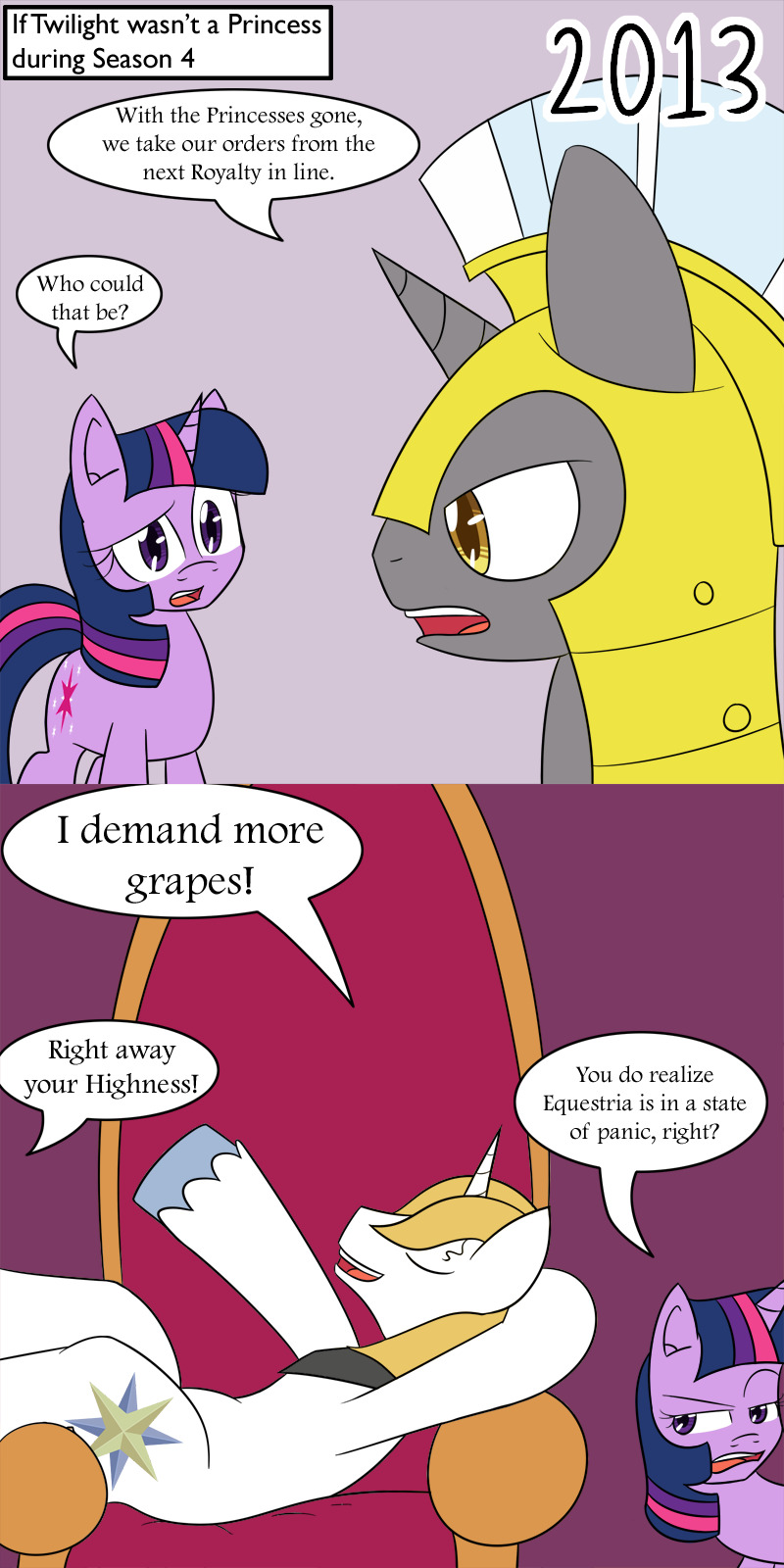
4.) If Twilight Wasn’t a Princess
2013 was surprisingly sparse as far as ambitious projects or art pieces go. I was in full swing with Motherly Scootaloo, and nothing really ‘amazing’ happened in 2013 for the blog. Which was surprising. But Season 4 of MLP DID happen! And it started with the Princesses going missing, and authority over Equestria being transferred to Twilight as the next closest Princess around. And with Cadance ruling the Crystal Empire, I thought, who did that leave to rule if Twilight HADN’T been able to temporarily take the role?
And judging by the length of the comments section on DA, a lot of people found the idea hilarious as well lol. Blue Blood NEVER showed up again for the entire run of the show, and it’s a shame because there was a lot of hilarious joke potential they could’ve done with him. But ya know, the show is what it is is, and this joke still makes me laugh.
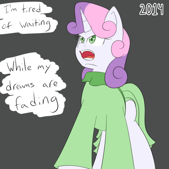
5.) My Time
My first original music video, with a song I had commissioned and everything! While it wasn’t my first video involving music and MLP, it was the first time everything was mine in one way or another. I wish I could write music, but the ambitiously talented AllLevelsAtOnce and Queen Mickey the Sass Master made this project well worth the time and effort put into making it!
And of course, it encapsulates the kind of futures I wish the CMC had acquired, with Sweetie Belle finally achieving her foreshadowed talent of singing. Apple Bloom built the stage, and Scootaloo likely would’ve ended up the choreographer if not for her baby. Sadly we shall only ever have fanon for that.
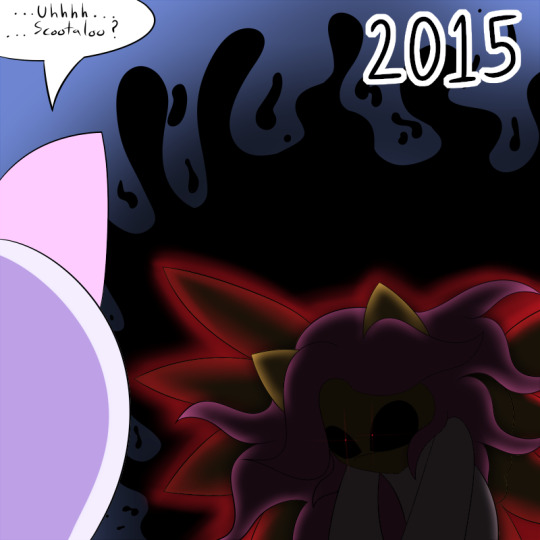
6.) Demonloo
Love or hate the wedding arc of Motherly Scootaloo, this will always be one of, if not my top, favorite panel from the entire arc. Scootaloo looks just so appropriately menacing, and the effects placed on her are glorious. And then of course, I love the little twist of “That’s not just an audience visual effect, she actually looked that way in the comic” rofl
Motherly Scootaloo was a trip that got weird with my inclusion of magic and magical beings from the show, so much so to the point that if I were to ever remake the whole thing one day, a LOT of that would be toned down. Probably to the point Chronus wouldn’t exist. But hey, things are the way they are, but I will forever love the art of this arc.
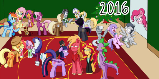
7.) A Motherly Scootaloo Christmas
If there ever was a picture that basically summarized the entirety of Motherly Scootaloo, it was this picture. Pretty much ever major character of the stories over the years was in the picture (minus Starlight) and showing their relations to everyone pretty much. I remember this picture basically killing me when I was drawing it, but was really proud at the time of how it came out. Of course, I could see how to improve it now, but I’m not gonna lol
It’s still crazy to me how many years Motherly went on for, and how much time and effort was put into it. But I’m still glad I did all of it over those years. It taught me so much about art, and about myself, and in the end, taught me the skills I needed to make art a true career for myself. And I’ll always love it for that. And introducing me to the best friends I’ve ever had, of course.
8.) Twilight-Midnight is PISSED
Look. I recognize the Aero crossover had some convoluted issues with it, but god DAMN if I didn’t enjoy drawing that fight scene! I GENUINELY loved every panel of it! I can only hope that in the future the fight scenes I draw will be just as fun to draw as these were. And as visually impressive!
That’s ultimately why this won my pic over say, the time-glitch arc with her Mom. The explosions, the action lines, the visual foreshortening, I’ve never seen such visual improvements in a single update from me quite like I have these entire scenes. When I push myself to be amazing, I can pull off some fantastic art, and I need to do it more!
9.) A StarTrix Christmas
2018 had a LOT of really good choices. Like. Too many choices. So many art pieces I was super proud of, so many pieces that showed growth as an artist, was a personal favorite, that people loved... So in the end, I went with the piece from the end of the year that is still a piece I hold up as truly a cultivation of how much effort I can put in to a picture.
Also it’s Christmas related. I LOVE Christmas. Never enough Christmas.
And as much as I hate FriendLight Glimmer, I still ADORE StarTrix content. It’s the good food for me, one of the rare things that the later era of G4 got right for me. And since I can make them be however I want in fanon, making them a GOOD loving couple was top priority for me, and I just adore them together. I truly do. And this picture is beautiful because of the love I put into it.
10.) Fate of the Lost Princess
I couldn’t NOT put Fate of the Lost Princess on this list. It’s too important to me, means too much to me, and shows my growth as an artist the most. And of the pages of Fate of the Lost Princess I have done so far, the piece of Tina and Noah on a bus stands out the most for me because, I ACTUALLY managed to make it look and feel like they were on a bus! I was so worried about this page and I spent so long working on making it look right, and in the end, I succeeded in a way I never thought I could!
It feels good to end the decade on my original webcomic, showing just how much I’ve grown as an artist. Going from a successful fanartist, to a successful original artist, that still does fanart on the side, but I’ve grown into my own person now.
I’ve lost track of how many times I tried to start an original comic, only to stop working on it and let it fade into obscurity. Fate of the Lost Princess is the most effort and work I’ve put into an original comic before, and I’m so proud of myself for not only getting as far as I have, but proud of how much effort I plan to put into it in the future, and how much effort I’ll put into the comics beyond Fate of the Lost Princess.
It represents everything that is me from the last 10 years, and I hope it’ll be the fantastic start of the 2010s I want it to be. And I couldn’t have picked something to be more proud of to wrap this decade up with.
#Personal Art#Looking back at the decade#Art of the 2010s#Silent Ponyville#Motherly Scootaloo#Tumblrpon#Friendship is Magic#StarTrix#Fate of the Lost Princess
32 notes
·
View notes
Text
5 Takeaways from SearchLove Boston 2018
Last week, several KoMarketers had the opportunity to attend SearchLove 2018 in our lovely city of Boston. There were so many of us, we barely fit all fit in the photobooth frame; see exhibit A:
A post shared by KoMarketing (@komarketing) on Jun 7, 2018 at 10:56am PDT
There we all are!
Personally, my favorite part was getting to see our Senior Director of Digital Marketing, Casie Gillette, lead a session about the keys to a successful content marketing strategy. It was so cool seeing someone you work with every day get up on the stage and really rock it!
But, I digress. The Distilled team put together a great show this year, which they attributed to the many awesome speakers who flew in from around the world to share their insights and knowledge. The mini dessert buffet from the Revere Hotel didn’t hurt, either.
Feeling like you missed out and wish you could’ve been there? Good news! Today, I’m sharing 5 highlights from the show to guide your search strategy this year and beyond:
1. Paid Media is Evolving – Fast
Samantha Noble, Managing Director and Founder of Biddable Moments, shared just how much digital advertising has changed over the last 10 years (and a ton of paid media options) in her presentation, “Beyond the Reach of Keyword Targeting: The Evolution of Paid Media.”
Over the last 10 years, ad platforms and options have changed dramatically. Samantha uses Google Maps and Google Images as examples of platforms that used to be free but have since incorporated ad space as a way to grow and drive revenue. Search ad listings have also expanded and evolved over the past several years to incorporate information that encourages users to click, such as company reviews, delivery time estimates, available promotions, and easy-to-navigate site links.
Most of all, Samantha’s presentation showed there are so many digital advertising options available to marketers today, and likely many more to come. Below are several new Google Search ad options she talked us through:
Vehicle Ads
Visual Sitelinks
Brand Enhanced Sitelink Format
Pop-Up Map Ads
Knowledge Panel Ads
Card vs. Listing Ad Format
4 Ads at Bottom of SERPs
Expanded Ads
Video Ad Extensions
What’s coming to Google Search? Vehicle ads, visual sitelinks, pop up map ads, and more. #searchlove @SamJaneNoble
— Anastasia Warren (@anastasiafwa) June 7, 2018
2. Don’t Be a Newsjack@$$
Ryan Charles, Marketing Director of Hire a Helper, shared his insights about newsjacking, aka taking advantage of news stories to promote a product or brand. We’ve witnessed some brands do this really well over the past few years – think Oreo’s “You Can Still Dunk in the Dark” tweet during the 2013 Super Bowl or Hostess’ and MoonPie’s Twitter feud during the solar eclipse.
If you spot an opportunity for your brand to engage with a current news story or event, how do you decide to go for it? To be a successful newsjack-er, the most important piece is to make sure your promotion or advertisement is adding to the story. More specifically, Ryan outlined what to check before hitting the publish button – saving you from becoming the next newsjackass:
Do you have a connection to the story?
It’s best if you have some kind of connection to a story: – geographic – personal – interest/fandom – relevant to what you do – the competition@reciprocalryan #searchlove
— Ruth Burr Reedy (@ruthburr) June 7, 2018
Do you have an original angle? According to Ryan, this angle needs to be unexpected, spark curiosity, and make people laugh.
Can you ship it in 24 hours? News moves fast, so you have to move fast to “catch the wave.”
Are you offering value? This could be monetary, comedic, emotional, or societal value.
Are you willing to take the risk to your brand reputation? The rewards of newsjacking can be brand awareness, links, or even money. Remember smaller brands can take bigger risks than big brands.
To mitigate risk, get feedback from outsiders before you post, understand the nuances of the story, and stay neutral if possible.
The bottom line is, your brand can reap serious benefits from tasteful newsjacking, but make sure you’re not misleading the media about an event, trivializing or capitalizing on a current event without thinking about participants, or newsjacking without value.
Wise newsjack advice and life lessons from @reciprocalryan – “Don’t get owned” #SearchLove pic.twitter.com/kla8Td83wv
— Kelly (@_KellyDubs) June 7, 2018
3. The Key to Successful Content? Data, Data, Data
Of course, there’s our very own Casie Gillette’s session “The Power of Data: 15 Keys to a Successful Content Strategy.” Even though businesses create more content than ever (2 million blog posts are published per day!), only 5 percent of that content drives engagement. A solid, data-driven strategy is essential to driving engagement and success. Below are a few of the tips Casie shared during her presentation:
Create Goals: Why are you creating this piece of content, and what do you hope to achieve? Whether your goal is organic visibility, form submissions, shares, or even purchases, make sure it aligns with business objectives.
What are your goals?
– organic visibility – form/registration – shares/engagement – purchase
Whatever it is, figure it out! Your content has to have a goal(s). #SearchLove
— Phoebe Fasulo (@Fassooo) June 7, 2018
Establish Baseline Performance: Any content that performs below that baseline can be refreshed or repurposed to improve performance and value.
Know Which Devices Your Consumers Use: Optimize content for the devices your users consume content on, whether it is mobile or desktop.
Monitor Impressions, Position & CTR: If a piece of content has high impressions, high position, and low CTR, you probably need to reevaluate the keyword you’re targeting.
The 5-10 Concept: Focus optimization efforts on content ranking in positions 5-10 to push it higher in SERPs.
Optimize for Question Queries: 27 percent of search queries are questions – figure out what questions your customers are asking and make sure your content answers them!
#searchlove Love this presentation by @Casieg! “Good content doesn’t have to be something that took you 2 months. It can just be something that clearly answers your customer’s question.” Preach!
— Ryan Charles (@reciprocalryan) June 7, 2018
4. The Future of Video is 1 to 1
Chris Savage, co-founder and CEO of Wistia, shared his passion for video during “The Future of Video is One to One.” He started off with a prediction:
“By 2020, every person in this room will make video for work every week.” #Video prediction from @csavage of @wistia at #SearchLove #SEO #socialmedia #social pic.twitter.com/XfVC0Zn23I
— Jessica Levenson (@guerillagirl) June 8, 2018
The reason? Video has evolved over the last six or so years, from many people making low-quality user-generated content to many people making high-quality user-generated content, as a direct result of better film and video technology available to consumers.
Brands, too, are creating videos differently. Chris cites Dollar Shave Club’s viral product launch video, which changed how brands think about video content: Video became a key marketing element. Companies started creating videos to support customers throughout the sales funnel, from product explainer videos to content marketing videos and recruiting videos.
Video is being used everywhere in the funnel@csavage #searchlove
— Greg Gifford (@GregGifford) June 8, 2018
Today, thanks to smartphones, users have access to super high-quality cameras at every moment and are creating videos daily. Chris stresses that brands have to keep up, and think about creating more unique video content – even pitch a prospect, as a thank you, or as follow-up communication.
@csavage reminded us that Planking was gone too quickly, and “Friday” is, unfortunately, around forever. Awesome presentation on the evolution and future of video. @distilled #searchlove
— Sarah B – GA Model (@SarahB_GAModel) June 8, 2018
5. Look Beyond Keywords: Visual Search
Jess Scholz, Global Digital Director at Ringier, shared the possibilities of visual search, AR, and VR in her presentation “Looking Beyond Keywords: From Visual Search to New Realities.”
Did you know 74 percent of consumers say text-based searches are insufficient in helping find products online? As a result, 23 percent of searches are for Google Images. Marketers need to start thinking about optimizing their products and offerings for text-based queries looking for images, and visual queries.
74% of consumers say keyword based searches are not helping them find the products they want. @jes_scholz #searchlove
— Jason Dodge (@dodgejd) June 8, 2018
To help make it easier for users to find your product images effectively, make sure all images have optimized metadata and the surrounding copy is based on keywords your customers actually search for. Uploading high-quality images to your site also make it easier to customers to find products through Google’s visual search.
Jess’s tip for brands concerned with creating a lot of high-quality images is to repurpose user-generated content – not only does it take the pressure of creating unique content off of brands’ shoulders, but users who engage with UGC are also two times more likely to convert.
During her presentation, she also discussed the possibilities for computer vision and AR. The key for implementing search by camera functionality or AR into your brand’s strategy, Jess notes, is ensuring it has value for the consumer and makes their life easier (whether it’s buying a product or gathering for new information).
Final Thoughts
There were so many amazing topics and speakers at this year’s show, and each gave us a look into what’s coming down the pike for search marketing and how to be ahead of the curve. So glad I had the opportunity to spend two days learning from the best of the best!
‘Til next year!
Thanks to all our fantastic speakers for #Searchlove Boston 2018! It was a blast! @bart_goralewicz @goutaste @TomAnthonySEO @willcritchlow @reciprocalryan @csavage @GregGifford @jes_scholz @ruthburr @Casieg @lisaschneider64 @meladorri @davidlevin123 @SamJaneNoble @dnawasari pic.twitter.com/XhKVO0pWJQ
— Rob Ousbey (@RobOusbey) June 11, 2018
from http://bit.ly/2MkwKBq
0 notes