#I wanted to post this with the season 1 poster redraw
Explore tagged Tumblr posts
Text
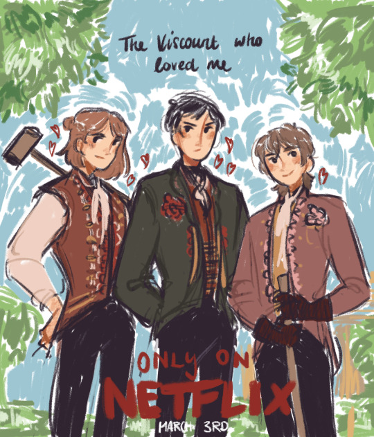
soooo,,,,Bridgerton AU?
#hetalia#aph romania#aph bulgaria#aph moldova#hws romania#hws bulgaria#hws moldova#I wanted to post this with the season 1 poster redraw#but I can’t decide on a ship for that one hahahaha#this one was clear from the beginning tho#one because I need the you are the bane of my existence and the object of all my desires scene for robul SO BAD#and two because the angst of that scene that’s like >you are my brother< / >HALF brother<#I want ro to have >do you even know all the ways a Lord could be seduced?< tho hahaha#I need season 3 and I need it now……#when I said I can make any media about my favourite ship I MEANT THAT#also yes aged up mol HAHAHAHA#(tbh I don’t get why he’s a kid in canon)#(don’t use)
266 notes
·
View notes
Text
Today is @blaseballzinejam reveal day! I'll be making and reblogging individual posts about zines and my pieces for them, but I wanted to make a round-up of all of the places you can find my work in the zine jam.
Solo zines:
last words of a shooting star, a Lenny Marijuana lyric comic about Season 24
Blaseball According to My Friends (Who Don't Know Blaseball), which is exactly what it sounds like
Collaborative zines I ran:
REALITY FLICKERS, centered on different interpretations of feedback
The Good Old Days, focusing on Season 1 and early canon
one minute to midnight, an exquisite corpse 12x100 about the Dale in s24
THE END, a 24-hour speed-jam zine focused on s24, co-run with @leonstamatis
The list of zines that I contributed writing, art, and other pieces to is under the readmore.
Zines I contributed to:
Salmon and Snake, an AU where s24 ended with the timeline being reset and shuffled
Lights Camera Action, making movie posters for fics and giving them reviews
Spellbooks and Strikeouts, a Dungeons & Dragons themed zine
title not found, about players who don't technically exist in the main timeline
Forecast Jazz, an album cover redraw zine
Radio Immateria, a zine of annotated playlists (with thanks to @queen-eevee for the playlist help)
Downpour, an exquisite corpse 12x100 about Knight and Percy
Letters from the Rumour Mill, about new lore takes on random characters
Forecast, about the s10 Forecast decrees
The Open Road, about players travelling
Tales from the Short Circuits, a collation of Short Circuits team lore
To the Hall and Back, about marriage and other long-term partnerships
Fusion Weather, about the effects of combined weather types
The Yourplace Ourfolks, a fanteam zine (with thanks to @panneshirley for letting me borrow his fanteam) (jules it wouldn't let me @ your main but it let me do the sideblog so here we are)
WIP Amnesty, a zine for WIPs and unfinished pieces
#waveridden.txt#blaseball#blaseball zine jam#waveridden.fic#waveridden.art#i started this in my drafts like three weeks ago and watching it slowly grow has been. intimidating.
47 notes
·
View notes
Photo

APPRECIATION & INTERVIEW
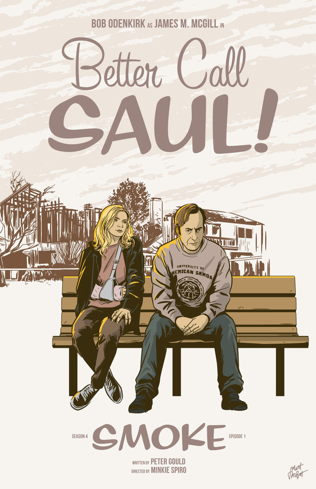
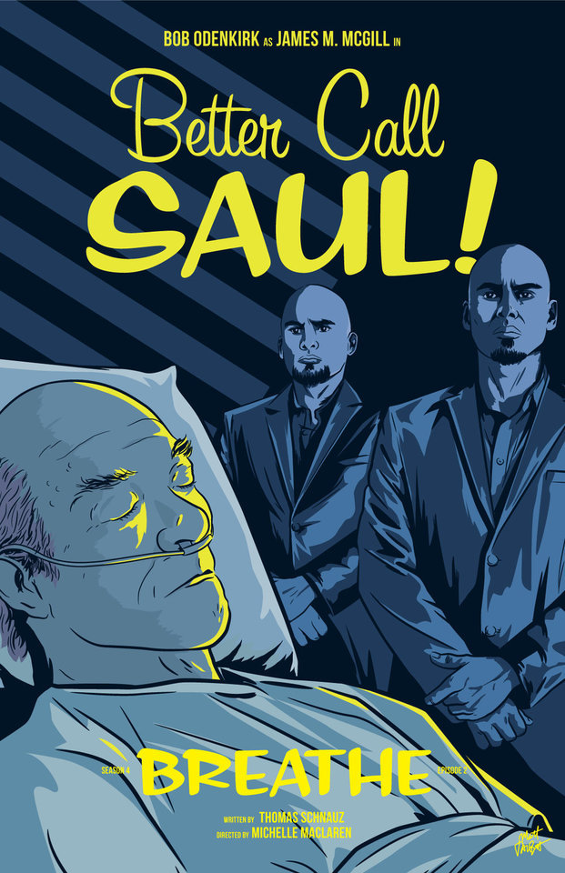
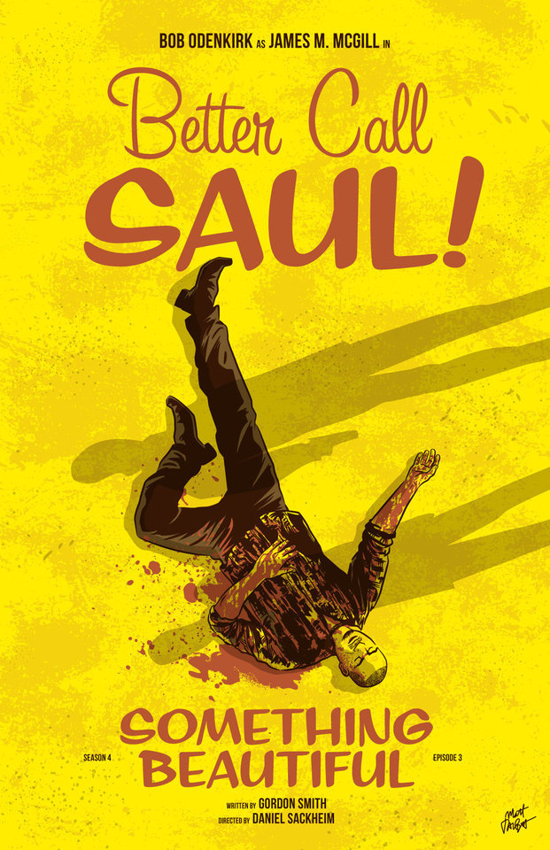
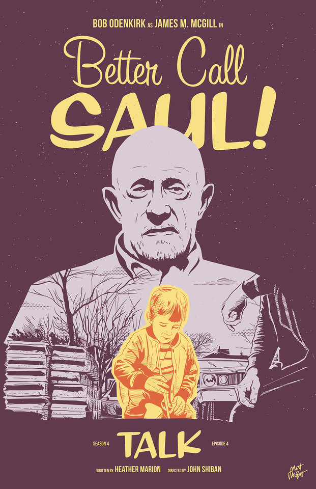
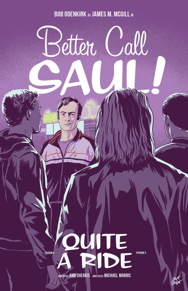
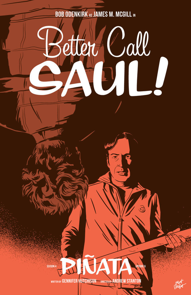
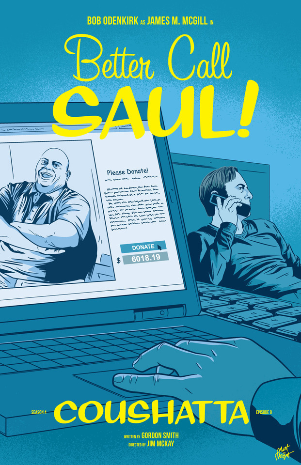
Better Call Saul episode posters by Matt Talbot After 4 nearly years, I thought it was time to catch up with Matt Talbot about his Better Call Saul poster project. The last time we talked during Season 1, Matt was deep in the hustle of making his name as an illustrator: juggling a full-time job, freelance projects, as well as band. Finding time for personal projects like this one can be a significant challenge. (Not to mention surviving the death of your tools: During Season 1 his Mac laptop died, and this season, his Wacom tablet bit the bullet). But despite these challenges, the 43-year-old New Hampshire native has persevered to create a clever and thoughtful series of episode posters that has garnered considerable attention, and brought with it new high-profile clients and art exhibitions.
First, congratulations on all of your success and recognition with this series of posters. It’s well-deserved. What’s been the most gratifying feedback you’ve received? Thank you! Every interaction I’ve had with anyone from the show has delighted me. I've been surprised by all of the cast and crew members who have said nice things – every note I’ve gotten has meant a lot to me. That being said, Michael McKean randomly tweeting at me that he has my poster for Chicanery hanging in his home blew my mind. I was eating dinner when my phone showed the notification and I literally jumped up from the table. I’ve been a fan of Michael’s since I saw Spinal Tap in the ‘80s and never in a million years would I have guessed I’d make something he valued enough to hang in his home.
Tell me about your contributions to Gallery1988 exhibitions. How does that process work? It's a pretty simple process. They invite me to be part of a show, and I make something to send them. I’m very excited for the opportunity to show there, and I feel like it’s a milestone in my art-making career.
Across the 4 seasons, which BCS posters are your favorites? Which one are you most proud of? I’m particularly fond of Rebecca, Rico, Marco, Switch, Sunk Costs and Something Beautiful. Oh man, it's hard for me to evaluate my own stuff. I tend to like the posters where I find a way to get a different take on something they did in the episode. I would say that “Sunk Costs” is also one of my favorites because I did something differently than how they shot it, and because Mike is so recognizable even from the back. I was also pleased with “Off Brand” because it was when I finally figured out how to draw Bob Odenkirk.
How has your process for creating these posters evolved over 4 seasons? When I started this project I had a vague idea that I would focus on scenes rather than portraits or likenesses, but that didn’t even last half a season! The characters were too good not to include. In that way, the posters have evolved in my willingness to draw characters, and also, hopefully, my ability to draw them.
My process is now something like: Watch the show on Monday; think about it on Tuesday, figure out what stood out to me and do a thumbnail sketch or two; draw it on Wednesday night; post it Thursday afternoon. I’m a bit faster at drawing these now compared to when I started. And I’m a bit more decisive on choosing which subject matter to depict.
There have been quite a few changes on the visual side of Better Call Saul over the last 2 seasons. New directors (Minkie Spiro, Daniel Sackheim, and Andrew Stanton), a new cinematographer Marshall Adams, even new cameras. What are your thoughts on how the show’s visual grammar has evolved? Has any of this impacted your posters from Seasons 3 & 4? I try not to just redraw literal scenes from the show, and I don’t need to tell you that they shoot the show in an incredibly beautiful way. I mean, they always, always, pick the best angle, the best shot to capture something. For that reason, it’s sometimes hard to to come up with another take on a moment from the show.
That being said, the visual style hasn’t really impacted my posters as much as the evolving subject matter has. The show, I think, is substantially darker than it was in the early going. It was easier to depict Jimmy’s hi-jinx in the first couple seasons. But with Chuck’s deteriorating mental state, the cartel stuff, Mike going deeper into Fring’s world and of course, Jimmy’s loosening sense of morals, the funny moments are harder to spot. That’s lead me to some more somber layouts and color choices.
We didn’t discuss this in our first interview. Which typeface are you using in your posters, or is this custom typography? The main logo and episode titles are set in Sign Painter, from the excellent House Industries.
The Heisenverse is known for it’s color theory and use of color. How has that impacted your color choices in these posters? I’ve kind of adhered to their blue=good/red=bad symbolism, but I also try to balance out colors between episodes and not repeat myself in sequential posters.
Many of your posters (especially ones this season) use a monochromatic, or simple palette of 1-2 colors. Tell me more about why you chose that approach. Is this a signature of your style? I’ve seen this approach in a lot of your work. You know, in the early seasons, I was trying to use simpler color palettes, but I wasn’t very disciplined and I got away from that. I’m trying to stick to a more consistent style in season 4. It is a conscious decision. I also feel like with the week-to-week nature of this project, it helps quickly set apart each poster. And, I really do love limited color palettes. Giving myself color constraints helps me figure out different ways to solve layout problems.
I’ve heard other illustrators say that Bob Odenkirk’s facial features are tricky to capture. Do you share that sentiment? Which characters are more challenging to illustrate? I do agree with that. I had a really hard time with him at first. I kind of think I have a better handle on it now, but I’m always trying to get better. I feel like if you can get his mouth right, it goes a long way.
I found Hector hard to capture both times I drew him. Mike, on the other hand, is just pure fun to draw. Jonathan Banks is so distinctive and iconic.
What’s been the most difficult poster thus far? Why was it challenging? Maybe it’s because a lot of time has gone by, but I can't think of one that stands out as having been really difficult.
Francesco Francavilla did alternate posters for some of his Breaking Bad posters. Inevitably, when artists look back at their work, they consider revising or redoing it because of a variety of reasons – their point of view has changed, their skill/style has evolved, or maybe they were never truly content with the final product. Looking back at 4 seasons worth of posters, are there any that make you want to scratch the revision itch? Yeah, more than I would care to admit. I would really like another crack at Amarillo. I know I could do a better job and that drawing is just super flat. In season two, I decided to to experiment with style and I kind of wish I hadn't. I like Cobbler, but I wish I had drawn it in my normal style. I would redraw Nailed for sure. Oh man, if I start going down this road it's not going to end well, so I'll just stop.
You mentioned earlier this season you were excited to draw Track Suit Jimmy. Who or what haven’t you drawn, that you are eager to illustrate? Howard! It bums me out to no end that I haven't drawn him, but it just hasn't worked out. And I need to include Kim more. It's kind of criminal that her face only appeared for the first time in a poster this season.
What’s your opinion of Season 4? Tell me about your favorites – episode, scene, character. I think season 4 is brilliant so far. The Kim/Jimmy relationship has deepened so much this season, and feels so real, but full of inevitable heartache. Oh, the flash-forward to Breaking Bad’s timeline was amazing. Mike doing his audit in the Madrigal warehouse. Really, anything Michael Mando does on screen. It's hard to pick. I so enjoy the deliberate pace of this show.
Where’s your favorite place to discuss the show? I honestly don’t talk about it too much online, though I lurk in a few places and read a lot. I actually discuss it mostly with my wife!
I know you get this question a lot, so let’s cover it here so folks understand: Do you have plans to sell any of this work online? I really appreciate that people like it enough to want to buy it or hang it, but I don't plan to sell the Better Call Saul posters online. I’m doing this for fun, not to make a buck off the show, and I don’t own the rights to sell it anyway.
What’s next for Matt? Do you have any other poster or illustration projects in the works? Is you band performing soon? I have several more pieces for Gallery1988 shows coming up. I’m pulling together an art show at a local brewery for whom I design all of their labels and stuff. I’m patiently waiting for a t-shirt I designed for one of my all-time favorite movies to be announced. And for the past several Octobers, I spent the month drawing a horror poster per day. I’m not sure if logistically I can do that again this year, but I’ll probably fit at least a few in. We’ll see how it goes. Sadly, with all of my illustration work, I haven’t had any time for music making, but someday I hope to get back to that!
Follow Matt: Web site / Tumblr / Twitter / Dribbble / Instagram / PosterSpy
– Interview by Shayne Bowman, Heisenberg Chronicles
#better call saul#artist interview#matt talbot#mine#heisenberg chronicles#illustration#fan art#posters#favorites#mattrobot#bcs season 4#gallery1988#g1988#house industries#sign painter
93 notes
·
View notes
Text
The content audit
1.0 Home
<!-- the link to each work-->
1.1 Illustration
Image1
Image2
....
<-----back
1.2 Graphic Design
1.2.1 The Design for help rural education
<-----back
1.2.1.1 Let children published their own picture book.
The organization let the children from Mudan township draw the story about their home town in the course. Our job is redraw their picture and allow it to be published.
Process image
Complete image
/* 1.2.1.1 Let children make their own magazine.Since the elementary school in Sudan Township indicatred that the children in small villege lack of confidence and passionate to study, the idea is about to allow children from countrysides find their special and give them a stage,What we do?We build the Magazine Model.There are some easy assignments for children to complete the content which associate with language, culture, and nature.We build the websites prototype.The magazine medel can be download on the websites allow teacher to use.*/
<-----back
1.2.2 School 107 Anniversary KV Poster
Process
I started with colourful and enthusiastic element such as ribbon, cake, party since it is for the Anniversary of school. In addition, Green building is the most special feature of our college and there are many trees and plants in the campus, so I also add those elements in the Poster.
My customer is the ambassador of the school, they prefer vivid and strong color, so I try to increase the saturation but keep the image harmony.
Every two weeks, I discussed with my customer and there would be some modify. Most of them was about the title. Originally, the typography looks softer and cute with the round corner, but my customer prefers more solemn style,
It was a great experience that I try to find the balance between the customer required and my own style.
Color image
Complete work image
<-----back
1.2.3 Commencement Ceremony Stage Curtain
In Taiwan, there is a phrase: "When the phoenix flower falling, it is the date of graduation"
The season of Phoenix flower fall is close to the date of graduation, and there often full of red flower on the street. That's why Phoenix flower become a common symbol of graduation, and I use it for the main elements of the design,
In the end of the Ceremony, students would sing the school song. I made a flower falling animation for this part. Like flower, we blossom in our youth, then it is time to start the next stage of life.
Process image
Complete work image
<-----back
1.2.3 Exhibition KV
The poster KV is for the freshman final exhibition of interaction design department.
Process image
The title of the exhibition is " The Eggs in the Universe ". We made a story about a egg escape from the earth, then the spaceman got the misson to find it. I use comics style in the post to discribe this story.
Complete work image
<-----back
1.3 Interaction Project
In most of the project, I was the one who charge for art
1.3.1 The Little Match Girl<!--haven't complete-->
Introduction
Behind the project
Video and picture
<-----back
1.3.2 Literature Board Game
<!--haven't complete-->
Introduction
The project aim to allow people understand Chinese classical literature with fun game. The story cards with illustration and summary can be collected in the game.
We are glad to have a chance to collaborate with Sanmin bookstore and published the board game!
Behind the project
What I do
In this project, I participate the whole process, including art, rule design, and summarizing literature.
How
First, we read the literature "Romance of the Three Kingdom". We collect the most classical story and summarize it.
Next, we went to board game store to do the market research. We played a myriad of games and found the most matched one for the literature. We create the new rule based on the other game and test it again and again to make sure the rule work.
Finally, discuss with the editor and complete the art design!
Character Style
I drew the characters again and again in order to make them vivid. In additionm, we hope to make the characters more handsome because we want to target female market. Since there are fewer female enjoy Romance of the Three Kindoms than male, We hope to let girls see the intresting side of the story.
About the project
<-----back
1.3.3 Along the river during Quing Ming Festival--- Exibition Device AR and 2DAnimation<!--haven't complete-->
Introduction
Along the River During the Qingming Festival is the most renowned Chinese paintings, while it is hard to understanding the meaning by just watching. As result, our team set the triggers on the original paintings, allowing user scan them by phone and get the short AR introduction viedo.
Behind the project
About the project
<-----back
1.4 3D work1.4.1 Model
Image
<-----back
1.4.2 9:00 short animation
Image
Video
<-----back
1.4.3 Music Video
Image
Video
<-----back
2.0 About
Enya Lin
Hi, I'm Enya Lin. a Graphic and Interation designers.
I always hope my design can help people and make more happiness.
PROFILE
Grauduated form Advertising Design department in vocational school.
Currently studing Interaction design in Ulster University.
I studied diverse skills and keep looking for what is the favorite for me.
SKILLS
Watercolour
Graphic Design
Layout
Computer Art
Film editing
SOFTWARE
Ps, Ai, Id, Ae, 3Dmax, html, css
EXPERIENCE
1.Published a Board Game
2.Key Vision for college Anniversary
3.Key Vision for college Ceremony
ACHIEVEMENT
25th Times Young Creative Awards
4th 高中職國際幕展
2019 Hackathon in College
Footer
<!-- the link to social media-->
Behance Instagram Facebook Twitter
0 notes